
Abstract
Background
A major challenge in healthcare is the interpretation of the constantly increasing amount of clinical data of interest to inpatients for diagnosis and therapy. It is vital to accurately structure and represent data from different sources to help clinicians make informed decisions.
Objective
We evaluated the usability of our tool ‘Triptychon’ – a three-part visualisation dashboard of essential patients’ medical data provided by a direct overview of their hospitalisation information, laboratory, and vital parameters over time.
Methods
The study followed a cohort of 20 participants using the mixed-methods approach, including interviews and the usability questionnaires, Health Information Technology Usability Evaluation Scale (Health-ITUES), and User Experience Questionnaire (UEQ). The participant's interactions with the dashboard were also observed. A thematic analysis approach was applied to analyse qualitative data and the quantitative data's task completion time and success rates.
Results
The usability evaluation of the visualisation dashboard revealed issues relating to the terminology used in the user interface and colour coding in its left and middle panels. The Health-ITUES score was 3.72 (standard deviation (SD) = 1.0), and the UEQ score was 1.6 (SD = 0.74). The study demonstrated improvements in intuitive dashboard use and overall satisfaction with using the dashboard daily.
Conclusion
The Triptychon dashboard is a promising new tool for medical data presentation. We identified design and layout issues of the dashboard for improving its usability in routine clinical practice. According to users’ feedback, the three panels on the dashboard provided a holistic view of a patient's hospital stay.
Keywords
Introduction
The total data volume of the world has been increasing rapidly and is expected to triple by 2025, up from the 64.2 zettabytes projected for 2020. 1 In healthcare, a single patient generates an estimated 80 megabytes of data per year, including imaging and electronic medical records. 2 Similarly, medical information systems in hospitals continue to exponentially generate large volumes of heterogeneous data from multiple sources during daily routine care.3–5 This body of aggregated information continues to grow; for instance, the results of laboratory tests and radiological examinations accumulate over time. Furthermore, hospital admissions have been increasing, except during the first COVID-19 wave.6,7 Steady increases in medical data volume have motivated researchers and physicians to address data presentation using innovative solutions.
Distributing data in hospital settings creates problems related to data collection, management, and processing. Data are broadly classified as structured or unstructured and arise from different sources. Structured data, including laboratory information, patient information, procedures, and ward transfers, are often obtained from discrete information technology (IT) systems. Conversely, unstructured data include handwritten notes, 8 patient medical history,9,10 imaging reports,10,11 vital signs, 9 pathology reports,9,11 and non-standard data terms and definitions. 12 Approximately 80% of medical data collected in electronic health records are unstructured because they cannot be easily managed using predefined data models. 13 Therefore, clinicians use multiple data collection tools, leading to poor oversight, waste of time, and can ultimately result in poorer decision-making for the patients’ sake. Clinicians additionally collect information on patients’ schedules and ward transfers during their hospital stay. The use of digital technology, as well as the quantity of data generated, has increased incrementally in everyday work routines. A survey from 2020 reported that 81% and 45% of the clinicians surveyed from China and Germany, respectively, concurred that the magnitude of patient data collected is overwhelming. 14 The increasing density and complexity of medical information received by clinicians can complicate decision-making. However, the use of digital tools capable of presenting all the clinical information intuitively and emphasising the key points can simplify these processes, rendering these data more useful for routine clinical care.
Nevertheless, the preparation and merging of patients’ data carry the risk of data loss, misinterpretation, or redundant/unnecessary examinations. For instance, the missing of data, 15 understandability of the data integration by clinicians such as differences in population and outcome, scuffling patient's medical history and contextualising patients’ conditions 16 can adversely affect patient safety. To overcome these challenges, an intuitive and simple system for organising large-volume data is required. Data must be visualised promptly for the identification of meaningful patterns and optimisation of clinical care, for example, interactive visual analytic tools, 16 clinician-oriented personalised user interfaces facilitating the context of medical records and treatment alternatives, and patient-tailored visualisation interfaces designed to accommodate limited medical knowledge. 17 The successful integration of visualisations such as timelines 18 and real-time displays of patient ventilation parameters 19 and physiological data 20 into clinical care has gained acceptance from healthcare professionals. Clinical data visualisation can amplify clinicians’ perceptual capabilities while significantly reducing their cognitive workload. 21
Therefore, we developed Triptychon as a data visualisation tool for organising and displaying inpatient medical data. This tool summarises a patient's laboratory and vital parameters and information about the hospital stay over time. The aim of this conceptual dashboard is to provide the treating physician with a brief overview of the patient, which can display the clinical appearance as well as laboratory parameters and interventions in parallel. This enables not only an impression of the current situation, but also the assessment of the longitudinal process from several source systems. Due to the consolidated nature of the data, it is not supposed to substitute existing systems, but merely merge them on the bedside. The design is arranged in such a way that it can be displayed on a tablet PC, which can be carried in the doctor's coat pocket.
Overview of Triptychon
The assessment and interpretation of large-volume electronic and handwritten data are daily work for medical personnel. However, IT solutions can be used to derive essential data from different sources and present it intuitively to clinicians. Herein, we aimed to develop an integrative and simple tool for presenting high-volume medical data.
Triptychon addresses this objective by integrating large amounts of complex patient dataset to help physicians quickly determine a patient's status. As the name indicates, the Triptychon dashboard consists of three data display panels, inspired by the structure of medieval winged altars. Based on this representation, the visualisation is displayed after entering the hospital encounter ID of the patient. The middle panel displays laboratory parameters, and the left panel shows information related to the patient's location within the hospital and procedures. The right panel displays vital signs and pain levels. This web-based application consists of interactive features such as tooltips enabled through clicks and selection of dates for detailed viewing that assists clinical personal efficiently.
The development of the project was altered through several iterative steps. An initial mock-up was evaluated in 2017 as part of the MIRACUM consortium 22 by various medical informatics specialists and clinicians. In 2021, a further evaluation was carried out as an online evaluation under the COVID-19 pandemic. This evaluation was based on the same task-based methodology. This evaluation was carried out exclusively by clinicians, and various modifications were made to the design subsequently (unpublished data).
Left panel user interface
The left panel represents the patient information in two tabs: diagnosis and course of treatment. The diagnosis tab displays general information such as name, medical record number, age, sex, history of diagnoses, procedures, and medications. Diagnoses are designated according to ICD-10 codes (International Statistical Classification of Diseases and Related Health Problems) assigned by a specialist or a physician based on the German coding guidelines. 23 Data on the procedures used, such as operations, computed tomography, and magnetic resonance imaging, are obtained using the OPS codes (‘Operationen- und Prozedurenschlüssel’ Operation and procedure codes). The treatment tab records a patient's movements between wards and procedures including interventions, examinations, and surgeries, each indicated by different icons (Figure 1(a)). The detailed procedural information is revealed by clicking the icons. The detailed representation of the left panel can be viewed in Appendix 1.

Overview of all three Triptychon panels. (a) Left Panel – showing the procedures and ward transfers (b) Middle Panel – showing the laboratory values of blood parameters grouped into different organ systems (c) Right Panel – showing the vital signs.
Middle panel user interface
The middle panel presents laboratory parameters as a categorical heat map of the inpatient stay (Figure 1(b)), and the detailed representation of the middle panel can be viewed in Appendix 2. According to clinical relevance, experts selected 21 laboratory parameters. These parameters were further categorised into seven different categories, representing different organ systems: blood count, haemostasis, inflammation, heart, liver, electrolytes, and kidney (Appendix 3). This longitudinal representation of the patient's hospitalisation is presented alongside older findings at the bottom and the newer ones at the top, along with the date and time of the laboratory tests visible on the right side. The laboratory values are divided into low and high quintiles, depending on their clinical utility and severity. Two laboratory medicine specialists assigned the laboratory parameters to mutually agreed-upon quintiles. We followed the sequential colour palette where the lower values are displayed in shades of blue, the elevated values in shades of red, and the normal range values in white. The values and units of the corresponding lab parameter are displayed by clicking the heat map cells.
Right panel user interface
The right panel displays clinical parameters such as blood pressure, pulse, and temperature on a line chart to express the changes during the patient's stay at the hospital (Figure 1(c)). The values are presented in quintiles according to severity, with lower values displayed in blue, elevated values in red, and normal values in green. Clinical data are presented in a radar plot form with vital signs and daily clinical observations including vomiting, defecation, dyspnoea, and cough. Data are coded as ‘yes’ or ‘no’ along with severity. The pain level tab displays a homunculus that shows pain levels on a numerical rating scale of 1–10.24,25 The clinical data and pain levels can be seen upon the selection of up to three middle panel dates. The detailed representation of the right panel including the clinical data and pain levels can be viewed in Appendix 4.
IT architecture
The application was mainly implemented in Python using the Django (version 1.11.29) framework, and the different visualisations were created using the Bokeh (version 2.0.2) and MatplotLib (version 2.2.5)26–28 libraries from Python (version 3.7.0). The versions mentioned represent the minimum necessary. JavaScript, HTML, and CSS were used to implement the front end of the application. The application was adapted to facilitate deployment on different platforms. We also used the Nginx service to handle multiple user requests in a single thread.
The application accesses data from the Fast Healthcare Interoperability Resources (FHIR) server or different SQL databases available at the hospital for data visualisation. The laboratory parameters are mapped to the Logical Observation Identifiers Names and Codes (LOINC), which are used for creating the middle panel visualisation. The data collected from the different databases are first loaded into the ‘pandas data frame’. The Bokeh framework creates the data table to display the patient's stay at the hospital on the left panel, the heat map to display the laboratory values in the middle panel, and the line plot on the right panel. MatplotLib generates the radar plot, the SVG images on the right panel, and the vector graphic for the browser. JavaScript renders all the visualisations on the browser (see Figure 2).

Triptychon – three-layered IT architecture: 1st layer – data sources, 2nd layer – Django Webserver framework using Python libraries for interactive visualisation, 3rd layer – rendering on the web browser using JavaScript and HTML.
Study aim
Although the accuracy of the information displayed in Triptychon is of the highest order, in principle, user experience and the overall usability of the dashboard take equal precedence. Dashboard interactions are vulnerable to usability issues that arise when human cognition and system functionality intersects. 29 For this reason, end-user usability assessments are important for identifying issues related to ease of use. In the following, we present this comparative and task-based usability study by a qualitative and quantitative evaluation approach.
Materials and methods
Participant recruitment and selection
To evaluate the usability of the Triptychon web-based visualisation dashboard, we aimed to recruit medical students in their sixth semester or higher and physicians actively working at the University Hospital Mannheim (Table 1). Given that, the study was conducted in multi-disciplinary hospital setting, and the study was open to all students and doctors that fit the recruitment criteria. The objective was to recruit 10–12 participants that are representatives of the target group (students and physicians).
Recruitment criteria for the evaluation study.

Study design
We used a mixed-methods approach to evaluate the usability of the Triptychon visualisation dashboard. The duration of the study was about 60 minutes per participant. The study design followed a usability script, created especially for the study, which included the usability testing method where participants performed tasks along with a think-aloud protocol. 30 In addition, the study design incorporated a semi-structured interview guideline and two usability questionnaires, the professionally translated German version of the Health Information Technology Usability Evaluation Scale (Health-ITUES) and the short version of the User Experience Questionnaire (UEQ) (Appendix 5).31,32 We diligently followed the steps to translate the Health-ITUES questionnaire. The English questionnaire was translated into German and vice versa with the help of certified translators meeting the requirements of ISO 17100:2015. Two certified translators performed the forward and reverse translation of the questionnaire to avoid knowledge bias and ensure translation uniformity.33,34
Pilot test
Before evaluating the platform's usability, we conducted pilot testing for approximately 60 minutes with two medical students in their sixth semester. The students completed the tasks using the Triptychon visualisation dashboard and the tabular form of the laboratory parameters. The list of task-based questions was answered both verbally and in writing. On completing the given set of tasks, a semi-structured interview was conducted. The participants’ interaction with the dashboard and the interview were recorded (audio and video). Questions addressing the user's experience (i.e. the formulated middle, right, and left panels) were cross-checked during the interview. After the interview, the study ended when the participants completed the Health-ITUES and UEQ.
The pilot testing results informed changes to the prepared list of tasks for the visualisation dashboard, the tabular form of the laboratory parameters, and the interview questions guide (Appendix 6). This enabled us to overcome obstacles that may have otherwise hindered our evaluation of the dashboard.
Procedure
Each participant was briefed about the purpose and goal of the study, following which they provided signed informed consent for participation. For the assessment of the visualisation dashboard, all participants completed two cases, a classic paper-based tabular form (laboratory system/curve, the gold standard) and the new visualisation form (Triptychon). The participants were divided into two groups as seen in Figure 3. Group A started with the classic tabular case and then evaluated the Triptychon case. The order of presentation was reversed for Group B. The task-based evaluation was performed using two test case studies (pseudo-patient records) from the University Hospital Mannheim (Appendix 7).

Block diagram showcasing the evaluation scheme of Group A and Group B.
Each participant watched a 6-minute video introducing the visualisation dashboard and describing data available in the three panels, such as patient history, ward transfers, and laboratory and vital parameters. The visualisation case study was presented on an android tablet, HuaweiTM MediaPad M5 (screen size: 265 × 195 mm). The tabular form was present on a paper similar to the ones used in routine clinical practice. The cases were designed to take approximately 15–20 minutes to complete. After the participants had completed and answered the task-related questions, the study moderator conducted and recorded the interviews. Finally, each participant was required to complete the Health-ITUES and UEQ to evaluate the usability of and satisfaction with the visualisation dashboard.
Data collection and analysis
Quantitative data, such as task completion and success rates, were collected using systematic observation 35 during the study and via video recordings. Subsequently, the physicians and students completed the Health-ITUES and UEQ.
The 20-item Health-ITUES was customised to report the usability of the web-based visualisation dashboard. The Health-ITUES addresses four usability factors: (a) quality of work life (QWL), (b) perceived usefulness (PU), (c) perceived ease of use (PEU), and (d) user control (UC). In addition, the Cronbach alpha coefficient was determined to show an estimated score of the internal consistency reliability based on all possible correlations between the items. The participants responded on a 5-point Likert scale ranging from 1 (strongly disagree) to 5 (strongly agree). Furthermore, the User Experience Questionnaire-Short (UEQ-S) was used to measure the comprehensive impression of user experience based on both the classical and Triptychon user experience aspects. 36 The UEQ-S also evaluated the comprehensive conception of user experiences, such as efficiency, perspicuity, dependability, originality, and stimulation. The UEQ-S Data Analysis Tool 37 was used to generate the results. We used task-based evaluation to determine how much time the participants needed, on average, to perform specific tasks using both forms of data visualisation.
A set of predefined questions guided the collection of qualitative data through semi-structured interviews with the study participants in an individual face-to-face session after completing the required tasks. The interaction with the visualisation dashboard and the interview sessions were video- and audio-recorded for later analysis. The recordings of the interview were transcribed and used for analysis. The moderator of the study also assessed the participants’ interactions with the dashboard (see the ‘Direct Observation’ section). We used thematic analysis methods for all qualitative data analyses 38 and for categorising the interview data into meaningful themes.
Results
Participants
For this study, 20 participants volunteered to participate in the evaluation study of the Triptychon dashboard. Table 2 shows the number of students and physicians recruited along with their clinical discipline.
Participants and their clinical disciplines.

Qualitative data
The qualitative data collected through the semi-structured interviews were subjected to thematic analysis, and we identified three patterns and themes. In the following, we present these three themes, namely the layout and terminology of the dashboard's user interface, the visualisation, and the users’ familiarity with the interface.
User interface
Terminology
During the usability study, the participants, especially students, immediately clicked the ‘Diagnose’ option to determine the patient's diagnosis and present the most likely diagnosis based on the laboratory and vital parameters. This observation was also addressed during the interview to understand why the participants clicked the diagnosis option rather than determining it from the given laboratory values. For example, P-02 clicked the ‘Diagnose’ option simply because it was there. In contrast, P-01 explained that the extra tab on the interface was not comprehensible enough or intuitive. For instance, after clicking the diagnosis option, P-16 searched for the specific date mentioned in the task but soon realised that the current dates and diagnosis were not included on the diagnosis page, which only included prior visit data, such as the hospital admission date (Figure 4). The participants also found the term ‘Reference’ to be ambiguous because the content shows the visualisation legend. However, several physicians felt that the ‘Reference’ option was necessary and intuitive as it was easy to find the data visualisation legend.

Quotes from participants’ interviews regarding the user interface and terminology.
Layout
In the classic patient file, laboratory values are shown vertically (i.e. top to bottom versus the horizontal layout on the Triptychon visualisation dashboard). Considering that the students are still learning and are used to viewing traditional patient files, adapting to viewing the data in the new form might require more time. The students also expressed dissatisfaction with how the dates were displayed; for example, having the admission date at the bottom of the list was considered slightly problematic. P-01: ‘….. the vital parameters are clear, although it is irritating for me that the temporal progression is displayed from top to bottom or bottom to top, I don't know, but in any case, vertically and not horizontally as I know it from the classic patient file….’
Interaction
Almost all the participants found the touch interaction for viewing laboratory values cumbersome. The participants preferred to have the values displayed in the coloured cell or have the values written along with the colour coding of the laboratory values instead of the click option. Furthermore, the study participants such as P-09 also mentioned that viewing the numbers and colour coding would enable a quicker overview. In another instance, P-02 stated that clicking the coloured cell to see the laboratory values would take too much time away from their routine hospital workflow. P-02: ‘what you could do would be the number as colour…..it is bad that you have to click everywhere individually. That takes too much time away from the daily clinic routine….’
P-09: ‘maybe if it's not too crowded, if you always write the numbers in, then you can see all the numbers without clicking and pick out what you find important’.
Visualisation
Middle panel
All the participants found the colour coding of the data visualisation potentially overwhelming and confusing because similar shades were used (e.g. the shade of red between quantiles 2 and 3). The participants’ confusion about the colour-coded visualisation revolved around the different shades of blue used to show the negative values (−1 to −5) and the shades of red used to show positive values (+1 to +5). P-11 stated that the colours used in the visualisation alone cannot be trusted and, therefore, would like the cells to also display absolute values. P-06 and P-17 preferred that the coloured cells contain individual laboratory values (Figure 5). This way, one can recognise the colour at a glance but still read direct values since the additional click interaction to view the laboratory values would be unsuitable for everyday use.

Quotes from participants’ interviews regarding the visualisations.
Left panel
Most participants found the icons on the left panel intuitive and easy to interpret, including those used to represent Operations, Wards, and Interventions. The participants also found clicking the icon to view further information very useful (Figure 5). However, some participants had trouble identifying the intervention icon. This led to additional click interactions on the left panel to identify the icon's content.
Right panel
To determine if a patient had dyspnoea, the participants had to follow a particular interaction path. They had to select the patient's hospital admission date, then click the ‘Clinical Data’ option, and then view the radar plot with the additional vital parameters of the patient. Of the 20 participants, 17 completed the task successfully. However, two students and one physician had difficulty completing the task and felt that the interaction path was not intuitive. The participants also found viewing only the radar plot (without vital parameter values alongside colour coding) less intuitive (Figure 5).
Learnability
The participants were also asked about the learnability of the dashboard. Several participants found the short 6-minute introduction video helpful; however, many requested additional hands-on training sessions to familiarise themselves with the parts of the dashboard (e.g. the colour coding of the left and middle panels). The participants felt that an extra question-and-answer session would improve their understanding of the visualisation. Additionally, P-09 mentioned that further hands-on training would enable older medical personnel to obtain a better overview of the visualisation dashboard. P-12 mentioned that such self-explanatory visualisation dashboards can help active physicians, even after a long day, quickly review a patient's laboratory values and vital parameters before meeting the patient (Figure 6).

Quotes from participants’ interviews regarding learnability and training.
Enhance routine workflow
Nearly all participants agreed that integrating the Triptychon dashboard into their routine practices significantly improved the workflow of clinical personnel during a patient's hospitalisation. The key advantage of the dashboard is its ability to consolidate all relevant information, including patient data, laboratory results, and vital parameters, into a single view that can be accessed with minimal effort. This feature aligns with the feedback provided by P-11, who noted that the current challenge in their everyday workflow stems from the need to gather patient information from multiple systems. P-11: ‘The biggest obstacle in my current daily life is that I need five systems to find information about a patient, depending on where I am in the clinic, and that is very annoying’.
P-03: ‘…as it was also in the information sheet, the doctors’ requirements or those of the nursing staff, when you do something by hand, I often find it difficult to understand, follow it, read it. In this case, I find digitisation very helpful. For example, I find that if everything can be found on a program, you can't lose a sheet. Furthermore, I assume that several doctors or nurses would have access to a patient at the same time via this application, as is often not the case now with the tabular form, since there is only one tabular form, and therefore only one person can work on it at a time’.
Direct observation
Physicians usually had fewer errors and determined the diagnosis faster than students. On the other hand, students tended to find solutions the easier way using the diagnosis option. Students also expressed greater dissatisfaction with the dashboard's layout; however, they were generally more satisfied with the colour coding of the laboratory values than physicians. Most physicians preferred having absolute values displayed in the visualisation. In brief, students preferred a quick impression over exact results, whereas physicians preferred the latter. In addition, many physicians wanted to be able to see reference ranges alongside the colour coding.
Students tended to click the diagnosis button to deduce the most likely diagnosis; however, physicians looked at the displayed laboratory values to ascertain the diagnosis. Students also remained on the diagnosis page, even after realising that they could not find the current diagnosis. In contrast, physicians realised that the diagnosis page contained only the previous diagnosis.
The participants’ interactions with the left panel produced slight frustration and confusion. We found that the colour coding used to represent the Intensive Care Unit (ICU) to be contradictory and not intuitive. The participants felt that the ICU should be displayed as red (as an alarm signal) and the colour coding representing operation (OP) should have a less conspicuous colour.
The participants also had difficulty locating the radar plot containing the patient's additional vital parameters. The participants were able to view the additional vital parameters after selecting the patient's hospital admission date and clicking the clinical data option. However, the participants only succeeded after several trials and multiple error messages. In addition, the participants did not click the correct spot on the right panel's linear graph to view the vital parameter values; this interaction often frustrated the participants.
Quantitative data
The quantitative data collected by systematically observing the participants’ interactions with the Triptychon visualisation dashboard were analysed to determine the completion of tasks and the time taken to complete them. Descriptive statistics were used to analyse quantitative data collected from the Health-ITUES.
Systematic observation
The participants needed less time to complete tasks with data presented in tabular form. In fact, tasks that used visualisation dashboard data took nearly twice as long to complete compared to those that used tabular data. However, when the participants were shown the visualisation dashboard after completing the tasks for the tabular form, the time taken was nearly halved (Figure 7). Furthermore, of the 20 participants, five completed the tasks successfully without inferring any false outcomes in case 1 (Tabular). In contrast, nine completed the tasks successfully in case 2 (Triptychon). Thus, the visualisation dashboard was associated with a higher success rate in terms of completing tasks without errors or false statements.
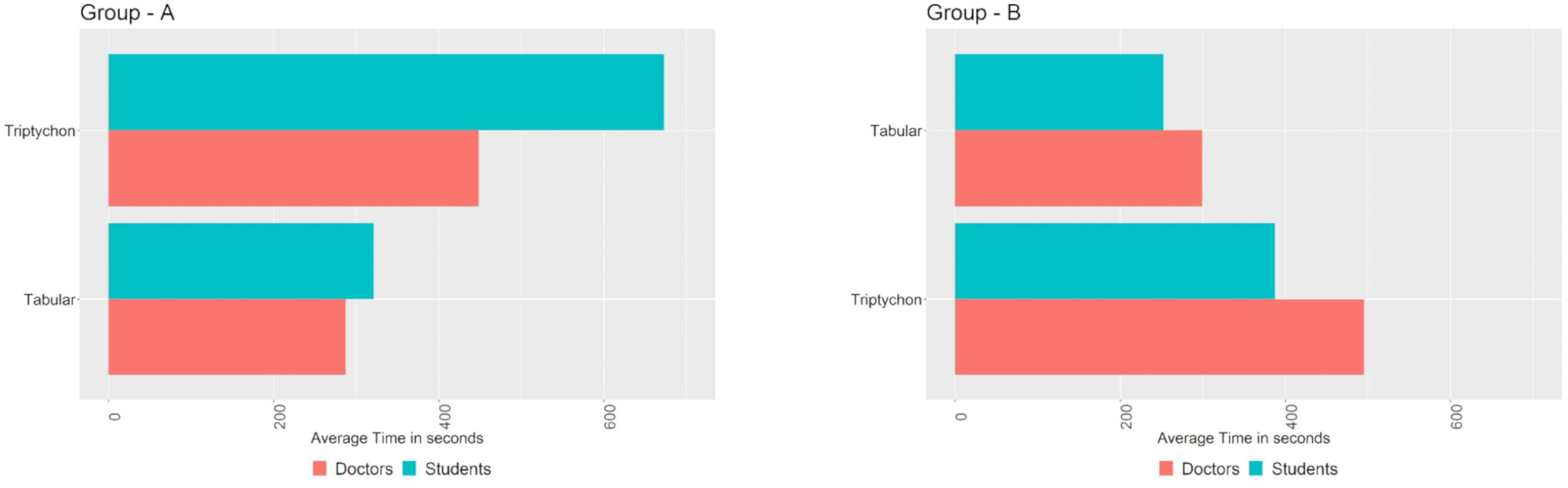
The average time taken to complete the case-related questions. Group A: Participants were given the Triptychon display, followed by the Tabular display. Group B: Participants were given the Tabular display, followed by the Triptychon display.
Questionnaires
Health-ITUES
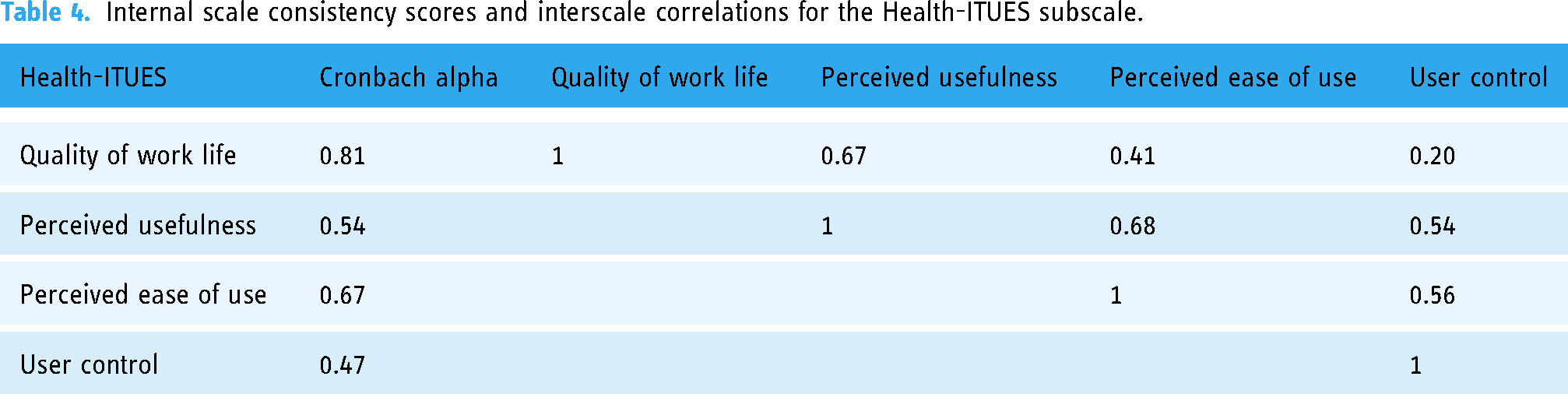
The Health-ITUES mean score was 3.70 (standard deviation (SD) = 1.0). The means, standard deviations, medians, and subscale score variances are reported in Table 3. The responses were completed for the PEU and QWL subscales. Almost two-thirds of the participants (65%) answered above average for the subscale QWL (3.94) and PEU (4.11). More than a third (45%) answered above average for PU (3.52), and nearly a third (30%) answered above average for UC. The Health-ITUES Cronbach alpha of 0.72 indicates good overall usability, with no redundant scale items. The internal consistency of the questionnaire's constructs indicates that the questionnaire is reliable. The internal consistency scale and the interscale correlations are presented in Table 4.
Descriptive statistics grouped according to the four factors of the Health-ITUES.

Internal scale consistency scores and interscale correlations for the Health-ITUES subscale.
UEQ-S
The UEQ-S was used to measure the visualisation dashboard's pragmatic quality, hedonic quality, and overall user experience. The pragmatic and hedonic quality items were assigned based on the component analysis of the efficiency, perspicuity, dependability, stimulation, and originality scales. 36 The consistency between the pragmatic quality and hedonic quality was very good (Figure 8(a)). The complementary Cronbach alpha values for the pragmatic and hedonic quality were 0.78 and 0.68, respectively. The mean value for the pragmatic scale (supportive, easy, efficient, and clear) was 1.60, and that for the hedonic scale (exciting, interesting, inventive, and leading edge) was 1.63. The overall UEQ-S demonstrated a mean score of 1.6 with SD = 0.74 (Figure 8(b)).

Results of the UEQ-S questionnaire; (a) average score of the items in pragmatic and hedonic qualities; (b) benchmark graph indicating the relative quality of Triptychon compared to other products.
Discussion
We assessed the usability and user experience of the Triptychon visualisation dashboard through a study involving 20 participants. This sample size proved adequate to conduct efficient evaluation studies to identify usability issues within the dashboard. These findings align with prior research, which suggests that conducting comprehensive usability studies with as few as 8–10 participants can successfully detect up to 80% of the inherent usability problems in a system.39–41 The primary focus of this study was to obtain feedback from the participants concerning usability issues using a qualitative approach. The emphasis was on obtaining in-depth insights and perspectives rather than statistical significance or generalisability.
Our qualitative and quantitative data indicated good usability and user experience. We used scores from the QWL and PEU constructs of the Health-ITUES, which reported the highest means, indicating that the dashboard was intuitive and easy to use. The qualitative data also provided valuable insights into the users’ feedback on the visualisation of the available data and their precedence. For our study, although we used a mixed-methods approach, we focused on the qualitative approach to identifying the shortcomings of the Triptychon dashboard.
The visualisation dashboard enhanced patients’ routine care. Furthermore, the users felt positive about the dashboard's potential uses within the context of the routine workflow at the hospital. Currently, physicians must access patient medical data from different sources. It can be highly burdensome for physicians to manage such huge amounts of fragmented data.42–44 However, the Triptychon dashboard overcomes this challenge by visualising and presenting data from different sources on a single dashboard. This is consistent with existing research; it is widely acknowledged that leveraging the capabilities of data visualisation dashboards holds significant importance in enhancing the efficiency and simplicity of healthcare analysis.44–46 It is broadly recognised that this approach has the potential to improve patient care, 47 support clinical decision-making, 48 and optimise hospital processes across various disciplines. This entails reducing the time required for data collection from multiple sources, minimising the cognitive load experienced by clinical personnel, expediting the completion of tasks, and mitigating errors. Therefore, in our dashboard, displaying only the important indicators and parameters enables physicians to see the most important values in the patient data overview. While this interface facilitates quick decision-making, it is not intended to replace other data sources. Triptychon also serves as a mobile dashboard for daily clinic use. Although this was not the focus of our study, we had a participant mention this during an interview where other organ system parameters were reviewed.
Our study participants were medical students and physicians. This helped us interpret our outcomes based on years of experience and domain knowledge. Physicians expressed interest when using the visualisation dashboard and argued for adding additional features such as absolute values and a results display to include a detailed overview of a patient's medical data. Differences between naïve and experienced participants – such as differences between students and physicians with extensive domain knowledge and years of experience – can affect interactions with presented data. 49 The careful design increases the dashboard's usability by including visualisation of fundamental data on a flexible interface capable of supporting different users with similarly different needs.50–52 Therefore, visualisation tools are only as effective as their design and implementation.
We identified opportunities for the dashboard's display, such as the colour coding, to represent high and low quintiles in the middle panel and graphically represented data. Middle panel colour coding of high and low quintile values confused many users. While the shades of blue and red represent the low and high quintiles, using the shades of blue for lower quintiles was described as misleading because lower laboratory values can also be concerning. Moreover, the participants preferred having both laboratory values and colour coding to provide an enhanced overview. In addition, the participants preferred that laboratory reference ranges be displayed at the bottom of the heat map as references. Previous studies have reported that heat maps and colour coding are more efficient and effective when reviewing the clinical data of patients.53,54 This aligns with Triptychon's task of displaying laboratory parameters using a heat map to represent the different quintiles as well as with the participants’ responses that colour coding is a valuable means of providing a practical overview of laboratory values. This contradiction could have resulted from the participants’ familiarity with laboratory values. Becoming more familiar with the dashboard may lead the users to view numbers as less important; however, additional studies are needed. Consistent training will likely improve application use.
The participants expressed a preference for the visualisation dashboard over the traditional paper-based tabular form due to its provision of additional information. Specifically, the dashboard included details on surgical interventions and vital parameters. However, contrary to the time analysis of task completion, the participants took less time to complete specific tasks when using the classic tabular form. These findings are consistent with previous studies comparing tabular and graphical data representations, where the participants demonstrated faster task completion with tables compared to tasks involving line and bar graphs.55,56 The discrepancy between participant preference and task performance may be attributed to the fact that the doctors participating in the study had several years of experience using the paper-based tabular form, in contrast to their first-time use of the visualisation dashboard. This observation is also applicable to medical students, who are trained and accustomed to using the paper-based tabular form.
Although the participants perceived the right panel's radar plots to be informative, some had trouble with navigation and data interpretation. This could be because radar plots are less commonly used for data visualisation than line and bar graphs or pie charts.57,58 Despite the familiarity of classic paper-based tables, graphically represented data can be more beneficial over time. Recurring comments from the participants dwelled on the terminology used in the visualisation. Therefore, careful selection of workflow terminology should enhance the dashboard's visual coherence.59,60 Hence, these terms will likely be different in the dashboard's next iteration. The participants found the dashboard's usability satisfactory and offered only minor changes to how the information is presented. Additionally, they performed better when presented with the visualisation dashboard after working with the paper-based tabular form, as the participants were already familiar with the type of questions/tasks. On the other hand, the participants also viewed an introductory video and requested additional training to familiarise themselves with the dashboard.
The quantitative results from the UEQ-S and the qualitative analysis showed a high user experience score. UEQ-S analysis demonstrated high pragmatic (1.60) and hedonic (1.63) ratings. Values > 0.8 are considered a positive evaluation, indicating an excellent result. 61 However, considering that the participants were recruited from a single institution, future studies should mitigate this potential bias by evaluating users in multiple locations. Users found the Health-ITUES to be usable; however, other questionnaires (such as System Usability Scale (SUS)) have been used in previous studies to evaluate the usability of dashboards displaying laboratory and vital parameters or laboratory information systems; these studies reported poor usability scores.62–64 Drew et al. (2018) attributed these results to issues with the SUS questionnaire. 65 The authors found no relationship between user preference and SUS score. They concluded that SUS scores may be more beneficial when comparing tools or when combined with formative usability testing to comprehensively depict the user's perceived experience. Similarly, in this study, we used the 20-item customisable Health-ITUES to measure usability, users’ preferences, and integration of the dashboard into the hospital's routine workflow and found high mean QW and PE subscale scores. Importantly, the Health-ITUES questionnaire has not been broadly used for evaluating visualisation dashboards and should undergo continued review once more established performance data are available.
Limitations
This study has some limitations. The German version of the Health-ITUES that we used was unvalidated at the time of the study; nevertheless, the validation process is ongoing, and importantly, the questionnaire was translated by certified translation specialists who conformed to ISO 17100:2015. 34 We recruited two certified translators for the forward and reverse translation processes to avoid knowledge bias and ensure translation uniformity. Another limitation of the study was displaying medication data on the left panel as the patients’ in-house documentation did not contain the medication information. Future studies may overcome this limitation by using Anatomical Therapeutic Chemical codes when possible. This study's notable limitation pertains to the accessibility of the dashboard for individuals with colour blindness and other visual impairments. Although this specific concern was not addressed during the testing phase of the dashboard in this study, it is acknowledged as an aspect that will be duly considered in the future development of the Triptychon dashboard.
Because the study participants were recruited from a single hospital, our results may not be generalisable to users in other locations. Thus, further multicentre studies on the evaluation of the visualisation dashboard are needed. Additionally, we designed the data for each case. This means that pseudonymous data were extracted such that all three-dashboard panels meaningfully displayed relevant patient-specific information. Other studies have also encountered similar limitations,57,66,67 which could be overcome using real-world data. Additionally, for the recruitment and selection of the participants, we did not control whether the participants matched the general cohort of doctors in the hospital. Although, we received participants from different disciplines for the study.
Furthermore, we compared users with years of paper-based workflow experience to those with only a cursory familiarity with the new digital platform. While we expect the results to improve over time, future investigations are needed to validate our findings.
Conclusion
The Triptychon visualisation dashboard emerges as a promising tool for the presentation of medical data, provide treating physicians with a concise patient overview, presenting clinical appearance, laboratory parameters, and interventions simultaneously. Through our evaluation, we have successfully identified design and layout issues that can be addressed to enhance its usability in routine clinical practice. The feedback received from target group users indicates that the inclusion of three panels on the dashboard offers consolidated data from various systems, therefore, offering a holistic view of a patient's hospital stay without replacing existing systems. These findings highlight the potential of the Triptychon dashboard as a valuable asset in healthcare settings, empowering clinicians with comprehensive and intuitive information visualisation. Further refinements and optimisations based on user feedback will contribute to the continued improvement of the dashboard's usability and effectiveness in supporting clinical decision-making processes.
Supplemental Material
sj-docx-1-dhj-10.1177_20552076231211552 - Supplemental material for Triptychon: Usability evaluation and implementation of a web-based application for patients’ lab and vital parameters
Supplemental material, sj-docx-1-dhj-10.1177_20552076231211552 for Triptychon: Usability evaluation and implementation of a web-based application for patients’ lab and vital parameters by Maximilian Kittel, Preetha Moorthy, Sonika Rao, Marie Halfmann, Margot Thiaucourt, Maximilian Strauß, Verena Haselmann, Nandhini Santhanam, Fabian Siegel and Michael Neumaier in DIGITAL HEALTH
Supplemental Material
sj-docx-2-dhj-10.1177_20552076231211552 - Supplemental material for Triptychon: Usability evaluation and implementation of a web-based application for patients’ lab and vital parameters
Supplemental material, sj-docx-2-dhj-10.1177_20552076231211552 for Triptychon: Usability evaluation and implementation of a web-based application for patients’ lab and vital parameters by Maximilian Kittel, Preetha Moorthy, Sonika Rao, Marie Halfmann, Margot Thiaucourt, Maximilian Strauß, Verena Haselmann, Nandhini Santhanam, Fabian Siegel and Michael Neumaier in DIGITAL HEALTH
Supplemental Material
sj-docx-3-dhj-10.1177_20552076231211552 - Supplemental material for Triptychon: Usability evaluation and implementation of a web-based application for patients’ lab and vital parameters
Supplemental material, sj-docx-3-dhj-10.1177_20552076231211552 for Triptychon: Usability evaluation and implementation of a web-based application for patients’ lab and vital parameters by Maximilian Kittel, Preetha Moorthy, Sonika Rao, Marie Halfmann, Margot Thiaucourt, Maximilian Strauß, Verena Haselmann, Nandhini Santhanam, Fabian Siegel and Michael Neumaier in DIGITAL HEALTH
Supplemental Material
sj-docx-4-dhj-10.1177_20552076231211552 - Supplemental material for Triptychon: Usability evaluation and implementation of a web-based application for patients’ lab and vital parameters
Supplemental material, sj-docx-4-dhj-10.1177_20552076231211552 for Triptychon: Usability evaluation and implementation of a web-based application for patients’ lab and vital parameters by Maximilian Kittel, Preetha Moorthy, Sonika Rao, Marie Halfmann, Margot Thiaucourt, Maximilian Strauß, Verena Haselmann, Nandhini Santhanam, Fabian Siegel and Michael Neumaier in DIGITAL HEALTH
Supplemental Material
sj-docx-5-dhj-10.1177_20552076231211552 - Supplemental material for Triptychon: Usability evaluation and implementation of a web-based application for patients’ lab and vital parameters
Supplemental material, sj-docx-5-dhj-10.1177_20552076231211552 for Triptychon: Usability evaluation and implementation of a web-based application for patients’ lab and vital parameters by Maximilian Kittel, Preetha Moorthy, Sonika Rao, Marie Halfmann, Margot Thiaucourt, Maximilian Strauß, Verena Haselmann, Nandhini Santhanam, Fabian Siegel and Michael Neumaier in DIGITAL HEALTH
Supplemental Material
sj-docx-6-dhj-10.1177_20552076231211552 - Supplemental material for Triptychon: Usability evaluation and implementation of a web-based application for patients’ lab and vital parameters
Supplemental material, sj-docx-6-dhj-10.1177_20552076231211552 for Triptychon: Usability evaluation and implementation of a web-based application for patients’ lab and vital parameters by Maximilian Kittel, Preetha Moorthy, Sonika Rao, Marie Halfmann, Margot Thiaucourt, Maximilian Strauß, Verena Haselmann, Nandhini Santhanam, Fabian Siegel and Michael Neumaier in DIGITAL HEALTH
Supplemental Material
sj-docx-7-dhj-10.1177_20552076231211552 - Supplemental material for Triptychon: Usability evaluation and implementation of a web-based application for patients’ lab and vital parameters
Supplemental material, sj-docx-7-dhj-10.1177_20552076231211552 for Triptychon: Usability evaluation and implementation of a web-based application for patients’ lab and vital parameters by Maximilian Kittel, Preetha Moorthy, Sonika Rao, Marie Halfmann, Margot Thiaucourt, Maximilian Strauß, Verena Haselmann, Nandhini Santhanam, Fabian Siegel and Michael Neumaier in DIGITAL HEALTH
Footnotes
Contributorship
PM, NS, and SR drafted and prepared the original manuscript. MN is the principal investigator of the study. PM, NS, SR, MK, FS, MT, and MN developed the concept and design of the study. All authors contributed to the work, discussed the results, and approved the submitted version of the manuscript.
Declaration of conflicting interests
The authors declared no potential conflicts of interest with respect to the research, authorship, and/or publication of this article.
Ethical approval
The study was conducted according to the guidelines of the Declaration of Helsinki. The study was approved by the Ethics Committee II of Heidelberg University (# 2021-662).
Funding
The authors disclosed receipt of the following financial support for the research, authorship, and/or publication of this article: This work and authors FS, NS, and SR were supported by funding from the German Ministry for Education and Research (BMBF) within the framework of the Medical Informatics Initiative (MIRACUM Consortium: Medical Informatics for Research and Care in University Medicine; 01ZZ1801E). For the publication fee we acknowledge financial support by Deutsche Forschungsgemeinschaft within the funding programme “Open Access Publikationskosten” as well as by Heidelberg University.
Guarantor
The Guarantor of this article is MK.
Supplemental material
Supplemental material for this article is available online.
References
Supplementary Material
Please find the following supplemental material available below.
For Open Access articles published under a Creative Commons License, all supplemental material carries the same license as the article it is associated with.
For non-Open Access articles published, all supplemental material carries a non-exclusive license, and permission requests for re-use of supplemental material or any part of supplemental material shall be sent directly to the copyright owner as specified in the copyright notice associated with the article.