
Abstract
In this study, we analyze city governments’ public presentations of their data-centered projects as a form of data storytelling and reveal how the documents adopt contrasting data presentation techniques to construct and activate two unique ideals of data-driven governance: urban service management and social reform. When reiterating the familiar narrative of data-drivenness as real-time monitoring and optimization of services, documents demonstrate accomplishments in numbers and keep most of the cities’ data work hidden from the public. In contrast, the emerging narratives of social reform suggest city governments as leaders committed to tackling structural injustices through data-driven approaches and invite the public to interrogate their data work through interactive, open-ended data visualizations. However, we argue that the increased visibility of government data and delegation of power to citizens signaled by the social reform narratives do not succeed in challenging the dominant epistemology or power hierarchy in data-driven regimes. Instead, the signaled values are leveraged to justify an ideal of entrepreneurial citizens in the documents which is still exclusionary. This finding suggests that scholars and civic societies take more nuanced approaches to demands for government transparency and accountability, as well as calls for more attention to the political effects of these mundane forms of data communication between governments and their constituents.
Introduction
Activities around data are core parts of everyday practices in city governments. Government agencies collect data, build databases, and develop algorithms and dashboards to inform the public and influence decision-making in hopes of effective service provision and cohesive governance. Often, these activities are invisible to the public as they happen behind the walls of government institutions. However, following recent open data movements and continued critiques from activists and scholars of data justice (Dencik et al., 2019; Schrock, 2016), city governments have begun to publish their data and promote outward-facing data-centered projects to the public through online channels such as open data portals and other official websites of governmental bodies. Advocates for open data policies have considered these public communications as signs of increased governmental transparency and accountability (Mayernik, 2017; Schrock, 2016).
However, in this paper, we argue that the increased visibility into governments’ data work provided through public presentations of their data-centric initiatives can also be leveraged to justify and activate particular government–citizen relationships within a “data-driven” future. This argument emerged from our analysis of materials from two US cities renowned for their investments in data-centered renovations of administrative systems. When analyzing the documents, we did not read them as a window to what city public agencies actually do with their data infrastructure. Instead, we viewed them from an organizational storytelling perspective (Boje, 2008; Lane, 2023), where the narrators leverage symbolic and performative functions of data to justify certain claims to internal and external stakeholders. This view allowed us to shed light on the different ideals of a data-driven city and its citizenry suggested by the documents and the contrasting techniques of presenting numbers and data visualizations that reify the ideals respectively.
In the following sections, we illustrate how the documents showcased on the cities’ public websites present starkly differing stories on what good data-driven governance means by narrating the cities’ data-centered initiatives with numbers, charts, and interactive maps—we name them the urban service management and social reform narratives, respectively. To give a quick summary, when cities focused on efficient service delivery, they tended to reduce urban problems to single, measurable indicators. Inspired by the managerial view on governance found in these narratives, we call them urban service management narratives. Metrics included in these documents focused on favorable trends, and thus, the documents signaled that the city is already being efficient and effective. Specific details about how exactly they produced analytical insights from the data and applied them to increase efficiency were withheld. The imagined audience for these documents is a population whose “collaboration” with the city centers on simple data collection efforts, such as reporting local problems through a form.
In contrast, social reform narratives told the story of governments as social reformers attending to larger structural issues, and employed descriptive analytical techniques arguably to understand the cities’ problems better. By sharing the analytical work with the public in more exploratory ways, the documents signaled that the city is committed to solving intractable problems, such as structural racism and inequality, and invited the audience to join the city’s data-driven efforts. That said, the presentation of data that depicted the government as open, inclusive, and transparent to the audience still only speaks to an exclusive set of citizens who are tech-savvy collaborators with the time, resources, and expertise to “innovate” using city-provided data. The same sets of skills and resources were required to engage with the seemingly open, inviting data visualizations in the documents.
Based on our findings, particularly from the documents suggesting the SR narratives, we discuss how the increased visibility of governmental data works and gestures of delegating power to the public found in the documents may not succeed in bringing meaningful transformation in epistemic culture or to the power hierarchy between governments and their constituents even under the claim of improving equity and justice. To the discussions around transparency and accountability in governments, this insight suggests that scholars and civic society members advocating for democratic governance and data justice adopt more nuanced approaches to their demands for these qualities of governments. More broadly, by showing how the documents construct and enact particular power relations and modes of participation in governance around data, we call for greater attention to these rather mundane government communications as a site of critical engagement to challenge and reshape the narratives underlying governmental data technologies.
Data storytelling in organizations
In this study, we read governments’ public presentations of their data initiatives as a kind of data storytelling—storytelling of and with data. Management scholarship has shown how, through the telling of stories, organizations create and reify their identities and establish certain visions about shared values and actions (Boje, 2008; Vaara et al., 2016). Furthermore, compelling organizational stories can induce stakeholders to buy into the vision embedded in the story and act in alignment with the organization’s goals and objectives.
Within the realm of government, scholars have shown how officials leverage storytelling techniques in speech, promotional materials, and policy reports to encourage a variety of stakeholders to vote, invest, and participate in their policy plans and actions (Lane, 2023; Sanders, 2019). Outstanding examples of the power of storytelling in government can be found in studies of smart and data-driven cities. For example, in their study of a US city government’s public communication around its digital inclusion initiative, urban geographer Wiig (2016) shows the power of officials deploying narratives of the “smart city” in government materials, attracting investors and potential employees in the tech sector. Taking a similar narrative approach, critical information scholars Sadowski and Bendor (2019) analyzed the promotional materials of information technology companies such as IBM and Cisco and argued that these materials present the companies’ products as attractive to city governments by telling a story of their products as the obligatory solution to numerous urban problems.
However, the narrative lens found in these studies has rarely been applied to studying another kind of rich data storytelling in smart cities: showcasing cities’ data-centered projects on their open data portals and other public-facing websites. Cities’ open data portals, though primarily built for sharing governmental data with the broader public, also present various materials that provide examples of activities and tools that users can create using data from the websites. The examples include citizen-led projects coming out of civic hackathons and workshops, but more often, they present governments’ data-centered projects in the form of text descriptions combined with interactive charts and maps. Studies on cities’ open data portals have been primarily interested in examining how the portals support government officials, community groups, and other stakeholders share and use data more effectively (Ruijer et al., 2017; Schrock and Shaffer, 2017). Thus, practices of collecting, sharing, and using data through the portals were the main subjects of the studies. Meanwhile, it is left unattended what the materials presenting the “best practices” of cities’ data-driven governance do as part of the key site of governments’ communication with the public.
Overlooked in this body of literature is, therefore, the question of what stories these public presentations of city data projects tell us by narrating particular data practices as exemplary and how data’s symbolic and discursive functions play out in these stories. Regarding the first question, one hypothesis can be that the stories tell the audience about what “good” governments and citizenship mean under a vision of data-driven governance. The fact that these stories are showcased as the “best practices” of government agencies or other users of governmental data makes this a reasonable assumption. In addition, governmental practices around open data movements have been active sites of promoting certain ways of civic participation in governance (Irani, 2015, 2019; Schrock and Shaffer, 2017). For example, based on her ethnographic study in “open governance”-themed hackathon sites in India, science and technology studies scholar Irani (2015) argued that rhetorics and practices found in the hackathon events facilitated entrepreneurial attitudes toward social problems and suggested quick technical solutions as seeds for innovation and economic progress in the country.
About the second question on what data does to make these stories compelling, we know from studies on organizational communications in various domains that data signals qualities such as legitimacy, authority, and expertise in many societies (Fiore-Silfvast and Neff, 2013; Mazmanian and Beckman, 2018). The studies also argued that data does not need to be accurate and factual to have value-signaling effects. Related to the context of this study, information scholar Currie (2020) argues that city officials in Los Angeles were cognizant of the power that resides in how they presented data products—interactive maps and dashboards—on the city’s open data website. By showing a quantified record of accomplishments, officials aimed to convince their audience of a trajectory of success. Furthermore, by selectively hiding how data is processed and used to inform decision-making, officials engaged in public “mystification”—idealizing their work and rendering it resistant to public doubts. Drawing on the dramaturgical theory of self-performance (Goffman, 1990), Currie argued that the city employees practiced impression management through data presentations. Relevant to our interest is then how these techniques of impression management activate particular relationships between government and citizens.
Communication and media studies have shown that data visualizations—from a simple chart to interactive maps with dynamic user interactions—make stories more engaging in terms of readers’ increased willingness to take suggested actions (Weber et al., 2018) or longer attention time (Engebretsen et al., 2017). Furthermore, advanced interactivity designs in digital storytelling can upend classic narrator–reader relations. For example, through actively manipulating the interactivity of visualizations (e.g. scrolling, zooming, and selecting variables and visualization methods), data stories can bestow different levels of control over the narrative to the audience/users (Weber et al., 2018). A key tool for building interactive data stories commonly used by municipal governments is ArcGIS Story Map, a web application for building interactive map visualizations combined with narratives (Roth, 2021; Scott et al., 2016). “Reading” a story narrated through Story Map is an interactive experience that combines spatial data and narratives. As users scroll through the story, maps, charts, and images corresponding to each section of the story pop up. Researchers in public administration report that Story Maps are effective tools for public education and collaborative decision-making, as the format helps the participants to perceive the issues at stake as more relatable and subject to their decisions and actions (Cope et al., 2018; Scott et al., 2016).
Together, these studies suggest that how governments present data initiatives through text and data visualizations (called “data stories”) can enact particular government–citizen relationships and, in so doing, have direct political consequences on the lives of the citizenry. We claim that scholarship on smart and data-driven cities would benefit from increased attention to how data stories function in public-facing materials, especially since a key concern in this body of research is understanding power imbalances between governments and constituent groups under data-driven governance regimes (Irani, 2015; Mattern, 2021; Powell, 2021). Following this claim, in this study, we analyzed materials presenting and narrating cities’ data-centered projects to the public through a lens of data storytelling, focusing on what relations the documents enact between the city governments and their constituents.
Data: Digital documents showcasing data initiatives in two US cities
We sourced our analysis materials from two major US cities that present themselves as “data-driven” (as described below): Boston and Los Angeles (LA). Both cities had public-facing websites where they presented multiple data-driven initiatives. By investigating materials from the two cities, rather than from a larger group of cities, our intention is not to construct a comprehensive argument about local data initiatives across all cities in the United States (or the world). Instead, the objective of this analysis was to examine and demonstrate the analytical value of reading governmental presentations of data work as organizational storytelling. Therefore, we also do not explicitly compare the data stories presented by Boston versus LA. Rather than take a comparative lens, we see each data initiative presented in either the Boston or LA portals as a unique object of analysis.
The city of LA has been an active site of critical research and advocacy activities since the 2010s, as the city launched several data-driven initiatives under the purview of public service management (Currie et al., 2016; Eubanks, 2018). The city has a history of geographic segregation between different classes and ethnic groups (Rothstein, 2017), and there have been growing civic demands for the city government to address the inequalities that originated from this history and were heightened during the COVID-19 pandemic. The strong drive toward data-driven reform of the city’s administrative systems is part of the city’s effort to address this criticism. In 2020, Mayor Garcetti (2013–2023) ordered all 36 city departments in the city to develop metrics to monitor and evaluate their performance with data- and evidence-based approaches. 1
The trend of adopting data-driven initiatives to address citizens’ demand is also found in Boston, but somewhat differently. In Boston, the city government’s investment in technological innovation in administrative processes started as early as 2010, when former Mayor Menino founded the Mayor’s Office of New Urban Mechanics (Crawford and Walters, 2013). This office was tasked with launching a new customer relationship management (CRM) system that aimed to leverage digital technologies to connect local partners and citizens. The rhetoric used to motivate the investment in the CRM system reflected the city’s focus on enhancing citizen “participation and collaboration” broadly construed (Crawford and Walters, 2013). For example, the city invested extensively in building a 311 app, a mobile app that allows people to submit public service reports and requests to city agencies.
In both cities, developing an open data policy was seen as a key aspect of promoting data-driven reform of city government. As a result of this broader narrative about the connection between open data and reform, LA and Boston both host and maintain open data portals. Also, the cities similarly showcase selected city data initiatives on the landing pages of their data portals. These showcasing sections have titles such as “Featured Stories,” “Applications,” or “Learn about our work,” which signal that these materials are intentionally curated for public presentation (Figure 1).

Landing pages of the open data portals in Los Angeles and Boston.
In our sampling process, we limited our object of analysis to the materials presented under these showcasing sections on each city’s open data websites and their data team’s websites linked in the open data websites. Materials presented under these sections took various formats, including web pages with static text and images, downloadable portable document formats (PDFs), and more interactive forms such as scrollable web articles with embedded interactive maps and charts. These more interactive data stories were created using commercial software packages for producing and sharing data visualizations, such as ArcGIS Story MapTM and TableauTM. We accessed these websites first in January 2022 and went back to them sporadically until March 2022. During that period, there was no change to the materials that appeared on the web pages we sampled from.
After reviewing each document in our initial data set, we narrowed down the corpus, focusing directly on data stories. Specifically, we looked for documents describing data initiatives’ goals, mechanisms, and outcomes and excluded documents presenting a web application or an interactive map without accompanying narrative elements. For example, we included a Story Map from Boston that illustrates an analysis of the city’s climate change resiliency. However, we excluded the “Rent Smart” web application, which provides a portal for Bostonians to search for available units. We also excluded content presenting citizen-led projects, given that our focus was on what stories members of government organizations tell in presenting their internal data works to the public and how they make the stories compelling. In our final dataset, all the documents’ authors were affiliated with the city government as full-time employees or interns in city departments at the time of authorship.
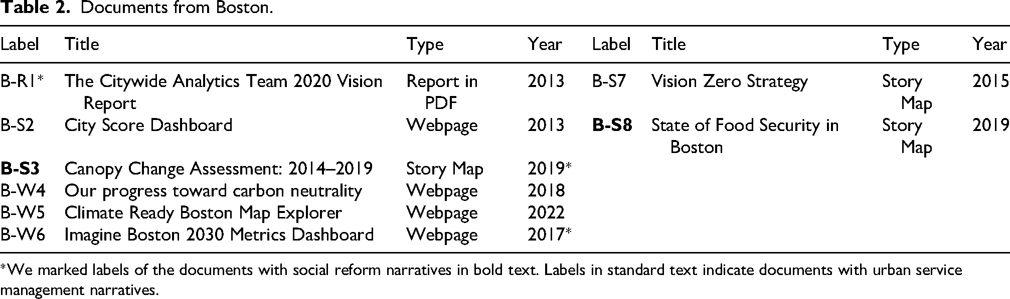
In LA, these sampling criteria led to a final sample of 12 documents: six from the city’s open data portal (LA Open Data Portal) and the other six from the geospatial data repository (GeoHub) (Table 1). The documents were found under sections named “Featured Stories,” “Applications,” and “Data In Action.” In Boston, the sampling criteria led to eight documents (Table 2). We found four documents from Boston’s open data portal (Analyze Boston) and two from the city’s map repository (Boston Maps). Similar to the open data portal in LA, Boston’s open data portal presented selected city data projects on its landing page under “User Stories.” The city’s map repository did not showcase maps on its landing page but had a separate tab called “Gallery,” where we found two documents that met our criteria. In addition, Boston’s CityWide Analytics team, which managed the city’s open data portal, had a webpage dedicated to the team with a section showcasing the team’s work in recent years. We collected two documents from this webpage: the city’s “City Score” dashboard and the CityWide Analytics team’s 2020 vision report.
Documents from Los Angeles.

Documents from Boston.
Throughout the paper, we refer to each document by either its original title or a shorthand in which we combine the first letter of each city’s name, the type of the document, and its number—for example, L-S1 stands for the first document in Story Map format from LA. We listed the documents and their shorthands in Tables 1 and 2.
Analysis
We conducted an inductive coding analysis to understand how these documents built a story around their data initiatives. Since the documents included heterogeneous communication elements, including text, images, and interactive elements, we adopted the multi-modal discourse analysis method (Gee, 2010). With the proliferation of visual communication online, critical discourse studies scholars have shown the usefulness of the multi-modal analysis method that understands visual elements as texts (Kress and Leeuwen, 2020), especially in analyzing data visualizations and their discursive effects in narrative building (Doerr, 2017). Following this perspective, we analyzed how textual and non-textual visual elements (maps and charts) interact with each other. In addition, drawing from studies of data storytelling and visual narrative building (Doerr, 2017; Weber et al., 2018), we examined the visual and interactive design of data presentations in the documents and how they shape the author-audience dynamic in the materials.
Throughout the analysis, the first two authors coded the documents together, comparing their results iteratively until they reached an agreement. We did not use QDA software but exported the web materials into screenshots and PDFs and marked our codes directly on those materials. We met regularly with the third author to discuss coding strategies, review data, and brainstorm emergent findings. Early into these conversations, we began to untangle the different narratives with which the documents framed their problems and how they introduced data as a “solution” to the problems (Dimension 1). Over time, we honed in on two distinct narratives: documents either (1) focused on improving efficiency in delivering a single public service represented in an indicator or (2) set out to tackle social injustices and inequalities by understanding the problems better with data. Using these broad categories as a guide, in the next rounds of coding, we delved deeper into how these narratives were constructed and, in so doing, how they fostered particular forms of engagement with an imagined audience. Specifically, we re-coded the documents around two narrative elements: how much of the government’s data work is made visible to the audience and in what format the information is presented (Dimension 2), and what kinds of actions the documents suggest the government and their constituents could respectively take in response to the issue/data presented (Dimension 3).
These three dimensions allowed us to explore how the documents adopted different styles of data presentations to justify different visions of data-driven governance. We named the two unique narratives that situate data as a solution to urban problems, Urban Service Management and Social Reform. When documents in our sample set out the story with one of those narratives, they tended to adopt a similar strategy in visualizing and narrating the government’s data work through certain combinations of text, visuals, and interactive design. This tendency allowed us to analyze the documents in two loose groups (Table 3).
Three dimensions of data storytelling around city data projects.

We do not argue for a strict categorization of documents into the two discrete groups. Not every document strictly followed the grouping across all three dimensions. For example, the “High Injury Network” in LA focused on the issue of reducing car accidents in the city and presented a map visualizing the number of accidents per road segment. Its focus on a single quantified phenomenon and presentation of a key performance indicator (KPI) is typical of the USM vision. The document, however, also presented a map of the community equity and health equity indices, which were commonly found in documents promoting an SR vision. Nonetheless, because the document only attached the maps at the bottom of the document and did not situate the problem in relation to the quantified disparities, we analyzed the document as part of the USM group. Again, our objective was not to suggest an exhaustive typology of data-driven city narratives, but to understand how cities adopt data visualizations to construct and justify different visions of governance, and the grouping of documents was done according to this objective.
How data is a solution to city problems
We found that it was typical for authors to first describe an urban problem in the public-facing documents and then use this framing to explain and justify a broader data initiative. While our data set contains data initiatives motivated by a wide variety of problems, we found strong alignment in how these problems were framed. Specifically, we found that introductory language coalesced around one of two distinct narratives, each providing a different perspective on the nature of urban problems and how data becomes useful in addressing the issues.
In approximately half of the stories in our sample, the language framing the data initiatives centered on using data to make concrete, incremental improvements to the city’s internal operation or delivery of a particular city service. When introducing problems, the narrators of these documents pointed the audience to a single quantitative indicator, such as the long average wait time for 311 call responses (B-S2) or the high number of car accidents in different street segments across the city (L-S8). Problems were not situated in historical contexts or narrated in a way that explored potential relationships to other problems. Instead, the documents highlighted a need to measure and monitor discrete problems in real-time. Implicit in the framing language of these documents was a claim that data initiatives would help inform city agencies where problems are concentrated, thus prompting actions to shift specific data indicators in a positive direction. Data indicators were then linked to broader outcomes, such as improving the responsiveness of city departments (B-S2) or the efficiency of internal operations (B-R1) (Figure 2).

Screenshots of a webpage presenting the City Score project (B-S2). This project was showcased on Boston’s open data portal.
The name we gave to this narrative, Urban Service Management (USM), captures its emphasis on the efficient provision of quality services as a primary goal of urban governance, which is characteristic of the managerial model of urban governance. In the US, the managerial model originates from the public administration reform in the 1970s, which adopted the evidence-based management practices from the private sector (Harvey, 1989). Later, quantitative performance measurements and cost optimization have been combined with advanced data technologies and provided a ground for more recent technocratic governance models such as smart city or data-driven governance (Hollands, 2008; Kitchin et al., 2015; Powell, 2021). The way USM documents introduce data as a solution to urban problems reiterates some elements of these well-studied (and frequently critiqued) narratives, including scoping urban problems into a single service provision with a concomitant service provider–client (Kitchin et al., 2015). With this narrow scoping, these data initiatives promise not only to elucidate the source of issues but also pinpoint responsibility for addressing them.
In contrast, the other half of the documents in our sample took a very different approach. The framing language of these initiatives envisions urban problems as complex structural issues that can only be understood by combining data from multiple sources. The authors introduced this narrative by highlighting the complexity of long-standing problems. All but one document in our sample that took this view on urban problems began by acknowledging the city’s long-standing, pervasive spatial and social inequalities and the government’s responsibility for causing or perpetuating them. These narratives also emphasized the structural nature of issues and implied that such issues cannot be addressed without a comprehensive understanding across multiple dimensions of urban lives. For instance, in a document presenting a project related to public health policy, the authors argued that “the overlapping crises of structural racism, [and] social injustice …demonstrate that steps must be taken …at all levels of City Planning” (L-S4).
Following this directive, data initiatives framed with what we call an SR narrative took on a broader institutional scope, bridging multiple data sources, including data from local government programs and demographic data from the census. These narratives further emphasized that the utility of data lies in its ability to illuminate urban complexities. For instance, in the LA Guide for Healthy Building and Healthy Place (L-S4), the narrators argued that “data-informed snapshots” of the complex situation are key to identifying disproportionately burdened areas and understanding the causes of these disparities. Getting these “snapshots” often meant quantitatively mapping the geographic distribution of resources by area and overlaying those maps with various socio-demographic factors (L-S1 and L-S2). In other cases, comprehending urban complexity meant creating a composite indicator by combining distinct measures into unified metrics. In a particularly salient example, the LA Controller’s Equity Analysis (L-S7) attempted to construct a single metric that measures “equity” for each census tract by combining data on housing rent, income, pollution, educational attainment, and internet access.
The narrative of using data-driven approaches to improving equity and justice in cities has rarely been reported in the studies of smart and data-driven city discourses. Using statistical techniques to combat urban social disparities has a long history (Battle-Baptiste and Rusert, 2018; Williams, 2020), yet we notice that such initiatives have been rarely associated with contemporary smart city narratives (Powell, 2021). Only recently, scholars have observed narratives from city governments that pose addressing urban disparities and social injustices as the primary motivation for adopting data-centric practices and systems in city governance (Joss et al., 2019). In the US, the rise of SR narratives might be driven by recent policy mandates from federal and state governments in response to the COVID-19 pandemic and civic uprisings. 2 The name “Social Reform” captures the calls in these orders to “reform” the governmental processes in equity and justice lenses.
In short, in the USM narratives, quantitative metrics are introduced to make a single solution seem inevitable and sufficient. In contrast, the SR documents introduce metrics intended to spark deeper analyses of the observed phenomena. Though wildly different in specifics, both groups of documents present a particular view of the utility of data and specific analytical techniques to justify the view. It is worth emphasizing that data analysis techniques proposed in the SR documents still heavily rely on the positivist way of knowing. The comprehensive indicators in the SR documents were generally aggregates of similar metrics found in USM approaches—data on concrete phenomena that are easily quantifiable and measurable. Whether the methods provide the insight purported by these documents is an open question. Another question, which we address in the next section, is to what degree and how the authors grant the audience access to their data analysis processes.
Visibility of data work
Following the stories that introduce data as a solution to urban problems, the narrators illustrated specific data initiatives of theirs to the audience, leveraging various data storytelling techniques. A key difference we see between USM and SR documents is their approaches to presenting (and simultaneously omitting) details of the “data work,” or information about how the data were collected, analyzed, and presented. We find that documents telling an SR story share more information with the audience and give them more control over the interpretation of governmental data. However, we also find that the data presentations in the SR documents tend to inadequately support the authors’ claims, thereby undermining their vision of a data-driven remedy to injustice. Furthermore, to recognize the flaws, readers must have substantial skills and knowledge of institutional data languages.
When promoting the narrative of USM, authors presented particular accomplishments as data-driven. For example, the City Score document (B-S2) highlighted two cases where the scoring system purportedly induced direct improvements in city service delivery. According to the authors, tracking the number of Emergency Medical Services calls encouraged the city to allocate more funding to the service and reduce call response times. The Analytics Vision Report from Boston’s analytics team (B-R1) similarly introduced their data projects, stating that the analytics team’s algorithms, data automation, and visualization projects made the operations of other city departments more efficient. These assertions were accompanied by numbers demonstrating the improvements: “91% of the streets are clean” (L-S10), “sign installation increased 21% in just 6 months” (B-S2). The amount of data collected and processed, such as the number of pull requests closed and datasets compiled, is also presented as proof of the city’s effective internal operation (B-R1). Signaled by this presentation of accomplishments in numbers is that data, as the authors claimed earlier, has already been improving city operations.
Aside from the numbers demonstrating measurable outcomes, the USM documents rarely provided readers with details about how the numbers were generated or processed. Neither did they outline how the claims of outcomes were derived from data. And none of the documents introduced above invited the audience to explore the data or examine the data-driven insights presented by the authors. For example, the City Score document stated that 81% of the calls were addressed in a timely manner since the deployment of the City Score system, but did not specify details that would make this metric meaningful, such as what response rate was before deployment and other factors that could affect the response rate. User engagement was also rather limited in the documents. Charts and tables were rarely interactive, and even when they provided an interactive map (L-S9 and L-S10), readers could not turn on or off layers, which allowed a limited room for readers to question and explore the claims through the map. Such limited, prescribed interactivity was the authors’ choice. Because the documents were created using Story Map, it was possible to present maps in a much more interactive, exploratory way. In other words, within the USM documents, the audience is expected to accept the authors’ claims at face value without full knowledge of where the data originates, how it is analyzed, and/or how it could be viewed differently.
In contrast, documents promoting a more SR narrative made the cities’ data work more visible to the audience and explicitly invited them to interrogate the data and analytical results through interactively designed visualizations. Taking the form of analytical reports, these documents bolstered the findings from their analyses with descriptive, interactive, and open-ended presentations of data. The most common form of data presentation in these documents in our sample was map-based storytelling created using ArcGIS Story Map. Nine of 10 documents promoting an SR vision adopted this format and presented interactive maps visualizing geographic disparities in economic, social, or health conditions. Text next to each map provided context for the map and narrated the insights the authors gained from the presented data. When they developed a certain analytical or data collection method, such as in the Emergency Rental Assistance Program (ERAP) Evaluation project (L-S1) and the project Mapping Black Owned Businesses (L-W3), the authors also described their method before or next to the data visualizations. By zooming in and out, or turning on and off different layers, readers could interrogate how the authors’ analytical claims are linked to the data visualizations presented in the documents. This style of presenting data, which invites the public to explore the data, was found in all seven recent LA documents (LS1–LS7) and the Food Security map in Boston (B-S8).
The images of government that this interactive data presentation reveals in the SR stories diverge significantly from what the invisible, prescriptive style of data visualization signals in the USM stories. As illustrated above, the SR documents develop a more open relationship with the public. These documents present information about how the city analyzes and interprets data, inviting more public scrutiny and engagement than USM documents do. Signaled here is a more transparent government, one that delegates more agency to its citizens. The way the documents make the impression of a trustworthy performer also differs markedly from the others. In the USM documents, presenting past accomplishments in quantified form was the main mechanism for earning trust. In contrast, when delivering the SR vision of a data-driven city, documents did not present any past outcomes to the public. Instead, they reiterate through the interactive maps the spatial disparities that are presumably already well-known and experienced by their audience, making the story relatable and appealing to the audience (Boje, 2008). Presenting the interim findings of their analysis is also aligned with the proposed goal of better understanding the problems, which is another factor that can convince the audience to see the authors as trustworthy.
However, we found that the data storytelling in the SR documents also carries several issues in its execution that undermine its legitimacy and credibility. In some documents, the authors’ interpretation of data was not well-grounded in the evidence they provided. In the Capital Improvement Equity analysis, the authors claimed a relationship between the age of infrastructure and the number of odor complaints. They did so by presenting the maps of the two variables side by side (see Figure 3). However, not only did the graphic not contain any numeric scale or explicit statistics, but the maps also did not even visually appear to be correlated. Similarly, in the ERAP evaluation document, the descriptive maps indicating the counts of applications to the emergency rental assistance program relative to the estimated need for assistance in each area failed to show what made the application rate for the assistance program in one neighborhood higher compared to others. Yet, the authors assumed a difference in access to information among those neighborhoods caused it.
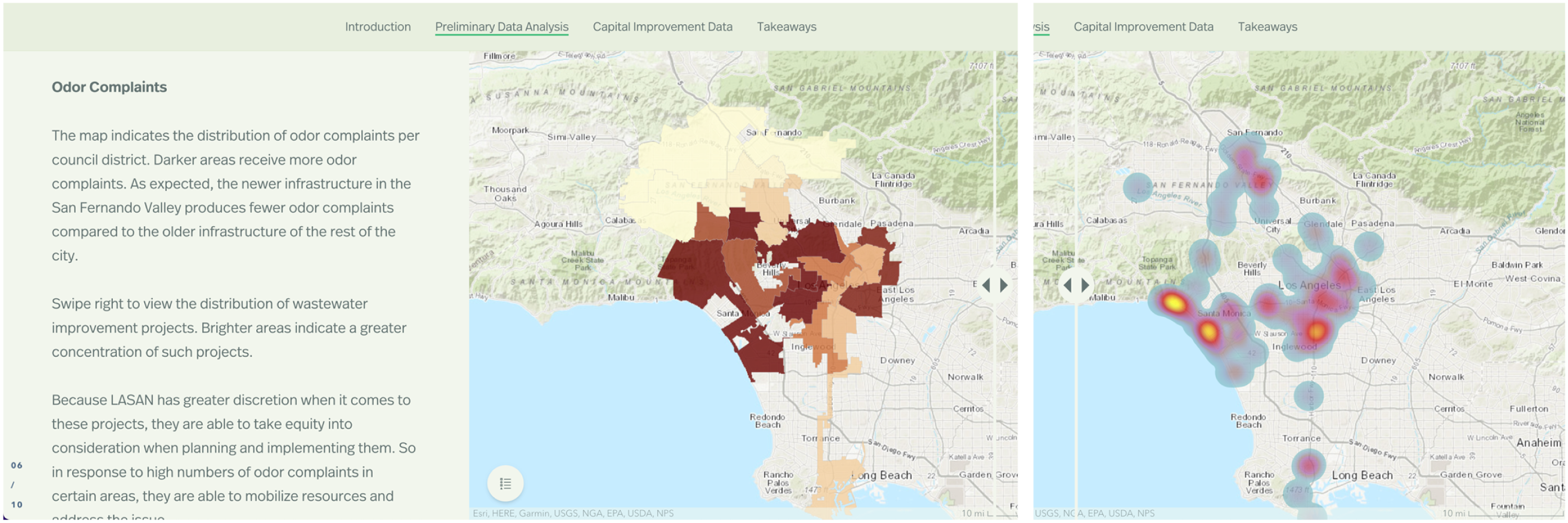
An interactive map from the LA Capital Improvement Analysis story map (L-S5).
While some of these problems relate to how data analysis techniques are executed, we argue that these dissonances in data storytelling reveal the inherent tension in the vision of finding solutions to structural problems through reductive quantification. The narrators of SR stories state a desire for different epistemological tools—broad contextual understanding, holistic analysis—to address structural problems. However, their method still proceeds from the premise that complex social phenomena can (and should) be captured by the simple measurements of needs and supplies and does not invite alternative sources of knowledge and practices, such as communities’ lived experiences and their needs expressed in their voices. Scholars have argued that geographic patterns of social disparities can only make sense when understood with the historical relations between public institutions and different social groups living in the cities (Cruz, 2020; Rothstein, 2017). However, efforts to achieve such understanding, at least in what is presented to the public, aren’t part of the cities’ knowledge practice. Rather, the documents employ the flawed analysis to support simplistic causal relations and highlight the power of data to decipher the complexity of urban problems.
If a reader notices such inconsistency or flaws in a narrator’s story, the narrator and their story lose trust (Austin, 1975). However, a reader also needs certain knowledge and skills to analyze the story and detect its weaknesses. Indeed, data presentation in SR documents requires the audience to have a high degree of patience and data literacy to follow and question the authors’ interpretation of what the visual analyses tell us about. This condition raises a question about whether the visuals were presented to be actually read and played with by the audience, and in either of the cases, who the presumed audience is. In the next section, we answer this question by examining the calls for action found in the documents.
Actions justified by data presentation
Along with diverging orientations to “data work,” the narratives that animate USM and those that animate SR documents suggest distinctly different actions that the city and its citizens should take.
As illustrated in the previous section, within the USM narrative, both the data and the framing of the data are cultivated to present the message that the city is already taking care of the identified problems using data-driven technologies. A notable example of this narrative is from Boston’s Citywide Analytics Report, where the authors argued that their real-time energy usage dashboard and cleaning of building data had saved staff time by presenting the number of hours saved and city staff’s feedback on the projects (B-R1). In this narrative, the city does not owe its citizens any particular action. Instead, the authors promised to continue expanding current efforts to improve efficiencies, such as data collection, monitoring, and data-driven decision-making (L-S8, L-S10, L-S12, B-R1, and B-S3). The city’s previous accomplishments, demonstrated by the metrics, justified these actions (B-S3). Further justification was provided by a comparison to global standards. A document about Boston’s progress toward carbon neutrality touted that “like many cities leading on climate action,” the city monitors greenhouse gas emissions in a way aligned with “international standards” (B-W4). In this narrative, a city can continue being successful without radically changing its current practices. All that is needed is more intense datafication of urban lives.
Under this statement, the narrative of USM situates the audience in a client/data relationship with the city. The authors solicit the audience to provide controlled feedback on pre-defined issues. A common move among these narratives was to share performance indicators with the public and explicitly invite the public to monitor the city’s work using said indicators (B-S3, B-S7, and L-S10). These documents did not solicit readers’ input on what measurements would be useful in addressing current problems, or how to conceptualize or design useful indicators. Instead, the authors of these documents direct public input through narrow channels: asking people to enter concerns in a portal (B-W6); fill out a survey (B-S2); or report a problem via the 311 information app (B-W5) or hotline (L-S10). These inputs from the public—the users of the city’s services—were to feed back into the city’s real-time monitoring system to improve city systems further.
The more open-ended and descriptive data visualizations, with better visibility into data processing, typical of the SR documents set up a different relationship with the public. In the documents, narrators invite the audience into conversations about how to move forward and suggest more radical changes in city practices. In the concluding sections, SR documents proposed that cities do more data work to “dig deeper” into the “patterns of inequity” (L-S1 and L-S5), by developing a better “data infrastructure.” Examples of proposed infrastructural changes included advanced data collection systems on businesses owned by racial minorities (L-W3) and a data-sharing system between city agencies (L-S5). In this sense, despite their different approach to data-driven problem-solving, the changes suggested in these documents are not radically different from the practices that narrators of the USM stories claimed to continue in their cities. While these SR documents did not present cities’ achievements in numbers, the limitations found in current data practices and systems were highlighted as reasons why additional investments were needed. Any potential mismatch between the nature of the phenomena and the method of knowledge-seeking was not questioned. With the more open and inviting presentations of their data work, this narrative portrays the city as a leader constantly striving to tackle long-standing injustices by leveraging data intelligence.
Then, when it comes to how citizens can and should participate in this version of data-driven governance, the SR documents again took a substantially different view from their counterparts. Unlike the narratives of USM, which direct citizens’ participation to less collaborative roles, all documents telling the SR story invited their audience to act as collaborators or expert partners in addressing complex structural issues. The documents explicitly requested their audiences to “conduct their own analysis” utilizing open data resources provided by the city (L-S5) or “take actions” based on the “insights” presented in the document (L-S3). While this mode of engagement endows more agency to citizens, it does so to only a limited group of citizens who can engage with the quantitative language and analytical techniques suggested in the documents. Citizens must have an “entrepreneurial” mindset too to invest their expertise and time toward solving the problems their governments are struggling with (Irani, 2019). Two SR documents subtly acknowledged this insularity by directing their request specifically to “business owners” (L-W3) or “leaders of community organizations” (L-S3).
In sum, the narratives of SR and USM propose profoundly distinct visions of the ideal relationship between government and the citizenry in data-driven cities, each of which imagines a different set of skills and mindsets necessary to be a “good” citizen of the city enterprise. In the USM narrative, the good citizen is one who agrees to be datafied and provides input into the efficient machine—the customer/auditor. While in the SR narrative, the good citizen is a data-literate partner who can effectively use data to solve complex issues—the entrepreneurial collaborator. Yet, regardless of these differences, it is interesting to note that across both narratives, authors come to a similar conclusion: to further invest in data infrastructure within city governments. Numbers and data visualizations can justify the same conclusion in different ways, either demonstrating the accomplishments or the limitations of current datasets.
Discussion
Our analysis suggests that the public presentations of cities’ data initiatives activate particular ideals of government and citizenship by combining compelling narratives with data presentations. That said, every document in our sample concludes with justifications of the government’s investment in datafication practices and asks citizens to participate in the plan. The diverging visions of data-driven governance and their association with starkly different data presentation techniques are at the center of our analytical findings. The most obvious point of divergence was the degree to which and how authors made the data work underlying a particular initiative visible to the audience. In our sample, USM documents presented accomplishments as cleanly captured through discrete quantitative metrics, without presenting any particular details of how they collected, processed, and used data to inform decisions. Governance through performance indicators has been criticized by smart city scholars and activists for reducing city problems to quantifiable subjects and increasing opacity in governmental processes in the guise of transparency (Kitchin et al., 2015). We adhere to the critique, but also extend it. We find that when read from the organizational storytelling perspective, the performance-based impression management with a certain level of opacity to details can contribute to the completeness of the narrative that portrays government as efficient service providers and citizens as their customers.
What deserves more discussion from our findings is the promise and limitations of the SR narrative. In particular, how data visualizations are leveraged in stories that promote a government’s data-driven efforts for social justice while still maintaining an exclusive vision of governance. City employees, when holding SR visions of data-driven improvement of social justice, provided visibility into the data work underlying how data was gathered, processed, and utilized. This information was also shared in interactive formats, giving the audience a certain level of control over ways to interact with data (Weber et al., 2018). The image of government constructed through this data presentation—a leader acknowledging past harms and committed to fixing them using legitimate, effective analytical tools—is relatively under-explored in the scholarly discussion around data-driven, smart cities. In our sample, the SR narrative was found in documents published in 2019 and afterward. Recent work in urban studies discusses the emergence of a “critically-oriented” smart city narrative that has arisen as a response to either critiques of techno-solutionism from academic and civic circles, and/or increasing calls for social and environmental justice from their constituents (Joss et al., 2019). Our discovery of how SR documents explicitly promote a collaborative, transparent relationship between the government and citizens can be read as a first step toward the renewed goal of data-driven governance.
Still, we argue that the SR data communication style in the documents we analyzed has several limitations in engaging the public in ways that promote equity and inclusiveness in local governance. In order to digest, no less than substantively engage with, responsive maps, charts, and multi-variable interactive graphs, readers need to understand the institutional language and techniques of advanced data analysis. Yet, access to such skills and knowledge is disproportionately awarded to privileged sectors of society. As we illustrated in our analysis, several documents with SR narratives also made claims about residents’ experiences that were not grounded in the evidence they provided. It was even difficult for readers like us, who are familiar with advanced data analysis techniques, to notice these weaknesses in data presentation. These convoluted ways of data storytelling certainly make these documents less accessible and inviting to residents who experience disproportionately more disparities already.
It is possible that these data stories might only be part of governments’ communication efforts that were tailored toward more data-savvy readers visiting the open data websites, while there were other kinds of community engagement happening outside these data-centric communications, which we did not analyze. Even if that were the case, we argue, it is still problematic that the narratives heavily rely on governmental data to quantify social disparities and prioritize even more data collection over other actions. Garrett and Decoteau (2023) have shown through interviews of experts and stakeholders involved in Chicago’s racial equity response that its emphasis on quantification of social disparities has caused significant drag in delivering resources to those who needed them, while allowing public officials and experts to conceive rediscovering patterns of racial disparities as an act of improving racial equity. Beyond this case, community groups are routinely under pressure to prove their deservingness of public resources in quantitative forms, which has eroded the effectiveness and autonomy of their activities (Bopp et al., 2017; Merry, 2016). Garrett and Decoteau (2023) called this phenomenon “data citizenship” where producing and managing data become central to the distribution of resources, rights, and recognition to citizens. We see the data stories drawing on the SR narratives heavily echo the idea of data citizenship and even combine it with an ideal of citizens as tech-savvy entrepreneurs, which also has been criticized for rendering structural problems subject to individual endeavors in neoliberal markets (Irani, 2015).
This finding has significant implications for scholarly discussions about how transparency and visibility practices can reshape the power dynamics between governments and the public in data-driven regimes. Demands for transparency and accountability toward governing institutions have been central to critiques of governing paradigms that rely on institutions’ monopolizing of information (Pasquale, 2015). We concur with these calls. However, our findings are a stark reminder that visibility of data work and explicit invitations to engage with data do not automatically translate into alternative epistemologies or citizens’ power over governmental data practices (Ananny and Crawford, 2018). We are not the first to argue that visibility to more information does not translate into accountability and can distract people from missing important information (Stohl et al., 2016). Activists fighting for data justice worldwide have also recognized this complexity and challenged governments’ transparency claims by demanding unspoken details (Torres, 2019) or exposing contradictory points within government authorities’ technical reports (Whitney et al., 2021). While these strategies allowed community members stronger influence over governmental decision-making and its communication, these efforts still required activists to cooperate with data and technology experts who could help them decipher the institutional, heavily technical documents.
To avoid further burdening communities with more data work for the sake of accountability, governments should actively explore alternative epistemic ways to understand lived experiences of disparities and inform actions with the understandings. Indeed, we notice some data projects from city governments and their public presentations began to center on collecting stories of community members as a basis for policy decision-making 3 . Critical scholars and activists have developed various community-driven knowledge-building strategies to inform policy decisions and have demonstrated their effectiveness in serving communities’ needs in various domains, including housing justice (Auerbach et al., 2020; Maharawal and McElroy, 2018), public health (Corburn and Cohen, 2012; Hanssmann, 2023), and others. Unfortunately, the SR documents we analyzed did not adopt community-centered approaches in their data projects, nor did they suggest any plans to do so. The only concrete action item they suggested was to invest more resources in further datafication of people’s lives. We do not have insight into whether this action item reflects actual needs or has become a narrative strategy to occlude the lack of other plans. However, the question certainly needs further investigation. Our findings suggest that interrogating government’s data narratives can be one effective strategy in elucidating these contradictions.
This study does have several limitations that should be addressed in future studies. First, our sample only included materials from two cities in the US. While we did intend this study to be a case study rather than a survey representative of any group of cities, it still leaves unexplored various possible couplings between data presentation styles and visions of data-driven governance that can be found in other social and cultural contexts. Second, our method focused on what the documents say and what is presented in the documents. That is, our analysis examines the particular impression management and audience engagement styles found in the documents but does not allow us to explore how these messages are understood by real audiences. Extending the view of data storytelling we suggested in this study, future studies can deepen our understanding of the varying interpretations of data and their impact on people’s perceptions of and actions in different societies.
Conclusion
Despite critiques of techno-solutionism and neoliberal tendencies in visions of smart city, data-driven regimes continue to be a powerful ideal that motivates action and directs resource allocation. In this study, we have demonstrated that municipal governments’ public presentations of data-centered projects configure and activate ideals of government–citizen relations by leveraging the discursive and performative power of data in storytelling. By analyzing public-facing documents that present data initiatives from two US cities, we demonstrated that governmental documents employed two distinct narratives in performing their links to ideals of “smart” or “data-driven” city; what we call the USM and SR narratives. Furthermore, we showed that these narratives guide how data is presented, justifies current and future government actions, and calls upon citizens to participate in a particular vision of data-driven governance in distinct ways. When cities focused on efficient service delivery and found the utility of data in measuring efficiency—which we refer to as the narratives of USM—details of their data work were largely hidden from the public, while the documents presented numbers that captured their accomplishments. This data presentation depicted the government’s “already being successful” and kept citizens’ participation in narrow, pre-defined forms.
While the USM narrative echoes smart city discourses previously studied and critiqued by scholars of data in governance, we also found the emerging narrative of data-driven governance that stresses quantitative analyses of social disparities as a solution to pressing social injustices—which we name the SR narrative. When telling this narrative, data presentations focus less on demonstrating accomplishments to signal efficiency or competency, and more on depicting governments as conscious of structural problems and open to collaboration with citizens. While this is a desirable change to the state–citizen relations toward more democratic and just ones, we also showed that it supports the narrative that still perpetuates the neoliberal ideal of citizen agency and justifies governments’ further investment into datafication without questioning the positivist worldview underlying the practice.
Situating the findings in the discussion around transparency claims in managing complex data and algorithmic systems, we discussed that visibility to governments’ data work cannot be equated to the transformation in power hierarchy and epistemic culture, even under the claimed awareness of structural injustice and will to combat it. The visibility provided in the form of interactive data visualizations not only required substantial skills and knowledge in institutional data languages to engage with, but also justified governments’ claims for further investment in data infrastructure as a priority for improving equity in the cities. People whom the governments proposed to serve better in the SR narrative are once again excluded from governance processes under the cities’ call for entrepreneurial citizenship. By highlighting the power-perpetuating effects of data storytelling in governments’ public communication, we suggest that it is important to rethink the seemingly mundane, informative presentation of governments’ data works as a site of active civic engagement to interrogate the narratives of data-driven governance and claim their agency in shaping governance.
Footnotes
Funding
The authors received no financial support for the research, authorship, and/or publication of this article.
Declaration of conflicting interests
The authors declared no potential conflicts of interest with respect to the research, authorship, and/or publication of this article.