
Abstract
Data sonification is a practice for conducting scientific analysis through the use of sound to represent data. It is now transitioning to a practice for communicating and reaching wider publics by expanding the range of languages and senses for understanding complexity in data-intensive societies. Communicating to wider publics, though, requires that authors intentionally shape sonification in ways that consider the goals and contexts in which publics relate. It requires a specific set of knowledge and skills that design as a discipline could provide. In this article, we interpret five recent sonification projects and locate them on a scale of intentionality in how authors communicate socially relevant issues to publics.
Introduction
The exponential increase in the production and consumption of data at all levels of societies, the diversification of stakeholders and the articulation of new needs, push the boundaries of how we make sense of such data, communicate knowledge information, and build knowledge (Masud et al., 2010). Extending the range of transformations to embrace different senses and languages other than visualization can help build effective data experiences for wider publics. Especially when data relates to social issues, which are complex by nature, complementary representation strategies and languages can lead to more comprehensive, coherent and effective communications. In this context, hearing and sound are gaining momentum as novel means for bridging the gap between expert and non-expert publics by both engaging and activating them and/or bringing attention to underrepresented dimensions and nuances of complex phenomena.
The tradition of using sound as a communication tool to engage publics traces back to movie production where sound is designed to complement the visual channel in shaping the experience of time, space, and narrative (Chion, 1994). In interactive gaming, sound is often used to drive or guide the experience of the player by conveying both informative and emotional content (Collins, 2008). The practice of using sound to represent data—known as Data Sonification—gained traction in the early 1990s mainly as an alternative or complement to the visual representation of scientific data and as a means of scientific analysis (Scaletti and Craig, 1991; Walker and Nees, 2011). 1 Over the past two decades, different sonification methods, from so-called audification to parameter mapping, have been applied to a variety of scientific fields 2 : seismology (Dombois, 2001); astronomy (Diaz Merced, 2013); geography and cartography (Ballatore et al., 2019; Krygier, 1994); and, the social sciences (Dayé and De Campo, 2006). More recently, a subset of sonification projects has been dedicated to support experts in getting insights and taking informed decisions in monitoring digital and digital-physical systems (Axon et al., 2019; Lenzi et al., 2019).
In data-intensive societies, with the complexity of social issues increasingly evident and inevitable and the visual channel often overstimulated, sonification can expand the domain of action in two interweaved directions: complementing data visualization in the representation of specific, “invisible” dimensions of a phenomenon to wider publics, and fostering the engagement of non-experts through a captivating and compelling experience. Both require a specific set of knowledge, skills and methods that design as a discipline can provide. A design-driven approach to the sonification of data for communicating with non-expert publics and engaging them has been explicitly advocated within the research community. For Barrass and Vickers (2011: 153–154), design could provide the framework to transform sonification from a scientific analysis tool into an independent medium that enables meaning-making to take place in a context where sound coexists with other sensory modalities and data to nurture an interactive communication process with publics. “Usefulness and enjoyment” along with efficiency are relevant parameters to “reconfigure sonification from an instrument solely for scientific enquiry into a mass medium for an audience with expectations of a functional and aesthetically satisfying experience” (Barrass and Vickers, 2011: 165). In this scenario, the number of sonifications created to feed an emotional connection between the author and publics has increased, with sonification breaking the boundaries of scientific analysis to confront the public domain with the complexity of social issues.
It is unclear, though, in a practice still in its infancy, whether the authors of such sonifications are ready to manage—and take responsibility for—the inevitable communicative dimensions of their productions and their agency: to what extent are they aware of it? Are they taking it into consideration and intentionally addressing that responsibility—as a design approach would require? Issues of usefulness, effectiveness and efficiencies of sonification as an independent modality or in comparison to visualization have confronted researchers on several occasions (Kramer et al., 1999: 19; Walker and Nees, 2011: 14). These encounters have highlighted the lack of an experimental approach that should also include the validation of the user experience and the application of a design-oriented process. The issue of how specific values in a data set are mapped to specific acoustic dimensions and the choices that are behind this process, has also been raised and sometimes referred to as the “mapping problem” (Barrass and Vickers, 2011: 153; Roddy and Bridges, 2016: 67). Efforts have been made to integrate Michel Chion’s sound design theory, which focuses on the communicative role that sound has in shaping visual experiences in well-established practices such as sound design for film (Lenzi et al., 2020). For instance, Roddy introduces Chion’s (2015) categorization of the listening experience in causal (a listening attitude where the listener asks herself “From what is that sound really coming?”, p. 323) and figurative (where the listener asks himself “What does that sound represent?”, p. 323) to define a “sonification listening model” (p. 183) able to decipher how listeners approach a sonification in order to gain insights about a phenomenon. As the needs of publics are more and more being taken into account, the role of authors' intentions needs to be addressed (Barrass, 2012: 178), thus paving the way for a design-oriented approach to the communication of data. Whether a tool for scientific analysis or as a communicative experience, data sonification involves different degrees of intentionality, meaning deliberate decisions to address specific needs, in a given context and with a purpose, when transforming data into sound.
We explore and expand this idea of intentionality through the discussion of five recent cases that aim at engaging publics with social issues and through which we consider the potential role of sonification as a medium of communication in the context of a data-intensive society. The selected cases are distributed on a scale of intentionality taking into consideration explicit statements of their authors while describing the process and the goals behind the sonification. From the highest degree of intentionality of Egypt Building Collapses by the activist group Tactical Technology Collective, to the use of sonification in data journalism and sound art on sensitive social issues, intentionality has been considered an indicator of a “designerly” approach that can position sonification as a meaning-making medium of its own, in addition to the current applications in scientific analysis for expert users and in the creation of art experiences.
Unpleasant sounds and causal listening: Sound as a connecting element
The Tactical Technology Collective, together with the Shadow Ministry of Housing and the Egyptian Initiative for Personal Rights, explored sonification in the 2013 project Egypt Building Collapses. 3 Data on one year of accidents involving the sudden collapse of residential buildings in Egypt is visualized on the website to raise awareness of a serious issue affecting Egyptian society that resulted in 192 casualties and more than 800 homeless families in only one year. Collapses are mainly due to poor public policy and regulation of private buildings’ construction and bad planning (Sobliye and Mortada, 2017: 208). The authors used sound as a “connecting element between the real experience of the collapse of a building in Egypt and the figures that describe it over time” (Briones, 2018). Sound becomes a complement of the visualization to emphasize the impact of the issue on the lives of real people and to increase awareness about the real tragedies behind numbers of building collapses. Data that illustrate the occurrences of such accidents for one year are used to build a 2:35 min soundscape that is streamed on the project’s website to accompany the visual experience. Upon accessing the website, a window suggests that visitors wear headphones or increase their speakers’ volume, thus alerting them to the sound they are about to experience (Figure 1).
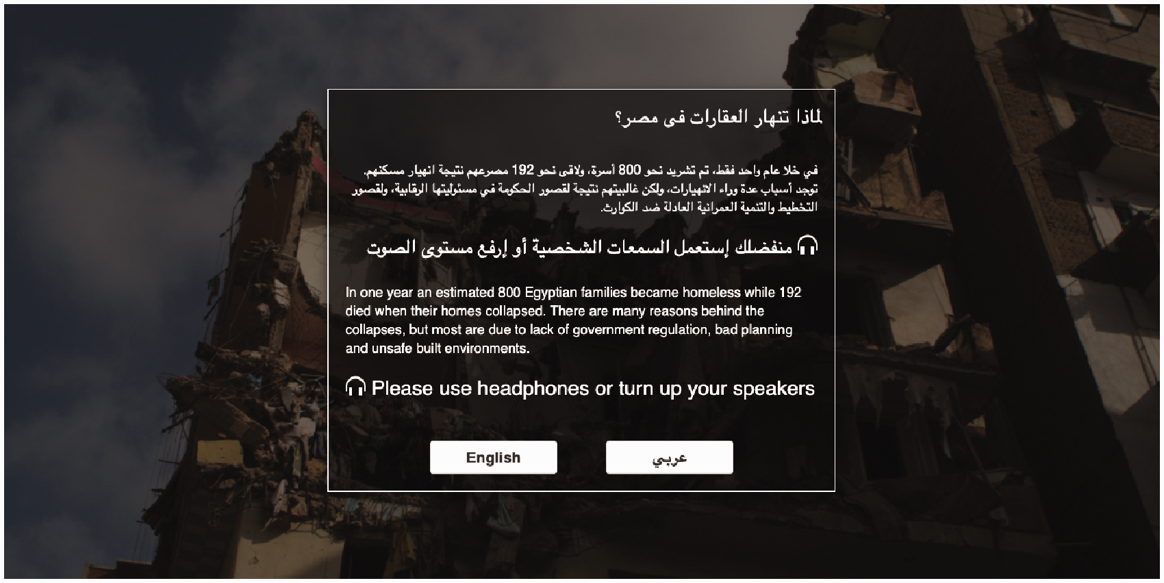
Egypt building collapsing website homepage which alerts visitors about the sonification experience.
Figure 2 illustrates how the soundscape is broadcast on top of the website’s main page together with the visualization of data, which illustrates the number of building collapses along with the number of injured, dead, and affected families. Interacting with the visualization, visitors can access further information detailing the reasons behind injuries, deaths, and family displacements, as well as zoom in on a specific area of Egypt. As for the sound experience, the soundscape is composed by sonifying each accident with a single sound of a collapsing building; the density of the sound samples gets higher over time as accident rates increase. The authors considered various options for the sound: “The first was calmer and softer; it could be described as ‘relaxing’ or even ‘meditative’. The second test featured more literal sounds of falling bricks and unstable foundations” (Sobliye and Mortada, 2017: 215). Conscious of the potentially intruding and annoying nature of sounds on the internet, in particular the rough sounds such as those of building collapses, the authors nonetheless opted for the second option in order to “tell stories of social injustice” that also intrude and sometimes cause annoyance when confronted.
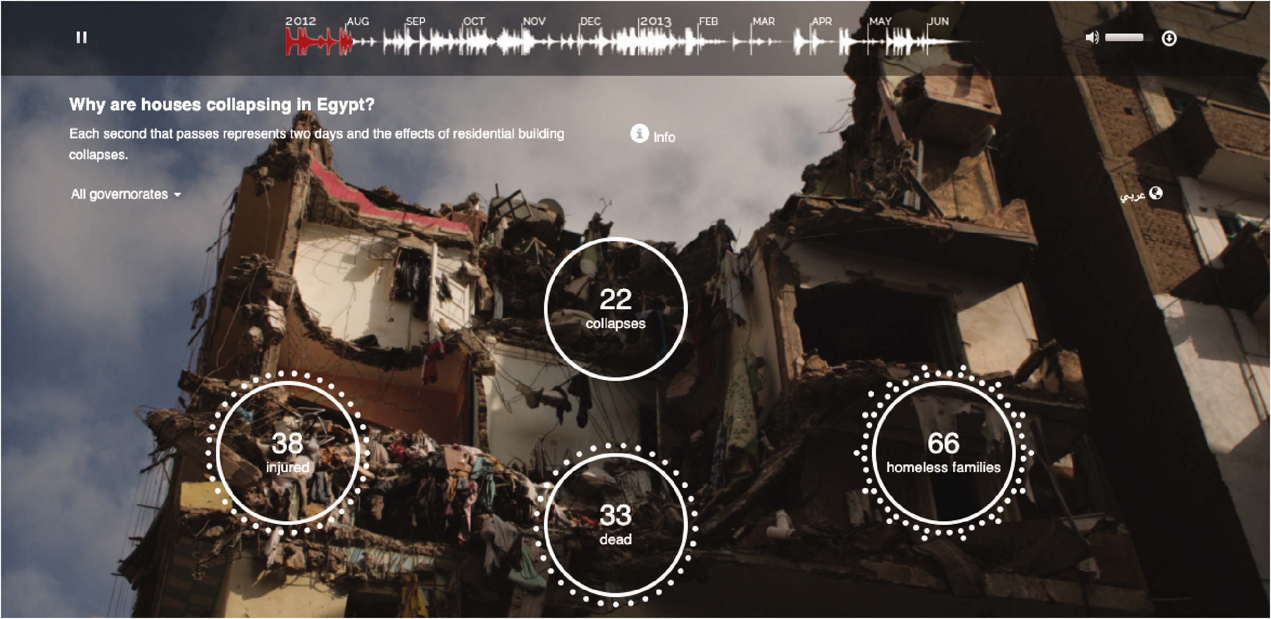
Data are visualized as well as sonified.

Real-time monitoring of seismic activity at the Oklahoma Geological Center. 12
The Egypt building collapses sonification is a good example of what Michel Chion defines as “causal listening” (Chion, 2015: 312): as a result of the choice of sound material, the listener will tend to associate the sound directly with its source, i.e., with the event that caused the sound itself (in this case, the collapse of a building). Interestingly, Chion notices that the use of indexical sounds (sounds in which the connection with the phenomenon which produced the sound is not arbitrary but “connaturated” to the phenomenon itself; Vickers and Hogg, 2006: 213) is made possible by a shared cultural experience such as that which happens with cinema. As listeners, it is through the experience of cinema (or, more recently, gaming) that sounds caused by events can be recognized and correctly interpreted although they have never been experienced first-hand (such as the collapsing of a building, a gunshot, or an extraterrestrial language; Chion, 2015: 319).
Ominous sounds and sonic memorials: Sonification for on-air data journalism
The American award-winning Center for Investigative Reporting 4 has been experimenting with data sonification since 2015 through its online platform “Reveal”, which also hosts a radio show. In its first production, The Oklahoma Shakes, 5 a soundscape was produced that connects data on earthquakes occurring in Oklahoma from 2004 onwards, with the goal of providing insights on the exponential increase of such events (allegedly due to the increase in the oil and gas industry exploitation of Oklahoma land), and broadcasting the sonification through the radio.
The timeline of the soundscape is obtained from the timeline of earthquake occurrences over the years, and each sound in the timeline is mapped to each single earthquake data: the bigger the earthquake, the louder and lower pitch the sound. An example of earthquake data from the Oklahoma Geological Center is shown in Figure 3. In this first incursion into the sonification world, the design of individual sounds (a bell-like synth sound obtained via MIDI processing) 6 is based on minor chords, a more “ominous” key than major. In the words of the author Michael Cory (2015) “choosing an ominous key—or any key—is as much an editorial decision as choosing colors on a map visualization. In this case, there’s not really any way around the fact that suddenly experiencing hundreds of new earthquakes every year is an ominous development, so I felt justified in the decision”. In this case, a cultural interpretation of musical values as emotional values is intentionally used by the author to determine design decisions on how to map data to sound, loosely suggesting to the listener the connection between “sad” sounds and sad events such as earthquakes. It is unclear, though, how much we can rely on cultural clichés—in this case, that minor keys are considered, in Western culture, to carry a sad message—for the design of an experience that, podcasted via radio, should be universally understood by any listener without prior training.
Another example, A sonic memorial to the victims at Orlando’s Pulse nightclub (2016) takes a different approach that seeks to design sounds that bear a specific message and explicitly communicate the intention of the authors as explained by Jim Briggs (Briggs, 2016). 7 On 12 June 2016, an armed gunman entered the Orlando nightclub Pulse, in Florida, United States and opened fire on the guests killing 49 people and injuring 53 others. 8 The soundscape is built using the birth year of each of the 49 victims of the shooting, from 1966 to 1998, when the youngest victim was born. Each person is represented with a bell-like tone, chosen because of the iconic value, across different cultures, of bells sounds “from European village bells and the way that they signify important moments in communities to gamelan performances and the additive effect of overtones produced by a body of many different, interdependent instruments” (Briggs, 2016). 9
From the oldest to the youngest victim, from the lower to the higher pitch, A sonic memorial composes a sonification (the waveform of which we can see in Figure 4) that is meant to be “funereal, but also celebratory”. Over the course of the sonification, the different tones (the different persons’ birth) will accidentally cross to create melodies which match, for better or worse, such as in the ways people match better with some people than others through the course of their lives. Through a poetic interpretation of the simplest dataset (the birth year of 49 victims) the authors created a sonic representation which powerfully conveys that “there is beauty in those cycles and new life within every beat” until the soundscape is abruptly interrupted at the year of the shooting. Designed to be broadcast as a radio show and as a sort of “threnody” to the victims, the project aims at communicating the value of life and the tragedy of mass-shooting in the United States. 10 In order to do so, the authors describe how data was mapped to sound dimensions by building upon socio-cultural values shared by both the designers and the listeners of the sonification. The choice of musical instruments, the sequence of the sound events over time, and the decision to use tuned (musical) sounds which would occasionally create a sense of harmony in the composition are explicit choices. The authors seem to rely on shared metaphors (Johnson, 2007; Roddy and Furlong, 2015: 183) to emotionally engage publics who do not need specific prior musical training.
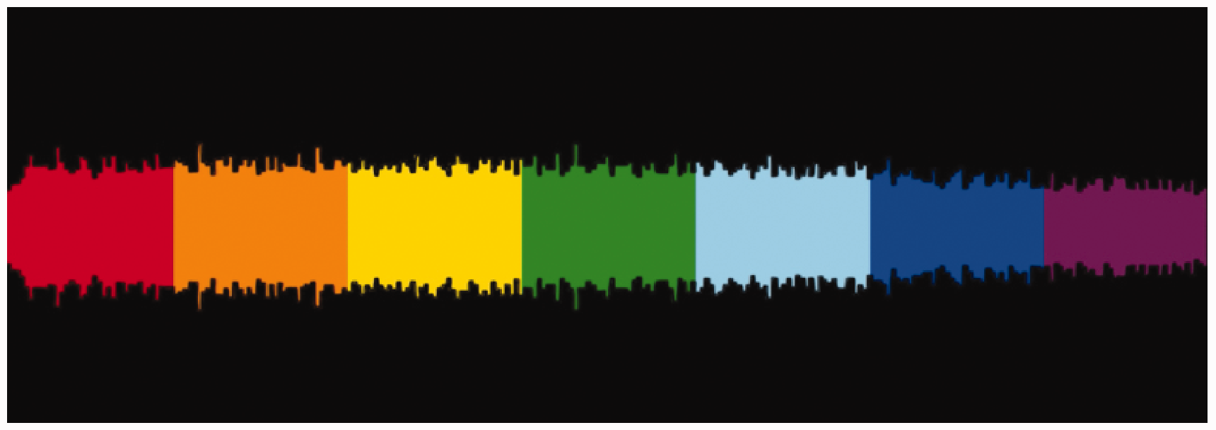
Waveform of the sonification “A sonic memorial”.
Experiencing forty years of global migrations through sound: Generative art and sonification
A different approach is taken by the sound artist Brian Foo, also known as the Data-Driven DJ. Foo is the author of a number of sonification projects in which generative art (using data as a compositional tool to create art experiences) and social responsibility (using sonification to engage publics in ways that resonate with events represented by the data) are mixed to different degrees. In Distance from home, the United Nations global refugee dataset from 1975 to 2012 is used to generate a song in which different audio parameters are mapped to different dimensions in the data. Specifically, “The quantity, length, and pitch of the song’s instruments are controlled by the volume of refugee movement and distance traveled between their countries of origin and asylum” (Foo, 2012). Unlike the two previous projects, Foo approaches the sonification process focusing on the design of a customized software rather than on the meaning of the content and the listening experience. The software determines the creation of a musical composition where its structure changes over time following the behavior of the dataset. In his words, Foo’s goal is to help the listener to “intuitively and viscerally experience the sheer volume of displaced populations and the distance they travel from their home country” (Foo, 2012). As the years go by, the volume of instruments playing and the duration of the notes they play increases, with the global pitch of the song getting lower: it means more people are leaving their homes to travel longer distances.
The experience of the sonification can be accompanied by visuals (Figure 5 illustrates a frame of the visualization for the year 2000) or only through sound. A link to the sonification without visuals is also provided for listeners who “prefer no visuals”, perhaps an implicit recognition that, accompanied by visuals, the listening experience would change in nature. Conveying through sound any additional contextual information (which the artist defines as “the reason for displacement”) is explicitly excluded by Foo in order to avoid “too much complexity”. In this way, Foo’s intention seems to be to elicit in the listener a symbolic/figurative listening attitude (Chion, 2015: 323) which requires prior training in order to infer the meaning of data from the different auditory dimensions of the composition. We could argue that, despite the choice of sound content being inspired by folk music as a cross-cultural expression of nostalgia and longing for home (Foo, 2012), the usage of abstract musical dimensions still requires the listener a higher cognitive effort to contextualize—hence, make sense of—the data as compared to, for example, Egypt Building Collapses.

Frame from the video animation for “Distance from home”.
Income inequality and agnostic sound material: The limits of sonification
In Two Trains, the reliance on musical dimensions to represent values in a data set without the representation of a wider context is greater. The project builds on the issue of income inequality among the districts of the city of New York, where unequal distribution of wealth is a larger problem compared to other cities (Foo, 2015), to build “a song with some exciting ups and downs” and at the same time “related with a topic that is relevant and current” (Foo, 2015). Foo selected data on average income in the districts (Figure 6) crossed by subway line number 2 (Brooklyn, Manhattan, Bronx) as it looked like “the perfect song composition, with a build-up, climax and falling action.” Average income values are mapped onto specific acoustic dimensions (pitch, rhythm, timbre) to obtain a sophisticated music composition which represents the change in income along places crossed by the two train lines. 11

Line 2 Train crossing from Brooklyn to Manhattan.
Foo (2015) “scoured through the Internet” to identify songs and musicians representative of the NYC music scene in order to compile the sounds to be used in the sonification and in this way also pay homage to the music scene. It is worth noting that, based on this choice, the sound samples used for the sonification do not bear any relationship with the phenomenon represented by the data set. This is one way that this approach is different from Foo’s Distance from home and the Egypt Building Collapse projects. Foo (2015) explains that he “tried to select agnostic sound traits” (e.g. volume, dynamics) to correlate to median income rather than biased ones (e.g. sad vs. happy sounds, vibrant vs. dull sounds) to further let the data “speak for itself”.
But can data really speak “for themselves”? What is the role of the author in shaping the message that data conveys to listeners? Additionally, and more specifically when considering the use of sound to represent and make data meaningful, to what extent can listening publics unpack individual acoustic dimensions (such as timbre, pitch and rhythm, Roddy and Furlong, 2015), let alone associate them with specific data values? Can the increasing density of music in the poorer districts of NYC be interpreted as intended? For example, could the very same music be perceived as happy to some ears even in the poorest districts of NYC? Is the author’s goal of being “as objective as possible” enough to embrace the responsibility that a communication process entails, with a listener that, in this case, could receive a message that is the opposite of what is intended?
Conclusions
The five cases we selected are examples of how sound and sonification can be used to engage non-expert publics with data and information about socially relevant issues. In this essay, we frame data sonification within a design process introducing the criterion of intentionality as a condition. In our framing, the highest degree of intentionality is represented by the Egypt Building Collapses case, a project where sound is designed to explicitly help the listener to intuitively and emotionally connect with the sensitive social issue at stake. At the opposite end of the continuum—the lowest level of intentionality, as shown in Figure 7—the author of Two Trains declares his “agnosticism” to the context, aiming at being “neutral”: “I wanted to make a pleasant/exciting-sounding song so it could be palatable for the casual listener and experienced independently from the topic of income inequality. I didn't want to be accused of favoring one area of the city or the other because one sounds ‘prettier’ than the other” (Foo, 2015).
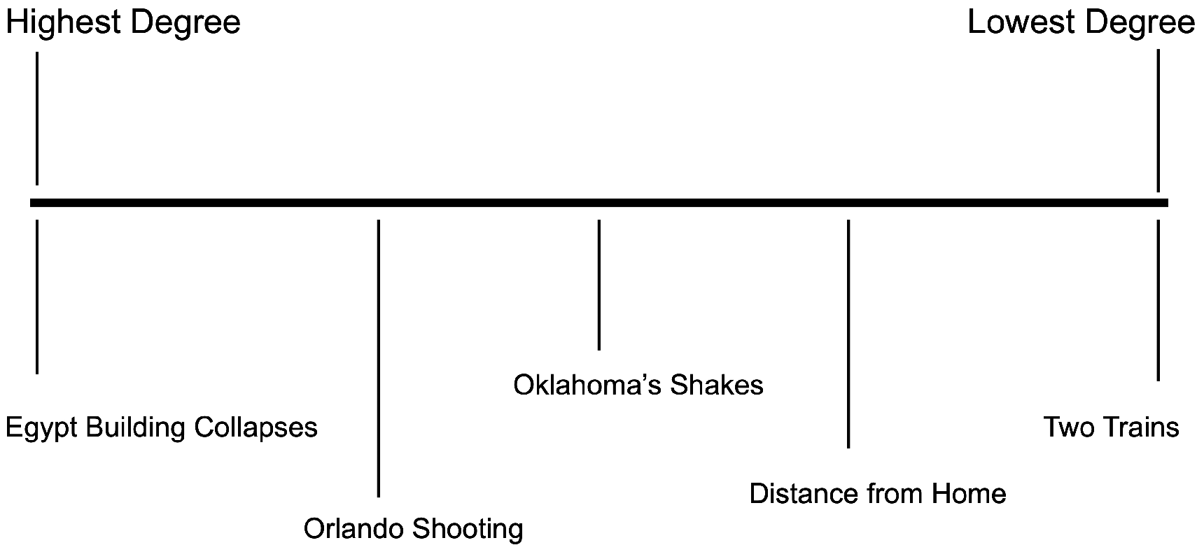
Intentionality in data sonification.
Along the continuum, from a higher to a lower degree of intentionality, A sonic memorial to the victims at Orlando’s Pulse nightclub explicitly chooses a specific sound material (bells and bell-like tones) that will help listeners to emotionally engage with the event represented by data, whereas in Oklahoma’s shakes a similar intention is still embryonic. In Distance from Home, the absence of an explicit relationship between the design of sound and the meaning of data results in a rather abstract listening experience where getting insights from the dataset might require prior training.
Being relatively new among the transformative practices that seek to represent data to publics, sonification projects are still often guided by the technicalities of transferring and mapping data into the language of sound, without critical consideration of the effects and the implications of such a translation process. The lack of context, a reductive approach to the representation of the phenomenon behind the data, and the presumption of objectivity in data often prevent an effective integration of data sonification in the broader process of designing experiences that aim at reaching, engaging and informing wider non-expert publics about social issues. To effectively serve this scope, recognizing the inevitability of a communicative relationship in every translation process—and the need to design it intentionally and responsibly—is essential. The continuum of intentionality and the map of cases proposed here are meant to foster this awareness and facilitate the intersection between design and data sonification.
Footnotes
Declaration of conflicting interests
The author(s) declared no potential conflicts of interest with respect to the research, authorship, and/or publication of this article.
Funding
The author(s) received no financial support for the research, authorship, and/or publication of this article.