
Abstract
Although the rapid growth of digital data and computationally advanced methods in the social sciences has in many ways exacerbated tensions between the so-called ‘quantitative’ and ‘qualitative’ approaches, it has also been provocatively argued that the ubiquity of digital data, particularly online data, finally allows for the reconciliation of these two opposing research traditions. Indeed, a growing number of ‘qualitatively’ inclined researchers are beginning to use computational techniques in more critical, reflexive and hermeneutic ways. However, many of these claims for ‘quali-quantitative’ methods hinge on a single technique: the network graph. Networks are relational, allow for the questioning of rigid categories and zooming from individual cases to patterns at the aggregate. While not refuting the use of networks in these studies, this paper argues that there must be other ways of doing quali-quantitative methods. We first consider a phenomenon which falls between quantitative and qualitative traditions but remains elusive to network graphs: the spread of information on Twitter. Through a case study of debates about nuclear power on Twitter, we develop a novel data visualisation called the modulation sequencer which depicts the spread of URLs over time and retains many of the key features of networks identified above. Finally, we reflect on the role of such tools for the project of quali-quantitative methods.
Introduction
The rapid growth of digital data and computationally advanced methods in the social sciences has in many ways aggravated tensions between the so-called ‘quantitative’ and ‘qualitative’ approaches (Marres, 2012). Yet Science and Technology Studies (STS) scholars have provocatively argued that the ubiquity of – particularly online – digital data finally allows these two opposing research traditions to converge (Latour et al., 2012; Venturini and Latour, 2010). Indeed, a growing number of ‘qualitatively’ inclined STS researchers are beginning to use automated, computational techniques, particularly forms of data visualization, for the purposes of interpretive, rather than purely statistical analyses (Abildgaard et al., 2017; Marres and Weltevrede, 2013; Rogers, 2013; Venturini and Latour, 2010; Venturini et al., 2018).
Network diagrams have become an important tool of these so-called ‘quali-quantitative’ methods (Venturini and Latour, 2010). Whether they are networks of hyperlinks, of users, of words or hashtags, these diagrams are claimed to have several advantages over other quantitative approaches: they are relational – moving beyond frequency measures, they do not require hard-and-fast categories or classes, and facilitate switching between qualitative close reading and viewing aggregate patterns.
Forms of network analysis present great promise for bridging ‘quantitative’ and ‘qualitative’ work. But in this paper, we argue that particular empirical cases or research questions might require different kinds of (visual) analysis. We will consider a case that concerns the diffusion of information through online media – how particular contents spread and are modified along the way. This case is difficult to study empirically, because it straddles quantitative and qualitative analysis and involves linking individual utterances to ‘macro’-level trends. Networks should be ideally suited to study this object and yet, as we will show, visualizing information flows as networks may obscure alternate networks and more subtle, temporal shifts. Drawing on a larger study about nuclear power debates in Britain on online platforms (Moats, 2015), we propose a data visualisation for tracing information flows differently. This approach is still in beta and requires fine tuning; however, we hope that discussing in practical terms the work of developing visualisations in relation to particular empirical cases might help to expand the quali-quantitative methods’ toolkit.
Big Data, networks and quali-quantitative methods
A recent commentary by Blok and Pedersen (2014) in this journal laments that the huge interest in new computational forms of analysis (which include machine learning algorithms, data visualisations, cluster analysis and artificial intelligence) has made many ethnographers and other ‘qualitative’ researchers close ranks and reassert the sanctity of traditional forms of research. These researchers have convincingly argued that these techniques can be reductive and ethically suspect and exacerbate existing types of inequalities, as well as incline researchers to ask narrower questions (boyd and Crawford, 2012; Iliadis and Russo, 2016; O’Neil, 2016; Uprichard, 2013). However, they have been slower to offer alternative proposals or engage fully with their counterparts in computer science and data science. Indeed, it has been argued that when qualitative researchers engage with programmers in practice, their interlocutors will be found to be more ethical, political and reflexive than critical theoretical accounts make us believe (Neff et al., 2017). Through the ‘situated’ example put forward by Danish university students which employed a combination of ethnography, digital tracing and social network analysis, Blok and Pedersen (2014) offer the idea of ‘complementarity’: ‘mutually exclusive’ but also ‘mutually necessary’ entities are a more productive way of describing the relationship between ‘qualitative’ and computational analysis. In a follow-up paper (Blok et al., 2017), the authors show practically how ethnographic and data-driven ways of knowing can inform each other. We agree with the underlying point of their commentary: what separates ethnography from approaches like computational network analysis are not so much fundamental philosophical divides (e.g. Seale, 1999) but more the practical negotiations between parties and the ‘… measurement device[s] deployed for their observation’ (Blok and Pedersen, 2014: 2). However, in line with the authors, it is important to stress that complementarity does not assume that qualitative and quantitative research are necessarily separate or immutable.
Differing capacities and ideals of quantitative and qualitative research (Fielding and Fielding, 2008) have long been described as narratives that serve the purpose of institutional boundary work (Gieryn, 1983), while in practice, there are many versions of both quantitative and qualitative research (Hammersley, 2013). Indeed, several authors have noted a rich shared but recently forgotten history between say, anthropology and quantitative social science (Munk and Jensen, 2015; Seaver, 2015) and even to the extent that these imagined rivalries exist, they are quickly becoming outdated. Noortje Marres (2012) argues that, although we should be sceptical about claims for the uniqueness of digital data and associated techniques, they are certainly involved in redistributing responsibilities and agencies within the academy and private sector. Changes in the method-assemblage of sociology, such as scrapers, Application Programming Interfaces (APIs), visualisations and a plethora of new research subjects necessarily have implications for the encounter between the so-called ‘quantitative’ and ‘qualitative’ researchers.
Several researchers, like Blok and Pederson, have tried to rethink relations between data science and qualitative or ethnographic traditions (Curran, 2013; Taylor and Horst, 2013). Some attempt to re-specify the offer of qualitative research to their quantitative counterparts while others try to rethink what traditionally ‘quantitative’ tools can offer ethnographers and qualitative researchers. On the latter, Latour et al. (2012) have argued that quantitative and qualitative methods produce different fictional ontologies of ‘micro’ and ‘macro’, as effects of these different types of techniques. They suggest that the gap between ‘micro’ and ‘macro’ historically originated from a lack of data, requiring researchers to either look at small, complete sets of individuals or at samples standing in for the aggregate. The abundance of online data, they argue, finally allows for analyses in a ‘flat ontology’. The authors refer to the approach known as actor-network theory (ANT) which attempts to break down dualisms and dichotomies by describing the development of heterogeneous networks, which notably sit between micro and macro. They also relate ANT to the alternative sociology of Gabriel Tarde (Latour, 2010) who, following Leibniz, considered the social composed of monads that are only defined through their relation to each other. In the example by Latour et al., an academic is not enclosed within the aggregate body known as the university but defined by association with it, just like the university is defined in relation to its students and employees. They are on the same level, not restricted to the micro and macro scales respectively. The authors create a network graph of online academic profiles in which both academics and institutions are represented as nodes (dots) and their connections as edges (lines connecting dots). They show how these nodes can be visually clustered so that entities with more shared associations are brought closer together; and these clusters can be compared in different networks over time. Thus, the researcher can ‘qualitatively’ interrogate the individual node, or ‘zoom out’ to aggregate relationships without ever losing sight of the individual. Latour et al. argue that the seemingly incommensurable ontologies of micro and macro, and quantitative and qualitative research by proxy, can be (almost) stitched together given the right combination of data and methodological equipment.
It is of course not only the scale of analysis that separates what we colloquially understand as ‘quantitative’ and ‘qualitative’ research. ANT and also Tarde’s approach are very eccentric forms of ‘qualitative’ research and there are other issues around offline research, meaning-making and subjectivities (and other ‘qualitative’ sacred cows) which are not addressed in the above proposal. Similarly, there is much more to ‘quantitative’ analysis than the visual network analysis deployed in their account. The authors do not fully address variables or causality, nor do they even use the numerical properties of networks, as computational social network analysts would, to make statistical claims about the centrality of particular nodes. 1 The networks are primarily interpreted visually to spot patterns and identify interesting entities and relationships (Venturini et al., 2014a, 2018), quantifications are generally only used to cluster, filter and spatialize networks. So ‘quantitative’ here has more to do with computer assisted techniques than with quantifications and measurement per se. Rather than combining qualitative work with quantitative explanatory or causal analysis on a symmetrical middle ground, the authors instead use network diagrams and clustering algorithms in the service of ANT-inspired textual descriptions. 2
While Latour et al.’s proposal is compelling, it is very much tied to a particular tool: the network graph. Many recent interventions at the intersection of ANT and digital methods indeed rely heavily on mono or bipartite network diagrams, representing hyperlinks, words, hashtags, usernames and Wikipedia entries, to name a few (Currie, 2012; Marres and Rogers, 2005; Marres and Weltevrede, 2013; Rogers and Marres, 2000). Networks are attractive because they bear an ‘uncanny’ resemblance (Marres and Gerlitz, 2015) to techniques like social network analysis and co-word analysis, which have long been in the repertoire of the social sciences. ANT-informed qualitative researchers in particular find several advantages in networks. Firstly, they are relational and thus surpass simplistic frequency measures or popularity metrics, which are often embedded in social media platforms (Marres and Weltevrede, 2013). 3 Secondly, although various categorisations are possible, based on researcher-defined concepts or mathematical operations, they are always reversible and open to questioning: clusters of nodes can be split up into their component parts at any time. Thirdly, they allow for quicker switching between the aggregate and the individual case, between generalisation and thick description. Many other formats, that try to capitalise on these advantages, have been proposed in related projects like EMAPS (Electronic Maps to Assist Public Science: www.emapsproject.com), including stream graphs, Dorling maps, and various kinds of matrices (Rogers, 2013; Venturini et al., 2014b). The Field Guide to Fake News (fakenews.publicdatalab.org) has made innovative use of networks fixed to a grid; a project known as the Law Factory (www.lafabriquedelaloi.fr) has produced novel ways of navigating through controversial legislation in France. However, none of these have (yet) proved as popular as the network diagram in relation to discussions of quali-quantitative methods.
Some of the same researchers, however, have expressed doubts about network graphs. Venturini et al. (in press) have raised questions about the extent to which network diagrams are too easily conflated with ‘digital networks’ (by which they mean online platforms and digital media supplying data), or associations between entities – the ‘actor-networks’ mentioned earlier, which are traditionally only apprehended through qualitative techniques. The map is not the territory. Latour has previously explained that the networks described by ANT cannot be drawn or visually represented as such; networks are merely a metaphor (Law and Hassard, 1999). 4 STS studies involving digital media or online platforms have long acknowledged that such devices mediate and curate relationships in contingent ways; they are ‘mediators’, not ‘intermediaries’ in Latour’s language (2005). Furthermore, network diagrams are mostly static, and even when presented in a temporal sequence of time slices, they may give a sense of permanence, while one key lesson of ANT is that stability is both fragile and hard won. 5 Venturini et al. (in press), however, still contend that network diagrams, even if approached cautiously, are useful because they resonate with digital and actor networks.
We should stress that it is not the purpose of this paper to contest the use of networks in the studies above, as long as these tensions are explored. Networks are undeniably an effective method for complicating simpler methods, which rely on categories and rankings even if they present their own set of challenges. However, in this paper, we build on this work at the intersection of STS and digital methods, by suggesting that alternative visual approaches can be adapted to particular empirical cases and research problems, rather than relying on now familiar techniques like networks. In the next section, we will consider a case where the tensions identified above – between network diagrams, social media networks and empirical actor-networks – become a serious problem. We will explore an alternative way of trying to achieve quali-quantitative methods while still retaining the relational, flat ontologies and zooming capabilities of the networks identified above.
The case: Nuclear debates on Twitter
After the 2011 disaster at the Fukushima-Daicchi nuclear plant, one of the authors, Moats, studied debates on various online platforms about nuclear power in the United Kingdom. Controversies about nuclear power in the UK have unfolded since the 1950s, both at the national level and locally, centred around specific nuclear plants and sites proposed for new plants. These debates frequently involve skirmishes around climate change, alternative energy sources and of course the implications of the Fukushima nuclear disaster. Particularly, the author was interested in how platforms like Twitter, Facebook and Wikipedia influenced these scientific controversies in contrast to more controlled settings like public hearings, consensus conferences or more traditional media such as newspapers and television documentaries. How do ‘facts’ travel and become accepted in these more unruly settings and who counts as an ‘expert’ when (supposedly) everyone has a voice? 6 The author carried out several ANT-inspired analyses of controversies, which focused on, but were not limited to, particular platforms in order to understand how these socio-technical arrangements benefited certain actors and certain articulations of the nuclear power issue at the expense of others. Following Marres and Moats (2015), the author was interested in online media, both to help map the controversy and to understand how online media format and inflect the controversy in different ways.
The specific series of events which concern this paper happened in March 2013: a new UK nuclear power plant was granted planning permission (the first in a generation) while at the same time, ongoing crises at the stricken Fukushima plant were discussed in less mainstream outlets including the so-called ‘conspiracy theory’ websites. How would these (largely) anti-nuclear Fukushima stories or (largely) pro-nuclear stories about Hinkley Point circulate as part of on-going controversies? In this particular series of events, it became clear that Twitter was a key channel in which claims about nuclear power were circulated (Moats, 2015).
Twitter is a micro-blogging platform in which users can (now) post 280 character messages on their timeline. They can also tag other Twitter users by mentioning them (e.g. @username) and use hashtags (e.g. #topic) to designate particular topics and campaigns that other users can ‘tune in’ to, much like a radio station (Murthy, 2013). According to Bernhard Rieder (2012), much Twitter research has focused on what he calls ‘information diffusion’, which deals with how content spreads, bypassing ‘mass media’ or ‘old media’ channels. 7 This comprises approaches ranging from cultural memetics (Blackmore, 2000) to theories of contagion, which also draws on the work of Gabriel Tarde (Kullenberg and Palmaas, 2009), as well as quantitative and mixed method studies (Bruns, 2012; Procter et al., 2013).
Although a detailed discussion of this broad field of research falls outside the scope of this paper, information diffusion is an interesting topic for our present purposes because it falls in between traditionally ‘quantitative’ and ‘qualitative’ approaches. Theoretically informed or micro-sociological approaches can describe how individual actors may distribute content or be swept up in a wave of contagion; it is not easy, however, to scale up these insights to explain the spread at the so-called ‘macro’ level. This is partly due to the fact that many theories situate the source of contagion in virtual or non-representational registers: they have to do with affect, beliefs or desires (Sampson, 2012) which are hard to index. 8 The aggregate results of information spreading are more easily measurable with a quantitative approach (Murthy, 2011; Murthy and Longwell, 2013) – how many links are shared, how many times a hashtag appears in a dataset, what is the shape and depth of the information cascades – but it is much harder to link these effects to particular causes at the ‘micro’-level (Vosoughi et al., 2018).
Network diagrams seem perfectly suited for this task, because they straddle the individual and the aggregate, but even they run into problems. Meraz and Papacharissi (2013), who study the role of Twitter in the Egyptian revolution, assume from existing literature on social media that the most frequently ‘mentioned’ accounts are the most important in driving information flows. A mention, as we use the term, occurs whenever a user includes another user’s name in a tweet – automatically notifying the recipient and showing it to their followers. By focusing on mentions, the authors reduce their corpus to users exceeding a certain threshold of mentions in the given time period, resulting in a network map of users mentioning each other.
Creating networks of user mentions is common practice in Twitter analysis and the reduction of the data is certainly justified given the sheer quantity of users studied. However, creating a network diagram or analysing Twitter data as a network generally amounts to selecting one type of digital trace (in this case a mention) and then treating instances of that interaction as if they were equivalent – i.e. individual mentions are all worth the same. This raises a few concerns. Firstly, mentions can denote a variety of behaviours (boyd et al., 2010): a mention can attribute content to someone or solicit a response. Furthermore, when ‘retweeting’ a tweet – some users just copy the tweet’s text, while others acknowledge the full chain of users back to the originator. Secondly, focusing on mentions automatically excludes the contributions of users not acknowledging their sources or receiving information in different ways (more on this point below). Thirdly, the amount of mentions is considered as an unproblematic indicator of certain behaviours (such as information spread or influence) rather than a metric reflexively driving and shaping those same behaviours. 9 Finally, we do not know if a given diagram maps the network spreading information or a network formed as a consequence of the spreading of information. Because most network diagrams only select one type of digital trace (in ‘monopartite networks’), they presume a specific mechanism or set of practices through which information spreads, when in the sense of ANT, this is precisely what needs explaining.
In addition, if we were to merely instrumentalise Twitter data and use a mention network to map the likely participants in a controversy, we might lose sight of the fact that what becomes visible through Twitter is itself part of the controversy (i.e. mentioning users or not is part of Twitter’s popularity game). If we take controversies seriously in the way ANT does, we need to be impartial about what sorts of entities and practices carry the most weight. 10 Controversies can then show unexpected actors and heterogeneous practices, rather than starting from how a platform like Twitter ‘normally’ works. Now, the way actors behave in a particular controversy should not be taken as representative of either Twitter or (for example) nuclear power debates in general. Romero et al. (2011) have shown that information spreads in very different ways according to a specific Twitter community, whether related to politics, celebrities or sports. Following controversies should then be an exploratory process, generating novel insights about Twitter as a Latourian mediator, without as many quantitative requirements of statistical or representative sampling.
It is obvious that any form of research design has its limitations, silences and assumptions about the normal functioning of society. So what sort of approach allows us to be less presumptuous about how information spreads, given that this question is central to the case at hand?
Sharing practices
Drawing on this case study of nuclear power debates, as well as existing literature about Twitter, we started by listing the many ways in which one user’s tweet can be viewed and then acted upon by another user. One of the key ways is to ‘follow’ particular users so that their tweets appear in one’s timeline. However there are also a range of potential uses for following from performing friendship to subscribing to even monitoring or stalking so it should not be assumed that following always indicates that information will be taken up by followers. The Twitter API, the most readily available means to gather Twitter data, currently only indicates retweeting or replying; it does not indicate who saw, or acted on, a tweet otherwise, nor does it give easy access to the ever-shifting networks of users and their followers.
Hashtags allow an easy analysis of how users can receive and share information. Hashtags are words, or phrases without spaces, preceded by a # such as ‘#Fukushima’. Bursts in the frequency of their use may make particular hashtags ‘trend’, and feature on Twitter’s front page for the user’s region (Gillespie, 2012). This in turn may be picked up by various algorithms and devices monitoring Twitter. Hashtags are a popular means of data reduction, because they are a topic-specific and user-defined, rather than a researcher-defined, unit of analysis.
When more than one hashtag appears in a tweet, they can be studied relationally, as proposed by Marres and Weltevrede (2013) who studied shifting hashtag associations. A hashtag may indeed be a primary channel for information spread in a campaign such as #occupy (Bennet and Segerberg, 2013), but it is difficult to conclude that certain hashtags are more central than others. Data for a particular hashtag may be retrieved and analysed, but related hashtags which are not captured in full may end up being more central to the debate. Hashtag networks work well when they clearly are the focal point of an activist campaign. In this particular series of events, though, not all users used hashtags and those who did often used several.
Far less accessible to researchers is the method of sharing through automated ‘bots’. Bots (robots) can be programmed to tweet according to certain triggers or criteria, or at regular intervals (Wilkie et al., 2015). For example, ‘forwarding services’ are websites and apps like Twitterfeed, dlvr.it, IFTTT and Hootsuite, which use RSS (Really Simple Syndication) feeds as their input and are set up to automatically Tweet a message whenever an article on a website is published in the RSS feed.
Twitterfeed users (twitterfeed.com) for example can link up to highly specific feeds based on ‘metatags’ for a specific category (business, entertainment, technology, etc.) and customize their tweet with a personal message including hashtags or mentions tailored to these feeds. Other services like IFTTT (If This Then That: ifttt.com) can also be triggered by events on, e.g., Facebook or LinkedIn; custom bots can Tweet a message based on what is ‘trending’ that day. Nearly identical-looking tweets may thus be generated by backchannel sources originating from RSS, without explicit links or visible traces on the Twitter platform.
Users can also retrieve tweets by searching for keywords on the web or via mobile interfaces. Tweeters can thus attract readers by a shrewd selection of terms, reflecting what they think people are searching for (Murthy, 2013). In his study of a sample of French Twitter users, Rieder (2012) further suggests that Twitter users, rather than merely disseminating claims or facts, often add a bit of ‘spin’ or ‘twist’ to content by using hashtags or discursive commentary, which he calls ‘refraction’. It is therefore important to understand that changes to a tweet’s discursive content potentially modulate its content but also, what Murthy (2013), following Goffman, calls a tweet’s ‘participation framework’ – an utterance’s implicit audience.
The preceding list is non-exhaustive and only shows that there are many, complex ways in which tweets can spread between users and that particular methods of retrieval and analysis (follower, mention or hashtag networks) focus on certain of these channels at the expense of others (Marres and Weltevrede, 2013). The danger here, as Venturini et al. (in press) mention, is that a particular network graph appears to represent Twitter as a whole, or that Twitter may be mistaken for unmediated associations between entities. Rather than favouring a ‘qualitative’ appreciation of the complexity of situated practices, a network representation then seems at odds with ANT-inspired analysis.
This is also part of a wider problem, well known to STS researchers, related to how Twitter data is made available through various APIs. APIs facilitate the gathering and analyses of certain activities, but do not permit researchers to access other types of data or to use other techniques (Marres and Weltevrede, 2013; Rieder et al., 2015). For example, mentions or hashtags are relatively easy to scrape and visualise as networks, while the nuances of discursive utterances are more complicated and thus often side-lined. Researchers can keep this limitation in mind or reflect on it, but the question is whether the problem can be avoided in practice, without abandoning the use of automated tools altogether.
The modulation sequencer
So, how do we obtain thick descriptions at the ‘micro’ scale without relinquishing our ability to understand patterns at the ‘macro’ scale? Rather than the earlier discussed routes of information diffusion, one could instead pragmatically focus on a particular object which travels. Lerman and Ghosh (2010), for example, focused on follower networks (several years ago these were easier to obtain), but rather than assuming their primacy they decided to evaluate the influence of follower networks on information diffusion. They accomplished this by isolating the URLs in their corpus.
By following a link, a stable object that can be found in many tweets, Lerman and Ghosh estimated the influence of network structures on sharing (i.e. the number of shares originating from a user’s followers). They found that around 50% of link shares come from follower connections, which begs the question: where does the other half come from? In any case, by following URLs, it is possible to evaluate the influence of different dissemination practices, not just follower networks, on URLs spreading. Now, gathering tweets by shared URLs is just as biased as any other way of circumscribing the data – the corpus will obviously not include users implicitly commenting on a URL but not reposting the URL itself. Yet in general, focusing on URLs seemed appropriate in this case because the nuclear power plant controversy was originally generated by online news articles and much activity came from users sharing links to the stories.
For the larger project mentioned before, we used Twitter's ‘filter’ API to obtain a collection of Tweets containing one of the following keywords: edf, fukushima, hinkley, nuclear, nukes, radiation, sellafield, tepco. 11 We assumed that tweets had to contain at least one of these words to engage explicitly with discussions about either Fukushima or the proposed new UK power plants, particularly the one at Hinkley Point. We tried to be as agnostic as possible about the form these controversies took and the terms in which they were discussed. 12 However, this dataset was never used to operationalize the controversy or to make quantitative claims about the frequency or intensity of the nuclear debate; it was used to identify particular events and then define subqueries and locate other materials not contained in the dataset (including from other platforms and even offline). Such keyword queries are a problematic yet necessary part of the research process: obviously queries in other languages, like Japanese, might be pertinent here; but they were not addressed though for practical reasons.
One of the authors, Borra, wrote a script to obtain every instance of a particular URL in the Tweets dataset collected from 7 March 2013 to today. This in itself was painstaking as URLs are often, sometimes multiple times, truncated by URL shortening services such as bit.ly (see Helmond, 2012) and must be traced back to their source. We thus made subsamples of our dataset consisting of tweets with at least one of the keywords and particular URLs. Due to the specificity of the keyword ‘nuclear’ and proper names like ‘Hinkley’ and ‘EDF’, we only missed a few tweets containing a given URL but not our keywords (less than 5% missing per URL for those we investigated 13 ).
Another reason why the study of URLs in Twitter is difficult pertains to the limits of qualitative textual analysis. Looking at the output of the above script, i.e., a list of every tweet with one of these keywords and a particular URL, there is a surprising amount of repetition but also many small modifications within the repetition: Fukushima – Fear Is Still the Killer [URL] Fukushima – Fear Is Still the Killer –
Sample of full list: emphasis added to show modifications
Basic typologies of tweets thus need to be defined before variations between them can be identified. These typologies can take multiple forms. Consider the ‘Levenshtein distance’ (Levenshtein, 1966), an algorithm detecting changes in words. Put simply, it measures the number of characters that need to be changed to turn one word into another. Turning C-A-T into M-A-T-T-E-R would have a distance, or ‘substitution cost’, of four: turn C into M and add T-E-R. The same logic could be applied to the number of words in a collection of words, such as a Tweet, and this could be used to identify similar tweets – i.e. having a low Levenshtein distance. Other established methods for detecting relative similarities and differences between sequences of entities include optimal matching methods in Abbott’s famous example of Morris dancing (Abbott and Forrest, 1986). The approach we developed bears some resemblance to forms of sequence analysis, as advocated by Abbot and others. Abbott (1999) has even argued that sequence analysis can deal with time in a way networks cannot. Such numerical representations, however, do not readily convey the typologies we seek. If we were to make quantitative claims about the frequency of certain tweet typologies, it would be essential to select and fine tune how these typologies are detected. In our more exploratory analysis, however, we decided to be more open about what counts as similar tweets.
In our tool, the Modulation Sequencer, the researcher will primarily locate patterns visually and qualitatively. 14 In order to avoid being steered too much by Twitter’s in-built notion of retweeting and previous ideas about information diffusion, the tool first removes @ mentions (‘RT @_______’ ‘via @_______’, or ‘@_______’) and incidental formatting (such as ‘:’, ‘"’, ‘'’, ‘…’, and ‘-’; capital letters, trailing spaces and multiple spaces) in order to determine the typologies of tweets, though these formats are replaced in the interface for reading purposes. In order to allow the analysis of modulation sequences, the tool then provides a chronological list of the cleaned up tweets (including hashtags and URLs), displayed along with their post date and time, username, and source (the device or interface sending the tweet as defined by the API). The latter is important as it might provide an indication whether the tweet was posted in an automated way.
The tool (Figure 1) first assigns a distinct colour to each group of tweets with identical textual representations, after cleaning. The remaining ‘unique’ tweets receive no colour, making them easy to recognize and analyse qualitatively. This rather blunt form of categorisation leads to some possibly arbitrary distinctions between typologies – for example, two sets of tweets with only one word difference.
15
However, we prefer to apply rather strict criteria for similarity, rather than assume, on the basis of one of the clustering approaches above, that tweets are related when they are possibly not. As part of a qualitative investigation, this categorisation of tweets may always be questioned later.
Partial screenshot of the modulation sequencer. Click here to view interactive version https://files.digitalmethods.net/var/modulation_sequencer/treehugger.html
These colour-coded typologies do not tell us if these groups of tweets originate from users who follow each other, a common hashtag, or separate bots. But tweets can still be examined qualitatively to find out how they are distributed by looking at (1) the particular device (through the source field, according to the API, one can tell whether it came from an iphone, tweetdeck, web interface); (2) the users’ self-presentation on their profile and their approximate number of followers 16 ; (3) whether they acknowledge the content’s origin through retweets. Our observations about the diffusion of particular content are limited to this descriptive level and only based on information we could readily obtain.
What about larger trends over time, though? We also included a function to zoom the graph out, giving each colour-coded typology a separate column to the right in the order in which they first appear (see Figure 2). This particular view inspired the name ‘modulation sequencer’, because it reveals subtle content modulations and bears a superficial resemblance to DNA sequencing as well as the sequence analysis method mentioned earlier. This zoomed-out view gives some indication about the dynamics of sharing and can be used to profile particular types of URLs’ trajectories. In Figure 2, for example, the pink typology indicates a very popular retweet, which clearly provides the main thrust of overall sharing. Yet, in order to understand how content travels through Twitter, we need to keep an eye on both these overall patterns and nuanced micro-practices.
Modulation Sequencer of Treehugger link (zoomed out): http://www.treehugger.com/energy-disasters/fish-caught-near-fukushima-contains-record-levels-radioactive-cesium.html. Click here to view interactive version https://files.digitalmethods.net/var/modulation_sequencer/treehugger.html
Three links
In this section, we will compare how some URLs were shared. With the modulation sequencer we analyse the text of individual tweets, user profiles as well as aggregate patterns. The tool helped us to locate which sharing practices were prevalent for each particular URL, and we used insights from the wider project and existing literature to describe the impact of these practices on the diffusion of URLs.
We first used the script mentioned earlier to obtain lists of every URL in our data set shared more than once for every day between 18 and 20 of March 2013, when both the Hinkley plant received planning permission and the Fukushima blackout made headlines. For each URL we expanded the temporal query to capture stray URL shares several months after the main event. As mentioned earlier, to verify the robustness of our dataset, we also checked the completeness of our capture by comparing the URL frequency with external sharing metrics. With the modulation sequencer, we then qualitatively analysed the twenty-some URLs pointing to English language articles that directly addressed ‘nuclear’.
On the basis of the analysed URLs, we will discuss three news articles which explicitly positioned the events as controversial and related them to ongoing nuclear debates. Thus, the extent to which these links were shared, to whom and how, was potentially significant for the controversy. We also chose these three articles, because they reveal a variety of sharing practices apparent in the (larger) dataset.
Treehugger
On 18 March, several sites picked up an announcement made by TEPCO, the Fukushima plant owner, that a fish had been caught with unusually high levels of radioactive Caesium 137. One version of this story appeared on the website Treehugger, an independent online magazine for environmentalists, which suggested that the Fukushima plant remained an environmental hazard.
How did this article spread on Twitter? The first tweet linking to this article was sent by the article’s author Michael Graham at 21:29 UTC, mid-afternoon New York time, and then by the Treehugger account itself. Graham had around 9000 followers at the time of the analysis whereas the website had around 250,000. The Treehugger tweet sparked a rally of about 30 retweets, most of them delivered manually through Twitter’s web interface, rather than through forwarding services.
An hour later, the UK branch of Treehugger chimed in by retweeting 11 of the users who shared the story in this format: RT @EcoPassport: Fish caught near Fukushima contains record levels of radioactive cesium http://t.co/B0OhWBbY0S http://goo.gl/8kJBI
The story really took off at 19:30 UTC the following day when @GreenPeace shared the story. This is indicated by the large stream of pink-coded tweets on the graph’s right side, which represent a collection of users retweeting @GreenPeace’s original message: ‘Record levels of radiation found in #fish caught near #Fukushima #nuclear plant: URL’. Notice how @GreenPeace mobilizes hashtags to emphasize the key terms of the story, particularly #Fukushima and #nuclear, to attract potential readers tuned into these hashtags. @GreenPeace had around 800,000 followers at the time of analysis and this elicited nearly 100 retweets in the next few hours and another 30 retweets over the following week. Nearly all of these appear to be manual retweets through the Twitter web interface; they appear on the graph as short bursts of different coloured typologies.
Our brief description of this particular link’s trajectory seems to support a very conventional understanding of information diffusion: users with more followers can spread links further (GreenPeace has twice as many followers as Treehugger and produces more than double the results). Users tend to acknowledge explicitly where they found the link through retweets, and only use hashtags like #nonuke and #green sparingly to target users concerned with particular issues. Such practices are common amongst groups of users whose profiles identify them as activists or politically engaged. However, links can also be disseminated in other ways, as we will explain.
Russia Today
Another TEPCO announcement triggered the second article, this time regarding an incident about a loss of power to the reactor – later it turned out that a rat had been chewing cables. This was picked up by a number of sites concerned with the energy sector, but less by typical online news sites. The news network Russia Today (RT) produced of the most shared links on this topic. RT is a Moscow-based English language television channel aimed at the Western market. It is a visible player on social media, especially, with accounts sharing the link who identify themselves as politically conservative in their profiles.
If we look at the graph, we can see that in contrast to the more heterogeneous Treehugger graph, the same basic tweet typologies are used again and again (the orange and yellow columns on the left side of Figure 3), due to the use of RSS forwarding services. Even though @RT_COM had 500,000 followers at the time, the hundreds of tweets mentioning them need not be RT Twitter followers, they only needed to be plugged in to RT’s RSS feed. @ConspiracyR – Conspiracy Realism
Modulation Sequencer of Russia Today link: https://www.rt.com/news/fukushima-power-failure-cooling-445/. Click here to view interactive version https://files.digitalmethods.net/var/modulation_sequencer/rt.html 24 Hour News that Informs you of world issues, Follow ConspiracyRealism for the Latest News and Updates and Subscribe to the URL below #NWO #HAARP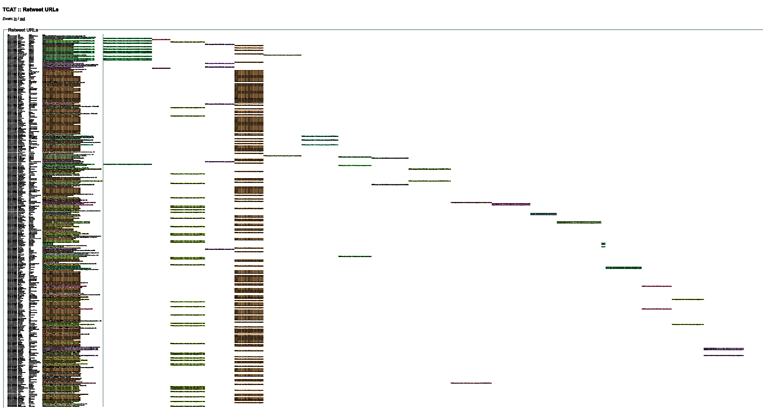
Again, the most frequent modifications are the addition of hashtags, directing it toward a targeted readership – seemingly conspiracy theorists or self-identified ‘truthers’. In addition to targeting, however, hashtags can also be used in a more scattershot way to increase the chances of the tweet finding its way into people’s keyword searchers. CitizenoftheWo4
Emphasis the authors’.
BBC
By far, the most shared link during these days was a BBC story (Figure 4), about the UK government decision to grant planning permission for a new nuclear power plant to French Energy supplier EDF. The article, originally titled: ‘Hinkley nuclear plant set to get go-ahead’, cites a number of claims which were recycled from the government’s press release: ‘the plant will deliver power to 5 million homes’; ‘create 20-25,000 jobs during construction’; ‘20 years since the last nuclear power plant’. These claims are broadly favourable to the decision while statements from Stop Hinkley, a local anti-nuclear group, were buried at the bottom of the article. But how would this relatively pro-nuclear story be shared on Twitter?
Modulation Sequencer of BBC link: http://www.bbc.co.uk/news/uk-21839684. Click here to view interactive version https://files.digitalmethods.net/var/modulation_sequencer/bbc.html.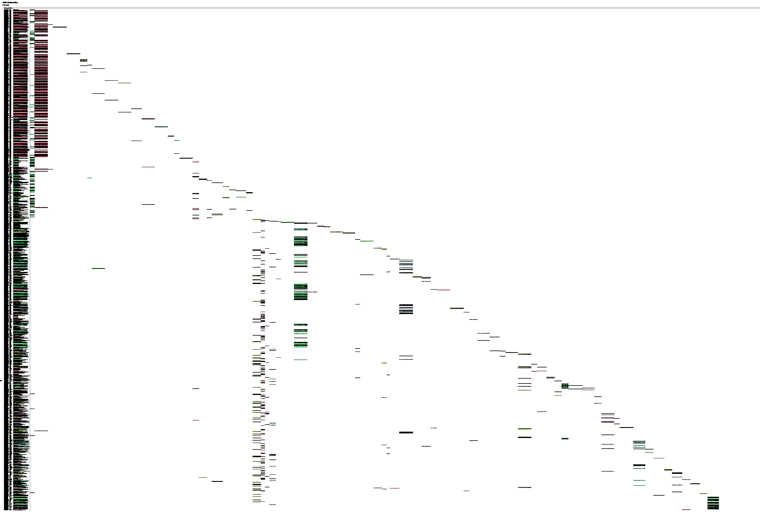
The first two tweets came at 3:05 am (GMT) from what appears to be a BBC bot. These tweets and nearly all of the 500 which followed, originated from various forwarding services, mainly Twitterfeed, dlvr.it and sharedby. These accounts use many hashtags: because the BBC has such a comparatively wide readership compared to Treehugger and RT – the intended audience must be re-specified through Twitter.
When the actual announcement happened, sometime around 2:00 pm (GMT), the BBC significantly updated and expanded the article’s title and content. The RSS-led stream of Tweets therefore changed from
18
BBC News – Hinkley nuclear plant set to get go-ahead [URL] 2:08:50 PM BBC News – New nuclear power plant at Hinkley Point C is approved [URL] 2:16:53 PM
Only after UK working hours did more proactive commentary begin to emerge. The proportion of RSS feeds declined dramatically and content became more diverse and unique (non-colour-coded) as can be seen from the graph. In many ways, it resembles a forum style discussion, like the comments section underneath most online news articles, though with few direct exchanges between participants. This is probably, according to the ‘source’ column in the tool, because users click the ‘tweet button’ under the article.
According to their profiles, many of the users employing this technique present themselves as individuals not strongly identifying with either environmentalism or the nuclear energy topic, though there are some exceptions. BBC News – Hinkley nuclear plant set to get go-ahead [URL] < 25k construction jobs clean reliable elec for 5million homes
While some of the users share this link in a positive way, many criticise the BBC’s framing of the announcement or explicitly make the link to ongoing Fukushima events. Fukushima spent fuel ponds in danger of boiling dry and UK announces go ahead for Hinkley C [URL] Not ideal timing I think
Discussion
These descriptions reveal a more complex picture of how micro practices including the use of hashtags, RSS bots, retweets and clever commentary contribute to aggregate patterns, including changes in the overall volume, discursive content and potential audience. They also show that, in this particular controversy, more technically savvy users employing bots and websites with certain technical features like permalinks and tweet buttons, have a distinct advantage in spreading content more widely. Twitter is certainly not the level playing field assumed by much early social media discourse (Gillespie, 2010).
It also seems clear that these situated practices mean different things to different users and groups of users. For example, the careful use of retweets seems important to activists trying to increase their network organically, whereas they matter less to users employing bots to disseminate content automatically. Hashtags can be used to target either certain audiences or the widest audience possible. Different groups clearly have different objectives: for some, Twitter is a popularity game in which followers and retweets should be counted in the 1000s, while for others, it is about building connections, or having the last word. Others have described these multiple, overlapping practices in more detail (boyd et al., 2010), but we hope to have shown how these practices impact information diffusion at the aggregate level, something not easily understandable through traditional network graphs.
Conclusion
Many recent attempts within STS to draw together quantitative and qualitative approaches, or more specifically to adapt automated tools to do qualitative work, tend to rely on network diagrams, since they are relational, do not require hard and fast categories and straddle micro and macro analysis. While networks clearly tell a richer, more nuanced story than frequency measures and rankings, we offered a case where networks might actually obscure the phenomenon under study.
In the particular case of nuclear controversies circulating on Twitter, we noted that creating network visualisations often requires that the type of network(s) content travels through is taken for granted. This might obscure other possible networks, including those not easily accessible through Twitter’s API or not visible on Twitter at all, such as offline interactions, activities on other platforms or tweets originating from bots. This reveals the tensions identified earlier between the particular form of network graphs (which format and mediate data in particular ways), Twitter itself as a platform formatting and mediating associations, and the elusive associations and practices beyond Twitter which we only have traces of. In other words, researchers often use networks and online platforms as a resource to study actors and associations, but it is equally important to analyse platforms like Twitter as a topic in order to reveal how various technologies and routines structure associations (Marres and Moats, 2015). We are better equipped to keep these tensions in mind by employing an approach which is (relatively speaking) agnostic about how Twitter is used and does not reduce data based on easy assumptions. Although focusing on a URL may still be a problematic circumscription of the data, it acts as an anchor to reveal the heterogeneity of practices.
Like a network diagram, the resulting visualisation was relational, meaning that variations between tweets were only considered in relation to each other. This could become more nuanced, however, if the Levenshtein distance is implemented as a gradient of similarity. Also like a network, this tool allows for the reversal of researcher defined categories by making available the individual components, which reveal tensions and ambiguities. Finally, this tool permits switching between the individual utterance and aggregate patterns. Yet, unlike a static network graph, by foregrounding the data ordered in time, we can get a better sense of the fleeting nature of user interactions, the stops and spurts of information sharing. Finally, rather than simply showing networked entities such as users and hashtags, this tool makes the discursive content of posts and other meta data more readily available for qualitative analysis.
We do not propose the modulation sequencer as a universal approach, or as a replacement for the trusty network diagram, but merely as an approach adapted to the specificities of a case involving information diffusion on Twitter. We argue that, in order to advance the project of quali-quantitative methods and to consolidate it as an approach to social research, its digital toolbox needs to contain more than one technique and the approach needs more reflection on what makes it appropriate and distinct. For example, while quali-quantitative techniques should retain certain essential features like relationality, reversibility and zoomability, we might also propose that they resonate with particular questions or empirical cases.
So rather than assuming that quantitative and qualitative techniques are distinct or that they can be simply stitched together with particular approaches like networks, we need to understand better how automated tools and qualitative analyses can work together around particular empirical cases with particular data formats (Blok et al., 2017). Perhaps the instinctual wariness of the so-called qualitative researchers towards automated tools and computational forms of analysis is, not because of the practice of ‘distant reading’ itself (Moretti, 2013), i.e. the automated grasping of patterns, but because of distant tool design – when ready-made tools are parachuted in from nowhere, rather than emerge from complex, situated practice and the particular challenges of data and platforms.
Supplemental Material
TCAT Modulation Sequencer BBC - Supplemental material for Quali-quantitative methods beyond networks: Studying information diffusion on Twitter with the Modulation Sequencer
Supplemental material, TCAT Modulation Sequencer BBC for Quali-quantitative methods beyond networks: Studying information diffusion on Twitter with the Modulation Sequencer by David Moats and Erik Borra in Big Data & Society
Supplemental Material
TCAT Modulation Sequencer Treehugger - Supplemental material for Quali-quantitative methods beyond networks: Studying information diffusion on Twitter with the Modulation Sequencer
Supplemental material, TCAT Modulation Sequencer Treehugger for Quali-quantitative methods beyond networks: Studying information diffusion on Twitter with the Modulation Sequencer by David Moats and Erik Borra in Big Data & Society
Supplemental Material
TCAT Modulation Sequencer RT - Supplemental material for Quali-quantitative methods beyond networks: Studying information diffusion on Twitter with the Modulation Sequencer
Supplemental material, TCAT Modulation Sequencer RT for Quali-quantitative methods beyond networks: Studying information diffusion on Twitter with the Modulation Sequencer by David Moats and Erik Borra in Big Data & Society
Footnotes
Notes
References
Supplementary Material
Please find the following supplemental material available below.
For Open Access articles published under a Creative Commons License, all supplemental material carries the same license as the article it is associated with.
For non-Open Access articles published, all supplemental material carries a non-exclusive license, and permission requests for re-use of supplemental material or any part of supplemental material shall be sent directly to the copyright owner as specified in the copyright notice associated with the article.