
Abstract
The multilevel model of meme diffusion conceptualizes how mediated messages diffuse over time and space. As a pilot application of implementing the meme diffusion, we developed the social media analytics and research testbed to monitor Twitter messages and track the diffusion of information in and across different cities and geographic regions. Social media analytics and research testbed is an online geo-targeted search and analytics tool, including an automatic data processing procedure at the backend and an interactive frontend user interface. Social media analytics and research testbed is initially designed to facilitate (1) searching and geo-locating tweet topics and terms in different cities and geographic regions; (2) filtering noise from raw data (such as removing redundant retweets and using machine learning methods to improve precision); (3) analyzing social media data from a spatiotemporal perspective; and (4) visualizing social media data in diagnostic ways (such as weekly and monthly trends, trend maps, top media, top retweets, top mentions, or top hashtags). Social media analytics and research testbed provides researchers and domain experts with a tool that can efficiently facilitate the refinement, formalization, and testing of research hypotheses or questions. Three case studies (flu outbreaks, Ebola epidemic, and marijuana legalization) are introduced to illustrate how the predictions of meme diffusion can be examined and to demonstrate the potentials and key functions of social media analytics and research testbed.
Introduction
Careful mining of social media messages can reflect the trends of human dynamics, such as where seasonal flu is spreading (Aslam et al., 2014; Nagel et al., 2013), when social movement ideology is diffusing (Tsou et al., 2013), and how urban mobility patterns reveal geospatial and social functions (Hawelka et al., 2014, McKenzie et al., 2015). Despite the new and evolving nature of social media, various models and theories are emerging to account for the ways in which message content and exchange dynamics both reflect and drive human processes in realspace (Cheung and Thadani, 2012; Wang and Zhang, 2012). Integrating several traditional theories (e.g., framing theory, narrative theory, diffusion of innovations, information theory, communicative competence theory, evolutionary theory), the multilevel model of meme diffusion (M3D) conceptualizes how mediated messages diffuse over time and space (Spitzberg, 2014). Memes are any replicable unit of cultural transfer of information. Thus, all digital social media messages are potential memes, and their replicability is a key distinction between memes and everyday face-to-face communication. It also makes memes a unique source of information that can be monitored and modeled at varying levels of granularity. The degree to which the diffusion of memes through social media networks can be modeled becomes a major theoretical challenge for businesses, governments, celebrities, and all those seeking to understand the human dynamic of communicative influence (Kamel Boulos et al., 2011; Sasahara et al., 2013; Segev et al., 2015).
The M3D anticipates that certain features of (a) memes or social media messages (e.g., novelty, repetition, etc.); (b) communicators (e.g., source credibility, network centrality, etc.); (c) structural (e.g., network span, homophily, etc.) and subjective network structures (e.g., counter-memes, thresholds, etc.); (d) societal processes (e.g., publicity campaigns, stage of diffusion, etc.); and (e) geo-technical factors (e.g., geospatial proximity, population density, etc.) predict or moderate M3D dynamics. In any given context, such processes may reveal unique diffusion maps or patterns across time and space, varying by rapidity of diffusion, exhaustion and duration of diffusion, and evolution of message variation. To the extent such unique patterns reveal distinct correspondence to realspace activities, they provide an important window into developing surveillance and intervention programs to serve the public interest in diffusing time and space sensitive information (e.g., disease diffusion and/or treatment, drug abuse or diffusion, natural disaster or crisis response). In other contexts, such surveillance may map important applications for organizations concerned with mapping or stimulating institutional reputation or product diffusion (e.g., academic reputation or product reviews).
As a pilot application of implementing the M3D in studying human dynamics and
social phenomena, we developed a web-based social media analytics and research testbed
(SMART) integrating social media application programming interface (API), machine learning,
and geographic information system (GIS) (Figure 1). SMART is designed with the goal of providing researchers with a
platform to quickly test hypotheses and to refine research questions. The analytics and
statistics presented on SMART may not directly provide answers to the research questions,
but the trend visualization and aggregated analytics can suggest possible outlooks and
potential spatiotemporal diffusion patterns for the selected topics and keywords in the
region(s) of interest. Researchers can utilize the frontend user interface of SMART—the
SMART dashboard—to visualize, characterize, and predict trends in these topics in different
cities over time. SMART can also provide broader applications beyond academia. Taking the
public health and epidemiology domain as an example, local healthcare providers, hospital
staff, government officials, first responders, and other stakeholders can access this online
web-based dashboard without local desktop installation to keep track of trending information
related to specific disease outbreaks. The following features of SMART underscore its
significance and innovativeness: SMART captures and updates the spatial nature of social media messages on a daily
basis, evaluates patterns of messages in diverse cities, and geographically tracks
patterns of diffusion. The frontend of SMART, the SMART dashboard, displays the dynamic temporal trends of
social media messages (daily, weekly, and monthly) with interactive selection
tools. The backend of SMART is built around geo-locating, data filtering, and machine
learning components to remove noise and errors in different subjects. These procedures
facilitate more accurate analysis and tracking of topics, such as disease outbreaks
and drug abuse. Users can select a target city to analyze the temporal trends and
top messages from individual cities, or use the default view to display the aggregated
trend analysis by combining messages from all cities in the monitoring list. The visualization map of tweet messages displayed in the online interface helps users
to understand the differences of social media messages between cities. This provides
information for users to track the spatial and temporal evolution of a topic. The system design of social media analytics and research testbed (SMART).

The development of SMART initially focuses on five topics (Influenza, Whooping Cough, Wildfire, Drugs, and Aztecs) because they represent a diverse range of patterns of use, targeted users, required analysis functions, and social values. Communication in general, and social media in particular, have been identified as key elements in each type of context: flu (Culotta, 2013; Nagar et al., 2014), whooping cough (Olsen, 2013), wildfire (Helsloot and Groenendaal, 2013, Slavkovikj et al., 2014; Sutton et al., 2013), drugs (Hanson et al., 2013; Young and Shoptaw, 2013), and institutional affiliation and reputation (Miao et al., 2014; Snoeijers et al., 2014). As anticipated by the M3D and numerous other theories, there is likely to be some degree of reciprocal influence and representation between social media communication and the activities that involve such communication. Mapping such media content and dynamics is the first step in revealing the degree of correspondence in socially relevant contexts of human activity, and that is the fundamental concept behind the development of SMART.
Web and social media analytics platforms
The high daily volume of user-generated content posted to social media and the Internet has brought great opportunity to social media and Big Data analytics (Tsou et al., 2013b). To facilitate such analytics and visual presentations, many research groups have devoted their efforts to analyzing information from social media and the Internet, and developing web-based interactive platforms to display analytics (Brownstein et al., 2008; Diakopoulos et al., 2010; Ginsberg et al., 2009; Kamel Boulos et al., 2010; MacEachren et al., 2011; McKelvey and Menczer, 2013). Applications of this domain include and are not limited to epidemiology surveillance, crisis management, and trend detection and monitoring. The design of SMART emphasizes the geospatial characteristics of social media data by giving users the ability to target topics in specific geographical regions and analyze the spatiotemporal patterns of social media messages. Here, we introduce and compare several applications that inspired the development of SMART.
With the release of public APIs from social media companies, there are many commercial platforms that tap into the data stream and provide social media analytics. Topsy 1 was a social media analytics system and a certified partner of Twitter that indexed all the tweets since 2006. With direct access to the Twitter firehose database, typing a search term in the Social Search interface looks up tweets from 2006 that are associated to the term and presents the most popular content in different temporal resolutions. The Topsy Social Analytic function allows users to select multiple keywords and compare the trends in the past 30 days. The function of displaying the most popular content and interactive temporal trend visualization informed the design of SMART. Different from Topsy, SMART not only shows the overall top content in each module but implements a map view which can present analytics at regional scales. Also, instead of analyzing single keywords or finding the trend of an URL being mentioned, SMART focuses more on topic-level analytics.
Electronic event-based biosurveillance systems are examples where near real-time information from the Internet is an important source of providing epidemiologic intelligence (Gajewski et al., 2014). These systems robustly validate data source from the Internet using epidemiological approaches against an official comparison dataset to generate statistics and predictions (Barboza et al., 2014). Google Flu Trends 2 (GFT) (Ginsberg et al., 2009) attempted to make accurate predictions about flu activity across regions in U.S. based on aggregated Google Search query data. Their prediction model indicates that the frequency of certain Google Search queries is highly correlated with the percentage of physician visits in which a patient presents with influenza-like illness symptoms. Users of the GFT application can view the overall flu activity in line charts or in map view that shows the intensity of flu activity using color gradient. GFT implemented an automated query term selection process to generate a list of the highest scoring search queries to represent flu activity. SMART and GFT are different in two ways. First, GFT automatically aggregates multiple search term for a topic and focuses on search queries of the Google Search users, while SMART composes each topic with keywords defined by domain expertise and tracks the conversation on social media related to the topic. Second, GFT focuses on the predication model of influenza, where SMART, besides monitoring influenza outbreak, can also be used to track the trends of different topics.
HealthMap (Bahk et al., 2015; Brownstein et al., 2008; Huston et al., 2015; Schwind et al., 2014) is created for disease outbreak monitoring and real-time surveillance of emerging public health threats. The application monitors multiple data sources including online news, validated official reports, and witness reports to reveal the current global state of infectious diseases. Users can pick from the predefined list of diseases and also have the option to specify a location and date range for the search. HealthMap presents the search results with an interactive dot map where data sources are aggregated to city or country level. The application also contains time series charts showing the temporal trend of disease alerts in the past 12 months. To calculate the disease activity index, the HealthMap system uses a filtering procedure to classify data sources into disease-related alerts and nonrelated information. While SMART also supports disease outbreak surveillance if a topic is defined with disease-related keywords, it is different from HealthMap in which SMART users can monitor the outbreak at any region of interests.
Many other applications apply visual analytics and mapping to support analysis tasks including identifying structure and semantics about media event (Diakopoulos et al., 2010), revealing city dynamics about citizens (Andrienko et al., 2013), and detecting abnormal events (Chae et al., 2012; Thom et al., 2012). SensePlace2 is developed to support the understanding of spatial and temporal patterns of activities, events, and attitudes (MacEachren et al., 2011). With a user-selected keyword, the application extracts the top 500 related tweets and displays them on the list view and the map view. The map feature on SensePlace2 displays tweets in both gridded density surfaces and in geo-located points to support analysis of tweets. The time plot and control function allow users to examine related tweets posted at a certain time period. Different from SensePlace2, SMART (a) normalizes conversations about each topic by the population of user-defined region of interests, and (b) implements a machine learning procedure to filter out nonrelevant conversations for the monitoring topics.
Technological framework and key components of SMART
SMART is a web application utilizing GIS, social media APIs, and machine learning tools for
Twitter data collection, normalization, and analytics. Figure 2 illustrates the two-tier system framework
design of the SMART system. The server side of SMART is a data processing and analysis
engine mainly developed with Node.js
3
and Python. Twitter data is collected with
official Twitter Search APIs, processed with our geo-locating engine, and then stored into
the open-source No-SQL MongoDB
4
database. To filter out noise in social media
conversations and retain only related messages, a machine learning procedure was developed
in Python with the scikit-learn library that allows the SMART system to
better differentiate tweets representing real-world instances of diseases from false
positives. Analytics about the monitored topics are also generated from the automatic SMART
backend engine. On the client side, analysis results and spatiotemporal patterns are
presented to the users in an interactive dashboard-like interface that contains several
visualization modules. This SMART dashboard is a web application built around
Bootstrap,
5
a popular open-source frontend framework with HTML, CSS, and optional
JavaScript extensions. For the visualization modules, we use
dygraph.js
6
to construct the temporal graphs for its interactive functions and
D3.js
7
to build word clouds for visualizing top keywords. Official Twitter JavaScript Widget is
implemented on the dashboard to display media content embedded in the tweets. The trend maps
module is developed with the open-source Leaflet.js
8
and basemap layers from Esri ArcGIS Online.
The SMART client side communicates with the server side by making RESTful API calls. The
server returns the response to the client side API call in the JavaScript Object Notation
format. Details about the SMART server side engine designs and client side user interface
designs are introduced as follows. The client-side and server-side technological frameworks of SMART.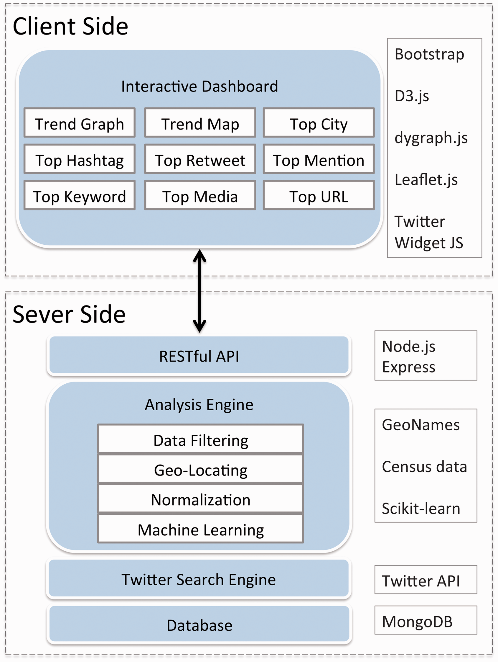
Social media retrieval (APIs)
SMART is originally designed to work with Twitter data. Twitter provides developers with two official APIs to access the tweet messages from the timeline. The Streaming API establishes a live stream connection with the global Twitter stream while the Search API is mainly for conducting singular queries to the Twitter timeline. With the Twitter Search APIs, SMART can retrieve tweets back to six to nine days before within the targeted area. This retrospective search function is useful for monitoring the social media responses to unexpected events, such as earthquakes. In addition, the design of SMART takes advantage of the spatial filtering methods provided by Twitter Search APIs. With the geocode parameter setup, the geo-search first identifies tweets with latitude/longitude coordinates that fall within the query areas, and then also finds tweets created by users whose profile location can be geo-coded to latitude/longitude coordinates that fall within the same area. By polling the Search API once per day, the system can access large datasets for specific geographic areas, which allows for detailed analysis of the data at municipal, regional, and national scales. Both geo-tagged tweets and non-geo-tagged tweets are retrieved with the Search API. 9 In terms of data management, the SMART system stores all retrieved social media attributes in MongoDB, an open-source and NoSQL database, considering its scalability and read/write performance (van der Veen et al., 2012). MongoDB is one of the most popular databases for Big Data with its capability of high performance queries, full-text search, and support of spatial query from very large datasets.
Geo-locating social media conversations and normalization
When searching for tweets with keywords, the Twitter search API can potentially return tweets with two types of spatial information: (1) geo-tagged locations provided by GPS-enabled devices, and (2) self-reported locations specified in user profiles. Geo-tagged locations are latitude and longitude pairs created by mobile devices with built-in GPS receivers or by users engaging with the geo-location features when posting a tweet. Self-reported locations are specified by users in their profile and can be changed at any time. Using Twitter messages with geo-tagged locations can potentially decrease the location uncertainty in analysis. However, tweets as such remain a small fraction when harvesting data with Twitter Search API, ranging from only 0.7% (Graham et al., 2014) to 6% (Takhteyev et al., 2012) depending on different topics. Many efforts have been made to infer the location of the social media users using user profiles (Hecht et al., 2011; Sakaki et al., 2010), with text content and timestamp (Li et al., 2011), and with models that combine multiple indicators (Ghahremanlou et al., 2014; Mahmud et al., 2012; Rodrigues et al., 2013).
For tweets that do not have attached latitude/longitude coordinates, SMART implements a placename geo-coding procedure using the GeoNames database (GeoNames, 2015). GeoNames is a community-driven geographical database that contains more than 10 million geographic names including alternative names. The backend system of SMART retrieves text from the user profiles and tries to find matches from the GeoNames database. In the cases when GeoNames gazetteers return multiple matching locations, the SMART geo-locating engine goes further and assigns the most populated location as a default to the tweet.
Normalization of population is another important task in the design of the SMART backend
system. SMART analyzes social media messages at the city level and it implements the block
group centroid demographic retrieval approach to normalize tweeting numbers in each city
based on their population size. Traditional city population size is based on the
administrative boundaries and census tracks, which do not match well with geo-search
circles of the Twitter Search APIs method. We used GIS software to calculate the estimated
population for each circle based on 2010 census tracts from the center of downtown to the
radius defined by the Twitter Search APIs. Each of these city point buffers was joined
with census tract centroids to determine which tracts should be included in our population
calculations (Figure 3). Using the
fine-grained census data allows us to gain a more accurate estimation of population, which
greatly improves the ability to accurately normalize tweet counts for individual cities.
Most of our city search methods use a 17 mile radius buffer to cover major metropolitan
areas of U.S. cities without overlapping each other (Tsou et al., 2013). Some cities use a larger or
smaller radius, such as Phoenix (40 mile) or Anaheim/Irvine (10 mile), in order to adjust
to the size and closeness of surrounding cities. The normalization function is limited to
the U.S. in the current implementation of SMART, and adding census data of other countries
can expand this function to more regions. Calculating population within the geo-search areas of targeted U.S. cities.
Data filtering and machine learning classification
Data filtering and cleaning procedures are very important for social media analytics due to the ubiquitous presence of noise. We developed comprehensive data filtering procedures on top of our previous research (Tsou et al., 2014; Tsou and Leitner, 2013). The first step is to exclude retweets and tweets containing URL links, as our previous studies have shown that these messages are more likely to be irrelevant to the study outcomes (Nagel et al., 2013). We also integrate a machine learning classification procedure for filtering noise from the tweets with scikit-learn, a Python library for data mining and data analysis. The goal of this procedure is to identify tweets that do not appear to indicate real-world cases of the monitoring topic/event so that they can be omitted from the statistical analysis. For classification, a linear support vector machine (SVM) (Joachims, 1998) was used, as this algorithm has demonstrated effectiveness at supervised learning tasks involving text. Twitter messages are transformed to numerical values using a term frequency-inverse document frequency model (Salton and Buckley, 1988).
For example, to train the SVM for the influenza topic, 1500 randomly sampled tweets from the 2012 to 2013 flu season containing the keyword “flu” were used to train the SVM classifier. Each of these tweets was manually inspected and classified as valid or invalid according to the likelihood that the message indicated an actual case of influenza, and this labeled data was used to train the SVM. The text classification model was validated using standard machine learning measures: recall, precision, and the F1 score. The test set was created by sampling 1000 influenza-related tweets at random. The validation procedure resulted in a precision score of 0.671, a recall score of 0.949, and an F1 score of 0.786. The high recall score indicates that the model correctly classifies the majority of valid tweets in the test set; however, the lower precision score indicates that invalid tweets in the test set are occasionally incorrectly categorized as valid.
Statistics and analytics for topics
After data filtering, SMART uses descriptive statistical methods to summarize the
analytics such as the most popular retweets, the most popular URL, the most popular
hashtags, and the most popular mentions. As the pseudo code (Figure 4) demonstrates, each new tweet is validated
with the pretrained SVM text classification model mentioned in the previous section. Valid
tweets are then inspected and entities (i.e., hashtags, user mentions, media, or retweets)
are extracted from the tweet text. Total counts of all unique entity values are maintained
in order to derive a list of the top 10 most frequent values for each entity. Pseudo code of the filter and classification procedures.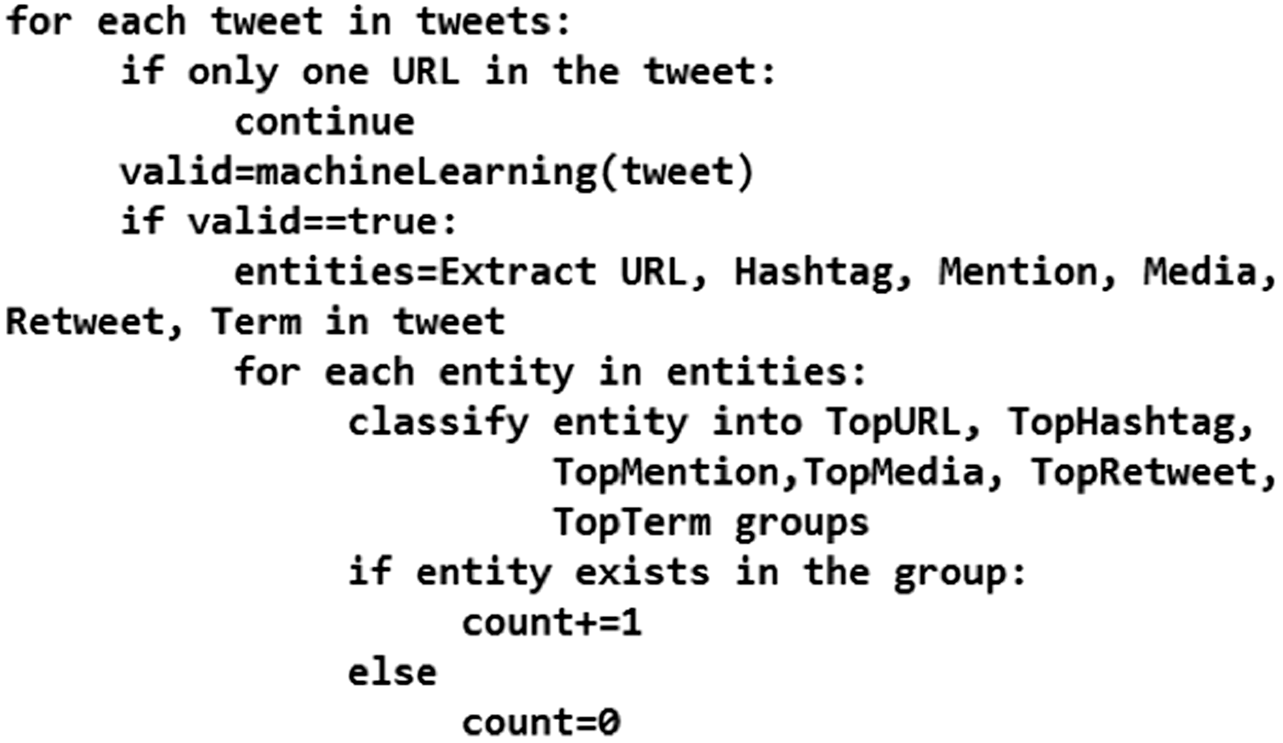
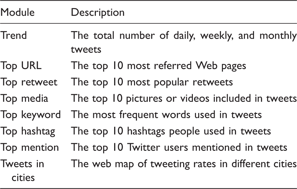
Descriptions of statistics and analytics modules in SMART dashboard.
Geo-targeted regional selection and multilevel spatial analysis
SMART can implement multiscale spatial analysis functions depending on the spatial
resolution of interest regions and on the spatial granularity of social media content. For
geo-tagged social media data that come with latitude/longitude coordinates, SMART can
aggregate them at different levels of map scale. For social media data that is not
geo-tagged in the first place, SMART can geo-locate these messages using user profiles and
then analyzes them at aggregated spatial resolutions including city level or state level.
SMART currently provides several aggregation modes for its spatial analysis results. In a
city-level trends map, analysis results are aggregated for each city and a circle on a map
represents each city (Figure 5,
right side). The graduated color in each circle shows the tweeting intensity in each city.
In a region-level trends map, social media messages are aggregated by administrative
boundaries (e.g., state boundaries, county boundaries) or bounding boxes (Figure 5, left side). Analysis results
displaying on the trends map can also overlay with external data sources such as land use
or census to provide users with additional information to preliminarily explain the
distribution of topics. Aggregated multilevel spatial analysis (state level, bounding boxes, and city-level
analysis) in the SMART dashboard.
Interactive user interface design
Different from traditional web map applications, the design of the SMART dashboard
provides interactive display maps with multimedia content, such as pictures, videos, text
messages, and charts (Figure 6).
The web-based user interface is built with open-source programming libraries,
jQuery and Leaflet APIs, to visualize and query tweets
from a server-side database. The user interface design in SMART dashboard.
The following key features are included in the SMART dashboard to provide interactive
query and visualization functions: Top index numbers show the number of tweets collected from one day, one week, or
one month. The left panel provides the list of targeted cities and the short cuts to different
functions (Word Cloud (Kuo
et al., 2007), Trend, Top URL, Top Media, Top Cities, etc.) Trend Function allows interactive queries of actual tweeting texts by clicking on
the point on the line chart. Users can switch the view to Daily,
Weekly, and Monthly mode. Word Cloud function shows the most prominent conversation keywords in tweets within
one day, past seven days, past 30 days, or combined all. Tweets in Cities function shows the normalized tweeting rates in each city using
graduated cartographic symbols. The dashboard also provides the top 10 list of top URLs (web pages), Hashtags
(subjects), Retweets (forwarded messages), Mentions (opinion leaders), and Media
(Pictures).
Figure 7 illustrates an example
of web maps for the combined “flu” and “influenza” tweeting rates among top 31 U.S.
cities. This web mapping tool was created by using open-source GIS mapping functions
(Leaflet APIs) and basemap layers from ESRI ArcGIS Online. The size of red circles
indicates the tweeting rates per one million people that were normalized by the method
described earlier. Users can select each city interactively to identify the detailed
information about the tweeting rate calculation. Analysis results are also shown in
different types of web maps depending on the spatial granularity of interests as mentioned
earlier in the “Geo-targeted regional selection and multilevel spatial analysis” section
(Figure 5). Web map of SMART dashboard for showing the combined “flu” and “influenza” tweeting
rates in U.S. cities.
The ultimate value of such dashboards is their ability to elucidate human dynamics in realspace. In order to evaluate the value of this dashboard, its preliminary utility in revealing a variety of social dynamics is illustrated by three independent case study exemplars.
Three case studies of SMART
When users access the SMART dashboard, at present they can select one topic from the topic
list (Figure 8) to analyze the
trends and popular messages. This topic list is potentially scalable. Here we present three
case studies to illustrate the practical uses of the SMART system and the SMART dashboard in
monitoring influenza outbreak, public responses to the Ebola outbreak, and online
discussions of marijuana legalization. These analytic functions of the SMART dashboard
provide researchers with methods for formalizing and testing their research hypotheses and
questions. However, these analytics results should not be used to give a direct answer or
action for complicated research issues. Since the current analytic capability of SMART is
still at a preliminary stage, the analysis results are simplified and generalized. Topic selection options in the SMART dashboard (http://vision.sdsu.edu/hdma/smart/).
Case #1: Monitoring influenza outbreaks in U.S. cities
The M3D predicts that some types of tweets will propagate more than others, based on a number of predictable factors. Furthermore, realspace events sometimes stimulate tweets (event-based or evememic), and sometimes social media activate realspace events (symbol-based or etymemic). In the case of flu, people are expected to tweet employers, friends, or family about their symptoms, or comment upon the flu symptoms of their social network associates. Furthermore, such tweets are likely to be viewed as personally relevant, credible, and readily diffused within social networks. Finally, given geotechnical contexts of “seasonal flu” and public health “vaccination” media campaigns, such tweets are expected to capitalize on a public attention readiness. Flu tweets, therefore, should reflect a dynamic evememic process.
The influenza monitoring case study is built upon our previous works (Aslam et al., 2014; Nagel et al., 2013) by using the
two keywords “flu” and “influenza” to collect related tweets from 31 major cities in the
United States. The dashboard can display multilevel temporal trend analysis at the daily,
weekly, and monthly scales for the 2014/2015 flu season (Figure 9). The system also includes historical data
as supporting background information (Figure 9c). We used the SMART graph to compare to the official Centers for
Disease Control (CDC)-curated manually collected flu records. The weekly SMART flu
tweeting trend is highly correlated to the CDC weekly FluView Influenza Positive Tests
Reports (Figure 10). The multilevel temporal trend analysis at (a) daily, (b) weekly, and (c) monthly
scales for 2014/2015 flu season monitoring tasks. Comparing the (a) SMART filtered flu tweeting trend (weekly) with (b) CDC FluView
Influenza Positive Tests Reported to CDC, National Summary (http://gis.cdc.gov/grasp/fluview/fluportaldashboard.html).

Case #2: Understanding public responses to the Ebola outbreak in the U.S. and West Africa
Flu outbreaks represent a situation expected to stimulate routine social media expressions. In contrast, Ebola represents a potential moral and existential panic that could reveal both self-expressions of apprehensions about the disease. Although flu kills thousands of lives per year, it is also a routine experience. In contrast, Ebola is widely viewed as an exotic, novel, and univocally feared disease with an extremely high mortality rate. Media exposure of the few domestic Ebola cases, and the prolonged outbreak abroad, provided an episodic context in which to observe a moral panic in its dynamic social media presence. There are likely to be few counter-campaigns or memes competing for the attention of the public on such topics in this context.
The emergence of the lethal Ebola virus in the U.S. and West Africa caused the public significant fear and concern regarding the risk of an Ebola epidemic (Seltzer et al., 2015). Public health policies aim to minimize the impact of disease outbreaks, yet heightened fear and anxiety can often drive population behavior. An effective intervention must anticipate how populations will respond. In the case of Ebola, the difference between containing a single isolated infection and combating a major outbreak can hinge on ensuring that the population understands how to respond to an infection. Some diseases may require immediate treatment, whereas others might involve sheltering and isolation in place, or contact chaining (Brennan, 2014; SteelFisher et al., 2015). Although our current health system and the CDC have good tools for reporting, monitoring, and measuring the spread of disease infection cases, we do not have effective tools to measure public perception, fear, and response during significant public health crises. Such panics can be counterproductive, diverting needed resources and attention away from more effective interventions (Towers et al., 2015). Thus, it is within the interest of both local and federal public health officials to understand the nature of public perceptions of risks regarding Ebola, and perhaps mine the myths that are diffusing regarding public health response to such outbreaks and moral panics.
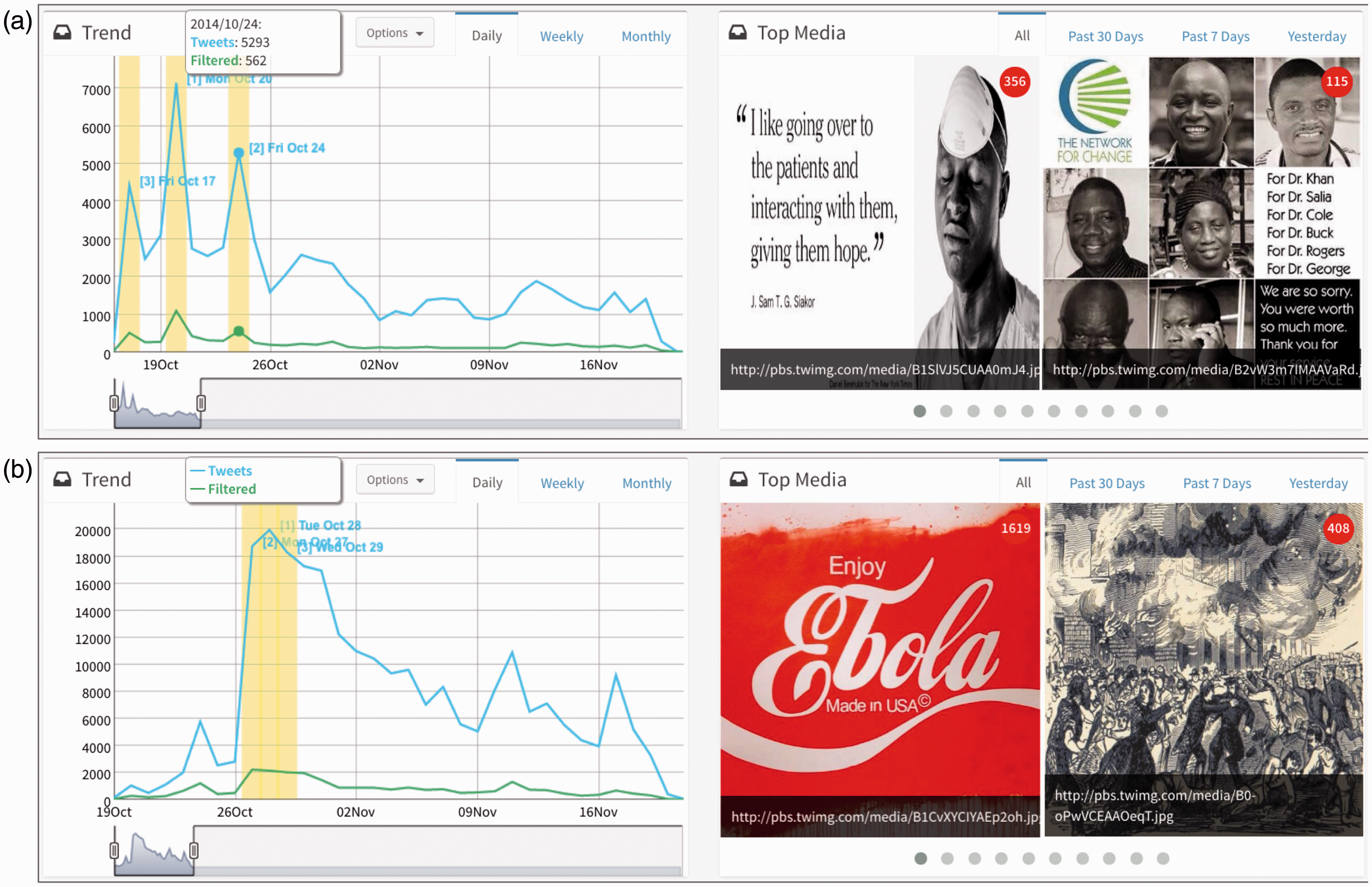
One potential use of SMART is to monitor public opinions and responses during or after
disease outbreaks or disaster events. During the Ebola outbreak in 2014, we used SMART to
track the public responses in West Africa and in the U.S. Twelve cities in West Africa,
three U.S. cities with 20 mile buffer zones (New York, Dallas, and Cleveland), and five
U.S. airports with 5 mile buffer zones (JFK, Newark Liberty, Washington Dulles, Atlanta
Hartsfield Jackson, and Chicago O’Hare) were monitored (Figure 11). Figure 12 illustrates the most popular media
(pictures) sharing in Twitter in these regions. The temporal trends of Ebola-related
tweets in U.S. cities are very different from the 12 West Africa cities. The most popular
pictures shared in Twitter in U.S. cities are very negative or sarcastic (such as “Enjoy
Ebola”). On the other hand, the most popular pictures and messages shared in West Africa
cities are mainly disease prevention-oriented information or medical aid from
international organizations. This knowledge can be used to gauge public opinions related
to the topic and devise response strategies accordingly. This case study demonstrates that
SMART can be used to listen to public opinions during crisis events or disease outbreaks.
SMART dashboard for public responses to Ebola in selected regions. Temporal trends of public responses to the Ebola outbreaks in (a) West Africa and
(b) U.S. cities.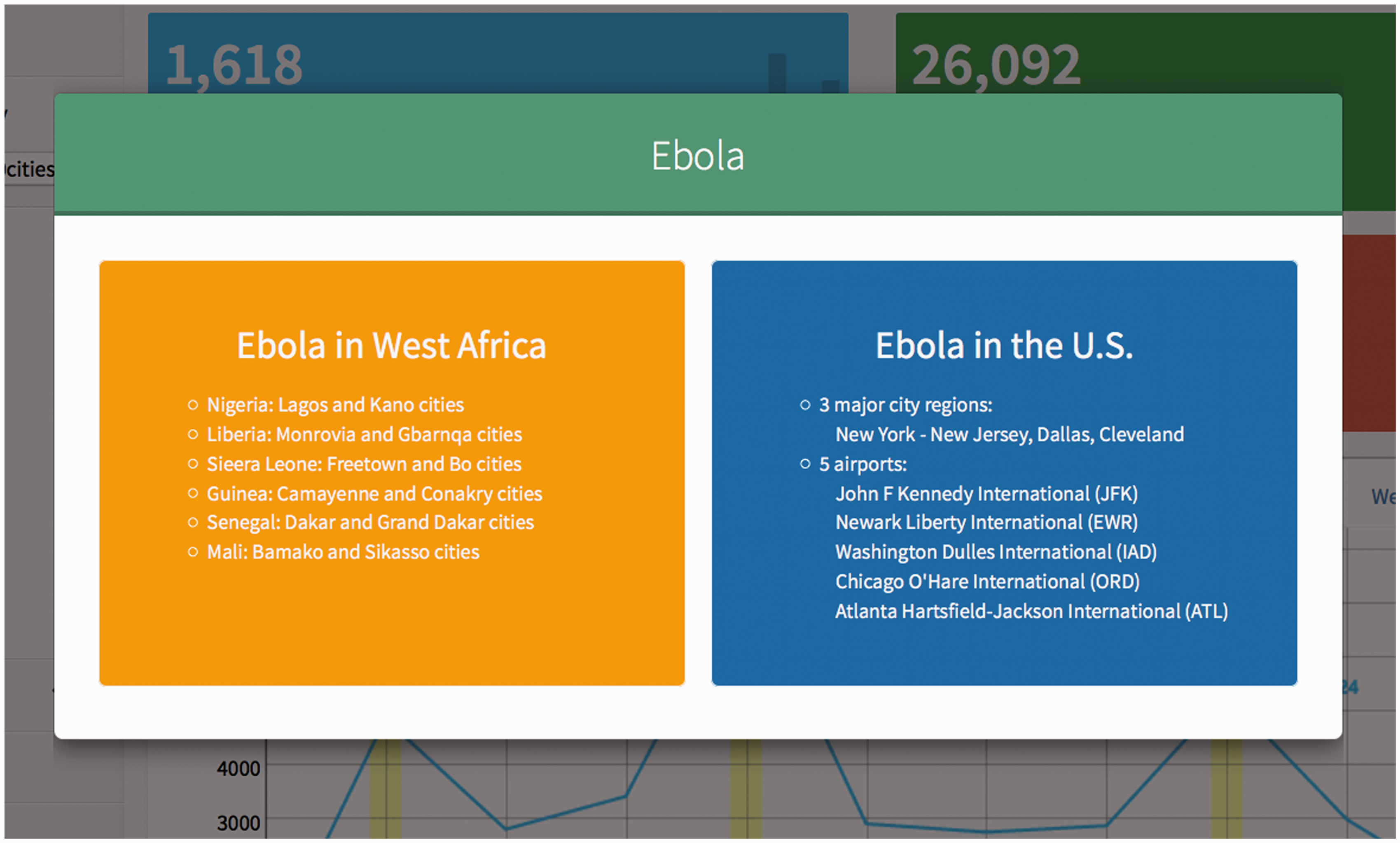
Case #3: Online discussion about marijuana legalization
Our second case study used SMART to monitor online discussions about marijuana legalization. The M3D anticipates that sometimes realspace events stimulate social media communications, and these communications in turn activate realspace events (i.e., polymemic events). Social movements use social media strategically and depend upon the self-generating and self-reinforcing features of such media campaigns to further facilitate the movement. Such movements, however, also evoke counter-campaigns and counter-framed messages. As such, tracking social movements focused on policy reform provides a unique opportunity to ascertain the role of social media in policy formation.
Working with domain expertise from the public health department at San Diego State
University, 12 keywords related to the marijuana legalization movement in the U.S. were
selected (legalization, pot, legalizing, anti-pot, anti-marijuana,
medicalmarijuana, #marijuanamedicine, #weed, #LegalizeIt, #cdb, #thc,
#cannabis). The SMART system served as the Twitter observatory of the marijuana
legalization discussion. As shown in Figure 13, SMART was able to pick up several peak days on which activity was
high on this topic, especially around 20 April 2015 (“420”), which has become a
countercultural observance day in North America on which celebrations and events related
to cannabis are hosted (O’Sullivan,
2005). The SMART dashboard provides the opportunity to extract text content and
embedded media, enabling inspection and interpretation of major activities of the Twitter
user community on that specific day. In addition to the temporal trends, SMART also
highlighted the most active Twitter users in this topic community. This information could
be useful for researchers, political consultants, community organizers, NGOs, and
government agencies to explore the opinion leaders and influential conversations in the
topic-related social network, which can lead to further strategic and policy planning. For
example, SMART was able to identify the Twitter user @THEMMEXCHANGE (The
Medical Marijuana Exchange) in the conversation related to marijuana legalization. The
handler of the @THEMMEXCHANGE account is a medical marijuana services and
advertising company that is active and well recognized in the marijuana legalization
discussions on Twitter. Monitoring the marijuana legalization movement and public discussions with
SMART.
Evaluation of user interface and the system
Shneiderman (1997) suggests that
a successful design of user interfaces would depend on three aspects: (a) Guidelines,
documents, and processes: provide a clear set of principles for developers to follow and
ensure a harmony in design across products; (b) User interface software tools: use for
prototyping and the implementation of actual design; and (c) Expert reviews and usability
testing: ensure a successful product for users. To evaluate the design and usability of
SMART, we invited nine graduate students from San Diego State University as testing users
with domain expertise including geography, computer science, public health, communication,
and sociology to conduct expert reviews on the user interface design and functionalities.
With a brief introduction of SMART, each reviewer was given seven days to test SMART from 9
February to 15 February. The review and testing was focused on identifying usability issues
and pointing out the positive and negative user experiences that should be maintained or
improved. Based on the aggregated expert review reports, the identified high priority
usability issues included: Loading of the page can be slower for topics with large amount of messages. Users cannot directly add new keywords inside the SMART dashboard. The updating frequencies on analysis results are different for topics. It would be nice to have a quick tutorial page before entering the system. Users cannot customize the display of modules in the SMART dashboard.
In addition to providing suggestions on significant usability issues, we also asked the reviewers to narrow down to three categories (efficient navigation, module organization and consistency, and, matching of user expectations) of the system and user interface design. Based on the aggregated suggestions and comments, key items of each category are described as follows.
Efficient navigation
Not very intuitive to trigger the popup windows for detailed tweets; Feedback submission form exceeding screen extent if using low viewing
resolutions; Several modules contain an “option” button but not sure what it is for without
clicking it.
Module organization and consistency
There are many analysis modules in the same page, making it somehow visually
cluttered; The time selection option is consistent across many analysis modules; The analysis modules are not aligned perfectly in the two columns; The title text for the Top URL module is not aligned with the time
selection options.
Matching user expectations
The Trend (timeline) module shows the changes of topic-related
tweets in different temporal resolutions; Clicking on any tag of the Word Cloud modules lists all the tweets
containing the tag, which matches the expectation; The order of the module items in the left panel does not match the order with the
actual module windows.
The expert reviews provide several important suggestions on how we could improve the functionalities and user experiences in future developments. Overall, SMART obtains positive feedback on its design, which is recognized in the review summary: (a) The graphic user interface design is friendly and intuitive; (b) the system functions as an easy-to-use tool to capture tweets; (c) variety of analysis modules supports exploration of different topics.
Discussion and conclusion
The multilevel M3D model anticipates that digital messages such as tweets serve a significant function as a transmitter of cultural change in society. As such, the model conceptualizes multiple levels of memetic influence, each of which is reflected to varying degrees in SMART, from (a) recovering the content of memes in tweets; (b) to the communicator level identified by users; (c) to the social network level recoverable from follower links, retweets, and URL links; (d) to the societal level of identifying the trends of other topics competing for attention in cyberspace; and finally (e) to the geotechnical level of urban and population differences.
There are four major challenges in developing and implementing SMART based on our own experiences: (1) control and access of social media data, (2) concerns over user privacy, (3) spatial uncertainty, and (4) biased user populations. First, similar to many web observatory applications, SMART extracts user-generated content through public APIs from a commercial company, Twitter. Researchers do not have any control or service guarantee of these public APIs administrated by private sectors. Situations such as the Twitter geo-search function breakdown problems are inevitable and can cause significant loss of data for researchers. Adding multiple social media data sources can be a possible solution for this challenge. SMART is originally designed to consume social media messages from Twitter. It is possible to extend the system design and data framework to collect other social media sources (such as Flickr, Instagram, Weibo, Foursquare, and YouTube). Adding more social media data sources might reduce the risks of missing key data due to the API failure or access deny. However, the integration of multiple social media sources under a unified database framework will be another challenge of system implementation.
Second, privacy concerns (Tsou, 2015) from users and the public may prevent the adoption of SMART in some sensitive research areas, such as drug abuse and drinking problems. The current design of SMART has taken several steps to protect the privacy of social media users. For example, data used in the analysis and the analytics presented on the SMART dashboard is only restricted to the public information that users agreed to share with the social media services. In the analysis stages, geo-tagged messages are analyzed at aggregated spatial resolutions, such as city or regions, to minimize the exposure of precise locations of social media users. At the visualization stage, to further enhance the protection, our privacy policy also implements a feedback procedure where users can request and have specific conversations removed from the SMART dashboard. Another possible privacy protection method is to convert all users to an anonymous ID. However, the user anonymization process may prevent future analysis of social networks from these messages. Future work needs to strike a viable balance between the protection of user privacy and the usefulness of social media messages.
Third, the spatial uncertainty in social media data affects the spatial analysis results of SMART. Social media messages were collected with different levels of location precision. Location information in the messages can vary from the most precise latitude/longitude coordinates points, to street addresses, to city names, to regions or place names that might not have clear boundaries at all. The procedure of aggregating geo-location information to different spatial granularities can introduce uncertainty to the final analysis results. Even though the geo-locating engine can geo-locate many incoming messages, the validation of actual user locations remains a difficult task in SMART.
Fourth, according to Pew Research Center (Duggan, 2015), young adults (age 15–24) are the majority users of most social media services. This could introduce demographic bias for the analysis of social media messages. To adjust to this demographic bias problem, one potential direction is to use a variety of keywords as sampling tools to collect opinions from different age groups of a population. For example, the use of the keyword #healthcare may collect a majority of messages from senior citizens rather than teenage users. But more validation studies are needed to verify the association between different keywords and different user groups.
Capturing human activities in real time using social media is now at the forefront of behavioral measurement and understanding human dynamics (Alshamsi et al., 2015). In this regard, the development of SMART is intended to provide a broader impact for both theory testing as well as future social response and monitoring. By following how the general population responds to trending topics, the role of public messaging in affecting population behaviors can be ascertained (Zubiaga et al., 2015). Such access will ultimately enable enhanced modeling of information propagation that can account for population-level behavioral responses and allow policymakers to tailor their communications to the specific needs of a given event or topic. This is especially relevant in public health cases such as influenza or disease outbreaks, where population responses can have a direct impact on the course of the outbreak, such as increased rates of vaccination, social isolation, and hand-washing. Further, knowledge of geographic disease diffusion and the communicative contents that correspond to such diffusion can be vital to designing and guiding public health campaigns.
To summarize, SMART can provide real-time spatiotemporal analytic functions for monitoring trending topics and online discussions by adding geo-targeting capability for cities and regions. Different cities and regions may reveal different patterns of conversations and trends. Linking space, time, and the content of social media messages, the SMART system is designed to discover meaningful patterns and insights of events such as disease outbreaks or social activities. The three case studies presented demonstrate the value of SMART in tracking disease outbreaks, monitoring public discussion, and measuring public perception during significant public health crises. With the capability of adding new topics and keywords to the monitoring system in the future, SMART is not limited to the public health domain and can be extended to other domains such as disaster responses, social movement studies, marketing, and political campaign.
This article is part of a special theme on Social Media & Society 2014. To see a full list of all articles in this special theme, please click here: http://bds.sagepub.com/content/social-media-society.
Footnotes
Declaration of conflicting interests
The author(s) declared no potential conflicts of interest with respect to the research, authorship, and/or publication of this article.
Funding
The author(s) disclosed receipt of the following financial support for the research, authorship, and/or publication of this article: This material is based upon work supported by the National Science Foundation under Grant No. 1416509, project titled “Spatiotemporal Modeling of Human Dynamics Across Social Media and Social Networks.” Any opinions, findings, and conclusions or recommendations expressed in this material are those of the authors and do not necessarily reflect the views of the National Science Foundation. The authors thank other HDMA team members’ contributions to the development of SMART.