
Abstract
Researchers in many fields have needed to develop a measure of infrastructure, and many proxies have been used toward this end, such as night light data and the Digital Chart of the World. Yet there are issues in using these methods. This paper presents a new way of proxying infrastructure: analysing the file sizes of map images on the Bing, Google, OpenStreetMap and Sina websites. The paper also demonstrates four ways in which this can be achieved. This approach is by no means perfect and does not solve all of the difficulties presented by other methods. Nevertheless, it does provide a simple and functional alternative proxy for level of infrastructure development.
Keywords
Background and motivation
Many researchers have tried to include a measure of infrastructure in their work for a wide variety of research goals. Unfortunately, there is no single data set which can give us a geo-coded measure of infrastructure. Accordingly, many proxies have been used, among them, the roads layer from the Digital Chart of the World (DCW), the Gridded Population of the World (GPW) data set (CIESIN and CIAT, 2005), the Gridded Economic (G-Econ) data set (Nordhaus et al., 2006) and, more recently, the Global Roads data set (gRoads; CIESIN and ITOS, 2013) and the Global Human Settlement Layer produced by the European Commission’s Joint Research Centre (JRC, 2014). 1 Yet these proxies present numerous issues, in terms of the granularity of their data and their appropriateness to social science research. While projects such as the Global Human Settlement Layer are moving in the right direction, they are not complete yet. We need a simple measure of infrastructure to use in the meantime.
An alternative: Using Bing Maps, Google Maps, OpenStreetMaps and Sina Maps
Accordingly, this paper presents an alternative means of proxying the level of infrastructure. By looking at the file sizes of images on internet map servers, such as Bing Maps, Google Maps, OpenStreetMaps and Sina Maps, we can make a reasonable inference into infrastructure development levels. To explain how and why map images are useful to proxy infrastructure, a brief discussion of the formats the map images are stored in is necessary.
Map file format and sizes
Bing, Google, OpenStreetMap and Sina have all chosen to use the portable network graphics (PNG) format to display map images in web browsers and other client software. The reasons for their collective decision are quite clear: the PNG format supports lossless data compression, which means that while file size can be greatly reduced, the map images will not suffer from the compression artefacts typical of other formats, such as those used in joint photographic experts group (JPEG) files; additionally, PNG files are not subject to the bit-depth limitations and potential patent issues of the earlier graphics interchange format (GIF) standard.
The functional specification document of the PNG format is registered as ISO/IEC 15948 (ISO/IEC JTC 1/ SC 24 Committee, 2004), the abstract of which states that ‘[t]he datastream and associated file format have value outside of the main design goal’. Using map images to proxy infrastructure, we are able to use one of these values. Inherently, the more complex a PNG image is, the greater its file size. We can use these file sizes as a proxy for the level of infrastructure development.
An illustration of this is made in Figure 1. As well as agreeing on a common image file format, Bing, Google, OpenStreetMap and Sina have also arrived at a common map image size: 256 by 256 pixels. When you visit the website of one of the four map servers, the image you see on screen is a composite of multiple tiles, each of these dimensions. Figure 1 presents individual tile images 2 from the four map servers for four cities: specifically (in descending order of population) Tokyo, Beijing, Littlerock (capital of the US state of Arkansas) and Timbuktu (capital city of the Timbuktu region of Mali). A quick glance at the sixteen tiles makes it clear that for three of the servers, the tiles of Tokyo are clearly the most complex, while those of Timbuktu are the least. This is reflected in the file sizes: for three of the map servers, the file sizes for Tokyo are the largest, and the smallest are for Timbuktu. 3

Comparison of four cities and four map servers at zoom level 9.
It is also worth comparing the same city for the four servers. For Tokyo, the OpenStreetMap image has the largest file size. The reason for this is clear: at this zoom level, the creators of OpenStreetMap have decided to include many roads, whereas Bing have chosen to only include major roads. A note should also be made on place names. As the text of the place names is part of the PNG image, it will therefore contribute to the file size. Bing have used entirely Latin characters; OpenStreetMap have chosen Japanese; Google use both Latin and Japanese characters; Sina, naturally enough, use simplified Chinese. This means that for countries which use non-Latin characters, the file sizes for Google map images will be greater than for those which exclusively use Latin characters.
It should be noted that the maps also contain other information, such as rivers. These too will add to the file size. Nevertheless, more infrastructure in the area should lead to a more complex map, which leads to greater file size. Also, we have no assurance that the the maps are complete or consistent across states. However, by giving the capacity to use four map servers, we can make some comparisons.
Applying the method
Applying this method is quite straightforward. To make things as easy as possible, four methods have been developed and made available on the replication website. 4
Method 1: Download the data as text files or images. To avoid having to make multiple requests to the image servers, 5 the file size data for Sina, OpenStreetMap and Google have been collected at zoom levels up to 9, 10 and 11 respectively and made available on the replication site. This is a snapshot captured in May 2016: further snapshots will be gathered to turn this into a time series.
Method 2: Use the infra package. For users of the R language, the
Method 3: Use the SpatialGridBuilder program. For researchers who want to avoid programming, the SpatialGridBuilder program is a standalone program which can create grids of any part of the world and download infrastructure data.
Method 4: Write your own, based on the R code. The basic R code has been made available and can be used as pseudo-code to build this in other languages. The principle is fairly straightforward and requires relatively little code.
Full details of these methods are available on the replication website.
Choosing a zoom level
One of the first things we need to do when using maps as indicators of infrastructure is to choose a zoom level.
First, a brief explanation of how zoom levels work for the four map servers. Once again, Google, Bing, OpenStreetMap and Sina have adopted a common approach, although there are some differences in the level to which they will zoom. The zoom level is an exponent used to determine how many tiles the world will be divided into, both latitudinally and longitudinally. 6 Hence at zoom level 0 (only used by Google and Open), the number of map tiles needed to cover the globe is 20 = 1 (or 1 tile wide ×1 tile high; see Figure 2). Longitudinally, this means that one tile covers 360 degrees. The number of degrees longitude covered by each tile decreases exponentially as the zoom level increases, as is shown in Table 1.

Google and Open, zoom level 0: the world in two 256 by 256 pixel tiles.
Zoom levels, number of tiles, and degrees longitude per tile.
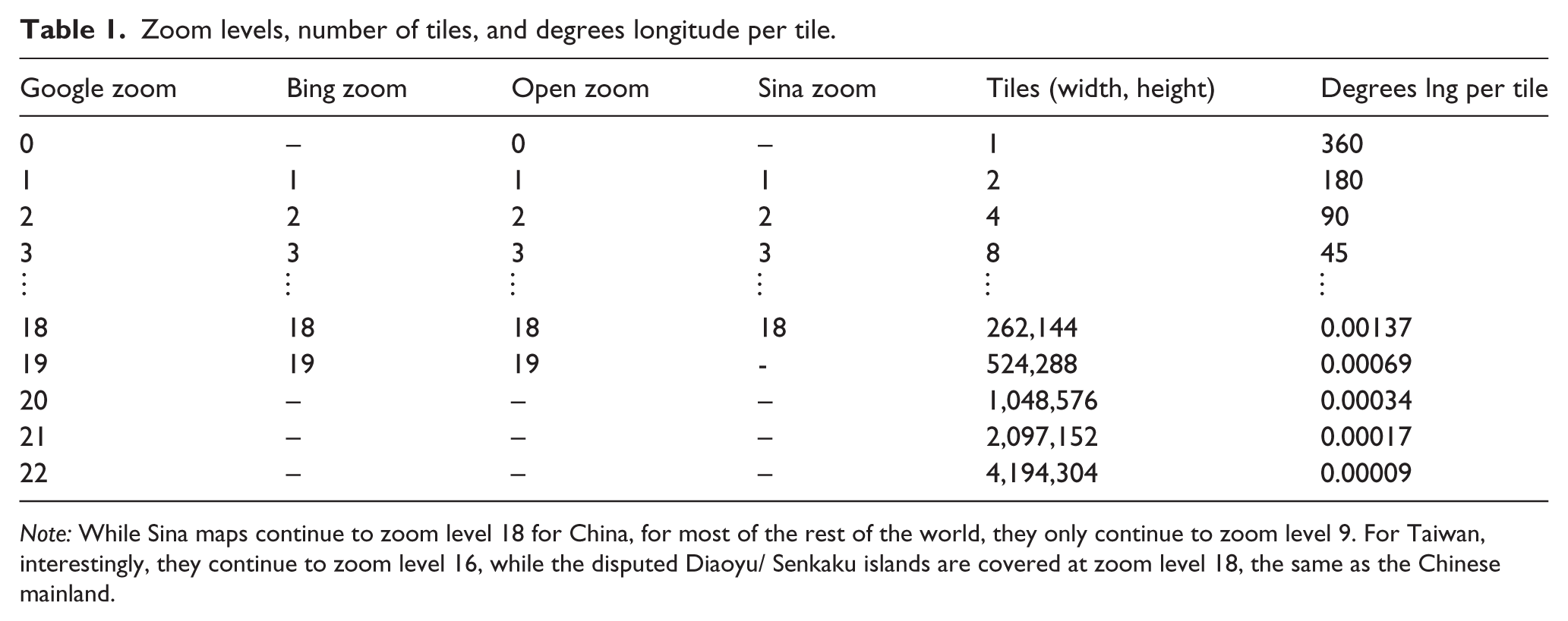
Note: While Sina maps continue to zoom level 18 for China, for most of the rest of the world, they only continue to zoom level 9. For Taiwan, interestingly, they continue to zoom level 16, while the disputed Diaoyu/ Senkaku islands are covered at zoom level 18, the same as the Chinese mainland.
The zoom level we use depends on our unit of analysis. Let us assume for the moment that we are using gridded data, and that our resolution is 0.5 degrees per grid cell (such as with the PRIO-GRID used by conflict researchers – see Tollefsen et al. (2012)). The zoom level we choose should be at least as high as our grid resolution, otherwise we will be repeatedly downloading the same map image. As the zoom level 10 divides the world into 210 = 1024 tiles longitudinally, which are therefore 0.35 degrees longitude per tile, we can use level 10 as our starting point; it is, of course, possible to experiment.
Visualisations
Now that the basics of using map size as a proxy of infrastructure have been outlined, it is possible to present some renderings of the measure. Figure 3 shows the infrastructure levels of the world at three different zoom levels (9, 10 and 11) for Sina, Open and Google. As was mentioned earlier, the priority of Sina is to provide maps of China: this is evident in Figure 3. For Open, Europe has by far the highest values, with Japan, South Korea and the east coast of the US also showing high numbers. These places also achieve high values in the Google maps, but at this zoom level, other regions also show up: mountainous regions such as the Himalayas and the Andes are clearly visible.
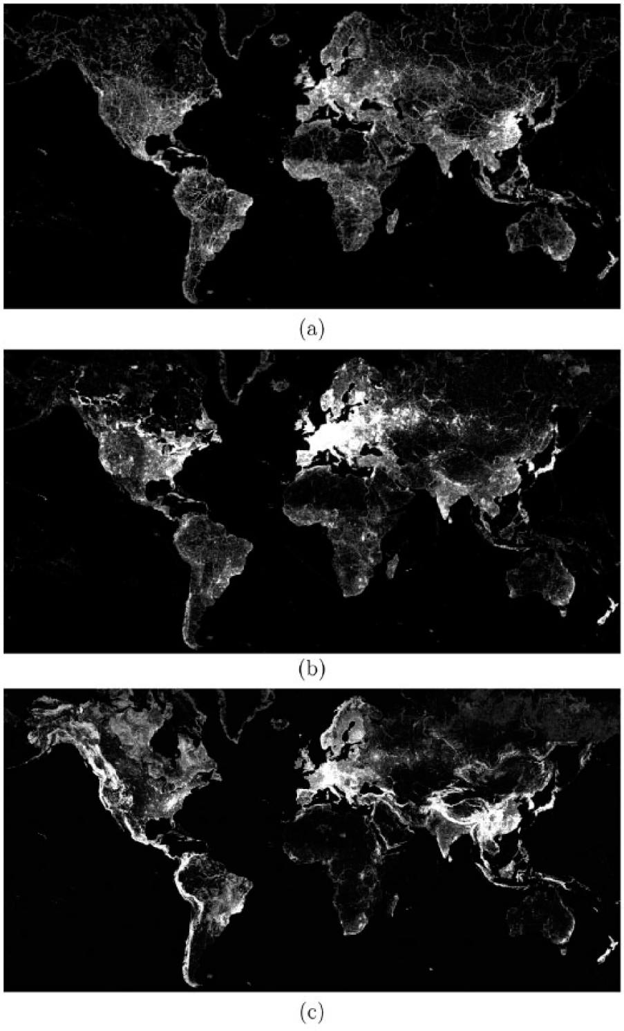
Renderings of infrastructure at three different resolutions and zoom levels: (a) Sina at zoom level 9, 0.7 degrees per grid cell; (b) Open at zoom level 10, 0.35 degrees per grid cell; (c) Google at zoom level 11, 0.18 degrees per grid cell. All three images have been brightened and cropped for publication. For convenience, the data are available from the author’s website at 168.144.172.143/infra.html.
Comparison with night light data
Night light data have also been used as a proxy for infrastructure. The data come from the National Geophysical Data Center of National Oceanic and Atmospheric Administration (NGDC-NOAA). The NGDC Earth Observation Group (EOG) provides nighttime observations of lights and combustion sources worldwide. The group started working with the Defense Meteorological Satellite Program (DMSP) data in 1994 and has produced a time series of annual cloud-free composites of DMSP nighttime lights.
Defense Meteorological Satellite Program (DMSP) night light data
As the name suggests, the fleet of satellites was developed in order to provide the US defense community with meteorological data. It was found, though, that a very nice additional benefit of the satellites was that they could be used to produce nightlight images. However, as producing nightlights was not their primary purpose, the satellites were not inter-calibrated; put another way, making year-on-year comparisons between nightlight data is possible, but presents issues. 7
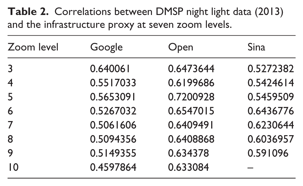
Table 2 presents a comparison between the infrastructure measure, derived from three map servers, and DMSP night light data. As can be seen, there is a positive correlation between the night light data and the three infrastructure measures. For the infrastructure measure based on Google maps, the correlation would appear to diminish as the zoom level increases; the reverse is the case for Sina, while correlations remain fairly constant for Open. More research is needed into why this might be the case.
Correlations between DMSP night light data (2013) and the infrastructure proxy at seven zoom levels.
We can explore this a little more, however, by looking at the parts of the world which have highest light levels, but comparatively low infrastructure levels. Interestingly, several of these points appear in Siberia. While attempts have been made in the night light data to remove surface light reflection, for instance from snow, this has not been entirely successful. The infrastructure measure is not affected by this problem.
Visibile Infrared Imaging Radiometer Suite (VIIRS) night light data
In 2012, the Earth Observation Group introduced new nightlight data from the Visible Infrared Imaging Radiometer Suite (VIIRS). The VIIRS was an improvement on the DMSP in several important ways: (1) the satellites capture night light data at a higher resolution (15 arc second grids, compared with the earlier 30 arc seconds); (2) they offer more levels of variance in the light data (65,535 levels compared with the older 63 levels); and (3) the instruments on the VIIRS were designed with inter-calibration in mind, in order that time series comparisons could be made without additional mathematics.
Figure 4 shows three renderings of Tokyo. The image on the left is DMSP night-light data for the year 2000 at its native resolution. It is very easy to determine which parts of the image are city and which parts are water, but within the city itself, it is hard to determine much variance: much of the city is registering at the highest value for the DMSP (63). The higher resolution VIIRS data in the centre image provide a considerable improvement. However, even though the goal of the nightlight time series is to create cloud-free averages, this is not always possible, as is shown by the slight blurring of detail in parts of this image. This is not an issue for the infrastructure image on the right. Indeed, this image captures infrastructure data which the other two cannot: looking very closely, we can see that it has captured the 14 km long Tokyo Bay Aqua Line. Night light satellites cannot capture this infrastructure because (a) it is too narrow, (b) it is too dark, (c) over 9 km of it is underwater. Table 3 shows that the two night light measures, plus the infrastructure proxy are all positively correlated, at a very similar level.
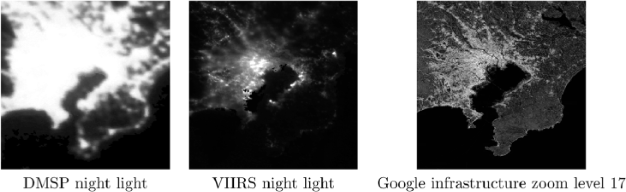
Tokyo comparison: DMSP night lights (2000) at native 0.008 degrees per grid cell; VIIRS night light (Oct 2012), at native 0.004 degrees per grid cell; Google infrastructure zoom level 17, at 0.004 degrees per grid cell.
Correlations between night light data and Google infrastructure zoom level 17: Tokyo.

Dealing with mountains and rugged terrain
Looking back to Figure 3, the fact that mountainous regions and other regions of rugged terrain are identifiable in the Google map is potentially a problem: how can we separate mountains from infrastructure? There are two workarounds. The first is to use SRTM topography data and apply the King’s move method to determine ruggedness (Pickering, 2016): by doing this, we can essentially subtract the value of the mountains from the affected grid cells. Figure 5 gives an example. Looking at figure (a), we have a grid built at 0.35 degrees per grid cell, using Google zoom level 10. This shows high values in some of the places we would expect: again, Europe shows high values, with some cities identifiable. But mountainous regions are also identifiable. Figure (b) shows the hundred highest values: some places in Europe, Japan, South Korea, Taiwan, but also places such as the Himalayas. Figure (c) shows the hundred most rugged terrains in the world, at this resolution, with places such as the Himalayas and the Andes showing up clearly. By subtracting the value of the rugged terrain from the map file sizes, we can find the hundred highest values of infrastructure in (d), which shows Europe, the east coast of the US and some key Asian cities. The method is not perfect: there are still some points in the Himalayas. Nevertheless, if research includes a mountainous region, this method can be applied.

(a) Infrastructure based on Google zoom 10, 0.35 degrees per cell; (b) top 100 highest file sizes; (c) top 100 most rugged regions, based on King’s move analysis of SRTM data; (d) top 100 infrastructures, based on filesize minus ruggedness of terrain.
The second method is much more simple: run the analysis at a higher resolution and zoom level. Mountain features take up less of the map image on higher zoom levels, but buildings and roads will take up more detail. Figure 6 demonstrates this. Looking at the Bing and Google maps, we can see a black swath running down the island. The ruggedness map, again based on a King’s move analysis (Pickering, forthcoming) of SRTM data, shows that this black swath is actually the most rugged part of Taiwan (the central mountain chain). Yet as it is shown in black on the Google and Bing images, at this higher resolution, the mountains are not being falsely interpreted as infrastructure.

Infrastructure and terrain ruggedness in Taiwan. Zoom level 15. (a) Infra. (Open). (b) Infra. (Bing). (c) Infra. (Google). (d) Ruggedness.
Comparison with road-based data sets: DCW and gRoads
Many researchers have tried to include a measure of infrastructure in their work for a wide variety of research goals. To do this, they have often used the roads layer from the Digital Chart of the World (DCW, later VMap0), because it was regarded as ‘the first comprehensive global dataset’ (Potere et al., 2009: 6536), 1 or as Nelson et al. (2006: 12) point out, it ‘provides global coverage and it is one of the best and most widely-used publicly available road network data sets’. 9
Yet while recognising the importance of the DCW, many have expressed their dissatisfaction with regard to its completeness and consistency (see Nelson et al., 2006: 12; De Sherbinin, 2011: 41; Smith and Langaas, 1995; Storeygard, 2013; Uchida and Nelson, 2010: 10). 10
Rather like the DCW before it, data from the gRoads project have also been considered as an infrastructure proxy. This is an attempt to create a comprehensive road data set based on modern data standards. Yet as Figure 7 illustrates, when operating at a very high resolution, data from gRoads do not have sufficient granularity to be used as an infrastructure proxy. Indeed, as the image demonstrates, using internet mapping data allows us to work at an even higher resolution than that used by the VIIRS project. 11

Kobe comparison: (a) Digital Chart of the World (DCW, based on VMap0); (b) gRoads; (c) Google map image, zoom level 15; (d) Google infrastructure, zoom level 21, 0.00017 degrees per grid cell (brightened for publication); (e) VIIRS (Oct 2012) at native 0.004 degrees per grid cell.
Summary
This paper has pointed out that many researchers have needed to create a measure of infrastructure, and have used several proxies as a means to accomplish this. Some old proxies presented issues for researchers, while some new ones are moving in the right direction, but are not yet ready. An easy-to-use alternative has been presented, which allows the researcher to capture four separate sources to create a data set. This alternative is by no means perfect: it too is subject to missing or inconsistent data, and introduces new issues, such as mountains and text affecting the results. Nevertheless, this paper has argued that map file sizes from Bing, Google, OpenStreetMap and Sina can act as a useful, if imperfect, proxy for the level of infrastructure. Future research will test whether this new measure can predict local wealth, in a more granular way than night light data (see Weidmann and Schutte, 2016).
Footnotes
Acknowledgements
The author would like to express his deep gratitude to the Konosuke Matsushita Memorial Foundation.
Declaration of conflicting interests
None declared.
Funding
This work was supported by the Konosuke Matsushita Memorial Foundation (grant number 13-G40).
Notes
Carnegie Corporation of New York Grant
This publication was made possible (in part) by a grant from Carnegie Corporation of New York. The statements made and views expressed are solely the responsibility of the author.