
Abstract
The dashboard is the most striking cultural artefact of the current coronavirus (SARS-CoV-2) pandemic. It reveals the fraught pandemic politics which are centred around territorial approaches on the scale of the state rather than international cooperation, democratic liberation, and local care. The dashboard is a biopolitical technology of anxiety, prompting national states of emergency. This narrow approach to framing the COVID-19 crisis is rooted in military-style pandemic preparedness planning that became fashionable in the 21st century. However, there is mounting evidence that this approach does not adequately address the uneven and unjust geographies of the present.
Introduction
Pandemic anxiety in the 21st century is a peculiar form of anxiety (cf. Everts, 2013a). It arises from the artefacts of pandemic risk management (i.e. numbers, statistics, graphs, models, and maps), bundled into online dashboards, which inform experts, politicians, and the public alike. The dashboard view of the pandemic – with its heat maps and aggregated numbers – is a biopolitical technology of anxiety that visualises the unfolding disaster, suggesting strong responses by national and regional governments (or else accepting the descent towards disaster and death). For the public health expert as well as the politician, the maps and curves instil as much concern and fear as they suggest the ways in which the pandemic needs to be acted upon – on the scale of the state and with territorial authority. Notwithstanding the global dashboards of the World Health Organization (WHO) and Johns Hopkins University, most dashboards have a built-in spatial imaginary of territorially confined spaces and societies whose integrity must be defended or regained. What is missing (or sometimes hidden in plain sight) from dashboards is more nuanced spatial, temporal, social, and epidemiological information.
Pandemic preparedness
In the aftermath of the H1N1 pandemic of 2009, many argued to stop being so fascinated by very low probability events such as deadly pandemics and to concentrate instead on the social conditions and the greatest killers. As Keil et al. (2011: 188) pointed out, ‘the current concept of pandemics has to be reconsidered and it should be accepted that the spread and severity of infectious diseases is generally more dependent on social conditions of populations than on the properties of the infectious agent’. In conclusion, they stated, ‘we know the great killers, namely cardiovascular diseases, diabetes, cancers and chronic respiratory diseases (plus malaria, HIV/AIDS, tuberculosis in a number of developing countries)’, with many premature deaths being ‘preventable by life style modification and public health measures such as improved social conditions, healthy nutrition, increased physical activity and a strict ban on smoking’ (Keil et al., 2011: 189). Now, almost a decade later, this seems like very good advice, with the risk groups in the current pandemic mostly suffering from precisely these chronic conditions. In general, the COVID-19 pandemic confirms the fact that pathogenicity is not a property of the virus but of social conditions and uneven geographies (cf. Hinchliffe et al., 2017).
However, the tedious work of smoothing out social and spatial inequalities as a cornerstone of pandemic preparedness has been avoided. Instead, public health has been infused with a fascination for emergency scenarios that are present in military-style pandemic preparedness planning. Influenza pandemics in the past lost much of their edge due to the advances in treating bacterial superinfections (which are the real killers in influenza pandemics). Nevertheless, pandemic preparedness as an exercise in managing end-of-the-world emergencies became fashionable due to a complex alliance between public health professionals, military officials, and journalists from the late 1980s onwards (King, 2002), garnering increased momentum after the 2001 Anthrax attacks. The first full-blown ‘this is not a drill’ pandemic situation was the 2009 H1N1 pandemic. It was the first influenza pandemic the public could watch unfold in real-time on their computer screens (Everts, 2013b). The pandemic as an unfolding emergency event to be experienced through data, maps, and graphs has matured now into the age of online dashboards.
Dashboard views
As Kitchin et al. (2015: 20) point out in respect to urban dashboards, ‘rather than reveal the world as it is, dashboards produce and shape the world’. They infer that ‘dashboard visualisations should not be naively accepted and interpreted as neutral, apolitical communication tools, but as active, ideologically loaded engineered devices’ (Kitchin et al., 2015: 20). Pandemic dashboards are designed with suggestive curves and colour coding. They create matters of concern and direct attention and actions in certain ways, foreclosing other paths. Pandemic dashboards hide as much as they reveal.
The publicly available dashboard view of the COVID-19 pandemic obscures risk groups as well as the small-scale patterns of the pandemic by glossing over the uneven geographies of disease and death (e.g. Figure 1 and Figure 2). Choropleth maps and maps with growing circles conceal the complex spatial patterns of viral spread and disease. They suggest that within a given territorially defined space the disease burden is shared by all equally. This is far from the case. The pattern of COVID-19 resembles that of other epidemics, with cities and regions with high population density (notwithstanding exceptions) generally being more and earlier affected than rural and remote places. Moreover, viral spread is less ‘rolling’ from one area to the next but rather hops and jumps, leaving out places in between, creating clusters elsewhere. This hopping and clustering is one of the reasons why the political responses seem (at least at times) so inadequate. The dashboard view suggests a far-flung territorial approach to the pandemic, with border closures and lockdowns, whereas the actual disease events necessitate a more localised approach, with the most severe outbreaks occurring in very local places such as hospitals and care homes.
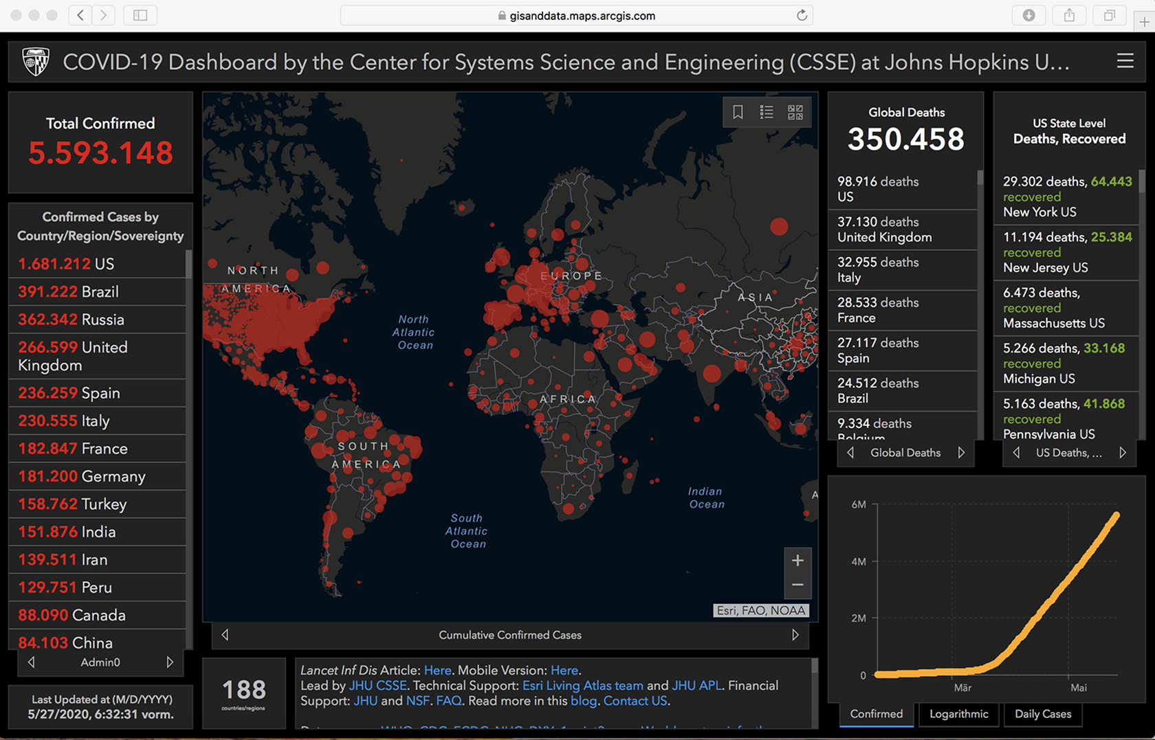
COVID-19 Dashboard, Johns Hopkins University, https://gisanddata.maps.arcgis.com/apps/opsdashboard/index.html#/bda7594740fd40299423467b48e9ecf6 (accessed 27 May 2020).
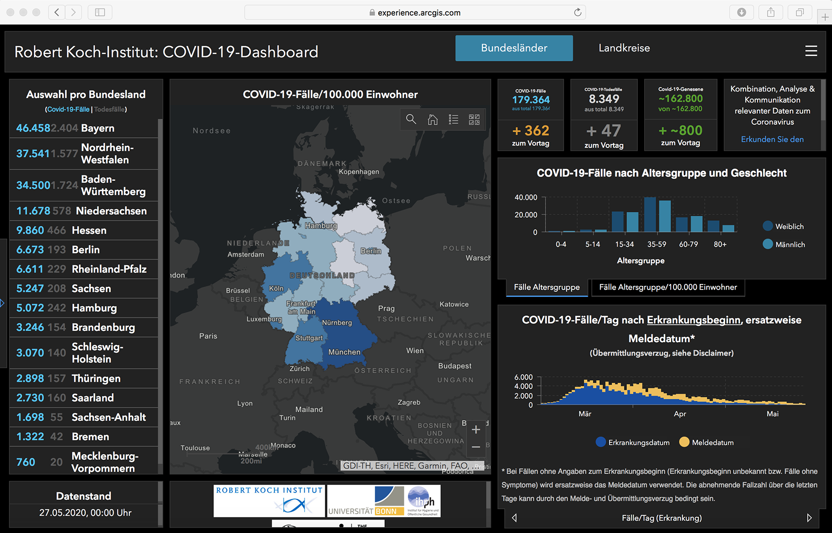
COVID-19 Dashboard, Robert Koch-Institut (Germany), https://experience.arcgis.com/experience/478220a4c454480e823b17327b2bf1d4/page/page_1/ (accessed 27 May 2020).
The maps and graphs of the pandemic dashboard do not show how communities and places are affected very unequally. Northern Italy, for instance, has an unfavourable demographic composition in relation to COVID-19 with very high proportions of frail elderly people (in terms of population aged 65 and over, Italy has the second oldest population after Japan). However, the conclusion that COVID-19 is the ‘Ebola of the rich’ (Nacoti et al., 2020) rings equally false when considering the high burden of disease and death experienced by poorer people and those belonging to ethnic minorities within their countries of residence. Research shows that the five boroughs of New York City are very unevenly affected, with the highest rates of COVID-19 hospitalisations and deaths in the Bronx – the poorest area with the highest proportion of racialized minorities (Wadhera et al., 2020).
UK data suggest that Black, Asian, and minority (BAME) people are affected and dying disproportionately from COVID-19. Although the reasons are thus far poorly understood, socio-economic disadvantages are very likely a contributing factor (Khunti et al., 2020). Other factors for the uneven share of suffering also seem probable, such as local long-term environmental conditions, with air pollution being one possible determinant of higher rates of hospitalisation and deaths (Ogen, 2020). These uneven geographies of disease and death shouldn’t come as a surprise to anyone familiar with the unequal share of the chronic disease burden in poor, minority, and polluted areas. However, this is all concealed from the dashboard view of the pandemic.
Public health in crisis
Although modellers are careful to stress that models need to be adjusted frequently to reflect the ever-changing situation (cf. Hinchliffe, 2020), the generalised dashboard views on ‘flattening the curve’ has never been officially revised, even when in some regions hospitals were completely overwhelmed, whereas in many less affected regions hospitals began financially ailing with most surgeries and treatments postponed and their beds remaining empty. Some authors are pointing now to equally large numbers of ‘collateral damage’ in terms of excess deaths among non-infected people who did (or could) not seek medical help. With normally crowded emergency rooms empty, Docherty et al. (2020: 13) conclude that ‘the public health message to “stay at home” during a period of social distancing needs to be more nuanced, with an equally clear message to patients with symptoms suggestive of an acute coronary syndrome, stroke and worsening of chronic heart failure to still seek urgent medical attention’.
The methodological nationalism of pandemic dashboards reveals the crisis of global public health. The new alertness around emerging infectious diseases was cast in the revised International Health Regulations, which invested new powers to the WHO in orchestrating pandemic preparedness. But after the 2009 H1N1 pandemic, the to-date mildest known pandemic in history, the WHO had to back off, taking the blame for sounding the alarm too loud and too early. In the intervening years, national preparedness planning seems to have more or less silently overtaken the approach of global public health. The WHO was very cautious in declaring COVID-19 a pandemic. It voted against face masks, border closures, and halting international travel. However, this had little effect and WHO advice was frequently overruled by national public health policies.
Conclusion
In addition to processes of ‘securitisation’ and ‘riskification’, public health has gone through a phase of ‘emergencisation’ in the 21st century. Emerging infectious diseases are now routinely dealt with within the frameworks of national security, risk management, and the declaration of national states of emergency, rather than international cooperation, democratic deliberation, and local care. The pandemic dashboard is a powerful visual-cultural artefact of this epoch. It coincides with the birth of new pandemic governmentalities, producing docile pandemic subjects, embracing the new pandemic consensus that caring for others is best achieved by leaving them alone.
However, national societies are not planes that can be landed safely by looking at a dashboard. People in 2020 are living in an interconnected world where lives depend on each other. An intertwined global and local approach would far better reflect epidemic patterns and social needs than national and territorially bounded responses. Geographers should not be deceived by the rhetoric (and noble aim) of saving lives through a generic version of social distancing. The state-wide locking up of children, poor people, people in crowded housing conditions, people in refugee camps, people with disabilities or other special needs – to mention just a few – has created unbearable situations in many countries and cases, as well as violence and suffering, the scale of which will only become apparent much later when the dashboards will have been switched off and pandemic anxiety is waning. Pandemic states are as unequal and unjust as anything before, and their uneven and unjust geographies need to be carefully studied and thoroughly exposed by future geographical research.
Footnotes
Acknowledgements
Many thanks to Reuben Rose-Redwood, Tyler Blackman, Michelle Buckley, Rob Kitchin, and Ugo Rossi for their valuable comments on an earlier version of this commentary. All errors remain mine.
Declaration of conflicting interests
The author(s) declared no potential conflicts of interest with respect to the research, authorship, and/or publication of this article.
Funding
The author(s) received no financial support for the research, authorship, and/or publication of this article.