
Abstract
We discovered a new type of assimilative color induction. An achromatic target with a white background was placed in the center of a concentric chromatic gradient that caused the glare effect. The target frequently appears to be in the same hue as the gradient. We discussed lower-level factors such as lateral inhibition and spatial summation functions, and higher-level factors such as illumination estimation.
How to cite this article
Kanematsu, T., & Ito, H. (2025). Concentric chromatic gradient affects color appearance of central targets. i–Perception, 16(6), 1–8. https://doi.org/10.1177/20416695251396873
Introduction
The glare effect is a brightness illusion where shine perception is caused by a concentric luminance gradient toward a white center (Zavagno, 1999). The gradient also enhances the simultaneous contrast between the perceptual brightness of the gradient and the center (Gori et al., 2010). Although colored gradients also cause the glare effect (Suzuki et al., 2019), it is still unknown whether the enhancement of simultaneous contrast is valid in colored gradients.
In this report, we investigated color perception within glare patterns, adding chromatic gradients (Suzuki et al., 2019), and compared that to those within a homogeneous color disk. Figure 1(a) shows an example where an achromatic disk (target) is placed at the center of a gradient. The target may appear to be slightly tinted the same hue as the gradient. An experiment was conducted to measure how frequently the target disk appeared colored while varying its luminance and the surrounding gradient color.

Stimulus and experimental settings. (a) Achromatic disks (targets) placed at the center of chromatic gradients. The upper row shows high-luminance targets, and the lower row shows medium-luminance targets. Since small retinal size of the target tends to be favored by the phenomenon, please adjust the viewing distance. (b) The gradient and homogeneous stimuli. (c) Experiment screen. The background was cropped for visibility. (d) Chromaticity of the stimuli surroundings of the gradient (filled circles) and homogeneous (filled diamond), target (white dot), and samples (filled squares).
Method
Participants
A total of 10 participants (aged 22 to 32), including one male and nine females, took part in the experiment. Their color vision was confirmed to be trichromatic using the Ishihara test. All participants had normal or corrected-to-normal vision. They agreed to the purpose and methods of the experiment, which had been approved by the local Ethics Committee of Kyushu University.
Apparatus
All experimental procedures were carried out with PsychoPy Coder v2022.1.2 (Peirce, 2007) running on Ubuntu 20.04.6 LTS. Visual stimuli were rendered on an LCD monitor (EV2450, EiZO, Japan) operating at 60 Hz and driven by a GPU (RTX 3070, NVIDIA, U.S.). Monitor luminance and chromaticity were measured using the high-sensitivity probe (CA-VP427, KONICA MINOLTA, Japan).
Stimuli
The stimulus, 4 degrees in diameter, consisted of either a gradient or homogeneous surrounding pattern (Figure 1(b)). The gradient and homogeneous surroundings corresponded to the illusion and control conditions, respectively. A linear luminance gradient from 170.5 cd/m² to 10.5 cd/m², spanning a 0.5 to 2.0 degree radius, produced a glare impression. The luminance profile was the same for all the gradient surrounding patterns. The gradient's chromaticity varied linearly from D65 to a specific chromaticity, over a 0.5 to 1.25 degree radius; between 1.25 and 2.0 degrees radius, the chromaticity remained at a constant value. The chromaticity and luminance of the homogeneous area were averages of those of the gradients. The stimulus was displayed at the center of a uniform background (24 cd/m², D65). The samples, which were seven 1.0 degree colored squares, were arranged in a row 3 degrees below the center of the stimulus (Figure 1(c)).
The surrounding hues consisted of five Munsell hues (5R, 5Y, 5G, 5B, and 5P) and D65 gray (Figure 1(d)). The seven colors of the samples were the five Munsell hues, 5BG, and D65. The addition of 5BG was intended to serve as a complementary color of 5R. The saturation of the sample chromaticities was reduced to 20% based on the surrounding of hue CIE1931 xy chromaticity coordinate (Figure 1(c)). When the sample chromaticities were fully saturated, the target seemed to be achromatic because the induced assimilation color was not vivid. The reduction rate was set based on the author's prior observations to match the appearance of the target colors on the gradient pattern. The chromaticity of the targets, 0.4 degrees in diameter, was D65 at three luminance levels: 90.5, 140.5, and 190.5 cd/m².
To test the accuracy of participants’ responses to the pale color of the sample, uniform stimuli were added to the experimental condition. The uniform stimulus was composed of a uniform surrounding and colored target. The surrounding was uniform white (D65, 170.5 cd/m²). The chromaticity of the target was equal to that of the samples. The luminance of the target was 90.5, 140.5, or 190.5 cd/m².
Procedure
The experiment was conducted in a dark room. Participants’ heads were fixed at a distance of 47 cm from the monitor using a chin rest. Participants selected one of the samples that matched the color appearance of the target located at the center of the stimulus. When the sample was selected using a mouse, a random-dot noise was presented for 0.8 s, and then the next trial began. The sample colors were the same across all trials, but their spatial order was randomized for each trial. A fixation point was not displayed. Participants were free to observe the stimuli. The sample was selected without time restrictions. Participants were able to practice the procedure before the experiment in order to understand it.
Participants responded eight times to each of the 57 conditions, consisting of 36 experimental conditions (3 target luminances × 6 surrounding hues × 2 surrounding patterns) and 21 test conditions (3 target luminances × 7 target hues). The order of trials was random. Participants took breaks freely or at least once every 14 min, with each break lasting at least one minute.
Results
Since the samples were pale in color, it could be difficult for participants to distinguish between them. Therefore, we checked the selecting accuracy of participants using test trials. The test stimulus was composed of the target with the sample colors on the white surrounding. The percentage of samples selected that matched the target color was highest for Participant 2 at 90% and lowest for Participant 3 at 53%. Even the lowest percentage exceeded the chance rate of 1/7. Since the percentage of all participants was within ±3 of the standard deviation, the responses of all participants were analyzed.
Figure 2 shows the averaged proportion of each sample color chosen. For the gray gradient, the gray sample was selected with a proportion of 0.787 to 0.975 across the target luminances. The gray sample was more likely to be chosen for low-luminance targets, while a chromatic sample was chosen more frequently for high-luminance targets. For the surroundings of 5Y, 5G, and 5B, the brighter the target was, the more frequently similar color samples were selected. This tendency was similar for the homogeneous conditions. However, for these same surroundings, proportions of the chromatic samples chosen were particularly low in the medium-luminance target.

Average proportions of sample selection across targets (n = 10). The horizontal and vertical axes indicate target luminance, and the probability of each sample chosen, respectively. (a) Shows gradient conditions and (b) the homogeneous conditions.
The differences in the proportion chosen between the gradient and homogeneous conditions were averaged (Figure 3). The difference between the same hue as the surrounding hue was analyzed to represent the amount of assimilation enhanced by the gradients, while the difference in the opposite hue, represented the amount of the contrast enhanced. The color pairs used for the contrast effect were 5R and 5BG, 5Y and 5B, and 5G and 5P. For example, the response of 5BG was analyzed as the contrast effect for the 5R surrounding. Two-way analyses of variance were conducted for each of the assimilation and contrast effects, with two factors: surrounding hue and target luminance. The analysis for the assimilation enhancement showed a main effect of target luminance (
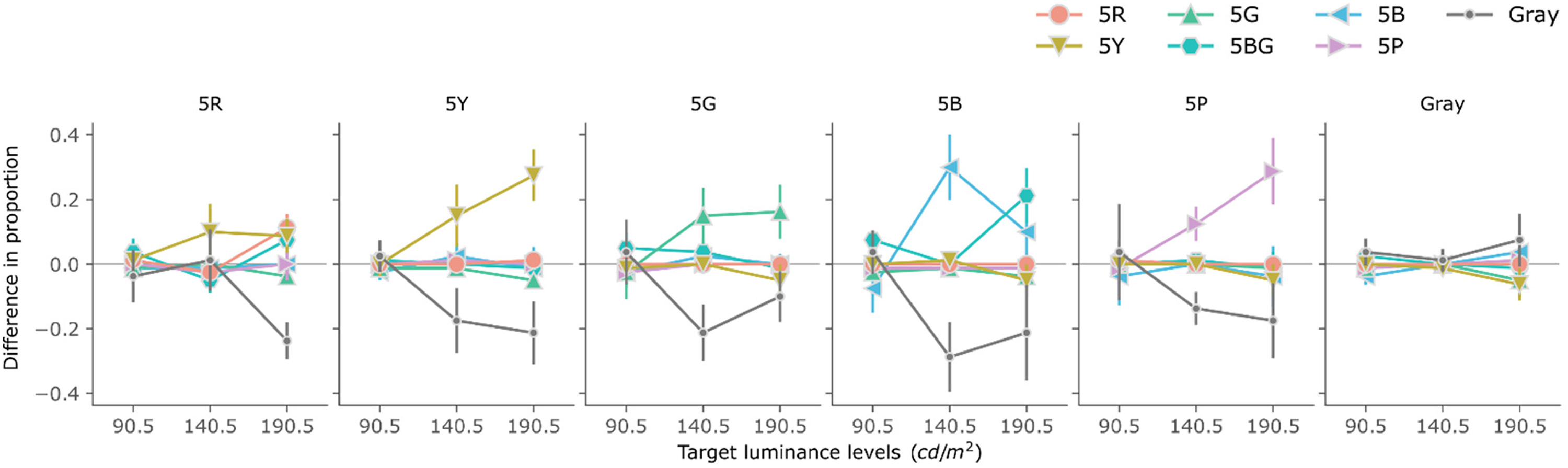
Difference in the proportion chosen between the gradient and homogeneous conditions. The horizontal axis indicates the target luminance. Each line indicates the samples chosen (see the legend). Error bars indicate standard errors.
Discussion
This study investigated the perceived color of achromatic targets placed within gradients of color and luminance. For the gradient condition, the proportion of selected samples matching the gradient color increased with target luminance. Although the control condition without the gradient also showed a tendency to select the same hue, the influence of the target luminance was unclear. In the following discussion, we refer to studies on brightness perception in achromatic luminance gradients and discuss whether they can be applied to colored gradients. The main factors are twofold: lower-level factors such as spatial lateral inhibition and averaging, and higher-level factors based on the interpretation of illumination and reflectance.
Visual neurons that respond to spatial contrast are thought to enhance perceived brightness and glare (Shapley & Enroth-Cugell, 1984). Gori et al. (2010) assumed a simultaneous contrast might arise between the perceptually brighter white caused by a luminance gradient and a gray test. We applied the explanation to our result: first, the complementary color of a gradient is induced in the white region surrounding the target by the simultaneous color contrast. Next, the simultaneous color contrast occurs between the induced color and the achromatic target color, resulting in the same hue of the target as the gradient color. The two-step contrast effect in the achromatic gradient may adjust a degree of simultaneous color contrast at the center of the colored glare effect. If the target appears darker due to the luminance gradient, the brightness contrast between the brightest target and the surrounding white is minimized. Since simultaneous color contrast increases as brightness contrast decreases (Gordon & Shapley, 2006), the same hue appearance will be enhanced in the brightest target. The difficulty with this theory is that the white surrounding the target does not appear as the complementary color of the grating. At this stage, it is difficult to explain this point.
The responses of visual cells that integrate signals over a wide spatial range and physical color blurring within the eyeball are factors that could contribute to assimilation (Cao & Shevell, 2005). There was a possibility that the appearance of colors in the central target area could change due to direct assimilation from the surroundings. However, we believe that direct assimilation is not a positive factor for two reasons. First, in a spatial composition where high-saturation colors change to achromatic colors toward the center, the gray areas appear to be complementary colors to the surrounding colors (Tsofe et al., 2010), which is inconsistent with the phenomenon of assimilation. Second, although scattered light from the surrounding colors may support the illusion, it cannot explain all the results. This is because the probability of the same hue being chosen was lower for the homogeneous condition than for the gradient condition although the homogeneous colors were placed closer to the target than the gradient.
Estimating illumination in a higher-order visual system is useful for explaining the self-luminous perception and luminance enhancement of the glare illusion (Agostini & Galmonte, 2002). When luminance gradients are interpreted as lighting that illuminates the central region, the visual system discounts the brightness of the lighting, making the central region appear darker. Although the estimation of illumination explains the contrast enhancement in achromatic colors, it cannot explain the assimilation effect of the color gradient. If a gradient color tints the estimated illumination, the color of the central area observed through the illumination should appear as a complementary color, with the illumination color subtracted. Because the glare effect of the colored gradients varies depending on the hue (Suzuki et al., 2019), it is thought that hue has an influence on the assimilation effect we observed. However, in the results of this study, hue had no significant effect.
Galmonte et al. (2015) reported an interesting assimilation effect in which reducing the width of achromatic luminance gradients causes the central region to appear brighter. This report is similar to our results, but upon closer examination, it describes a different phenomenon. The assimilation described by Galmonte et al. (2015) occurs between the central target and the central part of the gradient, and is interpreted as contrast effect relative to the outer parts of the gradient (the brighter appearance of the target can be explained by increased perceptual contrast against the outer black of the gradient). If colored gradients also increase perceptual contrast in the same way, the central target should appear as a complementary color.
Galmonte et al. (2015) clearly showed results for switching between the contrast and assimilation effects based on gradient width. Whether the switching also occurs in colored gradients cannot be determined from the results of the present study. To investigate the switching phenomenon, it is necessary to modify the present experimental conditions. One possible manipulation is to change the central target from achromatic to chromatic. The original target color was identical to the achromatic inner gradient, making it indistinguishable in the chromaticity spatial profile. By using a chromatic color instead, the target becomes visible in the chromaticity profile. This change will clarify in which space (e.g., cone excitation space or luminance-constant chromaticity space) the assimilation of colored gradients is most prominent. Another possibility is to test the effect of varying gradient widths. The switching caused by gradient widths occurs even when the gradient is not perceived (Galmonte et al., 2015). Therefore, it may share similar spatial characteristics with color perception in complex spatial configurations without gradients (Kanematsu & Koida, 2022; Shevell & Monnier, 2005).
The reason why the assimilation is less frequently observed under 5R gradient conditions is unclear. In fact, red stimuli are less distinctive in assimilation and contrast phenomena, unlike blue and yellow (e.g., Cao & Shevell, 2005). A study comparing hue and saturation discrimination may help us understand the unique results. The visual system is generally more sensitive to differences in hue than to saturation. However, at saturations of the lowest levels, saturation sensitivity exceeds hue sensitivity (Danilova & Mollon, 2016). This result was theoretically explained based on the assumption that noise distribution between two opponent color axes is correlated. We reexamined the results from the perspective of saturation and hue sensitivity. If the 5R assimilation effect is weak for some reason, it is possible that the coloration of the target was perceived but the hue was difficult to identify. This is consistent with the results showing a tendency for the gray sample selection rate to decrease under gradient conditions, while the samples of the same hue were not selected very often.
In summary, this study revealed that achromatic targets placed within chromatic and luminance gradients are perceived as having hues corresponding to the gradient, particularly when the targets are brighter. While several mechanisms may underlie this illusion—ranging from low-level processes such as spatial contrast and assimilation to high-level interpretations involving illumination estimation—none fully account for all aspects of the observed phenomena. Our results suggest that both contrast-based and assimilation-based explanations are partially valid, but further research is needed to determine the conditions under which each mechanism predominates. These findings contribute to a more nuanced understanding of color perception in complex visual environments and highlight the intricate interplay between physical stimuli and perceptual interpretation.
Footnotes
Acknowledgments
We thank Dr Sheryl Anne Manaligod de Jesus for editing this article.
Author Contribution(s)
Funding
The authors disclosed receipt of the following financial support for the research, authorship, and/or publication of this article: This research was partly supported by KAKENHI (Grant No. 22K20317).
Declaration of Conflicting Interests
The authors declared no potential conflicts of interest with respect to the research, authorship, and/or publication of this article.