
Abstract
The color appearance of #TheDress image varies across individuals. The color of pixels in the image distributes mostly in blue-achromatic-yellow color direction, and so are the perceived color variations. One of the potential causes is differences in the degree of perceiving light-blue pixels as a part of white clothing under a skylight, referred to as “blue bias.” A deep neural network (DNN) application was used to simulate individual differences in blue bias, by varying the percentage of such scenes in the training-image set. A style-transfer DNN was used to simulate a “color naming” procedure by learning pairs of natural images and their color-name labels as pixel-by-pixel maps. The models trained with different ratio of blue-bias scenes were tested using the #TheDress image. The averaged results across trials showed a progressive change from blue/black to white (gray)/gold, indicating that exposure or attention to blue-bias scenes could have caused the individual differences in the color perception of #TheDress image. In an additional experiment, we manipulated the relative number of artificially blue- or yellow-tinted images, instead of varying the ratio of blue-bias scenes, to train the DNN. If the blue-bias scenes are equivalent with blue-tinted images of scenes taken under daylight, this manipulation should yield similar result. However, the resulting outputs did not produce a white/gold image at all. This suggests that exposure to skylight scenes alone is insufficient; the scenes must contain unequivocally white objects (such as snow, white clothing, or white road signs) in order to establish a “blue bias” in human observers.
How to cite this article
Ichiro Kuriki, Hikari Saito, Rui Okubo, Hiroaki Kiyokawa, & Takashi Shinozaki. (2025). Can DNN models simulate appearance variations of #TheDress? i–Perception, 16(6), 1–15. https://doi.org/10.1177/20416695251388577
Introduction
The human visual system is always challenged to make the best estimation about the color appearance of object surfaces, and this estimation is reliable in most cases. This process is to ascribe tints in the visual field or object images to the color of illuminants; this process is called color constancy. However, this process occasionally becomes unreliable, particularly in photographs lacking dependable indicators to estimate shooting conditions, including the properties of illuminants. #TheDress is one of the most famous images in the last decade that yielded the largest differences in color appearance among people; some people perceive a white dress with gold laces while others see a blue dress with black laces (Aston & Hurlbert, 2017; Gegenfurtner et al., 2015; Lafer-Sousa et al., 2015; Toscani et al., 2016; Winkler et al., 2015). The variations in the color appearance of the dress have been reported to be more continuous than discrete representations of white/gold or blue/black when they are measured by a color-matching procedure (Gegenfurtner et al., 2015; Toscani et al., 2016).
Such variations in normal participants are suggested to be relevant with a phenomenon called “blue bias (Pearce et al., 2014; Winkler et al., 2015).” This is a tendency that an object that reflects blue skylight on a sunny day is likely to be perceived as a white object in shades under a blue sky. As psychophysical studies (Gegenfurtner et al., 2015; Toscani et al., 2016) and our reanalysis of the color matching results (Kuriki, 2018) has revealed, the variability in the perceived color of dress is considered to be related to the variance in the (implicit) estimation of illuminant color in a blue–yellow direction (Aston & Hurlbert, 2017; Kuriki, 2018; Toscani et al., 2016; Witzel et al., 2017). Another study has tried to ascribe the variance of color perception for #TheDress image to the blue bias, which the authors examined a link with chronotype of the participants (Aston & Hurlbert, 2017). Therefore, the perceived color of #TheDress, which is affected by the estimation of illuminant color, could depend on individual differences in the degree of blue bias (Aston & Hurlbert, 2017; Pearce et al., 2014; Winkler et al., 2015) in their lifetime experience. However, the degree of blue bias may depend on individual differences in the chance of experience (Aston & Hurlbert, 2017; Motoyoshi, 2022) seeing white objects under a blue sky or the differences in the attention to such scene/situations or by lifestyle habits (Aston & Hurlbert, 2017; Toscani et al., 2016). If that is the case, it will be difficult to manipulate the degree of blue bias in human participants using ethically acceptable procedures as a psychophysical experiment.
To address this issue, we used artificial deep-layered networks (deep neural networks [DNNs]) to simulate color-naming task in human participants. The DNN models have been used in recent studies on human visual perception or illusions (Gomez-Villa et al., 2025; Watanabe et al., 2018) by taking advantage that the layered structure of artificial network with the repeated processes of convolution and pooling the responses of preceding “neurons.” There are several studies using artificial models of neural networks investigating the performance and color vision mechanisms, such as contrast sensitivity (Akbarinia et al., 2023), color categorization (Akbarinia, 2025), and color constancy (Heidari-Gorji & Gegenfurtner, 2023). Therefore, we used one of such DNNs in the present study to mimic the color-naming task by training the DNN to report the color of each pixel in an image by a “color label.” We also tried to manipulate the variability of experiencing/paying attention to the blue bias scenes to examine whether outputs of such DNNs could show variability like those in human responses, particularly for #TheDress image. In the present study, we used an artificial neural network model, called pix2pix (Isola et al., 2018). Pix2pix is a representative model of generative adversarial networks (Goodfellow et al., 2014; Radford et al., 2016), which learns relationships between input and target images to achieve style transfer. We employed this style transfer to realize the conversion from natural images to color labels, serving as a model for the color-naming process in human participants.
Methods
The method of this study is outlined as follows. Initially, we implemented a semiautomated algorithm to label image pixels by color names. The algorithm had slightly different color-naming criteria between that for images containing a white subject rendered with bluish pixels (blue-bias images) and those without such characteristics (nonblue-bias images); each group was processed independently. Subsequently, we trained a DNN model (pix2pix; Isola et al., 2018) using images paired with object color labels so that the model learned to assign color labels at the pixel level. This model serves as an analog for the color-naming process in human participants. By varying the proportion of blue-bias to nonblue-bias images in the training dataset, we generated DNN models that are expected to simulate different degrees of blue bias in humans; 10 models were produced for each condition. We hypothesize that models trained with a higher proportion of blue-bias images will produce white/gold outputs for the #TheDress image. The following sections provide a detailed account of each stage of the methodology.
We first developed a semiautomated labeling algorithm, and the resulted labels were verified by human participants (Okubo et al., 2023). The labeling algorithm consisted of two steps. In the first step, all pixels in each image were classified into 25 clusters (this number was determined empirically by trials and errors; also see Supplemental Figures S1 and S2) by its chromaticity with k-means method in the CIE LAB space, which is designed to represent a uniformity in terms of suprathreshold color difference perception. The purpose of this classification step was to prevent unexpected abrupt changes in color category, that often happens for gradual color changes in an object when direct classifications by pixel colors were applied (Figure 1A and B). In the second step, centroid of each cluster was calculated and that were classified into categories based on a previous color-naming study in Japanese (Kuriki et al., 2017; Figure 1C; Okubo et al., 2023). In a psychophysical test (N = 15), color labels created using this method were preferred for more than 90% of images compared to those created without the clustering process (Okubo et al., 2023) (also see Supplemental Figures S1 and S2). This algorithm was applied to all training images to obtain color-name labels in the form of a graphical map.

Example of our categorical color labeling algorithm (Okubo et al., 2023). A. Original image. B. Results of color labeling without applying k-means clustering. Part of the yellowish wall on the right is oddly classified as green. Similar artifacts are seen on the ceiling. C. Clustering prevented artifacts in B. and yellowish wall is classified appropriately.
Aside from this process, training images were manually classified into two groups: blue-bias images and nonblue-bias images. Most images that contain white objects under a blue sky (e.g., Figure 2A) are classified to blue-bias images (Chauhan et al., 2014; Churma, 1994), in which the bluish pixels in the “white object” regions are usually perceived white by human participants; other images were classified as nonblue bias images.

Blue-bias image and its labels. Column A. Original images from MS COCO image set (Lin et al., 2014), including blue-bias case. The objects in these images are perceived white, although each pixel has a bluish chromaticity. Column B. Example maps of categorical color label, ignoring the blue-bias effect, and white object surfaces (sign board [top], snow [middle], and uniform [bottom]) are labeled with light blue (“mizu” in Japanese; Kuriki et al., 2017) pixel. Column C. Categorical color label with the blue-bias effect. The color labels for surfaces with white albedo are now white. The color label on the building (top row) changes slightly (beige part in column B. turns brown in column C) but both labels are acceptable. The color label for the green grass stays the same. More examples are shown in supplemental Figure S2.
Six hundred blue-bias images and 600 nonblue-bias images were chosen from MS COCO dataset (Lin et al., 2014). By varying the population mixture of the blue-bias images in the total 600 training images, individual differences in the degree of blue bias were simulated. To label white objects in the blue-bias images as white (Chauhan et al., 2014; Churma, 1994), color-category borders in the second step of our algorithm were shifted in –b* direction on the CIE a*b* plane by delta-b* = 13 (see Supplemental Figure S1C); this was applied to the blue-bias images only. After then, pairs of natural images and their corresponding color labels were used in the experiment.
Two types of labels for #TheDress image with and without the blue bias are shown in Figure 3. #TheDress image was used for testing purpose only and was never used for the training of pix2pix.
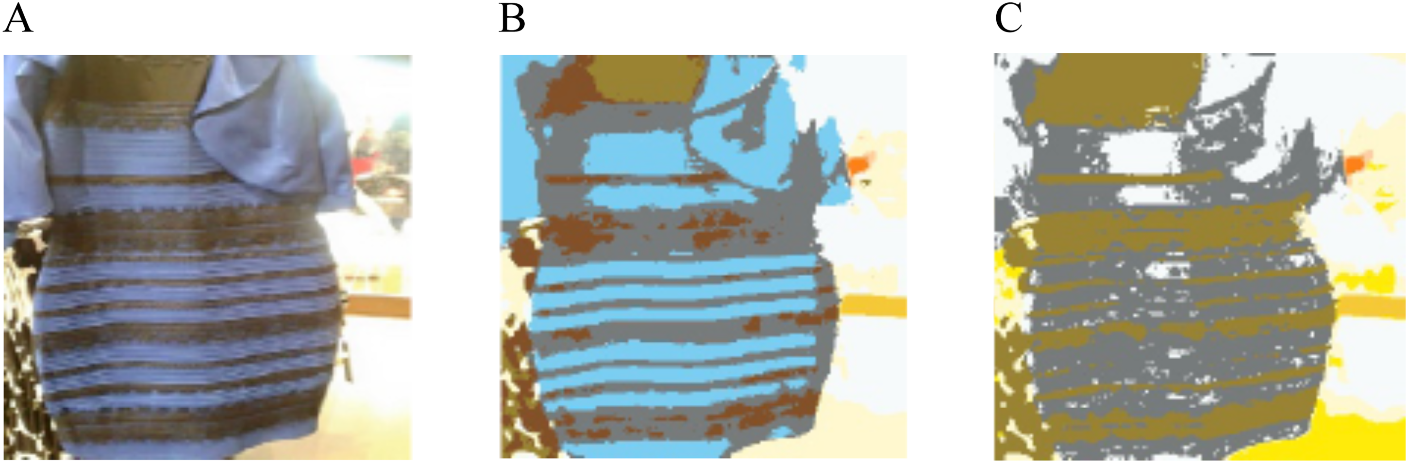
#TheDress image and its color label images. A. Original image resized to 256 × 256 pixels for the test with pix2pix (Isola et al., 2018). B. Color category label without blue bias. The dress part is labeled light blue. C. Color category label with blue bias. The dress part is labeled achromatic.
The pix2pix model was trained by using natural image pairs with its corresponding color label; the input image was the original and the target image was a corresponding label image. The model uses the color label of the paired image as a target (or “correct” response) when optimizing the weights between nodes of multiple layers. In the case of using Figure 2A as one of the training images (as an input image), it was paired with the corresponding label image in Figure 2C (as a target image) when taking blue bias into consideration. We then obtained a pair of images as output; the output image will show objects colors as a result.
The pix2pix was operated on Python (ver. 3.7.5), PyTorch (ver. 1.10.1 + cu113) with a NVIDIA GeForce RTX3060 on a PC, operated by Ubuntu OS (ver.18.04 LTS). We employed official PyTorch implementation of pix2pix (CycleGAN and pix2pix in PyTorch; Isola et al., 2018). Pix2pix used most parameters in default values, for example, the learning rate was 0.0002. The mini batch size was 1 and the number of repetitions needed for the convergence of training was at least 200 epochs. The pix2pix model consisted of a discriminator and a generator; the discriminator classifies input images as real (ground truth) or generated ones, while the generator tries to generate images to deceive the discriminator as much as possible. The discriminator has 2,769,000 parameters and the generator has 54,414,000 parameters. The pix2pix model we used in this study was obtained from a github (https://github.com/junyanz/pytorch-CycleGAN-and-pix2pix) and was not pretrained. We used the same loss functions for the discriminator and the generator as in the original pix2pix paper (Isola et al., 2018); to train the discriminator, the success/fail in discriminating a generated image from a real one was scored with 1/0, and the cross-entropy loss was derived by combining the output probability; the generator used input/output image differences (L1 norm) in addition to the cross-entropy loss (see Isola et al., 2018 for details). Example data and model parameters can be found at our github 1 .
When the models were tested with #TheDress image, we evaluated differences between corresponding pixels of the “correct” label (Figure 3C) and output color-label images in Euclidean distance of their chromaticity, only in a*-b* chromaticity in the CIE LAB space (


Considering the variability resulting from random initial values on the training process of the DNN, we repeated the training under the same condition for 10 times. We put #TheDress image as input to each trained model to examine its performance. The mean and variance of errors across 10 models were calculated, and the analysis of variance was applied to evaluate the statistical significance of the blue bias effect.
Results
Figure 4A shows a series of example output images of the models trained with different percentage of blue-bias images. As can be seen in the example images, the achromatic part is labeled “gray” when the blue-bias percentage is high, but that is simply because our pix2pix models were not trained to compensate for the brightness differences in the image. Figure 4B shows reduction in error between “achromatic/gold” label (Figure 3C) under different percentage of blue-bias images in the training data set. After a statistical evaluation was conducted by paired t-test, a significant difference was obtained between 0% and 50% (t (18) = 17.24, p < .001).

Example results of output images. A. Example outputs pix2pix models trained for different percentage of blue-bias images in the training dataset, when tested with #TheDress image (Figure 3A). From left, 0%, 10%, 20%, 30%, 40%, and 50% of training data were blue-bias images. B. Changes in output images for each blue-bias percentage condition (mean±SEM across 10 repetitions), evaluated by the rooted mean of squared errors (RMSE) of difference in C* between output image (Figure 4A) and blue-bias label (Figure 3C). The horizontal axis represents the % blue-bias image in the training data set. The vertical axis represents RMSE. The results asymptotes at below ΔC*=5.0 at 40% and above.
Figure 5 shows validation of training results with images in untrained dataset. The models trained with a dataset including blue-bias images yielded correct “naming” results for white objects such as plates on the table. Another interesting point of this result is that pizzas and red wine in bottles and glasses in the output images are labeled red (Figure 5C and F) while the corresponding part in the label images in the “correct” label was brown (Figure 5B and E). This implies that object recognition process seems to work when labeling object colors in the pix2pix algorithm. The appropriateness of the “correct label” will be discussed in the Discussions section.

Example images showing the results after training for color-naming simulations. Panels A and D show original images taken from MS COCO (Lin et al., 2014). Panels B and E show color labels defined by our algorithm (Okubo et al., 2023). Panels C and F show result of pix2pix outputs. Some reddish colors are seen in outputs (panels C and F) while such areas are labeled brown in the “correct (in terms of color naming)” label images (panels B and E).
Additional Experiment
The only and essential difference of the algorithm for the blue-bias labels from that for nonblue-bias labels is whether the range of color categories on the CIE a* b* plane is shifted by ΔC* = 13.0 toward bluish (−b*) direction. This is a process of compensating the correspondence between chromaticity coordinates of each pixel and color-name regions by canceling the overall bluishness of the chromaticity shifts by skylight. The blue-bias images used in this study are photographs that includes white objects (snow, cloths, road signs, porcelain products, etc.) in shaded area under blue sky. On the other hand, shifts in overall chromaticity of images in a certain direction of color space occurs similarly as shifts in color appearance under chromatic illuminant (Kuriki, 2018). It implies that the blue bias phenomenon is similar to a process of applying a color constancy algorithm for images under bluish illuminant, that is, blue sky. If that is the only difference, changes in the relative number of blue-bias images in the training dataset of the first experiment could have been simply evaluating differences in the training conditions for color constancy under bluish and whitish illuminants.
To test this possibility, we have carried out a supplementary experiment by conducting a series of color constancy training in DNN models while varying the ratios of images with slight yellowish and bluish tints across models, without employing the special set of blue-bias images. The reason of excluding the blue-bias images was to avoid possible confusions between the blue-bias images and the blue-shifted (synthetically tinted) image of nonblue-bias image. Note but the scenes including white items as a subject which reflects bluish skylight was the definition of the “blue-bias images.”
After ten DNN models are trained from different initial (random) values under each condition, #TheDress image was fed to the models to test their performances, like those in the first experiment. The tints of color images in this experiment that mimicked colored illuminant scenes were generated by shifting chromatic coordinates of all pixels in each image by ΔC* = 20.0 into either +a* (red), +b* (yellow), −a* (green), or −b* (blue) direction in CIE LAB space, based on our past study on color appearance shifts under chromatic illuminants (Kuriki, 2018). Within the entire set of training images, in addition to 10% no-shift (original) images in the overall training images, training images with shifts into +a* (red) and –a* (green) directions are included by 10% for each, to avoid any reddish or greenish tints to be misinterpreted as either color shifts in other directions (yellow or blue). The remaining 70% of the training dataset was images with yellowish or bluish color shifts. The ratios between bluish (−b*) and yellowish (+b*) shifts were as follows: (blue%, yellow%) = (70, 0), (60, 10), (50, 20), (40, 30), (30, 40), (20, 50), (10, 60), and (0, 70). The outputs for #TheDress image were evaluated by RMSE of each image from the white/gold label image (Figure 3C).
Figure 6 shows results of test with untrained natural images with color shifts in either +a*, +b*, −a*, or −b* directions in the CIE LAB space, by an example model trained when the (blue%, yellow%) = (40, 30). They appear to show good level of color constancy in all hue directions. The degree of color constancy of the models was evaluated by color constancy index that was defined by the following formula:

Example of results of learning color constancy. Row A. Original images taken from MS COCO (Lin et al., 2014). Row B shows color-shifted images of test images. Row C shows correct color labels, based on original image. Row D shows model outputs after learning color constancy. These test images were not used in the learning process. Images in row A are shifted in+a* (reddish), -a* (greenish), +b* (yellowish), or -b* (bluish; from left to right) by delta-C* =20 in CIE LAB space to derive images in row B. The output images show good level of color constancy (row D) regardless of tints in the input images (row B).

Results of learning color constancy without using the blue-bias images, under different bias conditions in blue-yellow direction. A. The histogram of color constancy index of pix2pix models for eight blue-shift % conditions. Error bars indicate standard errors of mean. Median of the constancy index was 77.4 ±4.3%. B. Example output images of models that learned color constancy under different ratios of blue and yellow shifts. The label below each image represents the percentage of blue- and yellow-shifted images within all training dataset; “B aa%, Y bb%” stands for “aa% of blue-shift and bb% of yellow-shift images was used,” where sum of aa% and bb%=70% and the remaining 30% were for no-shift (original), red-shift, and green-shift images (each 10%). C. Results evaluated in RMSE from the blue-bias label (Figure 3C). The horizontal axis represents the relative percentage of blue-shift images (filled symbols) or the percentage of blue-bias images (open symbols: replotted from Figure 4B). Error bars indicate standard errors (SEM) across 10 models.
Figure 7B and C shows output images and the results of RMSE changes with different training conditions of (blue%, yellow%). The percentage of blue shift (blue%) increases along the horizontal axis. The dotted line on the bottom shows the same RMSE curve in Figure 4B in the first experiment. The results of output images for the #TheDress image are shown in Figure 7B. These results show that changes in the bias of training images with blue–yellow ratios alone did not achieve “white/gold” outputs that were obtained under blue-bias learning in the first experiment (Figure 4A). Figure 7C shows same result evaluated by the RMSE, the same scale as in Figure 4B.
The result of this experiment seems to suggest the importance of blue-bias images that contain white objects (e.g., snow, white shirt, traffic sign, etc.) in the learning dataset to obtain white/gold output. However, it is possible that the models in this additional experiment yielded lower performance than the first experiment because of the training to additional hue shifts in reddish and greenish directions. To confirm whether the presence of blue bias images affect the result, we added 50% blue bias image to the training dataset when learning under the highest blue% condition. The RMSE between the white/gold template was 8.16 ± 0.71(mean ± SD) in ΔC*in CIE LAB space, which is significantly smaller than the original condition (15.0 ± 0.63 in mean ± SD; rightmost filled symbol in Figure 7C).
Discussions
Since our color labeling algorithm does not compensate for lightness in the labels (i.e., lightness constancy), the dress part of #TheDress image that human names “white” are mostly labeled “gray” with some “white” regions (Figure 4A). Since we paid most of our attention to the color of the dress, lightness differences (e.g., white or gray) in color labels for the training data and test data is not an essential part of this study. This is why we only evaluated errors in chromaticity (ΔC*; equation (1)). The key point in this study is to examine whether an “achromatic/gold” appearance can be obtained by when the opportunity of training with blue-bias images is increased.
As it was shown in the result images, the results of training under increased percentage of blue-bias images tended to yield achromatic/gold result, while lower percentage of blue-bias images obtained blue/black result (Figure 4). This result is in line with previous studies (Aston & Hurlbert, 2017; Lafer-Sousa et al., 2015; Toscani et al., 2016; Winkler et al., 2015).
The gradual changes in the RMSE suggest that individual differences in the appearance of #TheDress image were continuous (Gegenfurtner et al., 2015; Kuriki, 2018). Since the model of the present study used only categorical labeling responses, our results were slightly categorical; images are biased to either blue/black or achromatic/gold. Therefore, the results of intermediate blue-bias condition yielded gradual changes in the ratio of relatively blue/black outputs and relatively achromatic/gold outputs to yield the gradual decline in RMSE with the blue-bias %. This part is not simulating the property of human color appearance for #TheDress image. As it has been repeatedly pointed out, the performance of color constancy is different among studies depending on the method by which participants reported (Foster, 2011). The degrees of color constancy are slightly higher when the participants were asked to report color categories (e.g., Olkkonen et al., 2009) than when asked to report color appearance (e.g., by color matching; Arend & Reeves, 1986; Kraft & Brainard, 1999; Kuriki & Uchikawa, 1996). To observe the gradual changes in the color appearance by difference in blue-bias ratio, another experiment using a computer model of color constancy that outputs color appearance (Flachot et al., 2022) should be conducted by training with different ratios of blue-bias scenes, similar to the present study.
The second experiment tested the possibility that the exposure to blue-bias scenes is simply a bias of learning color constancy for scenes under bluish illuminant, that is, skylight. The test results for models trained to compensate for the overall color shifts in nonblue bias images indicated a notable difference compared to models from the first experiment, which produced achromatic/gold outputs as a result of training with blue-bias images (Figures 4A and 7B). The result of additional attempt implies that the exposure to blue-bias scene, which includes white subjects that are reflecting bluish skylight, is crucial to learn discounting the bluish illuminant and perceiving #TheDress images as white and gold. On the other hand, the result of (B0%, Y70%) = (blue: 0%, yellow: 70%) condition in Figure 7B was much bluer-and-darker than the 0% blue bias condition in Figure 4A. This implies that a kind of “yellow bias” (a yellowish-tint analog of the blue bias) could have affected much bluer and darker results in #TheDress responses.
One of the previous psychophysical studies on the appearance of #TheDress have tested the cause of individual differences in the appearance of #TheDress by measuring color appearance, achromatic points to try to relate the variance in the estimation of illuminant caused the difference in reported color from #TheDress image (Witzel et al., 2017). They used two images of #TheDress modified to disambiguate its spatial context by placing #TheDress in a shaded area or under a direct sunlight that gives clues to induce solid percept of white/gold (Figure 2 in Witzel et al., 2017) or blue/black pattern (Figure 10 in Witzel et al., 2017). As a result of perceptual experiment, the population of the two response types biased toward their expected ways, but the variability remained (Figure 13 in Witzel et al., 2017). When we tested our model with these figures, both the blue-bias model (main experiment) and the color-constancy model (additional experiment) showed gradual shifts in output from blue/black to white(gray)/gold as the proportion of blue-bias or blue-shifted images in the training set increased (Supplemental Figure S3). These results suggest that our models trained with different biases in color statistics simulate variability in human color perception, but the model do not provide information on the population distribution of each type of variability.
An interesting finding is the “veridical” color labels for objects in Figure 5. Red-orange part on the top of the cooked pizza (Figure 5A) appears to be colored correctly in Figure 5C, despite the “correct” label was brown (Figure 5B) in those pixels. Similar redness appears in the burned part in Figure 5D and liquid in glasses in Figure 5F, are “incorrect,” in a strict sense in terms of the correspondence to the “correct” label image. However, these colors in Figure 5C and F appear more natural than those in the “correct” labels (Figure 5B and E). This may be indicating that the object recognition process of DNN has affected the choice of colors for pixels as the part of objects (pizzas and wine glasses) in the output. These outputs may, conversely, seem to partially replicate the effect of perceiving typical color of objects in human observers (Hansen et al., 2006; Olkkonen et al., 2008). Although pix2pix can be trained to colorize outline images (CycleGAN and pix2pix in PyTorch; Isola et al., 2018), the present study did not train our model for colorization from outline or monochromatic images. Since the DNN classification tend to be biased toward the texture of objects (Baker et al., 2018), the resulted colors could have been affected more by texture than outlines, to which human color perception is biased (Hansen et al., 2006; Olkkonen et al., 2008). Granted that, the apparent veridical colorization, as exemplified in Figure 5C and F, seems to simulate the tendency of human vision to perceive colors affected by object recognition (Hansen et al., 2006; Olkkonen et al., 2008).
The notion of “correct” color is very difficult in the context of color constancy study; whether to take the correctness in chromaticity or typical color of objects. In the present study, we refer to color labels generated by our labeling algorithm as “correct” labels, by it is a role in the machine-learning process; we do not consider that the output of the algorithm is always correct in terms of perceptual constancy. If the purpose of the model were to reproduce perceptually correct result, it is expected to output a veridical color that is common to the real objects in real scenes, regardless of illuminant, shading, and surrounding situations. However, the MS COCO images contained some poorly illuminated objects, and such images were inevitably paired with an unusually labeled images in the training. In addition, we used the pix2pix model as a metaphor of color naming process for each pixel in the image, we took the color labels defined by the algorithm (Okubo et al., 2023) as the “correct” label in the training of pix2pix. That is why they are indicated by quotation marks in this article, when the labels are defined correctly as a pixel chromaticity but are not optimal in terms of perceptual color constancy for object surfaces.
The precision of the color labels is another controversial issue. As it can be found in the supplementary material (Supplemental Figure S2), some color labels are not perfectly uniform or smooth within an object. One of the possible improvements may be to apply an object segmentation algorithm (e.g., Segment Anything Model; Kirillov et al., 2023) before applying color clustering to limit the pixels to process within an object. This approach has been tested in our group but is not always successful, so far. We would like to report the improved method of labeling in future.
Finally, it must be noted that the results of this study are the results in machine learning models. However, these findings may offer valuable insights into the study of color constancy in scenes with blue bias and other lighting conditions in humans.
Supplemental Material
sj-pdf-1-ipe-10.1177_20416695251388577 - Supplemental material for Can DNN models simulate appearance variations of #TheDress?
Supplemental material, sj-pdf-1-ipe-10.1177_20416695251388577 for Can DNN models simulate appearance variations of #TheDress? by Ichiro Kuriki, Hikari Saito, Rui Okubo, Hiroaki Kiyokawa, and Takashi Shinozaki in i-Perception
Footnotes
Acknowledgment
We thank Yuta Moriyama for his technical support.
Author Contribution(s)
Funding
The authors disclosed receipt of the following financial support for the research, authorship, and/or publication of this article: This study was supported by JSPS grant-in-aid for scientific research No 21K19777 to IK.
Declaration of Conflicting Interests
The authors declared no potential conflicts of interest with respect to the research, authorship, and/or publication of this article.
Data Availability
Supplemental Material
Supplemental material for this article is available online.
Notes
References
Supplementary Material
Please find the following supplemental material available below.
For Open Access articles published under a Creative Commons License, all supplemental material carries the same license as the article it is associated with.
For non-Open Access articles published, all supplemental material carries a non-exclusive license, and permission requests for re-use of supplemental material or any part of supplemental material shall be sent directly to the copyright owner as specified in the copyright notice associated with the article.