
Abstract
Scrambled hue circles with a resolution ranging from 6 steps to 60 steps were presented on a varicoloured background. The hue steps were presented as mutually non-contiguous “chips,” small circular disks, placed uniformly on a large circle. The task was to sort the chips with respect to their hue. Participants generally manage to sort a 24-step hue circle faultlessly but commit many ordering reversals (also of several steps, up to five) on sorting a 60-step hue circle. The pattern of local reversals of chips depends on the hue region. The findings are relevant for the design of user interfaces for various types of applications, such as colour pickers or graphical design, that rely on
Introduction
In this article, we limit “colours” to “object colours” and—especially—“(
The object colours are contained in a convex body, the “object colour solid” in (say
The screen colours are an optimal representation of the object colours. For convenience, one adapts coordinates such that the unit coordinate parallelepiped becomes the unit
The space of
However, the screen colours distinct from the black–white axis have the topology of the interior of the 2-torus
If one constrains the colours apart from the black–white axis to those lacking any white or black content (Bouma, 1948; Koenderink, 2010a; Ostwald, 1919), they have the topology of the circle
Thus, the minimal set of screen colours for which a natural order exists is six, the colours
In this article, we study the discrimination along the colour circle. The method we use is a simple sorting task.
The basic sequence
Such colour circles are commonly used in colour pickers and applications aimed at artistic and visual design work. A continuous scale is commonly implemented, although a “limited palette” is universally recommended in art instruction (Quiller, 1989). If discretised, the graininess of the representation is typically decided upon arbitrarily or through user interface constraints.
It is of some practical interest to study the discrimination over colour circles of various sizes. The distribution of hues in these colour circles is fixed by the formalism mentioned earlier. It is reflected in all
Although there are formal reasons for the periodic sequence
Which order is more “natural?” Most naive observers have no clue. You may well know the correct order, but do you see it? If not, then is the “correct” order an arbitrary convention? Indeed many
The sorting becomes much easier, to the point of looking “natural,” when more chips are interpolated. For a 12-point scale, most people readily arrange the sequence starting from a pile of chips.
Interpolating even more colours indeed renders the task increasingly natural (Figure 2, left). However, as the number of interpolants is increased, one notices that most people agree on the order except for apparently random local disagreements. In such cases, similar chips are not so much seen as “related” as being “the same” or perhaps “the same for all practical purposes” (Davidson & Friede, 1953, p. 581/2) and are simply confused, at least at first blush. Apparently, one runs into a limit of resolution.

A 24-step colour circle compared with a continuous one. Are the chips in the discrete version all different? If so, how many hues are spotted in the continuous version? (The authors would venture “yes” to the first question and “six, perhaps seven” to the latter, which seems logically inconsistent, but fits the phenomenology.)
This is especially evident when a discrete scale is compared with a continuous scale (Figure 2, right). The chips of the 24-step scale appear distinct in hue, but how many hues does one spot in the continuous colour circle? In the latter case, one certainly cannot name all the colours (the reason why artificial systems were developed for naive users; Munsell, 1905; Munsell, 1912; Ostwald, 1919; Syme & Werner, 1814), but even in the 24-step scale, many people will find this difficult (Berlin & Kay, 1969; Miyahara, 2003); moreover, people are by no means the same in these respects (Kuehni, 2004). It implies that the chips are not really individuals, which might be considered to affect ordering qualitatively.
We are mainly interested in the sensitivity to colour order in natural contexts, where a natural context might be the display seen by a digital artist or designer (Quiller, 1989). In order to study this, we let participants order colour circles with various numbers of equi-spaced chips on an electronic display.
All chips are displayed at any given time. We only impose the constraint that the chips be geometrically ordered at equi-spaced locations on a circle. The background is a random pattern composed of all

A 24-step colour circle in perfect sorting order. The background is a random pattern composed of all
The densest subdivided colour circle in the experiment contains 60 chips. For such a size, participants already commit quite a few errors. Errors can be displacements by several steps, median displacement being two, upper quartile four.
With such an error rate, it becomes of much interest to study the distribution of errors over the colour circle. That is indeed the major objective of this study. Another aim is to arrive at an estimate of the desirable resolution for practical colour wheels used in the visual arts.
Methods
Equipment
The display was the LCD screen of an Apple MacBook Pro
These colorimetric data allow precise reproduction of our experiment. However, our results should reproduce (plus or minus some slop) on any modern display unit. Because of fundamental colorimetric reasons, all modern display units converge on the same red, green and blue components, the main difference will be in total radiant power and various technicalities that hardly matter for the present purposes.
The screen was binocularly viewed from a distance of about 57 cm and subtended about 32° × 20°. Experiments were done in a darkened room, thus the background pattern determines the adaptation level.
Participants
A group of 15 participants was recruited at the University of Leuven, it consisted of PhD students, postdocs and technical or administrative staff. All volunteered, none had experience with experiments involving colour and some had no experience with formal experiments in vision science. They were tested for normal trichromacy using the conventional Ishihara test (Ishihara, 1917).
Experiment
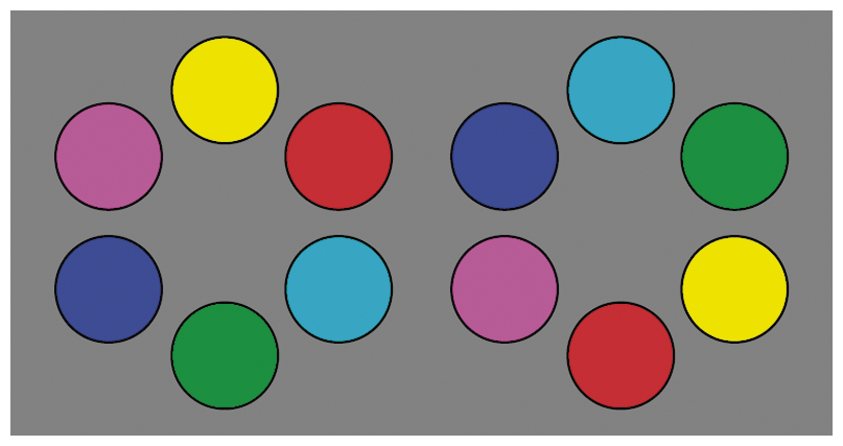
A typical display is shown in Figure 4. It shows a randomised colour circle in the process of being ordered.

A stage in the sorting task. Here, the colour circle is still in major disarray (perfect sorting order shown in Figure 3).
The participant can click on any chip that is seen to be out of order. The chip will magically move to the centre, leaving a gap (the situation illustrated in Figure 4). The participant may then move this chip (using the mouse) and drag it to its preferred location. The chips at either side of the preferred location will magically move aside to make place for the dragged item and the gap that was left by picking that chip in the first place vanishes. This process is iterated until the participant declares that the colour circle is in perfect sorting order.
Notice that the observers have to look back and forth between distinct locations all the time (Koenderink, van Doorn, & Ekroll, 2016), so memory colours no doubt play an important role in the process. Never can two chips be “directly compared” in a sense that has become a convention in regular psychophysics, the typical examples are the usual bipartite displays.
Results
We primarily focus on the 60-hue case, although we collected full data on 6-, 12-, 24-, 36-, 48- and 60-step colour circles. (The six-step case was used for initial practice, so we do not consider it further.) The coarser colour circles mainly serve as a good training for our participants. As stated earlier, a six-step scale tends to be problematic for naive observers, it appears like a mere bag of marbles to them. In contradistinction, quite a few people will sort a 24-step colour circle at the first try, without any glitches. No participant perfectly sorted the 60-step circle. The fractions of observers that managed to perform a perfect sort are shown in Figure 5 as a function of the total number of steps of the colour circle.

The fraction of observers that managed to do a perfect sort as a function of the number of chips on the hue circle.
Indeed, colour circles of 24 steps are easy enough to sort for most of the observers, but there will likely occur a few confusions. Even more articulated colour circles are hard to display nicely on current display units due to lack of display space. We judge that the 60-step case is about right for the present purpose.
All participants are at least partly confused several times. For the 60-step hue circle, we find about 15% mismatches. Mismatches may be significantly larger than single-step confusions, we find mismatches up to five. We define an error score as the sum of the products of the number of mismatches of a given amplitude with that amplitude (Figure 6).

Error scores. We show medians and interquartile ranges. Notice that the score penalises both the number and the amplitude of the mismatch.
The mismatches turn out to be non-uniformly distributed, although in a roughly regular pattern.
Analysis
It is a priori likely that there will be some outliers in a random group of naive observers. To clean the data, we performed a cluster analysis on the raw data, using an angular distance metric for the 60-dimensional response vectors, a spectral clustering method and a search for at most three clusters. We find cluster sizes of {13, 1, 1} and we keep the largest cluster. 5 Constraining to the largest cluster renders the data a trifle less noisy. The mean results for the major cluster are presented in Figure 7.
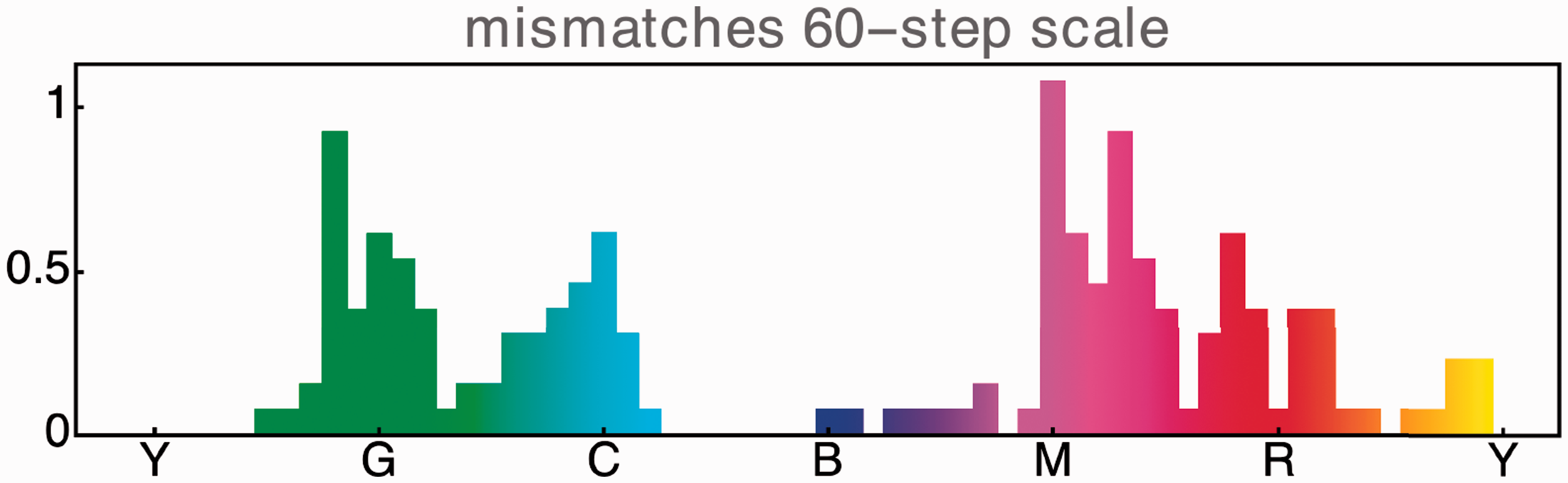
The average mismatches for the largest cluster. (Vertical scale represents the number of steps.)
By cursory inspection of Figure 7, one sees that the major variation occurs at a frequency corresponding to two cycles over the colour circle. 6 This dominant variation peaks in the green-cyan and magenta-red. Least confusions are in the yellow and the blue. Thus, the confusions mainly occur on the boundary of the “cool” and the “warm” hues.
Conclusions
Many human observers are able to sort a 24-step colour circle perfectly, although it takes some dedication. Finer grained hue circles give rise to sorting errors, even in very experienced observers. The patterns of such errors is quite uneven, the errors accumulate in the green-cyan and magenta-red regions. We discuss a few relations to conventional colour science and then move on to discuss consequences that might matter in praxis.
Notice that (quantified in the Methods section) the luminances are in the ratio LR:LG:LB = 21:62:17 (adding up to 100). The colour circle is in no way equiluminant, the luminance variation over the colour circle is as large as 4.9 (LY/LB). Indeed, an equiluminant representation would be entirely useless from an applications perspective, for the “yellow” would have to be degraded to a dark brown. We expressly point this out, because a hue discrimination study (like sorting) without equiluminant constraint evidently goes squarely against the grain of acceptable methods in vision science.
The relevant literature mainly focusses on the use of the Farnsworth 100-hue test as a clinical tool (Craven, 1993; Farnsworth, 1943; Kinnear & Sahraie, 2002; Mäntyjärvi, 2001). This test has been designed to make it as easy as possible, by giving participants only short sequences to sort at any given time and by constraining chips to be viewed perfectly side-by-side and in a neutral context. Most people will make at least 10 errors in sorting the 100 chips.
The sensitivity to colour order is likely to be much lower in a more natural (more varied) context and with chips not necessarily perfectly adjacent. Indeed, our data reveal a rather lower discriminability than the Farnsworth 100-hue test suggests.
In a recent study (Koenderink, van Doorn, & Gegenfurtner, 2018), we used methods that might be said to have at least some affinity to the present method. It remains one of the few available sources of this type of data. Those data are squarely in the present ball park, 7 given the differences of methods and quantification used. This is, of course, much as expected.
Another option is to convert the data to dominant wavelengths. This is not a particularly attractive format, but it has the virtue of mimicking historical data (starting with von Helmholtz, 1867). It is at least of academic interest to compare the sorting results to wavelength discrimination data.
Unfortunately, one notices quite a divergence in the available data. Numerous factors might play a role in that (Noorlander, Heuts, & Koenderink, 1980, 1981; Noorlander, Koenderink, Den Olden, & Edens, 1983; Thomson & Trezona, 1951; Zhaoping, Geisler, & May, 2011). For technical, methodological reasons, we prefer the Van Esch data of 1984 (Van Esch, Koldenhof, van Doorn, & Koenderink, 1984). We find an estimate that suggests a resolution that is perhaps similar to the estimate from the present sorting experiment, although the comparison is rather shaky. 8
An in-depth investigation is difficult due to a variety of factors. Indeed, the attempt to relate the sorting results to wavelength discrimination data is perhaps abortive. One problem is that the wavelength discrimination data refer to equiluminance, whereas the colour circle has a luminance variation of about a factor of five. 9
The conventionally quoted numbers of a million to 10 million discriminable colours (Wyszecki & Stiles, 1967) is mainly based on the data of MacAdam and Brown (Brown & MacAdam, 1949; MacAdam, 1942). Such numbers suggest resolution estimates that are one or two orders of magnitude better than our sorting results. 10 Thus, such estimates are entirely non-realistic for mundane tasks like sorting chips. One reason might be that these numbers relate to a large (at least two decades of luminance) range of radiance levels. The present data by design apply to real-world tasks involving screen colours.
Yet another comparison would be with
From a pragmatic perspective, a hue selection interface using 24 steps is easy to use and offers ample resolution in most applications. It is about the resolution offered by deluxe sets of colour pencils. A 36-step interface is already far less easy to use, because adjacent samples appear very similar and are easily confused at first blush, whereas the increased resolution will rarely be an advantage in drawing or painting.
Both the Munsell and Ostwald colour circles were designed to find use in the applied arts (Munsell, 1905; Munsell, 1912; Ostwald, 1919). The typical Munsell hue scale has forty hues, not significantly different from 36, whereas Ostwald eventually settled on a 24-step colour circle (see especially Bouma, 1948). The Quiller colour circle, which is in common use by watercolour artists, is slightly more detailed. However, it is special because its “chips” stand for actual pigments, which makes a great difference to the painter (Quiller, 1989). Even when the hues are indiscriminable, the physicochemical properties of a pigment may indicate its use in particular settings.
A 36-step colour circle may well prove worthwhile in precise retouching tasks, but it is overkill for most artistic applications. Even higher resolutions will hardly ever make sense.
Footnotes
Acknowledgements
The work was supported by the DFG Collaborative Research Center SFB TRR 135 headed by Karl Gegenfurtner (Justus-Liebig Universität Giessen, Germany) and by the program by the Flemish Government (METH/14/02), awarded to Johan Wagemans. Jan Koenderink is supported by the Alexander von Humboldt Foundation. The work was conducted at the Department of Psychology of Giessen University and at the Department of Psychology of Leuven University. We thank all those who acted as an observer. The manuscript was written at the Department of Electrical Engineering and Computer Science, where Jan Koenderink spent a term as a Visiting Scholar of the Miller Institute for Basic Research in Science, University of California Berkeley.
Declaration of Conflicting Interests
The author(s) declared no potential conflicts of interest with respect to the research, authorship, and/or publication of this article.
Funding
The author(s) received no financial support for the research, authorship, and/or publication of this article.