
Abstract
Introduction
‘How many colours are there?’ This question is often asked: A Google search for ‘how many colours’ yields numerous hits (on April 9, 2018, 14:40 a total of
Overall, responses range (very roughly) from as few as half a dozen to as many as ∞, with a suggested scientifically founded estimate of about 107 (Davidson & Friede, 1953; Judd & Wyszecki, 1975; Linhares, Pinto, & Nascimento, 2008; MacAdam, 1947; Pointer & Attridge, 1998; Poirson & Wandell, 1990; Schläpfer & Widmer, 1993). Reasons for these differences are that ‘colours’ are (among more) variously interpreted as spectral compositions, 32-bit numbers, prototypical qualities, or triplets of colorimetric coordinates.
For an answer colorimetry (or science) counts mutually nonoverlapping just noticeable difference (
Consider a few numbers from such design praxis. The PanTone FHI color guide (Pantone, 2018) has 2,310 samples, whereas the Munsell atlas (Munsell, 1905; Munsell, 1912; Nickerson, 1976) contains 1,600 samples but is already overkill for most uses.
Many of the colour charts that have proved serviceable in various fields, such as ‘W
Professional pastel collections (pastels cannot be mixed but have to be used as such) contain 100 to 200 items, grey-tone pastel collections about 10 to 12, special collections (say, skin colours for portraitists) would have a few dozen items (Mayer, 1991). Artists are perfectly happy with that.
‘Colour wheels’ used by artists generally tend to have 6 to 48 divisions, 12 perhaps being most common. By exception, the widely used Quiller Colour Wheel (Quiller, 2002) based on commercially available pigments has 68. Remember that Newton (1704) initially saw five colours in the sun’s spectrum and that the rainbow has seven colours in various cultures (Dedrick, 1998).
The Farnsworth (1943) ‘hundred hue test’ suggests that most people might distinguish definitely less than a 100 hues, and perhaps more than 50, let us estimate 75. Then there would be
Photographers consider the Ansel Adams (1949) tonal zone scale (10 greys) somewhat of an overkill, visual artists tend to compose in up to seven tones, two and three being most common.
In many applications, one needs a (not too large) number of categorically different colours. A well-known proposal by Boynton (1989) has a set of 11. There have been attempts to enlarge the set, but experience shows that this is unlikely to ‘work’. It is remarkable enough that 11 (just about) ‘works’, given the conventional estimate of the limited processing capacity of humans (Miller, 1956), which is almost certainly far too optimistic (Gobet & Clarkson, 2004). Boynton’s number is of the order of the maximum number of independent colour terms (Berlin & Kay, 1969; Levinson, 2000; Loreto, Mukherjeeb, & Tria, 2012; Saunders, 2000).
Taking the number of Munsell chips as a provisional (perhaps somewhat high) estimate of the practical number of colours, this is about 6,000 times lower than the number (we used 107) suggested by the
We use ‘vagueness’ in a very general sense, covering sloppiness, fuzziness or indistinctiveness of various kinds, intentional disregard of detail or fine distinction, and so forth. Taken together such effects define a certain pragmatic ‘graininess’ of the
The Research Problem
Why are such numbers so much lower than the
Edge detection methods are somewhat problematic, because the crucial importance of the spatiotemporal modulation used in
Pure edge detection may be avoided (Krauskopf & Gegenfurtner, 1992), whereas still avoiding the issue of perceptual qualities. This yields slightly higher
In any case, such psychophysical measures are not about colour differences in terms of qualities. They are about detecting any difference, regardless its phenomenological nature.
In contradistinction to this fundamental psychophysics, in design workflows the colour as a quality is very relevant. In selecting a colour for a task, the user picks a colour that matches a memory image, perhaps of a coloured patch seen before, perhaps even immediately seen before, because already present in the work in progress. This is common in painting practice.
The user compares or produces (see later) colours but hardly ever finds any need to judge the detectability of edges between uniform patches, ignoring the colours, as in the edge detection method (MacAdam, 1942; Noorlander & Koenderink, 1983). Moreover, colours are usually seen in complex contexts, instead of uniform adapting fields (as in Krauskopf & Gegenfurtner, 1992).
Artists are certainly interested in ‘edge quality’ (Edges, 2018) but hardly in detectability. The case of ‘edge strength’ for (far) supra-threshold modulations is still a research issue (Koenderink, van Doorn, & Gegenfurtner, 2018; Koenderink, van Doorn, Pinna, & Wagemans, 2016).
If one needs to find a paint to cover an abraded patch on a car body, the
On the other hand, if one desires to select a paint to colour an object so as to match one’s imagery of the desired result, only the particular colour is essential. In that case, the
These two cases are indeed categorically distinct. This has a huge effect on the relevant measure of graininess.
To work out the various numbers related to graininess, one needs to take account of some basic geometrical relations. Notice that the various numbers of pastels quoted above should be understood in terms of dimensionality (linear, areal, volumetric) and metric. This is a basic consideration in judging the various numbers. Consider some simple back-of-the-envelope estimates.
An
Thus, such rough guesstimates at least get one immediately in the right ballpark. Notice that the typical instrumental precision of the
The estimate of the ‘vagueness’ typical for colour in design work (apparently about 0.1–0.2) is much (say 20 times) larger than typical
Here, we arrive at the goal of the present experiments, which is to obtain empirical estimates of the vagueness in typical design tasks. We are especially interested in the spread over a group of naive users and in the distribution of the vagueness over the space of typical colours provided by a generic computer display. Therefore, all results will be presented in this format, rather than in terms of perhaps more familiar colorimetric systems.
Of course, the display
The preference of vision research certainly makes good sense from the perspective of physiology but not so much from the perspective of phenomenology and not at all from the perspective of praxis (Smith & Lyons, 1996).
‘Colour Pickers’ as Natural Tools to Probe Colour Vagueness
In typical use, colours are either specified purely mentally through numerical coordinates, or they will be synthesised by eye measure using one of the many available ‘colour pickers’ (Foley, Dam, Feiner, & Hughes, 2005; Koenderink, van Doorn, & Ekroll, 2016).
The former method is commonly used in formal graphics programming (Foley et al., 2005), coordinate values are typically selected from a set like
The latter method would be used to gain full precision and articulation. Formal design often implies selection from a fixed set, whereas free work will use a colour picker, ideally with some convenient user interface, more likely enforced by the software (application programs such as Adobe ‘Photoshop’; Brundage, 2012 and a great many others).
We have made an extensive study of colour pickers and their user interfaces (Koenderink, van Doorn and Ekroll, 2016). We prefer to speak of ‘colour synthesisers’ rather than ‘colour pickers’, because one picks from a discrete set, but synthesises items in continuous spaces.
An important finding, that pertains to virtually all interface designs, is that essentially all users arrive near their goal in about
The Structure of This Article
We describe a near (though by no means ‘final’) colour synthesiser. It allows naive observers to approach their target as near as possible in a time as short as possible. We suggest possible future improvements, some inspired by the present experience.
Improvements are always possible, some will mainly improve user experience, whereas others might actually improve final articulation. The present synthesiser already improves significantly over most commercial offerings (Koenderink, van Doorn and Ekroll, 2016). We stick to the original implementation for the sake of coherency of the empirical data. The most relevant properties of this synthesiser are summarily reported.
More importantly, we report on a total of roughly 3,000 settings achieved by about 50 naive users. This allows an admittedly coarse, but nevertheless unique, overview of the distribution of ‘vagueness’ over the entire
All data are presented in terms of display
Finally, we present an analysis of the results, compare it with the conventional colorimetric
The present data are fully irrelevant to colorimetry and industrial colour tolerancing issues, because the data only pertain to colour experiences but fail to address psychophysical
Thus, we present the data, because of their likely relevance to the community dealing with colour on a professional design basis, be it from ergonomic, engineering, or artistic perspectives.
The Colour Synthesiser
Methods
Colorimetric data for the display
Stimuli were presented on the

Measurements were done using gamma 2.2, and colours are expressed in
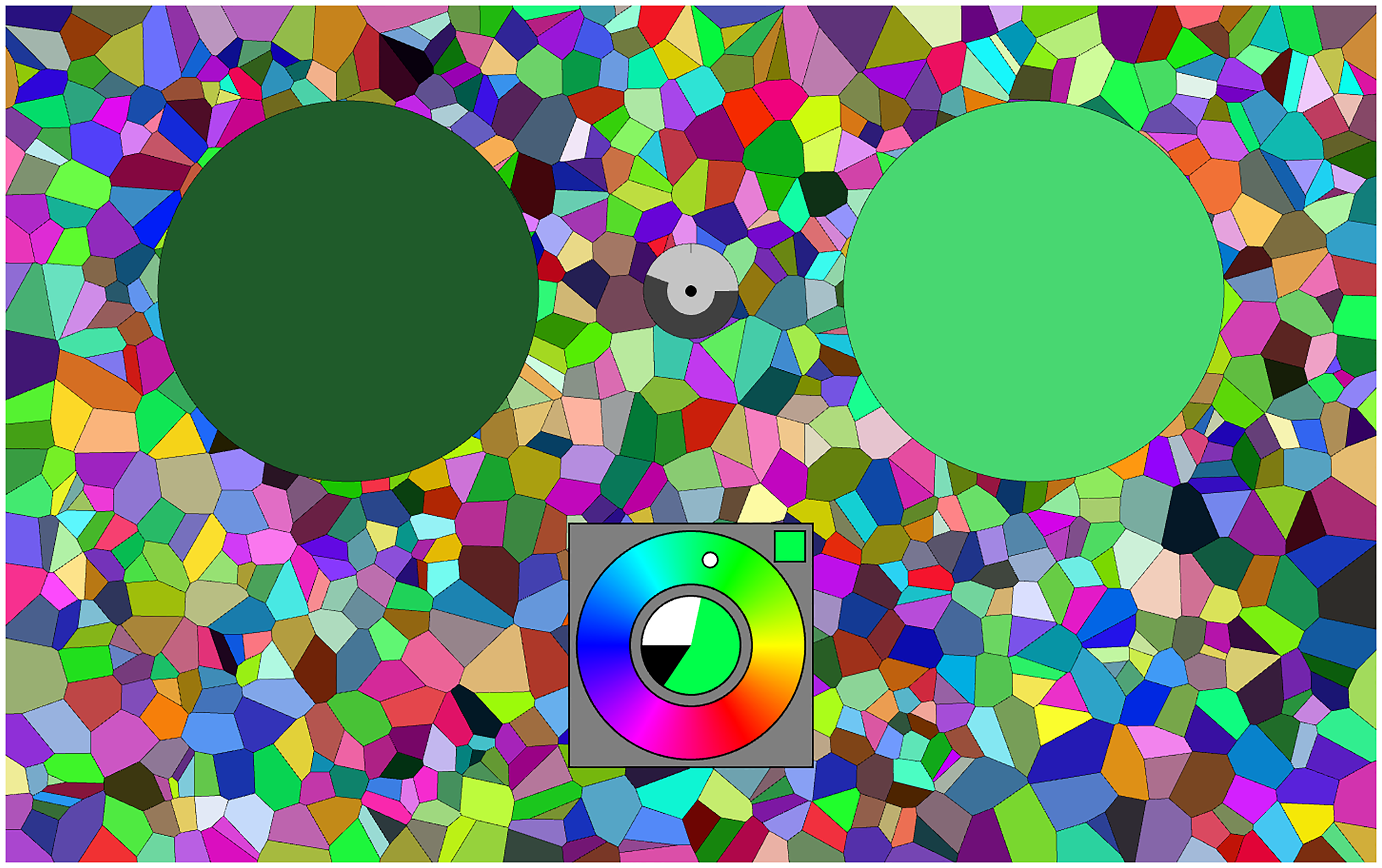
Stimuli were presented on a background that was a random mosaic representing the full Graphics of the colour-picker in the initial selection phase (left) and the generic adjustment phase (right). In the initial phase, a category is selected by clicking it with the touch pad. In the generic phase, the interaction is by way of the keyboard, the graphics visualises the current state. A screen grab from the running experiment. The left disk (dark green) is the target (fixed), the right disk (here a light green) the current synthesis result. The colour picker is at bottom centre, here it is in the final mode, the colour content is large, the white content much less, the black content small. The cursor in the hue circle indicates the present hue (here a cyanish green). The clock is at the centre of the two disks, here it has run for about half the allotted period. The random background is uniformly sampled from the 
Indeed, we look forward to see such results as reported here from a sizeable number of currently popular display units. Changing display conditions such as the nature of the background, or the geometrical layout, are likely to show differences. Our choice of background would be very unusual in a psychophysical setting, it more closely resembles the nature of major applications areas. One might say that the context is ‘generic’, which is indeed our intention.
From a psychophysical perspective such a context has the advantage of offering a fixed overall adaptation level. Thus, one cannot expect a ‘Weber fraction’ to be an articulating factor, since the denominator (the adaptation level) is constant throughout the
Viewing conditions
Experiments were conducted in a darkened room, thus ensuring a good black level.
The screen was viewed from a distance of about 57 cm. The screen subtended about
When necessary, observers used their natural correction. There is no control over that, but it makes participants feel comfortable, which we consider more important than perfect correction. Differences, if any, are expected to average out.
Viewing was binocular. Again, the main reason is to let participants feel good. The choice most likely makes no difference anyway.
Almost all user interaction was by means of the familiar keyboard. The exceptions were a few seconds at the start of each trial, where a touch pad click was expected.
No participant complained about the interface. This is perhaps not surprising, given the generally less than ideal ergonomic design of common commercial colour pickers (Koenderink, van Doorn and Ekroll, 2016).
Participants
Participants were volunteers (PhD students, postdocs, staff) of the Justus Liebig Universität Giessen and the University of Leuven (KU Leuven). They had no colour anomalies as judged by the Ishihara test. Genders include males and females, ages range from 20 s to 70 s.
2
Our experiment was in agreement with the Helsinki declaration and was approved by the local ethics committee (
The bulk of the participants may be denoted ‘naive with respect to the task’, although most no doubt had occasionally used some variety of colour picker before. This implements the kind of ‘general user’ selection we aim for. With a number of participants of about 50, that should indeed work. The randomised trials (see later) guarantee that various differences will tend to average out.
Design and Implementation of the Colour Synthesiser
To speed up colour synthesis, it was decided to use a two-tiered system. At the initial, very short, stage the user merely selects a general part of colour space. This choice can be undone at the next stage, it is in no way binding, being only introduced to save time in the second stage. A fortunate selection in the first stage puts the participant in the right ball park for the second stage. In the second, more intensive, stage the user adjusts parameters in order to get as close to the target as possible (see Figure 1).
The first stage involves picking a hue from a 12-step colour circle and a tint or shade indication from a 6-point Ostwald-triangle (Ostwald, 1919). This is clearly ‘picking’, so the natural interface is the touch pad. Two clicks suffice.
In the second stage, one needs three-parameter continuous adjustments. Here, the fastest interface uses key board control with visual feedback. We use only the arrow keys. One set (left or right) is used for hue, and the other set (up or down) remains available for a single parameter. This forces a modal design, which is perhaps regrettable.
We use the spacebar to toggle modes between colour, white and black content. The up or down keys always stand for respectively more or less. The actual setting (colour, white and black content, mutually adding to one) is always visible at the centre of the colour circle. The mode is always visible in the square at top-right. As long as participants use their eyes, there should be no confusion. However, it adds a slight cognitive element to the procedure.
In practice, this works quite well, although the modal interface is still less than ideal from an ergonomic perspective. It cannot be circumvented using the keyboard without complicating the interface with additional (to the user arbitrarily assigned) keys. A dedicated interface box would solve this, but the design constraints force us to focus on keyboard and touch pad (or mouse).
Anyway, we find that this colour picker is just as good, if not better, than the best colour pickers we considered in detail in a previous study (Koenderink, van Doorn and Ekroll, 2016). It is quite a bit better than most commercial implementations.
Users are given a verbal explanation and handed a short (one page) manual. They are allowed a few minutes to get used to the interface. Then they are supposed to use it for about an hour, non-stop.
Display and Task
In principle, the task is a trivial one: There is a target colour that is always visible and at another location, the user needs to synthesise a colour that resembles the target as well as possible (see Figure 2). There is a maximum period to do this, a running clock is provided on the display. When the time is up the next target appears after a short interval, the user may also stop the process at any earlier time, then the next target appears after the same short interval.
The allotted time is such that most users feel to be ready much earlier. However, they never feel assured that their synthesis is the best possible, so many keep adjusting interminably. This is the reason to impose a time limit, it protects participants against vacuous attempts at perfection.
In practice, the nearest approach to the target happens at roughly half the maximum allotted time (see later).
Empirical Ergonomics
We show only a few results on the empirical ergonomics, because this article concentrates on the distribution of vagueness over the realm of
The most important ergonomic result is perhaps Figure 3.
Overall error (Euclidean distance of the result to the target in the 
Apparently, the synthesis is largely done within about half of the maximum allotted time. Many participants indeed cut that period short. Typically, the synthesis is considered ‘done’ after one or two dozen interface actions.
Consider a few numbers. Time taken (notice that 45 s was allotted) is Left: The distribution of time taken per trial. In many cases, the trial was ended before time was up. In some cases, participants persisted until the bitter end; Right: Distribution of hues of target (bluish) and synthesised (orange) result. In the synthesis, one sees that in some cases, a cardinal colour was considered ‘good enough’. This happens for very whitish and (especially) very dark targets. For achromatic colours, the hue is indeterminate.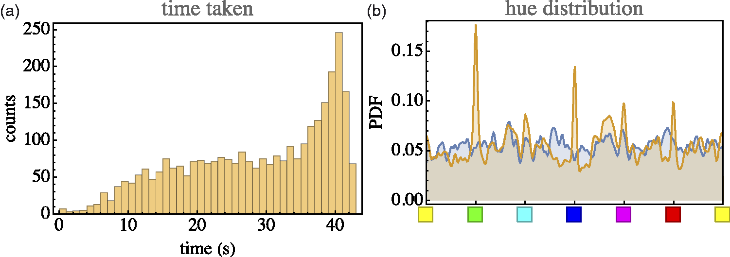
The median error is 0.098, with an interquartile range of 0.054 to 0.163. (See Figure 5.). In most cases, the closest encounter with the target occurred between 18s and 38s (quartiles, median 26s), about uniformly distributed. At the closest, encounter the distance was 0.073 (median, interquartile range 0.038–0.134), usually the end result was worse.
Left: The overall distribution of errors (mean 0.122, standard deviation 0.091). Right: The distribution of errors (median and interquartile range) for all participants, sorted by median.
As shown in Figure 5 right, there is quite a spread of the median final error over the 50 participants. The most accurate participants are twice as good as the least accurate ones.
The distribution of synthesised parameters is not necessarily even qualitatively similar to these of the target parameters (example in Figure 4 right). However, there exist trivial reasons for that. For instance, for very dark shades, the hue is ill defined and the participants find no need to fine-tune it. This makes sense if the error is measured in terms of distance in
This evidently tells a story that is very similar to what was found in an extensive investigation (Koenderink, van Doorn and Ekroll, 2016) including several types of colour pickers. The effect seen in Figure 4 right is encountered in a variety of ways, depending on whether a specific colour picker explicitly has hue as an interface parameter. For instance, the effect will be absent if the interface includes just three
For any variety of colour picker, users arrive at their setting in about half a minute or less, after that they enter a state of errant adjustments. They continue to perform random walks within about 0.1 to 0.2 (idiosyncratic, also colour dependent) of the target point.
Ca. 3,000 Instances of Colour Synthesis Due to ca. 50 Naïve Observers
Methods
Setup and observers were as described earlier. Indeed, we use exactly the same data set, the difference is only in the definition of the ‘data’.
In the section on ergonomics, we considered the full orbits through display space as the participants manoeuvred to the target. In this section, we consider only their final setting as relative to the target.
Experiment
Since it was considered possible that cardinal colours might play a singular role and that participants might recognise targets when confronted with another instance of the same, it was decided to draw target colours from a random, uniform distribution over the
Participants simply attempt to synthesise colours as close to target as possible, one after the other (since the targets were random, there are no possible effects of sequence). They simply proceed until a certain time is up (not more than an hour), or a certain number of trials completed (60). Figure 6 shows part of the raw data.
Five hundred randomly selected, raw settings (i.e., less than 17% of the total data volume; the full data set is not shown because too confusing). The spherical marks show the participants approximation to the target indicated as cubical marks. This basic data set is converted to a smoothly interpolated field of covariance ellipsoids. All further analysis is performed on that statistical summary of the raw settings.
Since the
Doing twice as good would imply eight times
We look forward to the date that colleagues will collect even much more extensive data of this kind. We estimate that about fifty thousand or better about a hundred thousand runs would result in a data package that would yield significantly better insight than our initial foray is able to provide.
However, even though indeed limited, the full data set presented here is very large. To describe the results, considerable summarising is required.
The data set is huge, because full tracks through the interface space are provided. It is made publicly available (see acknowledgments). But, although the data contain full records of the actions of users, these are not required for the present purpose. All that are needed are the target colour and the final synthesised colour.
To give at least some (partial) feel for the nature of the full data, consider Figure 7. This does not show the full orbits, but at least the distance to the target as a function of time. It illustrates the nature of the differences between participants quite well. Notice that the worst and the best performers in terms of error both finish in half the allotted period, or less. Some participants that used only a small part of the allotted time did very well in terms of error (Notice no. 39 and no. 51), whereas participants using essentially the full allotted period (like no. 54) do not necessarily do well in terms of error, although some do (like no. 4). Compare participant no. 54 and no.18, the former reaches the final error in a short time, then enters an errant state, whereas the latter keeps approaching the target, albeit with many substantial deviations away from the target.
Example of an environment (64 samples) located at 
Of course, a data set based on random location is somewhat harder to analyse than a data set based on a small number of targets with many repeats per target. However, the advantages clearly outweigh the obvious disadvantages, which are mainly of a pragmatic nature.
The ‘mismatch’ is the difference between the synthesised and the target colour, each mismatch is a 3D vector. (See Figures 5, 6, 7, and 8.)
This shows the set of 64 samples in the neighbourhood of a fiducial location at an orange colour. (Notice that the neighbourhood itself is not shown, but only the set of responses.) These synthesised colours are presented as a randomised 8 × 8 array (left), on an average grey background (centre) and on a background randomly sampled from the 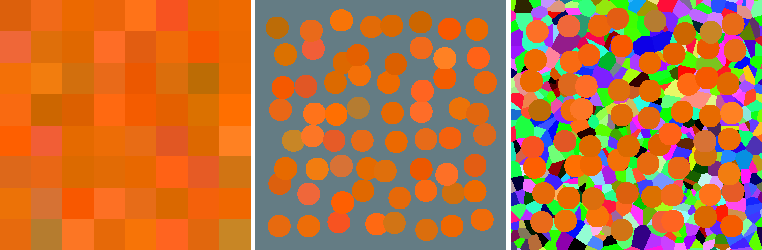
Since the target colours are randomly distributed over the
Two (spherical) volumes of radius r and centre-separation d have an overlap-factor
Because we retain all data, there are quite likely to be some ‘outliers’. To handle this, we consider items with z-score larger than 3.0 as outliers, with a maximum of 8 per location. After removing outliers, we recompute the covariance and so on, iteratively. Overall, we encounter five outliers (median, with interquartile range 2–8) per location. 4 Thus, the overall reject fraction is about 7.8%.
All this is done on a uniform cubical grid with space constant 0.1. The sampled covariance matrices are then packaged in a quadratic interpolation function that goes from locations in the
Analysis
Basic data-structure
The basic result on which all further analysis is based is the field of covariance matrices that specifies the spatial distribution of the vagueness over the
The basic data are presented in Figure 9 from six different views:
An overview of the covariance field. This represents the raw data of the analysis. It also indicates the grid of fiducial locations.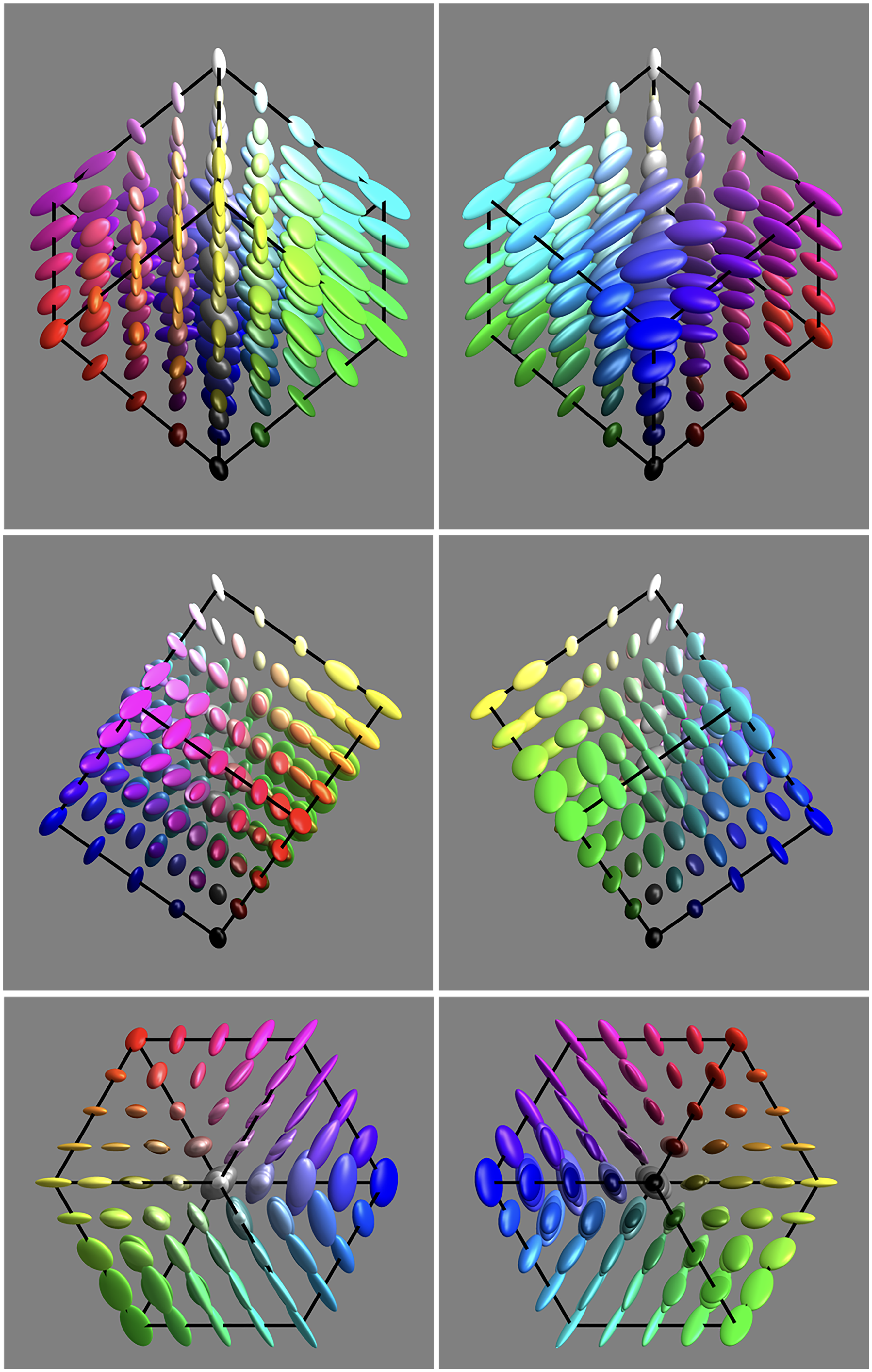
It is evident that the covariance field is smooth, but evidently space variant and that both the spatial attitudes as well as the aspect-ratios of the ellipsoids vary.
It is also evident that the resolution obtained through 3,000 randomly distributed samples is about right. To check this latter point, we redid the analysis using a body-centred-cubic lattice (Hurlbut & Klein, 1985) and sampling the Wigner-Seitz cells (truncated octahedra). In this case, there is no overlap.
The results are not essentially different, perhaps slightly more uneven due to what seems to be random perturbation. In view of this finding, we decided to stick with the data shown in Figure 9. We represent it in terms of a quadratic interpolation function, which is quite convenient, but—if so desired—a new covariance matrix can readily be computed at any point. We use that, for instance, in special cases such as a comparison with the conventional MacAdam
Number of mutually independent samples
The covariance ellipsoids define local volume elements. Integrated over the
The total number of independent colours hides the significant local differences. There are many ways to address this. One way is to consider the variations. The volume elements range over a factor of 40, which implies a factor of 3.4 in linear size. Although this suggests large variation, the volume ratio for the 75% and 25% quartiles is only 2.5 (1.36 in linear size).
Another way to obtain some insight into the spatial variations is to find the number of independent colours in particular submanifolds. In general, we consider line, surface, and volume integrals. This implies restricting the covariance to linelets or planelets, the methods are explained in the section Covariance Ellipses in Planar Sections and Covariance Segments in Linear Stretches in Appendix C.
For instance, one may compute the number of colours of a given hue, that are the colours confined to half planes at the achromatic axis. This depends upon the hue. For the six cardinal hues, one obtains the numbers shown in Figure 10 centre. On the average, there are 67 colours in a constant hue triangle, there is a hue dependence by a factor of 2 (1.4 in linear size). To judge these figures,
5
it is of interest that the grey axis has 13 steps (see later), thus an equilateral triangle with the grey axis as side would subtend about 73 discrete samples.
At left, the number of grains along the edges of the 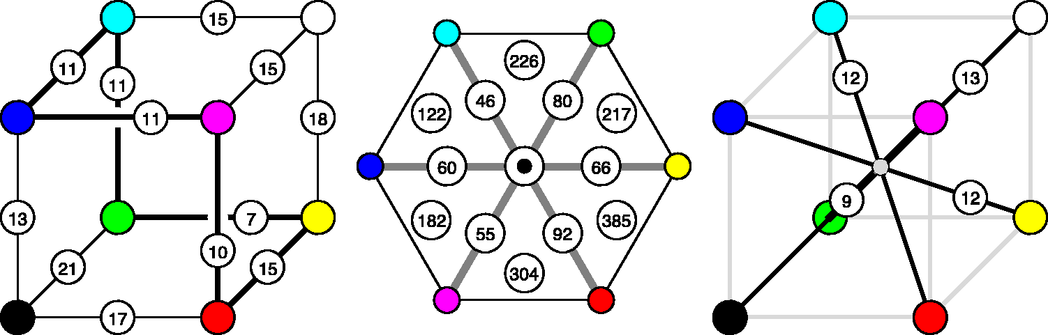
Of course, one might also approach this issue by counting grains in volume sectors, like the six tetrahedra shown in Figure 10 centre. Here the numbers vary by almost a factor of 3 (i.e., 385/122), reflecting a grain-size variation of
Another estimate of interest is the number of colours in a planar section through the centre of the
Instead of constraining the count to planar sections, one may consider counts constrained to linear segments (or curves). Of some interest is the number of independent grey tones over the achromatic axis, for which one finds 13. It is also of interest to count along the locus of optimal colours. One finds the numbers in Figure 10, they make for a total of 59 distinct hues (correcting for double counts). The dramatic changes near the yellow have important implications for the construction of ‘well-tempered colour circles’ (see Figure 11). The well-tempered colour circle (Figure 11 right) is much like the Munsell hue circle.
At left, the colour circle equispaced according to the Euclidean distance in the 
Figure 12 plots distances to the grey axis from points on the full colour locus (more precisely, the integrated vagueness from a colour to its projection on the grey axis). One might conclude that the primary colours red, green, and blue are the most chromatic, the secondary colours cyan, magenta, and yellow least, something that appears to be phenomenologically right, at least in the awareness of the authors. Overall, red comes out as the chromatic strongest, magenta as the chromatic weakest cardinal colour. The symmetry (a repeat at 120°) of the plot is striking, although it is certainly not exact.
These are distances from points on the full colour locus to the black-white axis. Apparently, the primary colours red, green, and blue are most highly chromatic, the secondary colours cyan, magenta, and yellow least.
It is of some interest to consider the degree into which the
Fairly global measures, like lengths of edges, body, and face diagonals, areas of constant hue triangles, volumes of cardinal hue sectors, and so forth, are of interest in judging whether
Counting along straight line intervals in general overestimates the separation of the endpoints, because the shortest connection is a geodesic, which is in general curved. Thus, a more correct count will integrate steps along geodesic curves (see Appendix D). Some results for the body-diagonals of the
The same goes for the ‘medians’ connecting mid-points of mutually parallel faces. One finds 5.5, 7.3, and 6.4. The ratio of the median geodesic length of the body diagonals to that of these medians is very close to
The geodesic distances from the centre of the cube to the vertices have a median of 5.5 and range from 4 to 7. The median of these distances is 0.48 times that of the median of the body diagonals, much as expected by the Euclidean geometry.
As shown in Figure 13, various geodesic distances between mutually far apart locations in the Estimates of the geodesic edge length from various geodesic distances through the 
This is also evident from the distribution of the density of the ‘number of colours’. (The density is the reciprocal of the volumes of the covariance ellipsoids.) Over the grid of fiducial locations, the ratio of the standard deviation to the mean is about 62%.
Nonuniformity can also be shown in Figure 14 (please keep in mind that the indicated standard deviations have been scaled up by a factor of 4!). For instance, notice that the standard deviations from red, green, and blue toward black are much smaller than the standard deviations from cyan, magenta, and yellow toward white. Along the hue locus, the standard deviations at red, green, and blue are much larger than those at cyan, magenta, and yellow.
6
Standard deviation (the covariance ellipsoids confined to an edge, see the section Volumetric, Planar, and Linear Measures in Appendix C) from vertices in the directions of adjacent vertices. Notice that these have been scaled by a factor of 4! Each cylindrical rod indicates a standard deviation at its base point in the direction of its axis.
Anisotropies
As a first analysis, one may simply make a scatterplot of all anisotropies in ellipsoid shape space. One finds that the majority of ellipsoids is strongly dominated by the linear part, with only a very minor fraction that would more properly be classified as planar or volumetric (see Figure 15).
The distribution of anisotropy plotted in barycentric coordinates. The covariance ellipses are predominantly linear.
Thus, at least in 3D, most ellipsoids are approximately like rods (predominantly prolate, or linear). Of course, this may work out very differently in planar sections, remember that a planar section of a broom stick might be circular, it could show about any aspect ratio.
Although indeed mostly rod like, a minor set of ellipsoids is perhaps better described as coin-like (or predominantly oblate, or planar) and an even smaller subset as pea-like (or predominantly spherical, i.e., volumetric). Again, such differences need not show up in lower dimensional sections, these are 3D (i.e.,
The spatial attitudes of the linear parts are far from being uniformly distributed. The linear elements alone go a long way to describe the nature of the field of covariance ellipsoids (see Figure 16).
The field of the linear component of the covariance.
Planar sections through the achromatic axis
Figure 17 shows planar sections in planes through the achromatic axis. Such sections are similar to the Ostwald triangles of a hue, that are the triangular arrays of mixtures of a ‘full colour’ with white and black, thus displaying the shades and tints of a hue. In the Covariance ellipses in planar sections through the cyan-red, magenta-green, and the yellow-blue planes. Covariance ellipses in the plane orthogonal to the grey axis, through the centre of the 

Planar section orthogonal to the achromatic axis at half height
A special plane is the plane
The planar section is only two dimensional (instead of the
Figure 18 shows the field of covariance ellipses in this plane. As in the previous subsubsection, the covariance ellipses plotted here are due to the statistical scatter as confined to the plane (see the Covariance Ellipses in Planar Sections and Covariance Segments in Linear Stretches section in Appendix C for formal details).
The achromatic axis
The achromatic axis is a special linear section.
The volumetric and linear parts of the covariance ellipsoids along the achromatic axis are plotted in Figure 19. As noted earlier, there are 13 mutually independent grey levels.
Covariance ellipsoids along the grey axis. From left to right: the covariance ellipses, the volumetric part, and the linear part.
The distribution over the achromatic axis is far from uniform, the resolution being lowest near the centre of the scale (see Figures 19 and 20).
Resolution along the grey axis. Notice how this appears very different from a ‘Weber’s Law’, as it indeed should. Remember that the adaptation level is always the same, which essentially rules out a Weber Law dependence. Furthermore, one has to remember the gamma mapping, which makes a simplistic Weber Law expectation inappropriate. Except from the—perhaps slightly puzzling—central maximum, a nice property of the curve is its symmetry about the grey point. This shows the approximate central symmetry of 
By eye measure, there is an obvious symmetry under black-white inversion. This will be further addressed in a later section.
Symmetries
Colour space is known to admit of various approximate symmetries (Griffin, 2001; Palmer, 1999). A cube has 24 orientation preserving symmetries (the group S4) and a symmetry order of 48 including rotoreflections. It is perhaps natural to wonder whether some of the symmetries of the cube occur as approximate colour symmetries. Such an idea comes not completely out of the blue, because the habitus of the Schrödinger colour solid is a ‘rounded cube’ (see Appendix A). The colour solid for
Indeed, various symmetries of the
To quantify such apparent symmetries, one computes the concordance over a uniformly sampled grid of the covariance matrices and the covariance matrices evaluated at the grid transformed by the symmetry transformation. The correlation measure between covariance ellipsoids is defined in the section Metric in the Manifold of Covariance Matrices in Appendix C, it is perhaps not trivial. Otherwise, computing such correlations simply comes down to numerical integration.
Various measures of concordance, or correlation, are readily available. It most likely is not very important which specific choice is made, but we did not attempt an extensive comparison. A simple measure, that has the advantage of being geometrically meaningful, is the Jaccard index (Jaccard, 1901) for cocentric ellipsoids. It is defined as the ratio of the volume of the overlap to the volume of the union. The Jaccard index is greater than zero and will approach unity for almost fully coinciding ellipsoids. The index is sensitive to size (when one ellipsoid contains the other it is their volume ratio) and shape (the index of two ellipsoids of the same volume depends on the difference of their anisotropies) as well as orientation (the index of two equally shaped, anisotropic ellipsoids depends upon their mutual orientation).
The Jaccard index can readily be constrained in various ways through suitable normalisations of the ellipsoids. 7 This allows it to be used as essentially a Procrustes metric (Gower, 1975).
Of course, one needs some method that lets one judge a value of concordance as being potentially meaningful. An easy way to do this is to find the concordance for a random scramble of the observed ellipsoid field. Such a concordance is certainly meaningless since a random scrambling does not represent any symmetry at all. One finds that the Jaccard index for the case of a random scrambling is about a third. For typical applications, averaging over about 103 instances, the level is estimated
8
as
There are various symmetries that seem to jump out on first sight. However, we concentrate mainly on two cases that we have considered for other reasons, namely, the grey axis (Figures 19 and 20) and the covariance ellipses in the plane orthogonal to the grey axis, through the centre of the
The case of inversion about the centre of the The Jaccard index along the grey axis for the case of inversion about the centre of the 
In comparison to the grey axis, we present the case of inversion for the full cube. In this case, we average the Jaccard index over a regular sampling grid of a 1,000 (
This comparison (concordance for the grey axis, discordance for the full cube) suggests that the grey axis is very special, something that is immediately obvious from a cursory inspection of Figure 9. The special status of the grey axis is also phenomenologically evident, of course.
There exist six symmetries of the cube that leave the grey axis invariant, namely, the identity, two rotations by
One finds that the rotations about the grey axis yield much larger mean Jaccard indices (both 0.41) than the inversion. This is also true for the reflections. One finds 0.45 (blue and green exchanged), 0.40 (red and blue exchanged), and 0.45 (red and green exchanged).
Other reflections in planes through the centre of the Reflection about the Hering-like axes in the plane at half height. (Here we have slightly redefined Hering’s axes to fit the geometrical symmetry of the Covariance ellipses in the plane through the grey axis, along the warm-cool direction.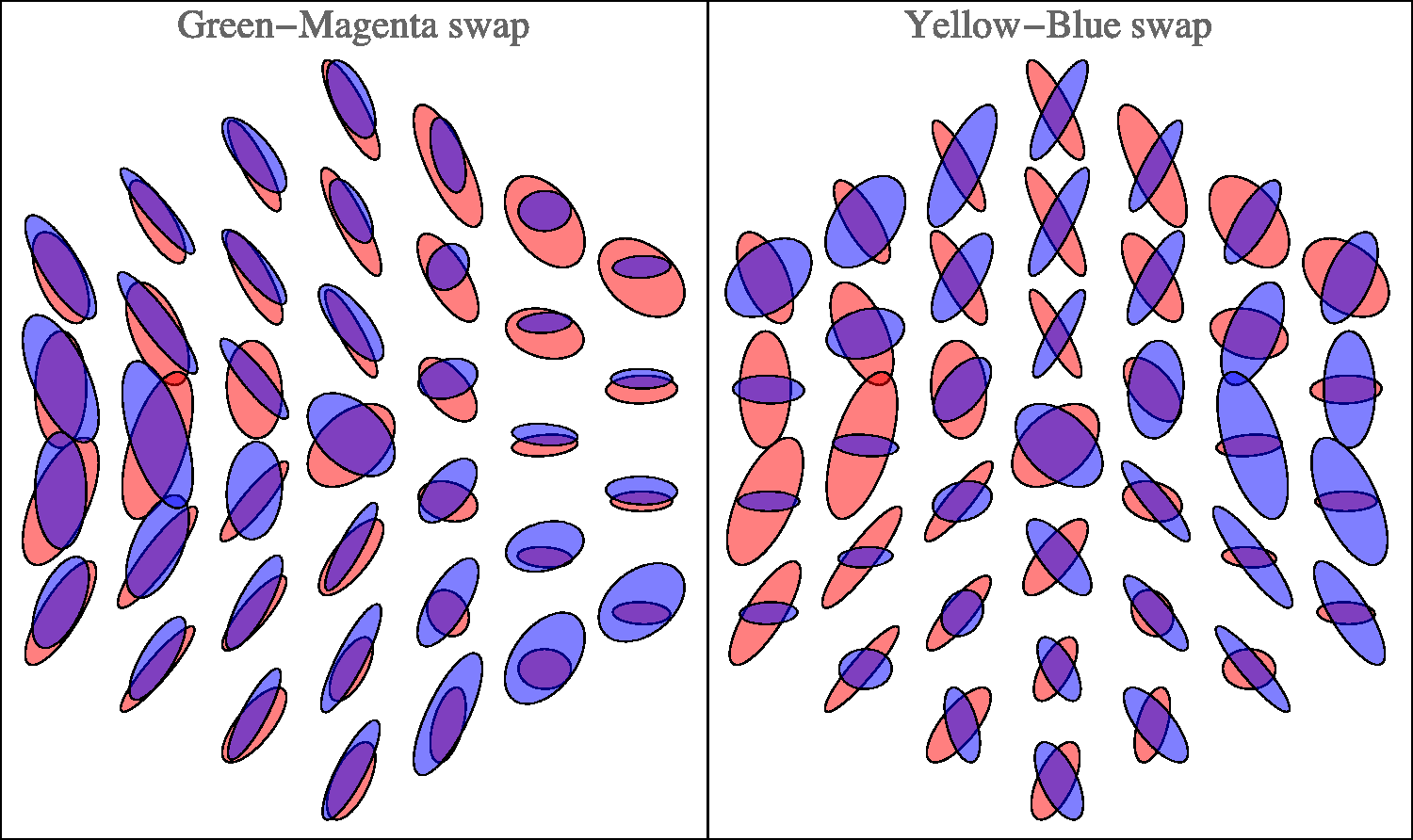
This case is especially interesting, because it relates to the possible importance of the Hering axes. Figure 22 lets one judge the results of reflections about the Hering axes in the plane. Apparently, the periodicity is not so much dominated by multiples of
Comparison with the classical MacAdam data
The classical MacAdam ellipses (MacAdam, 1942; Wyszecki & Stiles, 1967) are plotted in the
To handle this complication, the following procedure was used:
for a given MacAdam location in colour space, the if the result lies outside the unit cube, no comparison is possible, otherwise the calculation proceeds; an environment of the fiducial is determined in the usual way; the points of the environment are mapped to the chromaticity diagram (this implies correcting for gamma); a covariance ellipse of these points is determined in the usual way, treating the xy coordinates as Cartesian coordinates in a Euclidean metric.
Although this procedure is slightly odd from a formal perspective, it perhaps best captures the spirit of MacAdam’s original ellipses. Of the 25 MacAdam fiducials, only 11 lie within the Comparison with MacAdam ellipses. The plot is in the standard 
The correlation of the ellipsoid shapes (see the section Metric in the Manifold of Covariance Matrices in Appendix C) between the MacAdam ellipses and the empirical data from the present experiment is 0.84. Of course, the sizes of the MacAdam ellipses and the present data are very different. The correlation for the sizes (trace of the covariance matrix) is small.
The ‘size ratio’ may be defined as the square root of the ratio of the traces of the covariance matrices. We find that the size ratio varies from 8.7 to 24.2, with a median value of 15.5 (interquartile range 12.3–19.0). Thus, the ‘vagueness’ as defined earlier is apparently roughly in the range 10 to 20. However, one has to remember that the projective nature of the chromaticity diagram renders the computation somewhat fishy.
Another comparison of some interest is with the data presented by Krauskopf and Gegenfurtner (1992). These authors measured
A factor of 5 is a common kind of ‘safety factor’ used in practice as compared with psychophysics and quite understandable, because of the extreme difference of the nature of the backgrounds.
For those interested in discrimination proper, especially from the perspective of technical colorimetry (as distinct from vision science), a comparison with state of the art colour metrics would perhaps be of more interest. We summarily investigated whether a metric like
We do not draw any conclusions from this as a close match (up to some factor) would have been little less than miraculous. The operational definitions of the grain size are entirely different.
Discussion
The main result of the experiment is a smooth field of covariance ellipsoids. That is a field of six degrees of freedom (a 3 × 3 symmetrical tensor in
This field encodes a great amount of data, equivalent to about 103 vector-valued samples; thus, 3,000 scalar values, uniformly distributed over the
One aspect, to be considered upfront, is a comparison to the well-known data as canonised and made available by the
First of all, the task is very different. Second, the background, and thus the current adaptation level is very different.
In the MacAdam-type
In the synthesis method, the task is to produce a coloured patch such as to appear of the same colour as another, not contiguous coloured patch, both embedded in a background of randomly coloured texture. Observers get no fixation instructions. Indeed, they have to look back and forth between the target and the synthesised patch in order to do the task at all. This setup was designed (as discussed earlier) in order to let the task be similar to cases that occur most often in practice.
Thus, there appears to be no a priori reason to assume that the results of these very different tasks will be at all comparable. Indeed, they are not, as apparent from the fact that the typical observational spread differs by more than an order of magnitude.
Classical data as those due to MacAdam are usually plotted in the
Perhaps surprisingly, given the categorical differences of the tasks, the present data correlate well with the classical MacAdam data (see Figure 24), at least for a comparison of ellipse shapes (correlation coefficient 0.84). The correlation of sizes is insignificant. Of course, there remains the huge gap in magnitude. The linear size ratio is as high as a factor of 9 to 25.
This difference is in the right ball park for our attempt to account for the huge gap between the number of colours in practical representations (as the Munsell atlas) and the number of ‘different colours’ as it is often cited on the basis of
Such numbers immediately carry over to the various relevant two- and one-dimensional submanifolds. What remains to be studied is the detailed distribution of magnitude and anisotropy. First, we consider the coarsest features, then we go to more detail.
From Figure 9, it is immediately obvious that the nonuniformities and anisotropies are indeed substantial. It is also immediately evident that they are far from being random. What first strikes the eye is indeed a remarkable degree of symmetry. The symmetries are apparently related to the symmetries of the perhaps the symmetries are artefacts of the fact that the if not artefact, then the structure of the
We consider both issues.
Are the symmetries artificial? There are various reasons to conclude that this is not the case:
if boundary effects were a trivial cause, then they should have similar effects everywhere near the boundary. This is evidently not the case at all; the symmetries are also present near the centre of the
Indeed, the possibility that such symmetries are artificial can be safely ignored.
Are the symmetries of the
The
We propose that the
One might say that the
From a historical perspective, this is a formal equivalent of Schopenhauer’s intuitive notion of the colours as ‘parts of daylight’, in which he defined parts of cardinal colours as bipartitions of daylight. This can easily be generalised into tripartitions. Then all cardinal colours, black and white can be mapped on the set of all subsets of the tripartioned spectrum. Indeed, the Hasse diagram of the set of subsets is exactly an
On closer scrutiny, the symmetries are in no way perfect. However, most of the symmetries of the cube are at least approximately present. Reflection about the horizontal axis in Figure 22 yields a visually striking symmetry. (Notice that it may at least partially depend upon the fact that we used the standard display gamma of 2.2.) This symmetry is hardly surprising from the perspective of the generic user (just another ‘fact of life’), but it is perhaps counter intuitive to the physiologist and psycho-physicist.
It is a symmetry that fits very well in Hering’s notions of Gegenfarben, where black-white is one of the basic polarities. This would be impossible in a Helmholtz dark-light continuum, which has an entirely different topology. The light-dark dimension is a half line
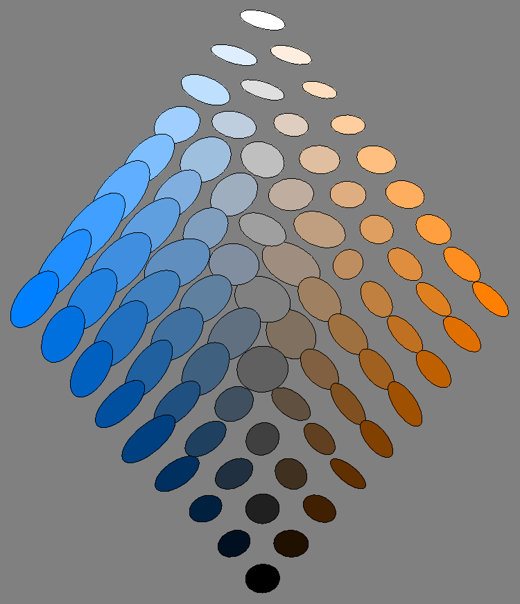
The overall symmetry is perhaps most strikingly displayed in the ellipsoids drawn in the plane orthogonal to the achromatic axis at half height (Figure 18). The section itself is a regular hexagon, neatly reflecting the basic symmetries of the
From the tripartition of daylight, one might expect to find a hexagonal symmetry of the covariance ellipses field. Then there would be three equally spaced directions and—in terms of Hering’s ideas—three pairs of Gegenfarben. Yet, the reality is different (Figures 18 and 22). The pattern is indeed beautifully symmetrical, but mainly a reflection symmetry about the yellow-blue axis, whereas there is perhaps a kind of antisymmetry (in terms of the shape of the ellipses) about a green-magenta axis. Thus, there are only (apart from black-white) two, not three Gegenfarben, which is basically Hering’s proposition.
In a recent study, we found the same symmetry in ecological optics (Koenderink, 2018; Koenderink & van Doorn, 2017). The reason is indeed clear.
From the (equi–)partition of daylight perspective, the red, green, and blue ‘parts of daylight’ play fully equivalent roles. This involves a very pure form of trichromacy in that the three parts stand on equal footing. One indeed expects arbitrary permutations of these parts to induce symmetries.
But from the perspective of ecological optics, the red and blue parts border on the infrared and ultraviolet spectral limits, whereas green derives from the mid-part of the spectrum. This implies that orange-blue modulations are due to spectral slopes whereas green-magenta modulations are due to spectral curvatures. Spectral slopes and curvatures are mutually uncorrelated spectral articulations.
One might distinguish between symmetries that depend on the fact that in the spectrum green is between red and blue and those in which red, green, and blue are ‘parts of white’ without further order. Then green is not between red and blue. The former structure may be associated with the symmetries noted by Hering, whereas the latter may be associated with Schopenhauer’s notion of ‘parts of white’.
The correlation structure of natural spectra induces Hering-type, not Schopenhauer-type symmetries.
In the arts, these Hering dimensions play an important role. They are often known in terms of the Aristotelian elements (Aristotle, 1982), ‘cool–warm’ and ‘dry–moist’. Especially the cool-warm dimension is used by visual artists on a daily basis, they are also found in affinities to antonyms by naive observers (Albertazzi, Koenderink, & Doorn, 2015); thus, they are apparently deeply ingrained in at least Western culture. However, the underlying cause appears to be of an ecological and ethological nature.
The interplay between the Schopenhauer and the Hering symmetries accounts for the bulk of the symmetries seen in our data. The Schopenhauer symmetries are perhaps best seen in Figure 9 bottom left, where similar
The data allow one to increase the efficacy of chromatic scales. For instance, Figure 11 showed the example of a ‘well-tempered’ hue scale. Such nonlinear deformations are likely to be useful in graphics displays where it is desired to use hue as a parameter that is intuitively used by eye measure. One should keep in mind that in such a well-tempered scale (like in the Munsell system), complementaries are not likely to be antipodal (complementaries mutually aligned with the centre), which might be a disadvantage from some perspectives.
Other applications involve the design of tritone scales for scalar (‘grey scale’) data. A popular example is the ‘temperature scale’. We consider it summarily.
The idea is that the edge progression A well-tempered temperature scale of a dozen steps.
Finally, a remark on the structure of the grey axis (Figure 20). The fact that the resolution is worst near the average grey seems at first surprising. However, metamerism renders average grey rather unstable (as a colour), much more so than either black or white (Koenderink, 2018). Thus, there may well be an evolutionary pressure for the structure here empirically encountered.
Conclusion
So ‘how many colours are there’ anyway? The exercise described here offers at least a partial answer. The limitations should be kept in mind: We only address ‘object colours’ for a standard daylight illuminant, that is, the interior of the Schrödinger colour solid for that illuminant.
The conventional answer is millions, based on
The enormous gap of four orders of magnitude(!) is due to operational definitions. Instead of the conventional edge detection thresholds (
The ‘visual match’ is our operational definition of a particular colour, the set of ‘particular colours’ being defined as a discrete collection of items that are all mutually distinct, such that their ‘eidolons’ overlap and together exhaust the space of object colours.
A colour counts as an ‘eidolon’ of a fiducial colour if it is not spontaneously seen as a particular colour distinct from the fiducial, say inside a specified probability level from the fiducial as determined by the method of colour synthesis. No doubt, such a match would yield a very obvious edge when compared with the target in the conventional way, for eidolons are very different from metamers.
Not only does it include metamers, but it also includes colours that are many
Here are some of the numbers we arrive at in this study. Of course, one has to understand them with some ‘slop’, the data provided earlier will suggest the kind of slop one might consider appropriate.
there are just over a 1,000 colours in the there are just less than a 100 colours of a given hue, depending on hue; there are about a 100 colours in a section orthogonal to the achromatic axis through median grey; there are about 60 distinct hues; there are about a dozen distinct greys.
Thus, the Munsell atlas might be said to offer ‘about the right’ resolution, albeit representing some oversampling.
‘Just over a thousand colours’ may not sound very impressive, but notice that it still beats the number of greys by a factor of 100. Thus, even a crummy system like this is very effective in helping one segregate things by eye. Because of its coarse grains a simple von Kries scheme largely helps fighting effects of metamerism, thus the crummy system is also very effective in helping one identify, or find things by eye. From a formal perspective, the dimensionality increase (three instead of one) easily makes up for the coarse graining. (A factor of
The size of the covariance ellipsoids (square root of the sum of the eigenvalues) varies only little over the
The field of ellipsoids over the
Thus, the
As the ‘colour for the people’ it is indeed hard to beat and—in terms of raw numbers—already the most common end-user system anyway.
Footnotes
Acknowledgements
Declaration of Conflicting Interests
The author(s) declared no potential conflicts of interest with respect to the research, authorship, and/or publication of this article.
Funding
The author(s) disclosed receipt of the following financial support for the research, authorship, and/or publication of this article: The work was supported by the DFG Collaborative Research Centre SFB TRR 135 headed by Karl Gegenfurtner (Justus-Liebig Universität Giessen, Germany) and by the program by the Flemish Government (METH/14/02), awarded to Johan Wagemans. Jan Koenderink was supported by the Alexander von Humboldt Foundation.