
Abstract
Background:
There is need for readily understandable graphical displays of glucose data to facilitate interpretation by clinicians and researchers.
Methods:
(1) Display of the percentage of glucose values above a specified threshold for hyperglycemia (%High) versus percentage of glucose values below a specified threshold for hypoglycemia (%Low). If all glucose values fell within the target range, then all data points would fall at the origin. (2) After an intervention, one can plot the change in percentage of glucose values above a specified threshold for hyperglycemia versus the change in percentage of glucose values below a specified threshold defining hypoglycemia: The quadrants of this graph correspond to (a) increased risk of both hyper- and hypoglycemia, (b) decreased hyperglycemia but increased risk of hypoglycemia, (c) decreases in both hypo- and hyperglycemia, and (d) decreased hypoglycemia but increased hyperglycemia. (3) A 2-dimensional triangular graph can be used for simultaneous display of %High, %Low, and percentage in target range. (4) Display of risk of hyper- versus risk of hypoglycemia based on both frequency and severity of departures from the target range can be used. (5) Graphs (1) and (4) can also be presented using percentile scores relative to a reference population. (6) It is also useful to analyze %Hypoglycemia or risk of hypoglycemia versus mean glucose.
Results:
These methods are illustrated with examples from representative cases and shown to be feasible, practical, and informative.
Conclusions:
These new types of graphical displays can facilitate rapid analysis of risks of hypo- and hypoglycemia simultaneously and responses to therapeutic interventions for individuals or in clinical trials.
Keywords
Numerous types of graphical methods have been used to display results from Self-Monitoring of Blood Glucose (SMBG) and Continuous Glucose Monitoring (CGM).1-6 A histogram or frequency distribution of glucose values can be provided by most programs for analysis of SMBG and CGM results, 3 but these histograms are rarely used in clinical practice. By defining thresholds for hypoglycemia and hyperglycemia, one reduces the frequency distribution to three components: hypoglycemia, hyperglycemia, and target range. The percentage of glucose measurements or percentage of time in each of these three ranges are frequently calculated and displayed.3,5,7,8 With the increasing awareness that HbA1c does not adequately reflect the quality of glycemic control,1-10 there has been a resurgence of interest in the percentage of glucose values in the target range, or “%Time In Range” (TIR).7-9 However, TIR is not a sufficient measure of glycemic control. For example, if 50% of glucose values were within the target range, it makes an enormous difference if %Hypoglycemia is 3% or 25%.
One can display the percentage of glucose values in the hyper-, hypo-, and target ranges using stacked bar charts.7,8 One can display the percentages of glucose values in several ranges. 8 McCall et al 10 utilized a 2-dimensional display of the maximal glucose values (alternatively, the 97.5th percentile) versus the minimal glucose value (alternatively, the 2.5th percentile) to help evaluate the relative importance of problems related to hyper- and hypoglycemia.
In the present report, we suggest several new options for graphical displays based on the percentage of glucose values (alternatively, percentage of time) in hypoglycemic, target, and hyperglycemic ranges. These methods facilitate comparison of results from a single patient at different points in time (eg, when receiving different treatment regimens or other interventions), and facilitate display of results from groups of subjects in the context of a clinical trial.
Method
We utilize CGM data of Garg et al, 11 Rodbard et al,12,13 and Russell et al 14 to illustrate several of these approaches.
A 2-dimensional display: Glucose data (SMBG, CGM) are used to calculate the percentage of values (alternatively, percentage of time) that glucose falls in three ranges with specified thresholds for a specified period of observation. One can plot any two of the three percentages versus one another, for example, %Hyperglycemia versus %Hypoglycemia, %Target Range versus %Hypoglycemia, or %Target Range versus %Hyperglycemia. We prefer to use a display of %Hyperglycemia on the vertical axis versus %Hypoglycemia on the horizontal axis (Figure 1). If all glucose values are within the target range, then all data points would fall in the extreme lower left-hand corner of the graph, at the origin (0,0). Lines corresponding to any specified level of %Target Range can be displayed.
Assessing changes in response to intervention: When comparing two different periods of observation in response to a therapeutic intervention, one can plot change in percentage of glucose values falling in the hyperglycemic range versus change in the percentage of glucose values falling in the hypoglycemic range.
Two-dimensional triangular plot: Since we have three percentages for glucose data for any subject and any specified time period, one might wish to utilize a simultaneous 3-dimensional display of all three percentages. Since 3-dimensional plots are often difficult to visualize and interpret, we seek to reduce the 3D plot to just two dimensions. One can take advantage of the fact that the sum of the 3 percentages (%Hypoglycemia, %Target, and %Hyperglycemia) is equal to 100%. A special type of graph, the triangle (triangular) graph, shows all three percentages as a single point on a 2-dimensional display.15-18
Measures of risk of hyperglycemia versus hypoglycemia: Rather than analyzing percentage of time (or percentage of observations), one can use a measure that combines frequency and severity of hypo- and hyperglycemia. One can plot risk of hyperglycemia, for example, High Blood Glucose Index (HBGI)19,20 (alternatively GRADEhyperglycemia21,22 or Hyperglycemia index23,24) versus risk of hypoglycemia, for example, Low Blood Glucose Index (LBGI)19,20 (alternatively GRADEhypoglycemia21,22 or Hypoglycemia index23,24) for data from multiple subjects.
In a variant of methods 1 and 4, one can plot the percentile scores relative to a defined population for the measure of hyperglycemia versus the percentile score for the measure of hypoglycemia. 25
One can plot %Hypoglycemia or risk of hypoglycemia such as LBGI19-24 versus mean glucose or versus HbA1c.26,27
Results
%Hyperglycemia Versus %Hypoglycemia
Figure 1A shows a 2-dimensional display of %Hyperglycemia (vertical axis) versus %Hypoglycemia (horizontal axis). This can display the trajectory of results from a single subject obtained at different times of day (clock time or in relation to meals), or other periods of observation (calendar dates, treatment periods), or can display data from several subjects as shown here. The antidiagonal lines show the combinations of the two variables that would result in the same percentage of glucose values in the target range. Ideally, all data points would fall at the origin. This graph provides an effective way to evaluate the extent of variability between individuals in terms of all three key segments of the glucose distribution, that is, %Hypoglycemia (Time Below Range, TBR), %Target Range (Time In Range, TIR), and %Hyperglycemia (Time Above Range, TAR). Any one of the three percentages is not sufficient to convey the clinical meaning of the data, but use of any two of the three percentages is effective, since one can then readily calculate the third.
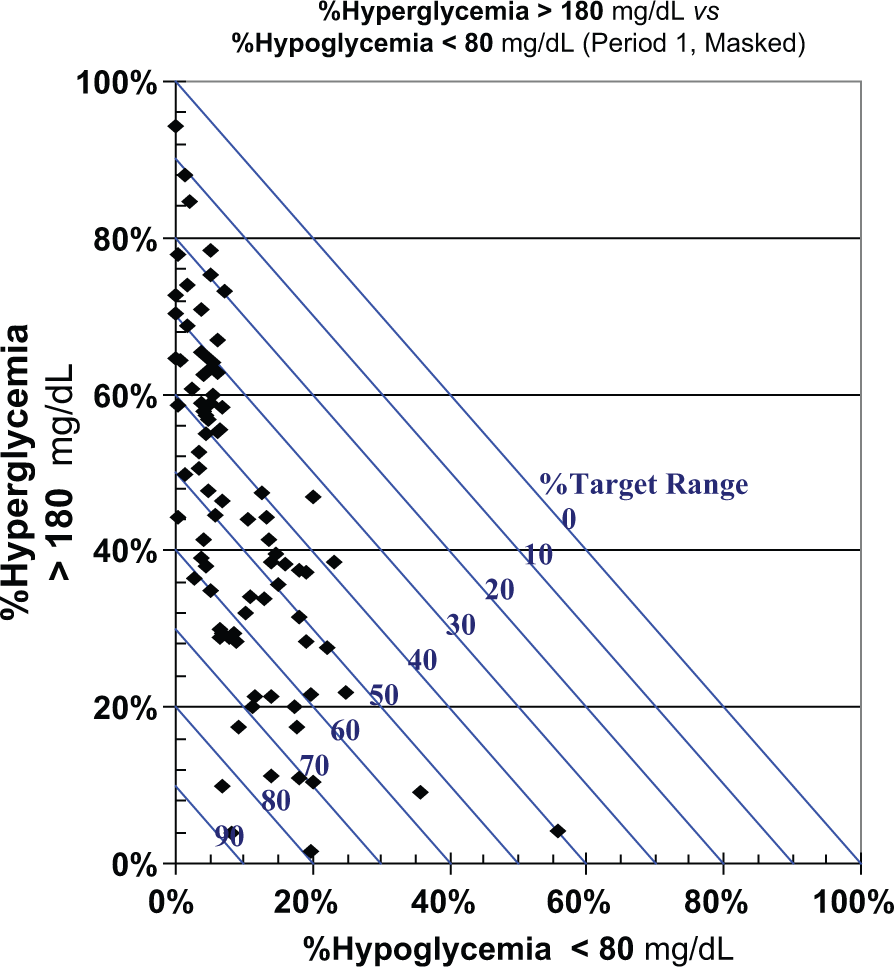
%Hyperglycemia (vertical axis) versus %Hypoglycemia (horizontal axis). Each data point represents a different subject in a clinical trial. Data of Garg et al 11 and Rodbard et al12,13 for period 1 (masked CGM). Diagonal lines corresponding to %Time in Range (target range) of 0% to 90% in steps of 10% are shown.
There are many potential variations on this graph. One could reverse the assignment of the percentages to the horizontal and vertical axes. There are three ways to select two of the three available measures: one could also use either %Target Range versus %Hypoglycemia, or %Target Range versus %Hyperglycemia. One can also display results from various times of day, eg, midnight to 6:00
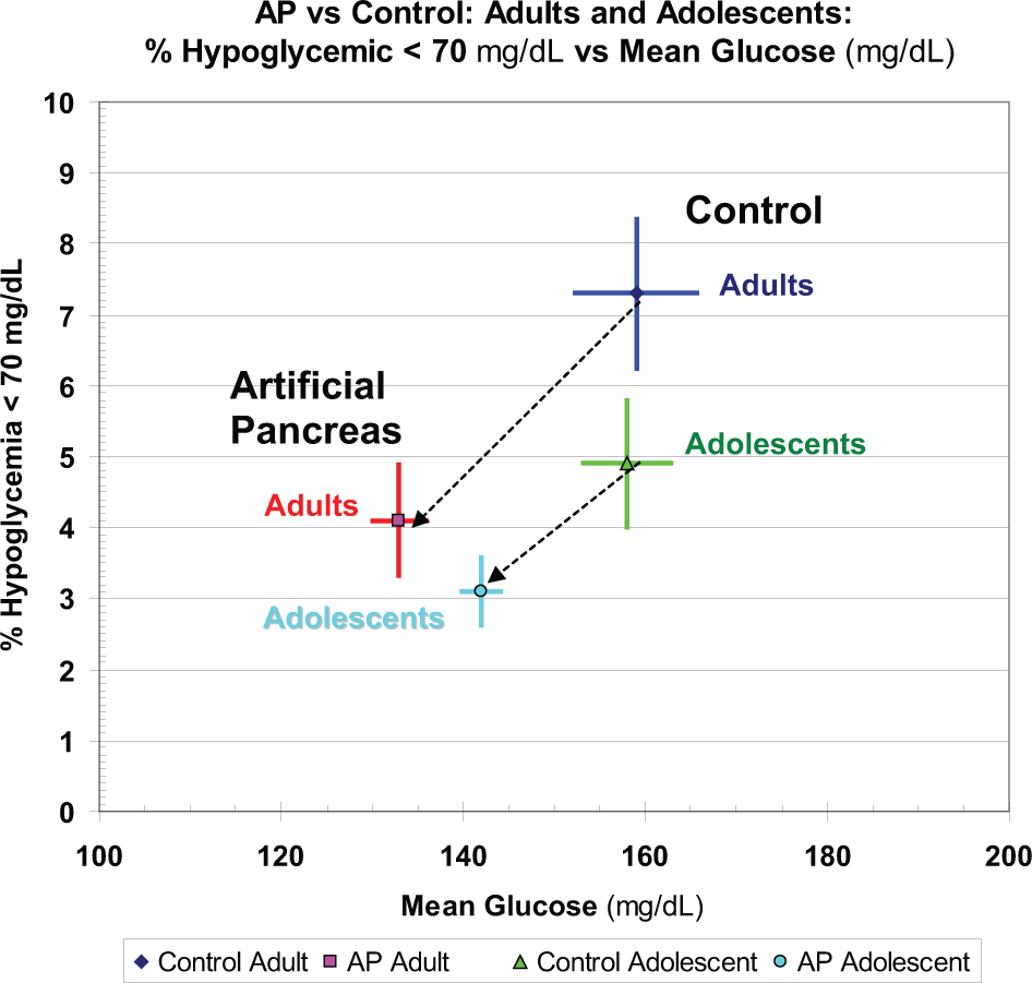
One can display the standard errors of the percentages for a group of independent subjects using horizontal and vertical error bars for each data point. Figure 1B shows the change in %High versus %Low before and after institution of a dual-hormone artificial pancreas, using data from the report of Russell et al. 14 Alternatively, one can plot the %Hypoglycemia, %Hyperglycemia, and percentage within the target range as a function of time, for example, using scattergrams or stacked bar charts.7,8
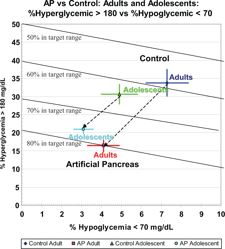
%Hyper- versus %Hypoglycemia during a control period and during use of a bihormonal artificial pancreas, in adults and adolescents. Vertical and horizontal error bars represent ± 1 SEM, calculated by the author from the SD and number of observations reported by Russell et al. 14
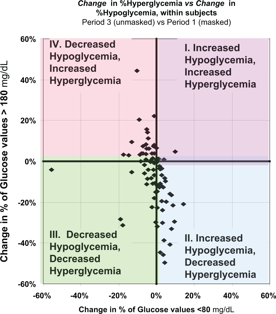
Change in %Hyperglycemia Versus Change in %Hypoglycemia Following an Intervention
In one study, a CGM device was operated in a masked mode during week 1 but in an unmasked mode during weeks 2 and 3.11-13 We sought to assess changes in quality of glycemic control by examining the changes in %High and %Low (Figure 2). With the assignment of variables to axes as used here, the first (upper right) quadrant (I) represents an increase in both %Hyperglycemia and %Hypoglycemia; the second (lower right) quadrant of the graph (II) represents a decrease in %Hyperglycemia but an increase in %Hypoglycemia; the third quadrant (lower left) (III) indicates decrease in both %Hypoglycemic and %Hyperglycemia; the fourth quadrant (upper left) (IV) represents a decrease in %Hypoglycemia but an increase in %Hyperglycemia.
Triangular Graph
The graphs displayed in Figure 1 explicitly shows only two of the three principal percentages of glucose values that characterize the three component glucose distribution. Some users may wish to be able to examine all three percentages simultaneously. This could be done with a 3-dimensional plot. However, to keep the graph in a 2-dimensional (planar) mode, we can use a triangular graph (Figure 3). One can evaluate the glycemic control for a group of subjects (Figure 3). Alternatively, one can display the trajectory of %High, %Low, %Target Range for various times of day (clock time or in relation to pre- and postmeals, bedtime, and overnight (3:00-4:00
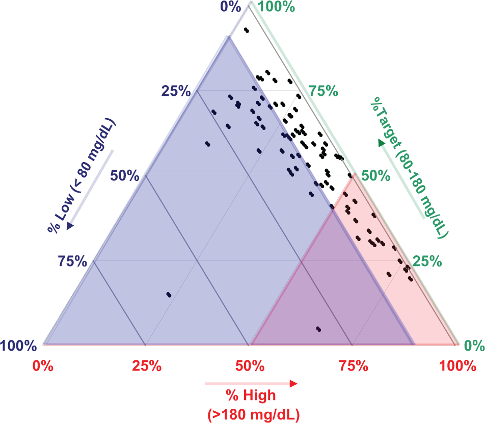
Triangular plot showing CGM glucose values falling within the hypoglycemic range (<80 mg/dL) (mean: 11%, range, 0 to 62.5%), the target range (80-180 mg/dL) (mean: 56%; range, 20-98%), and the hyperglycemic range (>180 mg/dL) (mean: 36%; range, 3-82%). Data of Garg et al 11 and Rodbard et al12,13 for week 1 (masked CGM), corresponding to Figure 1. This permits direct observation of the 3 percentages for each subject and facilitates comparison of groups of subjects. Color overlays show the regions with %Hypoglycemia >10% (blue), %Hyperglycemia >50% (red), or problems with both hypo- and hyperglycemia (purple).
Risk of Hyperglycemia Versus Risk of Hypoglycemia
Use of percentages above or below target range loses information regarding the severity of hypoglycemia and hyperglycemia because a value of 69 mg/dL would have the same influence as a value of 40 mg/dL, and a value of 181 mg/dL would have the same influence as a value of 400 mg/dL. Several approaches have been developed to combine information about the frequency of hypo- or hyperglycemia and the severity of that hypo- or hyperglycemia. This includes the following pairs of indices: {LBGI, HBGI},19,20 {GRADEhypoglycemia, GRADEhyperglycemia},21,22 and {Hypoglycemia index, Hyperglycemia index}.23,24 The three approaches give similar results. The adjustable parameters of the Hypoglycemia and Hyperglycemia indices23,24 enable them to closely approximate the properties of HBGI/LBGI and GRADEhyperglycemia/GRADEhypoglycemia. Figure 4A shows the same data as Figure 1 when results are expressed as HBGI versus LBGI rather than as %High versus %Low. The color-coded ranges for interpretation of risks of hypo- and hyperglycemia are based on results of Clarke et al.19,20 Subjects with a higher risk of hypoglycemia generally have a lower risk of hyperglycemia, and vice versa. This inverse relationship is expected when mean glucose covers a wide range.
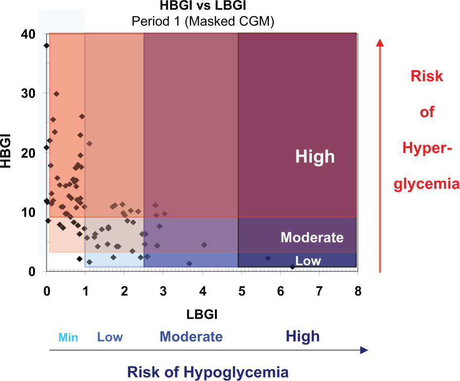
HBGI versus LBGI with color coding to denote low, moderate, or high risk of hyperglycemia, and minimal (Min), Low, Moderate, or High risk of hypoglycemia.
The numerical criteria for interpretation of {HBGI, LBGI}, 19 {GRADEhypoglycemia, GRADEhyperglycemia }, 22 and{Hypoglycemic index, Hyperglycemic index} 24 are not familiar to most clinicians and clinical researchers. Accordingly, it is helpful to display the ranges that have been previously designated as minimal, low, moderate, or high risk (Figure 4A).20,22
Percentile Scores
Alternatively, one can express criteria such as {HBGI, LBGI}, {GRADEhypoglycemia/GRADEhyperglycemia }, or {Hyperglycemia index, Hypoglycemia index} as percentile scores relative to an identified population (Figure 4B). This enables the user to assess where any patient stands with respect to a reference group. 25 If sufficient data are available, one might elect to use color coding (shading) by quartiles.
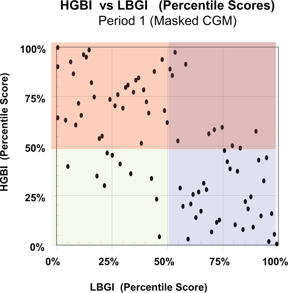
HBGI (percentile score) versus LBGI (percentile score). Data as in Figure 4A using percentile scores relative to the entire study population. Color codes indicate whether an observation is above or below the median for the entire group of subjects.
%Hypoglycemia or Risk of Hypoglycemia Versus Mean Glucose
Another potentially helpful form of presentation, which may be regarded as closely analogous to Figure 1B, is to show %Hypoglycemia (%TBR) (alternatively, LBGI or similar indices) on the vertical axis as a function of mean glucose on the horizontal axis (Figure 5). This type of graph is related to display of risk of hypoglycemia versus HbA1c as proposed by the present author in 1994, 26 and has been used very effectively to compare alternative forms of therapy. 27 Usually, when the intensity (dose) of therapy is increased, there is a decrease in mean glucose (or HbA1c) accompanied by an increase in the risk of hypoglycemia. In contrast, with the artificial pancreas, 14 there was a decreased risk of hypoglycemia as mean glucose was reduced (Figure 5).
Discussion
The methods presented here are intended to complement but not replace several well-established forms of graphical display, for example, glucose versus date, glucose versus time of day, the Ambulatory Glucose Profile (AGP or glucose profile),1-6 glucose in relation to meals, 2 pie charts or stacked bar charts of percentages of TAR, TIR, and TBR,7,8 display of statistics for glucose by time of day, meals, or day of the week using modified box plots 2 , and analyses of the stability of the AGP by day of the week.23,24
The present methods should be compared with other graphical methods and numerical indices that have been proposed to evaluate glycemic control.1-10 HbA1c had been regarded as the gold standard but there is a growing recognition that it is inadequate as a measure of quality of glycemic control. Widely varying patterns (and risks of hyper- and hypoglycemia, percentage in target range, and variability) can be associated with a given HbA1c.1-5 %TIR or “%Time in target Range” is popular,5,6,9 but this measure fails to indicate the nature of problems with hypoglycemia vis-à-vis hyperglycemia. Multiple criteria are available to evaluate the quality of glycemic control.19-24,26,27 Several of these indices combine information regarding frequency and severity of hypoglycemia and frequency and severity of hyperglycemia.19-24,26,27 These include the Average Daily Risk Range (ADRR),19,20 Blood Glucose Risk Index (BGRI), 20 Index of Glycemic Control (IGC),12,13,23-24,28 GRADE,21,22 Schlichtkrull M R ,23,24,28,29 and risk of hypoglycemia vs HbA1c.26,27
Thomas et al suggested use of a “glucose pentagon” displaying five criteria considered simultaneously 30 but the pentagon did not include a measure of hypoglycemia. McCall et al 10 proposed a graphical display identifying the highest and lowest glucose values (or the 97.5th and 2.5th percentiles in the case of CGM) that provides a 2-dimensional report. They proposed that this display can be used to infer the relative importance of problems with hyper- or hypoglycemia. Their approach uses only the extreme values (or percentiles) and may not reflect the frequency and average severity of hyper- or hypoglycemia.
The methods displayed in Figures 1 to 5 in the present report are new and novel. These approaches can help one evaluate the magnitude and clinical significance of problems of hyper- and hypoglycemia.
%High Versus %Low (Figure 1)
One can use two of the three parameters (%Hyperglycemia, %Hypoglycemia, or %Target Range) on either of the two axes resulting in six options for display of the data. We believe that the display illustrated in Figure 1 is likely to be the preferred method. The arbitrary choice of thresholds to define the lower and upper bounds of the target range results in many possible variations of the present method. In the present examples (Figures 1-3), the thresholds were <80 mg/dL and >180 mg/dL.
Change in %Hypoglycemia Versus Change in %Hyperglycemia (Figure 2)
This display is an effective and convenient way to show the effects of a clinical intervention. One can evaluate the effects on hypo- and hyperglycemia simultaneously.
Triangular Graph (Figure 3)
The triangular graph should be appealing to people who want to simultaneously visualize all three percentages (%Hypoglycemia, %Target Range, %Hyperglycemia) from a series of subjects, while avoiding the problems associated with a 3-dimensional graph. Although this type of graph has been only rarely been used and it is unclear whether it has ever been used in clinical medicine, it is not difficult to learn. The example in Figure 3 shows a very wide dispersion of results from different subjects with %TIR ranging from 20% to 95%, %Hyperglycemia ranging from 3% to 82%, and %Hypoglycemia ranging from 0% to 62.5%. It may be helpful to superimpose a series of color coded regions as in Figure 3 corresponding to good control, major problems with hypoglycemia (blue), major problems with hyperglycemia (red), or major problems with both hypoglycemia and hyperglycemia (purple). The boundaries for each sector are arbitrary and can be based on clinical experience and judgment.
Extensions and Generalizations
The displays shown in Figure 4 represent an extension of the methods shown in Figure 1: Figure 4 shows a 2-dimensional display of the risk of hyperglycemia versus risk of hypoglycemia. Risks of hyperglycemia and hypoglycemia may be described by HBGI and LBGI, respectively. Alternatively, one could use {GRADEhyperglycemia, GRADEhypoglycemia} or {Hyperglycemia index, Hypoglycemia index}. Ranges for clinical interpretation have been proposed for LBGI, HBGI 20 and GRADEhyperglycemia, GRADEhypoglycemia. 22 Another approach to interpret these parameters is to display them on scales corresponding to the percentile score for a defined reference population (eg, all patients with type 1 diabetes with duration >10 years who are receiving a specified type of therapy). Thus, rather than indicating that a person is experiencing 12% hypoglycemia and 35% hyperglycemia, we might translate those values into percentile scores, that is, the hypoglycemia might have corresponded to the 75th percentile and the hyperglycemia corresponds to the 21st percentile for a specified reference population. Use of percentile scores requires identification of an appropriate reference population with sufficient data to define the percentiles for that population. This approach is closely related to RIDIT (Relative to an Identified Distribution) transformation introduced by Bross. 25
Display of %Hypoglycemia (or risk of hypoglycemia) versus mean glucose (Figure 5) provides another way to evaluate quality of glycemic control, and is closely related to display of %Hyperglycemia versus HbA1c.26,27
Conclusions
The present report describes several new and novel displays of information related to hypo- and hypoglycemia, rather than simply using a single measure of quality of glycemic control such as HbA1c, %Target Range, or various mathematical combinations of indices of hypo- and hyperglycemia. The methods are simple and compact. These methods are based on the observed percentage of observations or percentage of time when glucose falls in the hypoglycemic, target, and hyperglycemic ranges (Figures 1-3,5). Alternatively, one may use indices which measure not only frequency of hypoglycemia or hyperglycemia, but also consider how far the glucose value falls outside the target range and thereby reflect the severity of hypo- and hyperglycemia (Figure 4A). In turn, the values for these kinds of indices, for example, {LBGI, HBGI},19,20 {GRADEhypoglycemia, GRADEhyperglycemia},21,22 and {Hypoglycemia index, Hyperglycemia index},23,24 can be expressed in terms of previously established norms20,22 (Figure 4A), or as percentile scores relative to an identified reference population (Figure 4B).
These methods and their numerous variations make it possible to follow the progress of a patient over time or in response to therapeutic interventions, or to compare different groups of subjects within a clinic or clinical trial. The thresholds used to define hypoglycemia, target range, and hyperglycemia can be adjusted if needed for populations such as infants, children, adolescents, pregnancy, or elderly. Results are usually very robust with respect to selection of thresholds. One can analyze the responses of a group of subjects to an intervention by focusing on the changes in metrics for hypo- and hyperglycemia. The triangular graph permits one to directly observe the three percentages corresponding to hypo- and hyperglycemia and target range using a 2-dimensional graph paper (Figure 3). When criteria for interpretation are not available, one can express results in terms of percentiles relative to an identified population (Figure 4B). Display of risk of hypoglycemia versus mean glucose (Figure 5) is another effective approach to evaluate responses to therapy.
Footnotes
Abbreviations
ADRR, Average Daily Risk Range; CGM, Continuous Glucose Monitoring; GRADE, Glycemic Response Assessment Diabetes Equation; GRADE
Declaration of Conflicting Interests
The author declared the following potential conflicts of interest with respect to the research, authorship, and/or publication of this article: The author has served as a consultant to the following companies: Abbott, Amylin, Halozyme, Mannkind, Merck, Sanofi, Valeritas.
Funding
The author received no financial support for the research, authorship, and/or publication of this article.