
Abstract
Background:
The standard continuous glucose monitoring (CGM) output provides multiple graphical and numerical summaries. A useful adjunct would be a visualization tool that facilitates immediate assessment of both long- and short-term variability.
Methods:
We developed an algorithm based on the mathematical method of delay maps to display CGM signals in which the glucose value at time ti is plotted against its value at time ti+1. The data points are then color-coded based on their frequency of occurrence (density).
Results:
Examples of this new visualization tool, along with the accompanying time series, are presented for selected patients with type 2 diabetes and non-diabetic controls over the age of 70 years. The method reveals differences in the structure of the glucose variability between subjects with a similar range of glucose values. We also observe that patients with comparable hemoglobin A1c (HbA1c) values may have very different delay maps, consistent with marked differences in the dynamics of glucose control. These differences are not accounted by the amplitude of the fluctuations. Furthermore, the delay maps allow for rapid recognition of hypo- and hyperglycemic periods over the full duration of monitoring or any subinterval.
Conclusion:
The glucose-at-a-glance visualization tool, based on colorized delay maps, provides a way to quickly assess the complex data acquired by CGM systems. This method yields dynamical information not contained in single summary statistics, such as HbA1c values, and may also serve as the basis for developing novel metrics of glycemic control.
Continuous glucose monitoring (CGM), used in the management of patients with diabetes mellitus, provides serial measures of glucose levels. The standard CGM report includes multiple graphical and numerical summaries. We introduce a new method, termed glucose-at-a-glance, to visualize and analyze CGM outputs, which may facilitate the clinical assessment of short- and long-term glucose variability.
The new method is based on density delay maps, which display the value of a variable at time ti versus its value at time ti+1. Up to the present, the primary biomedical application of traditional delay maps has been in the research analysis of heart rate time series,1-4 where these graphs are referred to as Poincaré plots. In addition, 2 parameters of delay maps, quantifying the local and global time series’ standard deviations (abbreviated SD1 and SD2), have been proposed for the analysis of CGM data.5,6 Here, we adapt and expand the delay map approach in new directions to allow for visualization of CGM data by adding a color scheme that represents different levels of density of the data points. To our knowledge, such colorized delay maps have not been previously used to help display and summarize CGM data.
Complementary to hemoglobin A1c (HbA1c) measurements, the gold standard in assessing recent glycemic control, and to currently used CGM statistical summaries, the density delay maps provide rapidly accessible information about actual glucose dynamics. This information relates both to the temporal “structure” of serum glucose variability and the duration of periods of hypo/hyperglycemia.
Methods
Clinical Data
To illustrate the visualization method, we used previously acquired CGM data from elderly subjects over the age of 70 years without diabetes (unpublished data) and with type 2 diabetes, who had been enrolled in clinical studies by the Joslin Geriatric Diabetes Research Group. The glycemic status of the diabetic subjects varied widely, as reflected in their HbA1c values. The CGM data were obtained using the iPro™ system version 1 or 2 (Medtronic, Inc., Minneapolis, MN) set at a sample rate of 1 measurement every 5 minutes. The studies had been approved by the Institutional Review Board at the Joslin Diabetes Center.7,8
Colorized Delay Map
The algorithm for constructing the “glucose-at-a-glance” plots comprises 2 basic sequential steps: (1) constructing a delay map and (2) color coding this map.
Delay Map Construction
The CGM data used here consist of glucose measurements sequentially acquired at 5-minute intervals. The delay map is simply a plot of the ith glucose value versus its (i+1)th value.
Delay Map Colorization
Each data point in the delay map (representing 2 consecutive CGM measurements) is assigned a color according to its density, calculated using a standard nonparametric technique.9,10
In the implementation used here, the color spectrum (given by the vertical bar on the right side of the graphs) ranges from a dark red-brown to a dark blue, where the former represents the most frequently occurring pairs of glucose values (Gi, Gi+1) and the latter the least frequently occurring ones. Additional technical details are provided in the appendix, including an explanation of how these maps can be used to calculate the percentage of time that consecutive glucose values are within a given range (subregion) of the delay map.
The delay map also provides insight into the structure of the variability of the CGM measurements. For example, uncorrelated outputs, such as white noise, yield delay maps with the appearance of circularly, symmetric scatter plots. In contrast, the delay maps of correlated output variables representing processes with feedback control show more complex patterns, as described below.
Results
To illustrate the basic principles of this methodology, we present original CGM time series and their respective colorized delay maps. For demonstration purposes, we show examples of data obtained from the following individuals: 2 non-diabetic subjects (Figure 1), 3 patients with diabetes with HbA1c values of 9.4% (Figure 2), and 3 patients with diabetes with HbA1c values of 7.1% (Figure 3).
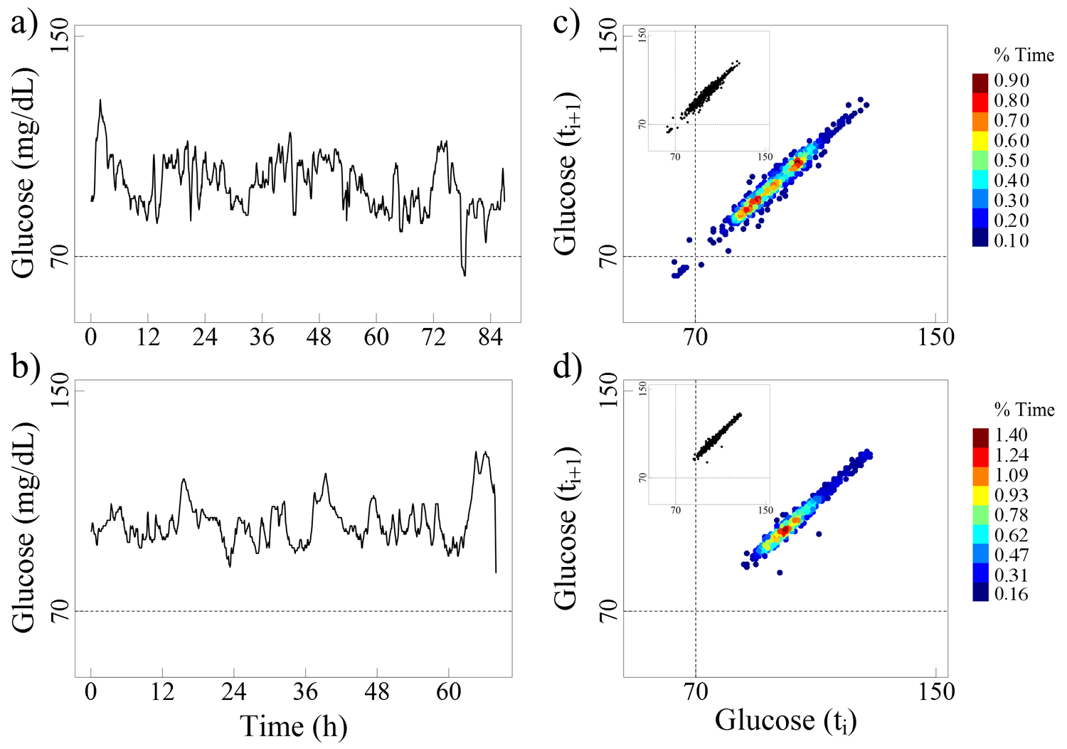
The left panels (a and b) present the glucose time series for 2 non-diabetic elderly subjects (82 and 76 years, respectively). The right panels (c and d) present their respective colorized delay maps, where the brown color indicates the most frequent pairs of glucose values and the blue color the least frequent ones. The insets display the traditional monochromatic delay maps.

The left panels (a, b, and c) show the glucose time series for 3 patients (76, 72, and 72 years, respectively) with 9.4% HbA1c values. The right panels (d, e, and f) show their colorized delay maps.

The left panels (a, b, and c) present the glucose time series for 3 patients (73, 77, and 73 years), all with 7.1% HbA1c values. The right panels (d, e, and f) present their colorized delay maps.
The maps from both the non-diabetic subjects and the patients with diabetes have a stretched elliptical shape, a finding indicating that a given glucose value is followed (or preceded) by one of similar magnitude. The width of the ellipse measured perpendicularly to the diagonal line reflects the amplitude of the short-term (5 min in these cases) glucose fluctuations. Delay maps for measures 10 min far apart would have a slightly larger width. In fact, the width will increase as the time delay between consecutive glucose values expands.
To illustrate what the typical shape of the delay map is for a random sequence, we randomized the time series from non-diabetic subjects by shuffling the order of the glucose values. The time series for the randomized signals and their respective colorized density maps are presented in Figure 4. Note the dramatic change in the shape of the delay map that becomes much more circular. This change is consistent with the fact that a given value is likely followed or preceded by another of (unrelated) magnitude.
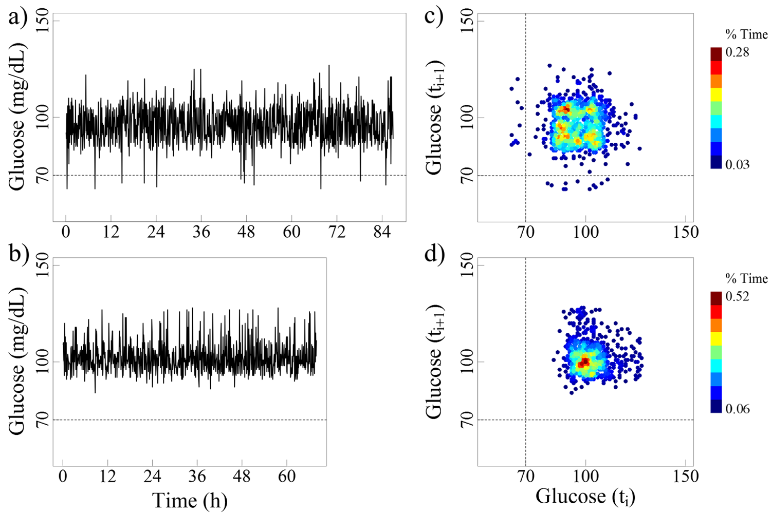
The left panels (a and b) show the randomized glucose time series values for the 2 non-diabetic subjects, shown in Figure 1. The right panels (c and d) show their colorized delay maps.
In the “real-world” examples shown here, as expected, the glucose values of non-diabetic subjects fluctuate within a relatively narrow range (50-150 mg/dL). The delay maps for these healthy subjects show small, well-circumscribed zones of increased density, representing “preferred” glucose values (Figure 1). The glucose time series for the patients with type 2 diabetes present larger elliptical patterns, covering higher ranges of values compared to their non-diabetic counterparts. Selected examples of the effect of noise on these delay maps are also presented in the appendix.
Furthermore, patients with comparable HbA1c values can exhibit very different glucose fluctuation patterns. Note that in Figures 2 and 3, the axes of the colorized delay maps cover a wider range of values than those required for non-diabetic subjects (Figure 1). By way of comparison we present (Figure 5) the delay maps for the same 2 non-diabetic subjects using the wider axis range (50 - 400 mg/dL).
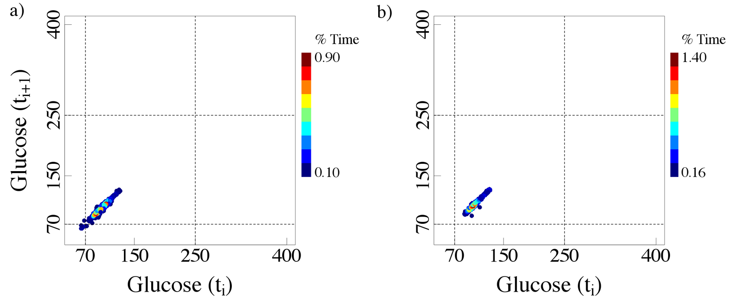
Colorized delay maps of time series of 2 non-diabetic nondiabetic subjects. Note that the difference between these panels and those presented in Figure 1 is the use of expanded axis ranges (50-400 mg/dL).
An apparent limitation of the density delay map method, as described here, is the fact that it does not give information about the time of occurrence of any given point (representing a consecutive pair of values). To add such information, a “point-and-click” adjunct can be incorporated that localizes any point of interest in the delay map onto the original time series (Figure 6).
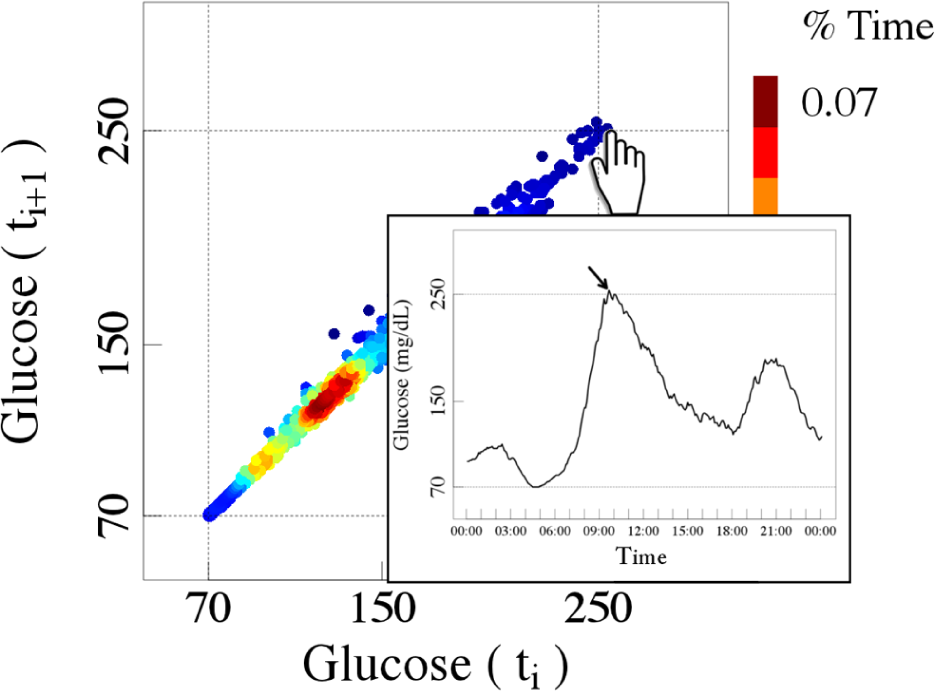
Example of a dynamic view of one of the colorized delay maps (Figure 3f) showing how the point-and-click option can be used to link any point on the delay map to its location on the original CGM time series.
Discussion
The “glucose-at-a-glance” visualization tool is a new way to display the complex, frequently sampled data acquired by CGM systems. The motivation is to enhance and facilitate assessment of glucose dynamics. Of note, the colorization based on the frequency of occurrence of sequential glucose values is of key importance in enriching the information provided by monochromatic delay maps (insets, Figure 1). As described above, the latter have been widely used by investigators probing heartbeat dynamics2-4 and suggested for exploring CGM data.5,6 To our knowledge, however, the colorized density maps along with the point-and-click adjunct connecting these maps with the glucose time series (Figure 6) have not been previously introduced.
The analysis presented here, based on the density delay map method, shows that the differences in the glucose dynamics of non-diabetic subjects and patients with diabetes are encoded both in the amplitude of the analyte fluctuations and their temporal structures. In particular, the colorized delay maps of non-diabetic subjects show relatively small brown-yellow zones corresponding to sustained periods of stable glucose levels. In contrast, the patients with diabetes often show a single or multiple enlarged “smeared out” brown-yellow zone indicating the absence of a stable baseline or the presence of multimodal instabilities, such that the glucose values appear to oscillate between different “attractors.”
Finally, this new visualization tool provides information complementary to the HbA1c values. As discussed above, the range and the structure of glucose variability may be very different for patients with comparable HbA1c values. The clinical implications of this graphically depicted instability remain to be determined.
Future Directions
The translational utility of the colorized delay map (“glucose-at-a-glance”) method as a general visualization tool in both types 1 and 2 diabetes mellitus will require clinical testing. The method may also inform more basic work on models of glucose control in health and disease, since the output of such models should replicate the graphical representations shown here. We note that for this presentation, we used the shortest delay provided by a commercial system, corresponding to a sampling rate of 5/min. One can use longer delays depending on clinician preferences. For this demonstration, we also used the entire time series. However, the method can be applied to any segment of interest (e.g., daytime glucose values) provided that a reasonable number of points (of the order of 50 or more) is available. We did not have access to longitudinal studies. However, we anticipate that the colorized density delay map will change over time, depending on therapeutic interventions, diet, and so forth. Finally, the use of this class of density delay maps to develop and test new quantitative metrics of variability also requires prospective evaluation.
Conclusions
The “glucose-at-a-glance” visualization tool, which is based on colorized delay (Poincaré) maps, provides a way to facilitate the assessment of complex data acquired by CGM systems. This method yields dynamical information not contained in single summary statistics, such as HbA1c values, and may serve as the basis for developing novel metrics and models of glycemic control.
Footnotes
Appendix
Abbreviations
CGM, continuous glucose monitoring; HbA1c, hemoglobin A1c.
Authors’ Note
MDC and ALG are joint senior authors.
Declaration of Conflicting Interests
The author(s) declared no potential conflicts of interest with respect to the research, authorship, and/or publication of this article.
Funding
The authors disclosed receipt of the following financial support for the research, authorship, and/or publication of this article: This work was supported by the Portuguese National Science Foundation (grant SFRH/BD/70858/2010; TH). We also gratefully acknowledge support from the Wyss Institute for Biologically Inspired Engineering (ALG and MDC); the G. Harold and Leila Y. Mathers Charitable Foundation (ALG and MDC); the James S. McDonnell Foundation (MDC); and the National Institutes of Health (grants K99/R00 AG030677 [MDC] and R01GM104987 [ALG]).