
Abstract
Although current athlete performance monitoring system designs undertaken within sports engineering and technology research have a strong focus on achieving functionality requirements, considerations on usability evaluation and testing during the design process are limited. Conventional design research highlights the importance of factoring usability at the heart of performance monitoring system designs like human-computer interfaces. Consequently, based on a user-centred approach, this research aimed to design a digital dashboard to optimise a scouting information flow within a professional basketball club and improve usability issues in the design by executing formative usability assessment approaches. Thematic analysis conducted on the data obtained from an initial semi-structured interview with the Head Coach of the club clarified dashboard functionality and design requirements, importance of the scouting process and information on potential system users. Thereafter, guided by the Build-Measure-Learn cycle in The Lean Startup framework, Minimum Viable Products (MVPs) of the dashboard were designed and 25 usability issues in the initial MVP were identified from heuristic evaluations conducted with three usability experts. Following system redesign, task-based think aloud usability testing sessions conducted with five coaches (i.e. users) at the club unravelled further nine usability issues in the dashboard, which were resolved by systematically pivoting to new MVPs during the iterative design process. Overall, this paper outlines a systematic approach to conducting formative usability assessment of sports technologies and highlights the importance of resolving specific usability issues present in technological systems like dashboards designed by practitioners embedded in applied sport environments.
Keywords
Introduction
The combination of analysis methods with a substantial increase in data due to technological enhancements have led to the formulation of data-informed decision-making processes to evaluate the value of athletes like basketball players. 1 Depending on specific decision requirements, insights generated from data as information (i.e. data in context) and evidence (i.e. information compared to standards) can be presented to practitioners using a variety of modes like reports, presentations and data stories.2,3 Yet, owing to the need to automate corresponding information flows to support decision-making in applied sport environments, there is widespread demand to develop technological systems to monitor the performance of athletes. For instance, Mullane et al. 4 developed a system to monitor and measure the performance of swimmers and communicate the results to coaches real-time via wireless technology. Similarly, Gorden et al. 5 recently illustrated the development of a system to monitor and provide real-time feedback on strength and conditioning exercises. A key component of those performance monitoring systems is a human-computer interface (HCI), which acts as the key platform for the communication between end users and the system. At a time when digital transformation is gaining significant traction within the sport industry, 6 interactive digital dashboards are used as a key HCI to communicate the insights generated from performance data to various stakeholders (e.g. coaches, players and agents) within sport environments.7,8 Research further suggests that the specific objective of creating dashboards in performance-driven environments like sport clubs is to assemble a selection of metrics under an appropriate visual presentation to promote high quality decisions. 9
Few 10 concluded that dashboards are ‘a visual display of the most important information needed to achieve one or more objectives; consolidated and arranged on a single screen so the information can be monitored at a glance’. Design research has increasingly directed its attention on dashboard design with evidence for its application relating to sports like professional rugby union,11,12 running 13 and basketball.14,15 Although detailed examination of dashboard design in sport research is limited, it has been examined extensively in other industries like healthcare and education. In public health, dashboards have been long used for internal reporting, monitoring and evaluation activities, before seeing exponential growth in popularity and use to overcome challenges caused by the COVID-19 pandemic. 16 In education, the use of dashboards is centred on the need to implement online educational platforms. 17 However, Matcha et al. 18 warned future researchers and developers from building learning dashboards following a-priori conventions and designs, proposing instead to use a user-centred model focussing on theory, design, feedback and evaluation. This suggestion is particularly interesting as it hints at the importance of ensuring a user-centred approach when designing digital dashboards.
When implementing human-computer interfaces like dashboards, beyond achieving core functionality requirements, recent research emphasises that usability is a key component to ensuring high-quality user experiences. 19 Such findings align with specific guidance from core design research, 20 where usability is considered at the forefront of user-interface design. Interestingly, Blessing and Chakrabarti 20 further highlight the importance of examining and improving the usability of user-interfaces as it can be the key factor in which a system is judged by a user. As the primary standard for working with computers, ISO 9241-210:2019 21 defines usability as the ‘extent to which a system, product or service can be used by specified users to achieve specified goals with effectiveness, efficiency and satisfaction in a specified context of use’. 21 Moreover, Nielsen 22 characterised usability by five quality components: learnability, efficiency, memorability, errors and satisfaction. Additionally, ‘utility’ is also considered important, as it tries to define the functionality of a design and find an answer to whether the interface does what the user needs. 22 Blessing and Chakrabarti 20 further suggest that the quality of user interfaces should be examined from the viewpoints of the users and system developers (e.g. engineers). From a technical perspective, usability assessments are typically approached from two angles: formative and summative. 23 The primary objective of formative assessment is to unravel potential usability issues at early stages of a design lifecycle. 23 Whereas summative assessments occur at later stages once a reasonably functioning system is developed and focusses on evaluating it against benchmarks (e.g. industry usability standards) or other systems (e.g. previous versions of the system). 23
While the functional aspects of the sport performance monitoring systems designed by Mullane et al. 4 and Gorden et al. 5 were validated, the design processes adopted in both system developments did not utilise specific usability assessment approaches to evaluate the usability of the user interfaces prevalent in those systems. Elsewhere, Goudsmit et al. 13 conducted interviews with the coaches to test the practical use of the coaching dashboard designed for sports like speed skating, cycling and running based on a qualitative approach. However, the authors didn’t utilise standard usability assessment approaches in that instance. 13 Perhaps as the most in depth illustration of usability examinations in current sport literature, Ranaweera et al. 11 illustrated how formative usability assessments (cognitive walkthroughs and task-based testing with think aloud technique) and summative assessments (benchmarking using the System Usability Scale (SUS)) can be conducted when designing digital dashboards in a professional rugby union environment. 24 However, in that study, the usability assessment process was executed by engaging only end users, without considering feedback from usability experts early in the formative assessment steps (i.e. cognitive walkthrough). There is further evidence of using the SUS in rugby union to compare the usability of a dashboard against evolving designs, 12 determining overall usability of instrumented mouthguards 25 and user experience evaluation of a sports arena booking website. 26
In terms of basketball, while there is a strong research focus on developing data science and analytics models to evaluate basketball performance,27–29 integration of those evidence into information flows and formative usability assessment of the subsequent digital systems is limited. For instance, Juliano et al. 14 developed an online dashboard to track the performances of Division I women’s basketball athletes. However, it is unclear if standardised usability assessment approaches were undertaken in that instance when assessing the usability of the designed system. Similarly, although Harlianto and Setiawan 15 illustrate how the insights generated from statistical models used to predict the most valuable player in a National Basketball Association (NBA) season were visualised using a web-based dashboard, the study does not explicitly consider usability assessment of the relevant system during the design process. Overall, this context illustrates a clear gap in current sport technology research, where most HCI (e.g. dashboards) design endeavours have predominantly focussed on achieving functionality requirements, without identifying and improving specific usability issues in those system designs based on standardised formative usability assessment approaches that consider the feedback of both usability experts and system users. Such contexts enhance the risk of pushing systems to consumers rather than accommodating a pull from end users to adopt them within their core operational processes. This situation can potentially result in the suboptimal utilisation of resources (e.g. design time of engineers, hardware/software use). Consequently, there is a strong need to illustrate how the usability of user interfaces like digital dashboards designed in applied sport environments can be systematically examined by providing explicit guidance on performing formative usability assessments of sports technology systems. Therefore, to bridge those gaps and further strengthen usability literature relating to sports, beyond achieving core functionality requirements, this study aims to illustrate how standard formative usability assessments can be conducted to identify and improve usability issues prevailing in a digital dashboard designed to optimise a scouting and recruitment information flow within a professional basketball club in the United Kingdom.
Methods
This section outlines details of the case study basketball environment, sampling considerations and the overall system design and usability assessment processes considered in this study.
Case study
Guided by a pragmatic philosophical stance, this study adopted a case study design to explore the usability of a digital dashboard designed to support decision-making in a professional basketball club competing in the British Basketball League (BBL). Specifically, an organisational requirement was defined at the club to optimise the scouting and recruitment information flow by implementing a digital dashboard as a user interface to process and visualise information on the performances of basketball players from the National Collegiate Athletics Association (NCAA). The NCAA is an established intercollegiate sports organisation based in the United States of America (USA), which serves as a key talent pool for teams worldwide. Prior to data collection, formal ethical approval for this study was obtained from the affiliated institution of the first author. Accordingly, formal permission was obtained from the BBL club for the research project, and written consent was attained from the participants prior to data collection.
Participants and sample sizes
Guided by a purposive sampling process and by considering further practical and logistic constraints due to the limited number of practitioners available in applied sport environments like that considered in this study, 30 the initial functionality requirements of the digital dashboard were obtained from the head coach (HC) of the club, of whom, at the time of this study, possessed more than 7 years of experience in professional basketball. Although the extraction of system requirements from the viewpoint of a single user may appear to induce bias, this situation was minimised because the HC was the key stakeholder with the greatest influence/power and interest in the recruitment process at the club. Mainly because the HC was the primary subject matter expert on recruitment due to resource constraints at the considered BBL club. Thereby, from a stakeholder analysis perspective, it was important to closely manage expectations of the HC as the primary decision-maker pertaining to the considered use case. Afterwards, this study adopted three usability experts (with more than 27 years of combined technical experience in system design and usability assessment) and five coaches at the club (potential users of the dashboard) having approximately 60 years of collective experience in professional basketball for the usability assessment. Specifically, when considering the cost of testing against reward, for qualitative usability assessments, research highlights that three to five experts (e.g. User Interface (UI)/User Experience (UX) designers, usability researchers) are sufficient for a usability evaluation and that testing with at least five users can help to identify 75%–80% of the usability issues in a system.31,32 Moreover, from a practical sense, there were only five coaches at the club, who would actually use the designed system for decision-making processes. Importantly, the selection of usability experts was guided by the following three key selection criteria: (a) experience of working as an applied practitioner in a professional sport environment with direct responsibility for digital system design or (b) evidence of conducting usability related research or (c) explicit experience of working professionally as a UI/UX Engineer/Designer.
System design and usability assessment process
To support potentially evolving user requirements in the current sport organisation,33,34 the dashboard development needed to be agile and flexible in execution. Subsequently, due to applications in other professional sport environments, 11 we adopted the iterative Build-Measure-Learn cycle in The Lean Startup framework (Figure 1) to develop Minimum Viable Products (MVPs) as rapid prototypes and resolve usability issues in them. 35 According to Reis 35 this approach helps to eradicate waste (e.g. time and resources) by enabling the program developers to fail fast and learn faster from eminent failures in the design process.
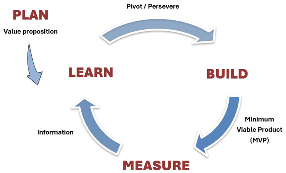
Iterative Build-Measure-Learn cycle used for the dashboard design and usability assessment. 35
Plan
While it can be perceived that the Build-Measure-Learn cycle begins with the Build phase, it practically begins with an initial Plan stage occurring in reverse to the conventional flow. 11 During this phase, the Build-Measure-Learn cycle required to formulate the sport innovation was planned, where key focus was given to defining clear design requirements with user engagement and appropriate usability conditions for stopping or continuing the design cycle. Aligning to user requirement extraction in performance monitoring system design research reported previously in sports engineering and technology literature,4,5,11 a semi-structured interview (less than 30 min) with the team’s HC was initially conducted by the lead author online via Zoom (California, USA)™ to elicit system requirements. The interview questions were structured to focus on the five W’s (what, why, when, where, who) and were developed initially by the first author and face validated with author JR. Prior to data analysis, the recorded audio content of the interview was transcribed verbatim using Otter.ai (California, USA) 36 and grammatical errors including unclear sections due to poor audio quality were amended by author AM. Thereafter, led by author AM (validated by authors PO and JR) and guided by an inductive approach based on a semantic coding structure, the six-step reflexive thematic analysis process specified by Braun and Clarke 37 was used to unravel themes of system requirements and guidelines for the initial prototype development. Moreover, driven by considerations from the Critical Assessment of Usability Studies Scale (CAUSS), 38 it was decided to conduct at least two design iterations pertaining to the usability assessment: one each for usability evaluation with experts and usability testing with actual users.
Build
The main objective of the Build stage in The Lean Startup framework is to develop a Minimum Viable Product (MVP), which is a version of the system containing just enough features or functions to evaluate the criteria defined in the Plan stage. 35 Consequently, during the Build phase of the initial system, Tableau Desktop (version 2023.1.0, Salesforce, Seattle, USA) was used to create an MVP of the dashboard to meet the initial functionality requirements defined in the Plan stage. Data required to design the dashboard was imported into Tableau from Microsoft Excel (version 2402, Washington, USA), after gathering publicly available NCAA player data from multiple web sources such as RealGM 39 and ESPN 40 through Power Query and HTML import options.
Measure
From a theoretical perspective, the Measure stage mainly focusses on evaluating the suitability of the MVP to achieve the criteria set in the Plan stage. 35 Because the primary objective of this study was focussed on examining usability issues (i.e. formative) in the designed system, the Measure phase was used to examine usability of the designed dashboard with experts and users. Resultantly, the industry accepted and widely used heuristic evaluation process (based on 10 heuristics of user interface design) was conducted with the three experts to evaluate usability of the first MVP.31,41 Importantly, independent evaluation sessions were carried out by the lead author with each expert using Zoom™ videoconferencing software. Every session lasted no more than 45-min and expert feedback on the 10 heuristics pertaining to the MVP were sequentially recorded using the template provided by Moran and Gordon 31 Afterwards, a list of usability issues (categorised as minor or major based on the technical complexity of the expected design changes), in relation to the heuristics were listed alongside any perceived functionality changes from the expert feedback. The Measure phase of subsequent cycles implemented after designing new MVPs to overcome issues extracted from prior heuristic evaluations were used to identify further usability issues from task-based think aloud (i.e. users discussing their thoughts when interacting with a system) usability testing sessions with the five coaches (i.e. users). Crucially, the tasks (see Table 1) were created to represent real-life scenarios within the scouting process and to ensure access to the key sections of the dashboard (e.g. widgets). Specifically, the tasks represent key steps that a user would undertake to extract information from the dashboard pertaining to actual recruitment related decisions at the club. In doing so, the tasks were streamlined to consider all possible combinations of engagement with the dashboard by a user. Thus, covering all key functionalities of the dashboard.
The list of tasks designed for the task-based usability testing sessions.
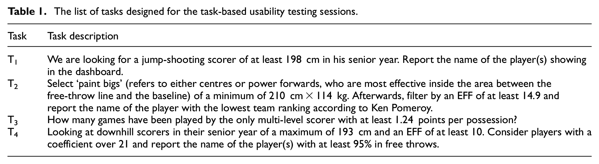
When conducting the task-based usability testing sessions, the following sequence of actions were adopted: (a) introduce main features of the interface to the participants, (b) provide a list of the four tasks, (c) perform each task sequentially and record the corresponding outcome and (d) respond to the post-task Single Ease Question (SEQ), used to indicate the difficulty of each task. 42 Moreover, guided by similar research, 11 each testing session was restricted to a maximum duration of 30min and conducted in-person at the considered club by creating a lab-based testing environment, where screens of the participants were recorded to help analysing the think aloud data. In this instance, the task completion rates were used as guides to identify potential sections of the interface with usability issues. Thereafter, subsequent user perceptions extracted from the think aloud process were mapped to triangulate and identify specific user perceived usability issues in the system.
Learn
Completion of the previous Measure stage typically yields core insights (as information) pertaining to the created MVP, which can be used to Learn about the design and decide to either Persevere with the prevailing version (if criteria defined in the Plan are achieved) or Pivot to a different design if further changes are necessary. 35 In this research, it was decided to Preserve with an MVP version if no major usability issues were prevalent after testing with usability experts and potential system users in the considered basketball club.
Results
In this section, we report outcomes of the system requirement elicitation process, iterative dashboard design and formative usability assessment steps considered in the study.
System requirements
As specified in the later sections, outcomes from the initial semi-structured interview with the HC yielded three key themes of system requirements: (a) dashboard functionalities and design, (b) scouting process and (c) user information.
Dashboard functionalities and design
The first theme includes details regarding the dashboard functions needed to improve the scouting process and specific suggestions on its design (see Table 2).
Dashboard functionality requirements and design considerations.
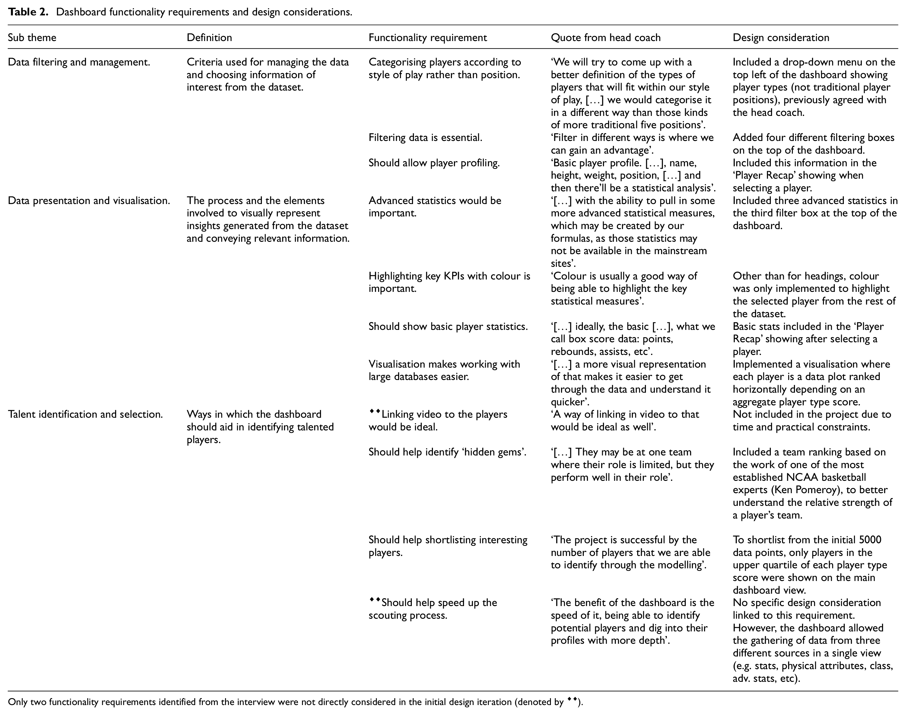
Only two functionality requirements identified from the interview were not directly considered in the initial design iteration (denoted by ♦♦).
Scouting process
The second theme focussed on providing a broad overview of the scouting process. On multiple occasions, the HC stressed that obtaining insights about a large pool of potential players (like the NCAA data considered here) helps to obtain a competitive advantage when negotiating contracts of new players. ‘The earlier we can identify players, the earlier we can start those conversations and express an interest’. With the domestic league and other national competitions in the UK ending in May, the HC indicated June as the optimal time for recruiting to start, thus providing a clear timeframe for the dashboard to be ready ahead of the 2024/2025 BBL season.
User information
The last theme provided information about the end users of the dashboard. The pool of stakeholders utilising the dashboard is quite limited, and the HC was the key stakeholder responsible for leading and coordinating the scouting process. This context further justified the decision to identify system requirements from the perspective of the HC.
‘I would say so, generally, our General Manager, myself as the head coach and two assistant coaches as well, who will be kind of loosely involved in the recruiting process… Primarily, the coaching staff and the General Manager will be in charge of recruiting for the player. So, they would be the ones who will be using the dashboard’.
Initial system design
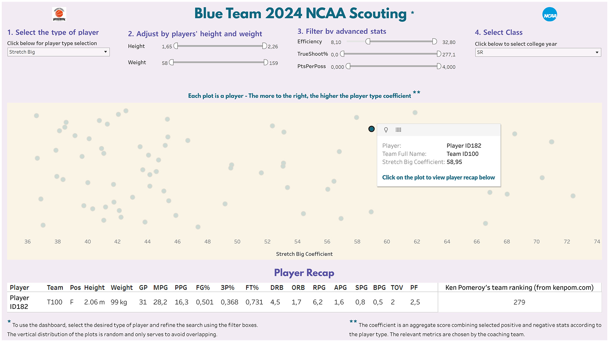
The dashboard design process was led by the lead author as an insider within the club (i.e. emic approach). Based on the guidelines proposed by Carroll 43 a single dimension scatter plot was used as the primary visual. The x-axis was specifically used to represent player rankings based on an internally generated single metric coefficient (details on generating the metric are outside the scope of this manuscript), whilst a ‘fake y-axis’ was used to separate and avoid overlapping of data plots in the visual. 43 To categorise players according to pre-determined types rather than by the position on the court (see Table 2), the internally derived list of 12 player types with their definitions and relevant KPIs were provided by the HC to the lead author prior to the system design. Consequently, four filter boxes (i.e. two sliders and two dropdown menus) were added at the top of the dashboard to filter players according to player type (12 categories), physical attributes (height and weight), performance statistics (efficiency, true shooting percentage and points per possession) and college class (freshman, sophomore, junior and senior). Also, to accommodate player shortlisting and reduce system process times (see Table 2), data were preliminary filtered to only consider athletes with a player-type coefficient above the upper quartile. Also, by clicking on each data plot, it would be possible to get each player’s basic performance statistics from the current season. The resulting initial dashboard version is shown in Figure 2.
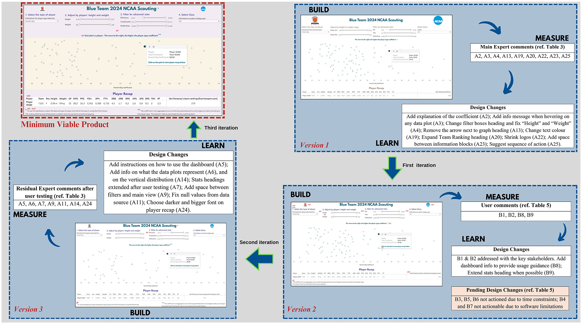
Evolving versions of the dashboard as the design process navigated through the Build-Measure-Learn cycles to redesign the system to overcome specific usability issues identified from the heuristic evaluations and task-based think aloud sessions. Location of each design change has been denoted by the relevant usability issue assigned in Tables 3 and 5. Individual images of each version of the evolving dashboard has been provided in the Supplemental Materials.
Usability evaluation with experts
From the three heuristic evaluation sessions, 25 usability issues were identified, including recommendations to fixing them (see Table 3). The severity of each issue was graded as minor or major by the lead author (in consultation with other authors) based on the technical complexity of the expected design changes to overcome the relevant usability issue. Thereby, it was initially decided to prioritise design changes to overcome major usability issues. However, this decision was quickly reversed due to time constraints defined for the overall project by the team management. Specifically, the dashboard design processes needed to be completed during the off-season period (i.e. in weeks and not months). Such constraints are typically prevalent when designing systems within professional sport environments. Hence, it was decided to prioritise usability issues requiring least changes to fix (thereby, minimising time spent on the design process). These rapid changes in the design approach were made possible by our mindset to fail fast and learn faster during the entire design process. This decision was also conditioned by the holistic aim of Lean Startup framework, where the focus is on engaging actual users early in the design process to swiftly turn the Build-Measure-Learn cycle to enable rapid prototyping and accelerated learning.
35
Hence, to engage actual users in the usability assessment process, initially,
The list of usability issues identified from the heuristic evaluations and the corresponding actions taken to fix them.
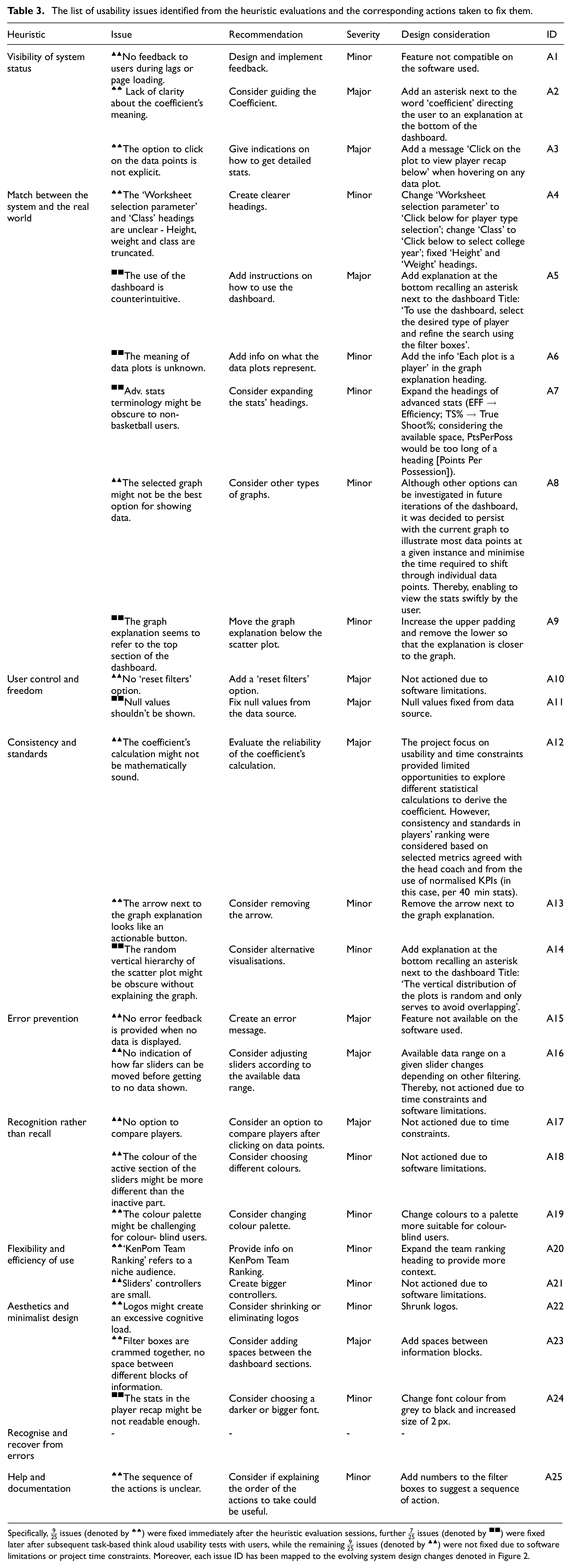
Specifically,
Usability testing with users
Table 4 illustrates completion rates of the four tasks used to test the usability of the redesigned dashboard (new MVP) with the five users.
Task completion rates (including SEQ results) of the usability testing.
The first task (T1) was completed by all participants, and they found it to be the easiest. Both U4 and U5 failed T2 as they selected the player with the lowest player type coefficient rather than the one with the lowest team ranking. This result suggested there was not enough clarity about the difference between the player type coefficient and team ranking within the dashboard. Although U4 and U5 successfully completed T3, both forgot to reset the sliders after completing the task. Thus resulting in no player data being displayed on the dashboard and was further evidenced through the Think Aloud feedback of U3, where addition of ‘reset filters’ was suggested as an improvement. Most users encountered difficulties with T4 when trying to filter data using the slider as its resolution could not support specific filtering requirements of the users (e.g. when trying to select an efficiency value of 10, the slider would skip directly from 9.8 to 10.1). Having understood that it was impossible to select certain efficiency values by moving the sliders, all users except U4 took substantial time to realise that the desired value could be typed into the text box adjacent to the sliders to filter the data pertaining to desired resolution, highlighting the need to make it explicit to the users. There was further evidence of this issue from the think aloud data from U1: ‘The sliders miss some values when you are trying to filter’. Moreover, U2 stated that: ‘The sliders should be easier to use’. Furthermore, beyond usability concerns, the testing process also illustrated further functionality improvement requirements. For instance, U4 stated: ‘The top toolbar is a bit too small for me’. This user wore corrective eyewear and mentioned it took some time to familiarise with to the size of the slider controls. Overall, completion of the task-based usability testing sessions with the users resulted in further seven usability issues and two functionality suggestions depicted in Table 5. Consequently, it was decided to continue the design process by Pivoting to a new MVP to overcome
List of issues identified from the task-based usability testing sessions with users.
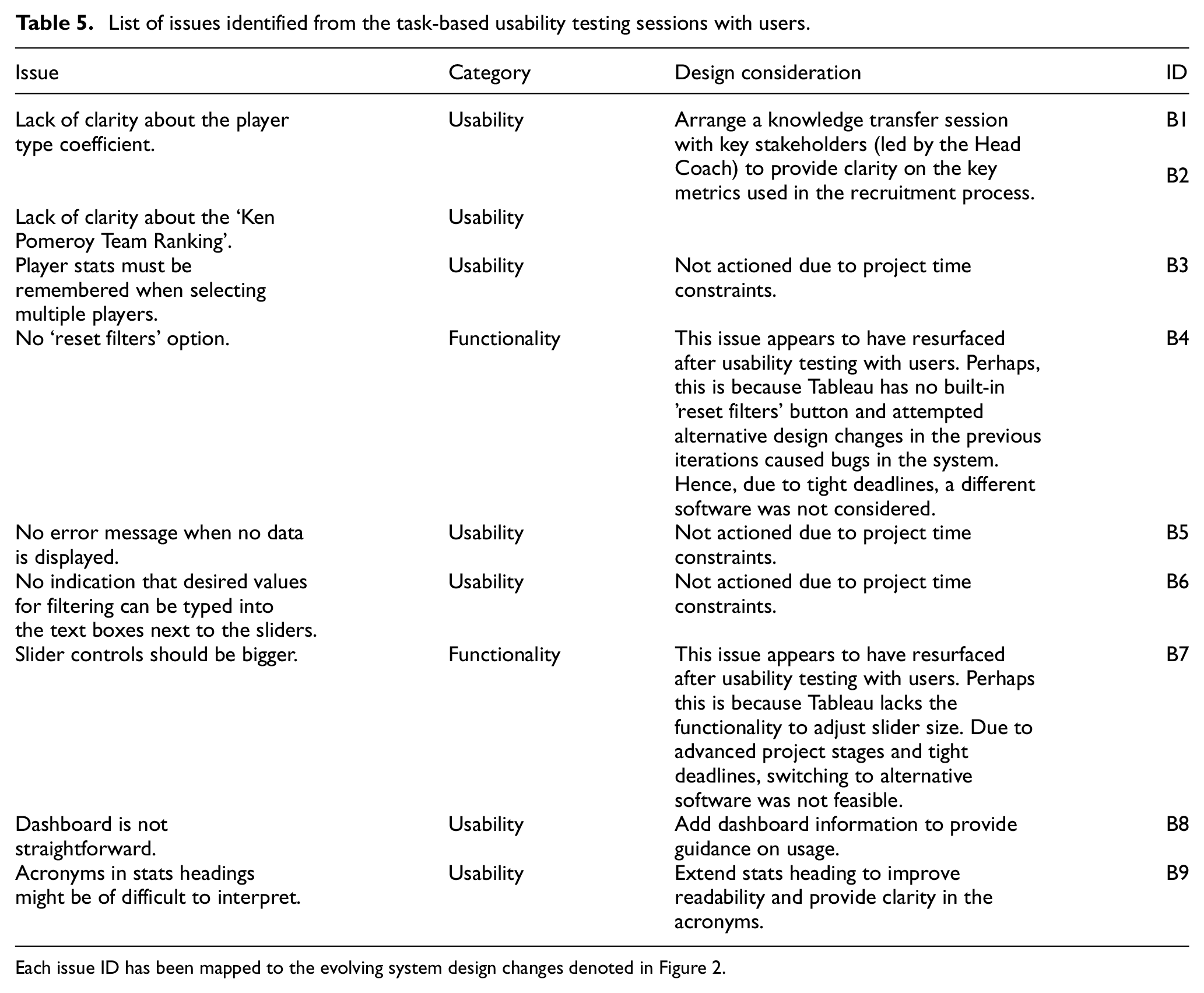
Each issue ID has been mapped to the evolving system design changes denoted in Figure 2.
Thereafter, further seven residual usability issues that were identified from the earlier heuristic evaluations (that were not factored when developing the second version of the dashboard immediately after heuristic evaluations) were considered (see Table 3). Subsequently, the finalised minimum viable product of the dashboard depicted in Figure 3 was created to end the initial design process. This decision was also derived because the criteria set in the plan stage of the Lean Startup process (see section 2.3.1) to stop the cycle were achieved.
Finalised version of the dashboard (minimum viable product) after overcoming key usability issues.
Discussion
This study was focussed on designing a digital dashboard to optimise a scouting and recruitment information flow operational in a British Basketball Club and improve usability of the subsequent system based on standardised formative usability assessments conducted with usability experts and system users.
System requirement elicitation
Selection of the HC as the primary voice for requirement elicitation was due to the high interest and power influencing the scouting and recruitment process by this stakeholder at the club. The subsequent understanding obtained regarding the scouting process from the HC was instrumental in guiding the overall dashboard design in relation to the holistic organisational objectives of the club. For instance, the importance of signing players before competitors and managing lesser-rated players to secure a contract for the following season were highlighted as key organisational philosophies.
‘The further ahead of the curve we are the more chance we potentially have of signing players […] if we were to come in and offer them a contract that guarantees their position for the following year, some players are a lot happier to do that than to wait to try and find… a more lucrative contract’.
As per the HC, it was also evident that the easiest and most common way for teams to get to know potential new recruits for an upcoming season is through agents: ‘the agents are often emailing or contacting the same teams within our league as well’, thus shrinking the chances of success in recruitment considering the team works on a low budget: ‘we are not able to offer the salary of many teams within our league’. Such feedback helped to clarify resource constraints that needed to be considered when undertaking the system design (e.g. limited finances for technology). The HC provided additional information on how the information provided by the designed dashboard would be operationalised at the club: ‘we would then work to connect with those players, either directly or through the agents who may not have proposed these players to us’. Although it is beyond the scope of this research, the overall organisational requirement to reach less popular players might indicate that ranking candidates based on traditional basketball performance statistics may not be sufficient. Considering the NCAA athletes factored in the dataset are playing in more than 350 different teams with varying competitive levels.
Usability assessment with experts and users
The usability evaluation approach examined in this research is a primer for illustrating how formative usability assessments can be conducted on systems developed for sport environments by engaging with usability experts during early stages of a design lifecycle. Mainly because, the cognitive walkthrough performed by Ranaweera et al. 11 when examining the usability of dashboards implemented in professional rugby union was conducted by only engaging with users. Whilst prior research justifies the applicability of using cognitive walkthroughs with users,44,45 unlike usability testing, usability evaluation (or inspection) methods like cognitive walkthroughs, heuristic evaluations, feature inspection, etc. are explicitly conducted with usability experts and system design teams early in the design process before engaging with actual users. 46 Moreover, the three experts recruited for the usability evaluation were external to the case study organisation. While professional sport is renowned for closed operational models with limited considerations of open innovation, the design process adopted in this study illustrates how sport environments can benefit from welcoming systematic engagements with external experts when integrating technology systems to support specific segments of the overall operational process. From a technical viewpoint, beyond identifying key usability issues, the heuristic evaluation sessions enabled the experts to suggest potential design improvements to overcome those problems.
While only selected issues identified from the heuristic evaluations were remedied prior to the second stage of testing due to time constraints, most problems identified from the subsequent task-based usability tests with users overlapped with those pending issues not considered for immediate system design following the usability evaluations with experts. For instance, to overcome the issue with misinterpreting labels identified from the second task (T2), the experts had originally suggested adding the option to select multiple players to compare them while showing the relevant statistic instead of the user remembering them when selecting different players. Also, the need to integrate a reset option identified by users when attempting the third task (T3) was also stated by the experts. As a remedy, in addition to including reset filters, they recommended the addition of prompts to inform system status to users when no data was available due to a filtering condition. One exception was the inability to type the desired figures for filtering inside the text boxes next to the sliders by the users. It is important to note that improving the system to overcome recurring issues like ‘slider resolutions’ were not feasible due to technical limitations of the chosen data visualisation software, where options to increase the size of the slider controls or their aspect were not offered. Moreover, the software did not have an integrated functionality to implement a ‘reset filter’ button in its dashboards. Hence, considering the tight deadline of the project, the possibility of using a different data visualisation software to overcome such repeated issues was not considered in the study. While this situation may suggest that the design changes undertaken after the heuristic evaluation may not have been optimal, as per existing usability guidelines, 38 it nevertheless signified the importance of triangulating system usability assessment outcomes obtained from both experts and users. Moreover, aligning to recommendations of similar healthcare informatics 47 and design research, 20 the outcomes of this study further signified the importance of adapting user-centred approaches to system innovations in an applied sport environment like a professional basketball club. Finally, as a form of member checking, the overall system design and usability assessment process could have benefited from repeated engagements with the stakeholders. For instance, an additional early engagement with the HC after the system requirements were elicited may have helped to identify specific usability issues (e.g. lack of clarity about the coefficient’s meaning) early in the design process (i.e. even before engagements with experts and users). However, such approaches were restricted due to resource implications prevalent in the considered environments, where time commitments by a key stakeholder like the HC for research endeavours can be limited.
Usability considerations in user interface design
As stated in the introduction, prevailing performance monitoring system design research in sports engineering and technology literature primarily focusses on meeting functionality requirements of a system without factoring usability aspects during the design process. Perhaps such a situation is manifested because design research typically generates prototypes that are not considered for direct deployment. 20 In turn, sports engineering and technology design research have adopted this thinking by considering functionality at the forefront of a system design endeavour.5,48 Interestingly, although Mullane et al. 4 adopted a user-centred approach to the design of a performance monitoring system, this is only perceived from the viewpoint of user requirement elicitation and not for system usability assessment. However, outcomes of the design research presented in this study suggest the possibility of considering usability attributes as a key component pertaining to the design process of sports technology systems. Importantly, in contexts where access to real users may be challenging during the system design process, outcome of this study highlights that systematically evaluating the usability of sports engineering and technology design using an approach like heuristic evaluation with the design team and potential technology experts can still help to unravel usability issues early during the design process. Such approaches have great potential to eradicate significant time and resource wastages on eminent failure from instances of limited system adoption by users due to prevailing usability problems in a design. Furthermore, our results also align with existing design research guidelines that emphasise the importance of factoring usability at the forefront of user interface designs. 20 Yet, above all, as further supported by other design research that adopted similar approaches when designing user interfaces in a professional rugby union environment, 11 the results of this study also strengthens the applicability of the Build-Measure-Learn lifecycle in The Lean Startup thinking as an adequate framework to guide the rapid prototyping, active experimentation and validation of user interface designs like digital dashboards implemented in applied sport environments. Consequently, other sport environments or industries aiming to design digital dashboards could utilise this thinking to fail fast and learn faster during the innovation process since constant developments in artificial intelligence (AI) would further enable the rapid creation of digital system MVPs in the future. Such mindsets will strengthen the operationalisation of validated learning based on active experimentation, which is at the heart of Lean Startup approach. 35 In turn, helping to minimise design wastages by shifting away from conventional product development lifecycles, which may be too rigid to accommodate evolving user needs in highly dynamic decision-making environments like professional sports clubs.
Design methods adopted to overcome usability issues
Most usability issues discovered in the heuristic evaluation and the user testing phases were improved by integrating textual descriptors within the main view of the dashboard. Although this system redesign approach helped to improve usability of the interface, it may have risked enhancing cognitive load on prospective users. 3 Thereby, it was important to find the ideal balance between being informative without overwhelming users with text. Consequently, asterisks were added at the bottom of the dashboard to redirect users to short explanations. These explanations provided an initial context which proved beneficial during the task completion phase. Another issue revealed during the heuristic evaluation sessions was the general organisation of sections and spaces within the interface. Enhancing spacing between the top section and the main body of the visualisation and distancing the individual filter boxes helped attain a neat overall appearance. Moreover, to further minimise cognitive overload and improve readability, logos were shrunk early in the design process. In the third version of the evolving interface (see Figure 2), the text within player recap was increased in size and darkened in colour. Finally, while some usability issues identified from the formative assessment could not be addressed due to technical limitations of the software used and project time constraints stated earlier, the overall approaches adopted to improve the dashboard highlighted that complex design changes are not always necessary to improve the usability of a system. Such findings should further encourage practitioners to integrate usability considerations at the forefront of system design endeavours operationalised in applied sport environments.
Study limitations
Although engagement of the HC as the only stakeholder for requirement elicitation helped to obtain a holistic overview of system needs and organisational philosophies, perhaps it limited collating micro level functionality requirements during dashboard operation. For instance, as evidenced in Table 5, in addition to specific usability issues, further functionality requirements were unravelled from the task-based usability testing sessions with the users. As a solution to overcome such limitations, Ranaweera et al. 11 integrated practitioners from the major user groups (i.e. strength and conditioning coaches and physiotherapists) when eliciting system design requirements. The relatively small pool of actual users (n = 5) that were used for the task-based think aloud usability assessment sessions can be perceived as a limitation. This situation was mainly caused due to the limited number of practitioners operating in resource constrained applied sport environments like the one considered in this study. While researchers have highlighted such implications that can exist when conducting applied research,11,30 there was minimal impact on the overall study results due to this situation. That is because, when factoring cost of testing versus reward, research highlights that testing with five users is sufficient to identify most usability issues in a system. 32 However, such resource constraints could impact the use of quantitative usability testing methods in an applied sport environment. Mainly because limitations in sample sizes caused due to resource constraints could enhance the risk of errors generated in statistical judgements (e.g. Type II) from usability testing approaches like split tests, benchmarking, etc. This context was a primary reason that the current study did not consider a summative test to benchmark the designed dashboard against industry usability standards, as only five actual users would be available to generate the relevant data. In contexts where the primary aim is on designing generalisable systems across sport organisations (e.g. injury management information system introduced by the league across all clubs), the design process could use a diverse pool of actual users from different environments during the usability assessment process. Designing a generalisable dashboard applicable to different basketball clubs was not a consideration of this research. Instead, the focus was on illustrating a systematic approach to conducting formative usability assessments pertaining to a system implemented to meet organisational objectives relevant to a specific case study environment. Therefore, we encourage sport usability researchers to consider the examined approaches in this study and report if they are applicable to assessing the usability of systems (hardware and software) operationalised in similar basketball environments and/or other sport organisations.
Conclusion
Overall, this case study illustrates how The Lean Startup framework can be used to guide the design and usability assessment of a digital dashboard within a professional basketball organisation. As supported by prior case studies in professional sport, the results reassure the capability of utilising the Build-Measure-Learn cycle in The Lean Startup framework to guide system developments in applied sport contexts. Perhaps more notably, the article illustrates a systematic approach to conducting formative usability assessments on digital systems like user interfaces implemented to support decision-making in a professional sport setting. Importantly, the study emphasises how the entire design and usability assessment process can be operationalised by practitioners embedded in a highly volatile, uncertain, complex and ambiguous (VUCA) applied sport environment like a professional basketball club in England. Hence, future design research that focusses on developing digital user interfaces like dashboards in sport environments could adopt the methodological framework presented in this study when aiming to identify specific usability issues in those systems. The results generated from such wider applications would help in validating the generalisability of the formative usability assessment approach utilised in this study across other applied sport contexts. Conversely, as stated earlier, it is important to emphasise that the dashboard itself in its current form may not be directly translated to other similar environments before examining specific operational objectives of those sport settings. Particularly, since the system developed in the current study was explicitly designed to meet the organisational goals of the considered club and because each environment contains unique operational models (e.g. case specific financial plan, game model, recruitment strategy), it is important to evaluate those contextual factors when adopting systems from other sport environments. Such endeavours could also consider the integration of the dashboard with other information systems, artificial intelligence, augmented reality, diverse data sources (e.g. data from college/youth players outside the United States of America) and metrics pertaining to scouting and talent identification during system adoption. Moreover, the findings provide evidence on the importance of considering a user-centred approach to sport related system design and further highlights how systems implemented in applied sport environments can contain usability issues that require systematic resolution prior to full scale implementation. Thereby, emphasising the need to further strengthen usability research pertaining to the sport industry.
Supplemental Material
sj-pdf-1-pip-10.1177_17543371251324816 – Supplemental material for Formative usability assessment of a digital dashboard designed in a British Basketball League club
Supplemental material, sj-pdf-1-pip-10.1177_17543371251324816 for Formative usability assessment of a digital dashboard designed in a British Basketball League club by Alessandro Mezzone, Patrick Oxenham and Jayamini Ranaweera in Proceedings of the Institution of Mechanical Engineers, Part P: Journal of Sports Engineering and Technology
Footnotes
Declaration of conflicting interests
The author(s) declared no potential conflicts of interest with respect to the research, authorship, and/or publication of this article.
Funding
The author(s) received no financial support for the research, authorship, and/or publication of this article.
Informed consent/declaration of Helsinki/ethics committee approval
Formal ethical approval for this study was obtained in line with the ethics process of the affiliated institution of the first author, including written informed consent from the BBL club to conduct the research and from the participants prior to data collection.
Data availability
Sources of the publicly available player data used to develop the dashboards have been stated in the manuscript. However, because the professional basketball club considered in this study wishes to remain unidentified, specific research data generated within the project will not be shared publicly.
Supplemental material
Supplemental material for this article is available online.
References
Supplementary Material
Please find the following supplemental material available below.
For Open Access articles published under a Creative Commons License, all supplemental material carries the same license as the article it is associated with.
For non-Open Access articles published, all supplemental material carries a non-exclusive license, and permission requests for re-use of supplemental material or any part of supplemental material shall be sent directly to the copyright owner as specified in the copyright notice associated with the article.