
Abstract
Idents, the logos appearing in the continuity between programmes, are ubiquitous yet easily missed aspects of channel branding. Focusing on BBC One and BBC Two as case studies, this article traces the evolution of the images and sounds of idents over the past three decades. The approach brings to light the creative contributions of graphic designers and composers by combining data from in-depth interviews with textual analysis of idents. The article highlights relationships between creativity, brand strategy and craft skills in the making of the BBC’s idents and, by extension, in communicating the corporation’s public purpose and overall brand identity.
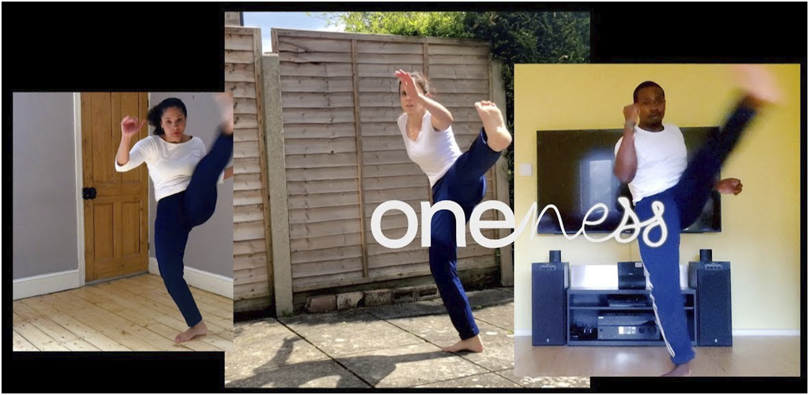
In April 2020, one month into the UK’s first national COVID-19 lockdown, BBC One began broadcasting a new series of channel idents. The previous idents, which displayed groups of people roller-skating, dog walking and Zumba dancing (Figure 1), were swapped for clips of more lockdown-appropriate activities – cooking, knitting and exercising at home (Figure 2). When being physically together was forbidden, BBC One’s idents brought others close; the sound design accentuating boiling water or the clicking of knitting needles drew audiences into these domestic spaces. The idents were a timely interpretation of the BBC’s fourth public purpose, that the corporation ‘should accurately and authentically represent and portray the lives of the people of the United Kingdom today’ (BBC, 2021a). They reminded us that BBC One is the channel that brings the nation together. ‘Exercise class, Avonmouth’, Martin Parr, (BBC Creative 2017). ‘Capoeira group practice, at home’, BBC Creative (2020a).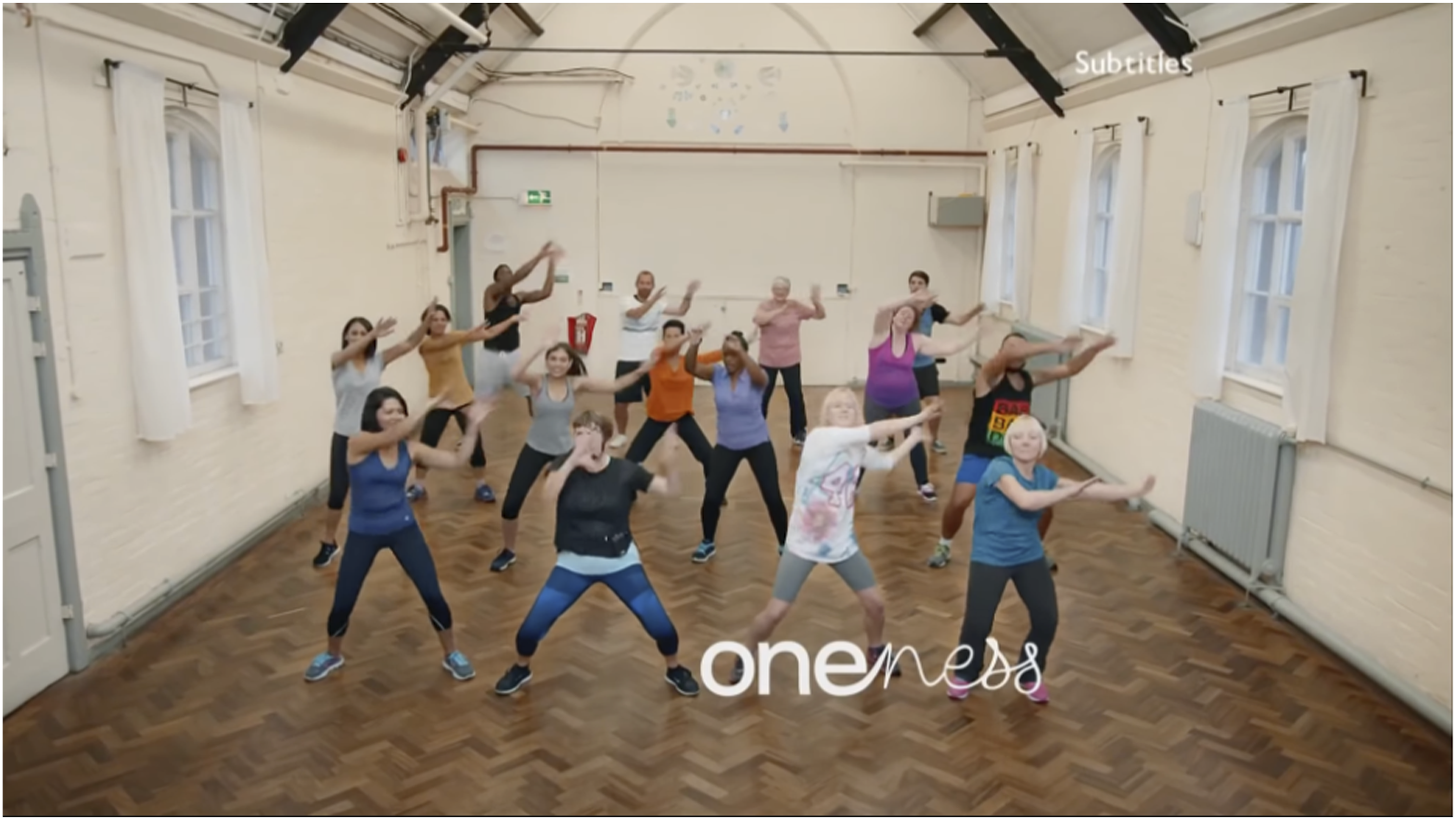
Idents, short for ‘channel identification’, appear in the breaks between programmes, and typically feature the channel logo, music and sound, overlaid by a live continuity announcer. They are around 10 seconds long and are seen and heard roughly 3600 times over their ‘shelf-lives’ (Mawer cited in Grainge, 2011: 94). Besides providing a smooth junction between diverse types of programmes, they must also convey the channel’s brand identity. Idents are therefore rich texts for understanding the ways broadcasters communicate with their audiences. Existing academic research on idents has endeavoured to highlight the creativity and skills involved in their production. In graphic design, Iain Macdonald (2014, 2015, 2016) and Barbara Brownie (2013) have provided insight into the production contexts of idents from the graphic designers’ perspectives. In media studies, scholars have investigated the institutional and industrial contexts of television channel branding more broadly (Ellis, 2011; Grainge, 2011; Johnson, 2012; Light, 2004). In particular, Catherine Johnson and Paul Grainge produced an account of the UK’s ‘promotional screen industries’, defined as a ‘fertile space between the worlds of marketing and media’ (2015: 3). Tackling essentialist dualisms that ‘set creativity against marketing’, the authors instead position promotional work – including the production of channel idents – as a ‘form of creative labour’ (Grainge and Johnson, 2015: 76). In order to map the field, Johnson and Grainge took an organisational focus, centred on the ‘meso’ level of analysis, and thus limited their interviews to top-level senior executives, rather than creatives or so-called ‘below-the-line’ workers (2015: 9).
Focusing on the BBC’s idents as examples of promotional texts, I aim to examine, at a ‘micro’ level (Deuze and Steward, 2011: 5), the working practices of individual creative labourers – in particular, graphic designers and composers. Accordingly, this article combines analysis of the idents as texts with data from in-depth interviews with graphic designers, creative directors and composers. The interviews were conducted remotely using a videoconferencing platform, recorded with consent, and transcribed and coded to group together key theoretical concepts. My chosen method of qualitative semi-structured interviews enables an investigation of the respondents’ subjective perceptions of the creative process.
This article also highlights the role of music and sound in idents. Music scholar Annette Davison (2013: 148) points out that we often listen to television more than we watch it. Music functions in television as an ‘auditory cue’ or ‘umbilical cord’, as familiar sounds bring inattentive viewers back to the screen (Davison, 2013: 148; Graakjær, 2015: 4). The routine return of a familiar sound also can evoke an emotional – even ritualised – connection with the television viewer. As Nicolai Graakjær asserts, the music heard between programmes ‘eases viewers’ orientation and decision-making regarding which channel to choose as the primary channel to watch or simply “where to feel at home”’ (2015: 60). Evidently then, music and sound play a crucial role for broadcasters and audiences. Nonetheless, the sound and music of idents are often underemphasised in academic research. An exception is the valuable work of Brownrigg and Meech (2002, 2011) who have provided an overview of the ‘sound world’ of UK television idents, describing a progression from the cinema-style fanfares of the 1950s, to a veritable ‘funfare’ of styles, including electronic and dance genres, in the 1990s and early 2000s. This article aims to further explore the relationship between idents’ aesthetic character and the promotional and technical functions they perform, focussing on more recent examples from the 1990s to the present.
This article is split into two sections. The first provides a brief background to the production context of idents and outlines the effect of structural changes within the BBC on working processes and hierarchies in ident production. The second section focusses on BBC One and BBC Two as case studies. Here, I have restricted the chronological scope to idents created after 1991, which constituted a turning point for the BBC as it began to adopt branding as a more central strategy in response to increasing competition (Johnson, 2012: 144). Overall, I argue that the images and sounds of idents provide creative insights into the position of the BBC’s channel brands within a changing broadcasting landscape.
Creativity, strategy and craft
Creativity is notoriously difficult to define; as David Hesmondhalgh and Sarah Baker state, the term has been ‘abused and over-used’ (2011: 2). Nonetheless, creativity has long been central to the BBC’s public purpose (Schlesinger, 2010). In 1998, Director-General John Birt stated his goal for the BBC to be ‘the world’s most creative and trusted broadcaster’ (cited in Schlesinger, 2010: 275). In 2003, under Greg Dyke, the centrality of creativity to the BBC was crystallised in a set of published written values, stating ‘creativity is the lifeblood of our organisation’ (cited in Schlesinger, 2010: 280). At first, marketing was considered antithetical to creativity and repelled BBC programme-makers and graphic designers alike; as broadcast design expert Martin Lambie-Nairn put it, ‘television was a creative toy cupboard and the creative people did not want to associate themselves with the nasty commercial side of things’ (1997: 21). Idents were initially excluded from discourses on creativity, which predominately centred on programme-making. Nonetheless, early idents did provide the BBC’s in-house designers with opportunities for creativity and innovation. For example, in the 1960s and 1970s, BBC designers Sid Sutton and Alan Jeapes harnessed latest developments in colour television and computer technology to create ground-breaking and colourful animated idents for BBC Two, symbolising the channel’s role as a ‘test-bed’ for new technologies in UK broadcasting (Crisell, 1997: 115).
Channel branding emerged as a distinct discipline in the 1980s and 1990s, combining the skills of marketing strategists and creatives, with teams often emulating advertising agency structures (Macdonald, 2015: 140). Lambie-Nairn pioneered the involvement of strategic planning when working on the ground-breaking ident for the 1982 launch of Channel 4. He realised that the ident needed to reflect the identity of the channel as a whole and devised the logo consisting of colourful computer-animated blocks flying apart and coming together. The concept of diverse elements forming a whole reflected the channel’s commissioning structure as a publisher-broadcaster, whereby its programmes are sourced from a range of independent production companies. Lambie-Nairn worked closely with Channel 4’s head of presentation Pam Masters, who subsequently held the same role at the BBC. The pair later applied what they learned at Channel 4 to the rebrands of BBC One and BBC Two in 1991. During this period, the BBC faced continuing pressure from Thatcher’s Conservative government towards the adoption of market principles, as well as increasing competition from new cable and satellite channels. Consequently, the BBC under Birt began to consciously adopt marketing and branding strategies (Johnson, 2012: 144). The relationship between presentation, promotion and creativity began to change within the BBC. From 1997, the in-house designers who had previously reported directly to the head of the channelnow pitched ideas to the newly created marketing department (Light, 2004: 81). The composers for idents were typically external freelancers, but like the in-house designers they also began to work to strategic briefs, and the ability to translate a strategy brief into music and sound became a crucial skill.
To fully understand the impact of this shift, it is important to consider wider changes in the UK’s cultural industries, especially in advertising and design – two industries that are closely connected to channel idents. In the 1960s and 1970s, creativity was predominately considered in Romantic terms, associated with archetypes of the individual creative genius or artist. According to Chris Bilton, copywriters and art directors in the advertising industry, the ‘creatives’, were imbued with ‘mythologies’ of individual intuition and sudden flashes of divine inspiration (2009: 27). This group was distinct from the account planners and strategists – ‘the suits’. However, from the 1990s, with the availability of tools for measuring advertising effectiveness, clients increasingly questioned ‘value for money’ (Bilton, 2009: 27). In this context, creativity became a term used to ‘refer to a broader range of strategic business services’ (Bilton, 2009: 24). Therefore, the notion of creativity in advertising began to shift from a realm occupied only by ‘creatives’ to include strategic insights and problem solving. This change was echoed in the design industry, as Paul Springer suggests, ‘the location of creative “lateral thinking”’ shifted ‘towards the early “big idea” stage and away from the designed execution of an idea’ (2009: 133).
Similarly, the creative process for the BBC’s idents now began to explicitly revolve around a strategic idea devised by the creative director. This process was maintained in 2005, when the commmercial subsidiary BBC Broadcast Ltd, which included the BBC’s branding and design expertise, was sold and renamed Red Bee Media. For Red Bee’s executive creative director, Charlie Mawer, the labour of graphic designers and composers constitute ‘craft skills’ that are in the service of implementing the ‘big idea’ originated by the creative director: As you start to get into really specific craft skills that we do not have, we will work with composers, 3D animators, illustrators, professional directors of photography, directors, etc. It will tend to be more in the physical making. I’d say 100% of the idea generation will be in our heads (cited in Grainge, 2011: 92).
Common definitions of ‘craft skills’ associate the term with activities involving making things ‘by hand or by means of traditional techniques’ such as knitting, woodworking, ceramics and embroidery (OED, 2021). However, it is used in the TV branding industry in a wider sense: designer Graham McCullum explains, ‘we mean using craft to communicate ideas’ (cited in Macdonald, 2016: 54). Industry awards bodies, which Grainge and Johnson argue are ‘central to valuations’ of promotional creativity (2015: 77), have similarly framed design and music composition as crafts in the service of a ‘big idea’. Promax UK, the awards body for television promotion, lists music, sound design, animation and motion graphic design within the ‘Craft Category’ (PromaxBDA, 2020). The D&AD awards for sound and music recognise ‘exceptional’ work where ‘the craft brings a creative idea to life’ (D&AD, 2021). The process described by Mawer above indicates a separation between two processes: the generation of the idea by the creative director and its ‘execution’ by designers, composers and other skilled craft workers.
The most recent BBC idents were created by the corporation’s in-house agency, BBC Creative, which launched in 2016. The decision to take promotional work in-house constituted a reversal of the decision in 2005 to sell BBC Broadcast Ltd, the company that became Red Bee Media. Whilst the decision may suggest an attempt to save costs, it also revealed that promotion was becoming increasingly central to the BBC’s identity. Managing Director of Red Bee Media Andy Bryant explained that most broadcasters now choose to produce their promotional material ‘in-house because they feel it is core to their creative soul’ (cited in Johnson, 2014). This is reflected in the brand positioning statement for BBC Creative: The vision for the BBC as expressed in their charter is simply: ‘To be the most creative organisation in the world’. This is reiterated in the BBC values which states ‘Creativity is the lifeblood of our organisation’. The corporation’s in-house agency, BBC Creative, has an equally clear ambition: ‘To meet this challenge through the making of creative and engaging marketing materials such as trails, idents and graphics, in order to bring to the attention of audiences around the globe the vast range of BBC programmes and services available to them’ (Spin, 2021).
Creativity has long been considered crucial for the BBC’s survival, but recently branding and promotion have also been understood as a fundamental part of its identity. As Johnson has argued, branding is ‘invaluable in developing and maintaining public support and loyalty for public service broadcasting’ (2012: 315). Today, the UK broadcasters’ in-house agencies such as BBC Creative, 4Creative and ITV Creative compete to produce the most creative promotional work, to win industry awards, and to engage with audiences. The names of these agencies, all containing the word ‘creative’, encapsulate the battle to claim ownership over that slippery and intangible concept.
Before the late 1990s, the graphic designers who created idents had relatively little creative authority compared to programme-makers. Neither was their work connected to marketing, which as Julie Light (2004: 137) notes did not yet ‘exist as a formal discipline’ within the BBC. As the structure of the BBC’s promotional activity shifted in response to the increasingly competitive UK television market, the roles of graphic design and music became further aligned with channel brand identity. More recently, promotion and presentation have been positioned not only as key to communicating the brand propositions of the BBC’s individual services, but as central to the creative ‘soul’ of the entire corporation.
BBC One and BBC Two, 1991–2021
I now turn to case studies to illustrate how the structural changes outlined above affected the production of channel idents, and the extent to which the creative work of designers and composers was guided by a brand strategy. My account begins in the year 1991 when BBC One and BBC Two underwent major rebrands, a pre-emptive move in advance of the BBC’s bid for renewal of its licence fee in 1996 (Lambie-Nairn, 1997: 113).
1991–1992
The BBC One ident created in 1991 features a silent globe surrounded by soft purple and blue shadows (Lambie-Nairn and Company, 1991a). Although it was visually attractive, the ident did not seem to clearly convey a distinct brand personality for the channel. An ex-BBC graphic designer stated: ‘it did not have much science or strategy around it really. It was, “how can you create numbers in a beautiful, memorable way?”’ (Mawer, 2020) Lambie-Nairn suggested: ‘We made the mistake, I think, of making a BBC One ident which was […] very ethereal and arty’ (2020). Evidently, in the context of idents, artistic creativity is only valuable if it has a strategy at its core, a lesson that Lambie-Nairn himself quickly internalised.
The BBC Two idents were treated more flexibly. Instead of a single ident, Lambie-Nairn produced a series of nine variants, a technique he had established in 1982 with Channel 4. For BBC Two, a real model of a Gill Sans figure ‘2’ was filmed in different scenarios: in the first one, named ‘Paint’, viridian green paint hurtles in from the side, splashing on the ‘2’ (Lambie-Nairn and Company, 1991b). Once the BBC Two idents were filmed, composers Tony and Gaynor Sadler, owners of the company Logorhythm Music, created subtle soundscapes, based on layers of percussion, harp and sound effects. Unlike Channel 4’s and ITV’s monolithic fanfares, the music was tailored to match each variation of the ident. The Sadlers recalled that the brief from Lambie-Nairn was informal; he simply asked them to create ‘a sense of two-ness’ (Sadler and Sadler, 2020). Beginning with the ‘Paint’ variation, Tony Sadler analysed the film closely, noticed ‘two big splashes’ of paint and decided through experimentation that this ‘sense of two-ness’ would be sonically represented by a mnemonic – two different pitches played on crotales, a type of tuned cymbal (Sadler and Sadler, 2020). As well as complementing the ident visually, the music also played a structural role in guiding the audience’s attention. In ‘Paint’, the crotales are preceded by the arresting sound of a gong that coincides with the paint hitting the ‘2’. The volume then fades to softer wind chimes depicting the smaller drops of paint. This type of structure, where the music dips down, is known as a ‘living hold’ and must last up to 30 seconds while the live continuity announcer speaks (Bryant and Mawer, 2016: 104). The composers applied similar techniques to the other eight variations, and the idents in the series were connected by unifying visual and aural strands: the Gill Sans ‘2’, the viridian green, the two-note mnemonic, and the use of bells and chimes. This was an artistic and authentic interpretation of a channel as a brand, expressed through a combination of images and sound. As Sadler (2020) explains: ‘It was like a calming mantra that worked incredibly well with the images and actually was very esoteric and minimalist. It was classical, but it was contemporary, and I thought this is BBC Two. This is definitely BBC Two’.
According to market research, the BBC Two idents transformed contemporary viewers’ perception of the channel from ‘dull’ and ‘worthy’ to ‘witty’ and ‘surprising’ (Lambie-Nairn, 1997: 125). Besides apparently being the first idents to receive their ‘own fan mail’, they also won multiple awards and nominations, including a BAFTA (British Academy of Film and Television Arts) craft award (BBC, 2021b). The BBC thus led the way in considering idents as creative and entertaining texts in their own right. The idents also demonstrated the creativity of the organisation to government stakeholders, as Lambie-Nairn (2020) recalled, the corporation’s management was concerned ‘about positioning the BBC as a creative powerhouse in the world, and this did it with spades’.
1992–1997
Lambie-Nairn’s 1991 designs provided impetus for the BBC’s in-house graphic designers to develop the brands through creating new variations of the idents. As designers began to report to the new marketing department formed in the late 1990s, the idents began gradually to reflect the channel’s programming strategy, with frequent references to specific genres of programmes.
In 1992, BBC One’s ‘arty’ globe ident underwent a rebirth, with a series of idents named ‘Creation’, created by BBC graphic designers Bill Wilson and Ian Greenway (BBC Motion Graphics Archive, 2021a). Unlike Lambie-Nairn’s original two-dimensional logo, this set of idents included a three-dimensional model of the ‘1’ logo, which is first depicted in liquid form, being poured into a metal casting mould, and then cut from a sheet of metal and sprayed with paint. Ex-BBC Graphic Designer Paula Williams states: ‘We took it into a three dimensional and often real world […] context’ (2021). Music and sound effects helped to bring the BBC One logo into the ‘real world’. Composers Mark Sayer-Wade and Tolga Kashif, who ran a company named Sound Sculptors, were employed to create the sound for the BBC One idents. Sayer-Wade (2021) suggests: They soon realized that […] what worked for Two wasn’t going to work for One. One was the more commercial channel, so it was bright, it was zazzy, it was showbiz […] It was supposed to appeal to everybody, not to an elite few.
Towards the new millennium, idents became increasingly tied to specific genres. For example, the designers created a Dalek version of the BBC Two ident to celebrate a new series of Doctor Who (1963-) which was broadcast alongside science-fiction programming, and a ‘kebab’ version to align with the channel’s increasing emphasis on comedy programmes (BBC Graphic Design, 2000). Tony and Gaynor Sadler continued to work on the BBC Two idents throughout the 1990s and early 2000s. They maintained brand continuity by adapting the existing music to the new tone of the idents as the channel’s programming strategy changed. For example, one ident named ‘Woodpecker’ was designed to sit alongside comedy programmes. The music combines the two-note mnemonic from the original idents with references to the ‘Woody the Woodpecker’ tune, creating an alignment between programme genre and brand identity (BBC Motion Graphics Archive, 2021b).
The early part of this period was characterised by a continuing divergence between the two channels. BBC Two brought viewers into a fantasy world where drops of paint move sideways and emit sounds of echoing bells and gongs where they fall. In contrast, BBC One emphasised ‘real world’ sounds and images: drills, saws and metal. This paved the way for more formalised conceptions of the channel identities in 1997.
1997–2005
Due to the imminent arrival of new digital channels in the late 1990s, the BBC needed to formulate more readily identifiable propositions for each of its services, especially considering it was about to launch several new channels of its own: BBC Choice, BBC Knowledge and BBC News 24. Accordingly, Lambie-Nairn was commissioned to design rebrands for BBC One, BBC Two, and later for the new digital channels.
A positioning statement produced by the BBC’s new marketing department described BBC One as ‘Our BBC1’, a channel with ‘broad appeal’ (Born, 2004: 259). In response, Lambie-Nairn reimagined the channel’s iconic globe motif as a hot air balloon that floats above recognisable locations, from St Michael’s Mount in Cornwall to the ‘Angel of the North’ statue in Tyne and Wear (Lambie-Nairn and Company, 1998). The new idents signalled an attempt to emotionally engage the viewers by providing reference points they could connect with (‘our BBC1’), whilst also highlighting the BBC’s remit to reach and reflect all parts of the UK.
The music was composed by Phil Sawyer, and variations were tailored for each ident, unified by a rising arpeggiated motif played on the harp and piano and ethereal synthesised strings. The modal and pentatonic tonalities of the ident variations give the idents a folk music feel, perhaps functioning as a sonic reminder of the BBC’s geographic reach, visually represented by the balloon floating across the UK. The harmonic ambiguity and repetitive, undulating melodic patterns give the music a sense of never quite coming to an end; the musical structure is inherently flexible so that the ident can last as long as required by the continuity announcer. The continuous and flowing feel of the music also serves the ‘future facing’ function of an ident, maintaining the viewer’s attention for the forthcoming programme (Ellis, 2011: 65).
A few years later, however, market research suggesting that viewers perceived the balloon idents as ‘aloof’ and ‘distant’ prompted a change (Mawer, 2020). When a new controller was appointed in 2002, she invited Lambie-Nairn’s company to pitch a new concept, resulting in a series of idents called ‘Rhythm and Movement’ which featured different genres of dance (Lambie-Nairn and Company, 2002). Each ident is based on variations of a seven-note tune, rendered almost unrecognisable in different rhythms and instrumentations, ranging from a Brazilian berimbau to accompany capoeira dancing to a string section underscoring ballet dancers. In contrast to the previous rather abstract idents, these focussed on diverse groups of ‘real people’ – an approach echoed later in the 2017 ‘Oneness’ idents. The music for ‘Rhythm and Movement’ seems less ethereal than that of the balloon idents, and striking percussive rhythms match the lively movements of the dancers. However, this synchronicity was not reflected in the production process itself; Peter Lawlor, a composer who worked on BBC One idents during this period, told me that for his particular project the process ‘was not very joined up’ (2020). He explained, ‘the graphic designer, the typographer, [and] the composer would all go away and do their thing’; ‘there was not any need for the composer to know about the marketing strategy’ (Lawlor, 2020). In this case, the brand strategy seemed to have been distanced from the design and composition processes.
BBC Two’s 1997 brand document positioned it as ‘my BBC2’: ‘topical and relevant, diverse, playful, modern, challenging, surprising, able to take risks, a channel of ideas’ (Born, 2004: 259). ‘Our BBC1’ indicates collectively shared experiences; by contrast, ‘my BBC2’ suggests a channel that caters for specific and individual interests (Ellis, 2011: 165). In 2001, BBC Two’s new channel controller, Jane Root, commissioned new idents to match the channel’s positioning statement and attract younger audiences. Lambie-Nairn subsequently devised a new vibrant yellow look, retaining the iconic Gill Sans ‘2’ logo. These idents emphasised the ‘playful’ aspect of the channel’s identity, conceptualising the logo as an anthropomorphic character that got up to antics: cartwheeling, bouncing, even Morris Dancing and snowball fighting (Lambie-Nairn and Company, 2001). Composers Tony and Gaynor Sadler adapted their original two-note mnemonic, incorporating new sound effects that underscored the lively movements of the ‘2’. Unlike the composer for the BBC One idents, the Sadlers were more involved in the overall creative process and recall working with Lambie-Nairn in a ‘good solid collaboration’ (Sadler and Sadler, 2020). They explained: ‘Martin said basically as weird as possible. But we went, yes, it has got to sound weird, but I think it has to be fun’ (Sadler and Sadler, 2020). For Lambie-Nairn and the Sadlers, the creative process involved a mutually agreed interpretation of an overall ‘big idea’: in 1991, this was a ‘sense of two-ness’ but by the 2000s this had evolved into a more ‘fun’ concept.
Evidently, the extent to which composers were involved in the overall strategy varied between projects; freelance composers were usually brought in towards the end of the process, which often limited opportunities to collaboratively develop strategies. In this case, the process was more collaborative for the BBC Two idents than for BBC One. Nonetheless, as a whole, the 1997 rebranding exercise clearly constituted a very different process compared to 1991. Lambie-Nairn explained that this time, rather than creating beautiful graphics that simply looked attractive, he focussed on strategically ‘engaging the emotions’ of viewers (2020). The realms of graphic design, composition, and branding were beginning to merge.
2006–2016
By 2006, the BBC had sold its internal graphic design department, which became part of an external company, Red Bee Media, as outlined above. At this point, the BBC One controller Peter Fincham had decided, ‘counterintuitively, in an era of fragmentation, with more and more and more channels, you need a place to bring people together, and that’s what BBC One should be’ (Mawer, 2020). In response, Red Bee Creative’s creative director Charlie Mawer and his team ‘came up with the idea of circles as an emblem’, which provided ‘something loose to tie everything together’ (2020; Red Bee Creative, 2007). He explained: ‘whilst we could still be as varied as fairies or acrobatic dogs or surfers, we still had a thought’ (Mawer, 2020).
Red Bee Creative invited several musicians to pitch for the ‘circle’ idents, eventually selecting Imran Hanif. Hanif realised that ‘all the music has to be different but there has to be a common theme’, so introduced a musical mnemonic for the channel – the first time BBC One adopted this form of sonic branding. The mnemonic is made up of three descending pitches, a short and flexible sequence that can be rearranged and incorporated into different musical styles. The composition process was not connected to the brand strategy, but instead Hanif worked intuitively, stating ‘I just did what I wanted to do’ (2021), without much explicit instruction from the creative director.
The new BBC Two idents were designed by Red Bee Creative in collaboration with advertising agency Abbott Mead Vickers BBDO. Each ident was based in a different setting, ranging from a campsite to an ocean (Red Bee Creative & Abbott Mead Vickers BBDO, 2007). In every ident, the camera pulls back ‘to reveal that you are looking at the world in an unexpected way – through the Figure 2’ (BBC Press Office, 2007). The music for the idents was initially composed by Vince Pope but was swapped in 2013 for pre-existing music by indie rock band alt-J. Nonetheless, as Brownrigg and Meech (2011) describe in their detailed analysis of this particular series, the idents are unified by certain musical features, such as the use of simple harmonic structures. Whether by design or by coincidence, the visuals and music together convey a flexible yet broadly consistent identity.
In general, during this period the creative process for idents began to be explicitly based around a ‘big idea’. For BBC One, the ‘circles’ concept represented the channel’s aim to bring people together, whereas BBC Two was conceptualised as ‘a window onto the world’. However, music does not seem to have been included on this level of ‘big idea’ strategic thinking, reflected in the BBC One project by the high level of autonomy granted to composer Imran Hanif, and in the BBC Two project by the indecision surrounding the music. Mawer suggests the perceived ‘subjective’ nature of music renders it apparently more resistant to strategic thinking than the visual elements: In any project I have ever worked on, music is the most challenging element of it, because it is so subjective, and it is very, very hard to argue strategically about. You can’t persuade someone to love you for rational reasons, it’s just a gut thing. And it is very much like that with music—you can say why you think it is right for the target audience, why you think it is the right melody or the right rhythm, but if someone doesn’t like it, they don’t like it (Mawer, 2020).
As Jason Toynbee argues, the Romantic ideology of creativity as a subjective ability embodied in the individual artistic ‘genius’ continues to hold a ‘special resonance in music’, perhaps due to ‘the prima facie “nonmaterial” nature of music – its issue in ephemeral performances’ (2017: 38). As a result, in the advertising and promotional screen industries, there is as yet no accepted method of choosing music for a brand: as Peter Kupfer recently discovered, evaluation of the appropriateness of music for a commercial is usually based on ‘gut feel’ and anecdotal evidence (2020: 84). Nonetheless, more recent ident projects carried out by BBC Creative may indicate a shift in the role of music and sound. For example, in creating the recent BBC Two idents, the composer was much more involved in the central concept, developed collaboratively by a small core team.
2017-2021
BBC One launched a new ident campaign in 2017, based on the theme of ‘Oneness’. Like the previous idents, the key message remained one of bringing the nation together. The idents displayed groups of people taking part in activities, ranging from sea swimmers in Clevedon to Bhangra dancers in Edinburgh New Town. The sound design consisted of the everyday sound effects of the filmed locations, rendering the idents as authentic mirrors of viewers’ lives.
As mentioned at the beginning of this article, during the Covid-19 pandemic, a new series of ‘Oneness’ idents were created, portraying collages of audience members’ activities during lockdown, shot with smartphones by individual contributors at home. One of the groups of contributors was the Black Girl Knit Club (BBC Creative, 2020b). Five members of the club filmed synchronised videos of themselves knitting, which BBC Creative coordinated via meetings on Zoom and by sending lists of instructions. Here, the ‘big idea’ and its crafted execution were one and the same: the concept of ‘Oneness’ revolves around bringing the viewers together and its execution, involving a coordinated effort amongst groups of viewers, exemplified this through synchronised action. Craft skills are a crucial part of the overall concept: the ident showcases the craft skills of the Knit Club, as well as the craft skills of BBC Creative in editing and coordinating the sequences.
In 2018, BBC Two underwent its biggest rebrand in 20 years, and the new idents were subsequently awarded a Music + Sound Award, Cannes Lion and D&AD Pencil. This ident campaign was notable for the extent of collaboration between internal creatives at BBC Creative, an external design agency named Superunion, and the composer, Alex Baranowski (BBC Creative & Superunion, 2018). Superunion’s graphic designers were employed not just for their artistic ability, but for their strategic insights: We were invited to pitch as branding experts, because they wanted a branding response, not just design. They wanted us to look at properly what BBC Two stands for, in terms of its core reason for being and who it is attracting, who it is talking to (Tudball, 2021).
In collaboration with channel executives, the designers devised what they called a ‘mood strategy’, comparable to the categorisation of content on streaming platforms like Netflix and Spotify. For example, Netflix’s genre categories range from ‘Quirky Romance’ and ‘Absurd College Humour’ to ‘Cerebral Drug Movies’. BBC Two executives sorted the channel’s programmes into categories, eventually settling on seven moods (neutral, pleasurable, fascinating, lively, eye-opening, non-conformist and challenging) containing 25 sub-moods. A separate ident was created for each of the 25 sub-moods. The idea to create a link with specific programme genres harks back to the idents created by the BBC’s in-house designers in 1992, such as the ‘kebab’ and ‘woodpecker’ idents referred to above. However, in 2018, this was achieved within a tightly planned strategic framework.
When it came to implementing the ‘mood strategy’, the team contracted out the work to 16 different animators. For example, the ‘silly’ ident was commissioned to Aardman, the creators of Wallace and Gromit, who created a design based on a brightly coloured googly-eyed monster. The creative director from Superunion explained that they provided the animators with simple ‘one-page mood boards’, with the intention that ‘they would take it and find their own way to do it’ (Tudball, 2021). This approach thus strives for a balance, focussing on a unifying ‘big idea’ whilst allowing flexibility for individual creativity.
The Superunion designers took a similar approach when briefing composer Alex Baranowski, who was provided with a written brief outlining the strategy, as well as images in the form of mood boards that ‘he could bring his own interpretation to’ (Tudball, 2021). Baranowski’s compositions all include a chime and a harp chord, with every mood containing a different array of instruments, harmonies and complex layers of sound effects. Technology played a crucial role in the collaboration between the composer and the designers, and this becomes especially clear when this project is compared to the 1991 idents. The Sadlers recorded the 1991 idents in a music studio using magnetic tape, any edits involving a highly labour-intensive process by which the tape would have to be physically cut and spliced (Sadler and Sadler, 2020). The music was produced fairly independently from the rest of the process, carried out after the images were filmed. In contrast, Baranowski worked from a home studio, containing an ‘arsenal’ of his own instruments, as well as a digital library, from which a vast array of sounds could be added to the score at any time (Baranowski, 2020). Baranowski also has a ‘mobile studio’ on his laptop which he could bring to meetings to test out ideas as he spoke to designers. Rather than writing the music at the end of the process, Baranowski explained that while the animators were working, he would begin choosing instruments and sound effects for each mood, sorting them into ‘palettes’. This iterative process enabled a close relationship between the images and sounds of the idents, by which the team would ‘carefully try to match every single movement with any single sound or musical movement’ (Baranowski, 2020).
A key development in the music industry since 1991 has been the increasing affordability of digital audio workstations – software that enables non-linear editing. As a result, composers can now easily edit, move around and manipulate any individual sound in an overall soundtrack. In a chapter on television title sequences, Davison illustrates the significance of non-linear editing for the relationship between music and images, providing an example of one editor who describes his role as creating ‘nerve endings’ between the music (the muscle) and the visuals (the skin) (2013: 162). Baranowski describes the iterative process of aligning sound and image in similarly organic terms, stating that he wanted to ‘ensure the sound world moves and breathes with the dynamic animated environments’ (2020, italics added). This profound correspondence between sound and image is intended to create an immersive experience for the viewer, the idents facilitating a smooth junction from one mood state to another.
Overall, the idents produced by BBC Creative showcase new ways of working collaboratively, quickly and reactively in small teams of in-house and external creatives. Both the BBC One and BBC Two ident campaigns were guided by a clearly articulated ‘big idea’ but relied on the creative contributions of designers, animators, composers, and – in the lockdown idents – audience members, to bring them to fruition.
Conclusions
Idents are creative texts that can help us understand how channels adapt in a changing broadcasting landscape. BBC One’s idents were transformed from the ‘arty’ and abstract globe in 1991 to the physical balloon in 1997. More recently, the channel’s intended role in uniting the nation was expressed in a more personal and informal style, with the ‘Oneness’ idents introduced in 2017 depicting images and sounds of ‘regular people’ taking part in everyday activities. The BBC Two idents have conveyed both continuity and variety in the brand identity, reflecting the channel’s broad range of programming from documentaries to comedy programmes. Throughout the channel’s history, the BBC Two idents have showcased highly creative designs and cutting-edge technology to achieve a range of beautiful, eccentric and comedic effects, communicating the channel’s ‘power to surprise’ (Superunion, 2021). Grainge notes that idents tend to have ‘more resources per minute poured into their creation than the surrounding programmes’, since their repeatability and brevity demands ‘textual perfection’ (2011: 65). He argues that ‘in their search for beauty, idents often present a vision of television as it could be’ (2011: 65). BBC Two’s idents demonstrate a particular preoccupation with audiovisual beauty, from the captivating splashes of paint in 1991 to the fantastical textures and colours in 2018. Overall, the idents for BBC One and BBC Two function as snapshots illustrating the intended relationship between each channel and its audience, as well as the creative possibilities of music, sounds and graphics in television.
Ofcom (2020: 24, 3) have described the current period as a ‘critical juncture’ for UK broadcasting, as viewers continue to turn towards online platforms such as Netflix, Amazon Prime and Disney+. As a result of increasingly fragmenting audiences, some of my interviewees suggest that the golden age of channel idents has now passed (Baranowski, 2020; Franklin, 2020; Sunderland, 2020). In the late 1990s and early 2000s, idents were considered the ‘holy grail of creative jobs’ for designers, drawing large budgets (Gilbert, 2021). In contrast, idents are now often considered by television executives to be an ‘unnecessary expense’ or ‘luxury’ (Franklin, 2020). One creative director suggested ‘maybe the ident will be […] resigned to history – these beautiful bits of film that no one can work out what they are for’ (Franklin, 2020).
Despite these pessimistic predictions, and dwindling budgets, channel branding is still a crucial way in which streaming platforms and linear channels alike assert ownership over content and maintain the loyalty of their viewers. As Derek Johnson notes, ‘even as a new portal logic dominates the space of Internet-delivered television, its relationship to the television channel may not be one of opposition and obliteration so much as evolution and adaptation’ (2018: 9). Online platforms still use idents, but they tend to opt for simple logos with short sonic mnemonics, epitomised by Netflix’s red logo and accompanying ‘ta-dum’ heartbeat sound effect. Currently, the BBC is in a hybrid state between digital and linear models, with content available through iPlayer and linear television channels (Grainge and Johnson, 2018). The recent idents for the linear channels BBC One and Two seem to reflect the corporation’s hybrid strategy. With the use of simulated smartphone screens, the junctions between programmes on BBC One during lockdown resembled a social media feed, showing glimpses of individuals in their own homes doing various everyday activities. BBC Two’s idents, in contrast, utilise a ‘mood strategy’ reminiscent of the organisation of content on online platforms.
The television industry may be profoundly changing, but as Derek Johnson states, ‘channels still matter’ (2018: 4). Whether in an online or linear environment, channels continue to be crucial to the experience of watching TV. For audiences, they provide navigational guides and recommendations, creating pathways through an increasing number of options; for scholars, channels provide a means of understanding and criticising television (Johnson, 2018: 4). As Ellis states, texts in-between the programmes such as idents function as ‘instruction manuals’ telling viewers and scholars how to ‘read’ television (2011: 60). For the BBC, idents show audiences and stakeholders why its channels still matter in a changing media landscape, and how they might fit in with the corporation’s current hybrid position between linear and digital broadcasting models. Ultimately, analysing the BBC’s idents and their production processes can valuably demonstrate how the corporation’s identity and purpose is brought to life through brand strategy, craft skills and collaborations between creative individuals.
Footnotes
Declaration of conflicting interests
The author(s) declared no potential conflicts of interest with respect to the research, authorship, and/or publication of this article.
Funding
The author(s) received no financial support for the research, authorship, and/or publication of this article.