
Abstract
Higher-dimensional data, which is becoming common in many disciplines due to big data problems, are inherently difficult to visualize in a meaningful way. While many visualization methods exist, they are often difficult to interpret, involve multiple plots and overlaid points, or require simultaneous interpretations. This research adapts and extends hyper-radial visualization, a technique used to visualize Pareto fronts in multi-objective optimizations, to become an n-dimensional visualization tool. Hyper-radial visualization is seen to offer many advantages by presenting a low-dimensionality representation of data through easily understood calculations. First, hyper-radial visualization is extended for use with general multivariate data. Second, a method is developed by which to optimally determine groupings of the data for use in hyper-radial visualization to create a meaningful visualization based on class separation and geometric properties. Finally, this optimal visualization is expanded from two to three dimensions in order to support even higher-dimensional data. The utility of this work is illustrated by examples using seven datasets of varying sizes, ranging in dimensionality from Fisher Iris with 150 observations, 4 features, and 3 classes to the Mixed National Institute of Standards and Technology data with 60,000 observations, 717 non-zero features, and 10 classes.
Keywords
Introduction
High-dimensional data are naturally difficult to visualize in a meaningful way, as anything with more than four dimensions provides challenges. 1 Unfortunately, many real-world datasets have much greater than four dimensions and have complex interactions between features, making a simple plotting of feature subsets impractical for most purposes. While visual data mining can be used to find structures in datasets,2 multivariate data complicates visualizations through the presence of those many features which have different interactions with other features.
Appropriate visualizations are frequently critical in data analysis, adding meaning, and displaying results, with best practices providing relatively simple and clear output to the audience.3,4 Additionally, visualization can provide confidence in data exploration since visualizations are frequently more intuitive than complex algorithms. 5 For the purposes of this research, we are interested in being able to utilize an interpretable visualization in order to identify general characteristics of a multivariate dataset when little is known about its underlying structure. The extent of class overlap, discriminatory features, and presence of outliers and clusters in the data are all useful to visualize. In the application of classification, visualization may provide insight into class structure and the linearity of decision boundaries.
Various methods have therefore been proposed for visualizing multi-dimensional datasets. However, issues exist with these methods; some become computationally expensive as the number of data features increases, while others are frequently not intuitive or do not lend themselves to the visualization of many data features. Surveys of various methods include those by Grinstein et al., 6 Keim, 5 Kromesch and Juhasz, 7 Chan, 8 and Kehrer and Hauser. 9 Mühlbacher et al. presented a survey of frequently used algorithms and their fulfillment of certain visual analytic requirements. 10 The presented hyper-radial visualization (HRV) method is incidentally more user-friendly than many of these methods, e.g. neural networks, k-means, support vector machines, and t-Distributed Stochastic Neighborhood Embedding (t-SNE), in that HRV’s basic operation and computations are straightforward, easy to implement, and if coded properly, can allow for some degree of interactivity as the visualization is built.
The HRV concept was originally proposed by Chiu and Bloebaum for visualization of Pareto frontiers in multi-objective optimization problems. 11 Herein, an efficient n-dimensional multivariate data visualization version of HRV is presented; this method is powerful in that data features are only aggregated, rather than transformed, to create the resulting visualization. Whereas HRV was originally designed for comparison of competing optimal designs, we broaden its use for visualizing class and exemplar characteristics in multivariate data. In order to improve the visualization, we also present optimization strategies to generate the groups required for both supervised and unsupervised cases. Now, as the number of features increases, any two-dimensional visualization becomes inherently limited in being able to display the information present. Here, the authors also create a three-dimensional version to enable visualization for larger numbers of features.
For this paper, example n-dimensional data are presented and existing visualization methods are reviewed, followed by these contributions (in order):
The HRV method is extended to multivariate data. An optimal group algorithm is developed for the HRV visualization, both in the event of having and not having class information. A three-dimensional version of HRV is developed incorporating the optimization strategies.
Example datasets
Seven example datasets, described in Table 1, are employed to illustrate, evaluate, and compare our HRV methods to existing visualization methods. These datasets range in size from 150 observations with 4 features and 3 classes in Fisher Iris, 12 to 60,000 observations, 717 (non-zero) features, and 10 classes in Mixed National Institute of Standards and Technology (MNIST). 13 All datasets have multiple classes, ranging from 2 to 10. Typically, data features correspond to measurements, e.g. Fisher Iris contains dimensional measurement of Iris flower petal and sepals. 12 Fisher Iris, in particular, is a common dataset used for visualization comparison.6,14 In general, the datasets were taken “as is”; however, 16 missing values in the Breast Cancer dataset were imputed via L1 nearest-neighbor approach within-class. Further details are necessary to understand the MNIST and Pavia datasets. MNIST contains data corresponding to visualizing hand-written numerals, and therefore all features are pixels in an image. 13 For data quality purposes, features (pixels) with zero range were removed. Pavia considers a 610 × 340-pixel hyperspectral image (HSI) from the ROSIS sensor, capturing bands between approximately 0.43 and 0.86 μm. 15 In HSI, each pixel of an image has an associated spectral signature over a set of bands, or discrete intervals on the electromagnetic spectrum.
Data under analysis.
HSI: hyperspectral image; MNIST: Mixed National Institute of Standards and Technology.
These sets were chosen to showcase flexibility to number of exemplars, number of features, number of classes, and general data complexity. Since Fisher Iris
12
is both a commonly used dataset and among the smallest datasets examined herein, it will be presented first to show the disadvantages of other methods. Understanding the relative complexity and an ability to generalize is important. Although a direct numerical comparison of complexity for these datasets is difficult, an extended Fisher ratio, from Gu et al.,
19
for c classes summing the Fisher scores of each feature is provided. This is

Existing visualizations
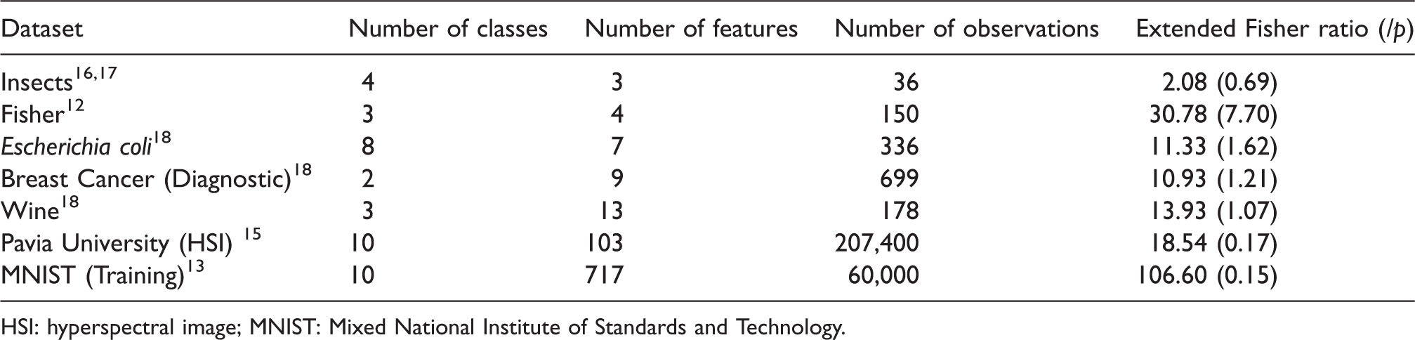
Various methods are in literature and practice for visualizing data, but all carry limitations. Though Lengler and Eppler created a periodic table of 100 visualizations to put some structure towards situational use, that structure does not provide a detailed explanation of the limitations of any given technique on a specific dataset. 20 Therefore, we discuss several techniques and their limitations here. Scatterplots are one common method, where each feature is plotted against another feature and simultaneous interpretations are posited. 7 Alternatively, features can be plotted three at-a-time to create three-dimensional figures. However, both of these methods can become difficult to interpret as the number of features or observations increase. For example, even with a relatively small number of features and observations, scatterplots are difficult to interpret, as seen in Figure 1(a) for Fisher Iris.
(a) Fisher Iris feature-by-feature scatterplots and (b) parallel coordinate representation.
Parallel coordinates is another commonly used method, where features are normalized according to their range and then each exemplar is plotted as a line of its features.7,21 To illustrate this method, Fisher Iris is visualized using parallel coordinates in Figure 1(b). It is apparent that even Fisher Iris is not easy to analyze and interpret with these coordinates due to many overlapping lines. Logically, more complex and larger datasets would be increasingly difficult to visualize with this tool, a problem described by Dang et al. as overplotting. 22 While variants of parallel coordinates also exist, such as connecting normalized feature values radiating from the center of a circle akin to a radar graph, 7 or using parallel dual plots, 23 these results can still be difficult to interpret due to overplotting.
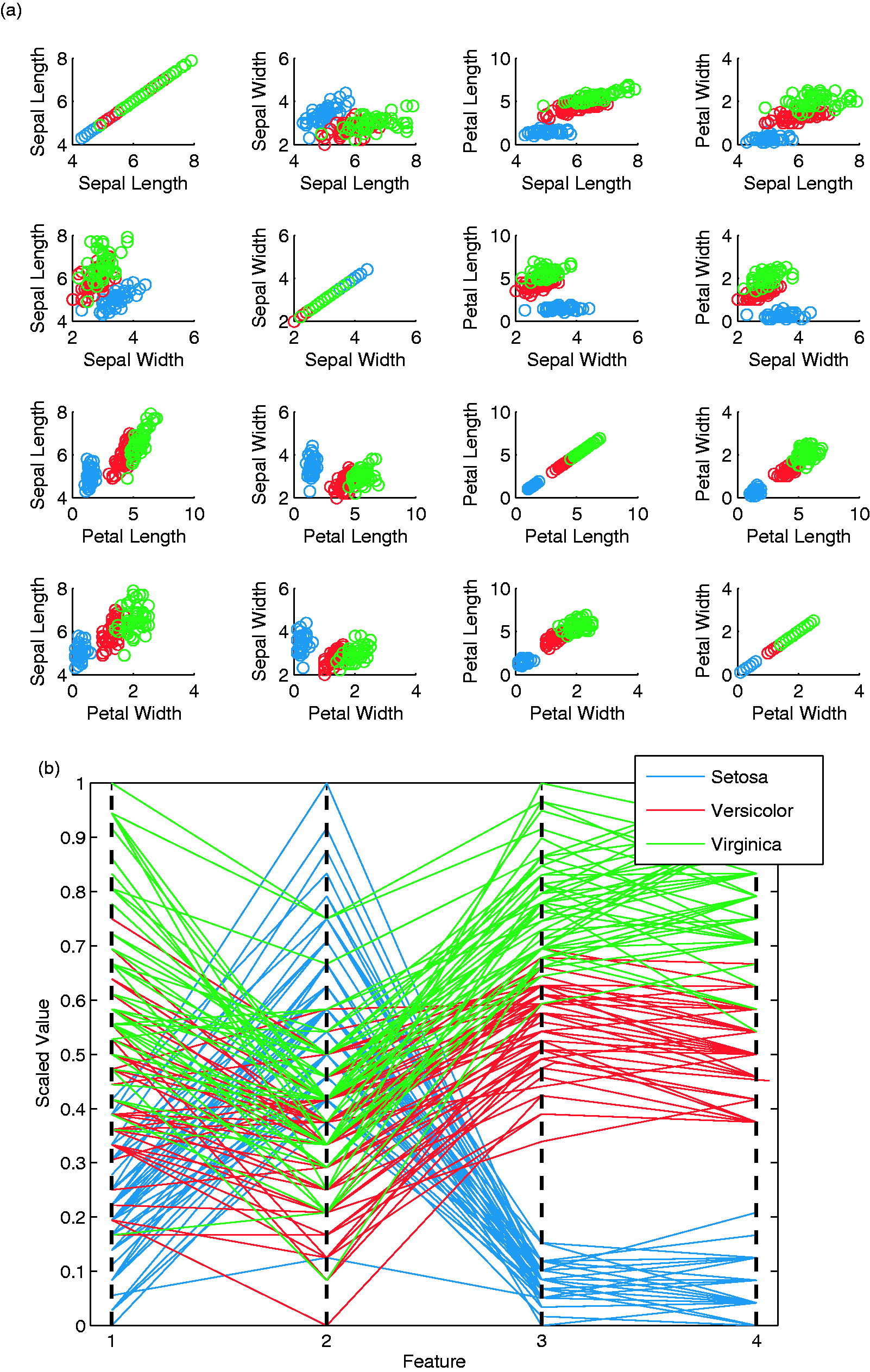
Many additional visualization techniques exist. These include, in part, iconographic (or glyph) displays, multi-line graphs, by-feature heat maps, logic diagrams of features, survey plots of features, and hierarchal methods.6,8 Additional methods include dimensional stacking, 1 multiple frames, 24 and nonlinear magnification. 24 Mosaic matrices, 25 using a hyperbox 26 and table lens, 27 are also used. RadViz places dimensional anchors (the features) around a circle, with spring constants utilized to represent relational values among points. 14 PolyViz is a similar construct, with each feature anchored instead as a line. 6 This is depicted for Fisher Iris in Figure 2. All of the methods mentioned have obvious interpretation, overplotting, and clutter issues as the number of features and/or exemplars grows.
Fisher Iris PolyViz visualization.
Some visualization techniques have been developed in the field of multi-objective optimization to be able to compare Pareto optimal solutions for problems with more than three objectives. There, these objective functions are optimized simultaneously. In order to determine optimality, optimal trade-offs are maintained, where a solution is Pareto optimal if no other feasible point is better in all objectives. Hyperspace Diagonal Counting is a method based on the premise of Cantor’s counting method, mapping exemplars to a line by counting along hyperdiagonal bins that move away from the origin. 28 However, this method becomes inefficient to compute as the number of features and exemplars grow, and may gravitate values toward the axes thus limiting its usefulness. 29 Another technique, which we leverage herein, is presented in the next section.
Dimensionality reduction is another class of techniques that can be used within visualization methods to try and reduce the amount of information via either feature extraction or feature selection. Of note here are feature extraction methods that transform data to a different space. Principal component analysis (PCA), for instance, generates projection vectors that account for variability found in the data.
30
Thus, data can be projected into a smaller number of dimensions (new features) while retaining a percentage of the total variance. Unfortunately, PCA projections do not guarantee that characteristics of the data, such as distances between points, are maintained. Instead, the Johnson–Lindenstrauss theorem shows that for any 

k0 values as a function of error
Bertini et al. suggested the evaluation of high-dimensional data visualizations via (1) the extent to which data groupings are maintained, (2) the extent to which systematic changes in one dimension are accompanied by changes in others, (3) the maintenance of outliers, (4) the level of clutter or crowding that could make interpretation difficult, (5) the extent to which feature information is preserved, and (6) any remaining aspects that may add complexity to the visualization. 35 Despite the abundance of visualization techniques that exist in the literature, the authors suggest that few, if any, meet a level of quality for several of these metrics. Therefore, we seek to leverage an existing visualization from the optimization field in order to attempt to satisfy, at a minimum, maintenance of data groupings and outliers, reduced clutter relative to classes, interpretability relative to original features, and minimal complexity of the visualization.
Hyper-radial visualization
Let Fi denote the ith feature (column) of the N × p exemplar-by-feature dataset X. In order to create a hyper-radial method for general data similar to the work of Chiu and Bloebaum in multi-objective optimization,
11
first, we normalize each feature according to

Next, features are grouped into two sets, most simply


Fisher Iris is visualized through HRV in Figure 4(a). As can be seen, this visualization already clearly depicts some class boundaries. The axes are annotated with the grouping number, e.g. G1, and the features grouped on a given axis, e.g.

(a) A Fisher Iris HRV representation and (b) instead with “optimal” groups.
This technique is powerful in that it is easily interpretable and calculable. In reality, the HRC values are just a weighted Euclidean distance, or hyper-radial, of the groups of normalized features from their minimum values. This is easier to directly interpret than PCA, e.g. where each axis is a different weighted sum of features. With HRV, the geometry of the data is essentially maintained through a polar plotting approach without any true transformation of the data. Similarity between exemplars is maintained for each feature group within a scaled factor. Minimums occur at 0, and maximums at 1, making it easy to relate positioning of solutions to one another.
Improving HRV
However, there are also limitations to this initial HRV methodology when used as a data visualization tool. The groups aggregate information from the features, and so different data points can possibly map to the same point in the visualization. Further, the membership of each group can have a significant impact on the visualization. As overall visualization crowding is difficult to avoid in a low number of dimensions, we are more concerned with class and outlier characteristics of the data, and the issue of group membership.
We propose using the adapted HRV method with multivariate data, after the addition of a few further modifications. Adding stacked-bar histograms to each HRC axis in the visualization can serve as an additional way to detect and see information as no matter the visualization, any overlap of high-volume, high-dimensional data can be difficult to determine in two or three dimensions. In the following sections, we will also introduce a method to choose optimal groupings and a third HRC axis for use with larger-dimensional data.
Figure 4(b) displays an HRV again for Fisher Iris with stacked-bar histograms and different groups from Figure 4(a), where the histogram legends denote the largest number of class exemplars in any bin, for a relative size comparison. It is clear from the visualization that the largest separation can be achieved using the third and fourth features (petal length and width). The class boundaries are also now obvious, and this demonstrates that HRV presents an effective means to visualize this four-dimensional data in two dimensions.
As alluded to, the success of the visualization and these improvements to HRV, for our purposes, are still entirely dependent on a proper choice of grouped features for the HRC computations. Therefore, next, we discuss strategies with which to find optimal, useful groupings.
Determining optimal groupings
Given some objective Jt, here we use t simply as an index with which to reference a specific objective function, finding an optimal grouping in two dimensions can be formulated as shown in equation (6), where xi is the value of the exemplar x in the ith feature, 
Supervised training. In the case where class information is known, we propose that the Rayleigh coefficient from multiple Fisher discriminant analysis (MDA) can be used as motivation to find groups with near-optimal class separation (or optimal in the linear sense). This coefficient is a ratio such that its maximization increases separation between class means and decreases the separation within class data.
In MDA, a set of 


This criterion, often noted as the Rayleigh coefficient or quotient,
39
is the equivalent ratio of between-class and within-class scatter for the projected space. Here, because
In our case, we do not wish to optimize to find optimal projection vectors. Instead, we wish to stay in our original visualization coordinates v(x) so that the results are more interpretable, although the visualization can be applied to projections as well. That is, the axes are more easily understood if they only represent hyper-radials, rather than some other non-linear transformation, differently weighted projections, or a combination thereof. Thus, we use a form of equation (9) directly in our HRC space to form an optimization with similar intent for input into the formulation from equation (6). That is, we can use

J1 may best linearly separate the data, but the resulting coordinates do not simultaneously seek to spread the data well across the axes and the determinants may yield very small values in the normalized space. For these reasons, we can optimize

With two groups and p features, there are
Unsupervised training
In the case where there is no class information, J1 and J2 are no longer useful unless predictions are made. Therefore, we propose a collection of objectives designed to spread the data maximally across the HRC space in various ways, under the assumption that doing so will help to reveal classes, overlaps, outliers, or other useful information.
The first technique is to maximize entropy over the HRC space, where maximal entropy indicates an even spread of data across the HRC dimensions. To do this, we define a grid of Ng centers over the 

The resulting entropy is defined as


As with any Gaussian method, the value for σ can have a major effect. Fortunately, we know that the coordinates will always be
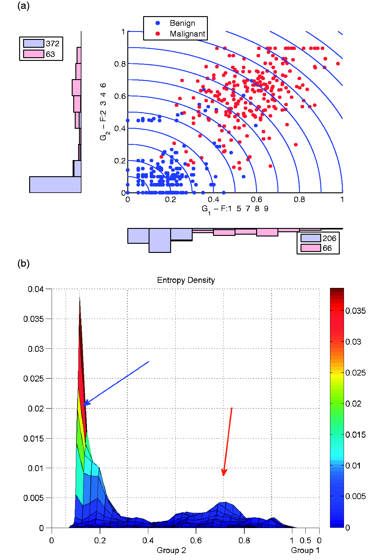
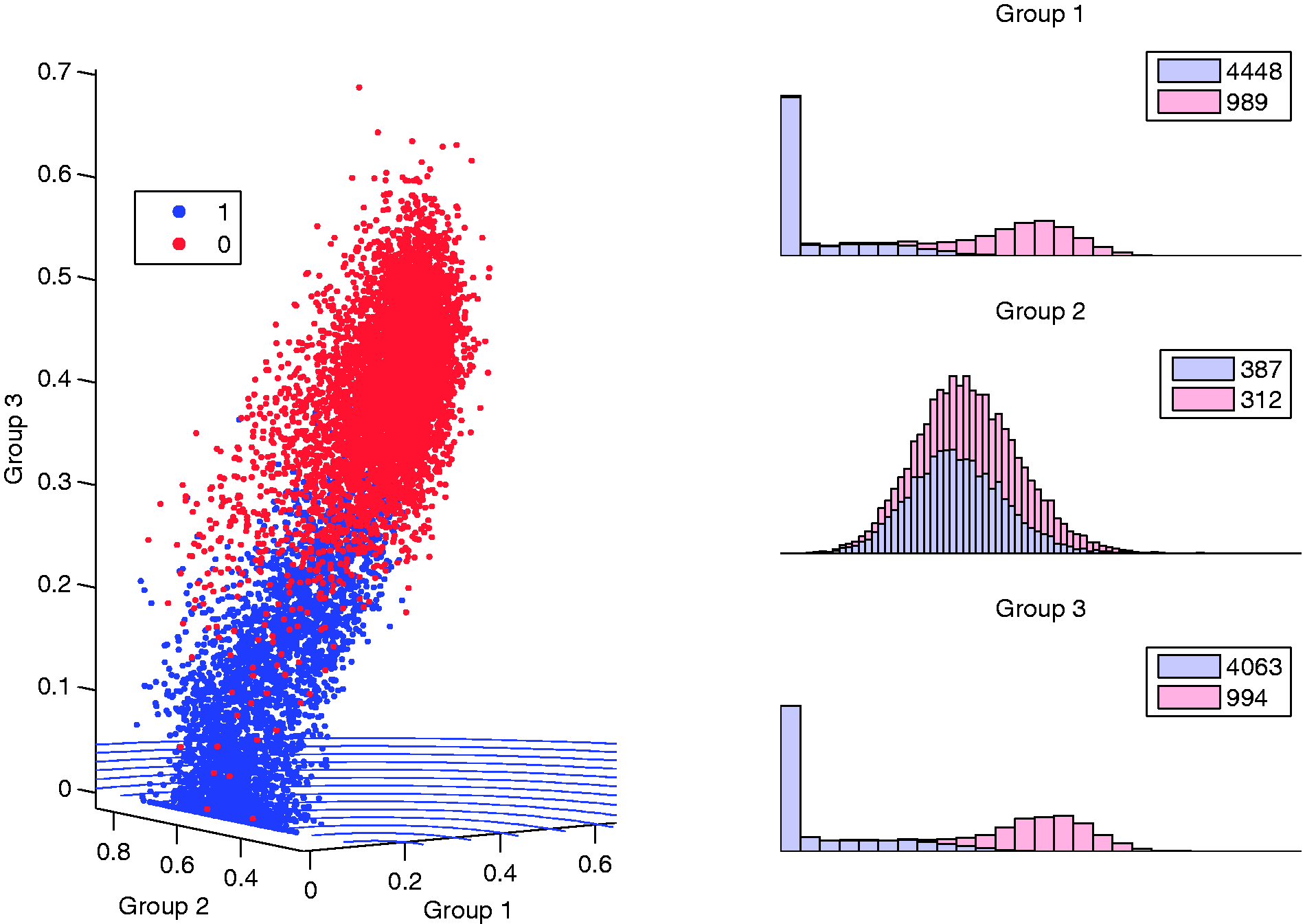
Breast cancer dataset: (a) visualization with optimal J3 and (b) corresponding densities.
Currently, the common σ over the grid provides a sensitivity threshold for the entropy surface. Alternatively, adaptive radial basis functions or adaptive kernel density estimation could be used to provide a more flexible entropy surface by allowing the spread parameter to vary locally. 42 However, this method more precisely fits and smooths the surface to areas of high and low density, which may decrease or increase sensitivity in an unwanted manner. This also increases the computational effort needed to generate the entropy. Full evaluation of the effect of using such a method is of interest for future research.
There are a few other objectives that serve to spread the data points as best as possible in the HRC space, while specifically being useful to identify outliers. Maximizing the absolute value of the correlation between HRC coordinates best spreads the data along the (v1, v2) diagonal, but could also make the visualization very linear and make it harder to see characteristics of the data. However, a similar idea is to maximize the combined (v1, v2) spread. One such technique is to multiply the variances found in each direction

Another is to force the spread to the extremes in both directions simultaneously while avoiding bias in any one direction

Yet another related objective is to minimize the absolute value of the correlation between coordinates. These objectives may become limited when the outliers of interest are outliers only with respect to a very small number of features relative to the size of the groups.
As an example of a large-scale application, Figure 6 depicts the image truth and a sample of 100 signatures from each class for the Pavia University HSI. Figure 7(a) shows J4 for this data. In both cases, a qualitative ColorBrewer43,44 color scheme is used to provide distinction between classes. The groups found distinguish the non-background classes very well, and particularly of interest is how the painted metal sheets pixels are revealed to be significantly different. The visualization suggests that the background class contains material or mixes that are similar to some of the other classes. Several outliers are also obvious here, and the groups indicate a subset of features that make these outliers different. When compared to the primary components of PCA, shown in Figure 7(b), the visualization provides more separation between the classes and pixels, all while the axes are more directly interpretable.
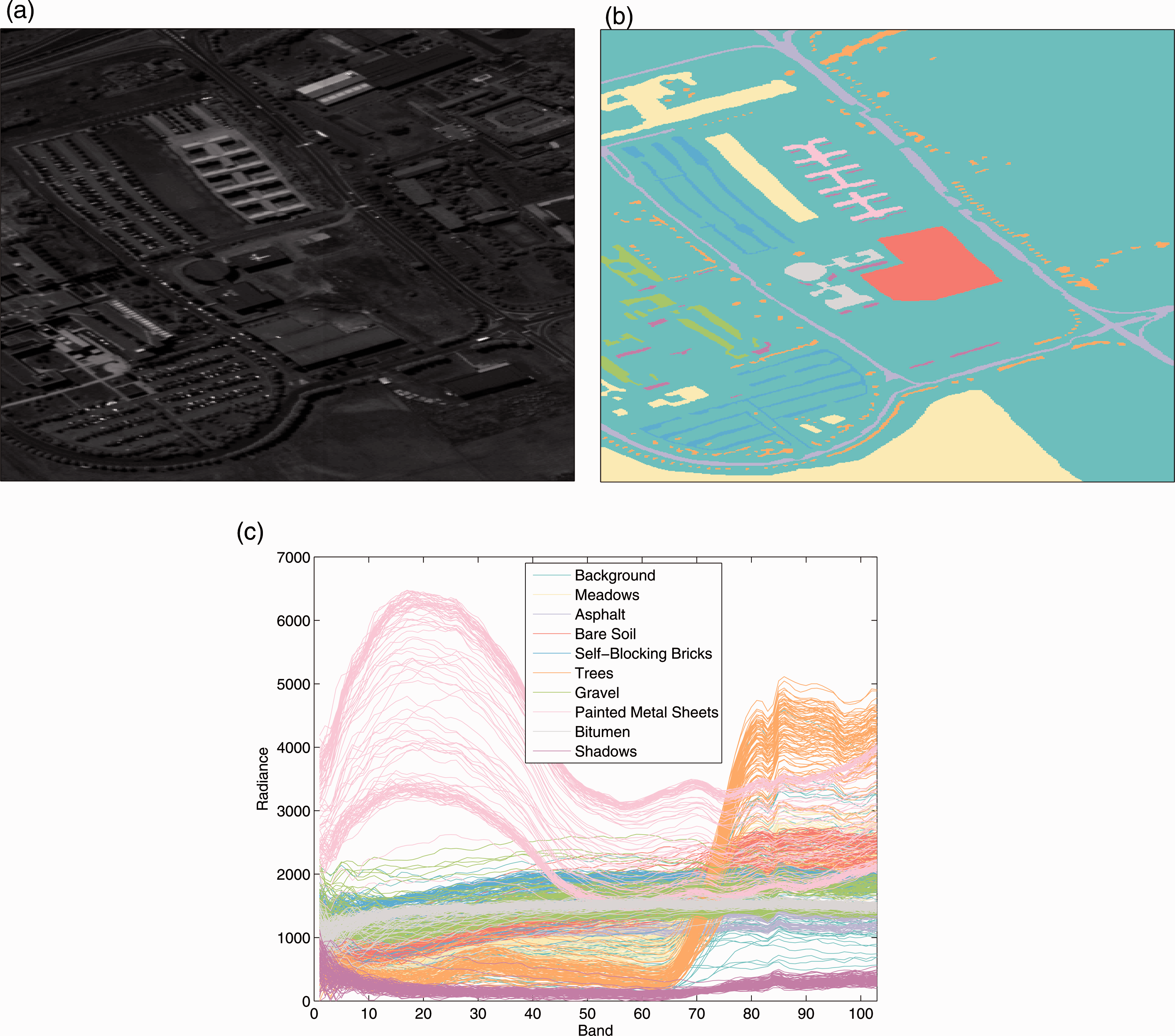
Pavia University HSI: (a) gray-scale image, (b) class truth, and (c) class spectral signatures samples.

Pavia University: (a) J4 HRV solution and (b) largest variance principal components.
Semi-supervised training
Additionally, HRV is suitable for semi-supervised analysis when class information is missing for some of the data, or if surrogate membership information is available. Two situations will be examined to illustrate: first, values computed from expected groupings, e.g. clustering algorithms, are considered; then, unknown or new data points are considered in the presence of some class information thereby using HRV to suggest possible class identities. HRV naturally lends itself to the first purpose, due to both HRV and methods such as k-means clustering being Euclidean distance-based. The second purpose involves using the supervised HRV methods with unknowns as an additional class and then visually determining the hypothetical class identities of the unknown observations.
For the clustering semi-supervised approach, the Escherichia coli dataset will be considered. While this dataset has known classes, for illustrative purposes, k-means clustering will be used to find suggested groups. E. coli consists of data from 7 features for 336 protein sequences and 8 classes (cellular component where each protein is found) collected on various E. coli proteins. 45 Since eight classes can provide an over-abundance of visual information for interpretation, and because many of the classes have few exemplars, finding statistical groups in data through k-means may be justified. With k = 2 in k-means, two clusters are found with 229 exemplars in cluster 1 and 107 exemplars in cluster 2. These resulting clusters are depicted in Figure 8 using HRV, where a largely clean separation between clusters is evident. When comparing these clusters with the known E. coli classes, the groupings appear to also have logical sense with the membership information found in Table 2 describing the groups. Analyzing the class memberships in Table 2 indicates that the clusters fall along protein types with inner membrane localizations largely grouped together and outer membranes, periplasm, and cytoplasm grouped together. HRV provides further levels of detail, both in regard to class similarity and discriminatory features (Group 2 axis), that the cluster identities alone do not provide.

HRV applied to Escherichia coli k = 2, labeled with clustering result.
Escherichia coli class memberships in k-means clusters.

The second type of semi-supervised approach with HRV involves the presence of unknown or new observations, and then using HRV to ascertain information on these unlabeled observations. The Insect dataset contains 30 observations of known species with six additional observations of unknown species.16,17 The additional six observations are, however, known to belong to one of the known species. Lindsey et al. illustrated the utility of a multidimensional projection method to cluster the unknown species into the known groups. 16 However, using HRV can achieve the same performance without their intensive method as exemplified in Figure 9(a), where the insect data separate cleanly by class and the class assignment of unknowns appears logically distributed. Admittedly, the insect data are only three-dimensional, but the ability to identify the classes depends entirely on the rotation of any three-dimensional plot, as shown in Figure 9(b).
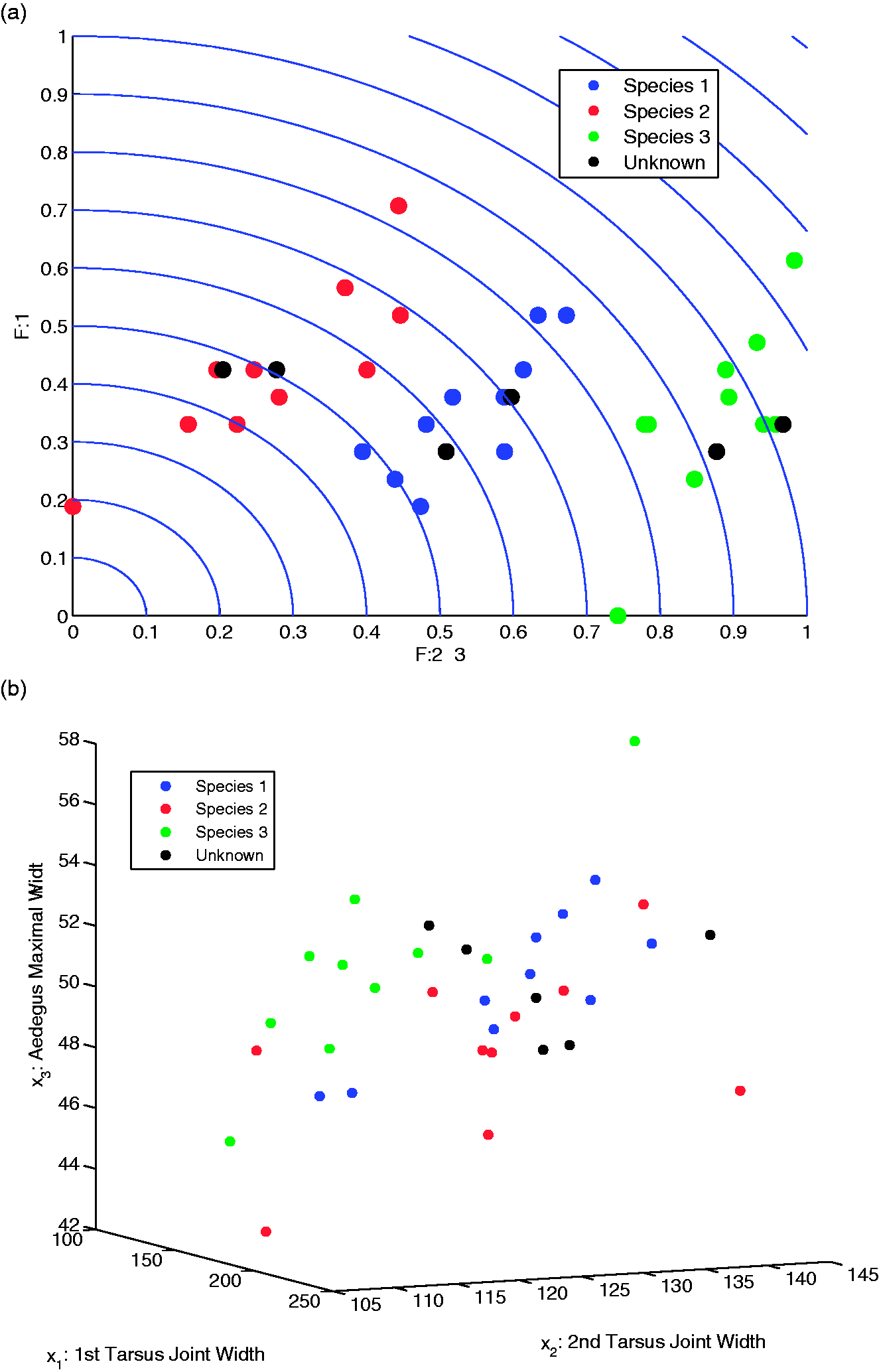
(a) HRV applied to insect data and (b) insect data feature scatterplot.
Three-dimensional HRV
As the number of classes, features, and exemplars increase, it becomes more challenging to display data in a meaningful way without transforming or projecting it, simply due to the amount of information that is being constrained to two dimensions. Unfortunately, a transformation or projection is not always intuitive to the intended audience for visualization, or may not be efficient to compute. As one example, van der Maaten and Hinton created a relatively successful cluster visualization of a 6000 exemplar subset of the MNIST dataset using their t-SNE algorithm. 46 However, t-SNE models Kullback–Liebler divergence between neighborhood conditional probabilities for all exemplars in the original and transformed spaces. Such an approach is computationally expensive, as the conditionals are computed for all exemplars and the transformed space is updated iteratively via a gradient approach. Further, feature information is lost and only a measure of aggregate proximity is maintained. The algorithm attempts to mitigate crowding of points, thus artificially adjusting the closeness of certain exemplars and clusters in the visualization.
In terms of HRV, we propose to help mitigate these issues by adding a third group for the HRC set of coordinates. All of the formulations and any heuristics easily adapt to incorporating the third group by adding another set of binary variables, and dummy features are used as needed to ensure equal group size. In order to expand the formulation to three groups, the binary constraints become those shown in equation (18)

As mentioned previously, as the number of classes, exemplars, and features grows, any visualization that tries to avoid true transformation will encounter issues due to the amount of information being constrained to an interpretable space. However, HRV can still be a useful tool. For example, consider the full training 0 and 1 classes from MNIST. Removing pixels that are 0 for all exemplars from both classes, the number of possible groupings is still
MNIST HRV using J2 and the 0/1 classes.
All of the desirable properties of HRV extend to the three-dimensional representation as each axis is still Euclidean-based for that group. In fact, using a third axis enables more distinction between points in the axis histograms. The only disadvantage to using three axes vice two is that the number of possible groupings is larger, and grows at a faster rate as a function of p, making the optimization potentially more difficult.
HRV can also be used to compare data projections. Here, we use a random sample of 600 exemplars from each class in MNIST. Figure 11 shows the J1 optima on the principal component and MDA scores for the nine major components in each case. Whereas the PC scores are more compact and have significant overlap of some classes in any direction, the MDA scores break out better by class and are more spread. This better geometry from the MDA result might suggest the presence of multiple classes in an unsupervised setting. The better visualization from MDA would be expected to some level, as MDA provides the optimal linear projections for class separation. Additional comparisons to dimension reduction methods, and further investigation into the embedded optimization problem, are included as Appendix 1.

MNIST HRV representations using J1: (a) principal component scores and (b) MDA scores.
Conclusion
In general, the visualization methodologies proposed here work best with a moderate number of features and a few classes due to the constraints of dimensionality and maintaining feature information. However, they have also been shown to be useful in identifying data outliers, comparing transformations, and comparing data classification complexity. With a very large number of features, the HRC coordinates may become more condensed due to the features being normalized. This can be mitigated in part by removing outliers, using projections, or exploring feature subsets. If performing unsupervised exploratory analysis on a dataset, a large number of classes can create a challenge unless they have break-defining feature subsets. Either way, this separation or lack of separation can still be useful information to the user.
The HRV technique itself is very simple and does not change the inherent properties of the data, thus making it very easy to interpret. Additionally, the visualization is efficient to compute. Determining optimal groupings using the objectives and formulations presented is relatively efficient, with a heuristic needed only once the number of features becomes large. In cases where the data have well-behaved class structures, the visualization provides a tool to identify this structure, and in cases where the boundaries are more complex or overlap, the visualization enables identification of such properties. If used dynamically, these visualizations can also be used for purposes of feature selection.
Footnotes
Declaration of conflicting interests
The author(s) declared no potential conflicts of interest with respect to the research, authorship, and/or publication of this article.
Funding
The author(s) received no financial support for the research, authorship, and/or publication of this article.