
Abstract
To investigate and compare the common features and differences of the cognitive processes, during which interfaces with diverse similarities are evaluated, this article chose the color code and layout forms of digital interface to carry out further research. The study adopted the visual Oddball experimental paradigm that was based on the event-related potential technique and integrated the behavioral and event-related potential data to analyze the neural features of the cognitive process when two coding forms were individually processed. The result reveals that there were P300 components, elicited by the target stimuli, in both of the two experiment sessions. The average amplitude of P300 positively correlates the similarities between the target and standard stimuli, with its latency positively correlating the overall complexity of the stimuli. In the color experiment session, there was apparent visual mismatching negativity around 200 ms after the present of the target, which is related with the early attention. The empirical significance of conclusions drawn in this study is listed as follows: first, it can help to effectively evaluate the usability of guiding features in the digital interfaces through the investigation on visual mismatching negativity elicited in the early attention process; second, the amplitude and latency of the P300 component can be applied in the evaluation and filtering of design schemes, which is based on the similarities perceived in the iterative process and this would enhance efficiency of user interface designers.
Introduction
Digital human–machine interface has been widely used in the domain of Internet media with the advent of the digital information era, namely, the command of naval vessels as well as the nuclear power plants. The digital interface, which integrates the properties of functional complexity and diversity of the system, has gradually replaced the conventional human–machine interface and become the primal windows, through which human interacts with the machine. The reliance and demands of users on the digital interface are increasing at the same time, keeping pace with the development of the interactive technique. Interface with sole visual style can no longer appeal to the users. Thus, iterative design method becomes the essential approach for designers to improve the usability and to meet the diversified requirements and tastes of the user population.
There do exist various methods for usability evaluation, which includes the subjective evaluation, physiological measurement 1 based on neural indexes, 2 and eye-tracking technique.3–6 With the increasingly proficient skills for neuroscientists to uncover and analyze the outcomes of neurophysiological measurement, event-related potentials (ERPs) have been the mainstream technique to capture the subtle voltage oscillations at the scalp,7,8 which is time-locked to the processing of external stimuli. 9 Differences between the properties of neural indexes or the different dimensions of single index can be manifestation of processing mechanisms to different events. 10 Furthermore, it renders it possible to continually and precisely uncover the cognitive process of the user population, with the conjunction of neural features to cognitive process. 11 The feature of high temporal resolution possessed by ERP makes it a vital investigative tool to reveal the regularity of the user.
The cognitive process of pairs of stimuli with similarities includes the early attention, working memory, pattern matching, stimuli evaluation, and decision.
12
Similarity was initially put forward by Goodman,
13
which was referred to the common features between two objects. According to the feature matching model, the similarity between objects A and B can be defined as functions with three independent variables; the first variable is
Thorpe et al. 15 adopted the Go/Nogo experimental paradigm and integrated the behavioral and ERP data to further investigate the categorization of animal and non-animal images, with familiar and unfamiliar patterns. The reaction time (RT) used to be utilized to measure and compare the time consumed in the cognition process, during which objects with progressive similarity were processed. However, it includes not only the time of cognition, but also the time on decision, which will result in the imprecision of measurement. The ERP data can manifest the time resources consumed in the cognitive process more precisely when compared with the RT. 16 Azizian et al. 17 applied the choice RT paradigm and revealed that there would be apparent N2-P3 complex component during the process of perceiving the target stimuli similar to the standard ones. They supposed that the N2 component could be related with response inhibition and the decision process when participants are inclined to a false choice. Furthermore, the P3 component might be reflection of the extent of processing during the categorization of stimuli. Sata et al. 18 found a main effect of P300 in the parietal region and both of the RT and latency positively correlated the difficulty of discrimination. Codispoti et al. 19 discovered that the frontal and temporal cortex would be activated when categorizing the stimuli based on its feature and performing selective attention. Watson et al. 20 reported that the average amplitude of the P300 would be affected by the similarity between prime words and target images, which bear resemblance with the prime in the conceptual aspect.
Compared with the above experiments, which were mainly explored between-category objects, researches about within-category were fewer. Ma et al. 21 adopted the S1-S2 paradigm to investigate the categorization of brand extension. They demonstrated that the amplitude of P300 elicited by target stimulus was positively proportional to the overlap between prime and probe stimuli, and this conclusion will help to evaluate the plausibility of brand extension. Azizian et al. discovered that the average amplitude and latency of P300 would show an increasing trend when the perceptual overlap between the target and non-target was raising. 22 They pointed out that amplitude of P300 could be a good neurophysiological index, which reflects the perceptual similarity between two stimuli.
The recognition process of stimuli with relevance and similarity consists of four stages. 23 The first stage is to perceive individual features of the target; then the second stage is to integrate separate features as a whole based on Gestalt principles, and the third stage is to compare the image perceived with the pattern stored in the working memory and make decisions finally.
Among the various elements of digital interface, color, text, icon, layout and animation are together in the top list of primal visual elements. Amid all these five coding forms, color can provide vigorous visual impact to its observers and reflect directly the visual style and semantics of the interface. Layout, on the other hand, refers to the design result, in which designs position diversified elements, with hierarchical functional importance, in a reasonable manner. An excellent layout forms can make full use of the limited space of displays.
We carried out research based on the color and layout forms, which were classified according to the degree of similarity between target and standard stimuli. This research work adopted the visual Oddball experimental task paradigm that was based on the ERP technique and collected behavioral and ERP data and analyzed the neural features of the cognitive process when two coding forms were individually processed, and P300 was studied and analyzed in depth. The objective of the research is to investigate and analyze the neurophysiological correlates of similarity cognition between different interface elements and provide empirical reference for the iterative and evaluative process.
Definition and hypothesis
Definition of the variables
The change of color and layout forms will ultimately result in the change of overall visual style; these two coding forms, however, show difference in the impact on selective attention and the perception of global stimuli. The target stimuli would elicit P300 component when it differs in physical attributes (color, tone, etc.) from standard stimuli in some experiment based on Oddball paradigm. 24 When it comes to the digital interface, especially when every single element ought to be perceived, users need to process all of these aspects in depth, including the localization, quantity as well as the semantics of elements. This research chose the color code and layout forms of digital interface, to investigate the neural components elicited when the similarity between the target and standard stimuli was progressively changed. We calculated the perception differences between selected colors and standard color, and similarity was perceived through Ranking Scale. 40 postgraduates with good interface design experience from Southeast University completed the Ranking Scale task.
Perceptual difference between colors
Color code becomes the most prevailing coding form, which makes interface distinct from other brand products. 25 Users will be inclined to classify different colors (red, green, etc.) to better perceive and discriminate colors, despite the continuum of colors existing in the spectrum. Thus, we targeted a no-brand music player interface and measured the perception difference of two colors beforehand. The CIE-Lab values 26 were listed in Table 1, and the ΔE separations were as follows: C0–C1, 30.88; C0–C2, 69.51; C0–C3, 54.90. The larger the ΔE value is, the larger distance in CIE color space between the deviant and standard stimuli will be. The distance between two colors can reflect the ease of discrimination. 27 Thus, we can conclude that the discriminability between slate blue and dodger blue is low relatively. Meanwhile, the discriminability between the chosen olive drab and dodger blue reaches the maximal high.
Lab values and color codes in the color experiment section.

Similarity between layout forms
The focus of layout in interfaces lies in how to effectively localize the information in the limited display area. An ignorant of the interface layout principles as well as disobedience of human factors recommendation will definitely result in the impairment of performance and user experience. We analyzed the elements and functions of the no-brand music player interface and divided the interface into five parts, which are exhibited in Figure 1. By changing the relative position and size of some functional areas in the interface, scheme A, B and C are screened out. Scheme A keeps the relationship between the size and space position in the original interface, which is named as the excellent interface; Scheme B keeps the interface functional framework, but changes on the main function area size, which is as a poor interface because of interface visual imbalance; Scheme C changes on spatial position and proportions of toolbar and menu bar at the same time under the premise of differing main function area size, which is as the worst interface because of function level disorder and visual imbalance.
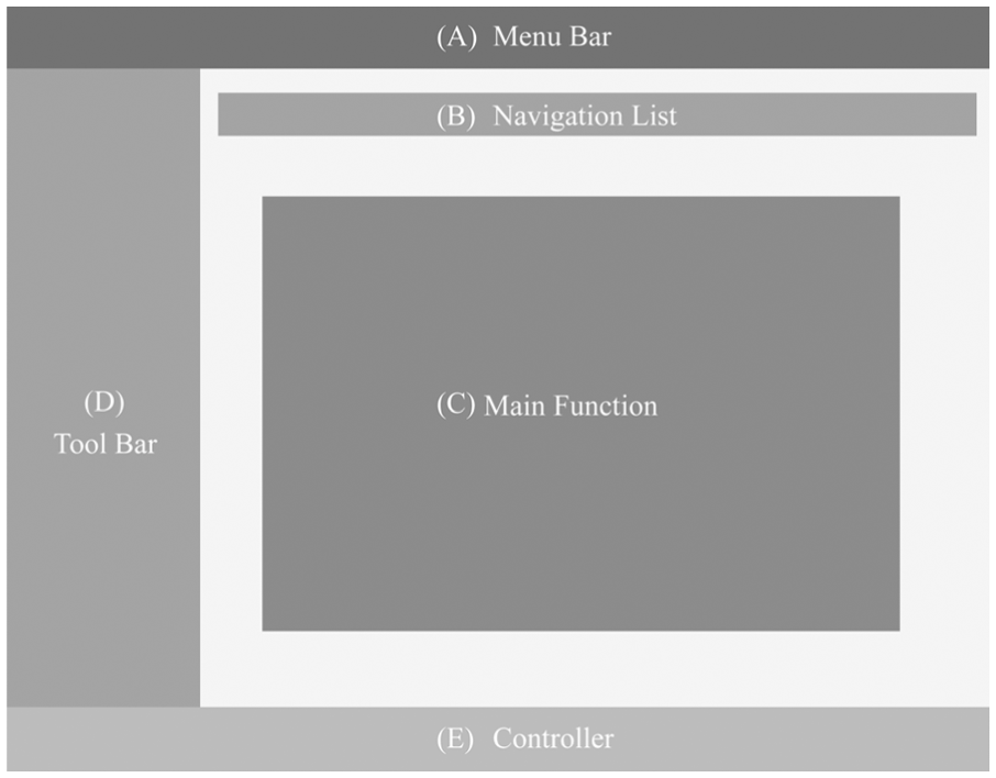
Function division in the no-brand music player.
Interface scheme similarity evaluation system was built based on Visual Studio before experiment, as shown in Figure 2. Fifty people were invited to participate in the survey, including 20 ERP-test subjects. We evaluated three schemes of layout and compared the affirmative rate of similarity among Scheme A, B and C through 7-ranks Likert Scale respectively. The result indicated that Schemes A and B bear more resemblance than Schemes C and B, for 69.32% and 38.25%, respectively. Based on the subjective evaluation results obtained at this stage, we further explore the mechanism of interface layout cognition and evaluation. Three different layout schemes are exhibited in Table 2.

Interface scheme similarity evaluation system.
Patterns and evaluation result in layout experiment section.

Hypothesis
Based on the theoretical results in the literature,15,17–19,21,22 we chose the color and layout of digital interface to carry out further research. We compared and explored the neurophysiological indexes in the two individual experiment sessions. Among the multiple components which would be elicited, we chose the P300 component to perform further analysis.
According to the principles of perception differences in CIE-Lab color space, in the color section, interface with the dominant hue of slate blue would be the most difficult to discriminate in the stimuli serial, compared with the dominant hue of olive drab and orange. As is concluded in the Azizian et al.’s 22 report, the average amplitude of P300 would be positively correlated with the discriminability. We hypothesized that P300 amplitude elicited by slate blue interface would be maximal high, and the orange interface follows behind, with the olive drab interface eliciting the least P300 component. The latency of P300 in purple block would be the longest, which is based on the conclusion that latency of P300 positively correlates the difficulty of recognition.18,22 In the layout experiment session, similar hypothesis could be made. That is, average amplitude of P300 elicited by scheme A would be higher than scheme C.
Due to the fact that human tends to be more sensitive to the change of color, we speculated that there would be neural components relating with attention in the early stages of visual information processing. In the layout session, likewise, attention-related components would possibly be elicited by the different forms between standard stimulus and target interface. These attention-related components would be different in aspects of amplitude, latency, and scalp distribution, which could result from the different cognition processes. These components would not be further discussed in the article.
Experiment
Subjects
Twenty participants were enrolled to take part in the experiment, with 10 male and 10 female students, whose ages range from 22 to 27 years old (M = 24.435, SD = 1.57). All the participants were right-handed and had normal and corrected-to-normal vision without color blindness or color weakness. The experiment conformed the Code of Ethics of the American Psychological Association and the World Medical Association. 28 To make participants familiar with the specific task requirements, all of them underwent training section. After completing the experiment, participants were given 50 RMB for rewarding.
Material
We adopted Oddball experimental paradigm in both of the color and layout session. In color experimental blocks, the hue of interfaces was listed in Table 1, and the C0 was the standard color stimuli, with C1, C2, C3 the target color. In the layout section, standard and target layout schemes were listed in Table 2, with all the images decolored in Photoshop to minimize the interference made by color factor.
The proportion of standard and target in both of the two sections remained the same, with 0.8 and 0.2, respectively. To make the stimuli more salient, the background color was set black (R: 35, G: 24, B: 21). The displays of all the visual stimuli were presented on a CRT monitor with the display size of 17 in (1280 pixels × 1024 pixels). Participants were seated in front of the screen with the viewing distance of 60 cm. Experimental compilation and behavioral data collection were based on E-Prime 2.0.
Procedure
The experiment was conducted by means of within-subject design. In the beginning of the stimuli serial, instructions were exhibited and participants could enter any button on the keyboard to the next display after grasping it. Several practice trials were performed with no data collected before the experiment part. The experiment consisted of two sessions: color session and layout session, as is introduced above. There were three blocks in the color and two in the layout session.
The block began with a 500 ms white fixation (5° × 5°) to inform participants that they concentrate attention. Standard and target stimuli were randomly present for 1000 ms each, with inter-stimuli interval of 500 ms in the form of blank. Participants were instructed to respond as quickly as possible and press button “A” in the color section and “L” in the layout section when the target emerged. As shown in Figure 3, there were altogether 160 standard stimuli and 40 targets in each block with the buffering interval of 15 s after each block. After finishing the color session, participants could take a short break for 5 min. The entire experiment lasted for 35 min.

Experiment flow and sample stimulus.
Electrophysiological recording
The ERP data were recorded continuously using a 32-channel electrode cap (BP). All recordings were performed using a front–central electrode as ground and electronically linked mastoid electrodes as reference. The horizontal EOG was monitored from electrodes as the outer canthi of the eyes, and the vertical EOG was monitored from electrodes above and below the orbital region of the left eye. Impedances for all electrodes were kept below 5 kΩ. The ERP and EOG signals were digitalized at 1000 Hz, and the filter bandpass was 0.5–100 Hz. ERP epoch began 200 ms prior to target stimulus onset and continued for 1200 ms thereafter.
ERP analysis
According to the topographical maps in the color and layout section, we founded that the central–parietal and parietal lobes were prominently activated in the color session, whereas the central–parietal, parietal as well as the occipital lobes were most activated in the layout session.
Combined with the conclusion about the neural generator of P300 component in previous researches,29,30 and results from the topographical map, we put emphasis on the analysis of central–parietal (CP1, CP2) and parietal (P3, Pz, P4) lobes in the color session, and central–parietal (CP1, CP2), parietal (P3, Pz, P4), and parietal–occipital (POz) lobes in the layout session, to further investigate the homogeneity and heterogeneity of the neural components in the two sections, as shown in red framed region in Figure 4.

Selected electrodes distribution map of the color (left) and layout (right) experiment.
Experiment results and analysis
Color experiment results analysis
Behavioral data
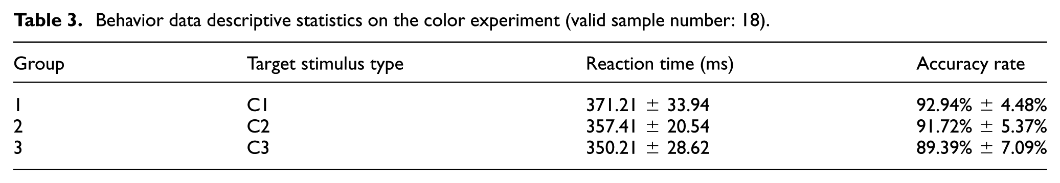
The behavioral data consist of RT and accuracy rate, which were collected based on E-prime 2.0. There were 20 subjects to complete the task, and two of which were excluded due to the obvious drift ERP data in the off-line analysis. Table 3 shows the behavioral data collected in the two experimental sections. From the data in the table, reaction time lasted longest in the slate blue interface, and dispersion degree also remained largest. When orange and olive drab were used as hues of interface, RT did not show any significant difference. Accuracy rates had ceiling effect in all three sections of color experiment. Therefore, further interaction effect analysis would not be conducted.
Behavior data descriptive statistics on the color experiment (valid sample number: 18).
ERP data
Figure 5 shows ERP waveforms in the epoch of 200 ms prior the onset of target stimuli and 1000 ms after the onset. ERP was recorded on the scalp electrodes of P3, P4, CP1, CP2, and Pz during the three blocks of color experiment. Waveforms elicited in the three blocks appear to be similar, among which amplitudes of P300 components elicited in the parietal and central areas were remarkably higher. Statistical analysis result indicates that the average amplitude of P300 has significant effect in P4, Pz, and CP2 electrodes, whereas no significant effect was found in the ERP recording of P3 and CP1 electrodes.

ERP waveforms of P3, P4, CP1, CP2, and Pz electrode in color experiment section.
Take P300 recorded in the Pz electrode for further analysis. The average amplitude of P300 in Pz electrode evoked in slate blue, olive drab, and orange interface was 10.87, 9.47, and 8.39 μV, respectively. The corresponding latency was 348.33, 317.89, and 327.56 ms. The interface with hue of slate blue evoked P300 component with the largest amplitude and the longest latency. From correlation analysis, experimental condition had significant effect on P300 amplitude (p = 0.047 < 0.05), while no significant effect was found on latency (p = 0.535 > 0.05). Same method has been adopted to analyze the P300 component in P4 and CP2 electrodes, and same conclusions were drawn. In addition to the typical P300 components, an obvious negativity wave appeared around 200-300ms after the onset of target stimulus, which will be interpreted in the discussion section about the brain physiological meaning.
Layout experiment result analysis
Behavioral data
Table 4 exhibits the behavioral data, which includes both RT and accuracy rate, in the layout experiment session. From the table, we can conclude that the average RT of Group-1 layout experiment (Scheme A as target) is longer than that of Group-2 (Scheme B as target), but discrete degree of RT in Group-1 experiment is smaller (SD1 = 48.6116 ms
Behavior data descriptive statistics on the layout experiment (valid sample number: 20).

ERP data
ERP waveforms recorded in the electrodes of P3, P4, CP1, CP2, Pz, and POz within the defined epoch are shown in Figure 6. As is shown in the figure, there are apparent P300 component around 400 and 500 ms after the onset of target for the above six electrodes, which is in line with the descriptions on the characteristics of P300 latency in Polich and Kok 29 and Patel and Azzam. 31

ERP waveforms of P3, P4, CP1, CP2, Pz, and POz electrode in layout experiment section.
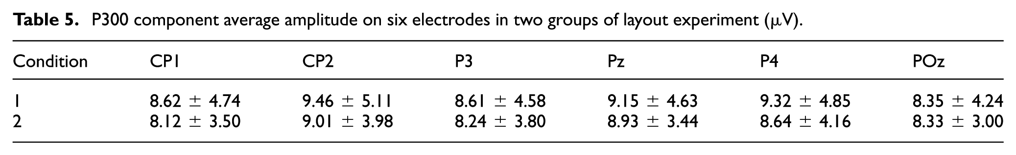
Table 5 displays the P300 amplitudes recorded in the electrodes of P3, P4, CP1, CP2, Pz, and POz in the period from 300 to 600 ms after the onset of target stimuli. In two groups of layout experiments, P300 component amplitude reached its maximum value in the central area (CP2) and parietal lobe position (Pz, P4). Average amplitude of P300 in the first condition is 8.92 μV, while the average amplitude in the second condition is 8.54 μV. By paired-sample T test, experimental conditions had a significant impact on P300 component volatility, T = 4.002, p = 0.038 < 0.05.
P300 component average amplitude on six electrodes in two groups of layout experiment (μV).
Latent periods between the two conditions were compared, and paired-sample test was conducted to analyze the P300 latency in the selected P3, P4, and Pz electrodes. No significant effect was found between layout forms and P300 latency (T = 0.638, p > 0.05). Same method was applied among different electrodes, and no significant difference was found.
Comparative analysis between color and layout experiment
In order to further analyze the difference of P300 components in color experiment and layout experiment session, amplitude and latency of P300 components recorded in P3, P4, CP1, CP2, and Pz electrodes were discussed within the -200-1000ms interval. Waveforms of five sets of experiments were grand averaged in Figure 7. It could be intuitively observed that P300 latency in layout experiment was longer than that of color experiment. Paired samples T test analysis showed that the correlation of P300 amplitude and experiment conditions (color layout) was not significant (p = 0.432 > 0.05), but P300 latency period was significantly correlated with the experiment conditions (p = 0 < 0.05).

ERP waveforms of P3, P4, CP1, CP2, and Pz electrodes in color and layout experiment session.
Discussion
There were P300 elicited by target stimuli in both color and layout experiment session. However, amplitude and latency of P300 varied from conditions. In other words, changes in main hue and layout forms would evoke P300 and carry implications on its latency, amplitude, and activation distribution. Donchin and Coles 32 used model-updating theory to explain the phenomenon, in which P300 is attributed to the update of the initial cognitive schema stored in working memory. In this study, both changes in main hue and position of element in interface would result in the renewal of the pattern already stored in the memory, and this process is so-called scheme updating.
Näätänen’s research 33 suggested that the occurrence of P300 components is related to the mismatching between target stimulus and working memory path, and the evoked P300 component amplitude correlates the consumption of cognitive resources when recognizing the low-frequency target stimuli. Karis et al. 34 and Kok 35 verified that P300 amplitude positively correlates the cognitive effort. Azizian and collegues17,22 carried out researches on the evoked P300 components in cognitive process of target stimuli with different similarities to standard stimuli and concluded that the P300 component was proportional to cognitive level in stimulus classification.
In color experiment session, with the color perception differences between target and standard stimuli decreased, namely ΔE (C0–C1) < ΔE (C0–C3), P300 amplitude would increase. This result can be interpreted that as the perception differences between two kinds of colors became smaller, it would be more difficult to identify the target color from the stimulus sequence. Azizian et al. 22 found the increasing P300 amplitude was caused by continually reducing the similarities between abstract faces. Consistent with his conclusion, when the target stimuli appeared, subjects needed to evaluate and classify the colors, and this process was affected by color perception differences and color naming. Holmes et al. 27 and Zhong et al. 36 discussed and verified the effect of color naming on color perception, in which naming forms of different colors would make influence on color perception in terms of the abstract semantics. The color dodger and slate blue share common semantic features in Chinese language system, for example, they both symbolize calm and peaceful. In the course of the experiment, color recognition might be affected by language when slate blue was the main color of the interface, but more attention was paid to the impact of color perception differences on P300 volatility in our study.
In the layout experiment, similarity recognition between excellent interface layout and standard stimulus was higher; therefore, it was more difficult to identify Scheme A in the stimulus sequence, and the greater identification difficulty was likely to lead to larger P300 amplitude, which is also consistent with the cognitive efforts theory of Karis et al. 34
According to color and layout experimental results, the higher similarity between target stimuli and standard stimuli pattern stored in working memory is, the more subjects' attention resources during the process of identifying target stimuli need to pay, which directly leads to larger P300 amplitude. Therefore, P300 component amplitude values could be used as a physiological index to measure the similarity between two types of stimuli or events.
Relationship between P300 latency and experimental conditions
Sata et al. 18 claimed that P300 latency could be used as the basis for measuring the length of stimulus evaluation time course. Statistical analysis revealed that P300 latency periods in layout and color experiments were significantly different. This significant difference of P300 latency could be speculated to correlate with the complexity of stimuli.14,37
Color code is low-level perception, but different layout forms, which are composed of interface elements in different space positions and sizes, belong to high-level thoughts comparatively. According to the Mazza and Caramazza 23 elaboration on target counting cognitive process, subjects needed a rough processing to the target first and then obtained space position of the characteristics to lay the foundation for further processing. Thus, it can be speculated that subjects need to identify the space position of each functional module in the interface, conduct more accurate and intensive cognitive processing on size and quantity, and match with the standard stimulus pattern stored in working memory. Multidimensional encoding forms constituted a more complex stimulus of interface layout cohesively.
In color experiment, non-feature properties of each element in the interface kept constant, and only the main color of the interface was changed across the experiment; thus, recognition complexity was low. Based on this, it can be inferred that P300 latency could be used as stimulus assessment time, which would delay with the complexity of stimuli.
The research of N2 component in color experiment
In the ERP waveform of color experiment, a more obvious negative wave component appeared in the range of 200–300 ms after the onset of target stimuli. According to the description of visual Mismatching Negativity (vMMN) made by Czigler et al.38,39 and Stefanics et al. 40 , the negativity wave appears after the onset of low-frequency target stimuli, which is caused by the differences between target and standard stimuli. Kenemans et al. 41 and Czigler et al. 38 obtained vMMN through the change of color in the target. However, Nyman et al. 42 did not acquire this mismatching component in spatial orientation judgment and recognition experiment, and Nyman speculated that vMMN component is related to early attentional cognitive process. Therefore, it could be inferred that the negative wave in the 200–300 ms interval after the target stimulus should be defined as vMMN component in color experiment. As we focused only on the P300 component in this research, the vMMN will be explored in the future. Inferences and the distribution of vMMN component in the brain region will be further verified in the future research.
Guiding significances of research conclusions to the interface design
We compared the neurophysiological indexes induced by target stimulus cognition under different similarities of color and layout schemes, which are two elementary factors in digital interface. P300 component was in detail analyzed and interpreted. The mean amplitude of P300 component is positively correlated with similarity degree between target and non-target stimuli. Compared with the layout factor, color factor will elicit component related with early attention course. By taking neuroscience method, we can explain user cognition and behavior in the human–computer interaction process from an endogenous level. The integration of behavioral and neurophysiological measurement can render it possible for usability engineers and user interface (UI) designers to precisely evaluate the usability of interfaces.
In human–computer interface designing, consistency principle is defined as the users perception of the multidimensional attributes in specific interface, including characteristic elements, functions, similarity, and inheritance of each subsystem in relative position.43–45 Good interface consistency can effectively provoke users’ prior knowledge and cognitive schema, which will reduce user’s learning cost, 46 improve user’s operating performance, 43 and enhance system usability. 47 Interface consistency is composed of three dimensions according to Ozok and Salvendy. 45 Color and layout forms in this study were subordinated to the physical consistency dimension. Results reveal that different features under the same dimension were not equivalent to user’s perception.
In color experiment, the onset of target stimuli induced early vMMN wave, which was related to attention mechanism, 42 but the same component was not elicited in layout experiment. Hence, inference could be made that changes of color characteristics could effectively guide user to orderly shift their attention, and this principle was especially significant in guiding visual orientation design of web page.
Similar layout framework in the web page usually makes users confused and lost. It is difficult for users to tell the differences in the functional aspect between current web page and the previous web page. In view of this situation, changing the color characteristics in the items can provide a good visual guide for users and help them to clarify the relationship among the different levels, which is based on attention guidance characteristics of color. In this way, users can take a good grasp of the differences and function positions between the current page and the last one. This method will help to enhance the interactivity of web page and improve user experience. As shown in Figure 8, there are some consistencies in layout, high light text and hyperlinks forms in the three interfaces, but changing the background color in headline can help users to distinguish clearly the differences from multiple modules in a fast speed.

A museum official website screenshot (picture from http://brlsq.net/burlesque/temp/coexhibitions/).
According to the conclusions in this research, P300 amplitude had a positive correlation with perceived similarity between target and standard stimuli. Combination of subjective evaluation and neuroscience measurement method can be used in usability evaluation of visual guidance in web page design assessment process. The effectiveness of feature encoding of visual guidance in the interface can be evaluated by vMMN component, which will be in-depth verified in the following study.
Application of physiological indexes in the process of interface development
Only in the situation that the application model constructed by designer goes match with the user mental model, a positive interactive relationship and good user experience model can be created in software interface design process. Iteration of software products also needs to take into account user’s existing mental model, namely, psychological cognitive schema, to ensure the interface elements can maintain consistency with the previous generation of products in the diagram appearance, shape function, semantic matching, and so on. 48 In this way, users can duplicate the original cognition mode in the new interface system and operate skillfully to achieve the goal of reducing the error rate and improving the operation performance.
Based on the conclusion of this study, P300 amplitude and latency period can be used to evaluate the interface similarity in different stages. Through combing with the subjective evaluation, behavior measurement, and ERP indicators interpretation, namely N400 components, user experience engineers can conduct precise consideration and selection comprehensively for iterative process schemes from the aspects of layout, function, and semantic in the development process of the practical interface.
Conclusion
Color element is comparative low-level perception feature compared with interface layout form, and it was easier to identify and recognize from the stimuli serial. P300 amplitude evoked by target stimulus is negatively correlated color differences, which is positively related the overall similarity of layout schemes in layout experiment. P300 latency is correlated with the complexity of stimulus.
The research results can be applied to interface iterative process to assess the interface consistency. Through merits and demerits assessment of digital interface in terms of layout, function, and semantics, we can get the mapping relations between stimulus variables and user cognitive neurophysiological components.
The in-depth explorations on digital interface element will be carried out in aspects of functional, semantic similarities and consistency. This will enrich the approach of neurophysiological evaluation on interface and reduce the iterative decision risk, as well as the design cost, which will ultimately shorten the development cycle and enhance efficiency of designing.
Footnotes
Handling Editor: Shengfeng Qin
Declaration of conflicting interests
The author(s) declared no potential conflicts of interest with respect to the research, authorship, and/or publication of this article.
Funding
The author(s) disclosed receipt of the following financial support for the research, authorship, and /or publication of this article: This work was supported jointly by National Natural Science Foundation of China (No. 71801037, 71871056, 71271053), Science and Technology on Electro-optic Control Laboratory and Aerospace Science Foundation of China (No. 20165169017) and SAST Foundation of China (SAST No. 2016010).