
Abstract
Network analysis offers a powerful methodological approach for uncovering patterns and structures within complex relational data. This study argues that qualitatively or quantitatively coded textual information can be conceptualized as a network of relationships between participants and the codes applied to their classified narratives/contributions, thereby forming a natural relational database. The main argument is that data gathered through qualitative methods (e.g., interviews, focus groups) and subsequently coded/classified/labeled contain mathematical structures that can be retrieved, visualized, and statistically analyzed using network methods—even if we are not analyzing social relationships. Furthermore, when participant attributes are incorporated, the resulting structures enable statistical evaluation of the extent to which experiences differ across groups or are similarly distributed across our participants’ attributes. This study introduces the Network Analysis of Qualitative Data (NAQD) framework, which integrates quantitative, mathematical, and qualitative principles to analyze textual data—an approach whose potential for rigorous statistical hypothesis testing remains largely unrealized in common qualitative software. Alongside presenting this analytic framework, and with the goal of democratizing access to data science tools, we introduce a peer-reviewed, free, and no-code software tool that implements NAQD (see https://cutt.ly/2riYDEhH for the published version of the software). However, this software is also freely available for Mac (https://cutt.ly/unZDUMq) and Windows (https://cutt.ly/KnL9frz) platforms. Unlike commercially available software, NAQD provides community detection, hypothesis testing of group similarities via Quadratic Assignment Procedures (QAP), and fully interactive HTML network renderings. We illustrate all steps and outputs using replication data from a project on teacher training at Minority Serving Institutions.
Keywords
Introduction
Network analysis has emerged as an increasingly vital analytical approach for identifying patterns and structures within relationships that, due to their inherent complexity and multidimensionality, may not be immediately apparent through conventional analytic frameworks that ignore relations across units of analyses (González Canché, 2019, 2023c, 2023d, 2025a, 2025b; Lee et al., 2026). This perspective suggests that qualitatively or quantitatively coded textual information can be productively conceptualized as relational data between participants and their assigned codes, effectively forming a relational database structure.
The central thesis of this study is that data collected through qualitative methods and subsequently coded/labeled contain latent mathematical structures that can be systematically retrieved and visualized using network analysis (see Figure 1). Based on these possibilities, this study introduces the steps to harness the mathematical power of network analysis to find structure in coded textual content. The analytic framework discussed is termed Network Analysis of Qualitative Data (NAQD). NAQD integrates quantitative, mathematical, and qualitative principles to analyze text data. To democratize access to these data science tools, we also present a peer-reviewed,
1
free, and no-code software tool that implements all elements of NAQD described in this study (see https://cutt.ly/2riYDEhH for the published version of the software as well as footnote 1). Note also that this software is available for Mac (https://cutt.ly/unZDUMq) and Windows (https://cutt.ly/KnL9frz) platforms. Conceptual framework
The integration of network modeling to analyze coded textual data is becoming more prevalent. For example, commercially available (i.e.,for profit) computer-assisted qualitative data analysis software (CAQDAS) like NVivo, ATLAS.ti, Leximancer, MAXqda, and QDA Miner all offer network or relational visualization capabilities. Nonetheless, unlike NAQD, neither of those software tools offer community detection capabilities, hypothesis testing of similarities across groups, nor fully interactive HTML network renderings. The latter, in addition to serving as guides for the interpretation of the resulting network structure, also offer measures of strength of the relationships among actors and codes along with information about the total number of contributions made by each actor and their level of influence in this network. Taken together then, not only does NAQD is more versatile in the presentation of the results, it also is offered completely free of charge and can be modified to accommodate other analytic needs in case researchers are familiar with computer and statistical programming. If they are not, note that NAQD has been developed to meet most of qualitative and mixed-methods projects’ needs, as tested with hundreds of participants that have been trained in this framework since 2015.
Background: Currently Available Applications and Scholarly Context
As noted previously, several qualitative software applications currently enable researchers to map their coded textual databases. This section aims to systematically describe these applications and delineate how NAQD both converges with and diverges from existing software tools. To accomplish this, we provide concise descriptions of some of the most prominent and influential software platforms. In the following discussion, we situate our analysis within a broader scholarly context that acknowledges the significant value of integrating network analysis with qualitative inquiry methodologies.
Methodologists have long argued that purely quantitative Social Network Analysis (SNA), while powerful for revealing structure, often simplifies social relations into numerical data, thereby “bracketing out” the content, meaning, and dynamics of social ties (Edwards, 2010). This has led to calls for mixed method approaches that integrate the “outsider’s” structural perspective with the “insider’s” perspective on process and meaning (Edwards, 2010) and for frameworks that simultaneously tackle connections, structure, and meaning (Fuhse & Mützel, 2011). Furthermore, scholars have specifically championed Qualitative Social Network Analysis (Qual-SNA) to move beyond structural description and access the meanings that actors attach to network configurations, which is crucial for explaining behavior in complex fields like social movements (Luxton & Sbicca, 2021). The NAQD framework is a direct response to these calls, operationalizing this integration by making qualitative codes—the vessels of meaning—the fundamental units of the network analysis from the outset.
However, a significant challenge identified in the mixed methods SNA (MMSNA) literature is the failure to achieve deep integration, often resulting in a parallel presentation of findings rather than genuine meta-inferences that emerge from the combination of methods (Froehlich et al., 2020). The commercially available software tools described below often reflect this challenge, as they typically prioritize manual crafting or offer visualizations that lack the statistical rigor of formal network analysis. NAQD is designed to address these gaps directly by offering a deeply integrated, statistically robust, and automated framework.
Positioning NAQD Among Related Network-Based Methods
Beyond the mixed-methods SNA approaches just discussed, several other methodological frameworks employ network analysis for qualitative data and data that capture processes or events like in process mining (Van Der Aalst, 2012). Positioning NAQD relative to these approaches helps clarify its distinctive contribution.
Epistemic Network Analysis (ENA) focuses on modeling connections between codes or concepts within discourse, typically examining code co-occurrences (that indirectly link participants) to understand cognitive frameworks or collective thinking patterns (Shaffer et al., 2016), yet removing the actual providers of those codes from their analyses.
Ordered Network Analysis (ONA) extends this code co-occurrences approach by incorporating temporal sequencing, constructing directed networks to capture how prior events influence subsequent interactions in socio-cognitive processes (Tan et al., 2022).
Transition Network Analysis (TNA) specializes further in temporal dynamics, utilizing stochastic and probabilistic models to identify and statistically validate transition patterns between states over time (Saqr et al., 2025).
NAQD establishes its distinctive position through fundamental architectural and analytical differences. While ENA, ONA, and TNA primarily model relationships between codes (forming one-mode networks), NAQD operates on two-mode (affiliation) networks that connect participants (one mode) to their generated codes (the second mode). This fundamental distinction in the unit of analysis reorients NAQD’s focus toward understanding the collective conceptual landscape of participant groups and formally testing for structural differences across sub-groups within a sample. Specifically, the NAQD’s framework uniquely integrates Quadratic Assignment Procedure (QAP) correlations to enable statistical hypothesis testing of group-level differences across networks. Furthermore, NAQD’s implementation as a no-code software tool specifically aims to make these advanced data science network analytics accessible to qualitative and mixed methods researchers without requiring computational programming expertise. Thus, NAQD serves as a complementary rather than competing framework for currently available analytic tools. However, NAQD is distinctly designed for research questions concerning how perspectives and experiences are structured and distributed across different participant groups. With this scholarly context in mind, we now turn to a review of currently available software.
Atlas.ti Networks
Atlas.ti is a commercial software tool that facilitates the labeling of textual data while preserving the comprehensive information researchers need for data retrieval, analysis, and conclusion development. Once coding is complete, Atlas.ti enables users to manually construct visualizations incorporating codes, families (grouped codes or categories), and quoted elements. During this visualization process, researchers can assign specific meanings to connecting lines by adding qualifying labels to each connection.
Short Essays on the Reasons to Enroll in a Data Science Seminar*

*Superscripts indicate the quote associated with each code or label.
While copyright considerations prevent reproducing these visuals here, we note that this manual visualization construction bears substantial similarity to using presentation software like Microsoft PowerPoint or diagramming tools such as Dia (https://live.gnome.org/Dia) to build conceptual maps that represent researchers’ interpretive narratives.
Essentially, Atlas.ti Networks visualizations highlight elements researchers deem valuable for explaining their findings. This contrasts fundamentally with NAQD’s objective of revealing structural patterns emerging from the hundreds or thousands of relationships connecting participants to their codes and textual contributions. In this respect, NAQD aligns more closely with subsequent visualization approaches we discuss, all of which aim to illuminate structural patterns arising from connections between actors and their codes (see González Canché, 2019, 2022d). Although Atlas.ti can potentially represent actor-code-quote relationships, connections are not automatically generated when elements are added to the visualization canvas; instead, researchers must manually establish these relationships.
NVivo Project Maps
Similar to Atlas.ti’s network capabilities, NVivo enables users to select codes, files, memos (research notes supporting analytical reasoning), and themes (code groupings or families) for inclusion in network diagrams. A significant distinction between Atlas.ti and NVivo lies in NVivo’s automatic retrieval of connections from observed data relationships. To illustrate this functionality, consider our example from Table 1. If we add the code “Professional Development” to the NVivo Project Maps visualization canvas without additional elements, no connections appear. However, when Actor ID1 is subsequently added, NVivo automatically generates a connecting line between this actor and the “Professional Development” code. This contrasts with Atlas.ti, where researchers must manually draw such connections.
When elements with pre-existing relationships are added to an NVivo map—such as codes assigned to themes or families—their connecting lines are automatically incorporated into the visualization. Consequently, including all codes and actors produces an aggregated representation of the complete connection set. NAQD extends this rationale but eliminates the need for researchers to selectively add elements. Instead, NAQD automatically incorporates all project participants and codes, positioning them within the sociogram according to measures of relevance and influence. These measures, known as centrality measures, will be comprehensively detailed in our methodology section.
Leximancer Concept Maps
Leximancer’s concept maps display themes (equivalent to codes or labels) identified through unsupervised text classification, along with their most strongly correlated associated words. These concept maps employ network representations where node size (displayed as circles or bubbles) reflects their frequency within the analyzed transcripts or texts. Unlike Atlas.ti Networks and NVivo Project Maps, Leximancer’s concept maps are automatically generated through unsupervised text classification, producing aggregated representations of the most frequent co-occurrences between themes and their constituent words across the textual data.
Given its unsupervised classification approach, Leximancer automatically assigns all sentences within the corpus (the complete text collection) to resulting themes (codes). A common limitation shared by Leximancer, Atlas.ti, and NVivo—and a key differentiator from NAQD—is their lack of centrality measures for identifying the most influential actors (code providers) or codes within the sociogram. This absence of relevance quantification arguably constrains researchers’ ability to discern and emphasize structural patterns embedded within complex networks of hundreds or thousands of connections.
MAXQDA MAXMaps
MAXMaps operates on a similar principle to NVivo’s Project Maps. Researchers can select codes, documents, memos, quotes, and categories (themes or families) for inclusion on the visualization canvas. When these elements are added, connecting lines between related items are automatically generated—an approach that aligns with NAQD’s foundational rationale. However, unlike NAQD, MAXMaps permits users to establish connections between objects that lack inherent relationships according to the structure shown in Table 1 (i.e., the
MAXQDA also provides a code co-occurrence visualization tool, which identifies the number of documents (such as interview transcripts or essays) containing specific code pairs. Researchers can utilize these frequency displays as an alternative strategy for revealing structural patterns in qualitative data. NAQD incorporates a similar analytical approach by quantifying how frequently actors contribute text associated with particular codes and assessing the relative prevalence of these relationships within individual actors’ discourse and overall network contributions.
QDA Miner’s Link Analysis
The final CAQDAS platform we examine that incorporates network visualization capabilities is QDA Miner. Its Link Analysis feature enables visualization of connections between codes and between codes and cases (research participants), with the primary objective of highlighting co-occurrence patterns and structures. The resulting visualization employs a layout algorithm that positions densely connected codes centrally while relegating less prevalent codes to peripheral positions—a spatial organization property also implemented in NAQD.
Code proximity based on co-occurrence prevalence can additionally be represented through dendrograms and proximity plots. These visualizations are feasible because data structured similarly to Table 1 can be transformed into matrices amenable to traditional classification and correlation analyses. Our methodology section will elaborate on the specific transformations NAQD employs to test for similarities and differences in participant experiences.
Finally, we reiterate that QDA Miner’s Link Analysis, like the other software tools discussed, does not incorporate centrality measures or relevance quantification in its visualizations—a consistent limitation across currently available platforms that NAQD specifically addresses. This brief review of currently available software that employs network analyses principles to visualize relationships obtained from textual data, serves to highlight the contribution of NAQD to the visualization and analytical capabilities of coded textual data by incorporating attributes into the resulting visualizations/analyses as well as offering the possibility to evaluate whether certain groups are more concerned about some topics or issues than others.
Conceptual and Methodological Frameworks
We begin by examining the rationale for employing network analysis and visualization for qualitative data. The transition from participants’ qualitative contributions to data frames, matrices, and ultimately sociograms provides researchers with a comprehensive analytical vantage point (Crossley, 2010). This integrated perspective represents a core objective of mixed methods approaches, which seek to leverage the breadth and generalizability of quantitative findings while preserving the depth and interpretability of qualitative accounts (Edwards, 2010; Schipper & Spekkink, 2015). NAQD constructs and visualizes two-mode (affiliation) networks, generating whole-network depictions that connect all participants to all codes within defined project boundaries. This framework enables researchers to identify central topics (codes) through influence measures, with visual representations facilitating more nuanced understanding of the underlying data structure.
For instance, resulting visualizations can reveal areas of overlap or consensus among participants’ expressed viewpoints or experiences—as captured through their assigned codes. These visualizations similarly highlight areas where disagreements or discrepancies predominate, as expressed through mathematical structures uncovered via network analysis. This analytical process parallels what Alexander et al. (2019) term “hot zones” in their visual replay methodology. In NAQD, these hot zones appear at the center of sociograms (network visualizations) and typically display larger node sizes. Correspondingly, NAQD’s network visualization techniques enable identification of peripheral discussion topics (cold zones), represented at sociogram peripheries with smaller node sizes.
Although most current network visualization applications discussed previously lack NAQD’s principled approach to relevance identification, the capacity to visualize patterns—or construct narratives through relational maps—explains the growing prevalence of network visualizations in CAQDAS. Sociograms serve as tools for comprehensively depicting relationship networks, transcending mere quantification and visualization of coded qualitative content (Crossley, 2010; González Canché, 2019, 2022d). Crucially, these visualizations yield maximum value when treated not as final products, but rather as starting points for deeper qualitative investigation (Luxton & Sbicca, 2021) or as components in processes designed to generate meta-inferences (Froehlich et al., 2020). Researchers should consistently view sociograms as analytical tools rather than end goals—expert interpretation of these maps may generate new questions requiring additional fieldwork or participant engagement.
Network Modeling
Network analysis and modeling provide powerful approaches for “dealing with complex systems in the real world” (Mitchell, 2006, p. 1199), including the structure of qualitatively coded textual content. Within NAQD, network modeling facilitates comprehension of multiple relationships arising from connections between participants and their codes, thereby indirectly linking participants who share similar codes. Conceptually, participants sharing codes may have experienced similar phenomena. Practically, actors become indirectly connected through their common contributions of similarly coded textual content.
This methodology aligns with what Coviello (2005) characterizes as a “bifocal” approach, where data undergoes simultaneous interpretation through both qualitative and quantitative lenses. However, whereas Coviello’s (2005) method emphasizes tracking network dynamics across entity life stages, NAQD delivers powerful cross-sectional analysis that can be disaggregated by attributes to reveal structural patterns at specific timepoints, with potential application in longitudinal studies (see González Canché, 2023d for an application of NAQD’s principles to longitudinal data).
Operationally, network thinking prioritizes relationships among specific events, including connections between individuals and their actions, or among broader categories, labels, or codes as researcher-defined (Maroulis et al., 2010; Maxwell, 2019). Formally, networks comprise collections of potentially interactive units (Csárdi & Nepusz, 2006; Kolaczyk & Csárdi, 2014; Mitchell, 2006; Wasserman & Faust, 1994). These units—typically termed nodes or vertices (e.g., actors, participants, or entities)—engage through connections referred to as edges or links (Wasserman & Faust, 1994). Networks where units share the same class and hierarchy (e.g., student-student interactions) constitute one-mode networks, while networks with different unit types (e.g., professors affiliated with universities or belief systems) form two-mode networks.
NAQD utilizes two-mode networks due to its focus on analyzing participants’ code contributions. Here, codes operationalize information (first mode), while participants represent information providers (second mode). Following Crossley (2010), although network analysis can focus on individuals, it also enables observation of participant clusters around specific topics or viewpoints during interviews (previously described as “hot zones”; see Alexander et al., 2019).
Highlighting Structure
NAQD employs graph theory (Biggs et al., 1986) combined with interactive visualizations to illuminate the mathematical structure inherent in coded textual information, subsequently serving as analytical maps or guides. Integrating graph theory with interactive visualization enables simultaneous depiction of all contributions within research projects. When participant attributes are incorporated, visualizations can be disaggregated accordingly, potentially revealing patterns or structures obscured in aggregated analyses. Consequently, centrality measures capturing participant and code influence can be computed at both aggregate and disaggregated levels using NAQD.
Specifically, NAQD was designed to test whether participant groups share similar “concerns” or “experiences” reflected in their coding patterns, or whether these concerns differ across groups. In summary, NAQD highlights structural patterns through influence measures and, when group information is available, tests inter-group similarities using quadratic assignment procedures, as demonstrated subsequently.
This disaggregation and comparison capacity directly addresses methodological opportunities identified in applied fields such as disaster research, where qualitative data utilization in SNA can help specify network boundaries and account for complex structures potentially missed by traditional surveys (Benedict et al., 2024). Moreover, NAQD’s automated processes help mitigate challenges of rigorous, consistent coding identified by Benedict et al. (2024) by providing systematic, replicable frameworks for qualitative-quantitative conversion.
Additionally, NAQD enables detection of actor communities based on denser-than-expected connections among code groups. We elaborate on this functionality in the following “Community Detection” subsection.
From Authors and Codes to Networks: Network Operationalization
To explain the transformation from authors’ texts to codes and their relationship, let us go back to Table 1. As can be seen in that table, textual datasets may be represented by collections of texts where we can identify the providers of that text, as well as attributes, such as the role the actors have in the research setting. In our working example we have four groups of participants. We have students, administrators, faculty, and faculty with administrative roles. We will further elaborate on how we programmed NAQD to use this information. For now, let us discuss how we can move from authors and codes to networks.
The information presented in Table 1 contains actors who provided us with their experiences that were transcribed into texts, and then we labeled or coded those texts to get codes or labels summarizing the texts (or quotes). When we first described Table 1 we showed these relationships to illustrate the coding or labeling process. In our current discussion we elaborate on how to operationalize these relationships to build networks.
Generally speaking, a network or graph may be represented as

More generally, we can standardize this relational thinking method by substituting each element with a unique identifier. In going back to Table 1, we can observe the following relationships


As can be seen from these relationships, there are cases where the same participant mentioned twice the same code, like ID2 whose contributions were classified under “High Program Impact.” Note that in this example we omitted some text in between these codes to illustrate this repetition. With this information in mind, ID2’s contributions may be represented as
Text Structure Network Analysis of Qualitative Data

This process of transforming unstructured text into a structured edgelist for network analysis shares a foundational logic with semantic network analysis approaches, such as that proposed by Drieger (2013), which also aims to retrieve network models from text. A key distinction, however, is that while Drieger’s (2013) method is fully automated and based on syntactic co-occurrence, NAQD’s foundation is in human-driven, interpretive qualitative coding (or machine-learning-assisted coding that aims to replicate human judgment; González Canché, 2023a). This contributes to ensuring that the network structure more closely reflects the researcher’s and participants’ conceptual frameworks and the nuanced meanings of the data, rather than just lexical patterns.
Centrality or Relevance of Units
As previously established, NAQD’s distinctive contribution lies in its capacity to detect structural patterns within coded datasets—a capability that differentiates it from other software tools. The framework automatically identifies actor and code relevance/influence using established social network analysis measures (Freeman, 1978). Specifically, NAQD computes three centrality measures that reveal mathematical structure through actor and code positions and relational pathways (Borgatti, 2006): degree, betweenness, and eigenvector centrality.
To demonstrate these concepts, the information from Tables 1 and 2 can be transformed into an edgelist, as depicted in Figure 2. This connection list can be uploaded to NAQD’s interface for network modeling and visualization. While larger datasets (typically ≥10 actors) enable comparative analyses, we employ this simplified example as a “toy complete network” to illustrate how centrality measures illuminate structural patterns. From edgelists to sociograms
Degree Centrality
This measure quantifies the number and frequency of an actor’s connections within the network (Borgatti, 2006). NAQD calculates degree centrality by counting how frequently an actor contributed information classified under specific codes—similar to the aggregated connections represented in equation (4). Practically, clicking an actor displays “No. of contributions: X,” indicating the total number of text segments (quotes) coded for that actor. Similarly, clicking a code reveals its frequency network-wide. For instance, an actor displaying “No. of contributions: 15” contributed 15 coded segments, while a code showing “No. Of contributions: 97” appears in 97 text segments throughout the network.
In Figure 2, actor ID1 (pink pentagon) shows 3 contributions, consistent with Table 1 and the edgelist. The code “Professional Development” (orange) displays 2 contributions, originating from actors ID1 and ID3.
However, degree centrality as a counting mechanism does not capture code-specific relevance for individual actors. To address this limitation, we programmed NAQD to also include code relevance or frequency per actor by clicking on the line(s) connecting each actor with her/his codes. In the case of actor ID2 (blue diamond in Figure 2), we know that this actor only had two contributions, and both were labeled as “High Program Impact.” In this case, when clicking on their connecting line we can see that a dialogue box indicates that actor ID2 mentioned this code twice. This same dialogue box also shows that this relationship represents 100 % of all her/his contributions in the network— see “Pct Edge weight: 100 %” in the resulting HTML sociogram in Figure 2. In other words, not only does NAQD shows the number of times that this code was provided by this actor, but also the percentage of times of this actor’s total number of contributions that this relationship represents. Had actor ID2 provided 10 codes in total, instead, and two of these codes were classified as “High Program Impact,” then a click in this same connecting line will read “Pct Edge weight: 20 %” for this actor’s total number of contributions would have been 10, with 2 of which (or 20%) being captured by this relationship alone. These “Pct Edge weight” estimates, then allow us to further contextualize the relevance of each code for each actor when clicking on their connecting line, and the relevance of the actor or code for the network, when clicking on that actor or code.
Betweenness Centrality
This measure goes beyond frequency counts. Instead, it detects the extent to which a given actor or code falls in between other actors or codes (Wasserman & Faust, 1994) thus effectively serving as a communication bridge in the system to ease the flow of information. In other words, betweenness centrality highlights both the participants who served as bridges of information and the codes that connected the individuals in this network. NAQD uses betweenness centrality as an attribute to add size to each actor or code. To the extent that the size of a node (actor or code) is larger than other actors or codes, this indicates that such an actor or code is serving as a relevant bridge of information. Based on these myriad of relationships, researchers can observe which actors and codes were the most influential by serving as bridges of information in the whole network.
Returning to Figure 2 we can see a clear pattern. Actors and codes that do not fall in between other units have the smallest sizes. For example, actors ID2 and ID3 as well as code “High Program Impact” and “Promotion Structure” have betweenness values of zero. On the other hand, ID1 falls in between the codes “Promotion Structure” and “Hands-on Experience” and “Professional Development.” Since these latter two codes also are connected to actor ID3, these codes have high betweenness centrality values.
Eigenvector Centrality
This measure appears as “Influence index” in a dialog box when an actor or code is clicked in the NAQD HTML output (see Figure 2). Eigenvector centrality measures the overall influence of a given code or participant as a function of the relevance of its connections (Borgatti, 2006; Freeman, 1978). Its influence index is standardized to range between 0 and 1, with 1 indicating the maximum level of influence, and highlights individuals or codes that are central as a function of being connected with individuals and or codes that are actively connected in the network (Borgatti, 2006; Freeman, 1978). Hence, an actor is central in eigenvector if such an actor provided codes or established connections with other actors who were also active or central in the network (influence begets influence).
Given that, mathematically, the eigenvector centrality of a unit
More specifically, note that ID3 with two codes shared has an influence index of 0.78 (max value is 1) whereas actor ID2 has an influence index of zero. This property is also observed in the codes. For example, the code “Promotion Structure,” which was only shared once (by the most active actor) has an influence index of 0.56, whereas the code “High Program Impact,” which was shared twice, but by an actor without power or influence, had an influence index of zero. These findings clearly indicate, then, that more than frequency, what matters in codes and actors influence is to consider the relevance of their connections—that is, my influence is a function of the influence of my connections. Empirically, as shown in Figure 2, when clicking on an actor or code, we will note that a dialogue box will read “Influence index: Y” and when the value of Y reaches 1, this indicates such a unit is the most influential from an eigenvector centrality perspective.
This finalizes our discussion of these centrality measures. Our description of the findings will elaborate further on these measures of centrality and their role in highlighting structure across each of the resulting networks. This is important because if we disaggregate the analyses by actors’ attributes, we will obtain one sociogram per group and each sociogram will feature these centrality indices for the corresponding group.
Community Detection
NAQD offers the possibility of identifying clusters or groups of individuals belonging to a given community as a function of being more densely connected to a set of codes than to others. More technically, NAQD implements a spin-glass model and simulated annealing to detect communities or a set of nodes with many edges inside the community and few edges outside it (Kolaczyk & Csárdi, 2014; Reichardt & Bornholdt, 2006). Following the structure of the network built from edgelists as described in this study, the spin-glass model allows links of actors and nodes to be weighted, that is to account for the number of times each actor mentioned texts that were labeled under a given code.
Procedurally, the spin-glass model implements simulations to iteratively identify the optimal number of communities to be observed in our networks by comparing the resulting structures of communities against graphs or networks of the same size and similar density levels in their connections (Reichardt & Bornholdt, 2006).
Note that this community detection function is only implemented if researchers do not select a column in their datasets that groups participants by color. That is, in looking at Table 2 we can see that there is a column called “Gender.” If instead of allowing the spin-glass model to detect communities we prefer to use gender to add colors to the actors in our HTML visualization, we simply need to select the column “Gender” in section D of the NAQD user interface (we detail this user interface in the appendix of this study). Alternatively, the column “Role” could also be used for this purpose. Notably, if comparative analyses are preferred, we could use the column “Gender” to test the hypothesis that Women and Men have similar distributions of their contributions to the network, as we describe in the next subsection.
Finally, note that if we allow NAQD to automatically identify communities via spin-glass, we can then download a dataset containing the community to which each of our actors was ascribed to. To interpret the meaning of these communities we can observe the resulting maps and identify the sets of codes to which actors classified in the same community (i.e.,same colors) were ascribed to. That is, these communities will reveal that a group of individuals consistently mentioned the same issues or experiences during their discourses or participation in our research projects.
Testing for Similarities or Differences in Experiences by Participants’ Attributes
NAQD enables testing the hypothesis that some sub-networks in our analytic sample are more similar than others as a function of participants’ roles or attributes. For instance, in our working example we have four groups: faculty, administrators, students, and faculty and administrators. This latter group classified as “faculty and administrators” is configured by faculty members who were also involved in administrative functions. Accordingly, their concerns or experiences should, in theory, be more closely aligned to the concerns raised by faculty and by administrators, than to the concerns raised by students. This hypothesis may be tested relying on the Quadratic Assignment Procedures (QAP) discussed next.
The QAP is a non-parametric analytic procedure that does not rely on normality assumptions and does not assume independence. QAP enables testing for statistical significance using network (e.g., matrix) data (Whitbred, 2011) and takes two main forms: correlation and regression analyses. In the former, QAP measures the extent to which two networks are statistically associated. This translates into measuring whether every corresponding dyad or pair of connections in two matrices tend to vary in the same direction (positive correlation with a maximum value of 1), the opposite direction (negative correlation with a minimum value of
When more than two groups are present, NAQD tests if similar concerns are expressed across all groups dyadically. That is, these analyses translate into testing all combinations across groups. To conduct these comparisons NAQD relies on combinations in the form:
Methodologically speaking, QAP can be classified under the random permutation test family, which is sometimes referred to as a randomization test (Phipson & Smyth, 2010). The random permutation tests begin by recording a given test statistic of interest across two mutually exclusive and exhaustive groups. These statistics can be mean differences, correlation coefficients, or regression coefficients, for example. In each test, one set of observed estimates is recorded and then thousands of estimates are obtained while shuffling all the values of the networks randomly X number of times—NAQD employs 50,000 permutations. Each time this random shuffle or permutation occurs the statistics obtained is also recorded. This procedure enables the recreation of a sampling distribution wherein the coefficients obtained through a random process should have a mean of zero given the lack of inherent structure upon which the data generating process rendering these coefficients was founded (as shown in the histograms located in Figure 7 to be discussed in our application section). Once this sampling distribution based on randomly shuffled estimates is obtained, analysts can compare the number of times randomly generated estimates were greater in magnitude than the estimates obtained with the observed data.
Using a correlation coefficient, as an example, NAQD estimates the proportion of times that the randomly generated correlation coefficients among two networks was larger than the correlation obtained with the observed data. Once more, the foundational rationale behind this test is that randomly obtained coefficients should be distributed around zero, on average. Hence, if randomly generated correlation coefficients exceed the magnitude of the correlation coefficient obtained with the observed (unshuffled) data, then we may conclude that our observed correlation was not better than what we would expect to see by chance alone. If the proportion of times that randomly generated correlation coefficients are greater in absolute magnitude than our coefficient obtained with actual data approximates zero, then one can conclude that our observed correlations are better than chance by 1 minus the proportion of times randomly generated coefficients were greater. Specifically assume that .005 is the proportion of times out of 50,000 permutations that the random coefficients surpassed the magnitude of our correlation coefficient obtained with actual data. Then we can conclude that 99.5% of the times we would expect our observed results to hold true had we had access to other networks obtained from the same population.
The QAP correlation implemented by NAQD begins by estimating a Pearson correlation coefficient across the corresponding cells of two matrices (Phipson & Smyth, 2010). This requires that the units in the networks are the same and follow the same order across matrices. For example, the representation shown in Figure 3 has three units. Note that these matrices contain the same units and follow the same order (U1, U2 and U3)— a process that is computed automatically by the NAQD software. The process takes the dyadic correlation among Ui and Uj in matrices 1 and 2 to assess whether a given dyadic intersection in one network (i.e., faculty experiences) is of a similar magnitude in the other network (i.e., students’ concerns). The second step is depicted in the shuffled section of Figure 3, where all rows and cells of the matrix are randomly permuted. Each time this permutation happens its corresponding Pearson coefficient is recorded. Matrix manipulation behind quadratic assignment procedures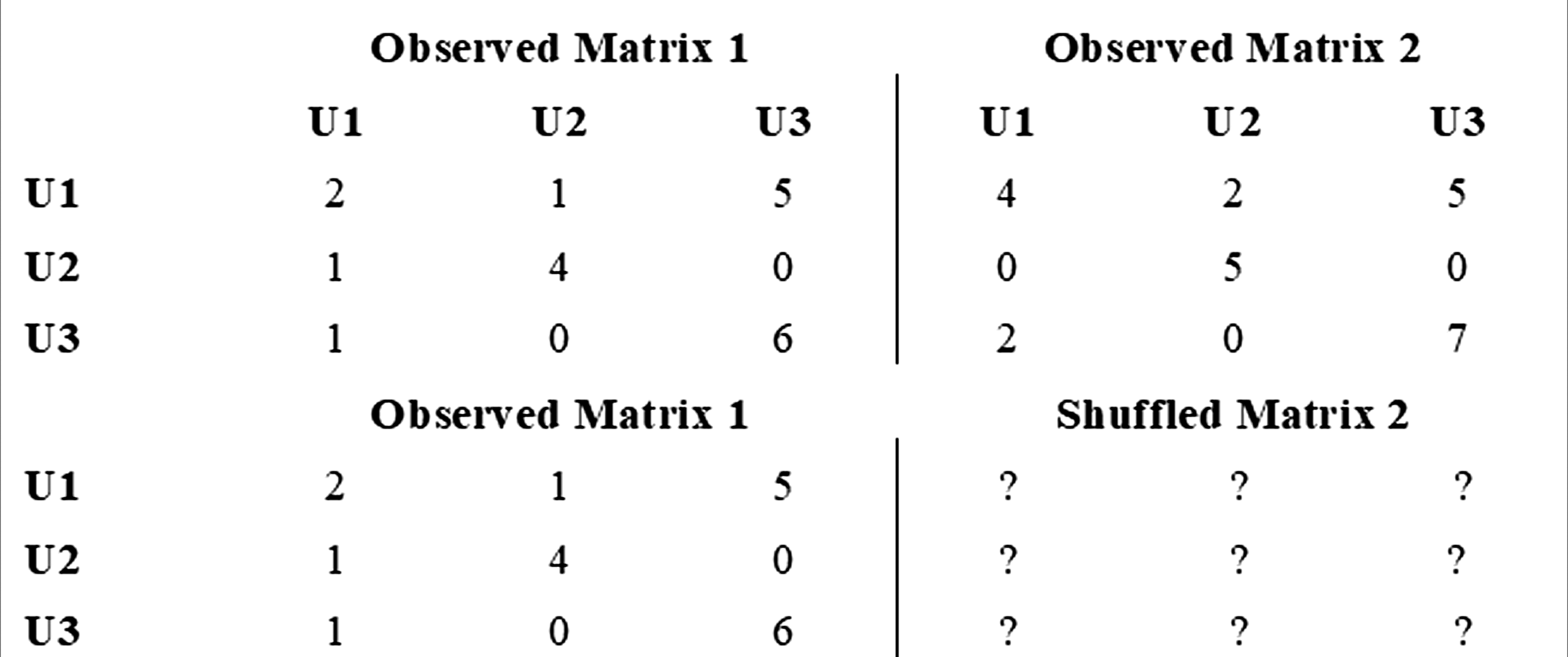
NAQD was programmed to run these random shifts 50,000 times. Moreover, by default, the diagonal of the matrix is ignored for it represents self-selection within each matrix—a default procedure implemented in relational modeling (González Canché, 2023c). After each permutation the resulting correlation coefficient is stored to test for the proportion of times these estimates were larger than those obtained with the observed data.
This rigorous statistical testing integration represents a significant advancement addressing key methodological needs in MMSNA literature. As Schipper and Spekkink (2015) note, balanced SNA requires clear analytical division: quantitative SNA reveals system-level patterns while qualitative data explains underlying mechanisms. NAQD operationalizes this approach by using quantitative QAP tests to identify whether significant differences exist, subsequently guiding qualitative investigation into why these differences occur and what they signify—thereby fostering the meta-inferences advocated by Froehlich et al. (2020).
Feature Engineering
Recall that NAQD handles two-mode networks comprising actors (first mode) and codes (second mode). Since QAP requires symmetric matrices, a transformation or network projection becomes necessary. Breiger’s (1974) seminal duality work demonstrated that two-mode networks can be projected as one-mode matrices using matrix algebra.
This needed transformation is obtained as follows. First the two-mode network needs to be represented as a two-mode matrix, wherein the number of rows counts the number of actors and the number of columns contains the number of codes. This process renders a set of matrices in the form 
In this transformation,
Thus, the matrices derived from qualitative data constitute one-mode representations of the original actor-code networks. Figure 4 displays all one-mode transformations, showing each matrix accounting for 26 codes within respective sub-networks (one per group). Ultimately, this transformation produces four 26×26 code matrices—one for each participant group—derived from interview data. Instead of using these one-mode projection like in epistemic network analysis (ENA), NAQD uses this statistical information to test whether experiences varied across groups based on attributes of interest for qualitative and mixed methods researchers. Projected one-mode matrices
Application
This section presents a reproducible case study applying NAQD to data from a project on teacher training at Minority Serving Institutions (MSIs). We detail each analytical step and provide the dataset, enabling researchers to engage directly with NAQD.
Data
Actors' Code Production Activity by Roles (complete distribution of Table 1)

Code Distribution by Roles

Table 4 reveals several instances where specific groups produced no codes for particular categories. For example, faculty-administrators provided no text labeled “Community Service,” students omitted “Cost of Program” and “Retention,” and administrators did not mention “Cohort Model” and “Experience being a minority teacher.” Since NAQD requires square matrices (as discussed previously), these absences are retained in all projected matrices as zero values, which preserves relational structure without compromising data integrity.
Research Questions
1. How do faculty, administrators, faculty with administrative functions, and students conceptualize and prioritize the most important issues affecting teacher education programs at MSIs? 2. How does emphasis on these issues vary when qualitative data are analyzed according to respondents’ roles and functions within MSIs (i.e.,student, faculty, administrator, faculty-administrator)? 3. Is there evidence that participants prioritize certain qualitatively coded issues differently based on their MSI roles and functions?
Findings
RQ1: Aggregate Conceptualization and Prioritization of Issues
The two-mode sociograms were analyzed following central actors principles. Figure 5 shows the aggregate network representation of all 887 connections across 26 interviewees and their 26 codes. Note that the interactive version of this Figure can be found at https://cutt.ly/8rikqLil. As stated above, in this representation the width of the links represents a measure of strength of the relationship between actors and codes. For example, taking ID13 and the code “Campus Environment” indicates that this actor mentioned text classified under this code a total of 15 times, which represented 22.7% of this actor’s contributions. In clicking on the node ID13 we can also see that he is a man, who served as a faculty with administrative roles in his campus. Sociogram of aggregate connections (see interactive version here https://cutt.ly/8rikqLil)
In terms of codes’ positions, Figure 5 also shows that the most relevant codes (i.e., hot zones of discussion) were “Challenges,” “Support system,” “Campus Environment,” and “Clinical Work or Student Teaching.” Here we can also see that ID26, ID16, ID20, and ID13 were central actors in this network. But only the latter was classified in another community, as can be seen by its pink color. Notably, four more of these actors in pink (i.e., same community as ID13) were also faculty (ID15), administrators (ID10, ID8), and faculty and administrators (ID6). This community algorithm indicates that these actors may be concerned with similar, if not the same, challenges or experiences, which in this case concerns issues faced by faculty, administrators, and faculty with administrative responsibilities. A complete mixed methods analysis would elaborate more deeply on the meaning of these community detection by elaborating on the codes and the content of the quotes these actors were concerned about.
As stated above, these networks also place codes that are not relevant at the periphery of the visualization (i.e., cold zones of discussion). For example, “Retention,” “Experience attending MSI,” “Experience being a minority teacher,” “Experience being a minority student,” “Mentorship” and a few other codes were non central issues or points of discussion, for only a few actors brought up these issues in their interviews. Notably, we can easily identify the actors who mentioned these issues, in case we want to follow up with them—see actors ID4, ID5, ID22 who mentioned “Experience being a minority teacher” or actors ID13 and ID15 who mentioned “Retention” issues, for example. As Alexander et al. (2019) suggest, interactive reviewability may also be implemented by asking these participants whether we captured their experiences accurately, while comparing and contrasting their position in the network (see also González Canché, 2023d for a discussion on participant validation).
RQ2: Disaggregated Analysis by Participant Role
Figure 6 shows four sociograms, one for each group and each corresponds to a central or key player analysis (Borgatti, 2006) of these two-mode networks.
4
These sociograms resemble the aggregated depiction except for the fact that only members of each of the four groups are analyzed, along with their measures of centrality. As discussed earlier in the study, eigenvector shows that a given unit in the network will be relevant to the extent such a unit is connected to other relevant units in the network. Betweenness centrality will highlight the extent to which a given unit falls in between other units or serves as a bridge between actors or units in this case. This last notion is important as this highlights both interviewees who served as bridges of information as well as codes that connected individuals in this network. Eigenvector will also highlight individuals who were central as a function of providing codes that were also provided by other active individuals in the network. Once more, degree centrality aids to both count contributions as well as to assess how important a relationship with a code is for a given actor. Disaggregated sociograms. HMTL Figure 6(A): https://cutt.ly/GricQWKw. HMTL Figure 6(B): https://cutt.ly/DriOLXrJ. HMTL Figure 6(C): https://cutt.ly/9ricUqEW. HMTL Figure 6(D): https://cutt.ly/zricI5pb
Figure 6(A) only includes the relational information provided by administrators. The interactive version of this figure can be found at https://cutt.ly/GricQWKw. An advantage of these disaggregated analyses is the added clarity in highlighting relevant codes. For example, in Figure 6(A) we can see that the two most important codes were “Support System” and “Challenges.” On the other hand, it seems that for administrators what happens inside the classroom does not have much weight. That is, only two individuals, ID1 and ID10, mentioned “Classroom Environment” and “Curriculum,” respectively.
In the analyses of faculty and administrators we can see that “Support System” and “Challenges” were also important topics, but in addition this group mentioned “Campus Environment” as another relevant topic. In this case, “Curriculum” remained a peripheral topic but “Classroom Environment” was not peripheral any longer. The sociogram for faculty is shown in Figure 6(C), with its interactive version available at https://cutt.ly/9ricUqEW. For this group the most important code was “Support System” but in this case, “Curriculum” became one of the most important codes as well. Moreover, “Pedagogy” emerged as another important code. For faculty the two most peripheral issues were “Experience attending MSI” and “Future Plans,” both with only one mention each. Finally, the sociogram for students is shown in Figure 6(D), with its HTML version available here https://cutt.ly/zricI5pb. In this case, the codes that emerged as the most relevant were “Clinical Work or Student Teaching” and “Inspiration.” Similar to their faculty counterparts, “Experience attending MSI” was a peripheral code, but these peripheral codes also included “Standardized Testing” and “Cohort Model” both with one mention each.
RQ3: Testing for Differences in Prioritization With QAP
Although we can start to see certain patterns and similarities across groups, we rely on QAP correlations to formally test RQ3, which asked whether we have any evidence to suggest that some groups of participants prioritize (or are concerned with) some qualitatively coded issues more than others based on their roles and functions held in an MSI. To address this question, we rely on QAP correlations.
As noted above, when participants’ attributes are considered in the analyses, NAQD will automatically conduct dyadic analyses across all the resulting groups. In this case since we have four groups, the resulting number of comparisons will be six. The results are shown in portable document format (PDF available here https://cutt.ly/ZriYlnEv). In QAP significant results indicate that the two matrices or networks are more correlated than what can be expected to happen by chance alone. This means that the textual contributions that were eventually coded or labeled are shared more frequently than chance alone by actors who belong to the comparison groups being analyzed. When no statistically significant correlations are found, the conclusion is that for those groups of participants being compared, there is a disconnect among their experiences or concerns.
Figure 7 contains all QAP correlations. For context recall that the qualitatively coded dataset was part of a project sponsored by the Kellogg Foundation (see González Canché, 2019). This project focused on the challenges and concerns that Minority Serving Institutions (MSIs) across the country face in terms of their production and training of teachers of color. This dataset, in addition to the (1) administrators and faculty (rho = 0.373***), (2) administrators and faculty-administrators (rho = 0.603***), (3) administrators and students (rho = 0.167), (4) faculty and faculty-administrators (rho = 0.363***), (5) faculty and students (rho = 0.476***), (6) faculty-administrators and students (rho = 0.225). QAP outputs

The observed network correlations (rho) indicated that the concerns of students and administrators and students and faculty/administrators are not shared on a statistically significant level. That is, these groups expressed challenges or experiences that were different at a network structural level. The integrative framework behind NAQD now needs a qualitative analysis guiding how or why this may be by observing the content of the qualitative codes. Hence “qualitative + quantitative = more than the individual components” (Fetters and Freshwater, 2015, p. 116). Note also that the example database also includes the content of the quote and one individual attribute of the actors (gender), which is critically needed to better understand the meaning of those discrepancies in experiences and perceived challenges.
The remaining of the comparisons indicated that administrators, faculty, and faculty with administrative functions statistically shared similar concerns or experiences with the experiences of administrators and faculty-administrators being the most alike (rho=0.603***). Finally, students and faculty also had similar experiences with the second highest correlation coefficient found across tests (rho=0.476***). This means that faculty, by being employed in a college or university do share concerns with administrators; however, by being active in the teaching and learning processes, faculty also shared concerns with students. This is interesting because students and administrators by themselves do not share the same or similar concerns as found in their respective correlations. As stated above, these outputs are a guide to highlight the structure embedded in these qualitative dataset. However, a qualitative analysis is necessary to better understand how these lack of correlations is substantively different in their experiences. In this respect, although the sociograms are useful in starting to guide this qualitative analysis, the understanding of the quotes associated with the codes is particularly relevant in this integrative process, wherein qualitative and quantitative results may lead to deeper and more nuanced understandings and stronger storytelling.
NAQD Outputs
In this section we will discuss all the outputs generated by the NAQD user interface as well as describing in detail all its components. Appendix A presents software access and its architecture. All outputs and supplementary materials are available in the centralized repository: https://github.com/democratizing-data-science/NAQD/tree/main.
NAQD is a user-friendly standalone implementation available in Mac and Windows operating systems that produces the following four outputs: 1. Community Allocation Database: NAQD produces a downloadable database with results of community allocation using spin-glass modeling. When analysts do not include a column containing an attribute for color, the resulting visualization will add the resulting spin-glass communities as colors to identify patterns. This resulting database also offers actors’ role (i.e.,student) and other personal (i.e.,gender) and non-personal attributes (i.e.,community assigned) that may strengthen the sense-making process based on subsequent qualitative analyses. That is, not only did these analyses will have community allocations, but also authors may further analyze whether participants with certain attributes may be more prone to being located in some communities instead of others (either qualitatively or quantitatively—via chi-squared analyses, for example).
The structure of this database is shown in Figure 8—to access this database follow this link https://cutt.ly/ZriTKHXu. This figure contains the ID names, the community ascribed, information about how the color is assigned (in this case the color shown in our sociograms is based on the spin-glass community), and the shape of their nodes (in this case we used gender). In addition, this table contains a cross-tabulation to start gauging any potential relationship. Based on this cross-tabulation, a preliminary analysis of these relationships show that most students (5 of 7) were classified in the sixth community detected. Faculty administrators and administrators were classified in the first and second communities, and faculty were spread out into communities 1, 2, 3, 5, and 6. The latter distribution helps explain why faculty were able to connect with both students as well as administrators and faculty/administrators as well. 2. QAP Analysis PDF: If actors’ attributes were added, as explained earlier, NAQD will also generate a downloadable PDF that includes all combinations of quadratic assignment procedures. This file can be accessed here https://cutt.ly/ZriYlnEv. These combinations will comprehensively test whether actors’ belonging to certain groups (or performing certain roles) share statistically significant similarities regarding their qualitatively gathered and pre-processed information. This PDF output matches Figure 7 and is the result of advanced matrix transformations and management (see Figure 4 as well). Moreover, these analyses in PDF should be added to mixed methods studies as outputs to illustrate the findings of a NAQD study. 3. Aggregated Network Visualization: NAQD will also produce an aggregated network depiction of actors and codes. The colors represented in this depiction are by default based on community allocation, as depicted in the first output described above. However, and adding flexibility to this analytic framework, researchers can easily select actors’ attributes instead, which may help them better understand these relationships. Moreover, this HTML network rendering is fully interactive, which offers measures of strength of the relationships among actors and codes along with information about the total number of contributions made by each actor and their level of influence in this network. For example, when researchers click on a given actor (or institution as in the case of the original study), a measure of influence will be displayed. This measure ranges from 0 to 1, with one being the highest eigenvalue centrality, indicating that this actor was providing codes that other influential actors deemed as relevant (Borgatti, 2006). Classified database with initial cross-tabulations

Additionally, the “No of contributions” information shows how many codes this actor provided as part of the interview process—also referred to as degree centrality. This same information box will reflect the role of this actor and the personal and non-personal attributes they may have. Additionally, the size of each node is weighted by betweenness centrality, or the relevance that actors and codes had in connecting actors to other actors and codes to other codes through actors (Borgatti, 2006). These three centrality measures are estimated at the actor or code level, thus aiding in the identification of key elements in the network (Borgatti, 2006; González Canché, 2019).
The HTML rendering will also provide information when clicking on a line connecting actors to codes. In this case, NAQD was programed to display information about how relevant a given code was for an actor. That is, we will be able to assess the percentage with respect to the total number of contributions that a specific code was provided by each actor. For example, assume actor A provided 10 codes in total, and 8 of them were classified as code j, in addition of the HTML output indicating width differences based on the prevalence of these connections, when clicking in the line, they will see that for actor A, this code represented 80% of her contributions as displayed in the information box “Pct. Edge weight” shown when clicking the lines connecting actors with their codes (see Figure 2, for an example). 4. Disaggregated Network Visualizations: Finally, if actors’ roles were selected during the analysis setup, NQDA will automatically render a disaggregated set of network depictions of actors and their codes. Once more, these networks will be fully interactive and will also display centrality levels and connection relevance as just described. Note that all these HTML outputs are stored locally as standalone files that can be shared with colleagues or posted online—like we did in this study. In this respect, it is always recommended that if posting the results online, all data protection and anonymity of the participants is ensured as much as possible (González Canché, 2025b). In other words, recall that posting the analyses online is completely optional and we should always prioritize the safety, confidentiality, and anonymity of our participants, even more so in this era when data science and interactive visualizations may jeopardize the disclosure of clues that may lead to weaken or destroy the anonymity of our participants (González Canché, 2025b).
Closing Thoughts
NAQD is an integrative analytic framework and software tool designed to unveil the structure embedded in qualitative data by applying network analysis to coded texts. It addresses longstanding methodological calls for greater transparency and rigor in qualitative analysis (Attride-Stirling, 2001) and for deeper integration in mixed-methods research (Froehlich et al., 2020). By providing a suite of features—interactive visualizations, centrality measurement, community detection, and statistical hypothesis testing—within an accessible no-code tool, NAQD moves the field beyond manual, interpretive synthesis toward a more structured, transparent, and robust analytic process. The outputs serve not as an end point, but as a powerful guide to strengthen storytelling, direct deeper qualitative inquiry, and build more nuanced understandings of complex social phenomena, directly answering the call for methodological strategies that combine the analysis of structure, connections, and meaning (Fuhse & Mützel, 2011).
Although all the steps described in this study may be replicated with textual data that was coded or labeled via machine learning approaches, our example focused on qualitatively coded information—for machine learning applications see González Canché, 2023a, 2023d. At this point, please note once more that the NAQD outputs represent a step forward toward the consolidation of our understandings. As such, these outputs are not the end product but a guide that will hopefully serve to strengthen our storytelling and reach deeper and more nuanced understandings.
The NAQD framework is particularly suited for studies seeking to understand how perspectives are structured across different groups within a sample. However, researchers should be aware of its limitations. NAQD provides a powerful static analysis but does not incorporate temporal dynamics in its current form. Furthermore, the quality of the NAQD output is entirely contingent upon the rigor of the preceding qualitative data collection and coding process; the tool reveals the structure of the codes provided to it, and its utility is maximized only when those codes are generated with methodological care and rigor.
NAQD’s flexibility makes it applicable across diverse research contexts, including education (understanding stakeholder perspectives), health sciences (mapping patient experiences), organizational studies (analyzing workplace culture), and community-based research (documenting collective narratives). The framework can accommodate data from interviews, focus groups, open-ended surveys, and social media content, provided rigorous coding precedes network analysis. Reflecting on existing tools, NAQD addresses limitations observed in commercial CAQDAS packages: lack of centrality measures, absence of statistical hypothesis testing, and restricted visualization interactivity. However, NAQD also inherits limitations from its foundational assumptions—most notably, its dependence on coding quality and its current inability to model temporal dynamics. As an emerging framework, NAQD will continue to evolve through user feedback and methodological advances; researchers are encouraged to engage with the open-source codebase and contribute to ongoing development (see centralized repository here https://github.com/democratizing-data-science/NAQD).
Compatible applications of NAQD can be found in GRATIS (González Canché, 2023d) wherein in addition to relying on network analyses, we can incorporate time to observe the evolution of these contributions. From this view, while NAQD does not incorporate time in the modeling strategy, this is not necessarily considered a limitation of the methodological framework, but rather a function of the types of questions and analyses that we may ask. That is, some studies may benefit from the implementation of GRATIS, whereas others may require the use of NAQD, or vice versa. What is more, some studies may benefit from the integration of both GRATIS and NAQD to strengthen the storytelling and address the research questions and meet the study’s purpose.
Before closing, we reiterate that complete NAQD analyses (and GRATIS analyses) will benefit the most by using the outputs discussed herein as guides to be complemented and strengthened via the qualitative understanding of the meaning of the codes being plotted. In this respect it is vital to note that if the coding or labeling process (or the data collection itself) was not conducted with rigorous methodologies or processes, the resulting outputs obtained with NAQD would still carry out this lack of quality and, more importantly, our resulting understandings may lead to biased or incorrect conclusions. It is only when the entirety of the research process is conducted with quality assurance in mind, that analysts employing NAQD will also render useful and potentially relevant results. Our main goal with the free and open offering of NAQD is to provide qualitative and mixed methods researchers with a framework and a tool that is both easy to use and that may help strengthen the analytic process and in doing so, also helping open the analytic black box typical of most qualitative studies.
In sum, by providing a suite of features—interactive visualizations, centrality measurement, community detection, and statistical hypothesis testing—within an accessible no-code tool (see Figure 9 for the software's user interface), NAQD directly answers the call from scholars like Fuhse and Mützel (2011) for a methodological strategy that can systematically combine the analysis of structure, connections, and meaning. As an emerging framework, it moves the field beyond theoretical advocacy for mixed methods toward a practical, robust, and transparent implementation that empowers researchers to not only describe network patterns but also to explain them, thereby achieving the explanatory depth that is the ultimate goal of integrative methodological excellence. Finally, as shown in Figure 10, the NAQD software comes with a data example in case researchers want to replicate our analyses while also offers the possibility of using our own coded datasets, even if we did not originally intend to analyze them using the NAQD framework illustrated in this study. Due to the integration of data science capabilities and interactive visualizations, we reiterate that researchers should always prioritize data protection and confidentiality. If interested in a discussion of how consent for academic research may be obtained when employing techniques like NAQD and GRATIS, please see González Canché (2025c). This author also includes a template that can be used in American and European universities to request consent. NAQD user interface Data handled by NAQD and loading process

Supplemental Material
Supplemental Material - Network Analysis of Qualitative Data (NAQD): An Analytic Framework and Software for Qualitative Data Science Visualization and Hypothesis Testing
Supplemental Material for Network Analysis of Qualitative Data (NAQD): An Analytic Framework and Software for Qualitative Data Science Visualization and Hypothesis Testing by Manuel S. Gonzalez Canche in International Journal of Qualitative Methods.
Footnotes
Ethical Considerations
Ethical approval and informed consent statements were collected. All data has been anonymized and no identifiable information is shared.
Funding
The authors disclosed receipt of the following financial support for the research, authorship, and/or publication of this article: This research was sponsored by grants from the Spencer Foundation and the National Academies of Education. But its content does not reflect those of the sponsoring agencies. All errors remain my own.
Declaration of Conflicting Interests
The authors declared no potential conflicts of interest with respect to the research, authorship, and/or publication of this article.
Supplemental Material
Supplemental material for this article is available online.
Notes
References
Supplementary Material
Please find the following supplemental material available below.
For Open Access articles published under a Creative Commons License, all supplemental material carries the same license as the article it is associated with.
For non-Open Access articles published, all supplemental material carries a non-exclusive license, and permission requests for re-use of supplemental material or any part of supplemental material shall be sent directly to the copyright owner as specified in the copyright notice associated with the article.