
Abstract
The open government data (OGD) movement claims to contribute to transparency and increased citizen understanding of government action. However, the literature so far shows these goals are not being reached, as ‘common’ (non-expert) citizens fail to access and understand OGD. This research makes an empirical contribution to this debate through a design experiment in the form of a field lab with a governmental agency, data visualization experts, and non-expert citizens in the Netherlands. In this field lab, the current practice of disseminating OGD by a regional water authority on the issue of drought was redesigned based on non-expert citizens’ needs. Our findings show that non-expert citizens prefer data storytelling techniques over OGD portals or traditional OGD visualizations such as graphs or dashboards. This is informative for the current shift from OGD geared at expert users, to OGD geared at fostering effective transparency with non-expert users. We also build on existing research to develop new evaluation criteria for OGD visualizations, and find that completeness and usability seem more important than objectivity in disseminating OGD with non-expert citizens when communicating about complex policy problems.
Points for Practitioners
Though online portals and dashboards remove generic barriers for non-expert citizens to access OGD, data storytelling can be a more powerful tool to communicate about complex issues and foster actual understanding of OGD
There is a renewed trade-off between evaluation dimensions of OGD dissemination for non-expert citizens (compared to expert users): completeness and usability are more important than objectivity (as in presenting data ‘neutrally’)
Though the single OGD user does not exist, and the group of non-expert citizens is heterogeneous in their needs and preferences, governments can greatly benefit from collaborating with citizens in innovation labs and storytelling experiments.
1 Introduction
Open government data (OGD) has traditionally been understood as “non-privacy-restricted and non-confidential data, produced with public money and made available without any restrictions on its usage or distribution” (Janssen et al., 2012, 258). It is associated with a multitude of economic, political and social goals (Buttow & Weerts, 2022; Janssen et al., 2012; Mergel & Desouza, 2013). Among these objectives, OGD has also been proposed as a regulatory tool, where information can be deployed strategically to empower citizens, as well as to encourage adherence to public policies (Baldwin et al., 2012). In line with theories on government transparency, it is assumed that sharing data on societal issues with citizens should increase their understanding of these issues, as well as potentially improve citizen participation and their ability to hold officials accountable (Meijer et al., 2012; Ruijer et al., 2017).
While the well-accepted definition of OGD might suggest that no citizen is excluded in advance from using OGD (‘by anyone for any purpose’), it is a myth that every constituent can make use of open data (Janssen et al., 2012). In practice, the reusability and interpretability of OGD is limited to those with the statistical and analytical skills to process and interpret these ‘raw’ data(bases) (Gil-Garcia et al., 2020). Moreover, in some cases the necessary conditions for (re)use and interpretation (even by highly skilled individuals) are not met, rendering OGD de facto unusable for any citizen (Wang et al., 2019). Therefore, this ‘raw’ access to OGD misses much of the potential for data to act as a conduit for citizen understanding of government policy.
Starting from this political or regulatory objective of OGD, “the provision of open data requires a transformation from treating open data as an end in themself — openness for the sake of openness — towards open data as a means for accomplishing a broader open government agenda of citizen inclusion and participation in decision-making” (Sieber & Johnson (2015, 2)). In particular, this reorientation towards democratic accountability and public participation requires considering the ‘common citizen’ or ‘non-expert citizen’ as user of OGD (van Maanen, 2023b) and rethinking the way in which OGD are disseminated, e.g., through data visualization.
However, research on the dissemination of OGD to common citizens and the evaluation thereof is still in its infancy. Ansari et al. (2022, 13) identified four key gaps that future research should focus on: (1) more qualitative studies and needs assessments to inform future tools on OGD visualization; (2) including usability evaluations when developing OGD visualizations; (3) enhancing usability evaluations by testing visualizations with diverse OGD stakeholders; and (4) exploring the usefulness of new visualization practices such as data storytelling. In this study we take up all four goals by answering the following research question: How can data dissemination be designed such as to increase non-expert citizens’ understanding of OGD? Here, citizen understanding of OGD is considered a necessary first step in achieving citizen engagement with OGD, to be followed ultimately by citizens’ independent use of OGD (Chokki et al., 2021).
We answer this question by conducting a design experiment in the form of a field lab with various employees of a regional water authority, data visualization experts, and non-expert citizens in the Netherlands. Field labs are experimental settings to foster innovation (Dekker et al., 2019; Waardenburg et al., 2020). In our field lab, we redesigned the water authority's dissemination of OGD on the topical issue of drought with non-expert citizens as target audience. Drought is an especially important issue to address in a field lab because it is a key societal challenge on both a global and a local level. Moreover, the issue of drought is a multi-faceted, technically complex, and politically sensitive issue, which makes it challenging to communicate about (van Maanen, 2023a).
2 OGD and its Dissemination Towards Non-Expert Citizens
2.1 Shifting Target Audiences and Forms of Dissemination
OGD has been anything but a static concept (Tai, 2021). Instead, a continuous evolution of OGD can be witnessed, especially with regard to the target audience or user of OGD. Initially, OGD was presented as part of ‘new open government’, a response to ‘old open government’ (or ‘pre-OGD’) with its traditional focus on the right to information, especially exercised by journalists and NGOs, and on corresponding freedom-of-information (FOI) legislation (Moon, 2020; Noveck, 2016). Unlike FOI, OGD aimed at disclosing ‘raw’ data proactively on government data portals (also referred to as ‘data over the wall’ (Sieber & Johnson, 2015)), and presumed citizens to be active users and producers of data (Moon, 2020) This ‘OGD 1.0’ is currently evolving into ‘OGD 2.0’ (or a ‘third wave’ of open data), which seeks to engage with data users, to contextualize data for users and to make data “more consumer-friendly” through interesting and accessible data visualizations (Begany & Martin, 2020; Verhulst et al., 2020).
In line with this evolution of OGD, a distinction between direct and indirect users has been proposed (Safarov et al., 2017; Van Loenen, 2018). Graves and Hendler (2014, 83) introduce a further distinction between types of OGD users: Government Data Provider, Government Data Consumer, Researcher/Journalist, Civil Programmer, and Common Citizen, defining the Common Citizen as “the large majority of the population that eventually may consume data via an application, a visualization or a report, but it is not directly involved with OGD”. With the transition from OGD 1.0 towards OGD 2.0, this indirect or end user of OGD has clearly entered the spotlight (Ansari et al., 2022; Begany & Martin 2020).
Furthermore, when moving to the non-expert citizen as user of OGD, the form in which data or information are disseminated, is an important factor to consider (Dourish & Mazmanian 2013). These forms cover a wide spectrum, ranging from publication of ‘raw’ datasets on data portals to interactive information dashboards. OGD portals often feature comprehensive machine-readable datasets that can be explored through advanced tools that allow for sophisticated analyses. These portals are sometimes made more attractive to non-expert users by including colourful maps, charts, graphs, and (interactive) dashboards to visualize the data and facilitate its understanding (Chokki et al., 2021; Simonofski et al., 2022). Still, all these forms of data dissemination have in common that the published datasets in OGD portals are the starting point and that visualizations are a derivative thereof.
The review of Ansari et al., (2022) shows that although many different visualizations have been developed over time, they still might run short when citizens lack contextual information to understand these visualizations. In our field lab (as discussed further in Section 3), the non-expert citizens explicitly expressed an interest in visualizations that went beyond graphs and dashboards (and therefore beyond the OGD portals). This led us to the nascent research on the use of storytelling techniques in data visualization (Ansari et al., 2022; Smith, 2013). Storytelling is usually understood as the art of using language and other communicative abilities to enhance traditional data visualizations (Echeverria et al., 2018; Lund, 2022). Storytelling might be necessary where providing visualizations like charts and tables is deemed insufficient to adequately comprehend what information is being conveyed (Knaflic, 2015). In fact, the narrative or story that is central to data storytelling, provides context and complements the data visualization (Lund, 2022). At the same time, however, storytelling requires additional work and resources from government organizations on top of merely disclosing data (Zuiderwijk & de Reuver, 2021).
2.2 Evaluating OGD Dissemination for Non-Expert Citizens
Evaluating a particular type of OGD dissemination (e.g., a visualization) is a next key topic to consider. As OGD 1.0 started with the needs of expert users, much emphasis has been put initially on quality dimensions of the ‘raw’ datasets, resulting in general evaluation criteria such as complete data sets (no missing data), data quality and accuracy, traceability, currentness, expiration, compliance, and interoperability (OECD, 2011; Vetro et al., 2016). Shifting away from this data-centric assessment of OGD dissemination, the user needs of non-expert citizens have to be taken into account.
For specific forms of OGD dissemination, in particular OGD portals, sets of evaluation requirements have been developed such as an export feature, feedback mechanisms, and a wide variety of datasets (Simonofski et al., 2022). However, these requirements do not apply straightforwardly to other forms of OGD dissemination, e.g., OGD storytelling. As such, uniform criteria to evaluate OGD dissemination for these users are still lacking (Ansari et al., 2022). It is nonetheless fruitful to develop more standardized measures of usability for OGD visualizations that can be applied broadly across settings to develop more generalizable insights.
One way to do so is to build on existing general criteria for evaluating government transparency, intended to improve citizen understanding. Without being exhaustive, three core dimensions of government information have been put forward in literature on government transparency: completeness, objectivity, and usability of government information (Grimmelikhuijsen et al., 2013, 576; Porumbescu et al., 2017). Completeness refers to whether the information being disseminated presents the public with “all relevant information needed to understand the subject-matter”. Objectivity (or ‘colour’) means that the “disclosed information does not exaggerate the benefits (or drawbacks)” of the subject-matter. Usability refers to the notion that information is “made public in a way that helps citizens understand” the subject-matter. These three dimensions are agnostic with respect to the form in which government information is being presented (dataset, data portal, visualization, textual story, etc.), and for that reason, allow for comparison between different ways of presenting government information to citizens.
These criteria create several expectations for OGD visualization, that will be worth exploring in the field lab. Sharing OGD in a ‘complete’ way on a certain policy problem would mean combining various datasets, potentially from multiple actors. This means that to communicate OGD in a ‘complete’ way, cooperation between these actors is needed, or at least the exchange of data (Kalampokis et al., 2013). Sharing OGD in an ‘objective’ way raises the common questions of what it would entail to neither 'understate' nor 'exaggerate' specific dimensions of policy problem (Peters, 2005), and most importantly, from whose perspective. Though quantitative (open government) data carries a connotation of objectivity, research has shown it rarely is (Bevan & Hood, 2006; Desrosières, 1993; Gitelman, 2013). This does not only relate to data on policy instruments adopted by governments, but also to data on the underlying policy problems or societal issues which these instruments seek to solve (Peters 2005). Finally, while the definition of ‘usability’ is related to 'understanding' by citizens, this concept is underdeveloped. There has been very little public administration research that sheds light on what makes some forms of government information more understandable than others (Porumbescu, 2015).
3. Methodology
3.1 Research Strategy: Field Lab
Recent design science research has advanced our understanding of the value of design thinking and using the design process for public policy innovations (Bason, 2017), such as improving the dissemination of OGD. Design thinking is thus useful to answer our research question. We conducted a field lab to follow and evaluate this design process. A field lab is a “collaborative platform for research, development and experimentation in a real-life setting, based on specific methodologies and tools” (Gascó 2017, 91). As Gascó (2017), Ruijer and Meijer (2019), and Waardenburg et al. (2020) show, field labs have grown to emphasize the needs of citizens. They provide an opportunity for public organizations to meet with citizens and other organizations to experiment together and are therefore adequate for tackling organizational barriers and identifying citizens’ needs with regard to OGD dissemination. They also incorporate a formal way of evaluating the final prototype with participants (through a final field lab session), which is often missing in research on OGD visualization.
We followed Hevner's (2007) three cycle approach of relevance, design, and rigour, to design science and integrated this with Mintrom and Luetjens (2016) five phases of design processes: empathetically observing the target group (P1); exploring the problem (P2); canvassing possible solutions (P3); developing a prototype solution (P4); and testing the prototype with the target group (P5). The research design was approved by the ethics review board to comply with requirements of privacy (GDPR), ethics and data management.
Firstly, in the relevance cycle (P1, P2, P3), we identified the problem of OGD dissemination towards non-expert citizens. We explored the context, stakeholders, and their needs and challenges. In a first (online) session with participants, we observed the target group (non-expert citizens), explored the various problem definitions of the selected issue (see 3.2), discussed the current communication forms of the participating water authority (whether or not with OGD), and canvassed possible alternative communication strategies and forms for disseminating OGD, emphasising the needs of the non-expert citizens to understand OGD.
Secondly, in the design cycle (P4), the participating data experts created an artifact to improve OGD dissemination. The regional water authority collaborated with the visualization experts to design this prototype solution (P4a). Due to issues with data quality, the prototype was not ready by the second session. As such, in the second session with common citizens, the design experts presented a more abstract idea for visualization on which government employees and citizens provided feedback (P5a), resulting in a more clearly specified design request for the prototype. Phase four was repeated (P4b), and an intermediate meeting was scheduled between the visualization experts and water authority to discuss and resolve the occurring data issues.
Finally, in the rigour cycle (P5), we evaluated the designed artifact with the field lab participants along the dimensions of completeness, objectivity, and usability. A third and final session of the field lab was organized to repeat the fifth phase (P5b), where government employees and citizens provided feedback on the final prototype. The design artifact was evaluated in two stages (specifications and final product). During the different field lab sessions each member of the research team took notes, which were discussed with the team afterwards during reflection meetings. An overview of the different steps in the field lab can be found in Figure 1.
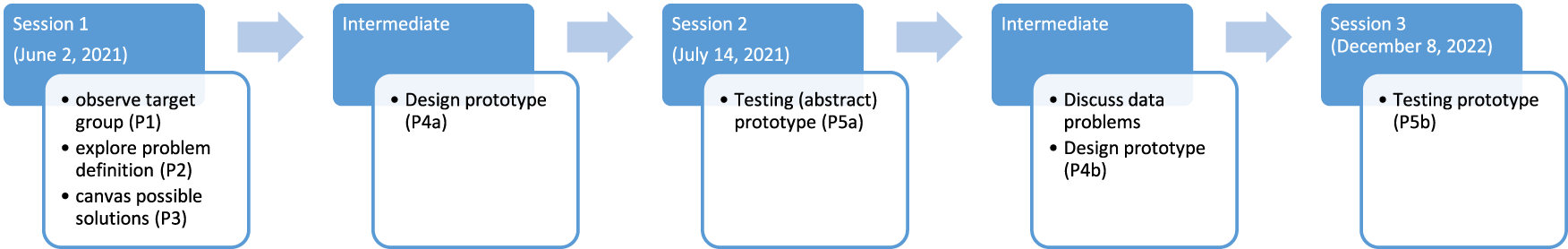
The different steps in the field lab.
3.2 Case and Data Collection
The goal of this field lab was to design a prototype artifact that helps common citizens understand the water authority's OGD relevant to drought. This case was selected based on both relevance and accessibility (Ruijer & Meijer, 2019). Drought is a key societal issue globally, but especially in the region of the water authority involved, thus especially relevant for non-expert citizens. This case provides a rich and meaningful context to study how OGD can be visualized for and shared with non-expert citizens, and how the dimensions of completeness, objectivity, and usability can be operationalized to evaluate this form of OGD dissemination.
We collaborated with one of the 21 regional water authorities in the Netherlands. These water authorities are regional government institutions responsible for managing water resources within a specific geographic area. The water authority's current data communication and visualization mainly takes place in two different ways: (i) via a data portal, where anyone, after registering, can access any ‘raw’ dataset collected by the water authority, and (ii) via a website containing data visualizations (so-called ‘story maps’) and some underlying datasets in csv files (see annex 3). Whereas the former form of data presentation could be seen as an example of ‘data over the wall’ (Sieber & Johnson, 2015), the term ‘story’ in the latter form is somewhat misleading as these visualizations do not contain any type of explicit narrative.
The participants of the field lab (twelve in total) were three employees of the water authority, two data visualization experts, three researchers, and four citizens (see overview in Table 1). In selecting the different participants, we took in mind the small-scale experimental size of a field lab (Waardenburg et al., 2020) and the five different profiles of OGD stakeholders identified by Graves and Hendler (2014), as they all play a distinct role in the design of new forms of OGD dissemination: (1) government data provider; (2) government data consumer; (3) researcher/journalist; (4) civil programmer; (5) common citizen.
Participants in the Field Lab.
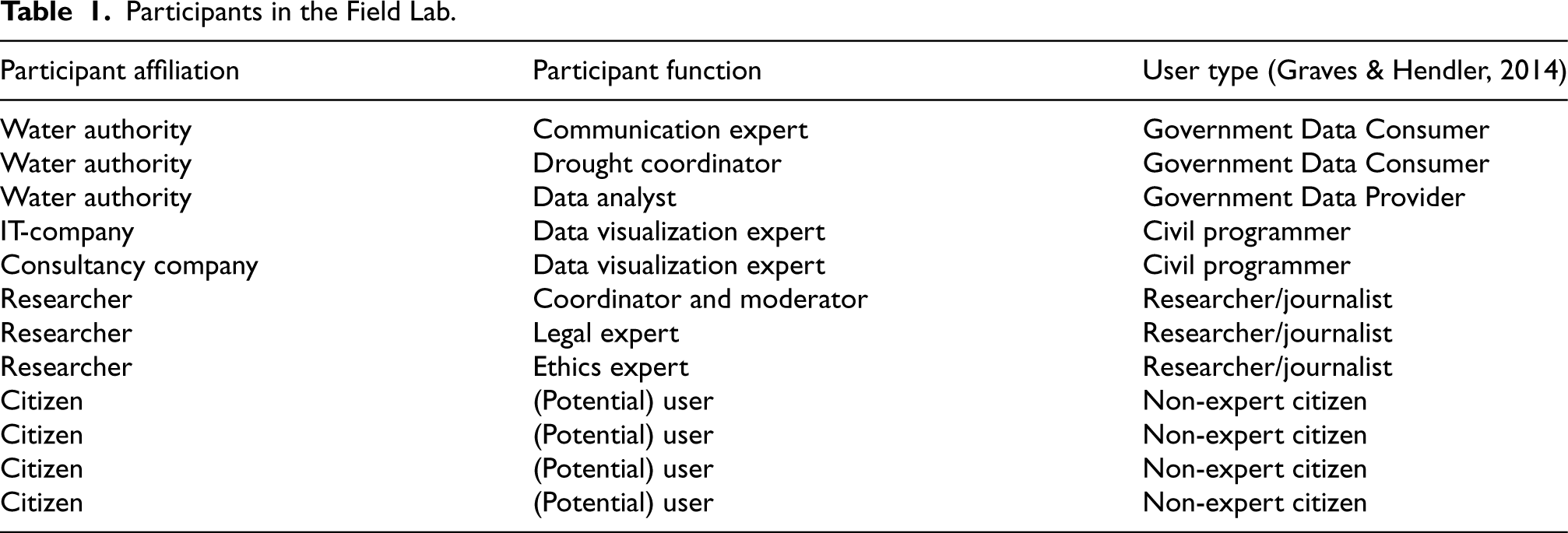
The employees of the water authority as both data provider and data consumer, brought in expertise on the data being shared and the current communication strategy. The data visualization experts as civil programmers were in charge of processing and visualizing the OGD into a prototype. The role of the researchers involved was to coordinate and moderate the discussions between the other participants, as well as to bring in relevant academic expertise. One member of the research team was appointed to challenge analyses and conclusions to prevent groupthink, as per the quality criteria for conducting field labs (Dekker et al., 2019). Finally, also following the guidelines by Dekker et al. (2019), non-expert citizens from the water agency's territory were included in the field lab, as they were the target audience in this field lab of new ways of OGD dissemination. An open invitation towards citizens was shared on social media by the researchers and the water authority, and citizens were selected to vary in statistical literacy (two yes, two no), knowledge on drought (two yes, two no), age (range from 25–65), and gender (two men, two women).
3.3 Data Analysis
The sessions of the field labs were recorded and transcribed verbatim. One author used AtlasTi software to code and analyse the data systematically. The coding was discussed among all authors, based on their own observations and notes during the different sessions of the field lab, and several amendments were made. To stay close to the experience of the respondents, we first used open emergent codes. Following Bowen (2006), we then grouped codes together under overarching axial codes (completeness, objectivity and usability). The full coding tree can be found in annex 1. The operationalization of the axial codes can be found in annex 2.
4 Results
4.1 Completeness: the Struggle to Paint the ‘Big Picture’ Problem
Communicating in a ‘complete’ way means presenting citizens with all relevant information on the policy problem. But what is drought in the first place? For citizens, drought evoked notions of joyfully sitting outside under a clear sky, garden grass turning brown, and fish dying in dried up ponds. For the water authority, drought was a far more multi-layered concept – with distinctions made between meteorological drought (the absence of rain), agrarian drought (moisture deficiency in the soil), and hydrological drought (shortages in ground water). For the water authority, it was important that citizens became aware of why this final layer of hydrological drought is a big problem. That means not just sharing data about how much rain has fallen, but also what current ground water levels are and why this is important to monitor. All this information, and more, would be necessary to provide a ‘complete’ image of the issue of drought, which demonstrates how complex this problem is in practice.
The water authority wanted to focus their communication on what citizens could do themselves with respect to drought, e.g., wasting less water. Midway through the discussion a participant noted that citizens were not the main culprits in the ongoing drought problem, but farmers who were watering their fields. Citizens wanted to see the bigger picture of what and who was causing drought. But this turned out to be challenging for several reasons. Firstly, the water authority explained that drought is such a complex, multi-actor issue that it can only tell part of the story, because the data, competences, and responsibilities regarding water management are dispersed across many (governmental and non-governmental) institutions. An employee said: “As water authority you have the idea that you can say something about a part [of drought], but that you cannot tell the total picture. Because you depend on other partners.”
A second and related barrier to completeness was the lack of data interoperability. Citizens were interested in seeing relationships between datasets that could provide a bigger picture of drought. But because the competences and responsibilities regarding water management are dispersed, a lot of the data are kept in silos across a multitude of agencies. However, even the data that the water authority had at its own disposal, was not immediately suitable and ready for use. A big struggle in the field lab, that also led to serious delays in the design process, was a lack of compatible and interoperable datasets. An expert said: “The biggest issue now is that there is no common denominator in the data. So, I cannot see which level water pipe is in which municipality. The databases also use different numbering so you cannot relate them to each other. None of the different files can be connected.”
Finally, the water authority was hesitant to start comparing the role of agrarians, citizens, businesses, and others in causing drought. While they on the one hand argued they did not have enough high-quality data to really explain these intricate relationships, they also wanted to avoid publicly putting the blame to either of the implicated actors for the lack of water in the area; which highlights the political dimension of the policy problem.
4.2 Objectivity: the Right Interpretation and Model Realities
Objectivity is about providing information to citizens without colouring it in a positive or negative way. During the field lab, there were a lot of discussions about how to interpret data in the ‘right’ way. As one employee said: “You could just say these are the water levels, form your own opinion about them with your own context. But really, you need the context. You can show a graph that goes into the red, but there is a story behind that. How come it is in the red? If you do not tell that story, people might draw the wrong conclusions.”
Thus, the numerical values on ground water levels or rainfall, as made available in csv files in the water authority's data portal, need to be contextualized to depict and understand the bigger issue of drought. Communicating about drought proved to be more than just creating an ‘objective’ graph and posting the visualization online. Providing opportunities for citizens to ask questions about data turned out to be indispensable for citizen understanding. A discussion during the final field lab session exemplified that the true value of opening up government data on societal issues lies in communicating with citizens about how to interpret this data. When the data visualization expert was showing the final prototype of data visualization (see 4.4), which included a red line depicting precipitation deficit data (Figure 2), an employee reacted: “This [red line] looks constant, so you think nothing is going on, and that is not the message you want to spread. That is why you need to help [citizens] so much with the interpretation. (…) A few millimetres makes a big difference. You are not shocked, because you think ‘well millimetres, nothing going on’. I am missing the urgency of ‘there is a problem’”
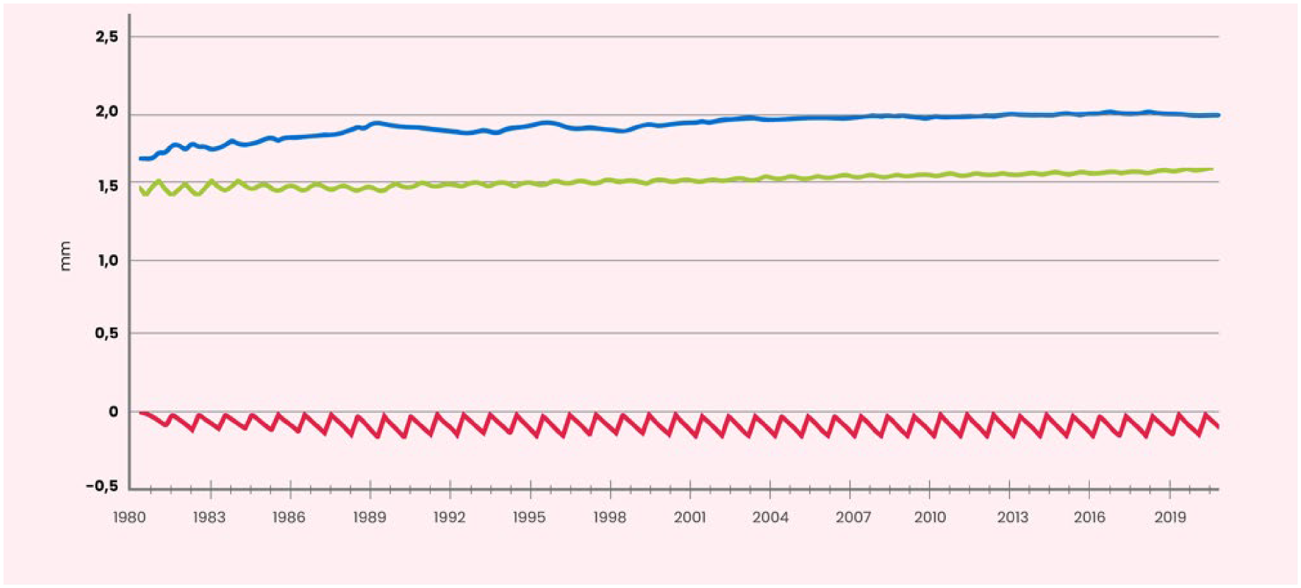
[Excerpt from scrolly, see annex 4]: Rainfall (blue line), evaporation (green line), and precipitation deficit (red line).
There was a fifteen-minute discussion about what this red line meant. It later turned out that in the raw datasets (see annex 3), every year the data on precipitation deficit was reset to zero, for administrative reasons, so a cumulative effect over years was not visible in these data. But even if these data would be aggregated to account for the cumulative effect over years, the resulting picture (a steep red line downwards) would not coincide with citizens’ experience that drought is a problem of recent years only. The water authority explained that one of the reasons that drought has not been so dramatic for a long time, is because of its policies over the last thirty years to compensate for precipitation deficits (which were now reaching their limits). Ultimately, it was only at the end of this conversation that all participants in the field lab had a better understanding of what this red precipitation deficit line meant, what the magnitude of the problem of drought was and what the (hidden) role of the water authority itself was. The data could not ‘objectively’ speak for itself.
Employees of the water authority also had models to monitor drought. They were hesitant to share these models (next to the collected data) because they felt it was too complex to understand and therefore would create noise in 'objective' communication about drought. Although citizens might expect that sharing ‘objective’ models would be unproblematic, the water authority pointed out that such data are not as straightforward as that, as model outcomes are complex and uncertain: “We need to be careful that we do not end up living in a ‘model reality’. Here's a pragmatic example. I was in [area], in a lady's back yard and there were some court cases going on. And the lady said, it's getting wetter here because of all the measures taken against drought. And I walked into her yard and it was soggy and the bushes were dying because they were flooded. And the models said ‘it's not getting wetter here’. That's a strange conversation to have. The hydrologist that never comes outside just sees his model and that is not getting wetter. But I was standing there and it was soaking wet.”
This quote illustrates that the reality of the model does not need to coincide with the reality of the ‘outside’ world, thereby showing the shortcomings of datasets, even if ‘objective’ in themselves.
4.3 Usability: Between Awareness and Activation of the ‘Average’ Citizen
Usability refers to the notion that government data is shared in a way that citizens can understand it. The water authority wanted to raise awareness about drought, but besides this, it wanted citizens to start taking action to save water. This links to the political and social goals of OGD assuming that, in line with theories on government transparency, disseminating data on societal issues with citizens should increase their understanding of these issues, as well as potentially improve citizen participation or activation. The citizens participating in the lab did not seem to have an issue with being nudged into acting by the water authority. Thus, the citizens engaged in a brainstorm about which form of data would be most ‘usable’ to activate citizens: “What about if we say ‘this year we want to save so much thousand litres of water’. That you set a target, and then use data to see ‘ok, if I do this then I can save ten thousand of the three hundred thousand’. And then you can put a number on things like having a rainwater barrel, or washing your car at a carwash that recycles that water instead of it going in the sewer.”
While the water authority really liked that idea, it was eventually left behind, because the water authority realized they did not have enough adequate data to quantify the effects of such citizen action. They were hesitant to make claims beyond their own data; perhaps also to avoid political debate and adhere to strict evidence-based statements (Boswell, 2018). Ultimately, all participants decided to just focus on creating ‘drought awareness’ with the water authority's data as a first step in citizen engagement, rather than explicitly trying to activate citizens. In other words, the incompleteness of the data also created limitations to data-driven activation of citizens.
The key discussion related to usability was the characterization of the audience. Although the water authority found it important to reach ‘the common, non-expert citizen’, during the field lab the joint conclusion was reached that a single (user) type of ‘non-expert citizen’ does not exist. An illustration hereof is that one citizen suggested a cartoon and simple language, while another noted that they actually really liked graphs, and wanted to see the data too. Eventually, the citizens agreed that they wanted a combination of how information was presented: graphs, but also simple text, and an appealing image. What they all wanted was some degree of governmental guidance; to be told in simple words what precisely they should be looking at in a graph or table, as well as what the key takeaway message from a figure should be. In other words: citizens wanted a meaningful, data-driven story about the underlying societal issue.
4.4 Design Artifact: Evaluating a Scrolly
The sessions in the field lab made clear that the existing forms for OGD dissemination in use by the water authority fell short of creating a clear understanding of the societal issue of drought for non-expert citizens. Based on the input collected during the different sessions of the field lab, the data visualization experts designed a prototype in the form of a ‘scrolly’. A scrolly is a term used to describe a type of data visualization technique that involves presenting information or storytelling by scrolling down a webpage or screen (Mörth et al., 2022). ‘Scrollytelling’ is therefore a particular form of storytelling, which combines scrolling and interactive elements to guide the user through a narrative or a series of visualizations. A printout of our prototype scrolly on drought is included in Annex 4.
Regarding completeness, the prototype combined different existing datasets on precipitation, evaporation, and precipitation deficits to explain how these affected groundwater levels, thereby contributing to drought. In seeing the full scrolly a participant noted “The term drought is used easily, but the story is actually very complex”. Although this was not all the relevant data with regards to drought, citizens felt this scrolly gave them a bigger insight into drought, that expanded their initial ideas on drought, such as ‘drought is brown grass’. The prototype also included information (without data, because that was not available) on the effects of drought (for agriculture, for biodiversity, and for people). This dimension of completeness, seeing OGD combined, was very important to the citizens in our lab.
Next, as far as objectivity is concerned, the explicit choice was made to present a ‘story’ to citizens about drought and its causes and effects. This story was created not only by visualizing different datasets in a particular order, but also by providing more (textual) context to interpret these graphs. The scrolly was the first communication form that contained a message on (the urgency of) the societal issue of drought. Rather than just showing a slowly declining (objective) line on a graph, the scrolly added the (subjective) interpretation that this seemingly small decrease was highly problematic. The citizens really appreciated these more ‘subjective’ textual additions to the ‘objective’ data. As one participant noted: “I saw these few millimetres [increase] in evaporation and without the text I would not realize this was a big deal”.
Moreover, for usability, the scrolly was especially helpful. Rather than just showing the graphs of precipitation or groundwater levels (like in the story maps), these were now accompanied by a textual explanation and simple images, for instance a raindrop for precipitation, along with the text: “The blue line in the graph represents the average monthly precipitation in millimetres. There are different forms of precipitation, such as rain, drizzle, hail, mist, and snow. The line shows a slight increase from 1980, indicating that there has been slightly more precipitation since then. After the rise, the line levels off. Since 2000, the precipitation has remained relatively constant.”
Finally, the scrolly did not show the graphs separately, but brought all the data lines together in one graph, step by step: first showing the line of precipitation, then adding the line of evaporation, then adding precipitation deficit, and then bringing this all together in a graph that showed that these all affect the groundwater level data. Even though the scrolly as such did not call for action, it highlighted the effects of drought, thereby at least sending a message why it is important to act on drought. Participants noted that after seeing the scrolly they had a better understanding of what caused drought, and why this was a problem.
5 Discussion
Firstly, regarding visualization forms, our field lab shows that while government portals and dashboards foster nominal transparency, removing generic barriers to transparency, they do not always foster effective transparency, which requires information being shared in a way that non-expert citizens can process and use it (Hood & Heald, 2006; Ruijer et al., 2020). In particular, the positive evaluation of the scrolly, as a particular form of data storytelling, confirmed the suggestion that engagement with OGD can be further enhanced through the use of storytelling techniques and putting data in context (Ansari et al., 2022). The role of narratives or stories in public policy has been widely discussed in recent years. Sandercock (2010) observed that in response to the marginalizing of stories in social science (in favour of numbers), feminists, historians, and anthropologists have reasserted the importance of narratives and stories, to better understand policies or societal issues. Our findings echo this, arguing that governments perhaps should reassert the importance of OGD storytelling, rather than throwing ‘data over the wall’ in portals. This ties to the seminal work of Rein and Schön (1977) and Stone (2002) who have highlighted that stories are not just accounts of events but can be powerful tools used to communicate complex issues, contextualize problems, and shape how societal issues are understood.
Given the importance of storytelling, our findings stress the need for and attention to the multiplicity of narratives. It is likely that different, even conflicting, interpretations will be offered of policy problems. Government organizations often have a specific interest in OGD. Where data themselves are never ‘neutral’ (Gitelman, 2013), this holds even more for government data that are collected, produced, and disseminated (van Maanen, 2023a, 2023b, p. 30). A ‘neutral’ presentation of the policy problem (independent of the policy instruments) is impossible, as the current state of the problem as exemplified by OGD, is also the result of political choices previously made to tackle that problem. Unilateral narratives might only blur the picture by providing the views defined by those in power (Matheus et al., 2020). This thus raises the question of which interpretation is ‘the right one’ (a key issue in our field lab). Our study shows that the best way out of this conundrum is to reconfigure ‘objectivity’ as a co-creative process between governments and citizens. Where our prototype scrolly is an important first step in governments disseminating OGD in a comprehensible way, non-expert citizens should be given the opportunity to engage with this story, asking for clarifications or providing alternative interpretations along the way, and by doing so also change what are considered to be ‘the data’. In particular, citizens should be allowed to challenge these OGD-driven government narratives with their own data or at least to challenge the government data underlying the narrative Carton and Ache (2017).
Secondly, regarding evaluation criteria for new forms of OGD dissemination, we relied on existing overarching transparency dimensions of government information: completeness, objectivity, and usability (Grimmelikhuijsen et al., 2013; Porumbescu et al., 2017). The coding scheme of annex 1 and 2 used to analyse the field lab sessions provides a useful starting point for further developing and refining evaluation criteria when disseminating OGD to non-expert citizens (Ansari et al., 2022). These findings could be further aligned with lay citizen requirements on specific forms of OGD dissemination, such as on data portals (Simonofski et al., 2022). For instance, despite many of their requirements being specific to portals (e.g., on search engines), one of their requirements, wide variety of information, aligns with our more generic dimension of completeness. To be sure, the quality indicators for OGD 1.0, such as data quality and interoperability (OECD, 2011; Vetro et al., 2016), are still relevant when it comes to OGD 2.0, as they posed important limitations to the ‘completeness’ of our prototype.
Building on this point, our research shows a renewed trade-off between different evaluation criteria of OGD when presenting OGD to non-expert citizens instead of expert users: completeness and usability are evaluated higher, at the cost of objectivity (which was more important for expert users). In particular, some ‘subjective’ interpretation was preferred to just sharing ‘objective’ datasets. Creating a complete overview of the societal issue at stake on the basis of available OGD is a challenge for (single) public authorities, but answers the non-expert citizen's need for a ‘bigger picture’. Also, presenting this bigger picture in simple terms, combined with graphs, rather than merely disclosing the underlying datasets, contributes to the usability of the information.
Thirdly, regarding the OGD ‘user’, our field lab shows that even in a small-scale setting the single end-user does not exist. Differences between non-expert citizens were manifest in the field lab. This does not mean, however, that it is impossible to take those different needs into account when disseminating OGD on societal issues. To some extent, the scrolly was a response to combine different ways of presenting and contextualizing OGD to account for those different needs. Even though storytelling techniques should not be considered a “one size fits all” solution for OGD dissemination, all non-expert citizens were interested in narratives regardless of data literacy. This shows that they are perhaps especially suitable for OGD dissemination surrounding complex issues, such as drought, where portals may be sufficient for less complex OGD topics. Where resources are limited, governments should take the time to consider who their specific group of target citizens is, and what their (data visualization) needs are.
6 Limitations and Avenues for Future Research
Firstly, while the small-scale set-up of our field lab warrants caution for extrapolation of the results too quickly. The experimental character of our design research method, a field lab, brings in clear advantages in developing, discussing and evaluating new forms of OGD dissemination with governments and citizens in a process of co-creation (Waardenburg et al., 2020). Moreover, our field lab allowed us to assess intermediate stages of development (Ansari et al., 2022), which is why a field lab is a valuable strategy for future OGD research.
Secondly, given the paradoxical situation that the government should serve all its citizens, but that the average citizen does not exist, representing ‘the citizen’ in a field lab is a serious challenge. For a field lab to work, a limited number of participants is a practical requirement to maintain active engagement among all participants. Future research could test how new forms of OGD dissemination with citizens, designed in experimental settings such as ours, affect non-expert citizens’ understanding of OGD in a large-N setting.
Thirdly, a common criticism of field labs is that they are ‘one time’ interventions and can have little effect after the fact (Ruijer & Meijer, 2019). But, because field labs concern a real-life setting, there is no end point of the study, only an artificial one, and it is possible to try and produce more long-term effects in government agencies. We tried to take this limitation into consideration by having a clear product (a scrolly) as output of the field lab, which the water authority could use (in amended form) in their future communication strategy. Next, in our separate meeting with the water authority we discussed the key (organizational) barriers faced with the available OGD in developing the scrolly. This was feedback the water authority could also use to inform their long-term data governance strategies.
7 Conclusion
This paper addressed the four gaps in literature formulated by Ansari et al. (2022): (1) Through a qualitative study and needs assessment of common citizens we developed a ‘scrolly’, a data storytelling tool that can inform future tools on disseminating OGD in a meaningful way; (2) We included usability evaluations when developing our data visualization tool as part of our field lab; (3) We enhanced usability evaluations by testing visualizations with diverse OGD stakeholders; and (4) We explored the usefulness of new visualization practices such as data storytelling by developing a scrolly. In doing so, our research provides a tentative answer to the research question how data dissemination can be designed such as to increase non-expert citizens’ understanding of OGD.
This paper is important because it shows that it is necessary to find a balance in OGD dissemination between three dimensions of government information: completeness, objectivity and usability. Different ways of disseminating OGD with different user groups (e.g., data portals for expert users or scrollies for non-expert users) reflect different trade-offs between these three dimensions of government information. In our field lab with non-expert users, the dimensions of completeness and usability gain weight as compared to the dimension of objectivity. The need to draw and see the bigger picture turned out to be central to increase citizen understanding of policy problems. This requires governments to engage in some form of ‘storytelling’ and to make choices in what information to present and in what way to highlight (the urgency of) the policy problem. What is more, this government story should be open to conversation and discussion, thereby reconfiguring ‘objectivity’ as a co-creative process between governments and citizens rather than as a neutral presentation of policy problems through OGD. In any case, it is high time that government organizations move beyond the portal in their OGD visualization.
Footnotes
Funding
The authors received no financial support for the research, authorship, and/or publication of this article.
Declaration of Conflicting Interests
The authors declared no potential conflicts of interest with respect to the research, authorship, and/or publication of this article.