
Abstract
We analyze the relationship between the lung cancer mortality and the indoor radon intensity from the viewpoint of nonlinear mathematics. We conclude that their relationship is governed by the proportionality law where the cumulative lung cancer mortality Y is negatively proportional to the cumulative radon intensity X; or specifically, the nonlinear change of nonlinear face value (qYu – qY) is negatively proportional to the nonlinear change of nonlinear face value (X – Xb).
The author obtained a set of data from late Professor Cohen on the lung-cancer mortality rate versus indoor radon level collected from 1,597 counties and territory of the USA. We initially presented the data as various primitive elementary graphs; then extended them to the primary graphs, leading graphs, and the proportionality graphs. The article emphasizes the building of a straight-line proportionality relationship for the dose-response data in a log-linear and/or log-log graphs. It demonstrates a straightforward methodology for solving the key upper asymptotes (Yu) for the proportionality equation using the Microsoft Excel via determining the “coefficient of determination”. (Note: q = log, Yu = upper asymptote of Y, Xb = bottom asymptote of X)
Keywords
(Symbols: θ = 10; q = log; αβ (extension of XY); ϕ = (0) (nonlinear zero); y = elementary numbers y or equation y; Y = cumulative numbers Y (i.e., cumulative of y).
Introduction
In the past, researchers in life and biomedical sciences do not have reliable nonlinear mathematical concepts for comprehensive understanding and in-depth analysis of the experimental data, resulting in inconsistent data presentations and miss-interpretations. 1,2 They do not even know what the linear numbers is and what the nonlinear numbers is. Typically, the dose-response and pharmacokinetics analysts over used and abused the first order kinetic equation (as exponential equation) and ignored the need to unlocking the nonlinear nature of the experimental data. They also made fundamental mistakes in omitting or disregarding the necessary “origin” or “starting zeros”, including the nonlinear zero. Most analyses wrongfully rely on primitive elementary line charts rather than on the reliable xy scatter charts as solid primary graphs. When comparing 2 variables, they tend to use statistical manipulation and curve fitting with polynomial equations to relate the 2 variables. 1,3,4 This article reveals that when comparing 2 variables mathematically, we need to compare both with the continuous cumulative numbers. That is, we can compare 2 variables graphically with primary graph using the cumulative numbers and mathematically with proportionality equations. The cumulative primary graphs, but not the primitive elementary graph, should be the foundation for all nonlinear data analyses.
We introduce a new extended XY math (named Alpha Beta (αβ) math) concept for graphical expression of the experimental data, along with the presentation of simple mathematical equations having meaningful equation parameters. 5 -10 The Alpha Beta (αβ) math is an extension of the XY math; it emphasizes the association between the XY continuous nonlinear numbers and its associated asymptotes; while the XY math is helpless in addressing the asymptotes relating to the nonlinear numbers. Their difference is XY = {(X), (Y)} and αβ = {α(Y, Yu, Yb), β(X, Xu, Xb)}, where Yu, Yb, Xu, and Xb are the upper and bottom asymptotes of Y and X variables.
Many researchers are new to the Alpha Beta (αβ) math and need to familiarize with several terminologies and phrases to read this article, thus, we will give the following 6 definitions (A to F) and explain the nonlinear concepts in the followings 5 subsections.
Definitions: (A). primitive elementary graphs are the plot of vertical elementary y versus various horizontal X either as column graph or as line chart. (B). Primary graphs are the plot of cumulative Y versus cumulative X. (C). Leading graphs are the graphs having a parabolic curve with continuous changing of the slope. (D). Proportionality graphs are the graphs with a straight line expressible as a proportionality equation. (E). Nonlinear face values are the measurement of variables relative to their asymptotes. (F). “Nonlinear change” or “change” in reading proportionality graphs, see Appendix B.
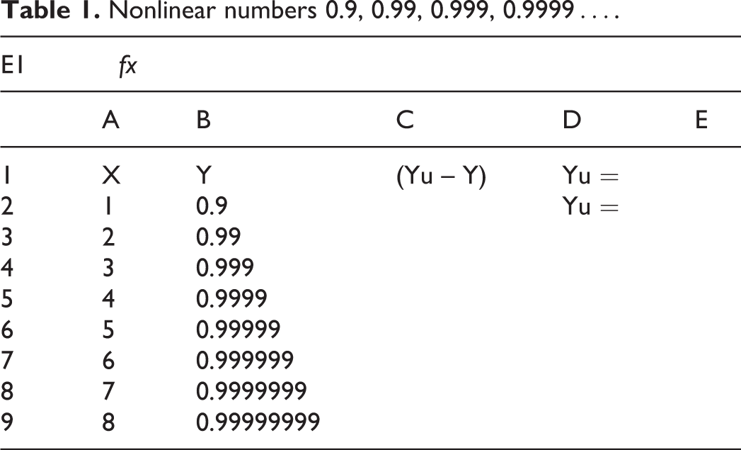
Subsections: (1). we need to understand what the continuous numbers is. The continuous numbers is (are) the non-terminating numbers with continuity. (2). there are 2 types of continuous numbers: linear and nonlinear continuous numbers. We define the linear continuous numbers as the numbers with equal spacing and having a linear zero that we can touch and cross over, such as…, -4, -2, 0, 2, 4, 6. 8, 10…Where the spacing between the numbers is 2 and they have a 0 that can be touched and crossed over between the negative numbers and the positive numbers. We define the nonlinear numbers as the numbers with non-equal spacing between numbers and are associated with 1 or 2 asymptotes, such as…, 0.3, 0.33, 0.333, 0.3333…, and…, 0.9, 0.99, 0.999, 0.9999….
(3). the traditional XY math is wrong to write 1/3 = 0.33333…or 1 = 0.9999…because 0.33333…is dynamic that is moving forever and 1/3 is static and is an asymptote of the nonlinear numbers. A static cannot equate to a dynamic, we cannot violate the Newton’s Law. The use of the equal sign “=” is one of the basic flaws of the traditional XY math. The asymptote 1/3 is never a part of the nonlinear numbers 0.33333…If we like, we can write 1/3 ∼ 0.33333…or 1/3 → 0.33333…to relate the asymptote and the nonlinear numbers, but not an equal sign “=.” Likewise, 0.9999…is dynamic that is moving forever and 1 is static, we cannot equate a dynamic to a static. For thousands of years people never bother to understand what is the relationship between a continuous nonlinear number and their asymptotes. Readers can read more examples in the reference.
9
Here, let us use the nonlinear numbers Y with
Nonlinear numbers 0.9, 0.99, 0.999, 0.9999…is a 1-sided nonlinear number, it has an upper asymptote Yu, Yu = 1. We will compare the change of this nonlinear numbers with the change of universal linear numbers Ul (Ul = 1, 2, 3, 4, 5, 6, 7…) and check whether the number 1 is the unique asymptote of the nonlinear numbers. However, before the comparison, let us explain the universal linear numbers and the universal nonlinear numbers. The universal linear numbers Ul is trivial and is known to all human being. For the universal nonlinear numbers, we use the symbol U
n
. The most important nonlinear numbers is…10-3, 10-2, 10 -1, 100, 101, 102, 103, 104…. This U
n
has a nonlinear zero as its bottom asymptote. No matter how large the negative of the power of 10, e.g. 10-100, 10 -10000, or 10-1000000, these numbers has continuity (Axiom I) and are approaching a nonlinear zero which can be approached but cannot be touched (Axiom II). Since the number 10 is extremely useful and will be used extensively, we introduce a symbol θ to represent 10, i.e. 10 = θ. Accordingly, the universal nonlinear numbers U
n
=…10-3, 10-2, 10 -1, 100, 101, 102, 103, 104…is also written as U
n
=…θ-3, θ-2, θ-1, θ0, θ
1
, θ
2
, θ
3
, θ
4
…or U
n
= θ ^ U
l
, or
In Table 1, let us input the universal linear numbers in Column A as X and the nonlinear numbers in Column B as Y, as shown in Microsoft Excel Screen. In the Screen, we reserve Cell E1 for imputing an
Nonlinear numbers 0.9, 0.99, 0.999, 0.9999….

(A). Primary graph, also. a Leading Graph. Y vs. X in linear scale. (B). Pre-proportionality graph. (Yu − Y) vs. X in linear scale. (C). Proportionality graph. q(Yu − Y) vs. X in log-linear scale. (C-1). Proportionality graph. q(Yu − Y) vs. X in log-linear scale. Yu = 1.0000001. (C-2). Proportionality graph. q(Yu − Y) vs. X in log-linear scale. Yu = 1.00001. (C-3). Proportionality graph. q(Yu − Y) vs. X in log-linear scale. Yu = 1.000000001.
Next, in Table 2, let us input “1” into Cell E1, followed by calculating (Yu – Y) in Column C. In Cell C2, we input “=$E$1 – B2”, then copy Cell C2 to Cell C3 through Cell C10, as shown in Table 2. By plotting Column A versus Column C for (Yu – Y) versus X, we obtain Figure 1B in linear by linear scale; this is a pre-proportionality graph; it is also a transitional graph, because we will convert the vertical axis into final nonlinear logarithmic scale in the next step.
Nonlinear numbers 0.9, 0.99, 0.999, 0.9999…(cont.)

We copy Figure 1B into Figure 1C and converting the vertical axis into logarithmic scale. Then followed by right clicking on data series and selecting “Add Trendline”, and then selecting “Exponential” from Trendline Options, we also selecting “Display Trendline” and “Display R-squared”, then click Close. We obtain Figure 1C. The coefficient of determination is R2 = 1, indicating that Yu = 1 is the perfect choose as the upper asymptote. How do we know this is the perfect asymptote? Let us try out with some other numbers.
Let us pick a number slightly larger than 1, say, 1.0000001, and input 1.0000001 into Cell E1, as shown in Table 3. Figure 1C will turn into Figure 1C-1, where the data line strays from the straight line and R2 reduced to 0.9603. When we change the number into 1.00001 and input 1.00001 into Cell E1, we obtain Figure 1C-2 and R2 reduced to 0.8244. We can improve R2 by increasing the number of zero after 1 in the numerator, such as 1.000000001. In doing this, we get Figure 1C-3 and the R2 improve to 0.9991; it is still less than 1. The overall trend is that all the numbers are eventually approaching 1 as an upper asymptote.
Nonlinear numbers 0.9, 0.99, 0.999, 0.9999…(cont.)

In this example, we need 3 graphs for expressing the relationship between nonlinear numbers Y and the linear numbers X. Figure 1A is a primary graph for plotting nonlinear numbers Y vs. X in linear by linear scale. It is also a leading graph because its parabolic curve leads us to visualize the nonlinear face value (Yu – Y) (the solid double arrow distance) is negatively proportional to the linear distance of X. In this example, we measure the nonlinear face value in a graph of linear by linear scale. In the main section of this article, we measure the nonlinear face value of the parabolic curve in a log-linear graph, and the nonlinear face value of a higher order of nonlinearity is (qYu – qY), shown as double solid arrows in Figure 2B. The parabolic line in Figure 2A has nonlinear value Y, it is approaching its upper asymptot Yu. The parabolic line in Figure 2B has nonlinear value qY, it is approaching its upper asymptote qYu.

(A). Primary graph, with Y versus X in linear by liner scale. (B). Leading graph, with qY versus X in log by liner scale.
In Figure 1C, the regression equation from Excel is the exponential equation y = e-.2.303X or (Yu – Y) = y = e-.2.303X. It is awkward to have an “e” in a log-linear graph. It should be a simple equation of (Yu – Y) = y = θ-X or (Yu – Y) = y = 10-X. Microsoft Excel program is unable to providing regression equation for the 10–based log-linear straight-line in a log-linear graph. Currently, it can only (awkwardly) provide the regression equation as exponential equation for a straight line in a log-linear graph. A straight-line in log-linear graph should involve a 10 or θ but not an “e”. The “e” is an irregular nonlinear number. The current exponential equation in a log-linear graph is one of the sources for generating the confusions. We urge, in the future, the Microsoft company can provide regression equation for the 10–based log-linear straight-line in a log-linear graph, as illustrated in this article. The Microsoft Company needs only to add a few lines of coding to come up with a regression equation for describing the straight line in a log-linear graph.
(4). There are more flaws in the XY math. Let us use the simplest forms of XY equation in Equation (1a) and Equation (1b) bellow to discuss some issues.

The first issue here is that we use the same symbol of Y and X in 2 equations, yet the meanings of 2 equations are dramatically different. In the Eq. (1a), the Y and X are linear numbers; yet, in Eq. (1b), the Y and X are nonlinear numbers. It is wrong to use the same symbols for representing both the linear and the nonlinear numbers. In Eq. (1a), the Y is proportional to X; their relationship is simple and straightforward, as shown in Figure 3(A). However, in the second equation, Eq. (1b), we have some issues. When we plot Eq. (1b) in a rectilinear graph, we obtain a curved line, as shown in Figure 3(B). A curved line means either one of Y or X or both Y and X are nonlinear numbers. This does not mean there is no proportionality relationship between Y and X; in fact, when we convert both the axes in Figure 3(B) from linear into nonlinear logarithmic scale, we obtain a straight-line in Figure 3(C) indicating the nonlinear numbers Y is proportional to the nonlinear numbers X. Here, the α means we measure the nonlinear numbers Y relative to its bottom asymptote Yb; and the β means we measure the nonlinear numbers X relative to its bottom asymptote Xb.

(A). Graph of Y = X. in linear-linear scale. (B). Graph of Y = 1/X. in linear-linear scale. (C). Graph of qα = 1/ qβ. in log-log scale. q(Y − Yb) = − q(X − Xb), Yb = 0, Xb = 0. (B-1). Graph of Y = 1/X. in linear-linear scale. (C-1). Graph of qα = 1/qβ. in log-log scale.
Here is the second issue. In Equation (1b), when X is 0, what will be the Y? Teachers in traditional math class will teach students that at X = 0, the Y is undefined. A sound math should have everything defined. It is irresponsible to say something is undefined. Then, what shall we do? We need a new nonlinear math concept, the Alpha-Beta (αβ) Math concept, to give the right answer and right expression, such as using Figure 3(C).
The third issue is that when Equation (1a) and Equation (1b) are representing 2 different phenomena, we need additional symbols to address the true nature of the equations, such as extending the XY symbols to (αβ) symbols for representing nonlinear numbers, as shown in Figure 3(C). As shown in Figure 3(B), the nonlinear numbers Y has the bottom asymptote Yb equivalent to x-axis and the nonlinear numbers X has the bottom asymptote Xb equivalent to y-axis. Their nonlinear face values are α = (Y – Yb) and β = (X – Xb), and their true values are qα = q(Y – Yb) and qβ = q(X – Xb). Consequently, we can plot the face values on the nonlinear logarithmic scale to give a log-log graph, as shown in Figure 3(C), where we have a plot of qα vs. qβ, i.e. we have q(Y – Yb) = -q(X – Xb) or qY = -qX with Yb = Φ, and Xb = Φ. Figure 3(C) is good for positive values of Y and X. When either Y or X or both assume negative numbers in Eq. (1b), we will get curved lines in second, third, and fourth quadrants of Figure 3(B); as shown in Figure 3(B-1). In traditional math, we cannot plot theses curves into log-log graph like Figure 3(C) because the negative numbers cannot plot on logarithmic scale. Then, what shall we do? Fortunately, the αβ math can come to rescue.
When X assumes both positive and negative values, one curve exists in the first quadrant and the other in the third quadrant in a Cartesian graph, Figure 3(B-1). In the first quadrant, the nonlinear numbers Y has the bottom asymptote Yb equivalent to x-axis; however, the x-axis becomes the upper asymptote of Y in the third quadrant. Meanwhile, in the first quadrant, the nonlinear numbers X has the bottom asymptote Xb equivalent to y-axis; however, the y-axis becomes the upper asymptote of X in the third quadrant. Because they share the common asymptote, we call them the pivot asymptotes, and representing them as Y p = 0 and X p = 0. In the first quadrant, the nonlinear face value of the nonlinear numbers Y is negatively proportional to the nonlinear face value of the nonlinear numbers X. Their differential equation is Eq. (1c), where K is the proportionality constant. In the third quadrant, the nonlinear face value of the nonlinear numbers Y is proportional to the nonlinear face value of the nonlinear numbers X, their differential equation is Eq. (1d). The notation “d” stands for differential or change. In the nonlinear change of nonlinear face value, we simply take the logarithmic transformation of the face value followed by taking the differential “d”.


In the first quadrant, Y p = 0 and X p = 0 are the bottom asymptotes of Y and X. In the third quadrant, Y p = 0 and X p = 0 are the upper asymptotes of Y and X. In any case, measurements of difference relative to the asymptotes are the upper values minus the lower values, e.g. (Y – Y p ) for the first quadrant and (Y p – Y) for the third quadrant. In the third quadrant, the negative X value makes (0 – X) a positive (e.g., 0 – (-3) = 3) and the negative Y value makes (0 – Y) a positive. When plotting the nonlinear numbers Y versus nonlinear numbers X [i.e., (Y – Y p ) vs. (X – X p )] for the first quadrant, and also plotting the nonlinear Y versus nonlinear X [i.e., (Y p – Y) vs. (X p – X)] for the third quadrant on a log-log graph, we obtain a straight line with slope K = -1, as shown in Figure 3(C-1).Table 4 gives the list of X, Y, (X p – X), and 1/(X p – X) for 4 quadrants. Formula bar gives Cell C11 as “=0 – A11”, i.e. 0 – (-0.20) = 0.20
List of X, Y, (Xp – X), and 1/ (Xp - X)

It is time people should learn the right science. The above examples of arithmetic and algebra should have taught in high schools. It is essential that all the high school students should learn the nonlinear concept at young age, yet, for thousands of years people have been following the wrong teaching generations after generations.
(5) In the next section, let us use a simulated data for illustration on how to obtain the upper asymptote using the template and on how to obtain equation parameters in the αβ Math. Other than using the template, people can also use a trial and error method for solving the upper asymptote and the parameters. 5,8
In the αβ Math, the change of linear numbers is simply taking the differential of the linear numbers, such as dY for change of linear numbers Y and dX for change of linear numbers X. For the nonlinear numbers, we first determine the face value followed by taking the logarithmic transformation of the face value, and then take the differential of the transformed face value. The face values of the nonlinear numbers are the difference of nonlinear numbers measured relative to their asymptotes, such as (Yu – Y), (Y – Yb), (X – Xb), and (qYu – qY). Then, their logarithmic transformations are q(Yu – Y), q(Y – Yb), q(X – Xb), and q(qYu – qY). And their change or the differential are d(q(Yu – Y)), d(q(Y – Yb)), d(q(X – Xb)), and d(q(qYu – qY)). In addition, by introducing the proportionality constant K, we have the differential and integral equations as follows.


Where C is an integral constant or position constant (for dictating the position of a straight-line moving up/down in a graph). We read the Equation (2a) as: the nonlinear change of the nonlinear numbers Y is proportional to the linear change of linear numbers X. We read the Equation (2b) as: the nonlinear change of the nonlinear numbers Y in second order of nonlinearity is proportional to the linear change of the linear numbers X. We read the Equation (2c) as: the nonlinear change of the nonlinear numbers Y in second order of nonlinearity is proportional to the nonlinear change of nonlinear numbers X.
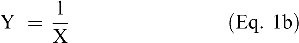
Table 5 (Worksheet 0) gives the basic data of the example. Column A gives the elementary (x); Column B is the cumulative X for succession of (x); Column C gives the elementary (y); Column D gives the cumulative Y for succession of X, e.g. D4 = D3 + C4, D5 = D4 + C5 etc. When plotting Column B vs. Column C for X versus y, we obtain a primitive elementary graph, showing a skewed-bell curve in Figure 4(A). By plotting Column B versus Column D for X versus cumulative Y, we obtain a parabolic curve as shown in Figure 4b. This is a primary graph with plotting cumulative X versus cumulative Y. It is also a leading graph because it leads us to generate physical equations based on its continuous change of the slope of the parabolic curve and its relationship with its upper asymptote. In the Alpha Beta (αβ) Math, the nonlinear numbers Y are associated with their asymptotes Yu and Yb. In most of the cases, the bottom asymptotes Yb are nonlinear zeros. Thus, we need only to learn how to solve for the upper asymptote Yu during the search for theoretical equation and parameters. In Figure 4b, the Y is nonlinear numbers that increases from the origin toward an asymptote. However, where is the upper asymptote? How do we determine the upper asymptote?
Resolving Optimal Yu (Worksheet 0)


(A) Illustration A. (a). Primitive elementary graph. linear by linear scale. y vs. X. (b). Primary graph. cum. Y vs. cum. X. linear by linear scale. (c). Optimal Unique Yu. Yu vs. R^2. (d). Transitional graph. (Yu − Y) vs. X. linear by linear scale. (e). Proportionality graph q(Yu − Y) vs. X linear by linear scale.
The following gives an illustration on how to resolve for the unique/optimal Yu using the Microsoft Excel. First, we build a template and then systematically resolve for the Yu through solving optimal coefficient of determination R ^ 2 (R2). The sequence of determining the optimal upper asymptote Yu are: first, select 7 to 10 estimated upper asymptotes, Yu1, Yu2, and Y3…Yu7 (see Figure 4(A) Illustration A). Second, calculate the R ^ 2 for each estimated upper asymptote, as shown in worksheet 1 to worksheet 5; and third, plot the estimated Yu vs. R ^ 2 and visually identify the optimal Yu from the graph. In Figure 4(b), we show the upper asymptote Yu as dashed horizontal line. The graph shows that the distance of vertical solid double arrow is negatively proportional to the distance of horizontal dashed double arrow; the larger the solid double arrow the smaller the horizontal dashed double arrow becomes, or vise visa. In equation form, it is “the nonlinear change of nonlinear face-value (Yu – Y) is negatively proportional to the linear change of linear face-value X,” or “the change of nonlinear true value q(Yu – Y) is negatively proportional to the change of linear true value X,” as shown in Eq. (2a). Its integral form is Eq. (2a-1).
According to Eq. (2a-1), we can plot (Yu – Y) vs. X on a log-linear (semi-log) graph for the values of q(Yu – Y) vs. X to obtain a straight line when the true upper asymptote Yu is applied in the calculation. (Note: we plot nonlinear face-value (Yu – Y) on vertical logarithm scale to give true value q(Yu – Y)). If the given Yu value strays from the true Yu value, we will get a curved line. To find the straight line, we need first to calculate y = (Yu – Y) and qy = q(Yu – Y), and plotting the equation y versus X on a log-linear (semi-log) graph).
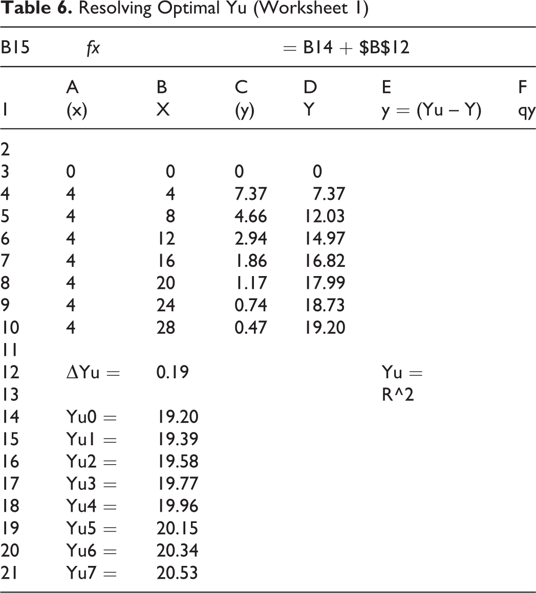
Next, let us generate a few (7 to 10) incremental estimated Yu as Yu1, Yu2, Yu3…Yu7, with initial Yu (Yu0) picked from the last (largest) Y number in Column D (i.e., Cell D10), Yu0 = 19.20. We assign an
Resolving Optimal Yu (Worksheet 1)
Next, we need to calculate Column E, Column F, and coefficient of determination R2 for a given estimated Yu starting from Yu1. We assign this first Yu1 value (in Cell B15) to Cell F12, as shown in Worksheet 2, and call this estimated Yu1 as
(Worksheet2)

The next step is to calculate the Column F for q(Yu – Y). This is done by taking the log of Column E, e.g. the formulas bar shows the calculation of Cell F3 as “=LOG (E3)”, as shown in Table 8 (Worksheet 3). We copy Cell F3 to Cell F4 through Cell F10 to complete the column, as shown in Worksheet 3. Next, we need to use the same
(Worksheet 3)
(Worksheet 4)

By using 19.39 (Yu1) as
(Worksheet 5)

The last thing to do is to express the proportionality equation and graph using the optimal upper asymptote. By assigning the optimal upper asymptote Yu (Yu = 19.96) to Cell F12, we have all data ready for graphing. We first plot Column B (B3: B10) for X versus Column E (E3: E10) for (Yu – Y) in a linear by linear scale, as shown in transitional graph Figure 4d. By converting the vertical axis from linear into nonlinear logarithmic scale in this graph, we obtain Figure 4e without trendline equation and without coefficient of determination. This log-linear (semi-log) graph is the proportionality graph. The transitional graph is a plot of (Yu – Y) vs. X in a linear by linear scale. The proportionality graph is a plot of (Yu – Y) vs. X in a log by linear scale where the true value comparison is q(Yu – Y) vs. X.
To obtain trendline equation and the coefficient of determination in the proportionality graph, we right clicking on data series (in Figure 4e). Then → adding trendline → then, in Trendline Options, select “exponential” → select “Display Equation on chart” → select “Display R-squared value on chart” → close, and we obtain Figure 4e with regression equation as y = 20e-0.115x, and with coefficient of determination R2 = 1. When we select “exponential” in the Trendline Options, Excel gives us semi-log graph and provides trendline equation as exponential equation. This is awkward because Excel is not capable of providing a 10-based equation. The remedy is to convert the e to θ (θ = 10) and convert -0.115 to -0.05 using conversion factor of 2.303 (0.115/2.303 = 0.05), as shown in Figure 4e, where y = 20θ-0.05x. The equation y = 20θ-kx means (Yu – Y) = Cθ-kx . By taking log on both sides of the equation, we get q(Yu – Y) = -KX + qC, its differential equation is d(q(Yu – Y)) = -KdX, meaning the change of nonlinear true value q(Yu – Y) is negatively proportional to the change of linear true value X.
The followings are the summary of the corresponding steps: Use the last experimental data point as a reference upper asymptote Yu, e.g. Yu0, Assign an Assign an estimated upper asymptote (e.g., Yu1) to a special Cell (i.e., Cell F12) for calculating the face value y = (Yu – Y) in Column E and true nonlinear values qy = log (Yu – Y) in Column F. Assign a special Cell (e.g., Cell F13) for calculating coefficient of determination R ^ 2 Calculate R ^ 2 in Cell F13 using the formula “=CORREL (B3: B10, F3: F10) ^ 2” Copy R ^ 2 values from Cell F13 to Cell E15 (parallel to Yu1 value) Go on to next estimated Yu (e.g., Yu2) and repeat the last 4 steps (step 3 to step 6), Using the 7 estimated upper asymptotes along with its coefficient of determinations to plot estimated asymptotes versus the coefficient of determinations, (B14: B21) vs. (E14: E21), to obtain the optimal asymptote, as shown in Figure 4c.
The above example with Figure 4a to Figure 4e and its associated equation is similar to that of an example in arsenic toxicokinetic analysis presented in reference. 6
The Full Analysis of Lung Cancer Mortality/Radon Relationship
In the followings, we provide analysis of the relationship between the lung-cancer mortality rates vs. indoor radon levels. First, we present the primitive elementary graph for elementary y (mortality) versus X (radon intensity) for linearly grouped and nonlinearly grouped data. Second, we emphasize the presentation of cumulative data Y (cumulative of y for succession of X) using the primary graph. Third, based on the primary graph, we navigate to come up with the reasoning for establishing proportionality relationship between the cumulative Y and the cumulative X according to the physical law. Fourth, we demonstrate the use of template to solve for the upper asymptote Yu of the proportionality equation. As a rule of thumb, we use a “10 by 1%” guideline to solve the optimal upper asymptote in the nonlinear proportionality equations, as shown in the previous section.
A. Data Presentation with Primitive Elementary Graphs
This author obtained a set of data from Professor Cohen on the lung-cancer mortality rate versus indoor radon level collected from 1,597 counties and territory of the U.S.A. 11 Because of large data number involved, we conveniently chose to use the data grouping for analysis. First, we use the grouped data to illustrate the noticeable difference between a linearly grouped and a nonlinearly grouped elementary y data when plotting the data in primitive elementary graph. Either way, we should not use these elementary y data for mathematical analysis. Instead, we need to compare a cumulative data with another cumulative data, but not an elementary number with a cumulative number (we need to compare oranges with oranges and apples with apples, but not apples with oranges). Notice the X data is always a monotonic cumulative data. Second, we emphasize the need to comparing the cumulative Y data with the cumulative X data by plotting the primary graph where we plot a grouped cumulative Y data versus cumulative X data followed by mathematical analysis, as will be shown in the next section.
A portion of Cohen’s original data, in ascending order of the mean radon levels r/r0 (r0 = 37 Bq m-3, = 1.0pCi L-1), is given in Table 11. The first Column (Column A) is the county code, there is 1597 (county and territory) sampling points for the U.S.A. The second Column (Column B) is the in-door radon level X in pCi/L. It is in ascending order (monotonic increasing). The third Column (Column C) is the mortality rate (y) for the county. The fourth Column (Column D) is cumulative Y calculated from cumulative of y in column C, where the Cell D4 is D4 = D3 + C4, D5 = D4 + C5, etc.; we copy the cell toward the end to complete the column. There is 1597 data points in Excel. (Attention: we always reserve a raw of cells above the data set as blank Cells for need in calculation, such as we need Cell D2 as blank cell).
Portion of Data for Lung Cancer Mortality Rate vs. Mean Radon Levels

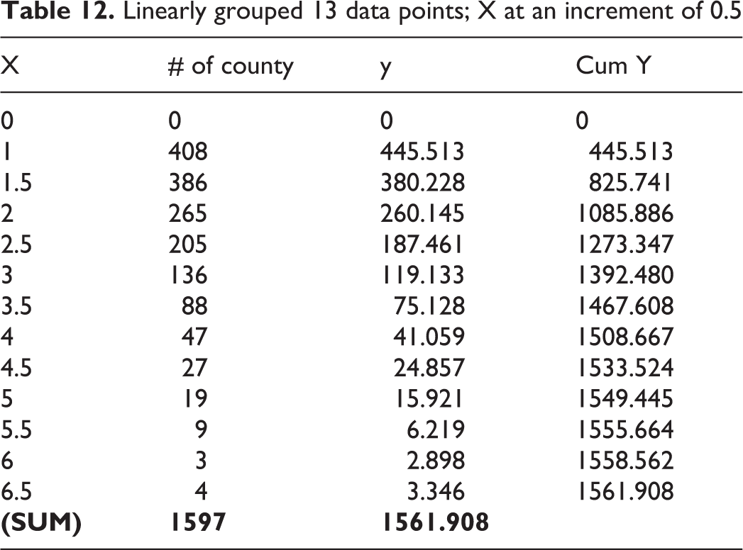
There are 3 sub tables for Table 11, Tables 12, 13, and 14. Table 12 and 13 give linearly grouped data having the X increases at an increment of 0.5 and 0.25. Table 13 has the starting X at X = 0.25, where we do not have any mortality up to this level (i.e., y = 0). Table 14 gives a nonlinearly grouped data having the X increases at an increment of 1.4X, starting at X = 0.240 (use this 0.240 and a factor of 1.4X will give us 10 sampling points to cover up to X = 0.942). All the sub tables also have a column with the number of counties for the given X. Table 15 gives the linearly grouped mean radon levels and corresponding mortality rates for the range (category). We conveniently select 12 linear groups, starting from X = 1.0 and increases the radon level in a linear increment of 0.5. The total mortality for radon level between category 0 and 1.0 is the sum of mortality within this range; it is listed as end point X = 1.0 (0 to 1.0) and y = 445.513. The total mortality for radon level between category 1.0 and 1.5 is the sum of mortality within this range; it is listed as end point X = 1.5 and y = 380.228, etc. Their cumulative Y is the sum of y for each corresponding increase of X in sequence, as shown in Column 5 and 10 of Table 15. Table 15 is the same as Table 12, except the Table 15 has a column of Category, and the Table 12 has a raw of 0.
Linearly grouped 13 data points; X at an increment of 0.5
Linearly grouped 26 data points; X at an increment of 0.25

Nonlinearly grouped 10 data points; X at an increment of 1.4X

Linearly grouped data (X increases linearly at an increment of 0.5) Mean radon levels vs. lung cancer mortality rates, (X vs. y or Y)

There are many ways to generate primitive elementary graphs using the above tables. However, there is only a single way to generate cumulative numbers-based primary graph. We will generate various primitive elementary graphs in the followings and the primary graph in the next section.
First, let us generate a primitive elementary graph using Table 15. In total, there are 12 linear groups in Table 15. Figure 5(A) gives the plotting of category versus mortality as a column graph where the mortality within linearly grouped category is given; this is one of the primitive elementary graphs. When we plot the data in Table 15 to give a linear by linear graph of mortality y versus mean radon levels X, we get a primitive elementary graph Figure 5(B), where we plot y vs. X in a linear by linear scale using 12 data points. Both Figure 5(A) and 5(B) give the decreasing mortality rate as the radon level increases. These graphs are misleading graphs that mislead Prof. Cohen to believe his LNT (linear no-threshold) theory. Appendix A shows one of Cohen’s misleading data analyses based on linearly grouped mortality rates y versus mean radon levels X (on different sets of data). 1

(A). Column graph Mortality within linearly grouped category. (B). Primitive elementary graph y vs. X linear by linear scale. Figure (B-1). Mortality versus Mean radon level. (C). Mortality versus Mean radon level. (D). Mortality versus Mean radon level. (E). Column graph Mortality within nonlinearly grouped category. (F). Mortality versus Mean radon level.
The form of decreasing line from linearly grouped data in Figure 5(B) is similar to the primitive elementary data line originally claimed by Cohen to represent the lung cancer rate. There is nothing wrong to present his primitive data line similar to Figure 5(B) as long as it stands alone and does not intend to relating y and X mathematically. The graph in Figure 5(B) is a primitive elementary graph, and as such, it is not supposed to use for comparing with cumulative primary graph or for modeling of data. If we like, we need to use primary graph, either a cumulative or a demulative (opposite to cumulative) data, for comparison and modeling. Cohen’s confusion analysis arises from 2 basic problems: First, the comparison of primitive data line with theoretical line is invalid because the theoretical data line is a cumulative data line, while Cohen’s data is as an individually grouped primitive data line. Comparison of cumulative data with individual data is not an appropriate comparison. Secondly, Cohen failed to recognize the nonlinear nature of the relationship between the 2 nonlinear numbers and failed to connect the data to the origin or zero. We need to collect, group, and present the nonlinear data as a cumulative data in a nonlinear fashion and address the origin or the zero. When we plot the data of Table 12 without the raw of 0, we essentially get the same figure as Figure 5(B). In Table 15, we have only 12 data points, where we missed the importance of connecting to the origin. This is to show that there is a serious mistake in Cohen’s analysis simply due to his failure to include more data between origin and the first data points or to include the origin (see graph in Appendix A).
Now, when we insert the data of Table 13 with 25 data points (minus the raw of 0) into Figure 5(B), we get Figure 5 (B-1).This graph indicates the importance of collecting more data close to the origin or using a smaller increment of X at an increment of 0.25 in contrast to at an increment of 0.5. It is clear, when there are only 12 data points; the simple curve tends to mislead the practitioner like Prof. Cohen to interpret or to model with LNT theory. 1 However, when there are 25 data points, the skewed bell curve becomes prohibitory difficult for them to model. It is understandable that some practitioners chose a short cut to avoid the collection of more data and to avoid the difficulties of modeling a complicated curve.
In addition to Figure 5(B-1), let us replot the data in Table 12 and 13 to include (connecting to) zero to get Figure 5(C) where we have 13 and 26 data points. Figure 5(C) gives 2 skewed bells, where the larger the increment of X (= 0.5) (and smaller the numbers of data points) the larger the bell will be. The practitioners of “Hormesis” would interpret these curves as biphasic hormesis curves. They would interpret the 13 data points curve from zero to X = 1.5 as linear no-threshold increasing y section followed by decreasing y section beyond X = 1.5. While they would interpret the 26 data points curve as linear with-threshold increasing y section followed by decreasing y section, because there is a threshold of y with y is zero up to X = 0.25 ((X, y) = (0, 0) to (X, y) = (0, 0.25)). The conflict/confusion of LNT and linear with-threshold will disappear when we make use of cumulative numbers, as shown in Figure 6A in next section.

(A). Primary graph cum Y vs. cum X, 1597 data points and grouped data. (B). Leading graph (originated from primary graph Figure A qY vs. X, Y in log scale and X in linear scale. (C). Locating optimal upper asymptote Yu. (D). Transitional graph (qYu − qY) vs. X linear by linear scale. (E). Proportionality graph q(qYu − qY) vs. qX nonlinear by nonlinear scale. (F). Proportionality graph q(qYu − qY) vs. qX linear by linear scale.
Now, let us compare the primitive elementary curve by inserting the nonlinearly grouped data in Table 14 (for y vs. X) into Figure 5(B-1) to give Figure 5(D). Because the relationship between the mortality and the mean radon level is a nonlinear phenomenon, the nonlinear curve gives a uniform and better range of coverage, especially in the initial small X range. Figure 5(E) gives the corresponding column graph for nonlinearly grouped data with 10 data points. This well-behaved bell-shaped column graph is quite different from that of 12 points linearly grouped column graph in Figure 5(A). (We are using the same 1597 data points as base).
In addition to the above graphs (of X and y), let us examine the relationship among the X, y, and the numbers of counties. By plotting the county data in Table 12 and 14, we get Figure 5(F). This graph shows that the lines of the number of counties, either linearly grouped or nonlinearly grouped is relatively close, indicating they are closely related (may be by coincidence). The nonlinearly grouped data line indicates that there are a greater number of counties having the high mortality in the middle range of X around X = 2, and less number of counties with low level of X (X close to 0.2) and high level of X (X larger than 4 or 5).
Overall, the above primitive elementary graphs have wide variations and the models based on curve fittings would be widely scattered and meaningless. Fortunately, we have a better and consistent way to look at these same data with a simple nonlinear concept where we can simply comparing the cumulative independent variable X with cumulative dependent variable Y as to be discussed next.
B. Data Presentation with Primary Graphs
When plotting cumulative mortality Y versus cumulative radon level X, we get a continuous sigmoid line with 1597 data points, as shown in Primary graph Figure 6a. In the graph, we also insert the nonlinearly grouped data from Table 14 and linearly grouped data from Table 13 (with 26 data points). Not shown in the graph is the county data. When we plot the linearly grouped or nonlinearly grouped county data into the same graph, we will get all the data fall into the same sigmoid curve.
Comparing the entire primitive elementary graphs in Figure 5 (Figure 5A to Figure 5F) and the primary graph in Figure 6 (Figure 6(A)), we see that the primitive elementary graphs are confusing and inconsistence, while the primary graph is simple and straightforward because the latter is in consistence with the physical law. (The beauty of using the cumulative numbers is the application of monotonic continuous numbers). We may say that the primitive elementary graphs are the presentation of “art” and the primary graph is the presentation of “science”. We will discuss how the law of nature dictates the relationship between the dependent variable (continuous cumulative Y) and the independent variable (continuous cumulative X) in the next sections.
C. Beware of the True Meaning of the Data and the Line in the Primitive Elementary Graph and the Primary Graph
It is importance to recognize and distinguish the true meaning of the data and the line in the primitive elementary graph and the primary graph. The primary graph gives the cumulative mortality Y versus cumulative radon levels X, such as sigmoid curve in Figure 6(A). The essential information of this graph is the rate of the change of the curve. For example, at low level of X = 0.5, the change of rate from X = 0.25 to X = 0.5 is relatively small (see Table 13) at around 39.01 (point A in the graph). At middle range of X = 1, the change of rate from X = 1.0 to X = 1.25 is very large at 194.71 (= 640.23 – 445.51) (point B in the graph). At the upper range of X = 6.0, the change of rate from X = 6.0 to X = 6.25 is very small at 2.15 (= 1560.71 – 1558.56) (point C in the graph). In essence, the rate of change of the line in the beginning and near the end is small, or the slope of the curve is very small. At certain middle range, the rate of change is very large or the slope of the line is very steep and large. In the beginning of small X range, the line convex up, whence the positive slopes is increasing. Beyond certain central point, toward the end of large X, the line concaves down and the positive slopes decreasing. It is unfortunate that the litterateur is full of misinformation. For example, Masters and Lindon misinterpreted the sigmoid curve similar to Figure 6(A) and interpreted the sigmoid curve as with high mortality at high radiation dose. 12 It is importance to recognize the small change of the slope at large X, rather than look at the height of the curve and misinterpret it as high Y at large X.
On the other hand, the primitive elementary graph can provide direct reading of the elementary mortality numbers y. As shown in Figure 5C, at X = 0.5, the mortality is 39.01 (relatively low), shown as point A’ in the graph. At X = 1.0, the mortality is 228.75 (very high), shown as point B’ in the graph. At X = 6.0, the mortality is 1.54 (very low again), shown as point C’ in the graph.
D. Mathematical Analysis Based on Primary Graphs and Physical Law
Now, let us discuss the full analysis of data according to the physical law. When dealing with the relationship between the dependent variable (continuous cumulative Y) and the independent variable (continuous cumulative X), we can have several situations of comparison. We can compare (A): the ordinary nonlinear Y with the ordinary linear X, or (B): the ordinary nonlinear Y with the ordinary nonlinear X, or (C): the higher nonlinear order of nonlinear Y with the ordinary linear X, or (D): the higher nonlinear order of nonlinear Y with the ordinary nonlinear X, etc. We have discussed the simple case (A) in subsection (5). We will discuss the case (D) using the data in Figure 6 (A).
For the lung cancer mortality/ radon level case, it is a higher order nonlinearity case. Thus, we need to apply a higher order nonlinear equation, either Eq. (2b) or Eq. (2c). For graphical interpretation, let us copy Figure 6(A) (with sigmoidal line) into Figure 6(B) and converting the vertical axis from linear into nonlinear logarithmic scale. We get Figure 6(B) with parabolic line in log-linear graph. We call it a leading graph that will intuitively lead us to formulating the proportionality equation based on the continuous changing of the slope of parabolic line. In the graph, value of the curve is qY and the curve is approaching qYu as its upper asymptote.
In Figure 6 (B), the measurement of nonlinear face value is a measurement of vertical distance from asymptote, which is (qYu – qY), as indicated by a vertical solid arrow. The measurement of horizontal distance could be either a measurement of linear X or a measurement of nonlinear X, as indicated by a dashed arrow. If it is a linear X, then we have a nonlinear by linear phenomenon with measurement of X from linear zero, such as the relationship between the fructose concentration and the enzyme activity, 4,6 where we can apply Eq. (2b) for describing the curve. When it is a nonlinear X, then we measure X from its bottom asymptote Xb, (X – Xb), and we have a nonlinear by nonlinear phenomenon, where we shall apply Eq. (2c) for describing the curve, as will be described in this section.
The relationship between 2 headed arrows in Figure 6(B) is that as the distance of vertical solid arrow gets bigger the horizontal dashed arrow gets smaller or vise visa—meaning that the 2 double-headed arrows have a negative proportionality relationship. For the above nonlinear by nonlinear phenomenon in Figure 6(B), we can use Eq. (2c) to describe its proportionality relationship. Their meaning is as follows: The nonlinear change of nonlinear face value (qYu – qY) is negatively proportional to the nonlinear change of nonlinear face value (X – Xb). In other words, the change of true-values (q(qYu – qY)) is negatively proportional to the change of true-values (q(X – Xb)).
Now, let us use template based approach to illustrate how to solve for the upper asymptote Yu. The bottom asymptote Yb is always assign as zero and thus no need for any calculation. We need only to solve for the upper asymptote Yu. Table 16 (Template A) gives the X, y, and Cum. Y, in Column A, C, and D for nonlinearly grouped data listed in First, third, and fourth column of Table 14. Column B is for the calculation of qX, it is log(X – Xb) or q(X – Xb) assuming Xb = ϕ = (0).
To start with, we assign/assume an
(Template A) Search for upper asymptote Yu (a)

(Template B) Search for upper asymptote Yu (b)

In the next step, refering to Table 18 (Template C) , let us calculate Column E and Column F for estimated upper asymptote Yu1. First we assign Yu1 value in B17 into Active cell in E14. Formula for Cell E3 is “=LOG($E$14)-LOG(D3)”. We can copy Cell E3 to Cell E4 through E12 to complete the column. Column F is the log of column E, e.g. F3 = LOG(E3). Next, refering to Table 19 (Template D), let us calculate the coefficient of determination R ^ 2 in Cell E15. Formula for Cell E15 is “=CORREL(B3: B12, F3: F12) ^ 2”. R ^ 2 is 0.9699. We copy this value into Cell D17 in parallel to Yu1. Next, we calculate R ^ 2 value for Yu2 by assigning 1593.146 into Cell E14. Once the Cell E14 is changed, all the values in Column E, Column F and Cell E15 all will change. The Cell E15 changs into 0.9823 (not shown in Template). We copy this value into Cell D18, in parallel to Yu2.
(Template C) Search for upper asymptote Yu (c)

(Template D) Search for upper asymptote Yu (d)

We sequentially change Yu value in Cell E14 from Yu1 to Yu10 and recording the corresponding R ^ 2 in column D, as shown in Table 20 (Template E) . This template gives the calculation with Yu7 = 1671.241. Refering to Table 20 (Template E) , by plotting R ^ 2 vs. Yu for Column D (D17: D26) vs. Column B (B17: B26) we obtain Figure 6c. In Colum D (D17: D26), we locate the maximum coefficient of determination R ^ 2 as 0.9926, its corresponding estimated Yu is Yu7 = 1671.241. This is also indicated in Raw 23 for Yu7 = 1671.241 and R ^ 2 = 0.9926.
(Template E) Search for upper asymptote Yu (e)

Next, we plot Column E vs. Column A for (qYu – qY) vs. X on a linear by linear graph, shown as Figure 6d. It is a transitional graph with plotting of mixed numbers (nonlinear numbers (qYu – qY) and linear number zero) in a linear scae. This is followed by converting both the axes from linear into nonlinear logarithmic scale to give Figure 6e, which is the proportionality graph without trendline equation and R ^ 2.
By right clicking on data set in Figure 6e, follow by selecing Format Trendline → select Power in trendline options → select Disply Equation on Chart → select Display R-squard value on Chart → then Close, we obtain Figure 6f with trendline equation y = 0.532X-1.62 and R ^ 2 = 0.9926. Equation y = 0.532X-1.62 means (qYu – qY) = 0.532X-1.62. Taking log and differential on both sides of the equation, we get

Figure 6f provides the physical meaning that the cumulative lung cancer mortality Y is negatively proportional to the cumulative radon intensity X; or specifically, the nonlinear change of nonlinear face value (qYu – qY) is negatively proportional to the nonlinear change of nonlinear face value (X – Xb).
Discussions
In life and biomedical sciences, the data are mostly nonlinear and thus require careful nonlinear data collection and analysis. In principal, for 2 variables analysis, we need to collect at least minimum of 7 data points (in exceptional cases of excellent data, we may get by with 6 data points) to account for skewed-bell and sigmoidal data lines. In designing experiments, we need to select independent variable X consistently in linear or nonlinear fashion but not with a mix or at random,
We need to emphasize the use of Primary Graph rather than the Primitive Elementary Graph in Data Analysis. The primitive elementary graph, at most, can only provide the peak information, but not the essential rate of change and proportional relationship between 2 variables. To obtain essential rate of change and proportional relationship, we need to compare one cumulative number with another cumulative numbers. For the cases with higher order of nonlinearity, we can generate one series of 4 graphs to describe the complete nonlinear phenomenon: a primitive graph of skewed-bell curve, a primary graph of sigmoid curve, a leading graph of parabolic curve, and a proportionality graph of a straight line. In another words, based on the primary graph we may extend the analysis to get a simple straight line and proportionality equation to representing the rate of change and proportionality relationship of 2 variables in a proportionality graph.
It is important for all researchers to learn how to distinguish between a primitive elementary graph and a primary graph. We cannot use a primitive elementary graph to build a dose-response mathematical relationship, because each elementary “y” has no mathematical connectivity, and one elementary number cannot mathematically relate to the other cumulative numbers. 9 Instead, we must resort to relating one cumulative number with the other cumulative numbers and using the primary graph for mathematical analysis, where we can have both continuous numbers Y, and continuous numbers X exist as cumulative Y and cumulative X. Cumulative numbers mean the existence of connectivity.
Summary
We analyzed the relationship between the lung cancer mortality and the indoor radon intensity from the viewpoint of nonlinear mathematics. We conclude that their relationship is governed by the proportionality law where the cumulative lung cancer mortality Y is negatively proportional to the cumulative radon intensity X; or specifically, the nonlinear change of nonlinear face value (qYu – qY) is negatively proportional to the nonlinear change of nonlinear face value (X – Xb).
Traditional XY math is insufficient to describe the nonlinear phenomena; we need to extend the XY math into the αβ Math to account for the existence of asymptotes, i.e. we need to extend XY = {(X),(Y)} into αβ = {α(Y, Yu, Yb), β(X, Xu, Xb)}.The αβ Math classifies continuous numbers into linear and nonlinear numbers. Nonlinear numbers are associated with asymptotes, and when measuring changes, we measure their changes relative to their asymptotes.
In data analyses, we must always account for the origin (either linear zero or the nonlinear zero). In data collection, the independent variable X must be consistent. The X needs be either linear numbers or nonlinear numbers, but cannot be with mixed arrangement.
The Alpha Beta (αβ) Math is a science for connecting a straight line to parabolic, sigmoid, and various bell curves in biomedical and physical sciences. We provide examples for building Excel Templates to solve for upper asymptotes and building a straight-line proportionality equation.
Data in life and biomedical fields must obey the law of nature. The experimental law dictates that the response be either proportional to or negatively proportional to the dose. We can build a straight-line proportionality relationship for the dose-response data in a log-linear and log-log graphs. This article demonstrates a straightforward methodology for solving the key upper asymptotes for the proportionality equation using the Microsoft Excel via determining the “coefficient of determination”. All examples include systematic demonstration of Excel data manipulation and extensive graphing.
Footnotes
Appendix A Cohen’s Data Analysis 1
Appendix B “Nonlinear Change” or “Change” in Proportionality Graph
The proportionality graph has a straight line that is expressible with an equation. Figure B1 gives the proportionality graph for Y = X in linear-linear scale. Where the
The general differential and integral equations of Figure B1 is
The general differential and integral equations of Figure B2 is
The general differential and integral equations of Figure B3 is
For linear numbers, we read the differential equations as simple
For nonlinear numbers, we have 2 ways to read the equations. We can address “d” first or address “q” first. The “q” implies the nonlinear change. In Eq. (Bb), we can address the “d” first by saying “the
Declaration of Conflicting Interests
The author(s) declared no potential conflicts of interest with respect to the research, authorship, and/or publication of this article.
Funding
The author(s) received no financial support for the research, authorship, and/or publication of this article.