
Abstract

Introduction
A graphical device of some antiquity is to add a one-dimensional display of the distinct values of a variable next to one axis or even both axes of what in Stata terms is a two-way plot. Examples can readily be found for scatterplots, histograms, and plots of density estimates. The need is especially clear in the last case: customarily, densities are estimated both beyond the data and within their range, so precisely where the data points lie is a key question. Yet another example could be line plots of irregular time series. Emphasis might be desired on exactly when observations occurred, but a marginal display of those discrete times may be considered more discreet than using
Such a display is a compact representation of the distribution of the variable concerned. Although a marginal strip typically restates what is shown in some sense in the main body of a graph, it can help clarify whatever clusters, gaps, or outliers are present while also roughly conveying the general level, spread, and shape of the distribution in question. The price paid for compactness is that repeated instances of any distinct value will necessarily be overplotted. Repeated instances are a good reason for talking carefully of distinct values rather than, say, unique values.
These displays are often called rugs or rug plots. The rug metaphor is most obvious when a display is horizontal and on the bottom of a graph, but that need not inhibit, still less prohibit, any similar display that is vertical. The rug terminology goes back at least to Hastie and Tibshirani (1990). As said, the underlying idea is quite old and often appears unobtrusively without any name. The earliest example known to me is from Brunt (1917): yet earlier examples would be most welcome. Other examples more than 50 years old can be found in Wallis and Roberts (1956), Boneva, Kendall, and Stefanov (1971), Binford (1972), Box and Tiao (1973), and Davis (1973). The term rugplot was used by Tufte (1983, 135) in a related but different sense. Such plots or plot components have many other names, for example, as one version of dot plots or strip plots.
History and terminology aside, how can rugs be added in Stata? Readers who have been using Stata since early versions may recall that versions before Stata 8 (2003) supported them as one-way plots (Computing Resource Center 1985). That functionality is still embedded in Stata, as can be found by
In this tip, I focus on how to get rugs in Stata 8 upward. As mentioned briefly in Cox (2004), two basic techniques are to add an extra scatter to an existing plot and to use axis ticks for each rug.
Defining new variables for position
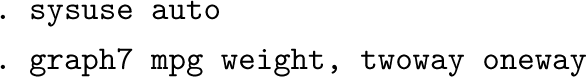
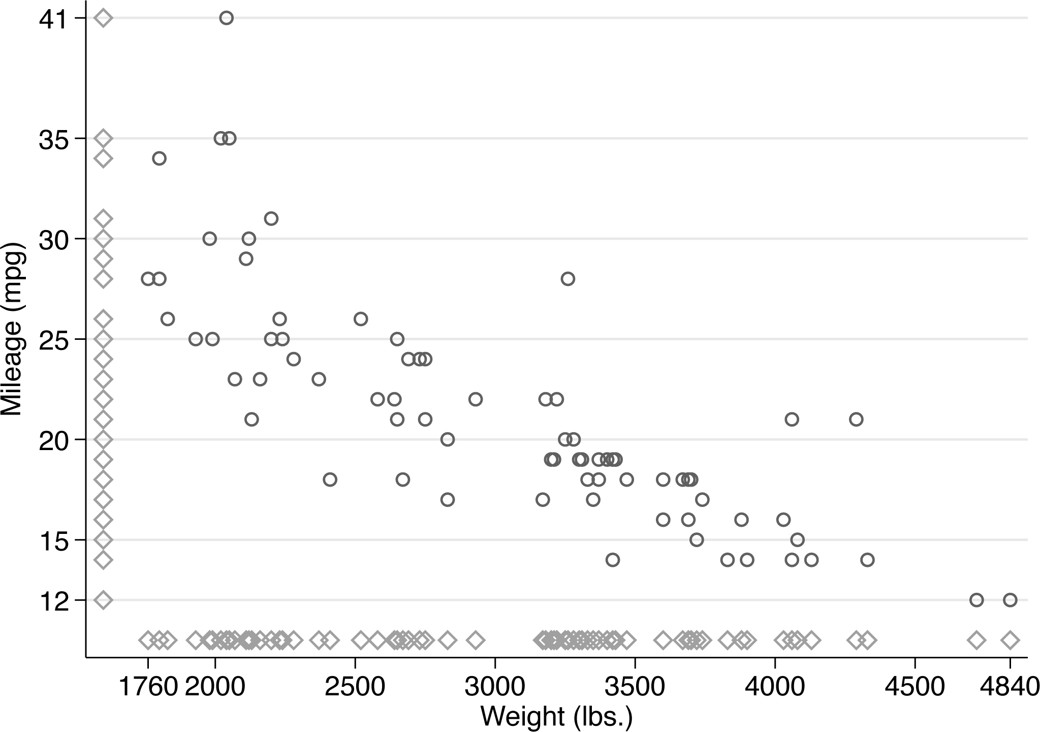
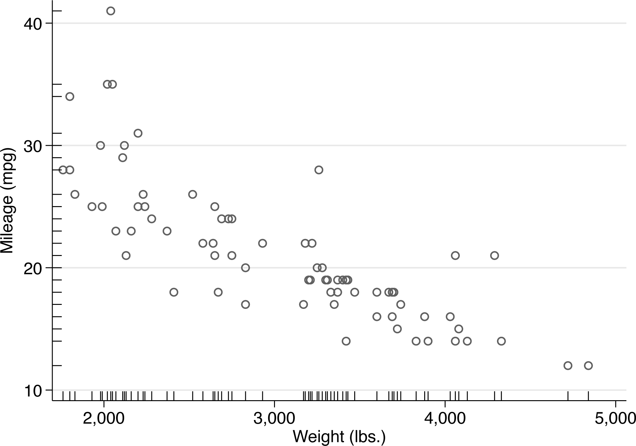
Let’s start with adding a rug for

Plain scatterplot
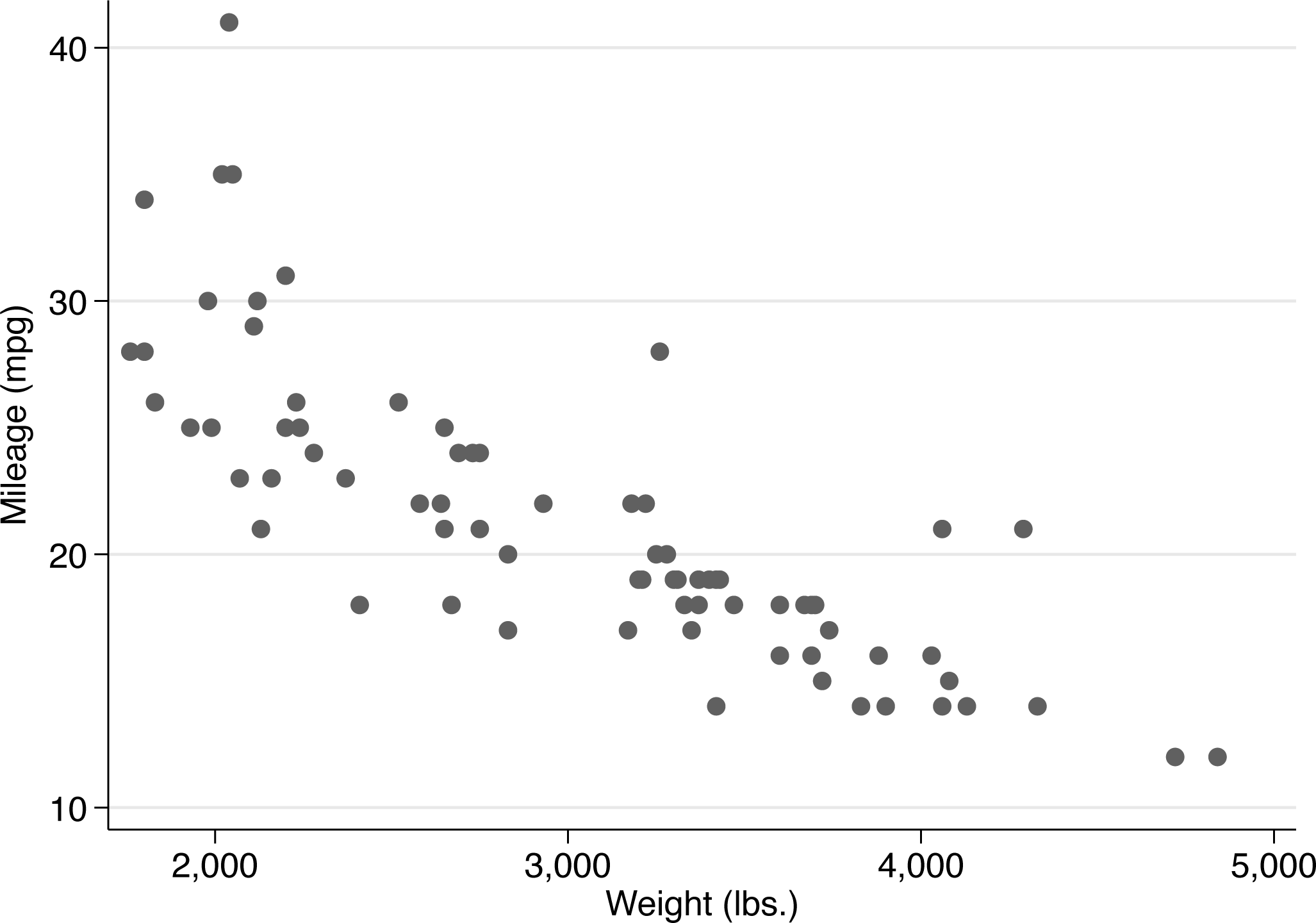
Then we guess that 10 would be a good vertical position for a rug.
A series of small decisions may be condensed into two commands, which yield figure 2. You might make other decisions, which is much of the point.
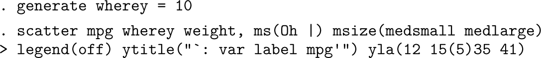
Scatterplot with added rug for the horizontal variable
I expand on the details below:
A personal preference for open symbols as tolerating overlap better than closed symbols leads me to use The pipe symbol was added as a marker in Stata 15. It is a good choice for a rug. I like pipes to be bigger than the default. If you are using an earlier version of Stata, you need a different symbol (or the method of the next section). We are now plotting two variables on the y axis. So Stata would add a legend and give up on showing the variable label of With these data,
Feeling encouraged by the result, we might now be emboldened to try a vertical “rug” for the outcome variable
That certainly will not trouble you if you want only a horizontal rug. Otherwise, you might find a different marker symbol acceptable. Because the entire point is to show distinct (different) values distinctly (clearly), open or hollow symbols have a clear edge over closed symbols. Tidiness dictates using the same marker symbol for both rugs. Using different colors for data points and rugs would be a great idea if your chosen scheme permits but must be imagined here because the Stata Journal scheme does not extend to color.
Let’s try that out with, say,
Scatterplot with rugs on both axes
We need to adjust the x-axis title and labels, more or less as before, because two variables are being plotted on that axis, and Stata does not know which text (whether variable label or variable name) should be used.
We gain a helpful smidgen of extra space by changing the display format of the x-axis labels to omit commas.
What else might be done?
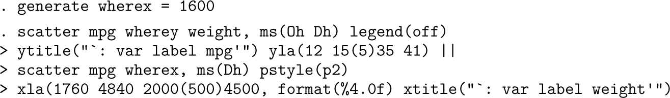
We could avoid some ad hockery by pushing each variable through
Here is how that might work:
The result is very similar to figure 3, so it is not shown here. For your own work, adjust the prefactor from 0.05 (5%) according to taste and circumstance.
Evidently, the
Other possibilities include putting the rugs at the top or on the right. The changes needed should be clear: Find the maximum on the variable concerned, and go a bit beyond that maximum in placing the rug you want.
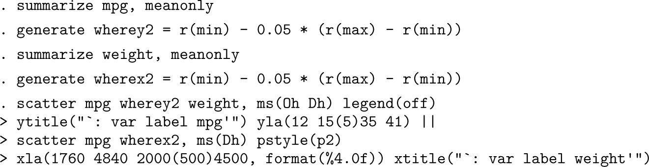
Programmers especially might have a conscience about the overhead caused by overplotting. Selecting just one of any subset of repeated values using a variable produced by the
The methods of the previous section are simple in principle but sometimes a little awkward in practice. Now we examine another method that is simple in both principle and practice and thus preferable if the results are acceptable.
The trick is to pass the distinct values of each variable to an axis tick option. You need to specify that the ticks are on the inside of each axis. You may wish to tune the appearance of the ticks. The
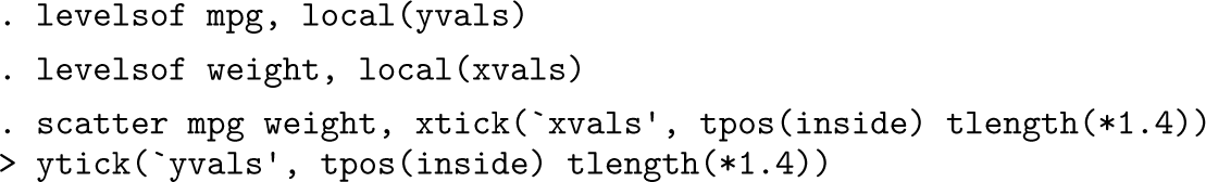
Scatterplot with rugs as sets of axis ticks on the inside of each axis
The tick length suboption is mentioned largely because you may wish to tune tick length. There is a small tradeoff between making ticks unobtrusive yet also discernible.
At worst, ticks on the inside might interfere minutely with display of the data, which you can eliminate by changing axis range (or axis labels) using an option like
You may also wish to change the tick color. For a miniature review of tick trickery, see Cox and Wiggins (2019).
In graphics, as in much else, the devil is in the details, and marginal rugs may be useful detailed enhancements to other two-way graphs. One common application not yet mentioned is for plots of a (0, 1) binary outcome versus a continuous predictor or controlling variable. Examples are whether it freezes or snows according to air temperature, whether a species is present or absent versus an environmental control, or whether a patient does or does not survive versus age or some risk measure. Here the rugs represent the distinct subsets of the predictor values for values 0 and 1 of the outcome.
My general impression is that experienced Stata users understand easily and quickly that a rug can be just a one-dimensional scatter. They may find it less obvious that ticks can be used for this purpose, perhaps because they are accustomed to Stata’s default of putting ticks on the outside—and indeed to the logic that such placement removes the risk that ticks interfere with data points (Cleveland 1994). Hence, there may be value in flagging both methods here.
Supplemental Material
sj-txt-1-stj-10.1177_1536867X251341426 - Supplemental material for
Supplemental material, sj-txt-1-stj-10.1177_1536867X251341426 for by in The Stata Journal
References
Supplementary Material
Please find the following supplemental material available below.
For Open Access articles published under a Creative Commons License, all supplemental material carries the same license as the article it is associated with.
For non-Open Access articles published, all supplemental material carries a non-exclusive license, and permission requests for re-use of supplemental material or any part of supplemental material shall be sent directly to the copyright owner as specified in the copyright notice associated with the article.