
Abstract

The goal
This tip is a miniature review of how you can add extra lines to graphs in Stata. Examples of why you might want to do so include showing or emphasizing key reference levels, such as 0 for many variables or freezing point 32°F for Fahrenheit temperatures; showing means, medians, geometric means, or any other summary; or flagging key dates such as 1812 or 1939. Those examples would all imply adding either vertical or horizontal lines, depending on which variable is on which axis. Some of the techniques to be discussed here allow addition of sloping or even curved lines.
If your interest is in adding shaded zones to plots, see Cox (2016) or Schenck (2020). For more on grid lines, see Cox (2009).
Added line options
Options in twoway
Typing
tells you about the
Such lines always extend over the entire vertical or horizontal range of the plot region, with scope to control whether that does or does not include being shown in the margin of the plot region.
Some further key points are not obvious until you experiment or look at other documentation.
Stata will always draw these lines before it lays down points, lines, or areas representing variables that are your data. The motive here is that such added lines are usually references or context showing interesting or informative detail. You can tweak the appearance of such lines through suboptions, but that may not be enough to stop such lines being occluded or obscured by overplotting of data elements. That is especially common if you are using bars or more generally areas to show data. Stata takes showing your data directly to be more important than showing added lines. If you want your added lines to be more prominent than these suboptions allow, you need to use a command (not an option) to specify added lines, as discussed in section 3.
Often, indeed perhaps usually, you will want to add axis labels to any such line.
Typing
tells you about the possibilities. Indeed, you could use such options to control added lines directly. Even if a grid line does not appear by default with whatever graph scheme is in effect, you can insist on having a grid line. Once a grid line exists, you can, as with added line options, control its appearance.
The provision of minor label options implies, apart from the documented consequence of a default smaller label size, scope for added lines with different colors, patterns, and so forth.
See also Cox and Wiggins (2019): despite its overt focus on axis ticks, it touches on various tricks for axis labels.
Options with graph bar, graph hbar, and graph dot
As documented under the commands concerned, you can also specify
Here is a twist that is well documented but often overlooked: The y axis in this case is always taken to be the axis showing the outcome or summary being plotted. That axis is the vertical axis with
With the other commands just mentioned, the other axis is regarded as a categorical axis, not an x axis. Perhaps that is to be regarded as a Stata idiosyncrasy, but it should help to explain why
This Stata convention flouts long-standing mathematical practices but was introduced for your convenience. Suppose you try out
Commands for adding lines
If the straight (or other) line you want is a regression or smooth of some kind, go straight to the subcommand concerned, whether the line is to be produced by (say) plain regression fits, fractional polynomial fits, or lowess or local polynomial smoothing.
Many of the other commands can be used to add lines. Let us start with commands for which you do not need extra variables.
twoway function and twoway scatteri
As a simple example, suppose first that we want to add a line showing the mean of the y variable to a scatterplot
In the
Now we have started, so let’s continue down the same road. You could try to get vertical lines by trying to draw an absurdly steep line over a very narrow horizontal range, but that is not recommended. The next trick is much more flexible
Let’s add a vertical line showing the mean of the predictor variable.
Figure 1 shows the result. Graphs like this are often used to explain Pearson correlation or regression. Readers are invited to consider incidence of data points in each of the quadrants defined: the top right quadrant shows data points greater than both means and so on.
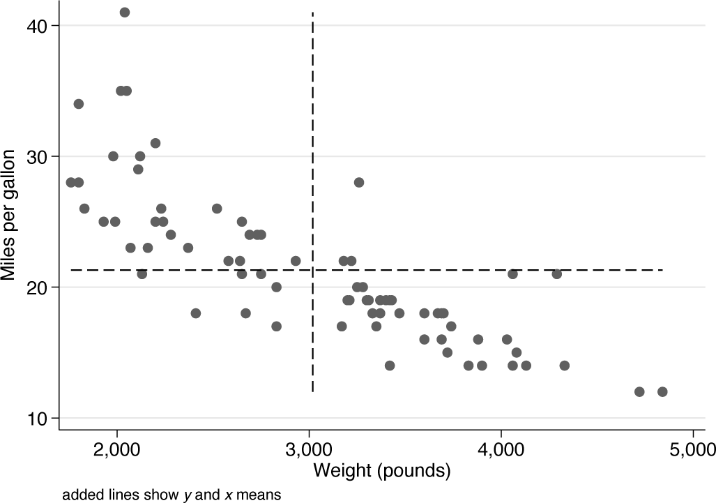
Scatterplot of miles per gallon versus weight for cars from the auto data. Added lines show the means for each variable.
For this example, we could have done that just about as well with
You will now see that we could have used a call to
The example was made entirely concrete. We used
Some other
Alternatively, you could always create a variable holding a constant to be used to add an extra line. Or you could create a variable such that distinct y or x values define lines, whether horizontal, vertical, or sloping. That device may offend a programmer’s sense of style or efficiency, which is largely why we started with other ways to do it. However, such a device is easy to implement and to understand from reading code and seeing its effects.
The existence of these commands, and the scope for repeating them in a