
Abstract
Membership of overlapping or intersecting sets may be recorded in a bundle of (0, 1) indicator variables. Annotated Euler or Venn diagrams may be used to show graphically the frequencies of subsets so defined, but beyond just a few sets such diagrams can be hard to draw and use effectively. This column presents two new commands for graphical alternatives:
Keywords
1 The problem: Indicating set membership graphically
The problem surveyed in this column is elementary, which as in logic or physics means fundamental as much as simple. In many projects, we have overlapping or intersecting sets. Suppose that data on membership of each set are held in a bundle of indicator variables, each with value 1 if an observation belongs to a particular set and value 0 otherwise. We want to show the frequencies of different subsets graphically.
Typically, counting to get the frequencies is easy. Often, the frequencies are already in a separate variable in a dataset, which solves that problem immediately. The problem lies in the graphics; we want to produce a display that is not only easy to understand in principle but also effective in conveying both coarse and fine structures in practice.
Concrete examples arise in many fields.
Missing values. Many projects need to confront serious missingness. We can represent missingness by indicator variables: 1 for missing and 0 otherwise. This can be done for both numeric and string variables. We start with examining frequencies of missing values in each variable and continue with frequencies of joint occurrences, examining how far missing data occur in blocks and so forth.
Medical symptoms. Many diseases, syndromes, or other medical conditions manifest in different ways. Patients diagnosed as having a particular condition do not necessarily manifest the same symptoms.
Social survey. Indeed, people can often be recorded using a battery of categorical variables. Many categorical variables are binary (employed or not employed, living in city or not, college graduate or not). Here we note just once that variables with multiple categories (meaning three or more categories) can be recorded in terms of a bunch of indicator variables, one fewer in number.
Gene families in genomes. Overlap between gene families in various genomes deserves mention here for its own sake and because it is a field of study that has sparked innovation over graphics for set membership.
Network meta-analysis. Network meta-analysis compares three or more interventions simultaneously by synthesizing the results of studies that have compared at least two. Understanding and visualizing the structure of a network meta-analysis can be challenging. The numbers of studies or of people contributing to direct evidence on a given set of interventions are important summaries. Freeman et al. (2023) proposed some visualizations, including upsetplots, for component network meta-analysis.
This column is focused on two new commands:
Talking about two commands that are similar, but certainly not identical, obliges a modest amount of repetition. No reader will find all sections equally interesting or useful, but every reader will be smart enough to skim and skip according to inclination.
Combined tabulations of multiple indicator variables are possible through the
2 General principles and precepts
2.1 Euler–Venn diagrams and the combinatorial challenge
A common solution for a few sets is to annotate an Euler–Venn diagram. Later, we will give more historical and bibliographical details, but for now a brief comment: Euler is named here as well as Venn as a small pointer to a longer history than is implied by the most common name, Venn diagram.
Whatever the name, we assume readers are familiar with such diagrams. If not, please take a few moments to Google for some explanations and examples. There is no official Stata command for Euler–Venn diagrams, but community-contributed commands include those from Lauritsen (1999a, b,c,d , 2009), Gong and Ostermann (2011), and Over (2022).
Most crucially, it is common experience that, while such diagrams can be helpful for very simple problems, they become unwieldy for more than a few sets. This is perhaps too obvious to deserve emphasis, but here are some quotations to that effect.
Hamming (1991, 16–17) commended Euler–Venn diagrams for simple cases yet continued as follows:
But if you try to go to very many subsets then the problem of drawing a diagram which will show clearly what you are doing is often difficult. Circles are not, of course, necessary but when you are forced to draw very snake-like regions then the diagram is of little help in visualizing the situation.
Gleason (1991, 33) noted that, in practice, the diagrams become unwieldy for more than about four or five sets.
Kosara (2007) was particularly brutal:
I would argue that Venn diagrams are a great tool for learning about sets, but useless as a visualization.
The point is better made by example than by exhortation. See figure 4 of D’Hontet al. (2012). We admire its wit but doubt its effectiveness. In principle, all the data on frequencies are shown. In practice, only individual detail can be read off at all easily. The comparison is of six genomes. Gene families that appear in none of the genomes in the study are not shown, so the total number of subsets is 26 − 1 = 63, supporting Gleason’s point.
The challenge here arises from elementary combinatorics. Given k sets and their indicator variables, there are 2 k possible subsets. Thus, for k = 1, 2,…, 5,…, 10, there are 2, 4,…, 32,…, 1024 possible subsets. The number of possible subsets explodes as the number of sets increases.
In practice, this problem, sometimes called “combinatorial explosion”, is eased whenever possible subsets do not occur and eased mightily when that happens often. Other way round, such explosive behavior underlines the importance of being able to select which subsets to show. The price of complexity may be to leave out rare subsets from a graphical display.
To keep track of the possible, or at least actual, subsets, users can code them by binary numbers (0 denoting absence and 1 denoting presence), such as 00, 01, 10, and 11 for k = 2. The concatenations 00, 01, 10, and 11 define the four possible subsets defined by two variables, distinct binary codes for binary numbers 00 to 11, and distinct decimal equivalents 0 to 3.
Hence, concatenation is here a simple and natural way to define composite categorical variables (Cox 2007). 00 is of degree 0, 01 and 10 are of degree 1, and 11 is of degree 2. Here, and indeed generally, leading zeros are retained as helpful reminders even though they might be considered redundant or ornamental.
Similarly, three such variables have eight possible binary concatenations (000, 001, 010, 011, 100, 101, 110, and 111) and decimal equivalents (0 to 7). As remarked, k such variables define 2 k possible subsets.
The subset that is binary number zero (for example, 00 for k = 2) may or may not occur in the data. Sometimes it does, as with any patients with no symptoms or any people with no missing data, and sometimes it does not, as with many gene families that occur in none of the genomes in a study.
2.2 The great divide and its compensations
As often with Stata graphics, there is a choice here for programmers between writing a wrapper for, say,
The existence of two commands is a complication that we suggest is more positive than negative, affording greater choice of graphical style to meet as far as possible both researchers’ tastes and what works best for particular datasets. In each case, options provide a great deal of flexibility. Care has been taken to provide similar syntax whenever the commands perform similarly. That eases switching between the two if researchers are unsure which is more suited to their current project, data, and audience.
2.3 Variables, values, and observations
If your dataset is already aggregated to frequencies or other measures of abundance, specify those as weights multiplying the indicator variables. Commonly, but not necessarily, integer frequencies define frequency weights, but both commands support measures with fractional parts, such as proportions or percentages, which can be specified as analytic weights.
The order of variables presented does not determine the order in which they are shown in a plot. By default, bars (spikes, dotted lines) are shown in order of subset frequency, but choosing a more suitable order is the user’s prerogative. There is considerable scope to change that sort order using other criteria.
Variables that are identically 0 or identically 1, at least in the data being shown, are not always useful and so might be omitted.
Various
2.4 Working with a reduced dataset
Like many graphics commands, these commands do various calculations first and use a reduced dataset in plotting the results of those calculations. In contrast, consider a scatterplot, where the user’s point of view is that the quantities to be plotted are already variables in the dataset. The present problem is more like construction of a histogram, where the user’s point of view is that—either by default or using explicit choices—the command should first calculate frequencies, fractions, percentages, or densities according to a set of bins with specified limits and then plot the histogram.
Unusually, the reduced dataset for both
Variables for each subset in reduced data
Allenby and Slomson (2011, 14) comment: “There is, unfortunately, no standard notation for the number of elements in a set.” They could have added “and no standard term either.” Other terms encountered (other than “number of elements”) include “cardinality”, “order”, “potency”, “power”, and the homely “size”.
Variables for each set in reduced data
3 upsetplot
Names should not matter, but they often do. A good name can be evocative, encouraging, or even entertaining. A poor name can be confusing or even condemn a good idea to obscurity.
The name upsetplot (or mutations using some upper case, an extra space, or both) was a play on set. The original author, Alexander Lex, was “upset” by certain Venn diagrams (Lex 2022). The term and the idea seem to have caught on widely within genomics, so we follow suit here.
Whatever you think of the name, note that the main idea was independently published by Unwin (2015, 179, 180, 182); see also Unwin (2024).
Our Stata implementation does not claim to provide or support all the extra bells and whistles implemented elsewhere, some of which seem likely only to complicate an already challenging design. Rather, it implements the core idea of a matrix legend to denote set membership and a summary of abundance for each set. That said, in some detailed respects, our implementation may allow better plots than some others.
3.1 Genomics example
The first example uses data from the study by Schnable et al. (2009) using counts of overlapping gene families for rice, maize, sorghum, and Arabidopsis. The frequencies here are copied from their figure 2, so, as often occurs, the counting is already done. We show how to enter the data directly as a set of indicator variables with their associated frequencies. Arabidopsis is a formal genus name, so we can use italic on our plots, following standard taxonomic practice.

We will use the same top title for the next few graphs. It is convenient to put the option text in a local macro. That is just general Stata technique and not at all a requirement of
The Stata Journal uses the

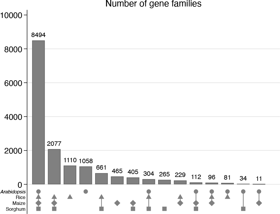
Default upsetplot for overlapping gene families. By default, subsets are ordered left to right by frequency.
Figure 1 is our first upsetplot. The default ordering of bars is left to right by frequency from most frequent to least frequent. The main twist on standard bar chart designs is use of a graphical legend in which a marker that is present denotes membership of a set.
As is common in statistical graphics, even with this relatively simple dataset, there is a little tension between a desire to show detail and a need to avoid crowding. The
Flexible control over sorting is strongly emphasized as a feature of


Figure 3 below sorts first on the number of sets to which a gene family belongs and then within that order by declining frequency.

Although the result is not shown here to save space, the next command shows how to get a twist on that, reversing the order on the first criterion.

If you are following along on your computer, it would be a good idea now to

As explained in section 2.4,

3.2 Missing data patterns example
We turn to looking at the patterns of missing values in one of Stata’s datasets. Here

After running the

As before, we use a convenient overall title and choose a gray color for the legend markers. More subsets are shown in these plots than in previous examples, so we need to squeeze the bar label text size a little.
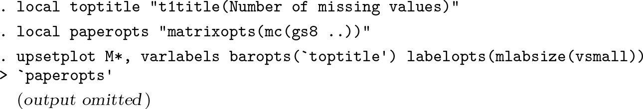
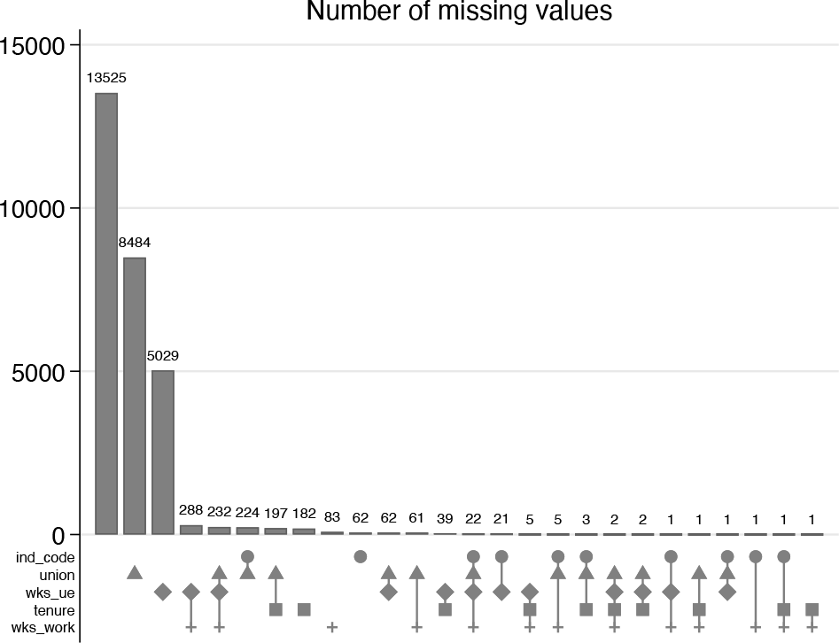
Figure 4 includes the subset in which none of the variables mentioned are missing, for which

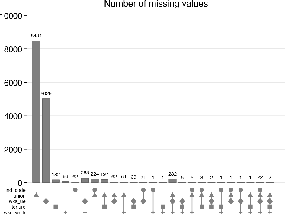
In the variant in figure 5, emphasis is placed on numbers of missing values both across observations and across variables.

3.3 Recasting from bars to droplines or spikes
Section 2.2 mentioned it is possible to show droplines or spikes rather than bars. Because the same information is shown, that choice would be a matter of taste or judgment. The syntax for recasting would be
4 vennbar
For consistency,
More importantly, much flexibility comes free with use of
As in general, using
We will revisit the datasets examined in section 3.
4.1 Genomics example
We are optimistic that you

Figure 6 is close to defaults and shows subsets in decreasing frequency order, reading from top to bottom. In detail, it owes a little to earlier experiments that showed that the y axis (which here is horizontal) should be extended to accommodate the bar label for the most frequent bar. You may agree with the suggestion detailed in Cox (2012) that when graphs have table flavor, the text for the horizontal axis often looks better at the top.

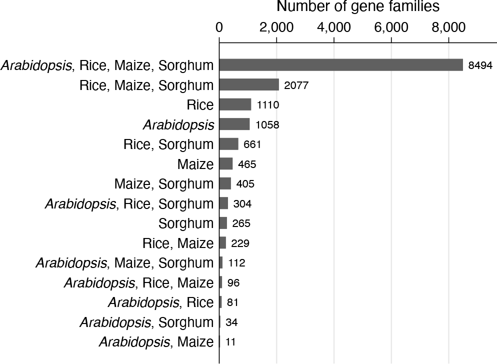
Venn bar chart for overlapping gene families. By default, subsets are ordered top to bottom by frequency.
By the way, a detail that is puzzling until it is familiar is that with
As already mentioned, the bar chart can be recast as a dot chart if that is preferred. The graph is not shown here, but the syntax may be of interest. The rendering of grid lines follows personal preferences for solid but thin lines.

Note that the
As with
Figure 7 is an example of a different sort order. A way to remember what happens with multiple


Venn bar chart for overlapping gene families. The ordering is by degree and decimal code, but text is shown.
Although the graph is not shown here, it is easy (for example) to flip sort order for degree to the opposite direction by removing

4.2 Missing-data example
Now we revisit the missing-data example using
Figure 8 is close to the default except for those options specified. In such cases, whatever you do can be right or wrong for a given context, such as using


Venn bar chart showing the structure of missingness in five variables from Stata dataset
To reduce the range of frequencies shown, we can omit observations with no missing values on any of the variables mentioned. Often, a focus on how many missing values there are is helpful as a measure of the problem to be faced and to understand the missingness patterns, namely, which variables tend to be observed or missing together. Figure 9 is our final plot example.


Venn bar chart showing the structure of missingness in five variables from Stata dataset
We close these examples with a reminder that if you prefer table form over such graphs, then reach for the
5 Syntax of upsetplot

5.1 Description
By default,
The order of variables presented to
Commonly, but not necessarily, subset frequencies (abundances) are already in a variable in the dataset. If so, that variable should be specified as frequency or analytic weights. If no weights are specified,
The display uses various subcommands of
The reduced dataset used by
The variables in such a reduced dataset are the original indicator variables and as follows. The names here may thus not be used as names for the indicator variables specified.
(Optionally)
5.2 Options
5.2.1 What to show
5.2.2 Detail of display
The default is to sort on the frequency (abundance) variable
Note that something like
graph_options are other options of
5.2.3 Saving results as new dataset
6 Syntax of vennbar
6.1 Description
The order of variables presented to
Commonly, but not necessarily, subset frequencies (abundances) are already in a variable in the dataset. If so, that variable should be specified as frequency or analytic weights. If no weights are specified,
The display by default uses
The reduced dataset used by
The variables in such a reduced dataset are the original indicator variables and as follows. Thus, the names here may not be used as names for the indicator variables specified.
(Optionally)
6.2 Options
6.2.1 What to show
6.2.2 Detail of display
graph_options refer to other options of
The default is
Note that any other
Using one or more
6.2.3 Saving results as new dataset
7 Historical remarks and literature survey
The elementary but fundamental idea of representing true (or present) as 1 and false (or absent) as 0 has a splendid history. Although it has yet longer roots, the idea was strongly developed by George Boole (1815–1864): Boole (1854) was his major work in this territory, on which see particularly Grattan-Guinness (2005). Boole has been given a full-length biography (MacHale 2014) and an even longer sequel (MacHale and Cohen 2018). For shorter accounts, see Gardner (1969; 1979, chap. 8), Broadbent (1970), MacHale (2000, 2008), Heath and Seneta (2001), or Grattan-Guinness (2004). Dewdney (1993) and Gregg (1998) provide examples of how such Boolean algebra features in computing. Knuth (1998, chap. 4.1) gives an excellent historical summary of positional number systems, and Knuth (2011) gives a masterly synopsis, including historical material, of related combinatorial algorithms. Strickland and Lewis (2022) focus on binary arithmetic and logic in the work of Leibniz (1646–1716). The leading biography of Leibniz is by Antognazza (2009), although the earlier biography by Aiton (1985) is still informative. Leibniz’s projects feature in many subplots in Stephenson (2003) and its sequels. Cox (2016) makes further Stata-related comments on truth, falsity, and indication. Cox and Schechter (2019) survey the creation of indicator variables in Stata.
Various commentators, from Leibniz onward, have seen anticipations of binary arithmetic in the divination manual I Ching (Yijing, Yi Jing, Yi King, etc.). That seems exaggerated. See Gardner (1974; 1986, chap. 20) for a brisk discussion and Knuth (2011) and Strickland and Lewis (2022) for further comments.
The
Euler–Venn diagrams are widely familiar in mathematics and science and indeed as a cultural meme echoed in cartoons, T-shirt or mug designs, and much else. Christianson (2012) mentioned Venn diagrams as one of 100 Diagrams That Changed the World. We could add, but rather should subtract, examples of diagrams that mimic their form but do not match their logic. Some entertaining examples are given by Bergstrom and West (2020, 149–151). Friendly introductions to set theory featuring Euler–Venn diagrams include Stewart (1975) and Gullberg (1997). Conversely, compare Hamming (1985, 367): “Set theory has been taught until the typical student is weary of it, so we will assume that it is familiar.” Beyond their original and continuing use in logic, such diagrams are commonly used in introductions to probability: see (for example) Pitman (1993), Whittle (2000), Dekking et al. (2005), Miller (2017), or Blitzstein and Hwang (2019). Historically and to the present, set theory is linked to much fundamental work in logic, number theory, and other parts of mathematics (Bagaria [2008]; various chapters in Grattan-Guinness [1994]; Stillwell [2010]).
For the history of Euler–Venn and related diagrams, see Baron (1969), Gardner (1982), Edwards (2004), Moktefi and Shin (2012), and Bennett (2015). Friendly and Wainer (2021, 102–103) flag the use of a similar area-proportional diagram by Playfair (1801, opp.p.48). Wilkinson (2012) covers some more recent work on drawing areaproportional plots from a statistical point of view. Macfarlane (1885, 1891) referred to composite categories laid out in sequence as the logical spectrum.
Venn (1880c,a,b, 1881, 1894) made explicit that the diagrams later often named after him grew out of earlier work. Indeed, few logicians were as fully aware of previous contributions. Thus, the name Venn diagram exemplifies Stigler’s Law (1980, 1999) that “[n]o scientific discovery is named after its original discoverer”. The injustice is partially corrected by crediting Euler’s earlier work (1768), on which see conveniently Sandifer (2007) or Bennett (2015). A distinction is often drawn (for example, Mollerup [2015, 166]) that Venn diagrams show all possible combinations, while Euler diagrams show only actual combinations. However, Euler’s contribution in turn was preceded by yet earlier work by Leibniz and several other scholars. Nevertheless, crediting Euler, Venn, or both is fair and there is no point to suggesting yet another term.
John Venn (1834–1923) now benefits from a full-length biography, Verburgt (2022). For shorter appreciations, see Broadbent (1976), Grattan-Guinness (2001), or Gibbins (2004). Grattan-Guinness (2011) places the work of Boole and Venn in context, surveying the development of logic in 19th century Britain. Venn’s interest in probability and statistics was profound: see especially his first book The Logic of Chance (1866, 1876, 1888) and a still useful review article on averages (Venn 1891).
Leonhard Euler (1707–1783) is also well served by a full-length biography (Calinger 2016). See also Calinger, Denisova, and Polyakhova (2019) on what in English is known as Letters to a German Princess. For a concise overview of some of his mathematical achievements, see Dunham (1999). For a shorter although still detailed account, see Youschkevitch (1971). For a very concise account, see Sandifer (2008).
8 Conclusion
This article takes as given that—beyond simple examples—annotated Euler–Venn diagrams have severe limitations in showing subset frequencies, even when cleverly drawn. They may allow individual detail to be read off easily, but they can be poor at showing the big picture of the distribution from common to rare subsets and do not offer any visualization of frequencies (or more generally abundances).
Whatever the graph preferred (or even if tables are desired), you need a data structure showing the information on overlap. That is calculated from a bundle of indicator variables—and, quite possibly, an already existing variable containing abundances.
The main contribution of this article is to document two new commands,
10 Programs and supplemental materials
Supplemental Material, sj-zip-1-stj-10.1177_1536867X241258010 - Speaking Stata: The joy of sets: Graphical alternatives to Euler and Venn diagrams
Supplemental Material, sj-zip-1-stj-10.1177_1536867X241258010 for Speaking Stata: The joy of sets: Graphical alternatives to Euler and Venn diagrams by Nicholas J. Cox and Tim P. Morris in The Stata Journal
Footnotes
9 Acknowledgments
This article arose from a conversation between the authors at the London Stata meeting in 2022. We much appreciate the enterprise, energy, and enthusiasm behind these meetings over almost 30 years shown by the late Ana Timberlake, Teresa Timberlake, David Corbett, and their colleagues.
Angela Wood originally drew the attention of Tim P. Morris to upsetplots. Antony Unwin provided Nicholas J. Cox access to his forthcoming book. Several posts on Statalist indicated very helpfully both interest in this problem and reactions to earlier versions of these commands.
10 Programs and supplemental materials
To install a snapshot of the corresponding software files as they existed at the time of publication of this article, type
12 Bibliographic note on Martin Gardner’s columns
Martin Gardner’s columns on “Mathematical Games” over many years in Scientific American covered much more than games and puzzles and included many splendid expositions of topics with mathematical content. They present a variety of small bibliographical challenges. The original articles will be accessible to many readers at ![]() but typically under the titles “Mathematical Games”. A further tiny detail is that pagination starts afresh in each issue of Scientific American, so volume and issue number together are needed for an exact citation. The columns were collected later in book form, often revised or retitled, in books that themselves often varied in publisher and even title over various reprints and reissues. A project to publish further revised editions, under yet other titles, from Cambridge University Press and the Mathematical Association of America, released its first four volumes between 2008 and 2014 but appears to have stalled. At the time of writing, it had not reached the books mentioned here.
but typically under the titles “Mathematical Games”. A further tiny detail is that pagination starts afresh in each issue of Scientific American, so volume and issue number together are needed for an exact citation. The columns were collected later in book form, often revised or retitled, in books that themselves often varied in publisher and even title over various reprints and reissues. A project to publish further revised editions, under yet other titles, from Cambridge University Press and the Mathematical Association of America, released its first four volumes between 2008 and 2014 but appears to have stalled. At the time of writing, it had not reached the books mentioned here.
https://en.wikipedia.org/wiki/List_of_Martin_Gardner_Mathematical_Games_columns and https://ansible.uk/misc/mgardner.html will help you find what you are looking for or indeed to determine whether a relevant column was ever written. See ![]() for a highly detailed bibliography of Gardner’s publications.
for a highly detailed bibliography of Gardner’s publications.
References
Supplementary Material
Please find the following supplemental material available below.
For Open Access articles published under a Creative Commons License, all supplemental material carries the same license as the article it is associated with.
For non-Open Access articles published, all supplemental material carries a non-exclusive license, and permission requests for re-use of supplemental material or any part of supplemental material shall be sent directly to the copyright owner as specified in the copyright notice associated with the article.