
Abstract
Two common problems with graph axis labels are to decide in advance on some “nice” numbers to use on one or both axes and to show particular labels on some transformed scale. In this column, I discuss the
1 Introduction
Consider a routine Stata graph, such as figure 1 obtained with Stata’s auto data. If you wish, you can read in the dataset yourself and follow the thread actively by typing in commands.
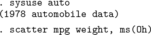

A common or garden scatterplot showing how
Users of Stata’s graphics commands quickly learn that there is an automatic choice of axis labels for such graphs. In
Here “nice” is a term of art as well as a simple English word. Part of the business of this column is to give some discussion of what it means for axis labels. As in the rest of life, niceness can be easy to recognize but harder to define precisely or universally.
Users also should quickly learn that you can reach in and override the default label choices if you prefer something else. For example, you might want axis labeling to start at 0, include more labels, or differ in some other way from the default. If so, spell out, say,
Sections 2 and 3 of this column focus on needs where neither the default nor the flexibility of specifying different choices on the fly is quite the answer. A problem often raised by users is wanting a series of graphs to follow the same label choices—because left to follow its own rules,
Users frequently want to show values on transformed scales. By far the most common example is that one or even both axes use logarithmic scales.
Although less common than logarithmic scales, various other nonlinear scales are possible in statistical applications. Square root, cube root, reciprocal, and logit scales are some leading examples. In principle, you just need to calculate what you want to show before the graph is drawn. The more challenging task is to show text labels on the original scales, just as with
Sections 4 and 5 here discuss a generic solution for labels on transformed scales, which is to loop over the text to be shown as axis labels and to work out where to put it in each case (Cox 2008b, 2012). To this end, the community-contributed command
Any readers new to Stata or more familiar with other software might like a confirmation that Stata’s axis labels are not text titles for an axis but any text shown at axis ticks. Other terms that can be found include tick mark label (Cleveland 1985, 23; 1994, 24; Robbins 2013, 156) and tick label (Koponen and Hildén 2019, 206).
2 nicelabels in practice
2.1 nicelabels fed minimum and maximum

As the examples show,
Stata programmers will appreciate the close correspondence between Heckbert’s original pseudocode and C code and the Mata code used inside
The default of “about 5” labels echoes widespread statistical practice, exemplified in the suggestion by Cleveland (1985, 39; 1994, 39) of 3 to 10 labels on any axis.
Naturally, you may ask for more labels. You should guess that, rather than use a step of 20, the code might suggest a step of 10 if you ask for moderately more labels. Here adding the option

This insistence on a local macro is intended to be in your own best interests, encouraging the use of that local macro within a later command, either interactively or in a do-file or program. Because
2.2 nicelabels fed a numeric variable name
Let’s now switch to the major syntax of
For 50 states of the United States in 1980, let’s imagine working with median ages. The point is not that

You feed the variable name to

With its default,
Let’s use

Figure 2 shows the result.

Quantile plot for median ages of 50 U.S. states in 1980.
A small lesson here is that the output of

Figure 3 shows the result. Utah, Alaska, and Florida are unsurprising identifications.

Quantile plot for median ages of 50 U.S. states in 1980. For this version, we specified a display format for the median age labels, and added some annotation.
2.3 Further twists
Let’s think how to tackle some further twists that may arise. For the sake of variety, examples are taken once more from
An axis should start at zero: Suppose you have a variable that is always positive, but you want an axis, and so axis labeling, to start at zero. Whether axes should start at zero is sometimes a vexed question in statistical graphics, but for now we will just run with that choice as a decision made. One way to do that is to feed

Note that using the maximum from the
Axis labels should include empirical minimum and maximum: A possibility shown by Tufte (2001, 149) is that the lowest and highest labels are the empirical minimum and maximum; the others are all “nice”. The trick here resembles that in the previous example—to get extremes from

Figure 4 shows the result. The example is candid in showing a limitation of the idea: it can seem a little awkward at best if a minimum or maximum label is very close to a nice label.

A scatterplot with nice labels together with empirical minimum and maximum on each axis
Here we are exploiting how easy it is to redefine a local macro.
Controlling the number of labels: Redefining a macro is also crucial to the next twist here. In a do-file or program, we might want to insist on at least a certain number of axis labels. One idea is simple: Try out the
As previously, but now finding that three labels are too few:

Once again: If you are working interactively, you could see for yourself that only three labels are suggested the first time around and move immediately to asking for more. The point about using
2.4 Further remarks
The aim of
Consider, for example, a graph with two years’ worth of monthly data and a monthly date on the X axis.
Less common—but important to their users—are variables on a circular scale such as compass bearings (in degrees from North, on a scale between 0 and 360 ◦ ) or times of day (in hours up to 24). Here useful steps are likely to be 90 or 45 ◦ or 6 or 3 hours, not (for example) 100 or 50 ◦ or 5 or 10 hours.
This implementation of
3 nicelabels in principle
3.1 Syntax
3.2 Description
“Nice” is a little hard to define but easier to recognize. This command follows common practice in general, and Heckbert (1990) in particular, in selecting power-of-10 multiples of 1, 2, or 5 that are equally spaced.
See Hardin (1995) for an earlier implementation in Stata of such ideas. Hardin (1995) implemented what Heckbert calls a “loose” definition of labels, while this command allows also a “tight” definition.
There are two syntaxes. In the first, the name of a numeric variable must be given. In the second, two numeric values are given, which will be interpreted as indicating minimum and maximum of an axis range. Those two values can be given in any order.
3.3 Options
4 mylabels in practice
As explained in the introduction,
A better idea, explicit in Royston (1996) in a Stata context, is to expect users to calculate what numbers they want to show and to focus on the question of what axis labels should be shown whenever such numbers are graphed. This is what
For a first example, we use

Figure 5 is the result.
Gallons per 1,000 miles versus weight, but labeled in terms of miles per gallon using
For
The labels you want to see: Often, but not necessarily, such labels are specified as numlists. We have already seen examples of the step notation, used just now for 15(5)40. More information on allowed notation is given at
The scale you are working on: Here the
A place to put the specification: As with
Although it is not so often wanted,
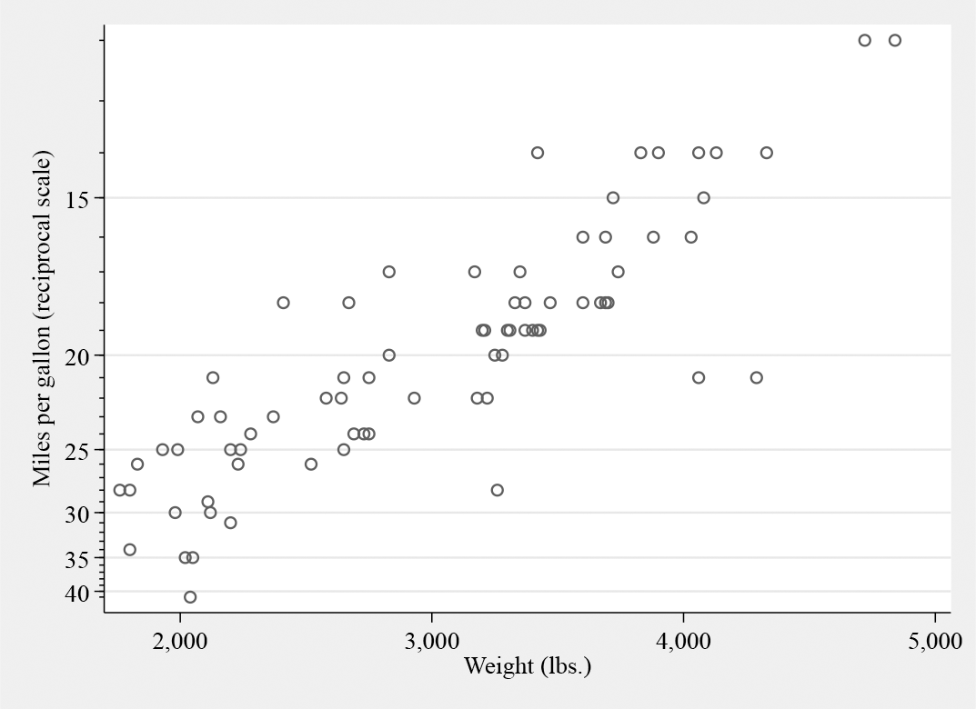
Transformations do not have to be nonlinear to be useful. A large group of linear transformations concerns mappings between different units of measurement, including simple scalings such as between proportions from 0 and 1 and percents from 0 to 100. The next example takes data for U.S. cities on average temperatures in Fahrenheit but shows labels on a Celsius scale. Recall that Fahrenheit temperatures F and Celsius temperatures C are related by F = 32 + (9/5)C. After a quick look at

July and January temperatures for various U.S. cities. The original data were on Fahrenheit scale, but
Fortuitously, but fortunately, the aspect ratio is about right, namely, that these cities vary much more in January temperature than in July temperature. The ratio of ranges is matched roughly by the aspect ratio of the graph.
Naturally, you could just calculate new variables holding Celsius values. The point is that you do not have to do that. For example, you might have many variables on the Fahrenheit scale, and holding two versions of each variable might seem a little cluttered in that case.
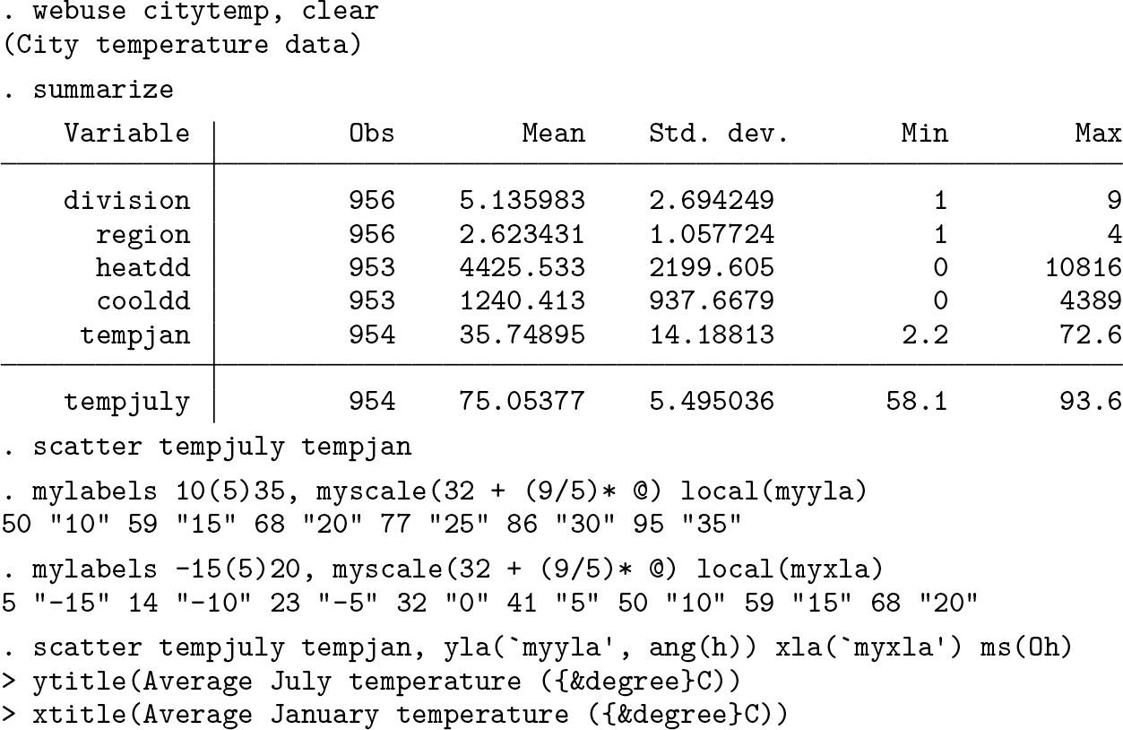
For our next example, let’s look at the
So we want to use

The result is shown in figure 7.

Spikeplot of wage on logarithmic scale with frequencies on a root scale. See text for how
Suppose first you want to show “%” explicitly by each label. Precedents include Robbins (2013, 188, 250, 278, 318), Knaflic (2015, 1, 48f, 51, 59, 81f, 156, 209f, 228ff, 238f), Koponen and Hildén (2019, 22, 64, 77, 84, 94, 101, 107, 185, 190, 193ff, 206, 209, 214ff), Wilke (2019, 29, 34, 69, 101f, 104, 107, 139ff, 179, 184f, 234ff, 258f, 261), Tufte (2020, 107), and Gelman, Hill, and Vehtari (2021, 4, 29f, 94, 96, 114, 126f, 166, 292, 467f). The excess of zeal in citation will be explained shortly.
Note the way the local macro is just passed from command to command, being modified or just used according to need.
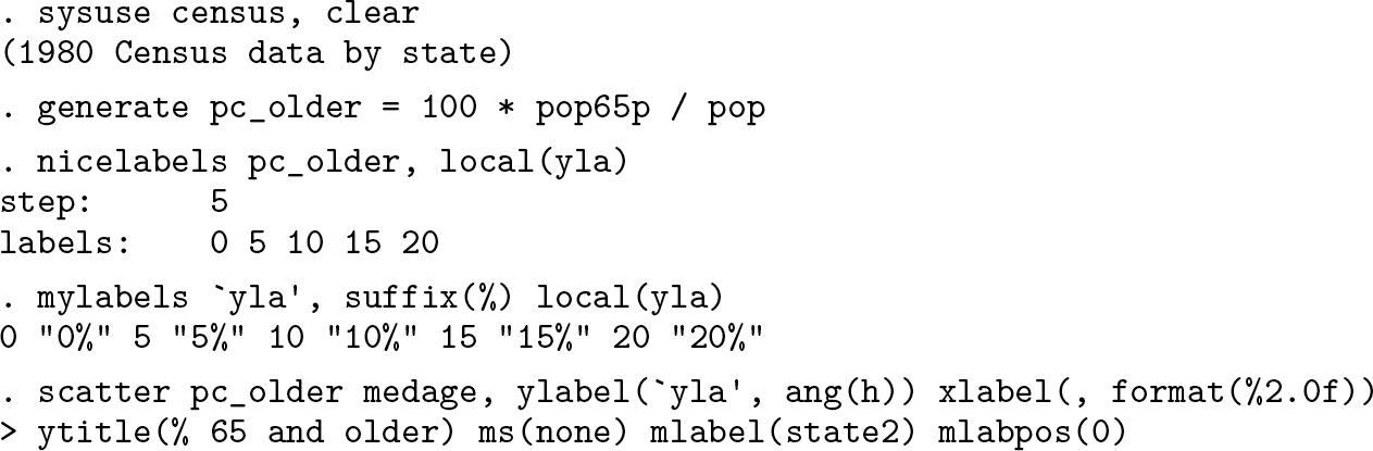
Figure 8 is the result.

Percent 65 and older and median age for 50 U.S. states in 1980.
There is a question of taste here. Simply, if you think that adding a percent sign to every label is repetitive clutter, then do not do that. The point of multiplying citations just now was to underline that some excellent authors often do this. Do make your own choice. You might prefer to explain measurement units in an axis title or text caption, if they need explanation at all.
There is a compromise, amply exemplified by Wong (2010, 24f, 50f, 58ff, 64f, 69, 100, 102, 107, 111, 115, 117, 119, 126, 128ff, 141) and Koponen and Hildén (2019, 98f, 181f), which is to add a prefix or a suffix to one label only, say, the first or last on an axis.
5 mylabels in principle
5.1 Syntax
5.2 Description
5.3 Remarks
You draw a graph, and one axis is on a transformed square-root scale. You wish the axis labels to show untransformed values. For some values, this is easy; for example,
The idea behind
Suppose you want labels 0 1 4 9 16 25 36 49, and your data are square roots of these. Your call is
A similar idea may be used for axis ticks.
Further examples are given in the help file.
5.4 Options
6 Conclusion
In graphics, like much else, the devil can lie in the details. Many graphs are for one purpose and can be optimized on the fly to match your personal taste or some compelling prescription. Other graphs may need to follow some overarching choices, worked out systematically.
Some other tips and tricks in similar territory can be found in Cox (2005b, 2007b, 2008a) and Cox and Wiggins (2019).
8 Programs and supplemental materials
Supplemental Material, sj-zip-1-stj-10.1177_1536867X221141058 - Speaking Stata: Automating axis labels: Nice numbers and transformed scales
Supplemental Material, sj-zip-1-stj-10.1177_1536867X221141058 for Speaking Stata: Automating axis labels: Nice numbers and transformed scales by Nicholas J. Cox in The Stata Journal
Footnotes
7 Acknowledgments
Many questions on Statalist and elsewhere have shown what kinds of needs arise across a wide range of Stata graphics practice. Richard Campbell, Richard Goldstein, John Kim, Clive Nicholas, Gabriel Rossman, and Philippe van Kerm are particularly recalled for challenges, corrections, and suggestions.
8 Programs and supplemental materials
To install a snapshot of the corresponding software files as they existed at the time of publication of this article, type
References
Supplementary Material
Please find the following supplemental material available below.
For Open Access articles published under a Creative Commons License, all supplemental material carries the same license as the article it is associated with.
For non-Open Access articles published, all supplemental material carries a non-exclusive license, and permission requests for re-use of supplemental material or any part of supplemental material shall be sent directly to the copyright owner as specified in the copyright notice associated with the article.