
Abstract
The spaghetti problem arises in graphics when multiple time series or other functional traces show mostly a tangled mess. The related paella problem (often experienced but not usually named as such) arises for multiple patterns combined in scatterplots. This column is a sequel to those in Stata Journal 10: 670–681 (2010) and 19: 989–1008 (2019). The focus is on what are here called front-and-back plots, in which each subset of data is shown separately with the other subsets as backdrop. The strategy is thus a hybrid of two more common strategies, showing each subset separately (juxtaposing) and showing subsets together (superimposing). A new command,
Keywords
1 Spaghetti and paella problems in statistical graphics
The spaghetti problem is easy to explain. Spaghetti plots are those showing many tangled lines—say, for multiple time series or other functional traces—which can be hard to distinguish and interpret. We may see broad collective patterns, but can we easily focus on individual series, too, or tell apart fine structure and mere noise?
This column is a sequel to a recent discussion of the spaghetti problem (Cox 2019). As promised then, it is also an update to discussion of a particular strategy discussed by Cox (2010).
The term “spaghetti” is often used informally in graphics discussions. Some token references to use in academic and professional literature were given in the 2019 column. Readers curious about earlier uses may appreciate an extra reference mentioning spaghetti, Zelazny (1985, 2001). In each edition of his book on business presentations (the dates just given are those of first and fourth editions), Zelazny gives (pp. 39, 111) examples in which a series of particular interest A is plotted in turn paired with each other series B, C, D, and E. That device is similar in spirit to the strategy used here but will not be explored further in this column.
As in Cox (2019), a related problem might be called the paella problem. Paella in scatterplots means that multiple point patterns for many groups are sufficiently mixed up that comparisons are made difficult. In paella itself, the mixture is a feature, but in graphics it can be a problem.
2 Front-and-back plots
The focus in this column is on what are here called front-and-back plots, in which each subset of data is shown separately and prominently (in front, as it were) with the other subsets as backdrop. The strategy is thus a hybrid of two more common strategies, showing each subset separately (juxtaposing) and showing subsets together (superimposing). A new command,
The need for a name is twofold. First, a name for use in Stata. Easy implementation of this strategy in Stata requires, or at least benefits from, a dedicated command. No such command was given in Cox (2010); that column explained how to approach the problem in Stata from first principles and gave example code. The command
Second, a name for a novel kind of plot. Not every kind of plot within statistical graphics needs a distinct name; otherwise, we would be tripping over terminology interminably. Nevertheless, this particular strategy is insufficiently known yet also often reinvented or rediscovered. An evocative name would do no harm in establishing it as a standard idea.
3 A line plot example: Investment in the Grunfeld data
The first example in Cox (2019) used the Grunfeld dataset bundled with Stata. That works as well as any to show the point of this strategy and indeed its limitations too. The dataset can be read into Stata with
The dataset includes various measures for 10 companies, each measured for 20 years. There are no missing values. If an idea does not work well with the Grunfeld data, it is unlikely to work well for larger or more complicated datasets.
Such datasets are often called longitudinal or panel data, depending partly on your field. The latter term raises mild ambiguity: when we say “panel”, do we mean a subset of the data or panel in a graph with several panels? The ambiguity does not often bite hard. Terms such as “facet” are available for the graphical meaning but as yet do not seem common in Stata circles.
We focus here on line plots of investment as a time series. The syntax of
Figure 1 shows the result. The main idea is repeating each panel (here an individual company or firm) as a series in front but with all the other firms as backdrop. Company 1 is shown with companies 2 to 10 as backdrop, company 2 with companies 1 and 3 to 10 as backdrop, and so on.
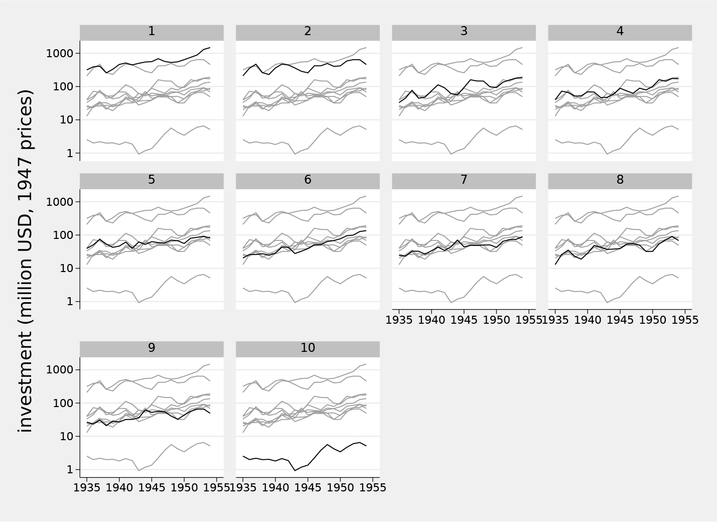
Investment time series for the Grunfeld panel data using a front-and-back plot
As in Cox (2019), we added an informative variable label, adopted a logarithmic scale, and specified customized axis labels.
Without prompting,
The defaults of
Varying the

Investment time series for the Grunfeld panel data using a front-and-back plot. In this case,
Another simple device is tuning line width. Figure 3 keeps the line choice but bumps up line width for the front series.

Investment time series for the Grunfeld panel data using a front-and-back plot. In this case,
So far, the examples given have all matched the form
4 Tradeoffs and the scope for selection
As in graphics generally, the tradeoff between subtle and strong contrasts can be delicate and difficult, balancing personal taste and the need for displays to be decoded easily and effectively. If the panels are all named, and the names mean something to researchers or readers, then one-to-one comparisons are likely to remain relevant, and tracking each series from one display to another remains desirable. That could be true of, say, countries or other places in economic or environmental datasets. If the panels are anonymous, or their identifiers are of no interest, then other series may be no more than collective context, and being able to focus on details may be less important. That could be true of patients or anonymous subjects in medical or social datasets.
The number of panels being compared can pose difficulties. The Grunfeld dataset as a first example is large enough (10 companies) both to show the problem of easy and effective comparison and to show difficulties with any solution. Do readers want to scan 10 graphs, or can they be trusted to do so? What about 50 or 200 or 1000?
A device that can help is an ability to select panels. Suppose all panels are of some interest, but you are especially interested in only a few.

Investment time series for the Grunfeld panel data using a front-and-back plot. In this case, four leading companies are shown distinctly, with the other nine shown as backdrop.
The
for a dataset on the states of the United States in which California, Florida, New York, and Texas are to be shown distinctly—or
for a dataset on European countries in which Germany, France, Britain, and Italy are to be flagged.
It is a matter of taste only, but it seems to me that graphs with 2, 4, 6, and 9 panels can look quite good. I am even tempted sometimes to avoid graphs with 3, 5, 7, or 8 panels, usually positively by including an extra panel or two. Otherwise put, if space is available, you might as well use it to show some data.
5 A scatterplot example: auto.dta
Let us look at an example of front-and-back plotting applied to scatterplots. We switch to
Figure 5 is a basic front-and-back plot, but a little more work can make it more effective. The idea here is to suppress the marker symbols and replace them with marker labels at the same places and magnified a little. That improves comparison both of each subset in its own graph panel with its backdrop and of subsets across panels. Figure 6 is the result. Bare numbers 1 2 3 4 5 may seem prosaic, but they are the data values in this case. In principle, any numeric or string variable may be used as a marker label, and text labels that are one, two, or three characters long can work well (Cox 2005, 2019). Fuller names may be in order so long as you have the space to show them without messy overlaps.

Scatterplot for miles per gallon and weight by repair record for cars in
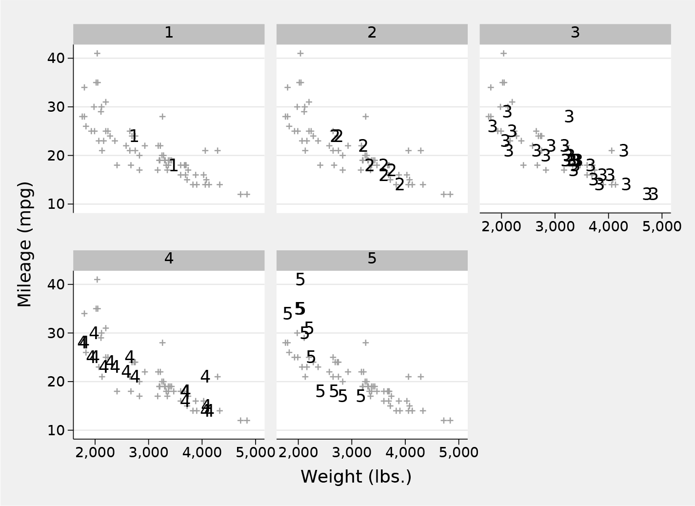
Scatterplot for miles per gallon and weight by repair record for cars in
6 A more challenging example: Gumbel quantile plots
The major example in Cox (2010) consisted of a composite Gumbel quantile plot for six distributions of annual windspeed maximums from various stations in Texas, Alabama, Florida, and Georgia. As explained there with references or through Cox (2007) and its references, such a plot ensures that a sample perfectly matching a Gumbel distribution would plot as data points following a straight line. In this section, that example is revisited using
You may wish to skim or skip ahead to the next chunk of code if you are already familiar with the idea of quantile plots (still often called probability plots).
Quantile plots typically show on one axis raw data or occasionally those raw data on a transformed scale. That typically requires little or no work from a researcher. On the other axis is shown an estimate of the associated cumulative probability, the fraction of the data less than or equal to each ordered value, often called the plotting position in graphical contexts, or percentile rank in numerical reporting. That estimate requires more work if you are not using a preexisting command. Often, the estimate is shown on some transformed scale, typically as the quantile of a reference distribution, as in this example.
The small issues surrounding plotting positions are illuminated by imagining a toy sample of seven observations with no ties, whose values would be ranked 1 to 7. Let us agree that the median for such an example dataset must have rank 4 and should have associated cumulative probability or plotting position 0.5. Possible rules for plotting positions rank / sample size or (rank − 1) / sample size both fail because they would yield plotting positions for the median of 4/7 or 3/7, respectively. The oldest solution for this tiny dilemma, which goes back at least to Galton (1883), is to split the difference and use (rank − 0.5) / sample size. Other solutions can be suggested on other grounds that give the same plotting position for the median of an odd number of values and also treat the upper and lower halves of the data symmetrically. A more subtle issue arises: plotting positions should not ever be 0 or 1, because only if probability distributions have finite bounds will the corresponding quantiles, indicating the minimum and maximum possible values, be determinate. Plotting positions strictly within (0, 1) leave scope for lower or higher values than those observed in a sample.
There is a continuing and even agitated literature discussing the merits and demerits of various plotting position rules. For some examples and more references, see Cox (2016).
A pragmatic position, which would not satisfy all of those who have written on this issue, starts with insistence that most uses of quantile plots are descriptive or exploratory. If the appearance or interpretation of such plots depends sensitively on choice of plotting position rule, then your sample is too small or too awkward to indicate very much reliably. The discussion is not trivial, however, if the issue is reliable estimation, usually extrapolation, of extreme quantiles.
Stata lacks an official command or function for plotting position calculation. That is not much of a limitation. It is even a feature insofar as it allows and indeed encourages researchers to think through what they want and make their choice explicit in code.
In real datasets, ties and missing values are entirely possible, so it is prudent to use
Figure 7 is the result. The main point for current purposes is simply that
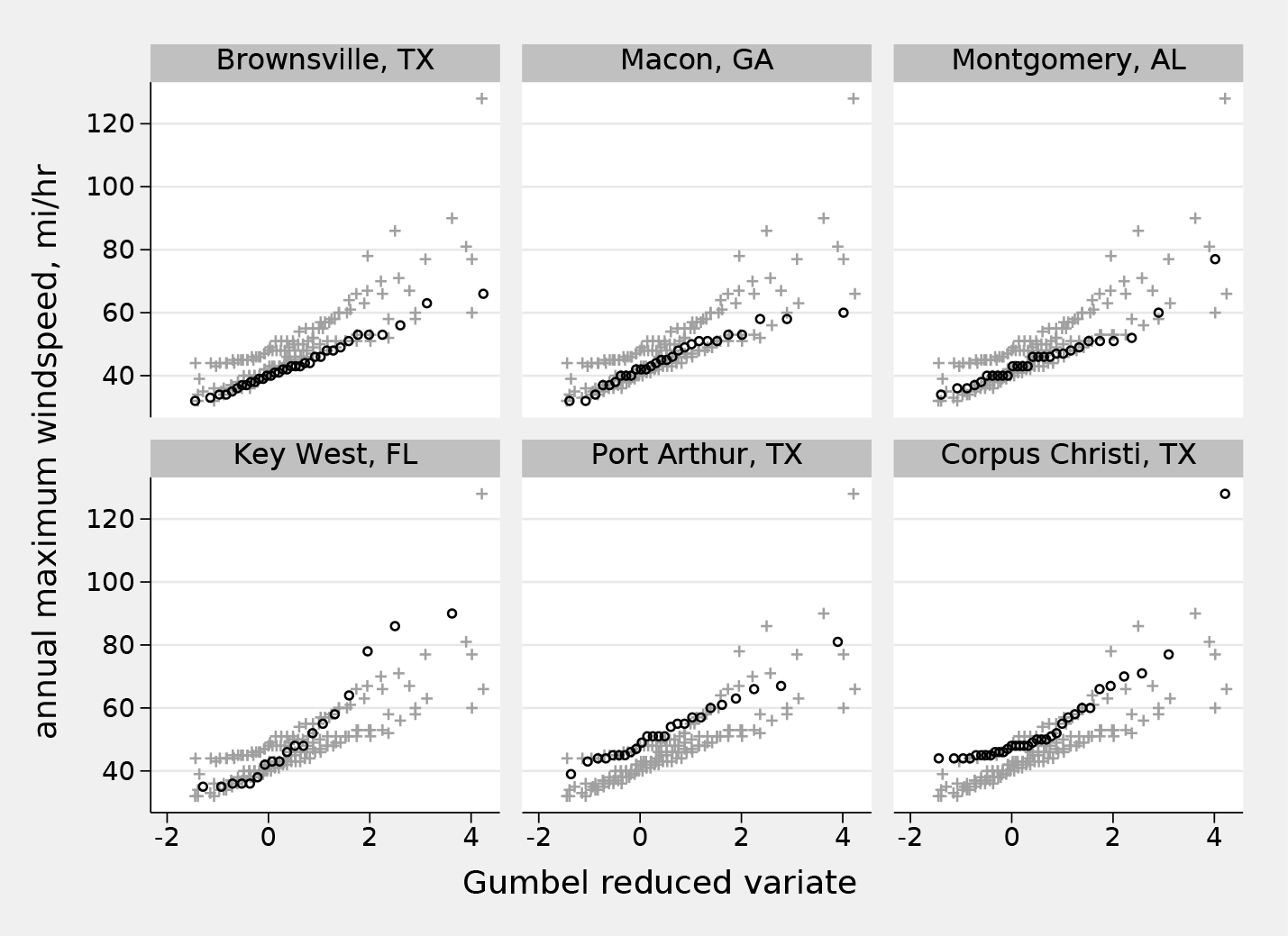
Quantile plots for annual windspeed maximums for six stations shown as a front-and-back plot
7 Roots and relations
I gather together here a bundle of references to applications of this idea. Most of these cite no other applications, so a fair surmise is that it has been repeatedly rediscovered or reinvented and hence that yet other applications may abound.
Front-and-back plots are a special case of what Tufte (1990, 1997, 2001) called small multiples, in which a display contains several panels, each a variation on a theme.
The longest root I have encountered of front-and-back plots belongs to a related idea in dynamic graphics dubbed “alternagraphics” by Tukey (1973). See also Tukey (1983), Tukey and Tukey (1985), or Monmonier (1993). Perhaps more accessible to many readers is a review by Becker, Cleveland, and Wilks (1987). They explain the principle (pp. 357–358): “At a given moment in time the viewer can identify some of the subsets and the selection of identified subsets can be changed quickly. There are many ways of implementing this idea. One is to cycle through the subsets showing each for a short time period…. Another technique is to show all of the data at all times and have the cycling consist of a highlighting of one subset at each stage. A third technique is to provide the data analyst with the capability of turning any subset on or off….”
Cleveland (1985, 74, 203, 205, 268) shows graphs in which summary curves for groups are repeated with data shown separately for each group. (Note: these graphs do not appear in Cleveland [1994].) The same idea is used in Wallgren et al. (1996, 47, 69).
Other examples can be found in Koenker (2005, 12–13); Carr and Pickle (2010, 85); Yau (2013, 224); Rougier, Droettboom, and Bourne (2014); Schwabish (2014; 2017, 98); Knaflic (2015, 233); Unwin (2015, 121, 217); Berinato (2016, 74); Cairo (2016, 211); Camões (2016, 354); Standage (2016, 177); Wickham (2016, 157); Kriebel and Murray (2018, 303); Grant (2019, 52); Koponen and Hildén (2019, 101); and Tufte (2020, 26).
Between submission of this column and final proofreading, I stumbled across examples in The Guardian of February 6, 2021 (https://www.theguardian.com/business/2021/feb/06/is-big-tech-now-just-too-big-to-stomach), and The Economist of April 10, 2021 (https://www.economist.com/graphic-detail/2021/04/10/our-house-priceforecast-expects-the-global-rally-to-lose-steam). Researchers should be taking note when good journalism raises standards in statistical visualization.
Readers knowing interesting or useful examples or discussions, especially early in date or comprehensive in detail, are welcome to email the author.
8 Syntax for fabplot
8.1 Options
graph_options are options of
9 Conclusion
Plotting data with a subset structure is a long-standing problem in statistical graphics. As one solution, front-and-back plots have long roots yet remain used and appreciated only occasionally. This column is further publicity for the idea, which is the main story, and for a distinct name and for a Stata implementation. The aim of the hybrid strategy is to get the best of both worlds—the clarity imparted by separate focus on each subset and the context provided by seeing that subset compared with all the other data.
11 Programs and supplemental materials
Supplemental Material, sj-zip-1-stj-10.1177_1536867X211025838 - Speaking Stata: Front-and-back plots to ease spaghetti and paella problems
Supplemental Material, sj-zip-1-stj-10.1177_1536867X211025838 for Speaking Stata: Front-and-back plots to ease spaghetti and paella problems by Nicholas J. Cox in The Stata Journal
Footnotes
10 Acknowledgments
Naomi B. Robbins helped with the Zelazny references from her personal copies. Antony Unwin underlined related tactics in dynamic graphics.
11 Programs and supplemental materials
To install a snapshot of the corresponding software files as they existed at the time of publication of this article, type
References
Supplementary Material
Please find the following supplemental material available below.
For Open Access articles published under a Creative Commons License, all supplemental material carries the same license as the article it is associated with.
For non-Open Access articles published, all supplemental material carries a non-exclusive license, and permission requests for re-use of supplemental material or any part of supplemental material shall be sent directly to the copyright owner as specified in the copyright notice associated with the article.