
Abstract
Receiver operating characteristic (ROC) curves are commonly used to evaluate predictions of binary outcomes. When there is a small percentage of items of interest (as would be the case with fraud detection, for example), ROC curves can provide an inflated view of performance. This can cause challenges in determining which set of predictions is better. In this article, we discuss the conditions under which precision-recall curves may be preferable to ROC curves. As an illustrative example, we compare two commonly used fraud predictors (Beneish’s [1999, Financial Analysts Journal 55: 24–36] M score and Dechow et al.’s [2011, Contemporary Accounting Research 28: 17–82] F score) using both ROC and precision-recall curves. To aid the reader with using precision-recall curves, we also introduce the command
1 Introduction
Recent developments in machine learning have increased interest in predictive modeling. An important component of building a predictive model is evaluating model efficacy. For evaluating predictions of binary outcomes, receiver operating characteristic (ROC) curves are the most common tool. In this article, we discuss when it may be advisable to consult an alternative tool—precision-recall (PR) curves—and introduce a command,
In some settings, we may be interested in predicting an outcome that is relatively rare (for example, fraud). In these settings with a rare outcome, ROC curves can be shifted outward relative to what would be found under a more balanced distribution. This outward shift can hinder comparisons of predictors. Our suggestion, and that of some recent literature (for example, Saito and Rehmsmeier [2015]), is to compare the PR plots for these predictors. There are, of course, other reasons for preferring PR curves to ROC, for example, having a loss function (or objective function) that better aligns with the output provided by the PR curve.
We illustrate the difference between ROC and PR curves using two well-known corporate fraud predictors: Beneish’s (1999) M score and Dechow et al.’s (2011) F score. While the M score has a preferable ROC curve, a PR curve highlights the F score’s lower false-positive rate for companies with the greatest predicted fraud risk.
While much of our discussion synthesizes previous work, there are a few novel aspects. First, we elucidate the potential magnitude for ROC curves to overstate the efficacy of predictors for rare events. This is accomplished through a simulation in which we vary the percent of cases of interest but hold the true predictive power constant. Second, we compare two commonly used corporate fraud predictors. While both Beneish (1999) and Dechow et al. (2011) discuss their out-of-sample predictions, there appears to be little subsequent work that compares these two predictors. Exceptions are Price, Sharp, and Wood (2011) and Cecchini et al. (2010), who compare the ROC curves for the M and F scores over the periods 1995–2008 and 1999–2006 (which overlap with our period of 2006–2011), respectively. Consistent with Price, Sharp, and Wood (2011), we find that the M score achieves a preferable ROC curve.
Our new command,
In the next section, we review ROC and PR curves and discuss the situations in which PR curves can add valuable information to the evaluation. In section 3, we compare fraud prediction scores. In section 4, we introduce the command
2 Review of PR and ROC curves
We assume that each observation belongs to one of two classes: positive or negative. In most economic applications, positive is coded as 1 and negative is coded as 0. To make predictions, we have a continuous “score”. For example, the predictive probabilities from a logistic regression could be used as a score. We do not require that the score be a probability. Instead, we focus on how our score ranks the instances. Throughout this article, we refer to a set of ordinal scores as a “classifier”.
Our task is to evaluate how well our classifier predicts class. Given a threshold, we could predict that all observations with a value that is above the threshold are positive and all observations below the threshold are negative. To see how well the rating works in combination with the threshold predict class, we define precision, recall, and the false-positive rate as


where the confusion matrix in table 1 defines true positives (TP), false positives (FP), negatives (N), and positives (P). In other words, precision measures how many of the items that were predicted to be positive cases are truly positive cases. Recall is the percent of positive cases that were identified. The false-positive rate is the percent of negative cases that were incorrectly predicted to be positive.
A confusion matrix defining TP, FP, negatives, and positives

The values of precision, recall, and the false-positive rate vary with the threshold used to map our scores into predictions. A common approach is to plot these values for all possible thresholds. PR curves plot precision as a function of recall; ROC curves plot recall as a function of the false-positive rate. 1 To facilitate a comparison with a classifier that bears no predictive value, these plots typically include a reference line corresponding to random predictions. For ROC curves, the reference line is a 45-degree diagonal. For PR curves, the reference line is a horizontal line at the rate of positives in the population.
We say that skew is greater when the absolute difference in the percent of positive and negative cases is larger. A dataset in which 50% of the observations belong to the positive case and 50% to the negative case exhibits no class skew. Class skew is also referred to as “class imbalance” in the literature. For datasets that exhibit class skew, it is usually the case that the negatives outnumber the positives.
2.1 When PR curves should be consulted
Before discussing when PR curves should be examined, we should note that ROC curves have many desirable features. The area under a ROC curve (ROC AUC) has a connection to the Mann–Whitney U statistic, which enables asymptotic analysis of ROC AUC, including confidence intervals. (For more details, see DeLong, DeLong, and Clarke- Pearson [1988].) ROC AUC has an intuitive interpretation as the probability that a randomly chosen positive case would be ranked higher than a randomly chosen negative case. While ROC AUC will always be bounded between zero and one, the achievable area under a PR curve will vary with class skew (Boyd et al. 2012). ROC curves also tend to be less volatile than PR curves.
Despite the many benefits of ROC curves, two related issues can arise in the presence of class skew. The first is that with few positives, recall will increase quickly as positive items are captured. This can lead to big differences in ROC AUC for small changes where the positive cases lie in the ranked list. Also, small changes in the false-positive rate indicate large changes in the number of FP when there are many negatives (this has been discussed by Davis and Goadrich [2006] and Saito and Rehmsmeier [2015]). The second issue is that, in many settings, ROC AUC is increasing in class skew.
This first issue is related to the classification objective. For a given task, we may care more about identifying a high percentage of the positives or ensuring that the items we flag are mainly positives. ROC curves are more attuned to the former and PR to the latter. Davis and Goadrich (2006) provide an example that highlights the different information provided by ROC and PR curves. We reproduce this example in figure 1. In this example, classifier 2 achieves a greater ROC AUC than classifier 1 but has a much lower PR curve. 2 Classifier 2 recalls all the positives while misclassifying only 25% of the negative cases. In other words, all the positive cases are in (roughly) the top 25% of the highest ranked observations. For classifier 1, some of the positive cases are ranked much lower. The PR curve shows us that for the highest-ranked observations that contain half of the positive cases (that is, recall equals 0.5), all the instances belong to the positive class.
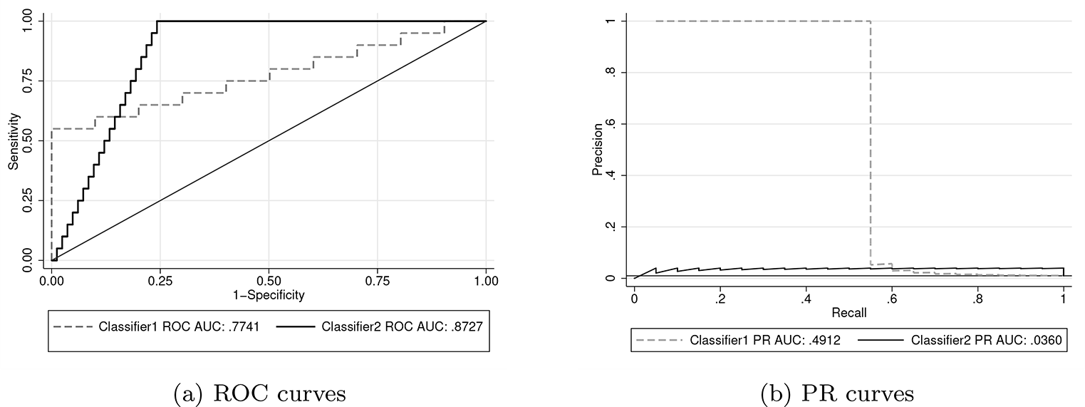
An example from Davis and Goadrich (2006) that illustrates how ROC and PR curves can provide different information about a classifier’s performance
We provide a slightly more intuitive plot in figure 2, which plots precision as a function of the item’s rank once sorted from highest to lowest score. Here we can see that if we are interested only in highest ranked items (for example, the top 100 or so), classifier 1 contains a higher portion of positive cases. If we are interested in identifying all the positive cases, classifier 2 captures these in the top 500. The intuitive nature of precision has led some to conclude that PR curves are more informative than ROC (Saito and Rehmsmeier 2015). It can be cumbersome to determine the number of FP among the observations with the highest scores from a ROC curve when there are many negatives. If our primary goal is identifying all the positive instances, ROC curves may still be preferable.

Precision as a function of rank for the example from Davis and Goadrich (2006)
The second issue related to class skew (that is, the inflation of ROC AUC) has been the source of some confusion. Fawcett (2006) states that ROC curves are unaffected by class skew; (Davis and Goadrich 2006, 1) caution that in the presence of class skew, “ROC curves can present an overly optimistic view of an algorithm’s performance”. Webb and Ting (2005) and Fawcett and Flach (2005) provide an excellent discussion of the effect of class skew on ROC AUC. Fawcett and Flach (2005) provide a useful distinction between what they refer to as X → Y and Y → X domains. Fawcett and Flach (2005) motivated this distinction by thinking about the causal link between the features used to construct the classifier and the outcome that we are interested in predicting. For the X → Y domain, the features cause the outcome; for the Y → X domain, the outcome causes the features. We use slightly different definitions—we define the X → Y domain as a setting in which the ROC AUC is affected by class skew and the Y → X domain as a setting in which it is not. These definitions are formalized in section 2.2.
For Y → X domains, ROC curves are unaffected by class skew. ROC curves are unaffected because the distribution of the classifier’s scores are fixed conditional on the true state (as described below). An example of a Y → X domain from Fawcett and Flach (2005) is medical diagnosis. Symptoms of a disease could be used to predict whether an individual is infected.
By contrast, for X → Y domains, an increase in the class imbalance inflates AUC. The X → Y domain encapsulates any setting that is not in the Y → X domain. Settings in a causal relationship that is run from the classifier to the true state would be in the X → Y domain because the conditions for Y → X domain are stronger than a causal relationship from the state to the classifier. As an example, a fraud detection score that contains management’s incentives to overstate earnings would be in the X → Y domain.
The essential feature of the Y → X domain is that we can express the distribution of the classifier’s scores as fixed conditional on whether the item is a positive or negative. For example, the body temperature of someone with an illness might follow a normal distribution with mean and standard deviation 101 and 2 degrees Fahrenheit, respectively. If the classifier’s scores follow a fixed distribution conditional on the item’s true status, recall and the false-positive rate would be unaffected by the percent of positive cases. A causal relationship from the true class to the classifier is not sufficient for a setting to be in the Y → X domain.
The shift of PR curves that results from class skew is generally seen as an advantage (see, for example, Saito and Rehmsmeier [2015]). Given that precision has an intuitive interpretation of the percentage of predictions that are truly positive, PR curves provide information about how class skew affects performance. Also, while PR curves are affected by class skew, so is their reference line. Thus, while the PR curve is shifting with the percent of positive cases, the results that we would expect under random selection are also shifting.
Thus far, we have discussed two reasons that we would prefer PR curves to ROC in the presence of class skew. The first reason is that, if we are concerned about the number of false negatives for observations with high scores, PR curves can provide a clearer evaluation than ROC. The second reason is that ROC AUC is often inflated when there is class skew. In the remainder of this section, we formalize the definitions of X → Y and Y → X domains and perform a simulation to shed light on the magnitude of the increase in AUC due to class skew.
2.2 Formal definitions of the X → Y and Y → X domains
To enable some mathematical statements, we denote the rating for instance i as ai . We also introduce pi to denote the latent probability of instance i being a positive case. The joint probability density function for ai and pi is denoted as fap . The true (observable) class is determined as

where Tp is the threshold for being a positive case. Varying the distribution of pi or the value of Tp changes the portion of positive cases. We focus on variation in Tp , which is isomorphic to a shift in pi ’s distribution.
By plotting the quantities in (1) and (2) for all possible thresholds, we see the ROC curve estimates

In writing (3), we have made the innocuous assumption that the probabilities P (pi > Tp ) and P (pi ≤ Tp ) are both nonzero. The variable c is the threshold for determining whether to predict that an instance is a positive or negative case. Allowing the false-positive rate to vary from zero to one plots all possible combinations of recall and the false-positive rate.
For a setting to be in the Y → X domain (that is, the ROC curve is unaffected by changes in Tp ), we require that

for all values of the false-positive rate. Any setting that does not satisfy this condition is said to be in the X → Y domain. By applying Leibniz’s rule and the implicit function theorem, we see that the derivative in (4) can be expressed as 3

The last term can be written as

where the conditional probability density functions fa |p>T p and fa |p≤T p are defined as

We assume that fa
|p≤T
p
(c) is not equal to zero, because we divide by this term in our equation for the derivative above. This term would equal zero when c is not in the support of fap
for p ≤ Tp
; that is,
A sufficient condition for equality in (4) to hold is that the conditional probabilities in (3) do not vary with Tp . Returning to our example of using body temperature to predict illness, it is plausible that the distribution of body temperatures of the infected would not vary with disease prevalence. For many other settings, it does not seem feasible that characteristics would not vary with prevalence. We now explore the potential magnitude of the increase in ROC AUC as class skew increases for a specific distribution for fap .
2.3 Class skew and inflation of AUC
As before, we denote the score as ai and the latent probability of being a positive case as pi . We assume a bivariate standard normal distribution for ai and pi so that we can characterize the strength of the relationship between ai and pi with the correlation, which we denote as ρ. We can think of ρ as the strength of the classifier (with zero corresponding to no predictive power and one corresponding to perfect prediction). Note that this is an example of an X → Y domain.
Table 2 shows how ROC AUC varies with the portion of positive cases for a given classifier strength. The AUC is calculated analytically using a procedure similar to that of Cook (2017). 4 Table 2 also provides the percent increase in AUC over 50% compared with the AUC when half of the cases are positive. For example, when ρ equals 0.2, the AUC is 0.5903 when 50% of cases are positive but increases to 0.6608 when 0.5% of the cases are positive. We calculate the percent increase as (0.6608 − 0.5)/(0.5903 − 0.5) − 1 ≈ 78%.
Effects of increasing class imbalance on ROC AUC. AUCs provided for various percentages of positive cases and ρ.

NOTE: The percent increase in AUC over 0.5 is presented in square brackets.
From table 2, we see that when the classifier has no predictive power (ρ = 0), the ROC AUC is always 0.5 regardless of the percent of positive cases. For ρ > 0, increasing the class skew inflates ROC AUC. The increase in AUC is larger for smaller (positive) values of ρ, as the AUC is bounded above by one.
While ROC AUC is greater for greater values of ρ, the difference can be decreased in the presence of class skew. For example, comparing ρ equal to 0.6 and 0.8 in table 2, we see that a difference of 0.7787 to 0.8824 under no skew shrinks to a difference of 0.9122 and 0.9767 when positives are only 0.5% of the sample. Compounding these smaller differences with the noise induced by finite samples can hinder comparisons of predictors.
3 Example: Fraud detection scores
Predicting corporate fraud is important for regulators like the U.S. Securities and Exchange Commission and investors alike. Two well-known fraud prediction scores from the accounting literature are Beneish’s (1999) M score and Dechow et al.’s (2011) F score. In addition to their nonacademic uses, these scores have been used extensively in the accounting literature. 5
Both of these scores are based on regressions of the Securities and Exchange Commission’s Accounting and Auditing Enforcement Releases (AAERs) on characteristics of firms that did and did not receive an AAER. Details about these scores are described in Beneish (1999) and Dechow et al. (2011).
Given the similar construction of these scores, it is natural to ask by how much their ranking of companies differs. Because we are interested only in the ordinal rankings provided by these predictors, we transform both to a standard normal distribution using a monotonic transformation. 6 This monotonic transformation facilitates visualization of the correlation between these rankings in a scatterplot. In figure 3, we see that there is a surprisingly weak relationship between these two predictors. The Pearson (Spearman) correlation between the normalized scores is only 0.15 (0.17).

Correlation between the M and F scores. Both scores have been normalized. The correlation between them is 0.15.
To evaluate these scores, we use a five-year period starting in 2006. Dechow et al.’s (2011) dataset includes part of 2005, and Beneish’s (1999) dataset covers earlier years, so beginning in 2006 ensures that we are not including observations used to create either score. We eliminate financial companies (that is, those with an Standard Industrial Classification code in the 6000s) as is common in the accounting literature, because they are heavily regulated and have unique characteristics.
We report ROC AUC and PR AUC for each year and the entire period in table 3. 7 When we compare predictions for individual years, both ROC and PR curves indicate that the F score performs better in the early years and the M score performs better in the later years. For the period 2006–2011, ROC and PR curves provide a different characterization of the relative performance of the scores. We also see in table 3 that AAERs are relatively rare—only 0.4% of company years received them.
Summary statistics for data used to evaluate fraud predictors

NOTE: Larger values of AUC are in bold.
The ROC and PR curves for the entire six-year period are provided in figure 4. There are some similarities with the example in figure 1. While the M score achieves a higher ROC curve than the F score, we see that the M score’s precision is greater only for recall between 0.4 and 0.8. If we are interested in examining companies with the highest scores in hopes that a high percentage is actual frauds, we see in figure 5 that the F score is preferable for the highest 5,000 (or fewer) companies.

ROC and PR curves for Beneish’s (1999) M score and Dechow et al.’s (2011) F score

A precision-rank curve comparing Beneish’s (1999) M score and Dechow et al.’s (2011) F score
Before proceeding to discuss the command to plot PR curves, the astute reader may wonder whether, given the weak correlation between the M and F scores, an average of the two would outperform either individually. We confirm that this is the case. A simple average of the normalized scores used in figure 3 achieves a ROC and PR AUC of 0.5871 and 0.0065, respectively. Both of these AUCs are greater than those obtained from either the M or the F score.
4 The prcurve command
This section describes the
4.1 Syntax
4.2 Options
twoway options are any of the options documented in [G-3] twoway options, excluding
4.3 Details regarding the rank option
The option to use the observation’s rank on the horizontal axis requires some explanation. While the idea is fairly intuitive—all items are ranked from highest to lowest score; then cumulative precision is calculated at each item—a complication arises when multiple items have the same score (that is, a tie). For tied items, there is not a unique sequence, yet precision may vary depending on how the items are ordered. Our approach is to use the average precision across all possible orderings.
Also, while we are referring to the horizontal axis as “rank”, a simple relabeling of the axis values would lead to an interpretation of the horizontal axis as the percent of instances (as used in cumulative-gains charts).
4.4 Examples
Example 1: Basic usage
We begin by loading Hosmer and Lemeshow’s (2000) dataset on predictors of low birthweight. For our example, we will use the variables
We will use the variable
To create a PR curve for the classifier

In addition to the plotted curve, the command displays the values of precision at different values of recall and some summary measures such as the number of observations used. Adding a few options to change the graph region color and line thickness, we have

The resulting plot is provided in figure 6.

PR curve
Example 2: Comparing two classifiers
A common task is comparing two classifiers.

The resulting plot is presented in figure 7.

Example of comparing two PR curves
5 Conclusion
In this article, we championed PR curves for predictions that involve few positive cases. This discussion was at times commingled with the different objective functions that may be easier analyzed with either ROC or PR curves. An important result is that ROC AUC is usually inflated for events that occur infrequently. In section 2.3, we saw the potential magnitude of ROC AUC increases. Even in the absence of this outward shift of the curve, PR curves may better align with our prediction objective and may offer a more intuitive visualization.
PR curves plot the portion of predictions that are true positives on the vertical axis. The intuitive nature of this measure has led some to favor these curves over ROC. We have also shown precision-rank curves, which use the observation’s rank once sorted by score in descending order for the horizontal axis. The Stata command
We explored the difference between ROC and PR curves through an example of fraud prediction, for which the areas under these curves prefer different predictors (for the period 2006 to 2011). If we are interested in a high percentage of the riskiest companies being truly risky, a PR curve shows us that the F score is preferable to the M score.
Footnotes
6 Acknowledgments
We thank Vinicius Caldas, Jesse Davis, Patricia Dechow, and Marc Rehmsmeier for helpful comments.
7 Programs and supplemental materials
To install a snapshot of the corresponding software files as they existed at the time of publication of this article, type