
Abstract
We present initial findings of our project RECOMM: an analytical tool that evaluates the resilience of urban areas. The tool utilises Deep Neural Networks to identify characteristics of resilience and assigns a resilience score to different urban areas based on the proximity to certain features such as green spaces, buildings, natural elements and infrastructure. The tool also identifies which urban morphological factors have the greatest impact on resilience. The method uses Convolutional Neural Networks with the Keras library on Tensorflow for calculations and the results are displayed in an online demo built with Node.js and React.js. This work contributes to the analysis and design of sustainable cities and communities by offering a tool to assess resilience through urban form.
Introduction
The configuration of the built environment plays a pivotal role in shaping how individuals interact with and utilise urban spaces. Urban communities respond to events based on the presence, location and configuration of resources in their neighbourhoods and cities. In the event of adverse circumstances, such as sudden earthquakes or flooding, or more gradual phenomena like climate change, communities adapt, withstand and flourish within and around the physical elements of their urban space. This research is based on the assumption that a noteworthy correlation exists between urban morphology and community resilience.
Urban resilience can make a significant difference to how urban environment functions. In a densely connected urban environment where there is a high dependence between urban structures, events, signals and materials will get easily transmitted between these structures. A densely connected urban environment will function seamlessly under desirable events. However, undesirable events will also propagate trough densely connected urban environment and could cause damage to urban structures. In this context, if a lasting damage occurs to some urban structures, it may take longer to bounce back. If, however, the urban environment is sparsely connected, both desirable and undesirable events will not propagate far, and it may take a shorter time to bounce back in response to undesirable events. Thus, it is important to establish tools for measuring and predicting resilience so that urban environment can be designed to operate in a most effective way.
However, there appears to be a vast variety of measures and scales of urban resilience. This makes it hard for designers to effectively embrace and use these different measures. Which measures should we use, what can these do for design of urban resilience and how can we understand the meaning of the scales of these measures? We address these issues in this article and propose a resilience measure that overcomes these limitations.
The end-goal of our research is to establish a dependable approach to compute resilience estimates for urban communities based on urban morphology. Specifically, we endeavour to leverage satellite images employing object detection models to facilitate an automatic and consistent evaluation of resilience for any urban area across the globe. Our long-term strategy is to equip our model with the capability to classify resilience values directly from images, by training it with a robust list of resilience values for each urban area. In this study, we present the initial step towards this strategy by using object detection to identify pertinent urban typologies in satellite imagery and assess resilience values directly on the web application. We develop a first prototype of this tool called RECOMM (measuring REsilient COMMunities). This work addresses the research question of: to what extent can deep neural networks (specifically Convolutional Neural Networks) help designers to quantitatively assess the level of resilience of urban areas and suggest how to improve it?
In this article, we present the RECOMM tool, the technology that underpins it and a number of tests we carried out to evaluate the extent to which this first prototype is accurate and yield useful results in comparison with other methods.
Existing work
This study contributes to the applications of object detection methods and remote sensing using deep learning. This field has been extensively studied in the past decades with significant advancement (Ref.1-3 among the most comprehensive surveys). General challenges include the need for a large dataset to improve accuracy of prediction, as well as the detection of small objects in remote sensing, as also pointed out by Ref. 1 This study is not so much affected by the latter, but we included in the limitations a point about larger datasets needed to increase the accuracy of our model.
Machine Learning (ML) and Artificial Intelligence (AI) methods have been extensively and successfully used to simulate new configurations and explore possible design solutions (e.g. Ref.).4-6 However, such methods have not largely been used so far as quantitative tools for urban analysis and assessment, especially in net zero and resilience design. On the one hand, we have a number of very important studies that expand the knowledge and use of ML and AI methods to enhance design approaches (see Ref.7-9 among many others).
On the other hand, there is a growing number of studies where ML and AI are employed to improve the control, management and design of buildings. Ohene and colleagues 10 recently provided a comprehensive review of quantitative methods applied to net zero emission building design. They indicated Deep Learning, 11 Residual Neural Networks (RNNs), 12 Artificial Neural Network (ANN) 13 and Genetic Algorithm (GA) 14 as emerging technologies applied to net zero building design (Ref. 7 , p. 13).
To date, there is still very little work that address net zero design and resilient communities at the urban scale with computational tools, specifically looking at quantitative approaches to assess resilience. We recently started surveying possible models to address quantitative methods to urban resilience, exploring existing work and highlighting possible ways forward. In Ref. 15 , we examined the resilience framework and identified a key issue associated with its ambiguity and holistic nature. As a result, researchers have attempted to breakdown the concept into multiple categories and sub-categories16,17 to facilitate a more nuanced understanding. In our investigation, we identified four primary categories that contribute to resilience, namely, the Social Environment, Economic Environment, Physical Environment and Management. Depending on the nature of the study, different balances may be assigned to each category, with some studies focussing on the impact of a particular category. Given the spatial focus of our investigation, we specifically examined the Physical Environment.
The breakdown of the main categories is dependent on the chosen research methodology. In our previous study, 12 we employed a quantitative approach utilising GIS data to evaluate the resilience of net zero communities. Within the Physical Environment category, we identified three subcategories: transportation, education and leisure. Our analysis revealed that proximity to these subcategories is linked to higher resilience scores in communities, as supported by our findings.
At the outset of this study, we decided to utilise specific data sources, such as online aerial photos, to reformulate the subdivision of the Physical Environment. Due to the nature of these data, we could no longer use the previous subcategories, as they relied on GIS information for location-based assessments (e.g. metro stations, bus stops). Consequently, we opted to evaluate the resilience of neighbourhoods and urban areas based on their layout, with a particular emphasis on Nature-based Solutions. Research has shown that such solutions have a positive impact on protecting communities and enhancing resilience in urban areas. 18 Additionally, our prior research 15 highlighted the significance of large infrastructures, such as train stations and stadiums (part of transportation and leisure categories), in shaping urban layouts and influencing resilience. Thus, we established four distinct subcategories within the Physical Environment: Green areas, Buildings, Large infrastructures and Natural elements.
In this study, we present additional findings in which we use our method to create an online tool that can automatically evaluate the resilience of any neighbourhood or urban area based on their layout.
Methods
We created two sets of satellite images. The first one is based on the DeepGlobe Land Cover Classification Dataset 19 and was used to train the model using Tensorflow. We selected a sample of 100 images out of the 803 images in the original set, choosing the most representative ones in terms of the different types observed. The second dataset was created specifically for this project, using QGIS to obtain features from OpenStreetMap related to the physical environment that, for their very nature, cannot be seen in aerial images, similar to our prior research. 15 This second dataset was used to validate the model.
Workflow
For the resilience predictive model, we followed the workflow below:
Dataset
1. Collect satellite images from the DeepGlobe Land Cover Classification Dataset 2. Object labelling with VoTT 3. Export the labelled images (JSON) (VoTT-JSON) 4. Import the labelled data (JSON) into roboflow 5. Pre-process the images in roboflow (including resizing and augmentation) 6. [in roboflow] generate a new dataset (with pre-processed images) and create train/test split (70/20/10%) 7. Export new dataset to YOLO5/PyTorch format for training.
Training
1. Import the pre-processed dataset from roboflow to Colab 2. Clone Yolov5 on Colab 3. Define model configuration and architecture 4. Train custom Yolov5 Detector (approx. 4 h—using CUDA tensor types running on GPU) 5. Evaluate Custom YOLOv5 Detector Performance 6. Run inference with training weights 7. Export weights (with the best weight model) for tensorflow.js
Web app visualiser
1. Import tensorflow.js weights from Colab 2. Apply the model to the on-screen satellite image selected by the user 3. Compute the distance between each identified cluster to the GPS location on the centre of the screen 4. Show the final resilience score
Data preparation and labelling
All of the satellite images in the initial dataset were at a uniform altitude and resolution, and subsequently labelled individually using Microsoft VoTT: Visual Object Tagging Tool.2 20 VoTT is ‘an open source annotation and labeling tool for image and video assets. VoTT is a React + Redux Web application, written in TypeScript’. 20
Our previous work on the city of Copenhagen
15
revealed that resilience values calculated on proximity and density of physical elements are mostly influenced by green areas, natural elements and entertainment venues. Based on these findings, we focused on four visually recognisable types as listed below, in order to identify pertinent classes for our training: • Green areas • Buildings (built areas Vs unbuilt) • Large infrastructures (train stations, stadiums etc.) • Natural elements (lakes, rivers, coasts etc.)
The utilisation of VoTT for labelling produced a dataset with clearly tagged images, where all images were assigned to the 4 predetermined classes, as shown in Figure 1. Manual Labelling process using VoTT.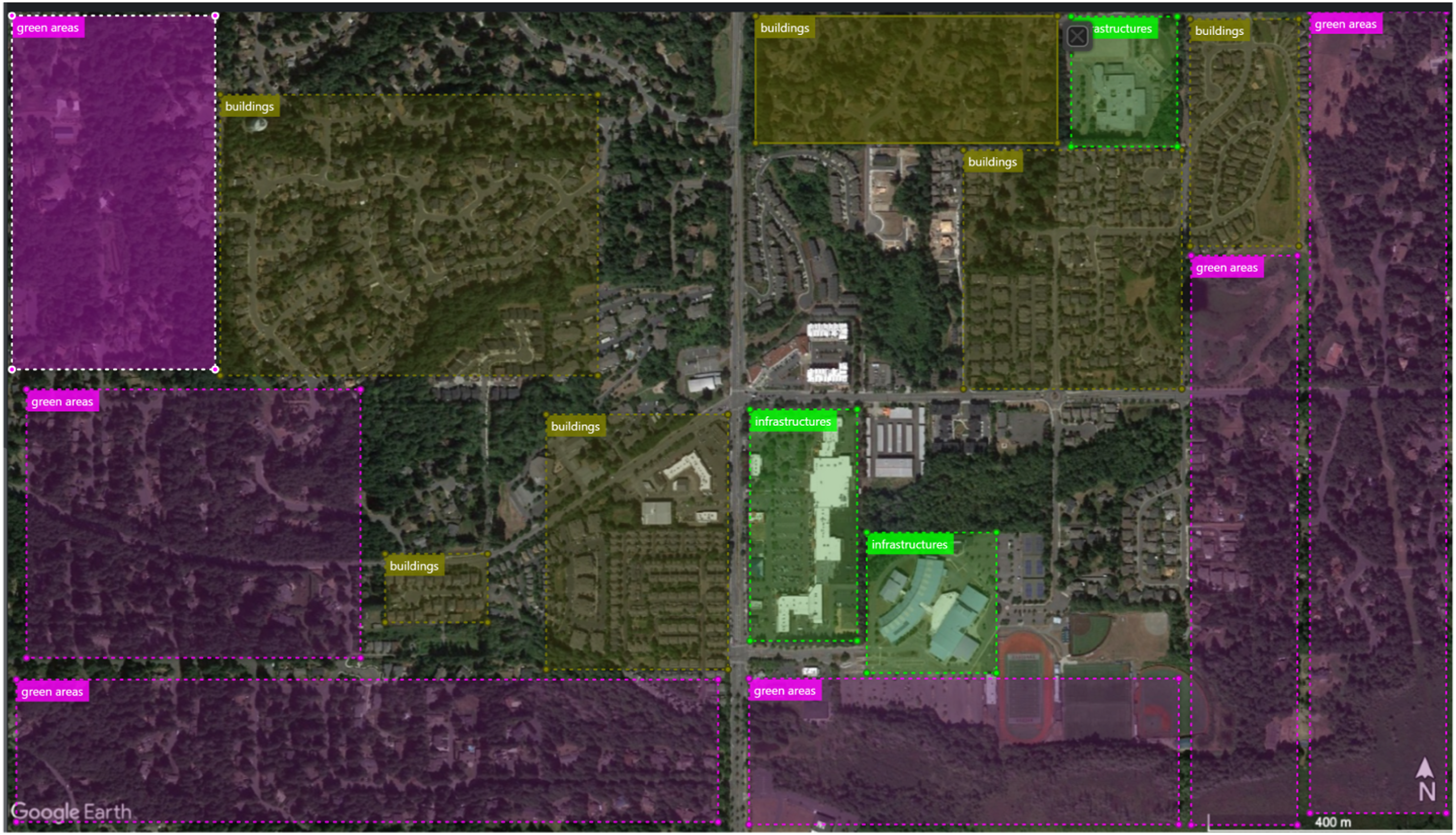
VoTT allowed for exporting the labelled images in various formats, including JSON, CSV, CNTK, VOC and Tensorflow Records. After some testing, we chose the VoTT JSON format as it offers a clear data structure that is compatible with Roboflow.
The labelled images were then imported into Roboflow, an online software that allows for pre-processing datasets for computer vision. 21
All images and labels were pre-processed, involving resizing all images to 416 × 416 pixels to ensure consistency in training. We increased the number of images to 559 by applying horizontal flip, rotation (−15° to +15°), saturation (−50% to +50%) and exposure (−25% to +25%). The dataset was split into 70% for the training set (489 images), 20% for the validation set (46 images) and 10% for the testing set (24 images).
The dataset, which was prepared for training, was exported in YOLOv5 format, as this architecture enables the use of tensors and GPUs, making it suitable for TensorFlow Figure 2 Visualising the performance of the object detector. The class-loss curve goes down to a value of 0.033 after around 40 epochs in this train.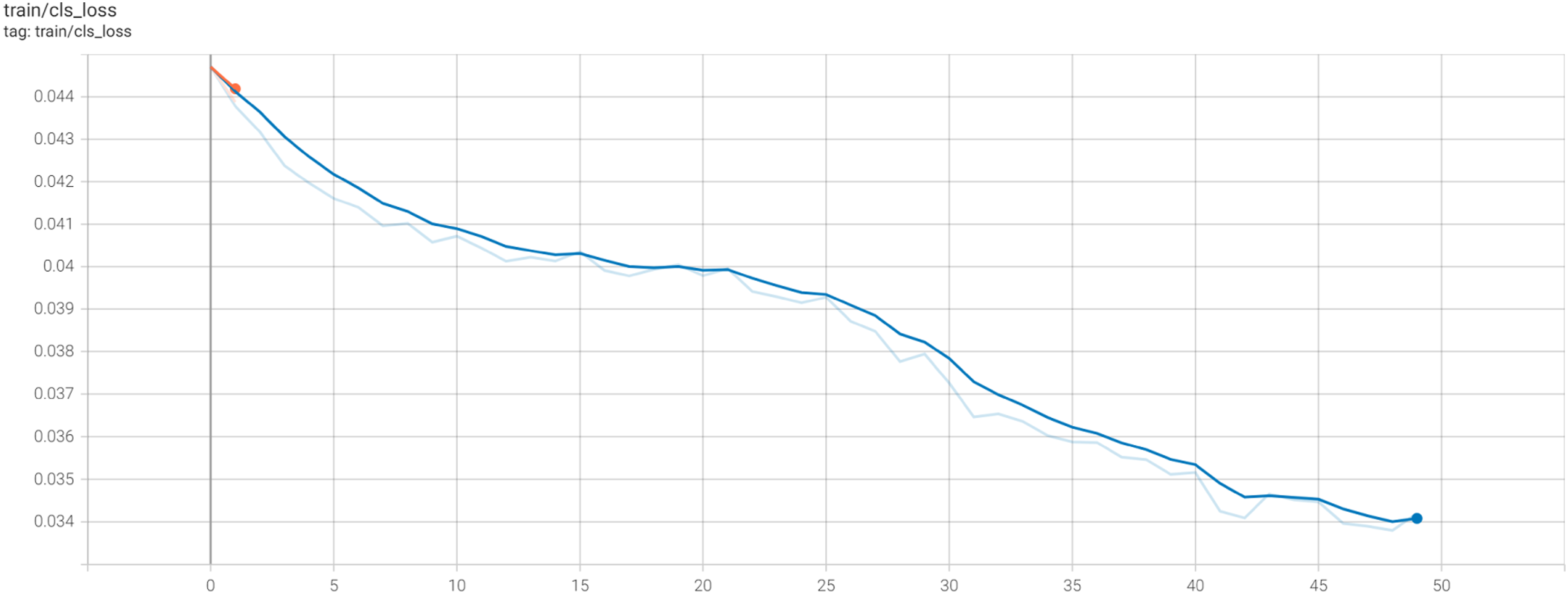
Training data on tensorflow
The main idea underpinning this experiment is to use the YOLOv5 Detector, which is an object detection model based on DenseNet/CNN backbone and train the weights for the model using inference. The You Only Look Once (YOLO) model was developed in 2015 by Redmond et al. 22 and has attracted significant attention from researchers in the field of computer vision ever since. YOLO is defined as ‘an object detection algorithm that divides images into a grid system. Each cell in the grid is responsible for detecting objects within itself’. 23 One of the advantages of the YOLO architecture is its ability to ‘computes all the features of the image and makes predictions for all objects at the same time. That is the idea of “You Only Look Once.”’ 24 Since its conception, the YOLO architecture has been developed up to the V5 (YOLOV5) and researched and tested by many, including Ref.25-29 to name but a few.
Different versions of YOLO have been developed by different researchers and each version has proposed different features Ref. 30 and Ref. 31 For example, with YOLOV4, Bochkovskiy and colleagues 32 demonstrated how to improve the performance of Convolutional Neural Network (CNN) on DenseNets 33 by running Graphics Processing Units (GPU) to make ‘everyone can use a 1080 Ti or 2080 TiGPU to train a super fast and accurate object detector’ (32, p. 1).
Released in 2020 by Glenn Jocher on GitHub, 34 YOLOV5 has been introduced as ‘a family of object detection architectures and models pretrained on the COCO dataset, and represents Ultralytics open-source research into future vision AI methods, incorporating lessons learned and best practices evolved over thousands of hours of research and development’. 34
YOLOV5 object detection model is based on a DenseNet architecture (cf. EfficientDet architecture, which employs ‘EfficientNet as the backbone network, BiFPN (bi-directional feature pyramid network), as the feature network, and shared class/box prediction network’ (Ref. 35 , p. 5).
Jung and Choi 36 demonstrated that an updated version of YoloV5 outperforms previous object detection model with similar architecture (e.g. YOLOV3 and YOLOV4), especially with complex surroundings like the urban environment.
For the training of our model (Figure 2), the following method has been followed: 1. Install dependencies, including TORCH.CUDA. This package adds support for CUDA tensor types, that implement the same function as CPU tensors, but they utilise GPUs for computation.
36
2. Import labelled dataset from robofow server 3. Define model configuration and architecture 4. Train custom Yolov5 Detector The model underwent 50 epochs of training and the network comprised 283 layers, 7,263,185 parameters, 7,263,185 parameters, 7,263,185 gradients, 16.8 GFLOPs (Giga flops, or floating point operations per second). 5. Evaluate Custom YOLOv5 Detector Performance 6. Visualise training data with labels
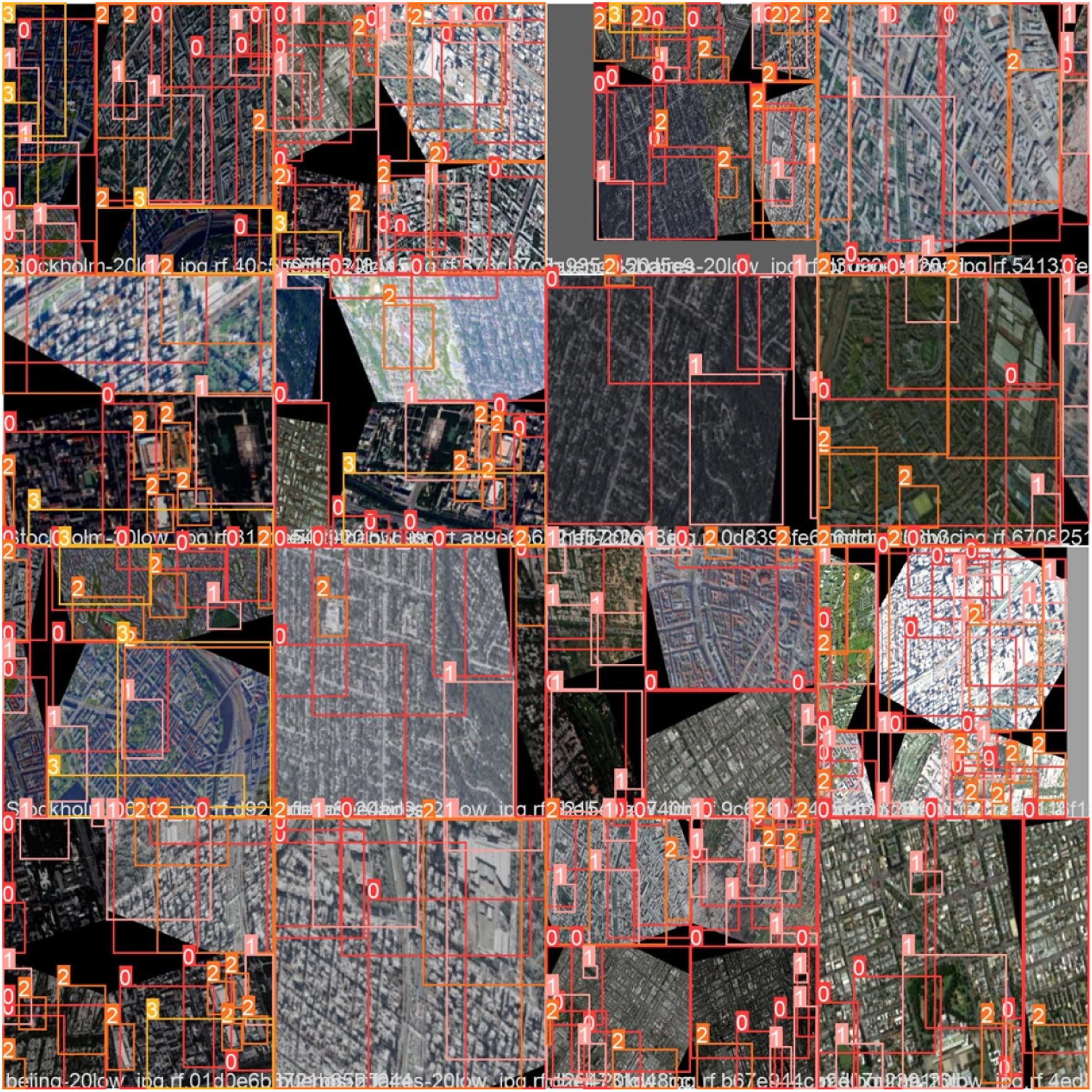
Figure 3 shows the ground truth training data, where the classifier was initially tested with the training set. The classifier accurately assigned the various classes, where 0 represented green areas, one represented the buildings, two represented large infrastructures and 3 represented natural elements. 7. Run inference with training weights Initial stage of image recognition using ground truth training data.
The final step of this method involves using the best weight obtained during training to perform inference on a new dataset using the detect.py method. In this case, we use the testing set to initially evaluate the model within Colab. Subsequently, we employed the best weight to estimate the resilience values any new map inputted to the model. As depicted in Figure 4, the model successfully detects buildings in a test image. Testing of the recognition of the class ‘buildings’.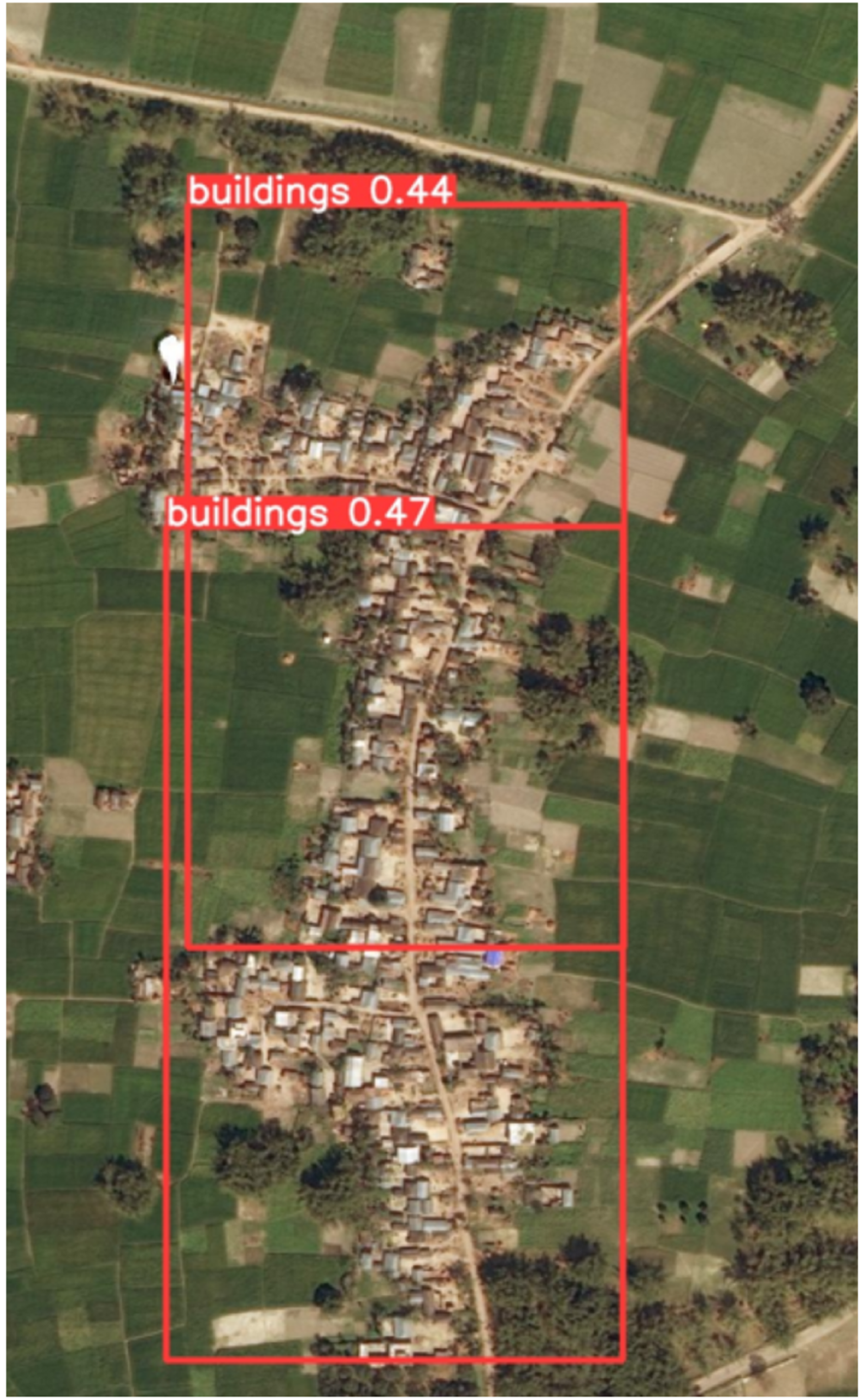
Visualise results on the web app
We determine the R values using a web application that calculates the distance in pixels between the centre of the map selected by the user and the centre of the rectangular selection identified by the Yolov5 model. The web application’s front-end was developed using React.js, while Tensorflow.js was used to facilitate the loading and online execution of the Yolov5 model.
It presents users with a Google Maps-like interface that allows them to explore a satellite map of the world, zoom in and out and search for specific locations. The user triggers the classification process by clicking a button located in the lower right corner. The satellite image of the GPS location at the centre of the screen is fetched from Google Maps, encoded and processed by the Yolov5 model. The output is the pixel coordinates of the identified markers for each class, such as green areas, buildings, infrastructure and natural elements.
These coordinates are converted back to GPS locations to draw squares on the map and calculate the line-of-sight distance between each point and the centre of the screen. The resilience values R are subsequently calculated by utilising these distances and the gamma value for each class, and the resulting values are then displayed on the screen. For this initial prototype, the model’s uncertainty for each identified marker is not taken into account, but it may be considered in future iterations. Figure 5
Validation of the model
To evaluate the precision of our model, we conducted a comparison of the resilience values of 15 cities obtained through two different methods. The first method involved using data from existing literature and rankings. The second method involved evaluating the resilience values using the method we developed in a previous study. 15 We then compared the results from these two methods to determine the accuracy of our model.
Ranking city resilience with existing literature
Given the holistic nature of resilience 15 and the diverse approaches employed by researchers investigating this concept,16,17 it is imperative to cross-reference different methodologies for a more comprehensive understanding of the topic and to ascertain the efficacy of our own approach. To this end, we have examined two of the most exhaustive rankings, namely, the 2013 Grosvenor report 37 and Numbeo’s Quality of Life global ranking, 38 to identify the 50 most resilient cities as per the former, and to cross-reference them with the latter. Both rankings employ a very distinct methodology compared to our approach. The Grosvenor Report presents a ranking of the 50 most resilient cities in the world based on several factors, such as social cohesion, environmental risks, infrastructure and governance. The data is sourced from a range of authoritative sources, including government statistics, academic research and surveys. On the other hand, the Numbeo Quality of Life Index assesses the quality of life in cities worldwide by evaluating multiple factors, including safety, healthcare, cost of living, property prices, traffic, pollution, climate and other indicators. This index gathers data from a global online survey based on contributors' perceptions. In both indexes, the factors are assigned a score and weighted based on their perceived importance to resilience. While Grosvenor acknowledges the dynamicity of cities, it provides a snapshot of the situation in 2013. The Numbeo Quality of Life Index, on the other hand, adjusts the weights periodically to account for changes in the survey responses and global trends.
We selected the 50 most resilient cities from the 2013 Grosvenor report 37 and cross-referenced them with the Quality of Life global ranking from Numbeo. 38 By comparing the two lists, we identified 15 cities chosen from the top, middle and bottom of the quality of life (QOL) ranking. The relationship between resilience and QOL index is based on the work of Tapsuwan et al., 39 who connected the concepts of liveability and QOL to sustainable living and resilience within the context of urban development.
Liveability is defined as ‘the degree to which a place supports quality of life, health and well-being’ (40,41). Hence, a liveable neighbourhood or city should be peaceful, safe, socially cohesive and inclusive, harmonious, attractive, affordable, high in amenity, environmentally sustainable, and easily accessible (
40
). An example of a highly liveable neighbourhood is one where there is a diverse range of housing that is affordable, well-linked to public transport, provides walking and cycling infrastructure, has easy access to schools, employment, public open space, shops, health, community and social services (
40
). All these qualities contribute to people’s quality of life, health and well-being.
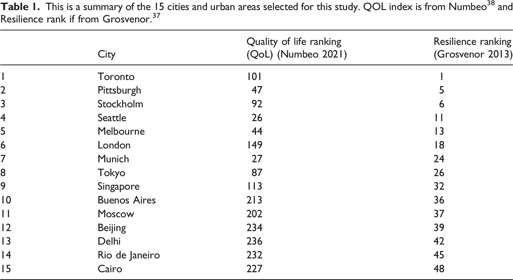
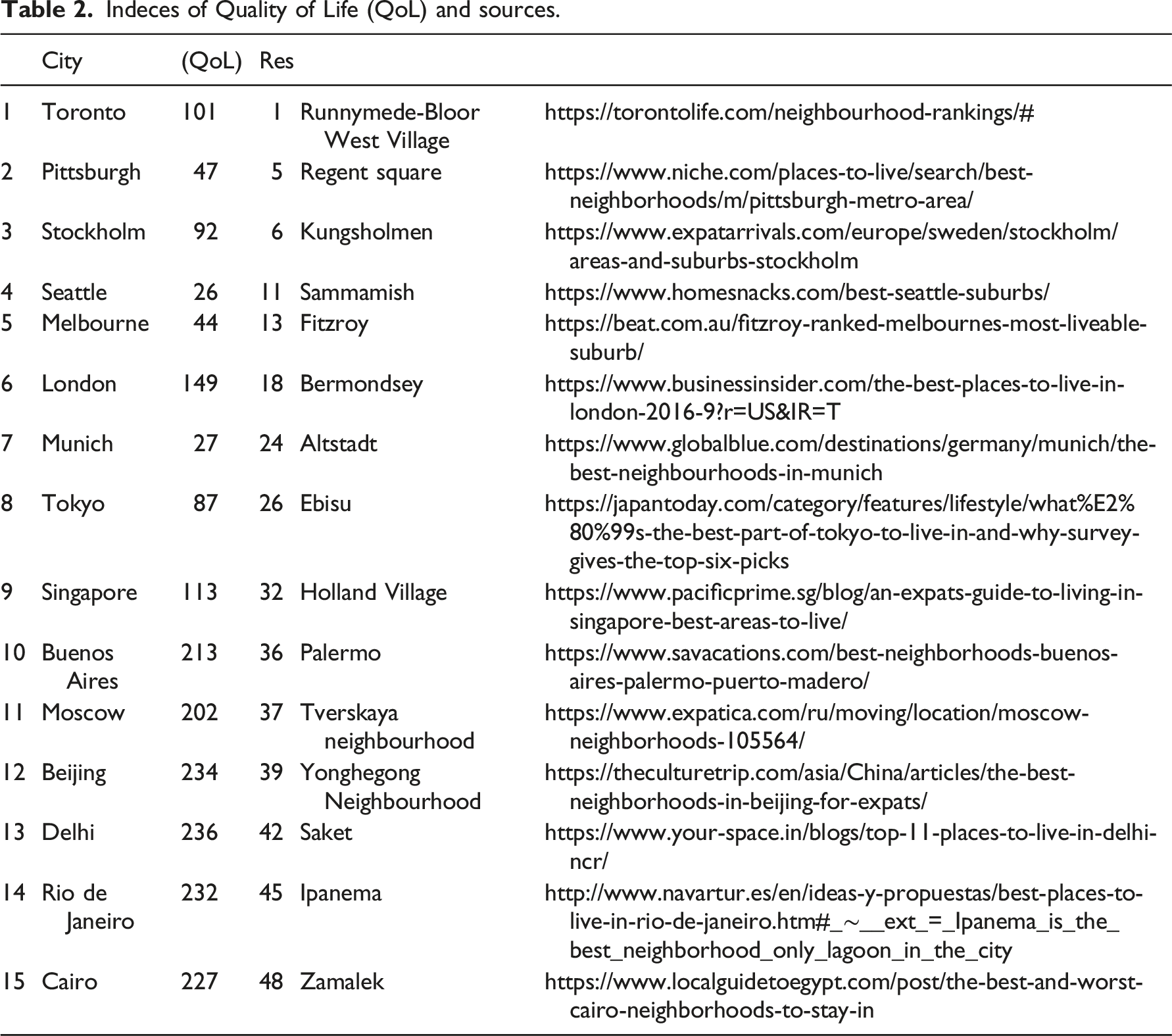
Indeces of Quality of Life (QoL) and sources.
Resilience by physical elements
To evaluate our model, we calculated the resilience value of each neighbourhood using the method developed in Ref.
15
, which can be summarised as follows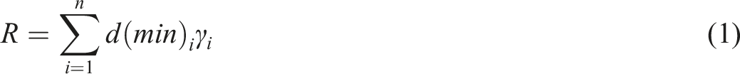
The ϒ values are calculated following the table below:
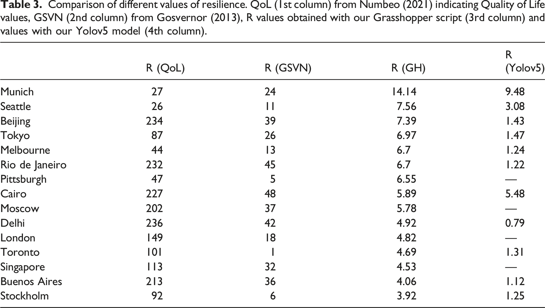
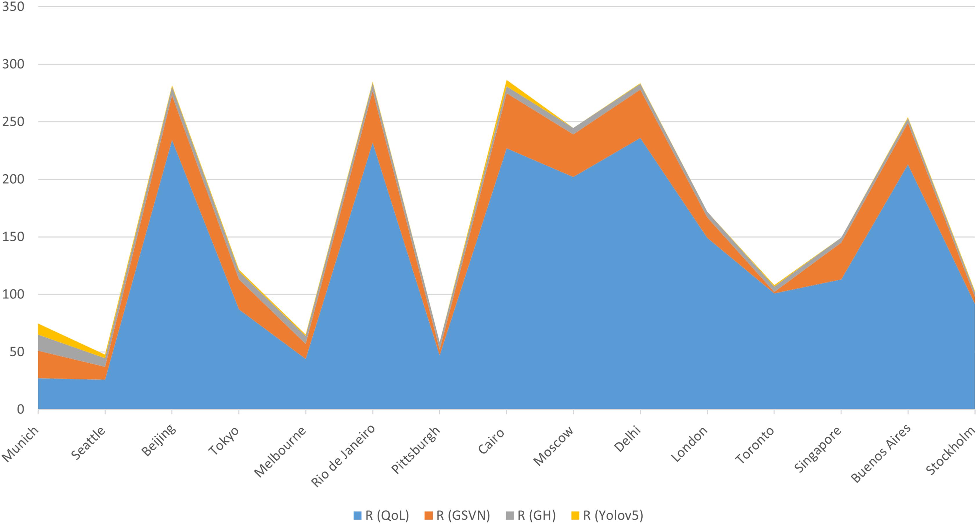
Comparison of different values of resilience. QoL (1st column) from Numbeo (2021) indicating Quality of Life values, GSVN (2nd column) from Gosvernor (2013), R values obtained with our Grasshopper script (3rd column) and values with our Yolov5 model (4th column).
Comparison
The resilience values obtained with these two methods have been compared with those obtained with the Yolov5 model as shown in Table 3 (Figure 6 and 7).
Analysis of results
Table 2 summarises four sets of resilience values (R), which show significant differences in relative magnitude among the sets. The relative values per city remain consistent across the sets, as illustrated in Figure 5. For instance, Buenos Aires has lower R values compared to Delhi and higher values compared to Melbourne in all four sets, and this pattern is observed consistently across all cities Figure 8 Visualisation using our web app. Grasshopper script where we computed (1) using data from OpenStreetMap. GIS OpenStreetMap data before inputting them into Grasshopper. Plot of the R values with the 4 methods from Table 3.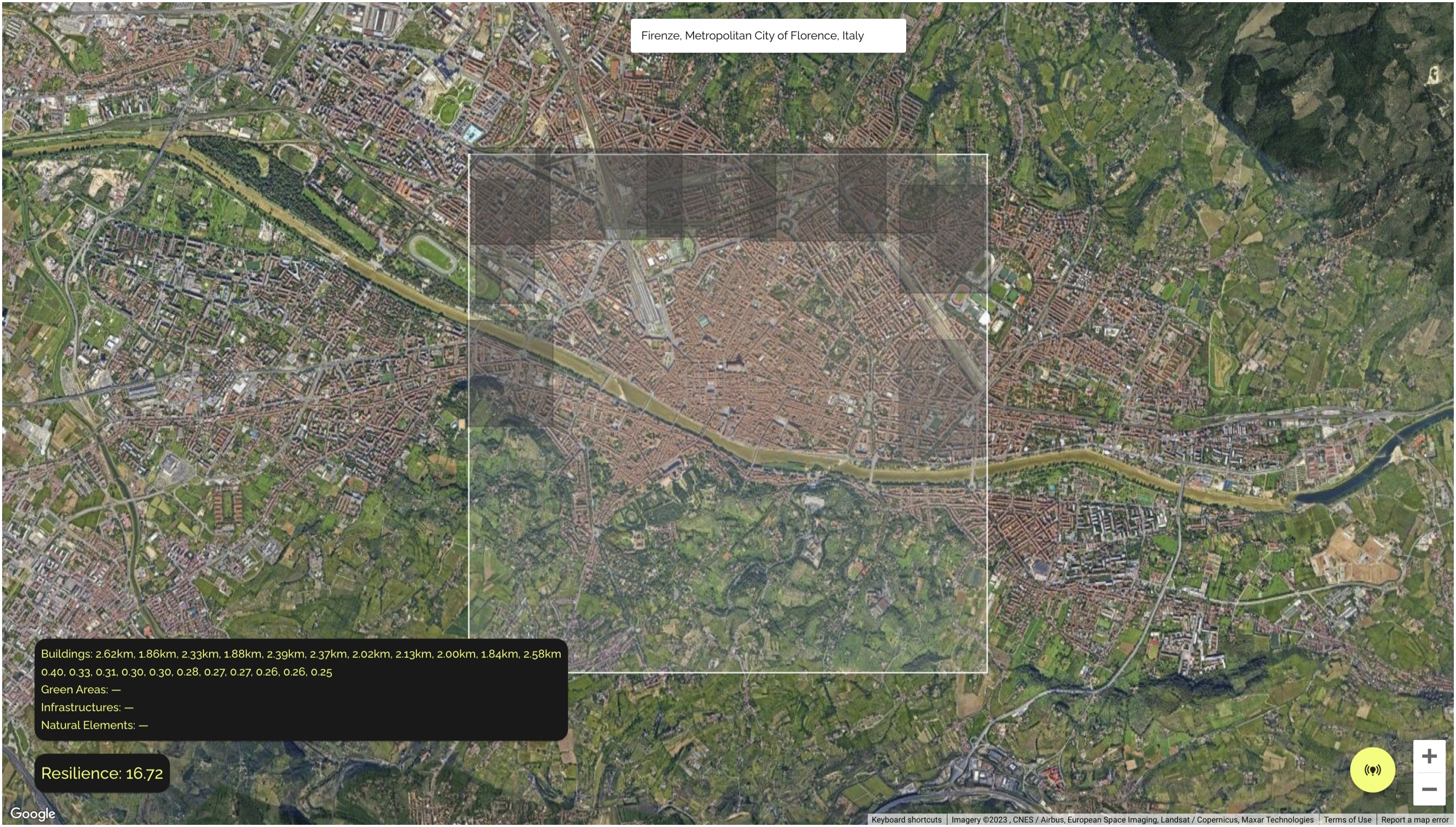
Analysis of connectivity
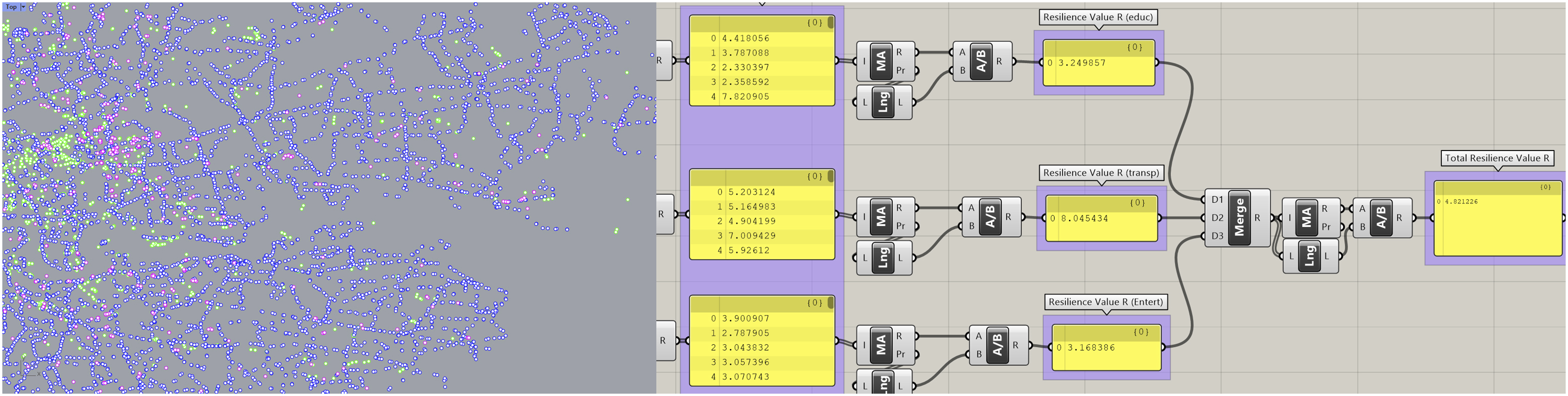
In order to assess how our tool performs against more established methods, we calculated the resilience values expressed through Shannon entropy. Shannon entropy was introduced by mathematician Claude Shannon in 1940s in his seminal paper ‘Mathematical Theory of Communication’, 46 mainly aimed at the field of telecommunication at that time. However, in addition to telecommunication matters, Shannon entropy was used to analyse performance of networks and connections in cities. 47
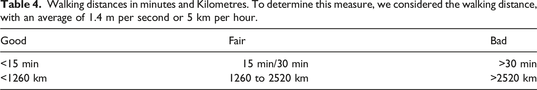
Walking distances in minutes and Kilometres. To determine this measure, we considered the walking distance, with an average of 1.4 m per second or 5 km per hour.
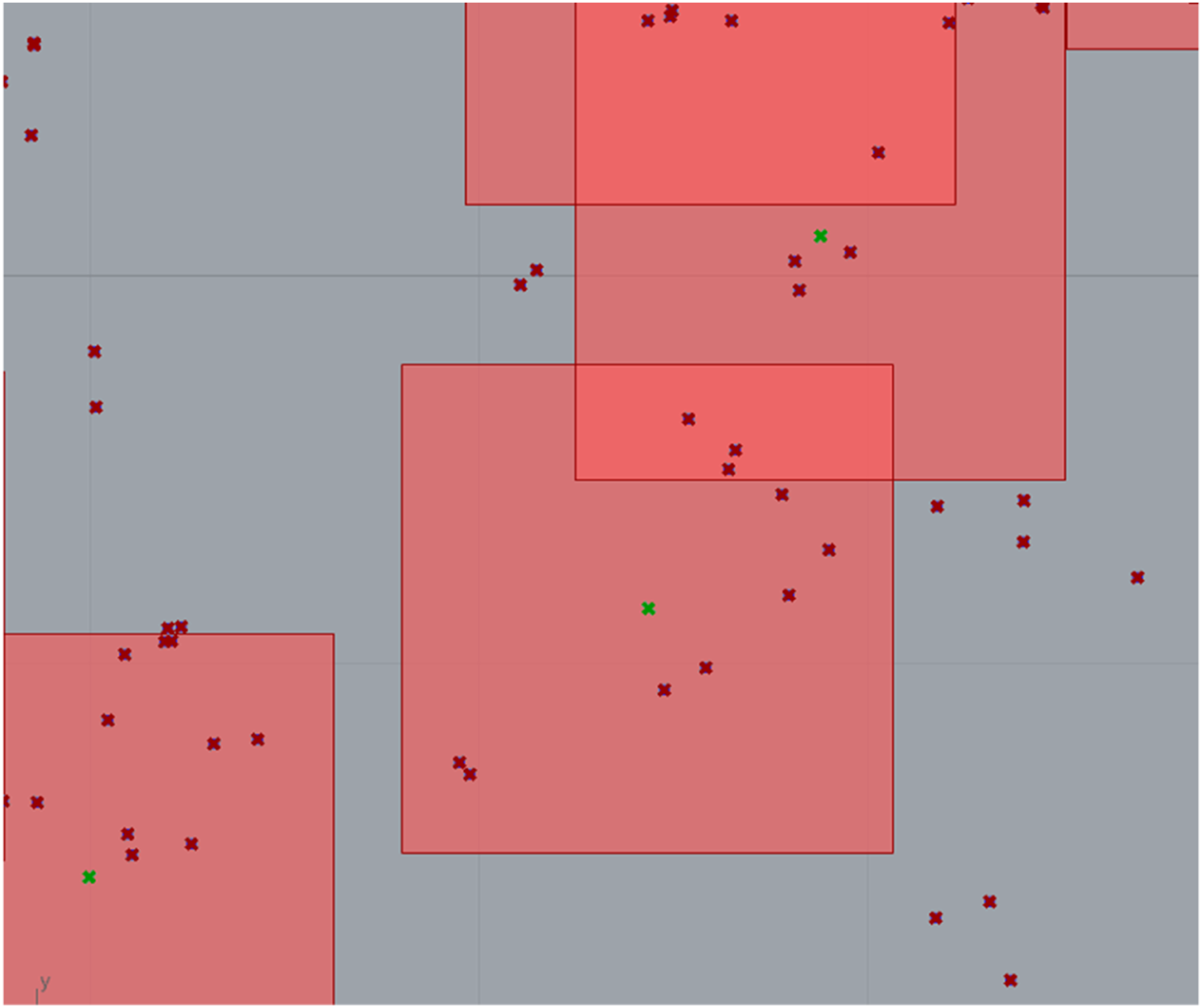
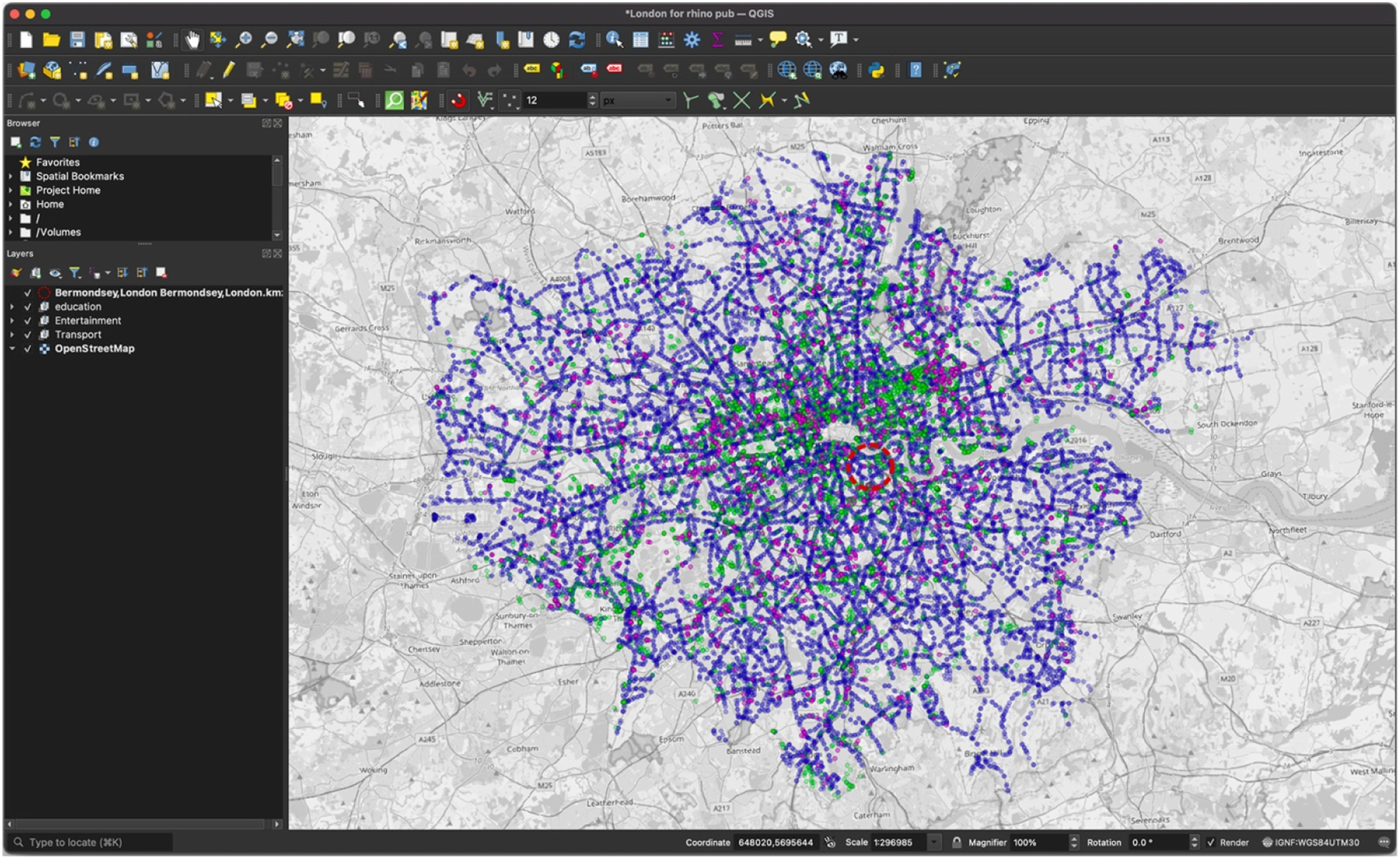
Tiles of 1.260 km including transportation entities around each educational building (indicated with green dots at the centre of the tile).
Calculation of Shannon’s Entropy and other connectivity values. Example of transportation points for one tile.
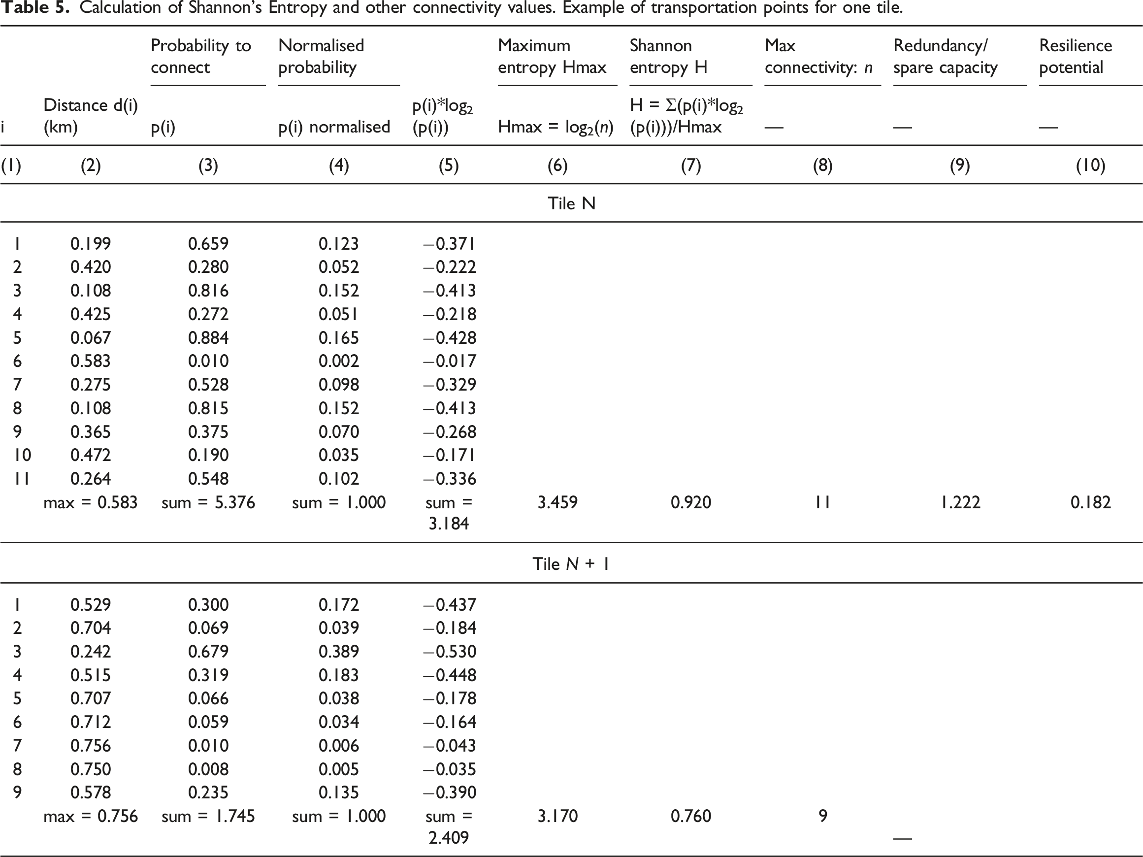
First, distance d(i) was calculated between the educational building and each transportation entity from the respective geographic coordinates between these entities (Table 5, column 2). Probability to connect between the educational entity and each transportation entity was calculated as an inverse of the maximum distance p(i) = 1—day(i)/dmax(i), as we are more likely to choose closer rather than further transportation points, assuming that they all can take us where we would like to go (Table 5, column 3). As the sum of these probabilities in Table 5, column 3 was greater than 1, the probabilities were normalised by dividing the initial probabilities p(i) by their sum. These normalised probabilities are shown in Table 5, column 4, where they all add up to 1. Subsequently, these probabilities were multiplied by their natural logarithm (Table 5, column 5), and their sum divided by the maximum entropy (Table 5, column 6), to obtain Shannon entropy in Table 5, column (7).
As it can be seen from this table, Shannon entropy H between the two tiles is different, indicating that the first tile will function better (H = 0.920) than the second tile (H = 0.760). Higher Shannon entropy indicates better information transmission and lower information storage, and lower Shannon entropy indicates lower information transmission and higher information storage.
As tile N has higher Shannon entropy, we calculated its redundancy/spare capacity and resilience potential, with reference to tile N+1. These indicators can only be calculated with reference to relative differences, and Table 5 shows a simple calculation in columns (9) and (10), based on work by Jankovic. 42 Thus, resilience potential was calculated for tile N with reference to tile N+1, where spare capacity was identified as a difference between the number of entities of the same type in these two tiles. That difference was Δn = 11–9 = 2, and spare capacity was then calculated as S = (nmin + Δn)/nmin = (9 + 2)/9 = 1.222. Resilience potential was subsequently calculated as p = 1 – 1/S = 1 – 1/1.222 = 0.182.
If we assume that the minimum number of entities for normal operation urban environment is nmin, then removing Δn entities from tile N (removing bus stops or similar) would change redundancy/spare capacity from 1.222 to 1, and resilience potential from 0.182 to 0. It follows that a removal of any single entity after Δn is removed could severely affect the operation of urban environment, which Jankovic 48 named ‘edge of collapse’.
We repeated the above process for all 530 tiles, calculating minimum Shannon entropy of H = 0.299 and maximum of H = 0.999. The redundancy/spare capacity ranged from S = 1 to S = 15.5. The resilience potential ranged from a minimum of p = .33 to a maximum p = .94.
Our RECOMM tool evaluates an overall resilience value R for Copenhagen of 5.27 (see full list of data per city in the project repository). We concentrated on the first tile at the centre of Østerbro to draw a comparison. Through Shannon’s Entropy, we obtained a value of 0.182 (or 1.82 to unitise it to our tool) for potential resilience for the tile considered. Our RECOMM tool for the same tile, returns a value of 1.57 as shown in Figure 10. Calculation of Østerbro 1.260 km tile with R = 1.57.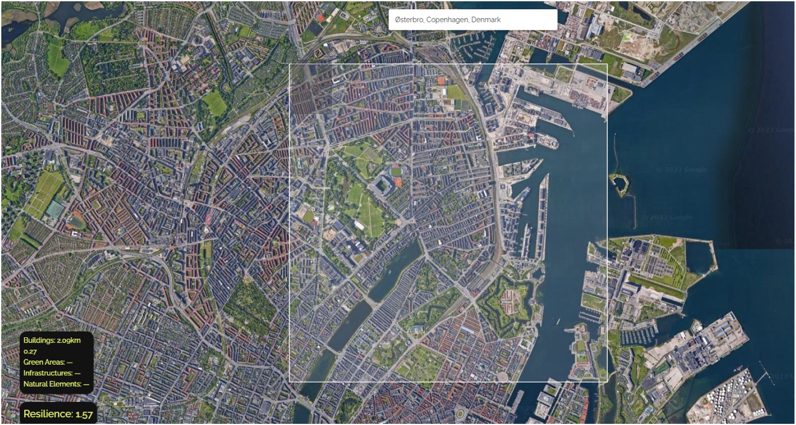
However, the resilience value R calculated with our RECOMM tool is not directly comparable with the resilience potential p evaluated with the Shannon entropy. However, as the two values are both indicators of community resilience (one based on frequency and mutual distances of typologies and the other on connectivity among typologies) we explored possible relationships between them. We calculated the Shannon entropy H, the number of points in each tile, the delta n, the spare capacity and the resilience potential p for all tiles in Copenhagen (530 tiles), as presented in the dataset (available in the project repository).
We found that Shannon entropy, spare capacity and resilience potential vary significantly between the tiles. This means that some tiles work more efficiently than others, and that this can create quality issues for residents. For instance, somebody who uses a tile with the highest Shannon entropy in the city centre may be living in a tile with the lowest Shannon entropy, and resolving the differences between the two may be an everyday experience that individuals need to go through. Different resilience potential values indicate that some tiles can bounce back quicker from a perturbance than others. This is important, as it can introduce difference between tiles if or when a large propagating event affects the city, for instance a mass demonstration, a terrorist attack or a propagating public health threat. Whilst the tiles with high Shannon entropy and high resilience potential may contribute to fast event propagation and can bounce back quickly, the tiles with low Shannon entropy may not propagate such events and despite a lower resilience potential, they may not need to use that potential to bounce back. Our initial testing through our tool suggests that there seems to be a possible correlation between resilience as calculated through distances (as in equation Ref. [1] and some of the connectivity measures obtained through Shannon’s Entropy. The relationship between the measure of resilience, Shannon entropy, redundancy/spare capacity and resilience potential needs further exploration, and it will be subject of our continuing research.
Statistical analysis
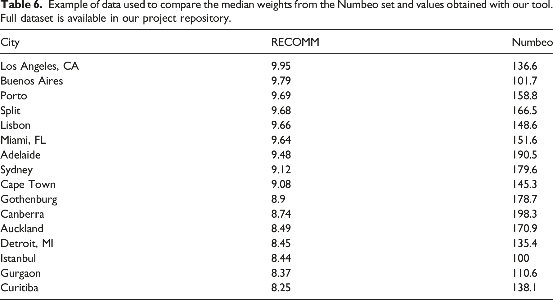
Example of data used to compare the median weights from the Numbeo set and values obtained with our tool. Full dataset is available in our project repository.
First step has been to check the distribution of the two sets from our tool and from Numbeo. Using a histogram we can see that both distributions are not normal.
We then performed a Shapiro-Wilk Test to check for normality. As the Shapiro-Wilk test for normality is sensitive to sample size (i.e. samples most often pass normality tests.), we combined the results of this test with graphics (e.g. with a boxplot or a histogram). Figure 11
H0 is that the sample distribution is normal. If the test is significant (p < .05), the distribution is non-normal (H0 is rejected). If p > .05 the test is not significant, therefore the distribution is normal (H0 is accepted). The Shapiro.test () method in R for the Numbeo set gives a p-value = 0.0,005,414 which is < .05. This implies that the distribution of the data is significantly different from the normal distribution. We can conclude that the Numbeo data are not normally distributed, confirming what suggested by the visual inspection.
The Shapiro.test () method in R for our tool’s set gives a p-value = 2.184 × 10⁻¹⁴ which is < .05. This implies that the distribution of the data is significantly different from the normal distribution. We can conclude that the also the data from our tool are not normally distributed.
As both sets are not normally distributed and the samples used are paired, we decided to proceed with a Wilcoxon paired text. With the Wilcoxon two-sample paired signed rank test we can verify if the median values of the two sets (Numbeo’s and values calculated with our tool) are comparable. The H0 is that the population median of the paired differences of the two samples is 0.
We calculated the Wilcoxon signed rank test in R with the method wilcox.test () on normalised data and obtained a p-value = .511, which is greater than the significance value alpha = 0.05. We can accept the null hypothesis concluding that the median weight of the two sets (Numbeo’s and ours) are the same. The results of the statistical analysis suggest that the results we obtained with our tool are comparable with the ranking of Numbeo.
Comparison with other tools
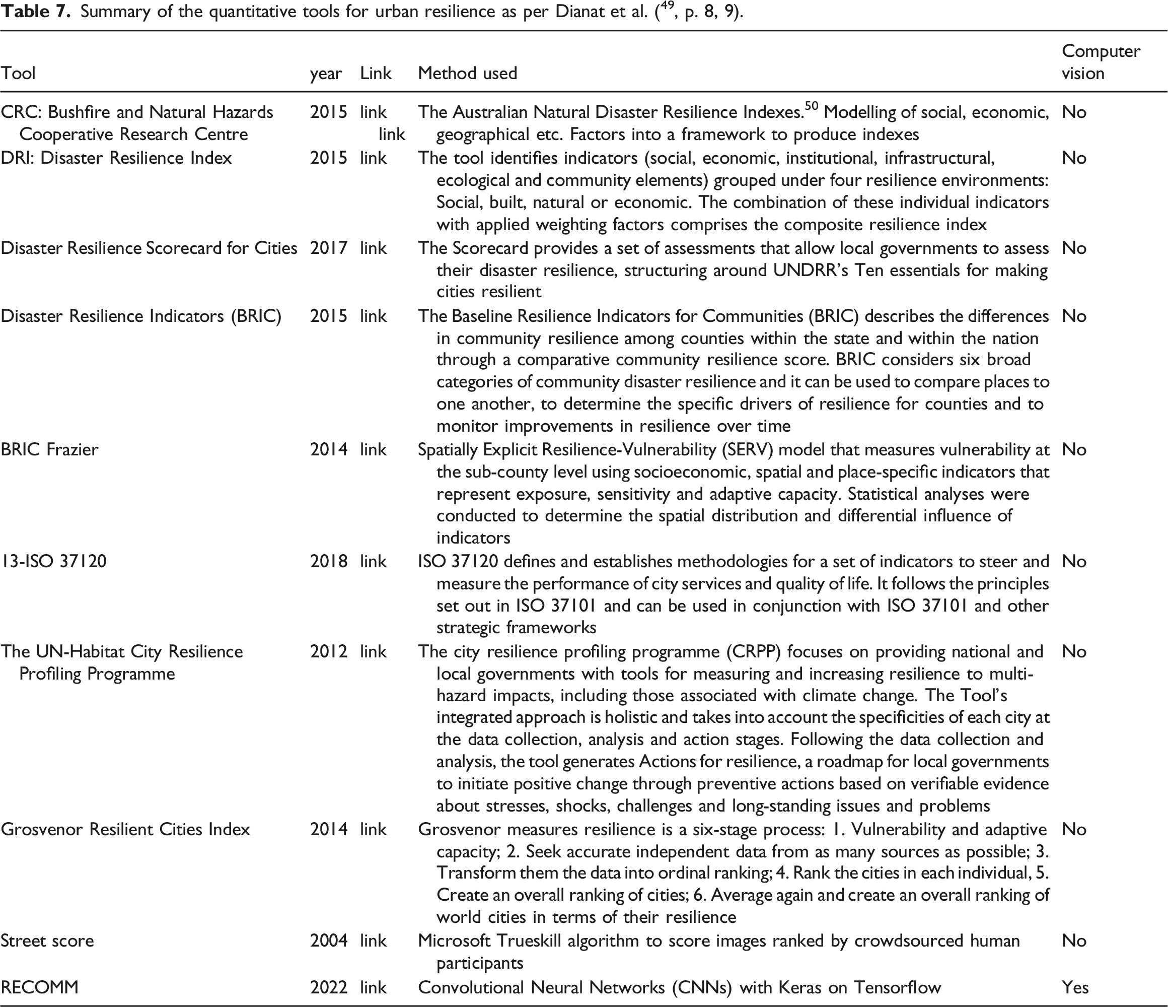
Summary of the quantitative tools for urban resilience as per Dianat et al. ( 49 , p. 8, 9).
In particular, we would like to draw attention to the difference between Streetscore and RECOMM, as they both employ images to evaluate an urban score. Streetscore was developed by the MIT Media Lab in 2014 through a scene understanding algorithm that predicts the perceived safety of a streetscape. It works by leveraging training data obtained from an online survey with over 7000 participants. 51 Participants to this study were asked to reply to the question of Which place looks safer? Between a pair of images provided. The results of this survey were ranked using Microsoft Trueskill algorithm: a ‘Bayesian skill rating system’ that ‘[…] tracks the uncertainty about player skills, explicitly models draws, can deal with any number of competing entities and can infer individual skills from team results. Inference is performed by approximate message passing on a factor graph representation of the model’ (Ref. 52 , p. 1). The dataset used in the training for this project was crowdsourced from human participants and their perceptions of street scenes. While a large set of individuals’ feedback on urban perception (like regarding safety) can ensure a good level of unbiased results, 53 there may still be a certain level of subjective influence in the outcomes on the basis of the contributors’ backgrounds and the locations where the images were taken. Naik et al. 51 suggested that Streetscore was effective in analysing cities close to New York and Boston, which were used for the image samples, but not in more remote areas such as Arizona, California and Texas, suggesting that the tool could be culturally and geographically biased (Ref. 51 , p. 782). In contrast, our RECOMM tool adopts a fundamentally distinct perspective based on aerial viewpoint and employing automatic recognition of shapes through computer vision. Our approach offers a significant advantage by reducing the inherent biases which can be related to human perception and subjectivity. We have not measured the bias possibly present in our tool (if any), but further studies should definitely include some testing with robust methods (Ref.54-56 among many others).
Limitations and next steps
During the development of the model, the following limitations were identified: 1. The model training was limited due to a small dataset comprising approximately 500 images. A model like Yolov5 requires more images per class (in the region of thousands), but Yolov5 can still produce accurate results with a small dataset.
23
The dataset used for the web app is based on DigitalGlobe Basemap + Vivid,
57
which may result in lower accuracy when compared to Google Maps. 2. The urban morphology was defined by a limited number of categories (4, such as green areas and buildings). A more comprehensive experiment should include more categories, such as distinguishing between various building types (such as schools, museums and residential areas) and consider integrating OpenStreetMap data to improve accuracy. 3. The model did not take into account individual contributions of each element, such as the distance from the centre of the area or the size of the typology. By incorporating these factors, the results could potentially be more accurate. Additionally, the model also returns a measure of uncertainty, which could be further incorporated into the R value. 4. The model results varied based on the zoom level of the visualised area, which is related to the scale of images in the training set and the resolution of images loaded in the web app. In future iterations, the area’s zoom level will be restricted once the user makes a selection. 5. The process of creating custom datasets for Yolov5 was challenging without the use of tools such as Roboflow for pre-processing and labelling. 6. In a further iteration, we could reduce the area under analysis, to check if this will lead to more solid results with a small sample as suggested by Naik and colleagues.
51
7. Once the tool will be further developed, we could implement a routine to calculate multiple images at the same time and extend the result to wider areas, if not to whole cities.
The next phase of this project involves building a larger dataset with annotated labels to enhance the model’s accuracy Historiography of the data distribution for the two sets: our tool (left) and Numbeo (right).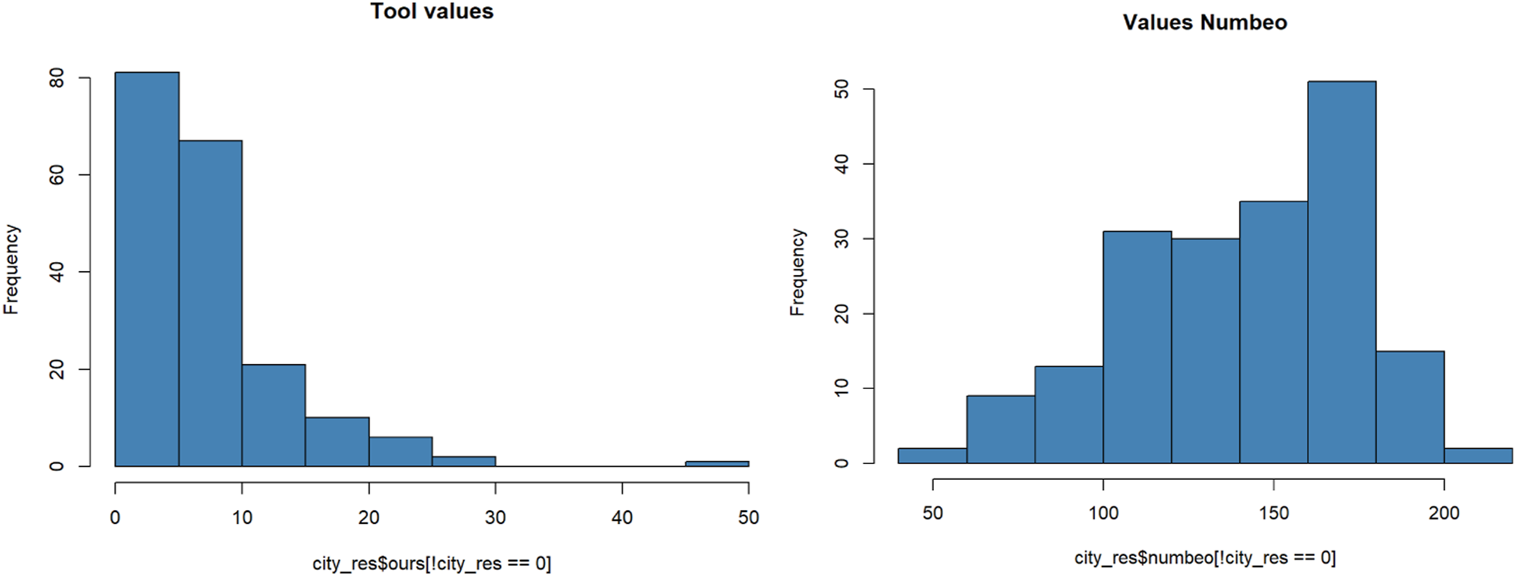
Conclusions
Our developed model calculates the resilience value (R) of any city in the world. The app provides an overall R and a breakdown of average R values based on urban typologies, organised by category, as seen in Figure 12. This research presents a novel tool to assess a city’s level of community resilience and suggests ways to enhance it. A screenshot of the web shoving the overall resilience value R and four clusters of buildings detected by the model. The contribution of each cluster to R (0.31, 0.28, 0.26) is calculated based on the distance from the centre of the area to each cluster.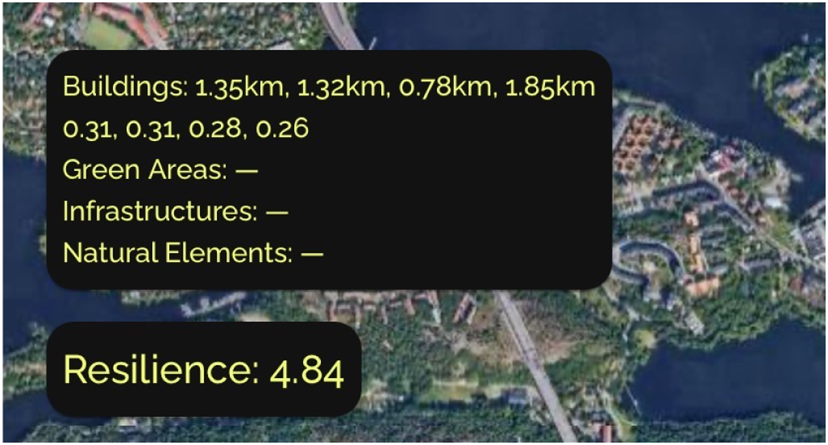
The results obtained with our tool are consistent in magnitude with existing ranking as per literature (quality of Life and Numbeo), as well as with values calculated with our previous method using the equation 1 as described in the section “Comparison” and summarised in Table 4 and Figure 8.
The analysis of connectivity through the Shannon Entropy suggested that there may be some interesting connection with the resilience calculated by our tool as elaborated in the “Analysis of connectivity” Section. This is an interesting direction for future development and investigation for our approach.
Finally, the statistical analysis section suggests that, as the median weight of the values samples calculated with Numbeo’s data and our tool are the same, our MERCOMM tool yields results that are comparable with the ranking of Numbeo.
We carried out a number of testing and evaluation to ensure that the results produced by our tool are on a par with other established ranking methods for urban resilience. Our tool offers the advantage that it can be applied to any city in the world, as calculations are based on urban morphology and the detection of urban elements and forms through computer visualisation. The tool is useful for analysing cities not included in current resilience rankings and allows designers to test design plans. The comparison of the resilience levels of a current master plan to those of proposed plans can provide valuable insights for planners.
Footnotes
Acknowledgements
Our YoloV5 model, the Colab notebook, the Grasshopper definition and the dataset used for training can be found at: https://anonymous.4open.science/r/caadria2022-3215/README.md. The web app can be found here: ![]()
Declaration of conflicting interests
The author(s) declared no potential conflicts of interest with respect to the research, authorship, and/or publication of this article.
Funding
The author(s) received no financial support for the research, authorship, and/or publication of this article.