
Abstract
Japanese-style gardens offer a wealth of spiritual and cultural value. In this study, we attempt to determine the optimum colour temperature for lighting Japanese-style gardens at night. We analyse the influence of a change in light source colour temperature on image recognition using digitalization and quantification with the semantic differential technique. In addition, we propose a new evaluation methodology for the semantic differential technique and examine the statistical significance of the results. We find that in summer, impressions of the optimum colour temperature for each element (vegetation, water, stone and structure) differ significantly, but in winter, because of the effects of snow, differences in the impression of each colour temperature are not as distinct. Moreover, the colour of the natural environment or overall season affects peoples’ preferred light source colour temperature.
1. Introduction
The Japanese-style garden is seen by both the Japanese and foreigners as a comprehensive symbol and potent expression of Japanese civilization, ideology and religion.1,2 It is also a useful and efficient vehicle for understanding and researching Japanese history and society. 3 Furthermore, the Japanese-style garden is an important representative of the Eastern garden system, one of the world’s three major garden systems.
To enrich the image of Japanese cities and promote tourist development, Japanese-style gardens are becoming increasingly important and integrated into people’s lives. 4 The illumination of Japanese-style gardens is consequently crucial. The Japanese-style garden is currently poised to take on new value in the urban landscape. 5
In recent decades, the development and use of light-emitting diodes (LEDs) has accelerated dramatically. In particular, LEDs have been fully applied to illuminate landscapes in many of Japan’s gardens, owing to their brightness, reliability, lower power consumption, and long life6,7 all of which are of great importance in outdoor lighting. Consequently, LEDs have occupied a unique position among lighting installations in various arrangements and uses. It is expected that, eventually, LEDs will predominate over conventional electric light sources 8 and that further advances in LED technology will revolutionize the lighting industry, leading us into a brighter and more energy-efficient future. 9
However, given the recent advances in the range of colours available for LED lighting 10 previous research that has investigated only four colour temperatures (2000 K, 3000 K, 6000 K and 10,000 K) is insufficient. 11 In this experiment, we address the limitations of previous research and add three additional temperatures (4000 K, 5000 K and 7000 K) that have been used frequently in recent years.
Colour rendering index (CRI), which is one of the important factors when selecting an appropriate light source, was not designed as a measure for white light produced by an LED combination. It can produce misleading results if CRI is applied to LEDs. 12 In addition, because the saturations of the eight standard sample colours are all fairly low, CRI cannot reflect how the light source will perform when rendering deeply saturated colours. The narrow, widely separated peaks of the spectra from LEDs can perform poorly when rendering saturated colours outside those peaks, but the CRI definition does not make up for this deficiency at present. Therefore, in this experiment, we do not take CRI into consideration.
This experiment takes as its experimental conditions each element of the night-time, Japanese-style garden in both winter and summer. Quantitative and digital evaluation methods are used to analyse the influence of each element under different light source colour temperatures, thereby determining the optimum illumination for Japanese-style gardens at night.
2. Conditions
2.1. Selection of gardens
We took photographs at the Kenrokuen, the Tokugawaen and the Nabana-no-Sato (Figure 1). These three gardens were appropriate for the purposes of the study because they are illuminated in both summer and winter and they experience snow, occasionally heavy snow, on an annual basis.
Landscape elements sampled in this experiment (available in colour in online version): (a) Branch-lifting for snow protection (Kenrokuen); (b) Kotoji lantern (Kenrokuen); (c) Artificial lake (Tokugawaen); (d) Waterfall (Tokugawaen); (e) Stream (Nabana-no-Sato); (f) Tree (Nabana-no-Sato)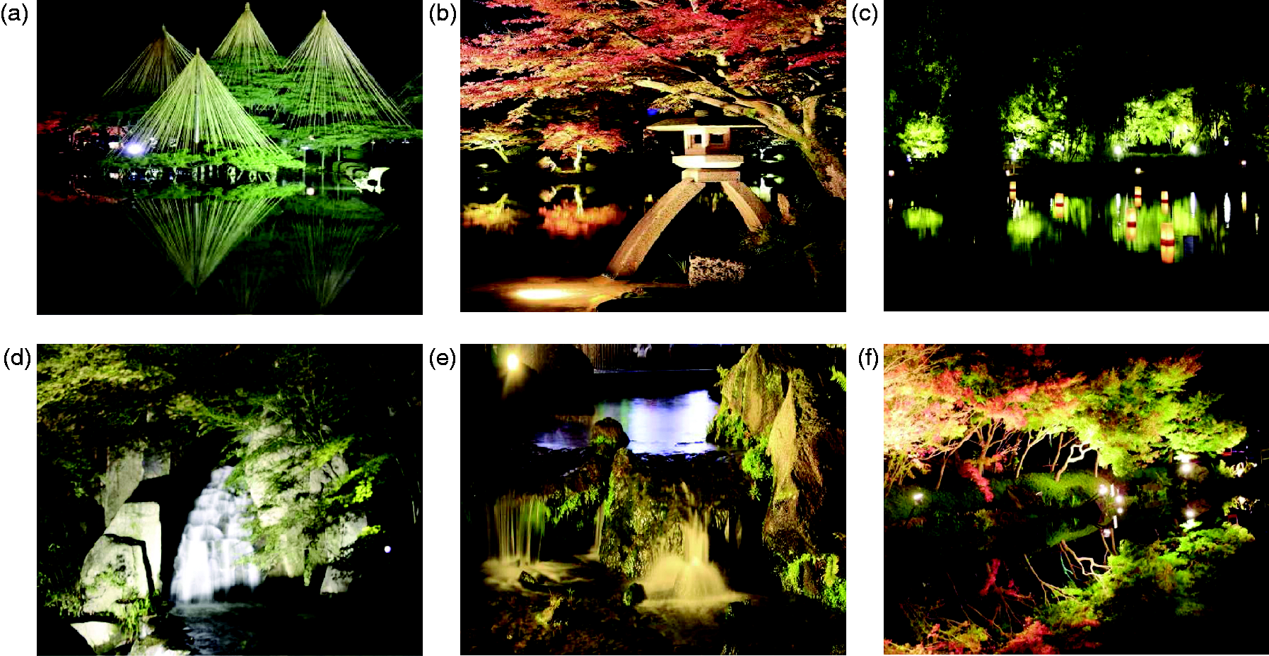
The Kenrokuen is a masterpiece, one of the three most outstanding gardens in Japan. Because it experiences heavy snowfall every year, the branches of its trees are supported by ropes to protect them against snow’s weight. These are called Yukitsuri. Kenrokuen’s Yukitsuri are the most famous in Japan. Furthermore, the Kenrokuen features Kotoji lanterns, shaped like the bridge of a koto (a musical instrument). These lanterns have become a symbol of the Kenrokuen and are characteristic of the Japanese style.
The Tokugawaen is located in Nagoya. Every year, a large number of tourists from around the world come to Nagoya to visit the Tokugawaen. This garden features a substantial amount of water, including rockeries, several waterfalls, streams, and an artificial lake of rare and substantial width. The lake is bordered by artificial structures such as teahouses, small bridges and a small wooden dock and can be explored using wooden boats.
In the Nabana-no-Sato, over 8.5 million LEDs have been used to create and illuminate the landscape, resulting in a perfect fusion of state-of-the-art lighting and natural landscape. This gives visitors a strong sense of the combination of historical and modern, natural and artificial.
2.2. Selection of landscape samples and photographic process
First, four elements were derived from Japanese-style garden landscapes as follows:
13
Vegetation. Vegetation is planted in gardens and changes visually through the seasons. Because the experimental conditions were summer and winter, for summer, we sampled trees that were stout, had luxuriant foliage, and were pure green in colour; for winter, we sampled evergreen trees covered with a great deal of snow. Water. Water is present in both natural and artificial garden waterscapes in the form of fountains, waterfalls, streams, artificial lakes, etc. Stone. We consider stones to be natural objects arranged in the landscape. Structure. We considered structures to be garden buildings, bridges, pavilions, etc.
Second, we referenced the experimental principles of previous research11,14,15 to take photographs of scenery at night using a digital camera (Canon EOS Kiss Digital X).
Good weather conditions do not influence visibility with regard to the human eye or camera, but rain and snow can cause pictures to exhibit white or bright spots. Thus, pictures of snow cover were taken only when it was not actively snowing. The digital cameras were mounted on a tripod 1.3 m from the ground. (For the observers in the present study, the largest height difference between observers is 29 cm since one was 155 cm and one was 184 cm tall. The experiment takes a significant amount of time so, for accurate results, we had observers sit while evaluating, thereby lowering the gap in height to below 5 cm, as the height of a seated observer is approximately 1.3 m). The light source was included in the landscape photograph. (The calibrations of colour conversion depend on the light source colour temperature). Sampled landscape elements (i.e. vegetation, water, stones and structures) were centred and photographed so that they occupied more than 60% of the frame. To obtain an accurate mean value of impression of one landscape, pictures were taken from multiple angles.
2.3. Method of colour conversion
An 18% grey card (25.3 cm × 20.2 cm) was placed in close proximity to the landscape element, with the lighting of the grey card and the landscape element coming from the same direction; a photograph of the landscape was then taken with the grey card in the frame. We ensured that no interfering light affected the photography and caused reflection of the grey card. For photographic adjustments, the size of the grey card could not occupy more than 15% of the frame. If the light source or environment changed, the photograph was retaken.
We set up a 6000 K light source to illuminate the grey card in the laboratory darkroom and photographed this grey card.
Image processing software (SILKYPIX 5, Version 5.0.31.0) was used to adjust the landscape photograph and make the parameter values of the landscape photograph’s grey card the same as those of the grey card that was photographed in the laboratory darkroom. In this way, the colour temperature of landscape photograph’s light source was changed to 6000 K and the luminance value was made the same as that of the simulation.11,15 Luminance values were measured using a luminance meter (Minolta CS-100). After that, the grey card was cropped out of the modified samples.
Based on the landscape photograph for which the light source colour temperature was changed to 6000 K, the remaining six colour temperature landscape photographs were generated by image processing software.
We set the luminance meter to chromaticity coordinate measurement mode to measure the light source colour temperature of each modified landscape photograph shown on the screen by the projector (EPSON EB-1776W) and confirmed that they were consistent with the CIE chromaticity diagram (Figure 2).
Seven standard colour temperatures, the standard deviation of the abscissa and ordinate values for modified vegetation samples in summer, and the colour gamut of the projector (EPSON EB-1776W) on the CIE chromaticity diagram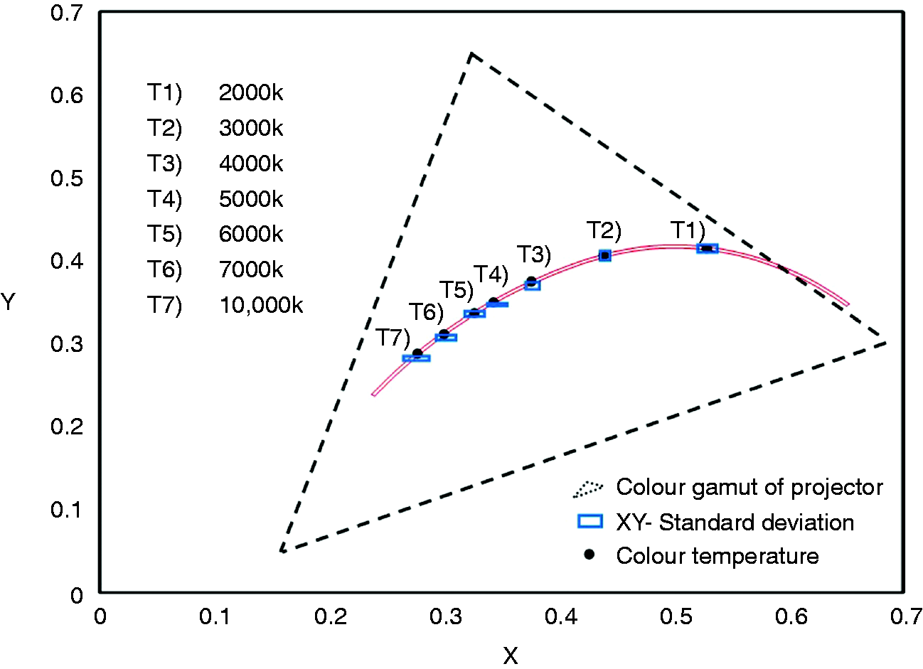
2.4. Calibration results of colour conversion
Seven standard colour temperatures are shown as black spots in Figure 2.11,16,17 The dashed triangle in Figure 2 shows the colour gamut range of this experiment’s projector. The modified vegetation sample in summer was chosen as the sample to calculate the standard deviation, since the difference between the light source colour temperature of the modified vegetation sample in summer and the standard colour temperature was the largest. The centres of the rectangles are the average values of the light source colour temperature for modified vegetation samples in summer, and the length and width of the rectangle indicate the standard deviation of the abscissa and ordinate values.
2.5. Experimental method
The experiment was conducted in a darkroom; 20 students in their 20s (13 males and 7 females) were surveyed. The landscape samples were displayed on the screen using a projector. The images were projected over the entirety of the screen. The respondents observed the pictures and evaluated them using semantic differentials.18,19 Each respondent was given a data sheet on which to note his or her evaluations of the landscape samples. Respondents were positioned as shown in Figure 3.20–22
Experimental image display. Thick black cloth (3.6 m in width and 2.1 m in height) is hung behind the screen; the screen (2.13 m in width and 1.63 m in height) on which the landscape samples are projected is placed in front of the respondents at a distance of 5 m; the height of a seated respondent is approximately 1.3 m; the effective vertical angle of human view is approximately 20°
23
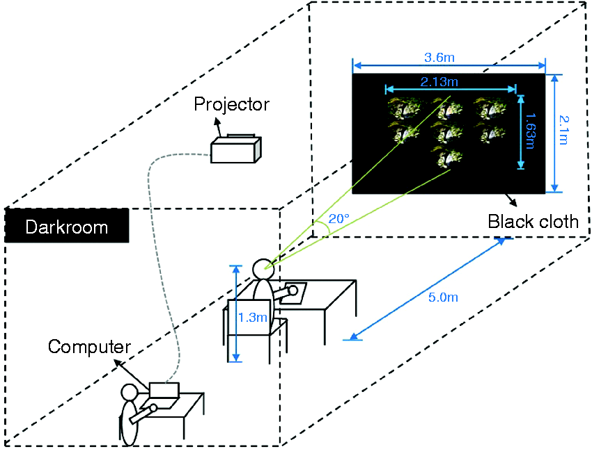
For a preliminary understanding of pictures, seven colour-converted images modified from one sample were shown one by one for 5 s each. For the formal test, to highlight contrast, all seven colour-converted images from one sample were collected into a single task and presented on one slide. The order of the seven images was as follows: 2000 K, 3000 K and 4000 K from left to right in the first row; 5000 K, 6000 K and 7000 K from left to right in the second row; and 10,000 K in the third row, as shown in Figure 3. Once the respondents finished evaluating the first task, the next task was shown.
Because completing each task took approximately 20 minutes, each element per season comprised at least six or seven tasks, and we selected respondents already proficient in the use of semantic differentials to reduce time. In consideration of the respondents’ psychological state, mood and physical condition, 5 minutes were allotted for them to rest after completing each task.
2.6. Selection and classification of evaluation items
The semantic differential method assigns a numerical evaluation score to each element, making comparative analysis possible. 24 Respondents were asked to evaluate their impressions of the gardens based on pairs of adjectives at either end of a seven-point scale. The adopted seven-point scale (+3, +2, +1, 0, −1, −2, −3) was neither too vague nor too exact. 25 The values +3 and −3, +2 and −2, and +1 and −1 indicated ‘extremely’, ‘quite’ and ‘little’, respectively; a response of 0 was neutral. Respondents scored how they felt by indicating which adjective from each pair best matched their feelings.
The adjectives used to indicate impressions were obtained by surveying 25 students and faculty members (18 males and 7 females), 23 of whom were in their 20 s, one of whom was in his 40 s and one of whom was in his 50 s. Several landscape samples were presented to the group; participants observed the samples and freely brainstormed impression adjectives that occurred to them.26,27
The results of this brainstorming were subsequently summarized and relevant evaluation items were extracted. With reference to previous research11,28 supplementary adjectives not mentioned in the brainstorming session were also added. The following constraints were applied when selecting adjectives:
Ambiguous adjectives were avoided. Adjectives that could be used to immediately infer the purpose of the investigation were avoided. Adjectives with immediate value-laden meanings were avoided. Specialized adjectives and adjectives that could differ in meaning depending on the respondent’s knowledge were avoided. Adjectives with intuitive meanings were preferred.
As a result of this process, 23 adjectives were selected as evaluation items. Antonyms for these 23 adjectives were determined and a data sheet displaying the 23 final adjective pairs, as shown in Figure 4, was created.
Bipolar scales defined by antonym adjectives on each end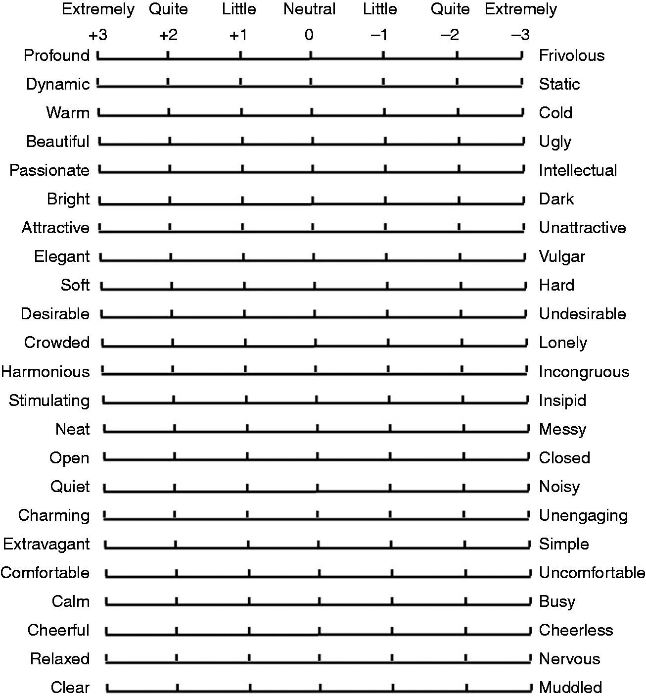
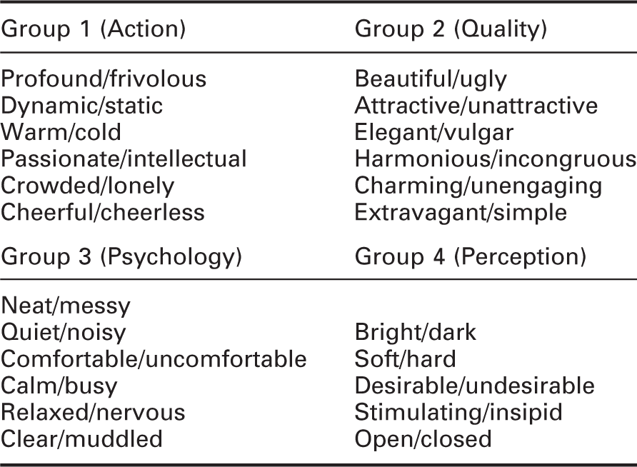
Adjective pairs by group
3. Results
3.1. Analysis of image evaluation
Analysis of the adjectives applied to each element allowed for an understanding of comprehensive impressions and factor structure.
29
Average image evaluation values were obtained from all respondents concerning vegetation, water, stones and structures in both summer and winter. For the same season, based on changes in light source colour temperature, the trends in the seven colour temperatures’ scores for each element were mainly consistent; the image evaluations for vegetation in summer and winter are given in Figure 5 as an example. In these graphs, the parameters are the seven phases of colour temperature. Positive adjectives are shown on the horizontal axis; impression evaluation values are shown on the vertical axis. The adjectives are arranged in groups from left to right on the horizontal axis, beginning with Group 1 and ending with Group 4.
Image evaluations for vegetation in (a) summer and (b) winter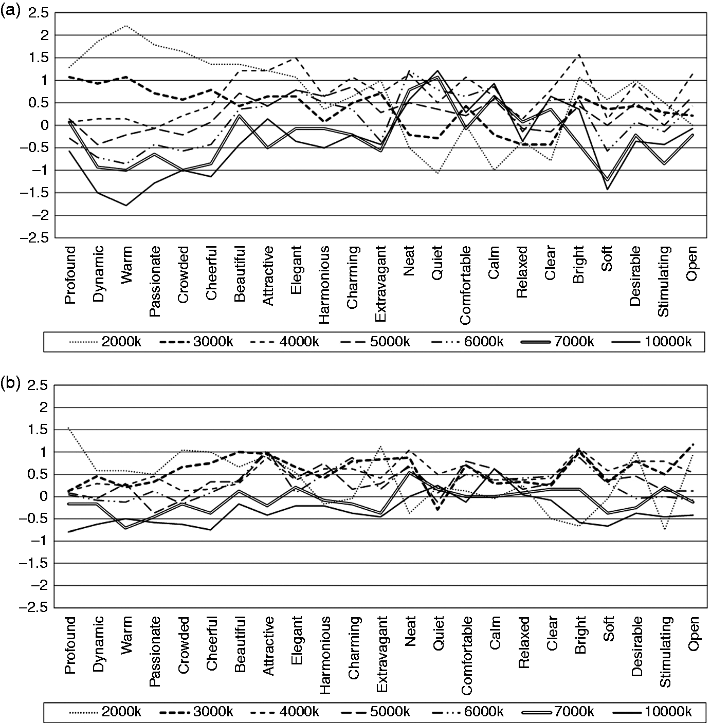
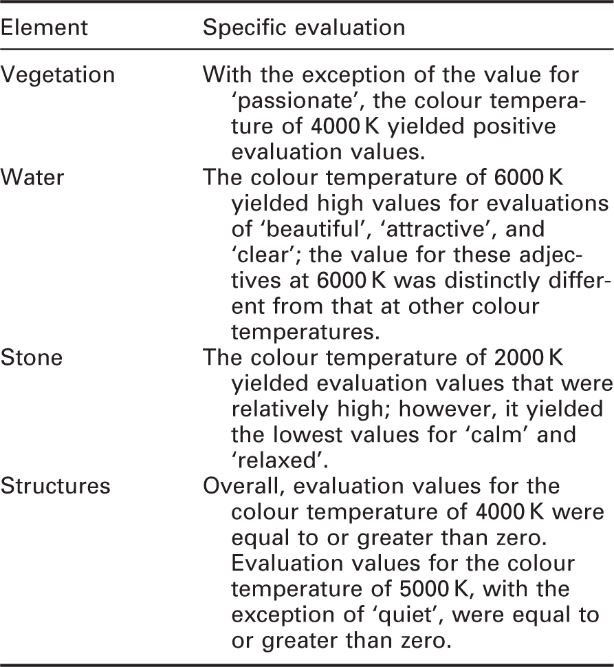
Element evaluation (summer)
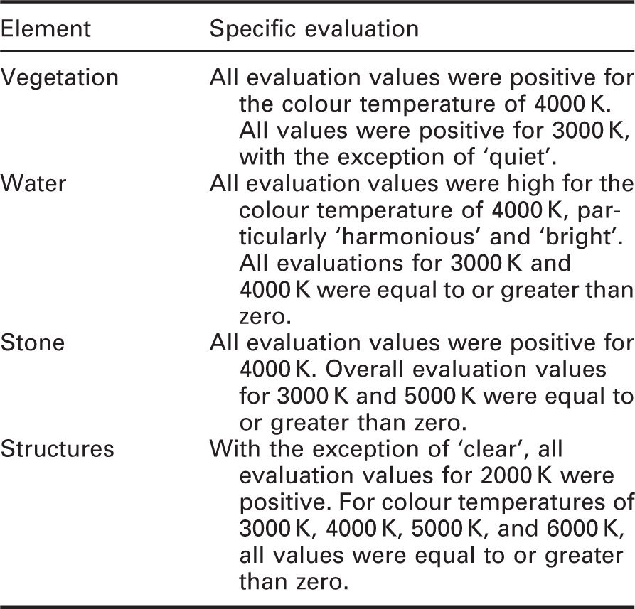
Element evaluation (winter)
3.2. Results of factor analysis
To understand the overall evaluation pattern caused by changes in light source colour temperature, we conducted a factor analysis (principal factor analysis with a varimax rotation) of the evaluation values for each element.
For both summer and winter variables, two common factors were extracted by examining items with absolute values greater than 0.6. These were named Factor I and Factor II.
30
The factor scores for each element are plotted in Figure 6. These graphs provide a comprehensive illustration of how each colour temperature was assessed with respect to each element in summer and winter.
Factor scores for each colour temperature and material in (a) summer and (b) winter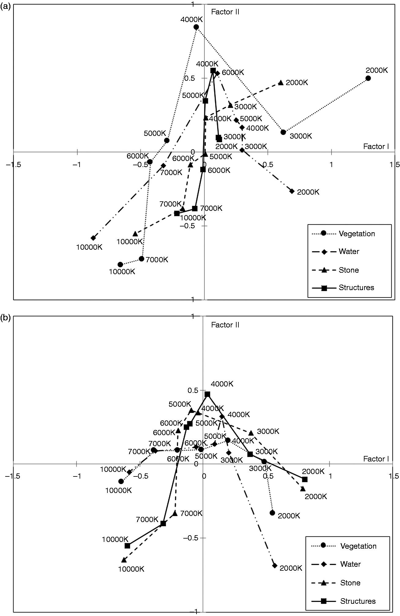
When determining the optimum colour temperature for each element, it was necessary to simultaneously account for Factors I and II. Optimum colour temperatures were considered to lie in the first quadrant
4. Evaluation methodology
4.1. Improving prior evaluation methodologies
Most of previous studies in this field have determined the optimum colour temperature for landscapes based on the largest value for equation (1):
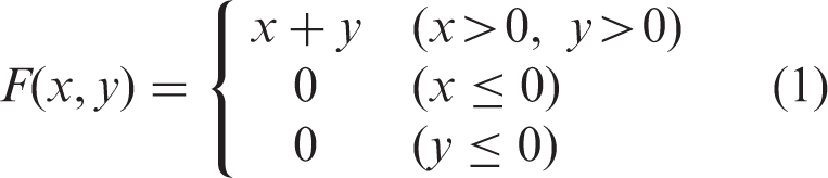
In equation (1), x and y are the values of Factors I and II, respectively. Based on the coefficient of correlation and the covariance, we proposed to use equation (2) for the evaluation. We verified both equations’ reliabilities and accuracies.
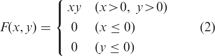
Based on theorems for piecewise-defined functions and topology, we determined that in calculating F(x, y) according to equation (1), x = 0 or y = 0 would result in a discontinuity. This discontinuity is not analytical, and it could invalidate the accuracy of evaluation. However, continuity is maintained in the case of equation (2). The experimental factors x and y are equally important. Both the x and y values should be high for an optimum colour temperature. Because F(x, y) is calculated as a product of both factors in equation (2), a small value of one of them is proportionally reflected in a small value of F(x, y). In contrast, this does not affect F(x, y) calculated according to equation (1). For example, Figure 7 shows the distribution of factor scores for vegetation in winter on the contour lines for equations (1) and (2). The figure clearly shows that the illumination at 3000 K received the highest evaluation scores according to equation (1) despite its lower value for y. In contrast, the illumination at 4000 K received the highest evaluation scores based on equation (2). Thus, equation (2) was determined to be more accurate and appropriate than equation (1). It ensured that only optimum colour temperatures with high values for both x and y are selected.
Distribution of factor scores for vegetation in winter on the contour lines for equations (1) and (2)
Equation (2) may be applied not only in the field of landscape lighting, but also to many other fields. The higher the number of samples, and the more densely packed or closer to the coordinate axis the sample distribution is, the more superior equation (2) becomes. Consequently, equation (2) is a necessary improvement resulting in a new evaluation methodology for the semantic differential technique known as the ‘Cross-Evaluation Index’.
4.2. Results from the two evaluation methodologies
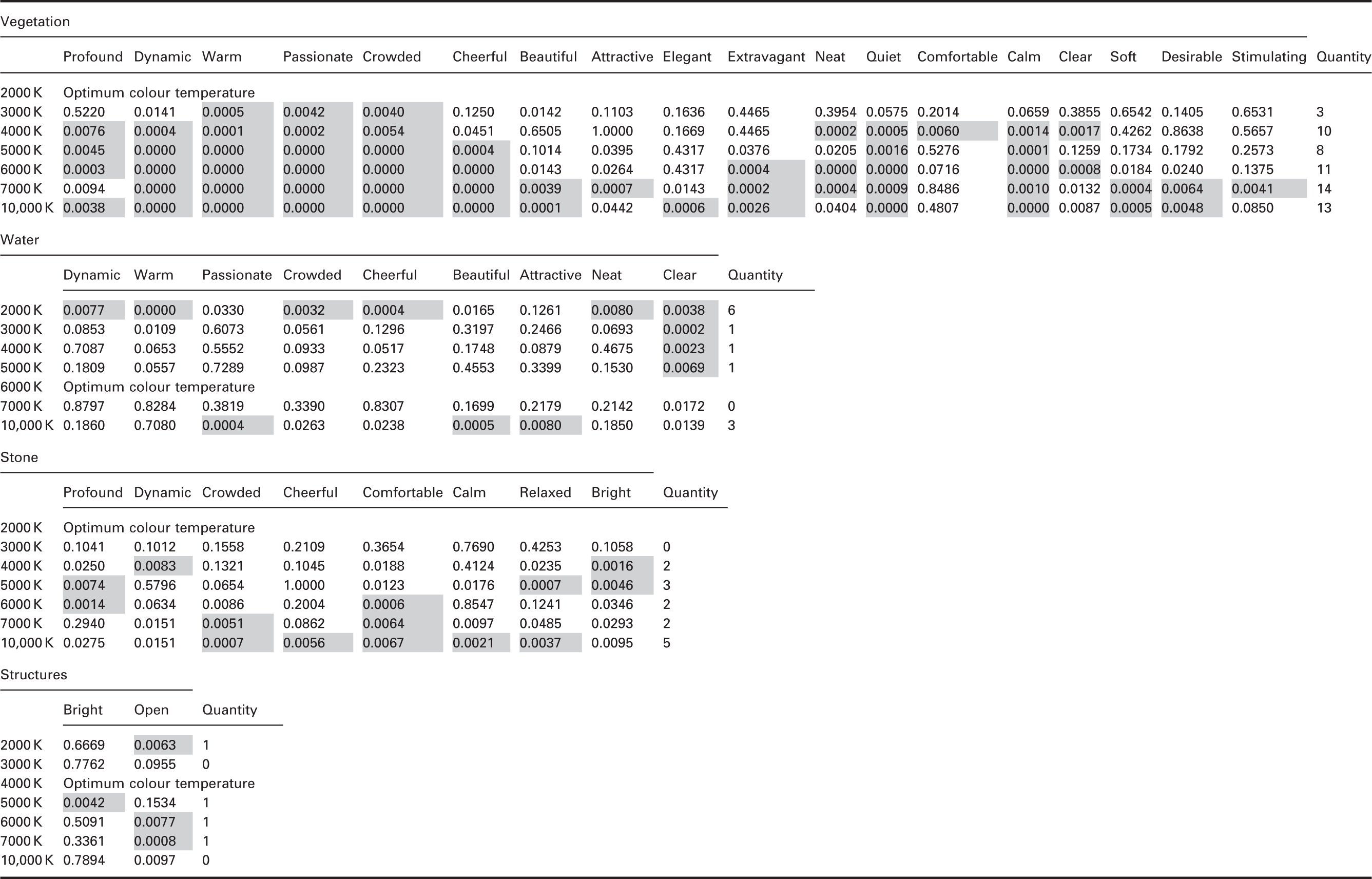
This study considered only colour temperatures in the first quadrant as candidates for optimum colour temperature; colour temperatures in the other three quadrants that yielded calculation results of zero were excluded.
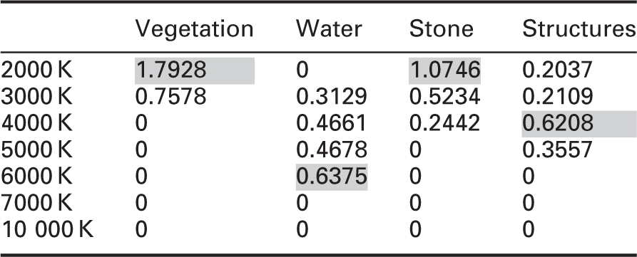
Equation (1) results (summer)
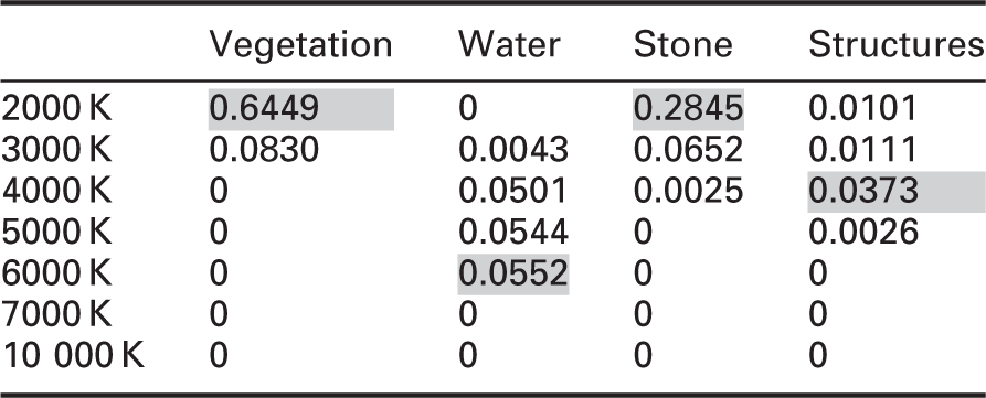
Equation (2) results (summer)
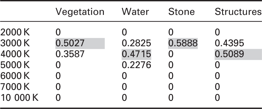
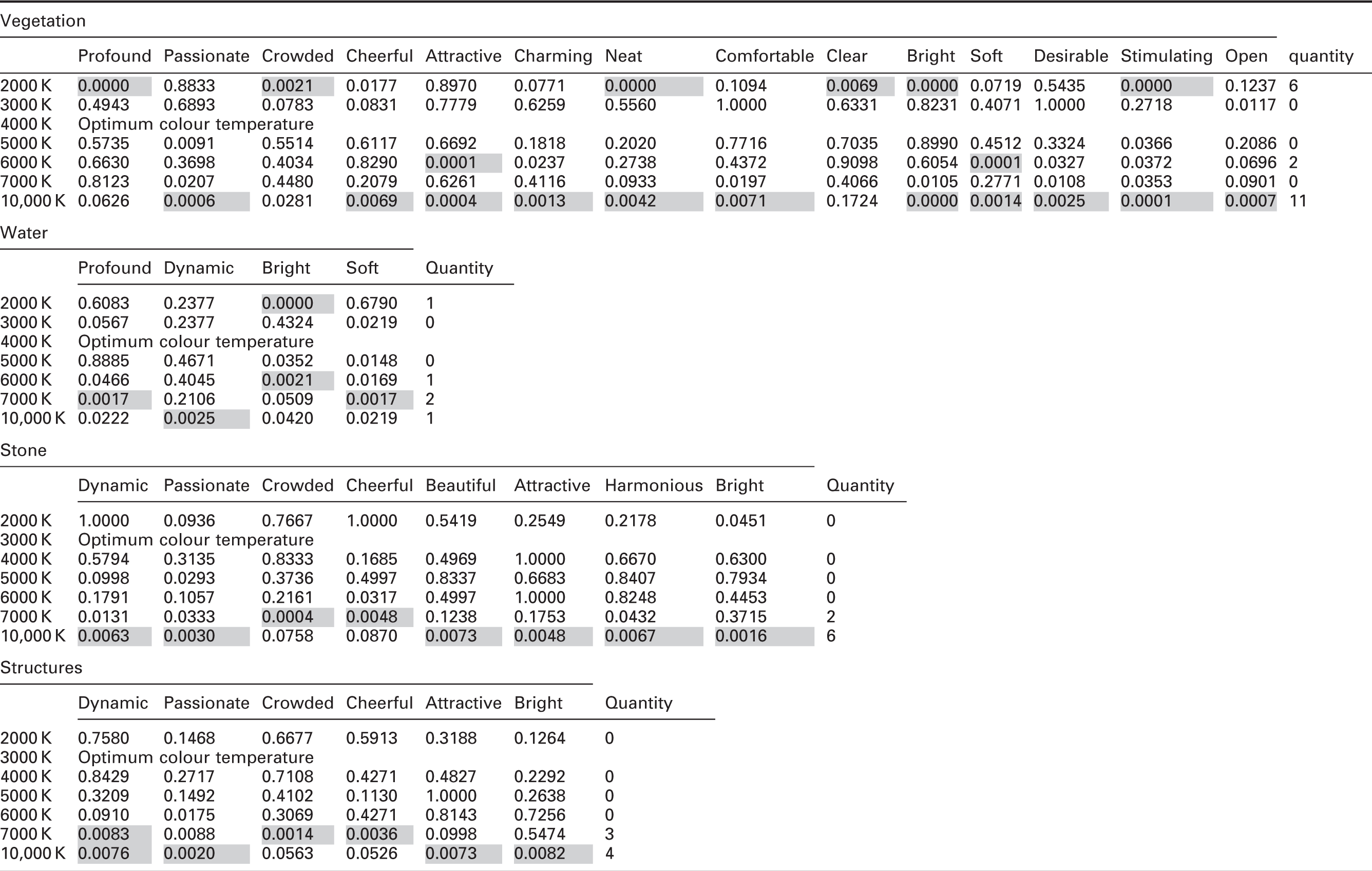
Equation (1) results (winter)
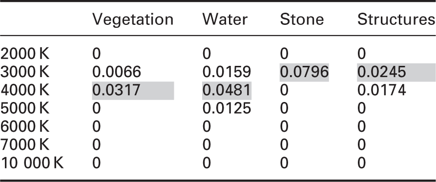
Equation (2) results (winter)
We compared the results obtained by each of the two evaluation methodologies. The results for summer were the same. However, compared with equation (1), equation (2) yielded a larger difference between the optimum colour temperature and other colour temperatures, indicating that results based on equation (2) have a higher confidence and accuracy.
The colour temperatures of 4000 K, 5000 K and 6000 K are distinct from one another, but when applied to different samples, as shown in Figure 1(d), they can function similarly. Waterfalls are whitish in colour; however, illumination at 4000 K, 5000 K and 6000 K yields similar results and no clear differences between these colour temperatures were seen. Figure 1(d) shows only a waterfall in summer; however, the results for this image affected the experimental results as a whole. This helps to explain why there were no large gaps in the results for the illumination of water at 4000 K, 5000 K and 6000 K colour temperatures.
Half of the results obtained using equations (1) and (2) were consistent for garden elements in winter. As for summer, equation (2) yielded larger gaps between the results than did equation (1), underscoring the value of equation (2) and the need for updating the previous evaluation methodology.
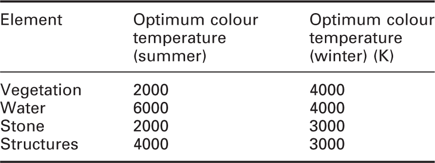
Optimum colour temperatures for each element in summer and winter
Student’s t-test results
To verify the reliability and accuracy of the results, particularly whether the differences among elements reflected salient or non-salient features, 31 we tested the statistical significance of the differences between the results for different colour temperatures using Student’s t-test.
Student’s t-test results for each element (summer)
Student’s t-test results for each element (winter)
The results of Student’s t-test clearly show that each element had adjectives for which p < 0.0083. Consequently, we concluded that significant differences existed between the colour temperatures for different elements in summer and winter and thus that the experimental results were accurate and reliable.
5. Discussion
For both summer and winter, for each adjective, colour temperatures further from the optimum more frequently showed significant differences. This indicates that the further removed a colour temperature is from the optimum, the more different the perception will be.
Regarding vegetation in summer, fewer adjectives ascribed to illumination at 3000 K were significantly different when compared with other colour temperatures. However, this number was still sufficient to highlight the difference between impressions of illumination at 3000 K and at 2000 K. Similarly, many adjectives for the other colour temperatures did exhibit significant differences, highlighting the differences between impressions of other colour temperatures and those of illumination at 2000 K.
Regarding water viewed in summer, 2000 K and 10,000 K had several adjectives that were significantly different when compared with 6000 K, underscoring how 2000 K and 10,000 K differed in impression from 6000 K. With the exception of ‘clear’, adjectives ascribed to 3000 K, 4000 K and 5000 K were not significantly different; impressions of 3000 K, 4000 K, 5000 K and 6000 K thus differed slightly. The colour temperature of 7000 K had no adjectives that were significantly different so the impression of 7000 K was not clearly distinguished from 6000 K.
Regarding stone viewed in summer, illumination at 10,000 K yielded impression different from 2000 K. Impressions of illumination at 4000 K, 5000 K, 6000 K and 7000 K differed slightly from those at 2000 K. At 3000 K, no adjectives were significantly different; thus, impressions of 3000 K and 2000 K were not obviously different with respect to stone in summer.
Regarding structures viewed in summer, because yellow, brown and grey hues were dominant, changes in colour temperature had little effect; only a few adjectives exhibited significant differences.
There were fewer significantly different adjectives for vegetation in winter than in summer. This is because, with the exception of pines and a few other species, trees in winter have no greenery and are covered only in snow. Impressions of colour temperatures, with the exception of 2000 K and 10,000 K, did not vary with respect to trees covered in snow.
Similarly, water, stones and structures are all covered by snow in winter; thus, impressions of these elements were strongly influenced by the presence of snow. Unlike in summer, impressions of the optimum colour temperature were not so distinctly different from those of other colour temperatures. Furthermore, fewer adjectives ascribed to the elements in winter exhibited significant difference; only two colour temperatures were considered optimum in winter.
According to the results of Student’s t-test, not all adjectives exhibit a significant difference. Moreover, when the seasons or elements changed, the adjectives without a significant difference varied as well. We conclude that in future research involving both summer and winter, adjectives that play no substantial role for each element should be omitted.
The seasonal background in the previous research was autumn; because of the red leaves, the red impression is strong. In this study, the backgrounds were both the green atmosphere of summer and the white atmosphere of winter; these provide people with senses totally different from that provided by autumn, so the optimum colour temperature will also differ. This phenomenon shows that the colour of the natural environment or overall season has an effect on people’s vision and perspective and consequently affects their preferred light source colour temperature.
When elements differ, optimum colour temperature may differ as well. In the previous research using equation (1), the optimum colour temperature for all elements was found to be 2000 K in autumn. In this experiment, using equation (2) as the evaluation methodology, the optimum colour temperature for each element was found to differ in summer and in winter, which is a more appropriate result.
6. Conclusions
In this experiment, based on factor analysis, a proposed evaluation methodology, and the results of Student’s t-test, we obtained a clear understanding of the differences in evaluation of the garden elements as well as the impressions they made on respondents when illuminated at different colour temperatures.
In summer, 2000 K is the optimum colour temperature for vegetation and stone. The reddish light of 2000 K produces an atmosphere that complements vegetation and evokes an emotional response. It also perfectly frames the holiness and stateliness of stone. For water, 6000 K is the optimum colour temperature. The cool, whitish light of 6000 K not only highlights the purity of water, but also offers a sense of coolness in the heat of summer. For structures, 4000 K is the optimum colour temperature. Structures are predominantly warm-toned; because 4000 K is both warm and whitish, it creates a refreshing atmosphere well-suited to the characteristics of structures.
In winter, all elements were covered in snow, which strongly affected respondents’ impressions; unlike in summer, optimum colour temperatures are not perceived much differently from other colour temperatures. For vegetation and water, 4000 K is the optimum colour temperature. In winter landscapes, 4000 K satisfies the desire for warmth and beautifully highlights both vegetation and snow; moreover, it is suitable for water environments, making water look brighter and more pure. For stones and structures, 3000 K is the optimum colour temperature. Because both stones and structures are commonly warm-toned, the yellowish illumination of 3000 K lends them a sense of warmth. It also expresses the artistic conception behind the placement of stones and harmonizes well with structures in terms of image and atmosphere.
Declaration of conflicting interests
The authors declared no potential conflicts of interest with respect to the research, authorship, and/or publication of this article.
Funding
The authors disclosed receipt of the following financial support for the research, authorship, and/or publication of this article: JSPS KAKENHI Grant Number JP15K12062.
Footnotes
Acknowledgements
We would like to thank all survey participants for their time and the valuable review suggestions.