
Abstract
Trust in visualization has emerged as a key research topic as visualizations increasingly permeate modern media and life. Empirical work indicates that the design of a visualization can influence trust, but it remains unclear how specific design factors affect trust. The two crowdsourced studies reported on in this paper explore how two common design factors—semantic color congruence and the presence of data reliability information using a dotted stippling pattern overlay—impact map trust and map reading. Our analysis suggests that participants’ trust and map reading were largely unaffected by changes in color congruence. However, data reliability had a negative effect on map trust, map reading accuracy, and map reading confidence. Participants viewing a map with data reliability represented were significantly more likely to trust the map less and perform worse on map reading. These results are consistent across stimuli that vary in scale, data pattern, and topic. Additionally, we found that perceived risk functions as a mediating variable for the relationship between data reliability and map trust. These findings not only provide empirical evidence for previously proposed theoretical frameworks of trust in visualization, but also suggest preliminary design recommendations for using congruent colors and including indicators of data reliability in maps.
Introduction
The design of a data visualization may shape how well someone can interpret a visualization and the degree to which it is trusted. Trust in visualization has emerged as a research focus because public-facing data visualizations are not necessarily trusted in the current era of post-truth politics. Additionally, visualizations are increasingly a vehicle for misinformation. Trust is often defined in social science as “the willingness of a party to be vulnerable to the actions of another party.” 1 Definitions in data visualization draw on this definition with Mayr et al. 2 describing trust as “the user’s implicit or explicit tendency to rely on a visualization and to build on the information displayed.” Given our focus on maps in this paper, we adopt Prestby’s definition of map trust 3 : “the willingness to rely on geospatial information interpreted from a map with the expectation that the information has been ethically and accurately represented by the cartographer.”
We also ground our work on trust in a theoretical framework. Elhamdadi et al. 4 proposed a framework that outlines visualization trust in two dimensions. One dimension distinguishes affective components of trust from cognitive ones while another dimension separates trust in data from trust in visualizations. Affective trust concerns characteristics of visualizations that influence people’s emotions while cognitive trust concerns characteristics of visualizations that people perceive as reliable or dependable. These characteristics are referred to as antecedents and precede trust formation.
The authors found evidence for several parts of their framework in an empirical study. They found that affective antecedents were significant predictors of visualization trust. Specifically, trust was linked to visualization esthetics: how visualizations elicited positive affect (e.g. joy, interest) or looked scientific. Other studies have examined the effects of visualization design on trust including beauty, 5 complexity, 6 and transparency. 7 However, less attention has been given to how more specific visual elements in visualization design (i.e. visual hierarchy, resolution) affect trust. Elhamdadi et al. also found that the cognitive antecedent, accuracy, was a significant predictor of trust in data underlying a visualization. In this study, we test how color use and data reliability representation influence trust.
We examine the effects of color on trust in this study for two reasons. First, color is perhaps the most widely used and misused visual variable in visualization design. 8 Second, color has been shown to elicit and amplify powerful emotional responses to visualizations 9 and has different meanings across cultures. 10 For instance, red is commonly associated with danger, death, and other bad topics or emotions in the United States. Conversely, red is a symbol of happiness, and success in China 11 With visualizations increasingly going viral, 12 colors may be perceived as appropriate for some groups of people but not others.
This is an issue of semantic resonance: whether the color choices in a visualization evoke the concept that they represent. 13 One type of semantic resonance is based on the whether they are conceptually intuitive. For instance, a map showing US election results is semantically resonant to Americans if it depicts republicans in red and democrats in blue. We use the term semantic color congruence (hereafter: semantic congruence) to describe the type of semantically resonant color use where the color used to encode data in a visualization aligns with the reader’s conceptualization of the data topic.
Uncertainty representation is another common trust-related design factor in visualization. While a substantial body of work has established best practices for how to encode uncertainty, 14 there are few examples evaluating whether or not visualizing uncertainty impacts visualization trust. Conducting evaluations that specifically use maps as stimuli is important because spatial data uncertainty is nuanced. Indeed, factors such as scale and spatiotemporal modeling factors amplify uncertainty. 15 Note that there is also inherent uncertainty in making maps (e.g. cartographic simplification, generalization). In this paper, we focus on spatial data uncertainty rather than inherent uncertainties of maps. Maps and other visualizations often do not visualize uncertainty because we lack methods for measuring uncertainty and people struggle to incorporate uncertainty when reading visualizations (for a complete review see Hullman 16 ). A potential consequence of this is that people may have marked distrust in maps that explicitly depict data uncertainty.
Data uncertainty is multifaceted. Indeed, the typology of uncertainty of geospatial information developed by MacEachren et al. 17 consists of nine major types (e.g. accuracy, completeness, currency). In this paper we focus on the uncertainty type credibility that is often conceptualized as the reliability of data. We selected this type of uncertainty because data reliability is a frequent way of operationalizing data uncertainty in information visualization 17 and cartography/GIScience. 18 We also chose to operationalize reliability as a binary variable (i.e. reliable or unreliable data) because visualization authors often need to simplify uncertainty representations in order for people to understand them best. 18 This binary is represented by a stippling (a random arrangement of dots) overlay on top of map units with unreliable data. We acknowledge that our operationalization and representation may oversimplify the nuances of uncertainty, but we believe it strikes a balance between uncertainty’s complexity and people’s ability to understand uncertainty. 19
Here, we address a need for empirical research on how visualization design can affect trust by testing two key design factors in thematic mapping: semantic congruence and data reliability representation. We examine these factors separately in two crowdsourced experiments to isolate the effects of each independent variable. Our rationale for reporting on the results of these experiments in the same paper is as follows. First, these independent variables represent two common design considerations for visualizations. They also capture different components of the Vistrust framework with semantic congruence corresponding to a visualization-level, affective antecedent and data reliability representation corresponding to a data-level, cognitive antecedent. 20
The primary contribution of this paper is to provide evidence that evaluates the linkages between specific aspects of visualization design and trust. We contribute these findings to help expand the relatively small body of works examining trust in cartography and geographic information science while connecting to ongoing recent discourse on trust in data visualization. Our findings on how semantic congruence and data reliability representation influence map reading constitute a secondary contribution of our work.
The rest of the paper is organized as follows. We first review related work. We then outline the design of the experiments. Next, we report on the results from the two experiments. Finally, we discuss the implications and limitations of our research before concluding by revisiting our contributions.
Related work
Visualization trust
Trust is a widely studied concept in computer science 21 and social sciences 1 but remains understudied in the context of data visualization. An overarching conceptualization of trust proposed by sociologists Lewis and Weigert 22 posits that trust consists of three dimensions: cognitive, affective, and behavioral. Cognitive trust is based on rational reasons and perceived competence whereas emotional trust is based on emotions. McAllister 23 largely echo this by conceptualizing interpersonal trust in terms of cognition-based and affect-based trust. McAllister, however, does not explicitly mention behavioral trust: intentions or actions that assume risk and reliance on something/someone. Such intentions and actions are theorized to be driven by or drive cognitive and affective trust. 22
It is not clear whether conceptualizations of trust carry over from interpersonal/organizational contexts in social science to data visualization contexts. People or groups of people serve as the trustor (who is placing trust) and trustee (who trust is being placed in) in social research.1,23 However, in visualization research, the trustee is not a person, but a visualization. Many studies have shown that people interact with computers, technology, and information in social ways that resemble behavior toward people.24,25 By extension, people may also trust computers and visualizations in similar ways that they do with other people. Interestingly, Lin and Thornton 5 found that the relationship between visualization beauty and trust was mediated by the perceived competence of the visualization author. In other words, when people viewed a visualization as beautiful, it signaled to them that the author was competent, so the visualization could be trusted. This suggests that people may apply social rules to trusting visualizations and view visualizations as extensions of their creators.
Research in data visualization also supports the social science theory that trust is multidimensional. 2 Indeed, Elhamdadi et al. 4 developed a framework for trust in data visualizations that centers around cognitive and affective dimensions. Each dimension is further broken down into visualization and data trust antecedents. Antecedents are factors that precede trust formation. The framework also highlights the importance of behavioral outcomes. Elhamdadi et al. 4 substantiated the two major axes of their framework (cognitive-affective, visualization-data) in an empirical study. On the one hand, two cognitive antecedents, the perceived accuracy and clarity of visualizations, emerged as strong predictors of visualization trust. Additionally, two affective antecedents related to esthetics (inducing positive affect and looking scientific) were significant predictors of visualization trust. On the other hand, cognitive factors of data accuracy, coverage, and clarity demonstrated high predictive power for data trust. The affective antecedent data source was also a strong predictor in data trust. Finally, the authors found support for behavioral visualization trust because the cognitive antecedents of accuracy and clarity, and the affective antecedent, esthetics, shaped whether someone would use or share a visualization.
This research provides a strong foundation for identifying higher-level elements of data visualizations that influence trust, but it does not isolate specific design techniques. In this paper, we evaluate semantic congruence and data reliability representation in thematic choropleth maps to understand how visualization design factors can affect trust.
Color and trust
We build upon recent research that evaluates the impact of color use on visualization trust. Lin and Thornton 5 conducted an series of studies to determine if the perceived beauty of a visualization impacts participant’s trust. Their work found that the three strongest predictors of map beauty were color hue, lightness, and saturation. Specifically, vibrant blues, pinks, and greens were perceived as beautiful. A subsequent set of studies found that perceived beauty predicted trust in visualizations across a variety of sources even when controlling for confirmation bias, topic, and complexity. Together, these results demonstrate that there is a strong correlation between color attractiveness and perceived visualization beauty, and perceived beauty with trustworthiness.
Christen et al. 26 examined whether GIScientists, neuroimagery personnel, and lay people would exhibit differential levels of trust toward maps and charts based on the color schemes used. Interestingly, maps and visualizations using either one of two spectral schemes (rainbow and heated body scale) were trusted significantly more than more “conventionally appropriate” sequential or diverging schemes that were tested. These spectral schemes featured vibrant colors that may have been perceived as more attractive to participants.
Padilla et al. 6 found that multiple forecast visualizations (line charts with multiple lines) encoded in a grayscale qualitative color scheme scored higher in perceived trust compared to color-encoded qualitative visualizations. The authors hypothesized that color complicated the visualization and made the trends less clear.
Research in human-computer interaction substantiates the idea that color appeal can affect trust. Cyr et al. 10 examined if semantic resonance is culturally dependent and linked to trust. Accordingly, they assessed the relationship between color appeal and trust in websites and whether culture moderated this relationship. Canadian, German, and Japanese participants were sampled to assess cultural differences. The authors found that color appeal exhibited a significant positive relationship with trust. Specific colors also exhibited different levels of trust across cultures.
These highlighted studies connect with Elhamdadi et al.’s visualization trust framework 4 in that semantically congruent colors may promote positive affect, an affective antecedent of visualization trust. With this empirical evidence in mind, we propose:
We are also interested in explaining the mechanisms underlying our independent variables and dependent variables. These mechanisms are referred to as mediating variables and the corresponding process is known as mediation. 27 For example, a mediating variable for the relationship between semantic congruence and visualization trust could be color appeal. Maps with more appealing colors are more preferred than maps with unappealing colors. 9 By extension, people may trust maps with appealing colors more. Provided that, we propose the following hypothesis:
Mediation analysis is common in psychology research to determine the causal mechanism of a specific effect.
28
Thus, it helps researchers strengthen causal claims and provides a deeper understanding of the relationship between two variables.
Color congruence and map reading
Color congruence may also influence people’s ability to interpret (read) visualizations. Recent work found that participants were faster and more accurate at reading categorical bar charts that had semantically-resonant colors, “color choices that are evocative of a given concept.” 13 Bartram et al. 29 examined a particular type of semantically-resonant colors by developing affective color schemes—ones that evoke a mood and/or emotions. These schemes were used in a later experiment to explore the influences of affective color congruence on map reading. 9 Surprisingly, map reading accuracy and response time were not significantly different between affectively congruent maps (e.g. map of homicide causes in dark colors) and affectively incongruent maps (e.g. map of homicide in pastel, playful colors). However, participants did perceive incongruent schemes as confusing which could erode trust and confidence in map reading. Wu et al. 30 incorporated affective congruence into terrain map color schemes and found that participants performed slightly better at map reading tasks when terrain colors were affectively congruent.
Kushkin 31 developed a tool that generates color schemes for maps that are cognitively congruent:“where colors are matched to emotions in a way that is aligned with human associations.” This definition coincides with affective color congruence. 9 Our study focuses on color associations with concepts rather than emotions. Kushkin 31 evaluated their tool by designing an experiment where participants saw a tourist map that depicted (1) attractions as icons and (2) emotions people felt throughout the town as colored dots. Participants used either a map with a cognitively congruent scheme or a color scheme based on traditional cartographic conventions to plan a sightseeing tour of the town. Participants in the cognitively congruent group completed the task significantly faster and with significantly less self-reported difficulty. Participants in the cognitively congruent group also made better decisions in their chosen places for the tour, selecting more good places and fewer bad places as designated by the authors. Together, these results indicate that people may more easily and effectively read point maps employing congruent color schemes. Considering the aforementioned empirical evidence, we hypothesize:
Uncertainty and trust
Uncertainty and vulnerability are often theorized as preconditions for trust. 1 Many scholars argue that trust functions to reduce feelings of uncertainty.32,33 So, what happens when uncertainty information is present in a visualization? We did not find any studies specifically examining how data reliability influenced trust in visualizations or maps, so in this section we review research that examined the effects of other kinds of uncertainty on trust.
Padilla et al. 6 found that COVID-19 forecast visualizations that represented uncertainty were perceived as more trustworthy than visualizations without uncertainty representation. An experiment focusing on weather forecast graphs had similar findings; participants trusted graphs that conveyed probabilities of weather events more than deterministic graphs. 34 We identified two previous studies that tangentially investigated how uncertainty representation affected trust in maps. Kübler et al. 35 evaluated whether or not representing uncertainty changed decision making with hazard maps. Participants were asked to select a location where they would purchase a house and chose locations in high-hazard areas significantly more often when uncertainty was represented. The authors suggest “that the depicted uncertainty at hazard zone boundaries might have suggested to participants not to trust the official hazard zone classification.” 35
There is mixed evidence regarding how uncertainty representation impacts trust. However, we believe that representing data reliability will cause people to be more critical of maps, thereby trusting them less.
The effects of uncertainty can be integrated with Elhamdadi et al.’s 4 visualization trust framework in considering data quality indicators as key cognitive antecedents to trust. Thus, we hypothesize:
Perceived risk may serve as the mechanism that links data reliability to trust. When people interact with any type of uncertainty information, their perception of risk intensifies, thereby decreasing trust. 36 Trust always involves some risk, but when someone feels uncertain about whether relying on something will have adverse implications, perceived risk may surpass the threshold for someone to feel comfortable enough to trust. 37 Economics studies indicate that uncertainty about purchasing something propagates as perceived risk and can diminish trust. 38 The same applies to maps with lay and expert users perceiving areas that depict uncertainty as risky. 39 Extending the results of prior work, we hypothesize that greater perceived risk from data reliability being represented will translate to lower trust:
Alternatively, people may trust maps less that visualize uncertainty because they are confused about what the uncertainty means. Indeed, a number of studies have demonstrated that people often struggle to make sense of maps and visualizations that represent uncertainty.16,35,40 Because confusion stemming from uncertainty can carry over to readers’ judgments of trust, we propose the following:
Uncertainty and map reading
The effects of uncertainty on map reading are more documented in prior work. Korporaal et al. 41 found that presenting uncertainty on maps did not impact participants’ decision accuracy, but it did impact participants’ decision confidence. Participants who used maps depicting data as being uncertain or certain to complete a search and rescue task were significantly less confident in their decisions. In another experiment, participants made more correct decisions about where to build a park and airport when maps displayed uncertainty, but no difference in decision confidence was observed. Viard et al. 42 tested how decision accuracy in an optimal site selection task was affected by uncertainty visualization on maps. Their experiment revealed no significant differences in decision accuracy. Scholz and Lu, 43 however, found that the accuracy of a map reading comparison task was roughly 10% lower for experienced and novice map users who utilized maps with uncertainty information. Deitrick and Edsall 44 conducted an experiment to compare people’s map reading accuracy and confidence in choropleth maps with and without data reliability overlaid on top of the map. Participants were more accurate and confident with their decisions when the choropleth maps did not display data reliability. Based on our review of the literature, we propose the following hypotheses:
Methods
We conducted a two-part study to examine how semantically congruent color use and data reliability representation affect trust in maps and map reading. Experiment 1: Color (henceforth referred to as E1) examined the influence of semantic congruence on map trust and map reading. Experiment 2: data reliability (henceforth referred to as E2) examined the influence of representing data reliability on map trust and map reading. Both experiments were between-subjects studies with near-identical designs that were administered online through crowdsourced participants from Prolific. 45 We chose to examine these two variables in the same overall study but not in combination with each other for two reasons. First, there are no theoretical or empirical linkages between semantic congruence and data reliability representation. A factorial design was therefore unnecessary because we were not interested in exploring interaction effects. Conducting separate experiments also prevented potential confounding effects from the other variables and made it easier to isolate the effects while strengthening statistical power. This study was approved and deemed exempt by The Pennsylvania State University’s institutional review board (STUDY00023559). The following sections describe the methods for each experiment.
Participants
We recruited 208 participants in E1 and 285 participants in E2. A priori power analysis (80% power at 0.05 alpha) was used to determine the lowest possible effect sizes detectable in the experiments. We chose to use a priori power analysis instead of post hoc power analysis because post hoc power estimates tend to diverge from true power values and its reliance on p-values makes it misleading.46,47 For E1 and E2, we were sufficiently powered to detect a small effect size (0.062 and 0.048, respectively). Participants were compensated $ 0.75 (equivalent to $11.25/h) to participate in the study which took around 4 min to complete.
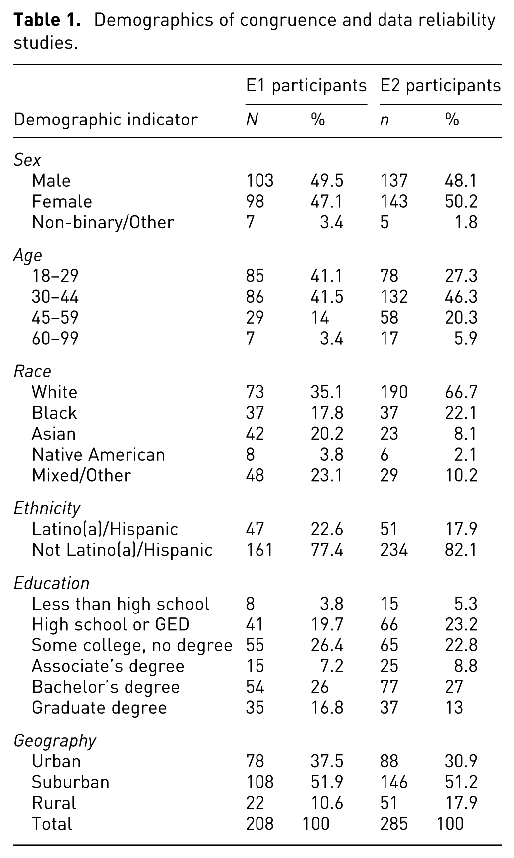
We used Prolific’s quota sample tool to obtain a representative sample of our target population: US adults who consume information online. We implemented quotas for sex, race, ethnicity, and education attainment that reflected our target population. Attributes of our participants are summarized in Table 1. All participants self-identified as being US-born residents with full color vision.
Demographics of congruence and data reliability studies.
Design
For E1, participants were randomly assigned to a congruent or incongruent group. Participants in the congruent group viewed a map featuring a color scheme that aligns with American associations pertaining to the map topic (Table 2). For instance, a map showing income change should visualize gains in green and losses in red to line up with American semantic color associations. 48 See Figure 1(a) to (c) for congruent examples. The incongruent group viewed maps that flip these associations (e.g. green will represent loss and red will represent gains). See Figure 1(d) to (f) for incongruent examples—paying particular attention to the difference in legends between rows.
Detailed map themes and color schemes used per map topic along with sources for strong semantic congruency.
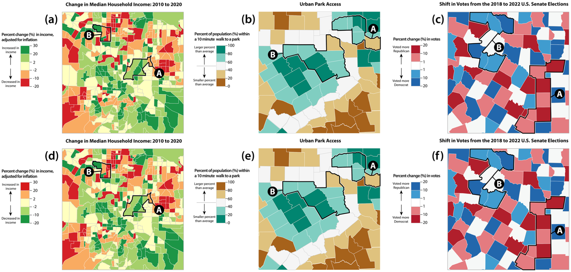
Example stimuli in Experiment 1 with congruent condition (a–c) and incongruent condition (d–f). Data pattern: clustered (a, b, d and e), dispersed (c and f). Scale: county (b and e), tract (a, c, d and f). Topic: income (a), greenspace (b), election (c).
For E2, participants were randomly assigned to a reliable or unreliable group. Participants in the reliable group viewed a map that does not visualize a second data layer (data reliability). See Figure 2(a) for a reliable example. Participants in the unreliable group viewed a map visualizes a second data layer (data reliability) as a binary reliable-unreliable. See Figure 2(b) for an unreliable example.
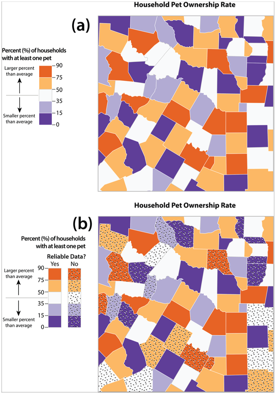
Example stimuli in Experiment 2 with reliable (a) and unreliable (b) condition. Topic shown is pet ownership which is not included in Experiment 1.
Stimuli
We designed multiple stimuli for each condition to engage in stimulus sampling which can boost the ecological validity of an experiment. 51 For E1, we created choropleth maps for the two experiment groups through combinations of three thematic topics, two geographical scales, and two geospatial data distributions.
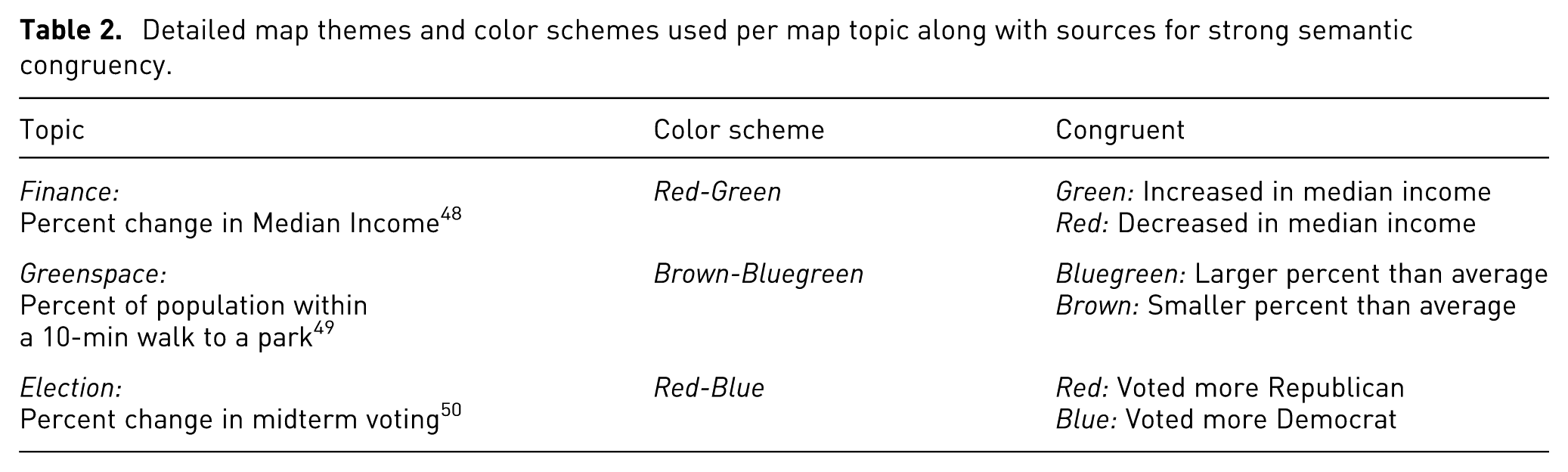
Thus, each of the congruence groups could see one of 12 possible diverging choropleth maps. We used choropleth maps because they are one of the most common thematic map types. 52 We chose diverging color schemes because they involve multiple hues, supporting our goal to evaluate color pairs that are semantically resonant. We used three thematic topics (finance, greenspace, and elections) that have salient color associations in the United States according to prior studies and based on our own pretesting (Table 2 and Supplemental Material, Section 2.5). In the pretest, 32 participants recruited from CloudResearch (an online surveying playform like Prolific), rated the appropriateness of five diverging ColorBrewer schemes for the topics outlined in Table 2.53,54 Participants responded to the following three-item scale for their ratings: the colors are appropriate for the map topic, I would associate the colors used with the map topic, and I like the color choices. The results indicated which diverging ColorBrewer schemes exhibited strong semantic congruence to which topic (Table 2).
We varied map aggregation using census tract and county levels. Finally, we varied data patterns by employing clustered and dispersed distributions.
We used the stimuli in the congruent group of E1 as the basis for the reliable group stimuli for E2. However, we added a fourth topic, pet ownership, that does not have strong semantic associations to improve the generalizability of the study (Supplemental Material, Section 2.5). The same variations in data patterns and scale were applied to this topic, resulting in 16 total maps. Examples of the reliable condition are shown in Figure 2(a). Stimuli in the unreliable condition represented a second data uncertainty layer as a dot overlay (Figure 2(b)). Map units without the dots represented reliable data whereas the map units with dots represented unreliable data. A binary encoding of data reliability was chosen over a range of values to account for the need for visualization authors to simplify uncertainty representations in order for people to understand them best. Indeed, binary indicators of reliability have been leveraged in numerous mapping contexts including health 18 and natural hazards. 41 This is also common practice in information visualization, though it may oversimplify the nuances of uncertainty. 19
We chose dots to represent data reliability as this approach has been shown to be an effective method for representing uncertainty in maps.41,55 We originally considered using fuzziness and hatchure to convey uncertainty, both of which have been shown to be intuitive and accurate visual variables for communicating uncertainty.43,56 However, fuzziness is difficult to implement on choropleth maps as map units share boundaries. Hatchure was not chosen because it ocluded more of the enumeration units compared to the dots.
Dots were arranged in a noisy manner to redundantly evoke uncertainty. 55 and make use of the visual variable arrangement with poor arrangement being effective at communicating less certainty. The dots built on the technique of Retchless and Brewer as they were half-white half-black. This enabled the dots to be visible on both dark and light map units. We systematically adjusted the maps so that 29% of the map units would have uncertainty dots. The location of unreliable polygons was random and was not based on real data. Examples of the unreliable condition are shown in Figure 2(b).
We created maps using U.S. Census Bureau TIGER/Line boundaries for Texas counties and census tracts. The scale of the tract maps was set to 1:120,000 m, and the scale of the county maps was set to 1:1,200,000. This resulted in 86 features for the county maps and 429 features for the tract maps. We rotated and flipped the maps to minimize the likelihood that participants would recognize the map feature structure during the experiment. We used real aggregation units to maximize external validity while improving internal validity by reducing the effects of potential place familiarity.
The basis of the complete stimuli set were four maps: two county-level, two tract-level, with each pair having a clustered and dispersed data distribution. We chose to use synthetic data so data patterns were consistent across topics. For the base four maps, we created an attribute field with random values ranging from 0 to 100. We represented the initial data with a 5-class diverging scheme classified using Jenks Natural Breaks. Next, we manually edited the maps so that their distributions were clustered or dispersed depending on the map.
We validated clustering of the resulting data patterns by calculating Global Moran’s I. 57 The four base map distributions were classified as either clustered or dispersed. We also checked the number of clusters and outliers in the clustered distribution using local Moran’s I. See Supplemental Material, Section 2.1 for details.
We also created annotated stimuli to support a map reading task for each of the 24 maps from E1 and the 36 maps from E2. Accordingly, we annotated two regions composed of seven map features (units) with a 7pt black outline and callouts as “A” or “B.” We created different pairs of regions for each data pattern x scale combination. In other words, the same regions were created for each topic at a particular pattern and scale. For E1, one pair of regions had units of the same value, and three sets of regions had units with different values (see Figure 1 for three of the four possible pairs). All 48 maps used in E1 are provided in Sections 2.3 of Supplemental Material.
For E2, the regions consisted of the same units as E1. With the added data reliability layer, one pair of regions had unreliable units in both regions and three pairs of regions had unreliable units in only one region (see Figure 2 for two of the possible pairs). All 64 maps used in E2 are provided in Section 2.4 of Supplemental Material.
Dependent variables
Map trust was measured using the MAPTRUST Scale developed by Prestby. 58 The MAPTRUST Scale is a numerical rating scale that consists of 12 empirically derived and validated items designed to exclusively measure trust in maps. These items are adjectives (e.g. “accurate,”“authentic,”“balanced”). One could technically argue this is ordinal data, so we followed best practices for treating ordinal data as continuous by employing seven response levels 59 labeled with anchors that Casper et al. 60 found to be perceived as equidistant from one another.
Map reading accuracy was measured as a dichotomous variable where correct answers from the regional comparison questions outlined in Section 3.5 (Figure 3) were coded as “c” and incorrect answers were coded as “i.”
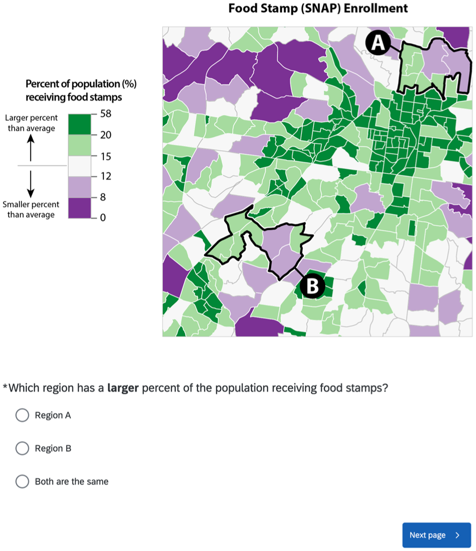
Map comparison task in questionnaire training block.
Map reading confidence was measured by having participants drag a slider between 0 and 100 (0 = not at all confident; 100 = completely confident) on how confident they are of their answer to the map reading task.
Mediating variables
Color appeal was measured by modifying a 5-item scale from Cyr et al. 10 Examples of items include “the color of the map is pleasing” and “the color on the screen was emotionally appealing.” Participants indicated their level of agreement with these statements on a 7-level continuous scale (1 = strongly disagree, 7 = strongly agree) with anchor labels perceived as equal-interval. 60
Perceived risk was measured by asking participants to indicate their level of agreement with the statement “Relying on this map for information is risky” based on Wilson et al.’s 61 findings that a single-item risk measure can be effective. Responses were recorded on a 7-level continuous scale (1 = strongly disagree, 7 = strongly agree) with anchor labels perceived as equal-interval. 60
Confusion was measured with a three-item set modified from Matzler et al. 62 “Interpreting the map was challenging,”“The information presented on the map was overwhelming,” and “It was difficult to understand the symbols and legends on a map.” The same 7-level agreement scale outlined above was used to collect responses.
Procedure
After participants elected to participate in the study on Prolific, they were redirected to a Qualtrics survey instrument. Participants first read an informed consent form. Consenting participants were randomly assigned to one of the two groups: congruent or incongruent for E1 and reliable or unreliable for E2. Participants were then randomly assigned to view one of the 12 (E1) or 16 (E2) maps produced from stimulus sampling. Participants began the survey by completing a version of the Ishihara test for colorblindness. 63 Participants then completed a training block where they completed a general-level map reading task that involved the comparison of two regions (Figure 3).
The main part of the survey consisted of three pages. On page one, participants viewed a map annotated with two regions so they could complete a map reading comparison task analogous to the training task. Participants were asked which region had a decrease in income, has a smaller percent of population, or voted more republican depending on the map topic. Participants selected either “Region A,”“Region B,” or “Both are the same.” Participants also indicated how confident they were in their answer. On page two, participants viewed the same map as the first page, but it was not annotated. Participants provided self-reported ratings for scales related to map trust and mediating variables. For E1, the mediating variable was color appeal while for E2 the mediating variables were perceived risk and confusion. On page three, participants completed a set of demographic questions.
Data analysis
To test hypotheses
For each hypothesis, we ran a multilevel (i.e. a mixed) regression model to examine whether there were stimuli-level effects influencing participants’ responses. 65 The stimulus sampling approach to our experiments meant that each condition had 12 (E1) or 16 (E2) possible iterations with the maps varying in scale, topic, and data pattern. This design could lead to stimuli-level variation that would violate the typical statistical assumption that observations are independent from one another. We addressed this by including stimuli as a grouping variable (i.e. a random effect) and examining if model variance was significantly attributed to grouping. If the effects of the grouping variable were not significant based on a calculation of intraclass correlation, we switched to a traditional model that treats observations as independent. The complete set of models for E1 and E2 are in Section 3 and 4 of Supplemental Material, respectively.
To test
Experiment 1 results
The aim of E1 was to evaluate whether semantic color congruence influenced map trust (
Congruence effects on map trust
The results of ordinal regression between predictors and map trust.
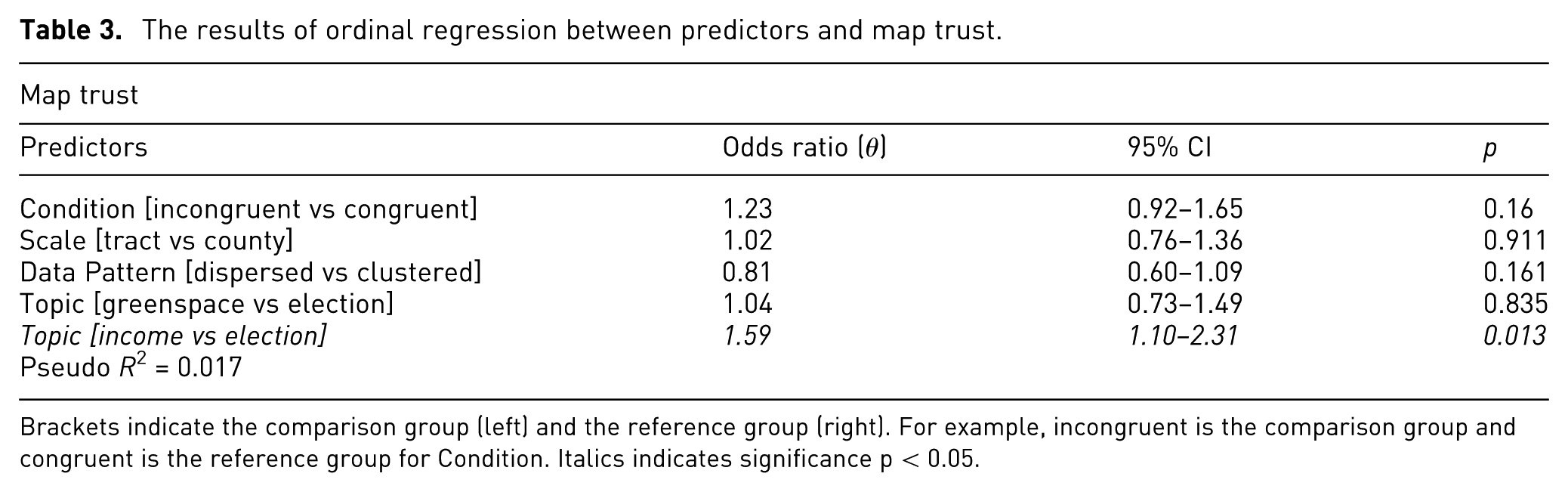
Brackets indicate the comparison group (left) and the reference group (right). For example, incongruent is the comparison group and congruent is the reference group for Condition. Italics indicates significance p < 0.05.
Congruence mediation analysis
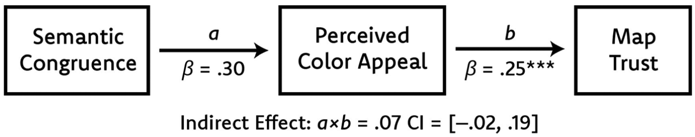
Mediation path diagram for H2 outlining a path and b path.***Denotes p < 0.001.
Semantic congruence had a positive effect on color appeal (Figure 4; a path) but was not statistically significant (b = 0.30, se = 0.19, p = 0.11). As shown in Figure 4 (b path), color appeal had a significant positive effect on map trust (β = 0.25, se = 0.06, p < 0.001). In other words, higher color appeal was a significant predictor of higher trust. The 95% confidence interval (CI) for the indirect effect of semantic congruence on map trust included zero, indicating there was not a significant indirect effect via color appeal (β = 0.07, BootSE = 0.05, 95% CI [–0.01, 0.19]). These results indicate that color appeal was not a significant mediator, so
Congruence effects on map reading
The results of logistic regression between predictors and map reading accuracy.
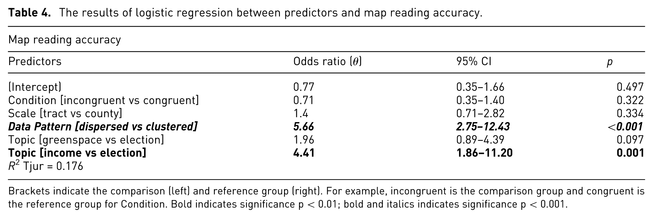
Brackets indicate the comparison (left) and reference group (right). For example, incongruent is the comparison group and congruent is the reference group for Condition. Bold indicates significance p < 0.01; bold and italics indicates significance p < 0.001.
The regression model intercept was a significant predictor of map reading confidence (Table 5). Thus, when all other predictors in the model are their reference levels, the odds of someone being confident in reading a map are 4.49 times higher than the odds of them not being confident (p = 0.001). Given that map scale was the only significant predictor, there was a high baseline level of map reading confidence when participants viewed county-level maps. Viewing tract-level maps resulted in a significant reduction in confidence, with odds of confidence 58% lower than those observed for county-level maps (p = 0.029). Semantic congruence was not a significant predictor of map reading confidence (θ = 0.79, p = 0.539), so
The results of logistic regression between predictors and map reading confidence.
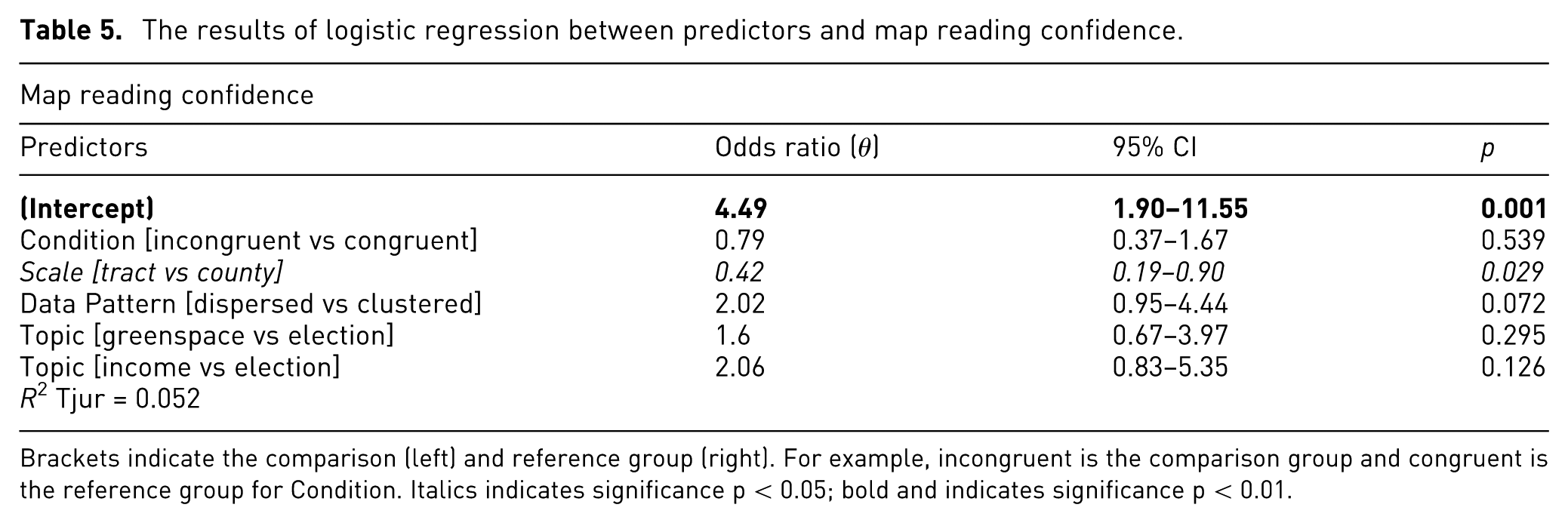
Brackets indicate the comparison (left) and reference group (right). For example, incongruent is the comparison group and congruent is the reference group for Condition. Italics indicates significance p < 0.05; bold and indicates significance p < 0.01.
Experiment 2 results
The aim of Experiment 2 was to examine whether data reliability representation was a significant predictor of map trust (
Data reliability effects on map trust
The results of ordinal regression between predictors and map trust.
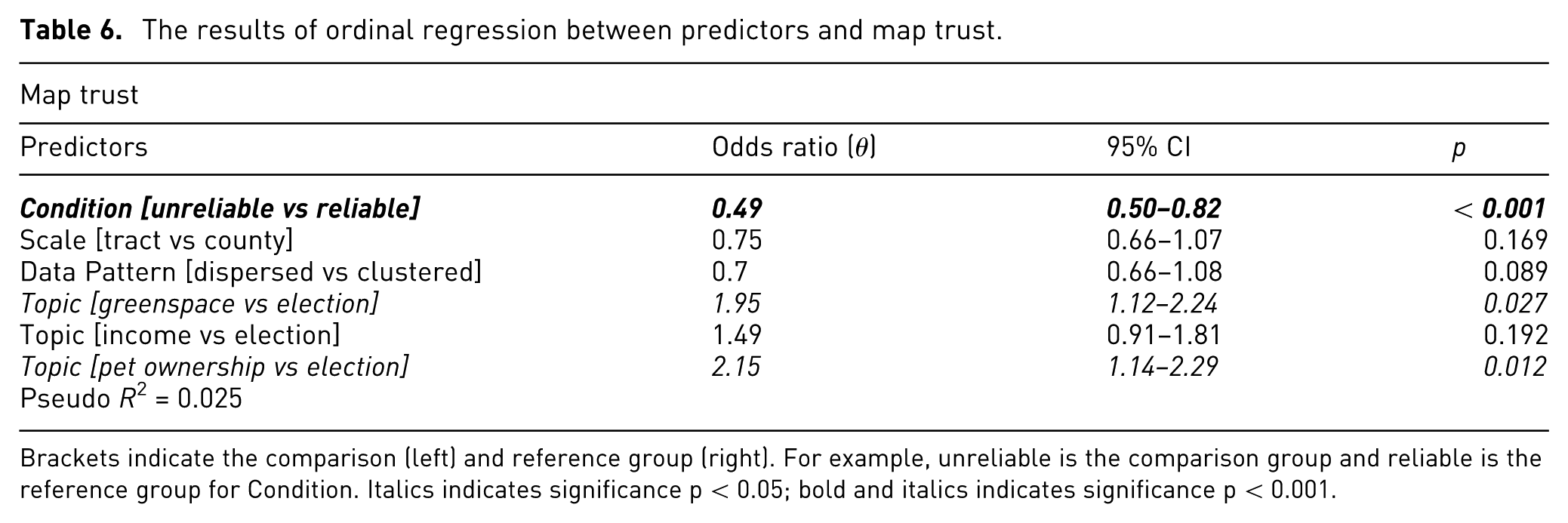
Brackets indicate the comparison (left) and reference group (right). For example, unreliable is the comparison group and reliable is the reference group for Condition. Italics indicates significance p < 0.05; bold and italics indicates significance p < 0.001.
Data reliability mediation analysis
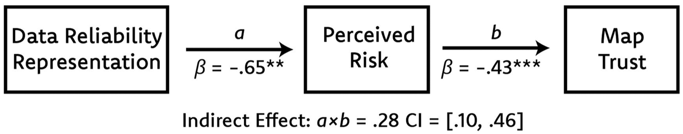
Mediation path diagram for H6 outlining a path and b path.
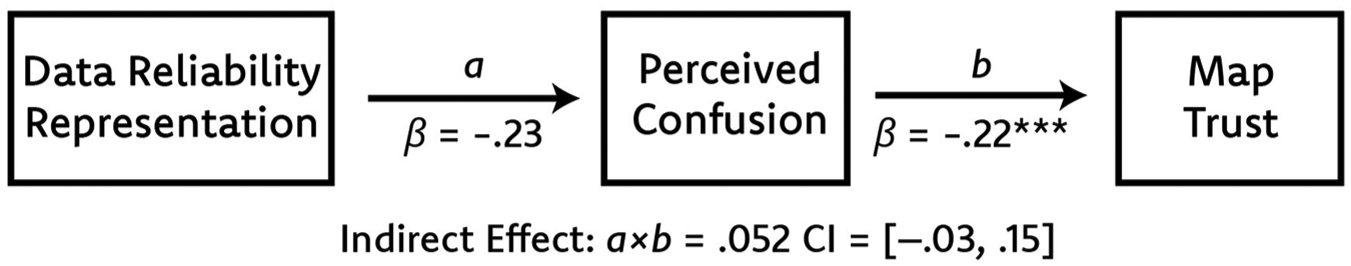
Mediation path diagram for H7 outlining a path and b path.
Data reliability effects on map reading
The results of mixed-method logistic regression between predictors and map reading accuracy.
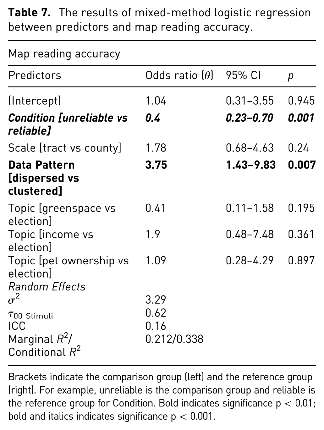
Brackets indicate the comparison group (left) and the reference group (right). For example, unreliable is the comparison group and reliable is the reference group for Condition. Bold indicates significance p < 0.01; bold and italics indicates significance p < 0.001.
We found that representing data reliability indeed had a significant negative effect on map reading confidence (
The results of logistic regression between predictors and map reading confidence.
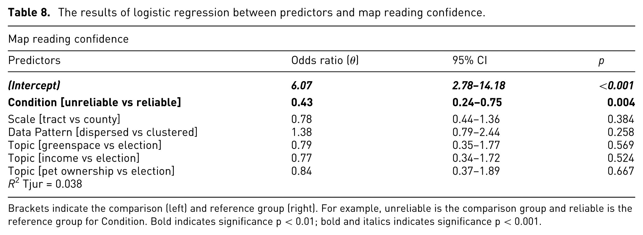
Brackets indicate the comparison (left) and reference group (right). For example, unreliable is the comparison group and reliable is the reference group for Condition. Bold indicates significance p < 0.01; bold and italics indicates significance p < 0.001.
Qualitative feedback
At the end of the questionnaire in both experiments, we asked an open-ended question, “do you have any feedback or comments about the survey?” Most participants did not answer the question or answered something along the lines of “no thank you.” However, five participants in Experiment 2 voiced that it was difficult to respond to items in the MAPTRUST scale 58 given the lack of context surrounding the map. One participant stated, “based on the information given, there is no way to know whether the maps are reliable, accurate, or objective” and another said, “without any information about the source of the data, methodology of collection, or what size of the population was represented per section I felt there wasn’t enough information to give reliable information.” These quotes highlight the importance of source and other contextual cues that have been shown to influence trust judgments. 69
Discussion
Significance
In this two-part study, we compared the influence of specific design factors (semantic congruence and data reliability representation) on how people trust and read thematic choropleth maps. We did not find evidence that semantic congruence has a significant effect on map trust. This suggests that semantic color congruence is not a strong enough esthetic cue to alter people’s trust judgments. Interestingly, the only mediation path that was significant between semantic congruence, color appeal, and trust was the relationship between color appeal and trust. Color appeal was a significant positive predictor in map trust. However, the lack of other mediation paths being significant suggests that another factor besides semantic congruence was driving assessments of color appeal. One possibility for why semantic congruence did not have a significant impact on trust lies in the design of our stimuli. All the stimuli were high contrast with vivid, saturated colors. Prior work found that vibrantly colored visualizations were perceived as more beautiful and more trusted compared to desaturated, dull visualizations. 5 Therefore, the effects of color vibrancy may have overshadowed the effects of semantic congruence.
Some of our results in E1 diverge from existing work while others substantiate existing work. On the one hand, color appeal was found to be a significant predictor to trust. 10 On the other hand, Elhamdadi et al.’s 4 found that esthetic cues related to the beauty of a visualization were not significant predictors of trust.
A key finding of our study is that people are less likely to exhibit high levels of trust in maps when they convey uncertainty information about data reliability. This is an important finding because prior studies demonstrated mixed effects of uncertainty on visualization trust. One group of studies found that uncertainty fosters trust, citing increased transparency as to why.6,34 Another group of studies suggests that uncertainty information decreases trust in maps.35,70 The results from our experiment support the latter direction of the effect. However, we caution about generalizing our results to all types of uncertainty because we only studied a binary operationalization of data reliability. Our work also pinpointed the mechanism of this effect, perceived risk, through mediation analysis. Our findings indicate that when people view a map with data reliability information, they feel a heightened sense of perceived risk, so they trust the map less. This would coincide with a key argument of sociology trust theory: that trust always involves some risk, but when people feel as though relying on the trustee will have adverse effects, trust deteriorates. 32 Empirical works in related disciplines such as economics 38 and sociology 37 indicate that uncertainty propagates risk and thereby diminishes trust, but such a relationship is not documented in the data visualization or cartographic literature. Overall, establishing mediating variables (e.g. the variables that underlie the relationship between data reliability and visualization trust) enables researchers to have a deeper understanding of the causal processes in causal relationships.
Our results suggest that confusion was not a significant mediator. This is interesting for two reasons. First, prior studies demonstrate that people struggle making sense of uncertainty information on maps.16,35,40 Second, several of the items in the confusion scale pertain to perceived clarity (e.g. Interpreting the map was challenging), which has been shown to exhibit a positive relationship with visualization and data trust.4,6 Therefore, our findings add nuance to prior empirical observations in that perceived clarity may be linked to trust, but it does not underlie the relationship between uncertainty representation and trust. Alternatively, people may have been able to easily make sense of the uncertainty information because it was presented as a binary: the data is reliable, or the data is not reliable.
Our analysis also highlights the impacts of color congruence and data reliability representation on map reading accuracy and confidence. We observed that semantic congruence was not a significant predictor of map reading accuracy or confidence across in Experiment 1. This conclusion corroborates the findings of prior studies on affective congruence and map reading accuracy9,30 but is contrary to other studies demonstrating that incongruent schemes can impair decision accuracy in non-visualization tasks.71,72 Incongruent colors may not have impaired decision accuracy or confidence in this study and the prior visualization studies because legends were provided as part of the stimuli that help reassure participants what a particular color corresponds to.
Including data reliability information on maps did decrease the likelihood that participants would complete the map reading task correctly and confidently in E2. This suggests that people attempt to engage with uncertainty information such as data reliability, but as prior work has noted, people have a hard time making effective use of uncertainty information in visualizations.16,40
The difference in results across our two experiments signals that data reliability representation is a more salient trust cue compared to color congruence. This begs the question: do cognitive cues like data reliability influence trust more than affective cues like color congruence? Cognitive trust has been shown to be more important early on in trust relationships while affective trust becomes important as the relationship matures, 73 but research on the interplay between the two is somewhat limited. 74 Alternatively, color congruence could simply be too weak of an affective cue in the examples we evaluated.
Overall, the results of the two experiments are particularly generalizable because we found significant effects of independent variables on trust and map reading across a set of stimuli that varied by topics, data patterns, and scales. We found that several of these control variables had a marked influence on trust and map reading. In E1, we found that participants who viewed maps about income were more likely to report higher trust and map reading confidence compared to participants who viewed maps about an election. Oddly, this pattern of results did not extend to E2. Instead, participants viewing maps about greenspace or pet ownership were more likely to report higher trust compared to participants viewing maps about an election. These results suggest that the election map was trusted less. Perhaps this is because politics are especially tied to people’s belief systems, so political maps are scrutinized more.
In both experiments, participants were more likely to correctly complete the map reading task when viewing maps with dispersed data distribution compared to clustered ones. The reason for this lies in a limitation of our experimental design. The map reading task asked participants to compare values of regions on the map with possible answers being “larger,”“smaller,” or “the same.” Only the clustered county-level maps had a task where the answer was “the same.” We believe that this task is much more difficult than identifying if regions have larger or smaller values. Therefore, a future study should design a more balanced procedure that includes a task with regions of the same value for all stimuli combinations. We also attribute the higher odds of participants from E1 being confident in their map reading for tract-level versus county-level maps to this limitation. Interestingly, the clustered county-level task where the answer was “the same” did not result in scale having a significant impact on map reading confidence in E2.
Finally, we found that our data exhibited clustering in E2 when looking at the response variable, map reading accuracy. Map reading accuracy not only varied from data reliability and data pattern on an independent level, but also on a group-level depending on which of the 16 stimuli participants saw. In other words, map reading accuracy was significantly influenced by which of the maps participants saw. This problem could be reduced by having participants view each condition (a within-subjects study) or by simply accounting for the random effects using a mixed model as we did in this study.
Practical implications
There is a push for visualizations to be more transparent, reproducible, and accountable in the wake of generative AI and post-truth politics. However, our results indicate that being transparent in the form of conveying data reliability could prompt people to trust visualizations less. Visualization creators therefore face a dilemma on whether and how to communicate uncertainty such as data reliability. One potential solution would be to calibrate people’s understanding of uncertainty via education and cues embedded in the maps. Acknowledging that uncertainty is an inherent part of any visualization and shifting the norm toward representing it could help people make better trust assessments. 16
Our findings also demonstrate that visualizing data reliability is challenging because readers may struggle with (and are less confident in) map reading tasks. This means that authors who wish to include data reliability in visualizations should help their intended audience understand how to effectively read such visualizations. Authors can annotate legends and/or parts of visualizations that illustrate what the uncertainty means, and what it does not mean. Broader data literacy campaigns could also be promoted.
Using appropriate colors in visualizations is one of the most standard and widely supported conventions in cartography and data visualization. 53 Yet, we report that participants’ trust and map reading performance were unaffected by incongruent color use. Our findings suggest that in cases where a visualization uses “poor” color choices and is seen by someone with different color connotations, the potential adverse effects to basic interpretation may be minimal.
Limitations and future work
We note several limitations for our experiments. Our operationalization of uncertainty representation as a binary variable of data reliability is perhaps overly simplistic of the concept of uncertainty. Indeed, uncertainty usually exists on a continuum with more than two degrees. 19 Additionally, multiple types of visualization uncertainty exist, 17 and these types of uncertainty may have different effects on visualization trust. Future studies should test how different types of visualization uncertainty (e.g. accuracy, currency, credibility) influence trust.
We also chose a single method for representing uncertainty that was extrinsic in nature because it added a new data layer to the visualization. Perceptions of uncertainty can also be influenced by the representation strategy used with some visualization choices being more intuitive and evocative of uncertainty.14,75 Recent research suggests that intrinsic uncertainty representations that integrate uncertainty information directly in a visualization are more effective. Future research should use a variety of techniques for representing uncertainty when examining how uncertainty representation impacts visualization trust. This will ensure that results are generalizable and provide further evidence for which uncertainty representation techniques are the most effective.
In addition to the uncertainty stimuli, we recommend future studies employ an ordinal confidence scale (e.g. not confident, somewhat confident, confident, very confident) to better capture perceived uncertainty.
We only tested diverging choropleth maps although sequential choropleth maps, isoline maps, cartograms, and other thematic maps could be used to examine semantic congruence. Future work should conduct similar experiments on a variety of thematic maps and other kinds of visualizations (e.g. bar charts) to see if the results of our experiments are broadly generalizable.
The study utilized perceptually optimized and widely recognized ColorBrewer diverging color schemes. 53 We acknowledge that the inherent quality and established nature of these schemes may represent a confounding factor. It is possible that these established and well-designed schemes lead to high trust ratings regardless of their semantic congruence to the topic.
Although our maps were made to resemble real maps “in the wild,” the lack of real data patterns, plausible source information, the absence of a real-world location, and the rectangular clip of the map frame may decrease the ecological validity of our stimuli. Indeed, several participants were unsure how to calibrate their trust given the lack of context in the map stimuli (Section 6.3). Future experiments could use real maps produced by a variety of sources and/or utilize real data to create new map stimuli. In the former case, researchers will need to control for contextual cues like sources, while minimizing variation across stimuli. In the latter case, researchers could add more context to their stimuli such as metadata, source information, etc. Such context should be varied and controlled for to strike a balance between internal and external validity.
Our experiments could have been improved by adding some additional questions. First, we recommend providing a manipulation check after responses to dependent and mediating variables were recorded. For E1, we could have asked participants if the colors shown on a map were appropriate for the topic visualized. For E2, we could have asked participants if information about the data quality was shown on the map. Arguably, our measure of perceived risk could be treated as a manipulation check based on strong predictive validity: our manipulation predicted perceived risk in the hypothesized direction. However, this measure was implemented for mediation analysis, so a deliberate manipulation check should be implemented in future work.
Conclusion
Our work provides empirical evidence to explain how design factors have differential effects on how people trust and read maps. Including data reliability information on a map results in lower trust, map reading accuracy, and map reading confidence. Conversely, using semantically incongruent colors did not have a significant impact on trust, map reading accuracy, or map reading confidence. These findings were consistent across multiple map scales, topics, and data patterns. We recommend that visualization designers weigh the pros and cons of representing uncertainty and continue to follow established best practices for color use.
Supplemental Material
sj-docx-1-ivi-10.1177_14738716251398423 – Supplemental material for The impact of data reliability and semantic color congruence on trusting and reading visualizations
Supplemental material, sj-docx-1-ivi-10.1177_14738716251398423 for The impact of data reliability and semantic color congruence on trusting and reading visualizations by Timothy J. Prestby and Helen Greatrex in Information Visualization
Footnotes
Acknowledgements
The authors would like to thank Dr. Cynthia Brewer for her guidance on designing the map stimuli for this study. We also gratefully acknowledge the financial support of the Penn State Geography Department via the GeoGraphics Lab.
Ethical considerations
This study was approved and deemed exempt by The Pennsylvania State University’s institutional review board (STUDY00023559). Informed consent to participate and for data to be published was provided as written input on a survey questionnaire.
Funding
The authors disclosed receipt of the following financial support for the research, authorship, and/or publication of this article: This material is based upon work supported by the National Science Foundation Graduate Research Fellowship Program under [Grant No. DGE1255832]. Any opinions, findings, and conclusions or recommendations expressed in this material are those of the author(s) and do not necessarily reflect the views of the National Science Foundation; this work was also supported by the Penn State Geography Department via the GeoGraphics Lab.
Declaration of conflicting interests
The authors declared no potential conflicts of interest with respect to the research, authorship, and/or publication of this article.
Data availability statement
All supplementary materials related to this study are available at ![]() , released under a CC BY 4.0 license. They include (1) Excel files containing the data Experiment 1 and 2, (2) R code for analysis of data, (3) Image files of all stimuli, (4) further details about stimuli development, and (5) pretest data.
, released under a CC BY 4.0 license. They include (1) Excel files containing the data Experiment 1 and 2, (2) R code for analysis of data, (3) Image files of all stimuli, (4) further details about stimuli development, and (5) pretest data.
Supplemental material
Supplemental material for this article is available online.
References
Supplementary Material
Please find the following supplemental material available below.
For Open Access articles published under a Creative Commons License, all supplemental material carries the same license as the article it is associated with.
For non-Open Access articles published, all supplemental material carries a non-exclusive license, and permission requests for re-use of supplemental material or any part of supplemental material shall be sent directly to the copyright owner as specified in the copyright notice associated with the article.