
Abstract
We present two experimental interactive dashboards that combine OWID (Our World in Data) case data with OxCGRT (Oxford Coronavirus Government Response Tracker) policy indices for multiscale analysis of COVID-19 which is an infectious disease caused by the SARS-CoV-2 virus. The pandemic exposed the vulnerabilities in our global systems. Data regarding COVID-19 was gathered and made available for open access. These data sources offer invaluable information for tracking, monitoring, raising awareness and understanding of COVID-19, recognizing its impact, as well as informing the general public, health authorities, policy makers, situation managers, and decision makers. However, COVID-19 data in its raw form is complex and difficult to understand and analyze. The application of visualization together with human factor design principles in a complex systems framework provides an effective means for exploiting these big and complex datasets. These visualization techniques can transform such inherently non-visual data into intuitive visual forms that enable users to gain insight into, and understanding of, information contained within the data – which is essential for a co-ordinated response. This paper discusses the application of visualization and development of interactive dashboards, set in a complex systems framework, to provide an effective means for the users to explore, analyze and gain awareness of the situation, thus enabling informed decision making.
Keywords
Introduction
In December 2019 novel coronavirus (nCoV) cases were first detected in China. It was an infectious disease caused by the severe acute respiratory syndrome coronavirus 2 (SARS-CoV-2). The virus is contagious and highly transmissible. It spread rapidly to many countries worldwide. On 30th January 2020, the World Health Organization (WHO) declared a Public Health Emergency of International Concern (PHEIC) and on 11th March 2020 the outbreak was declared as a pandemic which signalled a significant acceleration in the global response to the COVID-19 outbreak and acknowledged the widespread transmission of the virus across multiple countries and continents. 1 The declaration of a pandemic led many countries to implement various measures to slow down the spread of the infection and to prevent overloading their healthcare systems. The public health measures included lockdowns (total or partial), travel bans/restrictions, social distancing, mask wearing (mandatory/voluntary), school closures and remote working and recommendation on hand washing and mandatory immunization for health care workers.
After more than three years into the pandemic, on 5th May 2023 the WHO Director-General accepted the WHO Emergency Committee on COVID-19’s recommendation that as the disease was well established and ongoing, that it no longer warranted the definition as a PHEIC.
COVID-19 from a complex system perspective
The COVID-19 pandemic can be viewed from a complex system perspective where the principle that “the whole is greater than the sum of its parts” acutely demonstrates the complex multi-layered and multi-scale nature of the pandemic.2–7 COVID-19 is not merely a health crisis; it is a phenomenon that has brought to our attention the dynamic and intricate interconnections and interdependencies between our healthcare system, social behaviour, technology, economics, social media, governance, and politics. It also exposed the vulnerabilities in our global systems. Indeed, there are many interacting components with intricate interplay across various scales from the behaviour of the individual (micro scale) and the virus (pathogen) to the community (meso scale) and the country (macro scale) to the global responses (meta scale), see Figure 1. 8 These dynamic interactions lead to emergent characteristics that cannot be understood by examining the individual elements in isolation, that is, the whole is bigger than the sum of its parts. Indeed, each component can be a complex system itself, that is, systems of systems.3–7
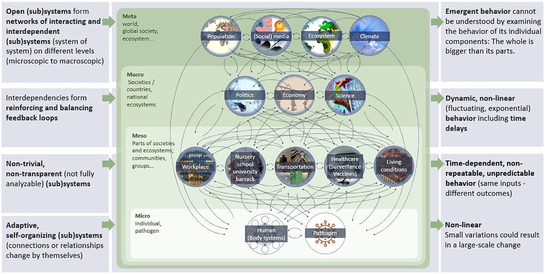
COVID-19 from a complex system perspective. 8
The micro scale is concerned with the interaction between individuals and the virus where the behaviour is adaptive and self-organizing with non-linear outcomes and where a small variation could result in a large-scale change, for example, a small number of super-spreader events can disproportionately intensify transmission.
The meso scale is where the concerns are at the community level – relating to where people gather, for example, where they work, where children and young adults are at schools, nurseries, barracks, as well as how people commute to/from their home. This also includes the healthcare system, for example, disease surveillance and vaccines availability/access. These aspects are not, however, fully analyzable as the non-trivial and non-transparent elements of these interconnected aspects are very challenging to analyze. At this scale the outcomes and behaviours are time-dependent, not predictable nor repeatable as the same inputs will result in different outcomes due to differences in the starting status, that is, causal/past dependence.
The macro scale is concerned with societies at the country level where there are interdependencies between the economic, political, and scientific elements such as the research, development of, and access to, vaccines. The interdependencies between the various elements and feedback loops indicate the need to make changes in order to have the desired outcomes. The behaviours are dynamic and non-linear and there are time delays.
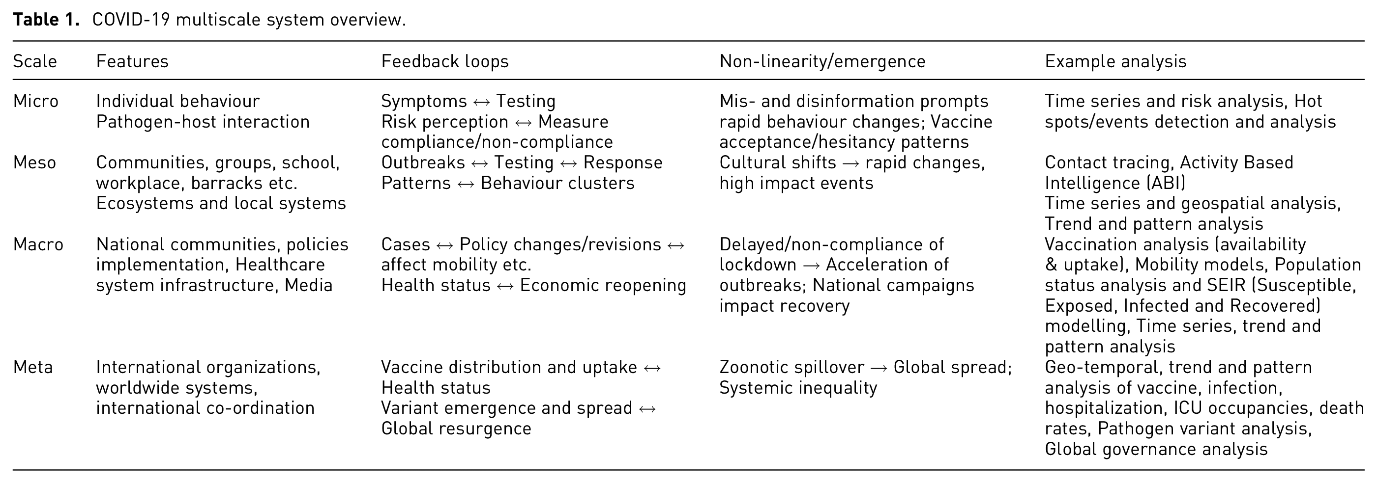
At the highest level, at the meta scale, there are networks of open (sub)systems which interact between and among the lower scales. At this level, the concern is the worldwide population, social media, ecosystem, and the climate. All these dynamic interactions create emergent behaviour that cannot be understood or analyzed by examining the behaviour and characteristics of any individual components in isolation, such as the virus, vaccine, or the healthcare system. Table 1 shows an overview of the COVID-19 multi-scale system, the features, feedback loops, non-linearity/emergence, and example analysis. Figure 2 shows a mitigation and feedback across all scales.
COVID-19 multiscale system overview.
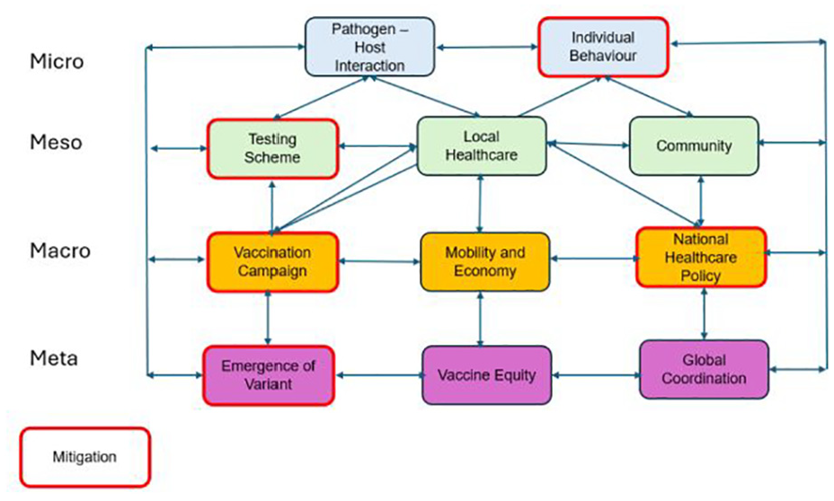
Feedback loops and mitigation.
It can readily be seen that understanding and addressing COVID-19 requires a holistic and integrated approach, acknowledging that actions and changes in one component can significantly impact outcomes in another, and that collective action is vital in overcoming the complex situation.
The Iceberg Model is a simple and effective system thinking tool that supports the understanding of the complexities of systems, such as COVID-19.4,5,7 The model consists of layers (representing different aspects or depths of analysis) that contribute to the observed events, enabling a deeper and more comprehensive understanding of the underlying structures and behaviour, origin and purpose, and mental models that steer the system behaviour,3,4 Figure 3. At the top two layers, above the waterline, the observer can see what is happening or what is changing. If the events are tracked over time, trends, patterns, or anomalies can be identified, upon which conclusions can be made about the system behaviour in relation to the functional structure.
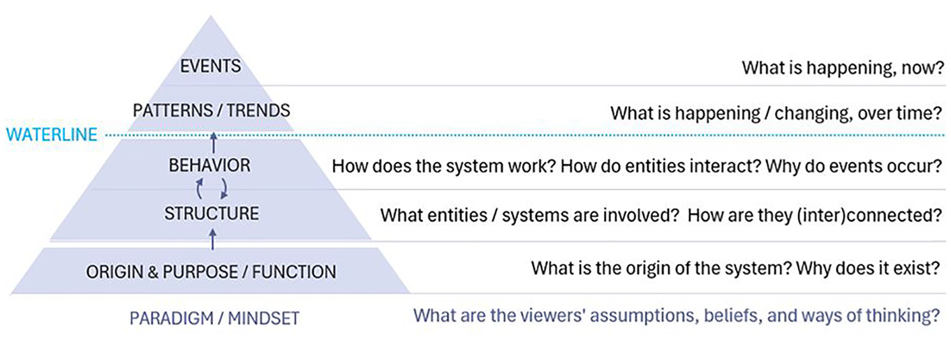
Modified Iceberg Model. 3
However, correlations between different events should be interpreted with caution, as correlations do not necessarily imply causality. The underlying system structure should be analyzed in order to identify what causes events to emerge. Unfortunately, this is generally much more difficult to recognize, that is, they cannot be seen below the waterline.
Fortunately, within the context of Public Health, tools and criteria exist to establish and validate causative relationships. For example, correlations may be tested according to Hill’s criteria (i.e. effect size, consistency, specificity, temporality, dose-response, plausibility etc.) to establish statistically significant associations that indicate causation. 9
In summary, the Iceberg Model shows that to understand the underlying structures, its origin and purpose, and the mental models that cause those events, it is critical to look beyond observable events, that is, to find the root cause. In doing so, it is possible to identify key points where control measures could lead to appropriate systemic change.
In the military intelligence domain, the Activity Based Intelligence (ABI) methodology was proposed to analyze events and patterns. 10 When in action, the ABI methodology has four pillars 11 :
Georeferencing to discover: Focussing on spatially and temporally correlating data to discover key events, trends, and patterns.
Integration before exploitation: Correlating data as early as possible, because seemingly insignificant events in a single field may be important when integrated across multiple sources.
Data neutrality: Prizing all data, regardless of the source, for analysis.
Sequence neutrality: Realizing that sometimes answers arrive before questions.
Since the control measures for COVID-19 fell largely within the domain of Public Health, it is also necessary to consider whether any analysis/intelligence products have utility and are actionable within the overall framework for epidemic control. According to the WHO the essential components of epidemic control include 12 :
Collaborative surveillance
Community protection
Clinical care
Access to countermeasures
Emergency coordination
These pillars serve as a foundation for analyzing the events, trends, and patterns that are visible above the waterline of the Iceberg Model. They ensure that events data are rigorously processed to derive an understanding of patterns and trends that integrates all available information while reducing bias as much as possible regarding when and where data were collected.
Applying the ABI pillars to handle the information above the waterline can largely be automated. Some pattern and trend analyses can be modelled and recognized (known patterns), although others will still require human analysis for identification and understanding (discovering the unknown). We argue that understanding the deeper levels behaviour, structure, and function will require a higher level of human judgement which should be supported by effective interactive visual interfaces.
In this paper we develop visualizations and dashboards to analyze and understand the observable events and detect their trends and patterns to make the first step in getting a glimpse of the underlying complexities of a system such as the COVID-19 pandemic. Data regarding COVID-19 were widely collected and made available for open access. These open data sources offer invaluable information for tracking, monitoring and raising awareness of the status of COVID-19, recognizing its impact, and informing the general public, health authorities, policy makers, situation managers, and decision makers. However, these data in their raw form are complex and difficult to understand and analyze. In the following sections we discuss how the application of visualization together with human factor methods provides an effective means for exploiting such big, high dimension, multi-variate, and complex datasets. These techniques can transform such inherently non-visual data into intuitive visual forms that enable users to gain insight into, and understanding of, information contained within the data. In particular, in exploring and understanding some of the elements amidst the complexity of the situation through the analysis and understanding of the events and their trends and patterns.
Data sources and related work
At the outset of the COVID-19 pandemic, there are many publicly available data sources, such as those from Johns Hopkins University, 13 the World Health Organization (WHO), 14 Our World in Data (OWID), 15 Centers for Disease Control and Prevention (CDC), 16 European Centre for Disease Prevention and Control (ECDC) 17 etc. These invaluable data have been used by many organizations, researchers and policy makers to visualize and analyze the spread of the infection – to derive understanding of, and insight into, the situation. Data from Our World in Data were selected for the work reported in this paper. 15
Visual Analytics (VA) tools and techniques were applied for health well before COVID-19,18,19 but with the pandemic, they were leveraged to communicate to a much broader audience. 20 New VA tools were developed to enable better analysis of epidemiological aspects,21–23 as well as public perception. 24 Coordinated and multiple views have been developing and maturing over many years, 25 but are still a highly relevant technique for building dashboards that can help users perceive new and insightful relationships from their data. Dashboards are very effective for presenting public health data 26 and were widely used to display COVID-19 information. 27 This led to many lessons learned for their designers. 28 As the Internet made COVID-19 visualizations from around the world instantly available, researchers even made the effort of gathering as many COVID-19 visualizations as possible 29 in their “COVID-19 Online Visualization Collection” (COVIC) database 30 to facilitate future design studies. A dashboard design 31 from a human-centred perspective led to project success and was able to prevent usability problems while minimizing stakeholder’s burden when working with limited public health agency staff capacity. A framework for evaluating dashboards 32 was designed specifically for health dashboards, together with seven evaluation scenarios: (1) task performance, (2) behaviour change, (3) interaction workflow, (4) perceived engagement, (5) potential utility, (6) algorithm performance, and (7) system implementation. There is ample evidence 33 for the potential of information visualization to improve decision-making, although risks exist for misguided use. As noted by Dasgupta and Kapadia, 34 the dashboard paradigm for public health is expected to stay, although many aspects of dashboard design are underappreciated.
Tools
There are many tools available; two tools were selected to integrate different data sources, pre-process/prepare and validate the data, and to visualize the data to support analysis. KNIME (Konstanz Information Miner) is an open source data analytics, reporting, and integration platform. 35 It integrates various elements for data mining and machine learning. KNIME was used in the work reported here for data pre-processing, ETL (Extract Transform and Load), and integration. Though KNIME also provides visualization functionalities, Power BI was selected for visualization as it provides better suited visualization functionalities.
Data preparation
For the analysis of COVID-19 data, daily data collection was carried out through a trusted source – Our World in Data. 15 These data points typically include new cases, recoveries, deaths, testing figures, and other key indicators. The data collection from Our World in Data and their preparation for our analysis were primarily conducted using KNIME, as it allows for efficient extraction, transformation, and cleansing of large datasets.
Once collected, the raw data was subjected to an extensive cleansing and processing phase in KNIME to ensure consistency and accuracy. This involved handling missing or erroneous values, standardizing formats across regions and countries, and correcting discrepancies. After data cleansing, KNIME was also used to calculate important metrics such as the daily growth rate, case fatality rate, and testing positivity rate. Figure 4 shows the workflow.
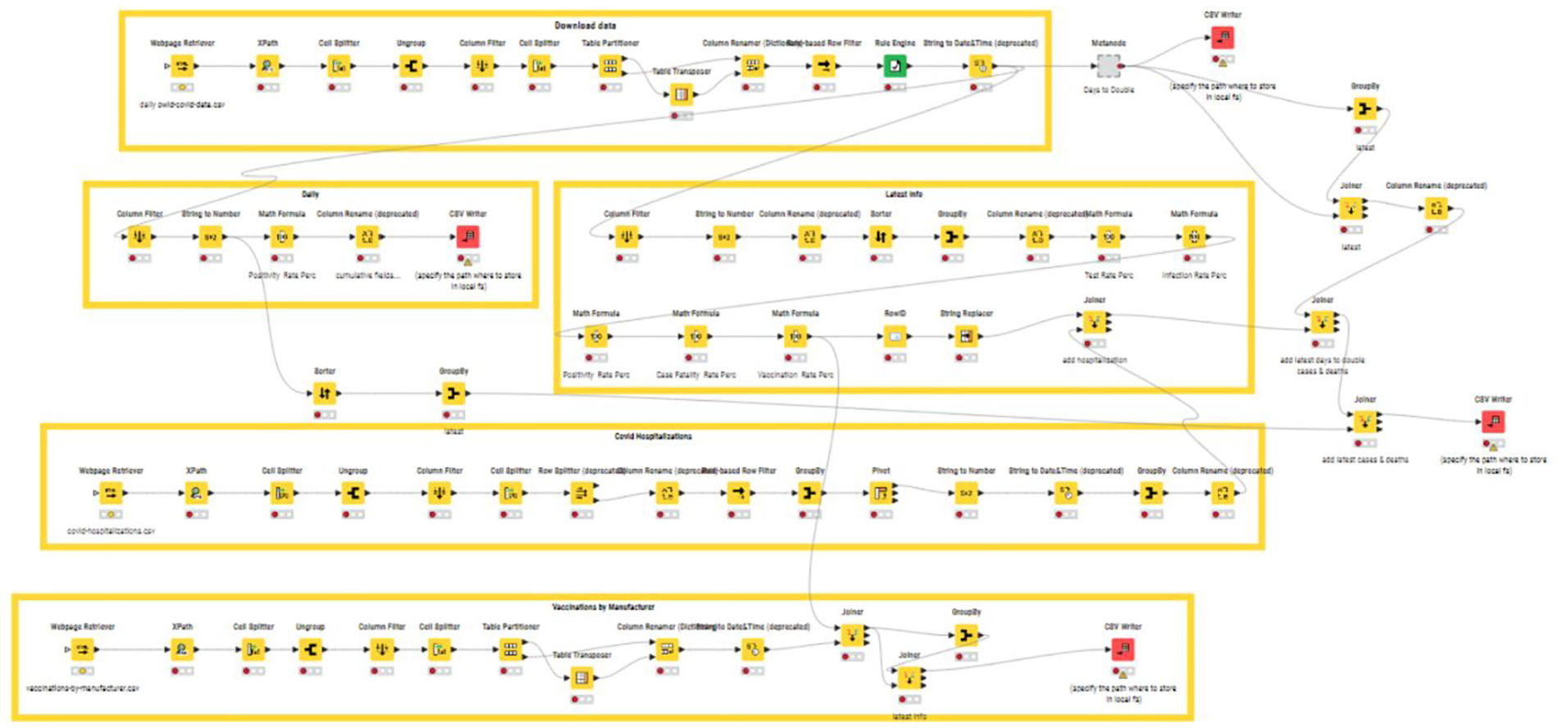
KNIME workflow.
For visualization and analysis, Power BI is employed to create interactive dashboards and charts that effectively communicate the insights derived from the data. These metrics and visualizations are essential for understanding and analyzing the progression of the pandemic, assessing the effectiveness of public health interventions, and making informed decisions based on reliable, up-to-date information.
Power BI is a Business Intelligence tool developed by Microsoft. 36 It enables users to visualize and analyze data from various data sources to derive insights and make data-driven decisions. It is versatile and applicable to a wide range of applications in diverse domains. 37 Power BI was used here for developing visualizations and dashboards to support the users in exploring, analyzing and understanding the COVID-19 data to gain awareness of the situation and thus make informed decisions. The dashboards are at an experimental/developmental stage.
User centred design process
The design of the visualization and dashboard is based on the user-centred design (UCD) process which is the foundation of the human factors discipline.38,39 It has been used effectively in many domains, ranging from automotive dashboards to hospital medical record systems. The process is iterative and is composed of three phases, namely, the (1) Analysis, (2) Design, and (3) Testing phases, with users at the centre of the whole process, 38 Figure 5.
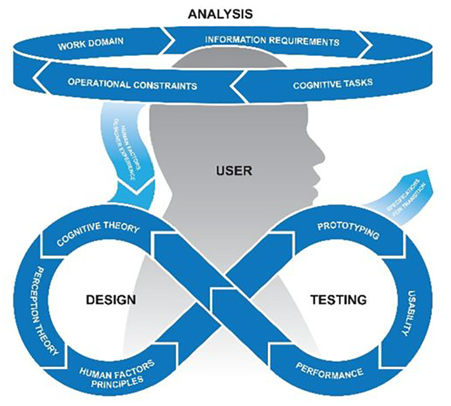
User design process. 38
The analysis phase focuses on understanding the users’ needs, their work domain, their preferences, and their mental model: what information they need; information gaps; their operational constraints as well as their cognitive tasks. The design phase poses the greatest challenge, as it involves translating the information gathered in the analysis phase into an initial design concept. This involves taking into account findings about human perception and cognition and applying human factors design principles. In addition, the required data sources need to be identified, and it needs to be determined where and how the data can be accessed and how they are integrated if multiple data sources are used, or if additional data sources are required. In the testing phase, tools are iteratively tested and refined to ensure maximum functionality and usability. The evaluation process involves user-in-the-loop testing with operationally representative scenarios using the representative user tasks identified in the analysis phase. It is critical to involve users at every phase of the process so as to ensure that the final “product” addresses their needs and provides a tool that is Useful and Usable (Liggett’s U 2 rule). 38
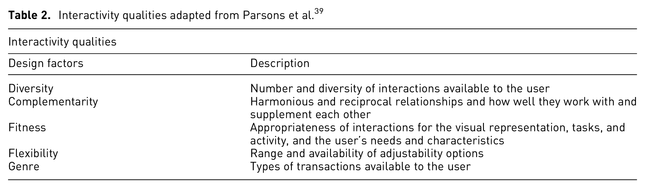
In this initial stage of UCD, with a prototype dashboard, interactivity can be explored to prescribe predetermined layouts that support a user. Interactivity at both a micro-level, (i.e. individual user interactions) and at the macro-level (i.e. combination of information sources) may provide insight into complex issues at the heart of decision-making in a complex system. 39 Macro-level interactivity supported by a dashboard with richness of data that allow for exploration of decision-making cues in multiple ways can indicate what information is most relevant to users at a micro-level, depending on their demographics. These considerations are reflected in the design of this tool, see Table 2.
Interactivity qualities adapted from Parsons et al. 39
Decision making in response to the COVID-19 pandemic involved multiple domains and jurisdictions across both public and private sectors, for example, local, national and international health organizations, government ministries for transportation, commerce and defence, private corporations manufacturing vaccines, pharmaceuticals and personal protective equipment, etc. Within the context of this paper, the scope was limited to the domains of Healthcare and Public Health. In the analysis phase of the work described here, a list of questions was generated to guide the visualization and dashboard design based on the question: Who are the users? Different potential information needs were identified. These can be divided into four categories:
What is the current situation or how is it developing, or has it developed?
What measures are being or have been taken to steer the situation in the desired direction?
What are the quantitative and qualitative effects of these measures? Qualitative measures are important since the success of all Public Health disease control measures in democratic countries are dependent on public acceptance and compliance with these measures. Implementing social isolation is only effective if the public adheres to the order and vaccines will not prevent disease spread if uptake is low.
What are the gaps or deficiencies in these measures and what improvements or additional measures would address these issues?
The following indicators, for example, were captured as indicators of the situation:
What are the infection rates – temporal and geographical location?
Where are the areas with high infection rates located? What are the demographic/socioeconomic characteristics of these areas?
What is the hospital occupancy rate at various levels of care?
What are the mortality rates – temporal and geographical?
With regard to the Public Health measures, one framework to categorize measures is 40 :
measures to reduce contacts such as lock down, social distancing, travel restrictions/bans and
measures to make contacts safe (i.e. measures or interventions which help protect an individual from becoming infected, as well as reducing person-to-person transmission), such as immunization, personal protective equipment, hand hygiene.
What is the vaccine status: availability and uptake/coverage by location?
In addition to the above questions, the following question was included to guide the visualization and the dashboard design.
Who are the users? Analysts, policy makers, administrators, private sector partners, general public?
Visualization and dashboard
Visualization and dashboards are widely used in presenting COVID-19 data and are publicly accessible on the web. For example, the UK Health Security Agency (UKHSA) data dashboard provides a means to inform the public of the health data; users can change the display chart into a table form and also download the data. 40 Similarly, Our World in Data and the WHO also displayed their data, and their data can be downloaded as well. Our World in Data focuses on tracking specific aspects of the data such as confirmed deaths, confirmed cases, tests, hospitalization, ICU admissions and vaccination, and policy responses (OxCGRT) etc. Users can choose to view the data in a table format, map view, line graph and bar graph for the aspect of interests. The WHO maintained official, authoritative oversight. It provides informative dashboards on COVID-19 summary, circulation, cases, deaths, hospitalizations, and variants. Users can filter on geographical regions.
We developed two integrated dashboards, namely a
Customization options could also be included to visually differentiate the level of detail/granularity of the data. For example, individual level data could be displayed in higher resolution while aggregate level data could be displayed with larger pixelation. Uncertainty in the days could similarly be displayed using a blurring gradient.
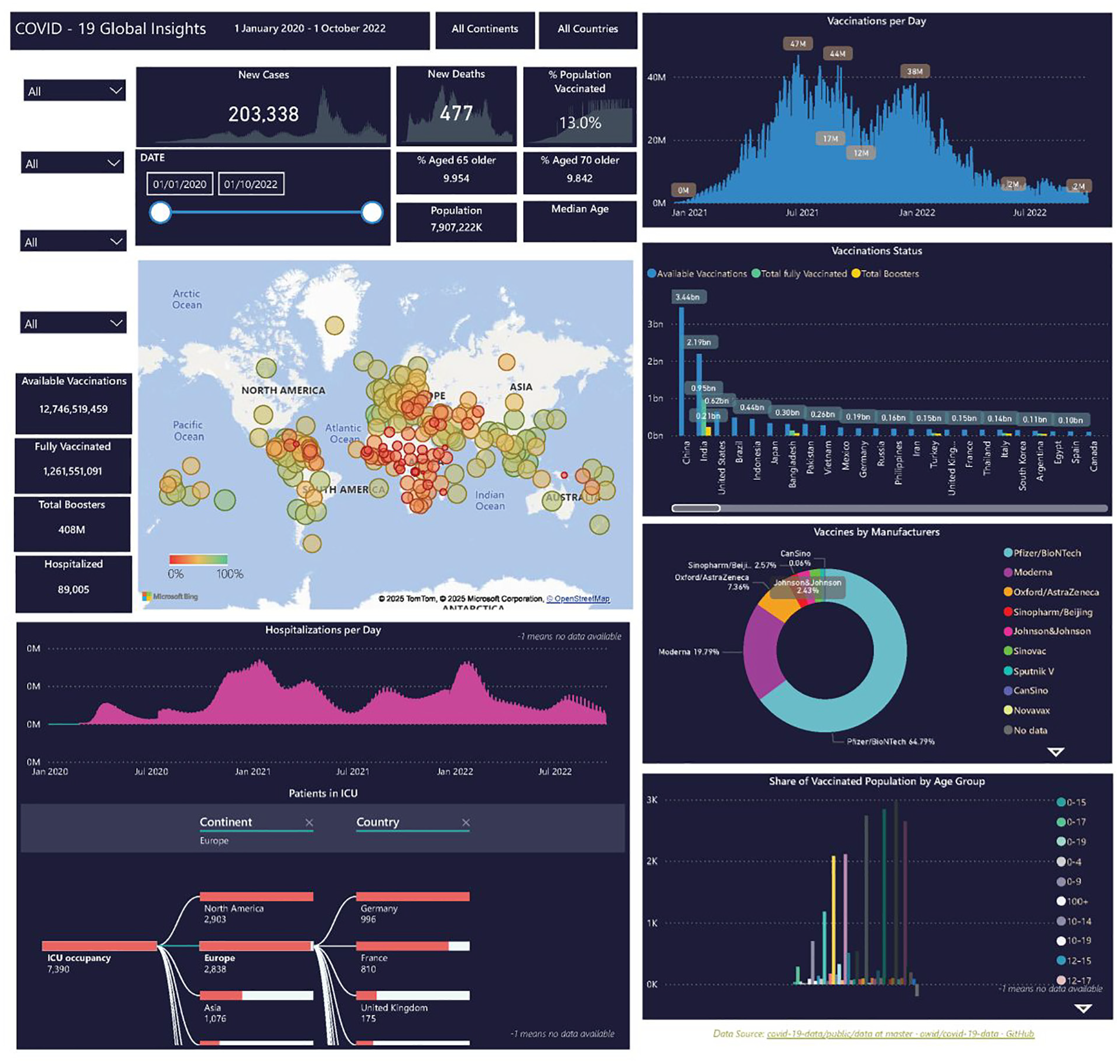
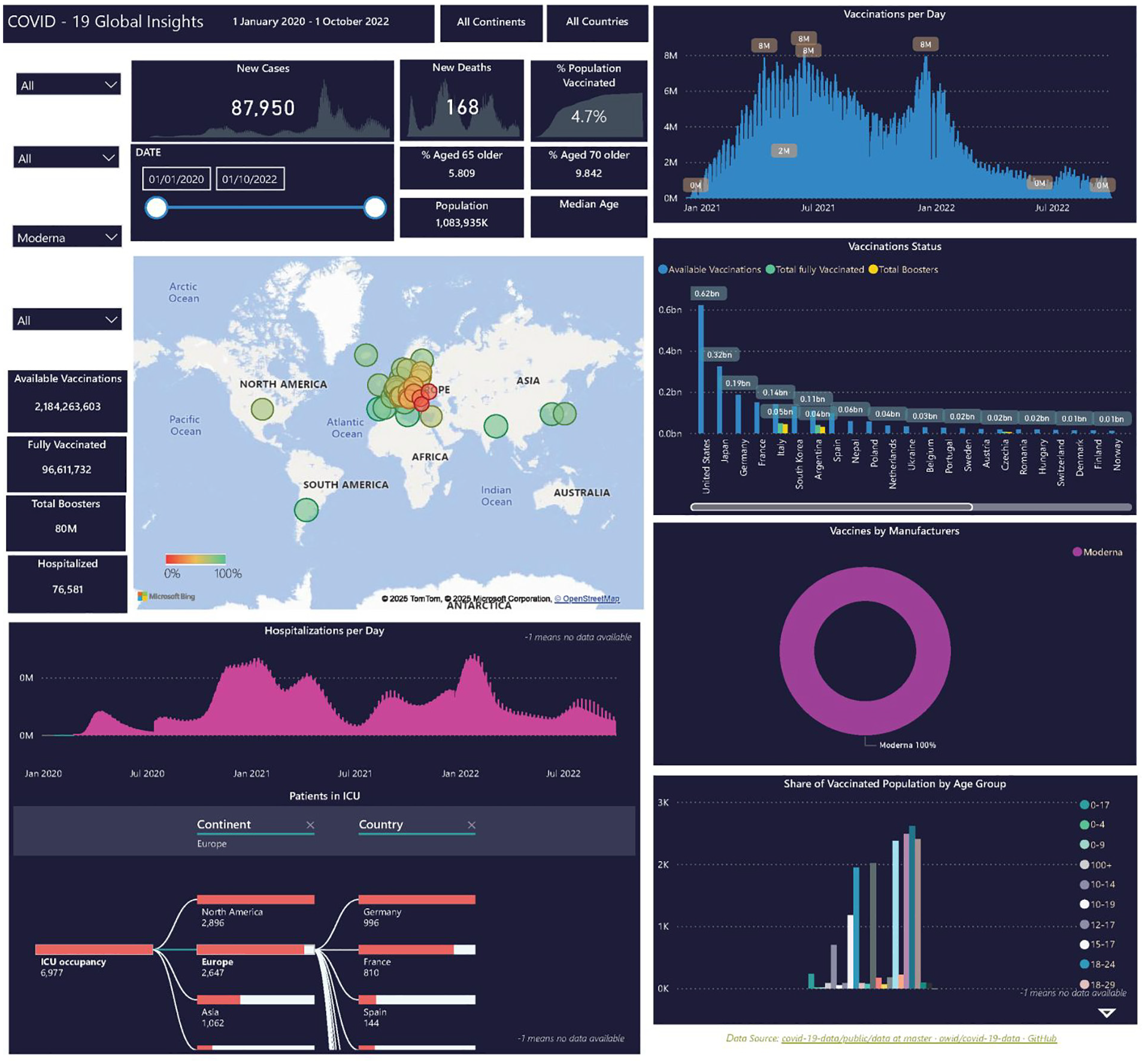
Vaccine dashboard
We developed an integrated dashboard to explore and analyze the vaccine status, see Figure 6. In this map, the bubbles represent the countries’ locations, and the size and the colour scale of the bubble corresponds with the percentage of the population vaccinated. The column chart shows the vaccination rate per day and the clustered column chart represents the availability of the vaccine, number of fully vaccinated people, and those with boosters for each country. A column chart is used to show hospitalization rate per day, while the donut chart shows the proportion of vaccine from different manufacturers. A decomposition tree is used to show the number of patients in Intensive Care Units (ICU), and the clustered column chart shows the vaccination information for different age groups. Summary information regarding the available vaccination, fully vaccinated, boosters, and hospitalization are available on the left-hand side. While the temporal patterns of new cases, new deaths, and percentage of the population being vaccinated, along with overall population, are shown at the top of the dashboard. Users can use the time slider to select the time period of interest. Users can also select information of interest by clicking on any element in any of the display or using the selector on the left-hand side in any combination. Each display has its corresponding tooltip for more detailed information. The integrated dashboard provides an effective means to filter, zoom and pan to explore and analyze the data, and, as it is integrated, clicking or filtering any feature in any display will result in an automated updates on all other displays. Users can use the time slider to select the time period or specific day of interests thus allowing association and understanding of cause and effect between underlying structures and surface level events in accordance with the Iceberg model.
Vaccine dashboard.
The dashboard covers a comprehensive amount of information in relation to the vaccines: the manufacturers, geographical, temporal as well as the vaccination status of the individuals in different countries – and their age groups. Furthermore, the number of people treated in hospital and the number in ICUs are also presented, thus providing an awareness of general population health status. The charts in the dashboard are integrated, therefore selecting/filtering any elements will result in automatic updates of the rest of the charts. Users can select information of interest in any combination, time period, geographical location(s), particular vaccines for particular age group(s), and the hospitalization and ICU occupancies.
Users can, for instance, discover from the dashboard that Pfizer/BioNTech has the highest usage followed by Moderna, or the vaccination status from different countries (map view) in different time periods, as well as hospitalization and ICU occupancy. The age group information also provides insight into the uptake of vaccines.
Clicking in the donut ring or selecting from the dropdown box in the selector, for example Moderna, would show information on which countries and age group(s) etc. the Moderna vaccine has been used, Figure 7. Also, the age groups that were vaccinated by Moderna. This provides an efficient means of analyzing the vaccine of interest and gaining insight into its uptake and impact.
Exploration of Moderna.
Users can also select country (countries) of interests, Figure 8. Users can discover the vaccine information for Italy: such as, what vaccines are available, age groups, temporal pattern of vaccine uptakes etc. This provides an efficient means to explore and identify the temporal pattern of infection in different countries and the availabilities of vaccines and the status of the vaccination, and insight of the health status such as hospitalization and ICU occupancies and gain insight of the underlying healthcare system infrastructure.
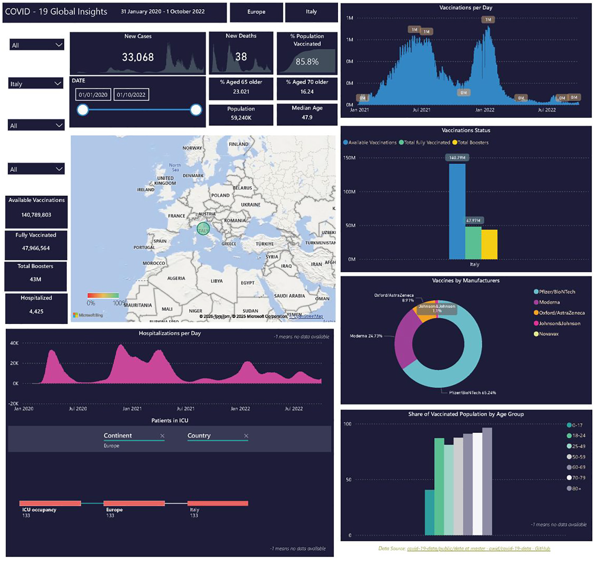
Exploration of Italy.
Stringency index and policy dashboard
During the pandemic there were various public health measures and policies from the different countries to slow or contain the infection rate, such as vaccination to make contact safer, travel bans, social distancing, face covering, school closure, workplace closure, or lockdown to reduce contacts.
The Oxford Coronavirus Government Response Tracker (OxCGRT) is a project initiated by the Blavatnik School of Government at the University of Oxford. It systematically collected information on several different policy measures that governments used to manage COVID-19 from more than 180 countries. It thus provides a means to systematically track and compare the governmental responses to the pandemic worldwide.45,46 It covers policies such as containment and closure policies, (e.g. travel restrictions and school closures), healthcare policies (such as testing and contact tracing), and economic policies (e.g. income support, debt/contract relief). They developed a stringency index which is a composite measure based on several response indicators such as school closures, workplace closures, monetary measures, vaccine investment and travel bans, rescaled to a value from 0 to 100 (100 = strictest). The index records the strictness of “lockdown style” policies that primarily restricted people’s behaviour. It is calculated using all ordinal containment and closure policy indicators, plus an indicator recording public information campaigns. It provides a means to explore and understand the different policy interventions and their resultant impacts on health, social and economic outcomes. Figure 9 shows the stringency index and policy responses in different countries and the different time periods. The map at the top left shows the stringency index for each country while the line chart shows the temporal pattern of the stringency index for each country. The remaining six maps show the most impactful policy responses, such as face coverings, international travel controls, internal movement restrictions, stay at home, school closure, and workplace closures. In the case of face covering, the implemented measures categories varied from: no measure, recommended, required in some public spaces, required in all public space, required outside-the-home at all times, and to no data available. The international travel restrictions include: no measure, screening required, quarantine from high-risk countries, ban on high risk regions, total border closure, and no data. While internal movement restriction ranged from: no measures, recommended movement restriction, restrict movement, and to no data. Stay-at-home policies include, no measure, recommended not to leave house, required (only essential), required (few exceptions), and no data. School closure policy varied from: no measure, recommended closing, required closing only at some levels, required closing at all levels, and to no data. Workplace closure varies from: no measure, to recommended, required for some, required for all but key workers, and to no data. The above illustrates the various policies and how they were implemented in different countries. Users can observe that the temporal pattern of the stringy index of each country and how they compared with other countries. Users can also discover that neighbouring countries do not necessarily have the same measures. These measures vary in response to the health status of the country, such as the number of cases and deaths, as well as ICU occupancy etc.
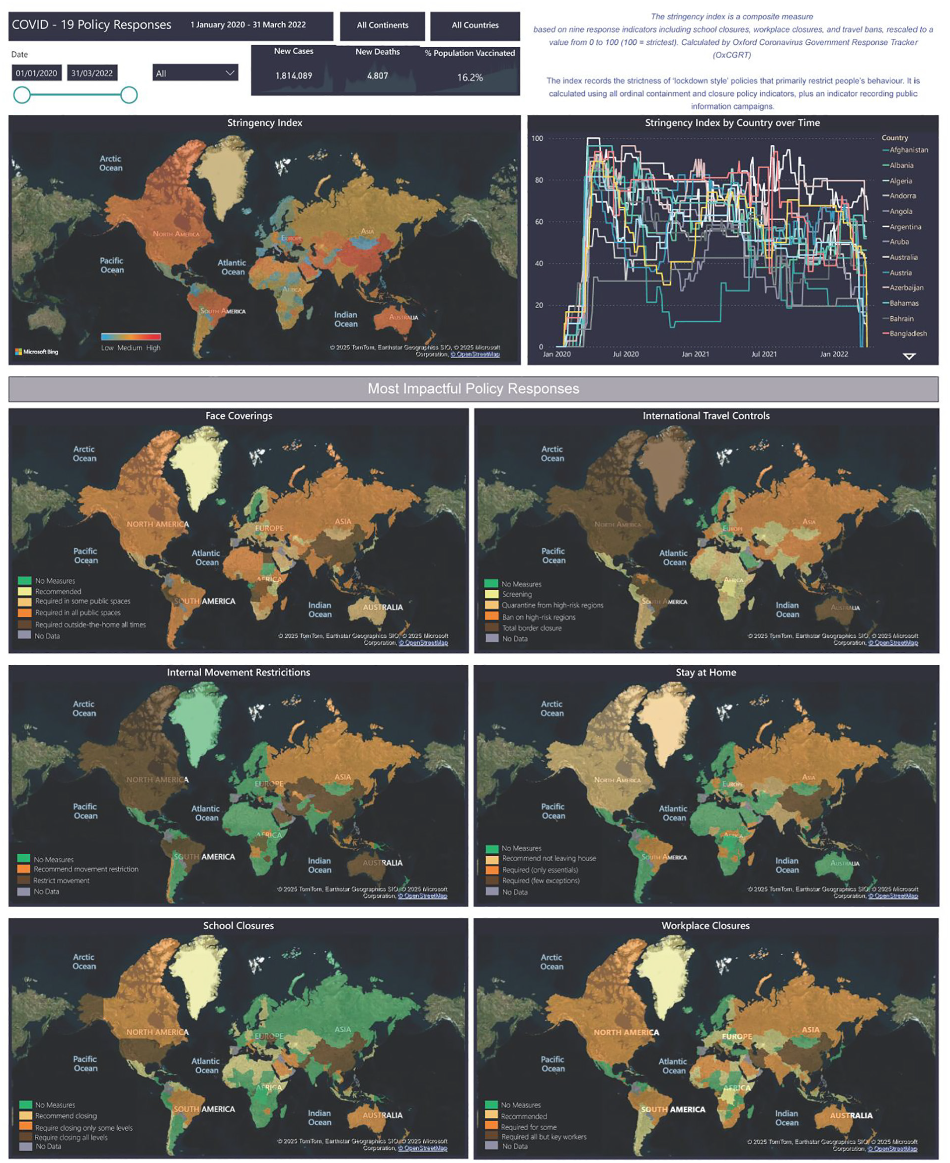
Stringency index and policies dashboard.
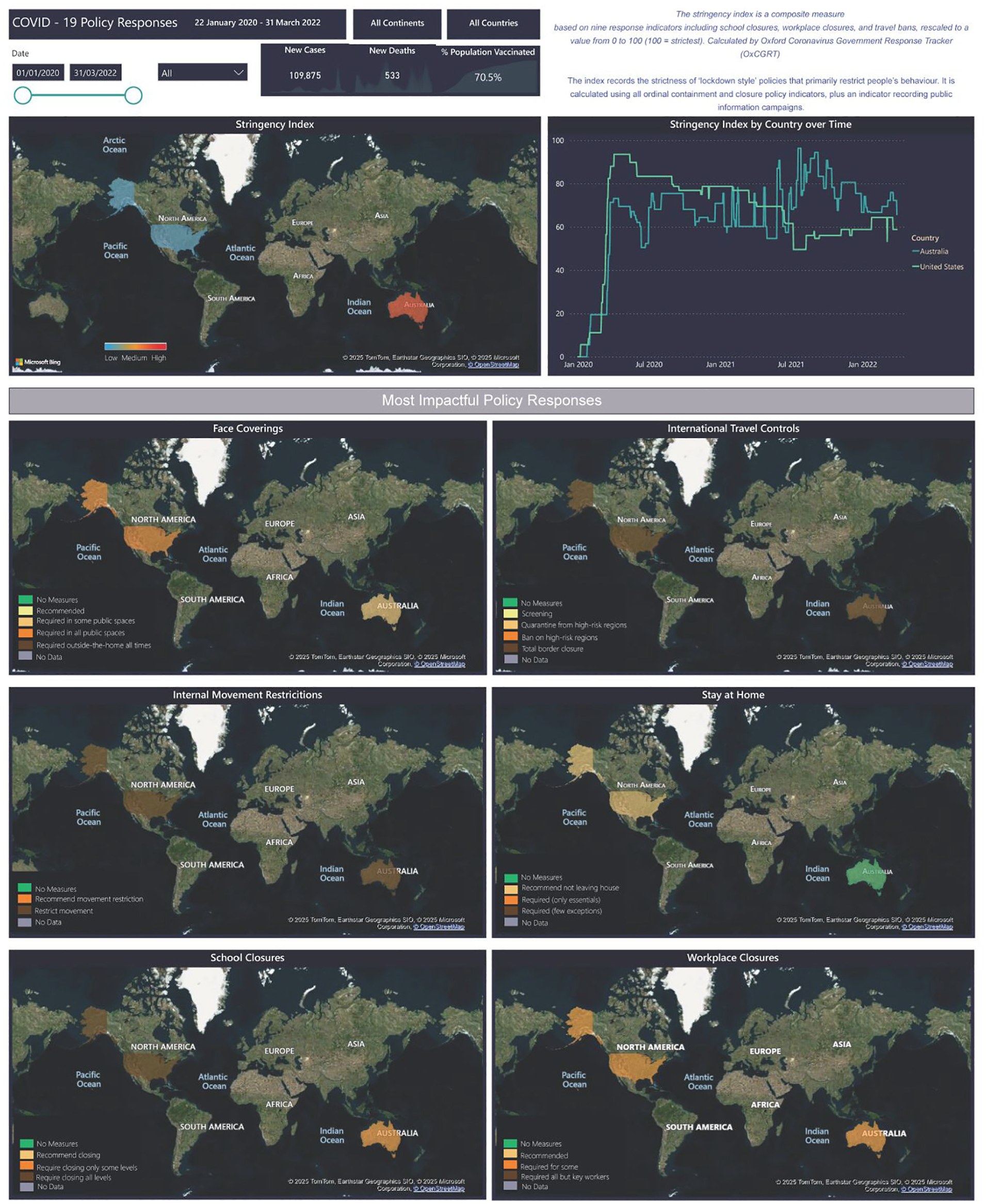
Figure 10 shows the stringency index and policies in Australia and USA. The user can thus, for example, discover how the measures varied between these two countries and varied temporally in response to the COVID-19 status in the country in question. Furthermore, that the same stringency index in two countries can result from different combinations of policies.
Stringency index and policies – Australia and USA.
Users can analyze the stringency index and the policies for the countries they are interested in, for example, or select a specific time period. It can be observed that neighbouring countries can have similar or very different policies and approaches. This provides an efficient means for comparing the different policies among the different countries during different time periods, and so gives an insight into the policies applied to reducing the infection rates and the stringency index pattern.
These dashboards have been designed with the aim to provide a useful and usable means to explore and understand the COVID-19 situation. The above dashboards show the exploration and analysis of COVID-19, in particular, the dynamic temporal and geospatial characteristics of vaccination, stringency index and policies, hospitalization, and age groups in different countries, that is, the observable events and their pattern and trends. Although, the time period for the data in the present implementation is defined, if more data were available, the dashboard can be refreshed to include new data. The frequency of refresh is dependent upon the frequency of data availability (collection and transformation into an appropriate form) which can vary from by the second, minute, hour, day, week, year etc. The dashboard can be displayed on computer screens and mobile devices.
Conclusions
COVID-19 created a global complex situation in which many aspects of populations’ lives, such as health, economy, education, travel, and social interactions were extensively affected. The complexity arises from multiple elements with dynamic interactions where feedback loops and non-linear changes lead to emergent phenomena that cannot be explained by examining individual elements in isolation. The interactive dashboards show the observable outcomes and behaviours of these interactions and provide an effective and efficient means of understanding and gaining awareness of the situation, and deriving insight, and thence to enable informed decision making and some understanding of the underlying complexity of the situation.
We find that mobility patterns are linked to outbreaks, while vaccines reduced severe outcomes, and system-level coordination enhanced desired outcomes – illustrating the Iceberg for complex systems characteristics.
Future work is required to develop means of analyzing, modelling and integrating the layers below the waterline in the Iceberg Model. Based on initial reactions from healthcare workers and policy makers in the UK to the COVID-19 pandemic, mindsets were negatively shifted from several factors which can be addressed by data captured in the current dashboards. 47 A lack of efficient use of scientific data was seen as a deficiency in early response where policy makers made “emotional responses” and hid behind limited scientific understanding. 47 The transparency provided by these dashboards would arm policy makers, health workers, and citizens with shared awareness of a ground truth. Noting the types of data used by other user groups would provide information about their decision-making and potentially foster trust. Trust in policy makers or government has been shown to be positively correlated with protective behaviours such as wearing a mask, respiratory etiquette, disinfecting surfaces, washing hands, and using sanitizer. 48 The utilization of an information rich tool by users across decision-making ranks (i.e. civilian to policy maker) would further increase overall trust in the health community by citizens by visually representing the correlated responses of decision-makers with the usefulness of information. 49
Future work may be directed at full user-centred design testing for each type of user and studies of trust in health communities and intentions to engage in protective or preventative behaviours based on trust.
This paper reports on an experimental application and, as such, was limited to a selected test bed of data. Graphic resolution and user options for customizability of data representation and analysis were likewise limited within the scope of this exercise. A fully functional version of the application would be envisioned to support visual analysis to the appropriate resolution of the data, and accommodate a variety of user needs, including individuals with colour vision impairment.
Footnotes
Acknowledgements
This is the work of the NATO Visual Analytics for Complex Systems Research Task Group.
Funding
The author(s) received no financial support for the research, authorship, and/or publication of this article.
Declaration of conflicting interests
The author(s) declared no potential conflicts of interest with respect to the research, authorship, and/or publication of this article.