
Abstract
We present a systematic review and design space for visualizations on smartwatches and the context in which these visualizations are displayed—smartwatch faces. A smartwatch face is the primary smartwatch screen wearers see when checking the time. Smartwatch faces are small data dashboards that show a variety of data to wearers in a compact form. Yet, smartwatch faces’ usage context and form factor pose unique design challenges for visualizations. In this paper, we conducted an in-depth review and analysis of visualization designs for popular premium smartwatch faces based on their design styles, amount and types of data, as well as visualization styles and encodings they included. From our analysis, we derive a design space to provide an overview of the important considerations for new data displays for smartwatch faces and other small displays. Our design space can also serve as inspiration for design choices and grounding of empirical work on smartwatch visualization design. We end with a research agenda pointing to opportunities in this nascent research direction. Supplemental material from the study is available here: https://osf.io/p3tbj/.
Introduction
Smartwatches are powerful personal data collection devices that allow wearers to see various types of data measured from their bodies, activities, or environments. Previous research has shown that people can perform simple comparison tasks with visualizations on smartwatches within several hundred milliseconds, 1 providing evidence that visualizations are effective forms of data representations in the context of wearable devices. However, small wearable displays’ usage context and form factor pose unique design challenges that require further research. In this work, we focus on reviewing smartwatch face designs and the context in which visualizations are shown, establishing a design space for smartwatch faces in terms of data and visualizations they can communicate, and pointing to open research opportunities for smartwatch visualizations.
Watch faces, the home screen of a watch, are the most frequently seen screen of a smartwatch. They constitute the context within which visualizations are seen. The properties of these smartwatch faces may affect visualization design choices due to the available space, the overall watch style, or competition for visual attention due to the presence of decorations. Beyond this challenging context, another difficulty in visualization design for smartwatch faces is the many types of independent data (e.g. steps, weather, battery levels) that often need to be embedded in a coherent smartwatch face design. These non-time/date functionalities that can be represented as visualizations are called complications in horology. 2 Smartwatch faces can be considered as small personal dashboards with distinct design challenges. These include limited display space for possible complications, unique device form factors, the desire to express personality through smartwatch face themes and design styles, and the mobile usage context that requires information to be readable at a glance. In addition, smartwatch faces require that time or date be readable as the primary data.
We conducted a first systematic investigation into the different constraints and considerations for the design of data representations for smartwatch faces, considering both the visualization properties and the context in which they are seen. Specifically, we build on a previous short paper by Islam et al., 3 in which the authors report on a survey that asked smartwatch wearers to describe their current smartwatch face and displayed data. However, the authors did not systematically analyze how visualizations were integrated into a coherent smartwatch face: the authors did not investigate how charts were drawn, if smartwatch faces used specific themes that applied to visualizations, or to what extent smartwatch face designers used graphical decorations that could affect visualization style and reading. To improve user experience and create better visualizations for smartwatch faces, we must consider these design dimensions, because factors like context, components, and style play a key role in how users engage with and benefit from the smartwatch. 4
Addressing these questions requires a systematic approach to fill a key research gap: developing a comprehensive design space of smartwatch face designs, that considers design dimensions beyond data representation. A systematic analysis that includes the context within which visualizations are seen, can guide designers in improving usability, personalization, and esthetics of smartwatch faces. In addition, it can inform the evaluation of smartwatch faces by providing data on current practice and common settings so that evaluations can target ecologically valid screen layouts and tasks.
In this work, we systematically analyzed 358 premium smartwatch faces according to design dimensions, such as smartwatch components (e.g. time display, number of complications, graphical decorations), external factors (e.g. display form) and visual features (e.g. themes, interface styles, animations, color) because they could impact visualization style and reading. We thus derive a comprehensive design space (Figure 1) for visualizations on smartwatch faces that goes beyond prior work, notably that of Islam et al. 3 that focused primarily on data representation on smartwatch faces. We emphasize how these dimensions allow us to uncover new opportunities for smartwatch visualizations, and how they may directly influence user experience and engagement with smartwatch faces but also the evaluation of these faces. We end with a research agenda and summarize future work on visualizations for smartwatch faces.
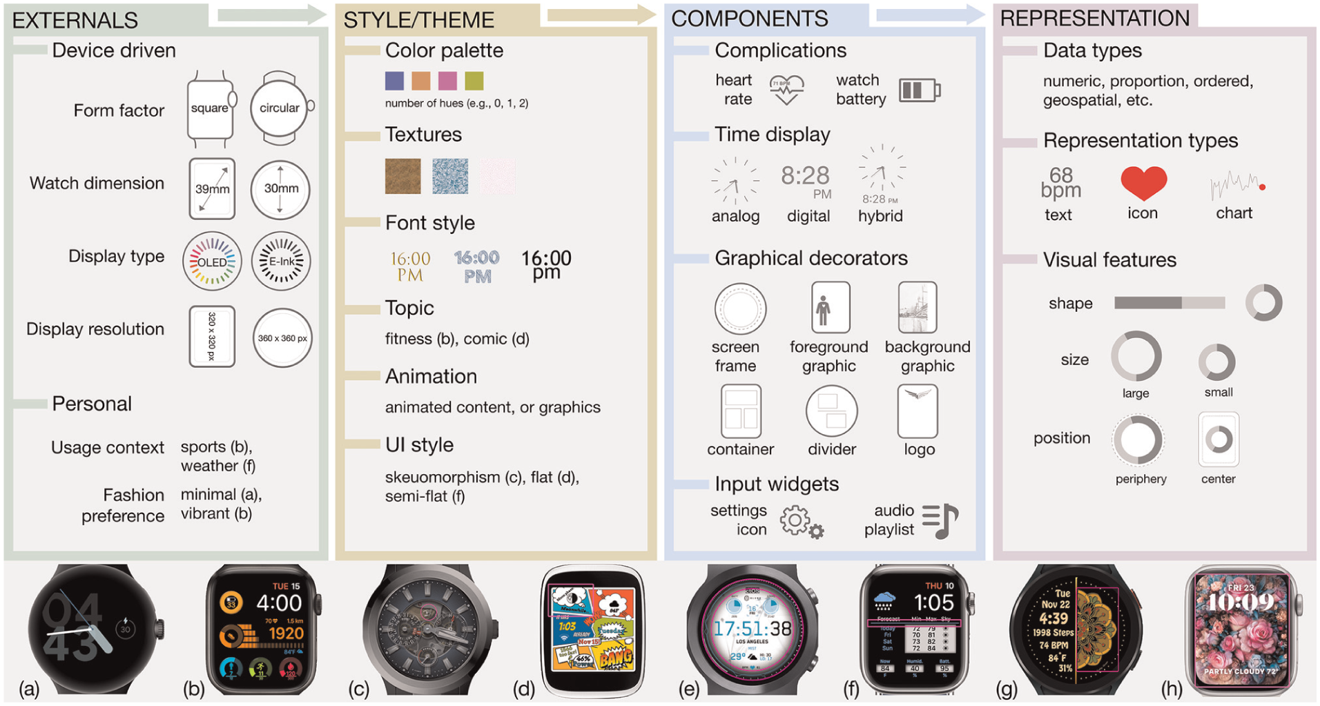
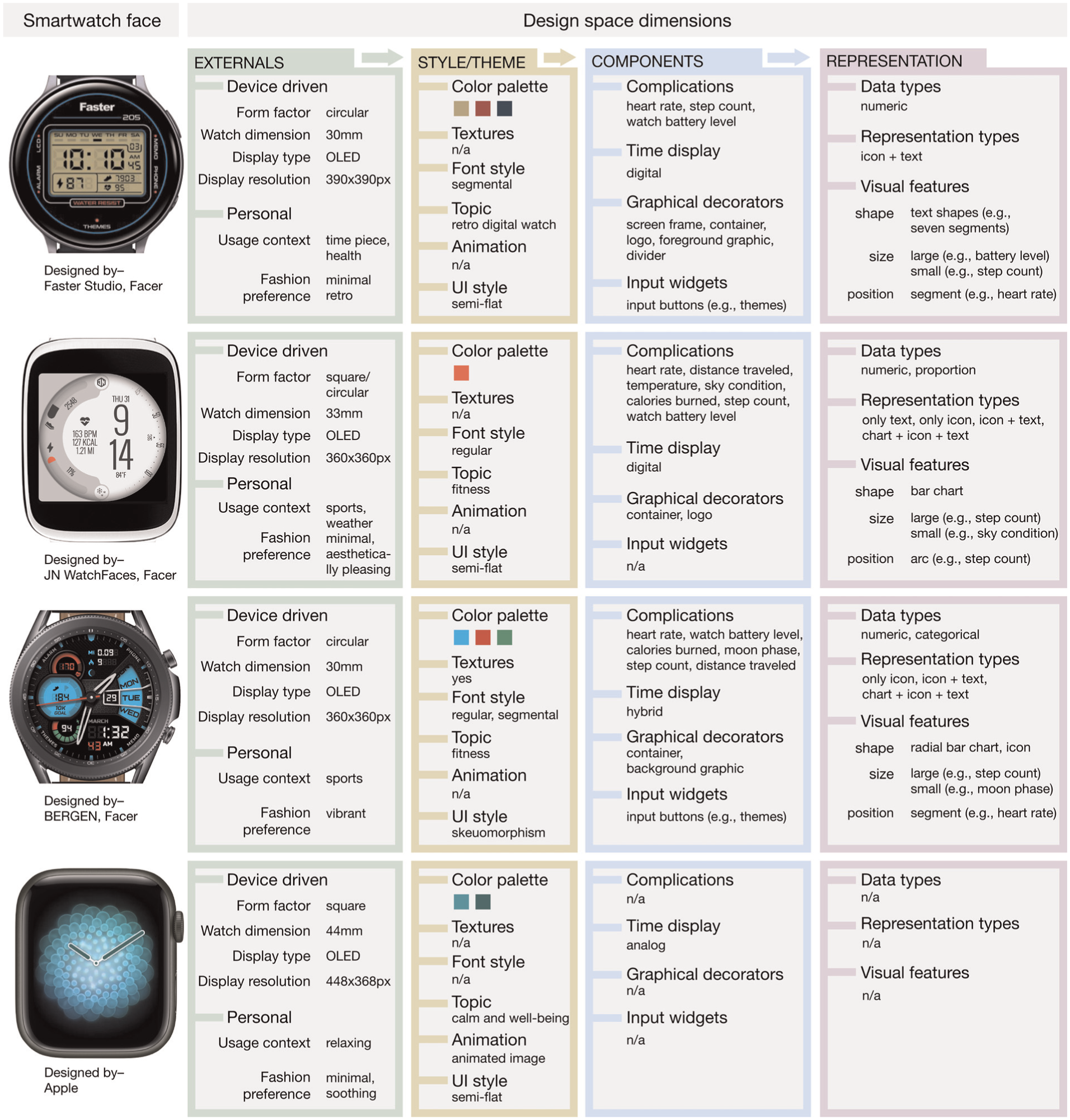
The dimensions of our smartwatch face design space that can influence visualization design and reading, with examples. Smartwatch face images (a, b, and f) indicate personal fashion preference as a factor; smartwatch face images (c, d, and f) show examples of smartwatch face design styles; and other smartwatch faces (c–h), in which regions highlighted in magenta color are—a logo (c), a container (d), a screen frame (e), a divider (f), a foreground graphic (g), and a background graphic (h). Figure acknowledgments can be found before the references.
Related work
Most past research on smartwatches has targeted smartwatches’ technical capabilities (e.g. battery life, 5 resolution, 6 interaction techniques,7,8 data collection methods9,10), or their role in people’s life. 11 Much less work has focused on how to represent information on a small screen or how to design visualizations in the context of smartwatch faces. The work most closely related to visualization design for smartwatches focused on particular design contexts such as health12,13 or design ideations14–16 for smartwatch data representations. In this section, we first review work that solely discusses smartwatch visualization challenges and then briefly summarize previous work on data representations on smartwatch faces and applications.
Smartwatch visualization considerations
Tasks
Albers et al. 17 showed that tasks viewers conduct when exploring a visualization are influenced by the design of visual displays and choices of visual encodings, such as position and color. Additionally, the mapping variables employed in visualization, including the approach to data aggregation, also influence the viewers’ tasks. For instance, a visualization may show the raw data or averages. Computed aggregates enable the visualization to perform tasks that would otherwise fall to the viewer. Designing smartwatch faces to align with everyday tasks is important because designs may impact the wearers’ tasks. The properties of smartwatch faces may also affect visualization reading tasks (e.g. space available, complications/visualizations shown), may constrain visualization design (overall style or theme that needs to be followed), and may be competing for visual attention (e.g. decorations). Smartwatches also present distinctive usage challenges that are much unlike the usage of visualizations on desktop screens. For example, on average, people look at a smartwatch for just 5–7 s,11,18,19 primarily to read the time (around 1.9 s 11 ). The extent to which additional information can be understood from a quick look at the smartwatch face remains uncertain. Researchers studied low-level perceptual tasks to understand the glanceability of smartwatch visualizations,1,20 the impact of visual parameters (e.g. size, frequency, color) on reaction times, 21 or representation preferences in an air traffic control usage scenario. 22
Representations
Recently, researchers started to research dedicated visualization techniques for smartwatches. Some of these research efforts target novel types of representations such as Chen’s temporal data, 23 Suciu and Larsen’s time spiral, 13 or Neshati et al.’s compressed line charts.24,25 In their exploratory studies, Amini et al. 12 showed that minimal designs and simple data-driven visualizations in the form of charts have great potential to support in-situ data exploration on small smartwatch displays. Pektaş et al. 26 showed how simple diabetes-related visualizations using icons and emojis on warnings and alerts could motivate wearers to monitor health-related information. Gouveia et al. 15 proposed six design qualities for smartwatches through an iterative ideation process. These design qualities include abstraction, integrating with activities, supporting comparisons to targets and norms, being actionable, leading to checking habits, and facilitating engagement when designing representations for glanceable feedback on physical activity trackers.
Customization and personalization
Despite the growing capabilities of smartwatches, which can effectively capture and communicate a vast amount of information to wearers, some wearers risk abandoning these devices and missing out on potential benefits. This can occur when there is a lack of context-specific data representations, inadequate design of visualizations, or customization options. Gouveia and Epstein 27 highlighted that customization on smartwatches—such as data, esthetic, and personal meaning customization—helps wearers sustain long-term interest in tracking. Wearers enjoy customizing smartwatches to their goals, needs, and preferences. Niess et al. 28 studied the impact of various approaches to represent unmet fitness goals on trackers through visualization, highlighting that multicolored charts on fitness trackers may lead to demotivation and negative thought cycles. Havlucu et al. 29 interviewed 20 professional tennis players and found that the abandonment of their fitness trackers was due to the type of information displayed on the smartwatches. The participants wanted specific tennis-related information, including recovery rate, nutrition, and details about their performance. They were interested in knowing where the ball hit their racket, the speed of a stroke, how the ball bounced off the ground, overall mobility on the court, and any weaknesses or errors in the game. Schiewe et al. 30 studied real-time feedback during running activities of 40 participants. Their participants preferred visualizations over textual representations for self-serviced concurrent visual feedback on smartwatches.
Our work focuses on visualizations on smartwatch faces. Being the home screen of a watch, smartwatch faces are the most frequently seen screen of a smartwatch. It is important to understand more broadly how these small-screen displays are designed, as they provide the context for visualizations.
Data representations on smartwatch faces and in smartwatch applications
We collected and reviewed publications that discussed smartwatch data displays for applications, smartwatch faces, or both. Of the papers we found, five12,14,31–33 focused on broad design ideations either on smartwatch faces or on both smartwatch faces and watch applications. Five papers1,20,34–36 investigated the perception of data reading and comparison tasks on smartwatch visualizations. The other papers focused on specific application contexts such as health,13,26,37,38 enterprise applications,39–42 driving,43,44 sports activities,45–47 map navigation,48–50 child care,16,51,52 affect annotation, 53 smart-home,54,55 air traffic control, 22 and library management. 56
The works most closely related to our work concern smartwatch face designs. We found only three papers15,27,31 that focused entirely on smartwatch faces. Gouveia et al. 15 focused on glanceable physical activity feedback for smartwatches derived through an iterative ideation process. They recommend glanceable feedback on the smartwatch face to prompt further engagement with the presented information. Gouveia and Epstein 27 found that smartwatch wearers personalize their watch faces in three ways: by highlighting specific data (such as key statistics), by adjusting esthetics (including color, layout, and icons), and by incorporating personal meaning (reflecting their interests or values). Wearers likely maintain long-term interest in tracking their health and well-being by integrating personal interests with tracking needs, such as linking health data to video games or TV characters. Esakia and Kotut 31 described five guidelines for designing smartwatch applications. They evaluated them in a mobile computing class, in which undergraduate students considered the applications as part of a design and development cycle. The design guidelines helped students develop smartwatch faces in a project promoting community physical activity.
With a similar focus on application areas, some research discussed representing health and physical activity data on smartwatch faces.13,25,26,37,57 Recommendations for smartwatch face designs from these papers were sparse. For example, Neshati et al. 25 recommended a space-filling line chart technique and associated interaction techniques for time-series data. Van Rossum 57 recommended aiming for understandable and clear visuals, especially for people with deteriorating eyesight, using a black background for contrast in dark environments.
Others reported smartwatch face design ideas from ideation activities, workshops, or design space explorations on smartwatch data representations.14,32 Carpendale et al. 14 offer new context-specific smartwatch applications, and smartwatch face design ideas from a range of situated ideation exercises. Klamka and Dachselt 32 show eight wearable application ideas and prototypes for personal information and mobile data visualizations with bendable color ePaper displays. In contrast, we focus on general smartwatch faces with a broad, everyday usage context.
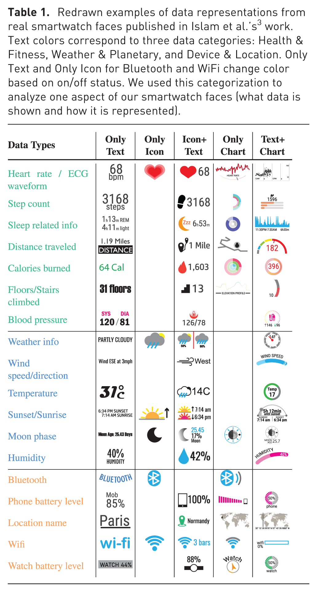
In a previous short paper, Islam et al. 3 studied which data people currently consume on their smartwatch faces and how it is visualized. The authors’ goal was to collect data that would allow to ground future studies on smartwatch visualizations (e.g. to inform choices about how many visualizations to test) in current practices of smartwatch wearers. Their study involved conducting an online survey with 237 smartwatch wearers, compiling smartwatch face visualizations reprinted in Table 1, and assessing the potential for future smartwatch visualizations by considering the technical capabilities of the survey participants’ watches. Although Islam et al.’s 3 work yielded many findings, the study had several limitations we address in this article. Specifically, the authors did not collect (i) the types of visualization charts used on smartwatch faces and (ii) how representations were integrated within other smartwatch face visuals (such as themes, i.e. the context within these visualizations appear, that can affect both visualization design and reading). Our work complements Islam et al.’s 3 work by systematically reviewing commercially available smartwatch faces and structuring a design space for smartwatch faces in terms of data and visualizations.
Redrawn examples of data representations from real smartwatch faces published in Islam et al.’s 3 work. Text colors correspond to three data categories: Health & Fitness, Weather & Planetary, and Device & Location. Only Text and Only Icon for Bluetooth and WiFi change color based on on/off status. We used this categorization to analyze one aspect of our smartwatch faces (what data is shown and how it is represented).
A systematic smartwatch face review: Toward a design space
We collected smartwatch face designs and conducted a systematic review to gain a deeper understanding of dimensions to form our design space of smartwatch faces. We studied smartwatch faces because they are the context in which smartwatch visualizations are shown. They may influence visualization design (e.g. if an overall style or theme needs to be followed) and visualization reading (e.g. available space, number of complications). Studying smartwatch faces, particularly the data shown on them, also highlights visualization opportunities and can ground future empirical work. In this section, we detail our methodology and report results.
Data collection and analysis
Islam et al.’s 3 work relied on participants’ own descriptions of their smartwatch faces that need to be systematically verified. We systematically reviewed premium (paid) smartwatch faces from a popular smartwatch face app and website to address this limitation. We focused on premium smartwatch faces because we considered these to exhibit acceptable design professionalism. The alternative of collecting smartwatch face screenshots from many participants would have been technically infeasible and potentially privacy-invasive. Screenshots are difficult to take and transfer from watch to study platform for non-tech-savvy populations, and smartwatch faces often contain privacy-sensitive information, such as locations or body measurements.
Therefore, we decided to collect smartwatch faces from the Facer App, 58 one of the most popular smartwatch face distribution websites. It contains a Top100 page that lists the premium or free Apple smartwatch faces and watches running the WearOS/Tizen operating system. Because WearOS and Tizen are closely related, we now refer to both as WearOS. According to a Facer forum, the number of weekly syncs or downloads decides the Top100 list. The list is reset every Sunday at midnight (00:00). One must have three designs that receive 3000 syncs in 30 days to become a premium designer on Facer.
We manually collected the metadata of the top 100 premium smartwatch faces every Sunday at midnight for 1 month, starting March 14, 2021, for WearOS smartwatches and starting September 18, 2022, for Apple smartwatches. When we began this work, the Apple list did not consistently contain 100 smartwatch faces; therefore, we had to collect this data later. The metadata collected for each smartwatch face included its rank, name, link, and thumbnail.
Among the 800 top smartwatch faces we collected, 358 were unique because several appeared in the top 100 for multiple weeks in a row. Some smartwatch faces in the list were also similar, and if so, we chose only the first instance collected during the initial week. To derive codes that could ultimately lead to design space dimensions, we first looked for what could form a smartwatch faces’ distinctive characteristics. We found data types, data representation forms, UI style, time display, and graphical decorations (such as logos, backgrounds, or screen borders). For example, some smartwatch faces differed only in a single complication or by color palette from the same smartwatch face designer.
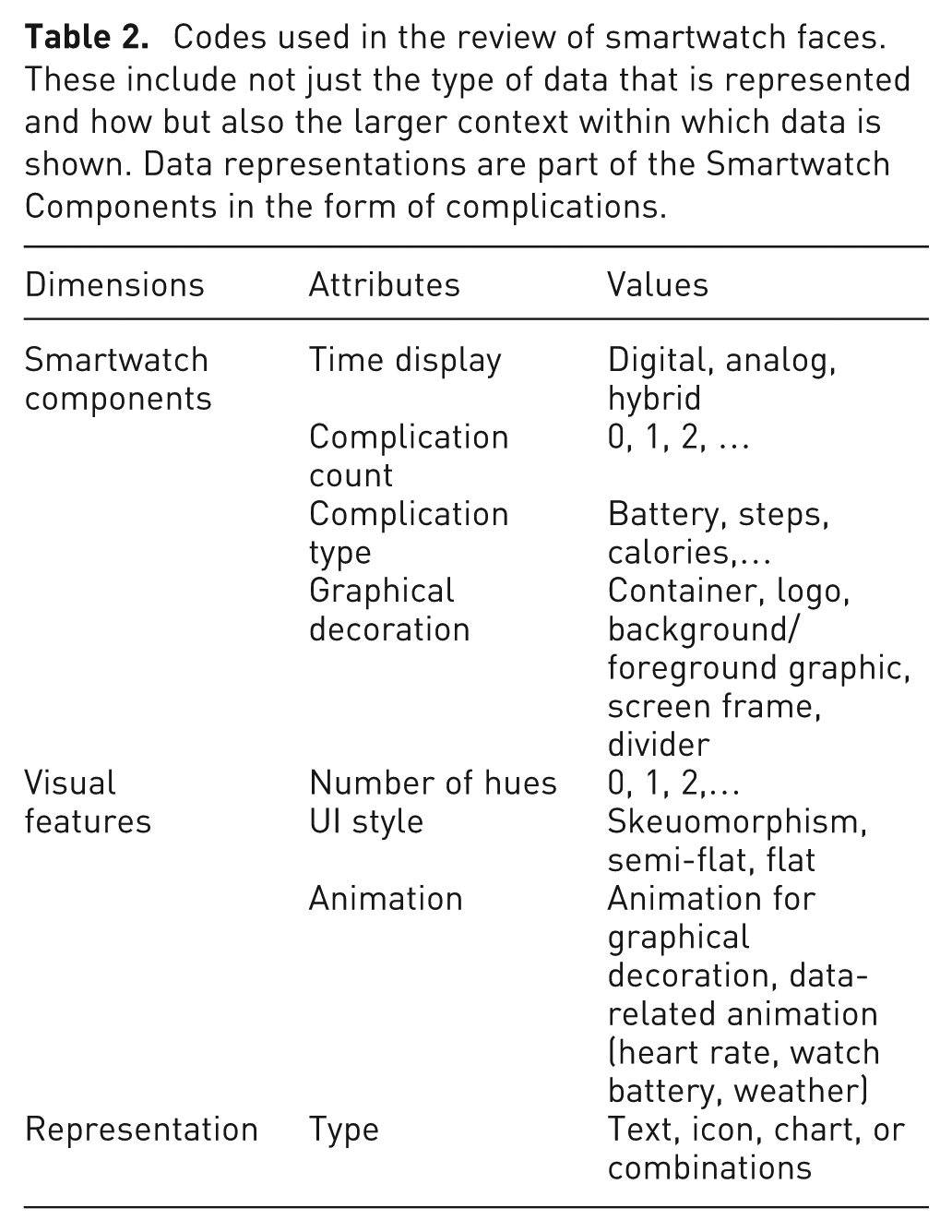
We derived a set of codes that targeted an understanding of the overall design and how data representations (shown in chart or text form) were integrated into the smartwatch face to compare and analyze these 358 unique designs. We reviewed smartwatch faces in the representative configuration shown on the Facer website (i.e. the configuration the smartwatch face designer chose). Wearers can usually configure smartwatch faces once installed, but we did not capture custom configurations. We acknowledge this as a limitation of our approach. Table 2 lists the codes we used. On a higher level, we focused on coding first what data information is currently shown and how. We identified what data are already seen as visualizations, data that have the potential to be turned into visualizations, and how many of these visualizations we could show. Simultaneously, we coded how the rest of the smartwatch face is designed, in other words, in what context these visualizations are or could be embedded, identifying factors that may affect their design.
Codes used in the review of smartwatch faces. These include not just the type of data that is represented and how but also the larger context within which data is shown. Data representations are part of the Smartwatch Components in the form of complications.
We conducted all analyses using the extracted image of each smartwatch face. If a design was unclear from the thumbnail, we visited the Facer website to look at the simulated smartwatch face graphic. We grouped our results according to the components shown on a smartwatch face and how they were shown. We compared our results on the number and type of complications, time display, and complication representation between our current review and Islam et al.’s 3 work. By conducting this comparison we hoped to either validate prior results or to reveal inconsistencies that may be explained by the differences in methodologies used. Ultimately, our systematic analysis was meant to uncover design space dimension and their potential importance. This approach was successful as, indeed, the codes we used for our systematic analysis later did inform and lead to the dimensions of our design space. By relating our dimensions back to our systematic review we can therefore see that these dimensions exist in current watch face designs and how frequently they occur. In addition, the following quantitative results can also serve to ground empirical work that later evaluates watch face designs inspired and described by our design space, as it can inform ecologically valid evaluations where the numbers of complications, distractors, sizes, colors etc. need to be chosen. Finally, it provides a record of current practices for future research that may study how preferences have evolved.
Results
Next, we detail the results of our investigation.
What and how much data is displayed on a smartwatch face and how?
Next, we describe the amount of information smartwatch faces communicate and the type of data shown and explain how these relate to data visualization design.
Number of complications
A complication is any feature displayed on a smartwatch face in addition to the time and could be used to display data. In other words, these counts indicate the potential to include multiple data visualizations. The smartwatch faces contained a median of 4 complications similar to Islam et al.’s
3
work, in which participants reported a median of 5. However, we saw a difference in the number of smartwatch faces with only one complication. While 13.41%  (Figure 2) of the premium smartwatch faces contained only one complication, in Islam et al.’s
3
work only 0.84%
(Figure 2) of the premium smartwatch faces contained only one complication, in Islam et al.’s
3
work only 0.84%  of the smartwatch faces contained one. The maximum number of complications per smartwatch face drawn was similar: 16 in this review and 17 in Islam et al.’s
3
work. The higher occurrence of smartwatch faces with just one complication may indicate a shift toward minimalistic designs or wearers’ preferences for less clutter and better readability. It could also reflect customization limitations, because Islam et al.’s
3
survey found that only 18.2% of participants could manually change their watch face, 19.4% experienced automatic changes, and 62.4% never changed their smartwatch face, suggesting either manufacturer restrictions or a lack of wearers’ awareness of the possibility to customize a watch face.
of the smartwatch faces contained one. The maximum number of complications per smartwatch face drawn was similar: 16 in this review and 17 in Islam et al.’s
3
work. The higher occurrence of smartwatch faces with just one complication may indicate a shift toward minimalistic designs or wearers’ preferences for less clutter and better readability. It could also reflect customization limitations, because Islam et al.’s
3
survey found that only 18.2% of participants could manually change their watch face, 19.4% experienced automatic changes, and 62.4% never changed their smartwatch face, suggesting either manufacturer restrictions or a lack of wearers’ awareness of the possibility to customize a watch face.
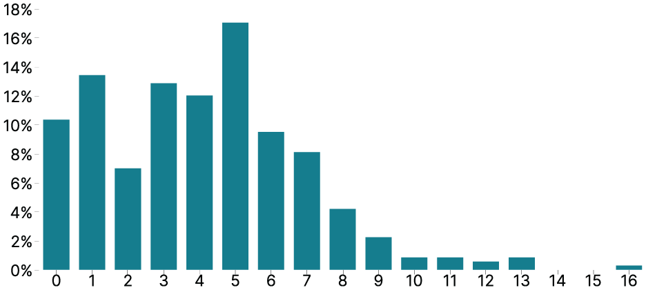
The percentage of smartwatch faces (y-axis) corresponding to different numbers of complications (x-axis).
Types of complications
We note the data types shown in these complications, ignoring purely decorative information. This constitutes an opportunity for visualization designers because this data could be shown as visualizations. Health & Fitness data was the most common, followed by Weather & Planetary, and Device & Location data echoing the results of Islam et al.’s 3 work. Watch battery level was ranked first again as well. The main difference to Islam et al.’s 3 work related to Bluetooth connectivity data, which was ranked eighth in their survey but did not appear in our work. Perhaps because Bluetooth icons only appear when a watch is paired to a phone and, therefore, did not show in our thumbnails.
Complications representations
We found seven ways complications were shown as text, icons, and chart combinations. As icons, we classified graphical content not in the strict semiotic sense but more analogously to how they are used in computing. Here, icons are a type of image that represents something else. As such, our icons can be both semiotic symbols  and icons
  . Figure 3 shows the representation type frequency found in our review. A simple text label (Text Only
  ) was the most common representation type for 1–2 data types on average on each smartwatch face (M = 1.72, 95% CI: [1.53, 1.91]). Icons accompanied by text labels (Icon + Text ) were the second most common (M = 0.92, 95% CI: [0.79, 1.07]). Both Islam et al.’s
3
work and our findings show that text seems to be the most frequent way to represent data on smartwatch faces, while charts or charts combined with text or icons are rare in practice. One notable difference in the data was the difference in Only Icon displays. Examples of representations that rely purely on a small image, such as weather icons (
) was the most common representation type for 1–2 data types on average on each smartwatch face (M = 1.72, 95% CI: [1.53, 1.91]). Icons accompanied by text labels (Icon + Text ) were the second most common (M = 0.92, 95% CI: [0.79, 1.07]). Both Islam et al.’s
3
work and our findings show that text seems to be the most frequent way to represent data on smartwatch faces, while charts or charts combined with text or icons are rare in practice. One notable difference in the data was the difference in Only Icon displays. Examples of representations that rely purely on a small image, such as weather icons (
 ) are still rare on smartwatch faces (Table 1). Yet, in Islam et al.’s
3
work, surprisingly, a large number of participants reported seeing Only Icon displays (M = 1.11, 95% CI: [0.93, 1.3]), which we attribute to a potential misunderstanding of the category. In our current review, Only Icon displays were, as expected, much more rare. We saw them for weather conditions (99×), moon phases (23×), wind directions (3×), compass/direction finder (1×), and altitude (1×).
) are still rare on smartwatch faces (Table 1). Yet, in Islam et al.’s
3
work, surprisingly, a large number of participants reported seeing Only Icon displays (M = 1.11, 95% CI: [0.93, 1.3]), which we attribute to a potential misunderstanding of the category. In our current review, Only Icon displays were, as expected, much more rare. We saw them for weather conditions (99×), moon phases (23×), wind directions (3×), compass/direction finder (1×), and altitude (1×).
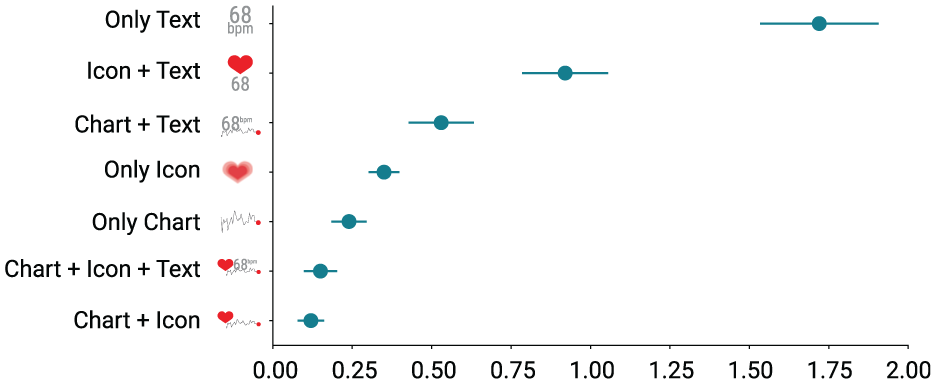
The average number (x-axis) of representation types (y-axis) presented on the premium smartwatch faces.
How is the rest of the smartwatch face designed?
Watch faces consist of components representing time and decorations, each with their own representation styles. These form the context in which visualizations are shown. Studying how they can influence visualization design and reading provides new avenues for research.
Time display
We categorize smartwatch faces based on the type of time display they employ as: digital, analog, and hybrid. These different are important because time displays may interfere with other visual components. For example, analog hands may overlap visualizations and digital time displays may take up a considerable amount of space.
Digital smartwatch faces represent time information as HH:MM:SS for hours, minutes, and potentially seconds. Analog smartwatch faces typically use hour, minute, and second hands to indicate the time, to resemble conventional analog watches. Hybrid smartwatch faces have both digital and analog time displays. Similar to prior work,
3
we found that the majority of smartwatch faces were digital smartwatch faces (60.3%  ), followed by analog smartwatch faces (26.3%
  ), and hybrid smartwatch faces (13.4%
  ).
).
For the following smartwatch face components, we only report results from our current review because Islam et al. 3 in their work had not asked participants about them.
Graphical decorators
We define graphical decorators as graphical content on the smartwatch face that forms a coherent unit and takes up space, similar to complications, but does not carry any data. We found six types of graphical decorators (Figure 4). Containers (254×), which surround other smartwatch face components; background graphics (141×), which are decorations on the background such as a wallpaper; logos (139×), which are small images to represent the brand or designer of the smartwatch face; foreground graphics (94×), which are other decorations in the foreground, such as small images or lines; screen frames (48×), which are decorations on the border such as frames; and dividers (31×), which are the lines that split the smartwatch face into dedicated regions.
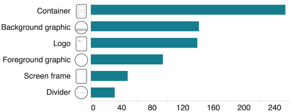
Number of smartwatch faces (x-axis) containing graphical decorators (y-axis).
Number of hues
We analyzed the main hues used to get a better sense of the overall look of the smartwatch faces. We did not consider black, white, and gray because these dominate most backgrounds. Nearly half of the premium smartwatch faces (43.30%  ) had only one hue (Figure 5). More than a quarter (24.58%
  ) had two, and only one-eighth (12.57%
  ) had three hues. The maximum number of hues on one smartwatch face was seven.
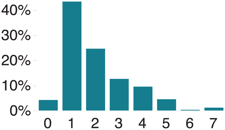
Percentage of smartwatch faces (y-axis) with a certain number of hues (x-axis).
Animation
80% ( ) of the top smartwatch faces had no animated content; 20%
  had animated content that did not represent data. Animations were used on decorations or complications to make them look more vivid and stand out. Sometimes animations were meant to make content even more iconic, such as a heartbeat animation for a heart icon
  .
.
UI style
Through the user interface (UI) style code, we captured the overall appearance of the smartwatch faces. We found three categories of styles: skeuomorphism, flat designs, and semi-flat designs, as shown in Figure 1 (Style/Theme). In UI design, skeuomorphism describes a graphical interface style in which elements mimic their real-world counterparts.
59
Skeuomorphism deploys gradients, shadows, or ornate details
60
and on smartwatch faces, these design elements are often used to recreate elaborate analog smartwatch faces, such as those of pilot or diving watches. Flat design is a graphical interface style in which no graphical elements attempt to create the appearance of continuous 3D depth. This style highlights simplicity by concentrating on two-dimensional elements, clean lines, and bright colors.
60
Semi-flat designs are in-between flat design and skeuomorphism: they are flat designs with some realistic touch, such as shadows. We found flat (36.87%  ) to be the most popular style, followed by skeuomorphism (33.80%
  ) and semi-flat (29.33%
  ) designs. The flat design was more frequent on Apple (56.32%
  ) than on WearOS smartwatch faces (18.48%
  ), while Skeuomorphism was more frequent on WearOS (54.35%
  ) than on Apple (12.07%
  ).
).
Factors influencing design popularity
Our metadata contained smartwatch face ranks ranging from 1 to a 100. We analyzed unique smartwatch faces categorized by their ranks as coded in the metadata, aiming to uncover patterns and reasons behind the varying popularity of different designs. Smartwatch faces ranked 1–50 exhibited an average of at least four complications, while there was a decline in complications beyond rank 50. Wearers seem to prefer smartwatch face designs with at least four types of complications, as supported by Islam et al.’s 3 work. We also explored representation types and found that trends in data representations were similar between top-ranked (1–50) and lower-ranked (51–100) smartwatch faces. Minimal color usage was preferred in smartwatch face designs, as evidenced by fewer hues in the top-ranked faces compared to those beyond rank 50. Additionally, we examined graphical decorators and found that in the top-ranked smartwatch faces (1–50), graphical decorators were consistently more prevalent. These findings indicate that the number of complications, color usage, and graphical elements may influence the preference for smartwatch face designs among wearers. Future studies on design preferences will help gain deeper insights into what constitutes an appealing smartwatch face design or a good design practice. Historical analysis in a few years might also reveal interesting results regarding preference changes and potential fashion trends.
Design space
Our review of existing smartwatch faces allowed us to reflect on watch face design more broadly and construct a design space. We systematically structured design considerations for a holistic smartwatch face and to shed light on the use of visualizations on smartwatches.
Inspired by our previous analyses, the design space is primarily descriptive. 61 It allows the description of existing smartwatch faces based on various factors. The design space also has the potential to be generative in that its components could inspire new smartwatch face ideas. However, we have not yet verified the design space as such. Figure 1 gives an overview of our design space with examples. The figure shows four important dimensions to consider in the design of a smartwatch face. The design space is based on our initial codes for the smartwatch face designs listed in Table 2. Data collection and analysis of actual smartwatch face properties led to the design space dimensions after several rounds of discussion among the co-author team. The Style/Theme dimension aligns with the Visual Features from Table 2. To make the design space comprehensive, we included Font Style and Texture in this dimension because our review and existing literature 62 indicated their significant impact on the overall styling and theme of visualization designs. The dimension Components is derived from the Smartwatch Components, introducing Input Widgets, which include interactive buttons and icons commonly found on smartwatch faces but do not convey categorical or numerical data. The Representations dimension emerged from the initial coding Representation Type, encompassing Data Types and Visual Features influencing smartwatch face visualization. We added a dimension in Figure 1 called Externals, which considers the device itself and individual usage context, impacting the overall design. While not part of the smartwatch faces designs’ coding or listed in Table 2, these device and personal factors may be important in designing smartwatch faces.
Unlike some other design spaces, our dimensions are not independent. They are ordered in a sequence (left to right) to show the dimensions’ main direction of influence. We consider smartwatch faces to be multi-view displays or small data dashboards in which the designer carefully chooses what to include and how to style and arrange content. For developers, we recommend complementing their reading of our design space with a look into developer guidelines for smartwatch faces on the final platforms (Android, 63 or Apple 64 ). These guides typically have additional broad guidance and feature descriptions available on each platform (such as automatic layouts and types of complications supported). Here, we, instead, cover platform-independent features needed to create holistic smartwatch faces.
Smartwatch face external factors
Factors external to the smartwatch face may influence its design (Figure 1 Externals). The smartwatch itself (device-driven) defines the shape (form factor), display size (watch dimension), display type, and display resolution, which may influence choices in other parts of the design space. For example, the display type (such as OLED or E-ink) greatly influences the colors available to style the graphics and represent data as visualizations.
E-ink smartwatch faces, for example, have fewer colors and lower display refresh rates, making animations difficult. They nevertheless have the potential for sport and activity smartwatches because of their paper-like characteristics, lightweight nature, low battery consumption, and readability in sunlight. 65 In contrast, OLED displays have greater color quality than other technologies.
In addition to the display type, the display shape (form factor) profoundly impacts the layout and the graphics design. Smartwatch faces now mostly come with square or circular displays; content is often shaped to match and create a harmonious esthetic, which can, in turn, constrain the types of visualizations that can be shown. Bendable displays are starting to emerge and smartbands might soon offer a large and curved display surface. Display curvature may, therefore, in the future, become a new factor under this dimension. Finally, personal factors such as intended usage context or fashion preferences play an important role in smartwatch face design. Purchasing decisions may be made on whether a smartwatch would be wearable in casual or business contexts and whether it goes with a certain fashion, as seen in previous work. 66 We expect that for some wearers, similar decisions play a role in smartwatch faces, their design styles, overall look, and visualization use.
Styles, themes, and topics
The theme of a smartwatch face design describes a set of design attributes applied to all elements of the smartwatch face to create a consistent, unified, or coherent look (Figure 1 Style/Theme). These attributes may define a set of colors used or visual textures imitated and potential animations used. Themes can also influence other dimensions, such as the smartwatch’s components and representation. For example, a smartwatch face with a minimalist theme may show only a few essential components, such as a digital time, date, or battery life, represented with simple visual features.
A theme may relate to a topic such as fitness, outdoor sports, games, and fashion. For example, Figure 1(d) shows a dedicated comic theme with a flat UI style, a set of primary colors, and comic-style fonts chosen, while Figure 1(f) depicts a semi-flat UI style going for an appearance of vintage-style weather components.
Smartwatch face styles relate to themes and specify how specific components are rendered. For example, in Figure 1(d), the fonts for labels use a comic style that matches the comic theme of the smartwatch. Specific color-related design themes and styles are common on smartwatch faces. For example, a darker color palette for the background is used most of the time to enhance content readability without disturbing wearers with a bright light during the night or to save battery. 57 The flat and skeuomorphism UI style is popular, whereas semi-flat designs are used frequently when the smartwatch face is meant to be different and unique compared to traditional smartwatches. Themes, including animation, often aim for a vivid overall feel but rarely use animation to represent data.
Both themes and styles influence how data representations can be designed. Aiming for a consistent design would affect graphical embellishments or decorations, such as shading used in visualization, as well as the available colors and potentially types of visual channels used. For example, a smartwatch face with a black-and-white theme cannot use multiple categorical color encodings based on hues.
Smartwatch face components, including data visualizations
We define components as any coherent object on the smartwatch faces that take up display space, including complications that may include visualizations, time-date-related data, graphical decorators, and input widgets (e.g. functional buttons; Figure 1 Components). Designers must decide which type of components to display and how many to put on the smartwatch face. Only two types of components display data: time-related components (time, date, or day) and non-time-related components, called complications 63 in horology. This data could be represented using visualizations. The type of complications available for a smartwatch depend on internet connectivity and available sensors on the device. This factor is therefore meant to be easily extensible. For example, to design a futuristic smartwatch one may consider complications that show sensor data about pollutants in the nearby environment or hydration of a wearer, even though these sensors and their complications might not yet exist. Graphical decorators refer to elements on smartwatch faces unrelated to data, such as logos, screen frames, or background images. Input buttons such as settings or audio buttons are typically represented by icons on a touch-enabled smartwatch face and do not reflect any categorical or numerical data. Designers should avoid unfamiliar metaphors while designing or choosing such icons so wearers can understand their functions. The choice of type and number of smartwatch face components (including visualizations) is closely related to the theme of the smartwatch. For example, an aviation-themed smartwatch (Figure 1(c)) may require specific time-related components to show the time zone, a chronograph, and a date display, and it is likely to use a skeuomorphism design style. A fitness-themed smartwatch face (Figure 1(b)) might instead require a large number of complications in the form of charts or text for showing step count, heart rate, or calories burned.
The smartwatch faces’ choice of an analog, digital, or hybrid time display also impacts the overall design. Analog smartwatch faces have dials that may overlap complications, such as small charts, and make them less readable. Digital time displays use fonts that need to fit the general style and typically take up a prominent position on the smartwatch face, leaving less space for other complications.
Graphical decorators also play an important role in smartwatch faces. Through them, themes can often be expressed, and they, too, can constrain the space available for complications. Containers are a particularly frequent graphical decorator that partitions the smartwatch face into regions, giving dedicated display space to complications. For example, Figure 1(d) uses a lot of space for comic-related background images and comic panel containers and constrains the complications to fit into speech bubbles. Decisions on which and how many components to display impact how the components can be represented, discussed in the next section.
Smartwatch face data representations and how data is visualized
Each smartwatch face component’s digital representation has, at minimum, a position, size, shape, and color scheme or texture (visual features). In this section, we focus our discussion on smartwatch face complications that represent data other than time (Figure 1 Representation).
One of the difficulties of designing a complication for smartwatches is that the data category it shows needs to be identifiable, such as steps, heart rate, or calories. Designers can place signs to identify data categories or rely on wearers to learn and memorize a mapping. The types of signs that can identify a data category include—text labels that specify the category (e.g. “steps”), accompanying icons (e.g. a foot icon for step count), and text units (e.g. “km” for distance traveled). The “three rings” on the Apple Watch is, instead, an example of a mapping that requires learning  . It uses three concentric radial bar charts with memorable colors but without a sign to represent what each colored ring stands for: movement, exercise, and standing. One of the advantages of memorized mappings is that no display space needs to be dedicated to labels, units, or icons.
Our evaluations showed that most smartwatch face complications represent data with text, icons, and chart combinations. Most data encoded a single data value  . More complex encodings, however, are certainly possible (e.g. multiple points over time or space
  ) and designers can take inspiration from more complex micro visualizations such as word-scale visualizations67,68 or data glyphs.
69
) and designers can take inspiration from more complex micro visualizations such as word-scale visualizations67,68 or data glyphs.
69
Representations by data type
We divided complications showing data, according to which data type they represent to discuss them in more detail: absolute numeric data, proportional data, categorical data, ordered data, temporal data, and geospatial data. Discussing complications by data type seemed more useful than by data category (e.g. steps, battery, …) because data in each category can easily be converted into different data types. For example, a step count can be an absolute numerical value (e.g. 6700 steps), converted to a proportion (e.g. 67% of a daily step goal), or shown as a time series. Next, we discuss representation possibilities and challenges based on the most common data types we saw represented on smartwatch faces.
 /sunny
  ) or a sign with an indexical color (Bluetooth—on
  /off
/off  ).
).
As opposed to categorical data,
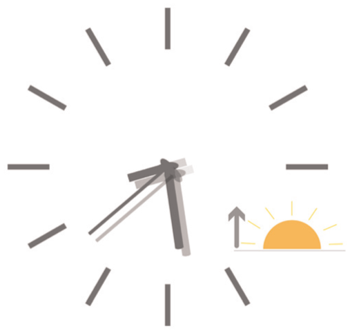
A watch face showing sunrise time.
The most common  ) maps
  also sometimes represent this data.
Representation types
or sunny day. Finding icons representing REM, Light, or Deep sleep stages would be more challenging.
There are two options for using an icon to represent quantitative data: a) designers can turn the quantity into an order or category and use a visual variable for categories such as hue, texture, or position; or b) add a visual variable to the icon that can represent a quantity such as position, size, area, or flicker. For example, suppose a designer wants to represent the quantity of calories burned with an icon. In that case, they first have to choose an icon that represents calories; a fire icon  is relatively standard. Next, the designer could apply a sequential color scale (
 ), size the icon relative to a quantity (), or apply animation-related variables such as flicker. Icons can also be stacked to create unit-based pictographs. Similar examples include step counts represented by different shoe icons (e.g. walking, running, climbing), but examples were rare.
The chart types the premium smartwatch faces commonly used to represent data were bar charts, pie charts, donut charts, gauge charts, area charts, pictographs, and sliding scales. As discussed above, the data type suggests the most effective chart type. The chart type directly affects its possible shape, size, and, ultimately, its location. For example, several charts can be curved and aligned with the rim of a smartwatch face.
The chart size is related to the area occupied on the smartwatch face. Size is more closely related to the shape of a chart rather than just its bounding box due to the tight layout of components on the smartwatch. The size of bar charts and sliding scales mainly refers to length and thickness. The size of pie, donut, and gauge charts primarily refers to the diameter. The size of area charts and pictographs relates mainly to their length and width. If a chart’s shape matches a smartwatch screen’s shape, the chart can fill the smartwatch face. For example, a donut chart can use the circumference of a round smartwatch face. We rarely saw space-filling charts (similar to Dragicevic and Huot’s SpiraClock 72 ). Often, charts were nested inside round containers, similar to complications on physical pilot or diving smartwatch faces.
Chart color describes how many hues are used on the chart to style the chart or to represent data. Black and white smartwatch face designs exist, and hue cannot be used to represent data. In this case, textures may be used to represent categories, 75 but these are difficult to design well in practice. Decorators such as gradients affect a chart’s color and must be used carefully. Gradients consist of different saturation or brightness of the same hue or gradients of various hues. One difficulty of using hues for categorical color encoding on smartwatch faces is that the hues need to match the overall theme and esthetic of the smartwatch face. A color scheme that might create an esthetic design overall might not work well for encoding data and vice versa.
Chart position refers to the place of the chart on the smartwatch face. Charts are often positioned in the middle of the smartwatch face or the periphery. The shape of the chart affects its possible position. For round smartwatches, ring-shaped or arc-shaped charts are most suitable for being located on the periphery of the smartwatch face, whereas other shapes like bar- and line charts can only be located in the middle of the smartwatch face.
Chart theme refers to the theme of complications, which often conforms to the overall topic of the smartwatch face. Charts used in research rarely have a theme, but these should be explored further for smartwatch faces. Colors, shapes, and, in particular, textures can help to define a theme.
Summary
In summary, our design space describes existing smartwatch faces and the factors that may influence visualization placement, design, and reading. We explore in detail the various ways in which data can be represented on a smartwatch face, including absolute numeric data, proportional data, categorical data, ordered data, temporal data, and geospatial data. Lastly, we delve into data representations on smartwatch faces (i.e. the concrete ways data is visualized, such as text, icons, and charts) and discuss the challenges and possibilities of visualizing data on the limited display space of a smartwatch. In Figure 7, we show how our design space can be used to describe four popular smartwatch faces. Our design space can also serve as a conceptual framework for envisioning future smartwatch faces as technologies, wearers’ expectations, and esthetics evolve. The dimensions can help compare different designs, identify factors for assessing smartwatch faces, and potentially help researchers generate new designs or variations of one design. In the next section, we discuss a research agenda derived from our work on the design space and exploration of current practice.
Four examples of smartwatch faces using our design space dimensions to describe them.
Research agenda
While we have previously hinted at possible future research directions, here we highlight what we consider the most important or promising research directions for visualizations on smartwatch faces.
Holistic study of smartwatch faces
Smartwatch face visualizations do not only need to be small, but they also need to be integrated into a coherent smartwatch face theme. As a personal data dashboard, smartwatch faces not only make fashion statements but can also play an important role in facilitating decision-making. Our design space is based on current smartwatch face designs and serves as a conceptual framework to guide future smartwatch face creations as technologies, wearers’ preferences, and esthetic choices evolve. We identified several open research questions related to integrating visualizations in smartwatch faces.
Designer’s vision versus use in practice
Through Islam et al.’s 3 work and our current review, we observed a tension between a smartwatch face design vision and the use of smartwatch faces in practice. While a big part of the market designs included a single complication that could display data (18%), 99% of people in Islam et al.’s 3 work reported to have more than one complication on their smartwatch face. Our design space highlights the many design features that are interlinked on a watch face and that make customization difficult to get right. We suspect wearers often customize or personalize their smartwatch faces to include more complications than the designer intended. While smartwatch designers may decide to follow design guidelines and recommended practices from the visualization community in their implementations, smartwatch wearers may make customization choices that violate these guidelines and practices. We can try to help wearers use a more appropriate design, for example, by suggesting the best locations for placing a complication that shows data depending on clutter or background color. Nevertheless, smartwatches remain personal devices, and wearers are (and should) ultimately be in control. As a community, we need to consider the right balance of allowing wearers to feel empowered in their customization without being constrictive in our attempt to guide them.
Study of the influence of themes
The visualization community has heavily debated using embellishments around data visualizations. Some argue that they should be avoided 76 ; some argue that they do not hurt or can even help. 77 Smartwatch face visualizations have, by design, several visual distractors surrounding them. UI styles such as skeuomorphism introduce extensive shading to give the illusion of depth. Busy material textures and color palettes may distract from reading data. The influence of certain theme choices, such as skeuomorphism versus flat or semi-flat designs, as well as graphical decorators, require further research. It is important to establish how they may support or hinder data readability, especially for scenarios that require quick and accurate data readings.
Scalability: The number of complications and their complexity
For small data representations shown on smartwatch complications, it is intuitive to recommend that their designs are simple and should encode only a few data values or dimensions. A broad range of the population buys smartwatches, and there are now even smartwatches targeted at children. 78 Designers of smartwatch face visualizations cannot assume visualization literacy and perhaps for this reason most smartwatch faces currently seem to be designed primarily with text and using only few and very simple graphs. Still, many smartwatch wearers exhibit intricate familiarity with the data (e.g. step counts, weather, or sleep patterns). Past work on word-scale visualizations67,68 has shown that complex representations are possible on a small display space. However, studying the encoding limits empirically in more depth would be helpful. Studies could investigate two scenarios of increasing visualization complexity: (1) adding more dimensions, more data values, and more encoding types while keeping the same (small) display space, and (2) decreasing the display space while keeping the same level of data complexity. Some of the past studies on visualization size73,79–82 have consistently shown that people prefer larger visualizations. Still, we have also seen that participants effectively and correctly completed specific tasks with appropriate encodings at a small scale. 1 In addition to questions regarding the scalability (or miniaturization) of visualizations, scalability questions also arise regarding the number of visualizations to show on smartwatch faces. Should all data be represented with a single visualization? If not, what would be a good number to have? Both Islam et al.’s 3 work and our current review show that wearers had 3–5 complications on average, including time on their smartwatch faces. The highest number of complications was 17. How many complications on a smartwatch display can effectively communicate with wearers requires further research. In summary, there are several avenues of scalability to explore: more data, smaller size, and more visualizations.
Specific visualization designs for smartwatch faces
Icons are useful on smartwatches as they often label the data shown. It would be helpful to study how such a label functionality of an icon can be combined with the display of numerical data. Possibilities exist, such as using animation, generating pictographs, or sizing icons, as discussed earlier, but their effectiveness has not been empirically assessed for smartwatch faces. Simplified icons with minimal color are highly recognizable 83 and potentially readable during glances, motivating one to study them further.
Studying personal design preferences
We found that a substantial percentage of smartwatch faces (10.34%  , Figure 2) only featured time-related data, omitting non-time-related complications. This observation raises the possibility that individuals may prefer the absence of data in specific contexts, driven by a desire to make a fashion statement. An example is shown in Figure 7, showcasing a smartwatch face Apple designed. This design aims to assist wearers in relaxation through synchronized soothing animations. The calming color palette and animated patterns create a soothing feeling, guiding wearers to inhale during animation expansion and exhale as it contracts. Notably, this smartwatch face displays time data analogically on a semi-flat interface without additional complications. People may avoid data dashboards for a minimalistic, soothing appearance driven by esthetics or personal preferences. Hence, the smartwatch faces, in such instances, may not align with the concept of data dashboards. Future studies may examine the connection between personal style choices, like preferring simplicity, and the usefulness of visualizations on smartwatch dashboards.
Smartwatch technology and Interactivity
Technology
In the future, displays of different shapes will emerge, for which dedicated smartwatch face designs must be developed. First, prototypes of watchstrap displays 84 as well as curved displays 32 have emerged, and other types of foldable, embedded screens in clothing or wristbands are already on the horizon. Specifically, our work can inform future design guidelines for these emerging devices and their various usage purposes and contexts. However, we affirm that our findings will have to be extended. Our results and discussion around usage contexts, personalization, themes, and general component types will still apply. We also expect that the types of data and representations will continue to be used but that, in particular, larger form factors will open new opportunities. For example, a smartband can hold longer line charts, small tables (e.g. calendars), or networks that are less likely to fit on a typical smartwatch face and that we did not see much in our current review. And while the main dimension we have identified as external factors (form, display type,…) still remains relevant, in the future it will include factors related to new and emerging technologies, such as “foldability,”“curvature,”“strechiness” or “display material,” that will also affect visualization design choices. Additional research is needed for these unconventional watch shapes and forms because they require understanding different information display zones based on arm postures, form and shape characteristics and usage contexts (e.g. walking, running, cycling).
Interactivity
While our focus has been on the visualization design aspects of smartwatch faces, not on interactions, we did observe only rare instances of interactive smartwatch faces. When they were interactive, mostly simple touch-enabled swipes and taps were available. Interactions we found relatively often were opportunities to tap through different types of data (e.g. switching from step counts to calories burned within one complication’s container). We also found some interactive games that players could play by touching the smartwatch face. Sometimes, interactive changes to smartwatch faces were enabled through companion apps, in which the layout and type of data shown on a smartwatch face could be specified. We have not seen smartwatch faces that allow to input data, correct data, or highlight specific complications. Smartwatch face designers can, however, take inspiration from prior work that attempted to mitigate “fat finger problems” (e.g. Bezel Interaction 7 or EdgeSelect Interaction 8 ). Even more complex interactions, specifically for visualizations, have been explored for touch interactions on desktop-sized or tablet-sized charts (see Brehmer et al. 85 and Lee et al. 86 for a summary). If they are useful, thinking about how they can be transferred to even smaller screens is an interesting avenue for research. Interaction styles beyond touch will have to be considered as well. For example wrist/hand gestures may affect what part of the smartwatch face are visible during the gestures thus the placement of visualizations; and at what angles charts are seen which in turn may impact glancability 1 and necessitate new studies on how to best represent data. One aspect we could not analyze using our approach was the ability of smartwatch faces to react to speech input. Yet, many smartwatches are equipped with a microphone. More research on multimodal interaction with visualization or personal data is emerging for mobile devices. 87 Ultimately, however, more research is needed on the interaction needs with smartwatch faces because data exploration tasks vary drastically for these devices.
The role of context
Purpose
Our design space covers smartwatch face purposes under external factors that influence the smartwatch face design, its themes, components, and representation of complications. Of the two purposes Sarikaya et al. 88 mention for data dashboards, smartwatch faces also concern decision support (“Do I need to walk more?,”“Should I leave for a meeting now?”) and communication in the broader sense by showing progress toward potential fitness goals, the weather, or simply showing the time. However, smartwatch faces have other purposes not covered in this past work, for example, entertainment (some smartwatch faces contain games with other complications) or simply making fashion statements. Further research is needed to elicit these purposes: how people choose smartwatch faces and how the purpose may guide design decisions in other parts of our design space.
Context of use
The primary intended context of use of a smartwatch face’s (sports, relaxing,…) must be considered in its graphical and interaction design and is part of the external factors identified in our design space. A related and important contextual factor identified in data representations, is the potential movement of a wearer. Movement might lead to changing lighting conditions that can affect the readability of a smartwatch face, but movement also often entails a primary task such as driving or running. How will movement affect people’s ability to read a smartwatch face, such as during sports activities? For example, the default for some Garmin watches is to show data during exercise using a large black font on a white background without any visualizations. Is this the most effective and safe way to communicate data to wearers during other primary tasks? Especially contexts with divided attention, such as glancing while driving, require further research attention. While driving, viewers can only afford glances at smartwatch faces. Visualizations in these settings are difficult to evaluate and test, and future work is needed.
Another important factor is the intended task context for smartwatch faces, an aspect that the design space does not cover in depth. While much research has centered around improving personal health through smartwatch face representations, there needs to be more focus on the visualization challenges related to other specific tasks on smartwatch faces. We also saw commercial smartwatch faces target contexts of use that we had not seen in research, such as entertainment, festival, or military usage. Carpendale et al. 14 showed that with dedicated ideation exercises, smartwatch faces could be envisioned that target specific usage contexts such as sightseeing in their case. Digital smartwatch faces are easy to switch, and studying the impact of dedicated but changing smartwatch faces on wearers would be interesting.
Conclusion
We presented a systematic review and design space for embedding visualizations into smartwatch faces. The design space is grounded in the collection and analysis of properties of actual smartwatch faces. Our holistic approach looked at smartwatches as data displays and personal accessories for which visualizations are just one of many components that must fit within a larger visual ecosystem. For the first time, we considered dimensions like the UI style and visual themes that may impact visualization design but have not been part of visualization design considerations in smartwatch research. We discuss the interplay of these dimensions, the choices available to visualization designers, as well as pitfalls and challenges when designing visualizations for personal use. Our research agenda highlights open opportunities for visualization designers and empirical research.
Footnotes
Acknowledgements
In ![]() Smartwatch face examples come from Facer
58
). From left to right: a) Pixel-like Analog/Digital (clayton), b) Big step 6000 (MB-Watch), c) B# – Open Heart (B Sharp Watches), d) Comic Pro! (Round or Square; Roch: Platinum Designs), e) Legion – ctOS (Watch Dogs), f) MOD–486 Weather Watch (Michael O’Day), g) Fall Mandala (Linlay Designs), h) Lovely (Cokanut).
Smartwatch face examples come from Facer
58
). From left to right: a) Pixel-like Analog/Digital (clayton), b) Big step 6000 (MB-Watch), c) B# – Open Heart (B Sharp Watches), d) Comic Pro! (Round or Square; Roch: Platinum Designs), e) Legion – ctOS (Watch Dogs), f) MOD–486 Weather Watch (Michael O’Day), g) Fall Mandala (Linlay Designs), h) Lovely (Cokanut).
Funding
The authors disclosed receipt of the following financial support for the research, authorship, and/or publication of this article: The work was funded in part by ANR grant ANR-18-CE92-0059-01, DFG grant DFG ER 272-14, and the Institute of Information and Communications Technology Planning and Evaluation (IITP) Grant funded by the Korean Government (MSIT), Artificial Intelligence Graduate School Program, Yonsei University, under Grant RS-2020-II201361. Tanja Blascheck is funded by the European Social Fund and the Ministry of Science, Research and Arts Baden-Württemberg.
Declaration of conflicting interests
The authors declared no potential conflicts of interest with respect to the research, authorship, and/or publication of this article.