
Abstract
Despite their widespread use, network visualisations can be rather challenging to design and use. This is due to the fact that such visualisations are generally used to represent highly complex underlying data sets. As such, the resulting charts often include a very large number of visual elements and many non-linear relations between them that must be displayed. More effective design-oriented approaches are therefore needed to better support designers in creating network visualisations for complex data sets that are more understandable and usable for their users. The use of visual metaphors seems to offer such an approach to designing visualisations of complex data. In this article, we propose the use of wayfinding map metaphor in network diagrams to support both the designers and users of this type of data visualisation. We also provide a mapping of the three common map wayfinding tasks – orientation, exploration, and navigation – to three categories of network diagram user interactions. To demonstrate the potential of our proposed approach, we provide an example case study using a prototype network diagram visualisation tool – Colocalisation Network Explorer – which we have developed to support the exploration of relationships between various diseases and the portion of the human genome involved in their onset.
Keywords
Introduction
With an exponential increase in data being collected – both in terms of volume and complexity – across all fields of study and in a wide range of application areas, it has become vitally important to find novel ways of structuring different types of data. In response to this need, network data structures have emerged as a prominent structure for organising and managing multi-dimensional complex data sets in fields such as medicine, natural and social sciences, and humanities. 1
While network data structures are well suited for organising and managing complex data sets, most existing visualisations of such structures remain less than ideal. This is particularly true when numerous visual elements are needed to represent data sets, and the relationships between them are non-linear. 2 In addition to the challenges entailed by visual representation, in the case of interactive visualisations of network data structures, their user interfaces also need to support complex interactions – for example, their users’ navigation through visualised network data – and therefore must be designed carefully.
It has been commonly acknowledged that interactions which better match users’ existing mental models are easier to learn and remember. Norman 3 has, for instance, emphasised the important role of familiar mental models in assisting users in their interactions with complex objects and processes. Despite this, however, it generally remains unclear as to how designers must decide on the right mental model to adapt – for example, from amongst several competing models – to facilitate users’ interactions with their designed interfaces.
In this article, we discuss a design-oriented approach to selecting a widely familiar mental model to support users in interacting with complex network visualisations. Here we highlight not only the reasons for choosing this mental model but more importantly demonstrate the design-oriented approach taken to mapping the functions associated with navigating network visualisations to user tasks supported by the chosen mental model.
Maps 4 and map-like visualisations 5 in their many forms 6 are used to represent highly complex data sets, while often combining different types of data – be it geographical or otherwise – on the same visual space. Yet, unlike network visualisations, maps are generally much easier to understand and interact with, even by ordinary users without much knowledge of visualisations or complex data. This ease of use and interaction can largely be credited to the types of mental models that map visualisations rely on. 7 For instance, most maps foster a range of exploratory user interactions 8 – that can be broadly defined as wayfinding 9 – based on already familiar navigational mental models from the real world.
To take a design-oriented approach, here we propose analysing the wayfinding process from a semiotic standpoint as defined by Zingale. 10 Based on this, we demonstrate how to match the main components of wayfinding with the types of interactions users perform with network data sets, as identified by Yoghourdjian et al. 2 We then show how this would make it possible for user interface designers to identify different functionalities needed to support the users with their orientation and information-seeking tasks when interacting with network visualisations.
To illustrate the effectiveness of our design-oriented approach in choosing wayfinding as a mental model for supporting users’ interactions with network visualisations, we present a case study of a network diagram visualisation tool – called Colocalisation Network Explorer (CNE) – which we have developed for the exploration of relationships between human diseases and those parts of the human genome that are potentially involved in their onset.
While we have previously discussed this research elsewhere, 11 here we extend this work by examining the concept of metaphors and further illustrate and expand on our design-oriented approach to defining users’ interactions with network visualisations using the wayfinding metaphor in map-related tasks.
Metaphors in visualisation design
In the Poetics, 12 Aristotle defines metaphors as “the application of a noun which properly applies to something else.” This definition remains relevant and is used in many modern-day dictionaries, all of which underscore the role of metaphors in proposing analogies between distinct entities.
Metaphors are widely used in the field of Human-Computer Interaction (HCI), due to their connection with creating mental models that may be familiar to users, and by doing so easing the learning curve of systems and applications – for examples, see.13–17
An illustrative example of the use of metaphors in HCI comes from the concept design of an early personal computer for children, Dynabook, as noted by Kay and Goldberg
18
: “There should be no discernible pause between cause and effect. One of the metaphors we used when designing such a system was that of a musical instrument, such as a flute, which is owned by its user and responds instantly and consistently to its owner’s wishes. Imagine the absurdity of a one-second delay between blowing a note and hearing it!”
The expressive power that metaphors offer, can be useful in the context of the visualisation design as well. In this case, however, the situation differs to some extent, as the designer must grasp not only the interaction requisites of the application but also the metaphorical imagery guiding the visualisation design, both in terms of its visual elements, as well as its supported interactions – in the case of interactive visualisations. For this reason, the use of metaphors in interactive visualisations is also highly valuable for guiding the process of conceptual exploration at the design stage, rather than just for the communication of the mental model used to support users’ interactions with the resulting visualisation itself. As part of this design process, the designer must therefore gauge the suitability of different – often competing – metaphors for framing the potential visualisation in terms of its visual design and interactivity by comparing the conceptual overlaps of those metaphors, as well as their potential for expansions and contradictions when choosing a suitable metaphor to inform the visualisation design. This is particularly true when designing visualisations for highly complex data sets.
Designing an interactive visualisation to support navigating complex data sets – such as multivariate network data structures – is a challenging task. While it has been argued that the complexity of the design process cannot be quantified in a manner that is rigorous or indeed reliable, 19 nevertheless, to develop an understanding of the space of possibilities that a designer is confronted with in such scenarios, it can be useful to consider all the possible combinations allowed by the set of possible impositions and implantations. 20 This, however, is not such an easy task for designers due to the large volume of specialised visualisation strategies 21 and the broad range of possible user interactions that can support the navigation of those visualisations. 22 In addition, in the case of network visualisations, there are also countless layout algorithms and methodologies to assess the quality of those algorithms, 23 thus making not only the design space and the array of potential options even more complex but also further complicating the process of defining the visualisation problem itself.
In referring to such wicked problems as described here, Rittel and Webber 24 point out that in some circumstances “one of the most intractable problems is that of defining problems.” Rittel also notes that those kinds of problems have no definitive formulation and no clear criteria to tell whether a solution has been found for a such problem. Furthermore, even when a solution has actually been found, it may not always be possible to see whether the solution can be tested.
Buchanan 25 argues that it is especially the role of the designer to face such complex problems, and to do so not through a deductive process that starts from a set of predefined categories, and then proceeds through many inferential steps to a clear solution. Instead, Buchanan argues for “[a] rich, diverse, and changing set of placements, such as those identified by signs, things, actions, and thoughts.” 25 Such “placements” can be considered as conceptual shifts of perspective throughout the analysis of the design problem.
In this regard, the back-and-forth of properties 26 that seem to take place in metaphors comes as an opportunity for shifting the visual design problem in a new conceptual domain and analysing it from a different perspective. It is emblematic that one of the examples proposed by Buchanan to introduce the idea of placements is a rhetorical figure, namely the oxymoron “deconstructionist architecture.” 25
As noted, the role that metaphors can play in visualisation design is twofold. On the one hand, users can be aided in their interpretation of a visualisation through the use of a familiar metaphor – based on visual imagery – that helps to create a suitable mental model, which maps conveniently to the visualisation in question. In doing so, an appropriate metaphor can help users to ask the right questions about the underlying visualisation data set, and find the right answers to those questions through their interactions with the corresponding visualisation of the said data set.
On the other hand, the designer of a visualisation can use an imaginative metaphor to explore possibilities and consider potential declinations of the use cases at hand – not to mention that new use cases and functionalities can be instantiated through novel metaphors.17,27 Therefore, one of the main benefits of considering metaphors during the visualisation design process is related to their potential for generating new meanings and ideas, as well as emphasising contradictions.
Metaphors have several properties that could be utilised in visualisation design to assist with either or both of these two interrelated roles. Discussing metaphors, Umberto Eco 26 uses the concepts of “trivial metaphor” and “open metaphor,” where the interpretation of the latter requires a more imaginative effort. Eco also describes an interpretation process, which we believe could be used in the visualisation design process. This process requires making imaginative interpretations when using a metaphor. An example of this process is used in the interpretation of the metaphor of “the house of the birds” as discussed by Borges. 28 In this interpretation, the contra-position between the earthbound property of “humans” and the airborne nature of “birds,” and the opposing concepts of the “house” and “sky” can be explored – one’s form is closed and the other’s is open, one is produced by culture and the other by nature, one is made of earth and the other of air, one serves as a shelter and the other is quite the opposite. During the interpretation process that follows, the interpreter – or the designer in our case – is led to draw inferences and observe the contra-position of “humans” and “birds” from the perspective of the “house” and “sky”. For example, the two dwell in closed versus open spaces, or the fact that, if menaced, “humans” take refuge at their “house” whereas “birds” take to the “sky”.
With this type of “open” metaphors, as opposed to the trivial ones, the interpreter/designer is pushed to notice new ways of categorisation. 26 Yet, it must also be kept in mind that while open metaphors are invaluable for promoting exploration by leading the interpreter/designer in unknown directions, they might end up being problematic when the aim is to support quick understanding on the part of the user – for instance, when the design goal is to ease the users’ learning curve. Caroll et al. 15 provide the example of the backspace key introduced by word processors, which was in the early days often misinterpreted by office personnel who were used to typewriters. This example highlights the potential semantic clashes between the typewriter metaphor and the word-processor functionality that proved to be too open in that instance for early users of word-processors.
For this reason, moving within the semantic space of a metaphor during the design of visualisations requires careful consideration to detail, to avoid any risks of misunderstanding. Therefore, the designers must also carefully decide on those aspects of the selected metaphor that informed the design of their visualisations, which are then subsequently exposed to the user.
With these concepts in mind, in the next section, we discuss the idea of designing for users’ interactions with complex network visualisations using the metaphor of wayfinding in map-related tasks. We will also elaborate on how the designer can use such a metaphor to break down users’ navigation tasks into different interconnected parts, tied to different aspects of a complex network structure, and use this to define visualisation design goals that – when implemented – would allow users to find the information they require from a network data set without getting lost in its visualisation.
Wayfinding in cartographic maps
Maps as a form of visualisation have existed for centuries, with the most common type being cartographic maps. 29 Cartographic maps visually display geographical and many other related map-specific information, often on a projected 2-dimensional space. Due to the wide variations in terms of their design, layout, projection, and underlying data sets that they visualise, cartographic maps always combine scientific perspectives with artistic and semiotic elements. 30 Examples of cartographic maps – representing this diversity – include environmental maps, 8 disease maps, 31 tourist maps 32 and illustrated tourist maps. 33
Tyner 34 divides cartographic maps into three different categories:
General-purpose maps: are concerned with emphasising the location of spatial phenomena (e.g. streams, roads, building). 35
Thematic maps: display spatial patterns of geographically located data (e.g. population density, family income, temperature). 35
Special-purpose maps: are targeted at users with specific needs (e.g. weather, water, soil). 34
Regardless of which category cartographic maps belong to, their users perform fairly similar tasks. These tasks include, for instance, locating places of interest on the map, getting geographical and other information about those locations of interest, getting information about spatial patterns of those locations, and making comparisons between patterns of different locations on the same map or even between different maps. 35
An important type of task often performed using maps – particularly interactive maps – can be broadly defined as “wayfinding” tasks. 36 Maps are, therefore, considered a valuable tool for the task of orientation in space, both physical and non-physical. Wayfinding requires some degree of user interaction, in order to allow the acquisition of information on one’s starting position on the map. To support wayfinding, most maps are designed in such a way that the view they provide is “that of a bird looking down on a world where the user has to imagine him or her as an object travelling over the map.” 36
Lynch 9 defines five elements that have a key role to play in wayfinding tasks – that is, the act of reading and understanding spatial information. These elements are:
Districts: into which the space is divided.
Edges: that define and delimit the districts.
Paths: that connect different points within the districts and between the districts.
Nodes: shaping where the paths intersect.
Landmarks: in the space, as relevant architectural elements that can be perceptively isolated.
Although these elements are related to wayfinding tasks when using cartographic maps – that is, visualisations of a physical space – they can also play an important role in users’ interactions with complex network visualisations. In the following sections, we discuss the visualisation of network data sets and illustrate how the elements of wayfinding tasks can be used to guide the design of users’ interactions with complex network visualisations. The aim is to show how the metaphor of wayfinding can act as a connection between the designer and the users of complex network visualisations. In this role, wayfinding serves as a tool for creating a shared mental model to support a common understanding of interactions with visualisations of complex data sets, both in cartographic maps and in network visualisations.
Network diagrams
Network diagrams 37 can be considered one of the most widely used forms of visualisations for interacting with complex network data sets. Network diagrams visually display data structures as a set of individual nodes of data items, connected to other nodes using a set of edges representing different existing relationships between the nodes. Despite these simple underlying visual representations, network diagrams can support the visualisation of very complex data sets. This is based on a broader approach that aims at capturing the complexity of a system through non-linear low-level relationships between its simpler components.
Complex structural patterns can emerge from such low-level relationships that display different properties of the simpler components – for example, see.38,39 Furthermore, in the case of network diagrams, nodes and edges often encode additional layers of information using a range of visual variables 20 and syntactic relationships 40 between visual elements – for a set of examples see. 23 Visually representing a large number of components, their relationships, and additional layers of information might, however, come at the expense of readability. As such, various strategies have been conceived to maintain a trade-off between the richness of the information presented visually and the readability of the resulting complex visualisation.
Interactive Network diagrams
Due to the complexity of their structures, and the large amount of information that network diagrams often present, supporting users’ interactions and information-seeking tasks with them is also far less than straightforward. Therefore, a wide array of interaction methods have been proposed for this type of visualisation. 22
Most interactive network visualisations support conventional interaction techniques such as brushing, linking, zooming, and panning. Other more specific interaction methods have also been developed to address issues that are symptomatic of complex network representations.
A prominent area of research interest in terms of interactivity relates to the viewing scale of network structures, with the most common approach being to start from a broad view and drill down to a smaller scale that better supports more specific user tasks. 41 It has, however, been acknowledged that the amount of visual information in a broader view of a large network visualisation can be too much for a user to understand. As such, alternative bottom-up viewing approaches have been proposed. For example, in a scaling-up approach, the viewing can initially start based on a specific query in a drill-down scale, and then move to a broader view of the network diagram. This approach is based on “search, show context, expand on demand” 42 or “start with what you know, then grow.” 43 Alternatively, to benefit from both strategies, a middle-first approach has also been proposed. 44 The cross-scale navigation approach, can be based on semantic zooming. This technique differs from a simple form of visual zooming, in that the scaling factor affects the visual elements not only in terms of their magnification but also in the type and amount of information shown – for example, showing or hiding layers of information at certain semantic zooming thresholds. This approach has for example been used to handle complex interactive information displays45,46 in network diagrams. 47
Additionally, the interactive navigation of network structures has been explored in visualisations that aim to better support users’ focus, by quantifying their point of view in an abstraction of perspective. 48 A similar interaction model has been suggested to facilitate users’ navigation across different nodes through their connecting edges by interactively manipulating their visual prominence based on users’ selection. 43
Yet another set of interactions has been proposed that change the visual appearance of the network – for a review, see. 22 This broad category of interactions includes support for making changes to the layout of a network by, for instance, filtering out or adding data points. Other methods entail giving users the option of switching between alternative visual representations – for example, from graph to matrix – to provide the type of visualisation that better suits a user’s needs. In addition, dynamic layouts have been developed for dynamic networks, in which the underlying data set changes over time.
Finally, in the case of multivariate data sets, interactive methods have been proposed that allow gathering nodes into higher-level entities to help users explore roll-ups and selections of multivariate visualisations. 49
Network diagram user tasks
Interactive network diagram visualisations generally provide the necessary functionality for a diverse range of visual information-seeking tasks. These tasks can relate to local nodes and edges, global structural features, circumscribed areas of the network, and the relationships that exist between these at different scales of viewing the network structure.
Different forms of interaction methods and representation forms have been previously investigated in terms of the set of tasks that they support best. For example, adjacency matrices have been found to be better at exploring the structure of a network, whereas node-link diagrams seem to be a better fit for following paths. 23
Considerations have also been given to the potential of different representation forms, particularly in terms of their support for different viewing scales – for example, magnification and coarse-graining.21–23 An important issue to consider in this regard is the need for users to switch their focus between subsets of a network momentarily and repeatedly throughout a visual exploration process. For instance, users might need to switch their focus between the topological structure of a network and specific connections, as part of their explorations, moving their focus across a visually complex network rapidly.
To design a platform that supports such a broad range of information-seeking behaviour, designers are required to consider and combine different visualisation strategies. Therefore, we believe that there is a need to devise design methods that help designers to systematically combine various visualisation forms and interaction methods to support users’ information-seeking tasks.
Yoghourdjian et al. 2 have identified four main categories of interactive tasks performed by users of network diagrams. These tasks are:
Topology-based tasks: in which users attempt to detect node adjacency, accessibility, common connection, and connectivity.
Attribute-based tasks: that support identification of nodes and their links using the data attributes associated with them.
Browsing tasks: which require following or revisiting a path.
Overview tasks: that are high-level and deal with the properties of the network itself.
All these tasks require users to develop and re-shape a mental model of their locations of interest and the relationships between different elements of a network data structure – in terms of the nodes, edges, sub-networks, etc. – in some form within the visualisation space. As such, these interactive tasks are very similar to wayfinding tasks using cartographic maps – as described in the previous section. These tasks can serve as a base to think about the flow of interactions using the metaphor of wayfinding. This can support the synergic combination of interactive visualisation approaches throughout the design process, preventing the user from getting lost.
Wayfinding in network diagrams
Since all visualisations – network or otherwise – define some form of a visual space in which they represent data, it is easy to understand why some of the interactions users perform with that space might be similar to wayfinding using maps. For instance, Munzner et al. 50 take a wayfinding approach for defining users’ interactions with their TreeJuxtaposer visualisation, by adopting the concept of landmarks – originally proposed in the field of urban planning by Lynch 9 – to facilitate the navigation of phylogenetic trees.
In the context of network diagrams, due to the topological nature of their data, the amount of information portrayed, and the necessity to transition between different levels of viewing, a wayfinding-based interaction model can be proposed as well. Here we adopt a semiotic perspective on the process of wayfinding – originally conceived in the context of urban exploration 10 – which defines the following five steps for wayfinding:
Mentally build and rebuild the map of the place.
Recognise the syntax of the place and of its signal system by evaluating layouts, distances and travel times.
Determine the semantic value of the parts and areas of a place by identifying the desired destination’s location.
Find the instructions about the paths to use to reach the desired destination.
Take decisions without hesitation.
Based on this notion of the process of wayfinding, here we consider the overall approach to orientation and then map the semiotic tasks that constitute the process of wayfinding as they relate to user interactions with network diagrams.
The process of information retrieval in complex network diagrams relies heavily on the topological characteristics of the network data structure. Additionally, users have to orient themselves within a multiplicity of interconnected geometrical visual elements that can challenge their cognitive abilities.2,51,52 Hence, a semiotic perspective on wayfinding may provide an effective model of how users can navigate the semantic topology which characterises a network diagram.
The first step of the wayfinding process, as defined above, underlines the fact that the orientation task is iterative. This means that orientation cannot be compartmentalised in one step of the user’s journey. As such, there needs to be a fluid transition between the user’s movements within the network diagram to assist with building a mental map of the network structure.
The second and third steps of the wayfinding process highlight that the syntactic aspects of the network should be clear. This aim can be achieved by using a consistent visual notation or language in the visualisation of the network diagram.
Finally, the fourth and fifth steps of the wayfinding process emphasise the importance of clear instructions. This requires the visualisations of network diagrams to provide visual cues that support identifying precise areas of the network structure, and flagging specific nodes of interest as a way of generating personalised landmarks.
Mapping network diagram user interactions to wayfinding tasks
In order to map network diagram user interactions and wayfinding tasks, we have used the categorisation of network interaction tasks outlined by Yoghourdjian et al., 2 and the wayfinding semiotic tasks previously enumerated. 10
However, it is important to note that neither of these two categorisations is very strict, and there is in fact some overlap between their categories/steps – both within and across the two categorisations. Yet, despite their loose boundaries, we are able to identify a rather marked compartmentalisation of their categories/steps to support some level of mapping between them. For example, each wayfinding task can be expressed as a question, and every network diagram user interaction task is characterised by a number of steps taken to answer a question.
Keeping these points in mind, here we propose a set of mappings between network diagram user interactions and wayfinding tasks. Table 1 provides a summary of these mappings. In what follows, we describe the proposed mappings based on the three main steps of wayfinding: orientation, exploration, and navigation.
Mapping of network diagram user interactions to wayfinding tasks.
Orientation
Mapping orientation type wayfinding tasks is perhaps the most challenging since, as pointed out earlier, orientation is a recursive process. Zingale 10 describes orientation as the process of “mentally building and rebuilding the map of the place,” which requires having local as well as global location information. In other words, if the user wants to answer the question “where am I?” while focussing on a node, they will need to know the structural characteristics of the entire network diagram and be able to identify the syntactic descriptors – that is, visual elements – of the node they are focussing on.
However, those interactions defined as attribute-based tasks are aimed at understanding the local attributes – for example, which segment of the network diagram the node belongs to. Such information would allow the user to understand what the characteristics of a specific node are, without necessarily contextualising the node within the network diagram.
The overview tasks, on the other hand, have the aim of understanding the global properties that characterise the node in terms of its position within the network diagram structure. Such tasks might, for instance, entail inquiring whether the node of interest is part of a tightly interconnected collection of nodes, if it is isolated in the periphery of the network diagram, or if it is a bridge or a hub intersecting several paths of otherwise isolated nodes.
There are of course a large number of possible inquiries that users might want to perform in order to orient themselves recursively within the network diagram and be able to extract the information they are looking for. These inquiries are very different in nature, and the sequence that the user might need to follow is not explicit – but rather, extremely contingent. As such, the possibility of the user seamlessly switching from one inquiry to another is very likely, regardless of whether the inquiries are local or global.
Exploration
The exploration type wayfinding tasks aim to answer the question of “where can I go?”. This inquiry can be mapped to topology-based network user interactions involving node connectivity and adjacency. This may, for instance, be related to the task of finding out how well-connected a node is, or what other nodes connect to it. The exploration, however, can be more or less structured. In other words, the exploration can involve a spontaneous random movement between neighbouring nodes, or it can be motivated by expectations based on existing knowledge of the network structure.
Therefore, exploration should lead to user insights on connectivity, by highlighting the set of nodes that are reachable from the selected one. An important issue to consider regarding exploration is related to hiding any existing visual noise, particularly in highly complex network diagrams. For example, it might be necessary to somehow hide those edges and nodes that happen to be positioned close to each other without being immediately connected. In these kinds of cases, the large number of edges can visually hinder the perception of connectivity, when they cross the immediate neighbourhood of a node, without being directly related to it.
Navigation
The navigation type wayfinding tasks are a key part of network diagram user interactions, as they aim to answer the question “how do I proceed?”. These tasks are related to browsing by following different network diagram paths. As noted by Zingale, 10 navigation can be performed by deploying existing knowledge or using signs offered by the environment.
Navigation is a crucial task that allows actual information extraction from the network diagram and depends on the two previously described tasks – that is, orientation and exploration. Here the actual interconnection between tasks emerges prominently, and the challenge is to facilitate users’ navigation through orientation and exploration. This means that providing for effective navigation is of utmost importance when designing network diagram user interactions. As such, the user should be able to visually read the network diagram, understand the topological features of the network structure, and know about the possible connections to neighbouring nodes.
In some cases, however, there are exceptions to this pattern of navigation interaction. For example, it might in fact be the case that users would want to start their navigation from a very specific node of interest. Furthermore, it could be the case that the user is interested in specific sections of the network diagram, and therefore, might need to be able to highlight a section of the network as a starting point, instead of a singular node or the overall topology of the network.
Colocalisation data set
To demonstrate the effectiveness of our proposed mapping of network diagram user interactions to wayfinding tasks, we wanted to use the network diagram for the visualisation of a very complex data set. The data set we ended up choosing for this purpose is one of those used in colocalisation studies.
Colocalisation studies are conducted in the field of genetics and molecular medicine in order to gain insights into the possible overlap of genetic causes of a trait under study – that is, the genetic mutations causing a disease. Colocalisation is a process that involves comparing two phenotypic signals – that is, two measurable traces of the traits under study – and seeing if they match the genetic signal.
Colocalisation is a statistical method utilised in molecular medicine to assess whether two association signals are consistent with a shared causal variant. 53 For instance, one signal could be associated with a disease and another signal with a biomarker measurement. The process allows for assessing the disease and the biomarker across various anchor points on a specific chromosomal location.
The term “anchor points” in this context refers to specific positions, or loci, on the chromosome where these phenotypes show genetic signals. The degree of colocalisation is determined by the number of matching anchor points – or DNA variants – shared between the two signals, leading to a higher colocalisation score with increased matches.
It is important to note that even if there are other independent signals present at the same chromosomal location, in the case that they do not share identical anchor points, they might stem from a distinct biological cause. The essence of colocalisation lies in the shared genetic anchor points, indicating the likelihood that the signals originate from the same underlying biological cause. In contrast, signals that lack colocalisation may be part of a different biological process.
For instance, let us consider one signal related to hypertension – high blood pressure – and another signal linked to cardiac surgery. These signals are representations of genetic data, or markers, found at specific locations on a chromosome. If the genetic markers for hypertension and cardiac surgery are matched at the same positions on a chromosome, this would suggest a colocalisation of these signals. This alignment at specific anchor points is indicative of a potential shared genetic basis, or a common underlying biological cause, for both traits. The more anchor points that match, the higher the degree of colocalisation – implying a stronger association between the two phenotypic signals.
The colocalisation data set used in the context of the work presented here was generated by FinnGen, 1 using the eCAVIAR method 54 expanded by Wang et al. 55
In terms of its structure, the colocalisation data set is constituted by triplets, containing a location on the DNA and the two phenotypes colocalising. This basic form of triplet is further enriched by measures detailing the colocalisation – for example, the strength of the colocalisation, and the biological tissue where the colocalisation is found.
For our work, we rearranged this structure to a bipartite graph, where all the nodes represent the loci and phenotypes, and the edges represent their colocalisation. This enables a global view of the network of colocalisations that render visible the more interconnected and the less interconnected areas of the genome with related phenotypes. By doing so, the structural properties of the graph are emphasised. For example, the more prominent or the less prominent hubs – sections of tightly interconnected nodes – can be highlighted through this method.
In colocalisation studies, a given data set is used for explorative purposes, which entail unrestricted exploration within the colocalisation space. The aim of such exploration might be to answer a diverse range of questions, such as: Given a gene or a locus which diseases colocalise with it? How many diseases? How many compared to the others? Answering these types of questions can increase researchers’ understanding of pleiotropic genes. Naturally, the same set of questions can be reversed, by starting from diseases and seeking adjacent loci along with their associated genes.
On a higher level, analysing chains of loci can enable tracking biological pathways. Similarly, inquiries about the proximity of phenotypes in relation to their clinical categorisation can be explored.
At a global level, on the other hand, the observation of isolated versus interconnected phenotypes can provide insights into the density of the underlying network, and by doing so, allow delineating specific areas of locus-disease interdependency.
Colocalisation network explorer
We have developed a prototype network visualisation tool, called Colocalisation Network Explorer (CNE), based on the mapping of network diagram user interactions and wayfinding tasks. In the following section, we will use this prototype tool as a case example to discuss and illustrate the effectiveness of our proposed mapping for facilitating users’ interactions with the underlying network diagram.
CNE has been designed and developed in collaboration with the Finnish Institute of Molecular Medicine (FiMM). 2 CNE is a web application, 3 targeted at molecular biologists, clinicians, data analysts from bioinformatics, and pharmaceutical researchers. It aims to enable performing tasks ranging from exploration of FinnGen colocalisation data set to drug design. CNE is conceptually based on a network visualisation 56 portraying the interconnection between loci and diseases.
Network diagram interactions
The network diagram interactions provided by CNE support wayfinding tasks in two different phases of the user’s interactions:
Landing phase: when the user initially views the visualisation and has to find a starting point.
Information seeking phase: during the process that follows, once a starting point has been selected.
It is important to note that in each of these two phases, the wayfinding questions presented earlier –“where am I?”, “where can I go?”, “how do I proceed?”– are in fact rather different, and have to be answered by following a different set of network diagram user interactions. Here we present those user interactions based on each of the two different phases.
Landing phase
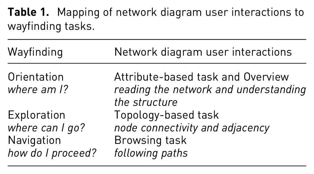
Figure 1 shows an example view of the CNE interface which users get initially at the landing phase of their interaction. Faced with a complex network diagram, it is understandable that the user would be unable to answer the first wayfinding question,
The user is interested in a specific node– for example, locus, gene, disease.
The user is interested in a set of edges for different reasons – for example, to see the strength of the colocalisation, or to find the tissue type.
The user is interested in a specific sub-network– for example, one ICD-10 category 4 or the intersection between multiple interesting categories.
In the landing phase, the user is presented with a bird’s-eye view of the network diagram in CNE.
The last question of landing phase–
Information seeking phase
After the landing phase, and once the starting point has been selected, the actual information seeking phase begins. At this point, the user has positioned themselves in the network diagram, either on a specific visual element – a node or an edge – or in a loose neighbourhood.
During the information seeking phase the user is likely to ask the same three wayfinding questions –“where am I?”, “where can I go?”, “how do I proceed?”– and carry out several network diagram interactions in an attempt to answer those questions. This process is then likely to be repeated cyclically.
Once again,
In the case of CNE, we have used the network spatialisation algorithm forceAtlas2.57,58 Using this algorithm, different communities – neighbourhoods – appear as groups of nodes drawn closer to each other, while hubs attract poorly connected nodes that are connected to them. Following this approach provides a strong visual hierarchy in the network diagram.
In addition to the above-mentioned two tasks, answering the question of “where am I?” requires performing two other related tasks: (3) attribute-based tasks, and (4) overview tasks. These tasks are also expected to be performed in a recursive manner, as the users will update their mental map of the network space. To support these tasks, CNE provides a smooth zooming and panning functionality to allow the user to move through the different viewing scales, following the example of a typical interactive map visualisation tool – for example, Google Maps. 5
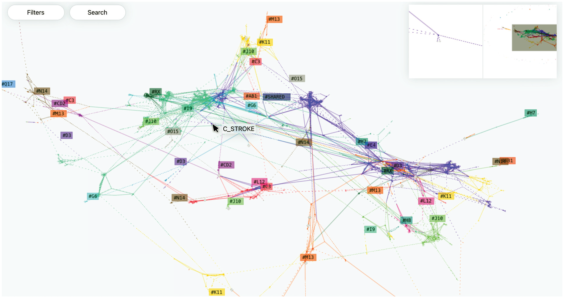
Although computationally more demanding, the fluid transition between viewing scales has been shown to help the users not to lose track of their visual reference. 59 CNE uses semantic zooming, in which the magnification factor influences different aspects of the rendering process of the network diagram, as shown in Figure 2. This semantic zooming is provided through the following three views:
Global view: is shown in Figure 2(a). In this view the disease nodes are visible, particularly interesting loci are displayed, and the names of disease nodes appear when the mouse pointer hovers over them. In addition, a set of labels – illustrating the ICD-10 code of each relevant neighbourhood – is also displayed. The labels are placed in the centroids of the clusters, obtained using the mean shift algorithm60,61 of the coordinates of the individual nodes of each separate disease group. This allows identifying the main districts as potential areas of interest in the network diagram.
District view: is shown in Figure 2(b). This view is meant for taking a closer look at the neighbourhoods, once the user has found some area that is potentially interesting. In this view, the portion of the network diagram under observation also displays the loci, their code, and neighbouring genes – visible through a label appearing when the mouse pointer hovers on them. The labels are rearranged in function of more fine-grained clusters, obtained by reducing the bandwidth in centroid calculation.
Local view: is shown in Figure 2(c). In this view, the name of each disease node appears as a label positioned close to it.
In global view (a) disease nodes are visible, with interesting loci highlighted, and disease node names appear when hovering. District view (b) provides a closer view of neighbourhoods, showing loci, their codes, and neighbouring genes when hovering. In local view (c) disease node names are displayed as labels positioned nearby.
Given the iterative nature of orientation, it is important to support the users by showing their position within the network diagram at all times – for example, showing a reference in the global view. In CNE this is achieved by adopting an overview+detail approach, displaying a miniature view of the network diagram in a separate area in the top right corner of the visualisation, and displaying the position of the main view as a grey rectangular area within the miniature view. This overview+detail approach has been found particularly useful in interactive map visualisations. 7
In addition to providing a global view, CNE also supports focus on details around the position where the mouse pointer is hovering. Our observations of the users’ interactions with early versions of the CNE prototype have shown that in the global and district views, the users require some hints to identify their precise position – as another example of the need between locating oneself locally and globally at the same time. CNE provides a magnified focus on details view of the immediate surroundings of the mouse cursor and positions it close to the global view of the network diagram. These two additional inset views support user navigation by framing the position of the main visualisation, which scale shifts between the two extremes. This weighted-triptych approach allows the three views we have identified to be available seamlessly during the process of orientation. In this way, the user can decide which level of overview they want to have, and consequently, what level of detail they need in forming and updating their mental model of the network diagram. However, in order to avoid the redundancy and the resulting hindered performance – related to overview+detail and semantic zooming as noted by Cockburn et al. 59 – we have removed the focus on details option from the local view.
The second question of
There are, however, cases in which even the immediate neighbours are located far away – in terms of the Euclidean coordinates on the visualisation display – from the selected node. This is due to the non-linear nature of the network structure where neighbours can belong to different communities or be under the influence area of different hubs. As such, the spatialisation algorithm we have used prioritises some connections over others due to the global structure of the network diagram.
In CNE, cases like this can potentially disclose relevant information about peculiarities in locus-disease interconnection. To keep track of displaced neighbours, CNE provides a scrollable list, enumerating all the nodes in the selection. When hovered over with the mouse pointer, each item in the list triggers a visual cue pointing at the relative node on the network diagram – in the form of a grey line that connects the list item and the node in the network.
A similar approach has also been adopted for cases where users would be interested in a specific sub-network. CNE makes it possible to compose such a sub-network by clicking on several new nodes, or by selecting all of the nodes belonging to, for instance, one ICD-10 category by clicking on the relative label.
The third question of
Given the semantic nature of the space represented by a network diagram, another possible browsing action is to jump from a local position to another node that is not connected to the previous one. This might perhaps be because the user wants to investigate a possible relationship between the two unconnected nodes or to start a new information seeking task from another location on the network diagram. This in turn might entail a transition back to the landing phase– that is, questioning once again the current position by asking “where am I?”.
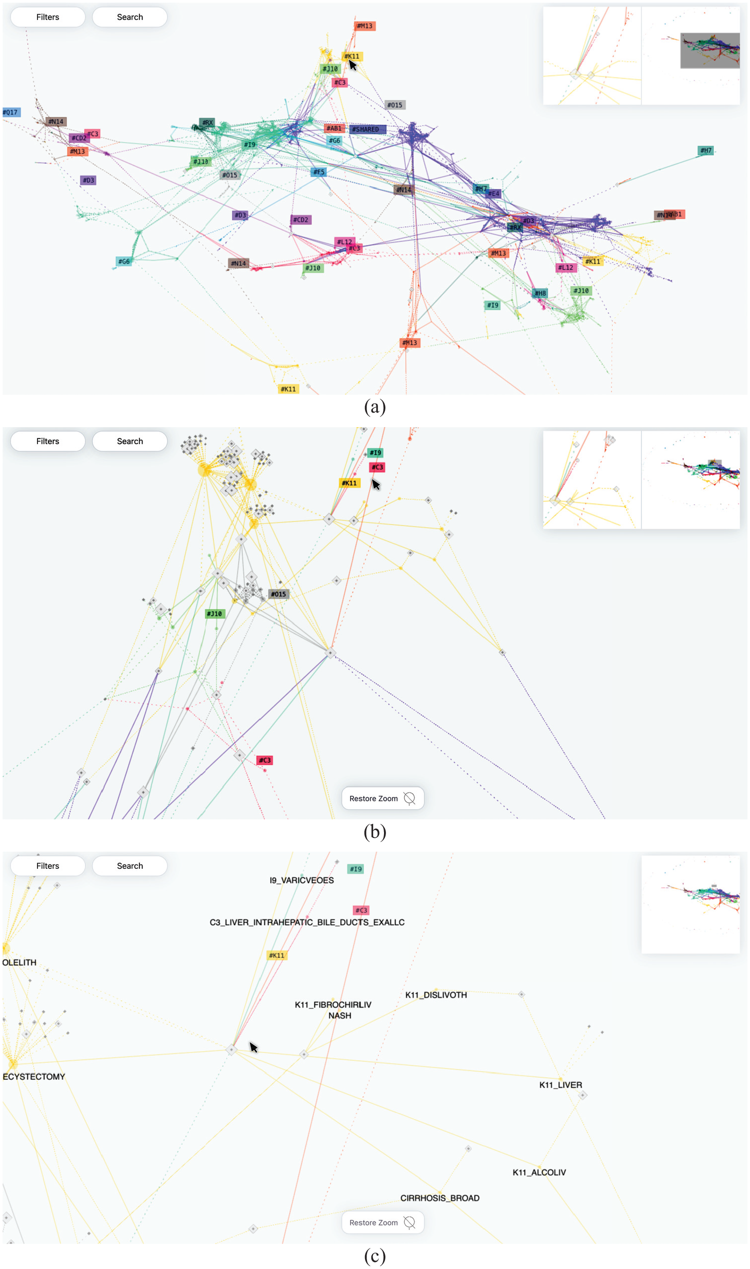
As this scenario shows, the two questions – in fact all three questions – are tightly related and the transition between the wayfinding tasks involved in answering one or the other can be fuzzy. To support the blurred relationship between information-seeking interactions, CNE provides a search menu available at all three viewing scales – global, district, and local – as shown in Figure 3.
CNE provides visual aid using grey lines to point to a single node (a), multiple nodes (b), and nodes that are not visible in the current viewport (c).
Additionally, the textual input into the search field brings up a filtered list of nodes based on the entered text. Hovering over the items on the provided list triggers a visual aid – a grey line – that points at the respective node, as shown in Figure 3(a). The visual aid works in the case of multiple nodes – see Figure 3(b)– and even when the nodes are not visible in the current viewport, as shown in Figure 3(c).
Landmarks
The concept of landmarks is another important component of the wayfinding metaphor that maps and map-like visualisations aim to support. Lynch 9 has highlighted the role of landmarks as highly visible and easily identifiable elements that support navigation tasks. Lynch further notes that effective landmarks are typically unique, memorable, and can be seen from various viewpoints, thus providing orientation in the surrounding space.
Due to its importance, CNE provides landmarks on several layers. Firstly, the network diagram generated by the force-directed layout algorithm that CNE uses usually results in an irregular structure. This means that, if the distribution of the edges is not homogeneous, the algorithm generates distinctive features in the visualised network diagram.
Secondly, employing colours to represent various categories of phenotypes distributed among neighbourhoods further improves their visual distinction. Aside from the fact that both colour and position are data-driven, and possess inherent semantic value – albeit to varying degrees – they can also function solely as orienting elements in the visualisation space. This idea is exploited particularly well in the inset, which portrays the global view. Where the shape of the network is visible and overlaps with the live position of the viewport, the user is able to locate the distinguishing visual features and move accordingly.
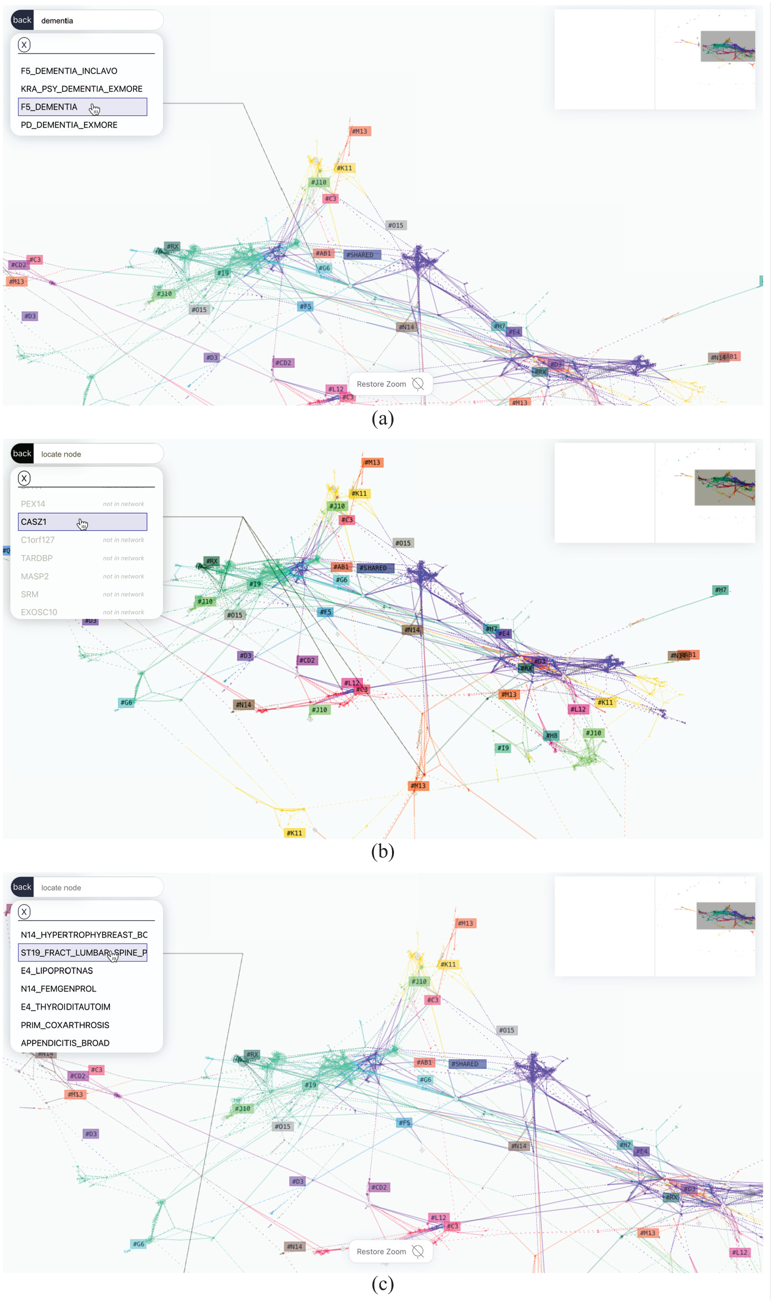
Finally, users can add personalised markers using the search function, which is meant to support complex queries. For instance, in case the user is searching for a specific gene which is part of several loci placed around the network, a set of personalised landmarks can be generated to aid the user’s navigation to different areas of interest. These landmarks can be used to navigate to a single area of interest as shown in Figure 4(a), to multiple areas of interest as shown in Figure 4(b), or to areas of interest based on exploration as shown in Figure 4(c).
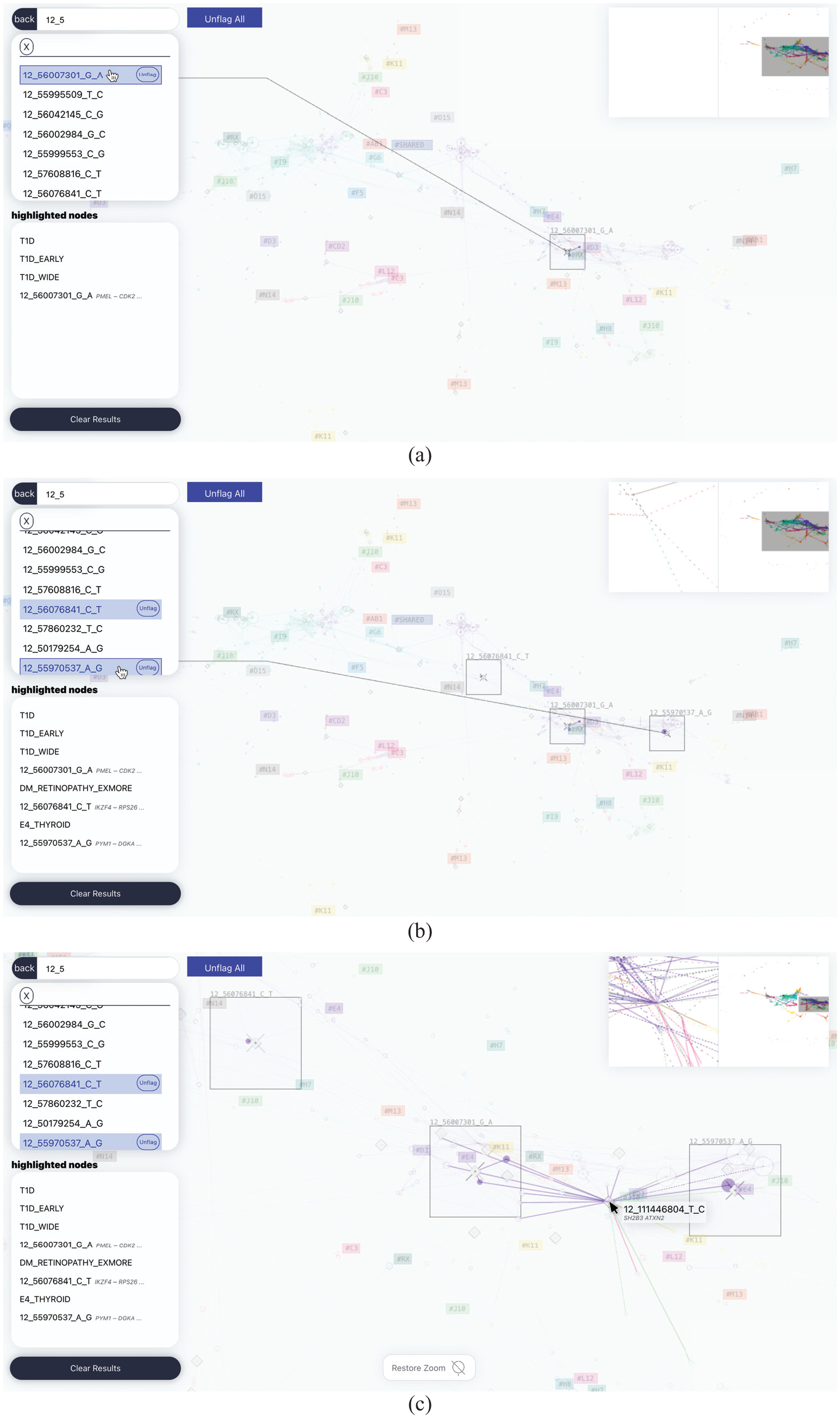
In CNE, searching allows users to flag nodes, generating highly visible boxes that mark the area where the search result is contained. This results in a set of personalised landmarks that aid user navigation to a single area of interest (a), multiple areas of interest (b), or areas of interest (c) that can be used in combination with transversal exploration to construct a sub-network encompassing relevant nodes.
End user involvement and feedback
We developed CNE through a collaborative and agile approach, 62 with the involvement of potential end users throughout the design process. This provided us with a considerable amount of feedback, a brief summary of which is presented here.
To gain insight into the usability of CNE and the effectiveness of our design-oriented approach to developing interactive visualisations, we recruited end users through a purposeful sampling approach. 63 These users had not taken part in our design process initially and were therefore unfamiliar with CNE to start with. However, they all had experience working with colocalisation data to a varying extent. The users were mainly researchers with a background in molecular medicine and bioinformatics, and they were, broadly speaking, either involved in clinical activities – that is, data gathering – or in data analysis.
The users’ overall response to CNE was a positive one, with most of them being excited about the types of new research possibilities CNE would offer. When presented with specific information-seeking tasks, users were also able to successfully retrieve the required information. In the case of articulated queries – for example, queries involving genes that appear in loci scattered across the network – the users found the interactive generation of landmarks – see Figure 4– very useful. We believe that this might be because the users did not have to remember multiple points in the network, and instead, they could focus fluidly on the surrounding area of each point of interest, and switch rapidly between different points, or compare them at different viewing scales.
However, many of our users described their initial interaction with CNE as being cumbersome, due to the large amount of information in the visualisation. The initial confusion was usually overcome with the use of the search function, which allowed the users to overlay visual cues on the position of familiar genes or phenotypes, and then proceed to interact with the network diagram. This suggests the benefits of adopting a viewing paradigm that does not prioritise the global overview.
The process of contextualising familiar information with the global structure of the data set, on the other hand, seems to have encouraged our users to explore new paths. Another viewing solution adopted in CNE is to keep the area of interest in focus while the rest of the entire structure of the network remains visible in low contrast in the background. This enables transversal navigation using an interaction pattern similar to the one used in Vizster 43 – with the main difference being that CNE highlights portions of the network until the user cancels this mode of viewing. In this mode, after selecting the node of interest, the user can proceed to expand the selection, highlighting more unrelated nodes and comparing or finding connections between sub-graphs, or excluding uninteresting nodes from the selection. In addition, hovering over a node in this mode momentarily highlights its immediate neighbourhood, which allows the user to have an overview and edit the selected portion of the network that is being explored. Despite its usefulness in supporting visual exploration, based on our end users’ feedback, this mode of viewing does not solve the initial disorientation problem encountered by them – as noted above.
After the initial interaction, and having familiarised themselves with the visualisation, our users tended to validate their domain knowledge by looking for patterns that they would expect in the data set – for example, the relation of a gene that they studied with a set of phenotypes. This validation was then followed by posing new questions and further exploration. This iterative cycle of orientation/validation and exploration covers exactly the type of user activities that CNE has aimed to facilitate, by assisting its users in finding answers to their three different questions of where am I? where can I go? how do I proceed?. Aiming to ensure that users would always be able to respond to these questions, has been a useful heuristic for guiding the design-oriented approach we have taken. This approach has helped our design process to select useful interaction methods and visualisation forms for CNE.
Finally, our users’ feedback showed that some found CNE to be too general as a tool for colocalisation studies. Despite their initial interest, several users considered CNE not useful for performing specific tasks, aside from purely exploratory ones. This led to a number of suggestions being made for including more advanced functionalities, such as basing the search on specific parameters – for example, chromosomal location – or integrating information on how genetic material affects phenotypes.
Despite this criticism, supporting free exploration of the structure of the underlying data set has proved instrumental in improving the data quality. For instance, in cases of weak statistical signal, non-significant loci were included in the data due to random noise. This was noticed by our users because big groups of loci – suspiciously close to each other in the genome – were found to cluster around certain phenotypes with fewer cases.
Explorations with stakeholders
In the course of several workshops, seminars, and co-design sessions that involved different stakeholders in addition to end users, CNE was used and then discussed from the perspective of its underlying wayfinding metaphor.
An outcome of this process was to explore different aspects of wayfinding related to the experience of using maps. One insight that emerged was that in many interactive maps – for example, Google Maps – the topological view of the terrain can be overlaid with the structure of the network of streets and other landmarks, thus adding another layer of information that can support user navigation and wayfinding.
It is possible to use the same type of information layering in interactive network diagram visualisations such as CNE to provide the necessary added data to support users’ information-seeking tasks and help their wayfinding-based navigation processes.
We took this as a starting point to devise an alternative layout algorithm for CNE, that is not force-directed but based on dimension reduction. Given the bipartite nature of the graph used in our example case, we explored the possibility of using one of the two layers – that is, the loci – to generate a topological layer that would serve as terrain, over which the network diagram of connections is displayed.
We did this by rearranging the data in a table structure, with phenotypes listed as rows and loci as columns, and the intensity index of colocalisation between rows and columns serving as the value. Using this method, we could project the phenotypes in a theoretical genetic space. We then generated a two-dimensional projection of this table.
To perform the necessary dimension reduction, we used self-organising maps, 64 implemented using the Python MiniSom package. 65 This made it possible to observe groups of similar phenotypes in the resulting visualisation. After this step, we positioned the nodes representing the loci using the centroids – calculated on the two-dimensional projection – of the sets of phenotypes that are colocalised with them. An example of the resulting visualisation is shown in Figure 5.
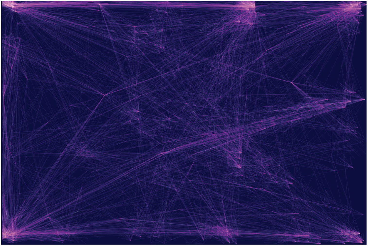
An example of the CNE projection showing the clusters of genetically similar phenotypes, aiming to provide landmarks for orientation in the topological space of the network.
Ideally, following this approach would result in tightly interconnected pairs of loci and phenotypes. Moreover, this approach tends to highlight loci associated with clusters that are distant from each other in the displayed projection. In fact, such loci will be more likely to be visually isolated. Further testing needs to be done, but the early results in terms of navigation were promising.
The interactive highlight of portions of the subnetwork was also implemented, analogously to the previous version, by clicking on a specific node the immediate neighbourhood is highlighted, allowing users to interactively expand the highlighted portion of the graph. This way, users can select interconnected portions of interest and get an idea of the nodes’ similarity and the loci’s specificity – that is, observing how many loci are interconnected in a cluster and not connecting to anything outside of it or how many edges shoot outside a community, in addition, they can focus on nodes and follow edges gaining specific understanding. Finally, in this version, the edges were colour-coded using effect size, namely the extent to which a specific variant is protective towards a certain disease (coloured white) or vice versa (coloured magenta).
Conclusions
In this article, we have discussed the concept of using wayfinding as a well-known map metaphor to guide the design-oriented approach we have taken to develop a prototype tool that aims to support users’ interactions with network diagram visualisations of complex data sets.
We have also proposed a mapping of the three main wayfinding tasks performed using maps – that is, orientation, exploration, and navigation – to three categories of network diagram user interactions.
In addition, we have provided an example case study to illustrate how this mapping could aid not only users’ interactions with a network diagram visualisation but also how it could facilitate the process of visualisation design itself.
By subdividing the interpretative task into parts that are characterised by different properties – for example, user needs – it has been possible to individuate different design opportunities. 3 Additionally, this has allowed us to identify and implement familiar network diagram functionalities that are commonly used in interactive maps.
More widely, this work also presents our attempt at better understanding the concept of complexity, particularly as it relates to visual complexity. Our longer-term goal is to analyse visual complexity in the context of other types of visualisations – not just network visualisations – used to represent large multi-dimensional data sets.
Based on these future analyses, we aim to formulate appropriate means of dealing with complexity in a wide range of visualisations. As part of this, we will investigate how different types of metaphors – for instance “open” metaphors – can be used to support the design of visualisations for complex data sets and users’ interactions with those visualisations.
Footnotes
Funding
Ethics statement and materials and methods
Patients and control subjects in FinnGen provided informed consent for biobank research, based on the Finnish Biobank Act. Alternatively, separate research cohorts, collected prior the Finnish Biobank Act came into effect (in September 2013) and start of FinnGen (August 2017), were collected based on study-specific consents and later transferred to the Finnish biobanks after approval by Fimea (Finnish Medicines Agency), the National Supervisory Authority for Welfare and Health. Recruitment protocols followed the biobank protocols approved by Fimea. The Coordinating Ethics Committee of the Hospital District of Helsinki and Uusimaa (HUS) statement number for the FinnGen study is Nr HUS/990/2017. The FinnGen study is approved by Finnish Institute for Health and Welfare (permit numbers: THL/2031/6.02.00/2017, THL/1101/5.05.00/2017, THL/ 341/6.02.00/2018, THL/2222/6.02.00/2018, THL/283/ 6.02.00/2019, THL/1721/5.05.00/2019 and THL/1524/ 5.05.00/2020), Digital and population data service agency (permit numbers: VRK43431/2017-3, VRK/6909/2018-3, VRK/4415/2019-3), the Social Insurance Institution (permit numbers: KELA 58/522/2017, KELA 131/522/2018, KELA 70/522/2019, KELA 98/522/2019, KELA 134/522/2019, KELA 138/522/2019, KELA 2/522/2020, KELA 16/522/ 2020), Findata permit numbers THL/2364/14.02/2020, THL/ 4055/14.06.00/2020, THL/3433/14.06.00/2020, THL/4432/ 14.06/2020, THL/5189/14.06/2020, THL/5894/14.06.00/ 2020, THL/6619/14.06.00/2020, THL/209/14.06.00/2021, THL/688/14.06.00/2021, THL/1284/14.06.00/2021, THL/ 1965/14.06.00/2021, THL/5546/14.02.00/2020, THL/2658/ 14.06.00/2021, THL/4235/14.06.00/2021 and Statistics Finland (permit numbers: TK-53-1041-17 and TK/143/ 07.03.00/2020 (earlier TK-53-90-20) TK/1735/07.03.00/ 2021). The Biobank Access Decisions for FinnGen samples and data utilised in FinnGen Data Freeze 8 include: THL Biobank BB2017 55, BB2017 111, BB2018 19, BB 2018 34, BB 2018 67, BB2018 71, BB2019 7, BB2019 8, BB2019 26, BB2020 1, Finnish Red Cross Blood Service Biobank 7.12.2017, Helsinki Biobank HUS/ 359/2017, Auria Biobank AB17-5154 and amendment #1 (August 17 2020), AB20-5926 and amendment #1 (April 23 2020), Biobank Borealis of Northern Finland 2017 1013, Biobank of Eastern Finland 1186/2018 and amendment 22 § /2020, Finnish Clinical Biobank Tampere MH0004 and amendments (21.02.2020 & 06.10.2020), Central Finland Biobank 1-2017, and Terveystalo Biobank STB 2018001. We want to acknowledge the participants and investigators of FinnGen study. The FinnGen project is funded by two grants from Business Finland (HUS 4685/31/2016 and UH 4386/31/2016) and the following industry partners: AbbVie Inc., AstraZeneca UK Ltd, Biogen MA Inc., Bristol Myers Squibb (and Celgene Corporation & Celgene International II Sárl), Genentech Inc., Merck Sharp & Dohme Corp, Pfizer Inc., GlaxoSmithKline Intellectual Property Development Ltd., Sanofi US Services Inc., Maze Therapeutics Inc., Janssen Biotech Inc, Novartis AG, and Boehringer Ingelheim. Following biobanks are acknowledged for delivering biobank samples to FinnGen: Auria Biobank (www.auria.fi/biopankki), THL Biobank (www.thl.fi/biobank), Helsinki Biobank (www.helsinginbiopankki.fi), Biobank Borealis of Northern Finland (https://www.ppshp.fi/Tutkimus-ja-opetus/Biopankki/Pages/Biobank-Borealis-briefly-in-English.aspx), Finnish Clinical Biobank Tampere (www.tays.fi/en-US/Research_and_development/Finnish_Clinical_Biobank_Tampere), Biobank of Eastern Finland (www.ita-suomenbiopankki.fi/en), Central Finland Biobank (www.ksshp.fi/fi-FI/Potilaalle/Biopankki), Finnish Red Cross Blood Service Biobank (www.veripalvelu.fi/verenluovutus/biopankkitoiminta) and Terveystalo Biobank (www.terveystalo.com/fi/Yritystietoa/Terveystalo-Biopankki/Biopankki/). All Finnish Biobanks are members of BBMRI.fi infrastructure (www.bbmri.fi). Finnish Biobank Cooperative -FINBB (https://finbb.fi/) is the coordinator of BBMRI-ERIC operations in Finland. The Finnish biobank data can be accessed through the Fingenious® services (![]() ) managed by FINBB.
) managed by FINBB.