
Abstract
Word Rain is a development of the classic word cloud. It addresses some of the limitations of word clouds, in particular the lack of a semantically motivated positioning of the words, and the use of font size as a sole indicator of word prominence. Word Rain uses the semantic information encoded in a distributional semantics-based language model – reduced into one dimension – to position the words along the x-axis. Thereby, the horizontal positioning of the words reflects semantic similarity. Font size is still used to signal word prominence, but this signal is supplemented with a bar chart, as well as with the position of the words on the y-axis. We exemplify the use of Word Rain by three concrete visualization tasks, applied on different real-world texts and document collections on climate change. In these case studies, word2vec models, reduced to one dimension with t-SNE, are used to encode semantic similarity, and TF-IDF is used for measuring word prominence. We evaluate the technique further by carrying out domain expert reviews.
Keywords
Introduction
The word cloud is a frequently used method for visualizing text content. 1 In its arguably most common form, words are arranged with a layout that packs the words to minimize the overall area used, that is, with a layout that lacks semantic meaning. Words are typically displayed with a larger font the more frequently they occur in the text, see Figure 1 for an example.
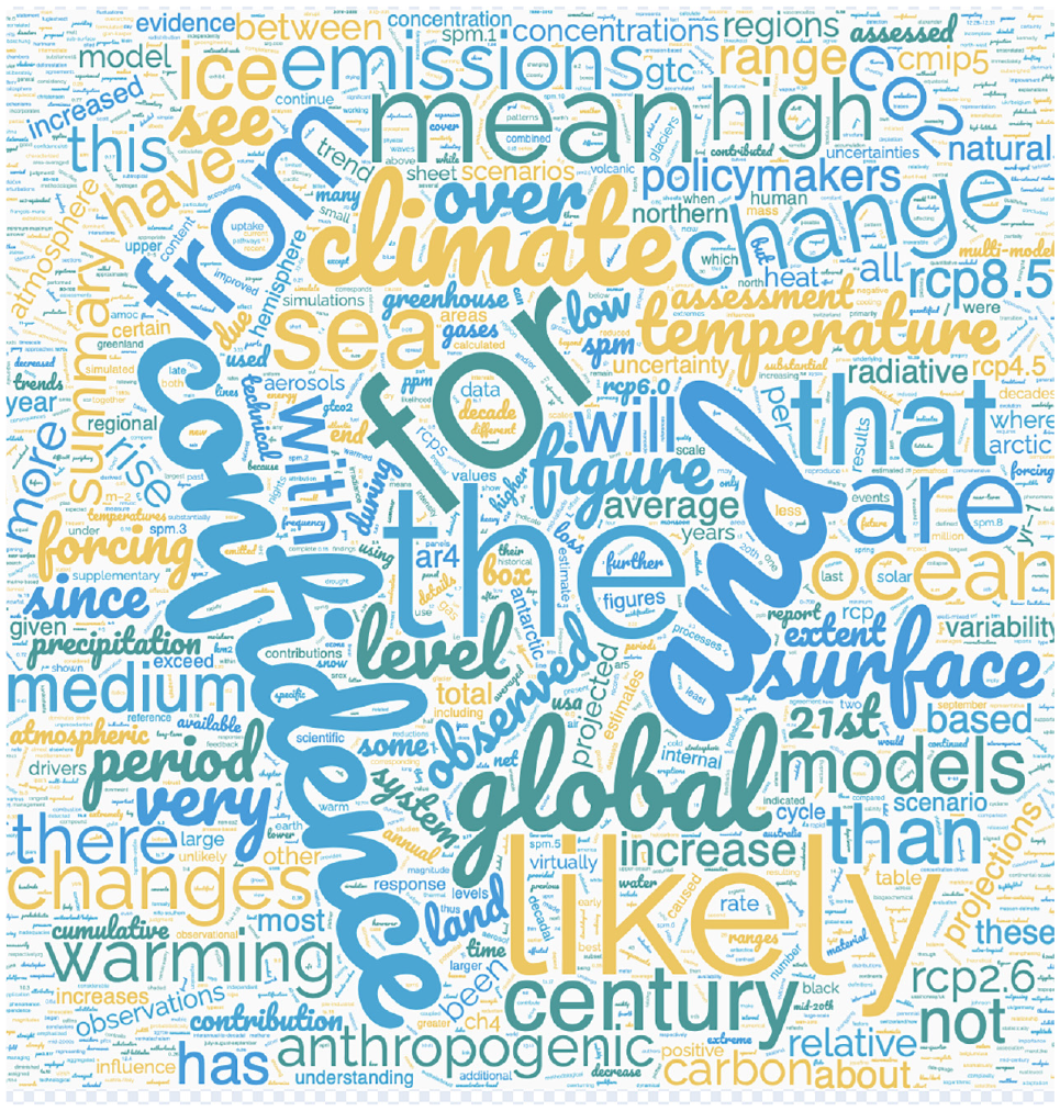
An example of a classic word cloud generated at wordclouds.com for the IPCC report “Climate Change 2021: The Physical Science Basis, Summary for Policymakers.”
One of the reasons for the popularity of this visualization technique could be that there are several easy-to-use services for automatically generating word clouds from a text. Another reason for the popularity of the word cloud might be that the need to create a compact and static visualization of a text often arises, and a word cloud can provide such a visualization.
However, criticism has been raised against some of the visualization principles underlying the classic word clouds. For instance, it is easy to mistakenly infer a semantic interpretation of the positioning of the words, when no such meaningful interpretation exists. 2 To use font size as the sole indication of a word’s significance is also problematic. Longer words might then be perceived as more important, since their length make them take up more of the space in the word cloud. 1 Additionally, the lack of a semantically motivated word positioning makes it difficult to compare the content of two word clouds. Corpus comparison is a task that often arises within digital humanities, for example, when comparing the content of two corpora of different genres, or when visualizing difference over time in corpora that span multiple years or even decades.
Therefore, based on previous criticism of word clouds, as well as on previous research in which the classic word cloud has been developed with new features, we here present, exemplify and evaluate a refinement of the classic word cloud representation, which we call Word Rain.
We exemplify the Word Rain technique by applying it to three separate tasks: (i) Showing differences between texts belonging to different text sub-genres. (ii) Detecting temporal differences in a corpus that spans several years. (iii) Generating candidates for new words to add to a specialized glossary. The motivation and the main application scenario for this work are rooted in digital humanities, and explorations of different types of texts on the topic of climate change are used in all three case studies.
We have chosen climate change as the example topic since it is both highly discussed and current, with texts readily available from a number of different genres and eras. We also perform a review of the Word Rain technique with researchers who have different kinds of expertise within this domain.
Background and related work
The word cloud is a widely used text visualization3–5 technique that can be traced back to the “psychological maps” by Milgram and Jodelet, 6 as discussed by Viégas and Wattenberg. 1 Another prominent earlier example of word clouds can be found on the cover of the 1992 German edition of “Milles Plateux” by Deleuze and Guattari. 7 The interest for this visual representation technique and its practical applications can be observed outside and within the academic environment, including the information visualization, visual analytics, and human-computer interaction research fields, where various usability concerns associated with the use of this technique are often raised. In the rest of this section, we discuss the relevant prior work on design, evaluation, and application of word clouds that will provide foundation for our proposed technique.
General design considerations
The
Still, the interest for
Advanced techniques and applications
A number of
Another direction of research has focused on
Finally, besides the techniques focusing on the word cloud as the final result in itself, the prior work in information visualization and visual analytics has proposed various approaches for the actual use of word clouds for
Several approaches have focused on word clouds / keyword summaries for
Further examples of the use of more or less traditional tag/word clouds as additional views within visualization tools (e.g. word clouds used as a supplementary view for metro map-inspired representations 42 ) or customization of node/link label attributes within dimensionality reduction or network visualization approaches (as used by FacetAtlas, 43 for instance) can be found in the literature, but these topics are beyond the scope of our study.
Word clouds in the wild
The popularity of tag clouds during the rise of Web 2.0 and availability of both offline and online word cloud generator tools such as Wordle, 9 which allowed quite a large degree of customization to the end users with respect to the font families, colors, etc., led to the wide adoption of this visualization technique among the general public, but also across various academic environments (word clouds can support, for instance, investigation of the language use and lexical semantic change over time 44 ). As mentioned above, the prior work has discussed this phenomenon and proposed several feasible explanations as well as perspectives on the use of word clouds1,8; such perspectives could be related to the existing discussions of the need to consider not only the analytical perspective in information visualization, 45 as well as the preference of even advanced users (with respect to the level of technical knowledge) for more straightforward techniques (“simple is good”). 46 Nevertheless, the question of whether the target audience always understands the encoding used for word clouds created by themselves or other authors as opposed to appreciating its esthetics without focusing on the contents remains generally unanswered. In relation to this, ongoing discussions of the concept of “visualization literacy” 47 should also be mentioned, in addition to the word cloud-specific work discussed above.
The existing authoring tools for web clouds include, among others, a number of freely available methods for automatically generating standard word clouds, both web pages and programing packages (e.g. http://amueller.github.io/word_cloud/). Figure 1 shows an example word cloud generated from one of the many services available (More specifically from https://www.wordclouds.com/). These services often provide several configuration parameters, but still typically adhere to the main principles of the standard word clouds. That is, to indicate word prominence (based on word frequency) with font size, and to not provide any semantic justification for how the words are positioned. Additionally, some of the more advanced tools developed within the information visualization community are made available in form of the source code, offline applications, or online tools (e.g http://wordcloud.cs.arizona.edu/2).
The applications of word/tag clouds “in the wild” include the roles of (i) graphical user interface elements, allowing for the discovery of particular web pages or data items; (ii) esthetic infographic representations of data; and (iii) actual tools for providing an overview of potentially large text documents/corpora. The latter case can also be related to interactive exploration of social media data 48 and close/distant reading methodologies in digital humanities 49 ; here, the use of word clouds is supported by a number of popular existing software suites, including Voyant Tools by Sinclair and Rockwell,50,51 for instance.
Word Rain: Data processing and visual encoding steps
We mainly focused on addressing two of the problems identified in previous research, which were also mentioned in the introduction. These are: (i) that word positions lack semantic meaning (and the resulting difficulties in comparing word clouds), and (ii) that font size as the sole prominence indicator results in longer words being perceived as more important than shorter ones.
Important for any new version of word clouds is to still retain as much of the simplicity as possible of the traditional word cloud. In particular, simplicity in that it should be possible to provide all of its visualization features in the form of a clear static image. That is, a static image that could either be provided digitally, or on a printed paper or poster, and that fills the same role of providing an overview of textual content as the traditional word cloud does today. In addition to addressing the two limitations mentioned above, this has been our main aim when designing Word Rain.
In Figure 2, the new design is summarized, and the difference between the classic word cloud (left) and the Word Rain representation (right) is shown. (I) Words in the word cloud are positioned without taking semantics into account, while Word Rain positions similar words close to each other on the horizontal axis. The semantically similar words A1–A3 are positioned close to each other, as are the semantically similar words B1–B2. This is achieved by using the information encoded in a multidimensional language model 52 built on distributional semantics, and projecting the model into one dimension 53 to use as the word’s position on the x-axis. (II) In the typical word cloud to the left, word prominence is only indicated by font size. In word rains, font size is still used as a prominence indicator. Prominence is, however, also indicated by the height of bars connected to the word, and by the vertical position of the word.
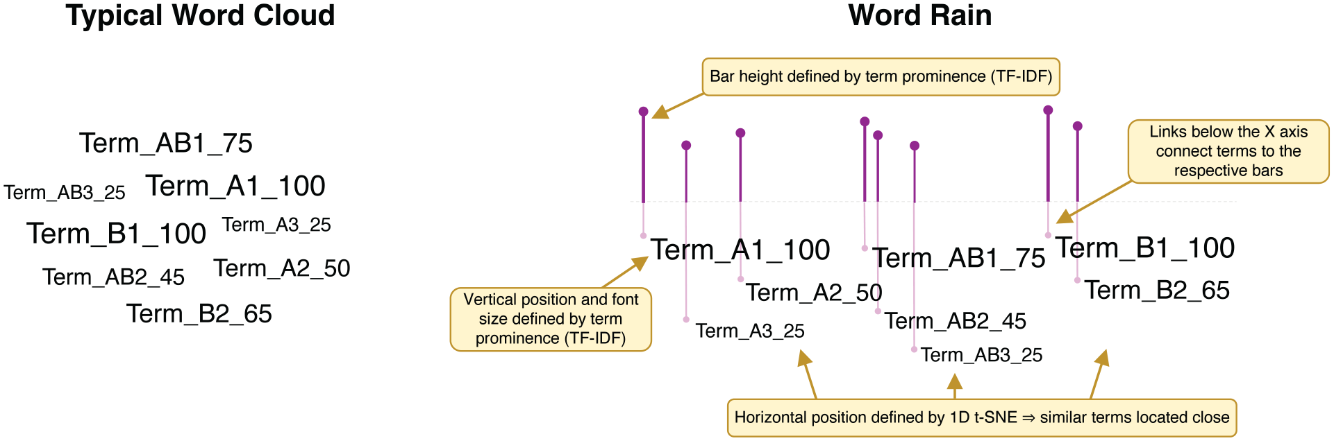
Illustrative examples of a typical word cloud (left) and our proposed Word Rain representation (right). In these examples, terms A1–A3 are semantically close, while being distant from terms B1–B3 and somewhat distant from terms AB1–AB3. Numerical weight (25–100 in these examples) indicates the prominence of the respective term.
The vertical structure of the visualization, with words of lower prominence being positioned below those of higher prominence, gave us the impression of words falling downwards, as if they were raining, hence the name “Word Rain”.
Figure 3 shows an example of a word rain generated from an IPCC report summary. In the following sections, we will in more detail describe the technique for generating word rains.
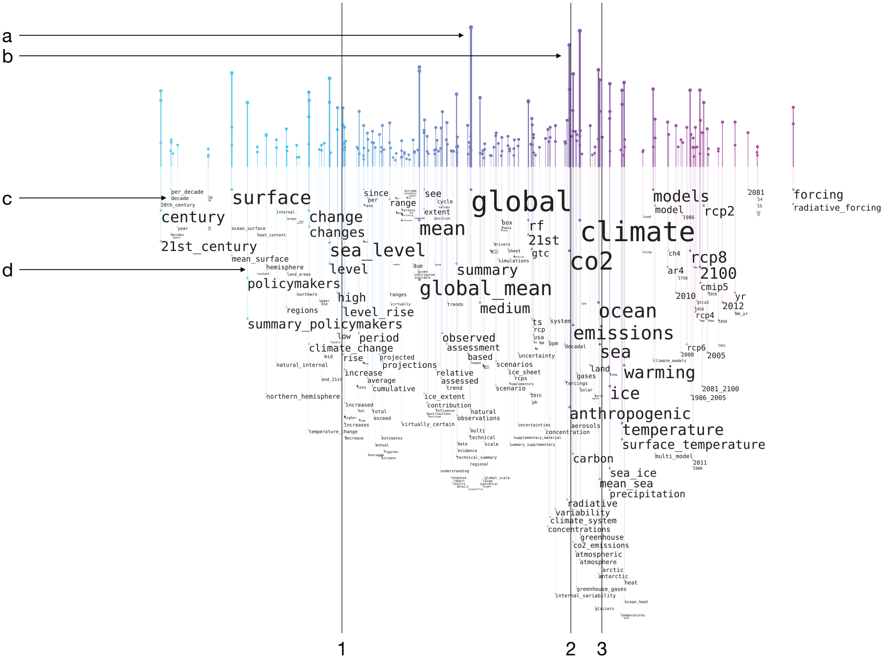
A word rain for the IPCC report “Climate Change 2021: The Physical Science Basis, Summary for Policymakers.” English stop words from NLTK was used, as well as a manually compiled stop word list, which, for example, included the words “likely” and “confidence.” The lines 1–3 and arrows a–d are added for explanatory purposes and are not part of the graph. The lines exemplify groups of similar words, that is, words signifying increase/decrease (1), “co2”/“emissions”/“carbon”/“greenhouse gases” (2), and “sea”/“ocean” (3). The letters indicate: the bar connected to the most prominent word (a), a highly populated semantic region (b), the words “decade”/“century”/“surface” which exemplify when words have (and have not) been moved downwards to avoid collision (c), and finally the connecting line to “policymakers”/ “summary_policymakers” (d).
Determining which words to display
The most basic principle of word clouds is retained in the Word Rain technique, that is, to extract the most prominent words of the text collection, and include these in the visualization.
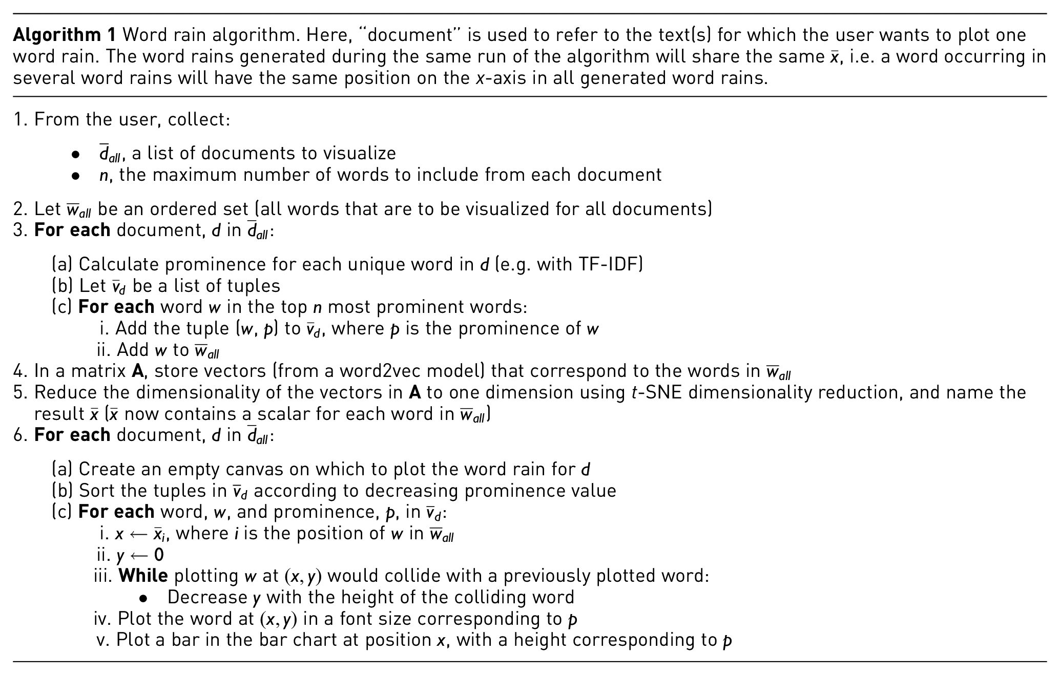
As the default method for creating a word rain, we determine a word’s prominence by its TF-IDF-value (term frequency, inverse-document-frequency), 54 that is, by the number of times a word occurs in a text divided by the total number of texts in which the word is present. The inverse document frequency can by configuration either be (i) computed based on the presence of the word in a number of documents, that each of them is visualized by a word rain, or (ii) by calculating the document presence of the word in a background corpus that is not visualized, but has the sole purpose of providing inverse-document-frequency statistics. It is also possible to configure the visualization functionality to use raw term frequency (without inverse document frequency) as the measure of word prominence.
The user can configure how many (i.e. the top
Horizontal word positioning
The type of model used to achieve a semantically motivated word positioning is a language model built on distributional semantics. That is, on the notion that words with a similar meaning, for example, “tea” and “coffee,” often occur in similar contexts. 55 The distributional semantics data representation is captured by multidimensional vectors. 56 By applying dimensionality reduction, 16 it is possible to retain some of the information of the model when projecting it into a one-dimensional space. The scalar representing the word in one-dimensional space is used for positioning the word on the x-axis. Thereby, semantic closeness of words will be represented by horizontal closeness in the Word Rain visualization.
We use a word2vec model 52 to encode the distributional semantics information, and a t-SNE dimensionality reduction 53 to reduce the information to one dimension. How the horizontal position of the words is determined is described in more detail in steps 1–5 in Algorithm 1.
Examples of horizontal positioning can, for instance, be seen in Figure 3. Words signifying increase/decrease are positioned around the horizontal position 1 (Figure 3). The words “co2,”“emissions,”“carbon,” and “greenhouse gases” are positioned around position 2 (Figure 3), and the two words “sea” and “ocean” are positioned very close to each other at position 3 (Figure 3). When using the same t-SNE projection for a number of texts that are to be compared, it is possible to use the position on the x-axis for comparing the texts. For the three texts in Figure 4, the same t-SNE projection was used, and the word positioning can therefore be used for comparing the text content. This is also the case for the two texts in Figure 6.
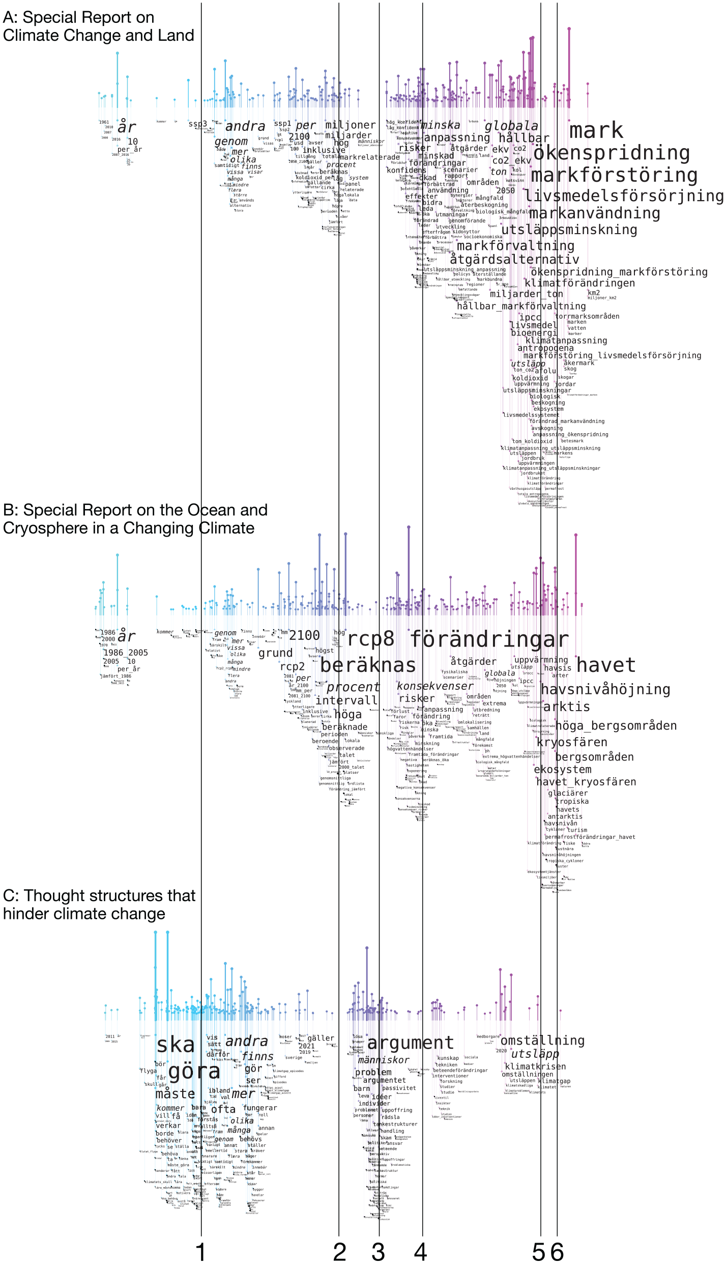
Word rains for Swedish translations of two IPCC technical reports from 2019: (a) Special Report on Climate Change and Land, 65 (b) Special Report on the Ocean and Cryosphere in a Changing Climate, 66 (c) A report on thought structures that hinder climate change mitigation. 67 The lines indicate clusters of prominent words for Figure A and B (2, 4, 5 and 6), and Figure C (1 and 3), respectively.
Word rain for the most frequent words (stop words excluded) in the entire corpus of climate change editorials from Nature.
Vertical word positioning
The vertical position of a word is adapted to the position of other, more prominent words of the cloud. That is, if the x-coordinates of two words are such that the words overlap, the least prominent of them is moved downwards (i.e. “raining down” in the figure) until a position is found where the word does not collide with a more prominent one. Thereby, the more prominent a word, the higher up on the x-axis it is typically positioned.
For instance, at the area at point c in Figure 3, the word “century” has been moved down, not to collide with the more prominent word “surface.” The word (or more specifically bigram) “per_decade,” on the other hand, does not collide with a more prominent one (since “century” has been moved downwards), and retains a high position in the word rain.
How the vertical word position is determined is described in more detail in step 6b–6c in Algorithm 1.
Font size
Despite the criticism raised against using font size as an indication of prominence, we decided to keep it as one of the prominence indicators. Partly because the prevalent use of font-size-based word clouds has made font size somewhat of a standard indicator of prominence. But also, and more importantly, because the use of different font sizes together with a semantically meaningful word positioning makes it possible to support the standard “overview first, then details on demand” workflow. 57 When starting to look at the word rain, words displayed with a large font will stand out and provide a quick overview of the most important content. It is thereby possible for the user to search for areas of the word rain with semantically interesting content and to focus the attention on those areas. This functionality is particularly powerful when a word rain is viewed on a computer screen, rather than on paper. The less prominent words might then be displayed in a font size too small to read when the image is shown in its original size, and details in semantically interesting areas can be explored by zooming in on and enlarging these areas (In order not to make the examples here too cluttered if printing them on paper, fewer words are included than if the word rains would be produced to read solely on a computer screen). For instance, the user might find “co2” and “carbon” at position 3 in Figure 3 interesting, zoom in on the region around position 3 and find, for example, “aerosols” and “greenhouse_gases.” The usefulness of the semantic positioning is particularly evident when comparing the word rain to the type of classic word cloud shown in Figure 1. This word cloud similarly includes words displayed with a very small font. However, since their position in the cloud is random, there is no possibility to explore them by zooming in into interesting areas.
The bar chart and connecting lines
Since the vertical positioning of a word does not follow directly from its prominence value, but is also dependent on its interaction with other words in the cloud, the y-coordinate of a word does not suffice for showing its importance. A bar chart with vertical bars above the words, with a height proportional to the word’s prominence, is therefore also used as word prominence indicator. Each word is linked with its corresponding bar in the bar chart with a semi-transparent line from the upper-left corner of the word. In Figure 3, point a is the highest bar, which is connected to the word “global,” and point b is a cluster of bars which indicate that there are a number of words with high prominence in that semantic region, as well as many non-prominent words. Finally, point d exemplifies a connecting line to the words “policymakers” and “summary_policymakers.” To emphasize the semantic x-axis, the bar chart (as well as the lines connecting the words to the bar chart) is colored with a gradient where the color corresponds exactly to the x value, thus the color coding is not designed to provide any independent information. A color gradient from turquoise to magenta was chosen, which maintains a reasonable contrast to the white background – also when printing in black and white – and which avoids a wide color range that might distract the readers (however, we acknowledge that further considerations for the choice of this supplementary color map 58 can be considered part of future work). The semantic similarity/dissimilarity of words is thus double-encoded by position on the x-axis and by the color of its corresponding bar in the bar chart.
Additional configuration possibilities and code availability
For all user-defined parameters, except which corpus and word2vec-model to use, a default configuration is provided. There are, however, a number of additional possibilities for configuring the Word Rain technique. For instance, which maximum font size to use and how much to move the words on the vertical axis when they collide. These two parameters, together with the number of words to show, regulate the airiness/clutter of the visualization (If there are uninteresting words that receive a high prominence value and thus will be displayed with a large font, adding these to the stop word list will reduce the clutter).
Another parameter is the option to extract and visualize n-grams 59 instead of, or in addition to, individual words. For n-grams, the word2vec-vector corresponding to the last word in the n-gram is used. This often works well for languages where the specifying word comes before the more generic word in a compound (e.g. adjective before noun), as is the normal case in Germanic languages like English, but might have to be adjusted for other languages.
Code for generating the word rains is available with an open license on GitHub (https://github.com/CDHUppsala/word-rain). The current implementation relies on Matplotlib 60 for rendering.
Apart from the code on GitHub and the text collection(s), a word2vec model for the language of the texts is needed for generating the word rains. This model could either be trained on the corpora for which word rains are generated, if these corpora are large, or on another corpus (For the word rains generated here we used a Swedish word2vec model found at http://vectors.nlpl.eu/repository/ and an English model that is now found at https://huggingface.co/fse/word2vec-google-news-300).
The word clouds are produced as fully searchable PDF files. Thereby, it is also possible to explore the cloud through searching for a particular term of interest and then, for example, explore the semantic neighborhood of that term. The word cloud generation functionality aims to be language independent, although the quality of the word2vec-models required for the visualization will be lower for languages with only a small amount of digital text available. The division of texts into tokens and n-grams relies on word boundaries being indicated by white space. Written languages for which this is not the case, for example, Japanese and Chinese, therefore require a pre-processing step where white space is inserted between tokens. 61 We have so far tested the functionality on texts written in English, Swedish, and Yiddish (using the Hebrew alphabet).
IPCC report example
The example in Figure 3 shows a word rain for the IPCC report “Climate Change 2021: The Physical Science Basis, Summary for Policymakers” (We extracted plain text from the PDF using the Poppler package https://poppler.freedesktop.org). 62 We configured the visualization to include the 300 most prominent words or bigrams, where prominence was based on TF-IDF. For calculating the background document frequency statistics, we used paragraphs from a small subset of “the British National Corpus.” 63 Each paragraph in the background corpus was counted as a document for the inverse document frequency statistics. We use the English stop word list from the NLTK Python programing package 64 as well as a list of seven manually compiled stop words (The entire list: “confidence”, “spm”, “10”, “11”, “12”, “13”, “figure”, “likely”).
Example applications for Word Rain
We applied the Word Rain visualizations to three separate tasks: (i) To visualize differences between different sub-genres, (ii) to visualize differences between documents over time, and (iii) to visualize the coverage of a lexical resource on a document type.
Differences between sub-genres
Many different kinds of reports – and other types of texts – on the topic of climate change are produced. We generated word rains for three different climate change reports: Swedish translations of two IPCC technical reports from 2019, Special Report on Climate Change and Land, 65 and Special Report on the Ocean and Cryosphere in a Changing Climate, 66 as well as for a report on thought structures that hinder climate change mitigation. 67 That is, two technical reports describing effects on nature from climate change and one report within a very different sub-field, the field of rhetoric/behavioral science.
The 300 most prominent words, based on TF-IDF, were included in the word rains. Since the aim was to compare the content of the three reports, only word occurrence in these three documents was used for calculating the IDF value. That is, in contrast to the previous example on English text, no background corpus was used for calculating document frequency statistics.
The same t-SNE projection was used for all three visualizations, that is, a t-SNE projection that included the vectors corresponding to all words that were to be included in the three word rains. Thereby, the horizontal word positioning of the three visualizations shares the same semantic interpretation, and can thus be compared.
In Figure 4, the resulting word rains for the three reports are compared. The result of the visualizations is that the “word rain profiles” for the two technical IPCC reports are very similar (Figure 4(a) and (b)). Both have their most prominent words positioned at the right end of the graph (at positions 5 and 6), while moderately prominent words are positioned in two clusters in the middle of the word rain (positions 2 and 4). It is particularly interesting that the two profiles are very similar, despite their most prominent words being different. With the Word Rain technique it seems to be possible to illustrate semantics on a more abstract level than the word level.
The profile for the human thought structure report has a very different profile (see Figure 4(c)). The areas important for the other two reports are almost empty for this report. Conversely, most words from report C are positioned around positions 1 and 3, areas that are almost empty for the two technical reports. We, by no means, claim that these examples show that the word rain profile can be used for giving an objective measure of the similarity or differences between texts. In contrast, the examples given here were actively selected based on them being two texts belonging to a narrow sub-genre of climate change reports, and another text belonging a totally different sub-genre. But we do claim that a word cloud, in which the words are given a semantically meaningful positioning, offers the possibility to provide useful information on the semantic content of the text. It is particularly valuable that such a word cloud might provide semantic information on a more abstract level, that is, information that lies beyond the individual words. For the standard word cloud, which does not employ any meaningful semantic information for the word positioning, this opportunity is lost.
Differences over time
For evaluating the Word Rain visualization on the task of showing differences in the content of a corpus over time, we used a previously compiled corpus of editorials. The corpus consists of editorials from Nature and Science that contain climate change related keywords and that were published between the years 1969 and 2016.
The corpus is divided into six eras centered around the publication of the IPCC assessment reports. The corpus is manually annotated for eight different frames used by the editors when discussing climate change, for example, if solving climate change is framed as a technological challenge, an economical challenge, or a scientific challenge. 68
It has also previously been shown that many of the general trends found by the manual annotations were possible to detect by applying automatic methods, in the form of topic modeling, to the corpus. 69
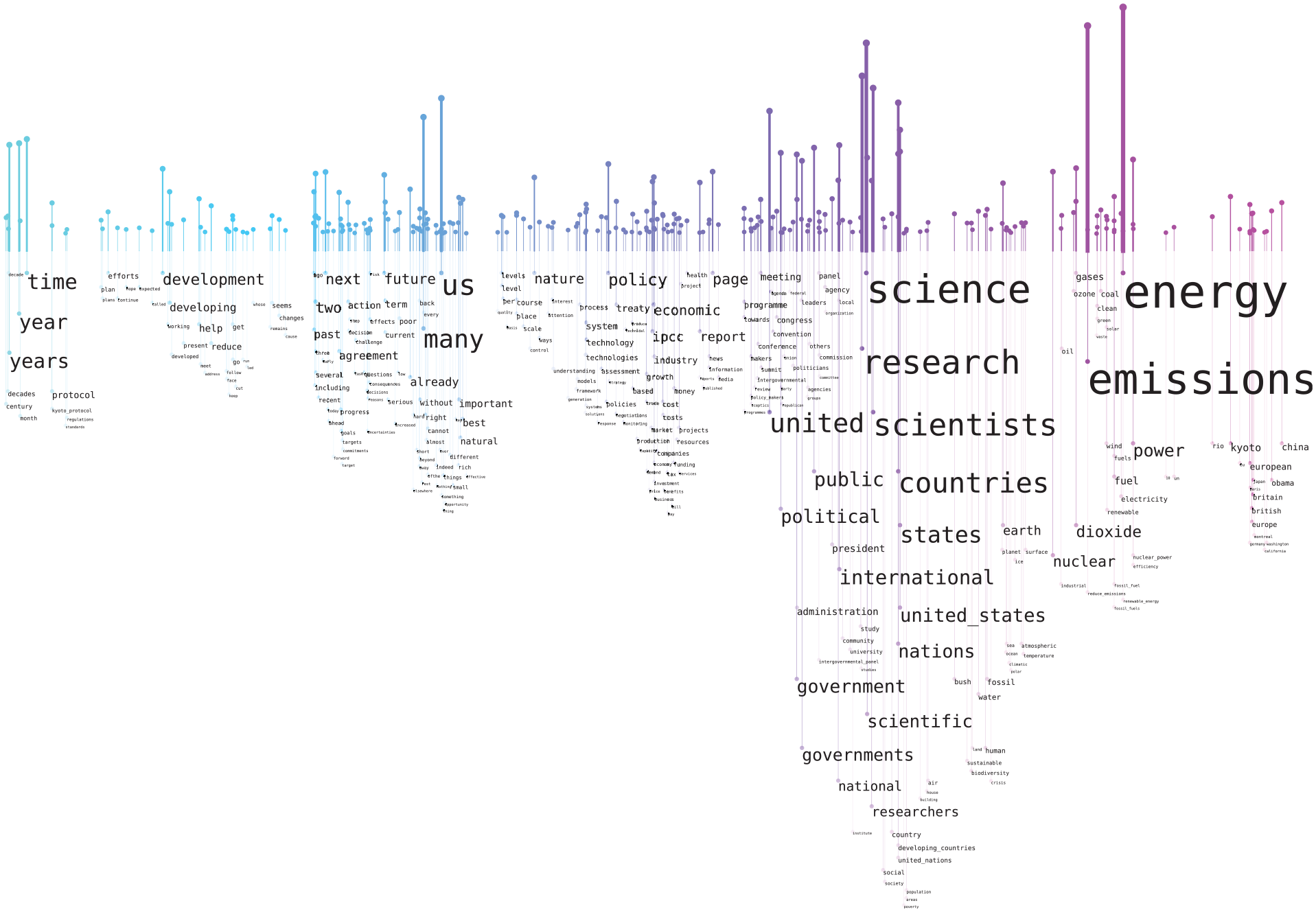
We here used only the editorials from Nature, and applied the same era divisions used in the two previous studies. For each era, we created a word rain, using the same t-SNE projection to make them comparable. We tried different word rain configurations, for example, regarding number of words to show, cut-offs for maximum and minimum word occurrences, and whether to use TF-IDF or raw frequency. We here include results from the configurations we found most useful, which was to use raw term frequencies together with an extensive stop word list produced in the previously mentioned topic modeling-based study. The top 300 words were included. Figure 5 shows the word rain for the entire period and Figure 6 shows visualizations for two of the six eras (1988–1992 and 2006–2010). For the era-specific visualizations, words that occurred in all of the six eras are excluded. Thereby, the visualization is more focused on words that stood out for one or several eras.
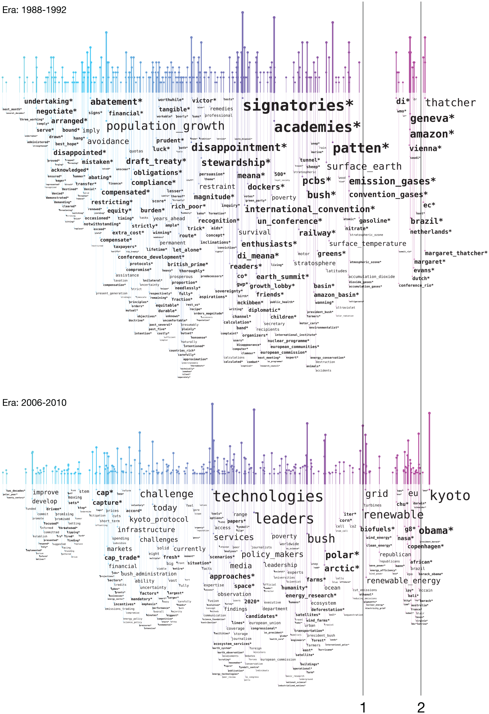
Word rains for the eras 1988–1992 and 2006–2010 in the corpus of climate change editorials from Nature. While Figure 5 shows the most frequent words for the entire corpus, the most frequent words for each era are shown here, but with words occurring in all eras excluded. New words, that is, words that have not occurred in a previous era in the time series visualized, are presented in bold and marked with an asterisk (*). Line 1 indicates words related to types of energy, which only occur in the 2006–2010 era, and 2 indicates words signifying person and place names in both eras.
To give an additional indication of novelty in a new era, we implemented the functionality of presenting new words in bold and marking them with an asterisk (*). That is, if a word has not been present in the visualization series for a previous time era, this word is marked with an asterisk. For instance, there is something that is starting to be a disappointment in the era 1988–1992, while discussions about “polar” and “arctic” are becoming important in the 2006–2010 era. The asterisks, however, are only meant to give new words extra focus, and not as a replacement for comparing the graphs themselves. Since a specific word always appears on the same x-coordinate within a time series, it is always possible to look for the word or word cluster manually in graphs from previous eras.
From the all-eras (see Figure 5) word rain, it can be seen that a few words are very dominating, mainly words related to science, but also the words “energy”/“power” and “emissions.” Although relevant conclusions, the same information could have been provided with a standard word cloud. When comparing the two eras, the benefit of the word rain becomes more evident. It can be seen that both have a spike in the right-most region (Figure 6, position 2), with words signifying person and place names. When applying the “details on demand” workflow and zooming in, it is evident that the names and places vary. In the first era, Margaret Thatcher is frequently mentioned, as well as the Amazon, and the place for the important climate change summit is Rio. Barack Obama is instead the most frequently mentioned person in the second era and the place for the climate summit (or treaty) changes to Kyoto. Such semantic-based comparisons would have been difficult to make if using a classic word cloud.
It can also be seen that the era 1988–1992 has a very evident gap (Figure 6, position 1) just to the left of the right-hand name spike. This gap is filled in the 2006–2010 era, mainly with words related to types of energy, for example, “renewable energy,”“wind energy,”“biofuels” and “energy efficency,” but also with the words “republican(s).” Other possible topics specific to the second era, albeit less evident, are “polar/arctic/ocean” and “forest/deforestation/ecosystems.” There are differences between the two eras that might also have been found in a classic word cloud, for example, that “stewardship” becomes important in the 1988–1992 era, while “leader(s)/leadership” is used in the later era. However, the horizontal alignment makes it much easier to find the same word in different eras. Another example is that “population growth” is important in the first era, but not in the second.
The methods applied here for comparing the different eras could be seen as complimentary to the above-mentioned topic modeling-based methods that have previously been applied to this corpus of climate change-related editorials. Some observations could be made using both methods, for example, the larger interest in renewable energies in the later era, as well as in polar/arctic research and in forest/biodiversity. Other observations could only be made when using the Word Rain visualization technique, and not by the topic modeling-based approach, such as the comparison of which names that were most common in the different eras. However, for the specific task of replicating the high-level trends for how climate change is framed, which had been manually annotated by Hulme et al., 68 the topic modeling-based methods were more useful.
Coverage of a specialized glossary
For investigating the usefulness of the Word Rain technique for visualizing the coverage of a specialized vocabulary, we again used the IPCC report “Climate Change 2021: The Physical Science Basis, Summary for Policymakers.” 62 This time, we used it for investigating the coverage of the GEMET (GEneral Multilingual Environmental Thesaurus) glossary (https://www.eionet.europa.eu/gemet/en/exports/rdf/latest) on the domain-specific words of the report, and for suggesting new words that might be relevant to add to the glossary.
To capture the words most typical to the domain of the report, and less typical to the general language, we made some changes to the configuration used for the word rains described above. Also for this experiment, we used paragraphs from a small subset of “the British National Corpus,” 63 and let each paragraph represent a background document. Using this corpus, we applied a cut-off that allowed words to occur in a maximum of 1% of the documents (= paragraphs) in the background corpus in order to be included in the word rain. The background corpus used consists of around 50,000 paragraphs, which meant that words occurring in more than around 500 paragraphs in this corpus of general English were excluded from the word rain. In contrast, the cut-off for the number of occurrences in the IPCC report was decreased to two occurrences. This decision was based on that also infrequent, but highly specialized, words might be relevant to add to a glossary. We also added numbers and years to the list of stop words, as those are typically not included in a glossary.
One graph was produced for unigrams and one for bigrams (see Figures 7 and 8, respectively). For the bigrams in Figure 8, we only included a small list of stop words, as many frequent words, otherwise classified as stop words, might be part of multi-word expressions. The visualization for unigrams in Figure 7 was configured to include a maximum of 3000 words and the one for bigrams to include 500 words.
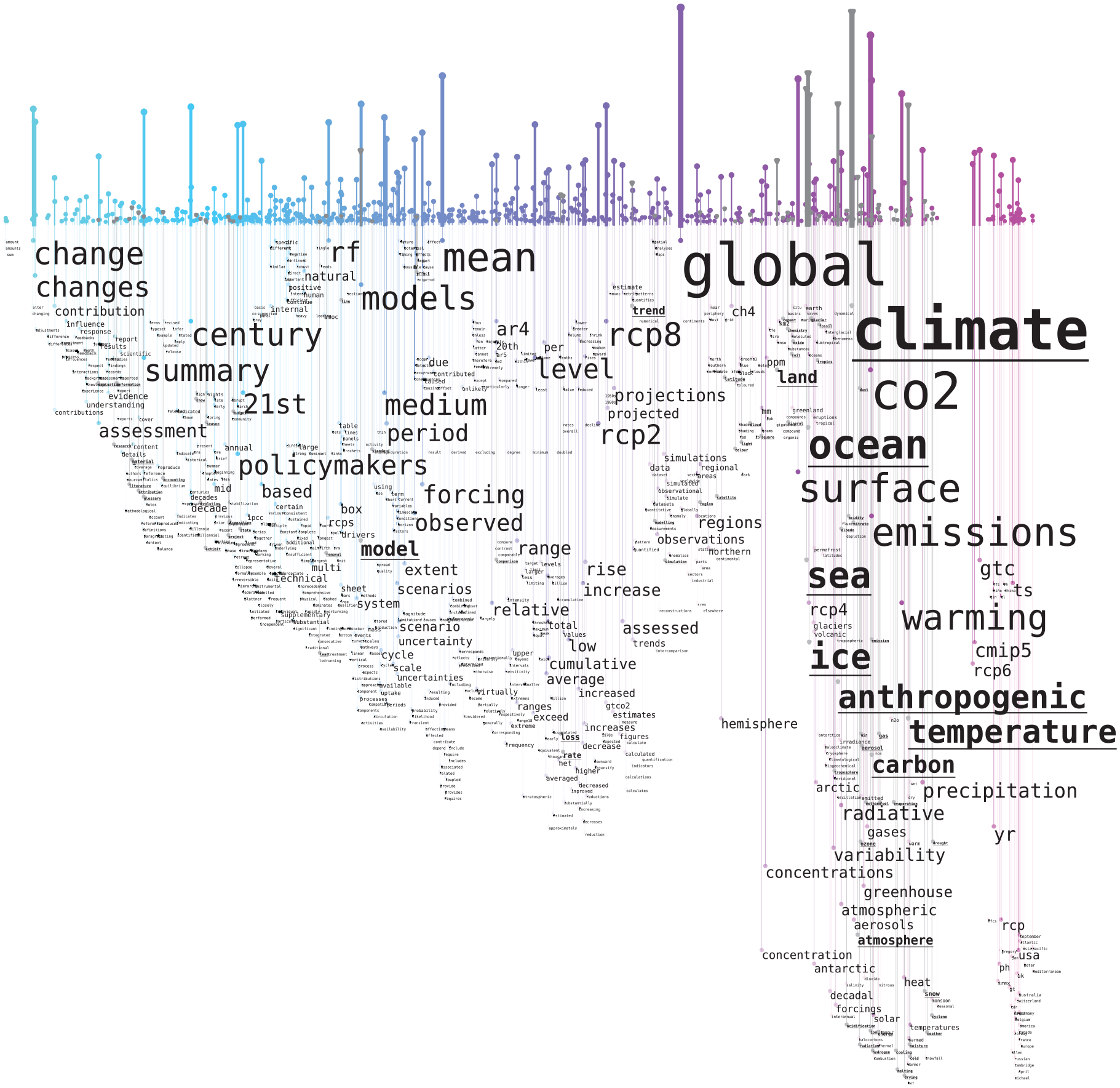
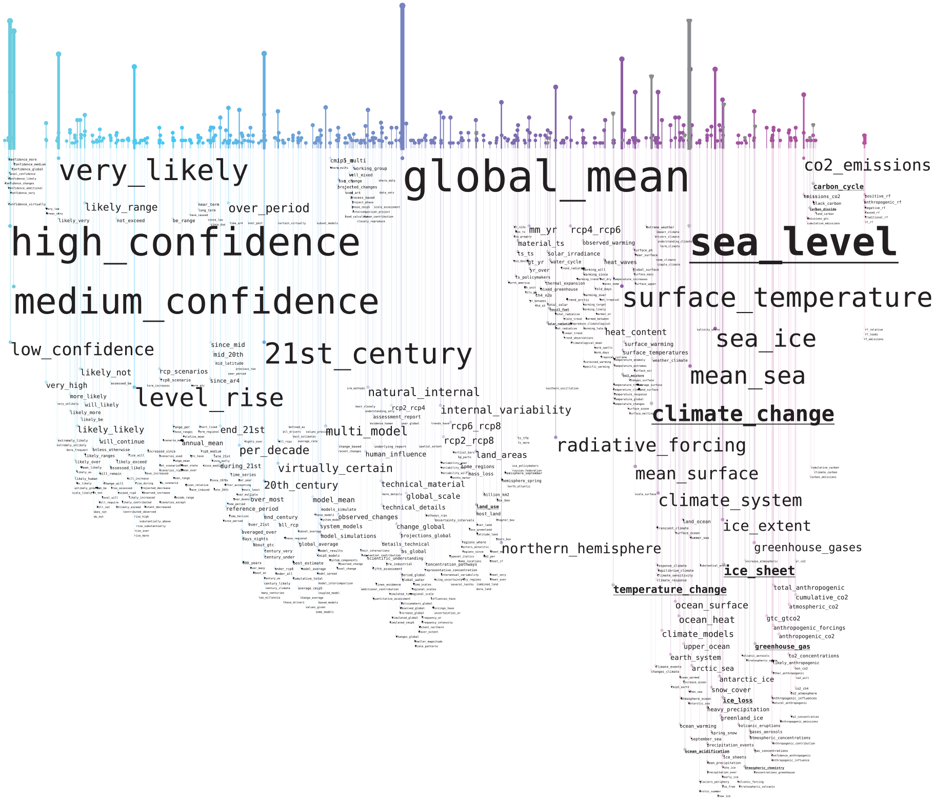
Unigram word rain visualizing the coverage for the GEMET glossary for the IPCC report “Climate Change 2021: The Physical Science Basis, Summary for Policymakers.” 62 Words and expressions already included in the glossary are underlined and their corresponding vertical bar is displayed in a gray color.
Bigram word rain visualizing the coverage for the GEMET glossary for the IPCC report “Climate Change 2021: The Physical Science Basis, Summary for Policymakers.” 62 Words and expressions already included in the glossary are underlined and their corresponding vertical bar is displayed in a gray color.
The glossary coverage for the IPCC report was visualized by underlining the words and expressions included in the glossary and by displaying their corresponding vertical bar in a gray color.
To be able to claim that Word Rain is a suitable visualization technique for providing an overview of glossary coverage, the results must be more useful than straight-forward choices, such as simple lists of covered/not covered words, or by a standard word cloud.
The advantage of the Word Rain technique for this task is that it, very quickly, provides an indication of what kind of vocabulary that is covered/not covered by the glossary, which gives a deeper understanding than just a coverage proportion, or by coloring a classic word cloud. When analyzing the unigram visualization, it can be seen that the not-covered words in the very right-most part of the graph are typically names and places, and therefore should not be included. It can also be seen that the left part of the word rain (around 75% of the chart) is dominated by general words that would not typically be included in a glossary. It is therefore reasonable that GEMET only covers a few words in this area.
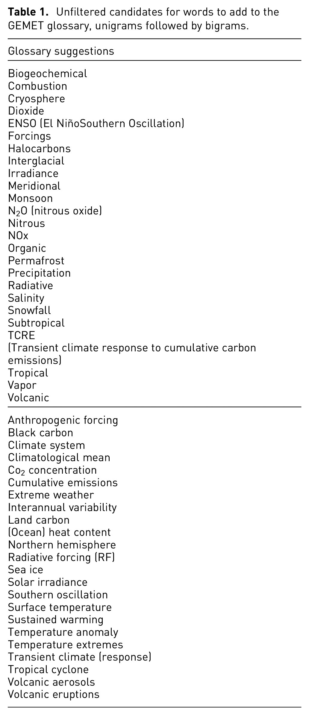
In contrast, there is a clear spike of interesting words positioned close to “climate”/“co2” and “ocean,” of which relatively many are covered by GEMET. The “overview first/details on demand” can be used to zoom into such areas for which it is interesting to study what is covered or not on a more detailed level. The area of IPCC-report-relevant words could be used for generating suggestions for words to add to the GEMET glossary. As this area is likely to contain many relevant candidates, it is a faster method for generating suggestions for new words to include, than, for example, to scan through long TF-IDF-based word lists without any semantic sorting. Examples of possible candidate words found when zooming into the area are shown in the first section of Table 1. For the bigram visualization, fewer examples of GEMET glossary matchings were found. Still, spatially close to the few bigrams that were found in GEMET, a list of new candidate words for inclusion in GEMET could be compiled (second section of Table 1). To determine which of these candidate words that would be suitable to add to GEMET, domain knowledge is required. We here only present an unfiltered list of word candidates.
Unfiltered candidates for words to add to the GEMET glossary, unigrams followed by bigrams.
Domain expert feedback
Evaluation/validation of various types of contributions in information visualization and visual analytics is an open challenge, discussed, among others, by Lam et al. 70 and Isenberg et al. 71 As we have chosen the topic of climate change as the main topic for selecting the source text data to be processed, represented, and analyzed with the Word Rain technique in this study, including the case studies with IPCC reports and Nature editorials discussed above, we chose the domain expert review72,73 as the main evaluation approach. The motivation for this choice is severalfold: (i) researchers who may actually use the Word Rain technique for representing and analyzing text data as part of their own research present an important target audience for us; (ii) such researchers most likely have at least passing knowledge/familiarity with the classic word/tag clouds, including the potential use of the technique in their field or their own contributions; (iii) the insights reported by the domain experts can complement some of our case studies and examples; and (iv) domain expert reviews are a viable option when focusing on the qualitative evaluation results (as we do not claim to provide quantitative evidence of the technique’s superiority with respect to effectiveness or efficiency for particular tasks, for instance).
Participants and protocol
While the precise definition of a “domain expert” varies in the literature,72,74,75 our intention was to involve academic researchers who focus on the broad problem of climate change in their work with some level of involvement of textual data (rather than exclusively climate modeling, for instance). Furthermore, as a pilot study, we conducted the first session with one of the co-authors of this manuscript (participant 0), whose background is in digital humanities, including traditional and computer-assisted text analyses of specialized domain corpora. The rest of the participants were external to this study, although it should be disclosed that they are part of the professional network of the authors of this manuscript.
The individual sessions were conducted over Zoom and lasted for 1 h each, with two authors of this manuscript being present besides the invited participant. The protocol itself followed the format of a semi-structured interview, with the introductory questions focusing on the participants’ background as well as their self-reported knowledge of information visualization techniques (namely, word clouds) as well as computational text analysis methods (including dimensionality reduction and TF-IDF).
The three external participants all have different scientific backgrounds, more specifically backgrounds in geography, linguistics and meteorology. The first invited participant (P1) is a PhD student, P2 is a researcher, and P3 is a full professor. All of the participants currently focus on the topics of climate change with slightly different foci. P1 and P2 have reported passing knowledge of classic word clouds and lack of knowledge regarding dimensionality reduction/t-SNE and TF-IDF, while P3 has reported prior experiences from multiple projects involving visualization methods, several of which involved word clouds, as well as passing knowledge of computer-assisted text analyses (but not dimensionality reduction/t-SNE or TF-IDF in particular).
As part of the introduction, a brief overview of classic word clouds and the visual encoding of a word rain was given, based on the contents of Figure 2; as part of this, a brief description of the underlying computational methods (such as text preprocessing and dimensionality reduction) was provided. Afterward, the experts were shown a single word rain for an IPCC report from Figure 3, asked to describe its contents while thinking aloud, and provide further feedback as part of the discussion. Then they were presented with diachronic representations for 1988–1992 and 2006–2010 Nature editorials (see Figure 6), and afterward these two eras versus the complete collection (see Figure 5).
At the end of the session, the experts were asked about further remarks and suggestions, and finally asked to fill in the standard System Usability Scale questionnaire, 76 as generated by a web-based tool. 77 The rationale for including this questionnaire was to complement the semi-structured feedback with additional commensurable results; it should be noted that SUS focuses on users’ subjective perceptions of usability, rather than task-based effectiveness or efficiency measurements.76,78
Feedback summary and suggestions for improvement
When exploring the
The domain expert interviews also resulted in a number of
On a related note, while the
One misunderstanding following from the layout of Figure 3 was that the most semantically central words were
A side effect of our choice that words only rain down when there is a collision is that the algorithm fills in spaces above prominent words with less prominent ones (see e.g. the upper left corner of Figure 8, above “high confidence”). This has the effect that words are not strictly
One of the domain experts expressed that the information on the
The corpora used for the expert review sessions were very small. Word2vec models, pre-trained on large general-language corpora, were therefore used for retrieving semantic vectors, instead of using models trained exclusively on the corpora visualized. The interviews showed that the
It should be noted that the sessions were conducted over Zoom with the figures displayed within slides, which might have had an effect on the
Regarding the
When discussing the
Discussion
When applying the Word Rain visualization to the three tasks selected, we were able to draw conclusions about high-level semantic differences between genres, about corpus changes over time and to make suggestions for additions to a specialized glossary. The first task would not have been possible to carry out with a classic word cloud. For the other two tasks, it might have been possible, but much more difficult without the semantic positioning of words.
Our study also showed that domain experts were able to understand and use the Word Rain visualizations, and had ideas for how the technique would be useful to apply on different types of textual data within their expert domains. Our general impression of Word Rain is, therefore, that it is a useful visualization technique.
There were, however, also aspects of Word Rain that were difficult to understand without explanations and that led to misinterpretation or a feeling of the word rains not providing enough information. Therefore, there is still room for improvements of the visualization technique, as described above.
When designing such improvements, it is, however, important to keep in mind that the aim of the Word Rain technique is to provide an improved visualization that still fills the role of the classic word cloud. That is, a visualization that in an easily understandable manner represents the content of a text, while it still provides all its visualization features in the form of a static digital or printed image. To add interactive features, in addition to the possibility of zooming (which corresponds to a larger print in the non-digital word), would therefore not be in line with this aim. To address the limitations described above, we have therefore provided suggestions for improvement that would be possible to implement for a static visualization, while treating Word Rain as a technique rather than a complete interactive tool. Eventually considering the application of this technique in a progressively broader context, the possible next steps regarding user interaction would be to allow the user to generate these static images in an interactive fashion, or to be able to interactively choose which pairs of images to compare, or to use word rains alongside or instead of word clouds as part of InfoVis/VA tools with multiple coordinated views 79 (potentially supporting more basic interactions, such as pan & zoom or filtering, 57 but also adjusting configuration or encoding, 80 which could allow the users to select a color map suitable for their task, e.g. for further highlighting the differences alongside the x-axis to better support comparison 81 ) – such applications, however, go well beyond the scope of this initial study and potentially beyond the typical use case scenarios for researchers in digital humanities and climate communication.
The text pre-processing (which might include the training of a word2vec-model when a pre-trained model is not used), and the t-SNE projection might be computed and cached once for the overall data set explored. Therefore, the computational aspects that need to be taken into account when rendering a word rain (essentially, step 6 in Algorithm 1) conceptually has a quadratic complexity with respect to the number of word labels, as each new label is checked for collisions with the previously laid out labels. This part of the implementation could be eventually optimized further, but it should be noted that it is currently used to produce static figures, as mentioned above, rather than being used directly within interactive tools.
Regarding the scalability
82
of the visual representation, Word Rain does provide an overview of the most prominent words and can be used for further in-depth exploration of less prominent ones (especially in relation to the more prominent ones within the same semantic clusters), if the user wishes so. While the overlaps between the labels are avoided, a large number of labels could still lead to a certain amount of visual clutter due to the overall use of ink (both for labels and other marks such as lines), thus the ability to set a threshold to include the top
Limitations of the evaluation/validation provided for our study can be attributed to the scope (case studies and domain expert reviews) and scale (three external experts interviewed). While our motivation for these choices is described in the respective sections, we do not claim that these efforts cover all of the relevant aspects of our novel visualization technique. Further empirical studies thus remain an important part of the future work, especially when considering generalizability of Word Rain for further text exploration tasks and corpora types.
Conclusion
We have here introduced the Word Rain technique, and thereby aspired to address two problems associated with the traditional word cloud: (i) that the word positioning lacks a semantic meaning; and (ii) that using font size as the only indication of word prominence might give the incorrect impression of longer words always being more important than shorter ones.
We have addressed the two problems by basing the horizontal word positioning on distributional semantics-based word similarity, and by adding two additional word prominence indicators that can be used alongside font size. That is, prominence indicators in the form of the vertical word positioning and in the form of a bar chart with bars that indicate word prominence.
The word positioning used by the Word Rain technique gives it an increased possibility (compared to a traditional word cloud) of conveying text content through the actual graph. Most importantly, text differences and text similarities beyond the level of the individual words can be revealed by the difference and similarities in the Word Rain visualization. We exemplified this by (i) contrasting two technical IPCC reports on concrete effects of climate change on nature with a report on human thought structures related to climate change, (ii) exploring temporal differences in a corpus of editorials on the topic of climate change, and (iii) investigating the coverage of a specialized glossary on an IPCC report.
In addition, the meaningful word positioning makes it easier for a user/reader to actively explore interesting areas of the graph by zooming in on regions with potentially interesting content. It is thereby useful to also include words in the graph that initially have a font size too small to be legible, but to give the user the possibility to zoom in on and further explore these words. Since the word positioning is based on semantics, these less prominent, and originally illegible, words can be located through their more prominent neighbors, which are displayed with a larger font. In a standard word cloud, without a semantically meaningful word positioning, such targeted explorations are not possible.
The results of our case studies and interviews with the researchers working with climate communication and climate adaptation texts are promising, while directions for future work on improving Word Rain, but also considerations that can be valuable for further research in text visualization, are also outlined in this work.
Supplemental Material
sj-pdf-1-ivi-10.1177_14738716241236188 – Supplemental material for From word clouds to Word Rain: Revisiting the classic word cloud to visualize climate change texts
Supplemental material, sj-pdf-1-ivi-10.1177_14738716241236188 for From word clouds to Word Rain: Revisiting the classic word cloud to visualize climate change texts by Maria Skeppstedt, Magnus Ahltorp, Kostiantyn Kucher and Matts Lindström in Information Visualization
Supplemental Material
sj-pdf-2-ivi-10.1177_14738716241236188 – Supplemental material for From word clouds to Word Rain: Revisiting the classic word cloud to visualize climate change texts
Supplemental material, sj-pdf-2-ivi-10.1177_14738716241236188 for From word clouds to Word Rain: Revisiting the classic word cloud to visualize climate change texts by Maria Skeppstedt, Magnus Ahltorp, Kostiantyn Kucher and Matts Lindström in Information Visualization
Supplemental Material
sj-pdf-3-ivi-10.1177_14738716241236188 – Supplemental material for From word clouds to Word Rain: Revisiting the classic word cloud to visualize climate change texts
Supplemental material, sj-pdf-3-ivi-10.1177_14738716241236188 for From word clouds to Word Rain: Revisiting the classic word cloud to visualize climate change texts by Maria Skeppstedt, Magnus Ahltorp, Kostiantyn Kucher and Matts Lindström in Information Visualization
Supplemental Material
sj-pdf-4-ivi-10.1177_14738716241236188 – Supplemental material for From word clouds to Word Rain: Revisiting the classic word cloud to visualize climate change texts
Supplemental material, sj-pdf-4-ivi-10.1177_14738716241236188 for From word clouds to Word Rain: Revisiting the classic word cloud to visualize climate change texts by Maria Skeppstedt, Magnus Ahltorp, Kostiantyn Kucher and Matts Lindström in Information Visualization
Supplemental Material
sj-pdf-5-ivi-10.1177_14738716241236188 – Supplemental material for From word clouds to Word Rain: Revisiting the classic word cloud to visualize climate change texts
Supplemental material, sj-pdf-5-ivi-10.1177_14738716241236188 for From word clouds to Word Rain: Revisiting the classic word cloud to visualize climate change texts by Maria Skeppstedt, Magnus Ahltorp, Kostiantyn Kucher and Matts Lindström in Information Visualization
Footnotes
Acknowledgements
The authors would like to express their gratitude to the domain experts for participating in the evaluation sessions. Additionally, the authors would like to thank the anonymous reviewers and the associate editor for their valuable feedback, as well as the Applied CompLing Discourse Research Lab at University of Postdam for the possibility to produce word rains using their editorial corpus. This work has also benefited from the Dagstuhl Seminar 22191 “Visual Text Analytics,” where the first and third author participated.
Funding
The author(s) disclosed receipt of the following financial support for the research, authorship, and/or publication of this article, i.e. Word Rain has been developed with funding from three research infrastructures:
•Huminfra: National infrastructure for Research in the Humanities and Social Sciences (Swedish Research Council, 2021-00176)
•InfraVis: the Swedish National Research Infrastructure for Data Visualization (Swedish Research Council, 2021-00181)
•Nationella Språkbanken: The National Language Bank of Sweden (Swedish Research Council, 2017-00626)
Supplemental material
Supplemental material for this article is available online.
References
Supplementary Material
Please find the following supplemental material available below.
For Open Access articles published under a Creative Commons License, all supplemental material carries the same license as the article it is associated with.
For non-Open Access articles published, all supplemental material carries a non-exclusive license, and permission requests for re-use of supplemental material or any part of supplemental material shall be sent directly to the copyright owner as specified in the copyright notice associated with the article.