
Abstract
This paper presents a detailed case study of the application of techniques from Information Visualization to data collected in Critical Care Units (CCUs). This data is heterogeneous and sometimes incomplete due to the pressures on staff in the environment. Thus, it can be difficult to use conventional means to visualize it meaningfully. The paper presents the software tool called CCViews. It was developed to support visualization of CCU data. It enables clinicians to view the trajectory of patient recovery and track the effectiveness of different interventions such as physiotherapy. Note that this work is underpinned by the world-famous information seeking mantra, which emphasizes the need to provide users with views of their data at differing levels of granularity.
Introduction
Historically, within Computing, the focus of much research was aimed at processing more efficiently and increasing processing capabilities. These days, computing power is limited only by budgets. Back in 1991, DeFanti and Brown highlighted the need for visualization of scientific data. 1 They coined the phrase “firehoses of data,” as a means of describing the overwhelming volume of data involved. The volume and variety of data collection has rapidly expanded ever since and there is little doubt that this trend will continue. The goal of Information Visualization is to find effective, often abstract, ways to visualize data.
In 1996, Shneiderman introduced the visual information-seeking mantra which states, “Overview first, zoom and filter, then details on demand.” 2 It purported that users need to be able to visualize their data at varying levels of abstraction. This mantra became the design brief for researchers in visualization of data across the world. Thus, rather than attempting to display the entire dataset, researchers should focus on selecting subsets of data which illustrate a particular axis or viewpoint. This is achieved through user-controlled data filtration or designer-controlled obscuration.
In addition to the mantra, classic approaches to usability considerations, such as those presented by Molich and Nielsen, 3 also continue to provide a good checklist for assessing the usability of applications. These visualization principles continue to have an ever-increasing role in presenting data in a clear and useful manner.
Visual information-seeking mantra
This mantra provides widely adopted principles for controlling the volume of data being displayed, whilst also allowing the user adequate control over data separation. Shneiderman goes into more detail by further defining tasks which represent common actions users wish to perform.
The ’overview’ presents a visualization of the entire dataset. This enables users to gain a perspective of the entire scope of the data. As the size of the dataset increases, an appropriate level of visual or informational abstraction should be used to ensure the entire data collection can be displayed appropriately. The “zoom” functionality enables the user to focus on items of interest. For example, in temporal data collections, users could choose to focus on a specific time range. The “filter” functionality enables the user to remove unrelated items from the current visualization. This enables the user to focus solely on data salient to their current investigation.
“Details-on-demand” is the final functionality of enabling the user access to the raw data displaying further information when a specific data item or group is selected. For example, when selecting a node in a server network, the display could extend to show all data attributes such as network address and traffic information. The functionality of details-on-demand could also be implemented using co-ordinated multiple views (CMVs). CMVs aim to synchronize multiple views of a display so that the selection of a data item in one view causes related changes in the other views. CMVs can suffer from scalability issues for large, high-dimensional, and complex data, 4 which are all common occurrences in big data collections. However, the effects of this could be mitigated with the application of the zoom and filter tasks.
Nevertheless, the visual information-seeking mantra defined by Shneiderman remains core practice within the well-established research discipline of information visualization. Consequently, the software presented in this paper is largely based on that original mantra. Due to the ever-increasing financial pressures on the NHS, their decision support systems have yet to exploit the potential that information visualization has to offer. This paper is presented as a case study of how that can be achieved in CCUs.
The remainder of this paper describes CCUs, the data they record and their needs for software support. This is followed by a review of relevant state-of-the-art applications. This first release of the software, CCViews, is presented with an emphasis on the Patient View representation. Following this a case study of a female patient who was in the CCU for 8 weeks is presented in detail. Subsequently, a discussion which focuses on how this software benefits Clinicians and Patients is presented. Finally, conclusions are drawn, and future work directions are discussed.
Critical Care Units
Critical care is a relatively new area in medicine with dedicated CCUs originating in the first half of the 20th Century. 5 The purpose of these units is to provide specialist health care to critically ill or medically unstable patients. There is a high level of care in a CCU which includes intensive monitoring and treatment. It is common for CCU patient’s to require organ support, such as the use of a ventilator to assist the patient with breathing, or a dialysis machine to support patients who have acute kidney failure.
Even though CCUs provide highly specialized care to acutely ill patients with complex needs, many patients struggle after they are discharged. The term post-intensive care syndrome (PICS)6,7 was defined to describe the range of conditions that patients experience after discharge from the CCU. These conditions are often classified into three categories: physical, cognitive, and psychological. This includes physical weakness, persistent cognitive dysfunction, and post-traumatic stress disorder (PTSD). 8 These conditions can present for months or years after a patient is discharged. Additionally, they have been shown to significantly reduce a patient’s quality of life (QOL). 9 Physical weakness presents in the majority of CCU patients after discharge, with more than 90% of long-stay CCU patients showing neuromuscular abnormalities for up to 5 years after discharge. 10
It is widely reported in the literature11,12 that the early use of both passive and active physiotherapy in the CCU, significantly improve patient outcomes. Delirium is one of the most common cognitive impairments in PICS. Ouimet et al. reported that greater than 30% of all CCU patients display symptoms of delirium. 13 The literature also reports a link between the prevalence of delirium with longer CCU stays and extended periods on a ventilator. 14 PTSD occurs in many CCU patients, with greater than 20% displaying clinically significant PTSD symptoms. Note that these symptoms are associated with a substantially lower QOL. 15
Assessments recorded in Critical Care Units
Several metrics have been defined to quantify patient recovery whilst in the CCU. These include (i) the Manchester mobility score known as MMS, (ii) the Chelsea critical care physical assessment tool referred to as CPAx, (iii) the medical research council (MRC) scale, (iv) the sequential organ failure assessment score known as the SOFA score, and (v) the Richmond agitation-sedation scale known as RASS.
The MMS is used for monitoring patient rehabilitation in critical care environments. It has been used widely in Critical Care across the UK. MMS is used as a strong indicator of patient recovery due to its inter-rater reliability and correlation with other recovery measures. 16 The Chelsea critical care physical assessment tool (CPAx) is a multi-attribute measure of physical morbidity. CPAx is a quick, easy to administer bedside measure which provides an overview of a patient’s physical ability. 17 The MRC scale is a widely accepted and frequently used multi-attribute manual assessment for determining the strength of a patient’s muscle groups. It has been shown to have substantial inter-rater reliability. 18 The patient’s SOFA score is another multi-attribute score used to track the number and severity of failed organs. Thus, it can be used for the predication of mortality. SOFA has proved valuable in providing prognostic information on in-hospital survival, particularly in the case of Sepsis. 19 Finally, RASS is used to monitor the patient’s level of sedation whilst also evaluating agitated behavior. RASS can be performed quickly using a three-step test. It has a simple scoring scale. Thus, RASS has been described as logical and easy to administer by clinicians. 20
In general, MMS, CPAx, MRC, and SOFA scores are all recorded once a day. In contrast, RASS may be recorded several times a day. Physiotherapy interventions are also recorded, including the range of exercises performed, the duration of the sessions and analysis from the physiotherapists. In addition to manually recorded data there is also a large volume of telemetry data recorded from the life support and monitoring devices.
Furthermore, when this data is considered along with the patient’s diagnostic information and clinicians notes, there is a huge amount of data being recorded about a CCU patient for the duration of their stay.
Literature review
There are many general-purpose data visualization systems which could be used to represent the large amounts of data collected in CCUs. Scalability remains the enduring challenge for developers of visualization systems. Richer et al. 21 present a comprehensive evaluation of this issue. Initially, the ambiguity of this term itself is addressed, followed by a review of scalability in 120 visualization publications from 1990 to 2020. A conceptual model for consistently assessing scalability is proposed followed by a case study on visual scalability and the issues surrounding visual clutter. Current state-of-the-art is best represented by the following three visualization systems. Each of these are research-based developments specifically aimed at the visualization of patient data.
The system developed by Brich et al., 22 is underpinned by a mathematical approach to managing the large quantity of data in CCUs. Specifically, focusing on quantitative data to which they apply techniques such as principal component analysis (PCA). 23 The usefulness of PCA is clear, it is very versatile and remains the most popular technique in multivariate analysis. The applicability of PCA to this problem is under investigation.
The second research-based development is the ECHO system was developed by Thomas et al. 24 The emphasis of this software is on large screen displays used to increase the effective and efficient handover of patients as staff change shifts. The visual representation of the data is both concise and clear. Thomas et al. have demonstrated the ECHO system using an array of two-by-two displays. The main disadvantage of their approach is the requirement of having to relocate staff to another space to perform handovers, as most CCUs would not have the space in situ to house such a large display.
Back in 2011, Faiola and Srinivas 25 published a significant paper on the process of a human-centered approach to software design for CCUs and other healthcare environments. Subsequently, Faiola and Newlon 26 developed the medical information visualization assistant (MIVA). This research-based development is the third version of MIVA, released in 2022, with an emphasis on supporting rapid decision-making in the CCU. Due to its time scrubbing tool and flexible design, MIVA is a highly significant contribution of software to the field. However, it would not meet the requirements of all CCUs as it does not represent all core data. Specifically, it does not report on physiotherapy interventions, which have recently become a core activity in patient recovery.
Alongside these research-based developments, Etiometry 27 is a commercial product which supports clinicians. It has an emphasis on real-time data collection and visualization, whilst also providing decision support and data storage. A similar commercial product called the Picis Critical Care Manager, 28 constitutes a suitable alternative to visualize CCU data.
Aside from the issues of cost and scalability, the main weakness of these commercial products is the fact that data is made available across several different views reducing their potential to support decision making.
Requirements
Datasets from Critical Care Units
Currently, much of the patient data is used separately and sporadically. The most valuable measures to the clinicians are the assessment scores as these represent proven metrics for directly tracking patient recovery. However, these assessment scores are recorded by a variety of individuals in the CCU, they are stored as independent entities and are only easily accessible in a numeric table format. This makes it difficult to visualize the overall process of patient recovery over time. Thus, CCU staff require software to support their analyses of this heterogeneous data.
Clinical requirements for software support
Clinicians have reported that they would benefit from being able to explore these patient datasets. In line with Shneiderman’s mantra, the users want to be able to explore their data at varying levels of granularity. They need to be able to see an overview of the recovery of a single patient, whilst also being able to drill down into the day-to-day details of that recovery, the physiotherapy intervention(s) and how they affected the CCU assessments. However, Clinicians also want to be able to collate and analyze groups of patients based on certain criteria. This would support analysis of correlations between groups of “similar” patients. Thus enabling Clinicians to identify trends and anomalies in the data.
A variety of visual representations are required to support the analysis of all the metrics recorded in the CCU. For example, CPAx is a 10-attribute measure which is recorded daily. Therefore, it is ideally suited to visual display to support greater understanding of the data.
Due to the vast quantity of data involved, it is essential that the Clinicians are not overwhelmed with too much data in a single visual representation. Whilst, most clinicians want access to the core metrics used, it is essential that other, less used, metrics are available as required. For example, physiotherapists might require detailed data about the patient’s physiotherapy activities, whereas a psychiatrist nurse may focus more on the patient’s medical history.
In conclusion, it is clear that clinicians would benefit significantly from bespoke software support for the exploration of CCU data.
Design goals
There were two main design goals. The first goal was that the design of the software should be underpinned by Shneiderman’s mantra, making it possible for the user to interact with varying quantities of their data. Specifically, the user should be able to “overview” the entire stay of individual patients. Additionally, they should also be able to access “details on demand.” Users should be able to examine the details of individual Patient’s recovery, accessing the metrics gathered daily in the CCU. The second goal was that the software development should follow a genuinely user-centered system design (UCSD) methodology. The agile methodology SCRUM 29 was used to support this embedding of the user in the development process. Scrum is well known 30 for being one of the most effective techniques to support an agile methodology for software development. Thus, the users were not only involved during the development but also during requirements gathering.
A variety of Clinicians were involved at different stages of the development of the software. Our main contact was via a Research Sister in the CCU. In parallel with the software development, she was gradually developing the CCU specialized care team to include physiotherapists and psychologists. She provided access to this expanding team made up of Nurses, Physiotherapists and Psychologists as well as the CCU Data Manager. Occasionally, the CCU Consultant was also available.
Although commercial software is used in the CCU to capture data and monitor patients, the users reported that their commercial software did not focus on more recent aspects of patient recovery including physiotherapy and psychological support. Therefore, at the start of the software development, two informal focus groups were conducted to identify the initial requirements. The first focus group comprised the Research Sister, the Data Manager and their senior CCU Consultant. For the second focus group, the Research Sister and Data Manager were joined by two physiotherapists and one newly appointed psychologist. Note that user availability is a limiting factor, as the staff simply did not have much time to interact with us.
A large number of requirements were captured in these early stages. The CCU team were interested in almost all of the potential solutions proposed. This included visualization of data, prediction of patient outcomes as well as mobile phone apps to support Patients in their recovery. As the requirements were prioritized, the software presented in this paper, the Patient View, was identified as the highest priority. This was due to its ability to represent physiotherapy interventions alongside patient recovery metrics. Subsequently, detailed sketches and paper prototypes were used to evaluate the proposed designs. Interviews were conducted to refine the design before development started. As the project evolved, a mixture of interviews and focus groups were used to gather user feedback.
CCViews software
This paper introduces the CCViews visualization software which has been developed in collaboration between the University of Plymouth and University Hospitals Plymouth NHS Trust, Plymouth. This is the first release of the software and it comprises two core units. These are (i) the Patient Population Filter and (ii) the Patient View.
Development
CCViews was developed using Java (JDK: V 1.8.0_181, JRE: V10.0.2) with the majority of the user interface designed with Java Swing components. Java was selected as the development language as an object-oriented approach supported the hierarchical structure of patient data. The use of Swing provided platform-independent components as the software was to be executed on a range of different hardware and operating systems. Some Swing components, such as the JSlider and JList, were extended to provide extra functionality. Some additional Java packages were used for the creation of charts and graphs; XChart (v3.5.4) for radar charts and JFreeChart (v1.0.19) for line graphs. These libraries provided a large range of visual customization options, whilst still maintaining platform independence. Bespoke Swing components were created using a combination of the Java Abstract Window Toolkit (AWT) and Swing. This supported highly flexible user interface designs which could be controlled at a pixel level, displaying dense data in a scalable format.
Patient Population Filter
Based on Shneiderman’s mantra, 2 an overview should be provided as an entry point. Furthermore, this overview should encompass the entire dataset. In the CCViews software, that translates to a single representation where all the data of all the patients is available. That overview representation is the Patient Population Filter (see Figure 1) as filtering the complete data is at the core of the CCViews software.
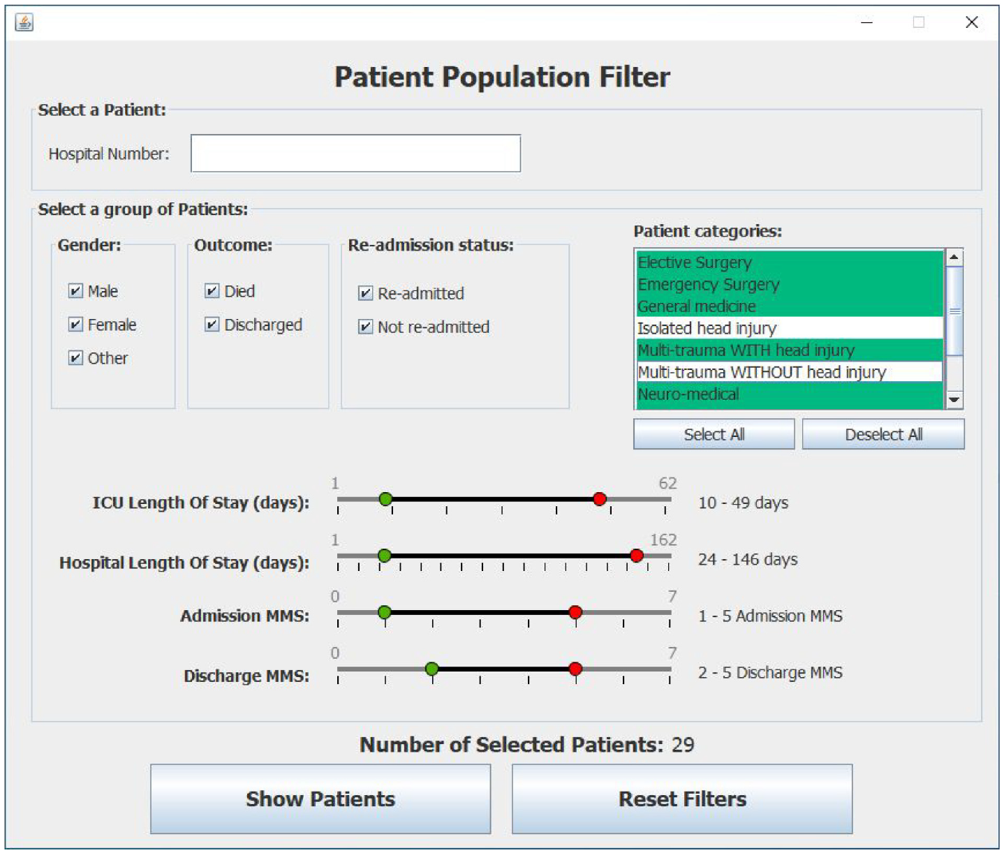
shows a snapshot of the Patient Population Filter which is used to enable clinicians to create subset of patients for further investigation using the Patient View representation.
The Patient Population Filter enables the Clinician to create subsets of patients for further exploration. This subset of selected patients can be viewed, one patient at a time, using the Patient View representation. Once the filter criteria are set, the user can visualize the CCU stay of each patient in their subset.
In Figure 1 note that some metrics are ranges of values such as “CCU Length of stay,” whilst others are Boolean values such as “re-admittance.” Enumerations are also used to represent the category of a patient. Note that the default values of these filters are automatically set from run-time analysis of the currently selected input file. This supports dynamic variation of the filter’s minimum and maximum values. Once the filter criteria are set, the user can visualize the CCU stay of each patient in their subset.
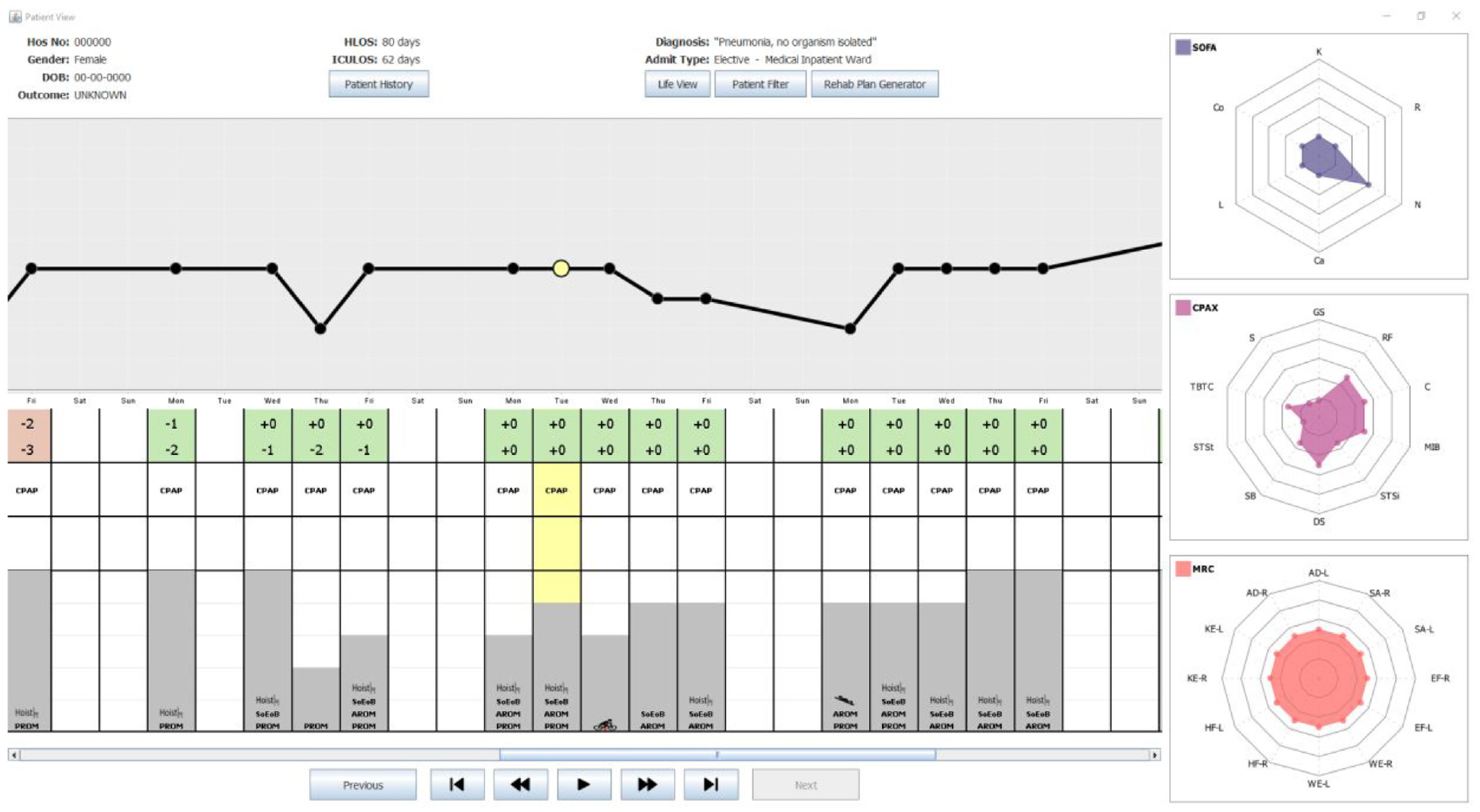
Patient View
The Patient View is a visual representation that enables clinicians to explore all the data pertaining to an individual stay of a single patient. It comprises (i) the core patient data, (ii) the overview of the CCU stay, and (iii) the daily values of SOFA, CPAx, and MRC.
Core patient data
The core patient data shows the details of a patient during a single stay in the CCU. This includes gender and date of birth as well as the duration of the stay in CCU and their current diagnosis. Additional information, such as medical history and pre-admission dependency, is also available as details-on-demand. This data can be accessed using the “Patient History” button which presents the text in a pop-out window.
Overview of the patient’s stay
The “Entire stay” overview provides a day-by-day overview of the whole stay of the patient in the CCU. It combines a basic graph of MMS values with a table of heterogeneous data. The first point on this MMS graph denotes the start of the CCU stay. Specifically, Figure 2 shows a patient who was admitted on a Monday with an MMS of zero and discharged on a Friday when their MMS was six. Note that clinicians are not focused on specific dates. Instead, they are interested in identifying trends such as evaluating the impact of weekend availability of staff and resources on patients. The remainder of Figure 2 is used to represent the data recorded daily for the Patient. Note that MMS was selected for the line graph as it has been clinically tested to be a strong indicator of overall patient recovery. 15 Having this as the focal point of the Patient View provides clinicians with an overview of how well a patient is physically recovering over time. However, any core measure could be used if MMS was deemed less useful in the future.
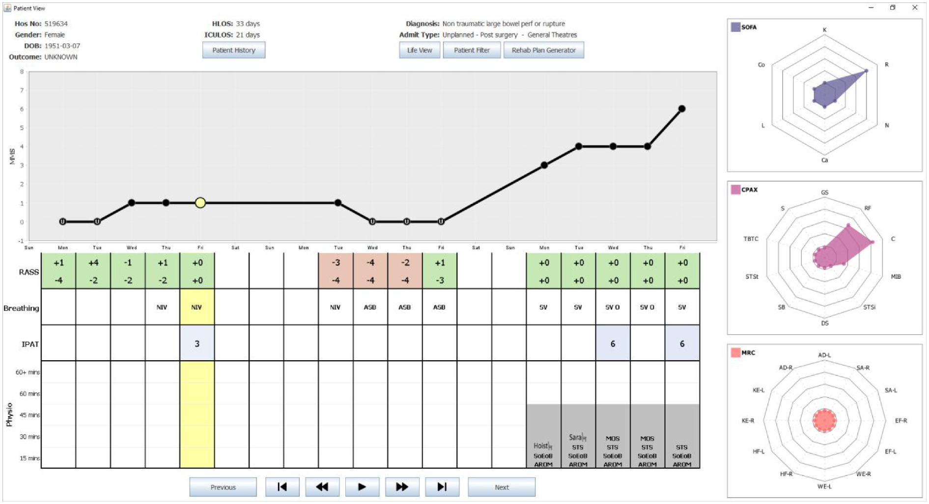
shows a snapshot of the Patient View representation of the CCVIEWS software. It shows patient details along the top (with all patient identifiers redacted) with an overview of the complete CCU stay depicting daily values of RASS, IPAT, SOFA, CPAx, and MRC values. The animation toolbar at the bottom enables the user to view the SOFA, CPAx, and MRC values day after day automatically.
The table shown below the graph, is used to represent a range of core daily measures recorded in the CCU. Thus, each column in the table lines up with the corresponding point on the MMS graph. This MMS graph is a crucial part for the Patient View as it is used as an interface to all the SOFA, CPAx, and MRC data recorded daily for the currently selected patient. This is discussed further in section 5.3.3. The table in the overview depicts the four metrics deemed most useful to the range of clinicians interviewed. The first row denotes the RASS value of the patient. Note that patients may have their RASS values recorded as many as 30 times in 1 day. Due to the potential density of RASS data, clinicians requested that this data was managed and interpreted by the system. Further interviews clarified that Clinicians were primarily interested in establishing when/if patients were well enough to receive physiotherapy. This is the case when their RASS value is in the range −1 to +1. Therefore, the corresponding cell in the table denotes the highest and lowest RASS values for each day. Furthermore, the background of the cell is encoded; red if the patient was never available that day, and green if the patient had, at some point, been available for physiotherapy.
The second row of the table denotes the status of the patient’s breathing. This row uses commonly used medical abbreviations: ASB which stands for Assisted Spontaneous Breathing, NIV meaning Non-Invasive Ventilation and SV represents self-ventilated. The third row of the table is used to quantify the severity of delirium experienced by the patient. This can range from 1 (mild) to a value of 9 (severe). The final row depicts the type(s) and duration of physiotherapy interventions carried out each day. Each day is represented by a stacked bar chart made up of 5 blocks. Each block that is filled with a solid gray background represents a 15-min period of physiotherapy that took place that day. Thus, in Figure 2 all physiotherapy interventions lasted 45 min. The types of intervention shown in Figure 2 include use of the Hoist chair or Sara chair, SoEoB refers to sitting over edge of bed, AROM denotes an active range of movements was carried out whereas PROM denotes those that are passive. STS stands for sit to stand and MOS means march on spot. Thus, the table provides a detailed overview of the patient throughout their stay in CCU, enabling clinicians to assess the effectiveness of different interventions on patient recovery.
Daily metrics used to assess patients
On the right of the Patient View representation, radar charts are used to visualize the 28 different values of SOFA, MRC and CPAx of the currently selected day. A day is selected by clicking on a point (solid black circle) in the MMS graph or clicking anywhere in the table. The currently selected day is denoted by a yellow highlight. In the MMS graph, the currently selected day is denoted by the larger circle filled in yellow. For clarity, the yellow highlight continues from the second row of the table.
Note that as the health of a patient improves, their SOFA chart should diminish with values tending toward zero on all axes whilst their CPAx and MRC charts should expand tending toward five. In Figure 2, the currently selected day is the Tuesday before discharge. Note the diminished SOFA chart and the fuller CPAx and MRC charts. Data is not usually recorded on Saturdays and Sundays. In the software, the Clinician can hover the mouse over any attribute on the radar chart to see the full name of the attribute and its numerical value. A set of animation controls is available at the bottom of the Patient View to enable the user to “watch” the SOFA, CPAx, and MRC values change over time.
The goal of this visualization suite is to enable clinicians to compare, and contrast, a wide range metrics simultaneously on selected subsets of patient data. This will provide novel insight into this data enabling Clinicians to identify trends or patterns which would have been otherwise not be detected.
Case study
On the 3rd of December 2018, a 49-year-old female was admitted to the CCU. Prior to her admission she was fully independent, and her past medical history describes her as being fit and well. She presented with a complex pneumococcal pneumonia which developed a right-side empyema, pneumothorax, and bronchopleural fistula. In total, the Patient spent 62 days in the CCU, during which she was sedated for 27 days, paralyzed for 12 days and on inotropic support for 19 days. On the 27th of December, she had a tracheostomy and was fully weaned from sedation. The following day she began active rehabilitation to rebuild her lost strength. She was finally de-cannulated in the ward where she stayed for a further 18 days before being discharged. A follow up was performed at a multi-disciplinary team clinic and she returned to work by summer of 2019. Using the data from this Patient, her journey can be visualized from admission to discharge using the Patient View visualization. Note that data was not collected at weekends.
Visualization of stay in the Critical Care Unit
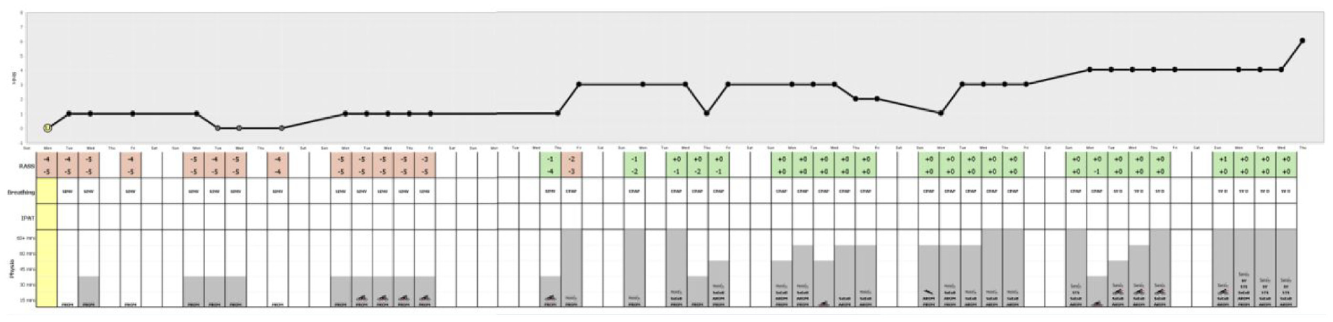
Week 1
On Day 1 of her stay in the CCU, no MMS score was recorded as the Patient was too unwell to have the assessment. Note that in Figure 3, this is denoted by the MMS score of zero on the graph along with the letter “U” denoting unwell shown on the corresponding point on the graph. The Patient’s RASS score never exceeded −4 on Day 1, indicating that she was in deep sedation. On the right of Figure 3, the SOFA radar chart denotes the Patient also presented with multiple organ system dysfunctions on Day 1. She had a central nervous system (CNS) component score of 4, along with a cardiovascular score of 4, respiratory score of 3, coagulation score of 2 and liver score of 1. Note that SOFA component values are displayed when the clinician hovers over that point on the sofa display.
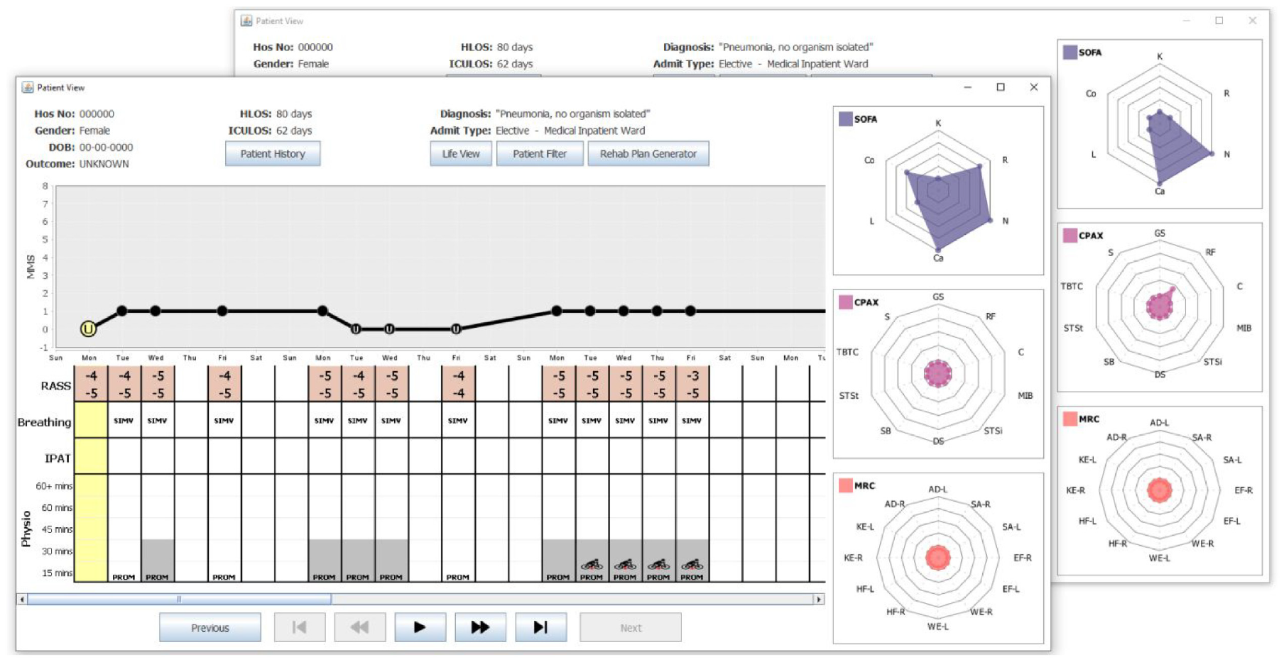
shows two snapshots of the Patient View depicting Weeks 1–3 of the Patient’s stay in the CCU. The SOFA, CPAx, and MRC charts are shown on the right. The snapshot at the front shows the Patient View when Day 1 was selected. This day is highlighted (see yellow circle) on the MMS graph, along with the corresponding column of the table (also highlighted in yellow). The snapshot at the back shows the SOFA, CPAx, and MRC data for Day 5.
On Day 2 of her CCU stay, the Patient is shown to be ventilated with synchronized intermittent mandatory ventilation (SIMV). Note that passive physiotherapy started with a session of less than 15 min. This is denoted as PROM (passive range of motion) in the physiotherapy section of the table in Figure 3. For the remainder of Week 1, the Patient’s RASS score denotes the Patient was deeply sedated. She remained on SIMV and received passive physiotherapy daily with sessions lasting up to 30 min. On Day 5 (Friday) some improvements could be detected as the Patient’s SOFA score began to decrease, and she recorded her first non-zero CPAx score with a respiratory score of 1. These improvements can be seen by contrasting the radar charts in each snapshot of Figure 3.
Weeks 2 and 3
Figure 3 shows there was a slight deterioration after the weekend and during Week 2. See the reduction of the MMS scores in the MMS plot. Furthermore, note that the MMS score was only recorded on Day 8 (Monday), as the Patient was too unwell to be assessed on the other days. Recall, this is denoted by the “U” for unwell in the MMS plot. During this time her respiratory SOFA score increased to 3 and her CPAx scores dropped back to zero. Throughout Week 2, the Patient remained in deep sedation, on SIMV with some passive 30-min physiotherapy sessions. On Day 15 (Monday), the Patient showed signs of improvement, recording an MMS score of 1 daily. During this week, she was passively using the Motomed (in chair) bike on her lower limbs. Note this is denoted by a red star on the legs to denote lower limb exercise.
Week 4
During Week 4, the Patient made significant progress in her recovery. More specifically, on Day 25 (Thursday), she recorded the first RASS score of her stay which was in the range deemed acceptable for active physiotherapy. This is denoted by the green background in the RASS table shown in Figure 4. On Day 26 (Friday), she moved from SIMV to a continuous positive airway pressure (CPAP) machine, recorded her highest MMS score of 3 and, with the assistance of the hoist chair, was able to sit up for the first time since admission. The overall scale of this improvement across these 2 days is clearly shown in Figure 4 when contrasting the radar charts for both days. Note how all SOFA scores dropped to zero, aside from her CNS score which remained at 2. The CPAx scores all started to improve, with four of the metrics being the highest recorded since admission and a non-zero MRC was also recorded for the first time.
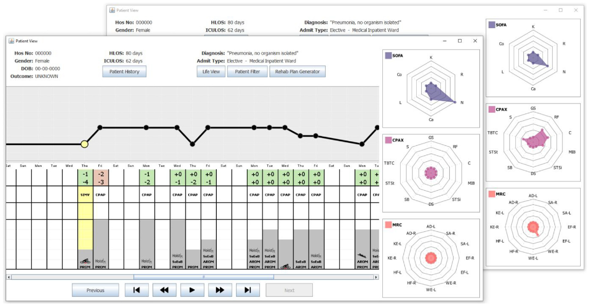
shows two snapshots of the Patient View depicting Weeks 3–5 of the Patient’s stay in the CCU. The SOFA, CPAx, and MRC charts are shown on the right. The snapshot at the front shows the Patient View when Day 25 was selected. This day is highlighted in yellow on the MMS graph, along with the corresponding column (also highlighted in yellow) of the table. The snapshot at the back shows the data for Day 26, the first day of the patients stay where CPAx and MRC scores were non-zero.
Weeks 5, 6, and 7
Over the following 3 weeks, the Patient remained on a CPAP machine and her RASS stabilized between −2 and 0. This progress is shown in Figure 5 which presents Weeks 5–7 of the Patient’s recovery. This positive trend of improvement led to longer physiotherapy sessions, with an increasing range of exercises used.
shows a snapshot of the Patient View depicting Weeks 5–7 of the Patient’s stay in the CCU. The SOFA, CPAx, and MRC charts are shown on the right. This shows the data for Day 36, the first day of the Patient’s stay where CPAx and MRC scores were non-zero. Note the general upward trend in the duration of physiotherapy throughout this period along with the switch from mostly PROM exercises to AROM exercises.
Note that in Week 5, most days consisted of PROM exercises. In contrast, by Week 7, this had changed to AROM exercises. The Patient’s MMS and SOFA scores fluctuated slightly during this period, but continued to show stabilization, with the MMS remaining at 3 on average, and the total SOFA score never exceeding 4. The CPAx and MRC radar charts illustrate the Patient’s overall recovery and increase in strength over these 3 weeks, as shown in Figure 5 which shows the Patient View when Day 36 was selected. Note, that on that day, the Patient’s CPAx had non-zero values for respiratory function, cough and transferring bed to chair only. Furthermore, her MRC scores were all mainly zeroes; the exceptions being a score of 1 in both knee extensions, and right wrist extension.
During this week, the Patient’s CPAx improved again to include non-zero values for moving in bed, supine to sitting, dynamic sitting and standing balance. Similar improvements can be seen in the MRC scores that week, with her achieving a score of 2 in every measure. These scores continued to improve and at no point during this period did any CPAx or MRC score decrease, showing that there was a constant level of recovery correlating strongly with the increase in intensity and variety of physiotherapy. 23
Week 8 and 9
Prior to this point in the Patient’s stay, her CPAx improvements had mostly been in supine and sitting measures, as shown in CPAx radar charts in Figures 3 to 5. During Week 8, her physiotherapy exercises started to focus more on improving standing with the introduction of a sit to stand exercise and the use of the Sara chair (stand aid). See Figures 6 and 7 which denote the entire stay of the Patient in the CCU. During Week 8, the Patient was taken off the CPAP machine and was self-ventilating with supplemental oxygen through a tracheostomy. During both Week 8 and Week 9, her MMS score was at least 4, and her CPAx and MRC scores continued to improve without any deterioration. Week 9 was her final week in the CCU, with all physiotherapy sessions lasting over 60 min, and the range of exercises extended to also include the use of a speaking valve which was fitted after her tracheostomy. During Week 9, she recorded an MMS score of 6, her highest since admission, whilst also attaining her highest scores in both CPAx and MRC. She was discharged from the CCU to the ward on Day 62.
portrays the entire stay of the Patient in the CCU. Note the three visibly identifiable pieces of information: MMS line graph trend showing overall recovery, RASS background color transitioning from red to green as the Patient is removed from sedation, and the increase in variety and length of physiotherapy sessions.
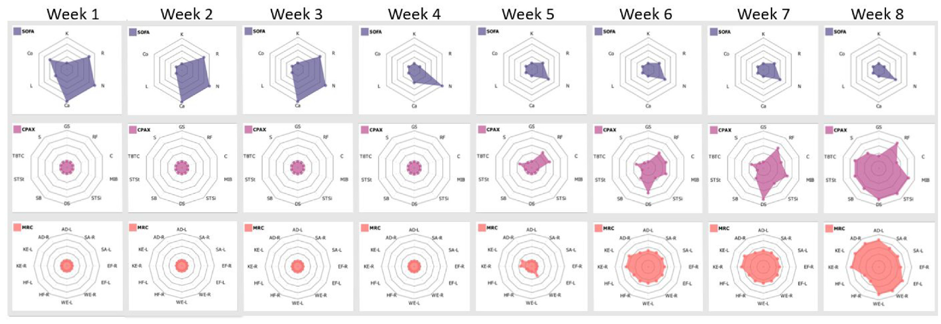
shows solely the CPAx and MRC radar charts, from the Patient View representation, for the entire stay of the Patient in the CCU. Observe the steady increase of both metrics throughout, with CPAx showing a consistent reduction in physical morbidity alongside MRC showing balanced muscle power improvement in all areas. The trend of shrinking SOFA plots, combined with growing CPAx and MRC plots correlate strongly with patient recovery.
Beyond week 9
The Patient was in the ward for another 18 days before she was discharged. The Patient’s recovery continued after she went home. In an update from the Patient, staff were delighted to hear that the Patient has also now returned to work.
Discussion
This project aimed to provide software support to Clinicians in our local CCUs. Throughout the project, there were two goals required to ensure that the software developed would fulfill the users requirements. The first goal was to ensure that Shneiderman’s visual information-seeking mantra was used as a foundation for design. The second goal was that the software would be developed with the user at the center of the process.
The methodology of a UCSD worked well and became inherent to the structure of meetings. The users were always keen to see the latest version of the software and so meetings began with handover of the latest version. Even though all patient names and birth dates were redacted, it was particularly interesting to observe the Clinicians identify individual patients based on their Patient View. User(s) evaluated the latest version of the software using scenarios. Note that the formality and length of feedback sessions varied based on user availability. There were at least seven formal feedback sessions carried out before the COVID-19 pandemic stopped all access to CCU staff. Initially, all available users were invited to these feedback sessions. However, due to unhelpful crossover of conversations, this was reduced to a maximum of two at any feedback meeting. The number of users was always based on clinical pressures at the time of our scheduled meetings. For example, there was one scheduled feedback session where only the Research Sister was available.
Meetings were audio recorded (with permission) to ensure that all user feedback was captured. As well as feedback, new and updated requirements were also discussed. It was common for requirements to evolve (and be refined) throughout the process of software development, so this was expected. In addition to these formal sessions, there were numerous informal sessions. One such example was from Christmas Eve in 2017 when sketches of the iconography panel were presented to one of the Physiotherapists. This evaluation took place in the only space available, the empty waiting room of the CCU. The Physiotherapist only had 15 min to spare but it was sufficient for him to approve the idea in principle. Subsequently, a prototype of the Patient View incorporating the iconography panel was developed for testing with the whole team.
Overall, this project aimed to provide visual representations of CCU data that were underpinned by Shneiderman’s mantra. The Patient Population Filter provides users with access to all of their data. It enables users to “zoom and filter” their preferred volume of data which is subsequently visualized using the Patient View. The volume of patients can be all the patients in the dataset or one specific patient. The filtering options include the patient’s gender, their outcome, their re-admission status as well as how long they were in the hospital or CCU. This wide array of filtering options was specified by the users.
The Patient View does successfully provide an “overview” of the entire stay of typical patients. The MMS graph denotes the overall improvement in the patient’s health. The iconography panel encodes their mental state, as well as their physiotherapy details specifying how much, and what type of physiotherapy they had. However, there are some patients who have extended stays on the CCU. On an average display device, the Patient View automatically changes to a scrolling window as the time spent in the CCU exceeds 1 month. Hence, the entire stay is no longer visible as a single overview, on an average desktop PC display device. This means that for atypical patients whose stay on the CCU is measured in months rather than weeks, the design goal of providing a single overview of the Patient was not achieved. Various solutions to this problem were discussed. The users consistently fed back that they did not want the iconography panel compromised to avoid the scrolling. In their view, the scrolling was not an issue. Therefore, the software has not been changed. The Patient View is presented on the basis that it only provides an overview for some patients, not all patients. Whilst the users were satisfied with this outcome, methods to overcome this limitation have been added to the future work on the project.
The Patient View successfully supports users analyzing the “details” of their patient data. By iterating through each day of the Patient View, Clinicians can inspect the daily values on the SOFA, CPAx and MRC plots. Whilst their emphasis is usually on whether the plots are “blossoming” or “wilting,” those individual details are available for inspection.
Overall, the use of a UCSD methodology has strengthened this project. Having the user involved at every stage is challenging but it has kept the project focused. Using the mantra as a basis for the visualization of the data also generally worked well.
Benefits to clinicians
The Patient View software was not available at the time this patient was admitted to hospital, but its benefits can still be seen retrospectively. This software collates data which currently cannot be accessed via a single system, enabling users to consider trends between separate data streams which could not be easily studied before. Clinicians report that outcome recovery data after critical illness is routinely collected as it is essential to tailor future interventions. It is also important for Clinicians to be able to collate all their data together, to explore and study that data so that they can gain new insight from it. The CCViews software supports Clinicians as they reflect, assess, and evaluate which interventions are working best for different patient groups. They reported “The capacity to zoom into and explore distinct patient groups is a huge advantage - it allows interprofessional clinicians to quickly and efficiently explore and examine outcomes and journeys of recovery.”
Having this range of data organized visually into a single display enables clinicians to quickly assess a Patient’s progress. This can reduce the time clinicians spend looking for information in raw data. In Figure 6, where the entire stay for the Patient is shown, it is simple to see three core pieces of information:
The upward trend of the MMS graph dominates the display and shows that the overall mobility of the Patient improves throughout their stay.
The background of the RASS scores in the table transition from red to green, clearly defining when the Patient transitioned from their sedated state back to a higher level of consciousness.
The gray bars denoting the length (in minutes) of physiotherapy sessions trend upward, as do the variety of exercises shown within them.
The software also enables Clinicians to look at daily recovery trends by comparing the changes to the radar charts across any desired period. Consider the collection of radar charts shown in Figure 7. Note how the SOFA plot diminishes, whilst the CPAx and MRC plots expand, illustrating the reduction in mortality and physical morbidity across the duration of the CCU stay of the Patient. This process is colloquially likened to the process of a CPAx and MRC “flower” blooming and that of a SOFA “weed” shrinking as the Patient recovers in the CCU. Using the software, this “blooming” and “shrinking” information from the radar charts can be used broadly or the details can be investigated in more depth. Clinicians have reported that “The system allows every member of the team including our strategic senior team to examine and quickly explore rehabilitation data in order to predict flow and trajectory of recovery. This is a real plus for this system as it also allows us to present data quickly and dynamically.”
Overall, this software has the potential to reduce the time clinicians spent interpreting information from data. It will improve their ability to identify trends between physiotherapy interventions and different recovery trends. Finally, by combining data from separate data streams it would enable better communication of patient progress between different teams and departments involved in the Patient’s care. This has the potential to improve CCU patient outcomes.
Benefits to patients
In addition to supporting clinicians, this software can also have significant benefits for patients. It is widely recognized that it can be difficult for patients in CCUs to appreciate the progress they are making. Further, they get frustrated with slow progress.
The Patient View software can be used to present the Patient’s recovery to them using the simple metaphor of the flower blooming and the weed shrinking. Showing patients their progress to date visually helps communicate how far they have already come, encouraging them to be proactive and engage in their recovery. This will be used to show patients where they were previously, inspiring the patient to surpass previous progress. This data visualization can also enable them to feel more directly involved in their recovery. Clinicians have reported that “The capacity to share this data with patients in an accessible and visual format allows patients and loved ones to identify areas of strength and development that they can target in their rehabilitation.”
Conclusions and future work
The Patient View presented in this paper is the only the first version of the CCViews software suite. It demonstrates a case study of transdisciplinary research applying techniques from the field of Information Visualization to the analysis of patient data. With reference specifically to the Patient View, it will be tweaked to improve the clarity of the data presented. Day numbers will be added to the view as well as identifiers to represent each week spent in the ICU. Given that the Patient View cannot be amended to manage patients with unusually long stays in the CCU, an alternative overview is being developed.
Additionally, numerous other visual representations are in development. For example, a visual representation called the “Life View” is under development. This representation would provide a visual overview of the frailty of a Patient. It would depict every time a Patient interacted with medical professionals including GPs, Consultants, in-patient and out-patient stays at hospitals. Therefore, another representation called the “Prediction View” adopts the latest techniques in machine learning to predict the Patient’s future recovery data. Predicting the next 1–3 days is relatively accurate help clinicians identify when patients are optimally ready to be discharged from the CCU.
Artificial intelligence offers a real opportunity in healthcare, expanding opportunities for data analysis to include qualitative 31 data as well as quantitative. The CCViews project is delivering the vast benefits of Information Visualization to CCUs. The Patient View presented in this paper is the first representation of many that are required. Therefore, CCViews will continue to be developed.
Footnotes
Acknowledgements
The authors would like to take this opportunity to sincerely thank the Patient for providing us with access to her data. The aim is to provide software support for the clinicians in critical care units. Testing software on artificial data is limited. Therefore, having access to real patient data has enabled this project to bridge the chasm between theory and practice. Thank you very much! This work was carried out as a collaboration between the University of Plymouth and University Hospitals Plymouth NHS Trust, Plymouth. The authors are grateful to both organizations for their support to carry out this research.
Funding
The author(s) received no financial support for the research, authorship, and/or publication of this article.