
Abstract
Visualization, a vibrant field for researchers, practitioners, and higher educational institutions, is growing and evolving very rapidly. Tremendous progress has been made since 1987, the year often cited as the beginning of data visualization as a distinct field. As such, the number of visualization resources and the demand for those resources is increasing at a rapid pace. After a decades-equivalent long search process, we present a survey of open visualization resources for all those with an interest in interactive data visualization and visual analytics. Because the number of resources is so large, we focus on collections of resources, of which there are already many ranging from literature collections to collections of practitioner resources. Based on this, we develop a classification of visualization resource collections with a focus on the resource type, e.g. literature-based, web-based, developer focused and special topics. The result is an overview and details-on-demand of many useful resources. The collection offers a valuable jump-start for those seeking out data visualization resources from all backgrounds spanning from beginners such as students to teachers, practitioners, developers, and researchers wishing to create their own advanced or novel visual designs. This paper is a response to students and others who frequently ask for visualization resources available to them.
Introduction and Motivation
Data visualization has become an increasingly important solution for analyzing and exploring huge volumes of complex, multivariate data. As such, the number of data visualization resources has grown very rapidly over the past decades. However, for students, researchers, practitioners, developers or visualization scientists who work in the field, searching for data visualization resources can be challenging and time consuming due to the rapidly evolving landscape of visualization. A simple Google search will not always lead to the most valuable resources and will not lead to a curated source of visualization resources. This collection of visualization resources serves as an effective starting point when searching for both literature and tools related to visualization due to the many hours of searching and curating dedicated to this project and decades of collective teaching and research experience. By decades-equivalent long search process we mean a search process that required decades of person-years to conduct. The whole team of co-authors searched for resources for approximately 2 years. In addition to this, some of the co-authors have been discovering resources over the course of their career which spans decades.
Many students, teachers, practitioners, institutions, and companies have been collecting data visualization resources, such as Souto 1 who provides a curated list of open-source data visualization developer resources such as programing libraries, software, and websites. These collections focus on the tools and techniques of visualization. Survey papers and literature, such as Lam et al. 2 , and Isenberg et al. 3 provide a collection of metadata on research papers at the annual conference series related to evaluating visualization.
By the term resource we mean content that provides benefits or utility to visualization students, practitioners, researchers, and developers. The inspiration behind this project comes from real-life experience. We are often asked what visualization resources are available from students, researchers, and practitioners. This is a response to this very common question.
This paper aims to provide an overview of collections of data visualization resources. It also provides a categorization of those resources. The contributions of this survey include:
The first comprehensive survey of its kind on collections of resources for data visualization,
An expanded categorization of visualization resource collections organized around readership with a focus on students, researchers practitioners, and developers.
We offer the collections in an interactive web-based browser. Our web-based collection of visualization resources is available at: https://sites.google.com/view/visres/.
Survey Scope
We focus on free, visualization-specific resources, e.g., open collections of visualization images or other collective meta-data. We catalog collections of visualization resources (as opposed to individual items), e.g. a survey of surveys, and state-of-the-art reports rather than an individual survey, or a survey of books rather than an individual book. There are too many visualization research papers (estimated in the thousands) to list individually. However, there are resources that present and explore the large collection of visualization literature such as VisPubData, 4 VisImageNavigator, 5 and CiteVis. 6 Similarly, there are over 100 survey papers on the topic of visualization and visual analytics. Therefore, we focus on resources such as surveys of surveys.7–9 We present collections of visualization resources spanning different types such as literature, software, and web pages. In summary, we include collections of visualization resources we believe provide great value to students, researchers, practitioners, and developers.
We focus on collections offered by non-profit institutions and organizations. This includes higher educational institutions, non-profit institutions such as Wikipedia, and collections of visualization resources gathered together for public use by volunteers.
Finally, in order to make the scope manageable, we ensure that the resources have a focus on visualization and visual analytics. See McNabb and Laramee, and Laramee 9 and Rees, and Laramee and Laramee 10 for detailed definitions of visualization and visual analytics.
The Search Process
The search process for visualization resources is challenging, time-consuming, and cannot be solved only by a series of Google searches. However, we do incorporate Google search for collections of visualization resources. Our search for visualization resources is influenced and guided by a number of projects, factors, and experiences spanning over a decade. Many of the visualization resources we describe were discovered through the following related projects and events:
In the past we worked on extracting document-level details of visualizaiton publications. During this project, we summarize image collections from the entire history of the visualization conference 5 and metadata related to VisPubData. 4
For 2 years we worked on a survey of surveys (SoS) for information visualization and visual analytics. 9 During this project, we came across many of the resources described here.
For 3 years we carried out a survey of information visualization and visual analytics books. 10 This project helped us discover many resources.
For over 10 years, we have been teaching a data visualization course in which the students are asked to search for visualization resources.
For approximately 20 years, we have been reviewing several 100 visualization research papers for over 45 different related conferences and journals. During this time, the team has regularly attended visualization related events such as the IEEE VIS and Eurographics Eurovis conferences. Informed by these events, we regularly come across useful resources.
All of these projects and experiences have informed our search for visualization resources. This search process is difficult to systematize and it is the result of a team of visualization researchers and students with more than 20 collective years of experience. We pass on the benefits of this effort and its associated costs to the reader. We provide more details on how we search for resources in each sub-section of the paper based on resource type. We understand there is no way to guarantee we have found everything. That is why we offer a collection on the web. Readers can contribute to this web page: https://sites.google.com/view/visres/
The Benefits of Collections
Focusing on collections offers a number of benefits. First, a collection of collections serves as an effective approach to navigate the abundance of visualization resources. Second, resource collections are often developed and maintained by an individual or a team of curators. Third, by focusing on collections, we take advantage of the many hours of search and constructive labor already invested in collecting the resources. Fourth, by focusing on collections, we inherit the benefits that bring similar resources together and their respective categorization.
Categorization
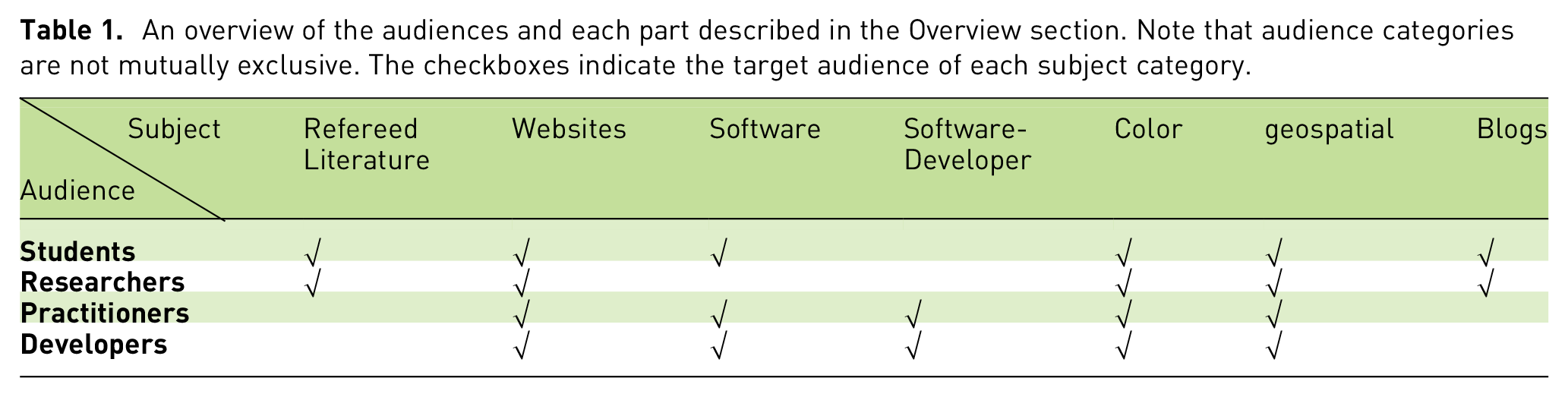
There are many different ways to group and categorize visualization resources. One possibility is to classify them based on type. For example, collections of refereed research papers with accompanying online resources, visualization books with online resources, open-source collections of visualization software, non-profit websites with collections of visualization resources, etc. Another possibility is to categorize the resource collections based on visualization subfield. For example, visual analytics, information visualization, or scientific visualization. However, as we shall see, it would be difficult to categorize resources this way due to subject crossover. A third categorization could be based on target audience such as resource collections for students, researchers, practitioners, or visualization scientists. However, many resource collections are valuable to multiple types of users. Another possibility is to classify resource collections based on special subjects such as education, geospatial visualization, or data-centered resources. However, this might result in many different categories.
After considering several different categorization schemes, we have chosen a grouping based on resource type because we believe this is the most relevant with respect to the prospective readers’ interest. In other words, resource type often aligns with the different categories of readership. For example, a researcher may be interested in finding starting points for relevant refereed literature. Thus, we group the collections of related refereed literature together. In another example, a student may specifically be interested in data visualization websites that offer a helpful collection of resources. Therefore, we have grouped the related websites together. Attempting to categorize visualization resources by subject will result in large crossover between categories. Ultimately no categorization is perfect in this case, i.e. results in no crossover. Table 1 provides an overview of our classification.
An overview of the audiences and each part described in the Overview section. Note that audience categories are not mutually exclusive. The checkboxes indicate the target audience of each subject category.
Overview
This paper organized as following: Section 2 discusses the resources focused on collections of refereed literature. An overview of visualization-focused websites is illustrated in Section 3. Section 4 focuses on off-the-shelf software collections for data visualization practitioner, while Section 5 focuses on visualization software collections for programmers. The special topic of color in visualization is presented in section 6 (due to its popularity). Section 7 discusses visualization resources on another special topic: geospatial visualization. Section 8 presents collections of visualization related blogs. Section 9 provides the conclusion of this paper and a discussion of future work. See Table 1 for an overview.
Related Work
The website usabiliTEST 11 is an online tool for usability testing, and information architecture on web usability issues. The website provides a page called, “Methods table” which provides a collection of resources on usability. It is a collection of resources for the Human-Computer Interaction (HCI) community. This is the closest related work we found on collections of resources. To our knowledge, this is the first comprehensive overview on this topic.
Liu et al. 12 provide a novel collection of visualization resources and a classification of the resources according to type. This short survey compiles and provides the descriptions, examples and information about the curators of each resource collection. It also serves as a novel starting point and concise overview on visualization resources for students, researchers, and practitioners with an interest in data visualization and visual analytics. This is an extension of their work. This paper extends previous work in the following ways: 1) It includes resources for developers, 2) It includes special focus topics such as color mapping, and 3) It is more comprehensive (approximately twice the size) covering new categories such as geospatial visualization and blog collections. Conceptually, what we present here can be seen as adding an additional row and five more columns to Table 1 as compared to Liu et al. 12 We have also added 4) a set of reader recommendations for each collection of resources for this extended version. The number of references has more than doubled.
Resources-Focused on Collections of Refereed Literature
This category focuses on peer-reviewed literature that offers collections of research papers. It offers a helpful starting point for readers interested in obtaining very helpful literature overviews. In this section, resources on surveys of surveys are presented. Next, research papers with online collections and resources are proposed. In the third subsection, we provide some surveys which gather online collections of images. The fourth sub-section focuses on SurVis 13 resources discussed in the literature. Lastly, surveys of visualization books are discussed.
Refereed Survey-based Resources (Surveys of Surveys)
Surveys present a valuable means to quickly find previous research on a particular topic. However, there are a growing number of topics and therefore a growing number of surveys. To address this, there have been recent developments on surveys of surveys.8,9,14,15 These surveys of surveys are valuable resources offering a concise overview of the interactive data visualization and visual analytic fields.
Text visualization has seen rapid gain in popularity in recent years, accompanied by a number of survey papers on the topic. Alharbi and Laramee provide an overview of these with a review of 14 text-based surveys. 14 Similarly, the surveys from the cross-disciplinary field of molecular dynamics have been analyzed by Alharbi et al. 8
A premier journal for publishing surveys in data visualization and computer graphics, Computer Graphics Forum, has an extensive collection of surveys – every survey published in Computer Graphics Forum. The website by Chen 15 features, over 180 survey papers presented in chronological order dating back to 1985.
As a hot topic in comprehending patterns and predicting trends of data, machine learning models have developed quickly in many different areas. Accordingly, information visualization of machine learning models provides an effective solution in interpreting the workings of these models. Chatzimparmpas et al. 16 contribute a survey of surveys on the exploration and interpretability of machine learning models. This work contributes 18 papers related to the visualization of machine learning (2014–2018).
Research Papers with Online Metadata Collections and Resources
There are a number of previous related papers that examine collective metadata from published visualization papers and publish the metadata itself as a contribution for further research and analysis.
Matejka and Fitzmaurice implement a method to create a dataset by slightly modifying a given one 19 while at the same time preserving the mean, standard deviation, etc, of both of them. In other words, the statistical properties of the two datasets are are the same. They demonstrate that statistics are not always adequate to understand data models and how visualization can be of help in these cases. Their work was based on the theory of Anscombe’s Quartet presented by Anscombe 20 and the Datasaurus Dozen created by Cairo. 21 Based on these methods, a web page is also provided to demonstrate the variation of datasets. 19
Diehl et al. created an educational platform called VisGuides 22 that promotes the discussion of visualization guidelines and well established concepts. It targets different kinds of audiences such as students, practitioners, and scientists, and teachers. It collects the advice and recommendations on visualization design from experts in the field.
Borkin et al. created an online database which aims to provide deeper insight into the elements of a visualization that affect its memorability, recognition, recall, and comprehension. 23 The database consists of over 5000 static images of which over 2000 contain visualization type information, and hundreds of these visualizations have extensive annotations, memorability scores, eye-movement metadata, and labels. In addition to providing insight on visual encoding techniques and designs utilized by the different publication venues, this database is also a resource for cognitive and perceptual experiments. Resources like these contribute to applications such as image extraction from document analysis.5,24
Ren et al. present an interactive authoring tool that enables the creation of bespoke and reusable chart layouts. 25 The website is free and open source from Microsoft Research and available at the Charticulator URL. 26 The gallery in the website consists of 26 visualization charts with videos.
Borgo et al. created a free resource page called Crowdsourcing4Vis, for a Eurovis 2018 State of the Art Report (STAR) on the use of crowdsourcing in information visualization for evaluation. 27 The website contains a spreadsheet of 82 papers, specifing the crowd-sourcing meta-data ralated to each paper, on crowdsourcing for evaluation in the information visualization community.
Wang et al. introduce “cheat sheets” 28 summary sketches of visual designs for data visualization techniques. Wang et al. implemented an iterative design process of data science and visualization and generated six types of cheat sheets: anatomy, construction, visual patterns, pitfalls, false-friends and well known relatives. They evaluate the results with a qualitative user study and demonstrate the readability and utility of the cheat sheets.
Fuchs et al. contribute an online visualization platform called EduClust 29 for teaching clustering algorithms. The web application features visual representations, interactions and animations to help users understand clustering input, parameters and algorithms. Also, the website can be used as a teaching tool to demonstrate the effect of different clustering parameters on various datasets while animating through each algorithm step.
Research Papers with online metadata collections: A summary of the online collections described in Section Research Papers with Online Metadata Collections and Resources. These papers feature a refereed collection of research papers with online resources.
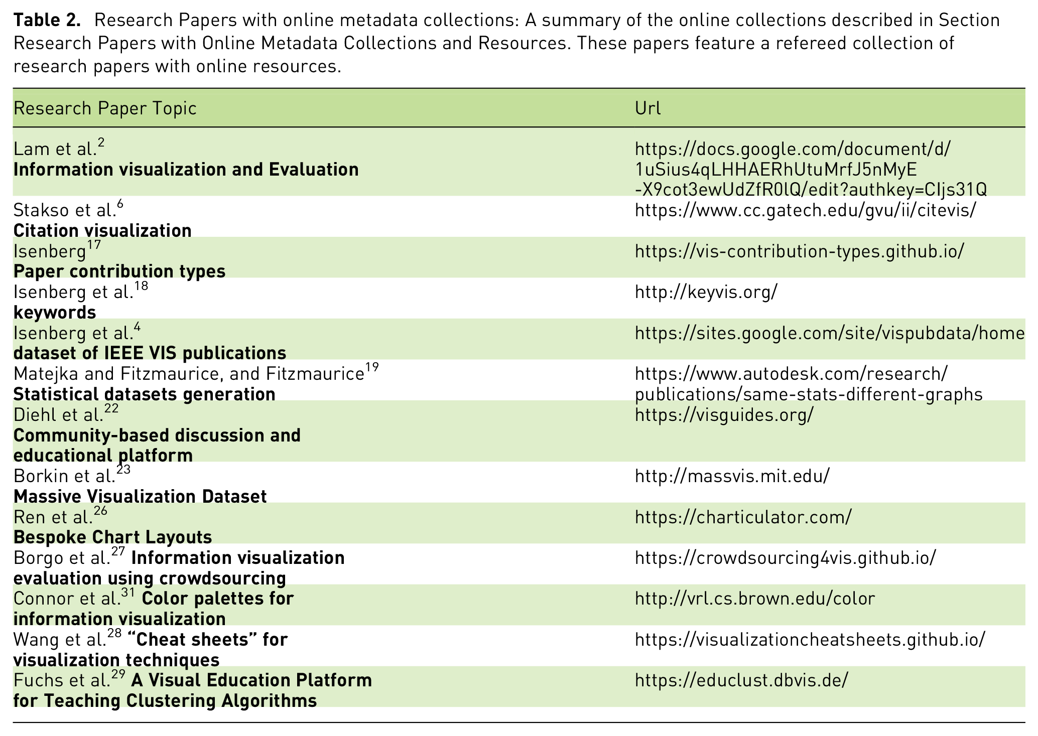
The work of Isenberg et al. (2016) 4 is a collection of metadata for every IEEE VIS conference paper. This is a resource we cite and use regularly. We recommend it to readers who are interested in a complete collection of visualization reference material for every visualization conference paper published since 1990. The work of Matejka and Fitzmaurice, and Fitzmaurice 19 is often cited and provides a very valuable illustration necessitating the need for visualization. As valuable as statistics are, statistics can remain the same for very different images. This resource illustrates this.
Diehl et al. 22 is a very valuable resource for both teachers and students of visualization and visual analytics. We recommend VisGuides for discussions of visualization guidelines and best practices in Visualization and all readers involved in teaching or studying those topics. We also recommend the study sheets offered by Wang et al. 32 for students and teachers, as well as the helpful teaching material on clustering algorithms by Fuchs et al. 29
The image collection provided by Borkin et al. 23 is recommend for those interested in studying the use of visualization “in the wild” i.e. including reports, infographics, news media, and scientific journals. It contains over 5000 sample images. Ren et al. 25 is a recommended resource for practitioners interested in creating advanced charts. They can be customized by the user in ways beyond the typical off-the-shelf software.
The literature metadata collection provided by Borgo et al. 27 is recommended for those readers interested in the use of crowdsourcing to conduct user studies.
Survey Papers with Accompanying Image Collection Browsers
A number of visualization survey papers have been published that assemble an online collection of images related to the theme the survey covers. The list of websites with accompanying image collection browsers is provided in Table 3.
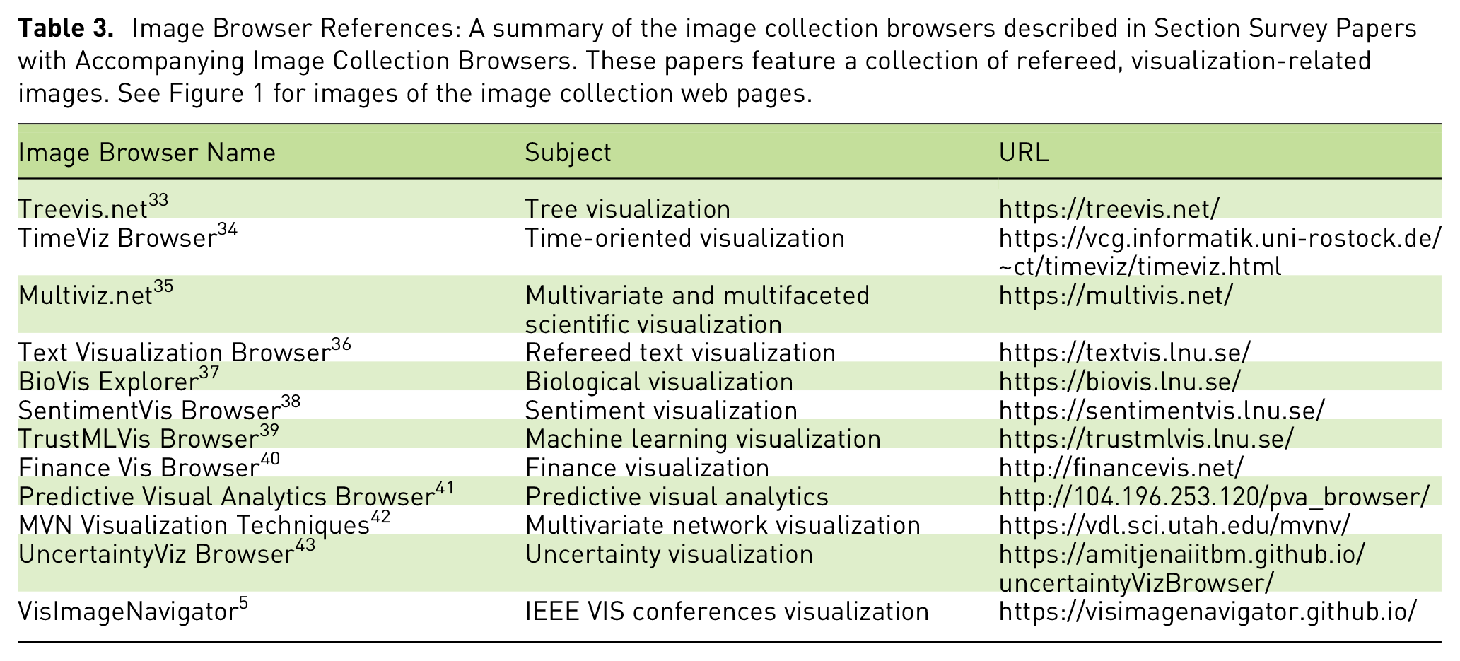
Image Browser References: A summary of the image collection browsers described in Section Survey Papers with Accompanying Image Collection Browsers. These papers feature a collection of refereed, visualization-related images. See Figure 1 for images of the image collection web pages.
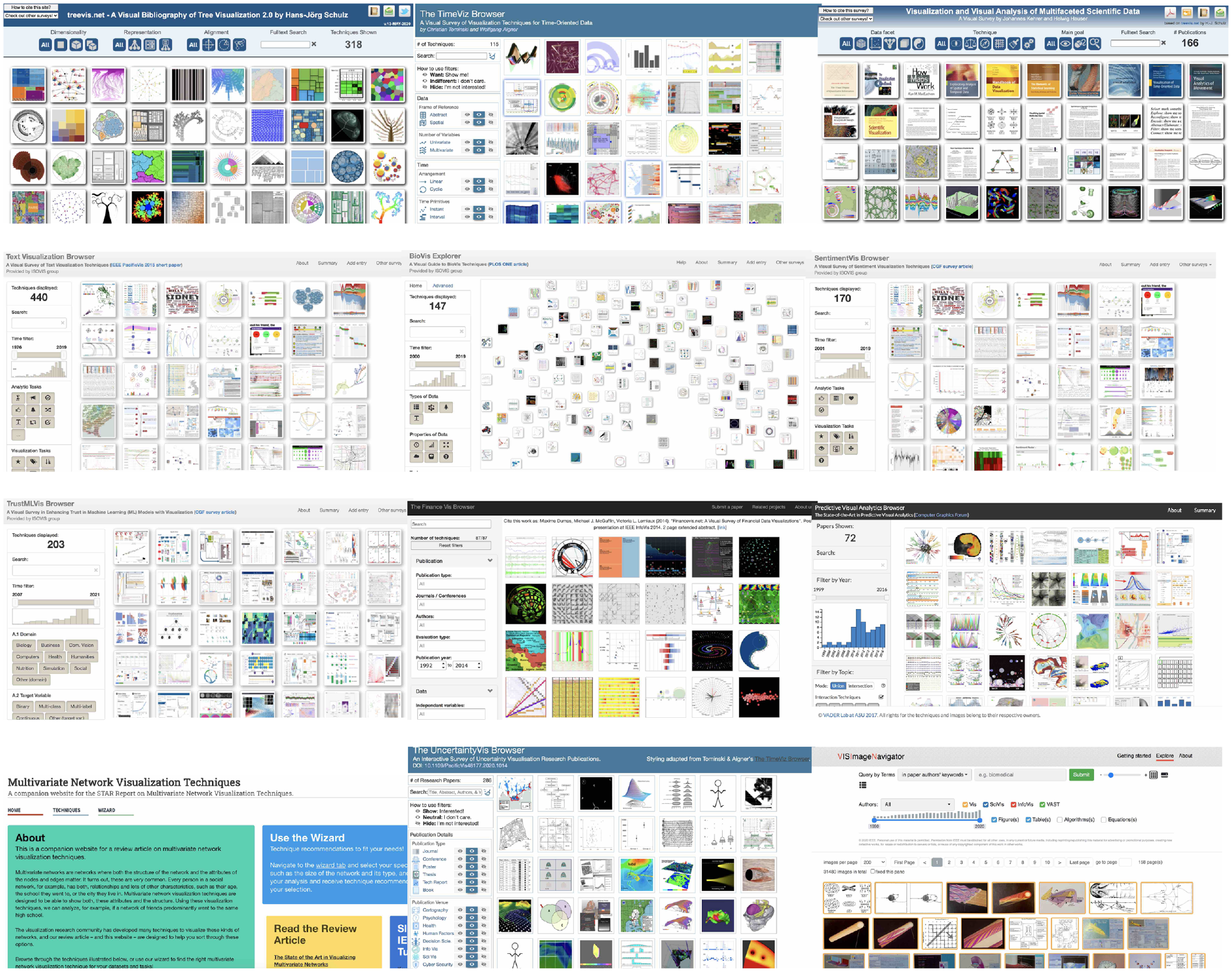
Thumbnails of Image Collection Browser web pages. They are presented in the same chronological order as Table 3.
One example of such a survey paper with an image collection browser is from Schulz 33 which features a collection of over 300 images that exemplify tree visualization. Another excellent example of this is presented by Aigner et al. 34 which hosts an online collection of over 100 images on the theme of time-oriented visualization. Kehrer and Hauser present an online collection of visualization images on the topic of multivariate and multifaceted scientific data. 35 The collection features over 160 images related to this topic from refereed sources.
Kucher and Kerren collect a large, online collection of refereed text visualization images. 36 Their collection holds over 470 images. Kerren et al. et al. present an advanced image browser related to biological visualization techniques. 37 This image browser has a special interactive feature that shows citations in the form of a graph with over 140 images. Kucher et al. present another survey paper on the state-of-the-art in sentiment visualization. 38 This is also an advanced image browser that features a valuable collection of metadata shown when clicking on an image. It holds over 160 peer reviewed visualization images. Chatzimparmpas et al. collect 200 refereed images on the topic of building trustworthy machine learning methods using visualization. 39 The image browser also offers a detailed set of metadata for each image.
Dumas et al. developed an online collection of visualization images focusing on finance. 40 The image browser supports a number of filtering options and stores over 85 peer-reviewed images.
Lu et al. collect an archive of online images related to the topic of predictive visual analytics. 41 A number of interactive filtering methods are available for over 70 images. Nobre et al. showcase both a collection of images and guidance on visual designs related to multivariate network visualization techniques. 42 Jena et al. present an impressive visualization image browser with advanced filtering options for over 280 images 43 all of which are dedicated to the topic of uncertainty visualization.
Chen et al. 5 have the most complete collection of image data (figures, tables, equations, and algorithms) of all three conference tracks of IEEE VIS (Visual Analytics, Information Visualization, and Scientific Visualization) in its 31 years of history with approximately 30 k images in total. This dataset is also cross-linked to vispubdata 18 so the user can find images by keyword search. Their open source models 24 can make the subsequent data collection easier with less human intervention.
Survey Papers with an Accompanying SurVis Web Page
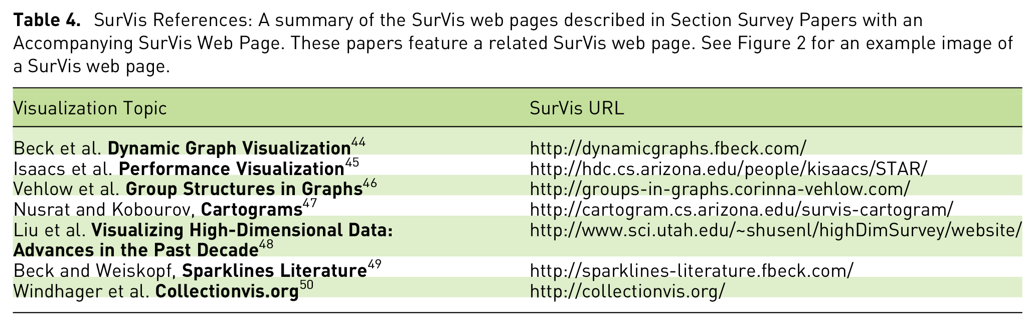
SurVis 13 is a flexible visual analytics tool used to structure and present a list of references in surveys. The list of websites with SurVis Web Page are summarized in Table 4 and Figure 2.
SurVis References: A summary of the SurVis web pages described in Section Survey Papers with an Accompanying SurVis Web Page. These papers feature a related SurVis web page. See Figure 2 for an example image of a SurVis web page.
A sample images of a SurVis web page. The full list is presented in Table 4.
The SurVis interface is divided into two main views. An overview of the literature collection and a detailed list of references accompanied by an image. In the overview, the collection is presented using a timeline that provides an annual chronology of the publication collection. A bar chart is integrated into the timeline to summarize the number of publications in each year. The rest of the overview leverages selectable word-sized sparkline visualizations embedded in word clouds to show the publications metadata and clusters. The selector mechanism enables linkage between the two views.
Several surveys incorporate SurVis to structure and visually analyze a literature collection. Beck et al. 44 use SurVis to systematically derive a hierarchical taxonomy of dynamic visualizations. Isaacs et al. 45 and Vehlow et al. 46 use SurVis to exhibit their literature collection. The former presents visualization approaches that inform users on optimizing software performance. The latter presents approaches that explicitly depict group structures in graphs. Nusrat and Kobourov 47 use SurVis in their bibliographic analysis. Nusrat and Kobourov applied some modifications to SurVis to incorporate different cartogram types and applications. Liu et al. 48 survey the approaches that visualize high-dimensional data. Beck and Weiskopf, and Weiskopf 49 present the state-of-the-art of embedding word-sized graphics within scientific texts. Windhager et al. 50 also use SurVis to present their literature collection which focuses on visual interface design for cultural heritage collection data.
Surveys of Visualization Books
Books are traditionally overlooked when compiling state-of-the-art reports, however, they can contain a vast trove of information. A survey by Rees and Laramee addresses this by reporting on information visualization books. 10 In total, 41 books are reviewed totaling over 23,000 pages with a combined value of approximately $3600 USD. Books are classified according to the audience with recommendations provided for readers, along with an indication of how many pages are dedicated to each topic.
The team at Information is Beautiful has compiled a list of 73 books on information visualization and infographics with a short description. 51 An extended list of 155 books also includes books covering programing tools. 52 Another list of 18 books has been compiled by Durcevic on the datapine blog along with a brief description of each book. 53 As part of their data visualization field guide, Tableau has compiled a list of 12 books including a few paragraphs of description. 54 Yet another list has been compiled by King from Solutions Review which includes 30 books and a single paragraph description of each. 55 The book recommendation website Goodreads lists books in the information visualization genre with a total of 54 books. 56
Survey References: A summary of the surveys of books described in Section Surveys of Visualization Books. These resources feature refereed collections of information visualization and visual analytics books. See Section Surveys of Visualization Books for a description of how they are selected.
Visualization-Focused Websites
As part of our search for visualization resources, we examined websites that focus on visualization and visual analytics.
Guidance on choosing a visual design
Blog(s)
Visualization training and educational resources
Events such as conferences, workshops etc
Visualization related publications
Visualization book collections and recommendations
Visualization tools and software
Data sources
Case studies and examples
Links to related web pages
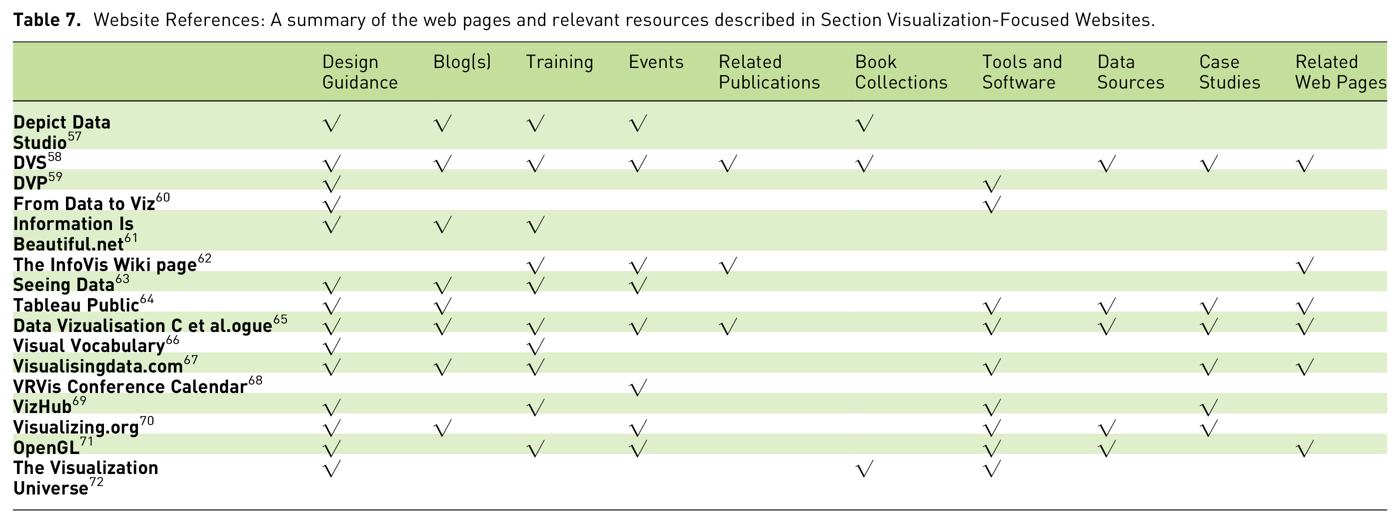
The above list also serves as a quality checklist for inclusion. The list of websites we found that meet our quality criteria are summarized in Tables 6 and 7. We do not include web pages of individual authors simply listing their own publications. We do not include solely for-profit news articles. An overview of the websites is provided by Figure 3, and Tables 6 and 7.
Website References: A summary of the Visualization-Focused web pages described in Section Visualization-Focused Websites. These websites feature a quality collection of visualization-related resources. See Figure 3 for images of the websites. See Section sec:websites for a description of how these websites are filtered.
Website References: A summary of the web pages and relevant resources described in Section Visualization-Focused Websites.
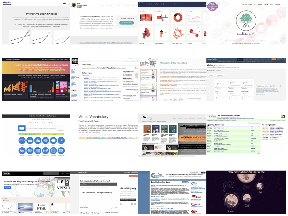
Thumbnail images of Visualization-Focused Websites presented in the same order as Table 6.
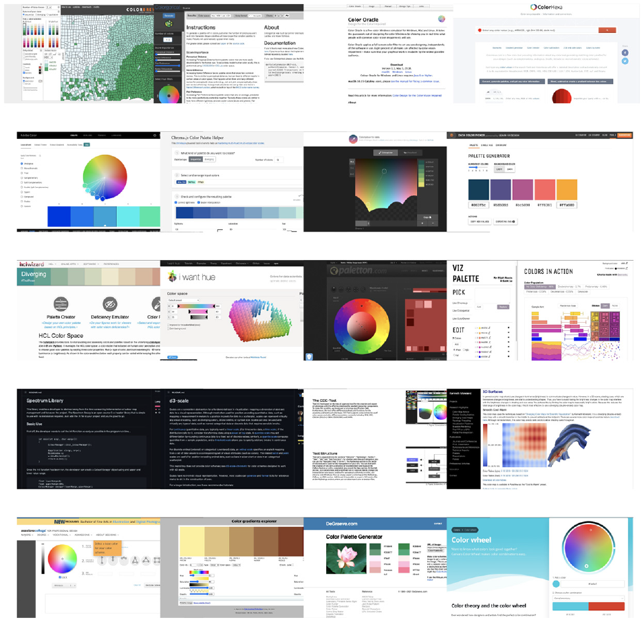
Thumbnail images of web pages of the color resources presented in the same order as Table 9.
The data visualization society.com (
The Data Viz Project (
The
The
The
Visualising Data.com 67 and Information Is Beautiful 61 are recommended for those interested in training opportunities in visual analytics and visualization.
Information Is Beautiful, 61 Seeing Data, 63 Tableau Public, 64 the VizHub, 69 and Visualizing.org, 70 are excellent resources for those interested in seeing how visualization is applied to real-world data. They include a large collection of high-quality case studies and examples in visual data representation.
The InfoVis Wiki Page 62 is a good resource for those interested in applying for a job as a visualization scientist. It is one of the few resources that collects job advertisements in visualization and visual analytics as well as the industries and business hiring in these areas.
DVS 58 and VRVis 68 are recommended for practitioners who are interested in participating in activities such as meetings and visualization events and developing their professional network.
Free, Off-the-Shelf Software Collections for Data Visualization Practitioners
This section describes free off-the-shelf software for data visualization in practice. Since the start of visualization as a field, hundreds of software tools related to visualization have been developed. Due to the large volume, we do not list individual programs but rather collections of applications. Luckily, a few dedicated practitioners have worked very hard at curating an organized collection of off-the-shelf software collections.
One of these collections is created by Andy Kirk 67 (https://www.visualisingdata.com/resources/) who has organized links to over 190 applications related to visualization. Each application is represented by an image. The programs are organized into the following groups: data handling, desktop application, web-based, qualitative, geospatial mapping, specialized applications and color tools. There is also a specialized category for visualization APIs for programmers (not strictly off-the-shelf).
Keshif LLC has put together an impressive collection of over 400 visualization tools 77 (gallery.keshif.me/VisTools). The tools can be filtered based on a number of attributes. For example, free (240+), proprietary (70+), and both free and commercial versions (30+). Tools can also be filtered based on features including charting, web-based, color, etc. or the type of data they can analyze such as temporal, multivariate network, geospatial, and text. The filtering and selection options are numerous and detailed.
Interactive things, a group dedicated to visualization, has also published a collection of 56 off-the-shelf tools that they use in their work. 78 Rather than maintaining a comprehensive list, they present a collection of over 50 tools that they use and recommend to others. The tools are organized into the following categories: maps, charts, data, and color (datavisualization.ch/tools/selected-tools/).
A team of University of Edinburgh has created an website called VisBrowser 79 which provides visualization tools and related resources. The online platform contains over 45 visualization tools. All resources are organized under six categorization of resources, namely, availability, programing skills, platform, features, type of data, and visualization.
Free, Visualization Software Collections for Programmers
We make a distinction between software solutions which are complete and form the basis of an entire application versus library solutions which are imported into existing software applications. We focus on complete, open software solutions and collections of open libraries, e.g., collections of chart libraries. The descriptions of the software collections convey their size and their organization.
Open Source Library Collections for Developers
There are now a myriad of open source visualization libraries for developers. There are so many that it is impractical to list each individual one here. Thus, we present a selection of curated collections of free developer libraries to assist in visualization and visual analytics. Luckily, we can exploit the work others have already carried out in collecting and archiving these resource links. An overview of these resources is provided in Table 8.
Open Source Libraries: Software development library collections for visualization developers described in Section Open Source Library Collections for Developers. These resources feature a quality collection of free open source libraries.
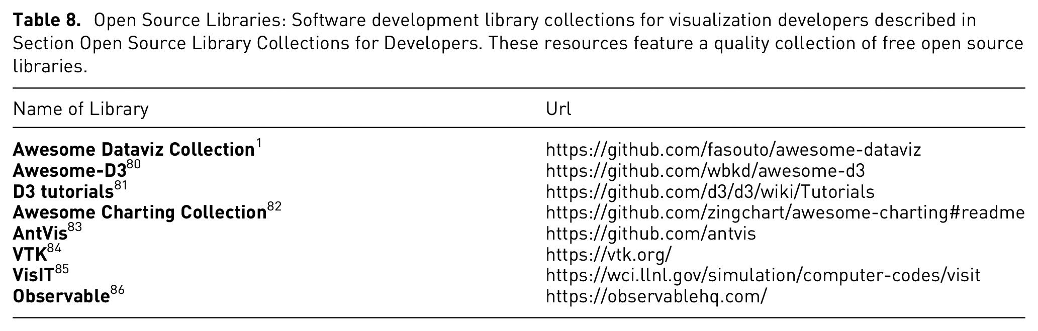
The first collection is called the
The next collection is dedicated to
Another collection is called the
Open Source Software Solutions for Developers
There are a handful of complete, whole package solutions that are supported by textbooks, companies, mailing lists, technical support, mature, older, classic, and feature large datasets. We use the term “software” to indicate a complete solution and not just a library that is imported into an existing program.
The
Special Topic: Color
Although we have focused on collections of visualization resources thus far, we make an exception for the subject of color mapping. Color mapping is a core topic in the fields of data visualization and visual analytics thus the demand for color mapping solutions and resources is high. Furthermore, color mapping is still not considered to be a completely solved problem. We dedicated a special section to the topic of color mapping due to its ubiquitous importance.
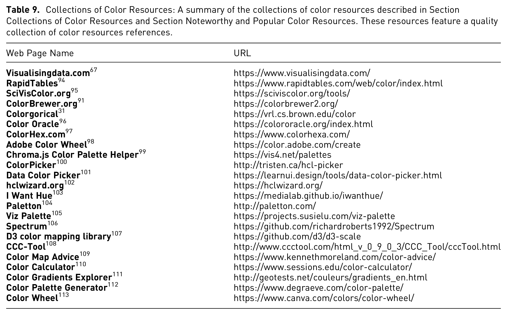
Collections of Color Resources: A summary of the collections of color resources described in Section Collections of Color Resources and Section Noteworthy and Popular Color Resources. These resources feature a quality collection of color resources references.
Collections of Color Resources
Noteworthy and Popular Color Resources
The
The
We recommend Colorgorical 31 to students, researchers, and practitioners who are interested in advanced exploration and design of color scales and color mapping. The user-options featured are more advanced and support the design of custom-made color maps. Users may even design color scales with optimizations for esthetics. Color Oracle 96 is especially targeted at users with color blindness or color impairment. It facilitates the design of color spaces for that special category of users. We recommend ColorHexa 97 for those users interested in exploring different color scales and possible designing their own customized color map. The website offers guidance on choosing and converting colors as well as colors that are compatible with each other.
The Adobe Color Wheel 98 is an advanced color developer tool for more experienced users. Among other features, it enables the user to derive a color map based on an image provided by the user. Color Palette Generator 112 has this same functionality. They can automatically generate color themes and gradients as well as color map recommendations. Paletton 104 is comparable to the Adobe Color Wheel and is recommended for advanced users.
Hclwizard.org 102 is another advanced color generation tool that enables the user to vary three color properties: Hue (=type of color, dominant wavelength) - Chroma (=colorfulness) - Luminance (=brightness). I Want Hue 103 is an advanced feature-rich, open source tool that also offers several color-related resources including tutorials and color theory content. We recommend this tool for users that would like to explore color maps in depth.
We do not recommend Color Wheel 113 as it is not very user-friendly and feature rich compared with the other color palette generation tools.
Color Libraries for Developers
This section presents color libraries for developers. Table 9 and Figure 4 feature an overview of the color developer resources.
The
The CCC-Tool 108 is an open source desktop tool for advanced users who would like to explore color spaces and color maps in depth. It also offers support for continuous, customizable color maps. However, this tool is still in development and may be less mature than others. We recommend Color Map Advice 109 for developers of scientific visualization applications as the library focuses on continuous color maps. Several related research papers on this topic are also offered. Color Gradients Explorer 111 is recommended for advanced users who would like to vary multiple properties of color gradients including hue, saturation, luminosity, and opacity.
We do not recommend the use of Color Calculator 110 as it is of limited functionality and not very user-friendly compared to other color tools.
Special Topic: GeoSpatial Visualization Resources
Geospatial visualization is an important subtopic in visualization. It emphasizes the expression of physical, spatial, demographic, and political organizations of data. Geospatial visualizations resources are widely used in industries such as navigation, weather forecasting, as well as aviation. Hence, we classify geospatial visualization as a special topic in visualization.
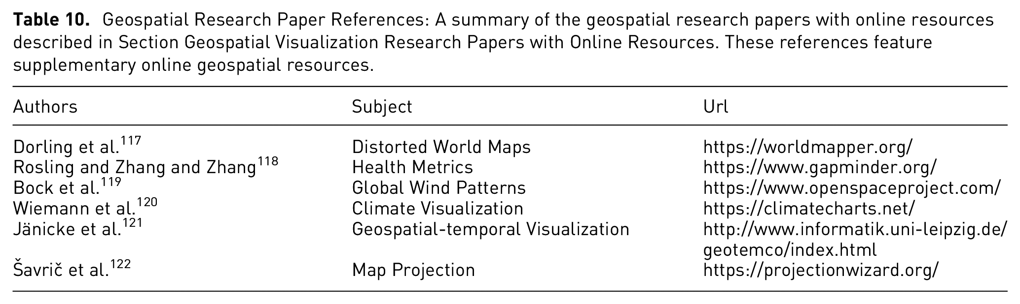
Geospatial Research Paper References: A summary of the geospatial research papers with online resources described in Section Geospatial Visualization Research Papers with Online Resources. These references feature supplementary online geospatial resources.
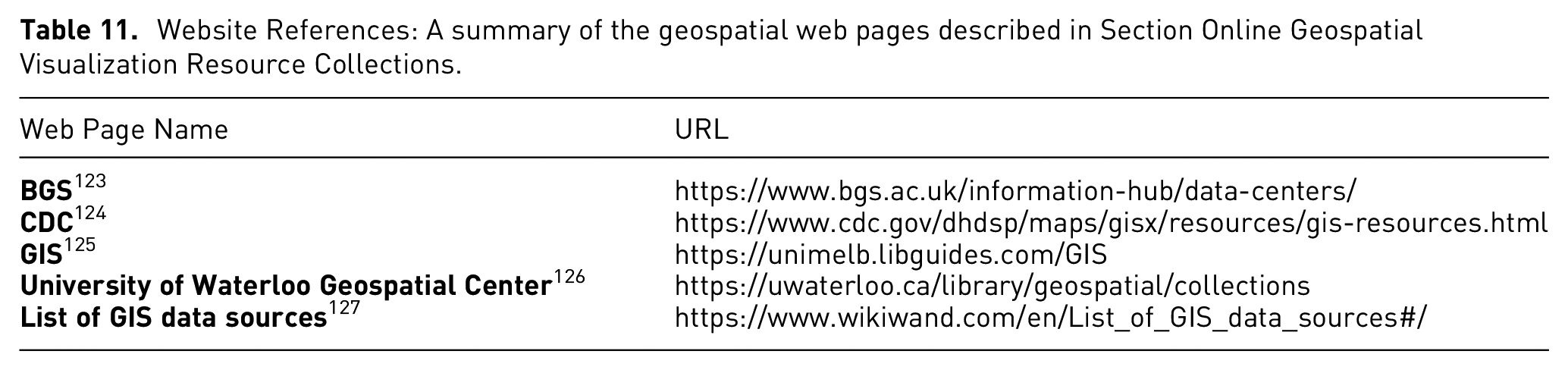
Website References: A summary of the geospatial web pages described in Section Online Geospatial Visualization Resource Collections.
Geospatial Visualization Research Papers with Online Resources
Geospatial images are often projected onto a map or a geographical representation. These representations may not be geometrically correct and may contain distortion to represent the data. An example of distorted world maps is provided by Dorling et al. in an online resource called the WorldMapper. 117 Each country on the map has its size mapped to a user chosen variable, distorting the area of the representation.
Not all geospatial data is represented in a geographical representation. Rosling and Zhang present various health metrics of different countries, enabling a comparison over time. 118 These comparisons along with others are available as an online resource.
Geospatial visualization is not limited to representations of data on Earth. The OpenSpace project provides software that enables exploration of the entire known universe. 119 The representation of weather is an example of geospatial data, predominantly represented with maps. ClimateCharts.net by Wiemann et al. enables users to visualize the temperature and precipitation on every place on Earth. 120 A variety of different data sources can be selected over a range of time spans. Another metrological-based web resource displays the global wind patterns in near real time, enableing the user to easily explore the data in a visually appealing manner. 121
Projecting the globe onto a flat medium such as a screen will always cause a distortion. To address this challenge, Šavrič et al. present Projection Wizard, a web application that helps cartographers select an appropriate projection for their map. 122
Online Geospatial Visualization Resource Collections
The British Geological Survey (BGS) is a public organization dating back to 1835. They provide geological data and services to both public and private sectors. 123 Their website hosts over 400 databases covering environmental monitoring, digital databases, physical collections (borehole core, rocks, minerals and fossils), records and archives. They offer a range of data and maps spanning from open source and free to licensed data. Their open geoscience offerings include maps, geospatial data, scans, photos, and mobile phone applications. The BGS website offers detailed descriptions of its research publications and services.
The Centers for Disease Control and Prevention (CDC) was founded in 1946, after World War II, in an effort to control malaria outbreaks. In addition to hosting a large collection of datasets, they publish a special webpage dedicated to geospatial visualization, 124 they call GIS Exchange (GISX). GISX offers a collection of resources including map making resources, online public health maps, geospatial data resource, GIS software and tools, GIS blogs and forums, and databases for public health research.
The Library of University of Melbourne, established in 1853, hosts rich collections of resources beyond books. They contribute an online collection of geospatial visualization resources 125 administered by David Jones. The resources include map materials of Victoria, portals of Australia and States data collection, spatial resources of Australian specialists and institutions, international sources of GIS, and specialized data collections, map libraries, blogs, societies, as well as a list of GIS spatial applications.
The University of Waterloo Geospatial Center is an inviting hub which provides GIS services and information resources to both the university community and the public. The Geospatial Center hosts a large collection of data and cartographic resources: Canadian geospatial data resources, U.S. and world geospatial data resources, maps and atlases, and online mapping resources. 126
Wikipedia is another website which contributes a list of GIS data sources. The list of datasets 127 is collected for building GIS systems, spatial data bases and other work related to geospatial analysis and visualization. Their web page of GIS data sources includes data from around the world.
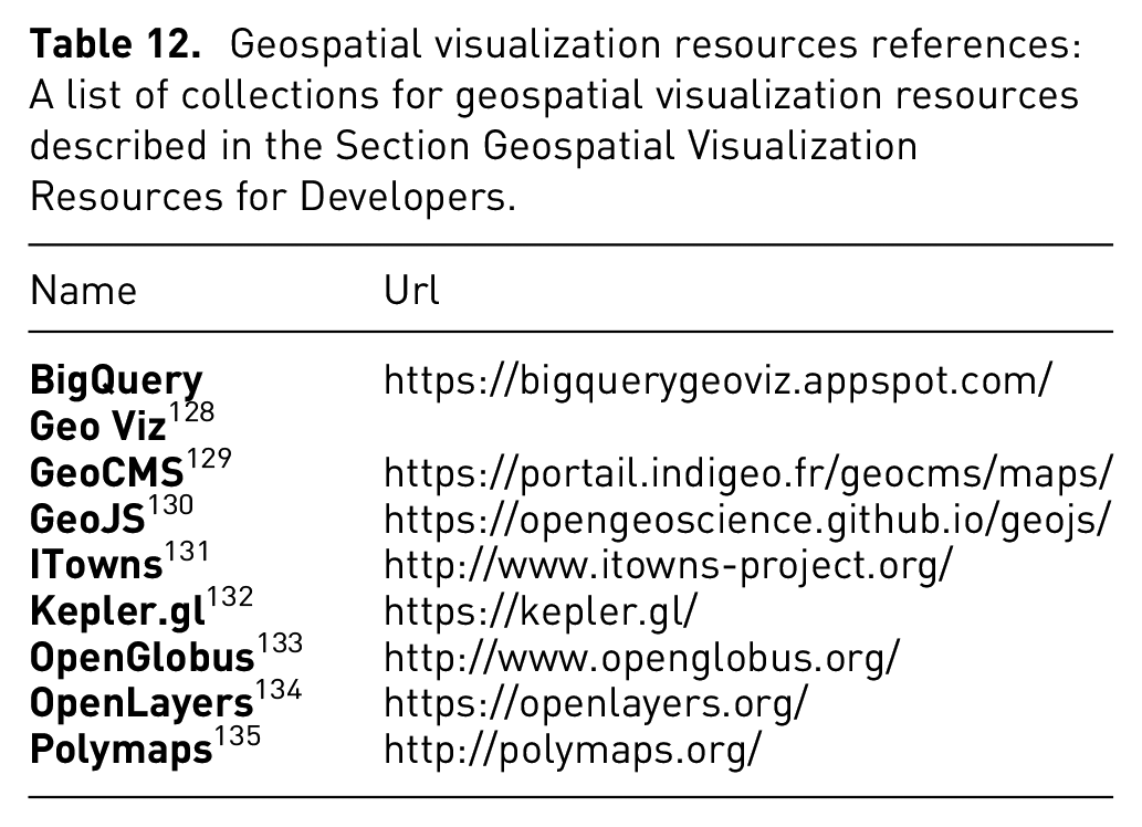
Geospatial Visualization Resources for Developers
Geospatial visualization resources references: A list of collections for geospatial visualization resources described in the Section Geospatial Visualization Resources for Developers.
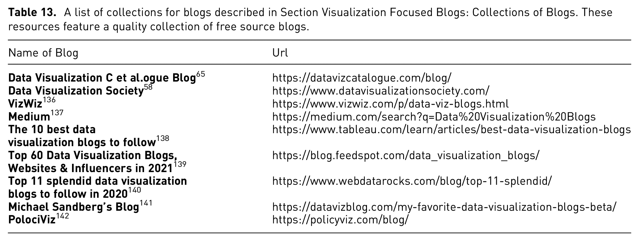
Visualization Focused Blogs: Collections of Blogs
Blogs are a collection of articles written by authors who like to share information on a variety topics. In this section, we present collections of blogs on data visualization. As part of our search for visualization resources, we include collections of blogs that focus on visualization and visual analytics. There are too many blogs to describe individually.
“Top 60 Data Visualization Blogs, Websites & Influencers in 2021” is a Feedspot article of collections on the topic. 139 The article hosts 60 sources of data visualization blogs. Each resource contains a description, author, link, and email contact of the collection. The resources are ranked according to the relevancy, individual brands, blog post frequency, number of followers in social media, domain authority, age of the blogs, as well as other parameters.
Another article on the topic is “Top 11 splendid data visualization blogs to follow in 2012” written by Rovnik. 140 The resource contains 11 data visualization blogs. Apart from the link to the website, each resource is followed by a description of features of the blog list.
A list of collections for blogs described in Section Visualization Focused Blogs: Collections of Blogs. These resources feature a quality collection of free source blogs.
Discussion
Collecting visualization resources is a challenging process. A simple Google search will not yield all of the visualization resources we describe here.
Unsolved Problems
Here we provide some unsolved problems to inspire future work.
Conclusion
In this paper, we present an extended collection of visualization resources. We classify the resources according using a reader-centric typology, i.e., taking into consideration the target reader audience. We compile and provide the descriptions, examples and information about the curators of each resource collection. This paper serves as a valuable resource, a novel starting point, and comprehensive overview on visualization resources for students, researchers, practitioners, and developers with an interest in data visualization and visual analytics and potential future work directions which can be explored. There are many other types of resources such as online videos. Therefore, we would like to expand our survey with more categories. We also think collections of resources that focus on more special topics in data visualization will make the survey even more comprehensive.
Footnotes
Acknowledgements
Special thanks to Richard D Greten for his valuable proof-reading.
Funding
The author(s) disclosed receipt of the following financial support for the research, authorship, and/or publication of this article: This research is supported in part by the Engineering and Physical Sciences Resource Council (EPSRC EP/S010238/1 and EP/S010238/2).