
Abstract
High Frequency Trading (HFT), mainly based on high speed infrastructure, is a significant element of the trading industry. However, trading machines generate enormous quantities of trading messages that are difficult to explore for financial researchers and traders. Visualization tools of financial data usually focus on portfolio management and the analysis of the relationships between risk and return. Beside risk-return relationship, there are other aspects that attract financial researchers like liquidity and moments of flash crashes in the market. HFT researchers can extract these aspects from HFT data since it shows every detail of the market movement. In this paper, we present HFTViz, a visualization tool designed to help financial researchers explore the HFT dataset provided by NASDAQ exchange. HFTViz provides a comprehensive dashboard aimed at facilitate HFT data exploration. HFTViz contains two sections. It first proposes an overview of the market on a specific date. After selecting desired stocks from overview visualization to investigate in detail, HFTViz also provides a detailed view of the trading messages, the trading volumes and the liquidity measures. In a case study gathering five domain experts, we illustrate the usefulness of HFTViz.
Introduction
With the development of high speed electronic chips, High Frequency Trading (HFT) has become one of the most profitable ways for trading. Financial markets have been transformed by faster speeds in recent years. For example, the BYX exchange reduced its order processing time sevenfold, from 445
HFTViz provides a visual interface to HFT data. It enables users to investigate several levels of time aggregation, that is, from hours to milliseconds. Altogether, contributions of HFTViz are:
An HFT data visualization design enabling the exploration and understanding of financial information like price changes, liquidity a measures and number of quoting messages in different timescales from milliseconds to hours;
HFTViz, a prototype for HFT data exploration;
A case study of HFTViz gathering five experts in financial data analysis.
Related works
Previous work related to high frequency trading data visualization can be organized into two categories: financial data visualization and time series visualization. In the financial data visualization, we concentrate on approaches related to financial markets. After that, we present the time series visualization section to discuss works leveraging time series visualization techniques in different domains.
Financial data visualization
Previous works related to financial data visualization methods can be organized in two groups: high frequency data and low frequency data. Low frequency data has a range from years to days. In the contrary, high frequency data has a time range from days to milliseconds.
One of the significant aspects of HFT data is its dimension. As an example, there are around 3000 companies in NASDAQ exchange, with the following temporal data: price, volume of trade, trade type (buy and sell), and message type (cancel, add, and modify). Hence, HFT datasets are multivariate high dimensional. For handling high dimensionality, previous research uses dense fields of color to encode information. As an example, pixel oriented visualization technique in 2 represent large datasets by mapping individual data values to pixels. This technique is not useful in our case since we have 500 companies in S&P500 b to show and millions of messages in milliseconds scale.
Several previous research papers target the visualization of multidimensional financial data. In Arleo et al. 3 the authors use geographical location of companies headquarter office, sector, financial performance (e.g. cash flow, personnel expenses) to create a visualization. Their goal is to provide firm-to-firm transaction network for financial analysts. FinaVistory platform visualizes narratives that are generated by computer analysis to address all economical concerns related to the news. 4 The approach iConViz proposes a platform to help financial regulatory authorities and banks manage the risk associated with corporation loans. 5 For detecting frauds, Leite et al. 6 propose EVA, a Visual Analytics approach for supporting fraud investigation, fine-tuning fraud detection algorithms, and thus, reducing false positive alarms. Closer to trading activities, TradAO assists users in exploring the whole optimization process of a trading algorithm and evaluating its detailed performances. 7 Besides financial analysis, trading, and fraud detection, there are emerging visualizations for cryptocurrencies. For example, BitVis enables users to analyze the behavior of their bitcoin accounts. 8 More generally, some visualization based tools have been also proposed to help portfolio managers. For instance in Yue et al., 9 the authors proposed a method to investigate different portfolios using their risk factors.
Besides finance, there are other areas that have high dimensional data. For example, in Genomics there are similar characteristics and challenges for handling dimension of genomes data. In Albers et al. 10 authors leverage summarizing approach to create an overview visualization for showing the broad view of Genomics dataset and its alignments trends. They conclude that large-scale visualizations should leverage simplicity and only provide details and excess dimensionality on demand.
Time series visualization
Time series visualization started with line charts that were used by Lambert and by Playfair in the 18th century. 11 Along the years, different visual designs were proposed by researchers in order to facilitate extracting insights from time series (see Aigner et al., 12 , and Müller and Schumann 13 for an overview of time oriented visualizations). We can categorize the purpose of these visual techniques, for example some focused on seasonal effects in time series data,14,15 others aggregate different time series through clustering in order to place similar data together. 16 Another category concentrates on proposing a way to explore and compare a set of time series.17,18 One aspect of time series that grabs researcher’s attention is the scalability of their visualizations. One of the oldest visualization approaches for scalability is to connect each time point with line and visualize line charts in small multiples 11 or sparklines. 19 Recent approaches are focused to propose different representations for line chart itself. For example, In Saito et al., 20 authors propose two-tone pseudo coloring visualization in order to represent line charts in one dimension. Also, in Reijner, 21 authors propose horizon graphs that have different vertical levels that are color encoded and split the vertical range of values in a line chart into a few vertical bands, that are then overlapped. Those aforementioned representations of line chart can save vertical space while it saves all the details of the line chart. In other works, scalability is addressed using color-based representations, referred to as heatmap or color fields. In heatmap, color saturation or brightness encode the range of values over time instead of using position. This approach is seen in many systems20,22–24 and answers well to scalability by stacking multiple such sequences of small height.25,26 In Javed et al., 27 for representing multiple time series, the aforementioned visual design split the space vertically and try to encode each time series per heatmap. Instead, the same space can be served to represent multiple visualizations. 27 Another representation of multiple line charts can be created by overlapping the layers of area charts with different colors (e.g. stacked 28 or braided 27 ). One of the problem in scalability with the majority of those space sharing techniques is visual clutter because of the large number of time series to represent. 29
Despite current progresses in financial data and time series visualization, there are still two major limitations. One is the frequency of the data that is used in aforementioned visualizations. The other is details of price quoting in the market. In HFT data, we have different aspect of quoting like Bid, Ask, Cancel messages that help us track market movement in details. In conclusion, despite the fact that there are many methods for visualizing financial data, they do not adapt well to HFT data characteristics. The goal of this paper is to introduce a visualization that helps a financial researcher investigate HFT datasets easily.
Data and user questions
In this section we introduce the data we use in more details, and the questions our typical target user has when analyzing such data. The dataset for this visualization is
Analysis of HFT dataset is challenging because of the amount of messages that are sent from NASDAQ server. According to Brown 30 a typical file containing a single trading day consists of something like 30–50 millions of messages (BX-exchange) up to 230 millions of messages (NASDAQ), thus speed makes a crucial difference. The data contains the messages that NASDAQ server sends to the subscribed trading machines.
Beside understanding HFT data, in order to characterize the design constraints, we have to identify the target user questions which are necessary for the user to reach their higher level goals. To that end, we gathered the questions by conducting five informal interviews with three experts in Financial Engineering who use the dataset as part of their research process. Firstly, we asked them to describe the usage of the dataset in the daily workflow of a financial expert. After that, we extract the user questions from their description and conduct another interview with them to fine-tune the details of each question. We did that process five times. In addition to interviews, we asked them to participate in our evaluation process and let us know their opinions.
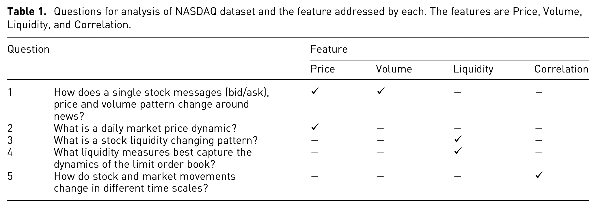
We have identified five principle questions (Table 1) that financial researchers need to answer in order to achieve scientific intuition in the process of analyzing the data. We have formed them according to their priority for our interviewers. Principal variables that our users mentioned are price (ask/bid/cancel), volume of trades and liquidities. These variables are related to each other. For example, when volume of selling a stock is high, we might expect that its price move downward. Another example is when a stock has low liquidity, investors usually avoid buying and by doing so, it might impact the price. Questions Q1 and Q2 endeavors to find out the messages price and volume patterns in the data respectively. The price of the stock in time
Questions for analysis of NASDAQ dataset and the feature addressed by each. The features are Price, Volume, Liquidity, and Correlation.
Proposed design
Our goal in the design of HFTViz is to create a tool for financial researchers that enables them to easily investigate the data. The challenges with HFT datasets are: (1) there is lots of data point to show and investigate (2) there are different methods and mathematical metrics to consider. For handling this, we divide the effects of the data into two groups. One is large-scale effects and the other one is detail-scale effects. For handling large-scale effects, we propose an overview visualization to answer to our user needs
Overview visualization
Our goal in designing overview visualization is to answer the large-scale effect of our user questions. This section starts with an introduction to overview visualization. Then, following subsections describe details about different aspects of the overview visualization. Firstly, we have to consider that users should be able to view data patterns in different displays. As discussed in the time series visualization section, one of the potential designs can be color field design.
10
This design makes the patterns in the data to pop out more in the visualization.
10
Since the number of messages in each day is large, we need an aggregation method to summarize the data points and visualize it in the screen. Other aspects of design include a tool for arranging the companies for effective comparison and also interaction techniques to help exploration (see Figure 1). In the following subsections,
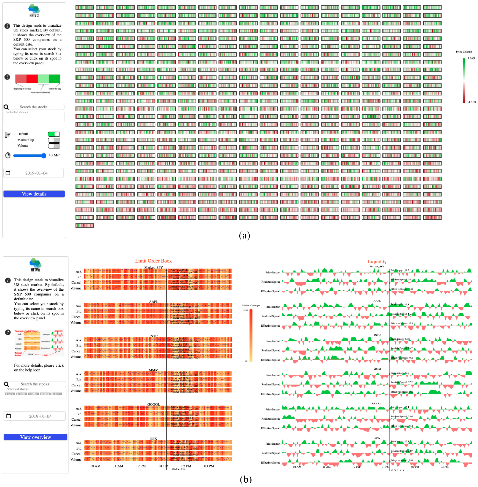
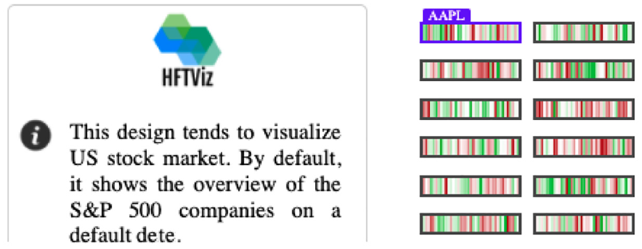
HFTViz helps analyze High Frequency Trading (HFT) data for financial data researchers. It contains two main sections: (a) Overview, and (b) Detailed view. Overview section of the visualization helps users to observe the market movements in a selected date. Details section is designed for investigating the details of selected stocks. In the overview section, HFTViz uses S&P500 companies. Each company is mapped to a small rectangle. Companies are ordered by name and user can change the order with different criteria like Market Capitalization and Volume. Color encodes the percentage of price change within the chosen date. Price changes in milliseconds are aggregated with each block’s texture reflecting the overall distribution of colors in that block. The search bar and date section help users to select their companies stock: (a) overview and (b) detailed view.
Perception
Visualizing 300 millions of messages can be complex. Since human visual system can be overwhelmed by many information, our design must rely on the concepts that show patterns easily to the users and support search for details. 32
One of the visual concepts that we can use in our design is preattentive visual processing. This aspect of the human visual perception allows user to rapidly find patterns in a visually cluttered environments. Leveraging this processing, we can implement some features in HFTViz that simplify visual search by making some patterns visually pop out. Since HFTViz knows the users needs, so it can use preattentive processing to highlight patterns. Also, Healey and Enns 33 authors mention that preattentive features can be processed in parallel so using this concept in our design, we can reduce visual search task’s cognitive load. For applying the impact of preattentive processing, we use color scheme. To avoid false attention, we use semantically informed color choices. We chose different shades of green and red for positive and negative price movements respectively (Figure 2). This color encoding enables us to leverage preattentive processing to find patterns in price movements.
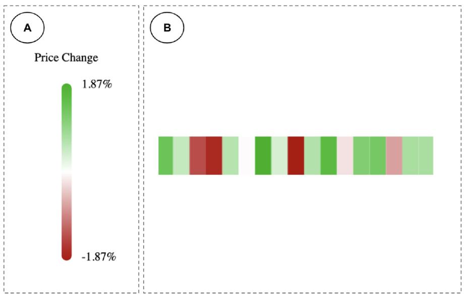
Preattentive processing in the overview visualization explains that users distinguish the region with darker colors beside the area with the bright colors. In the overview visualization we have two main parts: (a) the price change legend that helps the users to identify the range of price movements and (b) price dynamic of each S&P500 companies in a selected day.
Visual search
In case of not finding the patterns using preattentive processing, visual search can be helpful. In this process, users scan the scene with their attention to search for patterns. Visual search can be time-consuming for the users if they don’t have perceptual aid. 34 Due to our visual system limitations we can not recognize everything at once even when the pattern is shown in the current scene. 35 Since we have at least 500 companies in the overview section, visual search plays a key role in the overview visualization.
In Arnheim 36 authors mentioned that the direction of searching a display is the same as reading order. In our design we implement two tools for making flexible visual search. One is a search bar that aids user to search a company by name. The other one is sorting method. User can sort the companies with their market capitalization or trading volume. In addition, for helping users to have better visual search, we provide a padding space between each company block.
Aggregation
In large datasets, we usually have sequences that are larger that the horizontal screen size. Because of that even if we can put all of the data in the screen, it creates visual clutter and makes visualization hard to interpret. For handling this complexity, HFTViz implements horizontal aggregation blocks in the visualization. Price changes are grouped into blocks that can be shown in the screen (Figures 2(b) and 3). Using blocks can be an approach for down sampling the data and creates more control on the information flow in the block. 10 The blocks work like bin size in histograms. The number of blocks are defined by user. The users can change the blocks. Since we visualize the price changes in the overview, to aggregate the blocks together, we need to sum them up and create bigger blocks.
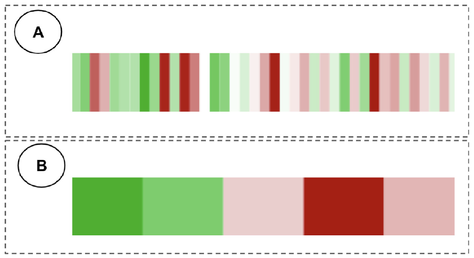
Percentage of price change movement for two different time intervals. US financial market operates for 390 min in weekdays (from 9:30 AM to 4:00 PM Eastern Time Zone). Each unit represents (a) 10 min and (b) 78 min.
Detailed visualization
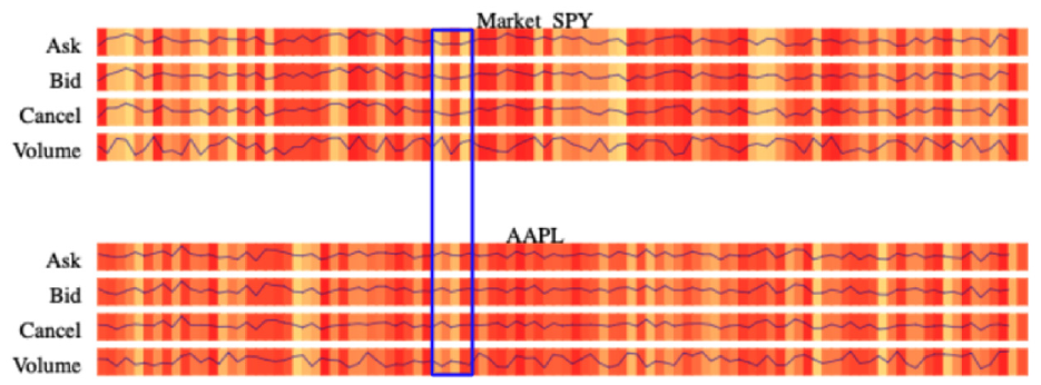
The design of HFTViz follows the Shneidermans’ mantra “Overview first, zoom, and filter, then details on demand.” 37 In the overview visualization, users select the stocks based on their price movement. Besides selecting stocks using overview visualization panel, we add SPY ETF e (as a S&P500 market indicator) by default to the selected stocks in order to help users compare stocks details with a market indicator. After selecting the stocks and adding market indicator, users can load the detailed visualization by clicking on View details button. Detailed visualization panel consists of two main components: the limit order book (LOB) view and the liquidity measures view. Since HFTViz provides various interactions, to show various data granularity of data, on user demand, it is crucial to arrange the information properly, so that users could perform analysis efficiently. According to the theory proposed in Barsky et al., 38 it is more efficient for users to compare views side-by-side, rather than commit visible items to memory. For this reason, we attempt to use the screen space fully in our system design, so that we could display different data granularity (LOB movements and its liquidity measures) side-by-side (Figure 4). This avoids that users are forced to rely on a mental map to perform comparisons. 9
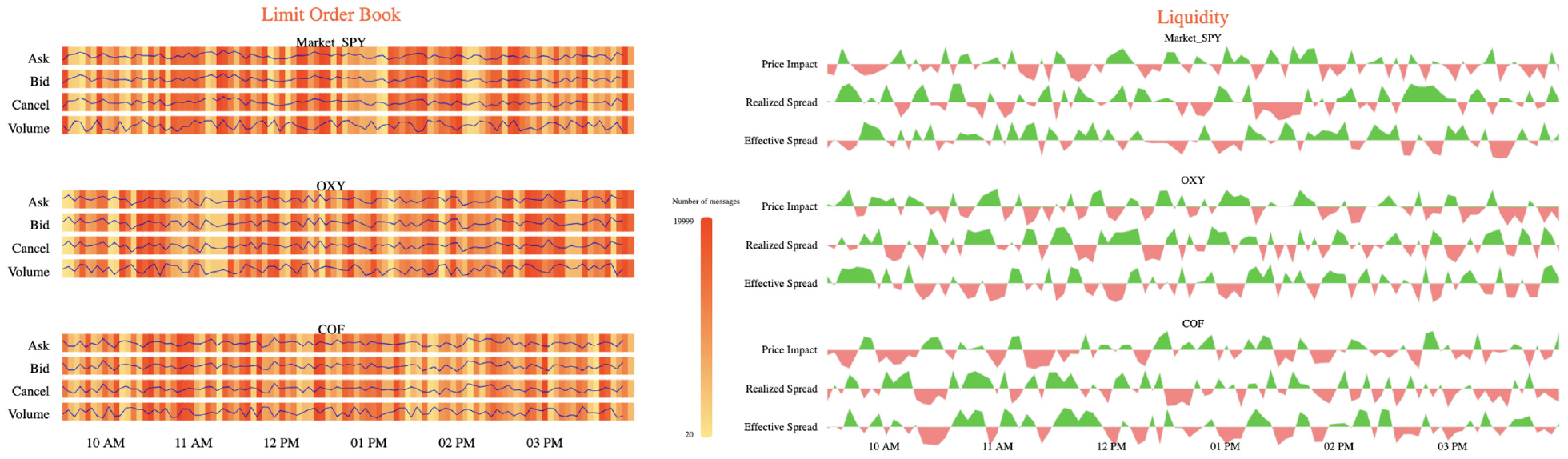
Detailed visualization consists of two major parts: LOB view on the left side and Liquidity view on the right side. It also leveraged side-by-side efficient view for LOB and Liquidity.
LOB view
We provide LOB view for the users to discover different aspects of LOB efficiently. The market changes every microsecond, which means different time periods may have different patterns and insights, such as different bid price, ask price, cancel price, and volume of the traded shares
There are two main parts in the LOB view, price movements and the message number. Price movements define changing price through time for bid, ask and cancel messages. For showing volume of the trade through time, we use the concept of price movements. In addition, message number shows the number of quoting messages (sell, buy or cancel) in a specific time period. For each selected stock, we divide its section into bid, ask and cancel. Furthermore, we add volume section to visualize the traded volume of the stock.
The design of the price movements is built on a line chart to capture the changes in the price. We use the x-axis to encode the timeline and the y-axis to encode the exact amount. The amount for bid, ask, and cancel section is their price but for the volume section, it represents the traded stocks in that period.
For the message number, we use the background of each section (bid, ask, cancel, and volume) to represent the number of quoting messages. Quoting messages is calculated as the sum of bid, ask and cancel messages and it shows concentration of stock trading. For designing the message number visualization, we use heatmap for each section (i.e. bid, ask, cancel, and volume). In each section, the x-axis represents timeline and the color of each block of the heatmap encodes the number of messages. Because of high number of messages in daily HFT data, we use aggregation technique as previously explained in Aggregation. Moreover, we enable zooming interaction for users to investigate the details on demand (Figures 5 and 6). In this approach, we divide the detailed heatmap with all messages into a discrete set of images, called 1-D tiles, details can be seen in these tiles by using the zoom function
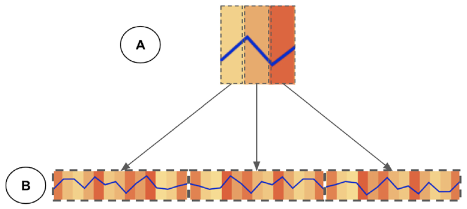
LOB view represent details on demand with the zooming level of the user. In this pyramid format, (a) Level-0 that contains overall movement of price and number of messages for that time period and (b) Level-1 with the details of price movements and number of messages.
The 1-D map view format with zooming level. Synchronous zooming helps users to investigate all the metrics efficiently.
We separate the LOB view into two main sections because we want to observe the pattern in number of messages and price movements together. An alternative design could be applying multiple lines for each of the price and message number instead of using heatmap for the message number. Nonetheless, there is a weakness to this alternative design. Having multiple lines together creates clutter in the visualization since we have four sections for each stock and multiple stocks to choose. Because of that, we choose heatmap for encoding the information regarding the message number.
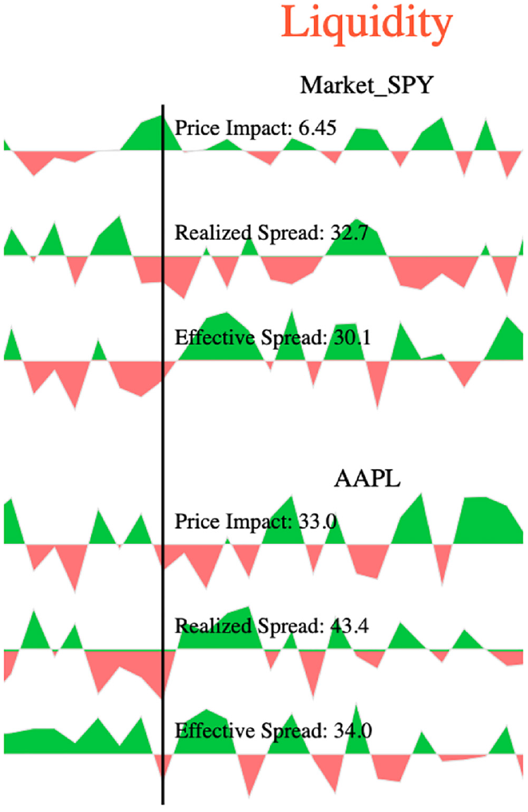
Liquidity measures view
The liquidity measures view shows different liquidity metrics for the selected stocks in addition to SPY ETF. Those metrics help users to observe the trade effects on the stock prices. Furthermore, the liquidity measures visualization enables users to investigate different patterns in the market to see which measure best captures the dynamics of the LOB
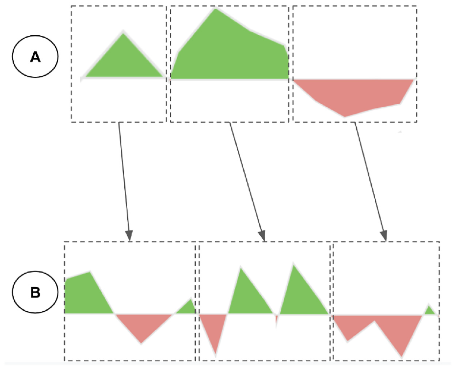
For visualizing the measures, we select top three liquidity metrics in importance to our potential users. Based on our set of user questions, we need to visualize the liquidity movements while we show its trend. As we explained earlier in Overview Visualization, color fields allow patterns and trends to pop out. As a result, we choose area chart for visualizing the liquidity measures. This design choice enables users to investigate quantity movements while they are observing the trend of positive or negative liquidity. We encode positive liquidity in green color and negative liquidity in red color in order to help users discover the trends.
An alternative design could be the line chart with green and red colors encoding positive and negative values respectively. However, there is a drawback for this alternative choice. The line thickness in the visualization when we choose different stocks could be very small. As a result, users could not identify trends efficiently. Our design choice uses colors to encode the space below the line chart efficiently for popping out trending in liquidity measures.
Implementation
We implemented a prototype of HFTViz using HTML, CSS, and JavaScript. This prototype uses D3.js for implementing all visual designs and the React.js framework for managing interactions. A demo of this prototype is publicly available at: HFTViz demo page. Please note that this demo is optimized for 1080p screens and the Google Chrome browser. Because of the NASDAQ-ITCH data license, HFTViz demo uses synthetic data and it performs all functionalities that we explained in previous sections. NASDAQ-ITCH data is in the binary format. In order to convert them to Comma Separated Values (CSV) files, we used MeatPy package. f For the prototype we use in the Evaluation section, we host the data and other files related to the visualization in a secure remote server.
Evaluation
We conducted a case study to evaluate the proposed HFTViz design. We invited five experts for a 1-hour online interview using a video-conference platform. The experts were enrolled in the evaluation because of their interest in HFTViz and their compatibility with the scope of the project. In addition, we followed an official written protocol describing the sequence of questions and features to be presented. Furthermore, we recorded the interviews with each expert and their interactions on-screen during the entire demo session for post-evaluation transcription. Our goal was to understand whether the questions that drove HFTViz development were answered; moreover, we wanted to assess the validity of our assumptions and design choices.
Each interview started with a 10 min presentation of HFTViz. During that presentation, we onboarded the user and showed all possible interactions. After that, we gave them 15 min in order for exploration, asking questions related to working with the tool and identifying a potential goal that they would like to investigate. Then, we asked them to identify the goal that they chose and share their specified screen for opening the visualization. Subsequently, they start working with the tool. This step took 25 min for the users. During that process, we record all the movements and selections on the screen. After investigation step, we started a discussion with the user for gathering their opinion regarding the tool. We asked them detailed questions about different sections in the visualization. Also, we organized some open questions to collect ideas for improving HFTViz in the future.
After gathering all the interviews recordings, we organize them into two sections with respect to the goals that users identified. The first section is “Investigating news effects on stock market” and the second section is “Exploring the effect of other markets on stock market.”
Investigating news effects on stock market
In this case study, we have three users that are working in financial academia and industry. They mainly had keen interest in observing the effect of different news in the market. The first user,
At first, the users started working with the search bar in order to find their desired stocks. When they picked a stock, they see its position in the “Market Cap” sorted overview panel in HFTViz . After selecting their first stock using search bar, they looked at the overview panel to select related stocks in “Market Cap” or “Volume.” They picked related stocks by clicking on their sections in the panel Figure 7.
As shown in the figure, Apple stock has the largest market cap by positioning at top left of the overview panel.
The users then explored the details of the selected stocks by clicking on “View details” button. After the details panel was loaded, the users start to interact with LOB section of the first selected stock at the top of the page and compare it with the market movements using hovering interaction. After hovering, the number of messages that shows the flow of messages in a particular time grabbed their attention to find the moments that their selected stocks had some attention from traders in stock market Figure 8. This view helped
Message number grabs attention of the user to see what is happening in that specific time in the market that attracts traders.
Changing in the liquidity patterns around hovered time identifies that the traders changed their orders and that affected the stocks price.
At the end of the journey, they asserted to have better understood the effect of news on the stock market. They found related stocks with searching in the search bar or by sorting with different criteria. Also they mentioned that they could find the special periods in the market by using number of messages heatmap in the details sections. Furthermore, they commented on the liquidity section. They mentioned that the design of that section helped them to find most popular liquidity metrics easily and see its movements. Beside the benefits of the HFTViz, they also mentioned some improvements that could make HFTViz more suitable for financial users. They suggested the hovering label to become larger for being more clear to read. Another point that they noticed was changing the sequence of selected stocks at details panel in order to put different stocks near the Market SPY at the top for making comparison. In general, users are satisfied with HFTViz and they like to work with it in their workplace.
Exploring the effect of other markets on stock market
In this section, we have two users that are portfolio analysts. They used different type of data in their works in order to create well performed portfolio. In addition, they have a keen interest in HFT world since they can investigate different phenomenon in the stock market in details. The first user of this case study,
Another user in this section,
Furthermore, the users pointed out some limitations of HFTViz. In the current version of HFTViz, we focused on displaying all information on S&P500 companies and selected stocks; however, also more filters of companies (i.e. filtering by companies sector) would be of interest to the users. The overall feedback for HFTViz was very encouraging and indicates that our system generally answers the questions presented in “Data and User Questions” section.
Discussion
Two case studies show the effectiveness and usability of our system for the exploration of HFT data. Overall, our collaborating users are satisfied with its abilities, especially with LOB visualization. The large overview presents a whole picture of the S&P500 world based on percentage of price changes. Supplemental Material is provided by the details panel. In details panel, HFT data is organized into two sections. The first section is Limit Order Book (LOB) view and the second one is Liquidity measures. LOB view helps users to investigate each stock in terms of its bid, ask, cancel messages, and volume of trade. Also, Liquidity view helps users to find out time periods that a stock has low liquidity which means there is a special period in the market. When compared with standard financial data analysis software, our system has already processed data and provided a comprehensive analysis of the whole S&P500 market and individual stock with well-coordinated views. To the best of our knowledge, HFTViz is the first visualization system analyzing High Frequency Trading data, which closely follows domain tasks and requirements. Both domain experts and users with basic knowledge about HFT could step into this world via HFTViz. 41
Although HFTViz receives positive feedback and satisfaction from users, it has still some limitations. Firstly, our users mentioned dynamic font size for the visualization in order to set legends and labels by the user for convenient reading. The possible improvement for this limitation could be creating manual setting that user can change the font and theme of the visualization in order to read it easier. One other improvement that our users mentioned in the evaluation would be to add more filters to the overview section. They mentioned that filtering by industry sectors, special markets such as ETFs, S&P400, etc. could help them to find their stocks faster. Adding a specific section for filtering and provide different filters and sorting could improve further to design. In addition, our users noticed customized changes in the order of the stocks and liquidity measures can facilitate comparison between a stock and the market ETF (SPY). To solve this limitation, we could add a drag and drop interaction in order to change the stocks sequence and their liquidity metrics.
In addition, the current HFTViz system can be used to visualize other datasets. First, there are exchanges that can support high frequency trading. Also we can use our visualization in other market analyses and create a platform for trading business intelligence. 41 Second, the design in the overview panel could be extended by adding different filter and sort criteria.
Conclusion
In this paper we presented HFTViz, a tool for the visualization of High Frequency Trading data. An evaluation from our users showed that our design choices fulfilled our user needs. Based on positive feedback that we received, future research on this tool could be built based on this work. Also, for future works visual modifying of selected stocks can be added in order to improve user’s performance
Footnotes
Acknowledgements
The authors thank the experts and users involved in the design process their helpful support.
Funding
The author(s) disclosed receipt of the following financial support for the research, authorship, and/or publication of this article: This work was supported by a NSERC grant (RGPIN-2015-06025) and an IVADO Fundamental Research grant (PRF-2019-3059794586).
Supplemental material
Supplemental material for this article is available online.
Notes
References
Supplementary Material
Please find the following supplemental material available below.
For Open Access articles published under a Creative Commons License, all supplemental material carries the same license as the article it is associated with.
For non-Open Access articles published, all supplemental material carries a non-exclusive license, and permission requests for re-use of supplemental material or any part of supplemental material shall be sent directly to the copyright owner as specified in the copyright notice associated with the article.