
Abstract
For many data analysis tasks, such as the formation of well-balanced groups for a fair race or collaboration in learning settings, the balancing between data attributes is at least as important as the actual values of items. At the same time, comparison of values is implicitly desired for these tasks. Even with statistical methods available to measure the level of balance, human judgment, and domain expertise plays an important role in judging the level of balance, and whether the level of unbalance is acceptable or not. Accordingly, there is a need for techniques that improve decision-making in the context of group formation that can be used as a visual complement to statistical analysis. This paper introduces a novel glyph-based visualization, PeaGlyph, which aims to support the understanding of balanced and unbalanced data structures, for instance by using a frequency format through countable marks and salient shape characteristics. The glyph was designed particularly for tasks of relevance for investigation of properties of balanced and unbalanced groups, such as looking-up and comparing values. Glyph-based visualization methods provide flexible and useful abstractions for exploring and analyzing multivariate data sets. The PeaGlyph design was based on an initial study that compared four glyph visualization methods in a joint study, including two base glyphs and their variations. The performance of the novel PeaGlyph was then compared to the best “performers” of the first study through evaluation. The initial results from the study are encouraging, and the proposed design may be a good alternative to the traditional glyphs for depicting multivariate data and allowing viewers to form an intuitive impression as to how balanced or unbalanced a set of objects are. Furthermore, a set of design considerations is discussed in context of the design of the glyphs.
Keywords
Introduction
Recent research has argued that not only the relational attribute values across data items, but also the dispersion of attribute values of each data item in the set which are functions to be considered in several application fields. An example of this is related to behavioral decision-making in marketing. Chernev 1 investigated the role of the balanced dispersion of the properties (i.e. value, ease of use, quality) of the products on the consumer’ decision when choosing among alternatives. As in the example, multivariate data exist across many disciplines, and a range of visualization methods are used to depict information to help the intended users gain insight into data or aid in making a decision. Glyph-based visualization methods are commonly used to depict multivariate data sets and can be utilized both independently and as part of a composition of a set of data records. Munzner 2 compares views with glyphs, and states that glyphs are small, nested, schematic regions; in contrast to views that are large, stand-alone, and highly detailed. Due to their usual small graphical appearance, glyphs can be used in various settings such as within node-link diagrams, treemaps, tables, or geographic maps. Borgo et al. 3 stated that a glyph as a sign could potentially gain greater attention and stimulate more cognitive activity during visualization than other forms of visual design.
This paper presents PeaGlyph, a novel glyph design for communication of “balanced” or “unbalanced” dispersion of attribute values as well as for the comparison of values. The PeaGlyph design was guided by established glyph design guidelines and an evaluation of existing glyphs in related literature. The limitations derived from the quantitative and qualitative results of the experiments were addressed in the glyph design by using countable objects (i.e. filled, unfilled, or part filled circles) to map related attribute values, rather than a pure length channel, as humans are good at counting and judging the relative frequencies of discrete objects. 4 Filled and unfilled circles were used to increase the perceptual salience, to ensure that the glyph structure was kept simple and since symmetrical elements are useful for communicating information. Furthermore, the usability of PeaGlyph was evaluated in the context of the tasks of relevance for understanding of structures of balance, and compared to the best performing methods from the first study. The results of the follow-up study are promising, and these two empirical studies are described in more detail in this paper.
The main contributions of this paper are:
a flexible novel glyph representation for multivariate data, designed for investigation of structures with balanced and unbalanced attribute dispersion in data;
two experimental evaluations that compare the usability of existing glyphs and of PeaGlyph in the context of revealing balanced and unbalanced objects;
utilization of a graph visualization approach to measure the effectiveness of visualization methods from a cognitive load perspective.
The remainder of this paper is organized as follows: The related work is summarized in Section 2, including the design of glyphs and associated studies in visualization literature. Section 3 describes the details of the novel PeaGlyph design. In Sections 4 and 5, the usability studies conducted are described and their results are discussed, and the evaluation of the novel glyph is detailed. Finally, Section 6 summarizes and discusses the findings in the experiments and proposes further studies.
Related works
The work presented in this paper is mainly related to the subjects of glyph design and usability-experiments on data glyphs, as well as the investigation of balance and unbalance in terms of data attribute dispersion. Previous work in these areas is summarized in this section.
Glyph encodings
Different data attributes can be encoded by a set of retinal (visual) channels such as shape, color, size, and orientation. Bertin 5 proposed categorization of semantic relevance for determining the suitability of different channels in representing certain types of information. Cleveland and McGill 6 performed experimental studies to order visual channels based on how accurately they can be perceived. The most accurate method is the position along a scale, followed by interval length, slope angle, area, volume, and shading or color saturation. In addition, adjacent properties of a glyph are generally easier to relate and compare than nonadjacent ones. Ward 7 provided a data mapping taxonomy using these attributes. In one-to-one mapping, each data variable attribute is encoded into a distinct graphical primitive (i.e. visual channel). One-to-many mappings (redundant mappings) in which an attribute variable is mapped to more than one visual channel, can be useful to improve accuracy. A many-to-one mapping represents multiple data attributes via the same kind of visual channel.
The appropriate design of glyphs is a crucial factor for their usability and a well-designed glyph can enable efficient and effective visual communication like other encoding methods. For effective glyph visualization, appropriate visual channels should be carefully chosen and combined. As a glyph is likely to be composed by a set of visual channels, the channel composition may affect how individual channels are perceived. Maguire et al. 8 proposed a set of design principles of the visual encoding based on the (findings) in perception and visible search areas. These are guidelines on semantic relevance, channel composition, pop-out effect, and visual hierarchy.
Furthermore, Chung et al. 9 proposed criteria for glyph design in the context of sorting glyphs visually. Borgo et al. 3 provided an extensive overview of glyph visualization research. Several principles of the perceptual organization such as similarity, connectedness, and closure, were outlined by Gestalt psychologists to assist the information design, 7 and help readers save processing time. The glyph design described in this paper is based on these design guidelines and principles.
Glyph applications
A large body of work exists for the application of different data glyph designs across multiple disciplines, from meteorological glyphs through geographically mapped medical data, to sports visualization. This paper does not aim to provide an exhaustive summary of all, but to provide examples of the diversity and flexibility of the concept of glyphs. Chernoff faces, 10 are an early example of glyph-based visualization, that use human facial features to map multiple data dimensions into a single icon. Keogh et al. 11 utilized color bitmaps for depicting time series data. Cao et al. designed a treemap-like icon 12 where each feature value was mapped to color-coded cells, and then the cells were packed to produce individual icons. In PeopleGarden, 13 the participants in a discussion group on web message boards were mapped as flowers in which the number of petals in the flower glyph represented the frequency of features. Glyph-based encoding has also been widely used in many analytic applications. Pearlman et al. 14 utilized data glyphs to understand large data sets in depth and diversity. SoundRiver by Jänicke et al. 15 is another example in which movie audio and video contents were depicted in glyphs. Ropinski et al. 16 investigated the use of glyphs in medical visualization. Legg et al. 17 delivered MatchPad where actions and events in sports were mapped to data glyphs. Similarly, the effectiveness of using glyphs in sports event analysis was shown by Chung et al. 9 For visualizing temporal geoinformation, Drocourt et al. 18 examined several icon-based visual designs. Visualizations making use of environmental cues are quite common. An example of such data-driven glyph design is the botanical tree metaphor by Kleiberg et al. 19 However, the fruits and leaves are highly abstract representations (mainly colored dots), and their shape does not change according to the data characteristics. The OECD’s Better life index visualization was developed by Stefaner, 20 where environmental cues were used to visualize multidimensional data about country characteristics. Recently, Khawatmi et al. 21 developed a web-based application that enables users for creating interactive glyph-oriented representations of microscopy data.
Glyph usability studies
A large number of usability studies have been conducted for different glyph types and design variations, to evaluate their performance in order to select the best performers for various tasks, as well as to provide design guidelines for effective information encoding in the glyph design space. Examples of well-researched data glyphs are Chernoff faces, 10 profiles (or Bar glyphs), 22 and Star glyphs, 23 which have been used in various applications.15,24
These user-studies can be divided into two categories: comparing data glyphs against each other and testing design variations of the same glyph category. Fuchs et al. 25 reviewed experimental studies on data glyphs and provided a systematic overview of the types of glyphs, the design characteristics, data, and tasks. In their review, they found that synoptic tasks (i.e. similarity search, visual search, trend detection) were more commonly preferred for the studies rather than elementary tasks. Moreover, they reported that a high number of studies used three categories of visual variables, Position/Length, Color, and Orientation, to depict data in glyphs. Face glyphs received most research attention and so evaluated frequently. 25 Blascheck et al. 24 presented a perception study to assess how quickly participants performed a simple data comparison task for small-scale visualization on a smart watch. Their research evaluated, three glyph types that are common in smart watches: Bar glyphs, Donut, and Radial bar glyphs. Their results showed that when quick data comparison is needed, Bar and Donut encodings were preferred on small physical display spaces. Fuchs et al. 26 compared the performance of four glyphs for time-series data under a controlled experiment. They chose Line glyph, Stripe glyph, Clock glyph, and Star glyph for their study. Lee et al. 27 compared the ability of four different visualization approaches for binary data sets. Two of these visualizations were Chernoff faces and star glyphs. The other encodings used a spatial arrangement of the objects, based on a model of human mental representation (i.e. similarity) and distinctive features. The experiments confirmed that participants were faster, more confident, and more accurate when an appropriate visualization of the data was made available. Li et al. 28 used metaphor-based representations in their experiment and compared RoseShape glyphs against abstract polygons to visualize multidimensional data about the educational level in America. The results indicated that participants were more accurate when working with more realistic faces. Testing design variations of a glyph also drew attention. Fuchs et al. 29 conducted three experiments to compare Star glyphs with its variations on the detection of data similarity. They used Star glyphs with contours (outlines) and reference structures (i.e. tick marks and gridlines) or without them as plain Star glyphs. Based on their findings, they provide design considerations regarding the use of contours and reference structures on Star glyphs. Klippel et al. 30 experimented with examining the shape characteristics of Star glyphs on classification tasks. They varied assignments of attributes located along the horizontal and vertical axis to obtain different shapes based on the same data. Miller et al. 31 reproduced Klippel’s study with the same settings, including colored axes and the number of dimensions encoded. They used two different ordering strategies of star-glyph axes, similarity-based (homogeneous shape), and dissimilarity-based (spike shape) to gauge which one better supported users in visual clustering tasks.
Balancing of groups
The ability to work in a team has become an important element in personnel selection in a variety of organizational settings. 32 Education is a good example of using collaborative learning to help students develop teamwork skills and acquire specific curriculum knowledge. Identifying features of group construction that affects the effectiveness of individual and collaborative learning becomes important.33,34 The group formation is concerned with the process of assigning participants to groups and roles. There are group design solutions that are widely used to create effective group configurations. Assigning participants to groups and roles is a challenging task, and the instructor must decide how to populate the groups with participants. Assignment can be done either by the participants themselves, by the moderator, or by the system based on factors such as characteristics, educational level, and expertise. A random assortment of participants may result in an unbalanced group composition, and effective groups are unlikely to emerge.
Computer-assisted grouping 32 is an automated process in which students are grouped based on data and constraints provided by the teacher (e.g. type and size of learning group). Belbin’s role theory35,36 (or Belbin’s role balance) is often used in the instruments in this context and states that balanced groups, where all roles are present, perform better, and have a positive impact on the quality of teamwork than unbalanced groups. The Felder-Silverman model 37 is another method used that categorize students learning styles into a sliding scale consisting of four scales. Besides them, clustering algorithms for group formation 38 are perfectly suited to group formation problems, since group formation attempts to split the student data into multiple groups. Balance is achieved on the basis of a set of specific criteria that apply to the learning objective in question. In other words, the desired balance in terms of diversity can be achieved by including students with different levels of achievement and characteristics in each group. Also, among all formed groups the distribution of the attributes (performance level) of learners should be as similar as possible for forming competitively balanced teams. 39 The group formation as an application problem has been handled in many ways as aforementioned. Different to existing approaches, this current paper considers the group formation problem in visualization context (different approach from existing applications) and argues that visually depicting the diversity within groups and the balance between groups can be used as a complementary and applicable approach alongside existing techniques.
Introduction to PeaGlyph
This section will describe PeaGlyph, a novel glyph design that was built to facilitate the comparison of data values as well as representing overall structures in which the “balance” between glyphs and encoded values are of interest. The design is based on established glyph design principles3,7–9 and on the results and feedback from the study presented in the Evaluation of glyph designs section. The PeaGlyph has been designed to be usable both as a stand-alone visualization or in combination with other visualization methods, such as scatterplots, tables, and maps. Furthermore, it is able to encode both categorical and numerical values, as well as meta-data for attributes, as detailed in the following subsections.
Glyph design
The PeaGlyph design was inspired by the visual features of a pea. The overall appearance of a pea consists of the combination of the shape with boundary details of a pea-pod, and the seeds, as exemplified in Figure 1 (left). These two aspects are the main features of the glyph available for mapping of data. In its basic form, each PeaGlyph represents either a record in the data set or an aggregation of a group of objects (such as the centroid representation of a cluster). The data attributes of a multivariate data set are each represented by a pea-pod in the glyph, such that the number of pea-pods in a glyph corresponds to the number of attributes in the represented data set. Figure 1 (right) displays an example where the values of four attributes are displayed in a PeaGlyph with four pea-pods.
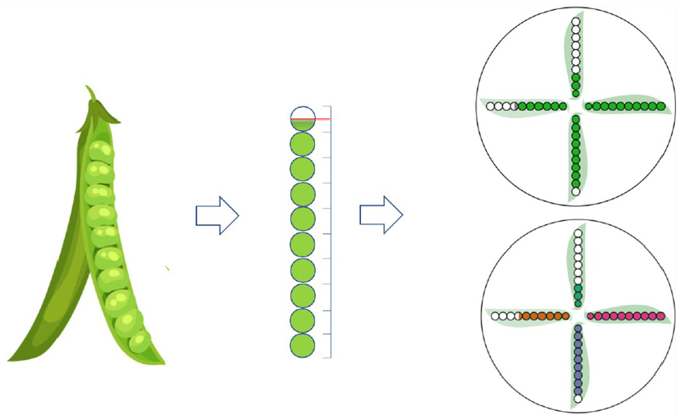
Examples of the basic PeaGlyph design. (Left) Each pea-pod includes a maximum of 10 seed. Continuous values of attributes are depicted into discrete form: filled, semi-filled, or empty circles. (Top right) Abstraction of seed and pods for four data attributes with a circular layout. (Bottom right) Using color to distinguish between attributes.
The basic glyph structure was intentionally kept simple with symmetrical elements that are useful for communicating information, as per the symmetry principle. 3 The seeds and pods are highly abstract representations as shown in Figure 1. The seeds are colored circles, and their leaves are colored with a light tone to show the shape of the pods. If there is a requirement to emphasize additional features according to the data, variation in color or texture can be used for the pods, as described in Table 1 which summarizes the visual channels available for data representation in PeaGlyph.
Possible visual channels of PeaGlyph.
In PeaGlyph, the data of a numerical attribute is represented through 10 circles (seeds) in a pod, a number that can easily be related to percent values. Furthermore, while more seeds could be used to represent more detail, a smaller number of objects can often be easier to comprehend. 40 Based on the underlying data value, a number of circles will be filled, with all circles filled representing the maximum value of the attribute and no circles filled representing the minimum value. There is also an option to use semi-filled circles to represent values at a higher granularity. In Figure 1 (top right) it is visible from the three filled circles that the value for the upwards pointing pea-pod (attribute) is 30% of the attribute’s maximum value, while the value of the attribute to the right is 100%. In a small setting, such as glyphs, filled and unfilled circles were preferred, as color is a highly salient visual channel 8 making the value representation stand out from the background of pods. The result of the initial evaluation, as described in the Evaluation of glyph designs section, indicated that Bar glyph was the best performing representation for identification and comparison of values. Bar glyph utilizes length and position as the main visual channel for comparison of values, with the minimum value position as a point of reference for comparison. PeaGlyph makes use of a similar abstraction in terms of employing the minimum and maximum values as points of reference for comparison of values. Additionally, the combination of colored and empty circles, when compared to representation only by length or position, enables the user to also use the number of empty circles as an indication to judge and compare values. Research in human perception shows that humans are generally much better at perceiving, counting, and judging the relative frequencies of discrete objects as long as their total number is not too large. 4 To further facilitate the comparison of values across attributes, the glyph encodes an equal number of seeds for each pea-pod that represents a numerical attribute.
Categorical attributes can also be depicted through the pea analogy, by representing each unique category of an attribute by a seed, thus creating a pea-pod with as many seeds as there are categories for corresponding attribute. Figure 2 displays examples of a categorical attribute with four possible values. If a single record is represented by the PeaGlyph, the seed representing the categorical value of that record would be filled (Figure 2, left). For categorical attributes where the PeaGlyph represents a group of records, different approaches can be taken. One alternative being to size each categorical seed according to the relative frequency of corresponding category in the group (Figure 2, center), or to use semi-filled circles where the fill level corresponds to the relative frequency of the category (Figure 2, right).
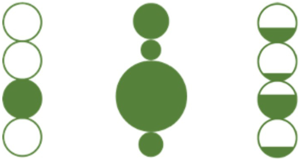
Alternative approaches to represent categorical attributes in PeaGlyph, for a data attribute with four categorical values. (Left) Representation of the categorical value of a single record. (Center) Using pea-size to represent category frequencies for a group of records. (Right) Using semi-filled peas to represent category frequencies for a group of records.
As described earlier, the circles representing the data value of an attribute are enclosed by a pea-pod shaped frame to further indicate that they are of the same attributes. As suggested in Table 1, the orientation of the pea-pod can be used to represent, for example, attribute meta-data or relationships between adjacent attributes. Beside the shape of the pea-pods, each attribute can be encoded with a distinct color, to make differences between attribute levels clear, thus supporting the discriminability principle. 7 Attribute coloring can also be used to represent categories or groups of attributes, assigning a distinct color to each group, which supports the similarity principle. 3 The combination of filled/unfilled circles, color, and shape as individual channels were selected as they normally do not affect each other in an integrated encoding, which is supported by the design principle of separability. 9
It is worth noting that the appropriateness of coloring as a method for distinguishing individual attributes will depend on the number of attributes of interest and should be decided on a case-by-case basis. There is a limitation in the number of distinguishable colors 8 and the hue channel should be used effectively. 41 If the number of attributes to be shown is high, a single color may be preferred and at this point the pea-pod frame still helps in perceiving each attribute separately.
Layouts
The examples provided in this paper are mainly focused on a radial layout, through this utilizing the strength of Whisker and Star glyphs in terms of evaluating structures of balance in the data. The glyph design can however be used flexibly, as exemplified in Figure 3.
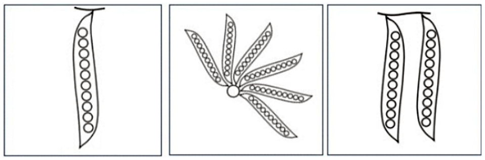
Possible design layouts of PeaGlyph.
Pea-pods can be lined side by side or form a radial layout with a specific angle between each pea, as well as it can easily be adapted to a hierarchical layout. This flexibility can allow the user to choose the most suitable layout according to the task at hand. Building on the concept of the proximity principle, 3 each data record, or each group of records, is represented by a set of pea-pods positioned close together in a glyph structure. To further emphasize belonging, an outer circle enclosing the pods can be used to visually separate the records or groups of records from each other (see right part of Figure 1).
Scalability
The PeaGlyph was designed for moderately sized multivariate data set, and thus has scalability limitations similar to the glyph designs compared in Section 4. For individual glyphs, the visual scalability is mainly related to the number of attributes. The “interesting” attributes of data, or the representative attributes of the clusters in a clustering analysis, are mapped to the pods of the PeaGlyph. Figure 4 shows examples of PeaGlyph with different number of attributes displayed. It is likely that pea-pods will overlap after a certain number of attributes. This can to some extent be mitigated by not drawing the pod-shaped background, resulting in a level of overlap similar to that of Star or Whisker glyph. To further prevent occlusions, the linear layout may be preferred instead of radial. The visual scalability in relation to the number of glyphs that are displayed in a limited display space (i.e. the number of records or clusters) is highly dependent on the layout of the glyphs and directly comparable to the limitations of other glyph designs, and approaches to overcome these limitations include the use of different layouts and interactive features. In an interactive system, the detailed attribute values may be shown as a tooltip to the users when hovering the mouse over the glyph of interest. Also, different interactive methods such as zoom in and pan to focus on glyphs can be used to facilitate the readability of the glyphs in small settings.
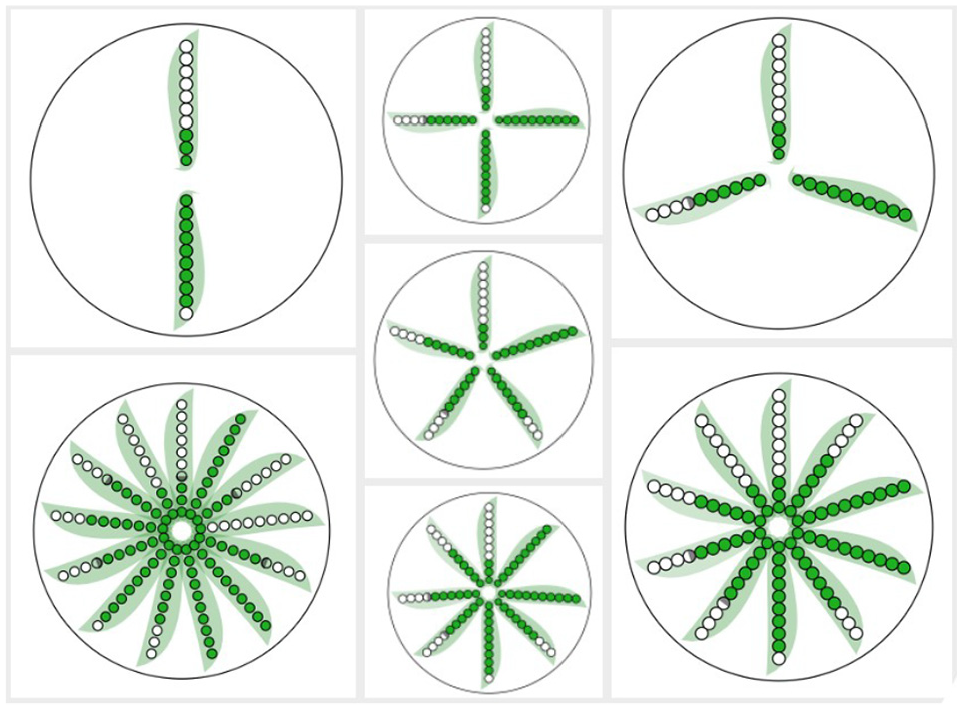
PeaGlyph with different number of attributes. The figure at the bottom left includes 13 attributes.
Evaluation of glyph designs
An initial user-study was conducted with the goal of examining the performance of different existing glyph designs in context of revealing structures of balance or unbalance in data. The findings from this study were to be used to guide the design of the PeaGlyph visualization for exploration of balanced structures.
Visualization methods
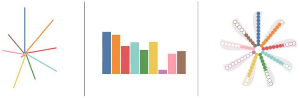
Based on the literature, four potential glyphs were chosen to compare their performance for a set of tasks. These were Bar, Star, Whisker, and Radial Bar glyphs, as displayed in Figure 5. In the study, each glyph presents a record in a data set, and each data value is mapped to an appropriate visual channel to encode the relevant information. For all glyphs used in the study, line lengths express the value of an attribute, and color represents different attributes in the data. For example, in a student data set each record is a student that is shown as a glyph in which attributes such as “writing” and “presentation” are depicted in color, and their values encoded in length.
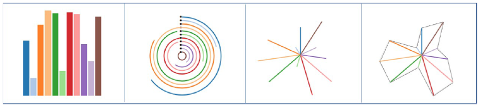
Chosen glyphs for the user study from left to right: bar, ring, whisker, and star glyph-depicting same data values.
Bar glyphs were selected as it is one of the most utilized glyphs and visualization methods, and due to its linear layout. The data have multiple attributes, where each is represented by a unique color, and the numerical values of the data items are represented by length/height. Whisker glyph also represents data values by length, but uses line segments radiating out from a central point, rather than parallel bars, as shown in Figure 1. Besides, two variations of the aforementioned glyphs were used, Ring and Star, to assess whether additional graphic features such as contours and basement layout affect the task-dependent performance of the glyph designs. Ring glyph is a variation of Bar glyph that utilize a circular design, where each Bar has a different radius, so each Bar is judged by its angle. Star glyph and Whisker glyph have the same layout, but the Star encoding has contours between attribute lines.
Experiment overview
The experiment was designed as a within-subject study. It included two main tasks, where each question was tested across the four glyph designs. In total, each participant performed 10 different questions, which were repeated for each glyph design, and no data set was used more than once for each question. The questions were multiple-choice questions, and participants had to select the option that they thought was correct among a set of glyphs. The performance of the visualization methods, in terms of accuracy and response time when performing the tasks, was analyzed for each main task. The study was conducted individually by using an online experiment builder, Gorilla, 42 with an interactive interface as in Figure 6. Ethical approval was received prior to the study. Prior to the experimental phase, a short questionnaire was used to collect information about the participants and their previous experience of data analysis. Short background information was provided to ensure that all participants possessed the basic knowledge needed to interpret the visual representations and understand the tasks. This was followed by a training period, including a small number of test tasks using the different visualization methods. The training was used as a way for the participants to become familiar with the tasks, visualization methods, and experimental environments. For the experimental phase, the tasks and visualization methods were counterbalanced using a Latin-square procedure, resulting in a unique ordering for each participant and, hence, reducing the potential learning impact on the results. The participants were able to take breaks between each task, but were asked not to take a break while answering questions, since the response time was measured. The system recorded the participants’ answers and the time it took to answer the questions. The answers and response times, which were stored and later used to analyze the results. Upon completing each task, the participants were asked to rate their confidence in the chosen answer using a five-point Likert scale (1 = low confidence, 5 = high confidence). At the end of the study, participants were asked to select their preferred glyph for each of the two tasks. Besides that, some participants provided overall feedback on the study through email after completing the study.
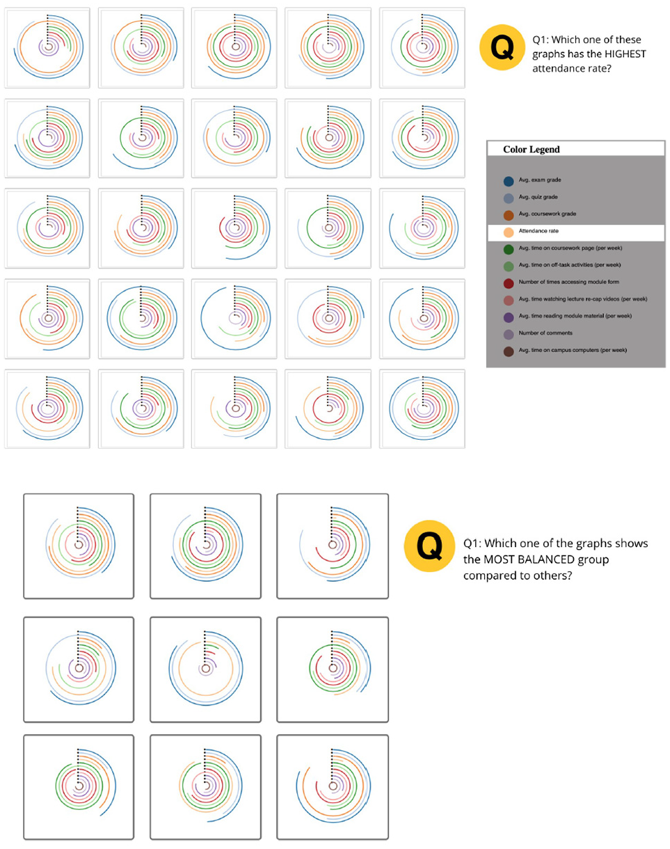
Screenshots from the initial experiment. The top image was taken from Task-1, and the bottom image from Task-2.
Tasks and data
The tasks of the study were aimed to represent tasks of relevance for investigating aspects of balanced and unbalanced data structures. This included the identification of the attributes with the highest and lowest values and detection of balanced and unbalanced structures of the visual encoding, where the difference of the encoded values of attributes is minimum for a “balanced glyph” and maximum for an “unbalanced glyph.” In other words, the dispersion between encoded attributes is lower than that of others for a “more balanced glyph” and vice versa. The study tested the following hypotheses:
H1. Bar glyphs will perform better than the other methods for identifying and comparing values.
H2. Whisker glyphs will perform better than the other methods for tasks involving comparison of the overall structure of the glyphs or shape comparison, rather than identifying values.
Artificially generated data sets were created to fully control the patterns and attribute values in the study. For this study, each record was produced with 11 distinct attributes.
First task
In the first task (Task-1), which relates to H1, participants were asked to find the glyphs displaying the max and min values of an attribute. The distance was kept identical for the different glyphs and, therefore, the same uniform small multiple layouts was used for all. As a consequence, it was essential to set a fixed aspect ratio for each glyph. To create a fairer comparison, a square aspect ratio was chosen for each glyph and a square framework. For each trial, the same type of glyph showing different data was drawn at a resolution of 96 × 96 pixels, which is the same setting as in Funch et al. 26 The glyphs were randomly laid out in an N-by-N grid, as displayed in Figure 6.
Results
Twnety-seven participants were recruited for the study. Eighteen of them were male and 9 females. Twenty-six of them completed the study. Four of the participants were not included when evaluating the results, as their response times during tasks were too long or too short (being 3 SD from the mean) compared to others. The participants were Master and PhD students from varying domains, recruited directly by the authors. A large portion of the participants were in fields other than computer and data science, and they reported that they had little or no experience of visualization and data analysis. The largest age group among participants was 29–38 years, followed by 20–28 years. In addition to the results presented in this section, the descriptive statistics of the results are provided as Supplemental Material. Friedman test was used to analyze the main effect followed by post hoc test using Wilcoxon signed rank test with Bonferroni correction for pairwise comparison.
Statistical testing confirmed significant differences for accuracy (X2(22) = 20.563, p < 0.05). Table 2 shows post hoc results with significant differences highlighted in red using p < 0.0125 following Bonferroni correction. The difference in accuracy was significant when comparing Bar with Whisker (µBar = 3.52, µWhisker = 2.78). Meanwhile, the Star showed a performance close to the Whisker (µStar = 2.66), with no significant difference. The Ring glyph (sometimes called a radial bar glyph) resulted in significantly better performance than the Star and Whisker.
Post hoc results (z- and p-values) from Wilcoxon signed rank test for different data glyphs.
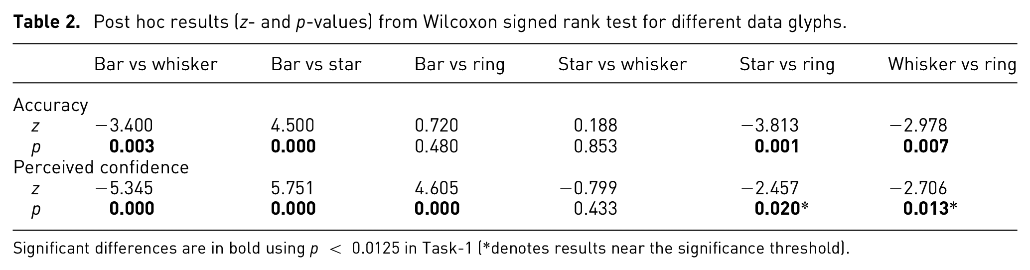
Significant differences are in bold using p < 0.0125 in Task-1 (*denotes results near the significance threshold).
Despite having different layouts, the Ring performed as well as the Bar glyph, and the difference was not significant (µRing = 3.38). There were no significant differences in terms of task completion time (X2(22) = 4.909, p = 0.179) according to the Friedman test. Even so, the participants took a longer time to answer the questions using the Star and Ring (µStar = 37,498, µRing = 42,965) compared to the Whisker and Bar (µWhisker = 29,067, µBar = 3259), with time measured in milliseconds. The existence of speed and accuracy trade-off for Ring glyph should be considered as to whether it is a good candidate for visualization. When looking at the perceived confidence (X2(22) = 28.262, p < 0.01) in Figure 7, the participants felt more confident answering the questions in Bar glyph, followed by Ring, Whisker, and Star. The post hoc analysis shows that all differences of Bar against others designs in perceived confidence were statistically significant. The results in the Star versus Ring (p = 0.02) and Whisker versus Ring (p = 0.013) are near the significance threshold, which may be an example of a type-2 error caused by Bonferroni measure being too strict. 43 The mean values with 95% confidence intervals (CIs) are displayed in Table 3 and Figure 7. For mean accuracy, the confidence intervals for Whisker and Star almost overlapped completely. There was also an accuracy overlap between the Bar and Ring, while the CI of Bar glyph did not overlap with Whisker and Star. However, for the mean “time” the intervals overlap for all four glyph designs.
Showing numerical values of CIs for mean of accuracy and response time in Task-1.
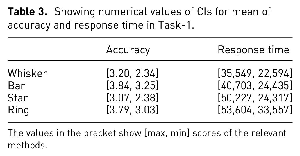
The values in the bracket show [max, min] scores of the relevant methods.
Visualization efficiency:
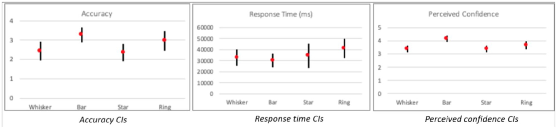
Confidence intervals of mean perceived confidence in Task-1 (95% confidence intervals adjusted for four data glyphs).
In summary, these results partially support the first hypothesis (see H1), with Bar glyph displaying the best performance, while Ring glyph was the second-best performer.
Visualization efficiency
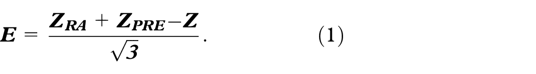
Different visualization methods prompt different amounts of cognitive load. To create better visualization as well as making more accurate assessments, it is important to understand this concern. Huang et al. 44 proposed a three-dimensional method of measuring visualization efficiency (E) (see equation (1)), where PRE signifies “user preference,” RT is “response time,” and RA denotes “response accuracy,” and these values are normalized using the z-score normalization to adjust them to a common scale.
The higher the score, the better the visual efficiency of the visualization. Using this approach, the efficiency scores of the compared glyphs – Whisker, Bar, Star, and Ring – are 0.345, 0.171, −0.170, and 0.158 respectively. Thus, Whisker glyph performed best in terms of efficiency, followed by Bar, Ring, and Star. Interestingly, although Star and Whisker glyphs are visually similar, the Star glyph’s efficiency score was considerably worse, while there was only a slight difference between the scores of the Bar and Ring glyphs. In terms of visualization efficiency, these results do not support H1.
Second task
In the second task (Task-2), which relates to H2, participants were asked to select glyphs with a large variance, which indicates that numbers in the set are far from the mean and from each other; while a small variance indicates the opposite. In the experimental context, the glyphs with large variance were called unbalanced glyphs and the glyphs with slight variance were called balanced glyphs. The participants answered the following questions in this task:
Q1. Which one of the glyphs represents the most balanced group?
Q2. Which one of the glyphs shows the least balanced group?
Results
Twenty-one participants completed this task. In terms of accuracy score, the results were significant (X2(21) = 11.400, p = 0.001).
Table 4 shows post hoc p-values for the task in which significant differences are highlighted in red using p < 0.0125 following Bonferroni correction. In particular, Whisker and Star glyphs (µWhisker = 1.66, µStar = 1.61) showed better performance than Bar and Ring (µRing = 1.33, µBar = 1.33). The number of accurate answers for Whisker was higher compared to Bar glyph, while there was no significant difference between the response times. Similarly, Star glyph performed better compared to the Bar and Ring. When looking at response times (X2(21) = 14.086, p = 0.003), there was a significant difference. The participants spent significantly more time using the Ring glyph (µRing = 17,126) compared to others (µBar = 6949, µWhisker = 7940, µStar = 7021). The Ring glyph showed worse performance than Bar glyph in this task; however, the participants were perceived to have more confidence using the Bar glyph, followed by Whisker and Star. The statistical testing confirmed significant differences for perceived confidence (X2(21) = 10.775, p = 0.01).
Post hoc results (z-and p-values) from Wilcoxon signed rank test, with significant differences highlighted in red using p < 0.0125 in Task-2.
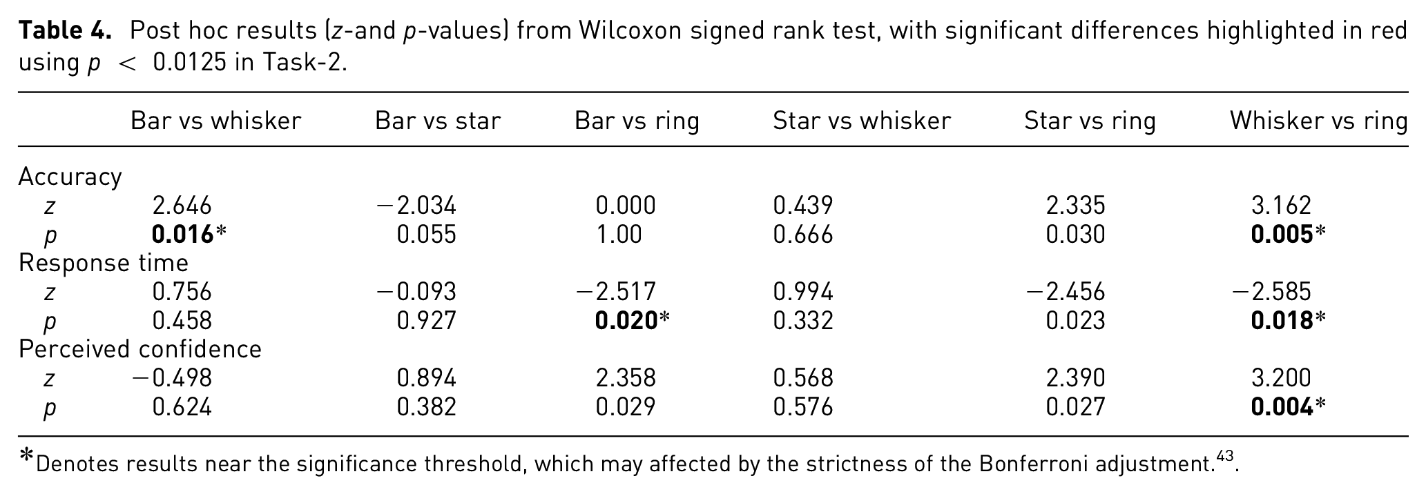
Denotes results near the significance threshold, which may affected by the strictness of the Bonferroni adjustment. 43
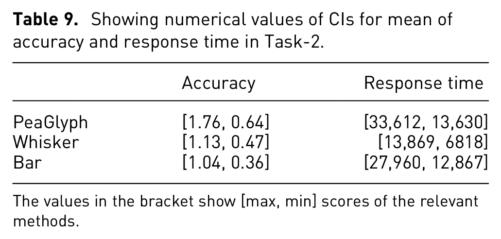
While CIs, in Figure 8, of accuracy for Whisker and Bar overlap slightly, the mean accuracy for Whisker was higher than for Bar glyph. Star and Whisker showed quite similar performance, in Table 5. The CI for response time shows a clearly longer response time for Ring glyph compared to the other designs, which largely overlap with each other.
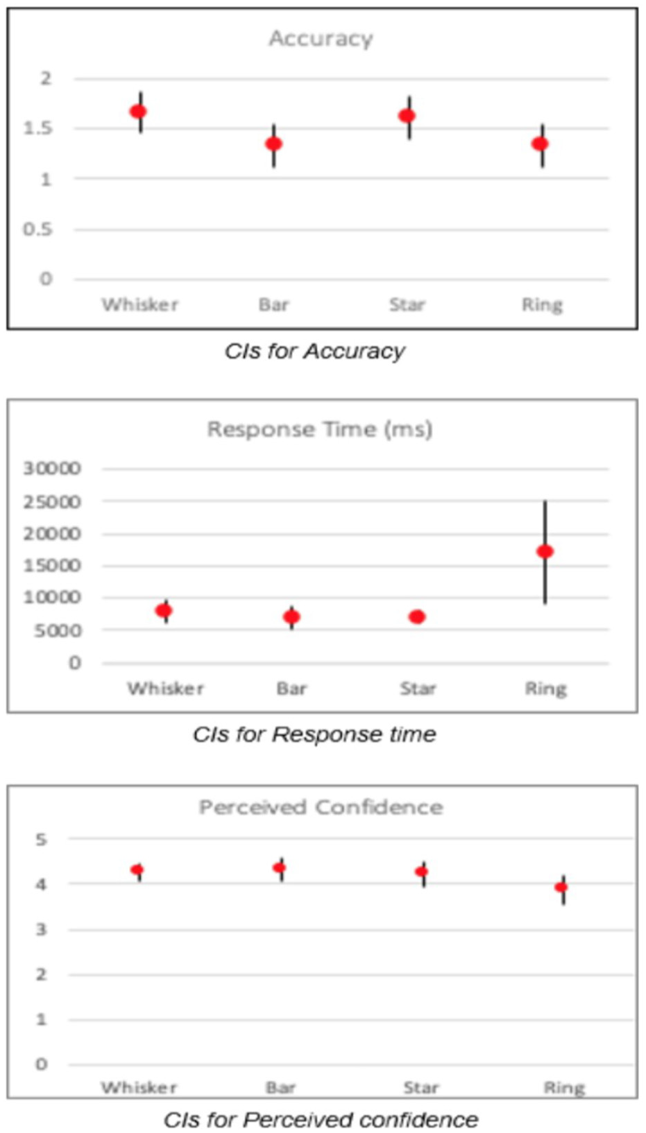
Confidence intervals for Task-2.
Showing numerical values of CIs for mean of accuracy and response time in Task-2.
The values in the bracket show [max, min] scores of the relevant methods.
Visualization efficiency
Using the approach suggested by Huang et al., 44 the efficiency of Whisker (−0.183) and Star glyph (−0.191) is higher than for the Ring glyph (−0.229), and the Bar glyph (−0.278) had the lowest score for visual efficiency. Thus, the cognitive load was less using Whisker and Star glyph, compared to Bar and Ring. The results support H2 at large, as Whisker and Star have better accuracy than Bar and Ring; and showed better response times than Ring and more or less equal confidence.
Discussion
In the evaluation the performance of four glyph designs were compared: namely Bar and Whisker as baseline glyphs and their variations, Star and Ring. Focus was put on two tasks of relevance for the investigation of balanced data structures. The first task involved comparison of feature values within and between glyphs, and the second task focused on comparing whether the combined records formed balanced objects, in terms of attribute values. The goal being to identify possible usability problems and evaluate the performance of the glyphs for the tasks at hand. The results paralleled the findings in the literature, confirming that the comparison of attributes for the circular versions is not straightforward. 41 Based on the study results presented here, Bar glyphs showed better performance against the other glyph variations for the identification and comparison of values (Task-1), thus supporting H1. In specific cases (e.g. when ordering of dimensions is not desirable), attribute values may be less easily perceivable and comparable between Bar glyphs. This may be due to the fact that human visual comparison is based on relative, not absolute differences (Weber’s Law). While considering the radial bar layout, it may be harder to perceive the length of the lines due to the angle and perspective. This problem is even more apparent for small size visualization methods (i.e. glyphs). Furthermore, visual properties should be perceptually uniform with an equal data distance corresponding to a perceptually equal visual difference. 3 This is clearly the case with Bar glyph, which use a combination of length and position in relation to a reference point, compared to the Radial glyph that encode equal values with different length bars. While Whisker and Star glyphs use perceptually uniform representations, the comparison of values may be complicated by the directional variation in relation to the reference point at the center of the glyph.
Whisker and Star glyphs performed best for tasks requiring comparison of balanced/unbalanced structures (Task-2), which support H2 at large. For these glyphs, identification of balance/unbalance is related to evaluating the symmetry of the glyph shape, with a symmetric shape generally corresponding to a balanced structure. The facilitation of pattern perception using simple and symmetric shapes is supported by visualization guidelines. 3
The novel PeaGlyph, described in the previous section, was designed taking the limitations of existing glyphs into account, in context of the investigation of balanced and unbalanced data structures as well as comparison and identification of data values. In the following section, the performance of PeaGlyph is compared to the best performing glyphs in this initial study.
Evaluation of the new glyph design
To evaluate the usability of the PeaGlyph design, a second user-study was conducted following a similar approach to the initial study. The PeaGlyph was compared against two best performing glyphs from the first study, namely Bar glyph and Whisker glyph.
Data
For this study, the Sustainable Society Index (SSI) data set was used, in which 154 countries are included and present the level of sustainability of countries. SSI is a scoring system developed by Social Society Foundation to measure human wellbeing, environmental wellbeing, and economic wellbeing for every 2 years. “Human wellbeing” indicators grouped into basic needs, personal development, and well-balanced society are described by nine quantitative attributes. Each indicator has the interval [0.0–10.0] in the SSI scoring system. It is worth noting that a public data set was preferred to a synthetic for this study, to compare the performance for realistic data structures.
Experimental design
The experiment was designed in the same way as the initial study, using a within-subject design and two main tasks where each question was tested across the glyph designs. The questions were multiple-choice questions, and participants selected the option that they thought was correct among a set of glyphs. The performance of the visualization methods, in terms of accuracy and response time when performing the tasks, was analyzed for each main task. The study was conducted individually by using the online experiment builder, Gorilla. 42 Ethical approval was received prior to the study.
In this second user study each glyph represents a country in the data set and each color represents an attribute of the country. These attributes are Sufficient food, Sufficient to drink, Safe sanitation, Education, Healthy life, Gender equality, Income distribution, Population growth, Good governance. The color scheme used to encode each attribute was the Tableau-10 from Tableau color palettes. 45
The following hypotheses were tested:
H1. PeaGlyph performs equally well or better, in terms of accuracy and response time, than Bar and Whisker glyphs, for questions related to finding the highest or lowest values.
H2. PeaGlyph performs equally well or better than Bar and Whisker glyphs, for questions in which users are expected to compare balanced and unbalanced structures between glyphs.
After the study, each participant completed a qualitative survey regarding their glyph preferences:
Q1: Which of the three glyphs shown above is the best to compare values? (i.e. finding highest or lowest indicators)
Q2: Which glyph shown above is better to show the unbalanced structure of glyph?
First task
The first task (Task-1) aimed to compare the performance of the three glyph designs (Figure 9) under elementary lookup tasks where participants focus on single attribute of a glyph and read individual values. 46 Here the participants were asked to find the glyph in a set of glyphs that displayed the maximum and minimum values of a feature.
The glyphs used in follow-up study, from left to right: whisker, bar, PeaGlyph, depicting the same data attributes.
The sample questions from this task were as follows:
Q1. Which one of these glyphs represents the highest education indicator?
Q2. Which one of these glyphs represents the lowest rate in safe sanitation indicator?
Results
Twenty participants were recruited from various domains. Nine of them were females, and 11 were males. The analysis was performed in two stages. First, the performance on the three glyphs was considered, as this was the primary research question. To check for normality, a Shapiro-Wilk test was run on each distribution. Since the data was not always normally distributed, a non-parametric Friedman’s test was used with standard statistical level p < 0.05 to determine the statistical significance between conditions. The Wilcoxon singed-rank test, with a Bonferroni correction was used as post hoc analysis to identify which particular differences between pairs of means were significant. Table 6 shows post hoc p-values for the task in which significant differences for perceived confidence with performance are highlighted in red using p < 0.0167 following Bonferroni correction.
Post hoc results (z- and p-values) from Wilcoxon signed rank test.
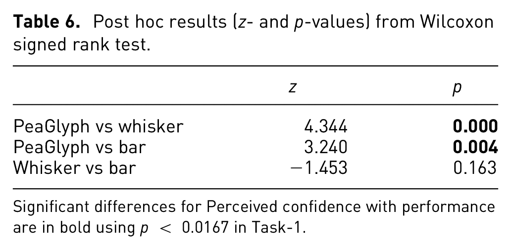
Significant differences for Perceived confidence with performance are in bold using p < 0.0167 in Task-1.
The participants showed better performance with PeaGlyph (µ = 3.9) than Whisker (µ = 3.4), but same as the Bar glyph (µ = 3.9), in terms of accuracy. Comparing the response time, Bar performed better with regards to the average response time. While users spent less time obtaining the same number of correct answers with Bar, their intervals have a degree of overlap, as seen in Figure 10 and Table 7.
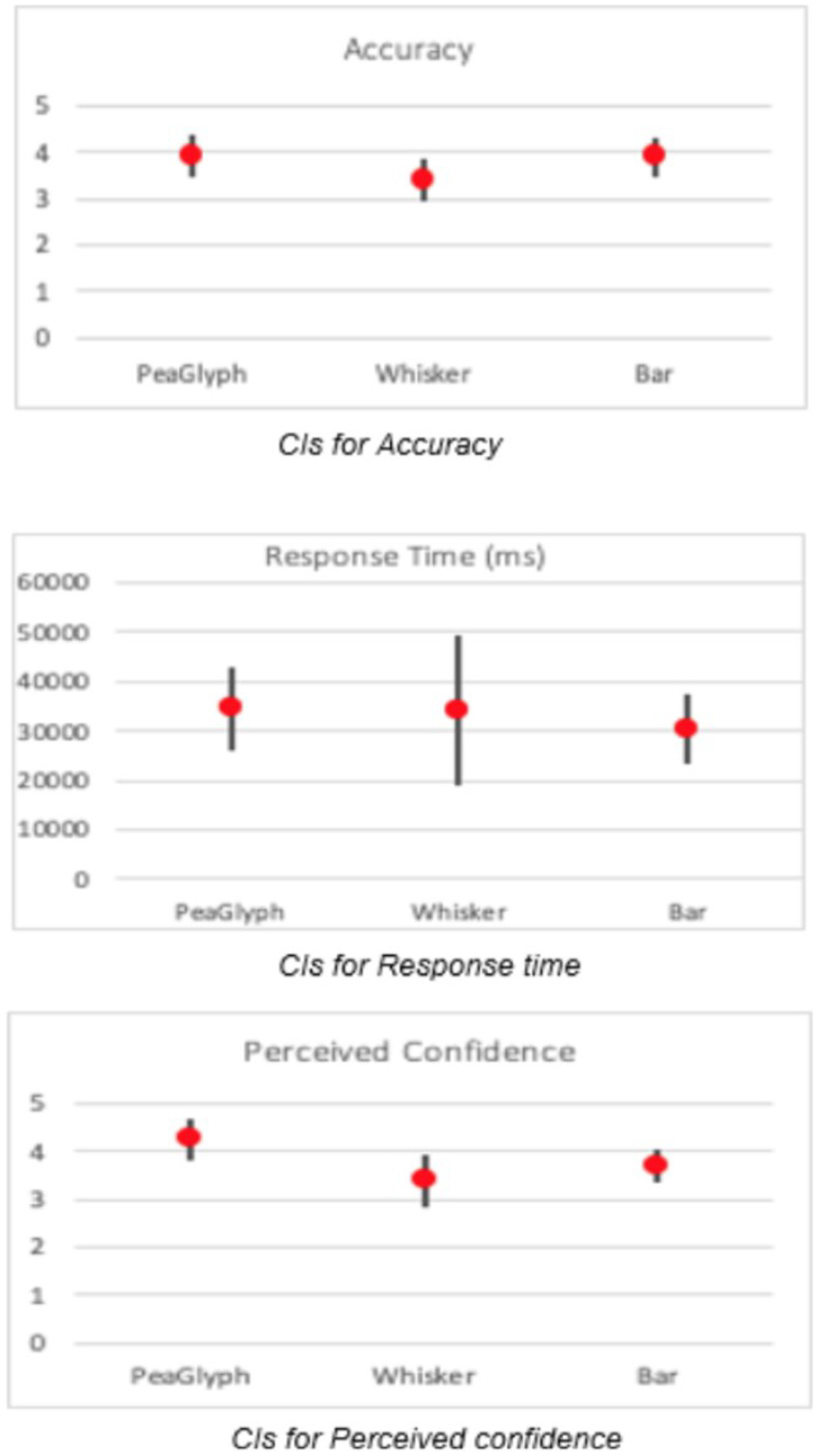
Confidence intervals for Task-1.
Showing numerical values of CIs for mean of accuracy and response time in Task-1.
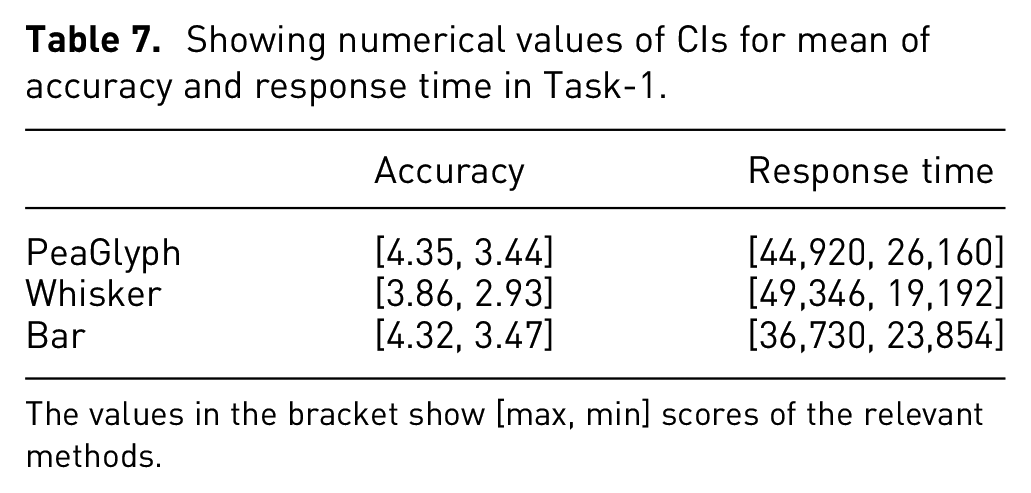
The values in the bracket show [max, min] scores of the relevant methods.
Statistical testing did, however, not confirm significant differences for either accuracy (X2(20) = 3.825, p = 0.148) or response time (X2(20) = 0.900, p = 0.638). However, the perceived confidence (X2(20) = 13.245, p < 0.01) of the PeaGlyph was higher than others, which may indicate that the participants found it easy to use and understand.
Visualization efficiency
When calculating efficiency scores for the visualization methods, the most efficient glyph is PeaGlyph with E = −0.125, followed by Bar (E = −0.449) and Whisker (E = −0.527). This indicates that the cognitive load was lower using PeaGlyph. The results in part support H1, with PeaGlyph being the most efficient glyph design for this task, and performing equally good as Bar and better than Whisker in terms of accuracy.
Second task
This part was organized the same as the second task (Task-2) in the first experiment. It aimed to compare the three glyph designs according to their performance under a synoptic task where the overall structure of glyphs is evaluated in term of “balanced” and “unbalanced.” The participants were asked to select the most balanced and unbalanced glyph in the glyph sets given.
Results
All participants in Task-1 finished Task-2 as well. Regarding the number of accurate answers, the participants showed better performance with PeaGlyph (µ = 1.2), followed by Whisker (µ = 0.8) and Bar (µ = 0.7). Statistical testing did however not confirm significant differences for accuracy (X2(20) = 0.840, p = 0.689).
Regarding the response time (X2(20) = 17,500, p < 0.01), the test confirms significant differences. Table 8 shows post hoc p-values for the task with significant differences for Response time highlighted in red, with a Bonferroni correction applied resulting in a significance level set at p < 0.0167. Whisker glyph (p < 0.001) did well in terms of response time and the difference was significant against the PeaGlyph and Bar, while its confidence interval has a small degree of overlap with Bar in Figure 11, with Table 9.
Post hoc results (z- and p-values) from Wilcoxon signed rank test.
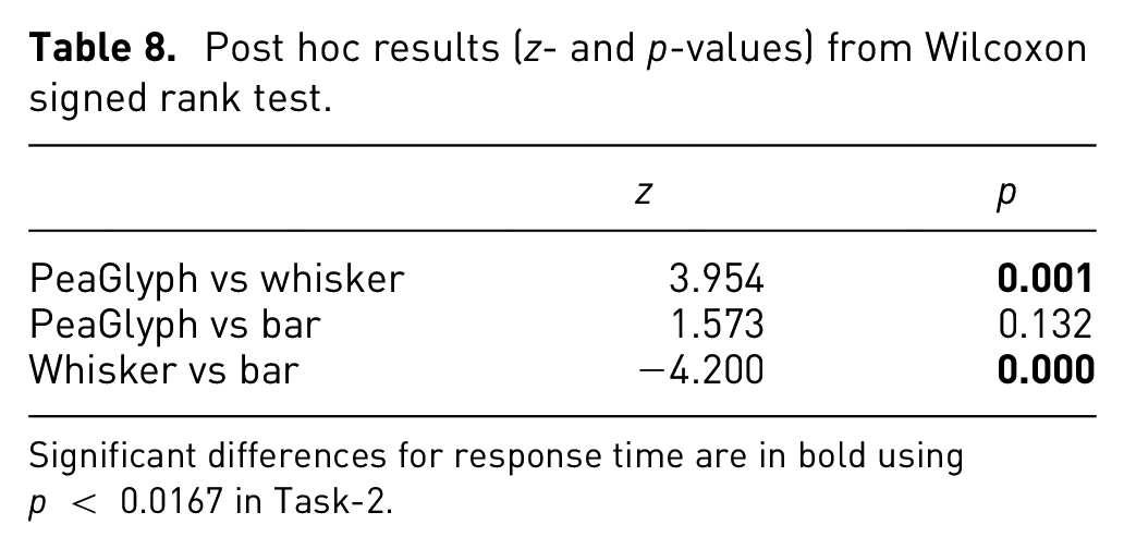
Significant differences for response time are in bold using p < 0.0167 in Task-2.
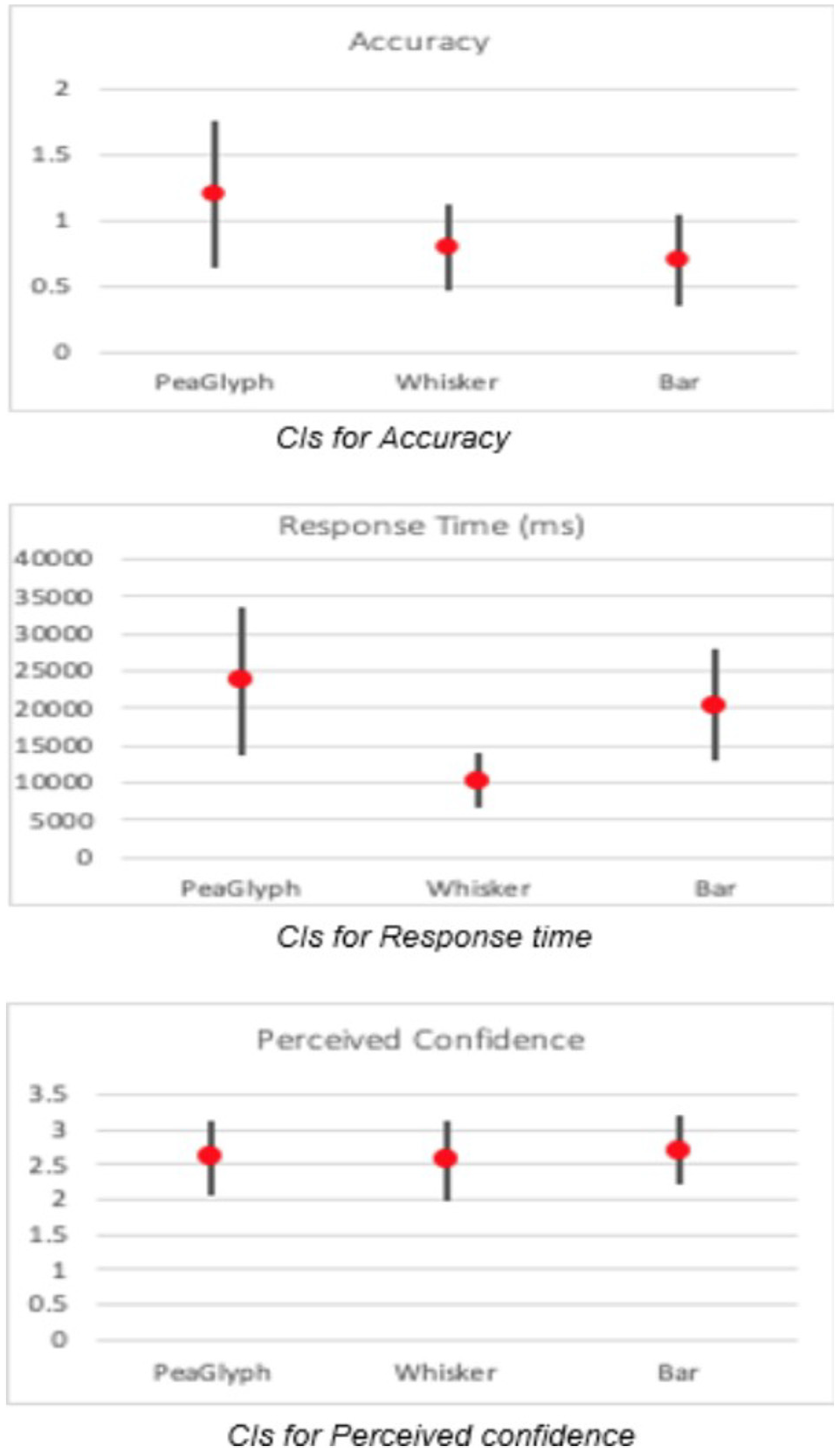
Confidence intervals for Task-2.
Showing numerical values of CIs for mean of accuracy and response time in Task-2.
The values in the bracket show [max, min] scores of the relevant methods.
In addition, the testing did not confirm significant differences for the perceived confidence (X2(20) = 0.966, p = 0.617). However, Bar had slightly better confidence rate, followed by PeaGlyph and Whisker. The CIs of the perceived confidence is given in Figure 12, where the intervals almost entirely overlap.

Participant preferences based on the tasks.
Visualization efficiency
Finally, considering their efficiency for Task-2, PeaGlyph obtained a higher score (E = 0.324) and showed higher efficiency and less cognitive load compared to Bar (E = −0.603) and Whisker (E = −1.052). While not supported by statistical significance, the results in part support H2, with PeaGlyph having a higher efficiency score and higher accuracy.
Discussion
Overall, the number of accurate answers increased with the new PeaGlyph design, although the participants were more familiar with Bar and Whisker. Meanwhile, the users generally felt more confident answering the questions using PeaGlyph. These are promising results and a good indicator for the performance and usability of the new glyph design. With regards to response time, the slightly worse performance may be due to the PeaGlyph being a new visualization method and, thus, possibly requiring more training than Bar and Whisker.
As seen in Figure 12, the participants widely preferred the Bar glyph followed by PeaGlyph for the look-up tasks (gray) and Whisker glyph was least preferred. Furthermore, PeaGlyph and Bar glyph were equally preferred for defining balanced structures, while PeaGlyph was least preferred for unbalanced structures. It is worth noting that the users’ preferences generally support the quantitative results obtained from the usability tests in Task-2.
In order to decide which design will be the most appropriate method for the tasks at hand, two user-studies were conducted.
Figures 13 and 14 summarize the results from these studies in terms of accuracy and response time. For lookup tasks, Bar glyph was the best performer for both experiments in terms of accuracy and response time. PeaGlyph showed equal performance as Bar for accuracy; although the response time increased. Compared to whisker glyph, PeaGlyph had better accuracy; while the response time was more or less the same. For Task-2 the designs were evaluated in terms of how they help reveal balanced or unbalanced objects within formed multivariate groups. In the first evaluation, the Whisker was the best performer in terms of accuracy, although Bar glyph was slightly better in terms of speed. For the second evaluation, PeaGlyph showed the best performance in terms of accuracy over Whisker and Bar. However, response time was better for Whisker glyph in this task compared to the PeaGlyph and Bar. It is worth noting that in information visualization, the methods are typically evaluated by comparing their differences in accuracy and response time. This makes design evaluation difficult in choosing one visualization over another. 44 Thus, we also evaluated the visualization efficiency of the designs. The efficiency results showed that PeaGlyph was the best option by obtaining the highest score in both tasks in the second experiment.
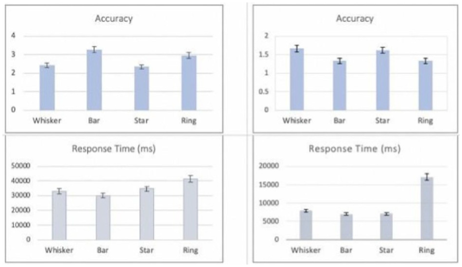
Showing Experiment-1 results. The charts illustrate the average accuracy and response time with the standard deviation. The left-side figures showing the results of the look-up task (Task-1), and the right-side showing the results of finding balance/unbalance objects (Task 2).
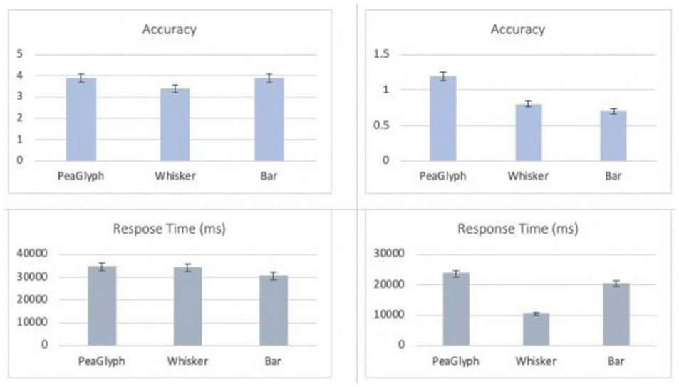
Showing Experiment-2 results. The charts illustrate the average accuracy and response time with the standard deviation. The left-side figures showing the results of the look-up task (Task-1), and the right-side showing the results of finding balance/unbalance objects (Task 2).
In summary, the participants increased the accuracy of their responses using PeaGlyph; however, the task completion time increased marginally. In particular, PeaGlyph can be preferred for tasks where the overall accuracy level is more important rather than the response time. Furthermore, analysts may want to be able to interrogate data with a more complex nature. PeaGlyph comes with various visual channels that can be used to encode more complex data sets (see section “PeaGlyph Design”). We are aware that some channels are more efficient than others, so the visual designer can select among them to encode their data set.
Use case study
This section demonstrates how the presented approach can be used to analyze the balanced and unbalanced within and between data attributes.
A Better Life Index (BLI1) includes multiple dimensions of the well-being of the OECD’s member countries. The OECD selected 11 indications of life to measure, which are the availability of housing, income, and work as well as the overall quality of life (community, education, environment, governance, health, life satisfaction, security, and work-life balance) – the selection of dimensions is explained by 40 in detail. All of the indicators are normalized to the range of 0–1. These variables make it possible to compare its member counties from many different perspectives.
For the 2014 OECD Better Life index, Decancq 47 introduced the distributional Better Life Index (BLI2), and countries are ranked according to their BLI2 scores representing each country’s overall well-being, taking the distribution of well-being into account. In Figure 15, the countries are mapped onto two-dimensional space based on their BLI2 loss (i.e. A country with a larger BLI2 loss due to multidimensional inequality will have a smaller BLI2 score). The countries on the lower end of the figure have a smaller loss compared to the countries on the upper side. For example, the countries such as Austria and Netherlands have higher average scores for the various dimensions of life. To make it clear, the PeaGlyph depicted the various life attributes of three of the countries selected from different areas of the projection, as seen in Figure 16.
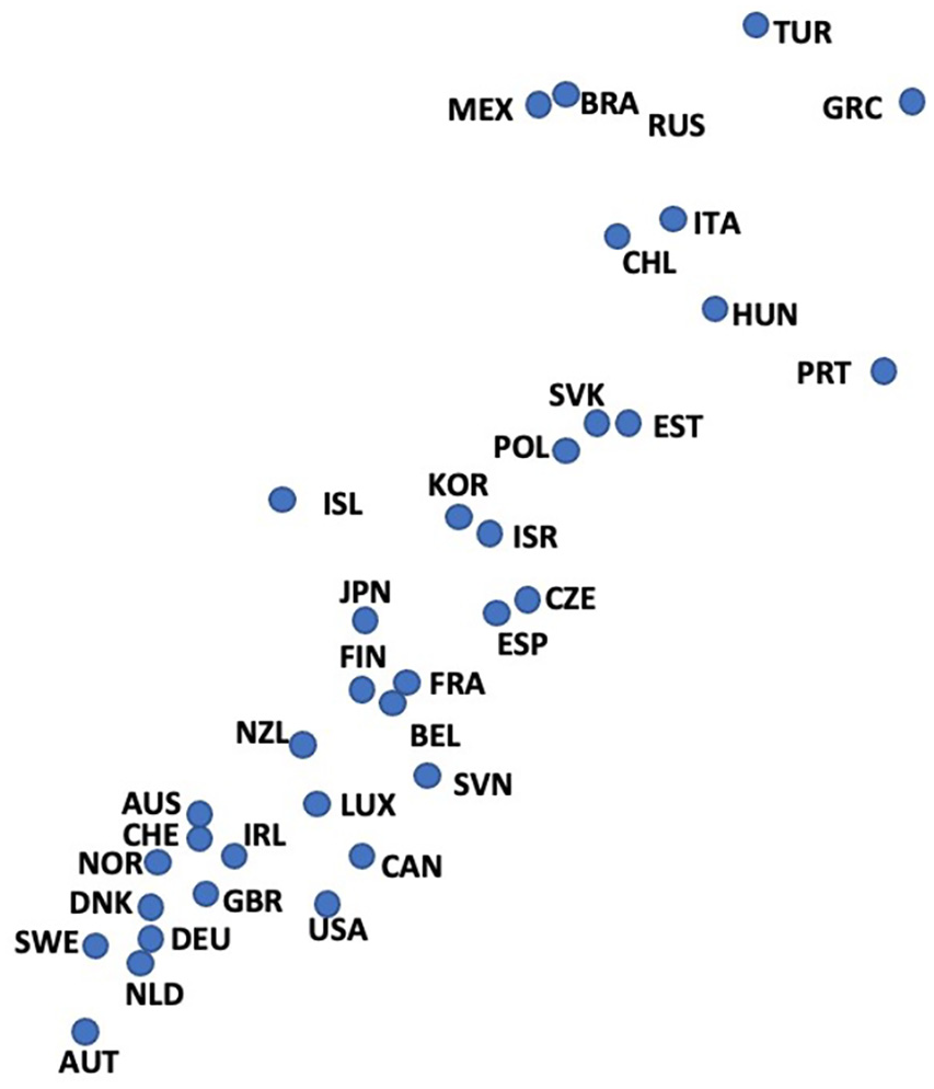
BLI2 loss due to inequity.
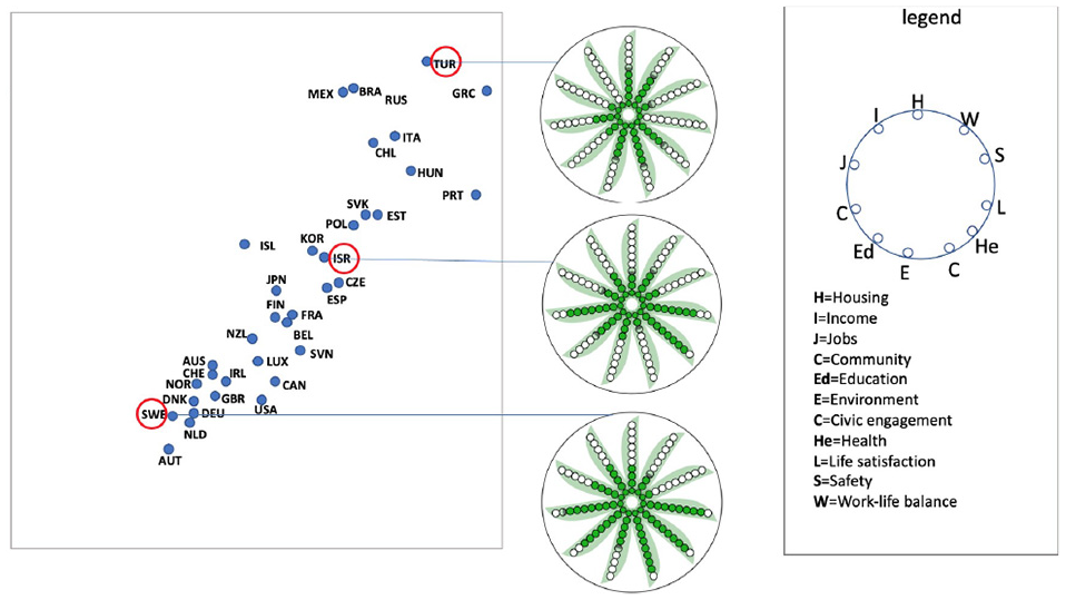
Comparing the multi-attributes across the countries in interest.
The countries encoded into the PeaGlyph can be compared to see which ‘life indicators’ (i.e. data attributes in our context) are more distinctive or similar across countries. PeaGlyph helps analysts identify the numerical value or ratio represented by each variable by counting the filled, semi-filled, or empty circles, allowing for easy matching of multiple attributes across countries. For example, in Figure 16, the user can quickly detect that the average scores of “job (J)” and “income (I)” for the country glyph (TUR) are lower than these values for the middle (ISR) and bottom glyphs (SWE). However, the glyph at the upper side had higher values than the other glyphs for both “Housing (H)” and “Work-life balance (W).”
Further, users can analyze the balance or imbalance between multiple attributes of each country, as shown in Figure 17. For this purpose, three of the projected countries were randomly selected, and their attributes were mapped to the PeaGlyph.
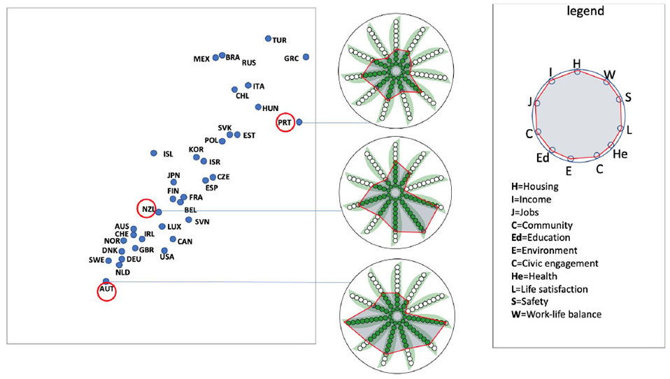
Representing balance/unbalance within the multi attributes of three countries of interest, using two design variations of PeaGlyph. The top figure includes a polygonal overlay on the Glyphs, while the bottom figure fades out the empty peas.
Two versions of the glyph are displayed in the figure to demonstrate the flexibility of the design. The polygonal overlay structure on top of the PeaGlyphs in the top part of Figure 17 serves to further emphasize the balance of attributes. The shape of the overlay is based on the underlying pea-based representation.
The country glyph (PRT) at the top is perceived to be more balanced than the other country glyphs in the middle and bottom in terms of the distribution of its variables among themselves, as visible from both the top and bottom part of Figure 17. Also, the balance in (AUT) appears to be greater than that of the middle country (NZL).
Due to the strength of human visual perception, this type of comparison can be easily performed for moderate sized data using PeaGlyph. Alternatively, it is necessary to consider the range and distribution together to decide on the balance or imbalance between the variables, which may be more cognitively demanding.
Conclusion and future work
Glyph-based visualization is a common form of visual design that has attained great attention from researchers in the visualization domain. This paper presents a new glyph design, PeaGlyph, which was designed based on established design principles and the results of a formal evaluation of four glyph designs. The PeaGlyph design aims to address the problems related to existing glyphs, as identified in the evaluation. PeaGlyph is described in the paper along with introduction of design schemes for alternative usage and data types.
Two usability studies are presented in the paper. These compare glyph designs for tasks of relevance for investigating structures of balance and unbalance in data. For the first study, four glyph methods were compared: Bar and Whisker as the baseline glyphs, and their variations Star and Ring. The study compared these four glyphs in terms of look-up and comparison of values and revealing of balanced objects. The performance of the novel PeaGlyph was then evaluated against the best performers of the first study, Bar and Whisker. The results were encouraging, and PeaGlyph performed as well as Bar glyph in term of accuracy, although the response time for the new design was higher than Bar. These results may be affected by PeaGlyph being a new visualization method and, thus, possibly requiring more training to use efficiently, compared to Bar. Furthermore, the participants reported in their feedback a preference for PeaGlyph and Bar over Whisker glyph for the look-up tasks. Whisker was the worst option for the studied balanced detection tasks. These results can be considered a good indicator for the potential of PeaGlyph as an intuitive and useful data glyph. Finally, the utility of PeaGlyph is demonstrated through a use case example.
Future work includes further evaluation of the glyph and additional use case testing in more realistic settings. Due to its visual simplicity and flexibility, PeaGlyph has the potential to be used for a variety of scenarios. Potential use cases to be considered for future studies include cluster analysis and the formation of comparatively balanced teams. 39
The latter is particularly promising since PeaGlyph has the ability to map summary attributes of groups as well as representing the balance within the attributes for each group. This allows facilitators to gain insight into the teams and change team members as needed to create the desired balance between teams. There is also a need to formally evaluate the number of data attributes that can be efficiently represented using the PeaGlyph design, as well as the effect of the color scale on the results.
Supplemental Material
sj-pdf-1-ivi-10.1177_14738716211050602 – Supplemental material for PeaGlyph: Glyph design for investigation of balanced data structures
Supplemental material, sj-pdf-1-ivi-10.1177_14738716211050602 for PeaGlyph: Glyph design for investigation of balanced data structures by Kenan Koc, Andrew Stephen McGough and Sara Johansson Fernstad in Information Visualization
Footnotes
References
Supplementary Material
Please find the following supplemental material available below.
For Open Access articles published under a Creative Commons License, all supplemental material carries the same license as the article it is associated with.
For non-Open Access articles published, all supplemental material carries a non-exclusive license, and permission requests for re-use of supplemental material or any part of supplemental material shall be sent directly to the copyright owner as specified in the copyright notice associated with the article.