
Abstract
To accommodate the demands of a data-driven society, we have expanded our ability to collect and store data, develop sophisticated algorithms, and generate elaborated visual representations of the data analysis process outcomes. However, data preprocessing, as the activity of transforming the raw data into an appropriate format for subsequent analysis, is still a challenging part of this process. Although we can find studies that address the use of visualization techniques to support the activities in the scope of preprocessing, the current Visual Analytics processes do not consider preprocessing an equally important phase in their processes. Hence, with this paper, we aim to contribute to the discussion of how we can incorporate the preprocessing as a prominent phase in the Visual Analytics process and promote better alternatives to assist the data analysts during the preprocessing activities. To achieve that, we are introducing the Preprocessing Profiling Approach for Visual Analytics (PrAVA), a conceptual Visual Analytics process that includes Preprocessing Profiling as a new phase. It also contemplates a set of guidelines to be considered by new solutions adopting PrAVA. Moreover, we analyze its applicability through use case scenarios that show resourceful methods for data understanding and evaluation of the preprocessing impacts. As a final contribution, we indicate a list of research opportunities in the scope of preprocessing combined with visualization and Visual Analytics to stimulate a shift to visual preprocessing.
Introduction
Moving toward a data-driven society triggers new demands for data analysis. Although we have evolved in our data analysis capabilities, data preparation is still a challenging part of this process. This activity is frequently mentioned as laborious and time-consuming.1–8 According to Dasu and Johnson 9 (p. IX), “the tasks of exploratory data mining and data cleaning constitute 80% of the effort that determines 80% of the value of the ultimate data mining results.”
We can observe variations in which tasks are considered part of the data preparation and how they are indicated in a data analysis process. 8 However, in general, data preparation is the process “to transform the raw input data into an appropriate format for subsequent analysis” (Tan et al., 2 p.3). As part of this process, several different strategies, methods, and techniques are used for data understanding, for example, similarity and dissimilarity between data objects, and for data transformations, for example, aggregations and normalization or standardization of variables. This set of activities is identified in this work as preprocessing, but this term is also referenced in the literature as data wrangling, 3 data cleaning, or scrubbing. 10
Data quality problems are present in most datasets, due to misspellings during data entry, missing information, or other invalid data. Moreover, when multiple data sources need to be integrated, the need for preprocessing increases. 10 Although automated processes are fundamental and accessible in this context, the data analyst’s participation in the decision of how this data should be transformed is still critical in many cases.1,4,6,11,12 To support the cases when the “human in the loop” is vital to data preprocessing, the use of visualization techniques can play an essential role in data analysis while providing meaningful insights4,13,14 since one of the strengths of visualization is enabling users to quickly identify erroneous data. 15
Nevertheless, most of the works in the scope of visualization are focused on supporting just the last phases of the data analysis process. Even though we can find studies proposing visualization methods to assist with preprocessing, they are predominantly focused on data transformation activities, for example, Kandel et al.,3,16 or limited to particular scenarios or data types, for example, time series data Bernard et al. 17 and Gschwandtner et al. 18 Thus, we can still observe opportunities, such as (a) alternative visualizations to explore data quality issues; (b) visualizations to support the evaluation of the preprocessing impacts in further phases; and (c) creating a list of guidelines to support novel visualizations in the context of preprocessing.
Additionally, for many Visual Analytics (VA) processes, such as in Keim et al. 19 and Sacha et al., 20 the preprocessing phase is not acknowledged as important as Data, Visualization, Models, or Knowledge phases. Furthermore, the preprocessing is described as part of a batch or waterfall approach inside one of the existing phases, and its activities, when detailed, are basically with regards to data transformation. However, as discussed by Krishnan et al. 6 and Milani et al., 8 preprocessing activities should be considered part of the entire process, not only because these activities require multiple interactions through the whole data analysis process but also due to their impact on the other phases.
This paper aims to raise awareness of these issues seeking to answer the research question: How preprocessing activities can be effectively incorporated into the VA process? Based on an extensive literature review around the topic, we derived nine different guidelines for consolidating preprocessing in the VA workflow, discussing their purpose, and presenting examples found in the literature. As a result, we extend the VA process to accommodate our findings and acknowledge the preprocessing phase’s importance, aiming at enabling data analysts to increase their ownership of the data under analysis, master the impacts of preprocessing activities, and contributing to more trustworthy knowledge discovery. The main contributions of this paper are:
A list of nine guidelines to be considered by VA solutions to incorporate preprocessing in the analysis life-cycle, presenting different examples found in the literature;
A conceptual process, named
Further research opportunities in the scope of preprocessing, visualization, and VA for advancing the area.
We use the term Preprocessing Profiling to indicate the activity of creating informative summaries while performing the data preprocessing activities. This term was inspired by the concept of Data Profiling, defined by Johnson 21 as the activity of generating informative summaries of a database (e.g. the total number of missing records in a table).
The structure of this paper follows the order of steps taken in the development of this work. First, in the Related work section, we present an extensive literature review involving preprocessing activities in VA scenarios that serve as background and motivation for this work. Then, we describe the guidelines derived from the literature and the PrAVA process in the Preprocessing profiling approach section. The following sections present a potential Usage scenario and Applications as part of the validation of our proposal. In the Discussion section, we explain the lessons learned and limitations of this work and research opportunities. In the last section, we outline our Conclusions. Figure 1 presents an overview of these steps.
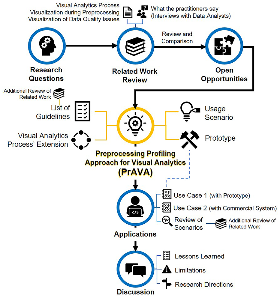
Overview of this work.
Related work
This section covers related work that serve as background and, at the same time, influenced the Preprocessing Profiling Approach for Visual Analytics (PrAVA). These works are grouped in four subsections according to their focus on Visual Analytics process, visualization during preprocessing, visualization of data quality issues, or interviews with practitioners. Finally, we present a review and comparison of the selected related work.
Visual analytics process
As part of the Visual Analytics (VA) discussion, Keim et al. 19 contribute with an overview of the different phases in the VA process. Their process (Figure 2) combines automatic and visual analysis methods with human interaction to gain insights and promote knowledge generation. Despite their notorious relevance to the VA area, their process does not detail the importance of the preprocessing activities. Also, the representation of their process such as a waterfall flow does not allow interactions related to data preprocessing.
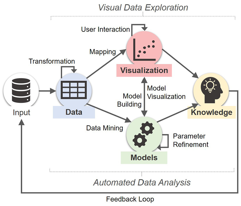
The Visual Analytics process based on Keim et al. 19 . Each node (colored rectangle) corresponds to a different phase, and their transitions are represented through arrows.
As an extension of Keim et al., 19 Sacha et al. 20 presents a new model for Knowledge Generation (Figure 3) that includes a high-level description of the human work process in the visual analytics integrating this model with different frameworks. Next, other works emerged inspired by these previous works, such as Ribarsky and Fisher 22 addressing the human-machine interaction loop complementary to Sacha et al. 20 and Federico, Wagner et al. 23 explaining the role of explicit knowledge in the analytical reasoning process when proposing a conceptual model for knowledge-assisted visualizations. These three references share the focus on the “Human” side, that is, cognitive science and knowledge generation aspects. Thus, despite Sacha et al. 20 also being one of the works that most describes the “Computer” side, the discussion about the data profiling and preprocessing challenges are still existent.
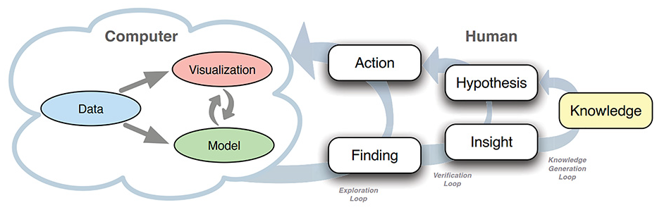
The knowledge generation model for VA proposed by Sacha et al. 20
Although limited to a subarea of VA, we can identify studies that contribute toward our discussion by showing preprocessing activities as part of their VA process description. For instance, Lu et al. 15 and Lu et al. 24 while introducing the Predictive Visual Analytics pipeline, and Sacha et al. 7 during their proposal of an ontology for VA assisted Machine Learning.
Visualization during preprocessing
In the existing literature, we observed few visualization studies concerned with data preparation activities. Also, the use of VA for the preprocessing phase is least reported in general. The same observations are also reported by other authors, for example, Kandel et al., 4 Sacha et al., 7 Seipp et al., 25 Lu et al., 15 Bernard et al., 17 and Lu et al. 24
Some studies in the context of VA and preprocessing can be found, for example, Bernard et al. 17 and Gschwandtner et al., 18 but they are focusing in time series data and do not provide a comprehensive discussion for preprocessing with different types of data. Likewise, we can find studies explaining how they are handling preprocessing during a VA process, for example, Krause et al. 26 and Sacha et al. 27 However, these studies are still not entirely dedicated to cover preprocessing problems. Nevertheless, their observation of how shifting the attention from visual analysis to visual preprocessing can improve the analytical processes contributes to our discussion’s relevance.
In this context, few relevant works can be cited with a broader coverage in visualization in preprocessing. One of them is the Predictive Interaction framework for interactive systems, developed by Heer et al., 28 that covers general design considerations for data transformations. As the main discussion, the authors propose that the data analyst can decide the next steps of data transformation by highlighting guidelines of interest in visualizations, instead of specifying details of their data transformations. With that, they expect to avoid a variety of data-centric problems related to the technical challenges of data analysts during programming. Similarly, Wrangler 3 is introduced as a system for interactive data transformations, which includes an interface language to support data transformation with a mixed interface of suggestions and user interaction on visual resources. Both papers provide primordial techniques in the scope of preprocessing, but they are limited to the data transformation activities.
Regarding visual data profiling, von Zernichow and Roman 29 propose an approach to use visual data profiling in tabular data cleaning and transformation processes to improve data quality. As part of their study, they also evaluate the usability of their implemented software prototype, which brings considerations under the usability issues and suggestions for further research, such as exploring visual recommender systems.
One of the most comprehensive proposals about preprocessing is Profiler, 16 an integrated statistical analysis, and visualization tool for assessing data quality issues. Profiler uses data mining methods to support anomaly detection. However, there is still the opportunity to explore different ways to view frequent data issues, for example, missing values in a dense-pixel display.
Visualization of data quality issues
There is comprehensive literature available on how to diagnose and handle data errors, for example, Kim et al, 1 Wickham, 5 Rahm and Do, 10 Chandola et al., 30 and Wang et al. 31 Among the different types of data quality issues, the missing data are one of the most frequently referenced.4,6,8
Templ et al. 32 criticize that no matter how well the classification mechanism for missing data has been planned, they still have limitations such as the difficulty to accurately identify the cause of the value being missing while working with multivariate data. Subsequently, they argue for the importance of visualization to solve the related questions, and they introduce Visualization and Imputation of Missing Values (VIM). In an empirical study to evaluate the best design for interpretation of graphs with missing data, Eaton et al. 33 observe that data interpretation is negatively impacted when there is a poor indication of the missing values. Additionally, more recent studies such as Sjöbergh and Tanaka 34 and Song and Szafir 35 endorse the importance of developing different ways of visualizing missing values as an attempt to avoid misleading interpretations resulting from the way the visualization procedure was developed. Similarly, McNutt et al. 36 claim that dirty data or bad user choices can cause errors in all stages of the VA process, and a superficial visualization without a closer re-examination can lead to misleading or unwarranted conclusions from data (what they call visualization mirage).
What the practitioners say
In addition to the research related to visualization techniques and the VA process, it is also important to understand the current practice of enterprise professionals with data preprocessing and how visualization supports this process. However, few works can be found sharing the experiences of the practitioners in the scope of data analysis and visualization, for example, Batch and Elmqvist, 37 Kandogan et al., 12 Kandel et al., 38 and Milani et al. 8 At the same time, other interview studies are focusing on interactive data cleaning, such as Krishnan et al. 6 When combined, these works bring light on practitioners’ reality on different perspectives, supporting a broader view of the practice and the current needs.
In the most recent of these works, Milani et al., 8 we interviewed thirteen enterprise data analysts and compiled a list of 10 insights for new visualizations in preprocessing scope. We compared our findings to the other interview studies to compile the final list, which brings confidence that this list of insights can be used as a consolidated set of requirements based on what the practitioners report. Moreover, these insights improved the reliability of our findings and provided background, helping in the definition of the guidelines presented in the next section.
Review and comparison
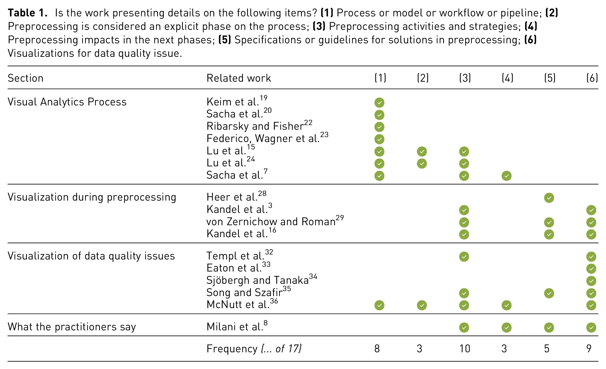
To better organize our discussion on the related work and to facilitate the comparison with the scope of our work, we defined six items to guide this effort. The results are summarized in Table 1, and further comments for each item are provided. We did not add all related work to the table, but only those we considered closer or more relevant to our discussion.
Is the work presenting details on the following items?
Regarding
Next,
Complementing the previous,
While evaluating
Multiple works3,8,16,29,32–36 cover the content of
In conclusion, besides the relevant contributions of these works, we can still observe opportunities to be discussed. From that, the following items receive less attention than the others:
Preprocessing as an equally important phase in the VA process.
Alternative visualizations to cover the same data quality issue by different perspectives.
Visualizations to support the evaluation of the preprocessing impacts in further phases.
List of guidelines to support novel visualizations in the context of preprocessing in a data analysis process.
To continue this discussion and support filling these gaps, we are proposing the Preprocessing Profiling Approach for Visual Analytics, which is described in the next sections.
Preprocessing profiling approach
In this section, we present the Preprocessing Profiling Approach for Visual Analytics (PrAVA), illustrated in Figure 4. First, we outline the nine guidelines that we identified as important to be observed while planning new solutions in compliance with our proposed approach and considering preprocessing an equally important phase in the VA workflow. Second, we explain the PrAVA process and its relation to the guidelines.
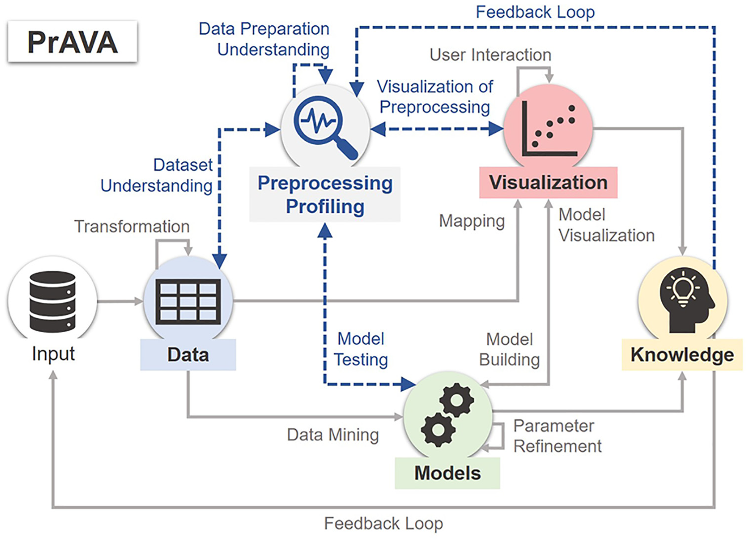
The Preprocessing Profiling Approach for Visual Analytics (PrAVA) is an extension of the VA process proposed by Keim et al. 19 . We added the Preprocessing Profiling phase and new transition options: Dataset Understanding, Data Preparation Understanding, Visualization of Preprocessing, Model Testing, and another Feedback Loop. The new objects are represented in blue color for the text font and dashed lines.
Guidelines
We identify nine guidelines for consolidating preprocessing in the VA process, composing the foundation for the proposed PrAVA extension. These guidelines were identified based on the current relevant literature (Related Work section), on the research directions in data wrangling raised by Kandel et al.,
4
Krishnan et al.,
6
and in our previous study that we interviewed enterprise data analysts.
8
In Table 2, we present a description of the meaning and motivation for each guideline:
List of nine guidelines to be considered as part of the Preprocessing Profiling Approach for Visual Analytics (PrAVA). For each guideline, we describe their meaning, motivation, and some examples of implementations in the context of VA or Visualization.
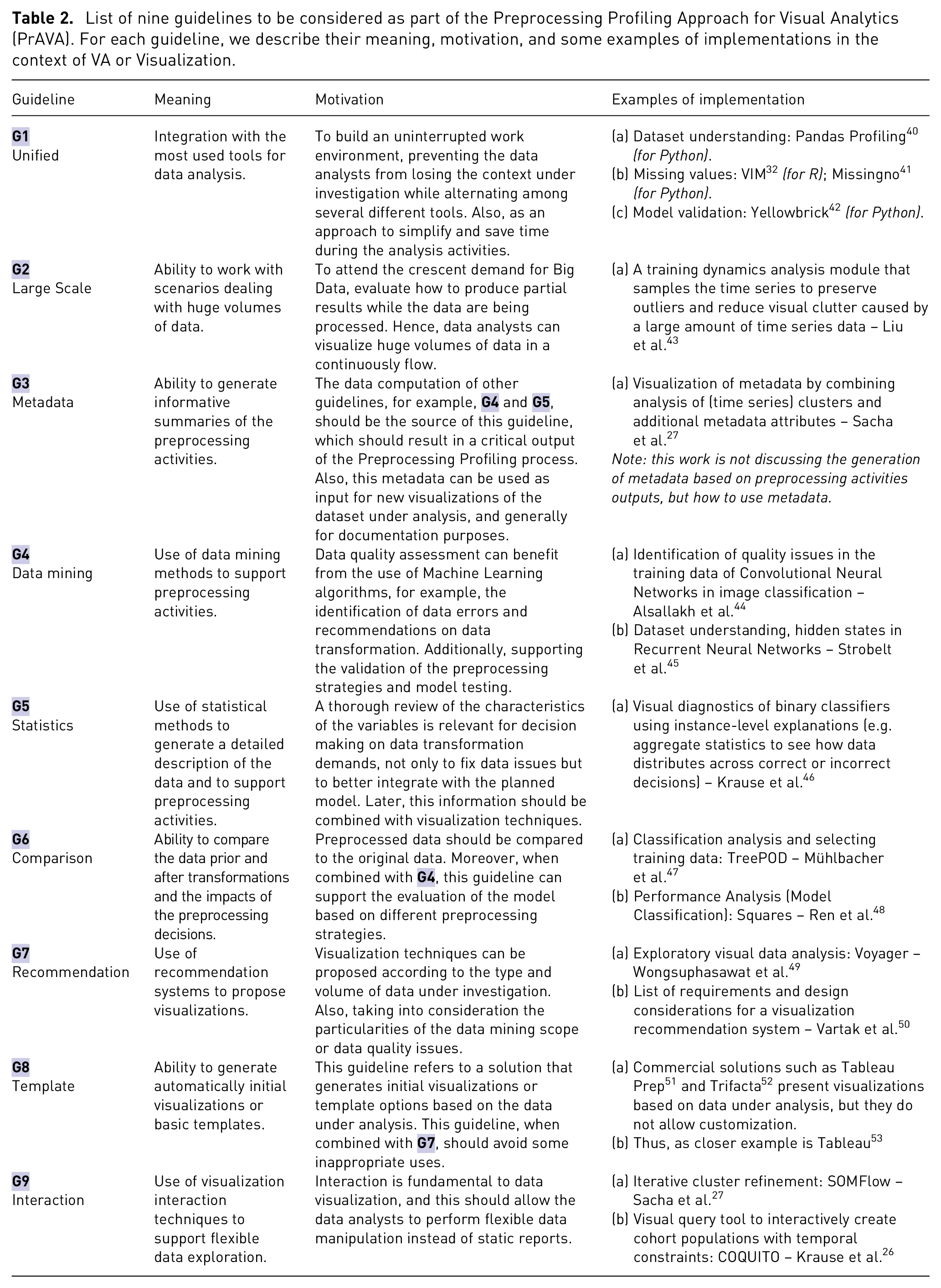
We also indicate additional work or software solutions that we consider related to each guideline. In other words, that can illustrate its possible implementations. It is pertinent to note that some of the suggested references may cover more than one guideline, or they may not fully cover even one guideline. Moreover, some of them do not have the preprocessing as an ultimate purpose. However, in their presentation, we can observe how they use the VA or Visualization during preprocessing tasks.
The structured list of guidelines aims to guide the design of new solutions in adherence to the PrAVA. At the same time, the insights gained during the examination of these guidelines supported us in devising the PrAVA process, which is explained in the next subsection.
Process
PrAVA is formalized as an extension of the VA process (see Figure 2), in which we include a new phase called Preprocessing Profiling, and new possible transitions among the phases. An overview of the PrAVA process is shown in Figure 4. Even though we recognize the importance of human cognitive activities in the VA process (see Figure 3), we decided to continue using Keim et al. 19 representation aiming for simplicity to illustrate the VA process; therefore, this decision allowed us to focus on the Preprocessing Profiling transitions.
By adding Preprocessing Profiling as a phase, we put activities such as the data profiling and the evaluation of preprocessing strategies before Model Building in the critical path, that is, as an equally important phase. However, preprocessing activities planned in the original Data phase as part of the Transformation transition (Data ↔ Data) can still occur since, for example, the dataset input may require data cleaning and normalization before proceeding with any analysis. Also, the other four original phases and their transitions remain the same. Next, we focus on explaining only the new transitions. Furthermore, we are indicating how the guidelines presented in Table 2 can be associated with this process.
The new transition
Another new transition is
All the transitions leaving the Preprocessing Profiling phase have a way back on the same connection (i.e. the arrows in Figure 4). Different from the original VA process (see Figure 2), which can be read as one-way direction, such as a waterfall approach, PrAVA considers the possibility of multiple interactions between two phases during the same process. Thus, we also added a new
However, the model proposed by Sacha et al.
20
(see Figure 3) better describes the different loops in this scope of knowledge generation and should be used as a reference for the subject. In summary, they define three different usage loops: (1) the exploratory loop, where finds are discovered; (2) the verification loop, where insights are generated by interpreting the findings; and finally (3) the knowledge generation loop, where insights are converted into verified hypotheses and data is transformed into knowledge. Our proposed
Big Data scenarios are the concern behind
In reference to
The VA process described in PrAVA includes cases in which data adjustments are identified in several phases of the data analysis process. These are not limited to the first time data are selected and transformed. We also advocate the advantage of using visualization techniques during the preprocessing, and not only to generate the final visualizations. Ultimately, our proposal with PrAVA considers the Preprocessing Profiling as a prominent phase, which deserves to have its transitions explicitly extended in the VA process.
Among our rationale for this novel approach, we can indicate a couple of reasons. First, even though Keim et al. 19 covered Data activities, as previously explained, it was not covering all the preprocessing activities as we are proposing in this work. We also do not consider Preprocessing Profiling a sub-phase of Data because we understand that the complexity related to data preparation has evolved over the years. These processes have been overlooked by the visualization research community as reported in our Related Work section and other references such as Crisan and Munzner, 60 which corroborates with this need for a revisited approach. Second, similar to what Munzner 61 explains during their nested model for visualization design and validation, the intellectual value of separating in explicit stages is that we can separately analyze whether each phase has been addressed correctly, no matter what order they were undertaken. Furthermore, the author conjectures that many experienced practitioners (visualization designers) carried out methodologies, albeit implicitly or subconsciously. Conversely, newcomers do not have that tacit knowledge, so we consider conceptual models fundamental to this audience. Moreover, even though these experienced practitioners have these internal processes that they can implicitly follow, as indicated by Munzner 61 (p.922), “sometimes designers cut corners by making assumptions rather than engaging with any target users.” Thus, our proposed approach aims to make these subconscious activities more explicit to provide a model that can be used to help guide the VA process itself. To conclude, PrAVA should enable the practitioners (data analysts or visualization designers) to increase their ownership of the data under analysis, master the impacts of preprocessing activities to the model building, and contributing to more trustworthy knowledge discovery in the VA process.
Usage scenario
In this section we present a usage scenario with PrAVA. We implemented a prototype solution, first, to assist with this usage scenario, and later, with other possible applications of PrAVA. This solution is described in Subsection Prototype, and the usage scenario is presented in Subsection Tim and the Iris Dataset.
Prototype
Since our primary goal is to describe a conceptual VA process (PrAVA), and not a system, we introduce in this subsection just the information that we consider relevant to the prototype’s overall understanding as it is referenced in the next subsections. The developed prototype solution generates two dynamic reports: Data Profiling (https://github.com/DAVINTLAB/pandas-profiling) and Preprocessing Profiling (https://github.com/DAVINTLAB/preprocessing-profiling).
The Data Profiling report supports the dataset understanding. This report was developed as an extension of Pandas-profiling. 40 The main sections are identified as Overview, information about the dataset such as the total number of rows and columns, variable types, and Warnings; Variables, descriptive statistics and visual representations to support a detailed view of each variable (or attribute) of the dataset; Missing Values, visualizations to help the identification of particular patterns related to the missing values occurrences; and Correlations, visual heatmap to present the values of the correlation coefficient of all pairs of variables.
The Preprocessing Profiling report supports the evaluation of data transformation impacts on the model. For this first version, we considered one data mining problem (Classification), one data issue to perform the data transformations (Missing Values), and one type of dataset (tabular data). Overall, the report performs the following tasks (a) reads an informed dataset and splits the data into training and testing; (b) does the data transformations; (c) trains the classification model; (d) runs the testing to predict the classes; (e) creates metadata of preprocessing; and (f) generates the visualizations. Regarding task (b), five different strategies of data imputation are considered. One strategy removes all the rows with at least one missing value, and this data imputation strategy is named Baseline (no missing). Another strategy replaces all missing values by zero, named Constant(=zero). A third and fourth replace missing values by mean and median values computed, respectively, based on all records on the same column. The fifth strategy replaces missing values by the most frequent value on the column.
As a final observation, the developed prototype is functional, but it cannot be considered an end-to-end VA System. Additionally, not all the guidelines were implemented.
Tim and the Iris dataset
In this hypothetical usage scenario, we present a persona named Tim, a biology student. In Figure 5, we illustrate the pathways performed by Tim during his activities.
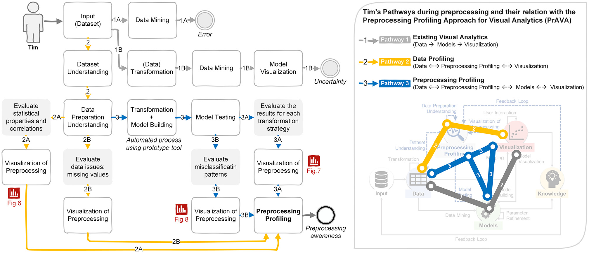
Usage scenario – The pathways took by Tim:
Tim is searching for strategies on how to solve the taxonomic problems of his current research. He has collected data about a group of Iris flowers, and he is interested in identifying the Iris species by the attributes measured from a morphological variation of the flowers. Tim’s dataset contains 186 samples (36 more than the original Iris dataset) 62 from three different species of Iris, namely, Iris Setosa, Iris Virginica, and Iris Versicolor. For each sample, four attributes were measured in centimeters: sepal_length, petal_length, sepal_width, and petal_width. Additionally, a fifth attribute informs the corresponding class of each sample. However, Tim was not able to get all the data for the new samples; as a result, his dataset has data quality problems, that is, the dataset contains outliers and missing values.
Tim is familiar with the Python programming development environment. To begin, he tries to run a classification model using his dataset without any data transformation. However, he could not move forward since an error message is returned informing him the classification algorithm cannot proceed due to missing values in the dataset. This attempt is shown in Figure 5 as
Dataset profiling
Tim starts by running descriptive statistics using Python. However, many lines of code and outputs with plain text would be required to generate all the information he wants. Consequently, he decides to use PrAVA’s prototype integrated into his development environment to create the first report for his analysis. With Data Profiling report information, he got an overview regarding the number of records, the dataset size, and variable types distribution. By reading the messages under Warnings subsection of the Overview, and by viewing the Correlations section of the report, Tim realizes the petal_length and petal_width columns are highly correlated with each other. Even though he had previously generated the covariance and correlation matrix, when he was executing his initial set of code, he considers it was challenging to observe the relation between two variables just by looking at the output with plain text.
Tim decides to explore each variable of his dataset (still part of Figure 5–
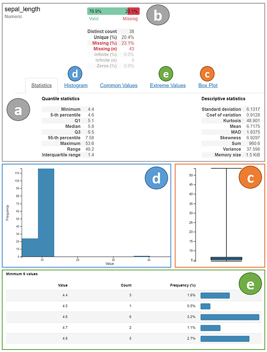
Data Profiling report. Variables section for sepal_length: (a) statistical measures, (b) horizontal barplot with valid and missing values distribution, (c) boxplot, (d) histogram, and (e) list of extreme values.
Preprocessing profiling
Tim moves to the analysis of the impacts of the preprocessing strategies on his classification problem after the completion of his activities in understanding the data. Tim informs his dataset as input to the Preprocessing profiling report. Since all the data transformation and model building are done automatically, Tim takes advantage of the time saved, and he runs multiple rounds (of training and testing) to evaluate the results of classification. Figure 7 shows an overview of the results for one round where he used only the variables related to sepal attributes.
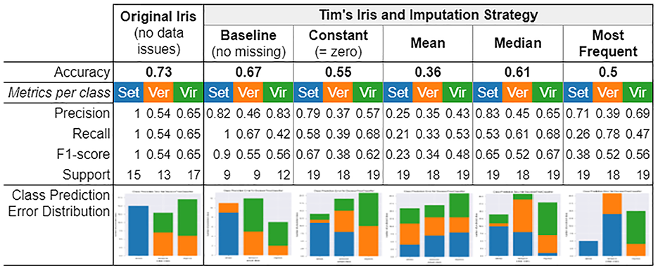
Classification results for one round of testing using the attributes sepal_length and sepal_width and different preprocessing strategies. First column refers to Original Iris dataset (without data issues). From second to sixth column refer to Tim’s Iris dataset and the corresponding imputation strategies performed. The classes are identified as “Set” in blue for Iris Setosa, as “Ver” in orange for Iris Versicolor, and “Vir” in green for Iris Virginica. In the last row, the Barplots also follow this order (Set,Ver,Vir).
Although the classification results varied in each round, Tim is still able to notice differences among the imputation strategies for all rounds performed. For example, the class of Iris Setosa was initially clear to classify (Figure 7, first column, class in blue). However, with the presence of data issues and the need to perform imputation strategies, the classification results are negatively impacted. Tim also observes a significant variation on the accuracy metric for the Mean imputation strategy (Figure 7, fourth column) compared to the others. With that, it is clear to him that he needs to identify outliers, for example, using visualizations such as Boxplot (Figure 6-c), and remove them before continuing, or, for this particular case, he could use the Median imputation strategy to avoid data with high magnitude to dominate results. These activities correspond to Figure 5 as
Furthermore, while comparing the Flow of Classes visualization for different rounds, he can observe new situations that were not possible with the prior perspectives. He notes that, even for a classification resulting in the same accuracy, there is variation in each group of classes being misclassified. For instance, when he runs a round using the four variables (Figure 8-a), four imputation strategies result in the same accuracy (91.1%). However, he can notice an additional flow of classes from actual class 2 (Versicolor) to predicted class 3 (Virginica) during Constant and Most Frequent imputations. While for Mean and Median strategies, the misclassification occurs only from actual class 3 (Virginica) to predicted class 2 (Versicolor). Likewise, when observing the results for another round, which considered only two variables (Figure 8-b), he can notice more variations among the possible combination flows.
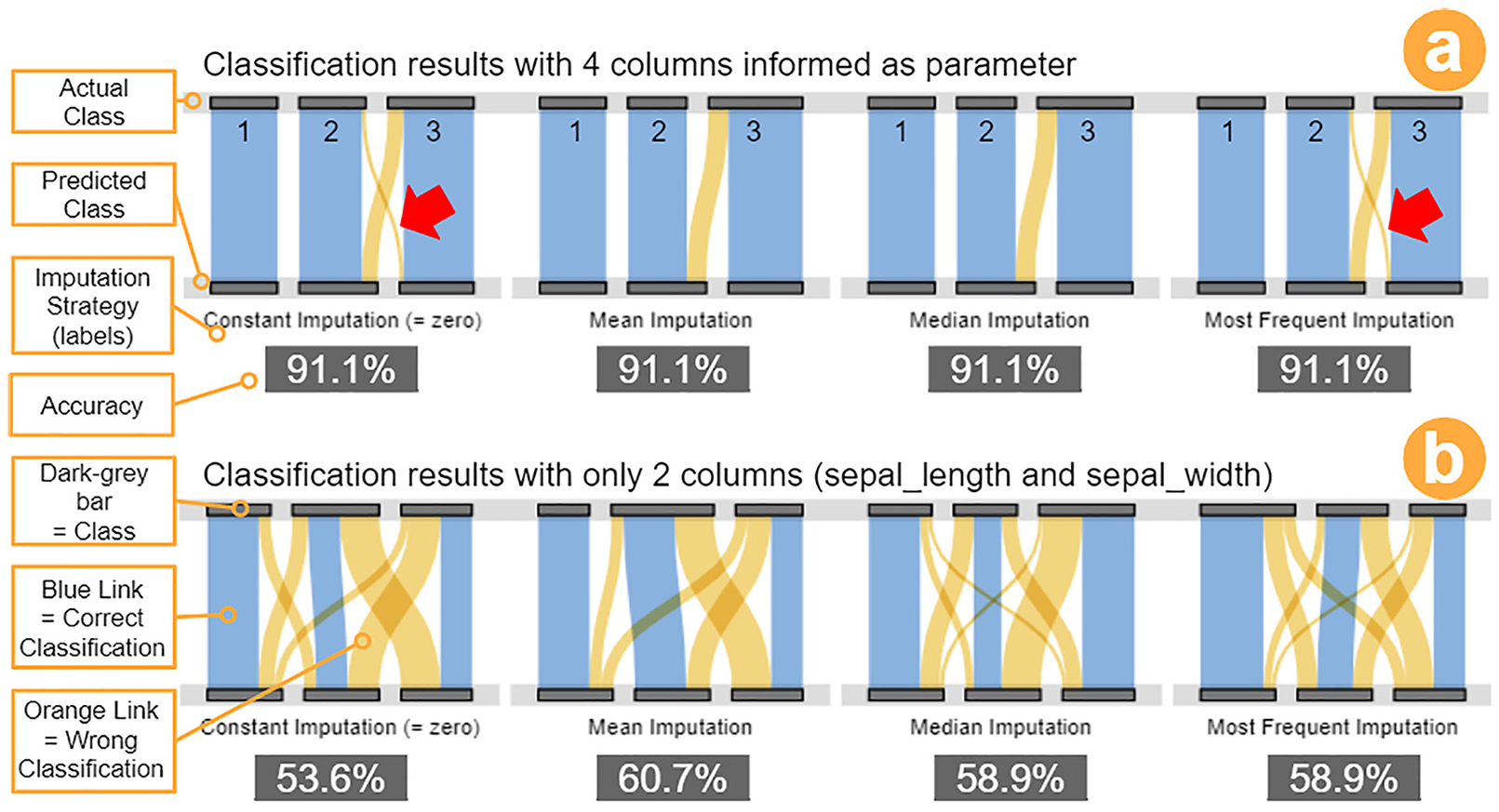
Preprocessing profiling report. Classification results for different missing values imputation strategies: (a) four columns informed into the classification model, and (b) only the two columns related to Sepal attribute were informed. The visualization Flow of Classes is used in both representations (inspired by Sankey diagrams).
Under these circumstances, he considers it essential to have different views for the same classification results, mainly when using a dataset with data quality issues. In conclusion, Tim takes these insights as reinforcement of the importance of exploring data transformation strategies before moving to further phases in the VA process or any data mining process. This process is shown in Figure 5 as
Applications
To showcase the possible advantages of using PrAVA, we created two application scenarios to describe the efforts made to understand datasets with tabular data. We looked into online repositories for open datasets that could be used in the scope of classification problems, and we selected two datasets that we did not have any previous knowledge of. In Subsection Mammographic mass dataset, we are using the developed prototype (described in Subsection Prototype) to explore one dataset, while in Subsection Cervical cancer dataset, we are using commercial software to explore a second dataset. To conclude, in Subsection Review of scenarios, we present a discussion of how preprocessing is being perfomed by other studies using the same datasets, and we relate the guidelines (described in Subsection Guidelines) to the tools used during our applications.
Mammographic mass dataset
We selected a dataset from the UCI Machine Learning Repository related to the breast cancer screening method. 64 This dataset contains the discrimination of benign and malignant mammographic masses based on BI-RADS variables and the patient’s age. We decided to start by running our prototype to collect information about the dataset for understanding it.
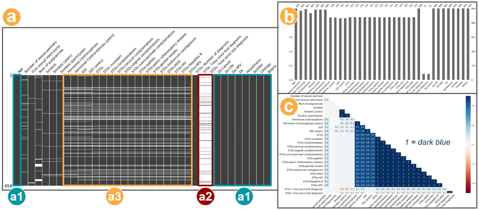
First, while reading the information available on the Data Profiling report, we could confirm the number of columns and rows (Figure 9-a), as well as the distribution of variable types (Figure 9-b), predominantly numeric. We could observe the presence of missing values and the information on which character was used in the original dataset to represent the not informed values (Figure 9-c). Also, in the Warnings (Figure 9-d), we could confirm which were the columns with missing values, and a highlight regarding the highly skewed distribution for one column. The original downloaded dataset did not contain headers, so the columns appear named as numbers in this report.
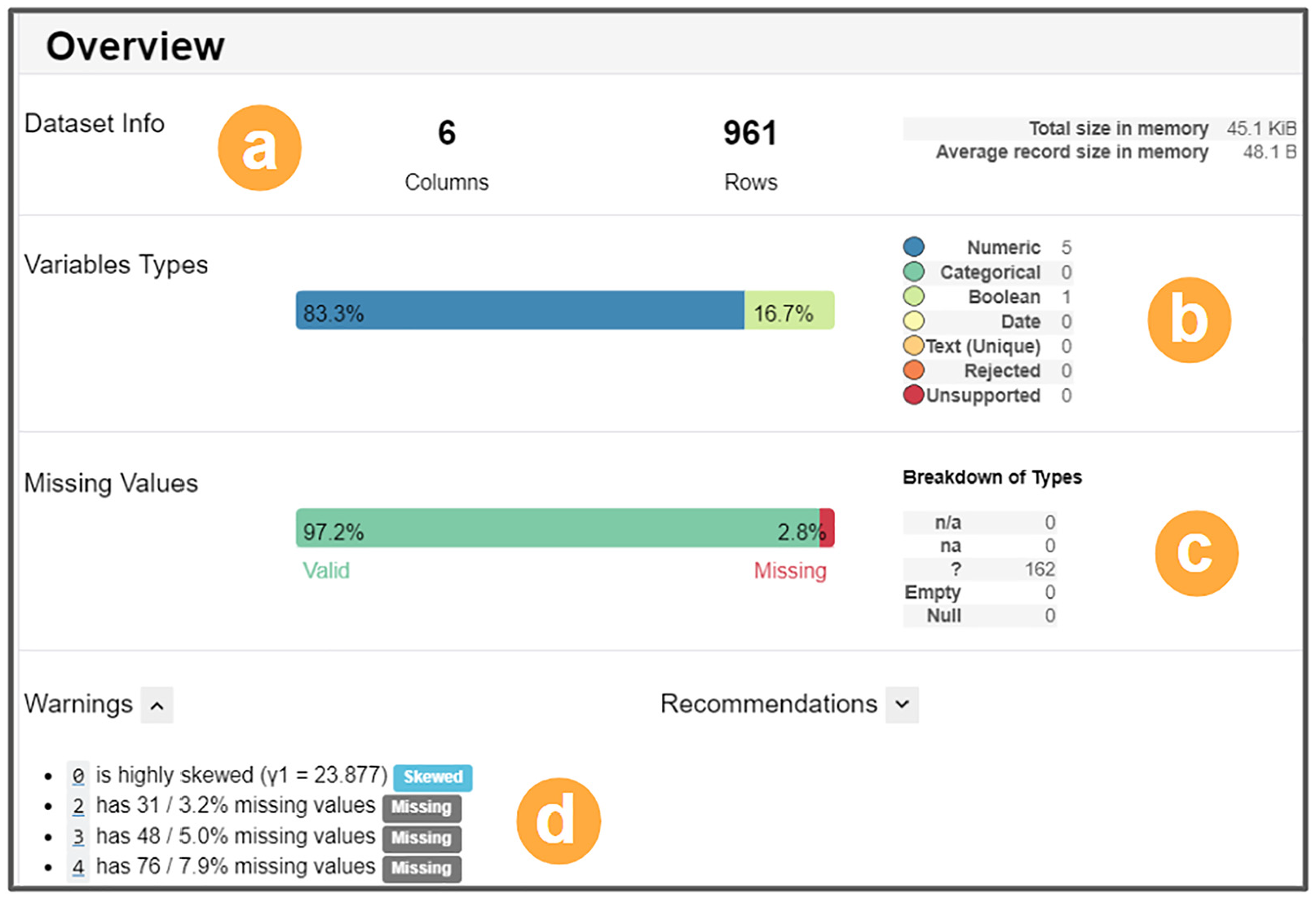
Data Profiling Report. Overview of the Mammographic Masses dataset: (a) dataset information with columns, rows, and size, (b) variable types, (c) missing values and breakdown of types, and (d) list of warnings.
We explored the Variables section of the Data Profiling report. Consequently, we confirmed that the first variable, column 0 (BI-RADS), presented high positive Skewness. Also, we noticed a possible outlier value (55.0). Next, we continued the dataset understanding by evaluating the Missing Values section. For column 4 (Margin), we could observe the higher percentage of missing values (7.9%), as initially listed in the Warnings.
Additionally, we explored the Correlations section to evaluate the relationship between each pair of variables with a visualization of the Spearman’s rank correlation coefficient. Based on that, we saw a strong connection between columns 2 (Shape) and 3 (Margin). We considered this useful in case we needed to remove columns to avoid potential bias in the classification.
As a final step, we consulted the documentation available for the dataset to confirm some of our findings and assumptions. For the BI-RADS variable, the value identified as a potential outlier, in fact, could be considered bad data since the expected values were ranging from 1 to 5. We also confirmed that column 5 (Severity) contains the class of each instance, this was the only variable without missing values.
We completed the initial understanding of the dataset, and we decided to move to the evaluation of the missing value imputation strategies. We used the entire original dataset, except column 0 (BI-RADS), and we ran multiple comparison rounds using the Preprocessing Profile report. For all rounds performed, we could observe some variation in the classification results. The maximum variation in accuracy noted was 6.4% between Baseline (no missing) and Mean imputation strategies. We want to note that rather than evaluating the better imputation strategy performance, our concern remained in observing if the visual resources developed helped to evaluate any possible impacts on the different cleaning or transformation strategies.
Through this scenario, we show some capabilities of using PrAVA, mainly during the data understanding of a new dataset, facilitated when accessing summarized information at a glance, and details on demand. Within minutes, we acquired an overview of the dataset. Furthermore, PrAVA effectively supported the comparison of the results for the different preprocessing strategies, not only because Preprocessing Profile report automated part of the work, but primarily because this set of activities performed increased the awareness of the preprocessing impacts. Finally, this approach brought confidence to move forward with the model building after knowing the possible influence of the preprocessing decisions in the final solution.
Cervical cancer dataset
In this second application, we describe the efforts made to understand the cervical cancer dataset that has been acquired from the UCI Machine Learning Repository. 65 We want to know, based on the dataset, which conditions suggest a higher probability of a patient having cervical cancer. To help in the task, we use Tableau, 53 Tableau Prep Builder, 51 and Python programming. Note that when we perform an action that represents a new transition introduced by PrAVA (i.e. the blue dashed lines in Figure 4), we highlight in parentheses the transition that was made.
We decide to load the dataset in Tableau Prep Builder, which should allow us to analyze the missing values and find other issues to address the simpler ones quickly. The visualizations provided by Tableau Prep Builder (Figure 10-a) show the distinct values of every column and, for each value, the number of rows with the same value. Immediately, we can notice that not all variable types were inferred correctly (
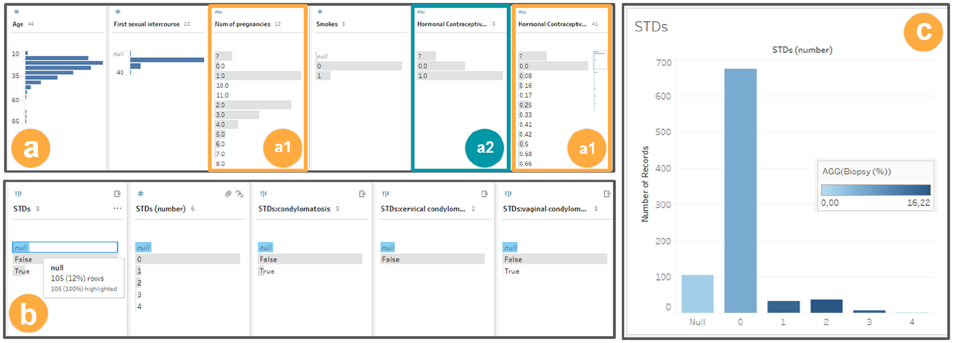
(a) and (b) Exploring the dataset with Tableau prep builder, and (c) histogram generated with Tableau. Both are using the cervical cancer dataset.
After correcting simple problems, we evaluate strategies to deal with the missing values. We examine again the visualizations provided by Tableau Prep Builder, as shown in (Figure 10-b). When a value is selected, for example, “null,” the same value is highlighted in the other columns. This helps us to observe that there is missing value correlation between several columns (
Wondering what the meaning of the discovered correlation might be, we transition from Tableau Prep Builder to Tableau and create a histogram of the STDs (number) column with the positive Biopsy ratio coded to color (
After analyzing the histogram, we reach a few conclusions. There is a positive correlation between STDs (number) and the biopsy, that is, a bigger number of STDs tends to be correlated to a bigger number of positive biopsies, identified by a dark color. Moreover, since the “null” rows have a lower positive biopsy ratio than any other group, mixing them with another group might result in loss of information, hindering the perception that the percentage of positive biopsies is lower among them (
To validate this hypothesis, we choose the practical approach of using the Machine Learning Python library.
66
We create a second version of the dataset (
We proceed to train and test using a decision tree model with each dataset (
These results contradicted our expectations because no significant improvement of the results is noticed when changing the STDs (number) column. This probably means that the information we thought that we would lose in some of the scenarios was either irrelevant or maintained by some other property of the dataset (
As an alternative visualization for this case, we generated the Nullity Matrix in Python based on Bilogur,
41
which allows us to confirm the correlation among columns with missing values (
Three visualizations to explore the missing values: (a) matrix (a data-dense display), (b) barplot, and (c) heatmap for variables correlation. This output was generated based on cervical cancer dataset, and using Missingno. 41
Moreover, other visualizations provided by the same library consolidate the observed patterns (
Finally, after some additional testing, using combinations of different imputation strategies (
This use case serves as representation of how the use of PrAVA supports the process of data analysis. This is an example of how the use of a variety of visualization techniques promotes a better understanding of the data under analysis and the impacts of preprocessing. Also, we were able to save information of this process (metadata), which enhances the data preparation understanding itself, that is, the Preprocessing Profiling (
Review of scenarios
In this subsection, we present a discussion on how other studies are reporting preprocessing activities as part of their process. To conclude, we summarize how the PrAVA’s guidelines are related to the tools used during the application scenarios presented in this section.
How is preprocessing reported?
We did an exploratory search for recent works citing the two datasets used in this section. A total of 20 papers were considered: 11 for the mammographic mass dataset, and 9 for the cervical cancer dataset. This exercise supported us to validate our use cases process choices described in this section. We present in this subsection some points observed on the processes involving the preprocessing activities of these works.
The works using the mammographic mass dataset tend not to describe the preprocessing steps in detail. This may happen because of the influence of the work (Elter et al.) 67 for which the dataset was created that used a model capable of handling missing values. Two exceptions are Shobha and Savarimuthu 68 and Azam and Bouguila, 69 which elaborate automatic preprocessing techniques.
Other works that use the cervical cancer dataset tend to describe the preprocessing step in more detail, for example, Ahishakiye et al., 70 Ahmed et al., 71 and Ijaz et al. 72 The two primary data quality issues are (a) the missing values and (b) the unbalanced class distribution. The most common preprocessing choices for (a) include removing columns with high missing value ratio, removing rows with missing values, and imputation (mostly with the average and the most frequent value). For (b), the preprocessing strategy is the oversampling.
Most of the other works that use the mammographic mass dataset choose different ways of dealing with data quality issues, including models that accept missing values and automatic preprocessing. These techniques are not the focus of this paper as it is centered around human decision making. Meanwhile, the preprocessing methods we used on the cervical cancer dataset are similar to the mentioned works. Overall, we could not identify any work using visualization to support their process. Therefore, our use of PrAVA exemplifies the possibility of better-informed decisions and a less time-consuming decision process when using the appropriate tools.
As a final remark, we could find observations such as “unstandardized dataset sometimes affects the performance of some of the algorithms” (Ahishakiye et al., 70 p.10). That supports the value of the preprocessing strategies evaluation and its impacts to further steps of the process.
What is the relation with the guidelines?
In Table 3, we present the list of PrAVA’s guidelines (Table 2), their status regarding the implementation in each tool used during the application scenarios, and some examples of implementations. In other words, we highlight which guidelines were met by each used tool. The status appears as  to indicate an implemented guideline,
  to indicate not implemented guideline, and
  indicates a limited or partially implemented guideline.
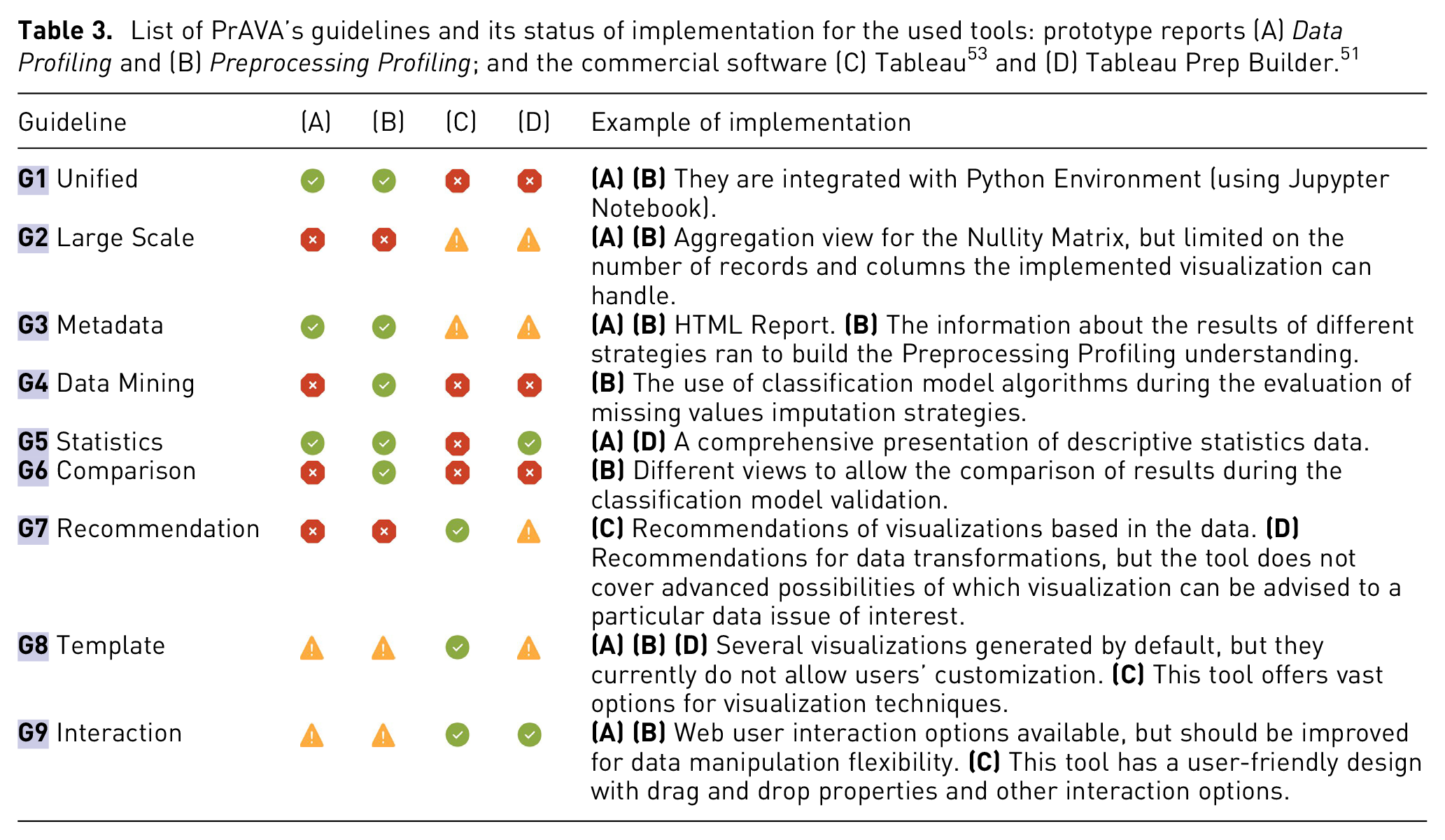
Even though Tableau
53
and Tableau Prep
51
are widely used, there are still opportunities to implement further guidelines that should facilitate the preprocessing activities in a VA process, for example,
It is noteworthy that we do not intend to compare the developed prototype with any commercial software. Rather than that, we aim to show that PrAVA can be used independently of a particular tool. In conclusion, this list of guidelines should be reckoned as a set of practices to evidence the activities executed in the Preprocessing Profiling phase during a VA process. The more these guidelines are considered as part of the developed solution, the more effective the solution will be.
Discussion
In this section, we organize a final discussion of our findings during PrAVA’s design and its validation (Subsection Lessons learned). We also explain some limitations of this work (Subsection Limitations). Finally, we present some topics that can be interpreted as research opportunities in the context of this work (Subsection Research opportunities).
Lessons learned
The main findings observed during our literature review were explained in Subsection Review and comparison. However, the nine guidelines presented in Table 2 summarize most of what we have learned in this process. To compile this list with some level of confidence in its contribution required the analysis of multiple works. Additionally, we summarize below some of our findings during this process organized as four lessons learned.
Critical but less discussed
Preprocessing is recognized as a critical phase to the data analysis process, due to the data preparation time-consuming nature or its impacts on the final results. Contradictorily, it is still a subject that receives less attention from the VA and visualization communities.
Implementing all the guidelines is not a trivial task
During the scenario coverage planning, we realized that there are many combinations to consider to set up all the required components under a new solution in compliance to PrAVA. We may need definitions of questions as what is the data mining scope? Which Machine Learning or statistical methods can be used to solve the problem? Which data quality issues are intended to be addressed? That leads to a chain of other questions, for example, which data transformation strategies can be used with this particular data issue? Which visualization techniques can be used to support this context? To sustain our decision on each strategy to use in response to these questions, we considered the references presented in Subsection What the practitioners say. Additionally, these decisions impacted how the guidelines could be implemented. To sum up, we acknowledge that implementing all the guidelines, even if aiming to cover a limited scope, is far from a trivial task.
Simplicity of the visualizations
Although most of the visualizations used in the usage scenario (Subsection Tim and the iris dataset) and the applications (Section Applications) are simple, they still demonstrate more benefits to understand the data when compared to viewing the plain text. The simplicity should favor understanding since it does not require a prior explanation, that is, most of the visualizations used are already part of the data analysts’ culture. Thus, since different users have different experiences, expectations, and graph literacy, the use of traditional charts is appropriate for most cases, as suggested by the insights in our previous study. 8 This is also in adherence to the idea of promoting visualization literacy.73,74
The value of an integrated tool
Through practicing on a developed prototype, three main advantages can be mentioned. First, considering we have the dataset loaded in the Python programming environment, with one command line to import the library and another to call the report, we can generate detailed and relevant information to support preprocessing activities. Consequently, we contribute to simplify the working procedures of data analysts, which is a big concern since it is reported as one of the most laborious tasks.
9
Second, as the reports present several metrics and visualizations by default, metrics that could be neglected by the data analyst due to unawareness, difficulties in applying, or limitation of time, can now be incorporated as part of their analysis. Third, this detailed information about the dataset and data preparation can be used as metadata for the preprocessing profiling phase. It helps build the principle of transparency on the activities performed, aligned to initiatives such as the European Union General Data Protection Regulation (https://ec.europa.eu/info/law/law-topic/data-protection/eu-data-protection-rules_en). As mentioned earlier, a system nor a tool is the focus of this work; however, during the usage scenario, the value of an integrated tool in this process was evidenced, which is aligned with
Awareness-raising
The actual VA process (Figure 2) can continue as-is since it covers confirmatory analysis cases, or when the dataset is well-known and automated methods for preprocessing are in place. However, its current representation conceals the importance of preprocessing. Thus, PrAVA better positions the critical components of preprocessing efforts. That is especially relevant in scenarios where the decisions made during preprocessing are crucial to the further phases of the process, and active participation of the data analyst is required. Moreover, other studies have explored the role of uncertainty as part of the VA process,25,75,76 and they emphasize that uncertainty in data can often be propagated during preprocessing activities. Thus, the efforts to develop alternatives to increase the awareness and trust of the data under analysis will contribute to a more reliable VA process.
Limitations
We identified four limitations in the current work that we consider important to explain.
Problem instance
As stated by Munzner 77 (p. 3), “Vis systems are appropriate for use when your goal is to augment human capabilities, rather than completely replace the human in the loop.” Hence, our scope considers the cases when the “human in the loop” is vital to the preprocessing. That means, the data analyst is still evaluating and formulating the questions about the data under analysis. For other cases, when the quality of the data is not a concern, the dataset properties are known, or all the needed preprocessing tasks are already mapped; thus, most of this process can be automated, and there will be no applicability to the approach we are discussing.
Guidelines’ list
To allow the extension of PrAVA to a variety of scenarios, and to facilitate its adoption, we have tried to design our approach as general and as simple as possible. As a consequence, if on the one hand, PrAVA may cause a first impression that some of the guidelines are quite obvious. On the other hand, it may not explicitly indicate all the complexity behind preprocessing. However, using the guidelines will result in solutions in which preprocessing is consistently considered. It is hard to assert that all potential scenarios are covered and new guidelines may emerge in the literature over time or from different types of applications that were not considered. Overall, we still consider helpful keeping the nine proposed guidelines structured for a consolidated reference.
Usage scenarios
We have not intended to present a detailed description of the types and strategies applied to the preprocessing scope, since we consider it a subject to another dedicated work (see Subsection Preprocessing + Visualization taxonomy). Thus, we limited our examples to scenarios that allowed us to encourage a general understanding of the PrAVA process.
Applications
We decided to proceed with the use cases (considering the definition from Ward et al. 14 ) to support the PrAVA validation strategy instead of using empirical methods with the participation of data analysts or domain experts. As part of the mitigation for the risks in not covering a realistic scenario, as explained in Subsection How is preprocessing reported, we searched for related work using the same datasets selected for our applications. We evaluated how they reported the preprocessing activities, and then we compared their process with the activities we performed. Nevertheless, we still consider important that an extension of PrAVA conduct user-centered experiments to obtain insightful comments to fine-tune this work.
Research opportunities
Interesting research directions in the scope of preprocessing and visualization were introduced by Kandel et al. 4 Although this work contains the perspective of a decade ago, its discussion is still relevant. Shall this be explained by the fact preprocessing as an object of study has received less attention from our community? In any case, to advance the discussion, we are indicating promising directions for further research.
Preprocessing + Visualization taxonomy
A comprehensive and up-to-date taxonomy of data quality issues related to preprocessing strategies and visualization techniques is needed. This effort should include the type of data quality, the issue description, the detection methods, the preprocessing transformation methods, and visualization techniques that can be used to assist in this process. To illustrate, a good start could result in an enhanced combination of the discussion presented in Kandel et al. 16 (preprocessing + visualization) and Kim et al. 1 (taxonomy of data issues).
Complementary to the previous point, the exploration of the preprocessing strategies considering the challenges of application domains, for example, fraud detection or public health, and data mining scope. Moreover, besides the perspective of the data analyst, other perspectives can be explored as well. For instance, in healthcare, the preprocessing tasks are often done by the domain expert. Is there any particular requirement to attend a domain expert compared to the data analyst in the preprocessing solution? This new study could be used as a benchmark before planing new solutions.
Visualizing data issues
We can consider two main groups of new visualizations to be explored. One is related to the understanding of data issues in raw data. Providing different views for the same data issue may allow discoveries that could not be noticed using just one visualization.
An alternative is to create a coordinated multiple view framework for different data issues. A similar idea was proposed by Sjöbergh and Tanaka 34 in the scope of missing values. Along with missing values, the outliers are another frequent data issue that requires attention, because how to differentiate what is noise and what is an outlier? The second group is the understanding of the impacts of the preprocessing. For instance, how to support pattern identification on misclassification that is caused by missing values?
Although the VA and Visualization community have a strong foundation in cognitive human perception and a variety of methods and techniques have been developed to create visual metaphors of the data, in the context of the preprocessing, we still can formulate a question like What helps the data analyst see a data issue? One possible way to obtain this answer is through empirical studies with the engagement of data analysis while working on practical problems based on real-world data and scenarios. Based on that, we could get inputs on the most significant elements that support data analysts to identify a data issue. This item is somehow aligned to studies in the area of visualization literacy, for example, Galesic and Garcia-Retamero 78 evaluates the graph literacy applied to the medical domain, and those concerned with visualizing uncertainty, for example, Correat et al., 75 Sacha et al., 76 and Seipp et al. 25
Systems and tools
Despite the fact we can find studies such as Zhang et al., 79 and its more recent revision Behrisch et al., 80 evaluating VA commercial systems in Big Data scenarios, we consider it worth to continue a comparative review of the state-of-the-art for open source and systems with special attention to preprocessing. As part of this discussion, it should be evaluated if the planned guidelines of PrAVA are attended or not.
Recommendation
Although multiple works have presented advanced solutions in the scope of data cleaning and transformation recommendations, within
Big data
Regarding data transformation activities in high-dimensional data, Liu et al.
81
provide a comprehensive survey on the topic that can be used as source of inspiration. While the Progressive Visual Analytics, proposed by Stolper et al.
56
indicates an alternative to handle Big Data scenarios, its adoption may cause new challenges, such as whether a current partial outcome is already good enough.
82
In the scope of preprocessing (
Likewise, careful validation of aggregation strategies, as indicated by Elmqvist and Fekete, 57 is needed to allow any visual metaphor to scale while analyzing large and complex datasets. Otherwise, a wrong design decision may introduce data distribution issues that may impair the visual identification of any pattern. For these cases, the resulting visualization is diminished and leads to uncertainty in the data. 25
Conclusion
A state-of-the-art literature review and the practitioners’ testimony in data analysis allowed us to reach the following conclusion: Data preprocessing is seen as one of the most laborious and time-consuming – and even tedious as stated by Kandel et al. 4 – activities of the data analysis process. Notwithstanding, few works in the Visual Analytics and Visualization areas address the challenges related to preprocessing as their research subject. Moreover, some studies do not explicitly consider preprocessing as an equally important activity to the knowledge discovery process’s final findings.
Thus, in this paper, we presented the Preprocessing Profiling Approach for Visual Analytics (PrAVA). Our main contributions can be summarized as introducing PrAVA as an alternative to support data analysts during preprocessing activities. By enabling better data understanding and evaluating preprocessing impacts, these methods should promote data quality and provide grounds for decision-making on data preparation strategies. Ultimately, we hope that we encourage a shift to a visual preprocessing.
Footnotes
Funding
The author(s) disclosed receipt of the following financial support for the research, authorship, and/or publication of this article: This work was partially supported by PUCRS (Edital Chamada Geral 1/2019 - PUCRS/BPA). Isabel Harb Manssour also would like to thank the financial support of the CNPq Scholarship - Brazil (308456/2020-3). Alessandra Maciel Paz Milani wants to acknowledge that this work was financed in part by the Coordenação de Aperfeiçoamento de Pessoal de Nível Superior - Brasil (CAPES) - Finance Code 001, during her Master’s studies, and the current support at the University of Victoria during the review process. The authors acknowledge the support of the Natural Sciences and Engineering Research Council of Canada (NSERC).