
Abstract
Linear diagrams have been shown to compare favourably to better known forms of set visualization, such as Venn and Euler diagrams, in supporting non-interactive assessment of set relationships. Recent studies that compared several variants of linear diagrams have demonstrated that users perform best at tasks involving identification of intersections, disjointness and subsets when using a horizontally drawn linear diagram with thin lines representing sets and employing vertical lines as guide lines. The essential visual task the user needs to perform in order to interpret this kind of diagram is vertical alignment of parallel lines and detection of overlaps. Space-filling mosaic diagrams which support this same visual task have been used in other applications, such as the visualization of schedules of activities, where they have been shown to be superior to linear Gantt charts. In this article, we present an experimental comparison of linear and mosaic diagrams for visualization of set relationships, in terms of accuracy, time-to-answer and subjective ratings of perceived task difficulty. The findings show that the two visualizations are largely similar with respect to these measures, suggesting that the choice of one or the other may be solely guided by other visual design considerations. Mosaic diagrams might be more suitable, for instance, in cases where miniature diagrams representing overviews of relations in different collections of sets are required, such as in small-multiples displays.
Keywords
Introduction
The study of sets and their relationships is fundamental to the disciplines of mathematics, logic and computer science. Visual representations of relationships among sets – intersection, containment and exclusion (disjoint sets) – have been used for centuries. However, the development of interactive visualizations and tools in recent years has gained a new impetus due to the wide range of applications that these tools find in a variety of areas, including the analysis of healthcare and population data, representation of relationships in social networks and the study of consumer purchasing patterns, to name a few.
Visual representation of sets and their relationships is most commonly done through Venn and Euler diagrams. 1 These types of diagrams, however, have well-known limitations.2–4 They generally do not scale well beyond a small number of sets and present usability problems. Automatic drawing of Venn and Euler diagrams is also problematic.5–7 In response to these limitations, alternative set visualization techniques have been proposed.
Linear diagrams, 3 which are of particular interest here, have been shown to compare favourably to Venn and Euler diagrams in terms of task completion time and the number of errors made by users, 8 for example, in tasks involving syllogistic reasoning. 9
In a recent paper, Rodgers et al. 10 compared several versions of linear diagrams produced by varying essential properties of their corresponding retinal and planar variables (in Bertin’s terminology 11 ). Their study concluded that users perform best at tasks involving identification of intersections, disjointness (exclusion) and subsets (inclusion) among sets when using a horizontally drawn linear chart with thin lines representing sets and vertical guide lines for aiding the detection of alignment across the vertical axis. The essential visual task the user needs to perform in order to interpret this kind of linear diagrams is a Vernier acuity task, which basically requires vertical alignment of the beginning or end of a horizontal line with those of other lines above or below.
In this article, we present a study comparing linear diagrams with a space-filling alternative visualization based on mosaic diagrams, 12 for representing set relationships as examined by Rodgers et al. 10 The proposed mosaic diagrams (as shown below) employ a space-filling algorithm whereby intersections are denoted by shared areas (represented in different colours), subset relations are denoted by area containment and exclusions are represented as uniformly (i.e. single) coloured areas.
The primary motivation for this study was the fact that mosaic diagrams have previously been used in other applications (e.g. visualization of task schedules) where they have been shown to be superior to linear-style diagrams such as Gantt charts. 13 The current study therefore investigates whether this superiority of mosaic over linear diagrams also holds true in the case of set visualization. To the best of our knowledge, this study is the first to compare mosaic and linear diagrams in set visualization tasks. As such, it aims specifically at comparing static representations of set relations and, using two representations both based on linear structure, albeit employing different instantiations of retinal and planar variables (see further discussion below), rather than providing an exhaustive comparison of set visualization methods based on disparate principles, or replicating previous comparisons. Thus, it does not compare mosaic or linear diagrams to other static representations such as Euler diagrams, Venn diagrams, or their modern variants described below, as comparisons between linear diagrams and Euler and Venn diagrams have been reported elsewhere.4,8 In particular, as regard variants such as Bubble Sets5,14 and LineSets, 15 these techniques are unlike linear (and mosaic) diagrams, which display only abstract set relations, in that they ‘require the existence of embedded items’, as pointed out by Rodgers et al. 10 Similarly, this study does not compare mosaics to the many interactive set visualization systems proposed in the burgeoning literature on this topic. The reader is referred to these works and to the literature review below for comparisons of interactive systems in terms of their design features 16 and task taxonomies. 17 While empirical studies of interactive versions of mosaic (and indeed linear diagrams) are of great practical interest for future work, comparisons of this kind lie beyond our scope here.
This article contributes to the information visualization literature by providing an analysis of time-on-task, accuracy and subjective difficulty ratings for each of these two linearly structured visualizations, with essentially comparable forms of set representation. In addition to its empirical findings, the article also discusses the relative advantages and disadvantages of mosaic and linear diagrams in terms of their design, including their potential uses as compact overviews of sets, and their ability to represent other properties (e.g. cardinality) of sets beyond the basic set relationships investigated in this study.
Background
Set visualizations
Set visualization is a common and increasingly important task. Not surprisingly, a wide range of set visualization techniques have been proposed over the years. Alsallakh et al.17,18 provide a comprehensive review of set visualizations in their state-of-the-art report. They classify set visualizations into six categories:
Euler and Venn diagrams. As mentioned, these visualizations are the most common representations of sets, and a large number of variations have been designed to improve them. For surveys, see Rodgers 2 and Ruskey and Weston. 19
Overlays. These techniques present set memberships as secondary information over other visualizations (e.g. spatial or temporal) which provide the context for analysis. These include the popular LineSets, 15 Bubble Sets, 14 Kelp diagrams 20 and TimeSets. 21
Node-link diagrams. These techniques represent relationships between sets and their members as edges of bipartite graphs whose nodes are the sets and elements. Node-link diagrams are considered to be easy to understand and allow visual encoding of further information in representation of the nodes (i.e. each element or set). Node-link visualizations can also be combined with other representations such as matrix-based (e.g. OnSet 22 ) or aggregation-based (e.g. Radial Sets 23 ) representations.
Matrix-based techniques. These visualizations use the matrix representation to show sets or set members as elements of matrices. Examples of this type of visualizations include UpSet 24 and OnSet. 22
Aggregation-based techniques. Unlike some of the above-mentioned techniques, aggregation-based visualizations do not aim to represent the relationships between individual elements of the sets involved. Instead, set elements are aggregated into their respective sets, and only relationships between those sets are represented. As such, aggregation-based techniques are more suitable for representing relationships between sets with large number of elements, where it would be impractical to show all the relationships between those elements. Examples of these techniques include AggreSet, 16 Radial Sets 23 and PowerSets. 25
Other techniques. There are also a range of other set visualization techniques, such as scatter plots (e.g. scatter view and cluster view 17 ), which represent set relationships using other visual methods than those described in the above categories. These include techniques such as bargrams, which resemble linear diagrams in some aspects, but incorporate other extensions, such as set-valued attributes, 26 and can be categorized as frequency-based.
More specifically, linear diagrams 3 fall into the category of aggregation-based techniques. Linear diagrams have been shown to be more effective than region-based representation such as Euler and Venn diagrams, 8 which tend to be more cluttered due to overlapping, coincident and tangentially touching contours, as demonstrated in an empirical study. 4
As mentioned earlier, Rodgers et al. 10 have also conducted a series of studies which compared the effectiveness of linear diagrams against Euler and Venn diagrams, as well as different variations of linear diagrams themselves, for performing tasks requiring visualization of set relationships. These studies have shown that linear diagrams are superior to Euler and Venn diagrams for identification of set intersections, containment and exclusions. They have also led to a number of visual design principles for creating more effective linear diagrams. These include (a) the use of a minimal number of line segments, (b) the use of guide lines where line overlaps start and end and (c) the use of lines that are thin as opposed to thick bars. 10 The effectiveness of these principles was demonstrated through a final study, 10 which we utilize in our own study, presented in this article.
Mosaic diagrams
Mosaic diagrams were originally proposed by Luz and Masoodian12,27 as an alternative to conventional timelines for visualization of temporal streams of media – in their case, recorded during multimedia meetings. As shown in Figure 1, unlike timeline visualization which reserves horizontal rows for each data stream (Figure 1(a)), the mosaic visualization uses a pre-specified vertical space proportionally between only those streams which occur at that specific point in time (Figure 1(b)).
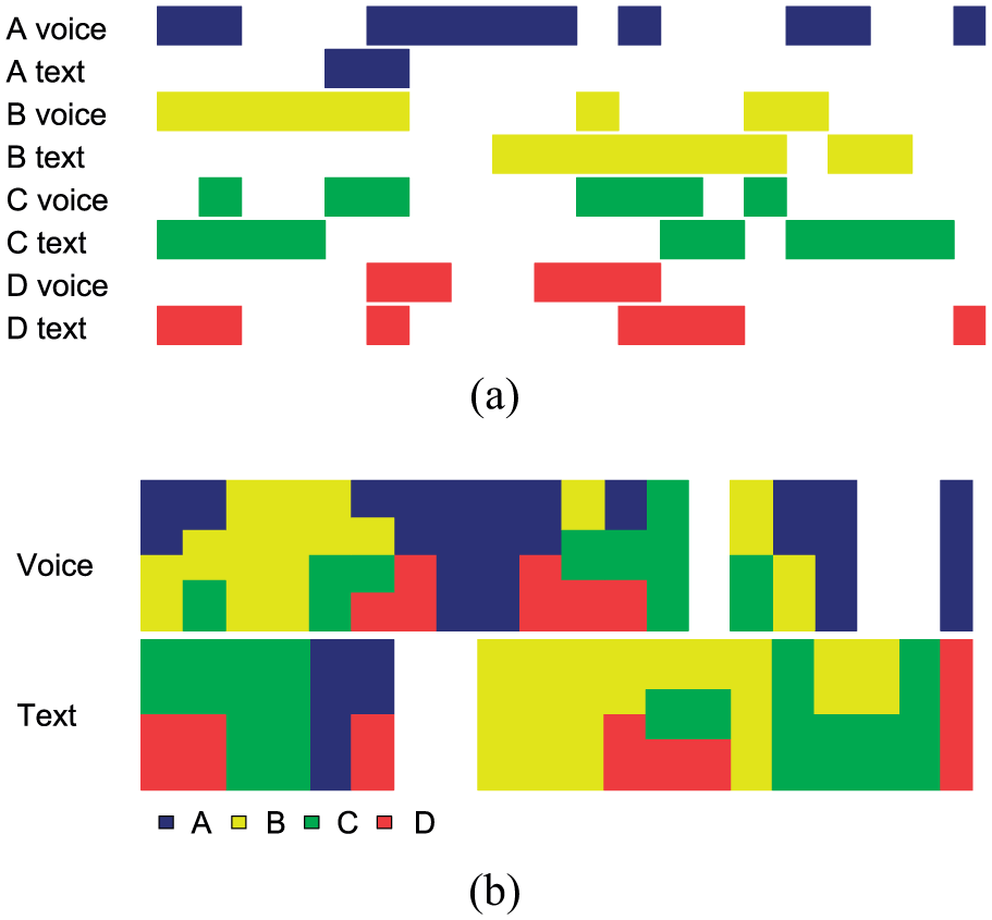
Visualization of eight media streams (four voice and four text) using (a) timeline and (b) mosaic diagrams.
The mosaic visualization has also been used for representation of event schedules, 28 in a manner similar to standard Gantt charts. A study 28 comparing static Gantt charts and mosaic diagrams has shown that mosaic diagrams match Gantt charts, in terms of speed and accuracy, for all types of tasks requiring detection of relationships between schedule events (e.g. durations and overlap of events).
Due to the similarity between Gantt charts and linear diagrams, we decided to investigate the use of mosaic diagrams as a potential alternative to linear diagrams for visualization of set relationships. In this form, mosaic diagrams are employed as an aggregation-based set visualization technique.
Figure 2 provides an example of the use of mosaic diagrams (Figure 2(c)) to represent set relationships, in comparison to Euler (Figure 2(a)) and linear (Figure 2(b)) diagrams. In this example, three sets of people are interested in books, technology and cars. As can be seen, some people are interested only in books, some only in cars, some only in books and technology, and some in all the three categories. Furthermore, everyone who is interested in technology is also interested in books.
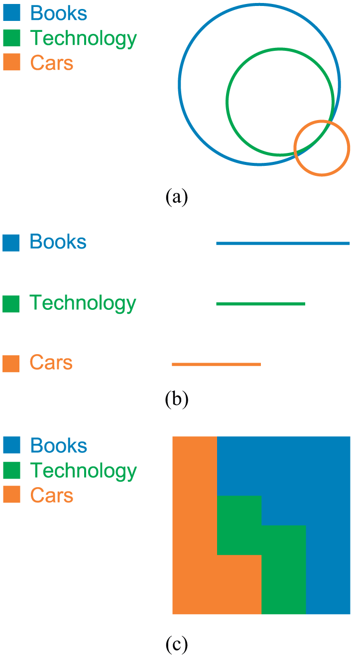
Relationships between three example sets, shown using (a) Euler, (b) linear and (c) mosaic diagrams.
Visual variables and perceptual tasks
Both mosaic and linear diagrams are in essence linearly structured on a two-dimensional plane. In terms of Bertin’s graphic sign system,11,29 size and planar position can be used to convey association. However, while for linear diagrams these two variables would in principle suffice to communicate the relevant set relations (intersection, disjointness and subset), mosaics cannot avail of the alignment between horizontal bars and set labels the way linear diagrams do. Therefore, mosaics need to employ a further variable to distinguish the different signs for individual sets. As there are typically many sets to label, and since colour is generally recommended for label encoding, 30 the colour hue attribute was chosen as the differentiating sign in mosaics. It should also be noted that Rodgers et al. 10 also considered colour as a variable in their evaluation of linear diagrams, but their results showed no significant differences in performance between colour-coded and monochrome diagrams. The use of colour places some constraints on mosaic diagrams. Notably, it limits the number of sets that can be encoded to the number of colours that can be reliably distinguished from each other if colour continuity issues are to be avoided. A study by Healey 31 places this limit at 10 distinct hues. In order to maximize contrast in the mosaic, one should not choose a colour that lies in the convex hull (in a uniform colour space) of the colours already in use. Thus, a suitable set of colours might be, for instance, the edges of a convex hull in the CIELUV space. 30 The use of high-saturation colours would also help improving discrimination of mosaic areas, as would the addition of thin, high luminance contrast boundaries to the different tiles. As will be discussed below, in the study reported here, we limited the use of colours to those colours used in the experiments of Rodgers et al. 10 in order to reduce the possibility of introducing confounds in the conditions we compared.
In terms of perceptual tasks, viewers rely on their ability to verify the alignment of lines accurately in interpretation of linear and mosaics diagrams. As such, both types of diagrams benefit from (and to some extent depend on) the hyperacuity characteristic of the human visual perception. 32 This allows viewers to perform alignment tasks, as well as comparing length of lines, very effectively, even in small diagrams. Unfortunately, however, performance on such tasks is known to degrade significantly if the lines to be compared are placed too far apart in the visual space, or when that space is crowded by intervening lines. 33 Furthermore, comparisons also become more challenging in the absence of contrast between the lines and their surrounding visual context (i.e. the background visual space).32,34 These factors have indeed contributed to, and demonstrated through empirical studies, suggestions made by Rodgers et al. 10 for generating the most effective visual variants of linear diagrams for visualization of set relationships, as discussed previously.
Therefore, we speculated that mosaic diagrams may be more effective than linear diagrams for Vernier acuity tasks due to their space-filling characteristic. This would make visual tasks such as identifying set relationships easier in mosaic diagrams, where background visual space is often filled using the colour(s) associated with set(s) of interest, unless of course when there are no relationships between sets, which is much less likely in such visualizations. This space-filling characteristic also allows spaces associated with sets of interest to join one another not only horizontally, but more importantly vertically, making it easier to perform vertical alignment tasks. It should, however, be pointed out that as is often the case in visualizations, there is a trade-off in adding this space-filling visual element. In this case, space-filling creates shapes of different colours, which in turn can reduce detection of continuity of lines. Although continuity is important, and according to Gestalt laws should be preserved, 30 mosaic relies on another powerful Gestalt principle, namely, closure. Thus, the shapes on the mosaic are perceived not as simple juxtapositions of rectangles, possibly of different heights, but as common regions. Such regions, Ware 30 notes, are ‘a much stronger organizing principle than simple proximity’. In the case of Venn diagrams they allow the user to perceive regions inside a closed contour as sets. In the case of mosaic diagrams, they allow easier detection of individual sets by creating uniquely coloured shapes for each set.
Finally, as a side note, it should be mentioned here that although another aggregation-based set visualization technique, called mosaic plots, has previously been proposed,35,36 and this technique is rather different from the use of mosaic diagrams as demonstrated here. mosaic plots are a combination of Spine plots and bar charts, designed to allow representation of relationships between groups of sets – for example, two gender sets and five age group sets for accident victims, as discussed by Hofmann 36 – rather than direct representations of relationships between individual sets as is the case of the mosaic diagrams investigated here.
Evaluation
In order to compare the effectiveness of mosaic and linear diagrams for visualization of set relationships, we adopted the same set of tasks used on the multiple comparisons of linear diagram variants carried out by Rodgers et al. 10 As in that study, the diagrams used in our study were derived from the Twitter graph dataset available through the SNAP project. 37 The variant of linear diagrams used in our comparisons was the variant found to be the most effective. 10 This variant uses (a) heuristically minimized number of segments and (b) thin horizontal lines for representing sets. These lines are distinguished from each other though the use of colour and placed on a grid of guide lines meant to facilitate visual alignment (for example, see the linear diagram shown in Figure 3). In order to standardize the labelling in the linear diagrams with respect to mosaic diagrams for experimental comparison, the same legends were used in both diagram types. These legends preserve the line ordering of the original linear diagrams.
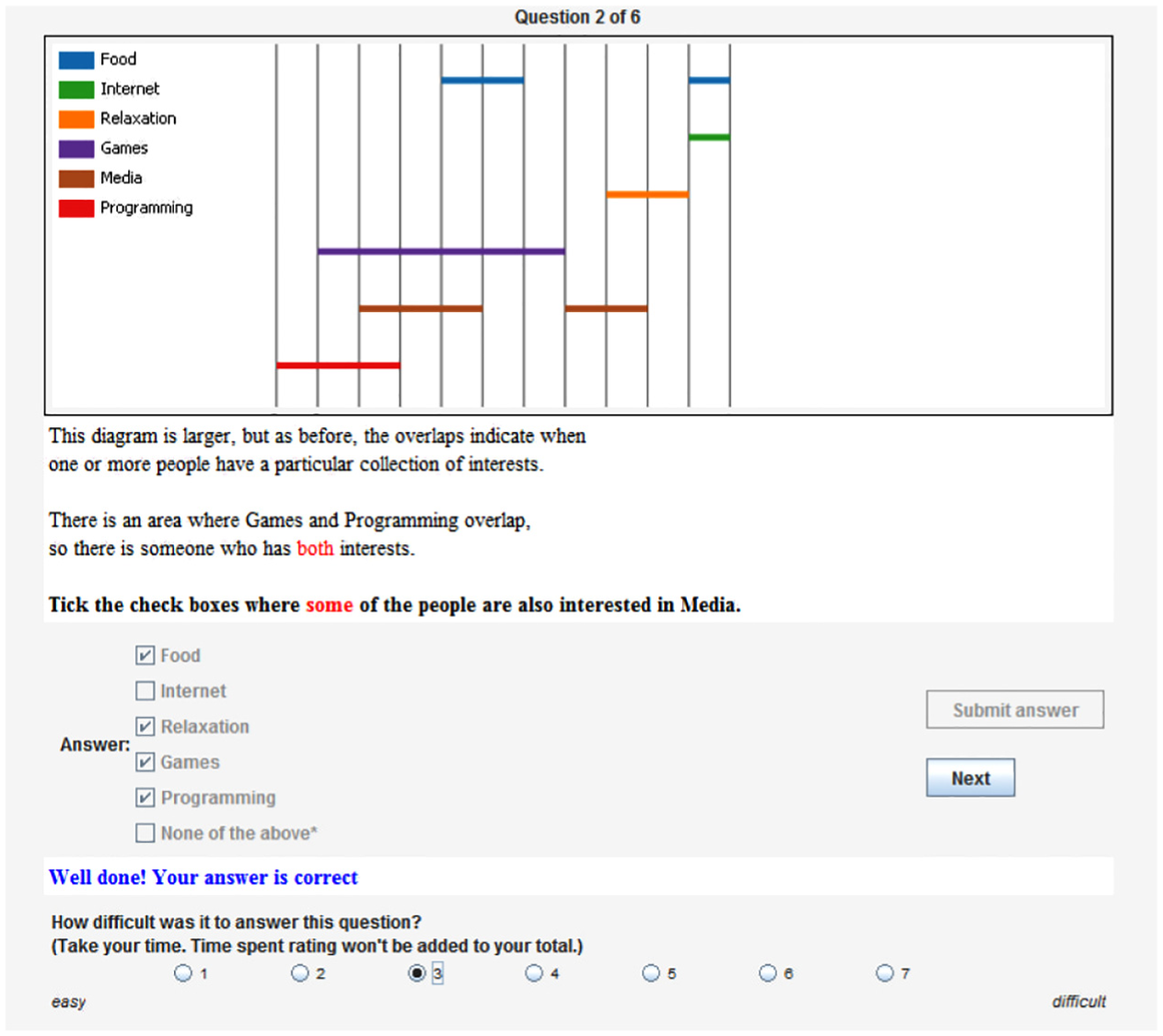
A screenshot of one of the tutorial questions, with the completed answer and difficulty rating.
The mosaic diagrams that were generated each corresponded to the linear diagram used in the final experiment of Rodgers et al., 10 except that we standardized the number of sets to six in all tasks. We replicated the linear diagrams manually and used a version of the freely available Chronos software 28 to produce the corresponding mosaic diagrams. All images were produced in PNG format, using the same size, colour combination and resolution used by Rodgers et al. for their linear diagrams. Identical settings were employed in the production of the corresponding mosaic diagrams.
Methodology
Unlike Rodgers et al., 10 who employed a between-subject design and collected their data through crowd-sourcing, we used a within-subject design, administered through a bespoke Java application and recruited our participants locally by personal invitation in each of our respective universities.
This alternative experimental setup was adopted in order to enable us to recruit a smaller number of more suitable participants and exercise better validation and control over experimental conditions and measurements. The choice of a within-subject (repeated measures) design was made because it allows each participant to experience each of the alternative visualizations under test (i.e. mosaic and linear) repeatedly, thus mitigating the effects of any potential inter-participant variations, and allows a smaller number of participants usually to reveal the relevant differences, should such differences exist. Well-known shortcomings of this kind of repeated measures design were also addressed. Specifically carry-over effects were mitigated by alternation of the two conditions, as well as replications with the opposite alternation ordering (see Table 1), and practice effects were accounted for by the ordering of tasks from easy to difficult, again in alternation.
The two replications of task questions in terms of the sets and diagrams used in the study.
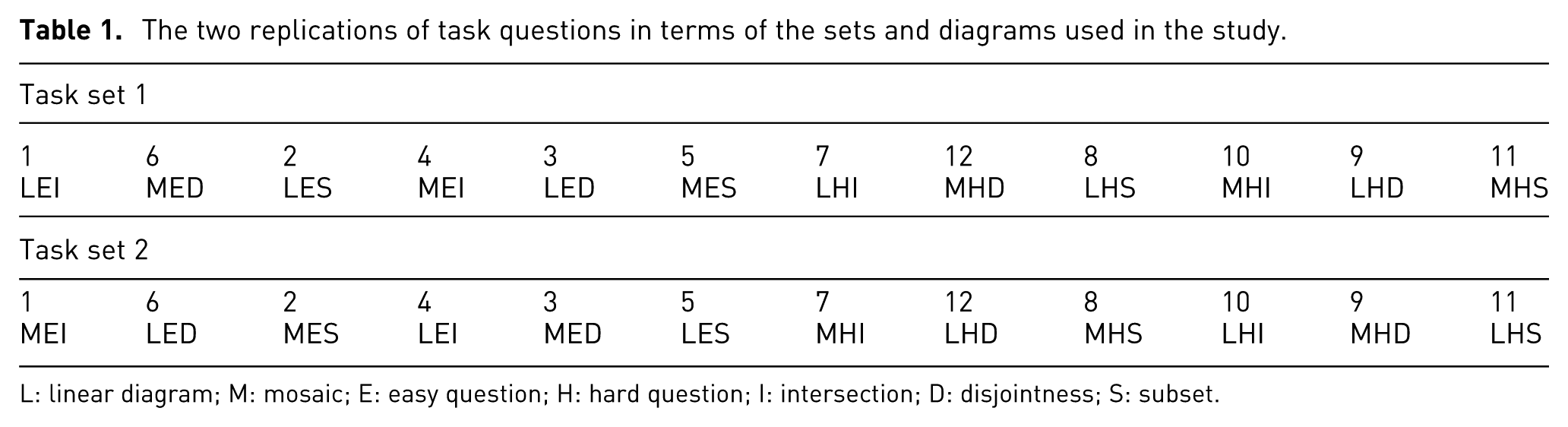
L: linear diagram; M: mosaic; E: easy question; H: hard question; I: intersection; D: disjointness; S: subset.
Furthermore, the use of a specially designed application for the study enabled us to obtain precise answer timings, as well as collecting subjective task difficulty ratings. Answer time and ratings allowed us to compare the alternative visualizations in more detail, for instance, in terms of the difficulties perceived by participants when performing similar tasks using each of the visualizations. This is in addition to the measures used by Rodgers et al.
In this experiment we considered three factors, with the following possible levels:
Two visualization types: (L)inear versus (M)osaic.
Three task types: (I)ntersection, (S)ubset and (D)isjunction.
Two levels of difficulty:
(E)asy: where the task involves identifying subsets, sets that intersect with, or sets that are disjoint from a set
(H)ard: where the task is to identify subsets or sets that intersect with
In order to make our study comparable to that of Rodgers et al., we adopted the same combinations used by them for two of these factors, namely, task types and difficulty levels.
Each participant was requested to answer 12
Each diagram used in the study depicted a collection of six sets and their relationships. Each question referred to a different collection of sets. These 6-set collections were drawn from a larger collection of 24 possible sets. The number of pairwise set relations (intersections, disjointness and subsets) for all sets used in this experiment, along with their respective mosaic and linear diagrams are shown in Table 3. On average, taken in pairs, these sets contain 8.4 (standard deviation (SD) = 3.6) intersection, 6.1 (3.5) disjointness and 1.6 (1.5) subset relations.
The numbers of elements in these sets were left unspecified, as we were only interested in assessing abstract set relations, which are immediately supported by linear diagrams and their mosaic equivalents. However, see section ‘Discussion’ for an example of how mosaics could support visualization of proportional cardinality relations through a simple modification. Although irrelevant to this study, exact cardinality and composition of the sets used can be retrieved from the SNAP project website (https://snap.stanford.edu/).
As mentioned, the task questions were presented in alternation (a mosaic diagram following a linear diagram or vice versa). In order to mitigate potential order effects, we distributed the questions so that a task was never followed by another task of the same type. Participants were assigned automatically by the system to one of the task question sets shown on Table 1, so as to ensure a balanced set of answers. Thus, for instance, on the first series, LEI (an Easy Inclusion task, with sets represented as a Linear diagram) is followed by a different type of task (an Easy Disjointness task) with sets represented as a Mosaic diagram (MED). The presentation sequences also contain no consecutive presentation of the same type of tasks (I, D, S). As regard difficulty level, we kept a fixed ordering whereby easier questions preceded harder questions, as mentioned earlier. Since this ordering is consistent across the two visualization types (i.e. experiment conditions), task difficulty should not affect the comparisons made between the two conditions. The results reported later in this article showed that our labelling of tasks according to difficulty level conformed to the participants’ levels of performance and subjective perceptions of difficulty.
The participants were instructed to answer the questions as accurately and as quickly as possible. We measured time (T) and accuracy (A) as the main dependent variables. Once the participants answered each question, they were presented with a task difficulty rating for that question, which they were asked to complete. Ratings were entered on a Likert scale, ranging from 1 (very easy) to 7 (very difficult). Participants were informed that the time taken to enter the ratings was not recorded (i.e. it was not added to their answer times).
A short text containing an explanation of how to interpret both mosaic and linear diagrams, including visual examples, was presented to each participant at the start of the study sessions. This was followed by the participants completing a six-question tutorial in which task questions similar to those asked during the actual study were presented in the same manner as in the actual study. This tutorial set of questions was, of course, based on a different collection of sets than the one used in the study. After answering each of the tutorial task questions, participants were given the correct answer, along with a brief explanation of the answer. Figure 3 shows a screenshot of one of the tutorial task questions, after it has been completed, along with the difficulty rating, yet to be submitted.
After finishing the tutorial, the participants were directed to the actual study. The study component functioned slightly differently from the tutorial session, in that the correct answers were not presented to the participants after they completed the test questions.
Task questions
Table 2 presents the task questions used in this study, along with the choices given for each question (please note that the sets belonging to the correct answers are shown in italics). The selected questions covered all types and difficulty levels enumerated previously. Words representing quantifiers and logical relations (some, all, none, both, either/or) were highlighted in the questions, so as to draw attention to the set relations being assessed. We realize that the wording of the questions is complicated and somewhat unnatural. However, given the difficulty in devising natural-sounding questions about abstract relations, and in order to facilitate comparison between our results and those of Rodgers et al., 10 we chose to replicate the wording used in their experiment.
Task questions used in the study, with all the given choices shown in brackets, and answers in italics.
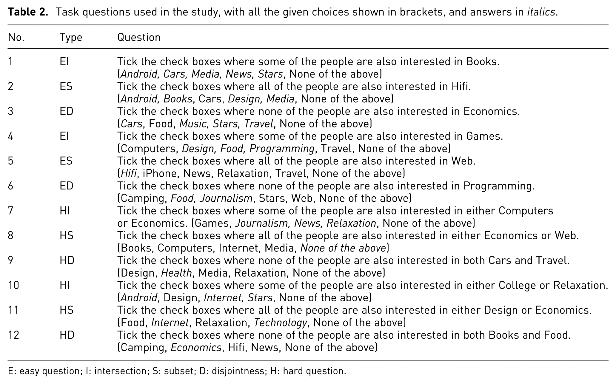
E: easy question; I: intersection; S: subset; D: disjointness; H: hard question.
Table 3 provides a small version of the linear and mosaic visualization images which were used alternatively for each question and of course were counter-balanced.
Alternative linear and mosaic visualization images used for each task question.
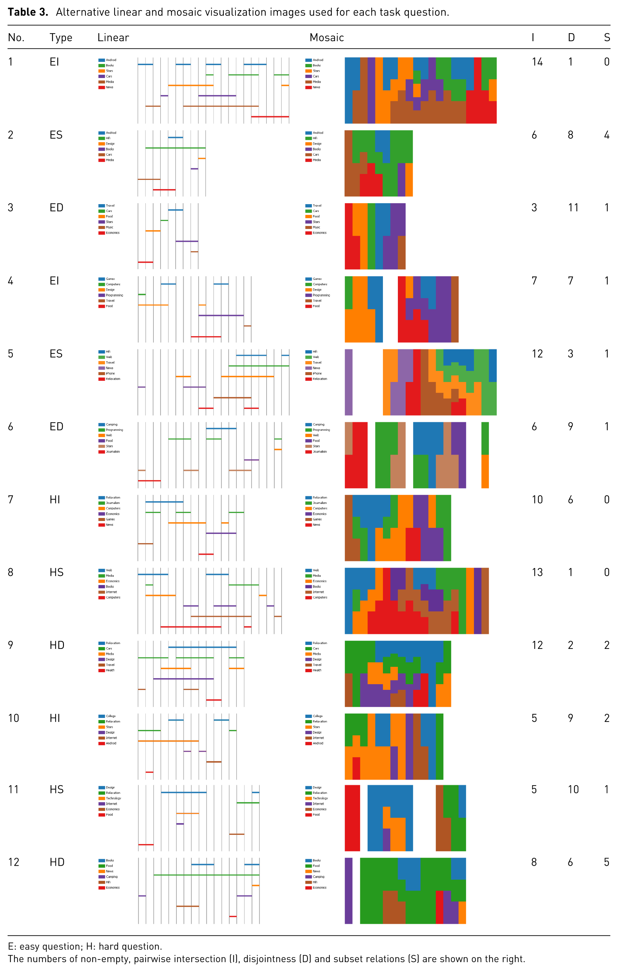
E: easy question; H: hard question.
The numbers of non-empty, pairwise intersection (I), disjointness (D) and subset relations (S) are shown on the right.
Participants
We initially conducted a power analysis to determine the number of participants needed in order to detect differences in user performance at the significance level
However, we recruited 26 participants in order to ensure the availability of sufficient data. Two of these participants experienced technical difficulties during the experiment, and their answers were excluded from the analysis. This left us with a total of 24 participants who completed all the task questions. Of these, 18 were male and 6 female, and their age groups were distributed as follows: 20–29 (8), 30–39 (6), 40–49 (5) and 50–59 (5). As regard their occupations, 10 were academics, 9 students and 5 had other occupations. Ten participants (41.6%) wore glasses, and none of the participants were colour blind. Once again, due to within-subject design of our study, these variations in participants attributes are likely to have little impact on the results of our study.
Results
The answers to the task questions were collated into a single data file containing all the 288 (24 × 12) answers and analysed using the R language.
We started by comparing the accuracy scores of mosaic and linear diagrams overall and followed this up by comparing them according to task type (i.e. tasks involving visual detection of intersections, disjointness and subsets, respectively). Analysis of accuracy figures are of special interest here, since accuracy analysis formed the basis for performance comparison in similar experiments. 10
Pearson’s
Comparison of accuracy scores in task questions based on linear and mosaic diagrams. The figures represent the percentage of correct answers out of the total number of answers given.
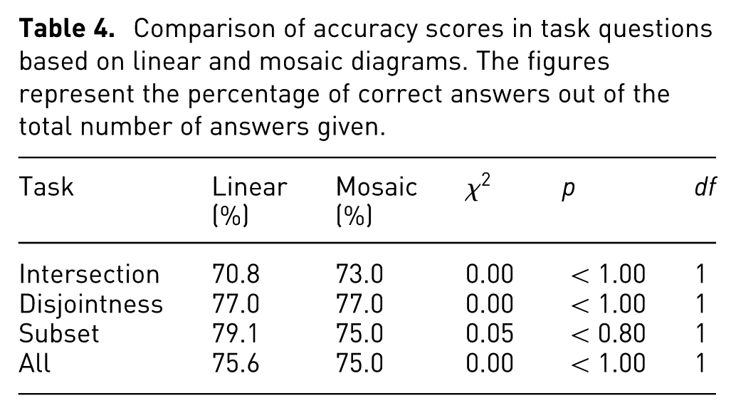
Given these results, we further investigated accuracy by comparing the different types of tasks grouped according to their difficulty levels, that is, easy (EI, ED and ES) versus hard (HI, HD and HS). In these comparisons, we employed McNemar’s test, as each group consisted of paired data. Once again the accuracy scores were rather similar, with no statistically significant differences shown (see Table 5). However, there appears to be a tendency for greater accuracy on the easier tasks for linear diagrams (84.7% vs 77.8%,
Comparison of accuracy scores in task questions (intersection, disjointness and subset) grouped according to difficulty level (Easy, Hard) for mosaic and linear diagrams. The
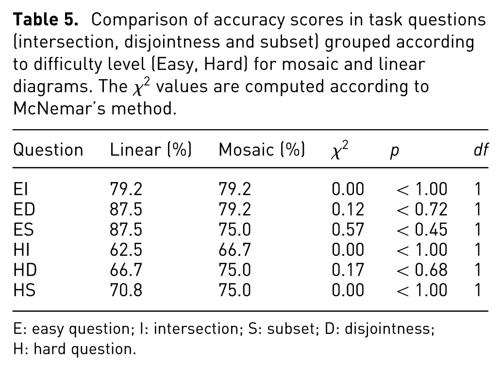
E: easy question; I: intersection; S: subset; D: disjointness; H: hard question.
We then measured the participants’ performance in terms of the time taken to answer each task question (excluding the time taken to rate task difficulty). The distributions of answer times are summarized on the box plots of Figures 4 and 5, for easy and hard questions, respectively. Overall, mosaic users took on average 54 s
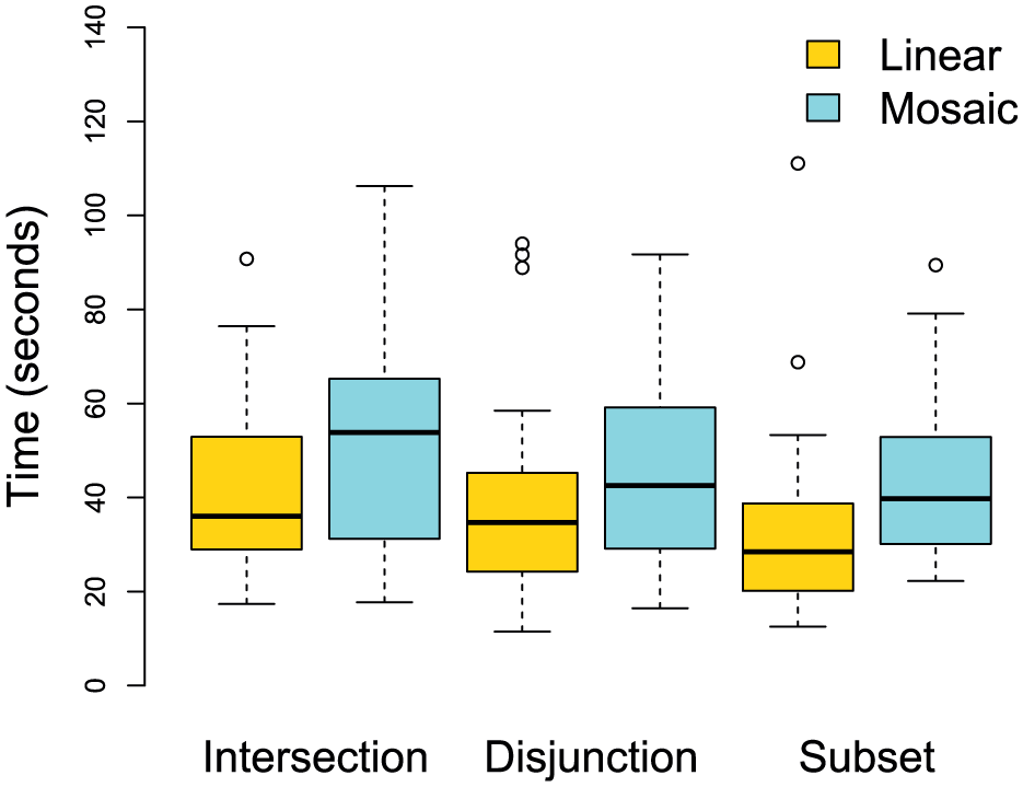
Time to answer easy questions using linear and mosaic diagrams.
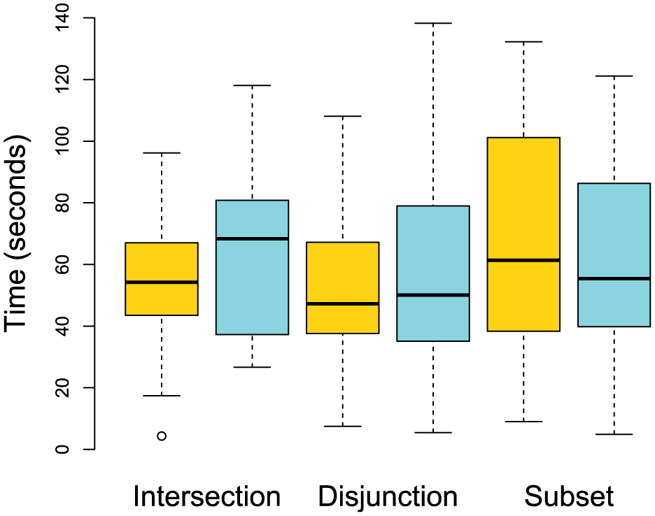
Time to answer hard questions using linear and mosaic diagrams.
Repeated measures analysis of variance (ANOVA) showed no significant effects for the two visualization types (
The only significant difference found was between easy and hard tasks (
Finally, we compared the participants’ subjective ratings for task difficulty. Figures 6 and 7 show summaries of responses for the two difficulty levels (easy and hard, respectively), grouped by the three task types and two diagram types. The ratings are again similar, but less consistent. The median rating is 3 for both mosaic and linear diagrams. The Kruskal–Wallis test showed no statistically significant difference (
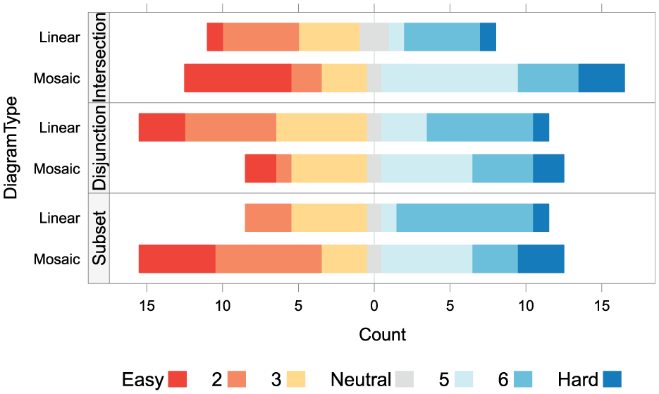
Ratings for task difficult, with respect to easy tasks (EI, ED and ES).
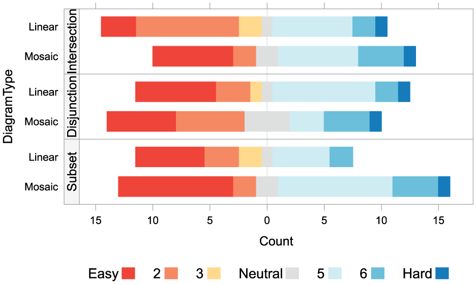
Ratings for task difficult, with respect to hard tasks (HI, HD and HS).
Discussion
The study presented here has shown that ordinary mosaic diagrams are comparable in their effectiveness to the most effective linear diagrams that follow previously proposed visual design principles, as discussed earlier. 10 However, the superiority of temporal mosaics over temporal linear diagrams (Gantt charts) in the context of task schedulling, 28 which we hypothesized would translate to the set comparison tasks, was not observed in this study. While it is not entirely clear why accuracy and answer times were so similar for both diagrams, one could speculate about contributing factors. One such factor may be the kind of tasks the user is asked to perform in each case. Even though the basic visual tasks are roughly similar (detection of gaps and overlaps), in schedule visualization, the user is also asked to assess interval length and position on the timeline (start and end times), which therefore provides a structuring element which facilitates interpretation and might benefit mosaic, where these characteristics are represented more prominently. The complexity and level of abstraction of the questions asked in the present set relations task are likely to be another contributing factor. The questions in this task are rather more abstract, and as we have pointed out, their textual formulation has to balance naturalness with the need to avoid ambiguity, resulting in wordings that are sometimes rather difficult to interpret. This is likely to have played a role in levelling down user performance across the two conditions.
There are, however, certain advantages to mosaic diagrams, which although not tested in this study, are likely to positively influence their effectiveness. For instance, the space-filling property of mosaic diagrams preserves the overview of overlaps and exclusions even if the diagram is dramatically reduced in size. Linear diagrams, however, rely on the position of labels to identify relations (colour being, as we noted before, a redundant attribute). As these diagrams are scaled down, the user’s ability to align vertically is greatly diminished, since the horizontally aligned labels would be impossible to preserve in miniatures, leaving the otherwise redundant colour attribute as the only means of identifying individual sets. In miniature linear diagrams, as in normal-sized ones, empty spaces will dominate the image, hindering the perception of vertical alignment of horizontal lines. Compare, for example,  to
to  . Such miniatures could be useful, for instance, in small-multiples diagrams,
39
or in ‘mini-charts’ like sparklines
40
when presented along with tabular data. Figure 8 shows these diagrams rendered on different scales (20 px, 50 px and 100 px, from left to right) in order to further illustrate this effect.
. Such miniatures could be useful, for instance, in small-multiples diagrams,
39
or in ‘mini-charts’ like sparklines
40
when presented along with tabular data. Figure 8 shows these diagrams rendered on different scales (20 px, 50 px and 100 px, from left to right) in order to further illustrate this effect.
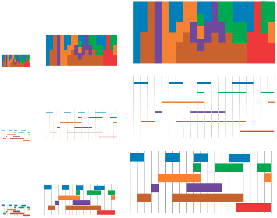
Comparison of different scalings of mosaic an linear diagrams. The middle row shows the original linear design used in the final experiment by Rodgers et al. 10 The bottom row shows a modified styling for miniaturization, with thicker lines.
In addition, mosaics highlight overlaps by facilitating visual alignment tasks, because the edges of adjacent areas to be aligned stand out clearly. In linear diagrams, however, comparisons of set relationships can become increasingly more challenging as more sets are included, thus leading to increasing vertical distances between sets and including more distracting line segments between sets that are placed vertically far apart. As mentioned previously, this kind of line ‘crowding’ is known to impair user performance in alignment tasks.33,34
Furthermore, linear diagrams do not generally represent other set properties such as their cardinality, and while it has been suggested 10 that visual properties including line size (e.g. length or width), colour and texture could be used to show set cardinality, it is acknowledged that their effectiveness has not been demonstrated. It could be argued that the use of line length for representing cardinality is potentially feasible, while changing line width may be less effective, given that it has been shown that thin lines are more effective than thick lines. Similarly, although colour and texture visual properties can be used for representing categorical variables, they are not very useful for representing ordinal variables (e.g. relative cardinality of different sets). 41
Mosaic diagrams, however, have been designed and shown 28 to facilitate comparisons of relative sizes (e.g. duration of task schedules). Figure 9 provides a simple example of how comparison of set cardinalities could be supported by proportionally varying the length of mosaic segments representing set relationships in proportion to the cardinalities of the sets being compared. Figure 9(a) shows only the relationships between the three sets (books, technology and cars) without conveying any information about their cardinalities. Figure 9(b), however, makes comparisons of the proportional cardinalities of the three sets relatively easy. For instance, it is clear that half of the people interested in cars are also interested in both books and technology, while the other half are not. Similarly, half the people interested in books are also interested in technology, while the other half are not. Also, it can be seen that books is the largest set, followed by technology and cars.
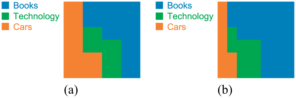
Relationships between three example sets, shown using mosaic diagrams: (a) without and (b) with cardinality comparisons.
Although interactive visualization techniques are not discussed here, mosaic diagrams have been shown to lend themselves well to the incorporation of interactive elements (e.g. selection, brushing and zoom) in comparison to linear-style visualizations such as Gantt charts. 42
It should be noted, however, that as with any visualization, the use of the colour hue attribute to encode data values places some restrictions on the visualization for viewers who suffer from colour-blindness. This is also true for mosaic diagrams. One possible solution in such cases is to use another colour attribute, such as tonal variations (i.e. value), or perhaps texture instead of hue variations.
Conclusion
In this article, we have proposed the use of mosaic diagrams as an aggregation-based technique for visualization of set relationships. This is a novel use of mosaic diagrams, which have previously been shown to be very effective for visualization of temporal data such as multimedia streams, and task schedules.
Although mosaics failed to yield performance improvements in comparison to linear diagrams for set visualization tasks, as we had expected based on reported results from a different task (schedule visualization) which compared similar diagrams, the potential value of mosaic diagrams for representing set relationships is supported by the fact that mosaic produced similar results as the most effective visual form of linear diagrams, as previously studied by Rodgers et al. 10
Finally, we have discussed a number of cases where mosaic diagrams are likely to be particularly suitable for visualization of set relationships. These include cases where visual space is limited and/or needs to be used more efficiently, cases where a larger number of sets need to be represented, or cases where other set properties such as their cardinalities also need to be presented. These, and other interactive properties of mosaic diagrams, still need to be further investigated within this particular task domain. We aim to carry out this work in the near future.
Footnotes
Acknowledgements
The authors thank the study participants for generously taking the time to complete the trial. All the materials employed in the experiment are available for download at http://homepages.ed.ac.uk/sluzfil/ivj2018-materials.tgz. Content used here which are related to the final study by Rodgers et al. are available at ![]() .
.
Funding
The author(s) received no financial support for the research, authorship and/or publication of this article.