
Abstract
The visual communication of behavioural expectations plays an important role in the management of contemporary urban spaces. This is evident in mass transit settings where posters and signage promoting good mobility practices are a common sight. Despite the prevalence of such semiotic interventions in passenger conduct in public transport environments globally (see Bissell’s Transit Life: How Commuting Is Transforming Our Cities, 2018; Moore’s ‘Preventing anti-social behaviour on public transport: An alternative route?’, 2010; and Ureta’s ‘Waiting for the barbarians: Disciplinary devices on Metro de Santiago, 2012), their visual structure has only received limited scholarly attention. This article seeks to address this oversight through a visual analysis of ‘manner posters’ issued by Japanese railway providers. Using a two-pronged content analysis approach, the author examines the design strategies employed to problematise passenger misconduct and solicit desirable mobility practices while simultaneously protecting customer sensibilities. Focusing on character figuration, image–viewer relations and the portrayal of misconduct, the article argues that manner posters inscribe behavioural expectations into the physical transport environment by modelling their narrative visual content after actual commuter experiences and using salience-increasing design techniques to highlight etiquette transgressions. As an in-depth visual analysis of transit manner posters, the article thus advances our understanding of the strategic use of visual communication for the management of everyday behaviour and the production and maintenance of public order in contemporary cities.
Keywords
The visual communication of behavioural expectations plays an important role in the management of urban spaces. Illustrated signs and notices proscribing appropriate or ‘correct’ conduct permeate the semiotic landscape of contemporary cities (Chesnut et al., 2022; Hermer and Hunt, 1996; Jaworski and Thurlow, 2011) and are particularly prominent in transport environments (Schimkowsky, 2021a). Public transport providers frequently employ posters and other semiotic devices to promote good mobility practices. Despite the prevalence of institutional interventions in passenger conduct in public transport systems around the world (Bissell, 2018; Fincher et al., 2019; Moore, 2010; Ureta, 2012), detailed analyses of the semiotic structure of such persuasive visual media are rare: there is a tendency to leave the role of visual communication in maintaining everyday urban order unexamined (but see Lazar, 2003; Padoan, 2014). This article seeks to address this oversight by examining the design strategies employed by ‘manner posters’ issued by Tokyo railway companies to appeal to commuter etiquette. Utilising a two-pronged visual analysis approach combining multimodal and quantitative content analysis (Parry, 2019; Serafini and Reid, 2019), it argues that Japanese manner posters inscribe behavioural expectations into the physical transport environment by modelling their narrative visual content after actual commuter experiences and using salience-increasing design techniques to highlight etiquette transgressions. The article thus advances our understanding of the visual communication of behavioural expectations as part of strategies of ‘mundane governance’ (Woolgar and Neyland, 2013).
The article begins with a brief review of existing research on the use of signage and posters in the governance of everyday life and urban spaces. It then introduces the methodological approach and case study. This is followed by an in-depth visual analysis of Japanese manner posters that examines (1) character figuration, (2) image–viewer relations, and (3) the portrayal of misconduct.
Background: Managing Conduct Through Signage And Posters
Signage is a key element in the production of urban spaces. Not only does it facilitate the navigation of urban environments and infrastructure (Denis and Pontille, 2010), but it also contributes to the governance of urban spaces by inscribing behavioural expectations into the material environment. Signage is frequently used to guide and regulate behaviour, and has been described as providing ‘instructions for use’ for places of modernity (Augé, 1995: 96). As a means of behavioural regulation, signage may carry prohibitions or proscriptions, or announce the presence of other technologies of social control such as CCTV (Lippert, 2009). United by a shared intent to deter or elicit behaviour, these semiotic devices can be understood as regulatory signage (Hermer and Hunt, 1996) and as a technology of mundane governance (Lippert, 2009; Woolgar and Neyland, 2013).
Signage’s role in co-constituting urban space is particularly evident in public transport environments. Train and subway stations feature a wide array of infrastructural media such as directional signage, departure time displays and announcements (Cockain, 2018; Denis and Pontille, 2010) which facilitate, shape and constrain mobility practices (Jensen, 2014). One particular genre of communication often found in urban transit environments consists of posters and digital signage addressing inconsiderate, inappropriate or otherwise undesirable passenger conduct (Bissell, 2018; Fincher et al., 2019; Moore, 2010; Rink, 2022; Ureta, 2012). While the interventional quality of persuasive posters puts them squarely in the category of regulatory signage (Hermer and Hunt, 1996), their visual and semiotic format frequently diverges from the official and standardised format employed by proscription and prohibition signage (e.g. a slashed-out red circle). Transit etiquette posters often avoid an ‘authoritarian’ format carrying threats and warnings (Moore, 2010) and instead embrace diverse semiotic structures and non-standard forms of visual expression (Schimkowsky, 2021b). For example, etiquette posters issued by Singaporean authorities as part of courtesy campaigns invoke a shared sense of community and belonging, and employ informal and ‘soft’ rather than didactic modes of address (Lazar, 2003; Yeo and Tupas, 2018). Campaign posters often integrate elements of ‘semiotic play’ such as cute mascot characters and a cheerful colour palette (Lazar, 2003: 212) which can be understood as a ‘conversationalisation’ of public discourse that masks power differences between the audience and the issuing authority (Fairclough, 1994). The employment of playful semiotic strategies is also prevalent in Japan where public signage often adopts a ‘mangaesque’ style (Wilde, 2018). Etiquette posters by Japanese railway companies are known for their friendly and creative visual and linguistic content featuring informal modes of address, humour, cultural references and cute illustrations (Padoan, 2014; Schimkowsky, 2021b). The use of these elaborate design strategies serves the double purpose of attracting viewer attention and avoiding offending customer sensibilities. Communicating behavioural expectations to passengers presents a challenge for railway companies which are bound by dominant cultural norms to pay deference to their customers, and thus consciously choose a visual format that mitigates sermonic and admonitory aspects of etiquette messaging (Schimkowsky, 2021a). Accordingly, poster design requires balancing the unequivocal communication of (un)desirable conduct and avoiding causing audience resentment or annoyance. This article analyses how passenger misconduct is visually problematised within these limitations.
Method
This article explores the visual communication of behavioural expectations in public transport environments through a two-pronged content analysis of manner posters issued by Tokyo railway companies. Ideals of customer service and the strain that Tokyo’s urban density places on the city’s public transport system prompt Japanese railway companies to engage in etiquette improvement campaigns addressing a wide array of mundane passenger (mis)behaviours (Fisch, 2018; Schimkowsky, 2021a). With about 15 billion passenger journeys every year, Tokyo’s urban railway system operates ‘beyond capacity’ (Fisch, 2018: 1). To ensure the smooth operation of the transit system, passenger adherence to appropriate mobility practices is crucial. Manner posters (see Figures 1 and 2) are among companies’ go-to tools for encouraging desirable passenger conduct, making them an ubiquitous component of the semiotic landscape of Japanese urban transit environments and a suitable case study for exploring the visual communication of behavioural expectations. This study examines the visual strategies employed to encourage desirable conduct in a doubly challenging communication context: poster creators need to secure the attention of audiences hurrying through crowded and semiotically oversaturated environments (Figure 3) while at the same time avoiding offending customer sensibilities (see above).
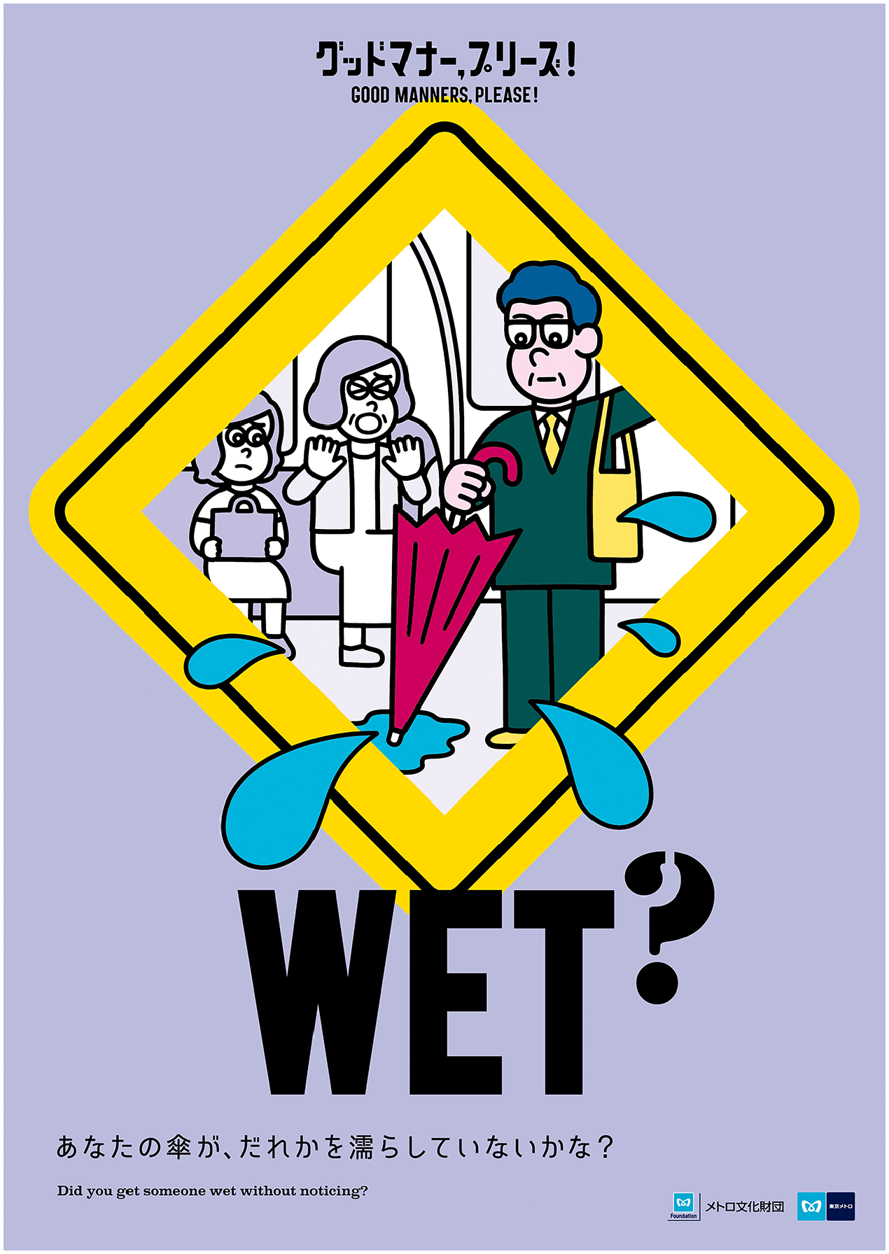
Poster asking passengers to be careful when handling wet umbrellas. © Tokyo Metro/Metro Cultural Foundation/Metro Ad Agency. Reuse not permitted.
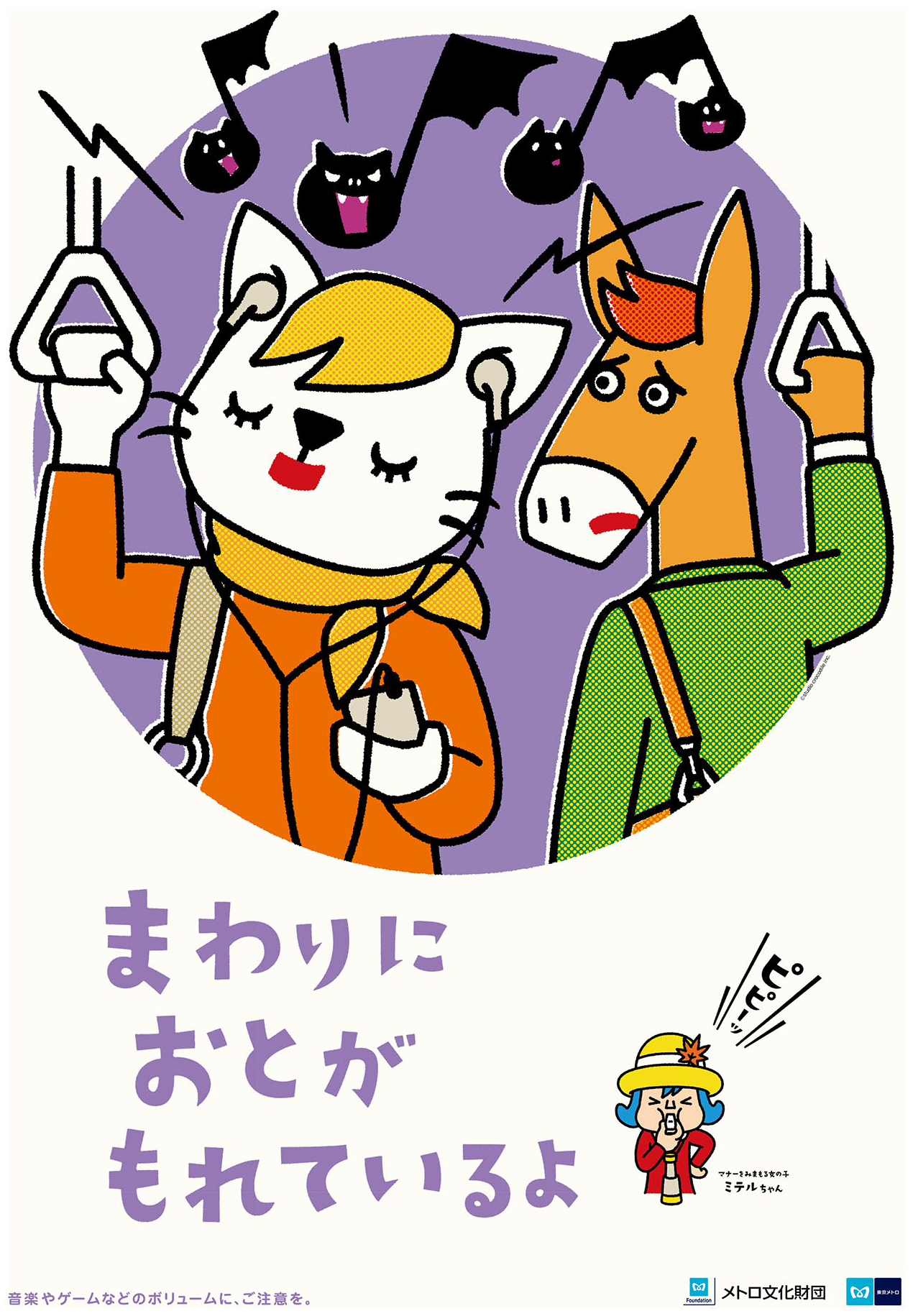
Poster asking passengers to pay attention to their earphone volume. © Tokyo Metro/Metro Cultural Foundation/HAKUHODO INC. Reuse not permitted.
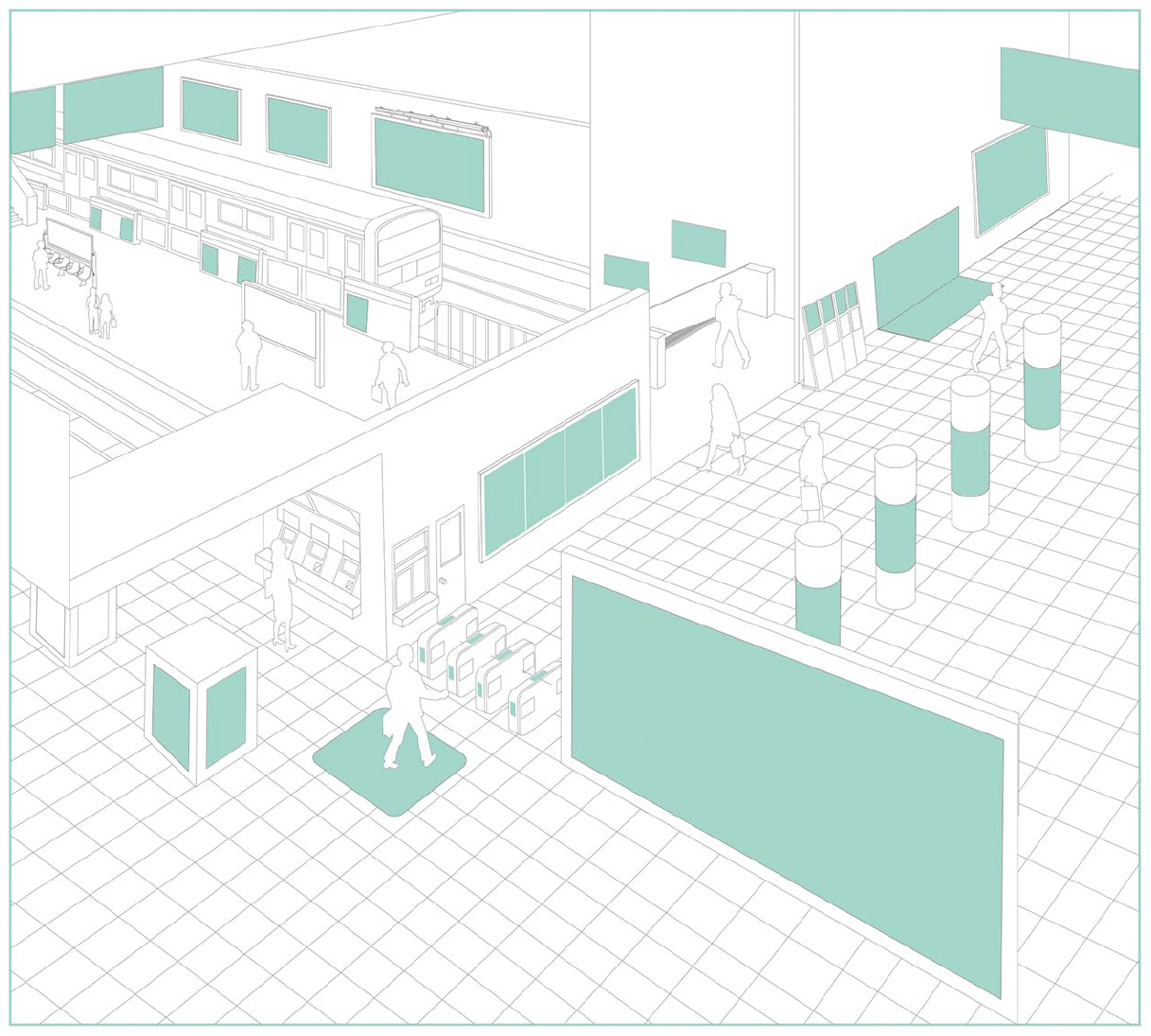
Advertising spaces in a Tokyo train station. Source: © JR East Marketing & Communications, Inc. (2021).
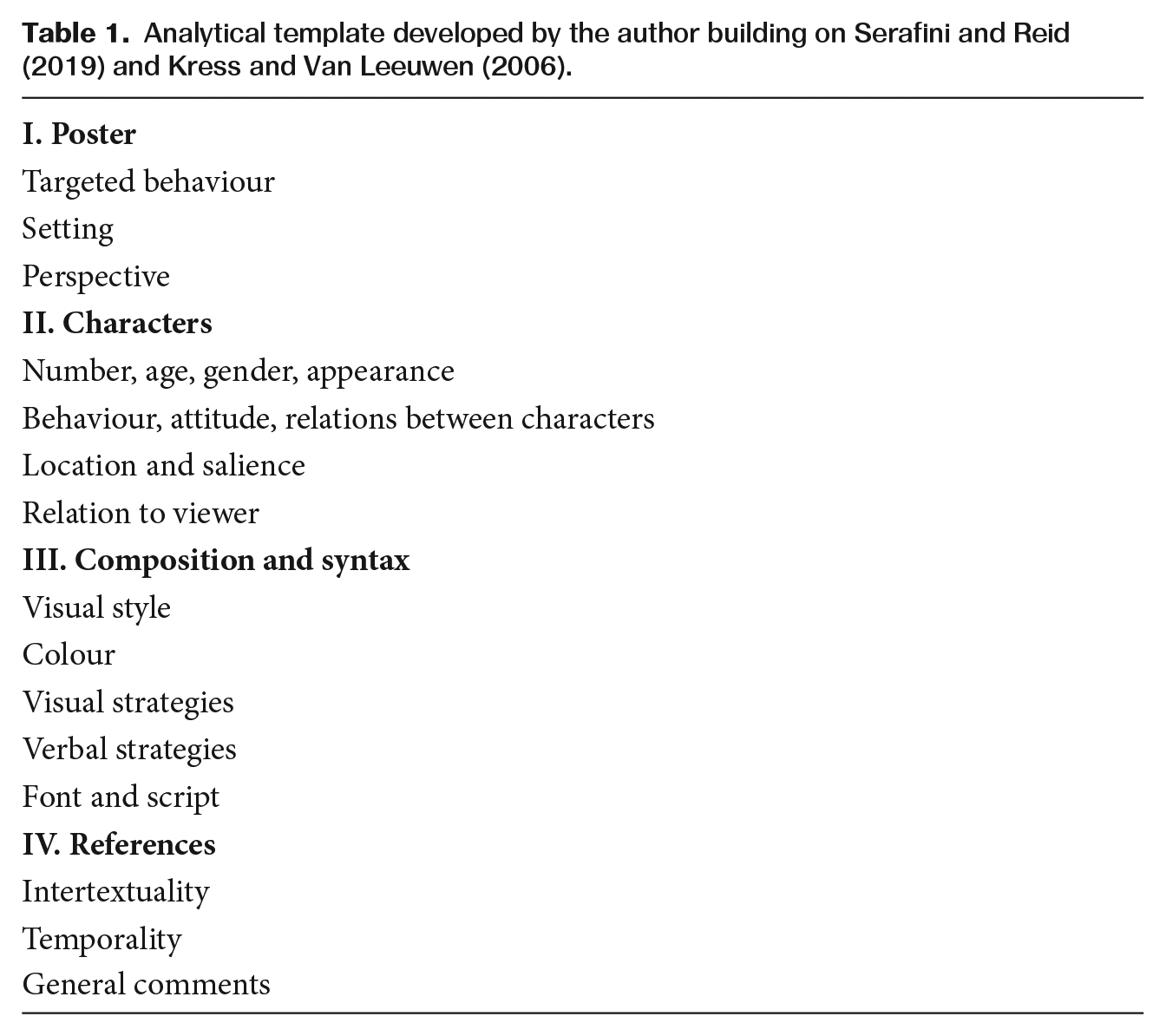
This article blends qualitative and quantitative approaches to visual content analysis in order to provide insights into the semiotic complexity of the visual communication of behavioural expectations. The following discussion of design strategies primarily draws on a multimodal content analysis (MMCA) of 40 manner posters issued by Tokyo rail and subway companies between 2011–2021. MMCA is a recent variation of qualitative content analysis that addresses the multimodal nature of contemporary communication and draws on interpretivist research designs (Serafini and Reid, 2019). Following Serafini and Reid, I completed an analytical template for each examined poster, facilitating a systematic and in-depth examination (Table 1). The template’s analytical categories were further inspired by Kress and Van Leeuwen’s (2006) influential work on ‘reading’ images. While the analysis also covered linguistic content, this article focuses on visual elements.
Analytical template developed by the author building on Serafini and Reid (2019) and Kress and Van Leeuwen (2006).
The sample examined here consists of posters targeting four different types of etiquette infractions: noise nuisances, ‘unclean’ behaviours (e.g. littering), rushing onto the train at the last minute and walking while using a smartphone. These behaviours were chosen as they are representative of efficiency, comfort and safety as underlying themes of transit etiquette campaigns (see below). For each behaviour, 10 posters were randomly selected from a private collection of 500 photos of manner posters issued by Tokyo railway companies between 2011–2021. This approach allowed me to account for the internal diversity of the manner poster genre (e.g. different production pathways; see Schimkowsky, 2021b).
The MMCA was supplemented by a quantitative visual content analysis (Parry, 2019) of 120 annual campaign posters issued by Tokyo Metro between 2010 and 2021. 1 Tokyo Metro’s posters were chosen because they are considered to be leading examples of manner posters within the industry and have repeatedly been the focus of media attention. Following common methodological advice (Parry, 2019; Rose, 2016), I designed a coding scheme to dissect the selected visual material into its individual components. The coding scheme, which focused on the targeted behaviours, the number of represented participants, the types and roles in which they appear, as well as their distribution, was then applied to all selected posters. The quantitative analysis thus allowed me to confirm that the MMCA findings are in line with patterns within a larger corpus of manner posters and shed further light on the employed design rationales.
Poster Content
Japanese manner posters target a wide array of behaviours ranging from boarding and seating etiquette to unruly sensations that passengers might encounter during their commute (Figure 4a). Previous research has shown that the majority of posters target passenger behaviours that could affect the efficiency, comfort, or safety of urban railway operations (Schimkowsky, 2021b). Rather than autonomous poster categories, these themes present interrelated concerns as railway companies recognise that a single breach of transit etiquette has the potential to impact multiple aspects of transport operations. The interrelations between themes of efficiency, comfort and safety are evident from the diagram below (Figure 4b). What stands out from this quantitative analysis of poster themes is a prevalent concern for passenger comfort. Most posters address behaviours that could negatively affect commuter experience, such as noise nuisances or inconsiderate use of seating. This illustrates that the principal target of manner posters is mundane passenger misconduct: behaviours that are considered impolite, inconsiderate, or inappropriate, but do not violate official regulations or bylaws (see Smith et al., 2010). Accordingly, creators of posters – as they stressed in interviews – are precluded from employing formal prohibitions and instead need to convince passengers of desirable conduct through persuasive design (see Schimkowsky, 2021a). The following sections will explore the visual strategies employed to achieve this goal.
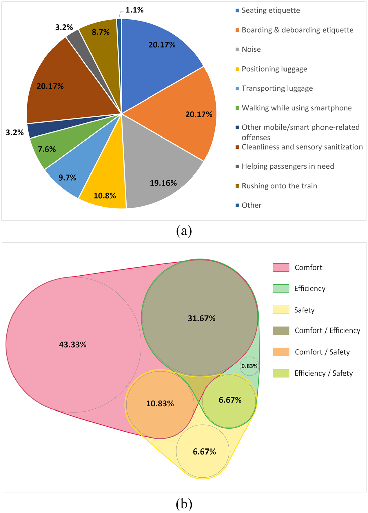
Behaviours and themes featuring in manner posters: (a) behaviours targeted in Tokyo Metro manner posters (2011–2021); (b) themes addressed in Tokyo Metro manner posters (2011–2021), graph created with nVenn (Pérez- Silva et al., 2018).
Character Figuration
The visual component of most manner posters takes a narrative format and usually depicts characters engaging in undesirable mobility practices in public transport environments. To understand how posters encourage good transit etiquette, it is crucial to examine their use of characters to tell bite-sized tales of passenger misbehaviour (see Wilde, 2018). Character figuration can be analysed along the axes of type and role. The former refers to the different kinds of characters depicted in posters: company employees, passengers and fictive characters. The first two categories require little explanation: they comprise railway company officials (e.g. conductors, station staff) and commuters. Characters’ identity is commonly signalled through visual references to their official status (e.g. uniform) or a recognisable passenger subtype (e.g. businessperson, student). However, it is not uncommon for passengers to remain visually unmarked as anonymous members of what Fisch (2018: 36) refers to as the ‘commuter collective’. While employee and passenger characters are symbolic representations of their real-life counterparts, the third category consists of characters without such counterparts. These can either be company mascots, licensed characters from media franchises, or ‘working characters’ whose existence is limited to their appearance as communication tools in posters (see Wilde, 2018: 137). An overview of the distribution of character types in manner posters can be found in Figure 5(a).
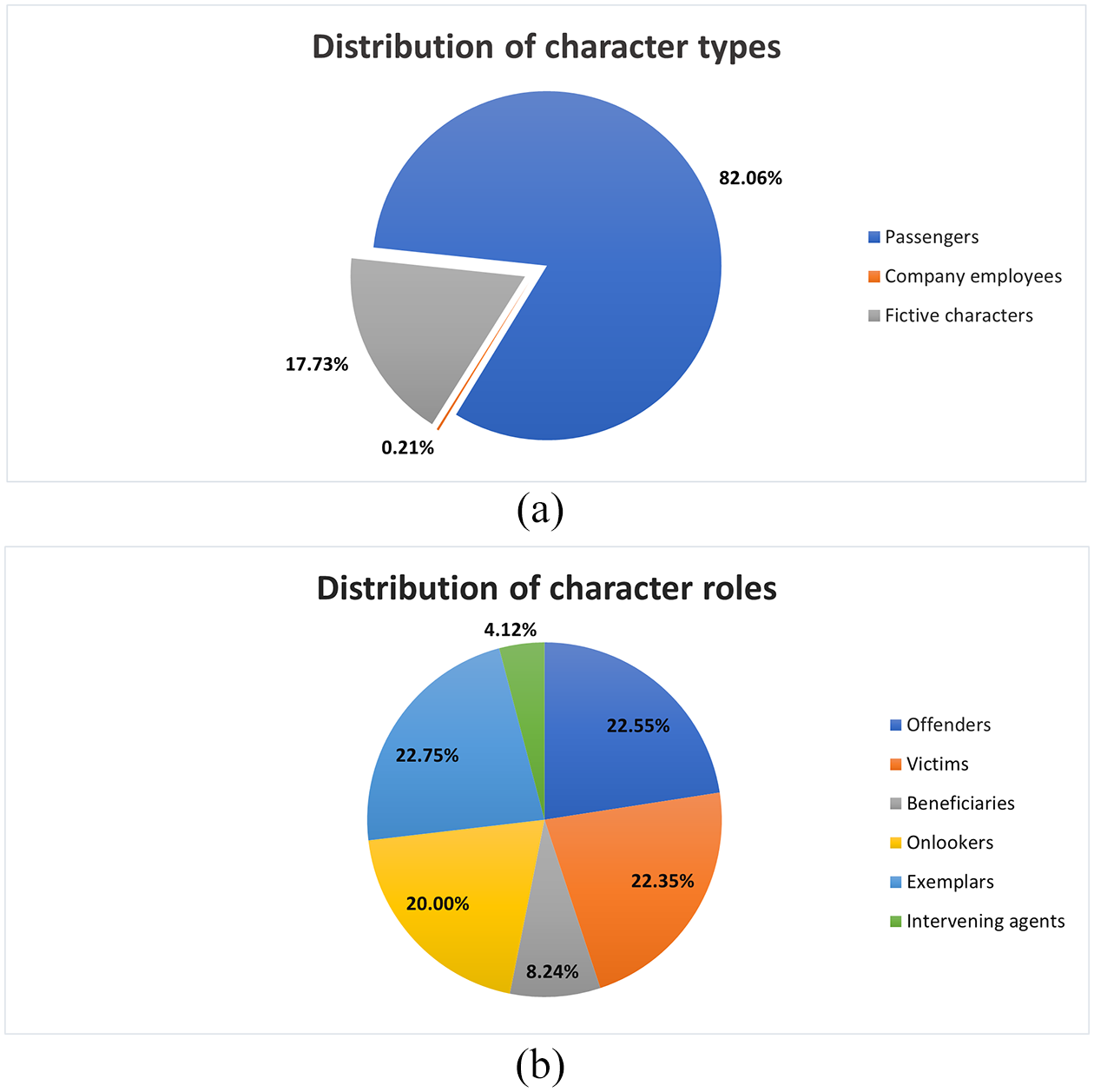
Distribution of character types and character roles in Tokyo Metro posters (2010–2021, excluding 2011–2012): (a) distribution of character types in Tokyo Metro posters; (b) distribution of character roles in Tokyo Metro posters.
The second axis of character role refers to the narrative functions fulfilled by characters. Roles are determined by character figuration, i.e. the way depicted characters relate to each other. The basic figurative structure in manner posters is the relationship between ‘offender’ and ‘victim’ – the portrayal of a passenger’s breach of transit etiquette (‘offender’) as negatively affecting a fellow commuter (‘victim’). Other character roles include the ‘onlooker’ (a character who observes the unfolding scene but is not directly affected by it), ‘exemplar’ (a character exhibiting model behaviour, often in contrast to the breach of the offender), ‘beneficiary’ (a character benefiting from a fellow passenger’s good behaviour) and ‘intervening agent’ (a character who intervenes in problematic behaviour, see Figure 5b). While the boundaries between these categories are not always clearcut (for example, the difference between a ‘victim’ and a ‘onlooker’ role can be a gradual one), character roles provide manner posters with a transparent and recurring narrative structure. In other words, the allocation of recognisable character roles increases the salience of posters’ manner message by simplifying the depicted narratives of etiquette transgression.
The examination of character types and roles allows us to identify common figurative structures. Both the multimodal and quantitative content analysis revealed that fictive characters are the character type that most frequently behaves as intervening agent. While there are a few manner posters in which passengers themselves are portrayed as intervening in misconduct, they are more commonly depicted as passive victims, or as reacting to transgressions of etiquette with a worried, saddened, or upset facial expression. When a fellow passenger is portrayed as actively intervening, the poster usually implies that they are not a stranger but have a pre-existing relationship with the offender. Similarly, not one of the examined posters depicted company employees as intervening agents. This scarcity of portrayals of employee or co-passenger interventions is in line with the reality of Tokyo’s urban railways where most passengers do not intercede in commuter misbehaviour and company officials only get involved in cases of extreme misconduct. Moreover, the design decision to avoid depictions of corporate intervention is rooted in axioms of customer service which, according to interviews with transport and design professionals, prevent railway companies from actively policing customer etiquette transgressions as this would constitute a form of overreach that could cause customer offence (see Schimkowsky, 2021a).
The policing of transgressive behaviour in manner posters is thus largely the domain of fictive characters. Their ambiguous ontological status turns them into useful intermediaries of company manner messages as they can act as proxies for companies where direct corporate intervention is considered inappropriate. Railway companies further believe that the use of fictive characters can help circumvent potential passenger perceptions of manner posters as unilateral directives by the company itself (Schimkowsky, 2021a). In other words, fictive characters are useful persuasive devices that ‘defuse’ the sensitive task of telling customers how to behave (see Wilde, 2018: 145). Their utilisation facilitates the problematisation of improper passenger conduct in manner posters which – as media of company–customer interaction – need to avoid upsetting passenger sensibilities by appearing overly didactic. Accordingly, character figuration in Japanese manner posters is shaped by considerations of which kind of character types are appropriate choices to convey behavioural expectations to customers. Put differently, the narrative roles open to characters are curtailed by considerations of customer sensibilities. This also helps explain the general absence of railway company employees on posters (Figure 5a): no suitable role is available to them in the portrayed scenes of manner infraction.
This section has demonstrated that Japanese manner posters employ recurring and recognisable character relations to increase the salience of their manner message. While the depicted character relations are broadly reflective of actual conditions in Tokyo’s urban transport environments, posters’ status as media of company–customer communication drives creative design adjustments such as the introduction of fictive characters as intervening agents. In contrast, image–viewer relations remain true to actual transit experiences, as we will see below.
Image–Viewer Relations
Image–viewer relations are another dimension of manner poster design that we need to consider in order to understand posters’ visual solicitation of good passenger etiquette. Kress and Van Leeuwen (2006) distinguish between ‘demand’ and ‘offer’ images as two different kinds of relations between characters depicted in an image (‘represented participants’) and image audiences (‘interactive participants’). In ‘demand’ images, represented participants visually engage viewers through direct eye contact and/or gesture (p. 117). Visual engagement of this kind addresses viewers as a visual ‘you’, and demands that interactive participants enter into an (imaginary) relation with represented participants (p. 118). For example, depicted characters might ask viewers to come closer, stay away, or they may attempt to seduce or command them. In contrast, ‘offer’ images lack such direct visual engagement. Represented participants do not look at, or otherwise directly act on, the viewer. Instead, this image type positions the viewer as ‘invisible onlooker’ to whom represented participants are offered as ‘items of information’ or ‘objects of contemplation’ (p. 119). While we might expect that manner posters employ ‘demand’ images to solicit desirable mobility practices, this is rarely the case. Of the 40 posters examined during the MMCA, only 8 feature ‘demand’ image elements, such as smiling fictive characters that ask viewers ‘to enter in a relation of social affinity with them’ (p. 118). Even in these cases, the ‘demand’ message is not a dominant component in the poster design. Characters who look directly at the viewer are usually minuscule compared to other visual elements and the poster size, thus reducing the impact of their gaze (see Kress and Van Leeuwen, 2006: 119).
Furthermore, characters’ gaze is often rendered opaque due to the detail-reduced drawing style commonly employed by manner posters which depicts eyes as black dots that look blankly ahead. In some cases, characters facing the viewer are depicted with closed eyes, thus avoiding direct engagement with the audience (Figure 2). In the few exceptions in which a ‘demand’ element is prominently depicted, it usually takes the form of a fictive, non-threatening character who is depicted with a pleading or saddened expression and does not have any apparent connections to actually existing passengers or the issuing railway company (e.g. a puppy or anthromorphised koala). Considering that ‘demand’ images can be perceived as patronising by viewers (p. 121), the reluctance to use such images in manner posters can be interpreted as company avoidance of confrontational persuasive strategies. Accordingly, poster producers’ preference for ‘offer’ rather than ‘demand’ images is evidence of the crucial influence that company concern for customer sensibilities has on manner poster design.
‘Offer’ images have been described as addressing viewers ‘indirectly’ (p. 119). Manner posters depict episodes of transit etiquette transgressions that are ‘offered’ to viewers as ‘objects of contemplation’. However, while Kress and van Leeuwen (2006: 120) argue that such images erect a ‘barrier’ between interactive and represented participants and facilitate a ‘sense of disengagement’, this is not the case with manner posters. Rather than inviting audiences to look at represented participants ‘impersonally . . . as though they were specimens in a display case’ (p. 119), the ‘offer’ format of the majority of manner posters strengthens viewer involvement by imitating a passenger gaze. The portrayal of (mis)behaviour largely resembles how these actions would appear to passengers if observed during their actual commutes. This is primarily achieved through the use of perspective. Most of the examined posters utilise a ‘long shot’ perspective that shows the complete body of the subjects portrayed and conveys their relationship to their surroundings. Commonly employed by filmmakers to show action or portray interaction between multiple visual elements, posters’ use of a long shot can be understood as a design necessity as it facilitates the unequivocal communication of the given manner infraction and its consequences. However, it also facilitates a naturalistic perspective resembling that of an actual passenger observing fellow commuters on the platform or train, such as by placing the viewer on a bench directly in front of the unfolding situation. Other shot sizes are sometimes used to the same effect. For instance, Figure 2, a poster problematising earphone sound ‘leaks’, uses a medium shot size that positions the viewer in direct proximity to the ‘deviant’ passenger subject, i.e. at a distance at which the escaping sound would be particularly audible. In other words, the poster places the viewer in the shoes of a fellow passenger who is bothered by inconsiderate use of mobile devices. Similarly, perspective can be used to make raindrops from a wet umbrella appear to fly out of the frame and towards the viewer (Figure 1).
Horizontal and vertical angles are used to a similar effect. Posters in the sample employ a frontal horizontal angle that heightens viewer involvement by aligning interactive and represented participants. Through this, the viewer is implicitly led to identify with the depicted passengers (Kress and Van Leeuwen, 2006: 136). Similarly, a vertical angle in many images frequently places viewers at eye level with the depicted passengers, thus suggesting a form of equality between viewer and passenger (p. 140). While the examined sample also includes posters that use a ‘fictive’ point of view that has no human counterpart in actual urban mobility situations, in the majority of the analysed cases the depicted scene looks similar to how it would appear to a fellow commuter (p. 143). Atypical for ‘offer’ images, in manner posters there is therefore no significant ‘barrier’ between viewers and represented participants (p. 120). The represented participants – passengers on a Tokyo train – are aware that their behaviour is observable by the anonymous commuter collective that poster design implicitly makes viewers a part of. If there is a sense of disengagement between viewers and the depicted characters, it is similar to the (inter-)active effort of civil inattention that passengers engage in on public transport (Goffman, 1971). Accordingly, the employed ‘offer’ format is part of a persuasive strategy that asks viewers to contemplate the depicted case of commuter misbehaviour from the perspective of a fellow passenger on the same train.
A ‘passenger perspective’ is further amplified by posters’ geosemiotic characteristics. Like other forms of signage, manner posters gain part of their meaning from their ‘material placement’ in the environment (Scollon and Scollon, 2003). As manner posters are commonly displayed in public transport spaces, their visual content overlaps with the physical context in which they are placed and ‘consumed’. Viewers primarily encounter manner posters while they traverse the urban rail network. In other words, posters’ passenger perspective corresponds to audience positionality. Poster placement thus facilitates viewer immersion. ‘Buying into’ the passenger perspective adopted by poster design requires little imaginative effort from viewers as they are passengers at the moment of manner poster consumption. Viewer immersion is further advanced by integrating temporal references into poster design. Manner posters usually have clearly designated display periods and their visual content can include temporal cues signifying seasonal events (e.g. Halloween or Christmas). The choice of the behaviours taken up by manner posters similarly reflects seasonal trends. For example, posters problematising the inconsiderate handling of umbrellas are often seen during the rainy season. Accordingly, there is a significant overlap between posters’ visual content, geosemiotic qualities and display period. Viewer immersion and the perceived salience of the poster message are heightened because the spatio-temporal location of the depicted scene is closely connected to the consumption context and viewers are likely to have encountered the depicted behaviour during their own journeys on public transport.
Viewer immersion is also heightened by the detail-reduced drawing style commonly employed by manner posters. The portrayed manner transgressions take place in ‘generic’ and ‘decontextualised’ public transport locations that do not specify station name or train line (see Aiello, 2019). At the same time, regardless of the overall detail-reduced ‘cartooned’ drawing style (McCloud, 1994: 30), a sense of realism is maintained as depicted infrastructural elements such as platform demarcations or carriage hand straps are closely modelled after their real life counterparts. In other words, manner posters combine visual elements with low and high modality (Kress and Van Leeuwen, 2006: 155ff) to achieve a portrayal of transport settings that is generic yet also naturalistic. This makes it easy for poster audiences to regard the depicted scene as part of the actual spaces that they move through during their commute. A similar pattern can be observed in manner posters’ portrayal of passengers. Like transport environments, characters are frequently drawn in a detail-reduced style that can be described as ‘iconic abstraction’ which offers limited clues to their identity or purpose of their journey and instead focuses on their (mis)conduct (McCloud, 1994: 41, 50). Manner posters’ generic portrayal of misbehaving passengers facilitates the communication of universal behavioural expectations. The simplified or ‘cartooned’ portrayal of characters heightens audience involvement: The fewer lines a character is drawn with, ‘the more people it could be said to describe’ (McCloud, 1994: 31, 42). Abstract cartoon characters present a ‘vacuum’ into which viewers can project their own identity – or the memory of fellow passengers they have encountered during their commute (p. 36). Together with a generic but naturalistic depiction of transport settings and passenger practices that are highly familiar to most Tokyo commuters, the cartoon depiction of passenger types and etiquette transgressions thus makes it easier for viewers to project their own memories of transit encounters onto the depicted characters and recognise the depicted manner message as relevant to them. Significantly, the indeterminate portrayal of passengers can also be understood as visually positioning them as ‘strangers’. Just as Tokyo commuters usually know little about their fellow passengers on public transport, manner poster audiences know little about the portrayed commuters. Image–viewer relations thus mirror the social relations of actual passengers. In other words, the visual design of posters quotes actual urban transport experiences as a frame of reference to heighten the salience of their manner message.
This section demonstrated that image–viewer relations are closely modelled after actual commuter practices. Viewer immersion and message salience are heightened by manner posters’ adoption of the point of view of a fellow passenger, depicting transport environments as generic yet naturalistic, and aligning posters’ spatio-temporal setting with the context of poster consumption. In other words, manner posters ask viewers to contemplate simulated scenes of commuter misconduct. The final section analyses the persuasive strategies that poster designers employ to influence viewers’ assessment of these visual imitations of transit etiquette breaches.
Visual Problematisation Of Manner Offences
Manner posters problematise passenger misconduct by visually highlighting the targeted etiquette infraction, its consequences and its framing. Common techniques employed to render the targeted conduct and its salient consequences include the purposive use of colour, size, position and vectors. For example, Figure 1 asks viewers to consider the effects of bringing a wet umbrella onto the train by showing gigantic bright-blue water drops flying off a red umbrella and forming a large puddle of water on the ground. In addition, the gaze of onlooking passengers and the shape of the offending item create vectors that further draw attention to the transgression (e.g. the umbrella ‘points’ toward the puddle of water below it).
Visual exaggeration is another technique used to emphasise transgressions. Posters asking passengers not to attempt to board the train outside of the permitted time window might depict the offending passenger as jumping towards almost closed carriage doors with their hands outstretched and their clothes fluttering behind them. The bodily reactions of ‘victim’ and ‘onlooker’ passengers might be similarly overstated, with passengers portrayed as grimacing and covering their ears when exposed to headphone noise. Including a high number of ‘victim’ characters is another exaggeration strategy. For example, in the case of a poster urging people not to block carriage exits, six commuters are depicted as unable to deboard because they are ‘stuck’ behind a single passenger who is engrossed in his phone. The quantitative dimension of the portrayed passenger figuration thus enables posters to visually argue that the targeted behaviour can affect the commuter collective as a whole.
Manner offences might also be emphasised through the use of visual metaphors. For instance, a 2015 poster indicates the excessive amount of noise that is (supposedly) being produced by chatting passengers by depicting them as operating hand puppets with gaping mouths. This suggests that design workarounds are required to represent etiquette breaches and consequences that are tricky to depict in the single-frame format employed by most manner posters. Manner infractions that are usually imperceptible to the naked eye (e.g. sound, intrusive clouds of make-up powder) are visualised through conventional symbols such as musical notes. Similarly, processes of action (e.g. passengers bumping into each other) are often conveyed through visual shorthand such as the use of path lines indicating movement and colourful spikes symbolising impact. Notably, these difficult-to-depict offences are frequently visualised in spatial terms: a boisterous conversation might be portrayed through multiple large-speech bubbles that occupy a lot of carriage space or through thin black lines that emit from talking passengers and ‘pierce’ other commuters. Functioning as connecting vectors that act on victim passengers (Kress and Van Leeuwen, 2006: 59), these sound lines highlight the vexation a noise disturbance might cause. Such portrayals of passenger offences as spatially intrusive are significant because they point towards the allocation of space as a master code of transit etiquette: questions of space (e.g. where and how to position yourself and your belongings on the train) are central to understanding what constitutes (in)appropriate behaviour on public transport.
While the problematic nature of the targeted manner offences is implicit in the visual emphasis of their consequences, posters also utilise additional visual strategies to clarify the framing of the addressed behaviours. For example, the way viewers are encouraged to think about the targeted behaviour is visually spelled out through the bodily comportment and facial expressions of the featured characters. ‘Victim’ and ‘onlooker’ characters’ facial expressions usually convey negative emotional reactions such as disapproval, concern, or shock. These can be further accentuated through conventional visual symbols for particular moods or (affective) states. For example, multiple sweat beads next to a character’s head can convey physical exertion. Moreover, abstract symbols that are employed to highlight the consequences of passenger misconduct can be equipped with an affective ‘charge’, such as through anthromorphising musical notes with mischievous facial expressions to communicate the objectionable nature of the targeted behaviour (e.g. listening to loud music, see Figure 2). The framing of the addressed behaviour can be further expounded through the use of fictive characters. As made-up entities without real-life counterparts, fictive characters can be believably depicted as exhibiting a wider range of emotional and bodily reactions than regular passengers. Accordingly, the often exaggerated emotional reactions exhibited by fictive characters make the visual framing of targeted misbehaviour more explicit.
Another visual technique used to problematise passenger misconduct is that of juxtaposition. Aiello (2012: 66) defines juxtaposition as a ‘more or less implicit comparison between different representational resources by means of a particular arrangement’ to produce new meaning within a certain image or between adjacent ones. In the case of manner posters, we can observe two kinds of juxtaposition at work: contrastive and amplifying juxtaposition. In the former, visual elements signifying opposing meanings are arranged in proximity to each other to highlight a certain behaviour or effect. For example, victims’ upset facial expressions can be amplified by juxtaposing them with a depiction of offenders as unaware of, or unperturbed by, the consequences of their behaviour (e.g. picturing offenders as closing their eyes, facing away from fellow passengers, or staring at their smartphone). In other words, a negative framing is emphasised by contrasting the victim’s predicament with the offender’s ignorance (Figure 2). Similarly, posters might juxtapose inappropriate and desirable passenger conduct. The inappropriate nature of the targeted misconduct is accentuated by depicting it in the context of exemplary passenger conduct.
In contrast, in the case of amplifying juxtaposition, misconduct is problematised through strategic arrangement of visual elements with analogous meanings or connotations. For instance, as manner posters frequently feature multiple ‘victims’, they often depict several characters who exhibit negative reactions to offending behaviour. This juxtaposition of victim reactions has an amplifying effect: it emphasises that the negative valuation of the targeted behaviour is not a matter of individual sensibilities but is rooted in shared perceptions or ‘common sense’. Similarly, poster designers might depict the targeted misconduct in the context of other etiquette breaches. For example, a manner poster problematising headphone sound leaks might portray the passenger listening to loud music as also taking up excessive bench space. Showing offenders as guilty of multiple offences emphasises the inconsiderate or inappropriate nature of the problematised behaviour. Furthermore, it can also clarify the negative framing of the targeted behaviour in the case of ‘ambiguous’ offences. For example, a 2020 poster problematising noisy conversations depicts the chatting passengers as also snacking out of a picnic basket they placed on the seat. Juxtaposing a behaviour that only becomes problematic when done to an ‘excessive’ degree (talking to other passengers) with a violation of basic transit etiquette (picnicking on the train) facilitates a clear-cut framing of the addressed behaviour as deviant.
Finally, the intended perception of the targeted behaviour can also be spelled out visually by framing a behaviour or character as out of place. For instance, a 2015 poster pictured a passenger boarding the train as the doors are closing while wearing a hybrid of a business suit and an American football uniform. Accordingly, the ‘deviant’ quality of boarding the train outside of the designated time window is emphasised by comparing it to the behaviour of a quarterback bolting across a football field. In other words, posters may problematise behaviour through visual reference to spatial definitions of (in)appropriate conduct and by portraying an offending actor as ‘out of place’ (see Cresswell, 1996).
The above discussion has shown that manner posters problematise passenger misconduct through interconnected design techniques that highlight misconduct, stress its consequences and clarify its framing. These strategies position the targeted etiquette transgression as a highly salient visual element that is suggested to audiences as a starting point for decoding the posters’ manner message. In other words, manner posters’ semiotic and narrative structures are centred around the problematic behaviour that they address. This emphasis of passenger misconduct is further facilitated by the overall detail-reduced drawing style commonly employed by posters – the visual de-emphasis of the setting or onlooking characters facilitates the emphasis of the manner infraction and underlying ideas of transit etiquette (see McCloud, 1994: 30, 37). Similarly, the earlier discussed design strategies of unequivocal character figuration and visual citation of actual commuting experiences as a frame of reference also heighten the salience of posters’ visual manner message. This visual emphasis of manner offences is a design response to the communication challenge posed by the geosemiotic context of poster consumption: manner posters need to be comprehensible to passengers hurrying through crowded and semiotically oversaturated public transport environments (Figure 3).
Notably, this visual emphasis of manner transgressions and passenger deviance does not remain unchecked. Designers are faced with a second communication challenge, this time posed by manner posters’ status as media of company–customer interaction. Japanese railway companies view instructing customers in desirable transit etiquette as a sensitive task that requires a carefully calibrated communicative approach (see Schimkowsky, 2021a). Accordingly, poster creators employ various design techniques to soften the etiquette message of manner posters and make it more acceptable to passengers. The salience of visual elements implying regulation is often actively reduced. As discussed above, intervening agents are rarely used and, if they are, their salience is often decreased by reducing their size or placing them in a peripheral location (Figure 2). Similarly, misbehaviour is usually portrayed as caused by public transport users’ carelessness rather than malintent, thus reducing the blame that posters place on passengers (Figure 2). Finally, the ‘mangaesque’ drawing style itself can also be understood as a softening design technique that gives the visual language of manner posters a friendly tone and prevents them from being perceived as an official reprimand, thus pointing towards the informalisation of public discourse (Fairclough, 1994; Lazar, 2003; Wilde, 2018). We thus need to understand public transport providers’ visual communication of behavioural expectations as a highly complex task: posters emphasise deviance while at the same time mitigating design elements which may offend audience sensitivities. Manner posters’ design conventions are shaped by considerations of the consumption context and the requirements of company–customer interaction.
Conclusion
This article analysed the visual structure of Japanese public transport etiquette posters in order to advance our understanding of the strategic use of visual communication in the management of behaviour in public and the maintenance of everyday urban order. Drawing on a multimodal and quantitative content analysis of railway company manner posters, it explored design strategies employed to problematise passenger misconduct and solicit desirable mobility practices while simultaneously protecting customer sensibilities by mitigating sermonic aspects of etiquette messaging. Specifically, the article examined the purposive use of character figuration and image–viewer relations to increase message salience and maximise viewer engagement, and identified common creative techniques used to convey desirable codes of commuter conduct. In other words, it highlighted visual strategies used to inscribe behavioural expectations into the urban environment while addressing the communication challenges posed by consumption context and the demands of company–customer interaction.
While etiquette posters are a common sight in public transport systems globally, their semiotic structure has only received limited scholarly attention. This article addressed this oversight by examining the visual strategies employed by Tokyo railway companies to promote desirable passenger conduct. As an inquiry into corporate persuasive communication initiatives targeting a wide range of mundane misbehaviours, the article is situated at the intersection of research on visual communication and the management of urban space. In line with previous research that showed that persuasive poster campaigns use soft and playful textual strategies to appeal to people’s behaviour (Lazar, 2003; Yeo and Tupas, 2018), this article demonstrated that mediated interventions in misbehaviour are often far more semiotically complex than the direct visual instruction found in common regulatory signage (e.g. a slashed-out red circle, see Hermer and Hunt, 1996). This semiotic complexity is tied to the perceived need to mitigate the face-threatening nature of a directive communication act as well as the challenge of securing people’s attention in the dense semiotic landscape of contemporary cities (see Halonen and Laihonen, 2021; Schimkowsky, 2021a). Future scholarship could further inquire into the use of semiotic resources to modulate behaviour in public by examining the strategic combination of verbal and visual elements, comparing persuasive communication campaigns in different socio-cultural contexts, or analysing the relationship between the severity of the targeted behaviours and the employed visual strategies. Studying public transport etiquette posters can thus advance our understanding of the use of visual communication for the management of everyday behaviour and the production of public order in contemporary cities.
Footnotes
Acknowledgements
I am sincerely grateful to Nozomi Ikeya, Alex Dennis, and Jamie and Jennifer Coates for their advice and support. I also wish to thank the editorial team of Visual Communication and the anonymous reviewers for helpful and constructive feedback.
Declaration of Conflicting Interests
The author declares that there is no conflict of interest.
Funding
This work was supported by the Japan Foundation Endowment Committee (Grant number 6380419) and the University of Sheffield.
Notes
Biographical Note
CHRISTOPH SCHIMKOWSKY has recently been awarded his PhD by the University of Sheffield. He was a visiting research fellow at Keio University and Waseda University in Tokyo when the research for this article was conducted and is about to start a visiting fellowship at Åbo Akademi University in Finland. Christoph’s work has previously appeared in Mobilities, Japanese Studies and Social Media + Society, among others. His current research explores the governance of everyday conduct in contemporary Japan.
Address: Department of Sociological Studies & School of East Asian Studies, University of Sheffield, Elmfield Building, Northumberland Road, Sheffield S10 2TN, UK. [emails: