
Abstract
This visual essay seeks to substantiate and illustrate the tenet that formal–structural elements in graphic design carry rhetorical functions. Based on a National Geographic feature article, the authors demonstrate methods for ‘measuring’ layout, colour and typography, and show the results in infographic visualizations. At the same time, the study showcases the epistemic value of these visualizations. The perspective adopted puts the double-page centre-stage.
The Idea & Material
The Rhetorical
The compass of rhetoric is vast and it has been multimodal from the very start – think of such early practices as cave painting, gesture, oratory, opera, theatre and dance. Models of sign and communication, for instance Karl Bühler’s (2011: 30–39), acknowledge the essential rhetorical fact that any sign use must in effect express the ethos of the rhetor, represent their rational take on the world (logos) and appeal to the emotional mindset of an envisaged audience (pathos).
Graphic Form & Structure
Despite a timid multimodal turn in rhetoric (Scheuermann and Vidal, 2017), views of which expressive means play into the graphic design of printed and screen media still carry a bias against certain modes. While the roles of language and image have been adequately recognized in verbal/visual rhetoric, a graphic artefact’s material form and structure are still being largely ignored.
This visual essay draws attention to essential elements in graphic design, such as graphic shapes, their positioning and composition, white space, colour (coding), salience, layout, page/image-flow and headlines, contents and indices as structuring devices. It sets out to ponder ways in which such elements of graphic form and structure can be captured in analysis and, more centrally, ways in which they can be visualized in an infographic format (see, e.g., Kilchör, 2015).
Graphic Design Literacy
It is a safe bet to assume that communicators who understand how rhetorical effects are created through graphic design can reflect on and improve their practice (Schneller, 2017: 331–332). Successful practitioners have a well-trained feel for the intricate relations between design choices and audience effects, even under the pressures of time and the constraints of the client’s brief. A practice-based trend in design-research (Lupton, 2004; Vaughan, 2017) is now purposefully exploring what and how we can systematically learn from the professionals’ approaches to design solutions. These endeavours have shown that, unless we find a language to systematically talk about graphic form and structure, we cannot easily probe its make-up and understand its effects (Friedrich, 2017). Drucker (2014) calls the interpretation of design that is informed by a descriptive and critical language for analysis ‘graphesis’. Curiously, the means of form and structure are not easy to order and see through; this is because they stand midway between the two major semiotic resources of language and image, and are intricately intertwined with the medium in use. Classification and typology may help, but they can ultimately only be had on the firm ground of empirical enquiries.
The Uses of Visualization
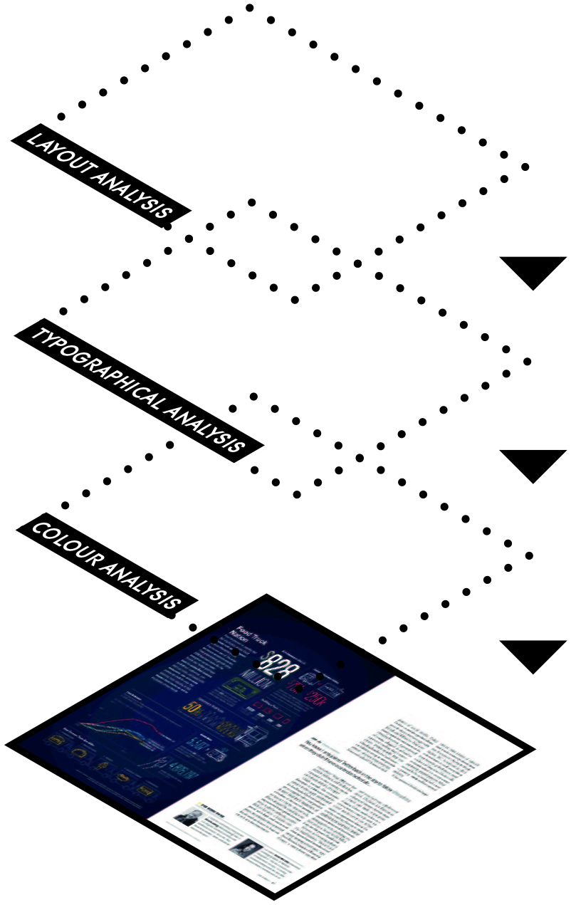
This visual essay looks at the rhetorical practice of popular science magazines with regard to selected aspects of their graphic form and structure. It presents two ways in which visualizations can display crucial elements in an empirical study of graphic design. First, we can visualize the overall analytical approach and components of a methodological rationale, explaining the ‘how’ of a study. Second, we can translate the results, i.e. observations on the data, into a visual, infographic display that offers quantitative distributions and patterns.
Once visualizations have been created in this fashion, not only do they represent an effectively surveyable shorthand for methods and results of empirical research, but they can also become visually expressed topoi in an academic argument (see Pflaeging, 2013, 2018).
National Geographic
The materials used for our methodological explorations of layout, colour and typography come from the July 2015 issue of the popular science monthly National Geographic. The magazine was first published in 1888 as an academic journal of the ‘National Geographic Society’. Ten years later, a noticeable ‘turn to the popular’ was initiated and National Geographic evolved into one of the most prominent magazines on the American market, with a particularly strong reputation for its image-heavy popular science journalism, e.g. in short-form genres (see Pflaeging, 2020). Photojournalists also showcase their art in the extensive feature articles, now the most traditional and prominent journalistic texts in the National Geographic.
The Flow of Double-Pages
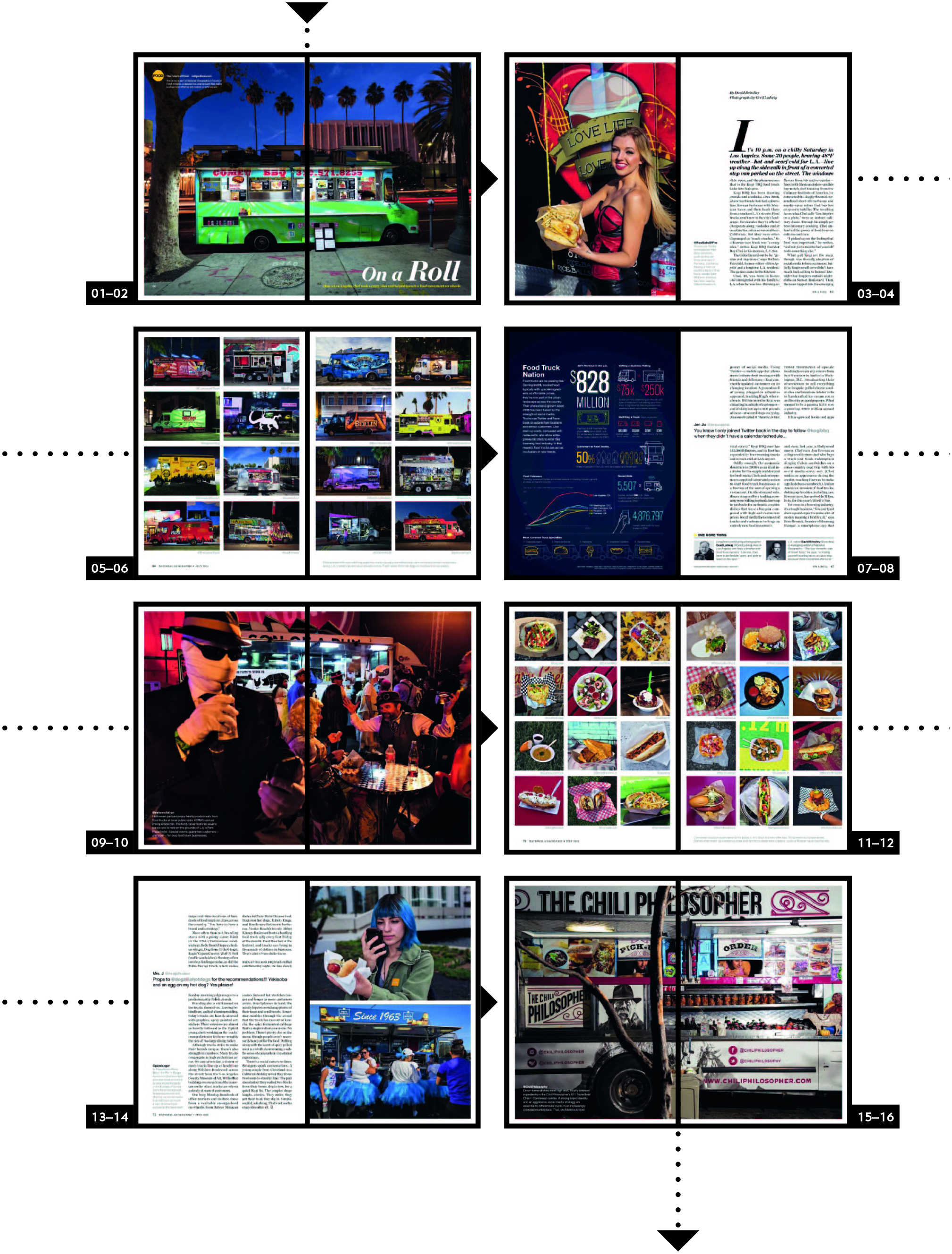
To the casual reader, a longer feature article primarily comes as a flow of pages, text and images, which have been designed by a calculated use of layout, typography and colour. Integrating all these formal and structural clues in perception, the reader pieces together a rough idea of the text’s content and its overall logical arrangement. What will stand out verbally and guide their fleeting interpretation are likely to be headlines, inserts, captions and add-on text boxes. Pictorially, skimming the feature article will result in an idea of the sub-topics that constitute the narrative or argument (Pflaeging, 2017b). Any high-quality feature will make sure to adjust text and images optimally so as to make these two semiotic modes interlock and cooperate in comprehension as effectively as possible. In our example, image-flow alone may allow the browsing reader to form a gist of the story without engaging with the running text and to selectively deal with only some sections of the feature.
Layout
Decomposing & Measuring the Page Space
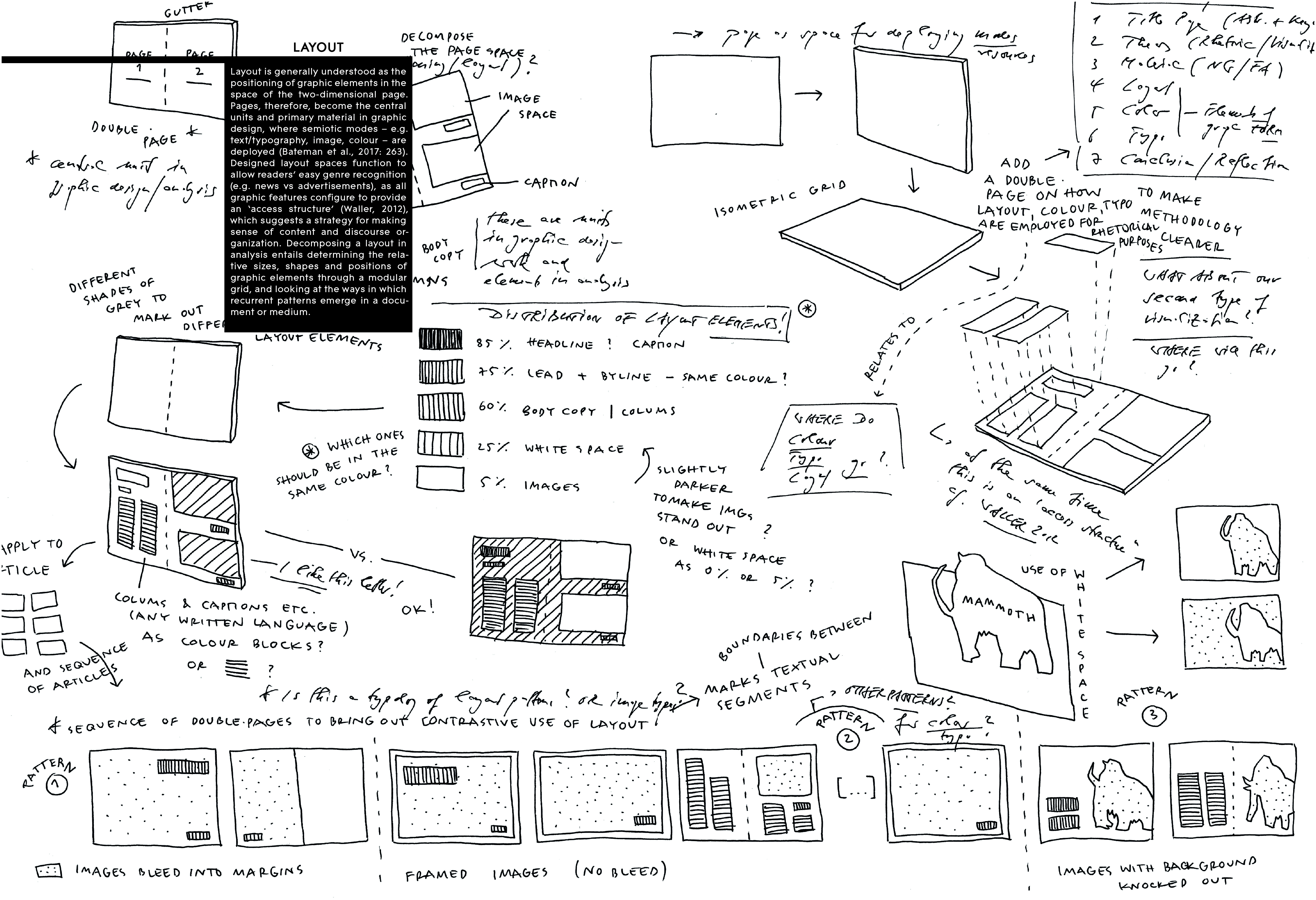
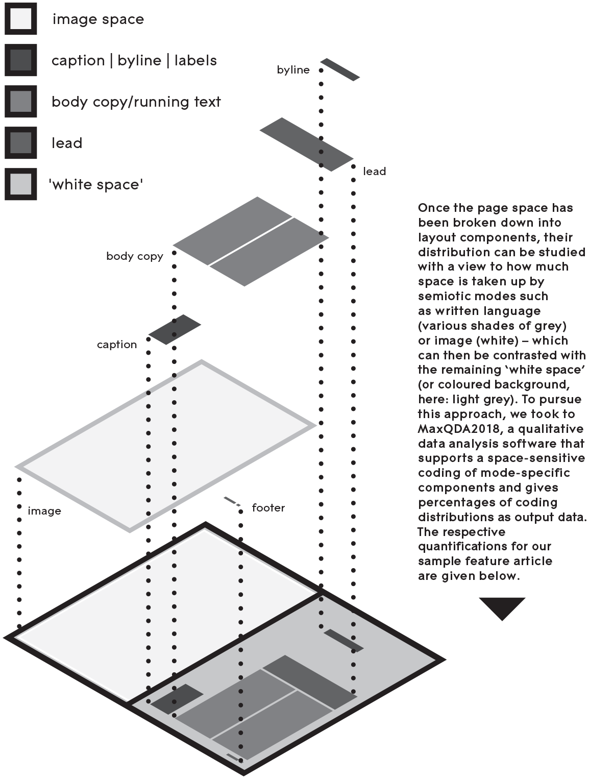
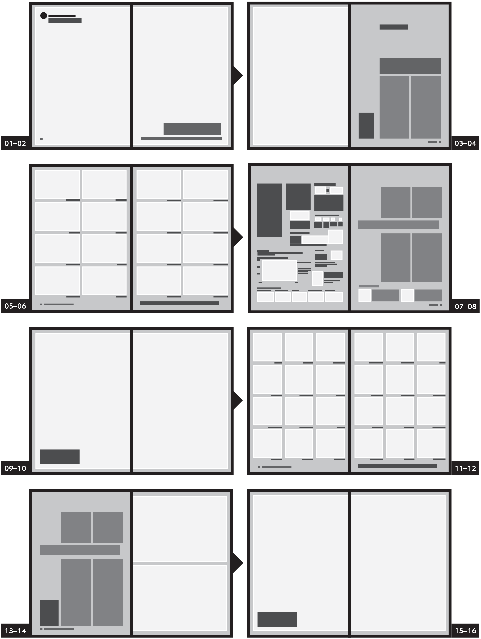
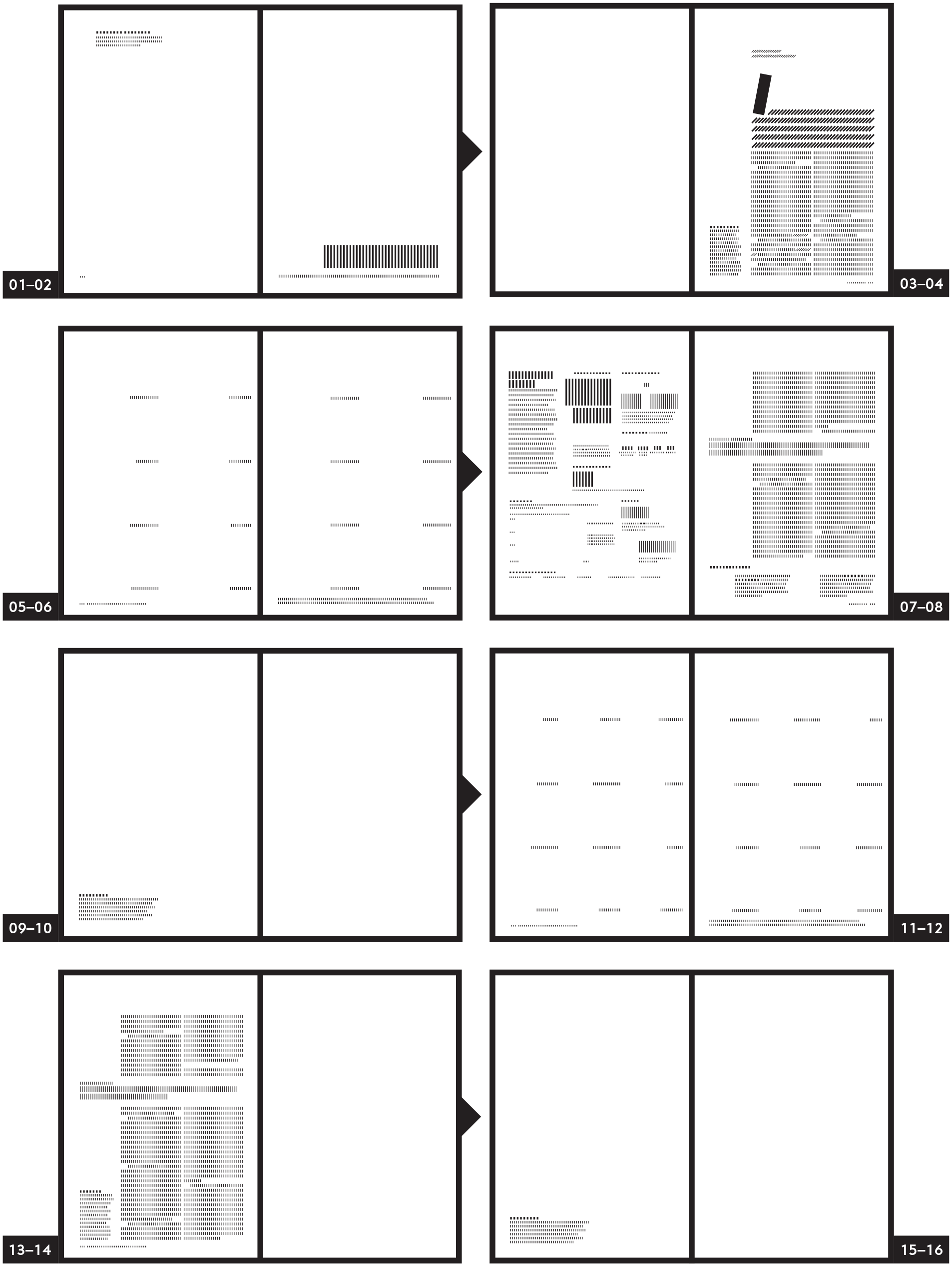
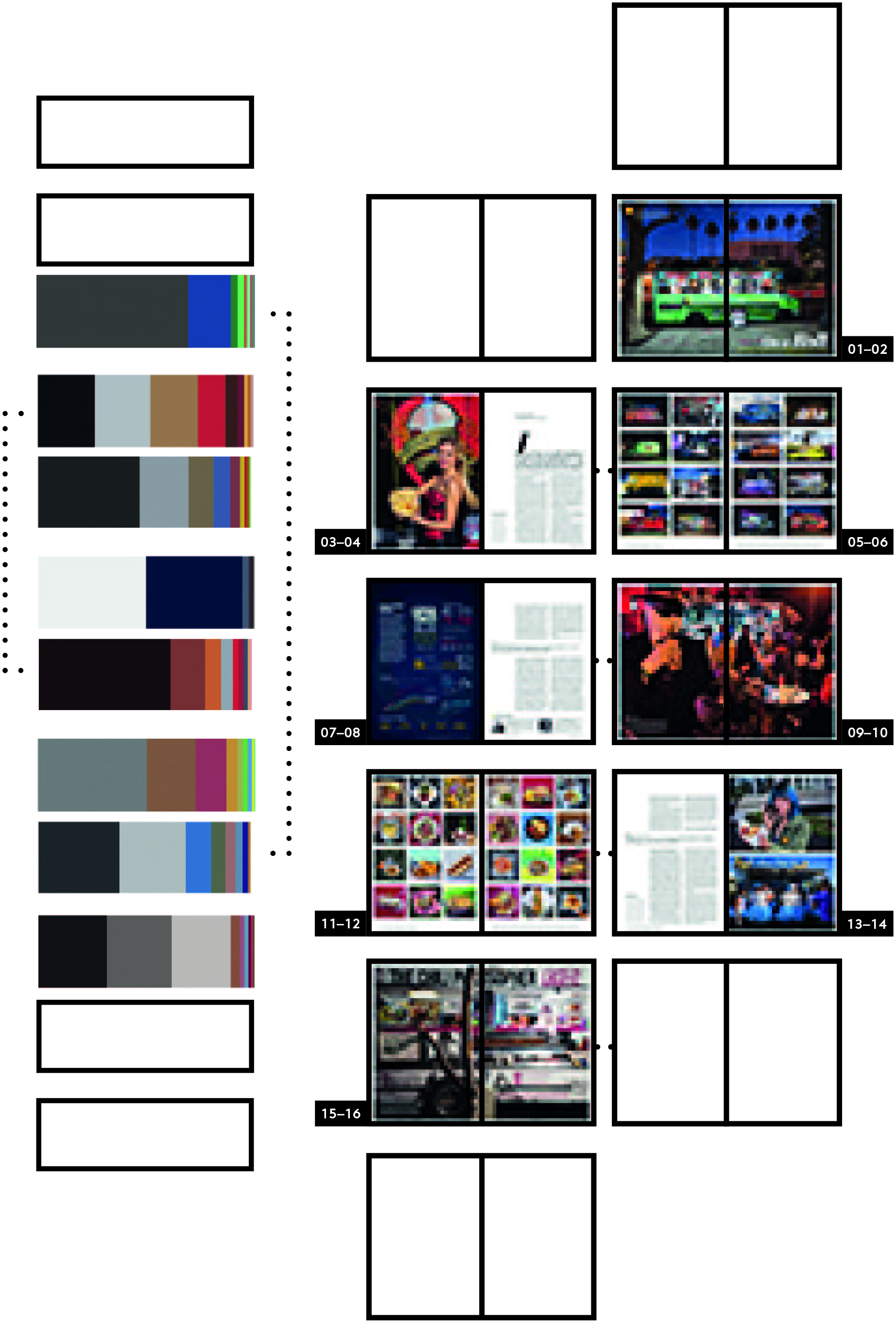
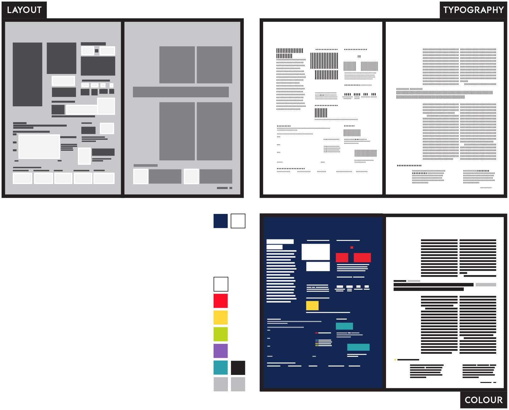
Layout can best be studied by decomposing the page – the central semiotic organizing space of a genre – into various constitutive graphic elements. An isometric grid proves useful here in order to faithfully record the positioning and size of each building block. Essentially, such an analysis recreates the work of the graphic designer, who achieves recognizable layout-patterns by positioning, typographic marking and white spaces. The analytical focus may primarily be on an analogue schematic representation of the individual pages in a document; a subsidiary aim might be to quantify the spaces occupied by recurrent elements, such as headlines, inserts, captions and images.
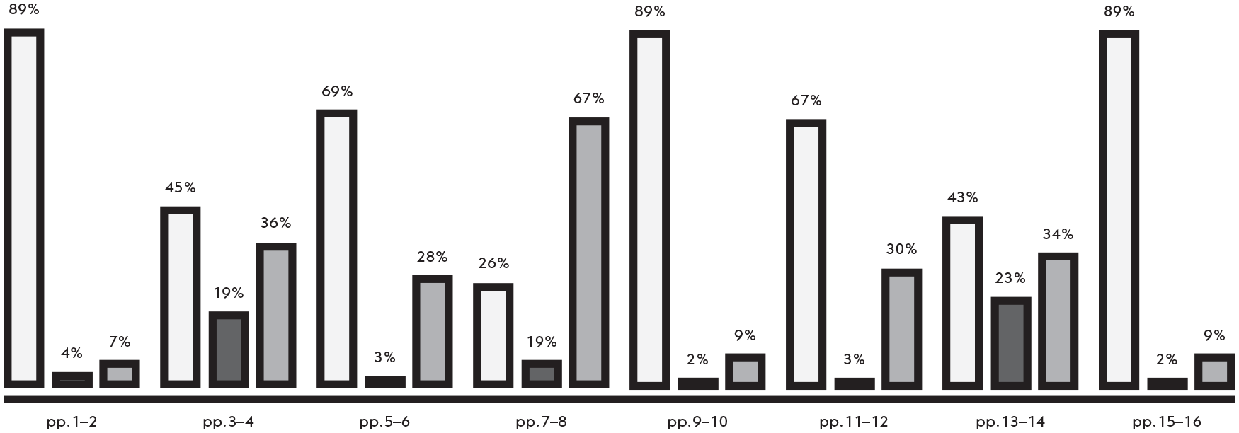
As our sample analysis here demonstrates, enquiries into layout provide the layout patterns of individual and double-pages. These constitute a repertoire of patterns valid for the object of study and functioning as a yardstick for comparison. Looking at the flow of pages, the analyst can also glean how the patterns have been used to create a sequential structure of layouts, which contains repetitions and specific configurations of layout patterns for rhetorical effect. In this way, media like National Geographic can be understood as more or less standardized collections of layout templates, which can flexibly be filled with material and built up into varying structures (Pflaeging, 2017a, 2017b).
The sample feature article contains four essential layout patterns. The intro- and outro- double page as well as pp. 09–10 represent the first pattern, accommodating a full-page image and a caption/headline. A second pattern is made up of a multitude of small images with captions each (pp. 05–06 and pp. 11–12). Text-only pages (p. 08 and p. 13) that differentiate between running text, pull-out quotes, captions and add-on text boxes constitute a third layout pattern. Finally, the title page (p. 04) stands out as a pattern which, in addition to running text and caption, typographically marks a journalistic byline and a lead. Rhetorically, it is important to see each type of layout as affording a specific functionality – from showing/explaining a sub-topic over classifying/surveying facts to narrating a story or building an argument.
Typography
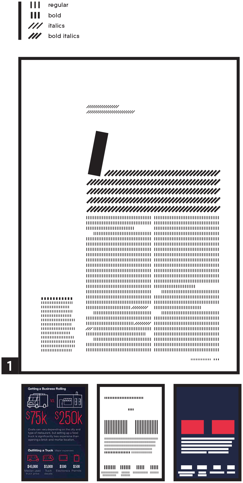
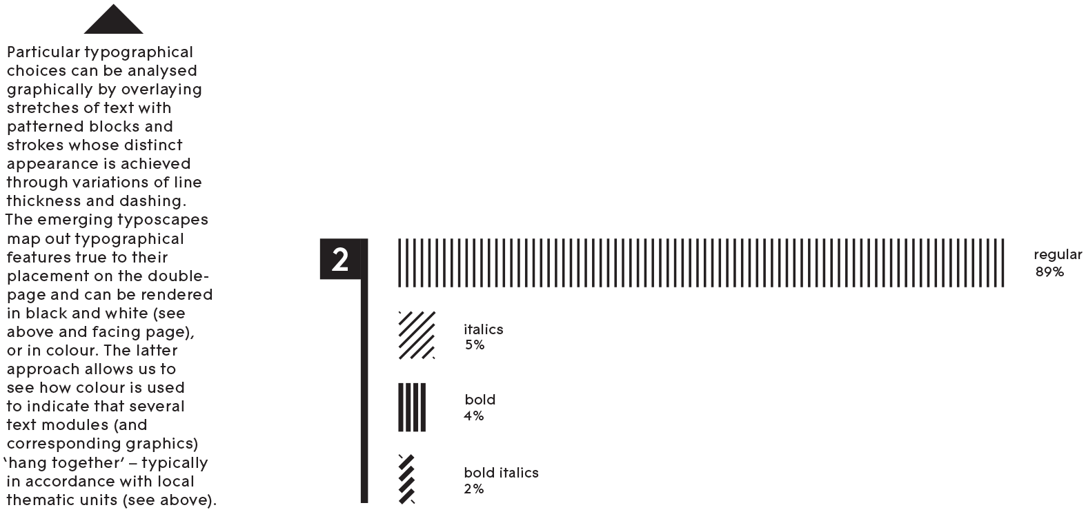
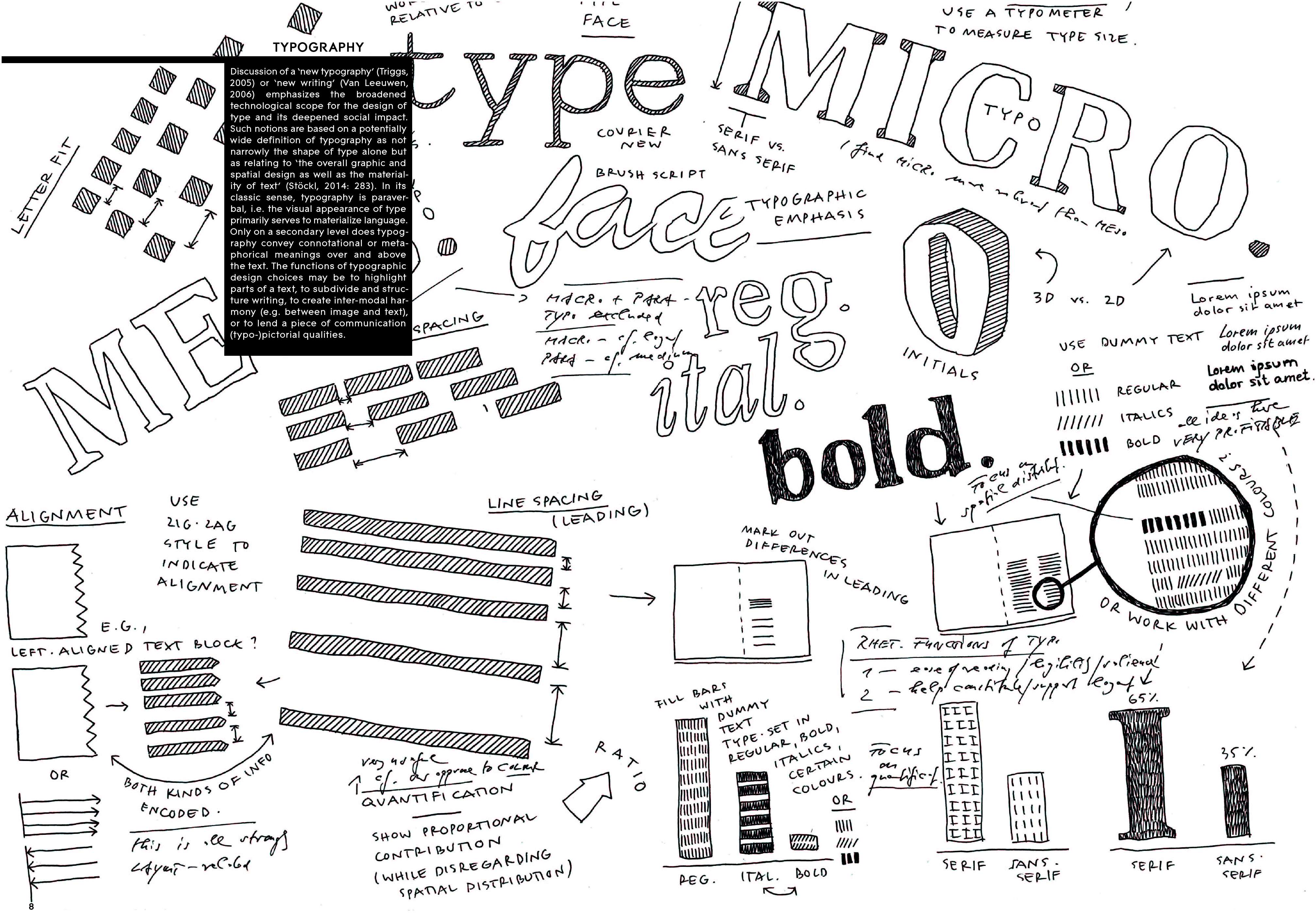
Charting the Typoscape & Calculating Typo-Profiles
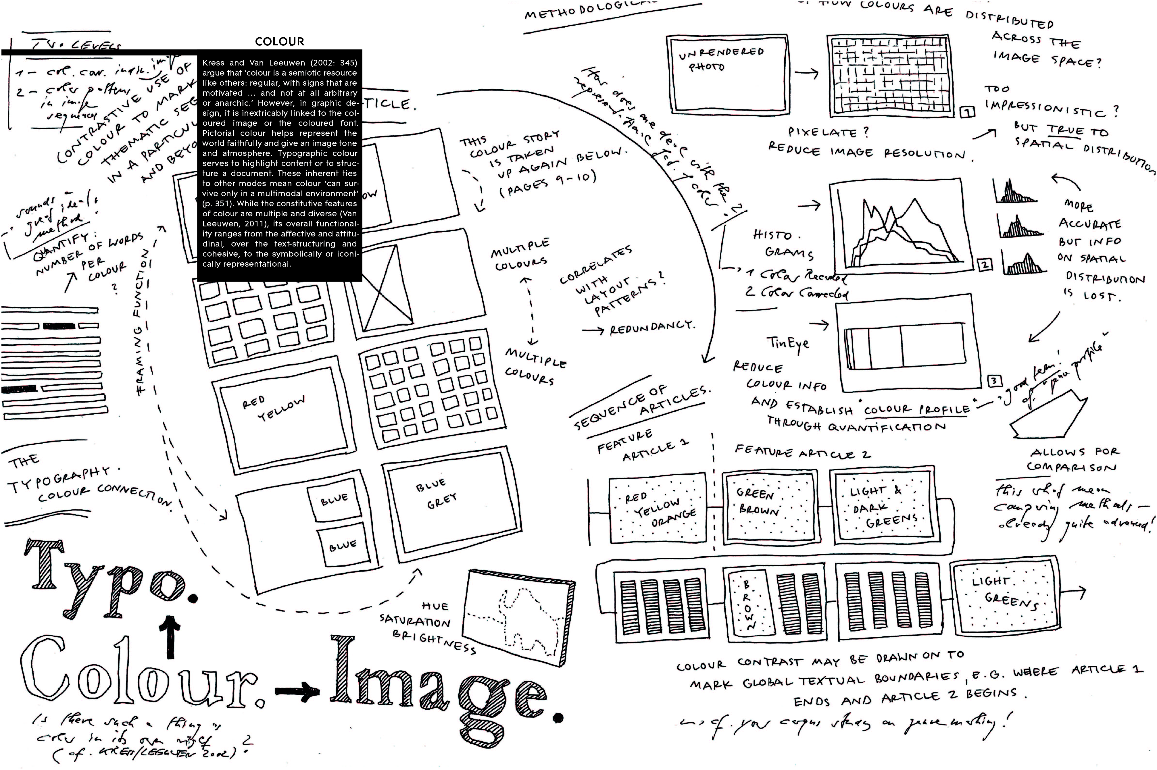
Any method for ‘measuring’ typography must choose a focus: we decided to ignore the macro- and para-typographic (see Stöckl, 2005: 210) as these dimensions relate to the entire feature article and the magazine-medium. Instead, we opted to explore elements of micro-typography as these are sufficiently minimal/distinct and relate to the page as the central organizing unit. Two approaches commend themselves: first, the font types and styles used may be captured in their actual spatial distribution. This can be done by filling the respective spaces, i.e. paragraphs, columns or blocks, with dummy text. Colour coding the visualization brings out how colour is employed to connect and disconnect text and non-photographic illustrations. Second, these very typographic elements may be measured in their proportional distribution, yielding a real quantification.
In this way, the analyses produce an idea of which fonts (e.g. serif, sans-serif) and font styles (i.e. regular, italics, bold) the feature article utilizes where and for what rhetorical purpose. This serves judgements of reading ease and brings to light any emphatic uses of micro-typographic features. As most typographic elements inherently facilitate the layout, any measurement of type will also automatically enable statements about the design of the overall page.
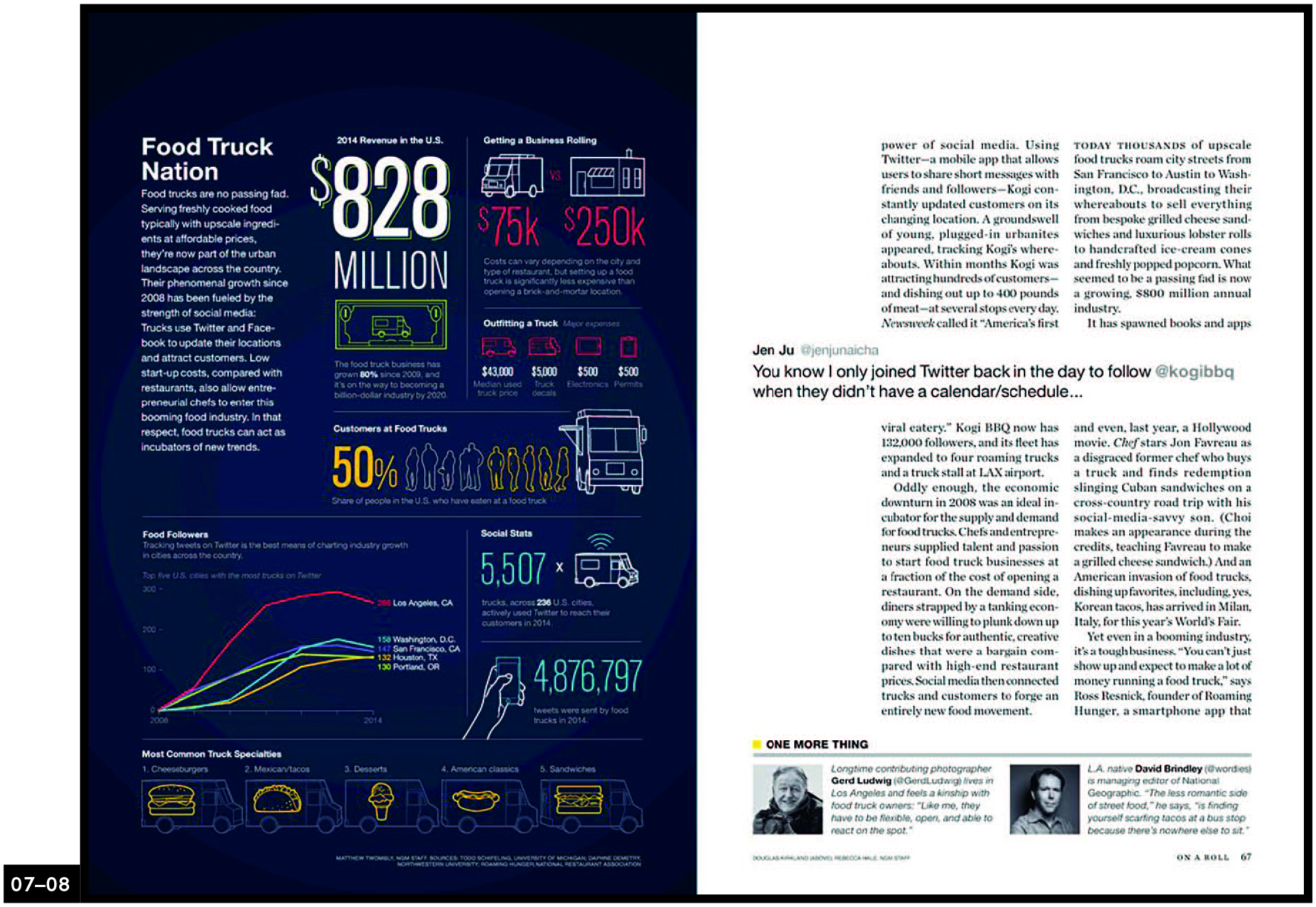
A micro-typographic look at sample p. 04 reveals three relevant observations: first, the page-space uses triple-coding – i.e. bold, italic font + large initial – for the introductory paragraph (lead), thus underscoring its significance. Second, the caption is set in a markedly different font from the running text of the columns; its sans-serifed, new-Antiqua characters match the content orientation (social media), they connote modernity and screen legibility. Third, meta-communicative parts of the text – byline and footer – are marked off by italics and small caps, respectively. Rhetorically, these and other typographic patterns function to signal types of content, identify places in an order or configuration of text parts and support optimal legibility or emphasis.
Colour
Resolution Reduction & Colour Profiles
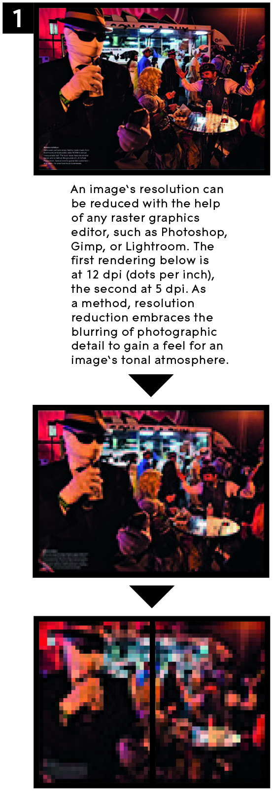
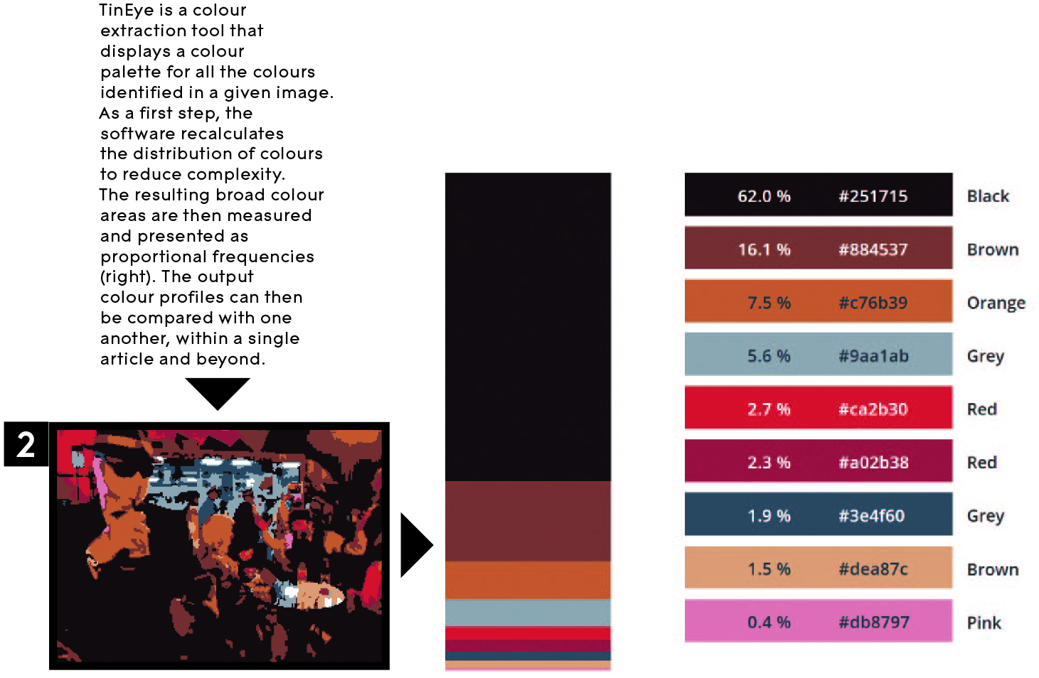
One way of ‘measuring’ the colour characteristics and array of tones is to reduce the image’s resolution. While this approach maintains the distribution of colours in the image space, it provides only a rough idea of which colours and tones are represented and to what extent. By contrast, a colour profile is more accurate because the bar produced with the help of a software called ‘TinEye’ faithfully records the proportion of colours present as broader or narrower individual stripes. However, this visualization cannot render the spatial distribution of the colours.
Adopting either method, the analyst is now in a position to adequately gauge the colour/tonal qualities of all individual images in a feature article and compare them with one another. This forms the basis for recognizing the calculated use of similar or starkly contrasting colours in a series of images, which would be ways of indicating sense-continuities or semantic contrasts. The image-flow or layout patterns in an illustrated feature seem crucially determined or even constituted by such calculated colour harmonies or disagreements – just as they are by parallels and dissimilarities in image composition.
In our sample, the colours of some content- and function-related images conspicuously rhyme: reddish tones dominate the images on p. 03 and pp. 09–10, bluish tones link both images on p. 14. All of these demonstrate typical uses of food trucks. The many small photos assembled on pp. 05–06 and pp. 11–12, on the other hand, seem to deliberately contrast in colours; their diversity emphasizes the variety of types (trucks and food) collected. Overall, any clear measurement and visualization of colour characteristics in images facilitate a systematic enquiry into patterns of image-flow and layout.
The Rhetoric of A Double Page Spread
Reassembling the Pieces
Our analysis essentially breaks down a perceptual whole into formal–structural elements. These are rooted in professional graphic design work, where they represent individual tasks to be performed or decisions to be made. In the reality of reading, however, layout, colour, typography and other elements of graphic form are closely intertwined and do not easily separate in the process of perception.
So, for example, on pp. 07–08, stylistic choices with regard to typography, colour and layout jointly produce the specific appearance of the page, which distinguishes two columns of running text, insert and author/Twitter-handle, as well as add-on text and small-print info (picture credits, footer). Colour in its own right is instrumental in marking important distinctions (see p. 07), such as the development of food-follower numbers in various US cities or the types of food sold. On p. 08, the small yellow square marks the separate add-on section at the bottom that contains editorial opinion, a function that is supported by the positioning of the two portraits and text paragraphs. Coloured type, on the other hand, plays a major role in highlighting important numerical facts about the feature’s topic (p. 07). However, colour is supported in this function by type face (a sans-serif font that contrasts with the serif font of the body copy, for instance), type size and styles (regular, light, condensed, bold, shadowed) and its positioning (layout). Ultimately, then, while each formal–structural characteristic can be shown to fulfil a rhetorical function, it is only in unison that its full potentials play out. The page provides the site for this inherent interconnectivity, where all these elements are deployed and organized in relation to one another. What exactly these functional relations are is teased out in the kinds of analyses demonstrated here.
Rhetorical Effects
Traditionally, rhetorical effect is regarded as rooted in the organization of an argument or story and in the choice and configuration of words. In this visual essay, we have proposed that elementary graphic forms also perform rhetorical functions. Generally, rhetoric can be instrumental in three well-known ways: first, by forming a convincing argument (logos), second, by stylizing the author as a paragon of whatever is favourable in the situation, and, third, by appealing to the emotions, tastes and attitudes of the recipient. This trio of functions translates well into the graphic design of a feature article: layout, typography and colour must work together to organize a discourse, to convey a distinct image of the professional journalist and to sure-footedly address the mind-set of a target audience.
Abstracting from the specific rhetorical functions of the various elements of graphic form and structure, we might perhaps set up two super-ordinate macro-functions: on the one hand, graphic form elements create a visual structure in the space of a page that indicates patterns of content-coherence and connectivity. On the other hand, through highlighting and guidance, they signal the relative importance of the parts in a page or document design.
Conclusion
Based on magazine design, a heavily visual and culturally central mass-communicative practice, this visual essay has developed methods for measuring and ascertaining the rhetorical impact of three interwoven elements of graphic form and structure: layout, typography and colour. The resulting visualizations demonstrate the various approaches to the material and accumulate measured data to form clear ideas of the patterns and effects at work in the concrete example. It is our conviction that visualizations of these kinds offer a considerable epistemic value in and of themselves. They provide the empirical facts of graphic design and demonstrate the ways in which design conventions are rhetorically motivated and how they play out in their various constitutive elements.
The methodological rationales proposed here take two directions. On the one hand, in a top-down fashion, we identified elements of graphic design that merit and allow for ‘measuring’. Here, we marshalled suitable software for time-economy, but had to also manually annotate the material, not quite avoiding the cumbersome. On the other hand, in a bottom-up fashion, the tools devised enabled us to reliably measure graphic forms and put this data together in meaningful ways. Both directions interact continuously and are inseparably interwoven in our work. Ultimately, our analytical focus was also twofold: spatial distribution and quantification of graphic categories. The first produced holistic patterns of page-design; the second verified those elements that dominate and become salient. Both go hand in hand; one cannot be had without the other.
Finally, our work has pursued a non-trivial and practically complicated aim: to tease and separate out individual graphic design elements from a perceptual whole. Such a target is not easy to aim for as most of these elements are para-semiotically interwoven with language and image, or with the very graphic material of the page-space. Once devised and professionalized, the methods tested and visualized here can be put to use for many purposes. Besides facilitating reasoning about rhetorical functions on firm empirical ground, such methods lend themselves to exploring entire media, contrasting them and tracing their historical development.
Footnotes
Funding
The authors received no financial support for the research, authorship, and publication of this article and there is no conflict of interest.
Biographical Notes