
Abstract
Community health care services are considered integral to overcoming future problems in health care. However, this sector faces its own challenges, such as how to organise services to provide coordinated care given: their physical distribution, patients using multiple services, increased patient use and differing patient needs. The aim of this work was to explore, analyse and understand patterns in community referrals for patients aged 65 years and over, and their use of multiple services through data visualisation. Working with a large community provider, these methods helped researchers and service managers to investigate questions that were otherwise difficult to answer from raw data. Each map focuses on a different characteristic of community referrals: patients reusing services, concurrent uses of different services and patterns of subsequent referrals. We apply these methods to routine patient data and discuss their implications in designing of a single point of access – a service for streamlining referrals.
Keywords
Introduction
Community health care is formed of clinically diverse services that provide local health care close to or in patient homes. Within the United Kingdom, these services are free at the point of access via the National Health Service (NHS) and range from potentially recurring, long-term care consisting of several appointments (such as clinic-based diabetes services) to shorter, potentially one-off episodes of care (such as home-based nursing visits). The planning and operation of community services is thus challenging given the breadth of their roles, diversity of care and complexity of patient use.
Community services are seen as crucial in meeting the current and future challenges facing health care. 1 They help to ensure that care is: person-centred, coordinated and closer to patients’ homes; maintains patient health and independence; and minimises acute admissions and hospital stays wherever possible. 2 Several high-priority national policies within the United Kingdom, such as the Better Care Fund and the NHS Forward View, 3 require a larger role for the community sector. Thus, there has been an emphasis within NHS policy towards moving services out of acute settings and into the community. This is often motivated by the perceived benefits that increased community care may lead to reduced health care costs, improved access to services, improved quality of care, a greater ability to cope with an increasing number of patients and improved operational performance in relation to a patient’s health and time. 4
Given the importance of these services, there is a growing emphasis on delivering more care within the community sector and the questions around how best to manage these services. One important question is: how services may be organised to provide coordinated care given their physical distribution, patients using multiple services, increased patient use and differing patient needs? This is where the application of operational research methods to community health care may contribute. 5
A patient’s history of community care – the services they have used and the services that they are currently engaged with – is stored and recorded within an electronic database, referred to as electronic health records throughout this article. Importantly, a patient’s use of and access to these services can vary greatly. Depending on the service, it is typical for patients to first access these services via a referral from a clinician in primary care, such as a general practitioner (GP), from an acute hospital or from social services. In this context, a referral is a transfer of care between services made by a formal request and can be made by a range of health care professionals. Subsequent referrals may also occur with community services being able to refer to other community services. Likewise, in some cases, a patient may self-refer directly.
Patients commonly use a range of community services throughout their lifetime, some of which they may reuse or use in conjunction with others. The above characteristics make planning within this sector challenging due to complex referral pathways and dynamics of patient use. 6 Adding to the complexity, community services may be provided by a mixed economy of different types and sized organisations 2 and patients may be referred between different services and sectors, thus requiring careful co-ordination. For an example of the full range and complexities involved in planning community health care services, see Hulshof et al. 7
With the wealth of collected data, accessible analysis and collaborative research are key to addressing the challenge of how to best organise referrals within this sector. We have worked with a large community health care provider in London to understand the dynamics of community referrals and inform service planning through visualisations of referral data. Such visualisations may enable researchers and service managers to investigate questions that are otherwise difficult to identify and answer from raw data by presenting the data in understandable, intuitive and informative ways. In particular, such analyses help to highlight key patterns and relationships within the data. For an overview of visualisation methods, see the study by Cleveland and McGill, 8 which briefly identifies and summarises some of the key principles behind data visualisation and comments on some features of graphical representations that may lead to more effective interpretation.
The aim of this work was to explore the large and complex system of community care through the visualisation of data, for patients aged 65 years and over, focussing on uses of multiple services and whether common patterns of referrals exist. In this article, we focus solely on services provided by a single Trust in a single borough of London (the only state provider of community health services in the borough). The patient group was chosen due to the operational difficulties of these services and mix of service users. For example, the diverse profile of services makes planning and organising difficult, as do the multiple points of access for each service. Furthermore, it is highly likely that this patient group would use several community services due to the increased likelihood of multiple morbidities. Finally, within the UK, elderly care has been at the forefront of the NHS’s future health care policies,3,9 making this a timely selection of patient group. Given our aim, the research questions were as follows:
How can data visualisation help understand complex dynamics in community health care?
How can key patterns of referrals and timings of patient use be identified through data visualisation?
How could the information gained from visualisation inform the future planning of services?
At the time of carrying out this analysis, care managers for the community services were beginning to design a single point of access (SPA). The SPA is a service that manages referrals into and between community services, seeking to streamline the process and reduce inappropriate referrals. The plans to implement this service presented an opportunity to make a timely contribution; thus, we undertook a collaborative approach to help inform their thought process in designing this service.
We begin with a brief exploration of the literature on visualising electronic patient records and referral data across health care settings. This is followed by a discussion of our initial steps and the data we used. A descriptive analysis of the data is presented in the ‘Methods’ section, alongside a description of each visualisation. We then present an application of these methods.
Applying these methods to their data, we draw out some implications towards informing their thoughts about the design of their SPA and discuss the benefits and limitations of the visualisations. We conclude with remarks about possible directions for future work.
Research landscape and original contribution
Several studies have used data visualisation to understand electronic health records, presenting a range of different methods, applications and insights. A systematic literature review on methods for visualising electronic health records 10 included 18 articles published between 1996 and 2013. A range of methods are presented from evaluations of single-patient data sets to larger sets for multiple patients, different colours and sizes of both text and objects; visual filters; and interactive methods used to help explain differences in data.
Several papers from this review were relevant to our work. For example, the work by Plaisant et al.11,12 in developing and extending LifeLines – a method for visualising individual patient histories through a series of timeline plots. Regarding larger sets of multiple patients, Falster et al. 13 visualised linked health data, exploring what events may occur before and after preventable hospital admissions. Using several timeline plots in parallel, they presented a rich analysis of length of stay and different types of care interactions to identify patterns of care that preceded or followed a preventable admission. Overall, the application of visualisations to health care highlights how complex data can be presented in a straightforward and digestible manner, providing valuable insight. In addition, more complex methods may help to identify key patterns within the data. 13
A common visualisation method is network representation where pairwise relationships between sets of entities are described by a collection of shapes (nodes) and lines connecting them (edges) (see Figure 1). Nodes are connected by an edge if they relate to each other, for example, if nodes represent services, an edge connecting them may represent a referral between them. This structure can be visually informative and provides a means of mathematical analysis, such as graph theory 14 or social network analytics. 15 In this article, we are particularly concerned with using networks to display and communicate information.
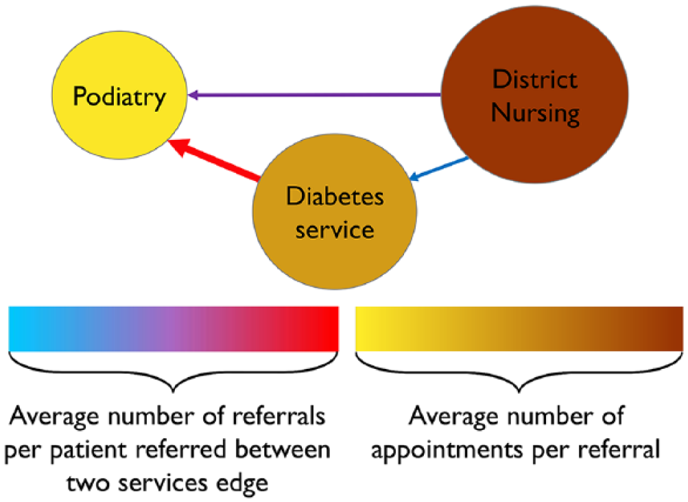
Diagram of a simple network representing referrals between services.
Network representations may be used to understand a variety of health care processes. For example, in Zhang et al., 16 having identified subgroups of patients, network representations were used to understand clinical pathways within chronic kidney disease care. Node and edge sizes were used to represent the number of patients in specific states and the number transitioning from one state to another, respectively. Node colouring highlighted key information such as the type of care interaction.
In addition, Soulakis et al. 17 produced an analysis of data for hospitalised patients with heart failure conducted using network methods. The sharing of patient records between providers was visualised with node size indicating the number of patient records used by a provider and edge width representing the number shared between them. Node and edge colouring were used in combination with an analysis of the network’s structure for identifying sub-networks of providers who commonly shared records. Thus, node colour related to the group in which the provider belonged and edge colour to their source. These examples highlight how network visualisations can be used to understand different characteristics and patterns within a data set.
Our work makes several contributions to this research landscape. We present a range of methods, each exploring different characteristics of community referrals, forming a comprehensive analysis. To our knowledge, this is the first visualisation work to consider community health care and the referral dynamics of this sector, in particular: analysis of a wide range of different services, reuse of services and concurrent uses of different services. While applied to a single provider, the methods are generalisable and easy to use in other boroughs, trusts and organisations. These maps are visually impactful, informative and simple to create, increasing their scope for use and application in practice.
Methods
Initial steps
This project was established, scoped and formed with the input of our collaborating Trust. To begin, we organised scoping meetings with clinicians and care managers from a broad range of community services (over 15 services). These contacts were provided by the Associate Medical Director for Quality Improvement and included care leads from physical health services and mental health services. These meetings were undertaken as part of an immersed operational research approach involving problem structuring and exploration through shadowing, facilitating consultations and project refinement. 18
The aim of these meetings was to learn from the Trust’s staff, especially regarding their understanding of how the system was formed and operated. These meetings consisted of informal discussions – either face to face or by a phone call – and a session in which staff participated in two mapping exercises. The discussions were carried out to gain an understanding of what type of care is provided by each service, what a patient’s typical use of service looks like and the timeframe of a typical patient use. The aim of the mapping exercises were to identify: the types of community services delivered by the Trust, how patients were referred into and between them, whether any common pathways existed (theoretically and in practice), whether there were any significant characteristics that we should consider from the outset and whether any previous attempts had been made to visualise this system.
From these exercises, three main characteristics were discussed. First, that all 30+ community services for physical health (services for treating physical ailments only) provided by the Trust we partnered with could theoretically refer to each other, while in mental health referral, pathways were more clearly defined. Second, it was believed that a large proportion of possible referral paths would be used. Finally, that it was common for patients to reuse services multiple times. We therefore sought to use visualisation methods to understand the referrals within the system formed of physical health services in order to understand the key dynamics better. The next step was to obtain and explore patient data for producing these maps.
Routine patient data – content and cleaning
We used a non-identifiable, patient-level, routine data set of patients aged 65 years and over, who used our collaborator’s community services within a single borough. When analysing patient data, there are several ethical considerations regarding the storage, handling and use of the data.
To ensure that data were secure, it was stored within a Data Safe Haven, 19 an encrypted technical solution for storing, handling and analysing sensitive data. This Haven is certified to the ISO 27001 information security standard and conformed to the NHS Information Governance Toolkit.
Regarding the use of health care data, in undertaking this work, we ensured that we fully complied with both the Trusts and academic ethics and governance processes throughout. At the outset, we sought both NHS and institutional ethical approval. From the HRA tool and consultation with the Trust, there was no need to gain NHS ethical approval due to nature of the research. Thus, we sought institutional research and ethics review, during which the research was deemed to not require review, thus our application to the review process was removed during the initial screening. These decisions were made based on our use of non-identifiable pseudonymised patient data in a non-interventional study. Conformity to the governance process was ensured by removing all time stamps and instead using days since a patient’s index referral and ordered referral markers to manage the data set.
It should be noted however that the data are of commercial sensitivity to the Trust. These data are used for contracting purposes, financial forecasting and performance measurement among others. Thus, in bulk, it provides comprehensive and detailed information as to how the Trust operates that may affect its financial future. To this end, we are unable to publish interactive versions of our reproducible results since this would make a large amount of commercially sensitive and detailed data available.
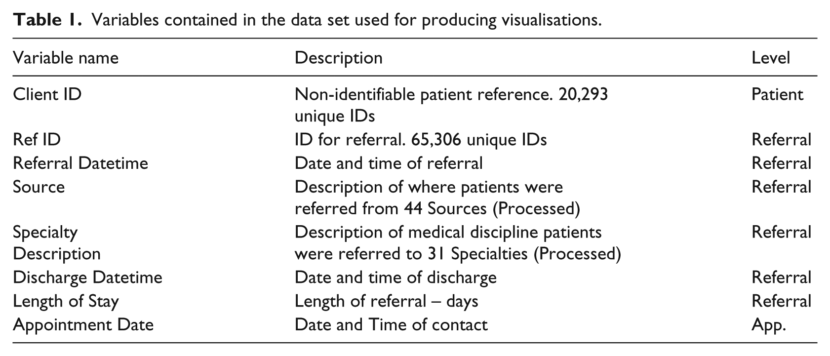
The data consisted of all referrals between 1 April 2014 and 31 August 2016. Lasting from the date of referral until discharge, referrals consisted of one or more appointments – represented as a row in the data. Thus, a patient’s community care history could span multiple rows and consisted the combination of their referrals to community services.
Table 1 details the key information required for our mapping and the level it was recorded at – patient, referral or appointment (App.) level.
Variables contained in the data set used for producing visualisations.
Prior to its use, the data were cleaned using a semi-automated pattern matching and duplication identification to find data that had been input incorrectly or were missing. For example, times were frequently incorrect or missing and often recorded as midnight rendering the information unusable. As a result, fields with missing data were not used within the analysis and we did not use imputation methods to counteract this. Furthermore, in some cases, multiple labels were used in the data set. For example, some services were recorded under multiple names, such as the Nutrition and Dietetics Service which was also recorded as: Adult Nutrition & Dietetic Service, Nutrition & Dietetic Service, Nutrition and Dietetic Service. To overcome this, we used only a single label pertaining to the most common usage and changed the other labels to align. After cleaning, several subsets were produced for analysis.
Initial analysis of individual patient pathways
The data were left truncated with some referrals beginning before 1 April 2014, and right censored such that not all referrals had concluded by 31 August 2016. Only appointments from 1 April 2014 onwards were included in the data. Due to left truncation, a patient’s first referral is unknown; we therefore note their first referral in the data as their index referral. Figure 2 illustrates the above, providing an example of hypothetical referral data for an individual patient. To overcome difficulties presented by incomplete data, we only use information for referrals that had began on or after 1 April 2014 and finished on or by 31 August 2016 in our remaining analysis.
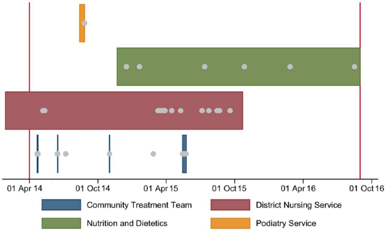
Hypothetical patient level referral data for community health care. The grey dots each represent an appointment.
Informed by our collaborator’s local and expert knowledge, we identified four dynamics of patient use from the individual plots. We anticipated these dynamics having identified them from a systematic review of operational research literature, 5 yet needed to analyse multiple plots to assess the prevalence of these behaviours in the Trust’s services. These four dynamics are indicative of community health care (by design and the nature of the care provided) and are key differentiators of these services in comparison to primary and acute care.
First, there was a large variation in the number and range of services used by patients. Some used a single service once, while others had multiple referrals, sometimes to the same service. This range is shown in Figure 3.
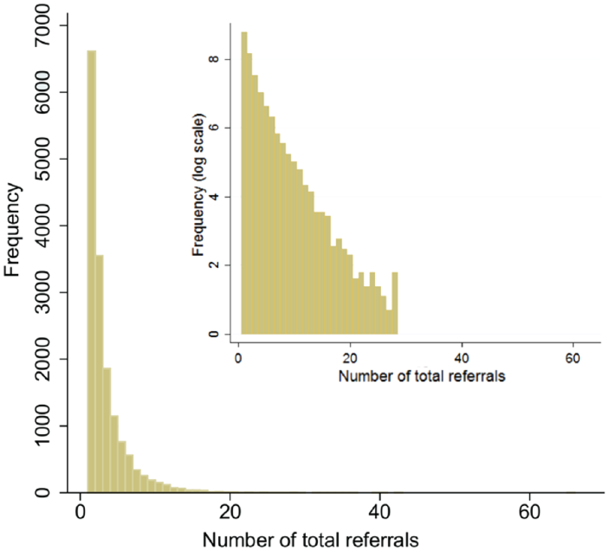
A histogram showing the distribution of the total number of referrals per patient in the data set – maximum of 64 (log-scale inset).
Second, referrals to different services commonly overlapped. Figure 4 shows the distribution of the maximum number of services used at the same time per patient. Third, the number of appointments, timing of subsequent referrals and length of referral varied. The distribution of referral length is shown in Figure 5. While the majority of patients experienced short length of stays, there is a long tail to this distribution with many lasting over 200 days. Notably, in Figure 5, some patient’s referrals lasted over 800 days. Referrals of such length are both possible and expected given the nature of care provided in community services. For example, many services provide long-term care to patients with chronic conditions, thus long referrals would not be uncommon for a service such as District Nursing when caring for home-bound patients. Fourth, we began to see common patterns of referral with patients using similar sequences of services. This information informed the data visualisation methods discussed in the next section.
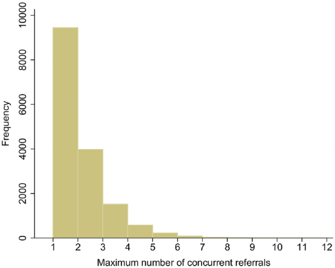
A histogram showing how the maximum number of concurrent referrals, per patient, is distributed within the date range of the data set – maximum of 12.
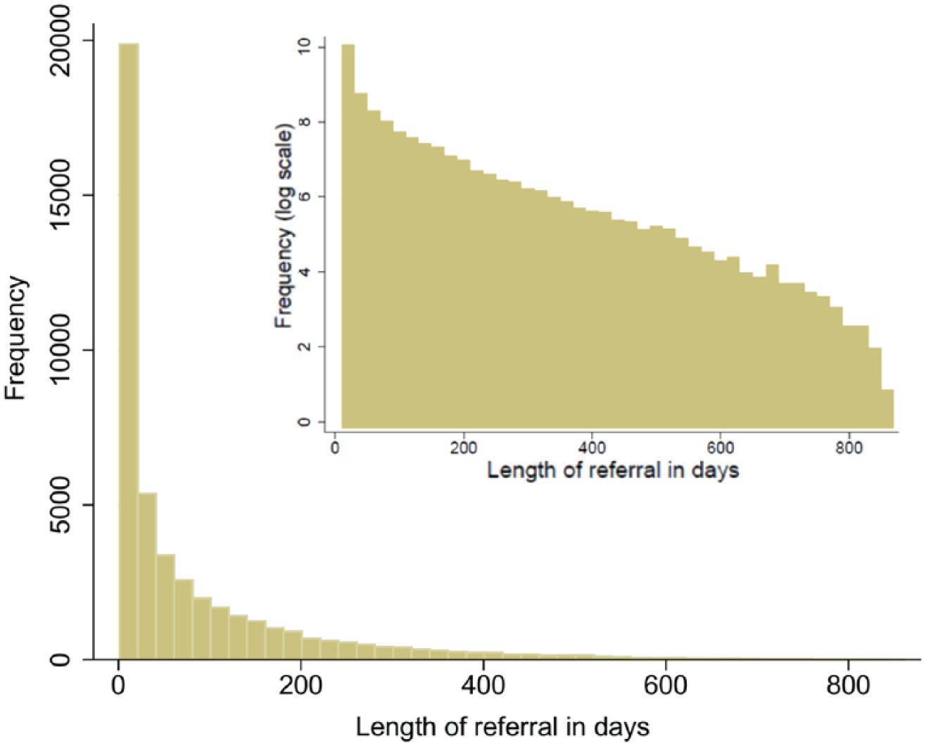
A histogram showing the distribution of referral lengths in days – maximum >800 days (log-scale inset).
Network map
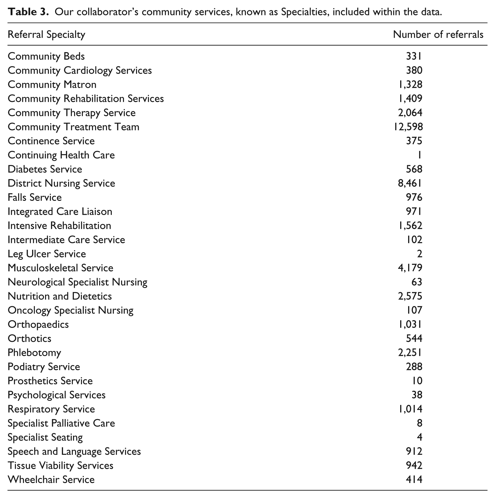
Motivated by the potential complexity of referral pathways, we produced a network map using Gephi. 20 There are two types of nodes in this network – Specialties and Sources (terms taken from the Trust’s data set), Tables 2 and 3, respectively. Notably, the service names in Tables 2 and 3 are those used by the Trust, but are for the most part widely accepted for each. Specialties are our collaborator’s community services based within a specific London borough, while Sources are the services outside of these that refer to them. Thus, Sources may comprise acute services, mental health services, social services or community services from other providers/boroughs. Notably, some Specialties may refer to other Specialties; hence, edges are directed from the referring service to the receiving.
Sources for community referrals included within the data set. Community services included in this table represent those that did not feature as a Specialty in the data set.
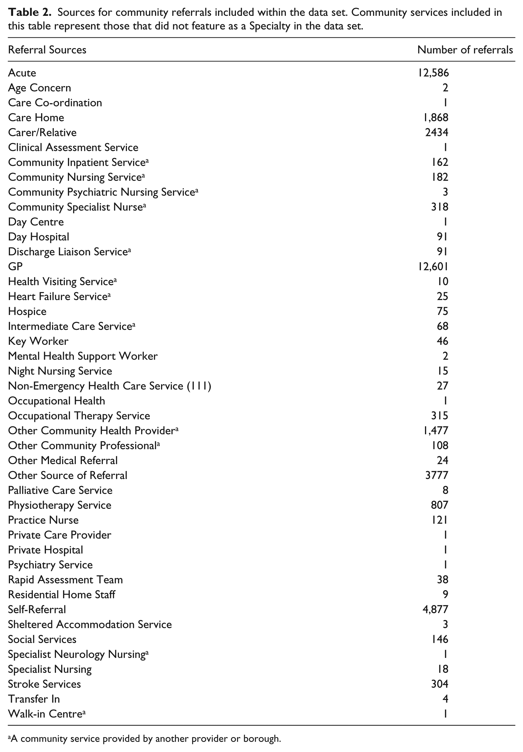
A community service provided by another provider or borough.
Our collaborator’s community services, known as Specialties, included within the data.
Volume of activity and frequency of patient reuse is represented in four ways: edge width, node size, edge colour and Specialty node colour. Edge width represents the total number of referrals between two services – ranging from 1 to 5810, while edge colour represents the average number of times unique patients used the edge. Source size corresponds to the number of referrals initiated, and Specialty size corresponds to the total received. Sources are uniformly white, while Specialties are coloured according to the average number of appointments per referral.
Due to the possibility of multiple Sources referring to each Specialty and left truncation, this network can only be used to interpret pairwise relationships. While visually connected, empirically, the data may not contain continuous paths between more than two nodes.
Chains of referral and concurrent use
Figure 6 shows how the number of patients in their second, third, fourth, fifth and sixth+ referral changes over time, since the start of their first referral – time 0. Figure 7 shows how the number of patients in two, three, four and five or more concurrent referrals changes over time.
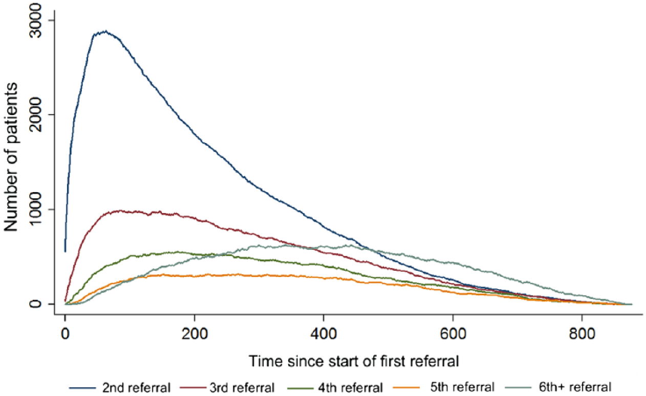
Timelines showing the number of patients in their second, third, fourth, fifth and sixth+ referrals over time. Time = 0 corresponds to the start date of a patient’s index referrals.
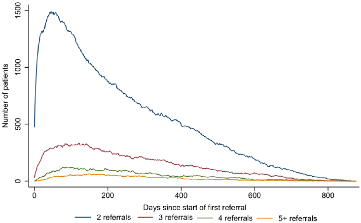
Timelines showing how the number of patients involved in two, three, four and five or more concurrent referrals changes over time. Time = 0 corresponds to the start date of a patient’s index referrals.
Due to right censoring, these plots bias towards shorter referrals. However, they highlight the potential for subsequent referrals to overlap. Thus, we examined the data further to identify chains of referrals, and services which were commonly used at the same time.
A chain occurs when patients are first referred to a Specialty which then refers them onwards to another Specialty. The total number of chains and the frequency at which services featured in them are visualised using the R package ‘alluvial’ 21 (Figure 9).
Similarly, we analyse how patients concurrently used services with an interactive sunburst plot, produced using R package ‘sunburstR’ 22 (Figure 10). By design, any service may theoretically refer to any other, and it was our collaborator’s expectation that many of these services would be used at the same time as one another. Furthermore, due to the nature of these services and the potential diversity of patients, none of these are mutually exclusive in terms of concurrent patient use. The only exceptions are where use of an inpatient service implies it is not possible to concurrently use clinic- or home-based services. Thus, the sunburst plot provides a means for exploring this complex and highly linked characteristic of services.
The sunburst plot (Figure 10) is a hierarchical plot showing the number of patients using different combinations of service. The plot consists layers of rings each divided into segments that represent different services, as indicated by colour. The inner most ring contains parent segments, representing all services used concurrently with at least one other service. The size of each segment shows the number of times this service was used concurrently. In the next ring, the parent segments are divided into sub-segments. Considered in combination with their parent segment, these segments represent pairs of concurrently used services, with size indicating how many times they were used together. Each subsequent ring follows this pattern, dividing into further sub-segments, increasing the number of services used together. This plot is also orderless, aiding navigation. For example, the size of a segment for service A in the second ring with a parent service B is the same size as the segment for service B in the second ring when service A is its parent. Joint uses can thus be examined starting from a service of interest. In creating the graph in this manner, each possible order of service combination appears in the plot. Thus, combinations of three services have six segments in the third ring and combinations of four services have 24 in the fourth ring.
Application to an SPA
Network map
Beginning with the complete map (Figure 8(a)), there are 75 nodes comprising 44 Sources and 31 Specialties (11 referring to other Specialties) with 386 edges representing 45,506 referrals. While visually complex, the relationships between nodes can be explored interactively within Gephi by highlighting individual nodes to reveal its nearest connecting neighbours. When sharing the network with collaborators, this was useful for highlighting key information, exploring the network and identifying services of interest.
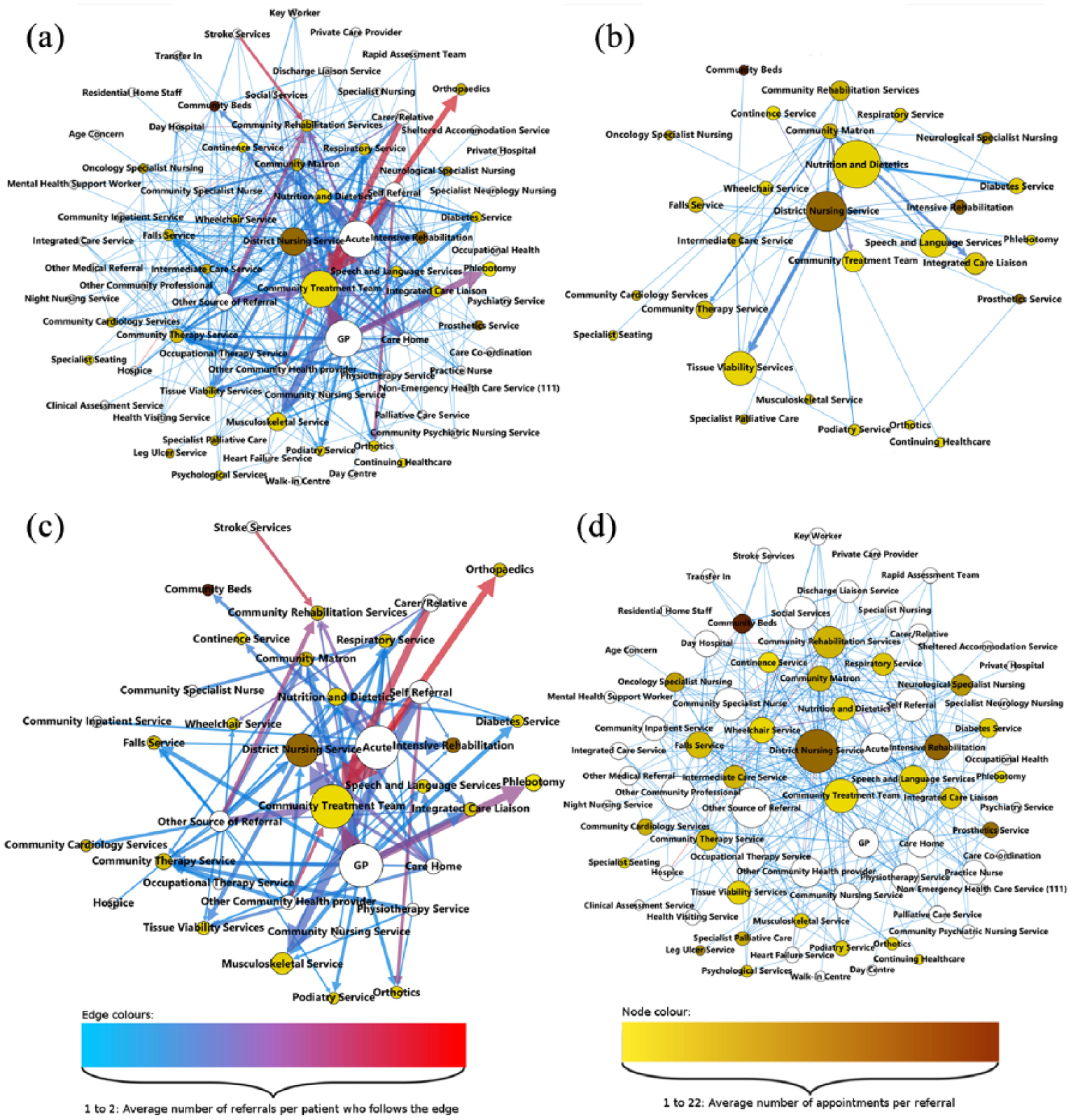
Network maps of referrals within our collaborators community health care services. (a) All Sources, Specialties and edges; (b) Specialty only network with all Specialty to Specialty referrals; (c) high-activity network: edges with >2 per month; (d) low-activity network: edges with ⩽2 per month.
Working through the network, two levels of referrals were identified. First, Figure 8(c) displays the bulk of activity from a few high-activity services, formed by filtering the network to only include edges representing more than two referrals per month. Consisting 36 nodes – 14 Sources and 22 Specialties (seven of which referred to other Specialties) – and 81 edges, this network represents 93.1 per cent of all patient referrals. Second, Figure 8(d) displays the large number of low-activity services and edges, formed by filtering the network to include edges which have two or fewer referrals per month. Representing the remaining 6.9 per cent of referrals, there were a total of 74 nodes – 44 Sources and 30 Specialties (with 11 referring to other Specialties) – and 305 edges.
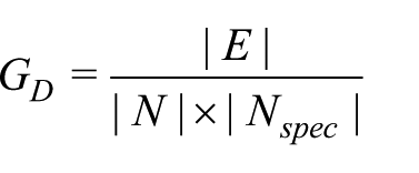
To further understand this system, we calculated various network statistics. In Figure 8(a), the average number of edges connecting each node is 5.147. Furthermore, the directed network density with loops – the number of edges in the network divided by the total number of possible edges, with loops occurring when Specialties refer to themselves – is 0.17. Due to the Source–Specialty structure of the network, we used an adapted density formula for this network
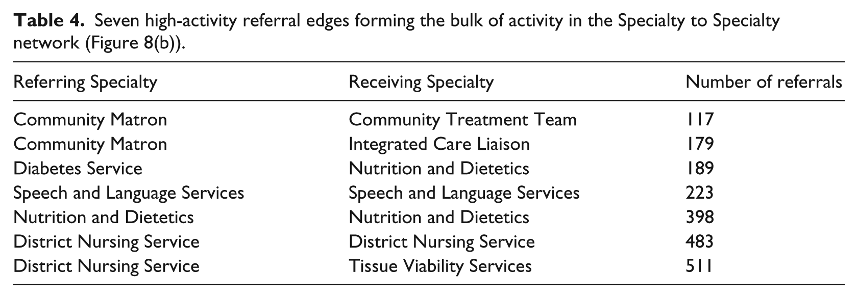
Although displaying significant connectivity, these measures are low in comparison to our collaborator’s thoughts that the network could be near completely connected, as noted in the ‘Initial steps’ section, which would correspond to a directed network density closer to 1. To investigate further, the network was filtered and resized to look at Specialty to Specialty referrals only (Figure 8(b)). Containing 28 Specialties and 74 edges, this network represented 2919 referrals with a directed graph density of 0.094. Furthermore, eight nodes and seven edges represented 2100 of these referrals (Table 4), confirming that relatively few Specialties referred to each other.
Seven high-activity referral edges forming the bulk of activity in the Specialty to Specialty network (Figure 8(b)).
Chains of referral and concurrent use
Next, we analysed chains of referrals consisting of a Source, first Specialty and second Specialty. Only considering the first and second Specialties, 47 combinations representing 814 patient uses were found. Altogether, there were nine different first Specialties and 23 different second Specialties with eight common between the two sets. To visualise these data, a flow diagram was produced using the R package ‘alluvial’ 21 (Figure 9).
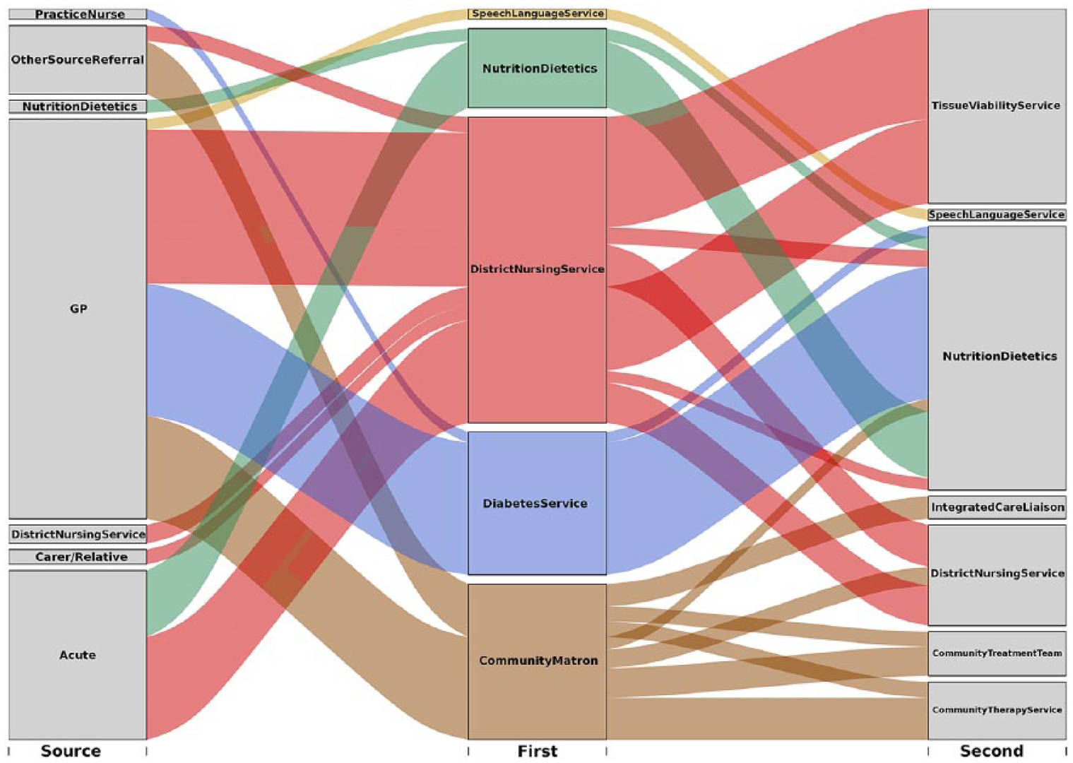
Chord diagram for chains of length one – number of occurrences >20.
Of the first Specialties, District Nursing Service (DNS) and Community Matron services were the most common, featuring in 17 and 15 chains, respectively, and accounting for 470 and 270 total patient uses, respectively. In comparison, the next most common were Nutrition and Dietetics and the Diabetes Service featuring in three and two chains, amounting to 114 and 161 patient uses, respectively.
For second Specialties, the maximum number of chains that a Specialty featured in was five, with a mean of 2.04 overall. There was large range in the number of patient uses for these second Specialties: Nutrition and Dietetics, 325; Tissue Viability service, 227; DNS, 154; Community Treatment Team, 77; Community Therapy Service, 77; and Speech and Language Services, 62. Significantly, 260 patient uses represented loops where the first and second Specialties were the same. This occurs when Specialties consist of multiple teams that each provide different types of care which patients may be referred between.
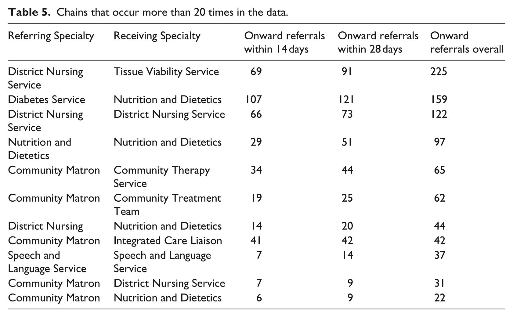
In response to this information, care leads suggested that it would be useful to understand how the timing of these onward referrals, in particular those that occurred within 4 weeks of the first referral. Table 5 presents chains with more than 20 occurrences, recording how many occurred in the first 14 days, 28 days, and time span of the data. This analysis could help identify inappropriate referrals, where patients may have required multiple referrals in the first instance or were referred to an incorrect service.
Chains that occur more than 20 times in the data.
Investigating chains of three and four Specialties would be a natural next step; however, we cannot present an extensive analysis here since few of these chains existed in our data set. For chains of length three, 66 combinations represented 196 patient uses, yet only two had more than 10 occurrences.
We also visualised joint uses of service by an interactive sunburst plot (Figure 10). Highlighting different segments reveals which services were used at the same time, displaying a step-by-step chain and the number of occurrences (Figure 11). Immediately, it is clear that DNS and Community Treatment Team are the most concurrently used services. This map is visually complex; however, its interactive capability helps overcome this for nuanced analysis 10 (for an example of the interactivity of sunburst plots 23 ).
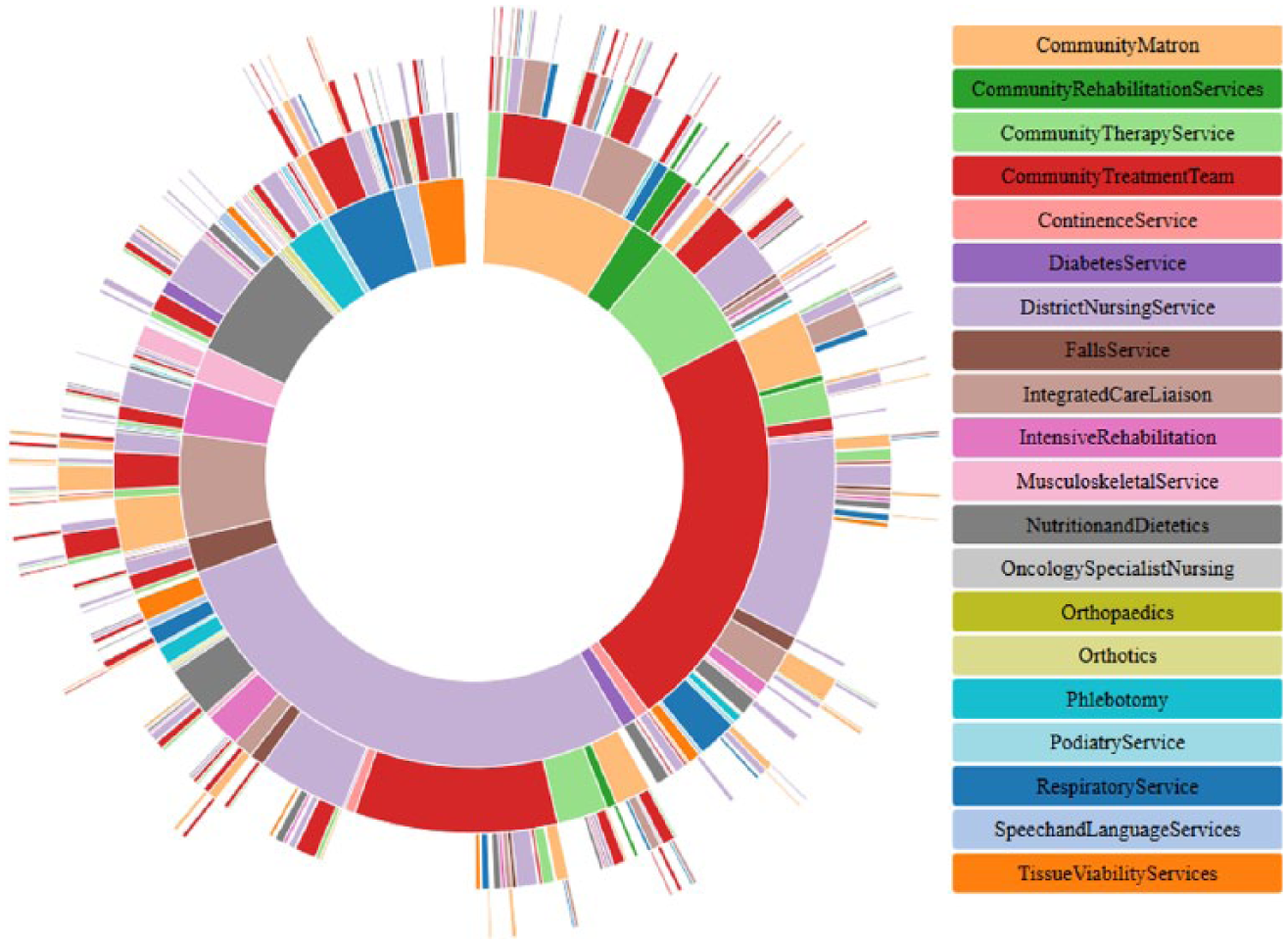
Example of joint uses of service – number of occurrences >20.
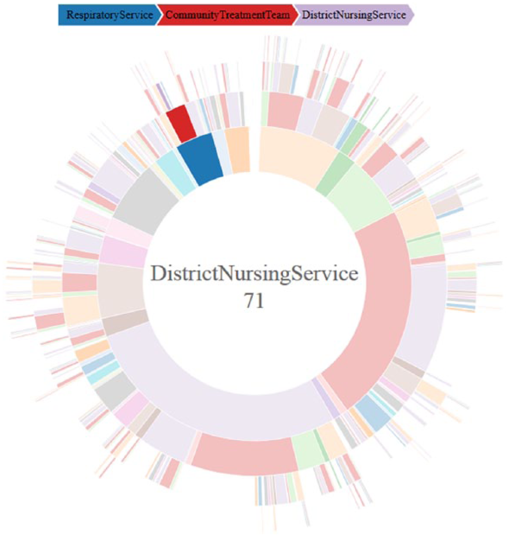
Example of interactive capability of the sunburst plot.
Discussion
The aims of this work were to explore the large and complex system of community care through the use of data visualisation by exploring how patients aged 65 years and over use multiple services and whether common patterns of referrals exist. Through collaboration with care leads and the exploration of patient-level data, we applied several visualisation methods to a Trust’s referral data in order to analyse the key dynamics of referrals within their community services. Hence, our first research question – ‘How can data visualisation help understand complex dynamics in community health care?’ – was addressed by these visualisations as they helped to understand the complex dynamics of patient use of community services such as: concurrent use of multiple services, the timing of patient use and repeated use of individual services.
Having shared this work with care managers throughout, the main benefit of these methods was the opportunity to ask and investigate more refined questions around the nature and patterns of referrals as they designed their SPA. Notably, answers to these questions could be gained from exploring the raw data and further analysis of more complete data. While the sharing of the visualisations led to more detailed discussion, at the time of concluding this work, the SPA was still in development; thus, we can only detail the resulting discussion topics and points raised.
The visualisations and analysis presented addressed our second research question – ‘How can key patterns of referrals and timings of patient use be identified through data visualisation?’ – as discussed below. Using a network representation, node and edge colouring, and network filtering helped to provide greater understanding of the Trust’s community referral data. This informed the service managers’ thoughts around the design of an SPA by identifying directions for further investigation. This included questions around what level of activity is appropriate within the system; and whether the dynamics and patterns presented within the network map were expected.
When interacting with the network in Gephi, service managers began to identify possible services for inclusion within the SPA. They discussed what sort of activity it should handle, for example, only external referrals from GP, social care and acute? and whether this would help to reduce some of the low-level activity and help avoid inappropriate referrals. Considering high activity, questions arose about whether natural groups of services existed and how referrals between them could be handled by an SPA and how the introduction of a point of triage may affect the structure of these referrals. For example, would only handling Specialty to Specialty referrals help the SPA to have a positive effect on patient access through improved handling of multiple referrals for a single patient? and how could the SPA be designed to streamline referrals so that patients are referred directly to the appropriate services?
Evaluating chains and concurrent uses of community services enabled the analysis of sequences and the identification of common pathways. Such information may be used to inform referral guidelines and service planning. For example, after sharing this work, our collaborators suggested this method may help identify cases of inappropriate referrals in instances where the initial referral is short and the specialty acts as a ‘point of triage’, rather than a point of care. Thus, the SPA could be used to prevent this. Similarly, such a referral may indicate that patients who are referred to a particular service, say the Diabetes service, often require another service, such as the Nutrition and Dietetics service, which could have been made alongside the initial referral, potentially improving the ease and speed of access. Furthermore, plotting chains of community services helped our collaborators to understand what services patients used and if any typical sequences of use existed in the data. This provided information that could be considered at the initial triage of referrals within an SPA by giving an indication of what may happen later in a patients care, aiding future planning of care.
The above discussions highlight how our third research question – ‘How could the information gained from visualisation inform the future planning of services?’ – was addressed by this work, having presented useful information to care leads that led to discussions about what considerations are important for the future planning of services.
Regarding community health care in the United Kingdom as a whole, the use of visualisation within different local contexts can provide a means to investigate and understand the key referral dynamics of different demographics. The information gained from data and system analysis may have many practical implications within the sector. 7 Community health care is made up of several, semi-autonomous services, each with a distinct function, that are linked by an overarching purpose that they each contribute to achieving – the maintenance and improvement of patient health by ensuring equitable access to care that is free at the point of access. 2 Thus, for a complex and fragmented system of care, such as community health care, 6 these visualisation methods may have a significant impact by overcoming some of the complexities and difficulties that are present in this sector of care. Given the range and depth of patient data and information that is collected, analysis using visualisation methods can help both researchers and care managers to learn more about these services and how they may be best organised to achieve their intended purpose. 16 Furthermore, these methods can help to identify the key dynamics of patient use among different demographics and help to highlight possible issues in how patient’s access and use services. Thus, such studies can be broadly effective by informing care managers and staff about what problems are of chief concern across demographics and what questions to investigate when redesigning these systems.24,25 This is helpful in the community sector since it has seen many changes to its configuration and funding over the last few decades. 4
Limitations and future work
Through collaborative working, limitations of this work were identified alongside areas for future research. Limitations in processing and using the data were introduced by working within the Safe Haven; for example, Gephi was not available within the Safe Haven. This increased the complexity of the mapping processes since the data were first processed in the secured setting and extracted for mapping. A further limitation occurred in sharing this work. When exploring the maps, collaborators would ask questions that could only be answered by patient-level data. Not having this available would introduce a time lag in the information we could provide and stifle useful conversations.
Furthermore, we obtained a single extraction of data for our mapping purposes, limiting the work due to the incompleteness of the data. For example, we did not have complete information for every patient and did not know patient entry points to community care. It would have been insightful to apply these methods to include their first referral, but were limited to using index referrals.
The end date of the data added a further limitation since patients who entered the system later would use fewer services, introducing bias towards shorter referrals. This could potentially be overcome using Kaplan-Meier curves to evaluate referral lengths, however; this does not overcome the limitation in identifying chains or concurrent referrals.
A solution to these issues is to work within the organisation, where data are more easily accessed and updated. We therefore ran a seminar for care leads within mental health, physical health and social care to teach them how to implement some of these methods. It should be noted, however, that access to more data may not improve the work. Community services change rapidly with new configurations and referral guidelines regularly introduced. 6 As a result, data sets that span large time periods may include multiple configurations of the system. This will lead to inaccurate conclusions or a misrepresentation of the system. Given the dependency on the accuracy and format of the data required for these visualisations, the reliability and validity of these methods for use in other scenarios may be greatly affected. In particular, they require that data are linked between services and that data for a range of services are both available and of a consistent format.
Finally, having studied the setting of community health care, the dynamics of patient use can differ greatly from those found in other care settings. Since community services form a wide and large sector of care, the work may be limited in its application to other settings such as acute services,2,5 particularly if uses of multiple services, or multiple uses of a single service are not common within a service – affecting the reliability and validity of the method. In application to other community settings, these methods will provide useful insight in scenarios where a mix of patients may use a mix of services over a given time period, and could be used to understand the referrals of patients between acute settings and community settings such as the scenarios modelled in Wolstenholme 26 and Koizumi et al. 27 A similar limitation may also exist given the cohort of patients (those aged 65 years and over who use services in a specific London borough) since the patterns of use and the conclusions drawn may vary across demographics. However, given the nature of community service, the reuse of services and the concurrent use of multiple services will still be relevant. In addition, since each service is often managed independently, implementing any changes or benefits suggested by studies such as this requires careful co-ordination and communication across services. Furthermore, these services are often reorganised from the top down, 2 and it is important that the implementation of new knowledge and directions is carried out in a sustainable manner and does not become disrupted by the ever shifting landscape. Some questions that arose from this mapping project that were not directly addressed include the following:
Can groups of services which patients ‘bounce between’ be identified by data visualisation?
Can data visualisation help to identify inappropriate referrals?
Can a patient’s total care be described by including services outside of physical community care, for example, acute care, social care and mental health?
These would be good directions for the future of data visualisation and informatics used for health care planning. Each addresses key difficulties in the provision of community care which are hard to identify from the raw data alone.
Conclusion
We produced several visualisations to aid the interpretation of referral data. Owing to the large amount of patient-level data that are captured by services, such studies can provide useful insight that can be used to inform and guide the management and organisation of these services. There are many methods in both mathematics and health care research that can be used to help improve and maintain these services; 7 thus, implementing these methods within services can help to better inform health care. In particular, simple studies can be effective, helping to understand what questions need to be asked and investigated – especially in settings where reorganisation and change occur frequently, making evaluation/understanding difficult. 2 Applied to community health care, these methods have both contributed to the published literature on health data visualisation and helped inform the organisation of community services.
Each analysis focusses on different referral characteristics of community health care. The network helps understand the vastness and complexity of the system; identifying common groups of services and levels of patient activity, while quantifying patient reuse. Analysing chains and concurrent uses of services provides insight into the progression of patient care and common combinations of services.
When used in conjunction, these maps produce a holistic understanding of the system, providing informative analysis in three ways. First, they help to understand complex data. Second, they are accessible and aid the identification of individual or groups of services with interesting characteristics. Third, they stimulate conversation around what information is beneficial in planning these services.
Footnotes
Acknowledgements
The authors thank the reviewers for their helpful comments, as well as various colleagues and collaborators for their helpful insights.
Declaration of conflicting interests
The author(s) declared no potential conflicts of interest with respect to the research, authorship and/or publication of this article.
Funding
The author(s) disclosed receipt of the following financial support for the research, authorship, and/or publication of this article: R.P. was supported by the Health Foundation as part of the Improvement Science PhD programme. The Health Foundation is an independent charity committed to bringing about better health and health care for people in the United Kingdom. M.U. and N.J.F. were supported by the National Institute for Health Research (NIHR) Collaboration for Leadership in Applied Health Research and Care (CLAHRC) North Thames at Barts Health NHS Trust. The views expressed are those of the author(s) and not necessarily those of the NHS, the NIHR or the Department of Health.