
Abstract
The rapid growth of the creative industries has arguably been the main driver in the transformation of the calligraphic sign. Today, the Chinese character can be transformed into a versatile and dynamic digital font, adaptable into almost any shape or color as long as it stays legible, and creative designers increasingly have room to ‘play with’ the Chinese character. Based on ethnographic research and visual analysis, this article identifies and investigates a development toward a revitalization of calligraphic features within contemporary typography design. Often, calligraphy is employed as an ideal, and static articulation of Chineseness. What I want to show here, is how in contemporary font design, national interest, creativity, and Chineseness become mutually constitutive. Increasingly, we see how the Chinese past is envisioned as creative. This article takes the winning designs of the national type font contest of China’s main national font design company as its case study. With this approach, the goal is to address the specific focus of this special issue by reorienting views on creativity and decentralizing the term, aiming to dewesternize its interpretation.
Watching the 6-minute video of TikTokker Xiedapao88 (2024) – 1.1 M views – I was reminded of the physical labor it involved to create a traditional clay movable type. In her TikTok videos, Xie Dapao cultivates an image of a hardworking Chinese woman, recreating the entire process of particular aspects of a ‘Chinese Intangible Cultural heritage’ by hand, from making paper to leather ancient drums and fireworks. In this video, we see her going from trampling a vessel of clayey water from the river to printing her own homemade clay moveable typeface in just 6 minutes. Not only was I reminded of the physicality of the process of printmaking by the video, but the juxtaposition of the slow laborious process necessary to render a calligraphic sign versus the smooth digital typefaces that just seem to magically appear on the screen at the same time is striking. Yang and Wang (2023) maintain how “literary and cultural articulations evoking China’s classical past instantly travel through a rhizomatic network of dynamic cultural production, dissemination and consumption (p. 249). Digital media, they argue further, help us, consumers, citizens, to become agents of cultural remembrance and imagination. It is in this context that I want to further investigate digital Chinese typefaces, how they are conjured by designers in China today as living and activating memories of the creative past and what this implicates.
In my previous work on contemporary practices of Chinese calligraphy, including calligraphic font design, I have observed how calligraphy is still often seen as a prime articulation of Chineseness (Vermeeren, 2025). Calligraphy is, in essence, a method of writing, and this starting point can help us understand its national importance. Standardized in the third-century BCE, the Chinese writing system, based on characters, has long served as an effective tool for unifying the vast empire throughout history. Because the meaning of each character remains consistent regardless of its pronunciation in the many different regional Chinese dialects, the written word became the preferred medium for the ruling elite to communicate with each other and with their subordinates. This created a strong bond between the elite and the written word, and as with all writing systems, Chinese characters signal power. The educated elite was bound together by their writing and over the centuries, these carefully – beautifully – crafted characters have accumulated many layers of cultural meaning, imagery, and connotations, while their visual forms have remained remarkably consistent from the beginnings of writing to the present.
Calligraphy, now, among other things, serves as a potent visual and cultural reminder of China’s alleged long and unbroken historical narrative. Contemporary ‘character makers’ for lack of a better umbrella term – calligraphers, font designers, and craftsmen – are inevitably connected to this past. Now, this admittedly long and impressive Chinese past is not often evoked or described using the adjective ‘creative’ and we typically read or hear about China’s past, especially in governmental discourse, as excellent, profound, or unique. And while rarely framed as inherently creative, China has of course been, and continues to be, creative. What the emergence of creativity as a keyword in global discourse, along with China’s trajectory from ‘Made in China’ to ‘Created in China’, designed to neatly fit into said discourse has done, among other things, is laying bare how slippery the concept of creativity is. It remains hard to define. But creativity is increasingly recognized in diverse cultural practices and contexts and is no longer just seen as a Western-centric notion. Increasingly, we understand creativity to also be collective, culturally rooted, and in conversation and negotiation within traditional practices globally (see, for example, Glăveanu and Sierra, 2015; Mehta and Henriksen, 2022; Wu, 2006).
This study contributes to these ongoing developments by using a case study of Chinese calligraphic font design. I use typefaces as a way to reconceptualize creativity as a diverse and expansive process that can transcend Eurocentric frameworks. My aim is to investigate how this seemingly abstract notion materializes through the design process of calligraphic font design. I demonstrate how this then might reshape a broader discourse – seeing creativity as less Western-centric, but also less rigidly tied to notions of newness and freedom. The main argument this paper wants to put forward is that contemporary Chinese calligraphic font design revitalizes traditional calligraphic elements while remaining very close to the calligraphic mold. This shows how creativity can also be a process deeply rooted in cultural heritage rather than solely focused on innovation. By exploring typefaces, the paper engages with the tension between calligraphy’s assumed historical authenticity and its adaptation to Western-driven notions of novelty and the pressures of capitalist market demands. In doing so, I propose a more expansive, less Eurocentric understanding of creativity that navigates between tradition and modern innovation.
This article is based on visual analysis. In order to better understand the context in which font designers create, I have conducted interviews with a range of professional font designers from the Type Design Research Centre, widely known as FounderType (方正 Fangzheng), the largest font design company in China. I also spoke with graphic designers who showcase their calligraphic creations on ZCOOL.com.cn, a popular online community where designers exchange designs, images, and insights. In addition, I followed a dynamic group of font designers, including current employees of FounderType and emerging designers aiming to break into the industry (see also Vermeeren, 2025). This article utilizes these interviews and discussions to contextualize my argument on creativity and font design.
Chinese font design emerged when around the second half of the 19th century, Chinese characters started to be encoded as four-digit numbers. This decomposed form of the Chinese character laid the foundation for early computing. Unlike earlier methods in writing and printing, such as movable type, handwritten calligraphy, or woodblock printing, this new input system was no longer tangibly related to the output. This is a crucial shift: whereas before the goal was to reproduce an original character as precisely as possible, now reproduction relies on technological agreement. The break away from the constraint of analog tools means that in theory, almost anything is possible as long as it remains legible. The challenge in design is to find a balance between preserving the integrity of traditional forms on the one hand and fitting within the constraints of both modern technology and taste on the other.
Something interesting is going on here. While the visual representation of the Chinese character is now based on a shared technological agreement, this has not led to an erasure of earlier methods. Quite the opposite has in fact happened: I observed a development toward a very deliberate revitalization of calligraphic features within contemporary font bank and typography design (Vermeeren, 2025). The past, in this field, is celebrated as an exciting source of creativity. But how exactly do font designers balance between adhering to traditional calligraphic rules on the one hand and embracing creativity and modern taste on the other?
I look at two winning designs of the 2023 Founder Award, organized by FounderType (FounderType, 2024a). The fonts of FounderType are being used by 90 percent of the newspapers, publishing houses and printing houses in China as well as major TV organizations and tech companies, and the Founder Prize has been awarded to font designers since 2001. It is worth examining the introductory text of the competition, which opens with the following:
Chinese characters are the treasure of Chinese culture. The Chinese nation has a 5000-year-old culture that continues to this day. With its unique form and structure, Chinese characters express the vastness of Chinese style. Chinese characters originated from oracle bone inscriptions, and have gone through bronze inscriptions, seal scripts, official scripts, and regular scripts. In modern society, the carriers and application forms of Chinese characters have undergone tremendous changes, but the inheritance and innovation of Chinese characters has always been our unchanging mission (FounderType, 2024b).
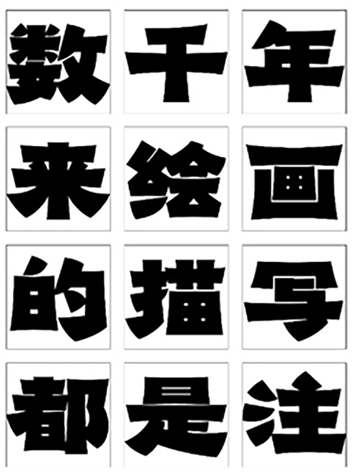
The familiar and widely adaptable narrative of 5000 years of illustrious Chinese tradition and civilization shapes this discourse. Meanwhile, the 2023 theme for the 12th Founder Award design competition is ‘Fonts Create the Future’ – it seems that both historical legacy and forward-thinking creative innovation must be reflected in the winning font design. The first place was awarded to a bold font, classified as 美术字 (meishu zi), which translates to ‘decorative typography’ – a visually artistic and stylized font, that prefers aesthetics over readability. I want to analyze Zhou Chanhui’s work however, which earned second place in the professional category of the 2023 competition (see Image 1). This font design is introduced as directly inspired by and modeled after the writings on the Cuan Baozi stele (see Image 2). The inscriptions on this original stele for Cuan Baozi are dated to the year 405, but the stele was only excavated in Yunnan Province in 1778, and has continued to excite and unsettle connoisseurs of calligraphy since its excavation. The inscription, a eulogy for the deceased, Cuan Baozi, is written by an anonymous calligrapher and has been found in a peripheral cultural area – a region far away from the ruling center, where the calligraphy style of Wang Xizhi (ca. 303-ca. 361) and his son was then considered the standard.
Typefont designed by Zheng Yutian. © FounderType.
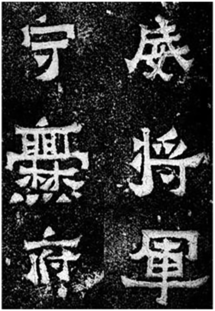
Fragment of Cuan Baozi Stele. CC-BY license from shufazidian.com https://www.shufazidian.com/ziliao/41146.html.
The conquest of China by the foreign Manchus in 1644, which ended the rule of the Chinese Ming dynasty, is said to have prompted a significant shift in calligraphy. The invasion led calligraphers to self-identify as ethnic Han Chinese in direct opposition to the invaders, and they turned their attention to ancient Han dynasty steles as a way to create and rediscover a specifically Chinese cultural identity (Ledderose, 2001). Previously dismissed as mere technical – and anonymous – exercises lacking aesthetic value, these engraved texts gained new prestige and were now celebrated as superior, valued for their originality and authenticity, untainted by centuries of repetitive copying. Adjectives such as “real”, “rustic” and “unadorned” became keywords in commentaries of calligraphy connoisseurship (McNair, 2012: 64). This embrace of archaic scripts was according to Shi-yee Liu (2014) also a subtle act of defiance against the Manchu regime, which, from the emperor on down, favored the Wang Xizhi tradition. The practice became increasingly popular, and led calligraphers to seek out all kinds of calligraphy on steles, including exciting writings from, as Amy McNair notes, “distant barbarians”: artists from the southwest borders of China and the early kingdoms of Korea (2012). McNair (2012) argues further that this continues today, since the PRC continues to create policies that “intentionally embrace “minority” cultures within a “unified China”, and advocated critical support for previously ignored or denigrated types of writing as “calligraphy of the people”(p. 66).
The inscriptions on the Cuan Baozi Stele are interesting indeed. The diagonal, flared strokes and square-shaped elements of the characters stand out, and resemble clerical script. Famous calligraphy critic and scholar Kang Youwei argued the style should be categorized as a hybrid, somewhere in between clerical and regular scripts (McNair, 2012). The Cuan Baozi Stele displays variation in the size of its characters, ranging from large to small, which creates an unfamiliar and unbalanced overall appearance. The characters themselves are also highly unconventional, incorporating both round and square brushstrokes – a combination that traditional calligraphers typically avoid within a single work. Combining these opposed modes, argues McNair, creates a visual tension – but appreciating such a tension is very much what she calls a ‘modern undertaking’ (p. 64).
The distinctive visual style of the anonymous stele continues to inspire. When we look at the font design made by Zhou Chanhui (see Image 3), the resemblance with the Cuan Baozi Stele is immediately clear. The font looks crisp and playful, but is instantly recognizable as a sort of copy of the original, with its upward curving ends of the brushstrokes and the square composition, filling in a large part of the square. The font designer has skillfully drawn inspiration from the distinctive elements of the anonymous inscriptions, and harmonized the font size into an abstract geometric style with minimalist lines. Unlike the original inscription’s irregular character sizes, this modern design had to be standardized for practical use, since the goal of a font design is that ultimately, it can be made into a complete ‘font bank’ (字库 ziku) – the complete set of 6763 uniform characters, all aligned with the intended stylistic vision to ensure consistency across the digital typeface.
Typefont designed by Zhou Chanhui. © FounderType.
Bronze award winner Zheng Yutian has created a font inspired by a variation of clerical script called lacquer style (漆书 qishu) invented by Jin Nong. Jin Nong (1687–1763) lived during Qing dynasty, and became known as one of the ‘eight eccentrics of Yangzhou’ – a group of calligraphers and painters that deviated from the official calligraphic rules, in order to explore their own individual interpretations of calligraphy. Jin Nong excelled in writing traditional clerical script, but after failing the state examination to enter bureaucracy, he turned away from official script type, and began to exaggerate elements to create his idiosyncratic personal style inspired in part by ancient stone inscriptions as per the fashion described above. His characters, seen in Image 4, are tall and square.
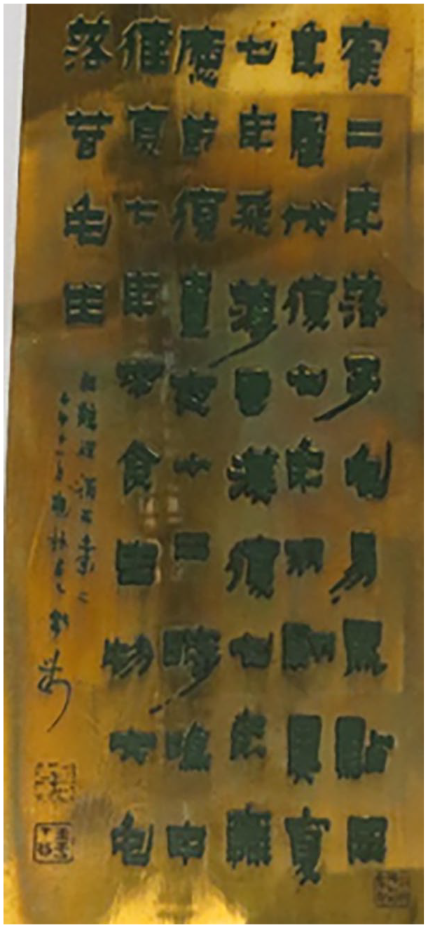
Paper-weight decorated with the calligraphy of Jin Nong. © The Trustees of the British Museum. CC BY-NC-SA 4.0.
The horizontal strokes are applied with a flattened brush tip, while vertical and left-downward diagonal strokes taper very sharply at the ends, creating a strange and I would say unChinese-looking spiky effect. The variation of heavy strokes with vertical slenderness within the characters further gives the font a dynamic impression, as does the trembling and unstable effect created in all of the strokes. One of the judges commented how these wavering lines create ‘a sense of instability’, making the font perfect for application to ‘horror themes’– reflecting yet another twist in ‘how the past should serve the present’, echoing Mao Zedong’s rallying cry of the Cultural Revolution.
Both designs navigate contemporary demands for creativity, cultural identity, and calligraphic skill. Zheng Yutian has drawn inspiration from an eccentric calligrapher, yet one who remains highly respected in national history. The negotiation here is not so much about adapting calligraphy to modernity, but rather about digging into its historical roots and uncovering that surprising creativity was always present – waiting to be rediscovered and brought back to today’s computer screen for all Chinese to enjoy (Vermeeren, 2025). Similarly, Zhou Chanhui uses as a prototype an unconventional calligrapher of unknown origin. But this does not mean the work is unfamiliar: the stele has been the subject of debate, praise, and critique for centuries. By designing this font, the font designer takes a deliberate step into a long lineage of calligraphers, connoisseurs and scholars, consciously continuing and evolving the art form. The font designer is part of the ongoing effort to bring traditional calligraphy into the modern era and keep it alive. We can thus speak of these reappearances as creative negotiations, in which the designer can, so it seems, freely choose from a wide range of historical materials: the rubbings of eroded stone steles, the square shapes of possible ‘barbaric writers’ or eccentric Qing dynasty calligraphers.
The reactivation of this creative past through contemporary font design makes national interest, creativity, and Chineseness both interdependent and mutually reinforcing. It is also political, as everything is, and ties in with recent governmental directives. One of Xi Jinping’s signature political strategies is the ‘doctrine of confidence’ (自信论 zixin lun), aimed at building the confidence of both the Party and the nation. Xi emphasized in a 2014 speech, later made public in 2019, that inheriting Chinese culture requires balancing tradition and innovation, stating that inheriting tradition requires more than simple nostalgia or rejecting foreign influences. Instead, new cultural expressions should be made by building on the creative innovations of the past. This is characteristic of Xi Jinping’s approach to managing cultural politics. He paints a picture of a creative Chinese past, a past that is intended to let today’s creatives grow in their cultural confidence. In doing so, he is simultaneously disciplining the ways in which this creative worker then ought to create: they should base their work on ancient, creative, and Chinese traditions. This imaginative return is an expression of Chineseness and seems to seamlessly fold into the governmental mandate to foster national cultural self-confidence. The designers of the two winning designs construct and employ a distinctive and creative Chinese past, and show that creative design is by no means incompatible with the strict template of traditional calligraphy. The opposite seems to be true: the creative past envisioned in these designs is a productive fantasy, as it is actively promoted by the government, sought after by the market and, thus, produced by designers. What is creative, as I have shown, is simply to use and be inspired by calligraphy.
Footnotes
Data availability statement
Data sharing is not applicable to this article as no datasets were generated or analyzed during the current study.
Funding
The author received no financial support for the research, authorship and/or publication of this article.