
Abstract
Generic visuals like stock photos and simple data visualizations circulate in the news with increasing frequency, and so do dominant narratives about them. Stock photos are clichéd and inauthentic, data visualizations represent facts, so the narratives go. Such narratives suggest that generic visuals have limited capacity to function as public images – that is, as visual media for social thought and civic spectatorship. Findings from our research contradict this. We found that while UK-based news audiences mobilized dominant narratives when talking about stock photos and simple data visualizations in general terms, this did not happen in specific engagements with particular generic visuals. In these cases, participants moved beyond dominant narratives, as generic visuals activated emotions, experiences and participants’ different identities. We argue that generic visuals in the news are resources with which people make sense of their everyday lives and that people’s everyday lives are resources with which they make sense of generic news visuals. As such, generic visuals do, in fact, function as public images, connecting and engaging audiences in public life and foregrounding the role of the personal in engagements with the social issues portrayed in the news.
Introduction
The news is an increasingly visual medium, particularly in its digital forms. The volume of news visuals circulated across media outlets and shared through various platforms has grown exponentially with the advent of social and mobile media (Thomson, 2019). Research into news visuals has concentrated primarily on arresting and iconic images, particularly photographs (Cohen et al., 2018; Zelizer, 2010). Likewise, research on non-photographic visuals such as data visualizations, now central to journalistic storytelling, has focused on award-winning or otherwise ‘beautiful’ examples (e.g., McCosker and Wilken, 2014). We contend that, given their ubiquity, it is important to investigate the role that more mundane, everyday news images – what we call generic visuals – play in our social and cultural lives.
Generic visuals have standardized formats and appearances, they perform particular design functions and they circulate with increasing regularity in the news media (Aiello et al., 2022). Here, we focus on two types of generic visuals, stock photos and simple data visualizations. Both image types are regularly produced, circulated and consumed in news texts, news organizations often use them together as part of one overarching visual (e.g. Figure 1) and they serve similar functions to each other as visual elements in the layout of news stories. While stock photography is often derided for being stereotypical, bland and inauthentic (Aiello, 2016), and data visualization is more typically considered as a trustworthy and authoritative representation of ‘facts’ or ‘truth’ (Kennedy et al., 2016a), they nonetheless have shared characteristics, and their ubiquity means that research into their social and cultural roles is urgently needed.
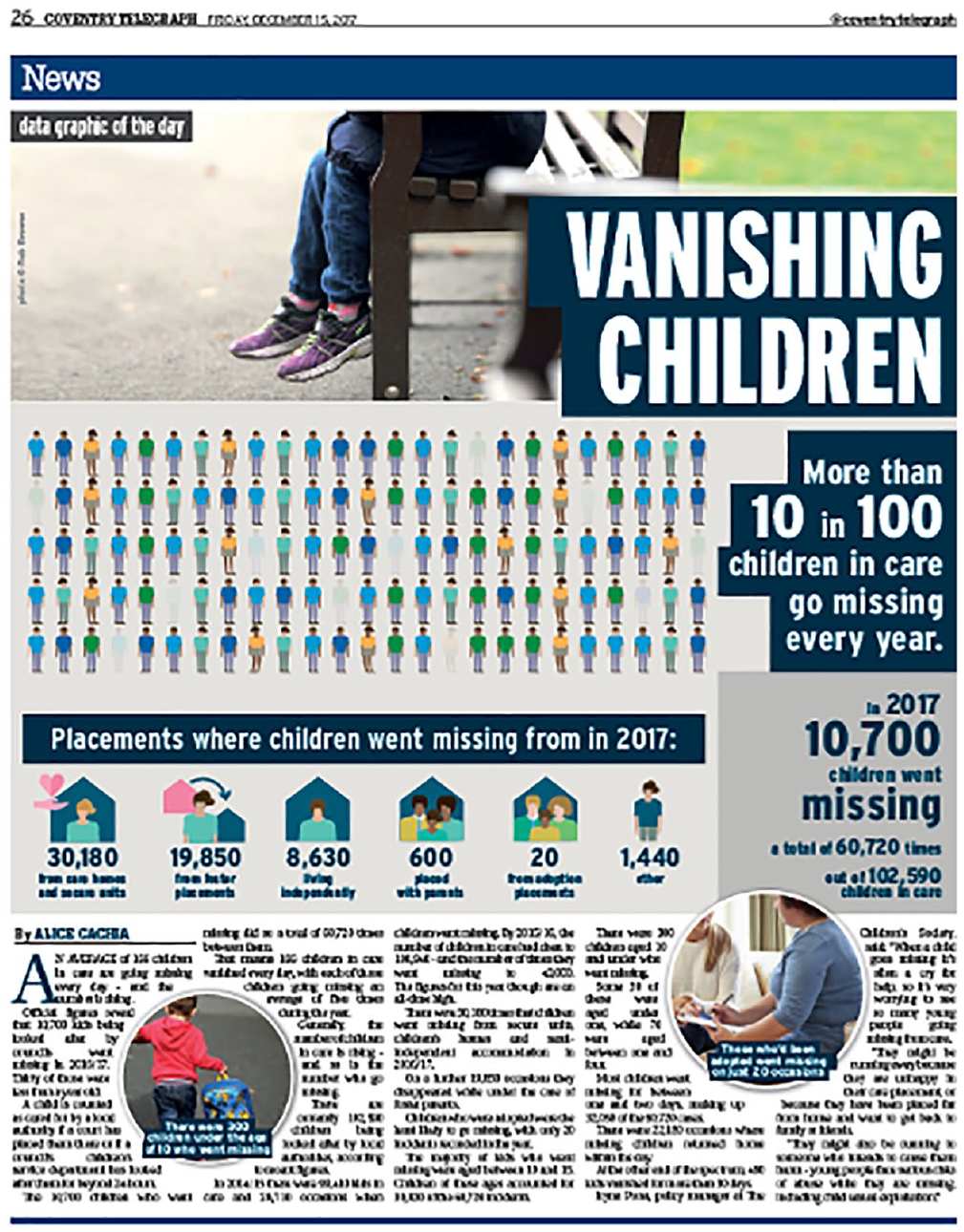
Article on missing children in the print version of The Coventry Telegraph (15 December 2007), featuring a stock image as a lead visual, a set of simple data visualizations as the article’s main focus (middle third of page) and stock photos as visual illustrations of key points made in the body of the article (bottom third of page).
Such research needs to examine the semiotic and production processes underpinning generic visuals and how people engage with them. We address the first two topics elsewhere (Aiello et al., 2022, 2025). In this article, we draw on interviews with 35 UK residents who consume news online, to explore how news audiences engage with generic visuals. We follow the tradition in media and cultural studies of researching the experiences, thoughts and feelings of people variously framed as audiences, users, readers and publics in order to advance understanding of cultural phenomena, such as Hall’s (1973) early work on decoding the news. In doing so, we contribute to knowledge about these emergent image types.
In this article, we show that when participants spoke about generic visuals in general terms, they mobilized dominant narratives – for example, stock photos are banal (Aiello, 2016) and data visualizations are truthful (Kennedy et al., 2016a). However, when they spoke about specific generic visuals, participants referred to their emotions, experiences and different identities in ways that challenged these dominant narratives. We therefore argue that people’s everyday lives are resources with which they make sense of generic news visuals and, at the same time, generic visuals in the news are resources with which people make sense of their everyday lives. In other words, generic visuals function as ‘public images’ (Hariman and Lucaites, 2016), becoming absorbed into the rubric of the personal, while the personal is a lens through which public issues and events come to have meaning. Approaching generic visuals through Hariman and Lucaites’ framework, we advance their argument about public images and their role in political assemblages of meaning-making.
These findings form part of a broader research project in which we examined whether generic visuals assemble publics, building on Warner’s (2002) argument that publics are brought into being in a variety of ways. We asked whether generic visuals bring people together around shared interests and concerns or activate citizens to care about particular issues. We partnered with three UK-based news organizations which facilitated our access to repositories of generic visuals and staff for interviews, both of which we discuss elsewhere (Aiello et al., 2022, 2025). They were Reach PLC, formerly the Mirror Group, which publishes a range of regional and national tabloid outputs; The Financial Times, or FT, a broadsheet publication targeted at a professional audience, prolific in its visual journalism; and BBC Yorkshire, one of the English regions of the BBC. In what follows, we situate our thinking about generic visuals in key debates, and then we outline our methodological approach. After this, we proceed with an analysis of our audience interview data, and in the last section of the article, we offer a critical discussion of our findings.
Researching engagements with generic visuals in the news
Generic visuals like stock photos and simple data visualizations increasingly populate journalism and other information sources, off and online, across mobile apps and other digital platforms. Despite our increasing exposure to generic visuals in the news, little is known about the roles they play. We propose that, in order to investigate audience engagements with generic visuals in the news, three distinct approaches should be brought together.
Research which emphasizes the growing importance of visuals in journalism’s aesthetics, across magazine design, print and online newspapers, and television news, is the first approach. In 2008, Machin and Niblock noted that images were increasingly found at the centre of the page in newspaper layout, and photographs in particular were becoming much more ‘dynamic’ and ‘decontextualized’ – that is, they were being used ‘to draw attention to single details such as a person or object’ (p. 256) rather than a specific event. Later, Machin and Polzer (2015) observed the growing significance of standardized news imagery in journalism, such as stock photos sourced from image banks, made to fit with a wide range of media stories. Machin and Polzer (2015) argued that such images were increasingly ‘used as part of the design as opposed to the more traditional function of bearing witness’ (p. 86), foregrounding the design role of generic visuals. In contrast to iconic visuals which stand out as visual representations in their own right because they are scarce, generic visuals are abundant, unremarkable and not recognizable as specific visual representations (Aiello et al., 2022). Frosh (2020) argues that generic visuals are ‘approximations’ of a range of values and identities. As such, they should be examined not as individual representations, but as part of broader sets of symbolic patterns and social relations.
Hariman and Lucaites’ (2016) work in The Public Image, in which they examine the role of photography as a medium in public life, is the second approach on which we draw. Focusing specifically on photojournalism, Hariman and Lucaites argue that it has the ability to ‘provide vital resources for thinking about the problems of collective living’, where ‘thinking’ includes ‘feeling, talking, and acting in response to those problems’ (p. 3). Public images are thus visual media for social thought and civic spectatorship. Because of its abundance in everyday life, Hariman and Lucaites (2016) consider photojournalism as a ‘small language about vernacular life in a public world’ (p. 11). In other words, it is a mode of engaging in public life which is rooted in the quotidian.
Although Hariman and Lucaites do not discuss data visualization, it shares many of the characteristics they identify as significant in photojournalism – abundant, quotidian, a resource for thinking. Indeed, we also build on scholarship examining how simple data visualizations such as bar charts, line charts and colour-coded maps are used and make meaning in news media (e.g. Amit-Danhi and Shifman, 2018; Engebretsen, 2020). Data visualization is considered trustworthy, even in ‘trivial’ form (Tal and Wansink, 2016), because it mobilizes conventions leading to assumptions of objectivity, transparency and facticity (Kennedy et al., 2016a), assumptions we examine empirically below. We bring together literature on stock photos and simple data visualizations to investigate generic visuals in the news, recognizing that we are dealing with two different visual forms and systems of influence which nonetheless can be considered together as components of the multimodal design of news pages (Van Leeuwen, 2008).
We integrate the perspectives discussed above into an approach that considers the relationship between generic visuals’ aesthetic features and the modes of engagement that they promote. We explore whether stock photography and simple data visualizations in the news work as public images, whether they ‘evoke deep stirrings of connection and challenge habits of indifference and disregard’ (Hariman and Lucaites, 2016: 14). To take account of audiences’ views of generic visuals, a further approach on which our work draws is media audience research, which has its origins in Hall’s (1973) early work on decoding the news. More recently, Das and Ytre-Arne (2018) have identified that the proliferation of screens and devices in everyday life and the circulation of media content characterized by the volume, variety and velocity of big data, both of which contribute to the increased circulation of generic visuals, have changed how people experience the media. Livingstone (2019) argues that fears about the potential negative consequences of such transformations and related forms of engagement have led to the re-emergence of old-fashioned imaginings of media audiences as ‘gullible, homogeneous, and unthinking’ (p. 172), which she describes as empirically inaccurate. To account for the ‘structurally unequal yet semiotically open processes of the circulation of culture’ (p. 174), we need to engage with ‘the everyday lifeworld and the public world of citizen action’ (p. 170), she argues. This means understanding social phenomena, including generic visuals, as ‘made and unmade’ (Neal and Murji, 2015: 812) through everyday practices. Focusing on audience perceptions can challenge existing thinking, as Hall (1973) did in his study of news audiences, and other media audience researchers have since (e.g. Skeggs and Wood, 2012). Indeed, our findings challenge assumptions embedded in dominant narratives about data visualization and stock photography, as we argue below.
Research design and methods
Like Livingstone (2019) and other media audience researchers, we believe that to understand the roles played by our media object of interest, generic visuals, it is vital to attend to the thoughts, feelings and experiences of the people who engage with them. We therefore carried out 35 interviews with a demographically diverse group of news consumers in the United Kingdom. We used a range of strategies to recruit participants, initially via our project’s social media accounts on Twitter and Facebook. After several months and having only recruited five participants this way, we employed a market research agency to recruit participants according to criteria that we specified. This approach has limitations, as participants need to sign up to be on an agency’s panel, which might skew towards participants with access to and the skills to use networked technology. To enable geographical inclusion, all interviews took place online, which may have had similar consequences for the composition of our sample. Nonetheless, these approaches enabled us to recruit participants who were actively interested in the news and/or readers of one of our partner organizations’ publications, a central criterion in our selection of participants. Other selection criteria reflected our commitment to ensuring diversity among participants. Sixteen participants were women, 19 were men; ages ranged from 18 to 65+ with the 18–24 age range best represented (11 participants). Twenty-seven participants were heterosexual, five were LGBTQ+, one asexual, one ‘other’ and one preferred not to say. Twenty participants were white British, two white other, six were Asian, four were Black and three had mixed ethnicities. Household income was varied; for 10 participants, it was less than €23,500; for 12, it was €23,500–€46,700. Participants had a range of education levels (for example, nine had university degrees).
We used visual elicitation (Rose, 2022) in our interviews to prompt discussion, using images sourced in three different ways. First, on our invitation, participants brought images to the interview which they had noticed in the context of their daily news consumption. Second, if they did not bring images to the interview, we asked them to visit an online news publication from which they typically get their news during the interview, and images were sourced from there. Not all of these images were generic, as defined above. Of 220 images discussed across the interviews, 118 were generic visuals, 46 were journalistic (that is, produced for a specific news story) and 56 were hard to classify. The third set of images sourced was from our database of generic visuals gathered during the course of our project, covering nine topics: the Afghan war; Brexit; Covid-19; the environment; social issues including race, gender and teenage pregnancy; politics; sports; the economy; and technology.
At the beginning of each interview, participants were asked about their general news consumption patterns and views about news images. Participants were then asked questions about specific images. After discussing images they had sourced or identified, participants were asked to select one or two topics from the categories of images in our database for discussion. The most popular selected topics were Covid-19 (selected by 10 participants), sports (9), Brexit (6) and the Afghan war (5). We also discussed images from the project database relating to misinformation, because an overarching project aim was to explore the role that generic visuals play in facilitating or inhibiting the spread of misinformation, an important issue for news organizations at the time of the research. At the end of each interview, participants were asked about their thoughts and feelings about stock photography and data visualization, to elicit their views about these image types in general terms. We did not use the term generic visuals at all during the interviews and only mentioned stock photography and data visualization in these final questions. We proceeded in this way because the term generic visuals can be hard to understand, and we did not want to silence participants with complex terminology. We also hoped this would minimize ‘the Hawthorne effect’ (Sedgwick, 2015), or participants saying what they thought we wanted to hear.
The research adhered to ethical principles and received ethical approval from the project’s lead university. Interviews, which lasted approximately 1 hour, were video-recorded, after which we separated the video from the audio, deleted the video and used the audio files to produce anonymized transcriptions using assigned pseudonyms, as we said we would in participant information sheets. We noted in the transcripts which images were under discussion and classified images not sourced from our database. We focus on encounters with generic visuals in this article, given its focus, rather than with other image types. Drawing on the transcripts and relevant related images, we engaged in thematic analysis following Braun and Clarke’s (2006) model, which enabled us to identify the two themes that we discuss in the next section of this article.
Engagements with generic visuals, with and beyond dominant narratives
In this section, we discuss the two main ways that participants spoke about stock photos and simple data visualizations in our interviews. First, we argue that when talking about generic visuals in abstract, general terms, participants mobilized dominant narratives of stock photos as bland and clichéd and data visualizations as factual and trustworthy. When reflecting on encounters with specific generic visuals, participants moved beyond dominant narratives, harnessing their different emotions, experiences and identities to make sense of the images. Below, we demonstrate dominant and alternative accounts of generic visuals that surfaced in our interviews. Building on these empirical findings, we argue that generic visuals function as public images, connecting and engaging audiences in public life by mobilizing the personal in engagements with the social issues portrayed in the news.
Mobilizing dominant narratives in general reflections on generic visuals
When participants expressed views about stock photos and simple data visualizations in abstract terms at the end of the interviews, they often mobilized dominant narratives, tapping into widely circulating assumptions about both forms of generic visuals. Many participants drew on what Frosh (2020) defines as the ‘standard critique’ of stock photography as stereotypical and bland, worthy of derision for promoting clichés (Aiello, 2016). According to Frosh (2020), stock photography is widely considered to be ‘incapable of producing those intensities of affect, aesthetic experience and moral response’ (p. 198) that are attributed to iconic photography. Likewise, data visualization was discussed favourably when considered in general, abstract terms, as participants reproduced the standard narrative that data visualizations are trustworthy representations conveying truth and facts (Kennedy et al., 2016a).
Lily, a white woman aged 18–24, mobilized dominant narratives about stock photography to explain how she felt seeing stock images in the news:
I perceive that as being kind of quite low-quality news. I feel like anybody could access those photos and use them to create an article saying something. Also, they are not as specific. It is always quite generic. I feel like you can’t get as meaningful photos as well. So, quite negative.
Lily’s negative perception of stock images is attributed to their lack of specificity and meaning as images, in their use in the news. Consequently, to Lily, the use of stock images in a news story suggested that the article itself might be low-quality.
Like Lily, for other participants, generic was a negative label, as evidenced in adverbs they used, such as ‘just really generic’, ‘just seem very generic’, ‘so generic’ and ‘completely generic’ (emphasis added). Similarly, they described the repeated use of images in news as ‘boring’, ‘lazy’, to be ‘bypassed’, ‘not accurate representation’ and ‘not realistic’. Emily, also a white woman aged 18–24, explained her feelings:
I think that, compared to an unstaged photo, they are less interesting because they don’t show what really happens or what was really going on, whereas an unstaged photo does. So, with an obviously staged photo, it feels less authentic.
According to Emily, a stock image lacks interest and authenticity because it does not show ‘what was really going on’. Through her comparison with ‘unstaged photos’, she recognized how different types of images function in distinct ways within the news. Unstaged photos are understood as truthful due to their indexicality – that is, their direct relationship to the people and events that they portray. This is in keeping with the perspective that the power of more traditional photojournalistic images derives from their functions as ‘a record of an event that has actually taken place while also resembling particular people and places’ and so evoking broader meanings (Aiello, 2022: 369). Emily positioned stock images as inferior to press photography, reproducing expectations that visuals should directly represent events in the news to hold cultural value (Frosh, 2020). Other participants also expressed negative feelings towards the repetition of stock images, which deterred them from engaging with the news stories in which they were used. Adam, a white man aged 35–44, said,
I think stock ones because they use them over and over, they get quite boring and when you see it again, you kind of miss the story. You think, ‘Oh, I have seen that before’, and you will go past without even thinking because you have seen that kind of stock photo.
For Adam, the repetitiveness of stock images makes him conclude that the news stories they illustrate are not worthy of being read.
While many participants reproduced negative narratives about stock photography, data visualization was seen in a far more positive light when considered in general terms, also in keeping with dominant narratives. James, an Asian man aged 25–34, said,
They [data visualizations] give a lot of information in an image. You know, it is generally easier to understand charts in comparison to a lot of words, so that is what makes it maybe informative. . . . It complements articles, topics, quite nicely, especially if the charts have been sourced correctly. It does kind of give the topic backing to it.
James highlighted the important relationship between the image and the news topic in a similar way to other participants in their critique of stock photography, suggesting that a visual representation’s value through indexicality also applies to data visualization. Unlike stock photography, data visualization was assumed to complement and support the news by providing additional evidence. Henry, aged 45–54 and of ‘white other’ ethnicity, also believed that data visualization adds credibility:
I feel, if they are done well, it really strikes home the point that the article is trying to make. I think there is a reasonable amount of research that shows that adding some numbers to some text makes the text more believable. It feels scientific. It feels like, ‘Here are some hard numbers’.
Participants with certain demographic characteristics were more likely to mobilize this narrative than others, such as men and those with higher educational levels. Henry, for example, was a management consultant with a postgraduate degree. As ours was a small-scale, qualitative study, we are not suggesting that there is a causal relationship between characteristics and attitudes. Rather, we propose that given that gender and education shape lived experiences, they may also shape perceptions of data visualizations. The dominant narrative about data visualizations entails an implicit assumption that audiences have the skills to understand and interpret them, confidence in which may vary by gender and education.
Moving beyond dominant narratives and mobilizing the personal in engagements with specific generic visuals
Dominant narratives about generic visuals in the abstract were often challenged in encounters with specific stock images and simple data visualizations. Understandings of specific images were often entangled with participants’ emotions, experiences and identities. These personalized engagements are suggestive of the role that generic visuals play as public images, as we argue below.
A few participants mobilized the dominant narratives discussed above when discussing encounters with specific generic visuals. Some specific stock images were considered ‘meaningless’, ‘clichéd’ and ‘unimaginative’, such as the image shown in Figure 2 of a woman in a trench coat with a red double-decker bus in the background. Olivia, a white woman aged 18–24, identified this visual as a stock image because of a perceived disconnect between the selected image and the content of the article, noting, ‘I don’t really like that one because it is saying it is about BBC York and North Yorkshire but it is quite clearly not a photo from Yorkshire, it is a photo from London’. Stock images lack specificity, in Olivia’s view – in this instance, the image does not represent the local area.
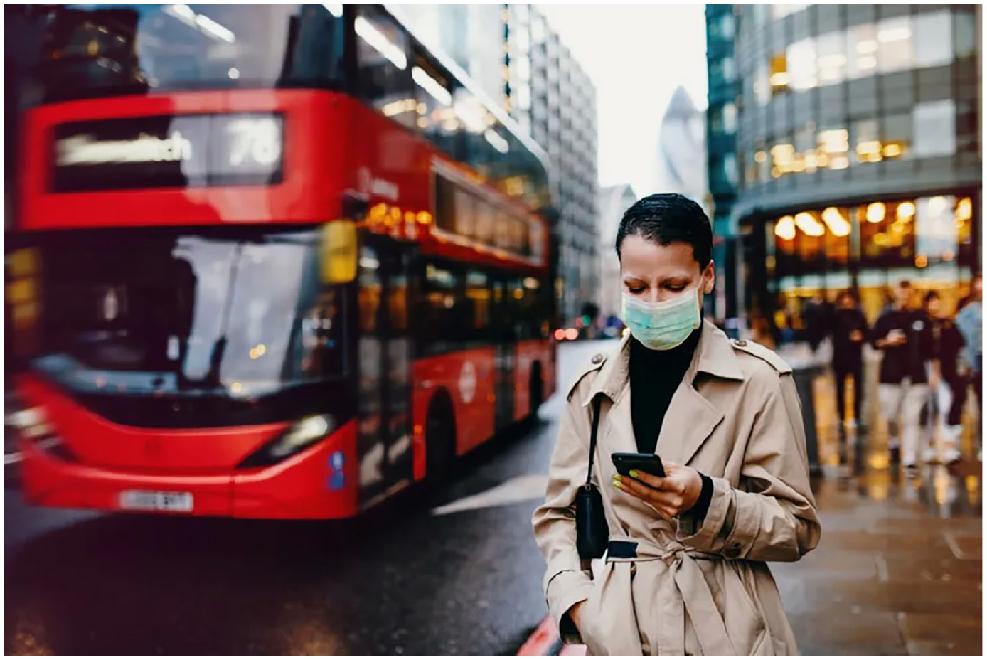
Stock image of a woman wearing a mask with a red double-decker bus in the background used as lead visual in an article from BBC York & North Yorkshire on Covid-19 tier regulations (15 December 2020, https://www.bbc.com/news/uk-england-55266900). Licensed by Getty Images, project image database.
Likewise, some participants reproduced dominant narratives about data visualizations in specific encounters with them. Ben, a white man aged 18–24, encountered a simple data visualization on UK mortgage approval rates on The FT, and considered it to be truthful. He stated that ‘It is almost as if there is proof – this is a graph, so it is a bit like evidence. I think a lot of these images with most articles can be used as evidence’. In line with the standard narrative, data visualization was seen by Ben to offer added value to the news with regard to credibility.
However, most participants’ comments on specific generic visuals questioned or moved beyond the dominant narratives about stock photos and data visualizations that we have discussed thus far. Sometimes, stock photos appealed to participants, and were seen to add narrative value by attracting attention or generating interest in a news story. For example, a stock image from The FT of a relatively diverse group of smiling young adults taking a group selfie (Figure 3) appealed to Jane, a Black woman aged 25–34:
With this image, it displays something positive, something good. If I saw an image like this, I would want to read more because I would want to know why is everyone in this picture happy. What is going on? How is it affecting the economy? How is it affecting the workplace?

Stock image of a diverse group of smiling young adults taking a group selfie used as a thumbnail on The FT for partner content article by Societe Generale on environmental social governance (9 November 2022, https://www.ft.com/partnercontent/societe-generale/why-the-s-in-esg-is-starting-to-matter-again.html). Encountered during interview.
This stock image piqued Jane’s interest and shaped her expectations of what the article would address. Elsewhere in the interview, Jane criticized stock photos as ‘not realistic’. Yet in this encounter with a specific stock photo, it seemed meaningful, because of what it depicted and the fact that it resonated with her in personal terms. Other stock photos were seen as informative and useful due to the familiarity of what they represented (Aiello, 2022). For Henry, stock photos of individual members of the royal family ‘help you orientate’, offering visual cues to the content of news items. Generic visuals can be used to identify articles of interest because they are ‘easier to glance at than glancing through the headlines’, he said.
Some stock photos were considered to offer evidence. For example, Jeff, an Asian man aged 18–24, pointed out that a stock photo of a person using a calculator, shown in Figure 4, ‘showed’ how expensive things had become ‘from a few years ago or a decade or two decades ago’. Likewise, the other two photos in Figure 4, of an electricity pylon and a close-up of a gas flame, were also seen by Jeff to provide evidence of rising living costs. Instead of equating these staged photos with a lack of authenticity, Jeff saw in them a shared experience of inflation and rising costs. This results from the evidential power of stock photography, where the depicted individual using the calculator becomes a stand-in for the participant and a generic ‘you’. We return to this point below.

Three stock images used as the lead visual by Sky News (16 November 2022, https://news.sky.com/story/rising-energy-bills-help-tip-inflation-to-highest-level-since-1982-at-11-1-12748553). Brought to interview.
At the same time, the dominant, more positive narrative about data visualization providing evidence was questioned when some of our participants encountered specific visualizations. Sometimes, participants did not feel informed by simple data visualizations such as graphs. For example, Jolin, a woman aged 45–54 and of mixed ethnicities, felt that a particular representation of people as statistics created distance between herself and the represented phenomenon:
You can distance yourself from a chart. But if they showed me those people, use the COVID example, if you’d show me, people, millions of people that are dying there or their coffins or something, that would have probably well, you know, it would have been more . . . But if you show me in a chart form, you sort of can distance yourself from it.
Sometimes, data visualization was seen as obfuscating evidence rather than making facts transparent. Several participants felt that the data visualizations they were shown during the interview were too confusing or hard to decipher without statistics skills. Rosie, a white woman aged 18–24, commented on her lack of confidence with statistics, something that Kennedy et al. (2016b) also found to be a factor in engagements with data visualization. Rosie noted that a bar chart from the FT that she encountered during the interview, shown in Figure 5, required skills beyond her own:
That looks quite complicated. It looks like you would need to understand what those charts say – especially the long, thin one at the bottom. I am not really a maths-y person and to me, they just look like you need to understand maths.
Data visualization of Kubota’s sales used in partner content article by Kubota on The FT (9 November 2022, https://www.ft.com/partnercontent/kubota/how-to-feed-the-world-and-sustain-the-planet.html). Encountered during interview.
Other participants drew connections between the visual style of a specific data visualization and its credibility. For example, in his encounter with a Daily Mail line chart of Covid-19 fatalities (Figure 6), Ben, mentioned above, stated that ‘These charts almost look like cartoons. It looks like fake news’. For Jane, also mentioned above, the perceived messiness of the line graph and excessive use of colours affected how she viewed the authority of the data source. She said, ‘I feel like if it was a true source, the image would be displayed properly, in a better way, not messy and all over the place with poor use of colours’.
Data visualization of Covid-19 fatalities by The Daily Mail (20 November 2020, https://www.dailymail.co.uk/news/article-8971669/What-DONT-tell-Covid-facts-twisted-strike-fear-hearts.html). Project image database.
The absence of sources in data visualizations led other participants to question their truthfulness and reliability. Similarly, the perceived reputation of a publication could lead participants to question the dominant narrative of data visualizations as trustworthy. For example, The Daily Mail was categorized as ‘immediately untrustworthy’ by Barri, a white man aged 35–44, who hinted at his knowledge of this publication and his political identity with these words. Simple data visualizations encountered on Twitter or Facebook were taken ‘with a pinch of salt’ by seven different participants. When Sophie, a white woman aged 35–44, encountered a data visualization on Twitter, she initially doubted it, until the interviewer confirmed it was created by The FT:
If they made the chart, I would probably be slightly more inclined to trust the data, certainly, rightly or wrongly.
Other participants also associated the perceived reliability of the simple data visualizations they encountered with their trust of The FT. In these responses, which question dominant narratives about generic visuals, audience members brought prior experiences to their encounters with them, not only of stock images and simple data visualizations as visual genres and of their related formats but also of (mis)information, journalistic credibility, types of news story and the functions of news media. These experiences intersected with participants’ identities, which in turn informed their perceptions of generic visuals in the news.
The emotional dimensions of engaging with news visuals are also important (e.g. Cohen et al., 2018; Papacharissi, 2014). Claims about the affective capacities of images are usually made in relation to iconic photographs, in contrast to what Frosh (2020) identifies as the dominant view of stock photography as incapable of producing affective intensities because of their characteristics identified above. Kennedy and Hill (2018) argue that emotions play a role in how people make sense of data visualizations, despite the ostensible appeal of such visuals to reason and truth, although their research did not focus on simple, standardized visualizations. Our research advances these debates by highlighting the emotional dimensions of engaging with generic visuals – and, by extension, pointing to the role of the personal in relation to public life.
One encounter, in particular, demonstrates the fusing of personal emotional response with public issues in reaction to a generic visual. Eilatan, a Black woman aged 35–44, brought the image in Figure 7 to the interview, a photo of an unaccompanied refugee child, taken as part of the ‘UK refugee project’ by Andrew Aitchison and licensed by Getty Images. Images from this project have been used in various articles, including one in The Guardian (16 November 2022) on child asylum seekers placed in Home Office hotels for adults. Eilatan’s response to this use of the photo shows that generic visuals can play an affective function:
Why that image particularly had an effect on me is I feel like it is almost like, ‘Oh, this child. Let’s just put him in front of the TV. That will keep him company’. It is quite a striking image because there is that lack of care. It is almost like this place is not suitable for the child but they are just putting the child in front of the TV, like that can substitute for any form of human care. It is just keeping that person occupied but it is not really treating that person like a human being. It is just like, ‘Oh, we need to put this child somewhere’, so they just put him in the hotel in front of the TV, basically.
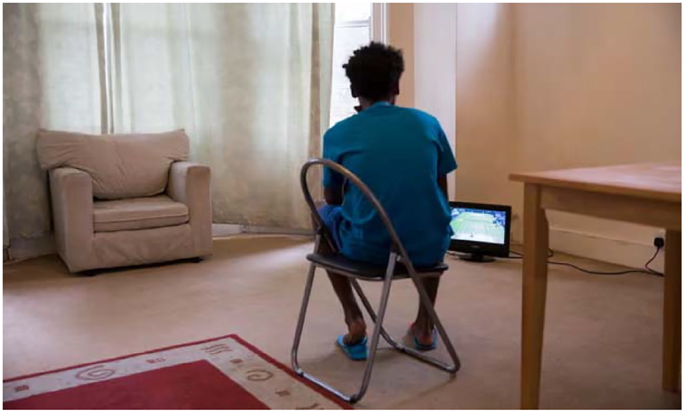
Image of an unaccompanied refugee child, taken as part of the ‘UK refugee project’ by Andrew Aitchison and licensed by Getty Images. Used as lead visual by The Guardian (16 November 2022, https://www.theguardian.com/uk-news/2022/nov/16/dozens-of-child-asylum-seekers-placed-in-home-office-hotel-for-adults) in an article on child asylum seekers placed in Home Office hotels for adults. Brought to interview.
Eilatan assumes that this image depicts a child asylum seeker and that the photograph is ‘incontrovertible proof that a given thing happened’ (Sontag, 1977: 5), which Sontag argues is part of the emotional power of images. The stock photo provoked concern in Eilatan, and as such it facilitated an emotional connection, despite the image not showing the face of the depicted individual or representing the specific event the news article addressed. In Regarding the Pain of Others (2004), Sontag links her ideas of incontrovertible proof specifically to iconic images, often rhetorically posited as the opposite of generic visuals, and yet here, a stock photo is also seen to offer evidence or proof. At the same time, Eilatan’s emotional response suggests that not all stock photos are meaningless or incapable of producing affective or moral responses (Frosh, 2020).
Some participants made explicit connections between the images in front of them and aspects of their identities, drawing on their everyday lives to make sense of generic visuals in ways which informed whether they did or did not connect with different generic visuals. Particular generic visuals were emotionally resonant for some, but not all, participants. For example, images involving children activated some participants’ identities as parents. In response to seeing an editorial stock photo of displaced Afghan children (Figure 8), Ali, an Asian man aged 35–44, related this image to his identity as a father:
I would open that first before them other ones because, being a father, I would be worried about them kids.
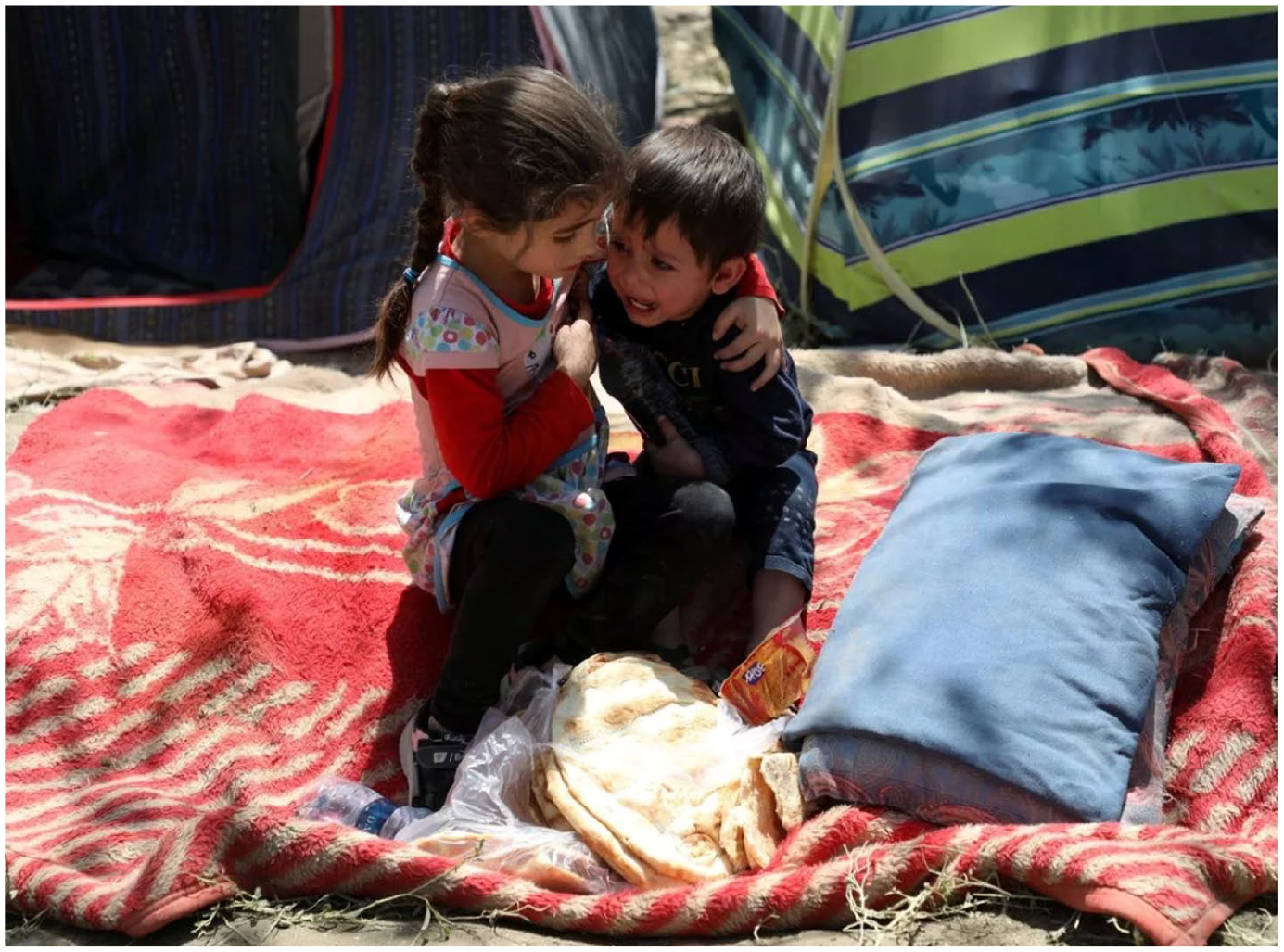
Image of displaced Afghan children, licensed by Reuters, used by The Mirror (18 August 2021, https://www.mirror.co.uk/news/politics/uk-take-20000-afghan-refugees-24781836). Project image database.
A FT data visualization of forecasted global warming activated the identity of Hailey, a 25-34 aged woman of mixed ethnicities, as a family member with relations in parts of the world most likely to be impacted by climate change (Figure 9). She said,
I would definitely share the global warming one, the one with the map changing the colour from yellow to red. With my family in Africa, like I said already, in South Africa, there is drought and everything happening, for them to see that. You need to start telling family now to start sorting things out, drilling boreholes and making sure that they have their own access to water because this is our future.
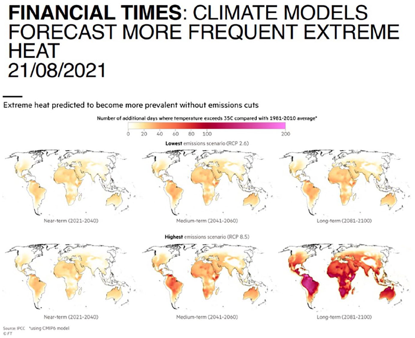
Data visualization of forecasted global warming in The FT (21 August 2021, https://www.ft.com/content/3ff5abeb-3b1f-41de-9336-167d73f803fb). Project image database.
This data visualization is brought into the sphere of the interpersonal and inspires individual action for Hailey. Other participants talked about recycling or reducing their consumption of meat after seeing generic visuals of environmental destruction and climate change from our data set. Such actions appear to connect to political beliefs, suggesting that generic visuals traverse the public and personal spheres – in Hailey’s case, the politics of climate change and her international family network.
Other participants also made connections between generic visuals found in the news and aspects of their diverse identities, including dis/ability, race and sexuality. For Pippa, a white woman aged 65+, a stock photo of a Paralympian activated her identity as a disabled person. She stated, ‘I take my hat off to these people because I am disabled myself and I don’t know how they have done it’. Similarly, Jolin, mentioned above, explained that a generic image of Prince Harry and his wife Meghan that she brought into the interview was significant to her racial identity, noting that ‘for me being a non-British person in the UK, I can resonate with Meghan, of the amount of abuse and racism I’ve suffered since I’ve been in this country’. Throughout the interview, Jolin returned to the example of Harry and Meghan, pointing out that this visual representation of them in the news was meaningful to her. In other words, she used a specific generic visual to talk about her life and to construct a narrative that went beyond the image itself.
These examples demonstrate that generic visuals function as resources in people’s personal lives. When Jolin encountered a stock photo of Meghan, her identity as a person of mixed ethnicities was activated. Generic visuals of Harry, Meghan and Kate, the wife of the United Kingdom’s other prince, speak to changing attitudes to racism in the United Kingdom and its persistence, which resonated with her lived experiences, as well as sparking wider debates about racism in the United Kingdom. Jolin’s response suggests that generic visuals function in multiple ways, simultaneously attracting attention, repeating standardized formats to shape understanding of issues, and connecting audiences emotionally with an issue.
Barri, also mentioned above, brought to the interview a stock image of a police car used in a news item about a shooting at an LGBTQ+ club, shown in Figure 10. Barri acknowledged that the story’s title, ‘Club Q Shooting’, and accompanying subtitle which explained that the club was for ‘the LGBT community’ played an important role in drawing him into the story, anchoring the image and fostering emotional connection. However, the use of a stock photo to accompany the story was also significant. The image connected with his identity as a gay man and evoked powerful emotions, including anger at homophobic hate crime, concern for the safety of the LGBTQ+ community, memories of trauma and appreciation of the publication’s considered decision to use this image. He said,
Where my personal experience is of being a gay man, I have had abuse in the past. It really hit home and it is like, no, we are still not safe. When I shared it on all of my platforms, people were just shocked as well.

Stock image of a police car with flashing lights behind a cordoned-off section, licensed by Reuters, used in a BBC article on Colorado Spring’s Club Q shooting (24 November 2022, https://www.bbc.com/news/world-us-canada-63733240). Brought to interview.
The image and the news story that it accompanied prompted Barri to remember past experiences, reflect on the ongoing discrimination facing the LGBTQ+ community and connect with others. Elsewhere in the interview, Barri recalled an image that was used in a different story about a LGBTQ+ hate incident:
There was one picture, like 10 years ago. I think someone got badly beaten up and it was the actual picture of the person after they were beaten up. That really got to me. It was more, not about the story, it was more to say, ‘No’. I really went off that publication. I think the picture they used was more to try and get the viewers or the readers in.
For Barri, the stock photo of a police car was a more considered and ethical choice of image for such a news story than showing the victim of a crime. This contradicts the view that stock photo usage is disconnected from the news story in which it is used. It also shows that participants’ assessment of generic visuals is grounded in lived experience. In other words, public news images are decoded through the lens of personal experiences and interpersonal relationships.
Personal experiences were also activated in encounters with examples of data visualizations that we discussed with participants, and they often informed whether participants trusted the visualizations in hand. Figure 11 shows an image promoting mask-wearing during Covid-19, which was circulated on Twitter. This image was included in our misinformation topic, because it does not have a source and therefore it is not possible to verify its accuracy. Hannah, a white woman aged 45–54, who worked as a medical librarian, responded to it as follows:
The fact that it is German doctors that are doing it, that fills me with more confidence, and I would have clicked on that image to then follow the link to see who was sending it, and then I would have followed back to see if these German doctors are actually German doctors and not just people sending this information. On the other hand, because of how and where I work, I already knew this information so I probably wouldn’t check as much as if it was completely new information to me, does that make sense?
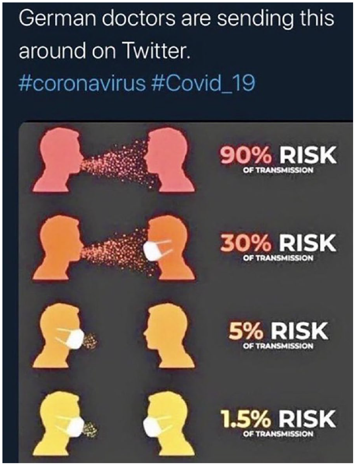
Data visualization promoting mask-wearing to reduce Covid-19 infections, shared in a tweet by Giles Paley-Phillips (26 November 2021, https://twitter.com/eliistender10/status/1465009443855286273). Project image database.
Hannah’s engagement with Figure 11 was shaped by her perception of German doctors, knowledge of Covid-19 risks and practice of checking information sources. Drawing these together, Hannah trusted the underlying message of the data visualization, despite noting its lack of a source. Anna, an Asian woman aged 35–44, asserted more explicitly that she viewed this data visualization through the lens of her own experience. Because it reinforced her pre-existing beliefs, she considered it truthful:
I think, rather than trusting this chart, I think I am trusting more myself. I already have been through this and I know what this chart is showing, whether it fits in what I already know. This chart is showing that it is 90% risk if you don’t wear any mask, which is true because it is what I have already experienced. I think source is not here the main object. My own experience relating to this source of information is more important in order for me to believe or not believe this resource.
Hannah and Anna draw on their experiences to make sense of the visualization, in this instance confirming the dominant narrative that visualizations are trustworthy, despite the absence of a source confirming the veracity of the message. As in the other examples discussed here, data visualizations as public images are decoded through personal knowledge and experience.
Taken together, these findings from our research show that participants have a complex relationship to generic visuals in the news. They sometimes mobilize publicly available, dominant narratives when considering specific stock photos and simple data visualizations. More often, they challenge or move beyond these narratives, connecting with these visuals in ways that activate their emotions, experiences and identities.
Conclusion: generic visuals as public images
Stock photos and data visualizations are both characterized by their standardized formats and appearances, their function as aspects of a designed page and their increasing ubiquity. At the same time, stock photos are often seen as clichéd, inauthentic and without meaning, whereas data visualizations are seen as truthful and trustworthy. In our research, participants drew on these dominant narratives when reflecting on generic visuals in generalized, abstract terms. However, when participants engaged with specific generic visuals, they often moved beyond dominant narratives and attributed meanings to them that drew on their experiences, emotions and identities. Thus, although dominant narratives make up the ideological framework through which participants make sense of generic visuals as particular types of imagery, in encounters with specific generic visuals, participants often challenged the dominant narratives that they themselves articulated when considering these images in more abstract terms. It was noteworthy that they drew on dominant narratives at the end of our interviews, despite having expressed more varied views about the value of stock photography and data visualization earlier in the interviews.
Because stock photos function through a logic of approximation, which Frosh (2020) refers to as their ‘someone-as-anyone structure’ (p. 201), people bring personal experience to encounters with generic visuals. That is, everyday lives and identities are lenses through which participants approach generic visuals; they provide the context from which sense-making processes are enacted. The genericity of generic visuals thus engenders conditions for reflection on everyday lives and experiences. Generic visuals sometimes elicit responses centred on emotional, personal connections, and the topics they represent are viewed and approached by audiences through the lens of the everyday. Participants often responded to the generic visuals they were shown or that they brought to the interviews by sharing their personal experiences of the topics at hand, such as Hannah and Anna in response to a Covid-19 visualization, and they sometimes moved the discussion beyond a focus on the images themselves. They used their lived experience and personal lives as resources to make sense of generic visuals and the issues they portrayed. At the same time, they used generic visuals to make sense of their own feelings and, more broadly, of their everyday lives.
Many of our participants responded emotionally to generic visuals in the news, such as Eilatan and Ali, who both expressed concern about the children they saw in different images. Because lives are shaped by identities, participants from different demographic groups responded to generic visuals in different ways. A generic visual may be overlooked by one participant, yet it may evoke strong emotions in another, because of its meaning to that person or the way it relates to their identity or experience. We saw this in Hailey’s response to a climate change visualization, and in Pippa’s, Jolin’s and Barri’s responses to stock photos which spoke to different aspects of their identities. Generic visuals become situated within personal experiences, they are used in interpersonal exchange or they signal collective forms of identification and belonging. Drawing on their lived experiences and identities, participants sometimes oriented beyond themselves as individuals and towards others in their engagements with generic visuals.
Another way that generic visuals traverse public and personal spheres is by offering a visual shortcut to reflecting on a political issue. Some participants expressed concerns about public events like climate change, racism or homophobia, concerns which were often expressed through explanations of personal connectedness to these political issues. A small number of participants took modest actions after seeing a generic visual, such as sharing it or changing personal behaviour. These small actions return us to our overarching research question: do generic visuals assemble publics, bring people together around shared interests and concerns, or activate citizens to care about particular issues? The answer to this question is that they occasionally do, in modest ways, through the examples highlighted in this paragraph and the collective forms of identification and belonging discussed above. These actions do not appear to extend beyond the sphere of the interpersonal, although it should be noted that we did not ask explicitly about political actions. Rather, we asked whether encounters with images led to changes in opinion or behaviour, made participants want to know more or do something about an issue, or led them to feel connected to others. Following Fratczak (2022), if we mobilize an expansive understanding of engaging in political activity, to include everyday and interpersonal actions such as those discussed here (Ekman and Amnå, 2012: 289), we can see some evidence of generic visuals assembling publics, in modest and mundane ways.
These findings contribute to debates about public images in a number of ways. Cohen et al. (2018) claim that iconic photographs which portray key moments of collective triumph and trauma contribute to public life because they are assumed to be vehicles of collective memory, catalysts for political action and resources for critical reflection on public issues. In short, they are public images. We argue that generic visuals are also public images with the potential to be transformed into meaningful resources, in part through the ways in which they are brought into dialogue with emotions, experiences and identities. In The Public Image, Hariman and Lucaites (2016) argue that photojournalism is the ‘public art most entangled with ordinary life and the news media, and thus the one that regularly connects individual experience with the expectations of citizenship’ (p. 14). They argue that photography is a key component of ‘civic spectatorship’, a term which combines two notions, ‘citizenship’ and ‘being a spectator’, traditionally seen as opposites. Our research considers data visualization alongside stock photography and it also addresses another absence in their work, by examining news images from audiences’ perspectives. We advance Hariman and Lucaites’ ideas about public images through our argument that generic visuals can play a public role and that, simultaneously, in engagements with generic visuals, the personal plays a role. In this way, generic visuals can, in the words of C. Wright Mills (2000 [1959]), unite personal troubles and public issues. We suggest that they do so through three functions: an orientation function in which they attract attention; an ideological function in which the repetition of standardized format shapes understanding of issues; and an affective function in which audiences emotionally connect with an issue.
Generic visuals are often commercially made, and they circulate widely. In this sense alone, they are public. They also function as public images in the sense that Hariman and Lucaites (2016) argue: they provide resources for thinking, feeling, talking and acting about collective issues. The ‘symbolic reiteration’ (Aiello et al., 2022) of generic visuals plays an important role in enabling generic visuals to function as public images. That is, the performative repetition and resignification of a range of visual resources across news stories and other sources contributes to promoting certain experiences and engagements. Emotions, experiences and identities also matter. The ways in which generic visuals make meaning connect with how viewers activate their personal experiences, identities and existing knowledge in their encounters with news imagery to complicate common perceptions of stock images as boring, irrelevant or meaningless on the one hand, and of data visualizations as objective, transparent or emotionless on the other hand. By advancing understanding of the role and meanings of generic visuals in the news, our research also advances critical understanding of what constitutes public images and how they function to offer ‘a way of being in the world with others’ (Hariman and Lucaites, 2016: 15).
Footnotes
Data availability statement
Declaration of conflicting interests
The author(s) declared no potential conflicts of interest with respect to the research, authorship, and/or publication of this article.
Funding
The author(s) disclosed receipt of the following financial support for the research, authorship, and/or publication of this article: This work was supported by the Arts and Humanities Research Council (grant number AH/T000015/1).