
Abstract
This article examines the design concept of glanceability as a normalizing mode of engagement with digital interfaces. The glance, a visual order that recurs across everyday life, has proliferated dramatically with the emergence of the graphical user interface (GUI). While glanceable cues are ubiquitous on screens, their impact remains largely overlooked in media studies. Addressing this gap, the article draws on a textual analysis of media theory and a technical walkthrough of the Apple Watch Activity Rings (Light et al., 2018). It argues that glanceable interfaces channel attention into minute interactions that create a rhythm of engagement in which informational complexity is traded for efficiency. Expanding Blascheck et al.’s (2021) framework of glanceable cues – ‘Presence and Access’, ‘Simplicity and Understandability’, and ‘Suitability and Purpose’ – with Ellis’s (1982) concept of voyeuristic distance, the article identifies three key trade-offs: low information resolution, reductionism, and fragmented interaction. Situating this analysis within Jonathan Crary’s theorization of attention in Suspensions of Perception (2000), it frames glanceability as a form of distributed agency that normalizes behaviour rather than simply reflecting notions of efficient data display. Within this scope, the article highlights the significance of glanceable GUIs in shaping contemporary engagements with screens.
Introduction
‘You can do it, you can do it, you can do it...’ – the repeating lyrics of Caribou’s song, barely distinguishable from the pulsating beat, blare through the speakers as the TV screen erupts in a frenzy of swirling colours. At the centre, an Apple Watch displays the three signature bands of the Activity Rings. The slogan ‘Crush goals. Close rings. Repeat.’ slides across the screen. After 10 disorienting seconds, the advertisement for the Apple Watch Series 10 extracts a firm command from the song: ‘Do it!’ – just as quickly as it began, it is over (apfelspot, 2024). This commercial offers no explanation for the Activity feature it portrays – a defining symbol of the Apple Watch since its debut in 2014. A quick browse through Apple Watch commercials on YouTube reveals a recurring visual language: athletes of various kind repeatedly close rings (Series 2, Series 6, Series 10), and everyday users take the stairs and stand up at the watch’s prompt (Series 4, Series 6). 1 The message is clear – fitness tracking is instinctive, unquestioned, and seamlessly integrated into daily life. The Activity Rings provide real-time feedback on movement, exercise, and standing goals through concise visual cues, reinforcing a behavioural loop that turns action into habit. In everyday use, the time spent glancing at the app is even shorter than the few seconds it appears in Apple’s fast-paced promotional videos. Throughout interface design literature, such concise cues are referred to as ‘glanceable visualizations’ – interface elements specifically designed for brief interactions that facilitate swift information intake (Blascheck et al., 2021). Using the Activity Rings as a case study, this research examines the design choices that contribute to glanceability. Through a media-theoretical analysis of the glance, it explores the following questions: (1) How does media theory focused on screen interfaces contribute to an understanding of glanceability? (2) How do glanceable interfaces engage users? (3) How does glanceability normalize user behaviour?
The glance constitutes a distinct visual order that recurs across many facets of everyday life: briefly scanning the faces of strangers on the subway, gauging speed on a car’s speedometer, or quickly checking a weather widget on the phone before leaving home. 2 Such practices of glanceability are directed at specific interfaces and embedded in diverse assemblages of humans and artifacts. Against this backdrop, the paper contributes to media studies by observing that the proliferation of the glance has accelerated dramatically with the emergence of the graphical user interface (GUI). It argues that the visual prompts of glanceable interfaces channel attention into minute interactions that form a rhythm of engagement. While efficient, the emphasis on brevity necessarily reduces the conveyed information to a low resolution leading to a visual order, where complexity is stripped away to prioritize immediacy. This aspect of interface design has received little attention compared to its ubiquity.
The tension of glanceable design becomes apparent when examining how it is conceptualized in screen media literature. Human–Computer Interaction research frames the glance as a problem of interface optimization. In contrast to such positivist accounts one of the earliest references to glanceability as a property of screen media strikes a more critical tune. In his ‘Glance Theory’ TV producer and media scholar John Ellis (1982) proposes that the glance, understood as a distracted look, marks a lack of voyeuristic distance to the medium of television. Seemingly very different, the critical literature on television viewing and the positivist research on glanceable interfaces are connected through the prism of attention. In Suspensions of Perception (2000) Jonathan Crary argues that the management of attention that gained significance in the late 19th century is a distinctly modern construct born out of laboratory science which involves the study of short bursts of focus within an unstable and distracting environment. Today these repetitive bursts of attention shape the multiple distractions of our world into coherent narratives and are commonplace on the digital screens of various devices. On television, banners and commercials seek to capture attention; on computers, mail programs prompt incoming messages; and on phones, screens briefly light up with widgets. Smartwatches are among the most prominent examples of glanceability as their small wrist-worn displays are designed to deliver information concisely. As the first section shows, studies in HCI largely examine glanceability in relation to activity tracking. This research follows in that tradition and turns to the Apple Watch, which as of 2024 remained the market leader in smartwatch shipments (Statista, 2024). As the watch’s tools for bodily self-monitoring have grown to be more refined and numerous, it can be difficult to pinpoint the specific attributes of glanceability. However, one interface has remained consistent since the device’s launch: the Activity Rings (Figure 1). Integrated into the Activity app, these three brightly coloured rings show daily activity metrics and exemplify the trade-off between efficiently conveying data and enabling deeper insight. Screenshot of the Activity rings embedded in the Activity app.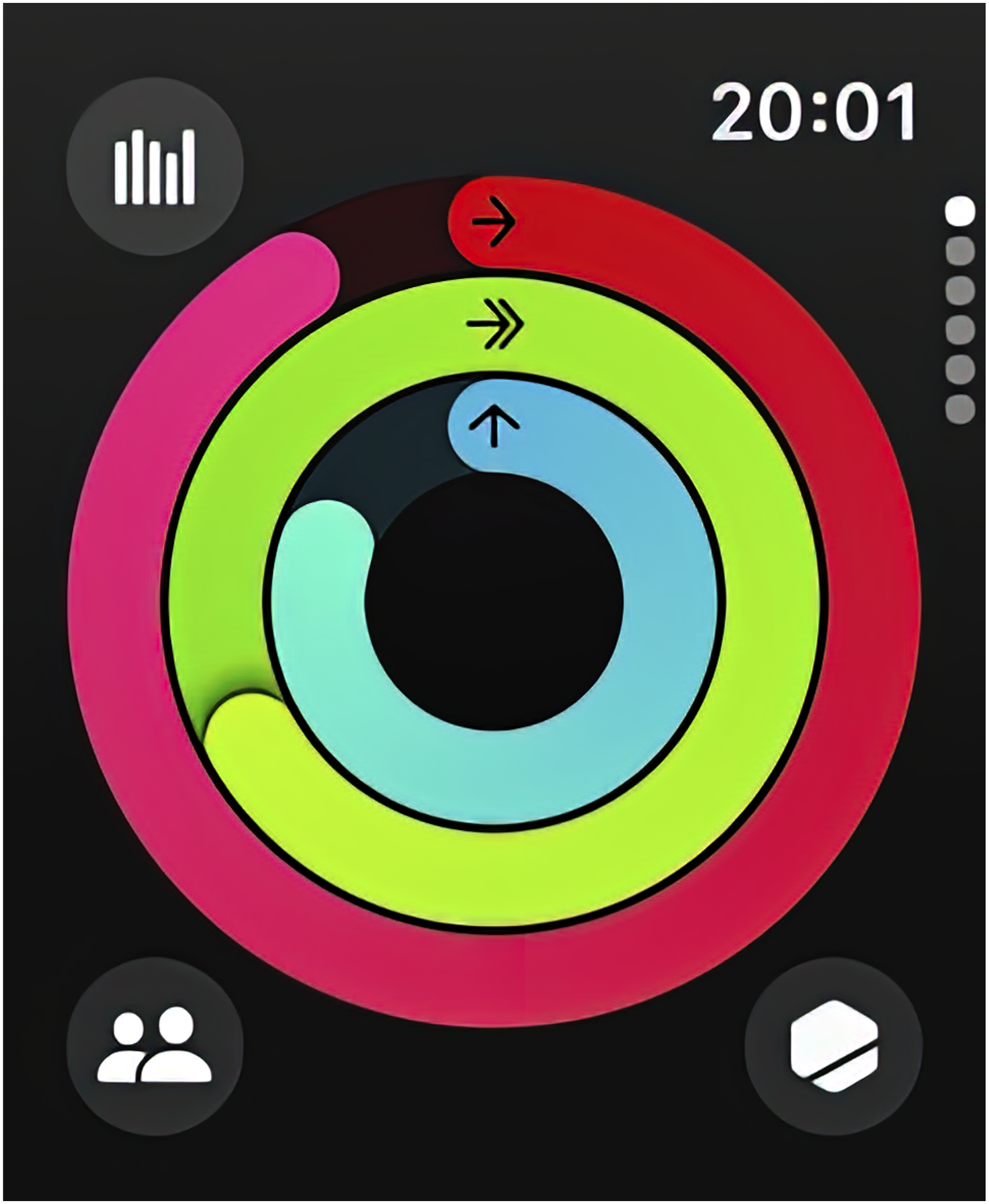
The paper introduces an extended framework for understanding this trade-off. The methodology follows Gillian Rose’s concept of Discourse Analysis I, which prioritizes the analysis of ‘visual images and verbal texts’ over ‘the practices entailed by specific discourses’ (Rose, 2023: 220). The glanceable interface is described and discussed across three sections. Each section corresponds to a research question and addresses the glance from a different perspective. The first section presents a textual analysis of media-theoretical perspectives on the glance, contrasting the critical notion of glanceability as voyeuristic distance in television studies with the more positivist approaches of HCI and adjacent fields. Drawing on Blascheck et al.'s (2021) three pictorial dimensions of glanceability, it introduces three distinct trade-off categories that refine the broad notion of voyeuristic distance. The second section analyses the engagement prompted by glanceable interfaces through a detailed account of the Activity Rings, applying the walkthrough method (Light et al., 2018). It situates glanceability within the broader discourse on the ecological operations of interfaces in actively shaping behaviour and perception. The third section delves into the normalizing effects of glanceable interfaces. It contextualizes the use of the Activity Rings within early discussions of interface design and the construction of attention, highlighting how these developments minutely structure our interactions with screens today.
How does media theory focused on screen interfaces contribute to an understanding of glanceability?
Glanceability is a key feature of wearable devices. Written as a handbook for application designers, Apple’s Human Interface Guidelines introduce the Apple Watch with the statement: ‘When people glance at their Apple Watch, they know they can access essential information and perform simple, timely tasks whether they’re stationary or in motion’. At Apple, glanceability is a specific feature of its smartwatch and is not referenced elsewhere in the guidelines. Here, the glance is defined as a brief moment of information intake, serving as a prerequisite for an equally brief interaction: ‘People glance at the Always On display many times throughout the day, performing concise app interactions that can last less than a minute each’ (Apple, 2024a). This definition aligns with its application in HCI and related fields where the glance is described as a brief look – typically lasting up to 5 seconds – that allows for the intake of information from a visualization without requiring extensive analysis (Consolvo et al., 2014; Gouveia et al., 2016; Matthews et al., 2006; While et al., 2024). It is also no coincidence that the term glanceability appears solely in the section of the handbook which describes the Apple Watch. Notably, most studies on the visual aspects of glanceability in HCI primarily focus on activity tracking for smartwatches (Blascheck et al., 2023; Boerema et al., 2012; Consolvo et al., 2008, 2014; Gouveia et al., 2016; Islam et al., 2020; Klasnja et al., 2009; Neshati et al., 2019). The unique accessibility of smartwatch screens on the wrist makes them ideal for quick glances while the emphasis on fitness tracking reflects broader cultural values concerning productivity and self-optimization. Previous research found that users check their smartwatches between 60 and 95 times per day (Min et al., 2015; Pizza et al., 2016), with 70% of these interactions only amounting to a glance (Gouveia et al., 2015). Such short interactions with an interface involve balancing complexity and symbolism to efficiently present a clearly arranged and limited dataset. Thus, glanceability describes a pictorial mode of conveying information within a very short timeframe, a design principle that has proliferated especially on small screens such as smartphones and wearable devices.
In research on HCI and adjacent fields glanceability is discussed as a means to optimize the engagement with interfaces. Blascheck et al. (2021) identify three categories of glanceable visuals: ‘Presence and Access’, which concerns the placement and size of an interface to minimize eye movement; ‘Simplicity and Understandability’, which emphasizes that visualizations should be easily interpretable without much learning; and ‘Suitability and Purpose’, which calls for visualizations to be tailored to specific, achievable tasks based on individual needs (Blascheck et al., 2021: 160-161). Much of the literature explores various types of visualizations according to one or more of these parameters (Consolvo et al., 2008, 2014; Gouveia et al., 2016; Islam et al., 2020; Klasnja et al., 2009; While et al., 2024). Consolvo et al. (2008) conducted one of the earliest studies on glanceable displays, demonstrating how behaviour change can be influenced through a phone’s home screen. Their application, UbiFit, playfully depicted a garden where various flowers bloomed on a two-dimensional lawn, each representing different physical activities completed by the user throughout the day. Echoing the category of ‘Simplicity and Understandability’, later studies suggest a preference for straightforward depictions of exact measurements. Gouveia et al. (2016) developed 21 unique glanceable design concepts and tested four of them with participants over 28 days. Their findings indicate that the garden visualization is the least preferred, with radial bar charts proving more popular. This aligns with Blascheck et al. (2023), who found that bar and radial bar charts are the most effective visualizations on watch faces, with participants showing a particular aesthetic preference for the latter. More detailed discussions concern the relation of icons and charts to text as well as the placement of distinct visualizations on a single screen (Blascheck et al., 2023; Islam et al., 2020). Overall, the visual parameters of glanceability are therefore determined by factors such as screen size, composition, pictorial tradition, and colour scheme. All these considerations are related to the efficient display of data. However, as Blascheck et al. point out, ‘research on glanceable visualizations has not considered people’s understanding of what the data represents and what it implies. Therefore, it has often only been the time needed for perception that is measured, not time to understand the data and especially not for realizing implications to one’s life’ (Blascheck et al., 2021: 159).
What is missing in the literature on HCI and related fields can be found in another area of media research. Since the mid-1980s, studies on television viewing have explored glanceability in a more culturally and socially resonant context. Expanding on prior work by Marshall McLuhan and Raymond Williams (McLuhan, 1964; McLuhan and Williams, 1978), John Ellis proposed a ‘glance theory’ that argues television’s regime of looking is less intense than that of cinema. In a somewhat polemical account, he suggests that glancing at television requires little effort, resulting in a lack of critical voyeuristic distance from the content. While a spectator going to the cinema is ‘caught by the projection yet separate from its illusion. The TV-looker is a viewer, casting a lazy eye over proceedings…’ (Ellis, 1982: 137). Ellis attributes this to the physical proximity of the television within the home, as opposed to the more deliberate experience of going to the cinema. He describes TV as ‘a relay, a kind of scanning apparatus that offers to present the world beyond the familiar and the familial, but to present them in a familiar and familial guise’, which diminishes the viewer’s sense of voyeuristic separation (Ellis, 1982: 163). Here, the glance is connected to the norm of the familial – a powerless look complicit with the pictorial logic of glanceable visualizations. While ‘glance theory’ has been rightly criticized for its schematic portrayal of television as a passive medium Ellis accurately identifies a key trade-off of glanceability: the lack of voyeuristic distance, which can lead to complicity with the television program. Most notably media scholar John T. Caldwell critiques this notion of passivity, referring to Ellis’s theory as a ‘surrendered gaze theory’ (Caldwell, 1995: 25). 3 However, while Ellis’s schematic approach to voyeuristic distance may be polemical, Caldwell’s notion of a surrendered gaze effectively underscores the central argument. More recent research on film viewing habits explores the concept of the glance within the context of multi-screen use where viewers quite literally surrender to another screen. Francesco Casetti (2011) distinguishes between the gaze, as a form of immersive spectatorship, and the glance, as a form of dispersed attention. Kannas et al. (2023) examine this distinction in relation to film students’ engagement with assigned films watched at home. Their survey results indicate that some respondents aspired to an immersive gaze but were hindered by their viewing environment, especially the presence of second screens (Kannas et al., 2023: 52). Vino Avanesi (2020) extends this argument, asserting that the convergent consumption of broadcast-era programs fosters an aesthetic of control that shapes the relationship between subjectivity and reality, resulting in a ‘Fordist factory-type enclosure in the home’ (Avanesi, 2020: 376). 4 While this research supports Caldwell’s rejection of the simplified notion of a passive, distracted domestic spectator, it also demonstrates that the modern infrastructure of film consumption is not only subject to multiple contesting screens but also enables viewers to directly manipulate their experience and ultimately alters their viewing habits. 5 Even film students, who are arguably more motivated to pay close attention to a film, clearly struggle with the reduction in viewing intensity that Ellis identified as a characteristic of glancing at the television.
This paper argues that the effects of glanceability on users’ lives can be examined through the lens of glanceability’s trade-offs, which have been conceptualized in media studies as a loss of voyeuristic distance. While traditional broadcast television, with its one-to-many communication model, differs from wearable devices that rely on a user-centred, interactive model, the erosion of voyeuristic distance from the depicted content is a significant issue in both cases. To further explore this trade-off, the paper examines Blascheck et al.’s (2021) pictorial categories of glanceability and proposes three corresponding categories that risk diminishing voyeuristic distance: low resolution of information, reductionism, and fragmented interaction. What Blascheck et al. (2021) label as ‘Presence and Access’ comes at the cost of ‘low resolution of information’, where the effort to minimize the viewer’s cognitive load results in shallow, redundant content. The category ‘Simplicity and Understandability’ carries the drawback of ‘reductionism’, acknowledging that the emphasis on easily interpretable visuals reduces complexity and obstructs a more holistic view. Finally, ‘Suitability and Purpose’ gives way to ‘fragmented interaction’, since tailoring visuals to specific tasks can fragment the continuous flow of daily life into compartmentalized interactions. These three trade-off categories show that the compositional choices of glanceable design operate on a spectrum between efficient data conveyance and the voyeuristic distance necessary for deeper reflection.
Although engaged with different media, the distracted television viewers (Ellis, 1982), the film student struggling to focus (Casetti, 2011; Kannas et al., 2023), and the individuals tracking their activity data (Blascheck et al., 2023; Boerema et al., 2012; Consolvo et al., 2008, 2014; Gouveia et al., 2015, 2016; Klasnja et al., 2009; Neshati et al., 2019; Pizza et al., 2016) all interact with visual aspects of glanceability, including screen size, composition, and pictorial conventions. Comparing these perspectives suggests that the concise, timely delivery of information promised by glanceability encourages interactions that are brief, fragmented, and somewhat distracted. To further explore this trade-off between efficiently conveying information and the erosion of voyeuristic distance in interface design, the next section examines the engagement with glanceable interfaces. Like most studies in HCI it focuses on activity tracking on smartwatches and takes a closer look at the Apple Watch, which, as of 2024, leads the smartwatch market in shipment share (Statista, 2024).
How do glanceable interfaces engage users?
The previous section demonstrated that the trade-off between efficiency and reflexive engagement – what John Ellis terms ‘voyeuristic distance’ – is central to interactions with glanceable devices. This section examines the Activity Rings as a glanceable interface, showing that glanceability functions as a form of distributed action that produces a rhythm of brief, repeated stimuli composed of low-resolution information. Building on the spectrum of glanceability outlined earlier, the analysis argues that this dynamic is not unique to digital media but extends a longstanding duality of attention and distraction that has shaped the construction of perception in modernity.
While the rings can be displayed on the Apple Watch home screen in various configurations, they are primarily embedded within the Activity app. This analysis employs the walkthrough method (Light et al., 2018) to systematically examine the Activity app’s interface. The method provides a structured approach to analyzing mobile software components, which are often ‘overlooked or subsumed in broader analyses of mobile technologies’ (Light et al., 2018: 20). The systematic interaction with an app is done via a ‘technical walkthrough’ which traces key elements such as icons and activation buttons. It follows a three-step protocol: registration and entry, everyday use, and app suspension (Light et al., 2018: 13–18). This technical walkthrough is embedded within the ‘environment of expected use’, describing the intention of the app provider by analyzing vision, operating model, and governance as pivotal aspects that inform an apps’ architecture (Light et al., 2018: 3f).
Apple’s vision for the Watch centres on health and fitness. When introducing it in 2014, CEO Tim Cook described it as a ‘comprehensive health and fitness device’ (Apple 2015). Since then, Apple’s commercials consistently show users glancing at their Watch to monitor heart rate, exercise, or blood pressure while simultaneously staying connected through calls and messages. This aspiration is formalized in the Human Interface Guidelines, which define the device’s design principle as one of glanceability: ‘When people glance at their Apple Watch, they know they can access essential information and perform simple, timely tasks whether they’re stationary or in motion’. This vision is embedded within an operating model. Montgomerie and Roscoe (2013) argue that Apple’s business model aims to ‘own the consumer’, integrating them into an ecosystem of hardware, software, and services. Crawford (2024), in the case of Apple TV+, shows that value in this ecosystem is generated through data collection, brand extension, and a ‘lock-in effect’ that is achieved through seamless integration, convenience, and interconnectivity. While Apple’s aspiration to collect health data is significant, this walkthrough focuses on the ‘lock-in effect’, which relies on a simple design language to establish convenience of use. 6 This convenience is infused with governance mechanisms. The features of the Activity app establish clear boundaries for desirable activity. They structure user activity by setting goals, issuing alerts, and offering sociability features such as awards and trophies. As Asimakopoulos et al. (2024) note, the Apple Watch is distinctive in providing contextual nudges – such as the hourly prompt ‘Time to stand’ that is sent when no standing is detected for a minute. While nudges such as these are strong behavioural prompts (Thaler and Sunstein 2021), this analysis emphasizes the subtler effects of glanceable design. Taken together, vision, operating model, and governance mechanisms, shape the Activity app’s aspiration to be a glanceable health tool. Beyond widgets or push notifications, the seemingly mundane visual cues of the app structure information into a rhythm of brief, repeated interactions with the watch that produces a specific assemblage of human–artifact activity which the technical walkthrough aims to trace.
Having established the environment of expected use the step-by-step documentation of the Activity app’s screens make glanceability ‘salient and therefore available for critical analysis’ (Light et al., 2018: 3). Light et al. structure the analysis into three distinct practices: registration, everyday use, and app suspension. The latter is not existent on the Apple Watch as it would require resetting the device. Registration into the Activity app is tied to the initial setup of the Apple Watch, where users are asked whether they would like to configure the app. The app opens with a welcome screen that outlines its intended use by explaining the parameters of the three rings. Users are then prompted to enter personal information, including date of birth, sex, height, weight, and wheelchair use, before setting a Move goal based on low, medium, or high activity levels. Each tier corresponds to a daily calorie target, displayed prominently on screen and adjustable via simple controls. The registration process concludes on the main page, which displays the activity rings.
Everyday use of the app is organized across six pages: the activity rings, detailed views of each activity, a pedometer, and a list of completed workouts. These pages are vertically arranged and can be navigated by swiping or turning the digital crown. In line with the walkthrough method, which requires a selective focus on material features relevant to the research question, this analysis centres on the Activity rings as the most direct expression of glanceability. Accordingly, the pedometer, the workout list, and nudging features such as awards or sharing are discarded. The rings are displayed on the first four pages, which fall into two templates: a large ring on the title page and detailed views of each activity on the subsequent three pages. The title page of the Activity app is dominated by the ring graphic (see Figure 1), foregrounding it as the primary glanceable element. Small icons in the corners hint at additional features but remain peripheral, while six grey dots on the right indicate the number of slides, navigable via the digital crown or by swiping. This layout caters toward ‘Presence and Access’ as it privileges immediate visual recognition of progress displayed by the rings over deeper navigation into secondary functions. Blascheck et al. (2023) show that bar and radial bar charts are the most effective visualizations on watch faces. To interpret this further, Casetti’s (2023) concept of screenscape is instructive. He follows Bernard Goeghegan (2019) in maintaining that screens are part of an ‘ecology of operations’ (Casetti 2023: 330). 7 They converge with their environment, merging with existing affordances while simultaneously introducing new meanings. In the case of the Apple Watch, the screen merges with the existing affordances of the wristwatch. The Activity rings echo the performative qualities of clock hands converging on the hour, which for centuries conveyed ideas of productivity and order. Tracking body metrics in this design, the familiar act of glancing at a watch face has, over the past decade, shifted from keeping time to also include self-monitoring. This familiarity of the visual metaphor of converging on the hour is an example of ‘Simplicity and Understandability’.
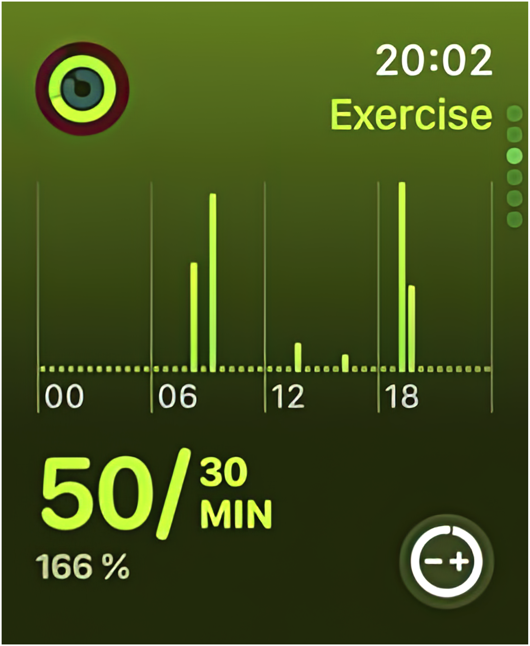
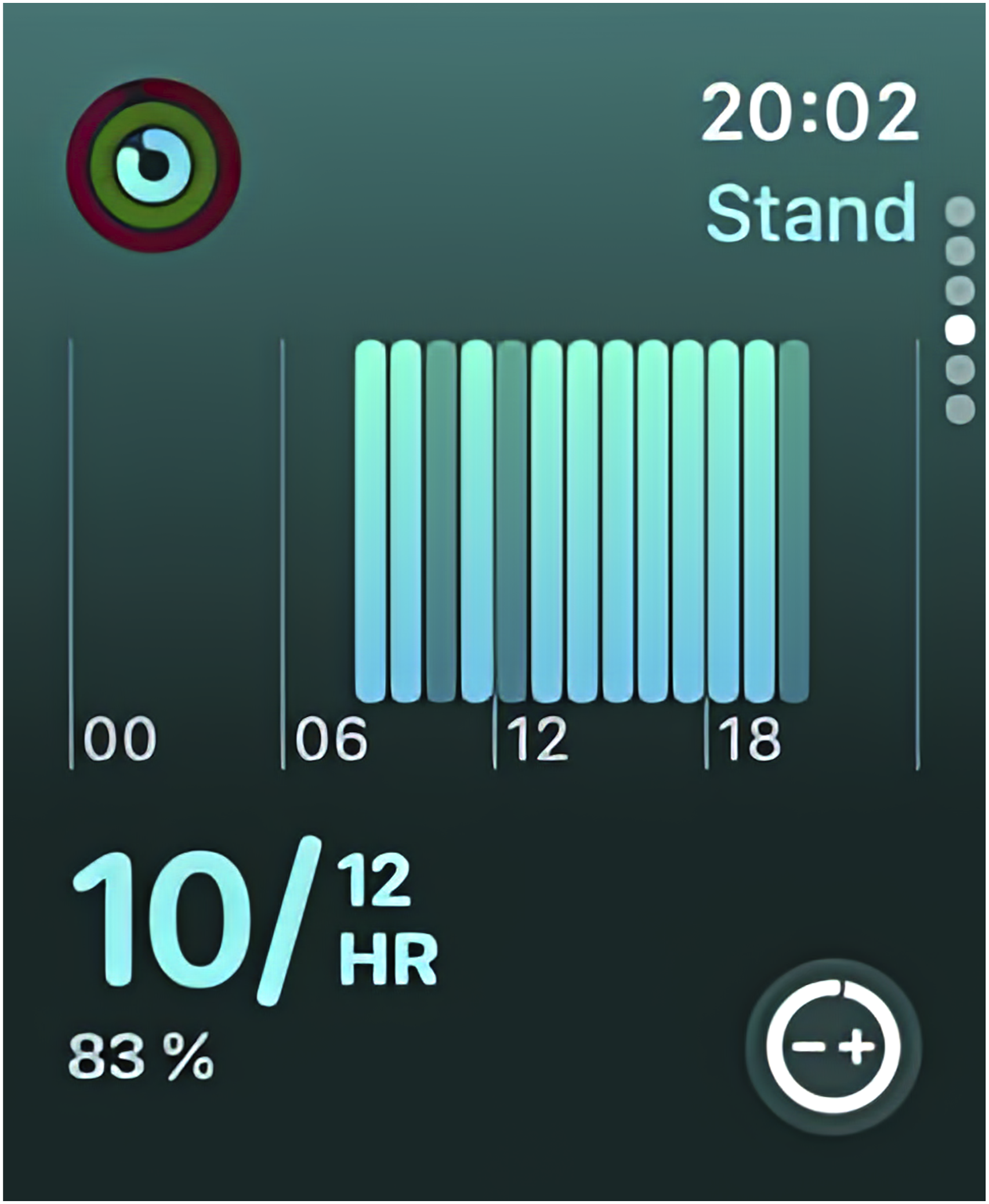
The subsequent three pages of the app provide detailed views of the parameters represented by the rings, labelled ‘Move’, ‘Exercise’, and ‘Stand’(Figures 2–4). This caters towards ‘Suitability and Purpose’ by tracking three distinct, achievable activity tasks throughout the day. Each page devotes roughly two-thirds of the display to a graph charting activity over time, with the lower third showing progress toward the daily goal as a fraction and percentage. The background shifts to the hue of the respective ring, highlighted in the upper left corner. Although framed as ‘detailed’ slides, these views retain the logic of glanceable design. Information is presented in deliberately low resolution: the fraction is immediately catching the eye, while the bar chart functions only as an approximation, offering a broad overview without a labelled y-axis. Through repetition of data, the use of colour coding, and proportional displays, the detailed slides are closely related to the ring graphic. They facilitate rapid recognition of progress and reinforce Apple’s vision of the Watch as a glanceable health tool. Screenshot of the ‘Move’ dashboard embedded in the Activity app. Screenshot of the ‘Exercise’ dashboard embedded in the Activity app. Screenshot of the ‘Stand’ dashboard embedded in the Activity app.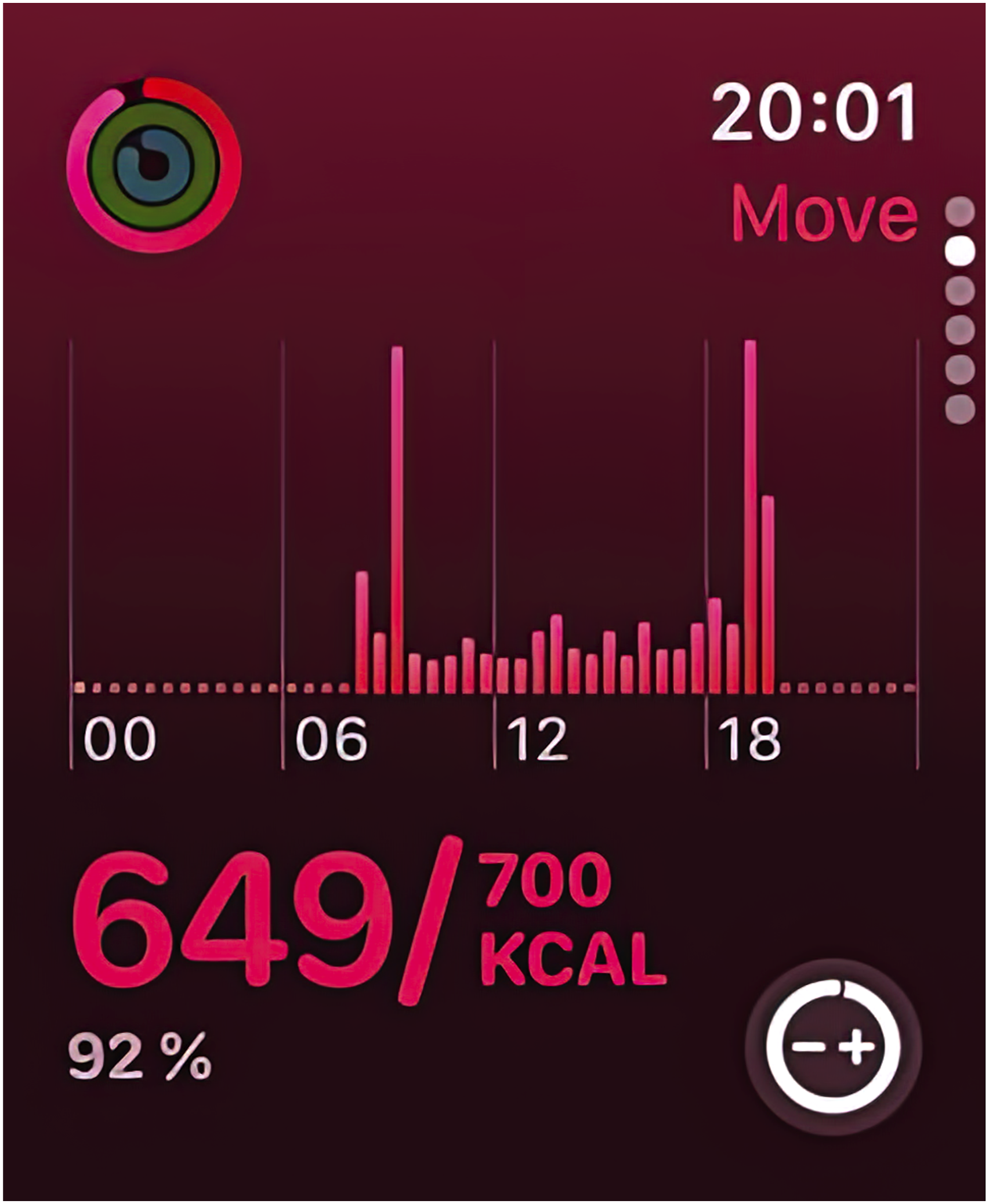
The walkthrough shows that glanceability is a form of distributed agency that creates a rhythm of repeated bursts of short interaction. Sharing in the ecological operations of a screenscape it gives the watch the power to ‘address eyes and mobilize feet’ (Casetti, 2023: 328). The design of the closing rings echoes the traditional language of watch hands converging on the hour, while new temporal cues such as the daily reset of rings, hourly ‘stand’ reminders, and periodic notifications, encourage ongoing engagement. Users learn to interpret and anticipate these signals as indicators of achievement or deficiency. Similar forms of distributed agency have been described by Gell (1998) in relation to soldiers whose weapons co-constitute their identity, and by Dant (2004) in the amalgamation of driver and car.
By producing brief, repeated interactions with low-resolution information, glanceability situates engagement on a spectrum between attention and distraction. This is marked by inherent trade-offs. To achieve the main categories of glanceability outlined by Blascheck et al. (2021) within a few seconds, the design of the Activity rings must strike a balance between simplicity and complexity. On this spectrum, the ‘Presence and Access’ of the rings is closely tied to the low resolution of information. With limited ‘screen real estate’ (While et al., 2024: 3), the design must convey activity data efficiently, which restricts nuance in relation to personal health. This trade-off is partly mitigated by contextualization in the Activity app (see Fig. 2–4) and the Fitness app, which offers longitudinal records and trend summaries. Yet across the formats on the watch display, the data remain largely reconfigured visually rather than expanded in substance. The principle of ‘Simplicity and Understandability’ also risks fostering a reductionist reading of health metrics. The familiar metaphor of closing rings, combined with a distinct colour scheme, simplifies information so that users are not required to interpret the data themselves. Apple mitigates this reductionism through customizable goals and through notifications prompting users to stand, move, or breathe. While these features acknowledge the complexity of health, they do not invite deeper reflection, tending instead toward a one-size-fits-all model that may pressure users into meeting targets even when it might be inappropriate. Lastly, ‘Suitability and Purpose’ of the Activity Rings introduces the drawback of fragmented interaction with the data. The distinct ring elements treat each task as an isolated goal, rather than as part of a holistic fitness strategy. This is reinforced by the separate slides for each activity. On the Watch, this is partly offset by companion apps that track related health indicators such as heart rate, blood oxygen, and sleep. However, these datasets often remain siloed, leaving users themselves to connect disparate metrics and construct a meaningful picture of their health and fitness.
In marking these trade-offs, this research does not suggest that users of the Activity rings have a uniform experience of health. Rather, it argues that the pictorial order of glanceability intends a specific interaction with an interface consisting of brief rhythmical engagements which are situated on a spectrum between efficient data conveyance and the capacity to provide deeper insight. 8 The agency of a glanceable interface must, then, be understood as a rhythmic interplay of attention and distraction. By focussing on three key parameters of activity, the interface inadvertently distracts from other potentially important factors. This narrowing of the information channel, subtle during initial use, is a defining feature of engagement with glanceable interfaces and a central aspect of their power to shape how users perceive the world. HCI and related fields emphasize optimizing engagement with such displays, particularly in multitasking scenarios where attention must prioritize a primary task – for example, when athletes in various Apple Watch commercials glance at their Activity Rings during a workout. Film studies, by contrast, explore how glanceable displays disrupt an individual’s ability to sustain focus. Reading this research side by side highlights that what enables people to maintain focus through short bursts of attention on one hand can also become a source of distraction on the other. This duality of attention and distraction is characteristic of engagement with glanceable interfaces. However, it is not specific to this phenomenon. Rather, it has been a central problem of modernity and plays a key role in the construction of attention that defines our engagement with interfaces to this day.
In his epistemological writings of the 1890s, Emile Durkheim linked attention and distraction to a blindness inherent in perception: ‘We are always to a certain extent in a state of distraction, since attention, by concentrating the mind on a small number of objects, blinds it to a greater number of others’ (Durkheim et al., 1953: 21). As an inherent aspect of perception, distraction has long been portrayed as a symptom of the ‘decay’ of perception within the broader decline of modern experience (Crary, 2000: 49). 9 This conviction underlies John Ellis’ ‘glance theory’, which argues that TV viewers are inherently more distracted than spectators going to the cinema, who watch films with greater intensity and an intent voyeuristic distance. Against notions such as these Jonathan Crary (2000) contends that broad historical assumptions, which imply a deeper and more valuable premodern wholeness, overlook the fact that attention is a distinctly modern epistemic construct. He argues that distraction only emerged as a problem in the late 19th century and should be understood as inseparable from, and even a ‘constitutive element’ of, the effort to cultivate attentiveness in human subjects. By the last quarter of the 19th century, research on attention recognized that ‘perception was essentially temporal and unstable but was also, if studied resolutely enough, capable of management and relative stabilization’ (Crary, 2000: 311). This conviction underlies modern research on glanceability in HCI and adjacent fields. Likewise, most research on attention in the 19th century focused on a limited number of objects or stimuli, studied in isolation from a broader context. This approach aimed to distil sensory capacities into pure, elemental experiences, separate from distraction or introspection. Consequently, any ‘interior’ faculty of attention was dismissed, rendering it a measurable quantity determined solely by the rhythm of external stimuli – often machine-produced, electrical, and brief.
Analyzing the Activity rings with the walkthrough method shows that its glanceable interface creates a rhythm of brief bursts of attention. This distributed agency is characterized by a low resolution of information that necessarily leads to trade-offs. As a complex of brief interactions within an environment of multiple stimuli, glanceability stands in line with the modern concept of perception which seeks to stabilize attention in a world of distraction. From this perspective, glanceable interfaces follow in the tradition of 19th-century laboratory experiments, which carried a normalizing force by stripping away complexity in favour of optimizing compliance with pre-determined external stimuli. The next section further explores the trajectories underlying this normalizing power of glanceable interfaces.
How does glanceability normalize user behaviour?
In Apple’s commercials, the three brightly coloured rings of the Activity app appear as a natural companion in daily life. Far from being perceived as ideological, they signal a physically active lifestyle in small visually striking fragments of information that require very little cognitive attention. However, despite the clear benefits of glanceable interfaces in reducing cognitive load, it is important to acknowledge the design’s gravitational pull toward a simplistic framework of interaction that can shape how people perceive – and engage with – the world around them. Wendy Chun points out that computers are powerful not only because they empower users, but ‘because software’s vapoury materialization and its ghostly interfaces embody – conceptually, metaphorically, virtually – a way to navigate our increasingly complex world’ (Chun, 2011: 2). Building on this notion, this paper advocates for a revised ‘glance theory’ that recognizes the diverse uses of interfaces while also examining their common denominator of normalization: the erasure of other possible and possibly critical gazes in an effort to shave off time and efficiently convey what device producers consider common sense or natural.
Amid an economy that is increasingly centred around attention, the competition for short moments of focus has long been a key consideration of interface design. At the Xerox Palo Alto Research Center (PARC), founded in 1970 and renowned for its groundbreaking work in interface development, Marc Weiser and John Seely Brown laid the foundations for what is now known under the term ubiquitous computing in an essay on Designing Calm Technology (1996). They were responding to the idea that '[i]nformation technology is more often the enemy of calm. Pagers, cellphones, news services, the World-Wide-Web, email, TV, and radio bombard us frenetically’ (Weiser and Brown, 1996: 1). They argued that navigating this constant bombardment of information ‘may be the most important design-problem of the twenty-first century’ (Weiser and Brown, 1996: 1) and requires what they term a ‘calm technology’. A technology is calm when it operates at the periphery and can easily move to the centre of attention. A prime example that they provide is driving a car. The attention of the driver is centred on the road and not on the noise of the engine. However, an unusual noise is noticed immediately, highlighting that the driver is attuned to the engine in the periphery and could quickly attend to it if necessary. 10 Drawing from this example Weiser and Brown call for a design that is not just focused on the object and its surface features. Instead, it seeks to enhance the peripheral quality of an object first by enriching the details in the periphery and second by enabling an object to move in and out of the centre of attention ‘so that we can most fully command technology without being dominated by it’ (Weiser and Brown, 1996: 2). Today, much of our technology is designed as calm technology. Examples include smart home assistants such as Amazon Echo softly reminding you to take your medication, a notification LED on your charger indicating the battery-status of your laptop, or the HUD in your car notifying you of a speed limit. However, as Blascheck et al. point out, ‘[w]hile peripheral or ambient displays are meant to catch a person’s attention from the periphery, a new field of glanceable displays has emerged with a goal of providing information quickly to a person who has chosen to give the display their explicit attention for a brief amount of time’ (Blascheck et al., 2021: 158). While a distinction exists between calm and glanceable technology, this paper argues that both approaches stem from the same fundamental challenge: the competition for and subsequently the efficient management of attention.
The normalizing effects of addressing this challenge become evident when we revisit the history of the construction of attention. With the emergence of scientific psychology in the late 19th century, attention became a focus of modern research. This shift required individuals to define themselves by their capacity to ‘pay attention’, understood as the ability to concentrate on a limited and preferably isolated set of stimuli (Crary, 2000: 1). While perceivers were long seen as passive receivers of such external stimuli, the view shifted as the subject became to be understood as a dynamic psychophysical organism, actively constructing the world by adapting to the sensory patterns of industrialized perception (Crary, 2000: 30, 95). In his detailed analysis of the history of perception, Crary highlights that while attention allows individual observers to form their own perceptions, it is ‘at the same time a means by which a perceiver becomes open to control and annexation by external agencies’ (Crary, 2000: 4–5). In a world saturated with digital technology, these external agencies include the companies and design teams that develop interfaces competing for and reshaping our attention – from Marc Weiser and his colleagues at Xerox PARC to the designers of the Apple Watch.
Understanding the agency of screens in engaging our attention is therefore crucial. The previous section has shown the distributed agency of the Apple Watch as a screenscape that merges with affordances of the existing environment while introducing new meanings and practices by creating a rhythm of interaction that structures the way people perceive their body and engage with their surroundings. The normalizing effect of this agency can be described as a guidance that privileges certain cues while deliberately hiding others from view. As Casetti points out the screen is ‘a geography of the visible’ that structures access to its visual data (Casetti, 2023: 330). As such the screen exhibits and hides, creating an ecology of operations based on ‘points of full visibility and blind spots; zones in which images are shared and areas in which they are intended for only a few’ (ibid.). An heir to the lab experiments of the 19th century the graphical user interface is a highly designed experience (Chun 2011; Galloway 2012) that has the potential to amplify a user’s capabilities while at the same time presenting them with a simplified, seemingly logical and, in any case, probable version of the world. In such a way the Activity Rings do not merely reflect the activity of users while they navigate through the day. They co-constitute their behaviour prompting them to take the stairs, stand up for an extended period, or move about intentionally. Echoing Crary’s analysis, the focus on specific parameters of attention inherently fosters a distraction from others. The emphasis on effortless implementation sacrifices the development of a more proactive engagement with physical activity – one that might consider less quantifiable factors, such as overall well-being or levels of stress. 11 Such an interaction resembles a navigation system that efficiently guides a driver to a destination through repeated short prompts of attention without being concerned with their sense of place or understanding of the surrounding landscape.
Seen in the context of attention, the glance embodies the essence of the normalization through brief bursts of focus. It acts as a shock of repetitive information, a rhythmic structure that is stabilizing an otherwise overwhelming flow of technologically induced stimuli. Jason Wilson notes that Crary’s notion of attention connects visual culture to a Foucauldian politics of the body (Wilson, 2004: 84). In this sense the glance is not only the smallest perceivable visual unit in the construction of attention but also the smallest module of the normalizing forces of the body, which ‘individuate, immobilize, and separate subjects, even within a world in which mobility and circulation are ubiquitous’ (Crary, 2000: 75). The essence of the glance lies in rhythmically reinforcing habitual interaction with objects by repeatedly extracting familiar patterns. Much like a recurring hero in a television series, activity statistics appeal to our capacity to recognize the world we encounter when we glance at the screen. Whether stationary or in motion, the attentive subject of these visual stimuli is an expectant observer of the very glanceable technologies designed to deliver the right information at the right moment.
While John Ellis may have overstated the passivity of television viewers and offered a simplistic view of the medium, he correctly identified the issue of voyeuristic distance – a normalizing force inherent in any technology that constructs attention, involving the organization of bodies in space and employing techniques of isolation. The underpinnings of this normalization stem from the construction of an industrialized subject that is amenable to control as laboratory experiments increasingly define it as a quantifiable set of distinct traits. While this article focuses on glanceability, the concept of voyeuristic distance can be expanded to encompass various forms of attention. Since the short timeframe of a glance allows only a rather superficial examination of a low-resolution grade of information, the simple cues can be readily adapted to other types of sensory output. For example, the Apple Watch uses vibrations to convey the status of Activity Rings, a function that could just as easily be communicated through auditory signals. In this way, glanceability can extend into more peripheral modes of attention, showcasing the interconnection of glanceable devices and calm technology.
Conclusion
‘You can do it!’ – echoing Caribou’s song featured in the TV spot for the Apple Watch Series 10, Apple’s fast-paced commercials present the Activity Rings as an indispensable tool for navigating a world full of tasks and adventures, where a person’s sense of self hinges on the ability to quickly and seamlessly ground themselves in the moment. Fitness tracking is the most prominent context of research on glanceable interfaces. Once largely confined to the realm of medical perception, the habits and routines of observing the body are increasingly shaped by digital technologies. While fitness trackers or health apps may align with biomedicine in subject and rhetoric, they are primarily developed outside medical research labs, emerging from discourses on interface design in fields such as HCI, behavioural psychology, and ubiquitous computing. Here, the primary goal is to sustain continuous engagement with an interface that competes with multiple screens and must be optimized to capture the users’ attention while demanding minimal interaction.
In their review of glanceability in HCI and related fields, Blascheck et al. acknowledge that ‘research on glanceable visualizations has not considered people’s understanding of what the data represents and what it implies’ (Blascheck et al., 2021: 159). This article addresses that gap by showing that glanceability encompasses more than the fixation on reduced attention spans typically suggested within these disciplines. It represents a trade-off between efficiently conveying data and enabling deeper insight. Glanceable interfaces channel attention into a rhythm of brief interactions and reduce informational resolution to prioritize immediacy. This reduced yet repeated information screens the complex design choices behind it from view and fosters complicity with the displayed content, functioning as a stabilizer of attention within a distraction-filled environment.
The effects of glanceability on users’ lives – challenging to quantify in HCI and adjacent fields (Blascheck et al., 2021) – can be better understood in connection with its trade-offs, which media scholar John Ellis conceptualized as a loss of ‘voyeuristic distance’, or the ability to reflexively engage with media (Ellis, 1982). Expanding on Ellis’s concept using a framework from Blascheck et al. (2021), the article examined three qualities of glanceable visuals: ‘Presence and Access’, ‘Simplicity and Understandability’, and ‘Suitability and Purpose’. These qualities were situated at one end of a spectrum between attention and distraction, with their trade-offs identified as ‘low information resolution’, ‘reductionism’, and ‘fragmented interaction’. This spectrum of the glance was analysed on the Activity Rings using the walkthrough method (Light et al., 2018). The analysis shows that glanceability constitutes a form of distributed action, producing a rhythmic interplay of brief bursts of attention to low-resolution information within a distraction-filled environment. In this sense, glanceability aligns with the modern concept of perception, which seeks to stabilize attention in a world of distraction. According to Jonathan Crary (2000), the story of perception is the story of fragmentation – the construction of ever smaller units of attention to well-timed external stimuli. His research highlights the important factor that the precise isolation of timeframes plays in the normalization of individuals. This notion was taken up by Yijun Sun (2023) who traces the invention of visuality in early electronic media systems. Looking at the historical development from radar to computers she argues that perception is intertwined with time and that temporal management plays a key role in improving observation and control. With the plethora of glanceable displays and the shrinking timeframes of interaction, the attentive subject of brief visual stimuli is shaped into an expectant observer who is primed for the very glanceable technologies engineered to deliver the right information at the right moment.
By looking at the glanceable interface as a form of distributed agency with the power to normalize behaviour this research agrees with Asko Lehmuskallio who notes that the gaze is ‘a metaphor used to point toward the orders of the visual, the ways in which we look as well as the ways in which what we look at is organized’ (Lehmuskallio, 2012: 43). 12 Glancing at our screens fragments our view onto the world by reinforcing habitual interactions, thereby continuously extracting and reproducing familiar patterns. As Crary summarizes, ’The more the senses are revealed to be inconsistent, conditioned by the body, prey to the threat of distraction and nonproductivity, the more a normative individual is defined in terms of objective and statistical attentional capacities that facilitate the subject’s functional compatibility within institutional and technological environments’ (Crary, 2000: 287). While collaborative filtering algorithms are widely regarded as the most pressing ‘assault on attention’ (Rogers, 2024: 42), the impact of the equally pervasive design of glanceable interfaces – what Weiser and Brown have termed ‘calm technologies’ (Weiser and Brown 1996) – is largely overlooked by media studies research. In a world progressively exploding with screens (Casetti, 2023: 317) it enhances productivity but also diminishes critical engagement, embedding normative patterns of attention in everyday life and warranting further scrutiny.
Footnotes
Ethical Considerations
Ethical approval was not required. This article does not contain any studies with human or animal participants. There are no human participants in this article and informed consent is not required.
Funding
The authors received no financial support for the research, authorship, and/or publication of this article.
Declaration of conflicting interests
The authors declared no potential conflicts of interest with respect to the research, authorship, and/or publication of this article.