
Abstract
Transforming variables before analysis or applying a transformation as a part of a generalized linear model are common practices in organizational research. Several methodological articles addressing the topic, either directly or indirectly, have been published in the recent past. In this article, we point out a few misconceptions about transformations and propose a set of eight simple guidelines for addressing them. Our main argument is that transformations should not be chosen based on the nature or distribution of the individual variables but based on the functional form of the relationship between two or more variables that is expected from theory or discovered empirically. Building on a systematic review of six leading management journals, we point to several ways the specification and interpretation of nonlinear models can be improved.
Keywords
Nonlinear models are common in organizational research. These have been used, for example, for modeling diminishing returns (e.g., Cennamo, 2018), U-shape effects (e.g., Huang et al., 2018), S-shape effects (e.g., Brands & Fernandez-Mateo, 2017), or relative effects (York et al., 2018). A nonlinear model can be constructed by either (a) applying nonlinear transformations to variables before analysis or (b) including nonlinear transformations in the estimated model. The first approach is typically justified by stating that a statistical technique, typically ordinary least squares (OLS) regression, requires normally distributed data and that a transformation makes the distribution closer to normal (e.g., by reducing skewness). The second approach is typically justified by stating that a discrete (e.g., binary, count) dependent variable requires special modeling techniques, such as generalized linear models (GLMs). Logistic regression, probit regression, Poisson regression, and negative binomial regression are special cases of this approach.
In this article, we explain why any justification that relies on the distribution of a variable is incorrect. Our article makes two key contributions. First, we show why transformation decisions, whether done as part of a model or applied manually before estimation, must consider the relationship between two variables instead of being based on the distribution of a single variable. Second, we discuss the interpretation of nonlinear models, an issue that is either overlooked or even explained incorrectly in recent guidelines (Becker et al., 2019; Blevins et al., 2015).
The article is structured as a set of guidelines derived from a review of books and articles on econometrics (e.g., Angrist & Pischke, 2009; Greene, 2003; Wooldridge, 2002, 2013), sociology (e.g., Breen et al., 2018; Long & Mustillo, 2019; Mize, 2019), and data visualization (e.g., Breheny & Burchett, 2017; Cattaneo et al., 2019; Mitchell, 2012a) as well as from a review of recent articles from six leading management journals. The guidelines are summarized in Table 1. Each guideline is demonstrated using a publicly available data set, which allows easy replication and can also be used in teaching. The Supplemental Material available in the online version of the journal includes R and Stata code implementing the techniques we discuss, a web application for constructing the plots demonstrated in the article (https://mronkko.shinyapps.io/PredictionPlots/), and a set of short video lectures explaining the key concepts of the article (https://tinyurl.com/nonlinearmodels).
Summary of the Guidelines for Transformations and Nonlinear Effects.
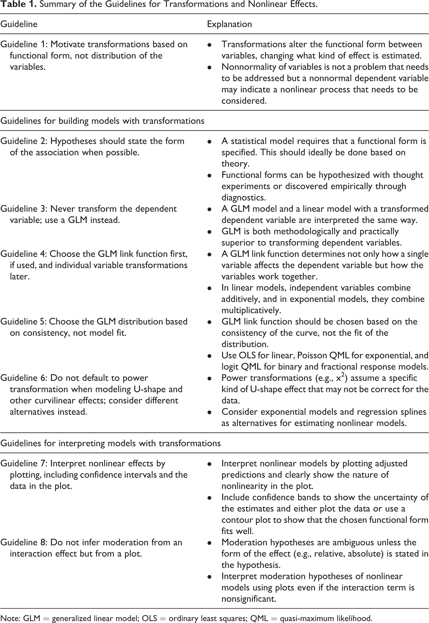
Note: GLM = generalized linear model; OLS = ordinary least squares; QML = quasi-maximum likelihood.
The Use of Transformations in Organizational Research
To ground our article in current research practice, we reviewed the 2017 and 2018 volumes of Academy of Management Journal, Administrative Science Quarterly, Journal of Applied Psychology, Journal of Management, Strategic Management Journal, and Personnel Psychology. The second and third authors read each volume in random order until 10 articles applying transformations were found or until all articles in the volume were read. The result is the list of 104 articles shown in Table 2. These articles were then coded in detail by the second and third authors, each of whom coded half of the articles, with the help of the first author. To assess reliability, 20 articles were cross-coded, producing an overall interrater reliability (Kraemer, 1980) of .75. The codes were further updated as the writing of the article progressed, further enhancing reliability.
Of the studies that tested hypotheses using regression-type models, 66% applied at least one transformation. 1 Log transformation, used either manually or as a link function in a GLM model (e.g., Poisson and negative binomial models), was the most common approach. It was followed by logit and probit transformations used in logistic and probit regressions as well as in some ordered and categorical variable models. Power transformations, particularly the second power, were used for modeling U-shape effects. Table 3 shows the commonly used transformations.
Overview of the Use of Transformations in the Reviewed Articles.
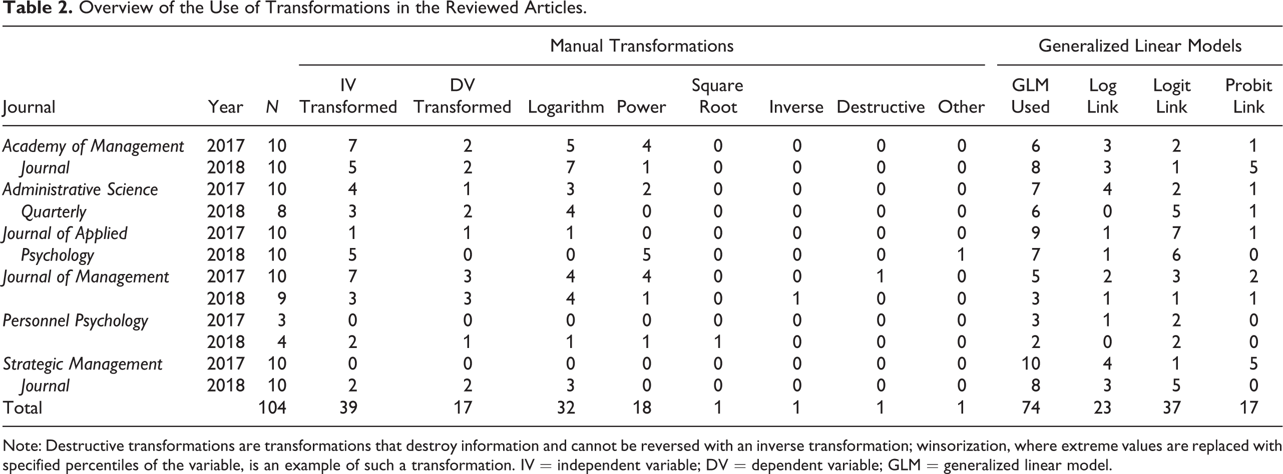
Note: Destructive transformations are transformations that destroy information and cannot be reversed with an inverse transformation; winsorization, where extreme values are replaced with specified percentiles of the variable, is an example of such a transformation. IV = independent variable; DV = dependent variable; GLM = generalized linear model.
Potential Functional Forms in Organizational Research.
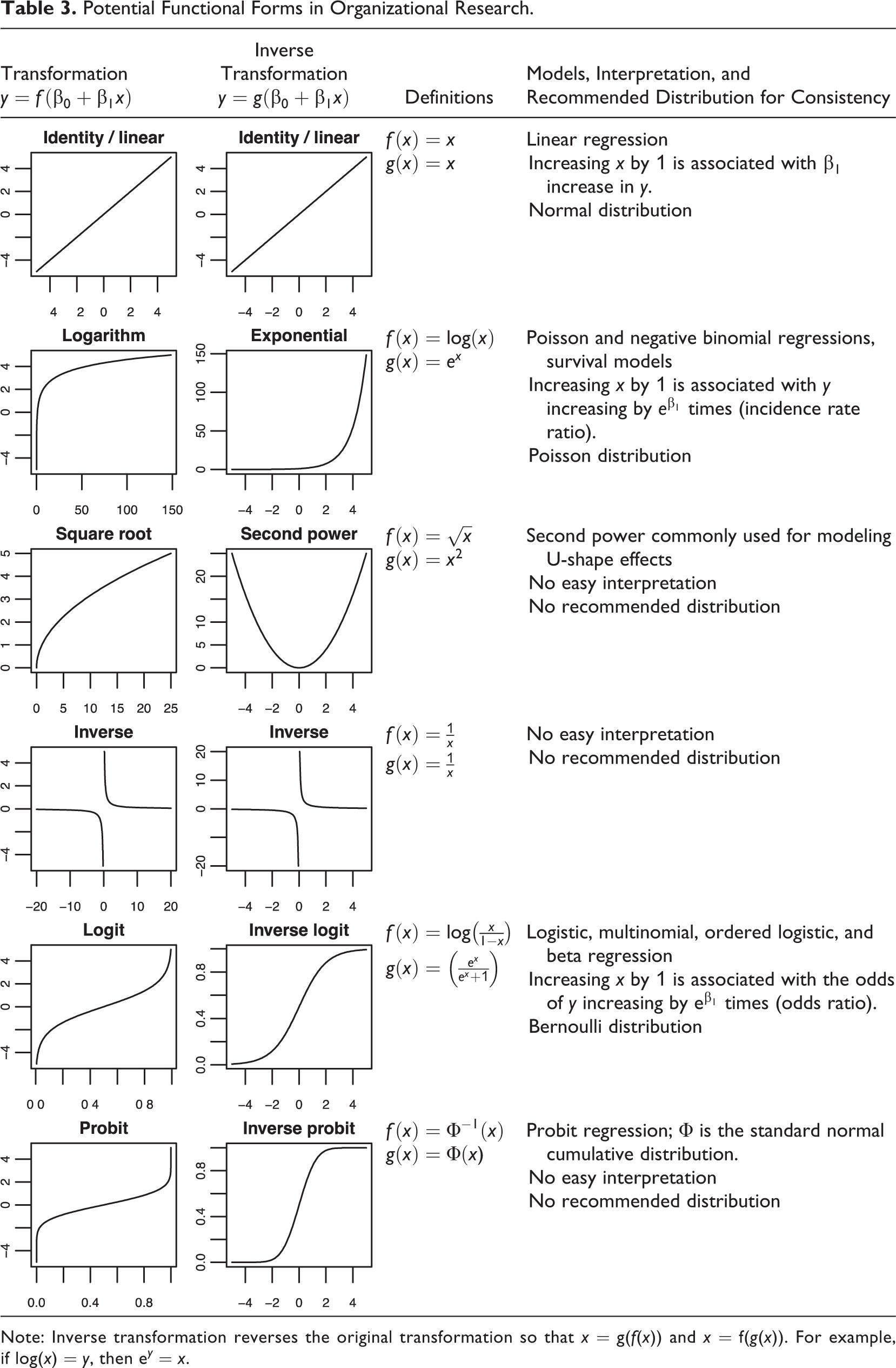
Note: Inverse transformation reverses the original transformation so that x = g(f(x)) and x = f(g(x)). For example, if log(x) = y, then e y = x.
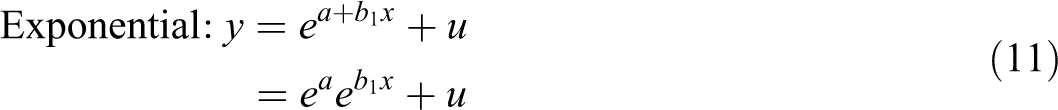
GLMs were the most common way to apply transformations, and therefore it is important to understand what GLMs do. 2 To this end, we take linear regression, shown in the first plot of Figure 1, as a starting point. In linear regression, the mean (or more precisely, the expected value) of the dependent variable depends linearly on the independent variables, and the data are assumed to be normally distributed around the population regression line. A GLM extends linear regression by introducing (a) a link function that determines a curve that characterizes the mean of the dependent variable as a function of the independent variables and (b) a distribution that specifies how the values of the dependent variable are dispersed around the mean given by the curve. Importantly, the distribution is a conditional distribution specified for a specific combination of independent variables, not an unconditional distribution of the dependent variable overall. In the linear regression model shown in the first plot of Figure 1, the observations are always normally distributed around the regression line. That is, if we only look at observations that have the same x value (e.g., x = 1), that subset will be normally distributed (conditional distribution). However, the overall unconditional distribution of y is not and does not need to be normal. In the Poisson model shown in the second plot, y is always distributed as Poisson for any specific value of x (conditional distribution), but the overall unconditional distribution of y is not and does not need to be Poisson. As this example shows, the choice of GLM distribution cannot be justified by looking at the unconditional distributions.
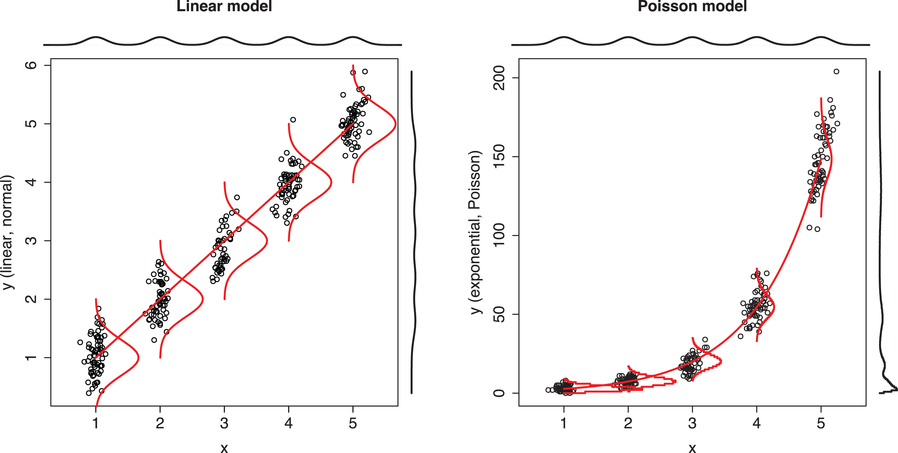
Comparison of linear model and Poisson model.
Linear regression and Poisson regression are both special cases of GLM, where the links are linear and logarithmic and distributions are normal and Poisson, respectively. Following the convention of using f for the link function and g for its inverse function, the linear model, a model with manual log transformation, and a GLM with a log link can be written as follows:


where u is the error term representing variation around the line or curve. The linear function is a special case of GLM where the link function is the identity function
Equation 2 and Equation 4 are two different ways of applying the same transformation, which can also be understood by rewriting Equation 2 as
Guideline 1: Motivate Transformations Based on Functional Form, Not Distribution of the Variables
Nonnormal dependent variables are a common justification for using transformations. Consider, for example, the following claim by Blevins et al. (2015): “The application of a linear regression model (LRM) is inappropriate for data with a count-based dependent variable (Cameron & Trivedi, 1998) and can result in inefficient, inconsistent, and biased regression models (Long, 1997)” (pp. 47–48). Similar statements were common in the reviewed articles; 55% 3 of the articles that applied manual transformations justified this decision based on the characteristics of variables, such as skewness. In 23% of the articles, no justification was given. The same pattern holds for articles that applied GLM models: 58% of these articles justified a GLM based on the characteristics of the dependent variable, followed by 42% that did not provide a justification. 4
Claims that a nonnormal dependent variable would be problematic for OLS regression are incorrect and thus not valid reasons to apply transformations. In fact, the proofs that regression is unbiased (Wooldridge, 2013, Theorem 3.1) and consistent (Wooldridge, 2013, Theorem 5.1) do not need any assumptions about the distribution of the independent or dependent variables or about that of the error term. What is required is the following: (a) random sampling, (b) the relationships between the independent and dependent variables are linear in the population, (c) each independent variable adds unique variance to the model, and (d) there is no endogeneity (see also Angrist & Pischke, 2009, pp. 70–73). A nonnormal error term or even a discrete dependent variable, such as a count, is unproblematic for regression if these four assumptions hold (see also Villadsen & Wulff, 2020).
Distributional assumptions are required in proofs of some OLS regression properties, but these assumptions are made only about the error term (conditional distribution) and not about the independent or dependent variables (unconditional distributions). The first assumption is that the variance of the error term is constant (homoskedasticity), which means that the observations are always equally spread out around the regression line. Homoskedasticity is required for the consistency of standard errors and efficiency of the OLS estimator. 5 The failure of this assumption is referred to as heteroskedasticity, and transformations have been proposed as a way to address this problem (Cohen et al., 2003, Section 6.4.1; Rosopa et al., 2013). However, this is ineffective 6 and has the side effect of converting the originally linear model into a nonlinear one, which may not be the ideal representation of the phenomenon. Heteroskedasticity-consistent (robust) standard errors (Angrist & Pischke, 2009, Chapter 8; Wooldridge, 2002, Sections 4.2.3, 19.2.3, 2013, Section 8.2) are a superior solution because they are effective even when the form of heteroskedasticity is unknown, retain the original model, and are available in commonly used statistical software (StataCorp, 2017b, Section 20.22; Zeileis, 2006). Indeed, 46% of the reviewed articles using transformations applied robust standard errors, and not a single article used a transformation to deal with heteroskedasticity.
The second assumption, normality of the error term, is only required for the proof that the t statistics used for calculating the p values of the regression coefficients and the F statistic that is used for the overall model test follow their reference distributions in small samples (Wooldridge, 2013, Theorem 4.2). But this assumption is mostly irrelevant for applied research because the large sample behavior of OLS regression, which does not depend on the normality of the error term, starts to kick in at sample sizes well under 100 (Wooldridge, 2013, Section 5.2).
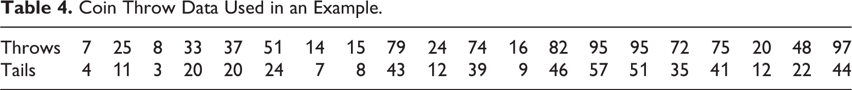
Example 1: Coin Throws
We now demonstrate that a nonnormal dependent variable is not problematic for linear regression. The data set shown in Table 4 contains two variables about a fair coin: Throws indicates how many times the coin was tossed and tails how many tails were counted. Table 5 shows the results of using these data in (a) linear regression and (b) Poisson regression, which is often used with count variables in organizational research (Blevins et al., 2015), to study how the expected number of tails depends on the number of throws.
The linear regression model gives the correct answer: The expected number of tails is half the number of throws. In other words, following the standard interpretation of linear regression, for each additional unit of throws, we should expect an increase of half a unit of tails. How should the substantially smaller coefficient of 0.022 from the Poisson model be interpreted? Organizational researchers struggle with this question, and many articles simply check the p value and state the presence of a relationship, leaving the coefficients themselves uninterpreted. The problem is not limited to organizational research given that the same concern was expressed in the classic book by Long (1997): “Unfortunately, all too often when these models are used, the substantive meaning of the parameter is incompletely explained, incorrectly explained, or simply ignored. Sometimes only the statistical significance or possibly the sign is mentioned” (p. xxiii). The recently published guidelines serve as examples: Blevins et al. (2015) omitted the interpretation of the coefficients altogether, whereas Becker et al. (2019, p. 853) give the correct interpretation but incorrectly claim that the interpretation of a GLM would be different from estimating a comparable model using a transformed dependent variable.
Coin Throw Data Used in an Example.
Linear Regression and Poisson Regression Models Predicting the Number of Tails Using the Coin Throw Data.
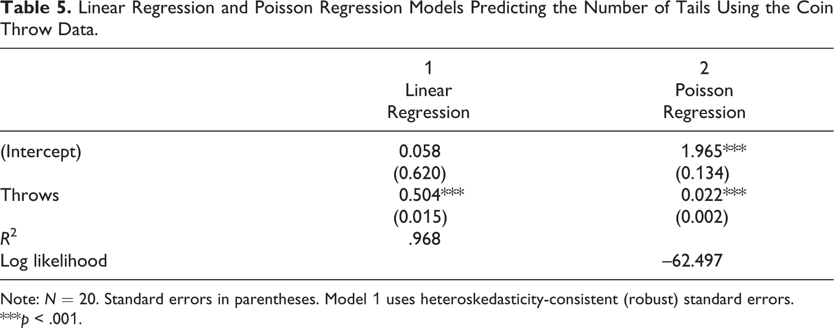
Note: N = 20. Standard errors in parentheses. Model 1 uses heteroskedasticity-consistent (robust) standard errors.
***p < .001.
If nonnormality is not a problem for OLS regression analysis, what do transformations do then? Transformations model nonlinear effects, and this is the reason for the difference between the linear and Poisson regression model results. Instead of fitting a straight line, Poisson regression fits an exponential curve, as shown in Figure 2. The correct interpretation of the coefficient of 0.022 would then be that each additional coin throw increases the expected number of tails by 2.2% (i.e., multiply by 1.022; Long, 1997, Section 2.4; Wooldridge, 2013, pp. 41–44, 191–194). Considering this interpretation helps to realize why the Poisson model is inappropriate for these data: The number of tails increases linearly, not exponentially, with each new throw.
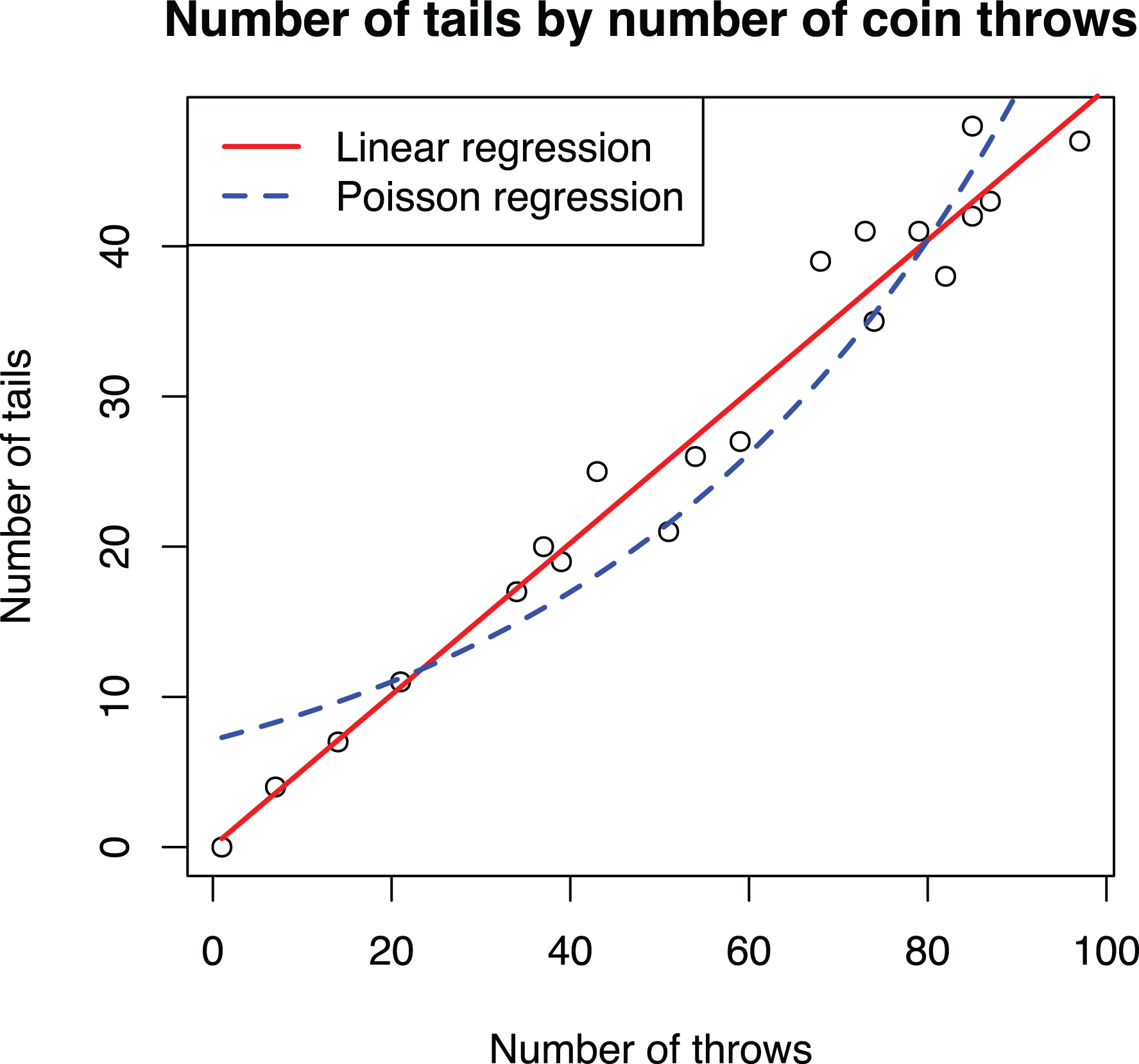
Scatterplot of the coin throw data overlaid with adjusted prediction plots of linear regression and Poisson regression models.
Example 2: Occupation Income
The second example is the Prestige data set from Fox (1997), containing data of 102 occupations from the Census of Canada in 1971. For simplicity, we focus on just three variables: Income is the average annual income of each occupation in Canadian dollars, education is the average number of years of education of those in the occupations, and women is the share of women in the occupation as a percentage. Later in the article, we also use prestige, which quantifies the prestigiousness of an occupation. We chose this data set because these data are publicly available, easy to understand, and commonly used when teaching regression analysis. Table 6 shows descriptive statistics and correlations for the data.
Descriptive Statistics and Correlations of the Prestige Data Set.
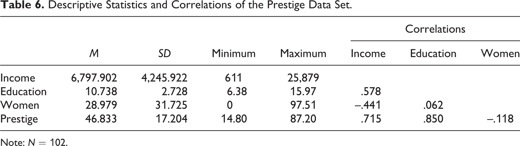
Note: N = 102.
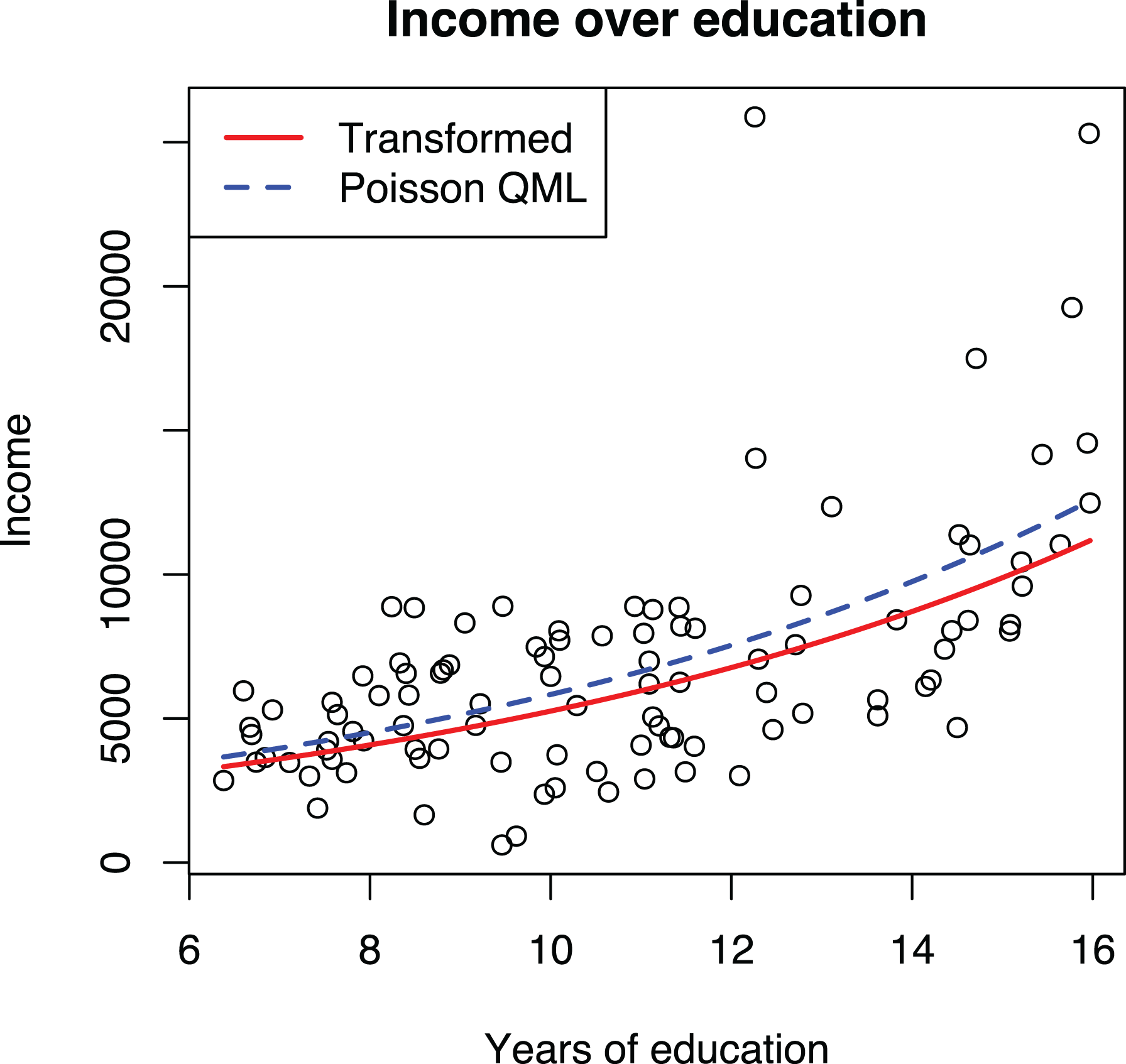
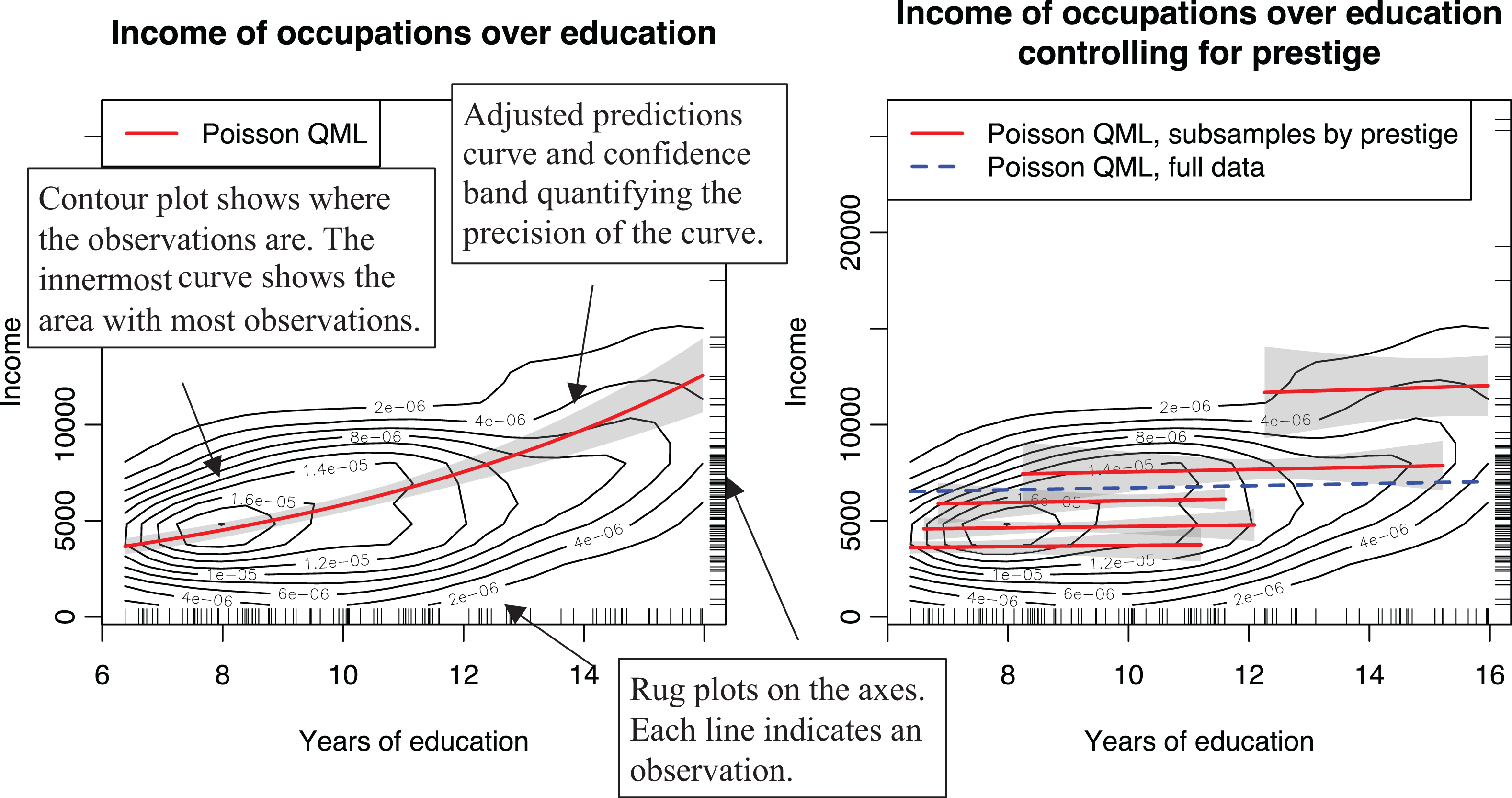
We use regression to understand how education influences income, controlling for the share of women in an occupation. Model 1 in Table 7 shows that each additional year of education leads to an increase of about $950 in annual salary, whereas Model 2 with the log transformed dependent variable indicates that an additional year of education increases annual salary by about 13% compared to the current level. As shown in Figure 3, the exponential growth is not very steep and is hence somewhat well approximated by a line, raising the question of why not just use the simpler linear form. Indeed, it is well known that linear models are often good enough approximations for predictive purposes, but understanding potential curvilinearity is critical for research because nonlinear models have different implications for theory testing and practical recommendations (Pierce & Aguinis, 2013, p. 317). On the research side, linear and exponential growth require different kinds of causal processes. With income, the increases should be expected to be proportional to current income levels due to diminishing marginal utility of money. If the effects of education on income were not proportional to the current income level, people would not seek more education because the marginal effect of additional years of school on their welfare would be diminishing. On the practical recommendations side, assuming that each year of education has an equal impact on income (i.e., a linear effect) would mean that a 3-year bachelor’s degree might not be worth the time and money: The 12 years of compulsory education would already produce 80% of the expected effect produced by the 15 years of education one would have after the bachelor’s degree.
In the case of income, the exponential curve providing relative effects is both theoretically and empirically more appealing and produces more realistic practical recommendations. However, neither the linear nor the exponential model, with the log dependent variable, fit the data too well, underpredicting the highest incomes. In the guidelines that follow, we present suggestions for how to address such a situation, but the point here is that log transformation of the dependent variable changes the interpretation of the relationship from linear to exponential.
Linear and Poisson QML Regressions of Income Using the Prestige Data Set.
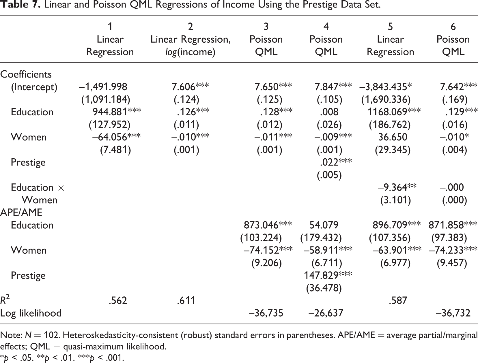
Note: N = 102. Heteroskedasticity-consistent (robust) standard errors in parentheses. APE/AME = average partial/marginal effects; QML = quasi-maximum likelihood.
*p < .05. **p < .01. ***p < .001.
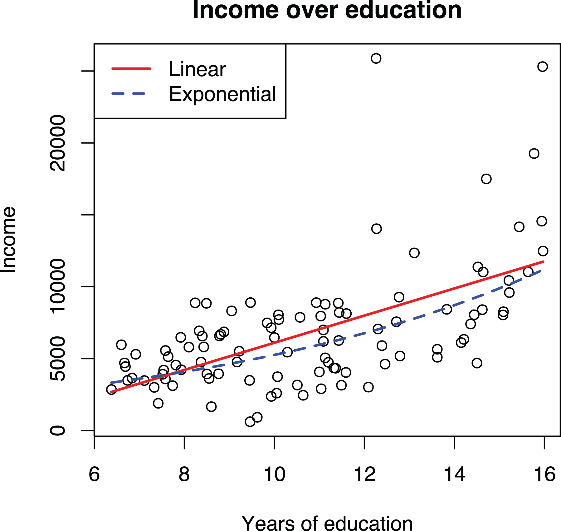
Visualizations of linear and exponential models with log transformed dependent variable using the Prestige data.
To summarize, (a) OLS regression assumes that all relationships between the variables are linear in the population. Transformations are useful because they allow modeling nonlinear relationships within the linear model framework. (b) OLS regression does not assume that any of the observed variables are normally distributed; rather, the normality assumption pertains to the error term, and even then, this assumption is not important. (c) Heteroskedasticity can be an issue when estimating standard errors, but applying transformations to address the problem is ineffective and produces a nonlinear model other than the one originally intended; using robust standard errors is a superior alternative. Thus, transforming a variable cannot be motivated by stating that doing so reduces the consequences of violating the distributional assumptions of regression. Indeed, it is a common and perfectly acceptable practice to use linear regression in cases where the error term cannot be normal and homoskedastic, such as with a binary dependent variable (e.g., Ranganathan, 2018; Yenkey, 2018). However, nonnormality of the data, particularly skewness, can indicate a nonlinear effect and therefore should not be ignored (Rönkkö & Aguirre-Urreta, 2020), but its source should be investigated.
Guidelines for Building Models With Transformations
We will now focus on guidelines for research practice, starting by how to specify models with transformations. Our central argument is that a transformation, whether done manually or within a GLM, should be based on the expected functional form between variables, whether on theoretical or empirical grounds, and not on the distribution of the variables themselves.
Guideline 2: Hypotheses Should State the Form of the Association When Possible
Estimated relationships between variables can be characterized by their form, strength, and statistical significance (Singleton & Straits, 2018, Chapter 4). However, organizational theories nearly universally ignore the form or strength of a relationship, focusing just on its existence and direction (Edwards & Berry, 2010), and this imprecision extends to the hypotheses that are used as tests of those theories. Indeed, not a single hypothesis in the reviewed studies stated the expected strength, and most of the articles did not specify any functional forms either. Of articles using a nonlinear model, 12% specified a U-shape form, and 9% specified a functional form without U-shape. 7 Not surprisingly, the same applies to linear models. Only two articles (2% of the total) mentioned a linear form in the hypothesis (Li et al., 2018; Seong & Godart, 2018).
Not specifying a functional form in the hypothesis is problematic because one is required when the hypothesis is tested. Consider the following hypothesis in the context of the Prestige data set:
Hypothesis 1: An increase in education is associated with an increase in income.
To test this statement, it must be formalized as an equation. Here the imprecision of the hypothesis becomes evident: It simply means that an increase of education will always produce a positive change in the expected income, but neither the form (linear, exponential, etc.) nor the strength (how large of an effect education has on income) of the relationship is specified. In other words, this means that “the proposed relationship is simply some monotonic function” (Edwards & Berry, 2010, p. 675). Yet specifying a functional form is required to construct a statistical model for testing the hypothesis. The current practice for solving this problem is to make an implicit assumption that a straight line is the most appropriate functional form (see also Jaccard & Jacoby, 2020, pp. 126–127). Such assumptions should be made explicit. A functional form should be based either on theory and specified in the hypothesis or derived from the data.
Strategies for Determining Functional Form Based on Theory
The ideal strategy for making the assumed functional form explicit is to state it as part of the hypothesis. If an (approximately) linear effect is expected, the hypothesis could be stated as
Hypothesis 1a: Expected income increases linearly with education.
However, as explained earlier when we introduced the example, in this case, an exponential functional form would make more sense because of the decreasing marginal utility of money. Thus, Hypothesis 1 could be refined and presented in one of three alternative forms:
Hypothesis 1b: An increase in education is associated with an increase in income; this effect is relative to the current income level (i.e., the increase is a percentage of the current value).
The same hypothesis can be stated also in a more condensed form:
Hypothesis 1c: Education increases income relatively to current income.
Or we could explicitly mention the exponential growth that relative effect produces:
Hypothesis 1d: Income increases exponentially with education.
Although the choice of a functional form was straightforward in the example, this is not always so. In some cases, the nature of the dependent variable might suggest a particular form; Beyond income and salaries, there are several other commonly used variables that are almost always thought of in terms of percentage change, such as firm growth, revenues, or investments. When the dependent variable is bound at an interval (e.g., yes/no, percentage), it might be safe to assume that a relationship in the hypothesis follows an S-shape curve (e.g., logit) so that as the hypothesized predictor increases, the dependent variable gets closer and closer to an endpoint of the interval, but once close, the speed at which the endpoint is approached diminishes. For example, if we consider the acquisition probability of a startup to be at 30% to start with, getting a new important patent might increase that to 40%. However, if the initial probability was already 90%, then any changes that the company implemented could only have incremental effects, and nothing that the company did would make acquisition certain (i.e., 100%).
In other cases, the choice of functional form can be less clear. Following Jaccard and Jacoby (2020, Chapter 6), we suggest using thought experiments. In the first strategy suggested by Jaccard and Jacoby, a researcher would start by drawing the x and y axes on a blank piece of paper and draw a starting point somewhere on the plot area. After this, the next point would be drawn by increasing x by one unit and considering how much a typical change in y would look. Then, the next point would be drawn similarly considering what an effect of an additional unit would have. Would the rate of increase be constant (linear), accelerating, or diminishing? Would the effect always be in the same direction? Perhaps there is a threshold after which the effect changes? Considering prior research can be helpful. For example, diminishing returns and escalating costs are arguments to propose logarithmic and exponential forms (Haans et al., 2016). Covering a broader range of management disciplines, Pierce and Aguinis (2013) discussed how the “too-much-of-a-good-thing” effect can be used to support theorizing of inverted U-shape effects across a variety of theories and domains. We emphasize that this is a conceptual exercise where a researcher is free to think of and propose functional forms without any constraints on how such forms could be expressed as a specific function.
A second strategy suggested by Jaccard and Jacoby (2020, Chapter 6) would be to draw two or more alternative forms that the phenomenon could follow and then consider what it would take for the phenomenon to follow each form. When the dependent variable is a fairly objective quantity, such as income, growth rate, or profitability, it should be fairly straightforward to choose between, for example, the linear and exponential models using this strategy. One would simply ask the question of whether an effect in absolute units (e.g., euros, dollars, number of patents) or a relative increase as percentages of the current value makes more sense.
Considering the dependent variable in an alternative way can sometimes be helpful. For example, if the dependent variable is the total number of citations that an article receives as a function of years since publication (Antonakis, Bastardoz, et al., 2014) or some other accumulative function, it might be useful to theorize about the rate of accumulation (i.e., how many citations an article gets each year) instead of the total number and then derive the functional form by considering how the rate develops as a function of the independent variable. The same applies to all dependent variables that are aggregates of some smaller components.
After a form has been specified on the conceptual level, it needs to be formalized as a function, considering also that combinations of functions may be possible (Jaccard & Jacoby, 2020, Chapter 8; e.g., exp[–x 2 ] gives a normal distribution curve). In our own teaching and research, we have found it useful to draw the assumed effect on a whiteboard and then consider how it could be constructed from the function shown in Table 3. Different combinations of functions can be experimented with by visualizing them using statistical software or even Excel to see how well they would map against the conceptually derived form.
Strategies for Determining Functional Form Empirically
What kind of association should be tested if one is not suggested by theory? In this case, the functional form should be chosen empirically based on the data (Jaccard & Jacoby, 2020, p. 222; Nikolaeva et al., 2015). We propose three strategies for doing so. The first strategy is to graphically inspect the relationship between the variables. One way to do so is to use a binned scatterplot, where the data are first divided into equally sized groups along the x variable and the group means of the x and y are then used in a scatterplot. The tool is easy to understand and effective in revealing the functional form even from a large number of observations (Cattaneo et al., 2019). This technique was applied in one of the reviewed articles (Hornstein & Zhao, 2018).
The second strategy is to start with a linear regression model and run diagnostics for nonlinearity. The residual versus fitted plot can be used to assess the overall need for a nonlinear model, and the partial regression or added-variable plots can be used to assess the functional forms of individual variables. These plots are thoroughly explained in textbooks and user manuals (e.g., Field, 2009, Chapter 7; Kabacoff, 2011, Section 8.3.2; Mitchell, 2012a, Section 2.4; StataCorp, 2017a, pp. 2296–2303) as well as in the supplementary video materials at https://tinyurl.com/nonlinearmodels, and therefore we will not go through them in detail but will simply focus on how they apply to our empirical example.
The first row of plots in Figure 4 shows the residual versus fitted plot and two added-variable plots for the linear model (Model 1 in Table 7). The residual versus fitted plots show that both small and large predicted values have larger than average residuals, suggesting that a nonlinear model would be preferable to a linear one. The added-variable plots indicate some bivariate nonlinearity. Particularly for both small and large values of education, the observations tend to be above the regression line. The second row of plots corresponds to the model with a log-transformed dependent variable (Model 2 in Table 7). The residual versus fitted plot now shows a linear relationship, and the added-variable plots do not indicate any major nonlinearities, indicating that the transformation effectively addressed the nonlinearity issues.
Even if the original linear model is used instead of a nonlinear one, these diagnostics should be done and reported to provide evidence that the chosen linear functional form is correct. Detailed reporting is not required, but a researcher could simply state, at a minimum, the following: “All models were diagnosed for heteroskedasticity, nonlinearity, and outliers using plots. No problems were found.” Unfortunately, doing so is not common (Kline, 2019, pp. 65–66; Simonsohn, 2018). In the reviewed articles, 96% did not report any model diagnostics.
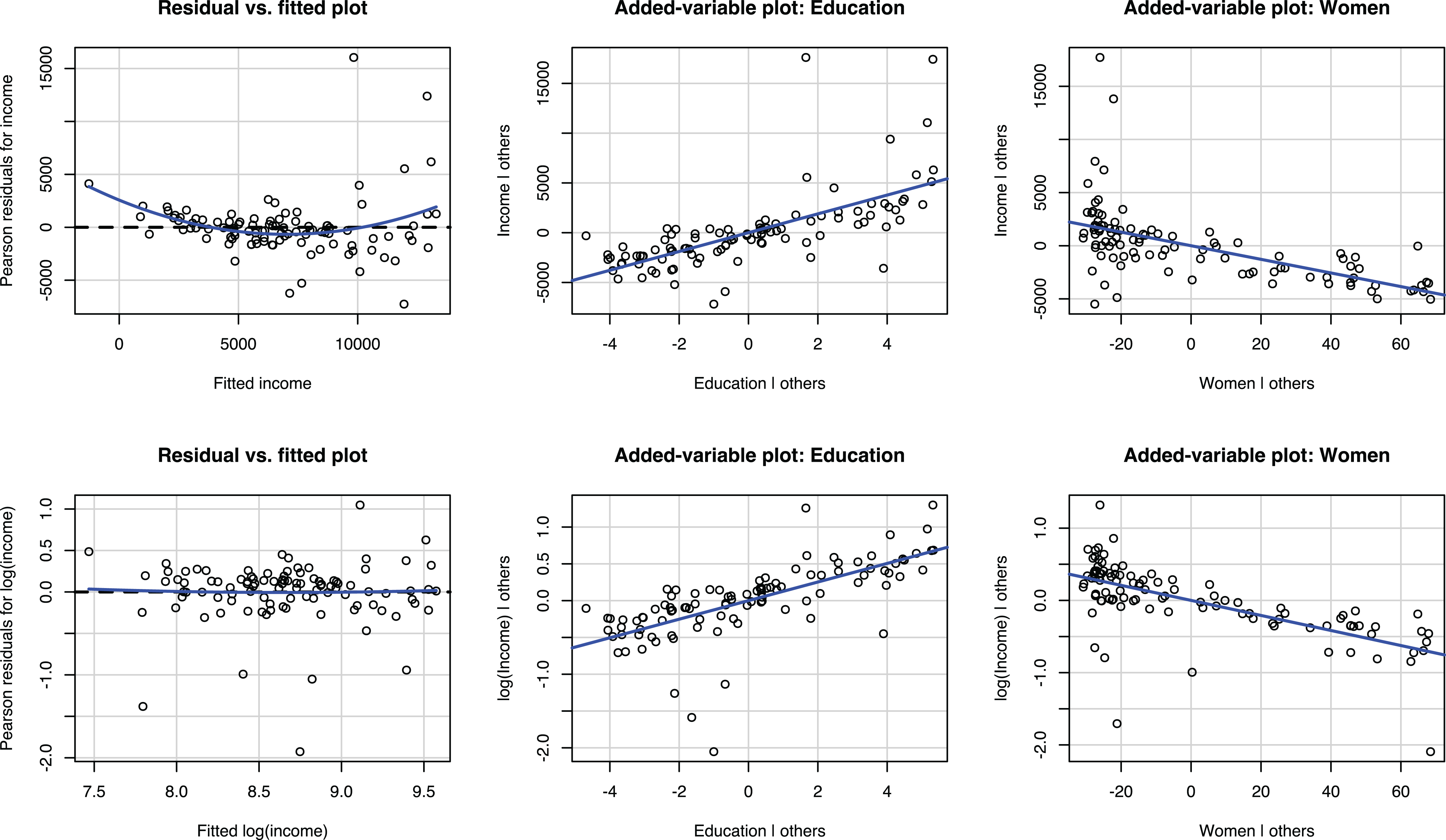
Residual versus fitted plots and added-variable plots of regression of income and log of income on education and women using the Prestige data.
The third strategy is to fit models with different functional forms and compare how well they explain the data. This strategy was applied, for example, by DeOrtentiis et al. (2018), who used a power term to test for the nonlinear effects of time and compared the results to those obtained from a linear model. With our example data, the linear and nonlinear specifications used in Model 1 and Model 2 in Table 7 could be compared using the R 2 statistic. The higher R 2 of the nonlinear model indicates that it has a better fit to the data. Another approach would be to use the RESET test, where powers of independent variables are added to the model to detect any omitted nonlinearities (Villadsen & Wulff, 2020; Wooldridge, 2013, pp. 306–307). However, this strategy has the disadvantage that a researcher must specify the functional forms to be compared, and thus a fully explorative analysis is not possible.
Although the empirical strategies for discovering the functional form seem attractive, they come with the risk of capitalizing on chance. In small samples, a few outliers could easily lead researchers to conclude that a relationship that is linear in the population would be a nonlinear one. Conversely, nonlinear population relationships could be easily dismissed as outliers. Although we are not aware of any published work addressing how well researchers can identify a functional form from a plot, we came across a small pilot study (J. Antonakis, personal communication, June 26, 2020). In the study, modeled after his published work (Antonakis et al., 2017; Antonakis, Simonton, et al., 2019), Antonakis simulated 171 observations from a population where the relationship between two variables followed an inverted U-shape effect (
To summarize, the fact that organizational researchers do not explicitly state the functional form of the relationship as part of the hypotheses but nevertheless apply nonlinear models for their testing cannot be seen as a methodological problem (Becker et al., 2019) but is rather a consequence of the imprecision of management theory or of the way it is tested (Cortina, 2016; Edwards & Berry, 2010). Ideally, researchers should state the expected functional form in the hypotheses based on what kind of effect makes theoretical sense. Table 3 shows commonly used functional forms and can be used as a reference. If such precision is not afforded by theory, the functional form should be chosen based on how well the model appears to fit the data in a visual inspection or by comparing models using fit statistics when appropriate. This is a holistic evaluation that unfortunately cannot be condensed into a simple rule. If functional form is determined empirically, it is important to report this as an exploratory analysis (Hollenbeck & Wright, 2017). Indeed, introducing a functional form and its explanation to a theory can be considered an important theoretical contribution (Jaccard & Jacoby, 2020, p. 41). Even if a researcher cannot explain why the identified functional form exists, such observation can inspire future work designed to understand why a given functional form was observed.
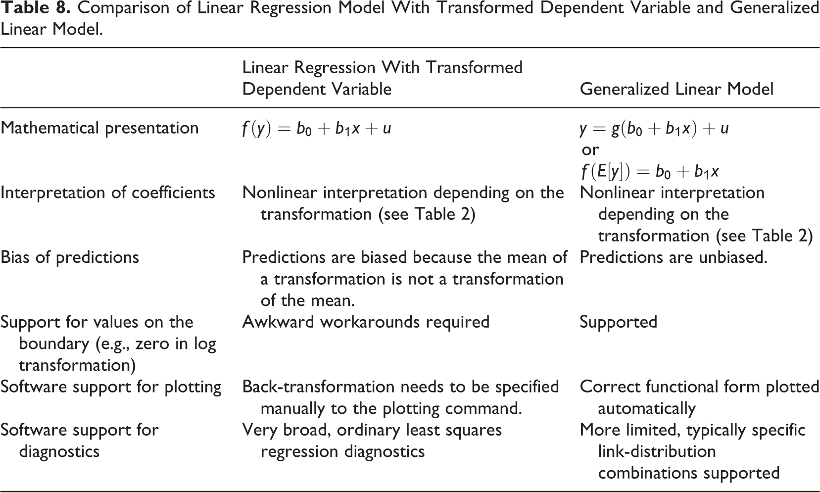
Guideline 3: Never Transform the Dependent Variable; Use a GLM Instead
Transforming a dependent variable is common in the reviewed empirical articles. As shown in Table 2, 17 articles applied a transformation to a dependent variable. Of these, 16 (15%) used log transformation, and one article applied winsorization (Souder & Bromiley, 2017). Yet analyzing a transformed dependent variable is not an ideal approach for two reasons.
First, to interpret the results, predictions from the model need to be converted back to the original metric. In the case of the log transformation, this happens by using the exponential function (e.g., Eggers & Kaul, 2018). However, the mean of the logarithm does not equal the logarithm of the mean, and this applies to all nonlinear transformations. This is demonstrated in Figure 5 showing the distributions of incomes for women- and men-dominated occupations. Comparing the original means against the means of logged incomes that are back-transformed to the original metric shows that the transformed variables underestimate the means. The effect is stronger for men-dominated occupations, which leads to underestimating the difference between the two groups.
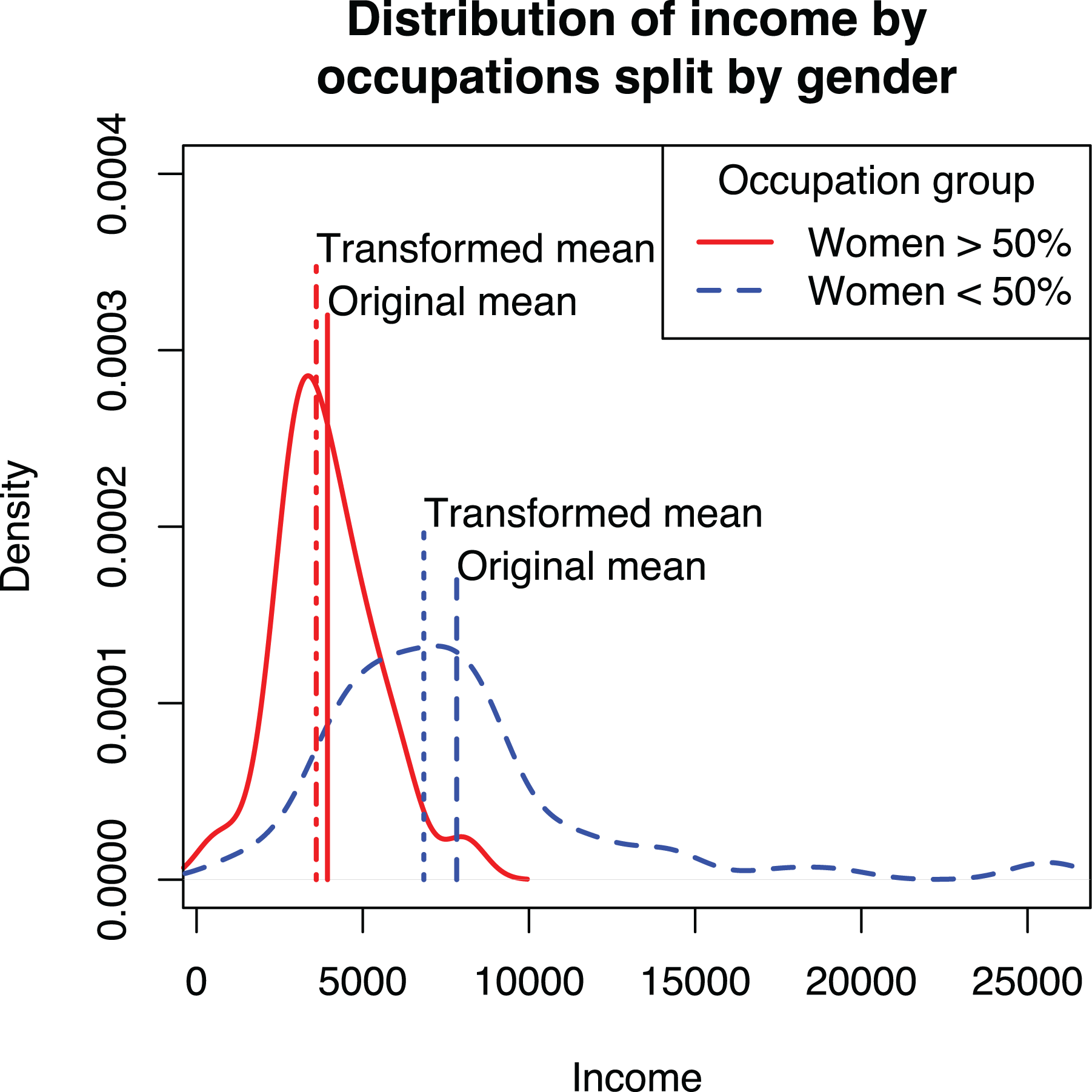
Distribution of income for men- and women-dominated occupations and the effect of transformation on estimates of mean.
Second, transforming the dependent variable requires awkward workarounds. Perhaps the most common way is to add +1 before taking logs (e.g., Clement et al., 2018; Gomulya et al., 2017; Vasudeva et al., 2018). The justification for the procedure is that the logarithm is not defined for zero and works differently for numbers more or less than one, and if all values were initially nonnegative, the transformation makes all values one or greater (Kline, 2011, pp. 63–64; Wooldridge, 2013, p. 193). Another, albeit less common, workaround addresses the bias caused by the back-transformation by using a correction (e.g., Balen et al., 2019; Duan, 1983; Wooldridge, 2013, pp. 212–215). These workarounds are required because a linear model of a transformed dependent variable, although common, is simply not the ideal way to model the dependent variable as a nonlinear function of the independent variables (Villadsen & Wulff, 2020).
A GLM with a log link avoids the problems caused by log transforming the dependent variable. Instead of manually transforming the dependent variable and estimating
To demonstrate that Poisson QML works better than manually transforming the dependent variable, we applied both techniques to the Prestige data set, as shown in Models 2 and 3 in Table 7 and graphically in Figure 6. The plot shows two curves, one based on predictions from the GLM model and another using the transformed dependent variable, back-transformed to the original scale, following current recommendations (e.g., Dawson, 2014). The GLM curve goes through the middle of the data and is thus a better fit than the curve using transformed dependent variable, which tends to underestimate the mean of the data, particularly for larger values. As an additional advantage, commonly used statistical software will automatically plot a GLM model correctly without the need to specify a back-transformation manually.
Effects of education on income estimated with regression of transformed dependent variable and Poisson quasi-maximum likelihood (QML) regression.
In the reviewed articles, none of the articles that applied a log transformation to the dependent variable considered a GLM model with a log link as a substitute. 8 Similarly, the articles that used a GLM model with a log link (Poisson or negative binomial regressions in the review) did not use the nonlinearity of the link as a justification and hence did not consider the log transformation as an alternative. Thus, the interchangeability of a GLM and a manual transformation does not appear to be common knowledge among organizational researchers, although there are some examples outside the reviewed articles that note the general applicability of GLM models (Dahlander et al., 2016, p. 289).
To summarize, GLM is both statistically and practically the superior alternative to transforming the dependent variable. The predicted curves go closer to the middle of the data, modern statistical software automatically constructs the adjusted prediction plots correctly, and the need for awkward workarounds (e.g., when a dependent variable can take the value of zero) is eliminated. Yet using OLS regression with transformed dependent variables can be useful for diagnostic purposes, as demonstrated in the previous guideline. The differences between these two techniques are summarized in Table 8. Although it has been known for some time in the technical statistical literature that Poisson regression can be used for this purpose, its uptake in research practice has been slow. A possible reason for this is the institutionalized idea that these models should be used (only) for counts (Blevins et al., 2015). As noted by Nichols (2010): “If you decide on a log link, you may want to call your model ‘GLM with a log link,’ rather than a ‘Poisson’ QMLE—some older reviewers believe Poisson regression is only for counts” (p. 20).
Comparison of Linear Regression Model With Transformed Dependent Variable and Generalized Linear Model.
Guideline 4: Choose the GLM Link Function First, if Used, and Individual Variable Transformations Later
Because GLMs are preferable to transforming dependent variables, specifying nonlinear models reduces to two decisions: whether to use a GLM and whether to transform any of the independent variables. The first decision is more consequential because it determines how the independent variables together influence the dependent variable. We will now turn to this, which requires understanding the difference between additive (linear) and multiplicative (exponential) models.
For simplicity, we focus on the case of two independent variables, x 1 and x 2, and only for the linear and exponential cases:


An important difference between the two models is that in the linear model, the effects of x 1 and x 2 are added together, whereas in the exponential model (e.g., Poisson regression), they are multiplied together. That is, in the linear model, the effect of changing x 1 is always the same regardless of the current values of x 1 and x 2. However, in the exponential model, the effect of x 1 is proportional to the predicted y, thus depending on both x 1 and x 2.
The difference between the additive linear and multiplicative exponential models was largely ignored in the reviewed articles. For example, Botelho and Abraham (2017) used four dependent variables: number of views, number of comments, and two ratings of online recommendations. All four variables were used to test the same hypotheses; an additive model was used for the two ratings variables, but when explaining the number of views and number of comments, the model was multiplicative. The use of a multiplicative model for one set of variables and an additive model for the other set of variables was neither noted nor explained in the article. More generally, out of the 40 reviewed articles that applied a GLM model with a log link or used a log-transformed dependent variable, just one (York et al., 2018) explicitly noted that the effects should be interpreted as multiplicative instead of additive, and one other (Dutta, 2017) noted that the effects in such models are relative to the current level.
The choice between additive and multiplicative models should be driven by theory. For example, if a study investigated the effects of a nationwide policy (x 1) on the number of new companies founded (y), the effect should not be the same for all countries but be relative to the size of the population (x 2), suggesting a multiplicative model. In other words, implementing the policy in a larger country should produce more new companies than implementing the policy in a smaller country. In contrast, an additive model would be appropriate, for example, if one modeled the effects of R&D grants (x 1) on the number of patents a firm receives (y). If two firms of different size (x 2) receive a similarly sized grant and there are no large economies of scale in R&D, both firms should get an equal amount of R&D work done using the grant and thus receive roughly comparable number of patents from the work. Therefore, the effect should be additive with other variables that determine how many patents a company receives.
In some scenarios, it may be desirable to combine linear and exponential effects. For example, if one models the total number of publications of a researcher as a function of time (x 2), an individual’s overall productivity can be exponential as a function of skills (x 1), but the number of publications (y) increases linearly, and not exponentially, over time. Here, the effects of skills and time are clearly multiplicative, but the effect of time itself is linear and not exponential. The GLM framework provides two alternative ways of modeling this combination of effects:


We demonstrate these specifications in Figure 7, where we estimate a linear effect of women (x
2) and exponential effect of education (x
1) on income using the Prestige data set. The first specification is problematic because the shape of the exponential effect
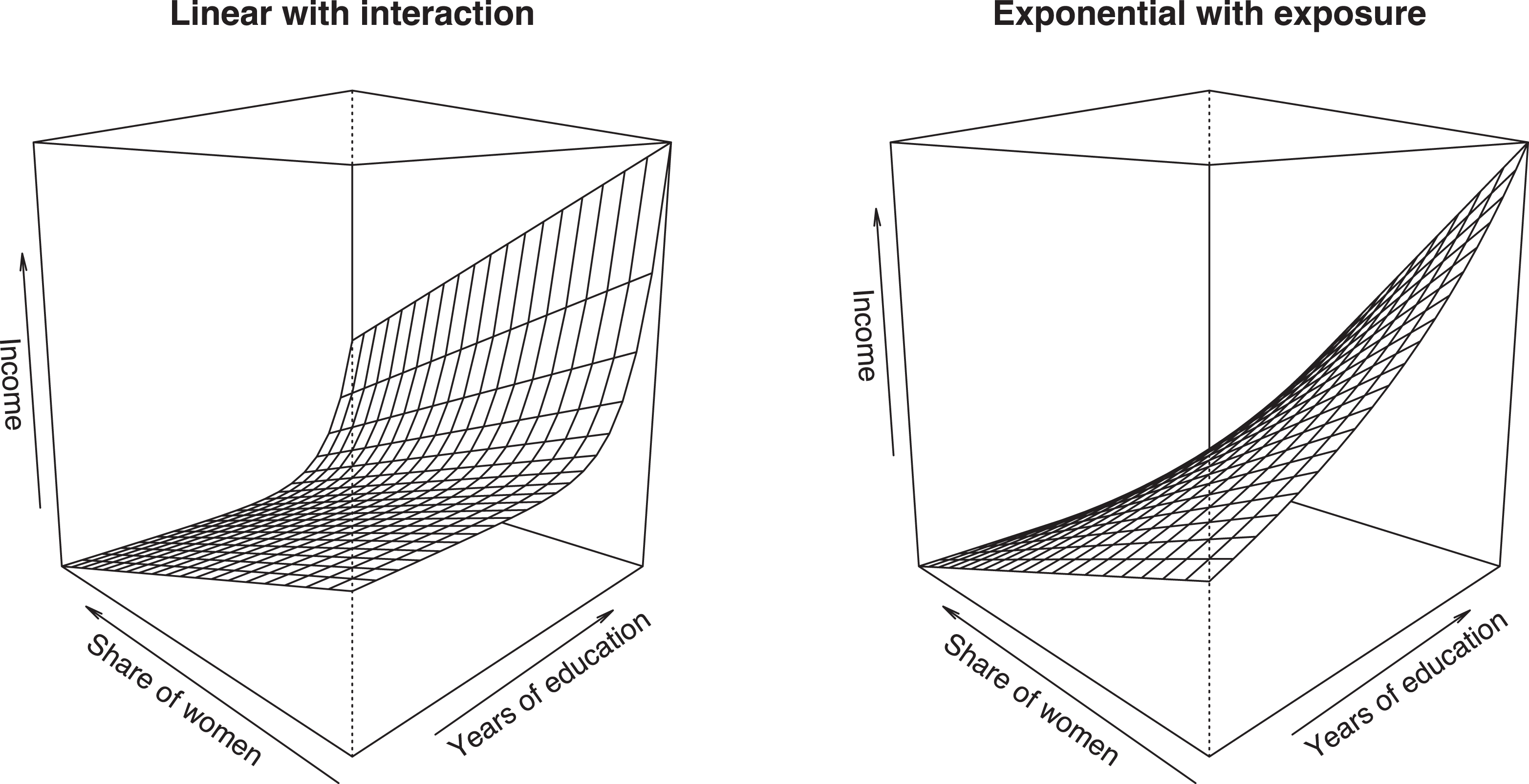
Comparison of two approaches for combining linear and exponential effects.
The second specification is more attractive, but adding log(x 2) is not enough to model a linear effect 10 ; we must further constrain the coefficient b 2 to 1, producing:

A logged variable constrained this way is referred to as an exposure variable, and it enters the regression equation as a multiplier, thus modeling an effect that is directly proportional to the exposure variable (Cameron & Trivedi, 2009, p. 559). The use of exposure variables is not common in organizational research, but they are common in, for example, epidemiology, where researchers might be interested in which factors affect the number of cases of a disease in a country. Because countries vary in their population numbers, each country has a different number of people that could be potentially exposed to a disease and become a case. In this case, we would use the number of people in a country as an exposure variable, and the total expected number of cases would be individual risk (
To summarize, the first decision when specifying a model is to determine whether the variables in the model are combined additively or multiplicatively. In the linear, additive effects model, the effect of each independent variable is in absolute terms not dependent on any other variables in the model. In the exponential, multiplicative effect model (e.g., Poisson regression), the effects are always relative to the current values of all independent variables, typically expressed as percentages. In practice, the choice is whether to use a GLM and which link function to use, decisions that have been traditionally made based on the distribution of the dependent variable. Instead, we argue that theory should play a much more important role in this decision. The thought experiment strategies explained earlier can be useful here as well.
Guideline 5: Choose the GLM Distribution Based on Consistency, Not Model Fit
The specification of a GLM involves two key decisions: choosing the link function for the relationship between the independent variable and the expected value of the dependent variable and the (conditional) distribution for the dependent variable. Importantly, the distribution concerns the conditional distribution for a specific set of predictor variables, not the unconditional distribution that one would analyze in the data preparation and screening stage of research (see Figure 1). Of these, the first decision is much more important because it determines which functional form is estimated; the second decision only influences whether the chosen form is estimated correctly. Unfortunately, the exact opposite decision process has been entrenched in the discipline given that current guidelines take the (unconditional) distribution as a starting point and largely omit discussing the transformation (e.g., Blevins et al., 2015). The same is true in empirical applications of GLMs; 58% of the reviewed articles that applied a GLM justified the model choice based on the distribution of the dependent variable, 42% did not justify the model choice, and just one article (Mata & Alves, 2018) focused on the link function when choosing a model. As discussed earlier and demonstrated with the coin throw example, this practice can lead to choosing a functional form that has a poor fit with the studied phenomenon.
How should the (conditional) distribution be chosen? Because distributions represent variation of the dependent variable due to variables other than the ones in the model, the choice of a distribution can be difficult to motivate based on theory. Hence, the question becomes which distribution should be applied if the chosen distribution may, in fact, be incorrect? GLM models are estimated with maximum likelihood estimation, which has been proven to be consistent and asymptotically efficient if the model is specified correctly (Lehmann & Casella, 1998, pp. 443–450; Wooldridge, 2002, Chapter 13), including the correct (conditional) distribution for the dependent variable. Unfortunately, maximum likelihood estimation is generally not robust to misspecification of the distribution and becomes inconsistent (Wooldridge, 2002, Chapter 13). But fortunately, there are exceptions to this rule. A case in point is linear regression, which assumes a normal distribution of the error term but works well with any distribution if the model is otherwise specified correctly, as previously discussed. With exponential models, the Poisson distribution has been proven to produce consistent estimates regardless of the actual distribution and can be even used for noncount data (Cameron & Trivedi, 1998, Chapter 3; Gourieroux et al., 1984; Silva & Tenreyro, 2006; Wooldridge, 2010, Chapters 18.2–18.3, 2013, Chapter 17.3). If the model uses the logit curve, we can use the Bernoulli distribution for the same effect (Wooldridge, 2002, Section 19.4.2), and the data do not need to be binary but can also be fractions (i.e., in the [0, 1] range). In these cases, the estimates are QML, and heteroskedasticity-consistent (robust) standard errors must be used.
The current practice of choosing between Poisson regression and negative binomial regression is to estimate both models and choose the best fitting one with a likelihood ratio test (e.g., Blevins et al., 2015). To understand why this rule is potentially problematic, we need to consider the four different scenarios in Table 9. Negative binomial regression is a safe choice and may also be more efficient when the distribution of the dependent variable (conditionally on the independent variables) is Poisson or Poisson with overdispersion. In other cases, negative binomial regression can be inconsistent and should not be used. The problem with using the likelihood ratio test to determine which distribution to use is that the test does not provide evidence that the negative binomial distribution is correct but only that the data are more likely to come from a negative binomial distribution than from a Poisson distribution. Thus, the use of negative binomial distribution should be limited to scenarios where there is a strong theoretical reason to believe that that distribution is indeed correct, and the Poisson distribution should be used instead as a default alternative due to its more general consistency. Although none of the articles in our review justified the distribution based on proven consistency, other articles have done so (e.g., Carnahan & Somaya, 2013, p. 1587; Wu, 2011, p. 936).
Consistency and Efficiency of Poisson Regression and Negative Binomial Regression in Four Different Scenarios of Conditional Distribution.
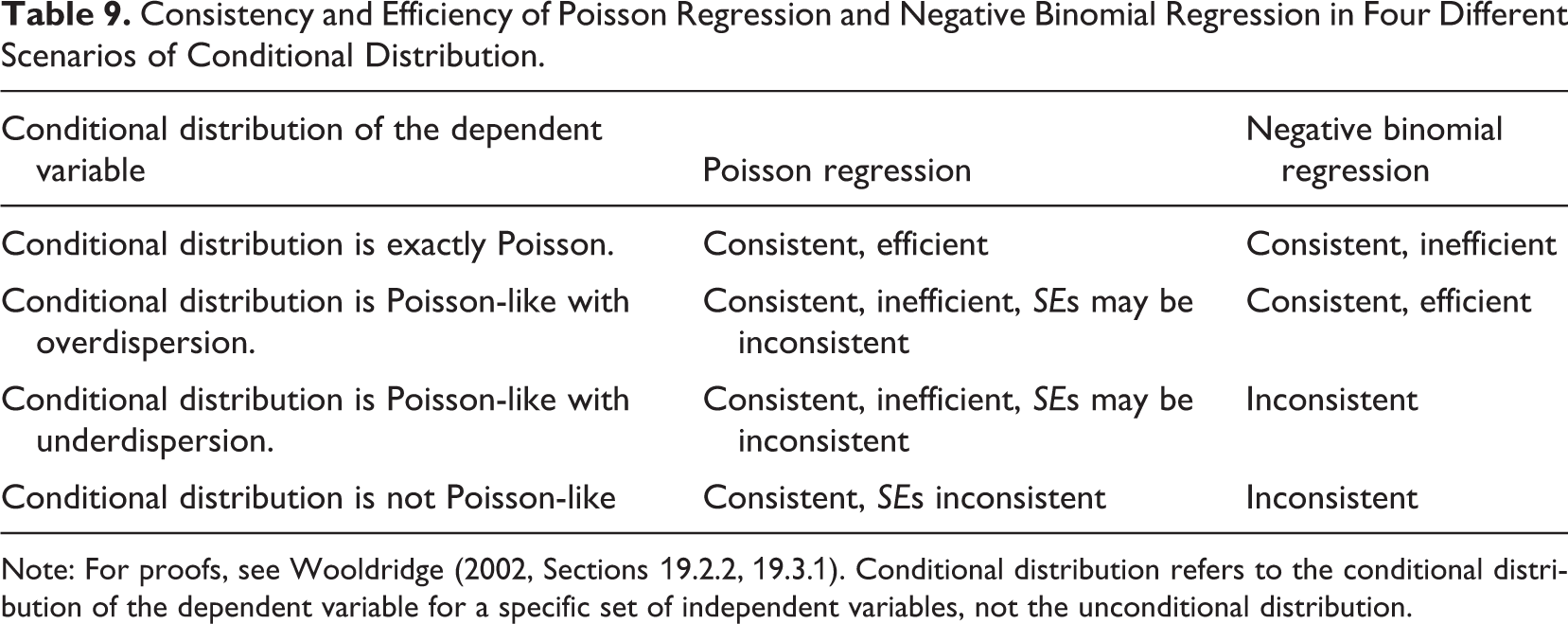
Note: For proofs, see Wooldridge (2002, Sections 19.2.2, 19.3.1). Conditional distribution refers to the conditional distribution of the dependent variable for a specific set of independent variables, not the unconditional distribution.
To summarize, when using a GLM, a researcher needs to choose a link function that describes how the independent variables are related to the expected value of the dependent variable and a (conditional) distribution for the dependent variable around the expected value. The first decision should be based on theory or, if theory does not provide enough guidance, on an empirically identified relationship. The choice of which distribution to use in the model affects the robustness and efficiency of the analysis. In models that use a log link, Poisson distribution has been proven to produce consistent estimates, and the same has been proven for the Bernoulli distribution in the case of a logit link. Given that consistency is the most important feature of estimation results, these two distributions should be preferred over negative binomial (log link) or gamma (logit) distributions unless there are strong theoretical reasons to believe that the chosen distribution holds for the data. A likelihood ratio test between two models does not provide this information. See Villadsen and Wulff (2020) for an excellent discussion on the distribution choice.
Guideline 6: Do Not Default to Power Transformation When Modeling U-Shape and Other Curvilinear Effects; Consider Different Alternatives Instead
Adding squared independent variables to a model is currently the dominant practice for modeling nonlinear relationships in organizational research; out of the 18 (17%) articles that stated some kind of nonlinear hypothesis, just one did not use a squared independent variable (Bamberger et al., 2018). Out of the 19 (18%) studies that did use a power transformation, just two did not state a nonlinear hypothesis (DeOrtentiis et al., 2018; Hou et al., 2017), but even these articles used power terms to model nonlinearity. 11 Thus, there is a strong convention that nonlinear effects should be tested by adding power terms to the model and that power terms should be used only for that purpose.
The almost exclusive use of power terms is problematic because it can lead to incorrect inference of a U-shape effect. Power terms assume a specific form of nonlinearity (parabola opening up or down) and can lead to incorrect inference of a U-shape effect if this form does not fit the data well. For example, fitting a parabola to a data set where y = log(x) would erroneously indicate the presence of a U-shape (first up, then down, or the other way) effect. An opposite incorrect conclusion of an increasing trend could be made if y first increases gradually but then decreases steeply (Simonsohn, 2018, Figures 2, 3). We show this effect in the first panel of Figure 8, which shows a binned scatterplot and second-order polynomial curve produced by the binsreg command and an exponential curve fitted with Poisson QML regression for reference. Because the inflection point of the U-shape curve falls within the range of the data (Haans et al., 2016), we would conclude that education has a negative effect on income for about the first 8 years of schooling, which does not sound realistic.
Although the exponential model is clearly a better alternative for modeling the nonlinear effect of education on income, it is not a universal solution; the exponential form is a specific form, which may not fit all data well and cannot be used to test U-shape effects the same way that power terms can be used. Regression splines provide an alternative approach for modeling nonlinear effects. Here, the idea is to fit a linear model that has one or more knots, where the direction of the regression line changes. An in-depth explanation of spline regression is beyond the scope of this article, but we refer the reader to Edwards and Parry (2018) for details. Of the reviewed articles, Kim and Rhee (2017) and Rawley et al. (2018) used splines with fixed knots to capture nonlinearities in the data. Simonsohn (2018) proposed a variant of this technique and an accompanying test. This technique was used by Shin and Grant (2019) in a recent publication. Another alternative is the use of fractional polynomials (Nikolaeva et al., 2015; Royston & Sauerbrei, 2008; Sauerbrei et al., 2006), but this strategy was not applied in any of the reviewed articles.
The second plot of Figure 8 shows a spline regression with two knots estimated from the data. We chose to use two knots because we assumed that the effects of education probably increase after primary education and further increase at the university level. However, this assumption was not supported empirically because there is just one clear change in direction in the plot. This suggests that the effect of education is steady for primary and secondary education, after which the effect increases steeply. The spline model also fits the higher education occupations much better than either the exponential or polynomial curve.
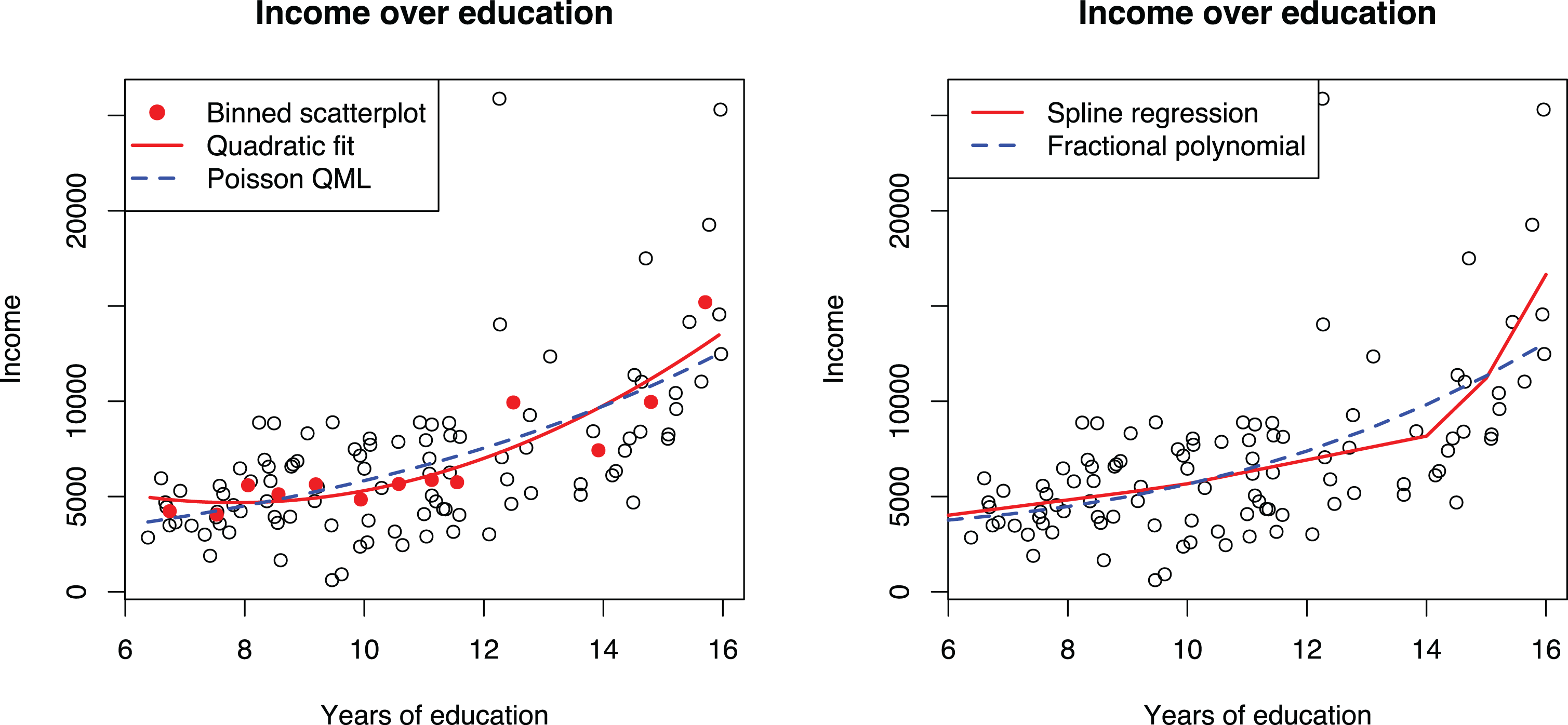
Binned scatterplot matrix, spline regression, and fractional polynomial regression for discovering functional form between income and education.
To summarize, the currently dominant practice of estimating nonlinear effects in organizational research is to add a second power of the independent variable to the model. Although this approach is useful in detecting whether nonlinearity exists, it may not be ideal for detecting what kind of nonlinearity is present in the data and can lead to incorrect interpretations. Instead of the routine application of power terms, we suggest that researchers also consider other transformations, such as the log transformation of the dependent variable or a GLM or by using regression splines, which provide a flexible alternative for modeling nonlinear effects.
Guidelines for Interpreting Models With Transformations
Our review indicated that nonlinear models were commonly interpreted incompletely or even incorrectly. This is a major problem because the form and strength of the relationship between the focal variables should be of prime theoretical interest (Edwards & Berry, 2010). Therefore, we will now present two guidelines for improving the interpretation and reporting practices.
Guideline 7: Interpret Nonlinear Effects by Plotting, Including Confidence Intervals and the Data in the Plot
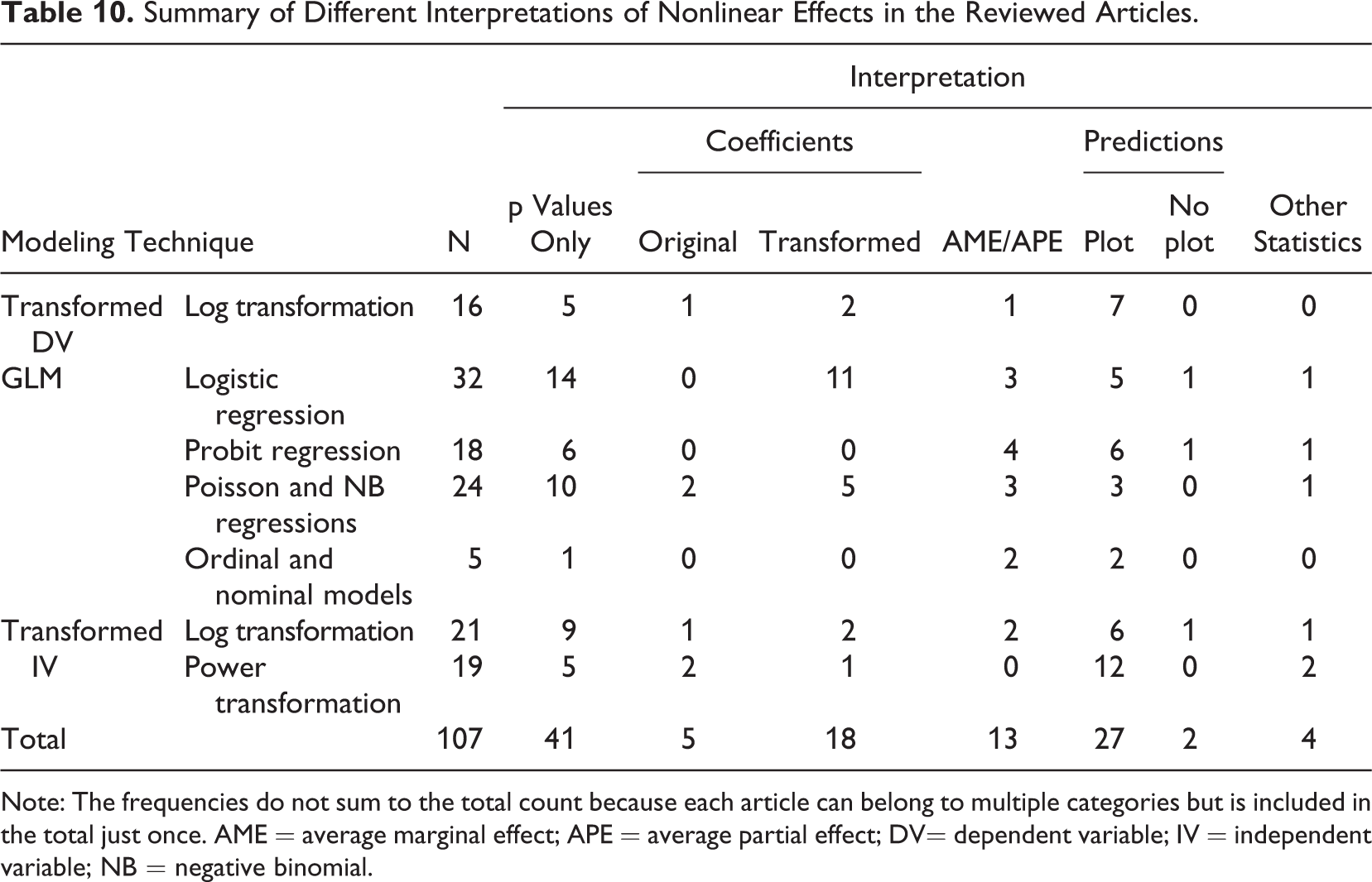
The interpretation of a linear model is straightforward: The regression coefficient gives the expected increase in the dependent variable as an independent variable increases by one unit, and this effect is constant through the range of the independent variable. The case of nonlinear models is more complicated because changing an independent variable by one unit produces a different absolute change in the dependent variable depending on the current value of the dependent variable, the independent variable, or both. Consequently, several different interpretation techniques were applied in the reviewed articles, as summarized in Table 10. The most common strategy was to simply look at the p values and the sign of the coefficient to infer the direction of the effect, ignoring both the strength and form of the relationship. The second most common approach was to use prediction plots, but this is mostly explained by the convention of doing so with models containing interactions or powers as independent variables. Only one article that did not use powers or interactions plotted the effects (Eggers & Kaul, 2018). The remaining articles used direct interpretations, average marginal or partial effects (AME or APE), or other statistics that were not reported in detail. We will next discuss different interpretation techniques in some detail.
Summary of Different Interpretations of Nonlinear Effects in the Reviewed Articles.
Note: The frequencies do not sum to the total count because each article can belong to multiple categories but is included in the total just once. AME = average marginal effect; APE = average partial effect; DV= dependent variable; IV = independent variable; NB = negative binomial.
Interpretation Based on Numbers
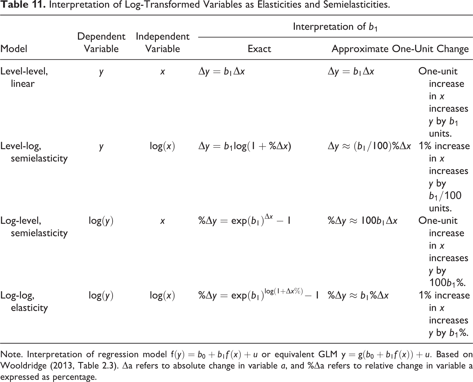
Exponential models can be conveniently interpreted as giving approximately the percentage change in the dependent variable relative to its current value when an independent variable increases by one unit, as shown in Table 11. This works well when the percentage change is small, but already at the regression coefficient of 0.3, the difference between the approximation (30%) and the results from the exponential model (1.35) is 5 percentage points (Wooldridge, 2013, pp. 192–192).
Another alternative is to exponentiate the coefficients (i.e., interpret exp[β] instead of b), which can be interpreted either as percentage changes or as ratios. If interpreted as percentage change, an exponentiated coefficient gives a more accurate estimate of a positive one-unit change at the expense of the accuracy of a comparable negative change. 12 Thus, if a percentage change interpretation is needed, the approximate interpretation should be preferred unless there are good reasons to focus only on the positive changes of the independent variable. When interpreted as ratios (e.g., incidence rate ratio, odds ratio), an exponentiated coefficient indicates that the current value of the dependent variable is multiplied (positive effect) or divided (negative effect) as the independent variable changes. For example, the ratio of 2 indicates a +100% increase for a positive effect or a –50% decrease for a negative effect (for an exemplar use, see e.g., Turner & Rindova, 2018, p. 1265).
Interpretation of Log-Transformed Variables as Elasticities and Semielasticities.
Note. Interpretation of regression model
The most common ratio-based interpretation was the use of odd ratios with logistic regression. Unfortunately, their interpretation is not easy, and indeed about 27% of the articles applying odds ratios interpreted them incorrectly. The most common error was interpreting the odds ratios as changes in probabilities, which cannot generally be done because the probability depends on the base odds. Moreover, the parameter estimates of logistic models, and consequently the odds ratios, are negatively biased unless all relevant independent variables are included in the model (Breen et al., 2018). 13
Reporting the APE or AME (Wooldridge, 2013, p. 592) is an interpretation strategy that can be applied to all nonlinear models. In this approach, we estimate the predicted marginal effect—expected change in the dependent variable when an independent variable changes by a very small amount—for each observation and report the average. This strategy essentially expresses a nonlinear effect as a single linear effect and tends to produce very similar results to just applying a linear model (Angrist & Pischke, 2009, pp. 59, 76–78; Breen et al., 2018; Simonsohn, 2018), as demonstrated in Table 7. 14 However, although it simplifies the interpretation, it also makes this approach difficult to justify. If linear interpretation is desired, using a linear model in the first place would be a simpler solution.
Interpretation Based on Plotting Predictions
Calculating and plotting predictions is a general strategy that can be used with all nonlinear models. Predictions can be calculated in two different ways that are not sufficiently clearly distinguished in the literature: adjusted predictions (sometimes referred to as predictive margins or recycled predictions) and predictions at means. Calculating adjusted predictions involves using the estimated model to calculate predicted values of the dependent variables for every observation by altering one or more of the independent variables and holding other independent variables at their observed values. Prediction at means involves first calculating a mean for each variable in the model and then calculating predictions for a hypothetical observation that would have all of the variables at their mean values. The difference between the two prediction approaches can be understood with an example. Table 12 shows data on education from a sample consisting of five men and five women. We want to calculate predictions for six different levels of education between the ages of 6 and 16 years. With adjusted predictions, we would first adjust all observations by replacing the original values of education with 6, then calculate a prediction for each of the five women and five men, and then take a mean over all observations. This would be repeated for all education values to get the six average adjusted predictions. When predicting at means, we would calculate just one prediction for each education value for a hypothetical person that is half man and half woman. Although these two predictions are the same in linear models, in nonlinear models, they are not, and the conclusions can be different (Long & Mustillo, 2019; Wooldridge, 2013, pp. 591–592).
Adjusted Prediction and Predictions at Means Using Example Data.
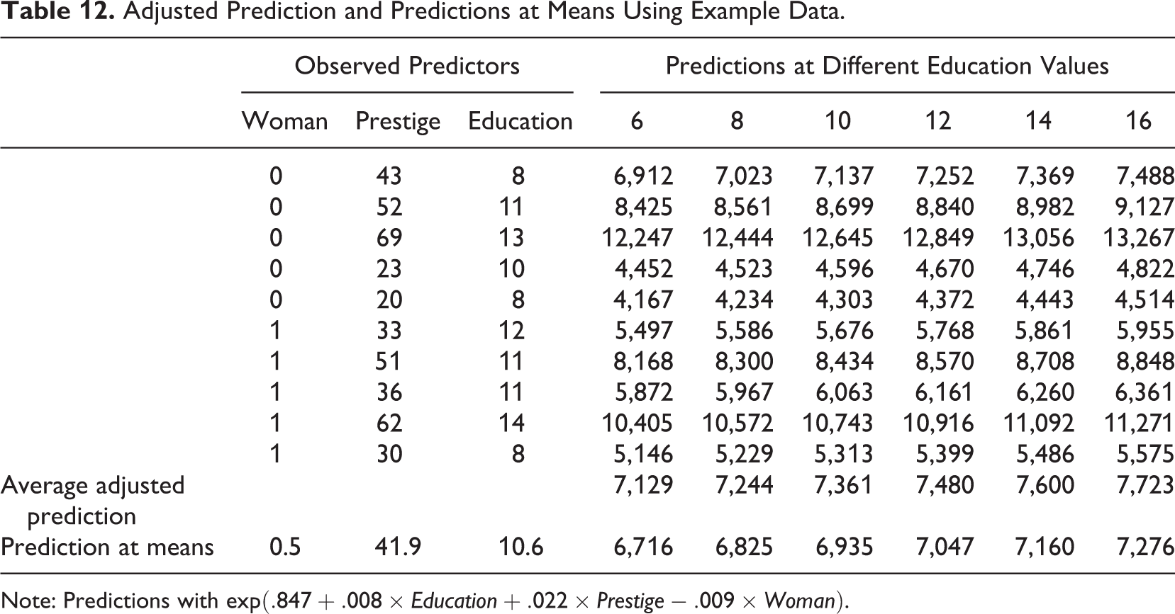
Note: Predictions with
Calculating the effects at mean values also hides the fact that a nonlinear effect can look quite different at different values of the independent variables. Consider the following models:


where x is the variable of interest and a is the effects of all other variables and the intercept. In a linear model, a simply indicates the intercept of a set of parallel lines showing the constant effect of x. In contrast, in an exponential model, the effects of a are not additive but multiplicative. In the logit model, a indicates how far along the logistic curve (inverse logit) the observation starts. If an observation is in the relatively flat part of the curve, x has a small marginal effect, but things are different in the steep middle part of the curve. Figure 9 shows the effect of x for different values of a. For this reason, it is important to plot the marginal predictions at different values of the variables other than the one of interest. However, except for articles estimating interaction models, not a single study plotted multiple curves.
Effects of other variables on the relationship between x and y in linear, exponential, and logistic models.
As explained previously, plotting the prediction curves allows the interpretation of the form of the relationship in a way not possible with numerical summaries. However, nearly a third of the articles that used prediction plots for interpretation did so incorrectly (30%). The most common error was to visualize a nonlinear relationship as a straight line. 15 The reviewed articles also rarely reported which of the two prediction approaches they were using, leaving the impression that researchers may not be aware of the difference between these two methods and the fact that adjusted predictions are generally superior to predicting at means when nonlinear models are used. Of the articles that calculated predictions, about half (51%) did predictions at means, and a third (35%) used adjusted predictions. For the remaining 14% of the articles, we could not determine which of the two approaches was used. 16
Improvements to Plotting Practices
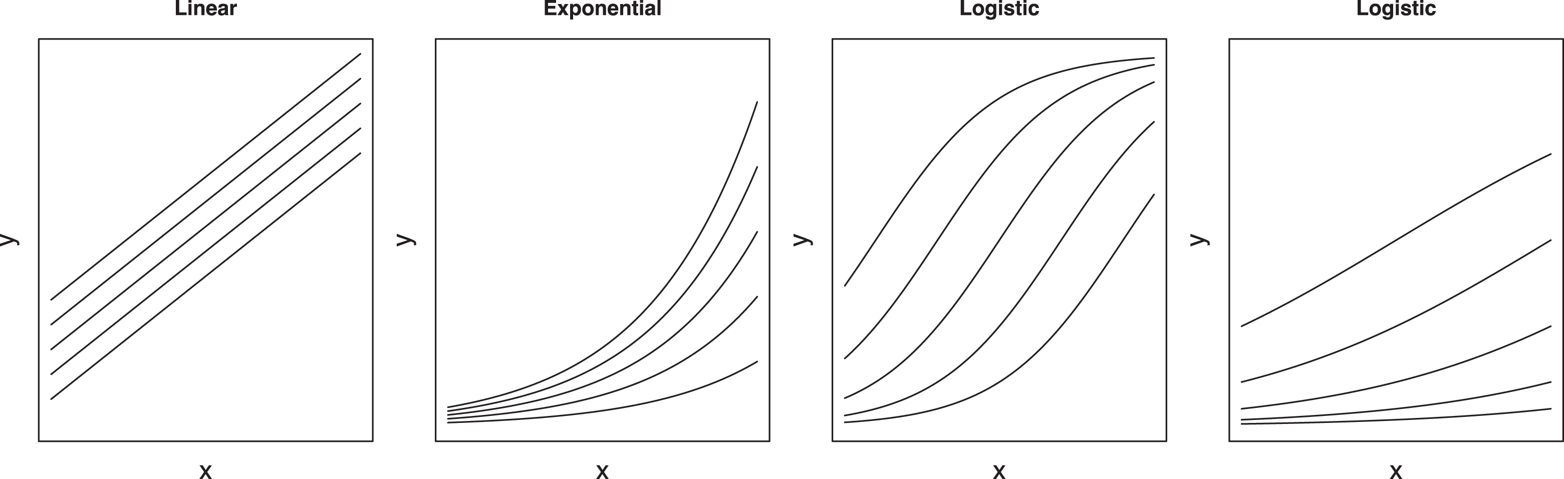
In addition to showing the functional form, it is important to show the precision of the estimate and to provide evidence that the chosen form fits the data. Confidence bands can be included to accomplish the first task (Mize, 2019). To support the chosen functional form, we recommend that researchers not only visualize the predicted curves but also indicate where their data are in the same plot (Fife, 2020), either by plotting the cases (as done in, e.g., Figure 3) or, if not possible due to their large number, by using rug and contour plots, as shown in the first plot of Figure 10. A contour plot shows which parts of the plot the observations are located in (have higher density) using a set of nested simple closed curves. The innermost curve shows the part of the plot area with the most observations, which get sparser as one moves toward the outer curves. A rug plot indicates how the observations are distributed along each variable by using small ticks on the axis. This can be useful because it indicates the range and distribution of each variable without providing any information on specific variable combinations that may be confidential. Unfortunately, showing the data in an adjusted prediction plot is not common. Only two of the reviewed articles presented any information where the data were the located in the plot. 17
Adjusted predictions plots of the effect of education on income with confidence bands and visualization of location of the observations for the full Prestige data and for subsamples.
Overlaying an adjusted prediction curve on the data works well when a single variable explains the pattern between two variables well but may not be as effective in other scenarios. To demonstrate, we add prestige as a control variable in Model 4 in Table 7, causing the effect of education to disappear. 18 The second plot of Figure 10 shows that the adjusted prediction curve does not explain the pattern in the data well. To better visualize this kind of effect, we can divide the data set into five quantiles by prestige and plot the prediction curves separately for each subsample. The resulting five curves show that the model indeed explains the data well, although the effect of education is not what one would expect.
To summarize, we recommend that adjusted predictions (not predictions at means) should be used for interpreting nonlinear models. As a graphical interpretation technique, this approach produces results that are easier to interpret (compared to, e.g., exponentiated coefficients) and clearly present the nature of the nonlinear effect (compared to, e.g., APE/AME). Although previous research has called for graphical interpretations of specific classes of nonlinear models (Hoetker, 2007; Wulff, 2015), we extend this recommendation to generally all nonlinear models. These plots should show confidence bands (Mize, 2019) and also indicate the positions of the observations. This will provide evidence of both the appropriateness of the nonlinear functional form as well as the magnitude of the effects.
Although plots can be conveniently produced with spreadsheets designed for plotting interaction models, some of which even support nonlinear models (e.g., Dawson, 2014), the ones we are aware of do not support confidence bands, are limited to predictions at means, and provide little support for visualization of the observations. Because of this, we do not recommend their use. We recommend instead that statistical software be used. Adjusted prediction plots have been available in leading statistical software for years (Breheny & Burchett, 2017; Fox, 2003; Williams, 2012), and adding a scatterplot of the data is not difficult to do (e.g., Mitchell, 2012b, p. 448). To facilitate the adoption of these techniques, the Supplemental Material available in the online version of the journal provide examples in R and Stata and an online calculator for users of other statistical software.
Guideline 8: Do Not Infer Moderation From an Interaction Effect but From a Plot
Testing moderation hypotheses with nonlinear models requires special care because using interactions in these models can produce confusing results (Mize, 2019). Murphy and Russell (2017) claimed “inappropriate use of transformations” (p. 552) to be one cause of small moderation effects in management research, but the problem is not inappropriate use of transformations. It is, instead, inappropriate interpretation of the modeling results. Typically, the statistical significance of the interaction term would be checked. If not significant, one would conclude that there is no support for the moderation effect, and the results would not be interpreted any further. Indeed, out of the 77 articles that tested a moderation hypothesis with a model containing interactions, 14 (18%) interpreted the interaction coefficient or its significance when testing a moderation effect. However, only checking the interaction provides a misleading picture of moderation (Greene, 2010; Mize, 2019; Mustillo et al., 2018).
To discuss moderation testing, we need to first define what moderation is. Unfortunately, the concept itself is often defined imprecisely. For example, Dawson (2014) stated the following: “In general terms, a moderator is any variable that affects the association [emphasis added] between two or more other variables; moderation is the effect the moderator has on this association” (p. 1). This definition is problematic because the main hypothesis defining the association typically leaves its form (e.g., linear, exponential) undefined, resulting in considerable ambiguity about what exactly a moderation effect means. Consider, for example, the following hypothesis:
Hypothesis 2: The positive effect of education on income is moderated by percentage of women; the effect is stronger for occupations with less women.
Assume that a typical man and woman earn $6,000 and $4,000, respectively. If a typical man goes to school for one additional year, he should expect a $600 or 10% increase in salary. Now, consider the same effect for a typical woman under three scenarios, a $400, $500, and $600 effect corresponding to 10%, 12.5%, and 15% increases in salary. The effect of education is positive for both genders in all three scenarios, but is the effect moderated by gender, and if so, in which direction? This question is ill-defined unless one is willing to assume a specific functional form. The answer depends on whether one is interested in percentage increase (exponential curve) or absolute increase (linear model). Particularly, in the second scenario ($500 or 12.5% for women), the moderating effect of gender would even have a different sign ($100 less vs. +2.5 percentage points more for women) depending on the chosen functional form (i.e., absolute vs. relative effects).
The effect of functional form is shown in the last two regressions in Table 7. The linear Model 5 has a significant interaction term, whereas in the nonlinear Model 6, the interaction term is nonsignificant. Nevertheless, Figure 11 shows a clear moderation effect if absolute income is considered: The effect of education is much stronger for men-dominated occupations in both plots. It also shows why plotting the data is helpful in choosing a model: The linear model clearly extrapolates the data and underpredicts the incomes of higher education occupations, particularly those with more women, and hence does not fit as well as the nonlinear model.
Comparison of linear and nonlinear models where education and share of women interact.
Why is an interaction effect not required to infer moderation? The reason is that in the exponential model, the effects are multiplicative instead of additive, as noted before. The lack of a significant interaction term thus does not mean a moderation effect would not exist in absolute terms (Russell & Dean, 2000); it is simply presented in an alternative form, as Figure 11 shows. Similarly, if the appropriate model for the data is an exponential model, then fitting a linear model can produce significant interactions that did not exist in the exponential model. This is a form of confounding interactions with nonlinearity (see also Cortina, 1993). The same logic also applies to logistic models, where a moderation effect can exist even if there is no interaction in the model, as shown in McCann and Folta (2011, Figure 2). In some instances, the logit and linear models can even produce interaction coefficients of different signs (Ganzach et al., 2000). Plotting the effects can also resolve such apparent contradictions. Indeed, 51 (66%) of the reviewed articles that tested moderation hypotheses did so by plotting, although in eight cases, this was done incorrectly by visualizing a nonlinear model as a set of straight lines instead of using the curves that the model implied.
Should we interpret Figure 11 as supporting a moderation effect? Ideally, moderation hypotheses should be stated in a way that leaves no room for ambiguity (see also Gardner et al., 2017). If we assume that the effect of education on income is relative to the current income level, we could state an alternative, more precise moderation hypothesis:
Hypothesis 2a: The positive relative effect of education on income is moderated by percentage of women; the effect is stronger for occupations with fewer women.
The results shown in Table 7 and Figure 11 would not support Hypothesis 2a. Even though the absolute increase of income is greater for men-dominated occupations, the results do not demonstrate that education would increase income differently between men and women. Both experience the same relative effect, and the differences in the absolute effect are simply due to men earning more regardless of the education level.
To summarize, nonlinear models neither hide nor produce spurious moderation results, although an incorrect interpretation can do so. Testing a moderation hypothesis requires a comprehensive interpretation, preferably through plotting, instead of just checking the significance of the interaction term in the model. A key problem in testing moderation is that the main hypothesis and the moderation hypothesis are typically imprecise, lacking the expected functional form. This creates ambiguity because it is possible that moderation exists when considering absolute effects but not when considering relative effects, as our example shows. It is also possible that the effects are both moderated but in different directions. To resolve these issues, researchers should assess their models more comprehensively and interpret results by looking at the shape of the curves in a plot and comparing how well they match the data.
Conclusions
Our review of the methodological literature and empirical practice clearly indicate that organizational researchers should rethink their use of transformations. Decisions to use nonlinear models (Blevins et al., 2015) or transformations (Aguinis et al., 2019; Becker et al., 2019) should not be based on the distributions of individual variables but should be based on the expected functional form of the relationship between independent and dependent variables, which should in turn be based on theory. As such, transformations are not something that should be relegated to the data preparation stage (Aguinis et al., 2019; Becker et al., 2019) but should be considered as an integral part of the research design, on par with the choice of independent variables in the models. Against this background, the recent claims that the use of transformed variables for testing hypotheses would be problematic are simply incorrect (Aguinis et al., 2019; Becker et al., 2019; Maula & Stam, 2020). If the hypothesis does not specify a functional form, then any monotonic form should do (Edwards & Berry, 2010). Unfortunately, despite recent calls for more precise theorizing, the current theories still provide limited support for determining the functional form (Cortina, 2016; Edwards & Berry, 2010; Ferris et al., 2012).
Our article highlights three key concerns. First, transformations are often applied either unnecessarily or at least with incorrect justification, such as relating to nonnormality of variables or because the dependent variable is a count. Second, transformations are not always applied where they should be. This is evident in the insufficient consideration the functional form is given when framing hypotheses and in how omitting regression diagnostics that would provide evidence of a given functional form appears to be the rule rather than the exception. Third, the nonlinear models that transformations create are often interpreted incorrectly. We hope that these guidelines and empirical examples will improve future research practice. The Supplemental Material available in the online version of the journal provides example Stata and R code and a web-based tool for users of other statistical software that should be helpful for researchers interested in adopting these techniques.
Finally, we wish to point out two problems discovered during our review that are not directly related to transformations and nonlinear models but are nonetheless worth discussing. First, many articles document their analytical steps incompletely, leaving readers guessing how a statistic was calculated based on the modeling results. To reduce such ambiguity, researchers should fully disclose their analytical procedures, including publishing analysis files as supplements to the articles. Fortunately, the field seems to be moving in this direction as prominent journals are making efforts to increase transparency in the empirical research process (Aguinis et al., 2018; Antonakis, Banks, et al., 2019; Banks et al., 2019; Bergh & Oswald, 2020; Chen, 2018; Grand et al., 2018).
Second, there are several misunderstandings relating to the role of transformations in statistical analysis in the organizational sciences. These myths may have been caused by the use of transformations without providing supporting citations (Becker et al., 2019). However, the loose citation practice also extends to methodological guidelines that often cite books such as Cameron and Trivedi (1998), Long (1997), Cohen et al. (2003), or Greene (2003) without providing a page, chapter, or section number. The loose citation practice is problematic because it makes it difficult for readers to verify whether the citation supports the presented practice given that some of these books are difficult to navigate unless one is an expert in quantitative methods. Loose citation practice also easily translates into loose argumentation. For example, the claim that regression analysis requires normally distributed data or that the error term must be normally distributed are strictly incorrect and misleading, respectively. The normality assumption pertains to the error term and is only relevant in very small samples. We believe that more rigorous citation and use of econometrics books focusing on what these books prove or demonstrate would contribute significantly to avoiding these misconceptions.
Supplemental Material
Supplemental Material, sj-pdf-1-orm-10.1177_1094428121991907 - Eight Simple Guidelines for Improved Understanding of Transformations and Nonlinear Effects
Supplemental Material, sj-pdf-1-orm-10.1177_1094428121991907 for Eight Simple Guidelines for Improved Understanding of Transformations and Nonlinear Effects by Mikko Rönkkö, Eero Aalto, Henni Tenhunen and Miguel I. Aguirre-Urreta in Organizational Research Methods
Supplemental Material
Supplemental Material, sj-r-1-orm-10.1177_1094428121991907 - Eight Simple Guidelines for Improved Understanding of Transformations and Nonlinear Effects
Supplemental Material, sj-r-1-orm-10.1177_1094428121991907 for Eight Simple Guidelines for Improved Understanding of Transformations and Nonlinear Effects by Mikko Rönkkö, Eero Aalto, Henni Tenhunen and Miguel I. Aguirre-Urreta in Organizational Research Methods
Supplemental Material
Supplemental Material, sj-do-1-orm-10.1177_1094428121991907 - Eight Simple Guidelines for Improved Understanding of Transformations and Nonlinear Effects
Supplemental Material, sj-do-1-orm-10.1177_1094428121991907 for Eight Simple Guidelines for Improved Understanding of Transformations and Nonlinear Effects by Mikko Rönkkö, Eero Aalto, Henni Tenhunen and Miguel I. Aguirre-Urreta in Organizational Research Methods
Supplemental Material
Supplemental Material, sj-xlsx-1-orm-10.1177_1094428121991907 - Eight Simple Guidelines for Improved Understanding of Transformations and Nonlinear Effects
Supplemental Material, sj-xlsx-1-orm-10.1177_1094428121991907 for Eight Simple Guidelines for Improved Understanding of Transformations and Nonlinear Effects by Mikko Rönkkö, Eero Aalto, Henni Tenhunen and Miguel I. Aguirre-Urreta in Organizational Research Methods
Footnotes
Acknowledgments
This document was prepared using the StatTag software (Welty et al., 2016). The software is cited as per the license conditions.
Declaration of Conflicting Interests
The author(s) declared no potential conflicts of interest with respect to the research, authorship, and/or publication of this article.
Funding
The author(s) received no financial support for the research, authorship, and/or publication of this article: This research was supported in part by a Grant from the Academy of Finland (Grant 311309).
Supplemental Material
Supplemental material for this article is available online.
Notes
References
Supplementary Material
Please find the following supplemental material available below.
For Open Access articles published under a Creative Commons License, all supplemental material carries the same license as the article it is associated with.
For non-Open Access articles published, all supplemental material carries a non-exclusive license, and permission requests for re-use of supplemental material or any part of supplemental material shall be sent directly to the copyright owner as specified in the copyright notice associated with the article.