
Abstract
Relying on a multimethod approach with eye tracking, cued retrospective reporting, and a memory test, this experimental study (N = 45) shows how individuals engage with static, interactive, and interactive-animated data visualizations embedded in online science news. The results suggest that interactivity and animation engage participants most strongly: The second part of the news article is fixated the longest by participants exposed to the interactive-animated visualization, which translates into higher learning outcomes. However, the dynamic process of news reception requires a nuanced understanding of how users attend to visual and textual parts of a message to make informed statements about their effectiveness.
Keywords
Introduction
Democracy is based on the premise of a knowledgeable citizenry that is capable of making well-informed decisions (Van Aelst et al., 2017). Today, many of these decisions—from mandatory vaccination to investments in renewable forms of energy—are related to science and technology. Bridging the gap between science and its public understanding is thus of crucial importance—and so is well-designed science communication in mass media. Online news nowadays provides for more sophisticated means of communicating science than had traditionally been the case, and visualizations of scientific information in the form of charts, diagrams, or maps play a pivotal role in this respect (Allen, 2018; Harold et al., 2016; Rodríguez Estrada & Davis, 2015). High hopes are placed particularly in interactive data visualizations (Sterman, 2011), which are graphical representations of information that allow for a user-controlled exploration (Ward et al., 2015). It is assumed that the possibility to access information through clicking, sliding, or zooming-in might provide a more direct and personally meaningful experience of abstract phenomena and thus facilitate both comprehension and learning (Bolsen et al., 2019; Nocke et al., 2008; Schroth et al., 2014). However, research has produced only tentative results (Neset et al., 2016) and was not able to clearly attribute the observed effects to the interactive potential of visual content (Herring et al., 2017; Retchless, 2014). In addition, interactive images are increasingly enriched with short simulated motion pictures. Such animations have already been studied when used as single-message features (Harrower & Fabrikant, 2008), but the effects that might result from combining animation and interactivity in data visualizations remain unexplored.
The present study addresses this gap by investigating how users actually engage with interactive and animated images in online news and how these novel visualization types affect the perception and subsequent learning about a complex topic such as climate change. To this end, we introduce an innovative multimethod approach combining eye tracking methodology, cued retrospective reporting, and a memory test in an experimental research design. This comprehensive approach allows us to better understand why learning from a complex news message might be facilitated (or hindered) due to a particular visual design, as we are able to show (1) how often, for how long, and in which order specific elements of a news article are visually attended to (eye tracking data); (2) why specific patterns of visual behavior occur (verbal data); and (3) whether the information that is observed is thoroughly processed and stored in memory (recognition and recall test). Finally, an experimental design allows us to compare the effects of a static, an interactive, and an interactive-animated data visualization as a feature of an online science news article. These insights not only advance our understanding of visual science communication on the internet but also inform the use and design of novel visualizations types to both inform and engage audiences online.
Perception of a Multimodal (Science) News Message
Visual representations of data have always been of great importance in science communication (Pauwels, 2020). By uncovering patterns and relationships in abstract information, diagrams, charts, and maps go beyond simply illustrating written material (Rodríguez Estrada & Davis, 2015) and make perceptible what would otherwise not be visible to the human eye (Schneider, 2012). Consequently, they increase interest and engagement and help audiences better understand and remember scientific information (Arsenault et al., 2006; Kessler et al., 2016; Lazard & Atkison, 2015). However, not every form of data visualization is equally beneficial (van der Linden et al., 2014). Early studies have already pointed to the relevance of the actual design of graphical content (Carpenter & Shah, 1998), showing that readers were more affected by the chart type than by the actual information displayed (Zacks & Tversky, 1999). The novel design possibilities in online environments have given these findings new significance (Harold et al., 2016). McMahon et al. (2016), for example, found that infographics decrease users’ sense of confidence in the data presented merely because they look less serious. Since design decisions influence the immediate perception of information, and the impact of novel design elements, such as interactivity and animation, is not yet clear, scholars increasingly call for user-centered studies of science-related data visualizations (Rodríguez Estrada & Davis, 2015) that focus on the way in which recipients perceive, evaluate, and mentally process visual information embedded in a text-based news message (see also Haßler et al., 2019).
Today’s multimodal online news environment facilitates a great variety of self-determined and discontinuous patterns of news consumption (Conlen et al., 2019; Holsanova et al., 2006). Drawing on action-centered theories of media use (Renckstorf & Wester, 2001), we thus conceptualize news reading as an active, reciprocal process of attention, selection, and interpretation, guided by two competing mechanisms—salience and schema (Bucher & Schumacher, 2006; Kaspar, 2013). Salience theory proposes that dominant textual, visual, or interactive elements of a news message drive the process of selection and interpretation. Reception is considered a bottom-up process, based on involuntary attention (Itti & Koch, 2000). Schema theory, by contrast, proposes that individual intentions and capabilities are decisive for users’ engagement with media, conceptualizing reception as a top-down process, based on voluntary attention (Anderson & Pearson, 1984).
Eye tracking research has revealed that bottom-up effects mainly occur in the very first phase of reception (Bucher & Schumacher, 2006), when users try to find out what navigational options they have to explore a news article in more detail. Such orientation phases are usually characterized by scanning gaze patterns together with fixations of salient elements that by experience promise to be informative. Visual cues have been found to play a significant role in this first phase (Leckner, 2012; Pros & Tarrida, 2015). They are important entry points for news consumers, attracting attention, and sustaining interest in the media message. In later phases, characterized by top-down effects, textual and visual elements are perceived in an alternating manner as individuals try to combine information from all available sources to grasp the meaning of a news item (Holsanova et al., 2006). Websites are predominantly received linearly (i.e., from top to bottom), with longer fixation durations at the top of a page (Kessler et al., 2020).
Only a few scholars have investigated the perception of graphical representations in print and online news. In a first study, Holmqvist and Wartenberg (2005) showed that infographics can prolong the reading of an associated text more than pictures or drawings do. More recently, de Haan et al. (2018) confirmed this result, suggesting that infographics are used to get an overall impression of a news story but are not considered in detail. Research on multimedia learning illustrates that eye movements are further affected by the specific combination of textual and visual information—that is, whether a diagram is presented within or after a body of text (Johnson & Mayer, 2012). Although these studies provide important insights into overall reading patterns, they do not consider interactivity and animation, two key features of contemporary graphical content that may significantly influence in what order and for how long individuals observe textual and visual parts of an online news article and what they eventually take away from the information.
Interactive and Animated Elements in Data Visualizations: Impact on Perception and Learning
In this study, interactivity is understood as a technological affordance that is built into a media interface, enabling users to modify the pace, sequence, or narrative organization of content in real time (Steuer, 1992). Interactive elements engage both visual and tactile senses, as they orient news consumers to the possibility of performing mouse-based actions, such as clicking, sliding, swiping, or zooming-in, to access, encode, and experience information in a user-controlled fashion (Sundar et al., 2010). Animations, by contrast, only speak to the visual senses. They are defined as a series of consecutively shown static pictures (frames), with each picture appearing as an alteration of the previous one. While static graphics present all information simultaneously, animations present information over time, which make them especially suited to represent physical or temporal change (Tversky et al., 2002). Interactive data visualizations are considered innovative news elements and rated as more appealing, interesting, and involving than their static counterparts (Ancker et al., 2009; Ward et al., 2015). According to salience theory, they are perceptually salient features that strongly attract visual attention (Wang & Sundar, 2018). 1 The human visual system is sensitive to movement (Pritzel et al., 2003), so adding dynamic animations can further enhance this effect.
Schema theory, however, prescribes that the reception process is determined by not only visual design but also individuals’ capabilities and needs (Anderson & Pearson, 1984; Lehmann et al., 2014). Initial attention therefore needs to be distinguished from sustained attention allocated toward the data visualization. With an interactive visualization, users have more control over the flow of information, which can lead to selective scanning, matching on content that is believed to be most interesting or important (Herring et al., 2017). In their study on reading activities on interactive online articles, Conlen et al. (2019) report that users show a continuum of behaviors, ranging from linearly interacting with the content to interacting only with specific article components, likely based on personal relevance. They assume that, in general, users are willing to engage with interactive content but only if it is crucial to the central storyline. These findings align with previous work showing that simple interactive affordances, such as clicking or swiping on an image, might eventually become too boring for users (Greussing, 2019), while complex interactive pathways are likely to overwhelm and confuse them (Bucy, 2004). Consequently, interactive data visualizations might encourage users to turn away from the visual content, seeking other information sources, such as the surrounding text, to help them understand the article content more easily and straightforwardly. Adding animated elements to an interactive data visualization could compensate for these drawbacks. Prior studies found that moving images induce higher levels of arousal than static images (Sundar & Kalyanaraman, 2004) and help focus individuals’ attention by clearly distinguishing themselves from other components on a webpage (Wolfe & Horowitz, 2004). However, there is also evidence that the explicit representation of dynamic changes tempted users to consider animations only superficially and invest too little cognitive resources in understanding their main content (Schnotz & Lowe, 2003).
In a common news article, data visualizations are integrated into written material. Hence, in addition to altering the perception of the graphical representation itself, interactivity and animation may affect how users attend to the surrounding bodies of text. Existing research has produced inconclusive findings. Drawing on limited capacity models (Lang, 2000), it is argued that the saliency of interactive and animated elements in data visualizations comes at a cost: By capturing user attention and directing it toward the graphical content, they are said to divert visual attention away from the surrounding text-based content (Xu & Sundar, 2016). Supplementing the interactive image with an attention-arousing animation might even amplify this negative effect (Opach et al., 2014; Wolfe & Horowitz, 2004; Yang et al., 2013). Drawing on the concept of user engagement (O’Brien & Toms, 2008), however, it is argued that enhancing information salience is beneficial for focused attention and positive affect (McCay-Peet et al., 2012), which in turn induce intrinsic motivation and a willingness to learn more (Arapakis et al., 2014; Greussing & Boomgaarden, 2019). That is, interactivity and animation are assumed to evoke situational interest, understood as an initial hook that translates into personal interest. Individuals feel absorbed by the media message and become curious about the story, which results in a desire for active exploration and discovery, indicated by investing more time and effort into the overall reception process (Oh & Sundar, 2015). Previous studies have indeed found that enabling a user-controlled exploration of information can induce positive emotional responses, such as enjoyment or satisfaction (Oh et al., 2018), particularly when the interactive features support the user experience in a natural and intuitive way (Oh & Sundar, 2015; Reychav & Wu, 2015). Further enriching an interactive data visualization with animated elements can support positive emotional responses. Moreover, research into learning from animated content indicates that a dynamic representation of information can serve as an “external cognitive aid for mental operations and processes” (Berney & Bétrancourt, 2016, p. 152). Users do not need to mentally infer the attributed changes but can directly perceive them in an animation, freeing up cognitive resources to attend and process the remaining parts of the news article.
Given the competing theoretical assumptions and inconclusive empirical findings discussed above, it appears important to better understand the perception, evaluation, and processing of interactive and animated information. Eye movements are considered to bridge the gap between perception and cognition; they provide an unobtrusive, real-time behavioral index of concurrent visual and cognitive processing. Eye movements and fixations are indicators of the uptake of visual information and provide insights into the cognitive processes underlying a wide variety of human behaviors (Ashby et al., 2016). Extensive work has proposed a positive relationship between visual attention and information processing, arguing that such attention makes content accessible for further processing in working memory (Kruikemeier et al., 2018; Schmidt-Weigand et al., 2010).
Research Questions and Hypothesis
Against the backdrop of a high relevance of public understanding of science and the potential contribution that data visualizations may make in this respect, this study focuses on users’ perceptions and interpretations of interactive and animated elements in data visualizations as a premise of media effects (Bucher & Schumacher, 2006) and links them with message processing. In particular, it aims to investigate how individuals visually perceive, evaluate, and learn from an online science news article that includes a static, interactive, or interactive-animated data visualization. Visual perception thereby refers to how long and in what order participants look at the content of the news article. Given the multidirectional evidence base as discussed above, we pose the following first research question:
As outlined above, news reading patterns are driven partly by the visual design of a news article and partly by user characteristics. To better understand why specific patterns occur, we thus incorporate what users think about the static, interactive, and animated elements and how they assess the role of data visualizations in online news. Specifically, we ask the following question:
Data visualizations are commonly integrated into written material. Since prior research has hardly investigated the effects of interactivity and animation on these texts, we pose the following research question:
Visual attention has consistently been found to predict cognitive processing and learning (Kruikemeier et al., 2018; Schmidt-Weigand et al., 2010). We thus hypothesize that adding interactive and animated elements to data visualizations affects visual attention allocated to the news article, and this attention then affects memory of the article content.
Methods
These research questions and hypothesis are addressed by utilizing a demanding, innovative multimethod approach combining eye tracking methodology, cued retrospective reporting, and a memory test in an experimental research design. 2
Sample and Procedure
Forty-five participants 3 completed the study (Mage = 23.1; SDage = 3.9, 71% female)—all students enrolled in communication science, recruited from the research participant pool of a Swiss university in spring 2019. First, participants completed an online survey on demographics, issue involvement, internet literacy, perceived prior knowledge, environmental concern, and need for cognition. Then, they signed up for an individual appointment in the university’s eye tracking lab. There, each participant read one of three versions of the stimulus article while eye movements were recorded (i.e., three experimental groups 4 ). The participants could freely choose how long they spent on the information presented, as they were instructed to read the article as they would normally do. Following stimulus exposure, the participants completed a posttest survey assessing knowledge uptake (memory for information presented) and took part in a short cued retrospective reporting, as suggested by van Gog et al. (2005). Finally, participants were informed about the study objectives and reimbursed with either 20 CHF or course research credit. Each lab session lasted about 40 minutes.
Stimulus
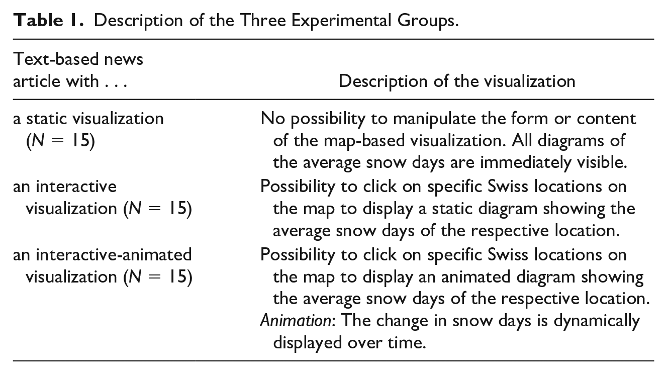
Three versions of an online news article, redesigned from one published by a Swiss media outlet (Vögeli & Brupbacher, 2019), were created on the climate-related decrease in snow days in Switzerland. To control for article content, the exact same information was conveyed across all experimental groups. After an extended introduction outlining the relevance of the topic and longitudinal trends, the specific decrease in snow days for nine Swiss locations was presented on a map-based data visualization. For each location, a diagram showed the average amount of snow days for two time periods (1960-1990 and 1990-2018, respectively). An insert indicated the percentage decrease (see Appendix A for screenshots, available as supplement 5 ). Following the visualization, possible reasons for the decrease in snow days were discussed, underpinned with scientific expertise (e.g., a direct quote from a climate scientist). Explicit reference was made to two locations on the map that show unusual longitudinal trends. The article ended with possible actions against the climate-related decrease in snow days, again supported with quotes from scientists. Total length of the article was 540 words.
The difference among the three experimental groups concerned only the design of the data visualization (see Table 1). We decided to use a rather simple type of interactive data visualization, requiring users only to click on hotspots, as they represent a typical example of graphical content used in German-speaking online news (Zwinger & Zeiller, 2016).
Description of the Three Experimental Groups.
All participants viewed the stimulus material in digital format on a 22-inch color-calibrated monitor positioned at a fixed distance (approximately 25 inches). The length and design of the stimulus was oriented toward common news websites in Western countries; the average reading time was 3.1 minutes (SD = 1.0). Before conducting the study, a pretest among 61 German-speaking contributors on the crowdsourcing platform Figure Eight was administered to ensure that participants perceived the stimulus material as professionally designed, easy to understand, and highly usable. 6
Measurements
Eye tracking is a process-tracking method that allows researchers to monitor the position (fixation, defined as the maintaining of the visual gaze on a single location) and movement of the eyes and thus to objectively assess news consumers’ visual behavior (King et al., 2019; Zillich & Kessler, 2019). In the present study, visual perception of the stimulus is based on eye movement data capturing for how long and in what order participants attended to the content of the news article (Holmqvist et al., 2011). A priori, three areas of interest (AOIs) were selected to distinguish among visual attention directed at the (1) first body of text, (2) map-based data visualization, and (3) second body of text (see Figure 1, available as supplement).
Within these AOIs, we focus on two key measures of visual attention: fixation time, defined as the sum of the fixation durations inside an AOI, and fixation count, defined as the number of all fixations inside an AOI. In addition, for visual attention allocated toward the data visualization, a trained student assistant manually counted how often participants looked at the nine diagrams and what properties of the diagrams were visually considered. To gain insights into what individuals prioritized when engaging with a news article, we are further interested in the order in which participants attended to the different textual and visual areas. This information is provided by the AOI sequence chart, which is a representation of the fixated AOIs over time.
All eye tracking data were collected on a stationary remote system from SensoMotoric Instruments (iView X Red) with infrared illumination that tracks movements from both eyes at a sample rate of 120 Hz. Participants were not required to wear any physical installation and could freely move their eyes around the screen, enabling a more natural experimental environment. To ensure accurate tracking, the experiment started with a nine-point calibration (deviation X: M = 0.25 [SD = 0.12]; deviation Y: M = 0.27 [SD = 0.12]). The distance to the screen and the tracking quality were monitored during the entire session.
For evaluation of the data visualization, we rely on self-report data obtained in cued retrospective reports. Following van Gog et al. (2005), participants were asked to watch the recording of their eye movements and verbalize what they were thinking while reading the stimulus article. If they remained silent for more than 3 seconds, the question “What did you think here?” reminded them to keep talking. In the gaze replay, one dot indicating the fixation was visible at a time and moved across the screen. Participants were able to pause the replay while talking. The reports were recorded and transcribed by a trained student assistant. The first author of this study systematically annotated and condensed the transcripts (following Mayring [2004] and based on the respective research question) to identify patterns in the data.
Following Eveland and Dunwoody (2001), memory for information presented was assessed by a cued recall test with four multiple choice questions and a recognition test with five open-ended questions, covering information presented in all parts of the stimulus article (see Appendix B for original question wordings, available as supplement). Correct answers were coded as one. The open-ended questions covered more than one piece of information, so participants received partial point for each piece correctly mentioned. Answers that were incorrect or left blank were coded as zero, which resulted in a maximum of nine points for memory (M = 5.4, SD = 1.6).
Additional Measures
Issue involvement has been found to be a decisive predictor for engagement with graphical content in news (Lee & Kim, 2016) and is thus used in our mediation analyses as statistical control. It was measured using five items covering individuals’ general interest in environmental issues and climate change and their interest in news and conversations about these topics (M = 3.7, SD = 0.6, Cronbach’s α = .85). In addition, we assessed personal influence variables with regard to impact of scientific information in general to ensure that there is no systematic bias across the three experimental groups. In particular, internet literacy (queried using 1 self-assessment item; M = 4.4; SD = 0.61), environmental concern (queried using 4 items by Tobler et al. [2012]; M = 4.7; SD = 0.42, Cronbach’s α = .71), perceived prior knowledge on climate change (queried using 1 self-assessment item; M = 3.6; SD = 0.75), credibility attribution (queried using a semantic differential with 10 items by Schweiger [1999]; M = 3.9; SD = 0.49, Cronbach’s α = .80), and need for cognition (queried presenting users a random subset of 7 out of 16 items by Bless et al. [1994]; M = 2.3; SD = 0.69) were surveyed and controlled. The data show that all of them are equally distributed across the three experimental groups (p > .05), indicating that there are no significant differences in mean values that could explain a potential effect of the experimental condition. All items were measured on a 5-point scale, ranging from 1 = strongly disagree to 5 = strongly agree.
Results
Visual Perception of the Data Visualization (Research Question 1)
In line with our first research question, we first report on whether interactive and animated elements in data visualizations alter the overall perception of an online news article. We start by focusing on participants’ reading patterns—that is, in what order they notice the textual and visual parts. The gaze recordings displayed in the AOI sequence charts (see Figures 2a-c, available as supplement) show that across all experimental groups, the AOIs are observed one after the other—the first part of the text, then the graphic, and, finally, the second part of the text. Twelve persons (27%) looked at the graphic within the first 5 seconds.
In the retrospective reporting, this pattern is justified by a clear expectation of how data visualizations should work in a news article. Participants assumed that textual and graphical elements are deliberately arranged in this order to best support the understanding of the content, resulting in statements such as I noticed the data visualization from the beginning, but I read the text first, because if you only have the graphic without the text, you don’t know the context and can’t understand the graphic.The interviews also show that it is sufficient for the users to know that interactive elements are included—their specific functionality and the content they will reveal is not yet relevant.
The eye tracking data further show that 20 persons (44%) returned to the visualization while reading the second part of the text. According to the retrospective interviews, the visualization was mainly used to validate and contextualize the text-based information: Where in Switzerland is the venue mentioned? How many snow days are there exactly? Is that really an exceptional number compared with other locations? Participants also pointed out that the visualization helped them have a better memory for the information presented in the text. As outlined in the multimodality literature (Bucher & Schumacher, 2006), in later phases of the reception process, people draw on all sources/modalities available to make sense of the news article. Ten out of the 20 persons returning to the visualization were exposed to interactive and animated elements. The static and the interactive visualization had five persons each. In the interviews, however, the design of the graphic is not mentioned as a reason to reexamine it.
Besides the overall engagement with the stimulus article, we are interested in the visual attention allocated to the data visualization, indicated by the time spent with this AOI. An analysis of variance (ANOVA) with Bonferroni correction based on 10.000 bootstrapping iterations revealed a significant mean difference regarding fixation time (in ms) between the interactive-animated and the static conditions (mean difference 95% confidence interval [CI] [40.7; 24922.5]) and between the interactive-animated and the interactive conditions (mean difference 95% CI [3848.7; 28730.5], F[2, 42] = 5.83, partial η2 = .22; see Table 2). The interactive-animated version of the visualization generated the longest visual attention; the static version ranks second place. The interactive-animated visualization was examined not only the longest but also the most intensively—it generated the highest number of fixations, differing significantly from the interactive visualization (mean difference 95% CI [1.6; 51.6], F[2, 42] = 2.3, partial η2 = .099). The long fixation on the visualization with animated elements might be explained by the duration of the animations, as 94% of the users watched them until the end. Hence, we conduct a more in-depth analysis of participants’ engagement with the visual content.
Analyses of Variance With Bonferroni Correction for Fixation Duration and Fixation Count in the Respective Areas of Interest.
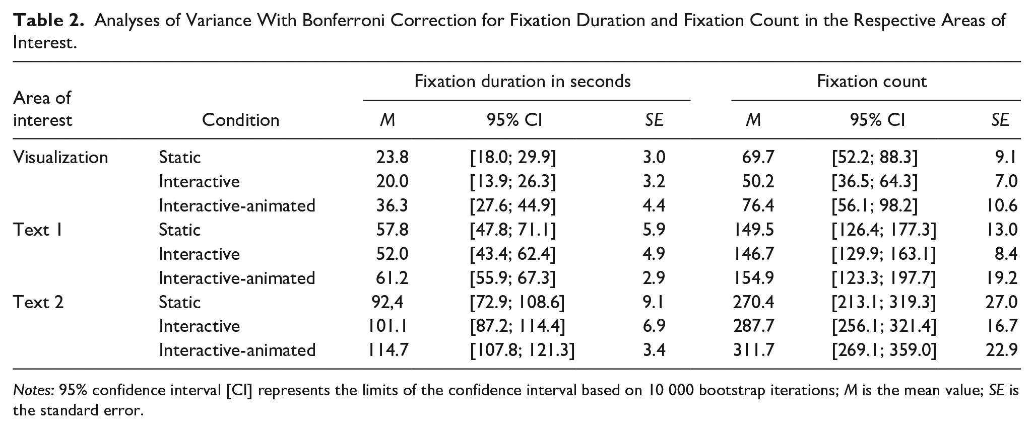
Notes: 95% confidence interval [CI] represents the limits of the confidence interval based on 10 000 bootstrap iterations; M is the mean value; SE is the standard error.
The map-based data visualization consists of nine single diagrams presenting more detailed information about the decrease in snow days for different locations in Switzerland. The gaze recordings show that participants assigned to the static condition looked at significantly more diagrams, on average, than participants assigned to the interactive one (F[2, 42] = 9.9, p < .01). No significant difference is found among all other conditions. On average, eight of the static diagrams were visually attended (M = 8.4; SD = 1.2), but only five of the interactive ones (M = 4.9; SD = 2.6). The interactive-animated presentation form ranks in the middle, with seven diagrams (M = 6.7; SD = 2.4). To grasp the main content of the diagrams, it is primarily necessary to examine the insert displaying the percentage decrease in snow days. Here, the same pattern emerges—the inserts in the static graphic are fixated most often, while those in the interactive graphic are fixated the least. The difference between these two groups is significant (F[2, 42] = 11.1, p < .01).
While the eye tracking data indicate an influence of visual design, participants’ answer as to why they paid attention to specific diagrams suggest that selection behavior is not affected by the presence (or absence) of interactive and animated elements. On the contrary, participants selected diagrams that represent places with which they have a personal relationship (e.g., their home town or holiday resort) or for which they have some prior assumptions about how the snow days could have changed over time (e.g., locations in the south that might be particularly affected by a decline). In the vast majority of cases, locations that were not considered personally relevant were simply ignored. One participant noted From the data visualization I obtain just what I want and need. There are several places to choose from, but I don’t look at them all; I only look at those that have something to do with me.
These findings corroborate that for news consumers data visualizations mainly fulfill a supportive function. They should make the text more comprehensible, but there is no need to perceive them in their entirety, as one participant in the static condition explained: This article has already said that in some cases the snow days have been reduced by more than half. I was therefore less attentive to the visualization—I had already extracted the information from the text.
Evaluation of the Data Visualization (Research Question 2)
The cued retrospective reportings indicate that the core expectation of graphical representations of content is to be clearly structured and quickly understood. Interactive and animated elements in data visualizations are evaluated against these expectations. Participants in the interactive and interactive-animated conditions noted that I liked the interactive elements. The effort was small; you click, and the information is available. But if I had to open more, if it’s nested or something. . . . I wouldn’t use it. But here it was only one click I enjoyed the animation, it wasn’t too long and I wasn’t forced to watch everything.
When discussed, the quality of the data visualization was mostly evaluated positively—30 people rated the graphs as clearly structured and easy to understand, regardless of which graph they were exposed to. Moreover, the retrospective thinking-aloud interviews highlight the emotional impact of the interactive-animated type. The animations are described as exciting, appealing, and impressive—“It was an interesting effect . . . if you don’t know where the bar will stop in the end. I thought, oh, it doesn’t stop at all, wow! That reinforces the statement.” Moreover, participants emphasize that the graphic becomes self-explanatory when animations are employed—“You open the animation and don’t have to think about how to read the graphic . . . because the bar goes right down and you see what happened to the snow days.” The content of the article is thus regarded as more comprehensible. Each graphic, however, also had critics. Regarding the interactive elements, participants did not see the added value of being required to click on a hotspot to display information, while animations were regarded as overly dramatic.
Visual Perception of the Surrounding Text Parts (Research Question 3)
The stimulus consisted of two bodies of text, one before and one after the visualization. An ANOVA with Bonferroni post hoc test reveals that across all experimental groups, the same amount of time was spent on the first body of text (F[2, 42] = 0.96, p > .05, partial η2 = .04). For the second body of text, however, significant differences emerge (F[2, 42] = 2.64, partial η2 = .11)—here, the fixation time was significantly longer for participants exposed to the interactive-animated visualization compared with the static visualization (mean difference = 95% CI [4447.1; 42478.4]). For fixation count, no significant differences emerged. This indicates that individual engagement with the graphic paired with the animated content intensified engagement with the subsequent text-based information (see also the heat maps of the various article versions displayed in Figures 3a-c, available as supplement).
Memory for Information Presented (Hypothesis 1)
Last, in line with Hypothesis 1, we test for direct and indirect effects of the stimulus article on memory. We run a mediation analysis with 10,000 bootstrap resamples and 95% percentile confidence intervals using Hayes’ (2018) PROCESS macro (Model 4). The mediation model includes the three experimental conditions as a multicategorical independent variable (dummy coded), knowledge acquisition as a dependent variable, fixation time as a mediator, and issue involvement as a covariate. The static condition serves as the reference group, against which the other two conditions were tested.
When running the mediation analysis testing for acquisition of information presented in all parts of the article through visual attention allocated to all parts, we find no significant direct or indirect effects (p > .05) for any of the conditions. Given the findings obtained in the ANOVA models above, in a next step, we narrow the analysis down to acquisition of information presented in the second body of text. The dependent variable thus includes only a subset of five questions (four of them tapping recall memory). The results show that a longer examination of the second part of the news article with interactive and animated elements indeed translated into a higher knowledge acquisition—we find a significant positive indirect effect of the interactive-animated condition on memory through fixation time (point estimate = .39, 95% CI [0.02; 0.95]; see also Figure 4). As we find no significant relative direct effect (point estimate = −.27, 95% CI [−1.10; 0.56]), it appears that in this model knowledge uptake from these kinds of online news articles is completely mediated through visual attention (Hayes, 2018). Importantly, the indirect effect remains stable when controlling for issue involvement. For the static and interactive condition, neither direct nor indirect effects emerged (p > .05). Hypothesis 1 can therefore only be confirmed for the interactive-animated condition and only for the second part of the text.
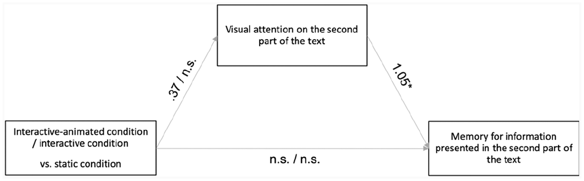
Path diagram of the serial mediation.
Discussion
Relying on an innovative multimethod approach with eye tracking, cued retrospective reporting, and a memory test, this experimental study provides important insights into how new forms of graphical representations on the internet affect the reception and subsequent learning of information about complex topics, such as climate change. Overall, it shows that the dynamic process of news reception requires a nuanced understanding of how users actually engage with visual and textual parts of a message in order to make informed statements about their effectiveness. Specifically, our data indicate that interactive features do not immediately grab all attention; rather, participants show a linear reading pattern from top to bottom. Challenging assumptions proposed by salience theory (Itti & Koch, 2000), only half the participants exposed to an interactive version of the stimulus fixated on the graphic at the beginning of the reception process. One possible explanation for this effect is that visualizations with clickable hotspots are quite common in today’s online environment and thus do not attract much attention anymore. This might be even the case when the hotspots are used as a main feature of the visualization—in our study, participants could only see a blank map of Switzerland, unless a hotspot was clicked. This finding has important consequences. On the one hand, it shows that the attention-grabbing potential of (simple) interactive visualizations affording only one click may be overestimated in the literature (Sterman, 2011; Ward et al., 2015). Just as with static graphical content (de Haan et al., 2018), interactive graphical content mainly serves as an add-on to the central text, used to contextualize the overall news message. On the other hand, taking our findings one step further, they imply that engaging with interactive and animated affordances cannot be assumed to influence the reception of a news message as a whole. Instead, only those parts of the message that are perceived after the graphical content might be affected. The present study supports the following inference: Adding interactive and animated elements to a data visualization only affected the time spent with the body of text after the visualization, which, in turn, translated into better learning. This insight may at least partly explain the inconclusive results obtained in previous studies on learning from multimodal news (but see Xu & Sundar, 2016). One direction for future research thus may be to further examine whether the combination of interactivity and animation in graphical content is indeed able to overturn the common pattern of website reading (i.e., allocating most of the attention to the beginning of the website; Kessler et al., 2020), as indicated by our data. Notably, this effect could be only observed for the richest version of the data visualization, with both interactive and animated elements. In line with user engagement models (O’Brien & Toms, 2008; Oh & Sundar, 2015), the cued retrospective reports point to emotional impact as a potential explanation for its superiority—the combination of interactivity and animation is consistently described as an intriguing design feature that arouses curiosity and interest in further information.
This study carries significant implications for creators of science-related data visualizations: While they are intended to display rational and objective scientific data, such images also stimulate subjective interpretations and affective responses (Schneider, 2012). Moreover, as suggested by the literature (McCay-Peet et al., 2012), animation can lead to sustained attention: The fixation duration was longest for participants who were exposed to the interactive-animated visualization. Importantly, however, interactivity and animation are only successful if they are simple and easy to use, as individuals aim to have information quickly available in order to rely on effortless processing (for similar notions regarding infographics, see de Haan et al., 2018). Despite these promising findings, it would be shortsighted to unconditionally recommend interactivity and animation in data visualizations in order to promote news consumers’ understanding of science-related news. Indeed, the results of our study suggest that design choices must be linked back to the information that news organizations aim to communicate. According to the gaze recordings, static visualizations are perceived in more detail than their interactive counterparts; on the static map, more diagrams carrying relevant information were visually attended. That is, even though interactive-animated visualizations generated the longest overall fixation time, hiding important information behind clickable hotspots can pose a risk, as users appear to exploit interactive data visualizations rather selectively.
Our study is among the first to systematically investigate the effects of graphical representations in science communication with regard to the combination of text and different types of data visualizations. The study reveals notable findings in this respect, but it is important to assess them within the context of their limitations. First, we applied an innovative multimethod approach consisting of eye tracking, cued retrospective reporting, and a memory test. This approach enabled us to gain detailed insights into individuals’ reception processes but required us to collect the data in a lab setting, which—together with the forced exposure to the stimulus article—affects the external validity of the study (Zillich & Kessler, 2019). Second, the eye tracking methodology requires high effort, which resulted in a rather small sample size (45 students; King et al., 2019). Moreover, as with any student sample, students are very well comparable with each other in terms of their cognitive abilities, age, and education, but they are not representative of the general population. Inherent in the eye tracking method is that it cannot be determined whether a recipient perceives something because of its special characteristics (e.g., it is strikingly designed), due to a habitual behavior, or because it is cognitively guided (Zillich & Kessler, 2019). To ensure that our findings are not specific to sample or issue characteristics, further research should test them in a more representative sample with different stimulus articles, going beyond the topic of climate change. Moreover, since our data suggest that users tended to ignore information to which no personal relation could be identified, further investigating the role of personal relevance for the use of interactive content might be an important issue for future research, aiming to get more close to a comprehensive understanding of the impact of interface features used in contemporary visual science communication.
Supplemental Material
Figure_1 – Supplemental material for Learning From Science News via Interactive and Animated Data Visualizations: An Investigation Combining Eye Tracking, Online Survey, and Cued Retrospective Reporting
Supplemental material, Figure_1 for Learning From Science News via Interactive and Animated Data Visualizations: An Investigation Combining Eye Tracking, Online Survey, and Cued Retrospective Reporting by Esther Greussing, Sabrina Heike Kessler and Hajo G. Boomgaarden in Science Communication
Supplemental Material
Figure_2a-2c – Supplemental material for Learning From Science News via Interactive and Animated Data Visualizations: An Investigation Combining Eye Tracking, Online Survey, and Cued Retrospective Reporting
Supplemental material, Figure_2a-2c for Learning From Science News via Interactive and Animated Data Visualizations: An Investigation Combining Eye Tracking, Online Survey, and Cued Retrospective Reporting by Esther Greussing, Sabrina Heike Kessler and Hajo G. Boomgaarden in Science Communication
Supplemental Material
Figure_3a-3c – Supplemental material for Learning From Science News via Interactive and Animated Data Visualizations: An Investigation Combining Eye Tracking, Online Survey, and Cued Retrospective Reporting
Supplemental material, Figure_3a-3c for Learning From Science News via Interactive and Animated Data Visualizations: An Investigation Combining Eye Tracking, Online Survey, and Cued Retrospective Reporting by Esther Greussing, Sabrina Heike Kessler and Hajo G. Boomgaarden in Science Communication
Supplemental Material
Supp_Appendix_A – Supplemental material for Learning From Science News via Interactive and Animated Data Visualizations: An Investigation Combining Eye Tracking, Online Survey, and Cued Retrospective Reporting
Supplemental material, Supp_Appendix_A for Learning From Science News via Interactive and Animated Data Visualizations: An Investigation Combining Eye Tracking, Online Survey, and Cued Retrospective Reporting by Esther Greussing, Sabrina Heike Kessler and Hajo G. Boomgaarden in Science Communication
Supplemental Material
Supp_Appendix_B – Supplemental material for Learning From Science News via Interactive and Animated Data Visualizations: An Investigation Combining Eye Tracking, Online Survey, and Cued Retrospective Reporting
Supplemental material, Supp_Appendix_B for Learning From Science News via Interactive and Animated Data Visualizations: An Investigation Combining Eye Tracking, Online Survey, and Cued Retrospective Reporting by Esther Greussing, Sabrina Heike Kessler and Hajo G. Boomgaarden in Science Communication
Footnotes
Declaration of Conflicting Interests
The author(s) declared no potential conflicts of interest with respect to the research, authorship, and/or publication of this article.
Funding
The author(s) received no financial support for the research, authorship, and/or publication of this article.
Notes
Author Biographies
References
Supplementary Material
Please find the following supplemental material available below.
For Open Access articles published under a Creative Commons License, all supplemental material carries the same license as the article it is associated with.
For non-Open Access articles published, all supplemental material carries a non-exclusive license, and permission requests for re-use of supplemental material or any part of supplemental material shall be sent directly to the copyright owner as specified in the copyright notice associated with the article.