
Abstract
This study examines the impact of graphical features on perceived reliability and user trust in automated systems. Participants viewed 60 static graphs showing system reliability over time, with variables such as maximum reliability, minimum reliability, average reliability, cumulative probability of success/failure, and slope. Each graph was presented with different success or failure rates. Participants rated the system’s reliability, predicted success rates, and willingness to rely on the system. Analysis revealed that perceived reliability was most influenced by minimum reliability when success was depicted and maximum reliability when failure was depicted. These findings suggest that user perceptions of reliability are complex and not solely dependent on the expected features of system performance, indicating a need for further research into the relationship between graphical representations and perceived reliability.
The effects of reliability information on user trust are widely studied, revealing that miscalibrated estimates of system reliability often leads to either over-or under-trust (Schaefer et al., 2016). Miscalibrated estimates of reliability occur when users’ perceived reliability diverges from actual reliability, influenced by factors such as system errors or consistently high performance. Errors or low performance typically decrease trust, while high performance can lead to over-trust, inflating perceived reliability (Parasuraman & Riley, 1997). To better understand this dynamic, our study focuses on the role of graphical features in shaping perceived reliability and user trust.
To better understand the misestimation of reliability and, consequently, trust in a system, our study focused on the role of graphical features in shaping perceived reliability. This research investigated how graphical representations of true system reliability influence perceived reliability over time. Presenting users with system reliability information, a form of system transparency, has been shown to increase performance (Hoff & Bashir, 2015). However, increased transparency can negatively impact trust when system reliability is low (Kaltenbach & Dolgov, 2017; Kluy & Roesler, 2021). These findings highlight the need to further examine alternative visual representations of reliability information and their effect on user-perceived reliability, especially given the role of perceived reliability on user trust and performance in terms of decision-making, cognitive load, and situation awareness.
To explore this further, we examined perceived reliability as a function of system reliability over time, representing time on the x-axis in our graphical depictions. This approach allows us to refine our understanding of how different features of reliability and time visualizations influence trust.
The main aim of this study was to assess how participants’ perceptions of an imaginary system’s reliability were influenced by specific graphical features depicting system performance over time. We identified several key features, including maximum and minimum system reliability, average system reliability, cumulative probability of success/failure, maximum positive and negative slopes, average slope, and the area under the curve (AUC).
Our objective was to determine which of these features most closely align with participants’ perceptions of system reliability. We were particularly interested in how information presentation impacts users’ understanding and their willingness to rely on the system. This study aims to answer the following research questions: How do different graphical features of system performance over time influence perceived reliability? Which graphical features most strongly correlate with users’ willingness to rely on the system? We hypothesize that features such as maximum reliability, minimum reliability, and average reliability will have significant impacts on perceived reliability and trust.
This study is novel in its use of mathematical formulas represented as graphs to present reliability information, examining the relationship between these graphical features and user-perceived reliability and trust. To our knowledge, no prior research has undertaken this specific approach, making our findings a valuable contribution to the field of human-automation interaction and trust calibration. By identifying which graphical features most influence perceived reliability, designers can create visualizations that better communicate system performance and build appropriate levels of trust and perceived reliability.
Methods
Participants
Participants in this study were undergraduate students at the University of Alabama in Huntsville (UAH), recruited through an online platform, and received course credit for study completion. One hundred ten students completed the survey. Participants were excluded for failing to pass the manipulation check (n = 47) or to complete the survey (n = 1). The final sample size was 62. The participants were predominantly 18 years old (43.5%), mostly female (72.6%), mostly white (62.9%), and primarily psychology majors (24.2%). The selection criteria included being over 18 years of age and having English literacy.
Survey
The study was conducted using Qualtrics survey software, with each graph shown to participants in random order to minimize order effects. The graphs displayed time points on the x-axis, represented as 1 to 6, and the chance of success or failure on the y-axis. Fifteen formulas were generated with varying graphical features corresponding to the variables of interest, including maximum and minimum performance, the sum of performance at all time points, the average performance, cumulative probability, maximum positive and negative slope, average slope, and area under the curve (AUC). Each of these graphs was then vertically flipped, so if a graph represented a high chance of success on the y-axis, its flipped version showed a low chance of success. Both versions were then represented once with the chance of success on the y-axis and once with the chance of failure on the y-axis, creating four unique graphs for each of the 15 formulas, resulting in a total of 60 graphs. Examples of the four graphs representing one of the formulas is shown in Figure 1.
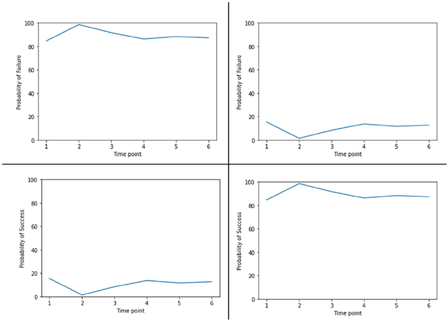
Four graphs representing one of the 15 formulas.
After viewing each graph, participants were asked several questions to assess perceived reliability. The first question assessed subjective reliability and asked, “How reliable is the system depicted in this figure?” with responses on a 5-point sliding scale from “not at all” to “completely.” The second question assessed predicted success and asked, “If the system depicted in this figure were to run all the way through 100 times, how many times would it succeed?” Responses were entered on a sliding scale ranging from 0 to 100 with increments of 10. The final question assessed the choice to rely on the system and was a yes/no question asking, “Would you rely on the system depicted in this figure?”
Demographic questions pertaining to age, gender, ethnicity, and college major were included to gather participant information and ensure a representative sample.
Analysis
Statistical analysis was performed using R software (R Core Team, 2021). All responses were reviewed for completeness. Descriptive statistics were calculated for all variables, and inferential statistics, including ridge regression analyses, were conducted to examine the relationships between graphical features and perceived reliability and trust.
This study was approved by the Institutional Review Board (IRB) at UAH, and all participants provided informed consent before participating. Measures were taken to protect participants’ confidentiality, including anonymizing responses and securely storing data.
Results
Descriptive Statistics
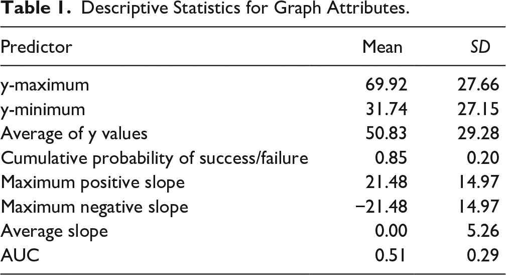
Descriptive statistics for the graph attributes are shown in Table 1. Prior to analysis, rows were split into two datasets based on the y-axis label (failure or success). All predictors were standardized. Additionally, data from 48 participants were excluded due to failing the manipulation check or not completing the study.
Descriptive Statistics for Graph Attributes.
Subjective Reliability
A ridge regression determined the influence of graph attributes on subjective reliability ratings (1–5). Separate analyses were conducted for graphs labeled with the probability of success and failure.
Success Label
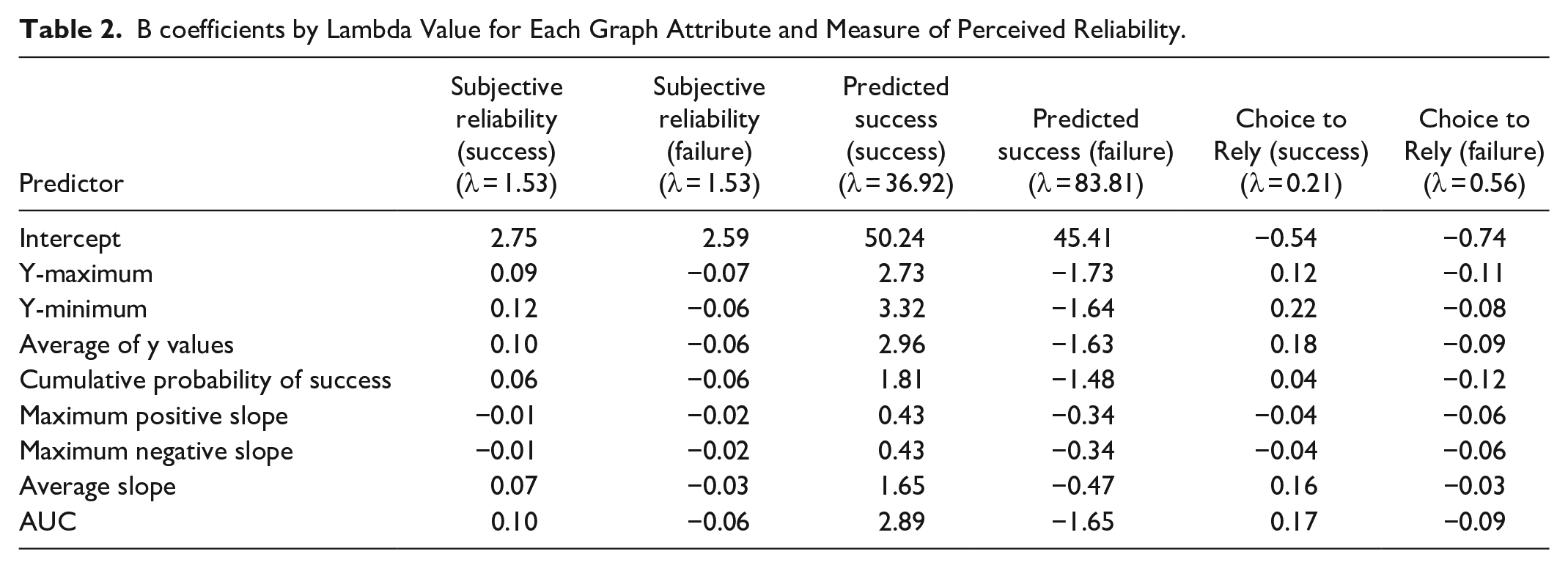
A lambda value of 1.53 was selected (Figure 2). The model predicted a subjective reliability rating of 2.75 when all graph attributes were at their mean values. Significant predictors included the y-maximum (B = 0.09), y-minimum (B = 0.12), average of y values (B = 0.10), and AUC (B = 0.10; Table 2).
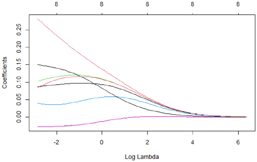
Graph attribute coefficients by log lambda value.
B coefficients by Lambda Value for Each Graph Attribute and Measure of Perceived Reliability.
Failure Label
A lambda value of 1.53 was selected. The model predicted a subjective reliability rating of 2.59 when all graph attributes were at their mean values. Significant predictors included the y-maximum (B = −0.07), y-minimum (B = −0.06), average of y values (B = −0.06), cumulative probability of success (B = −0.06), and AUC (B = −0.06; Table 2).
Predicted Success
Ridge regression was used to determine how graph attributes predict the number of successes participants indicated for 100 repetitions. Separate analyses were conducted for graphs labeled with the probability of success and failure.
Success Label
A lambda value of 36.92 was selected. The model predicted 50.24 successes out of 100 when all graph attributes were at their mean values. Significant predictors included the y-maximum (B = 2.73), y-minimum (B = 3.32), average of y values (B = 2.96), and AUC (B = 2.89; Table 2).
Failure Label
A lambda value of 83.81 was selected. The model predicted 45.41 successes out of 100 when all graph attributes were at their mean values. Significant predictors included the y-maximum (B = −1.73), y-minimum (B = −1.64), average of y values (B = −1.63), and AUC (B = −1.65; Table 2).
Choice to Rely
Ridge regression was used to determine the influence of graph attributes on whether a user would choose to rely on or stop the system. Separate analyses were conducted for graphs labeled with the probability of success and failure.
Success Label
The selected lambda value was 0.21. The model predicted a greater likelihood to rely on the system with higher y-maximum (B = 0.12), y-minimum (B = 0.22), average of y values (B = 0.18), and AUC (B = 0.17; Table 2).
Failure Label
The selected lambda value was 0.56. The model predicted a greater likelihood to stop the system with higher y-maximum (B = −0.11), y-minimum (B = −0.08), average of y values (B = −0.09), and AUC (B = −0.09; Table 2).
Discussion
The primary aim of this study was to explore how different graphical features influence perceived reliability and user trust in automated systems. Our findings suggest that user perceptions of reliability are significantly impacted by specific graphical attributes, with notable differences observed depending on whether the graphs depicted success or failure probabilities.
Subjective Reliability
Our analysis revealed that for graphs labeled with success probabilities, subjective reliability was most strongly influenced by the minimum reliability, maximum reliability, average reliability, and the area under the curve (AUC). Specifically, higher minimum and average reliability values were associated with higher subjective reliability ratings. This suggests that users tend to focus on the lower bounds and overall consistency of system performance when forming judgments about reliability.
Conversely, for graphs labeled with failure probabilities, the same attributes (maximum reliability, minimum reliability, average reliability, and AUC) were significant predictors but in the opposite direction. This indicates that users are particularly sensitive to high failure rates and lower overall reliability when assessing systems depicted as potentially failing. These results align with previous research suggesting that users are more averse to potential losses than they are motivated by potential gains (Kahneman & Tversky, 1979).
Predicted Success
The predicted number of system successes out of 100 trials was also influenced by the graphical attributes. For success-labeled graphs, higher y-maximum, y-minimum, average y-values, and AUC predicted a higher number of perceived successes. This indicates that users extrapolate from high performance indicators and consistent reliability to predict future success.
In failure-labeled graphs, the same attributes predicted a lower number of successes, reinforcing the idea that users expect poor performance to continue when failure is prominently displayed. This highlights the importance of how performance data is framed and presented in influencing user expectations.
Choice to Rely
The decision to rely on or stop the system was significantly influenced by the same key graphical attributes. For success-labeled graphs, higher y-maximum, y-minimum, average y-values, and AUC increased the likelihood of users choosing to rely on the system. This suggests that users are more likely to depend on systems that show high and consistent performance.
In contrast, for failure-labeled graphs, higher values of the same attributes led to a greater likelihood of users choosing to stop the system. This demonstrates that users’ trust is easily undermined by high potential for failure and that they are likely to abandon systems that appear unreliable.
Implications for Design
These findings have important implications for the design of graphical representations of system reliability in automated systems. Designers should consider how different graphical features might influence user perceptions and trust. Presenting reliability information in a way that highlights consistent and high performance can enhance trust and perceived reliability. However, care must be taken to avoid overtrust, especially in systems where occasional failures are inevitable.
Limitations and Future Research
This study has several limitations. The sample was limited to undergraduate students, which may not be representative of the general population. Future research should include a more diverse sample to enhance the generalizability of the findings. Additionally, the study focused on static graphs; dynamic or interactive visualizations might yield different results and should be explored in future studies.
Further research is needed to examine the underlying cognitive processes that drive these perceptions and decisions. Understanding how users interpret and integrate different pieces of graphical information can provide deeper insights into designing more effective and trustworthy automated systems.
Footnotes
Declaration of Conflicting Interests
The author(s) declared no potential conflicts of interest with respect to the research, authorship, and/or publication of this article.
Funding
The author(s) disclosed receipt of the following financial support for the research, authorship, and/or publication of this article: This work was supported by the U.S. Army Combat Capabilities Development Command (DEVCOM) Aviation & Missile Center (AvMC).