
Abstract
High rates of chronic disease have created challenges for public health decision-makers in resource allocation. Decision tools designed to support public health professionals can help address these challenges. This study aims to investigate the impact of different uncertainty visualization techniques on user perceptions. The study was designed for the purpose of supporting the development of CDPoRT, a chronic disease risk prediction tool. Participants performed a fictional recourse allocation decision-making task with map-based visualizations, tables with and without uncertainty data, and a table with uncertainty explanation. The findings show that CDPoRT’s user interface may benefit from the inclusion of an overlay map to visualize the rate and uncertainty information for public health resource allocation decisions. Future research can consider the development of interactive features to facilitate comparisons between multiple geographical regions and simulate interventions.
Introduction
The chronic disease burden in Canada is significant, with chronic conditions accounting for a large portion of healthcare costs and mortality rates (2018 Pre-Budget Submission to the House of Commons Standing Committee on Finance, 2017; National Health Expenditure Trends, 2023). Despite efforts to promote healthy lifestyles, the prevalence of chronic diseases continues to rise, posing economic and ethical challenges for public health decision-makers. Public health decision-making involves allocating resources to address health risks and reduce the burden of diseases (Gatseva & Argirova, 2011; Vision, Mission, Mandate and Values, 2019; Winslow, 1920). Various frameworks and tools have been developed to guide decision-making processes, but challenges remain in ensuring effective and equitable resource allocation (Daniels, 2016).
Decision-support tools are increasingly being used to augment human reasoning in public health decision-making. These tools need to be well-designed, taking into account human factors such as usability and workload, and should effectively convey uncertainty information to users (Bhatt et al., 2021; Eberhard, 2021; Friedman, 2009; Harrigan, 2021; Lee et al., 2017). Geospatial uncertainty visualizations play a crucial role in public health decision-making by providing insights into the uncertainty associated with geographic data (Delmelle et al., 2022). Different visualization techniques, such as bivariate and overlay maps, tables and textual descriptions, have varying impacts on decision-making and user perceptions (Correll et al., 2018; Felfoldy & Garner, 1971; Kinkeldey et al., 2014; Kinkeldey & Senaratne, 2018; Koo et al., 2018; Lee et al., 2017; Lucchesi & Wikle, 2017; MacEachren et al., 2005; Senaratne et al., 2017).
The Chronic Disease Risk Prediction Tool (CDPoRT) algorithm, developed by researchers at the University of Toronto, offers a means to estimate the 10-year risk of major chronic diseases in Ontario (Ng et al., 2020). An interface for this decision support tool is being designed to assist public health professionals in visualizing predicted disease risks and new cases for intervention planning and resource distribution. However, challenges such as the diversity in statistical training among public health professionals and the lack of guidelines for data-driven decision-making need to be addressed in the design and evaluation of such tools. Additionally, further research is needed to compare the effectiveness of different types of uncertainty visualizations and their impact on decision-making performance in public health contexts.
The aim of this study is to investigate the impact of different geospatial uncertainty visualizations, including overlay maps, value-suppressing uncertainty palette (VSUP) maps, univariate maps, and tables with and without textual explanations (see Figure 1), on chronic disease risk prediction and resource allocation decisions using CDPoRT. The research questions include how uncertainty visualizations affect confidence, mental workload, usability, and understanding of uncertainty information. Our hypotheses are that different visualization types will impact decision-making differently. Overlay maps have separable dimensions and employ extrinsic encoding, which should lead to higher confidence and usability ratings due to lower cognitive load. VSUP maps have integral dimensions and employ intrinsic encoding, which should lead to lower confidence and usability ratings due to higher cognitive load (Felfoldy & Garner, 1971; Kinkeldey et al., 2014; Kinkeldey & Senaratne, 2018; Senaratne et al., 2017).

Decision-making task questions for each visualization: (a) overlay map, (b) VSUP map, (c) univariate map, (d) table with rate information only; low cases: 148 versus 165 k, (e) table with rate + uncertainty information; low cases: 148 versus 165 k, (f) table with rate information only; high cases: 275 versus 316 k, (g) table with rate + uncertainty information; high cases: 275 versus 316 k, and (h) table with rate + uncertainty information + text explanation.
Methods
This study employed a within-subjects experimental design involving Ontario public health experts who completed decision-making tasks using four types of uncertainty visualizations: overlay map, VSUP map, table, and univariate map (See Figure 1). The map-based visualizations displayed categorical data only, while the table conditions display modifications in the type of data and type of uncertainty information presented.
Participants
Twenty participants, including public health professionals (n = 9) and public health graduate students (n = 11), were recruited through convenience sampling (i.e., social media, student email listservs, and campus flyers). Eligible participants were either a public health graduate student enrolled at an Ontario university (MPH or DrPH program) or a public health professional employed in Ontario, Canada. Participants were also required to successfully complete a training quiz demonstrating their understanding of the study task. Upon completion of the study, participants were compensated with either entry into a raffle for a $100 gift card or a $15 Starbucks gift card. This study was approved by the University of Toronto Research Ethics Board (#43990).
Experimental Design
Three independent variables were manipulated in this study: visualization, data, and uncertainty display. There were four visualizations presented: overlay map, VSUP map, univariate map, and table. The order of visualization conditions was counterbalanced and randomly assigned to participants.
Overall, for the table visualization condition, each participant completed five table versions, in a block, in the order presented in Figure 1. The data variable had two levels: low cases and high cases, which were modified in the table visualization only. The uncertainty display variable had three levels: no uncertainty display (control), numeric display (margin of error), and numeric display plus text (explanation of the uncertainty), which were modified in the table visualization only. The aim was to study how decision-making strategies may be affected by the presentation of different information. However, following the analysis of our data, it became apparent that there was a bias in our training module, leading to uniform decision-making strategies among the participants included in the study. Therefore, we do not report on the decision-making strategy results, and the different versions of the table condition. After uncovering this issue, we collected data from four more participants removing the training quiz. The decision-making strategy results are reported for this additional sample.
Procedure
The study was conducted online on REDCap. Participants completed a screening questionnaire to determine their eligibility and collect demographic information, including technical expertise (professional work experience) and statistical knowledge. Technical expertise was measured using one self-reported rating about the participant’s total years of public health experience. Six questions including objective and subjective measures were used to determine the statistics knowledge of the participants and were combined to create a composite variable. The subjective ratings were completed on a 5-point Likert scale and the objective questions were scored for correct responses to statistics questions.
If participants met the eligibility criteria, they proceeded to a training module. The training was designed to explain the purpose of the study, describe the study task, and test their understanding of the task. Participants who completed the training quiz successfully proceeded to the study.
Task
The study task required participants to make public health resource allocation decisions using the visualizations provided. Each visualization displayed disease cases and rates for two fictional public health regions, and the participant had to choose to prioritize one region for public health intervention.
Dependent Measures and Analysis
Post-task questions captured confidence, mental workload, usability, and understanding of uncertainty using self-reported measures. The user’s confidence in their decision and understanding of the uncertainty information was reported using a 5-point Likert scale. Four relevant constructs from the NASA-TLX (mental demand, temporal demand, effort, and frustration) measured mental workload while using the visualization (range: 4–28) and five relevant constructs from the SUS measured the usability of the visualization (range: 5–25). For the table block, post-task questions were presented following the table with uncertainty and textual explanation (i.e., numeric display plus text).
Repeated measures ANOVAs were used to compare the different visualizations in terms of (a) confidence, (b) mental workload, and (c) usability. We also compared participants’ self-reported understanding of the uncertainty information between two table conditions: rate + uncertainty information (high cases) versus rate + uncertainty information + text explanation. Because the assumption of normality was not met, we performed a Wilcoxon rank test.
Results
Sample Demographics
Overall, the sample was educated in statistics and were generally knowledgeable about it. All but two respondents had taken at least one graduate-level statistics course. The total statistics knowledge score combined the subjective ratings and objective assessment questions for a maximum of 20 points. The average knowledge score was M=14.6, with SD = 2.9 (median=15, IQR=12, 17). In terms of technical expertise, the median for public health graduate students was 2 (IQR = 1, 2) which corresponds to 1 to 3 years of work experience. For public health professionals, the median was 5 (IQR = 5, 6), indicating 7 to 10 years of work experience.
Confidence
The means and standard deviations for confidence were as follows: overlay (M = 4.3, SD = 0.64), VSUP (M = 3.4, SD = 1.23), univariate (M = 4.0, SD = 0.92), and table with uncertainty (numeric display plus text; M = 3.7, SD = 1.09). See Figure 2 for confidence boxplots. The sphericity assumption was not met (p = .02), so we used the Greenhouse-Geisser epsilon correction (E = 0.66). The results were significant, F (3, 19) = 5.34, p = .009. Post-hoc tests showed that the overlay map had higher confidence ratings than the VSUP map, t (16) = 3.85, p = .001, and the table (numeric display plus text), t (16) = 3.04, p = .007. Also, the VSUP map had lower confidence ratings than the univariate map, t (16) = -2.57, p = .02.
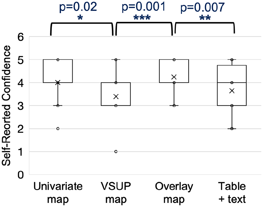
Boxplots of confidence ratings; x represents the mean.
Mental Workload
The mean and standard deviations were as follows: overlay (M = 9.4, SD = 4.83), VSUP (M = 12.3, SD = 5.76), univariate (M = 10.9, SD = 5.51), and table with uncertainty (numeric display plus text; M = 12.0, SD = 4.81). See Figure 3 for mental workload boxplots. Display type was marginally significant at α = .1, F (3, 19) = 2.49, p = .07. Post hoc tests showed that participants reported less mental workload with the overlay map than with the VSUP map, t (16) = −2.57, p = .02, and the table (numeric display plus text), t (16) = −2.75, p = .01.
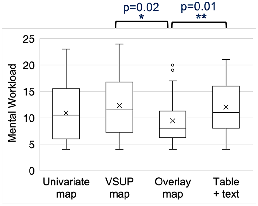
Boxplots of mental workload ratings; x represents the mean.
Usability
The means and standard deviations for SUS score were as follows: overlay (M = 16.0, SD = 1.76), VSUP (M = 15.3, SD = 2.83), univariate (M = 15.6, SD = 2.76), and table with uncertainty (numeric display plus text; M = 16.2, SD = 1.98). Display type was not significant, F (19, 3) = 1.16, p = .3. See Figure 4 for usability boxplots.
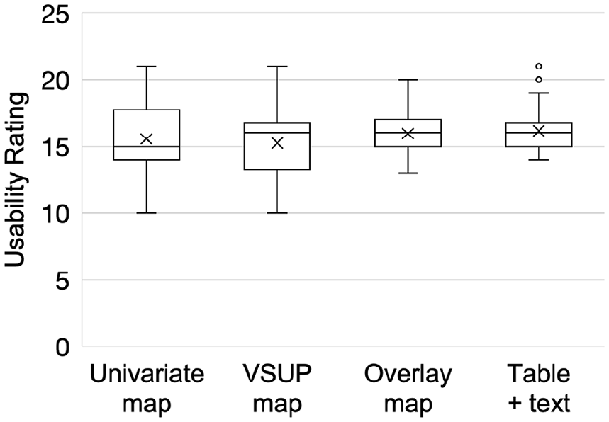
Boxplots of usability ratings; x represents the mean.
Self-Reported Understanding of Uncertainty Information
The difference between the two table conditions (rate + uncertainty information vs. rate + uncertainty information + text explanation) was not significant (p = 1). The average ratings for both conditions were also equal at a rating of 3.9, signifying participants “mostly understood” the uncertainty information displayed.
Pilot Sample Results
As mentioned earlier, we collected data from four additional individuals (who fit our eligibility criteria) after removing the training quiz from our study procedure. In terms of decision-making strategy, we investigated whether participants chose to prioritize the region with the higher rate of disease or lower rate uncertainty. For this sample, we found that all participants prioritized the rate data when using the univariate map (n = 4), followed by the overlay map (n = 3), VSUP map (n = 1), and table (n = 1).
Discussion
The study findings provide insight into how the geospatial visualizations for the CDPoRT interface can be better designed to improve public health decision-making by reducing mental workload and increasing confidence. The results for mental workload and confidence ratings suggest that the public health experts would have lower mental workload and greater confidence using an overlay map for chronic disease risk prediction and resource allocation decision-making. The visualization with the poorest performance in these constructs was the VSUP map. These findings can be explained by human factors theories and concepts for information processing such as optimal allocation and switching, proximity compatibility, redundancy coding, and absolute judgment limits (Wickens & Hollands, 1999). For example, the overlay map represents uncertainty information using redundant encoding with shape, size, and colour. Conversely, the VSUP map only uses colour saturation to represent the uncertainty information.
There are some unexpected results that can be explained by potential limitations of the experimental design. When comparing the self-reported ratings of the user’s understanding of uncertainty information between table conditions, that is, table with uncertainty (numeric display only) versus with uncertainty and textual explanation (numeric display plus text), we found that responses between the two conditions were not significantly different. The results regarding the unexpected performance with the table with uncertainty (numeric display plus text) or univariate map could be due in part to our experimental task, which involved pairwise comparisons rather than multiple region comparisons, which would be expected in standard public health practice for resource allocation decisions. It could be the case that with more regions or complex decision-making data, the textual descriptions in the univariate map and table with uncertainty (numeric display plus text) result in improved performance.
Another explanation for the unexpected results could be that the textual explanation in the table with uncertainty (numeric display plus text) increased the information available regarding the uncertainty and this added to participants’ cognitive load and resulted in confusion. This explanation is supported by the concept of pre-attentive processing, which suggests that visual data (e.g., colour and shape) is processed much faster and reduces the cognitive load in comparison to numbers and text (Barrera-Leon et al., 2023). One solution for the latter issue, is potentially redesigning the textual explanation so that it is provided in an interactive feature (e.g., hover or highlight) to prevent excess information being provided on the display.
This study provides an exploratory analysis of public health expert decision-making using uncertainty displays. The study was designed for the purpose of supporting the development of CDPoRT, a chronic disease risk prediction tool. The findings show that CDPoRT’s user interface may benefit from the inclusion of an overlay map to visualize the rate and uncertainty information for public health resource allocation decisions. The overlay map resulted in the lowest mental workload and highest confidence ratings for users, while the VSUP map resulted in the worst performance in these domains. Future research can consider the design of interactive dashboard features to facilitate comparisons between multiple regions and simulate interventions. Future studies can also examine the effects of contextual information on decision-making such as financing, resource/ infrastructure availability, disease dynamics, and local community preferences.
Footnotes
Acknowledgements
Special thanks to Dr. Vinyas Harish and Lori Diemert, whose support significantly influenced the development and refinement of this research. Another special thanks to our research assistants Mark Wei, Luckyna Laurent, Marta Shahezian, and Sherry Zhang for volunteering their time to support the data collection, auditing and analysis.
Correction (September 2024):
Article has been updated to correct minor typographical and stylistic errors.
Declaration of Conflicting Interests
The author(s) declared no potential conflicts of interest with respect to the research, authorship, and/or publication of this article.
Funding
The funding for this work was provided by the University of Toronto XSeed and Data Science Institute Catalyst Grants.