
Abstract
The research presented here tests user comprehension of a new kind of risk-based visualization of hurricane forecasts versus other common representations: a cone of uncertainty (with and without a centerline) and an ensemble representation. Our landfall heat maps use intensity hues and a filled black circle with size representing hurricane category at the time of forecast, rather than representing the hurricane path. In two online studies we compare how different representations of the same scenarios affect viewers’ (a) judgments of the risk that a location is likely to be hit by a hurricane, (b) their likelihood of issuing an evacuation order for that location (if they were to be in a role of issuing evacuation orders), and (c) their confidence in their judgment. Findings contribute to developing a toolkit of visual materials that designers of hurricane visualizations can select from based on empirical evidence of user responses to their elements.
Introduction
It has now been well documented that the cone of uncertainty, the predominant representation of hurricane forecasts, can lead viewers—members of the public, journalists, television forecasters—to misinterpret the maps and their potential implications: whether or not a particular location is likely to be hit by a hurricane, whether evacuating is necessary, and how confident they should be in their judgments (e.g., Boone et al., 2018; Broad et al., 2007; Liu et al., 2017; Padilla et al., 2015; Ruginski et al., 2016). These misinterpretations can have deadly consequences, and are part of what has led the US National Hurricane Center to announce that they will pilot releasing additional representations for the 2024 hurricane season (Falconer & Freedman, 2024).
The research project presented here develops and tests user comprehension of a new kind of risk-based visualization of hurricane forecasts, where the goal is to create a representation that allows people to comprehend risk and make evacuation judgments that are more consistent with what expert assessments of risk (e.g., of likelihood of high winds and of potential flooding) would recommend. As Broad et al. (2007) demonstrate, viewers can easily misinterpret the cone of uncertainty graphic as implying that there is little to no risk for locations outside the cone–which can easily turn out not to be the case, as the cone represents a 67% confidence interval. Based on evidence that the centerline in the cone of uncertainty can lead to overestimation of the likelihood that the centerline will be the actual path, and given the misinterpretation that the cone contains risk within its perimeter and not outside of it (Ruginski et al., 2016), our approach emphasizes hit risk, rather than hit “miss.” Building on evidence that viewers’ comprehension of hurricane hit-risk in ensemble maps can be improved with concentric ellipsoidal confidence intervals that use overlapping shapes and transparency levels (Liu et al., 2017), our landfall heat maps use a similar design aesthetic with intensity hues rather than transparency, and use the heat map and a filled black circle with size representing hurricane category at the time of forecast, rather than representing the hurricane path.
By comparing effects on users of our risk-based visualization approach relative to other commonly used representations—a cone of uncertainty (with and without a centerline) and an ensemble representation—we can begin to develop a toolkit of visual materials that designers of hurricane visualizations can select from based on empirical evidence of user responses to their elements. Our approach is thus consistent with and contributes further evidence to Ma and Millet’s (2022) synthesis of design options for hurricane risk graphics, and builds on systematic assessment of viewers’ experience of alternatives like HTI [Hurricane Threats and Impacts] graphics (Millet et al., 2022).
In our studies, the primary outcomes of interest are how the representations affect viewers’ (a) judgments of the risk that a location is likely to be hit by a hurricane, (b) their likelihood of issuing an evacuation order for that location (if they were to be in a role of issuing evacuation orders), and (c) their confidence in their judgment. (We ask about likelihood of issuing evacuation orders for a community rather than about individual likelihood of evacuating to avoid idiosyncratic judgments based on how stable viewers’ actual or imagined residences might be, their personal or familial norms about evacuating vs. staying the course, etc.). We also assess viewers’ self-reported risk tolerance and their previous experience with hurricanes, to explore the extent to which different visual elements may affects different viewers differently.
Study 1: Effects of Risk-Based Visualization Relative to Current Visualizations
In Study 1, 102 online participants, recruited from MTurk in hurricane-vulnerable US Gulf and Eastern seaboard states, were (between-subjects) randomly assigned to view one kind of visualization (cone of uncertainty, cone of uncertainty with centerline, ensemble, or variants of our risk-based visualization) and to make judgments about four different hurricane scenarios within that visualization style.
The four hurricane scenarios, presented in different orders for each participant using the Qualtrics randomization feature, were based on NOAA data from previous hurricanes, and they differed in the level of risk they represented (from low to high); across the visualization types, the scenarios represented exactly the same four situations, locations, and risk levels, and thus allowed fair comparisons of the effects of the different visualization types. The study also included follow-up questions so that we could explore potential individual variability in how viewers might comprehend or make judgments about our risk-based visualizations–and thus the extent to which our design approach might generalize (be similarly effective) across individuals with potentially relevant differences. In particular, we asked about participants’ risk aversion (risk-taking comfort); their prior experience with hurricanes and having to make an evacuation judgment; and about basic demographic characteristics.
Scenarios
Two scenarios were chosen based on data from previous high-and medium-impact hurricanes in a similar location: Hurricane Harvey and Hurricane Michael. Two time-based distances from landfall (1–2 days and 3–4 days from landfall) were chosen for each based on cone of uncertainty maps from NOAA’s hurricane website. This allowed us to present the same four different scenarios across the map types.
The risk-based visualization for each of the four scenarios is data-driven, based on NOAA cone of uncertainty forecast maps, FEMA disaster maps, and flood data from various public and government resources. The heat-map-like design expresses three levels of risk (low, medium, and high). Risk coverage was decided retroactively, based on the amount of state or federal assistance that was ultimately required in each county of the state, as well as on the location of a user in proximity to any given risk area, as represented with a “YOU ARE HERE” location symbol within each map. Figure 1 shows the resulting 16 scenarios across the four visualization types.
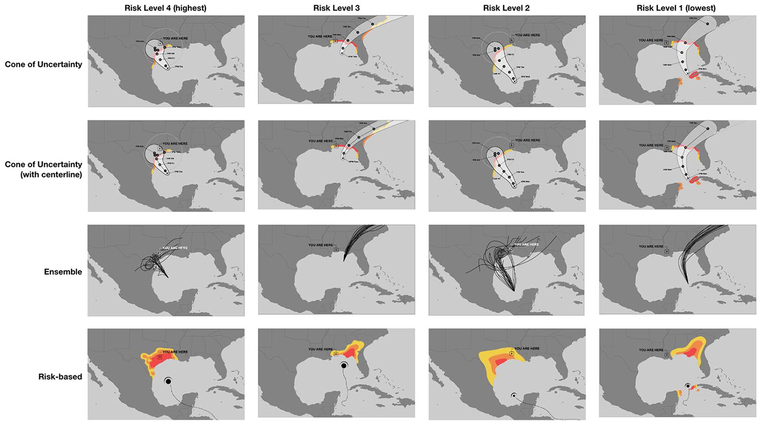
The 16 scenarios.
Questionnaire
In the questionnaire, implemented on the Qualtrics platform, participants were assigned to a map type and were asked to make the same three judgments for each of the four scenarios, presented in different random order for each participant, Participants were to enter their ratings on a 5 point scale in response to these questions:
Considering the “YOU ARE HERE” location on this map, how likely is this community to be hit by the hurricane?
If you were mayor of this community, how likely would you be to issue an evacuation order?
How certain would you be in that judgement?
Participants were then presented with additional questions about their hurricane experience, how they feel about weather forecasts, and a single question about risk aversion. Finally, participants were asked about their age, gender, race/ethnicity, education, and zip code, as well as an attentiveness validation question.
Data Collection
The procedure was judged exempt from further review by The New School Human Research Protection Program, Protocol IRB 2020-122.
Participants were recruited in October 2020 from Amazon Mechanical Turk (MTurk), restricted to those who have been granted the Mechanical Turk Masters Qualification, with an incentive of $1 for completion. We restricted the pool of MTurk workers to residents of US Gulf Coast and Eastern seaboard states that are vulnerable to hurricanes, assuming they would be more likely to be knowledgeable about hurricanes and have experiences with forecast maps and potentially evacuation judgments.
The average age of the final set of participants was 38, ranging from 21 to 70. 70 reported having ever been in the path of a hurricane and 42 had experienced having to decide whether or not to evacuate from a hurricane. Participants randomly assigned to the different visualization styles did not differ significantly on any of the demographic or hurricane experience characteristics we measured.
Results
Judgments of Risk of Being Hit
As Figure 2 shows, participants viewing all four kinds of visualization rated maps that represented higher risk as involving more risk, linear contrast F(1.98) = 387.46, p < .0001 (although the effect isn’t fully linear, as the ensemble map judgments do not linearly increase across map risks 1, 2, and 3. The results are fully linear for the other three map types). Patterns of findings are the same whether or not risk aversion is included as a covariate, and also whether or not prior hurricane experience is included
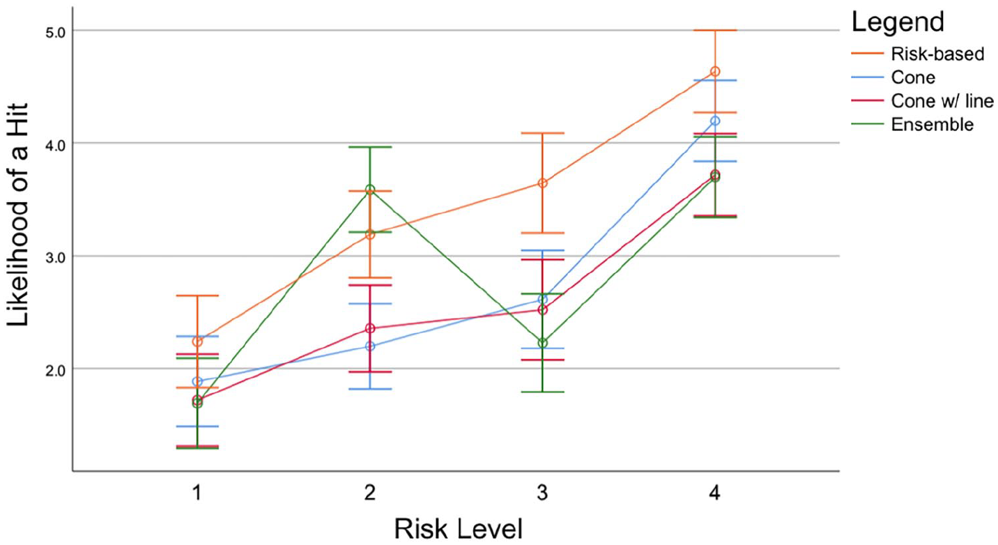
Judgments of likelihood of a hit.
The different representations led participants to judge the risk that the four locations would be hit differently, omnibus F(1.98) = 6.49, p < .001, partial eta-squared = .166. Partici-pants viewing the risk-based maps rated risk to be significantly higher than those who saw the ensemble maps, contrast F(1.98) = 9.32, p = .003. But participants who saw the ensemble maps did not rate risk significantly differently than people who saw the cone-centerline or no-centerline maps.
The pattern of evacuation judgments mirrored the pattern for hit risk judgments. The risk-based map led to notably higher confidence at the highest risk level than the ensemble representation, but it did not lead to significantly greater confidence than the cone of uncertainty representations. Perhaps not surprisingly, people who reported greater risk tolerance reported greater confidence in their evacuation judgments, but we saw no evidence that this differed for different visualization types. We saw no evidence that participants’ risk tolerance, hurricane or evacuation experience, preferred source of weather information, or any demographic characteristics otherwise affected their judgments.
Discussion
This study’s results demonstrate that our risk-based visualization led to comprehension of risk that was at least as accurate as the more frequently seen cone of uncertainty, and to elevated judgments of risk that—at the highest risk levels—we see as more closely corresponding to what the data should be communicating. The findings at least partially support our goal of more clearly communicating risk and supporting better and more confident judgments and decisions consistent with expert evaluations. Viewers of the risk-based visualization accurately understood the levels of risk associated with the four different scenarios, just as viewers of the cone of uncertainty representations did.
Unexpectedly, we did not see the comprehension benefits for our ensemble maps that Ruginski et al. (2016) did (benefits for reducing the potential misinterpretation that hurricanes get larger over time from cone of uncertainty representations), but of course our scenarios and judgments had a different focus. Our online MTurk study also differed methodologically from Ruginski et al.’s lab study, with different and fewer scenarios, and so we are cautious about generalizing too far about our ensemble map results.
The fact that our risk-based visualizations led to elevated judgments of risk even for our lowest-risk scenarios, however, suggests that this design doesn’t yet meet all our goals. What we want to create is a risk-based visualization that does not inflate judgments of risk when the levels are low, but rather leads to appropriately low levels of risk judgment—ideally even lower than equivalent cone of uncertainty representations.
This design goal guided Study 2, whose purpose was to test the effects of particular design elements in alternate versions of our risk-based visualization that decrease overestimation of low levels of risk.
Study 2: Effects of Alternate Risk-Based Visualization Design Choices
The design elements selected for testing in Study 2 were based on hypotheses about what might have led to overestimation of risk in the low-risk scenarios in Study 1, informed by additional qualitative testing of naive users using think aloud methods. These hypotheses included that risk-based visualization viewers may have overestimated risk for low-risk scenarios if they interpreted the heatmap as a weather map; that viewers may have made risk judgments based on their extrapolations or projections of where the hurricane path until the moment represented in the scenario might lead (extending the direction and curve in ways that did not match the risk projection); and that viewers may have misinterpreted the location about which they were to judge the risk (the “You are here” representation may have been ambiguous).
Based on these hypotheses, three elements were selected for testing (see Figure 3): a legend with labels explaining that the colors on the visualization referred to high, medium, and low risk regions; including or not including the hurricane path up to the moment visualized in the scenario; and an alternate pin representation for the locations viewers were to make judgments about. The Study 2 questionnaire was again implemented using the Qualtrics platform with MTurk recruitment in March 2021. The experiment design was again between-subjects; after participants consented to participate they were randomly assigned to one of eight variants of the risk-based visualization, with one or the other design alternatives on the three dimensions in Figure 3.
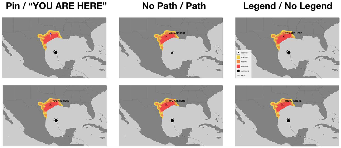
Design elements tested in study 2.
Participants again responded about scenarios reflecting four different risk levels (representing the same hurricane scenarios as in Study 1) presented in a different random order for each participant, and they were asked the same three questions about each map as in Study 1 (hit risk, evacuation judgment, confidence) as well as the remaining additional questions.
Findings show that the presence of the hurricane path in the risk-based visualization can lead to overestimation of risk for the lowest risk level scenario and underestimation at the higher levels. Removing the hurricane path from the representation seems to improve comprehension, The pattern of results shows that there was less overestimation at the lowest risk level when the representation includes a legend, does not include the hurricane path, and uses the pin rather than “You are here” representation.
Conclusion
The evidence presented here suggests to us that the kind of risk-based visualization we are developing has promise and is worth exploring further, and that hurricane risk can be communicated without the design elements that have been shown to lead to misinterpretation in cone of uncertainty representations. The findings suggest, in particular, that not including the hurricane path can actually lead viewers to judge the likelihood of hurricane hit-risk in ways more consistent with modeled levels of risk. While this may seem counterintuitive, we interpret this as consistent with arguments that representations of the predicted hurricane path may lead viewers who are not sensitized to the probabilistic nature of the path representations to perceive more certainty than is warranted or useful for decision-making.
The evidence also suggests that our scenario-based testing of the effects of alternative representations on viewers’ comprehension and judgments is useful as part of an iterative design process. Further testing will help us determine which design elements are more effective for which viewers and for which comprehension and judgment goals; thus far the evidence suggests that the individual differences we have explored do not seem to affect interpretation adversely, but this deserves further investigation with larger and more diverse samples of viewers, as part of understanding the potential effects of design choices in hurricane risk visualizations (Ma & Millet, 2022).
Of course, the visual representation of a risk model is dependent on a good underlying model of risk, which begs the question of which models are best—and also how publicly modelers will be willing to commit to showing model details that could lead to liability for forecasts that do not accurately predict the storm. Although the studies presented in this paper suggest that stripping away everything but the risk assessment leads to clearer, more consistent interpretations of hurricane risk, there are potential downsides to relying solely on risk models.
Footnotes
Acknowledgements
The authors wish to thank members of the Spring 2020 graduate course “Visualizing Uncertainty” at The New School for inspiration and feedback.
Declaration of Conflicting Interests
The author(s) declared no potential conflicts of interest with respect to the research, authorship, and/or publication of this article.
Funding
The author(s) disclosed receipt of the following financial support for the research, authorship, and/or publication of this article: This work was supported in part by The New School faculty research funds to Hill and Schober, as well as a grant from the Urban Systems Lab at The New School.